
 Welcome back, readers. It’s May, and that means the weather’s getting hotter. Stay inside, away from the evil, evil sunshine. Relax, grab a lemonade, and browse through this month’s collection of portfolios. This time around, we have a whole lot of grid-based minimalism with black borders, and some other stuff, too.
Note: I’m judging these sites by how good they look to me. If they’re creative and original, or classic but really well-done, it’s all good to me. Sometimes, UX and accessibility suffer. For example, many of these sites depend on JavaScript to display their content at all; this is a Bad Idea , kids. If you find an idea you like and want to adapt to your own site, remember to implement it responsibly.
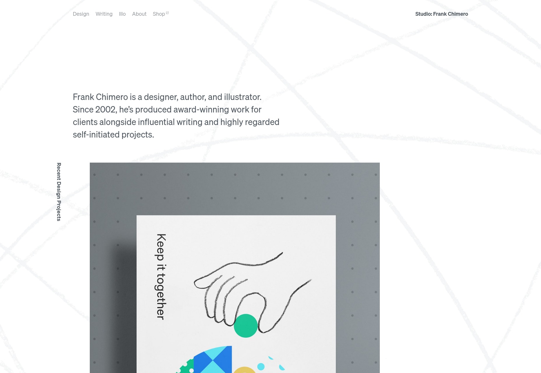
Frank Chimero
We’ve actually featured a previous version of Frank Chimero’s portfolio once before, back in February 2016. Where the previous iteration was mainly focused on selling his writing, this version includes portfolios for his design and illustration as well.
It’s still pretty simple and modern, but there’s now a definite tendency toward using more images. Also, those pencil strokes in the background are a very nice touch, and fit thematically with all of the work he does.
Platform: Static Site
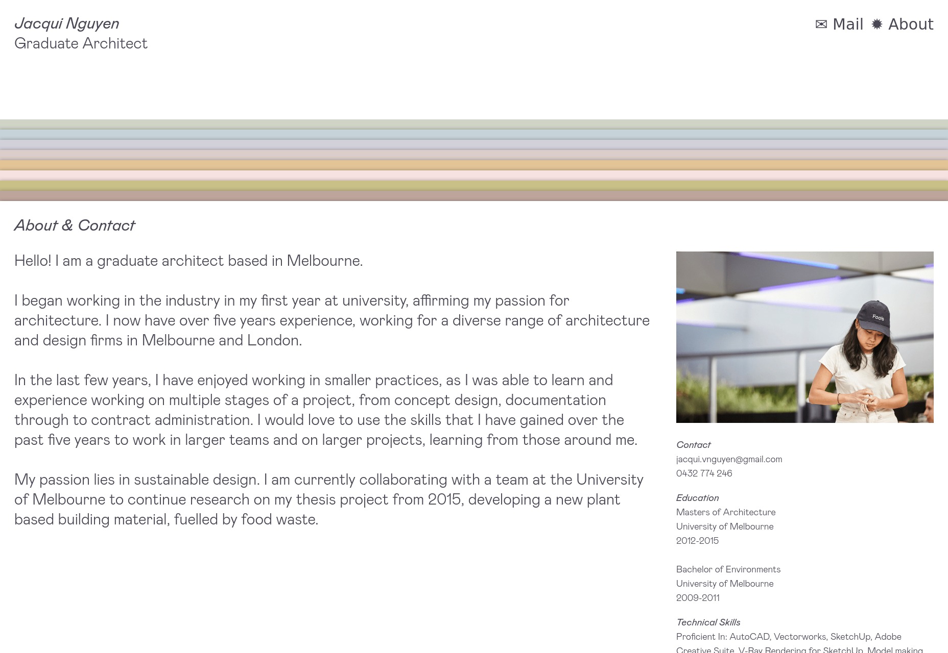
Jacqui Nguyen
Jacqui Nguyen is an architect, and her one-page portfolio pulls off something I didn’t expect to see this month: an accordion-based layout that I actually kind of like. It doesn’t hurt, mind you, that it’s styled to look vaguely like a file drawer.
I have a weird love for office supplies I never use. Anyway, that slight touch of skeuomorphism is just enough to set her site apart without delving into the realm of leather textures and other abominations. Above all, it is functional. That feels appropriate for an architect.
Platform: WordPress
Tej Chauhan
Tej Chauhan combines the presentation style website with pseudo-brutalism (read: minimalism with monospaced type) in a way that I find interesting. On the one hand, you have the presentation-style layout and handling of images for the portfolio, plus the nigh-unusable navigation so prevalent in presentation sites. (The red dot is the menu button.) On the other, every other element is near-brutalist in its aesthetic.
I wouldn’t adopt Tej’s approach to navigation, but the rest of the design presents some interesting contrast in style.
Platform: WordPress
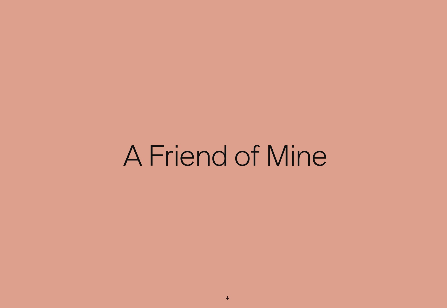
A Friend of Mine
A Friend of Mine is a design agency that took on an interesting challenge when designing their portfolio: limiting the sense of style and personality as much as possible. Their whole shtick is that they tackle every problem differently, according to the situation. They don’t have a “house style”.
In execution, this means that their site is as simple as possible, taking minimalism to its practical extreme. I like to think that the constantly changing background color on the first part of their home page is a symbol of their commitment to doing everything differently as-needed.
Platform: Static Site
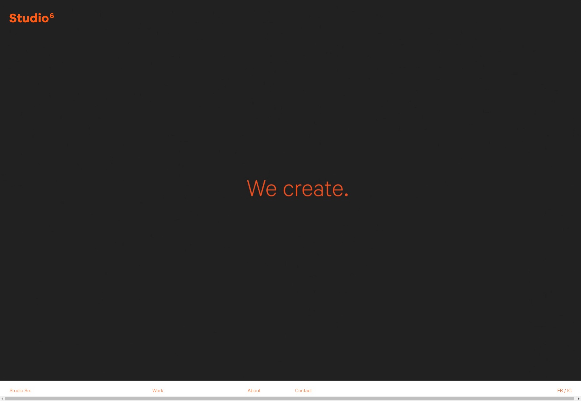
Studio Six
Studio Six’s agency portfolio is basically a study in what you might call corporate elegance. It has some of the hallmarks of artsy work, some fantastic typography, and the some of the restraint of your average corporate site. It manages to strike a balance between all of the elements that you don’t see to often.
Platform: Static Site and/or JS App
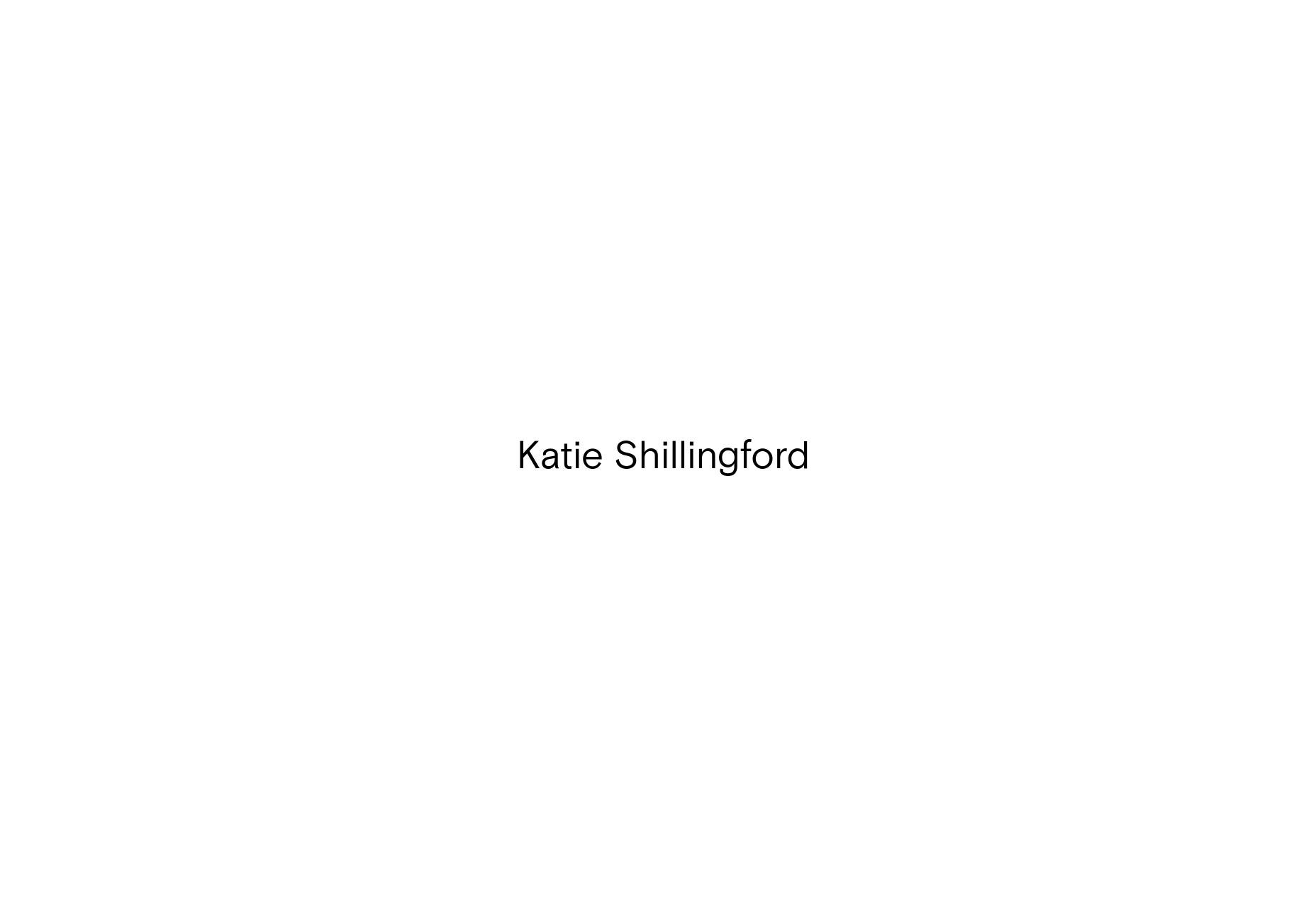
Katie Shillingford
Katie Shillingford is a fashion stylist, and her site goes for that magazine feel without trying to completely copy magazine layouts. It’s actually one of the better examples I’ve seen of adapting a print medium’s aesthetic to the web, even if it is loaded down with slideshows galore.
Platform: Static Site
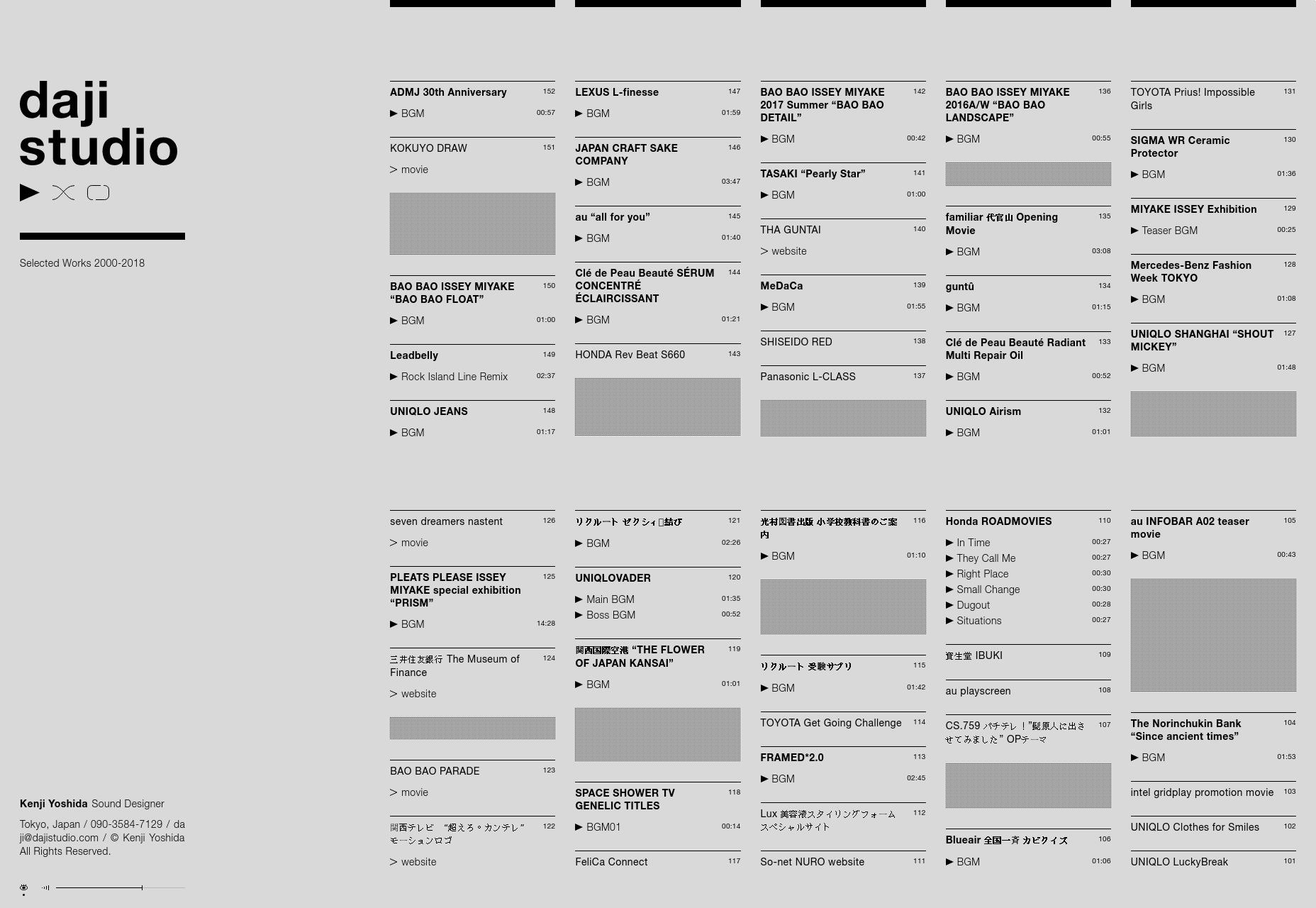
daji studio
daji studio is the portfolio of Kenji Yoshida, a sound designer. You might expect, then, to be blasted by audio the second you open the page.
But lo and behold, Kenji is polite. No audio plays until you click one of the many “play” buttons scattered around the pleasing grid-based design. Be like Kenji.
And the site looks cool, too. The audio visualizations that take over the whole screen when you click a play button can be jarring at first, but overall, I like them.
Platform: WordPress
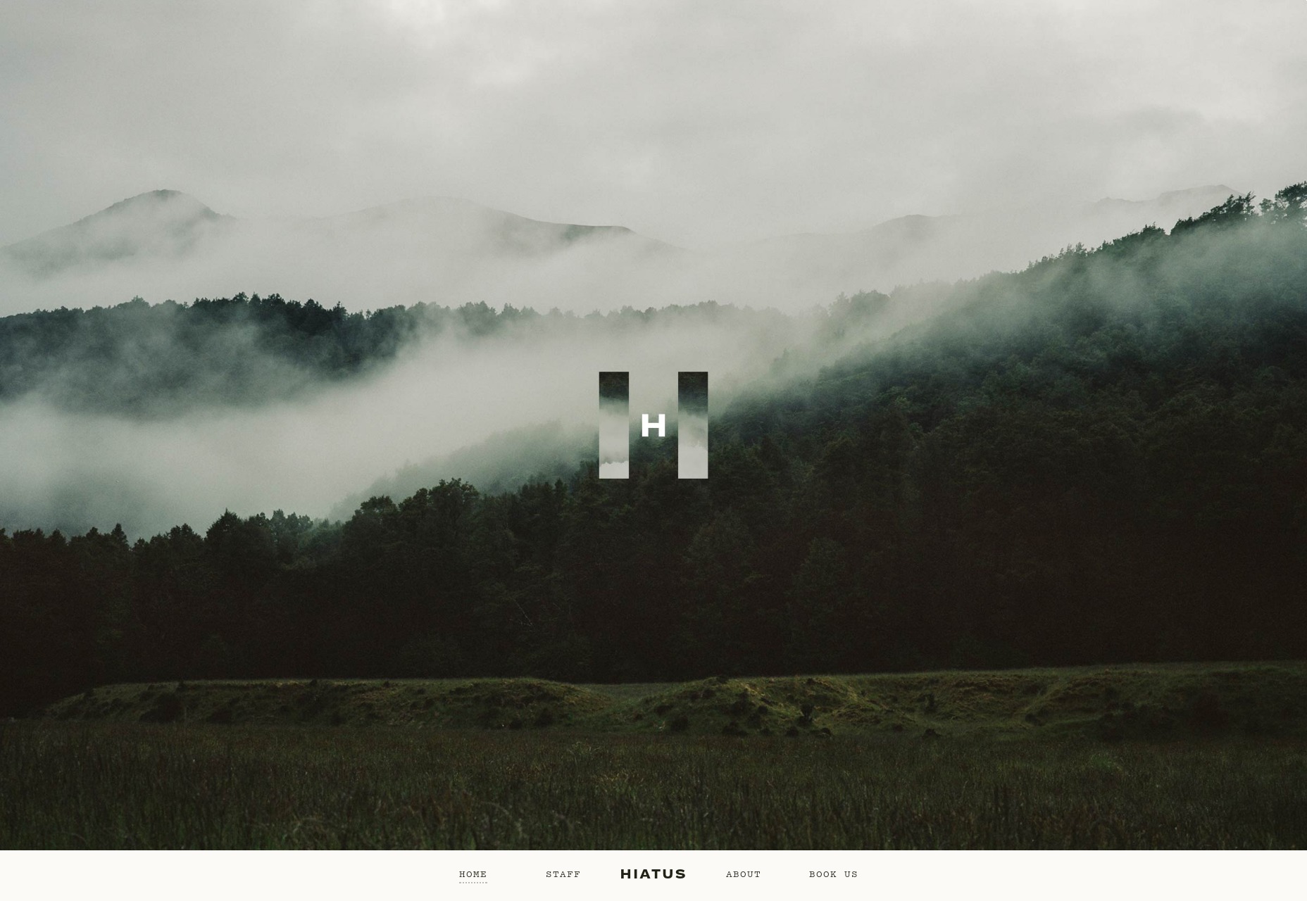
Hiatus
Hiatus is a team of video editors, and their site is deliciously creative. From making their branding look kind of like a pause button, to the rustic style of their site, to the layout that literally keeps the branding front and center at all times, this thing just… well it made me look.
Plus, unlike most video studios, they don’t hit you with a bunch of auto-playing video. You have to actually click on a project and then click play, so you’ve got plenty of time to set up your headphones first, and it won’t hurt your data caps unless you want it to.
Platform: Static Site
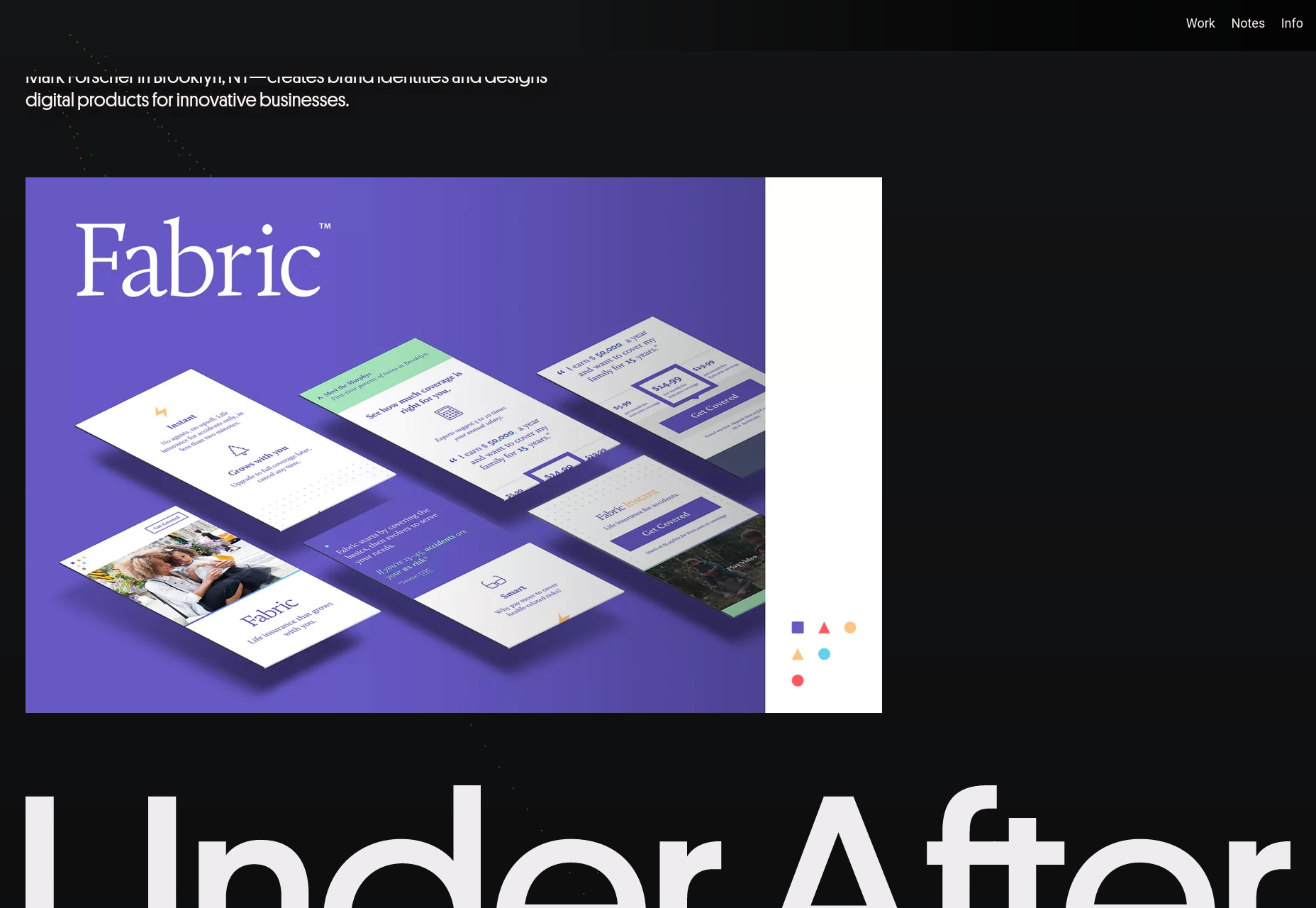
Under After
Under After is another minimalist portfolio that spices things up with just a hint of an illustrator’s touch, here and there. The site’s strongest point is really its typography, but the general layout is pretty snazzy as well.
I actually really like the way they designed those testimonials, and it might be the first time I’ve ever said that. Or not. I just know I don’t say it that often.
Platform: Static Site
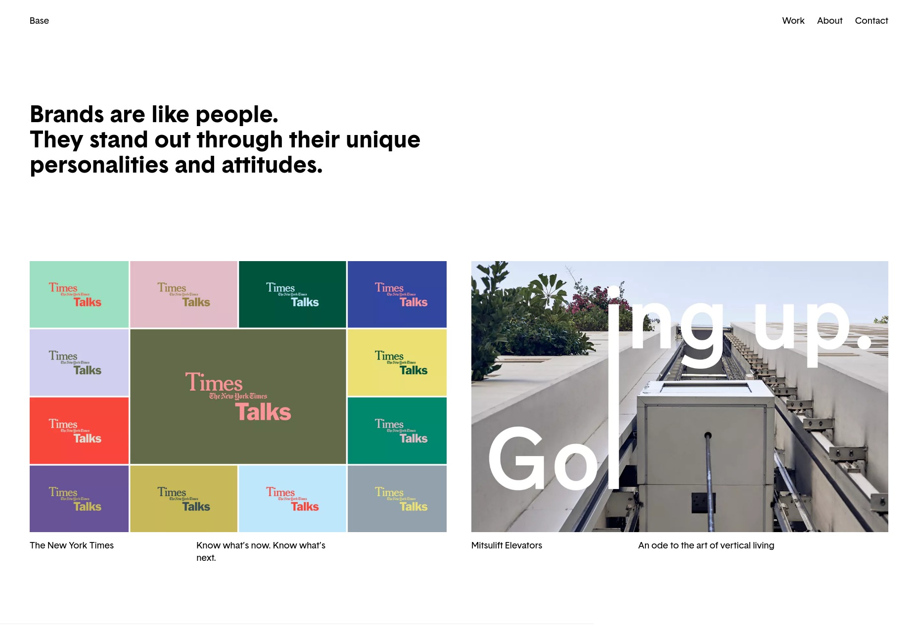
Base
Base is a branding studio, and they’ve gone with a website design that forgoes any real fancy touches, and gets straight to showing off their work. It’s simple, it’s clean, it looks good.
Platform: WordPress
Mathilde Serra
Mathilde Serra is an art director with a strong emphasis on type. Combined with the strong colors, and a penchant for illustration, her portfolio looks classy and creative.
It’s so good, it’s almost worth the pre-loader. No but really, go look through the case studies. They’re beautiful.
Platform: Static Site
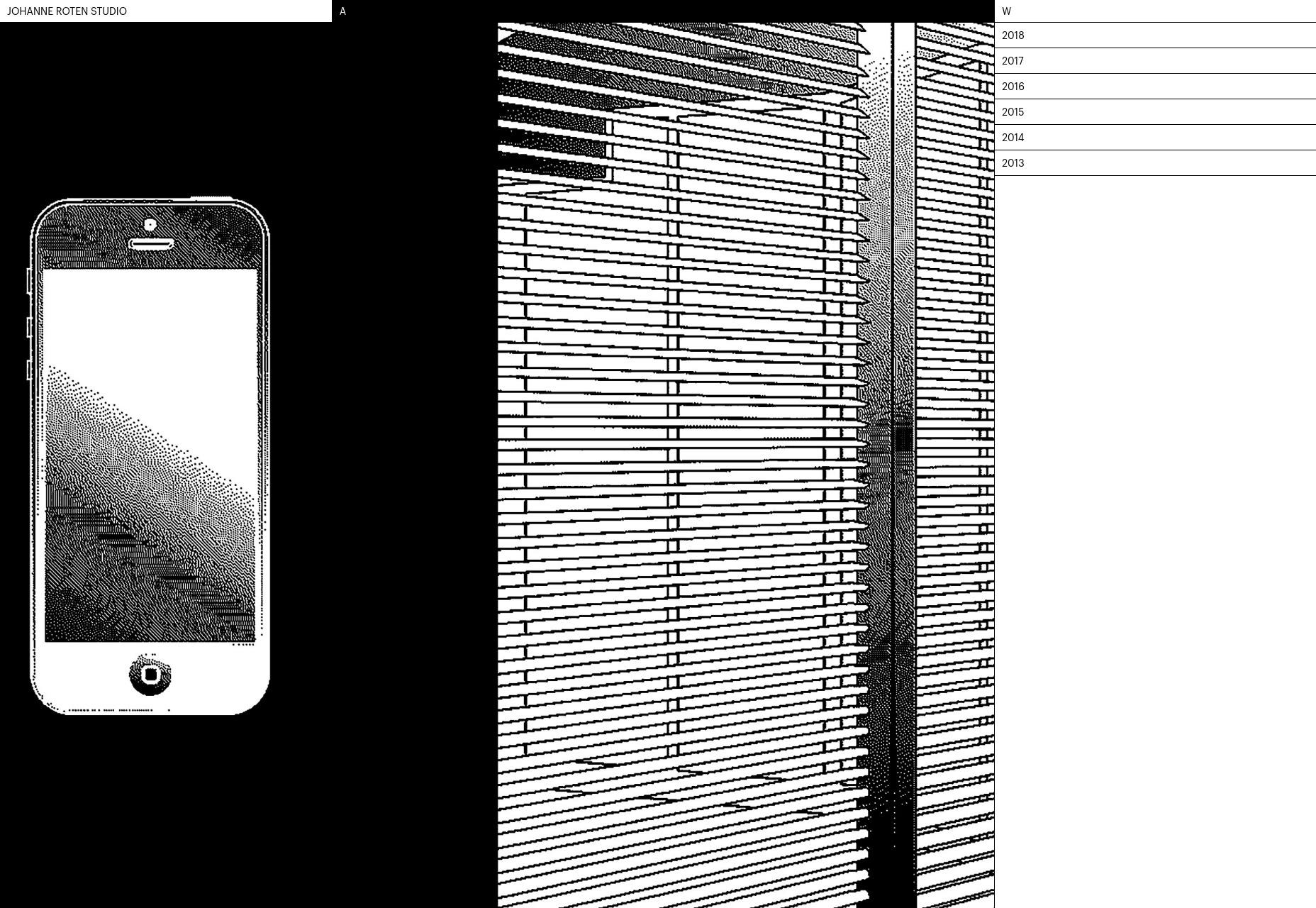
Johanne Roten
Johanne Roten is a Swiss graphic designer, and the Swiss style definitely shows in her work. It’s got that feeling of near-extreme-minimalism we’ve come to associate with our favorite some of our favorite designers from there. It’s also maybe one of the more well-organized one-page portfolios I’ve ever seen.
Platform: Static Site
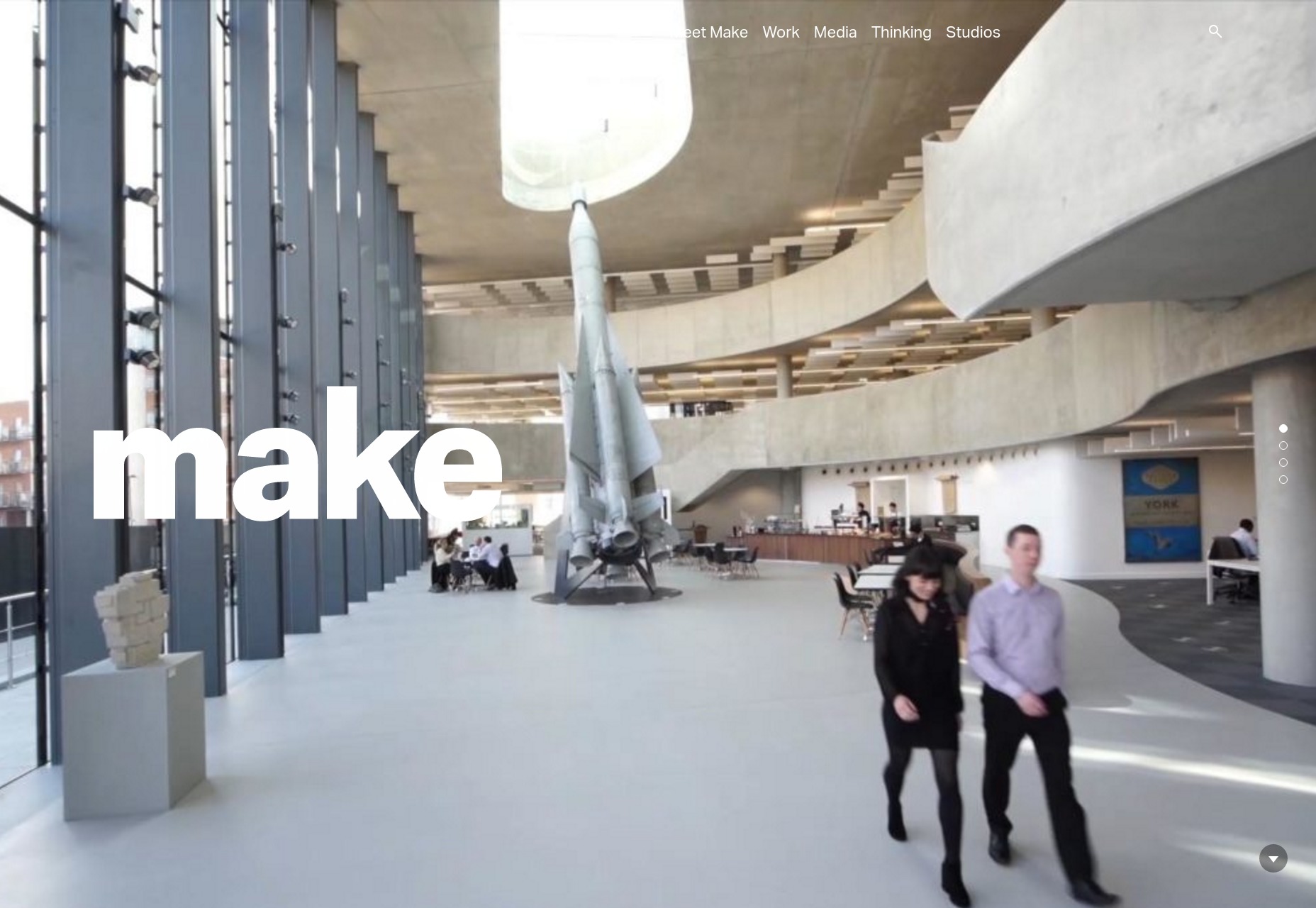
Make Architects
Make Architects is an interesting portfolio, and not just for its design, which looks darn good. It takes that asymmetry-focused minimalism that got so popular last year, and combines it with a more business-friendly aesthetic.
It also spends half of its home page showing off not just their work, but advertising how they work. ie. it’s an employee-owned company, etc. They put just as much effort into letting you know what to expect from their business practices as anything else. It’s an approach I’ve seen before, but these people do it right from the get-go.
Platform: WordPress
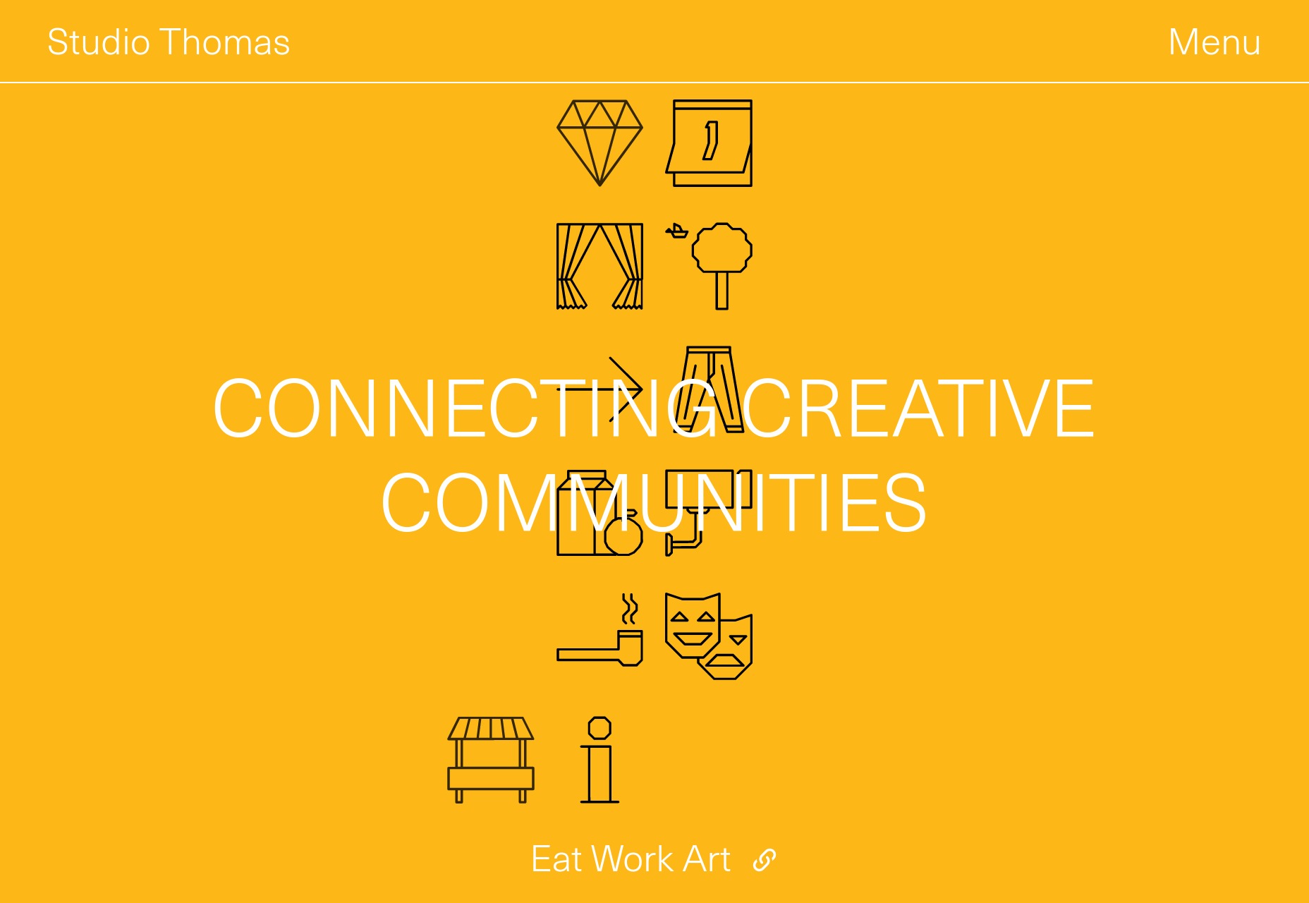
Studio Thomas
Studio Thomas is one of those studios that has, with some mild animation aside, chosen the dead-simple look for their site. I am rather partial, though, to the header/navigation. It takes an interesting approach to telling the user where they are on the site at all times, putting the page title right up top with the site’s name.
It’s like they think telling you what page you’re on is equal in importance to telling you who they are. And I can’t say I disagree.
Platform: Vue.js / Nuxt
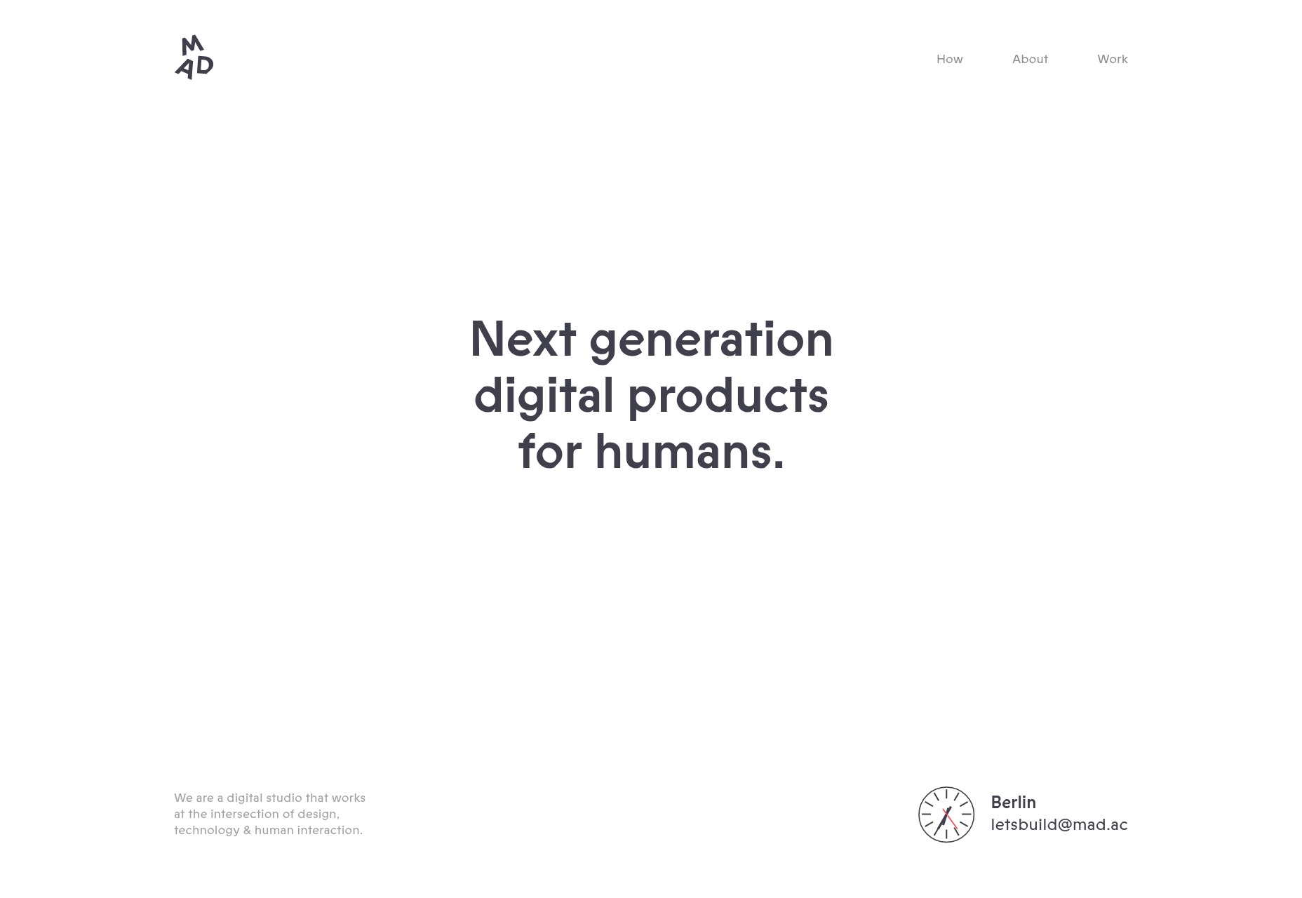
MAD
MAD has also gone for a dead-simple look, but they’ve given their type and visual flair a distinctly playful look through very small touches. It’s a subtle kind of full-site branding, but it gets the message across while keeping the site usable and readable. I can get behind that.
Platform: Static Site
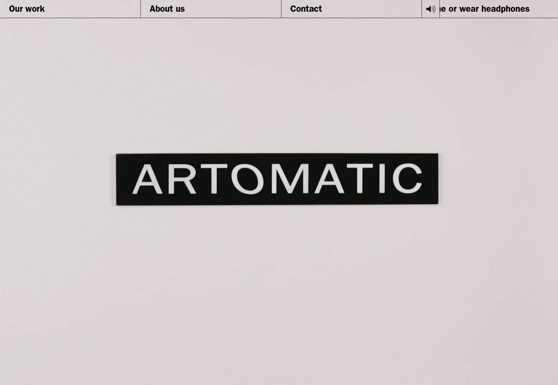
Artomatic
Artomatic is bringing us yet more of that minimalism with lots of black borders that is this month’s theme. Well, there’s also a sense of carefully-imposed order, and one of the nicer approached to video that I’ve seen.
Platform: Static Site (probably)
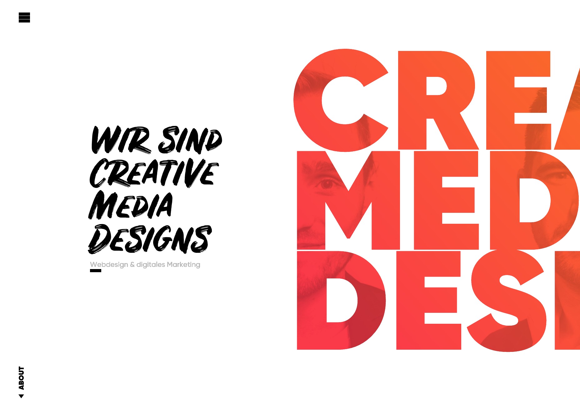
Creative Media Design
Creative Media Design is a German design studio with a style that you might call simple, professional, efficient, and quintessentially German. True to the ambitions stated in their name, though, the site is livened up with the excellent use of accent colors, and a few small touched of handwriting-style type.
Platform: WordPress
MD
MD is yet another site on this list competing for “most minimalist thing since blank paper”. I mean, portfolio slideshows aside, it has a one-column layout. And yet, it still looks good.
Platform: Static Site

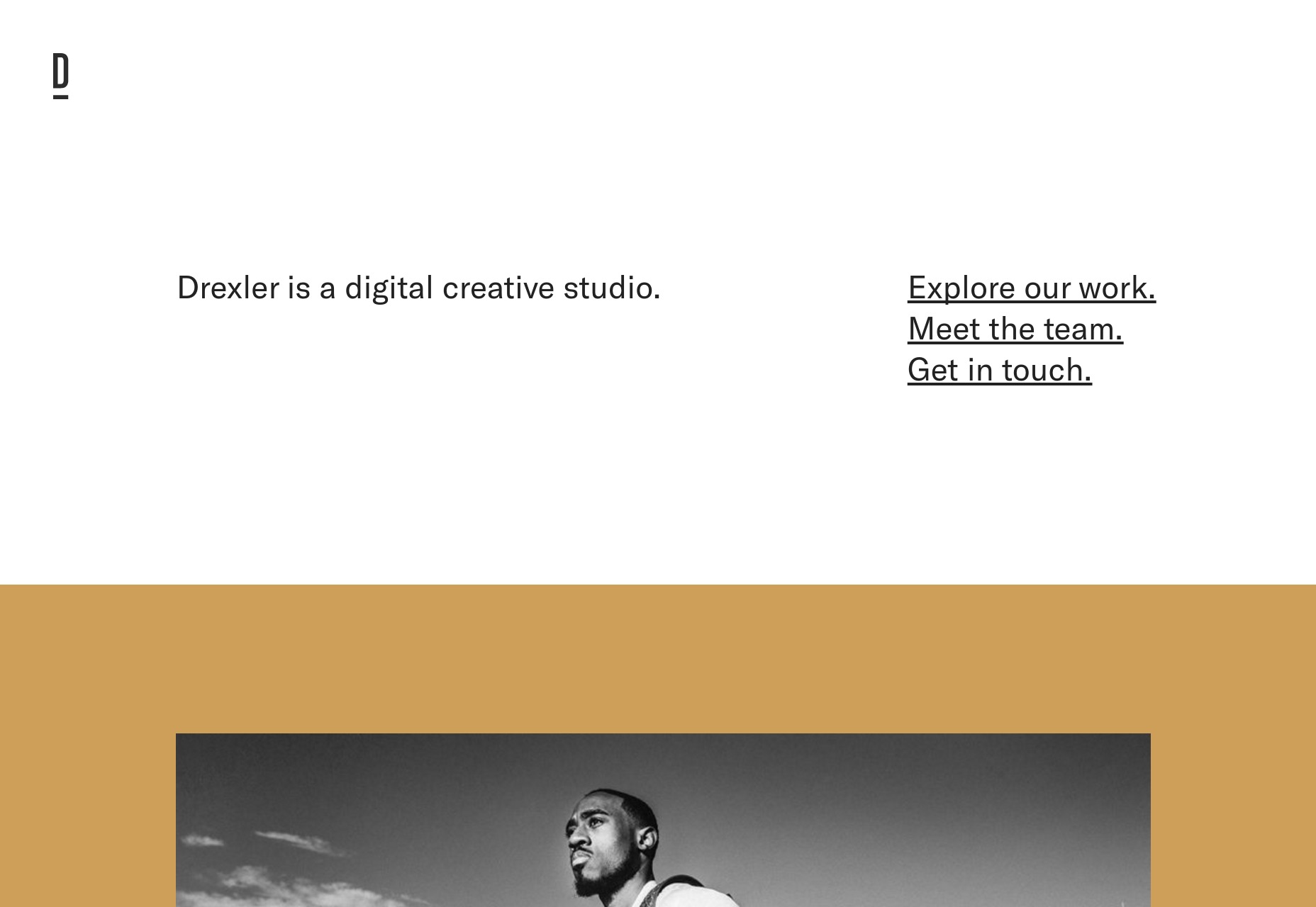
Drexler
Drexler’s studio portfolio spices things up by going back to the old asmymmetry. I mean, what’s old is new again, right? Or at least what’s old is a refreshing change of pace in a sea of grid-heavy aesthetics.
Platform: WordPress
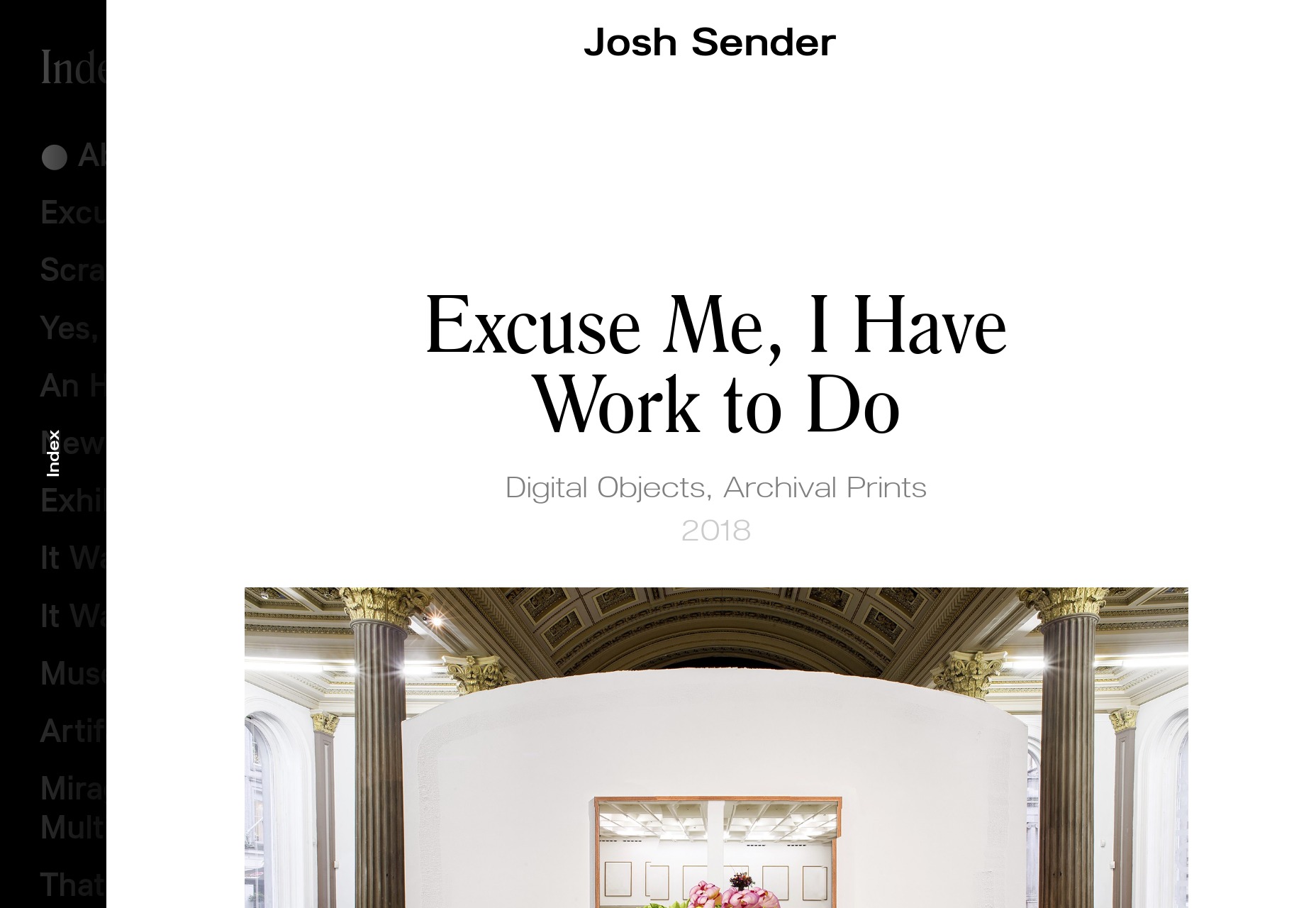
Josh Sender
And lastly, Josh Sender has introduced me to the beautiful Romana BT family of typefaces. Just look at those headings. I mean, the rest of the site is good, but those headings are beautiful.
I also rather like the approach to the navigation used on this one-page portfolio. It’s simple, efficient, and mostly stays out of your way, while never being exactly hidden.
Platform: WordPress
| Add Realistic Chalk and Sketch Lettering Effects with Sketch’it – only $5! |
p img {display:inline-block; margin-right:10px;}
.alignleft {float:left;}
p.showcase {clear:both;}
body#browserfriendly p, body#podcast p, div#emailbody p{margin:0;}
from Webdesigner Depot https://ift.tt/2wEtBZD
from WordPress https://ift.tt/2Geh8LF
No comments:
Post a Comment