
 Hello again, Readers. It’s time to stop playing those games you got on the Steam Summer Sale for a minute, ‘cause it’s July now—I know, it caught me off guard, too.
This month, I say “minimalist” at least as much as I did last month, because the trend of near-monochromatic, dead-simple, kind of post-modern sites shows no signs of slowing. I’m okay with this, but if you’re going to be redesigning your portfolio this month, maybe throw a bit more color at it. Please? For me?
Enjoy.
Note: I’m judging these sites by how good they look to me. If they’re creative and original, or classic but really well-done, it’s all good to me. Sometimes, UX and accessibility suffer. For example, many of these sites depend on JavaScript to display their content at all; this is a Bad Idea , kids. If you find an idea you like and want to adapt to your own site, remember to implement it responsibly.
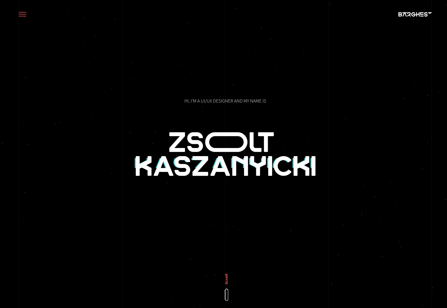
Zsolt Kaszanyicki
This particular portfolio reminds me of old “futuristic graphics” in the best possible way. You’ve got the old thick sci-fi type combined with a ‘90s-era flicker effect on a dark color scheme. Combine that with the more subtle animated touches, and you have a fantastic presentation-style site.
Platform: Static Site
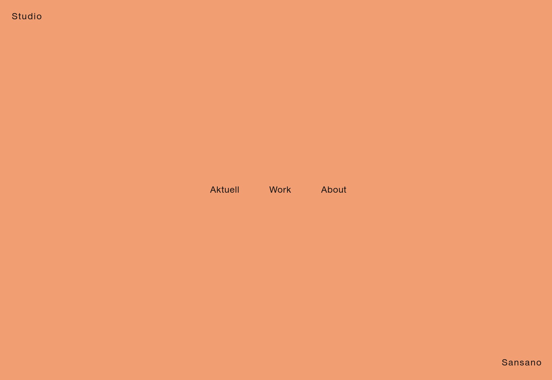
Paula Sansano
Paula Sansano’s portfolio is visually minimalist, and very pastel. I also actually quite like the way JavaScript is used to transition from one page layout to another smoothly and nearly seamlessly. What I like even more is that this does not tie the site’s basic functionality to JS. The site works just fine without it.
See? This is how it’s done.
Platform: WordPress
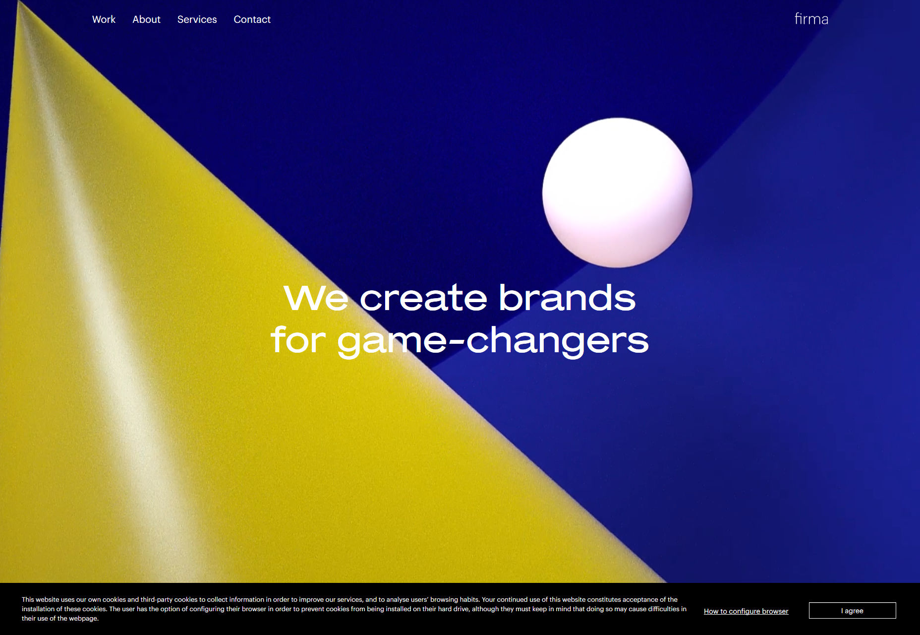
Firma
Firma’s agency site is another one bringing us back to that retro-futuristic aesthetic. This time, it’s accomplished through animated clipart. I’m not even kidding. Don’t you remember when those basic 3D geometric shapes were the height of clipart fashion?
And throughout the rest of the site, little touches of clipart-style illustration abound. It’s an aesthetic approach that maybe shouldn’t work, but it does.
Platform: WordPress
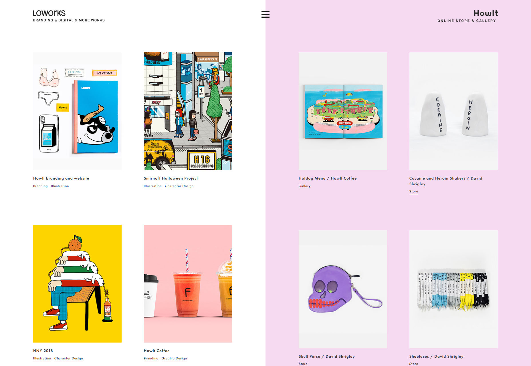
Loworks
Well, they say the Japanese are efficient. If Loworks is anything to go by, they‘re not wrong. You seem this site actually pulls double duty by being two sites in one (sort of): a portfolio, and a store/gallery. The home page is actually kind of two home pages that share the screen.
The consistent aesthetics keep things manageable, though. And browsing into one “side” of the site or another will show you separate navigation, so it’s not all that confusing. It’s an interesting approach.
Platform: Static Site
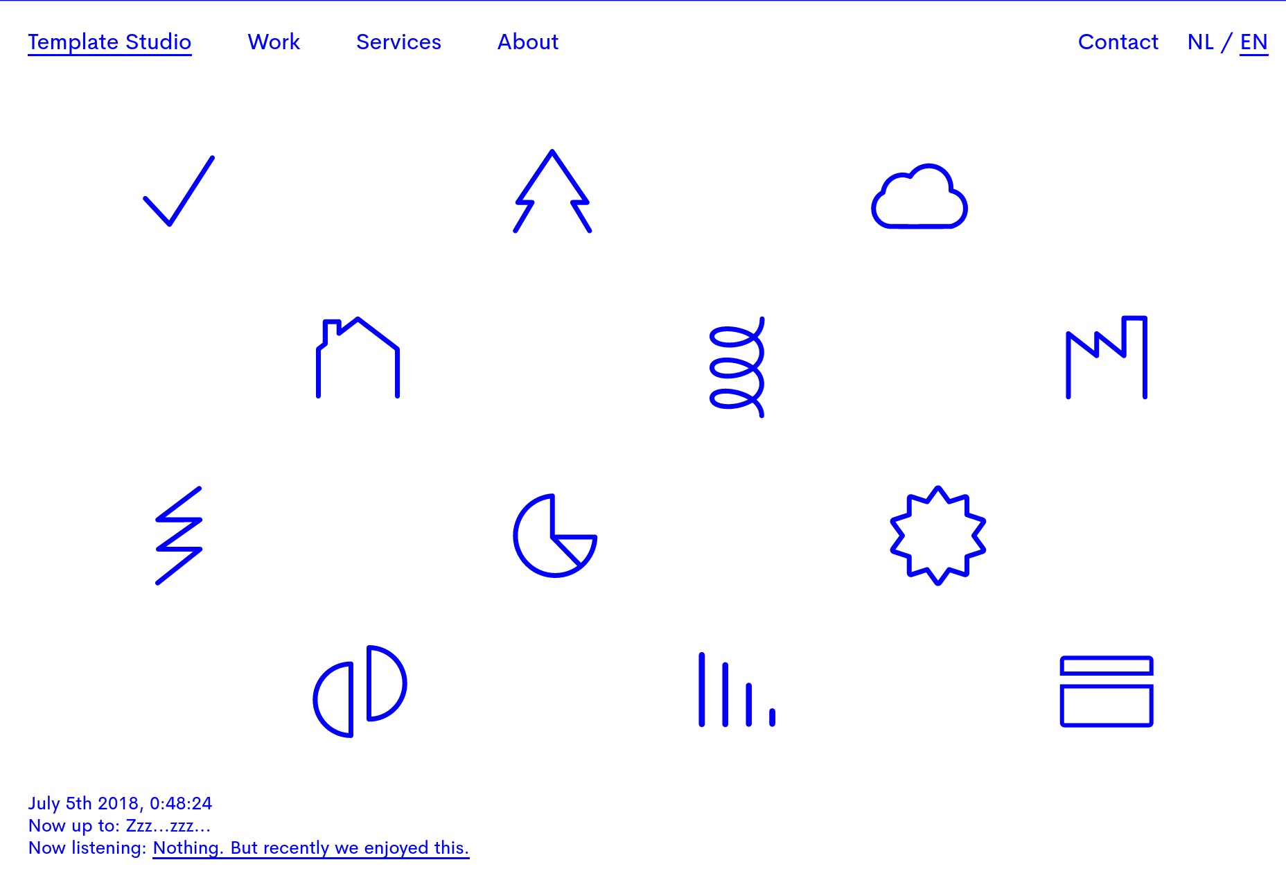
Template Studio
Template Studio is perhaps an odd name for an agency that does some pretty original work, but that’s irony for you. The site has a some pretty decent typography combined with a simple layout, and some fantastically executed diagonal lines. Sorry, I’m a sucker for those.
Platform: Vue.js
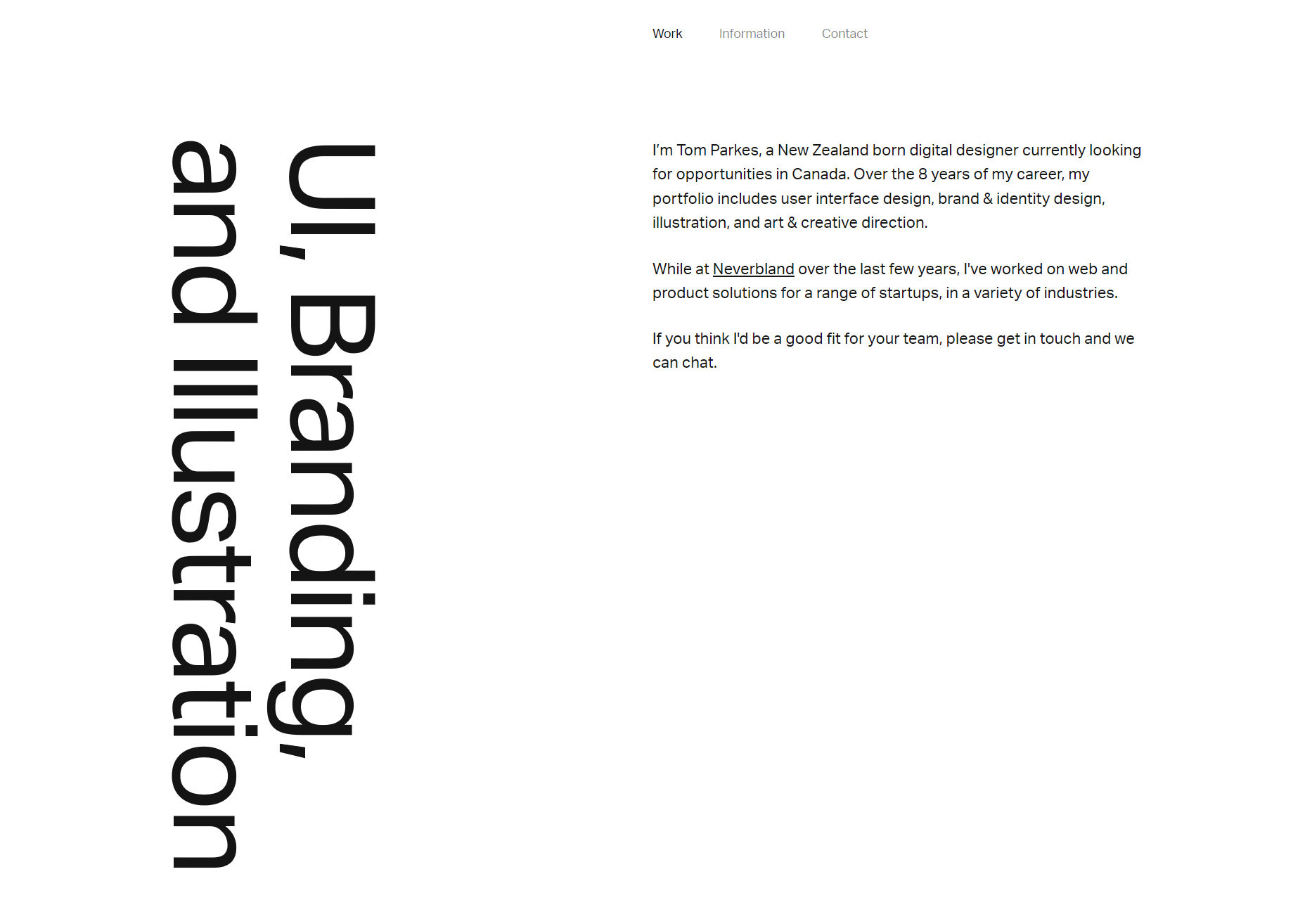
Tom Parkes
Tom Parke’s portfolio goes for some of that full mid-‘00s minimalism, and it looks fantastic. It’s just got that good old clean feeling we all used to try and steal from Apple, but with a penchant for text that makes you crane your neck to read it.
Platform: Static Site
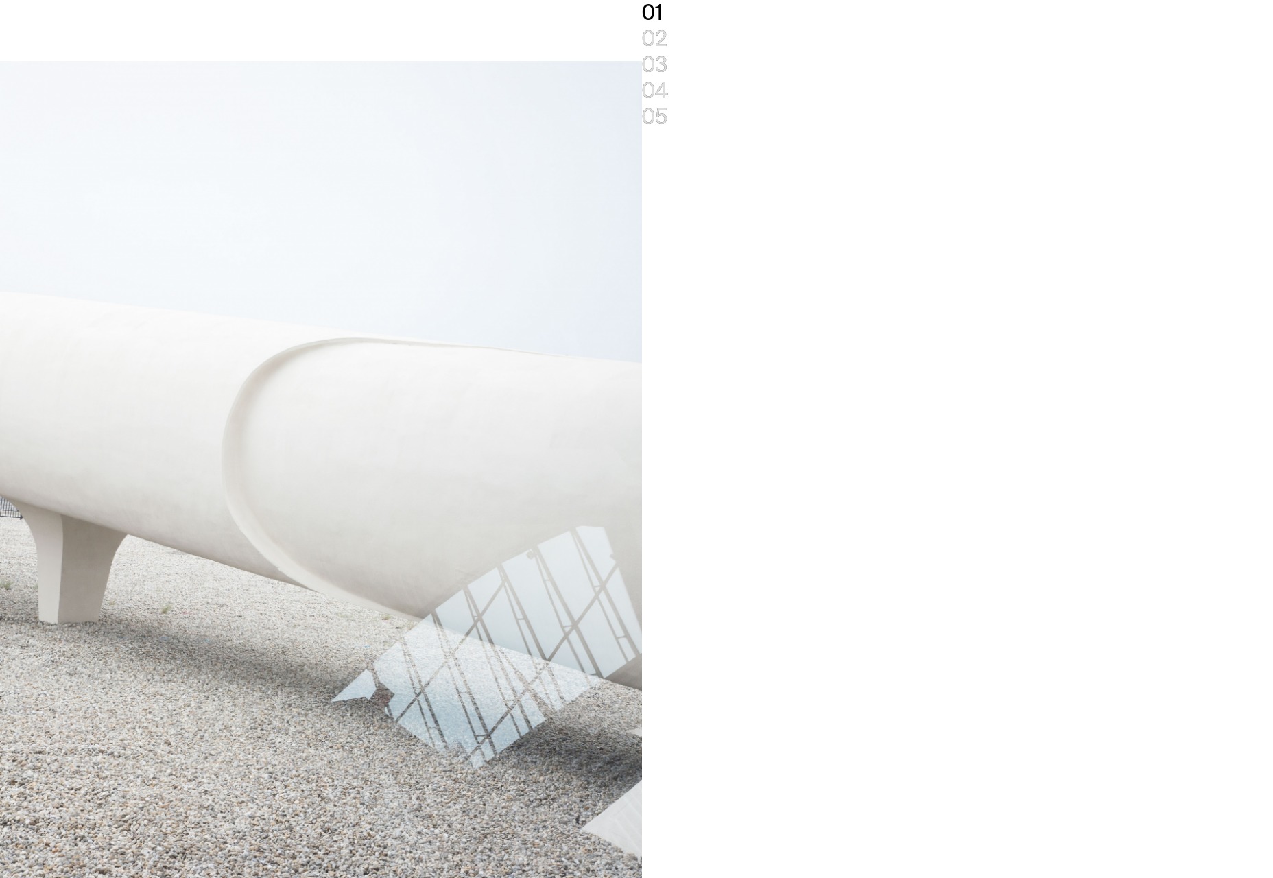
Naho Kubota
Naho Kubota’s portfolio is that kind of artsy minimalism that got real popular recently. It is also basically a kind of vertical slideshow, but not in the way we’ve come to expect, what with all of the full-screen content sections we’ve become so familiar with. It’s somehow even more minimalist than that, but it also somehow has more text-based information than you’d expect. It’s a fusion of ideas, and it works.
Platform: Static Site (probably)
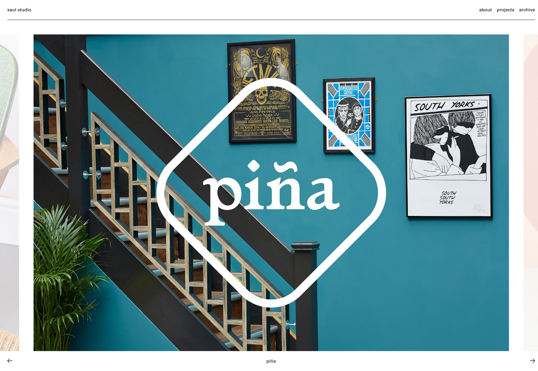
Saul Studio
Saul Studio’s site is simple, clean, and professional. It’s not going to win awards for mind-blowing visuals or originality, but as always, I like to celebrate the sites that are just plain good. In many situations, reliable design beats innovative design, and it’s good to remember that.
Platform: WordPress
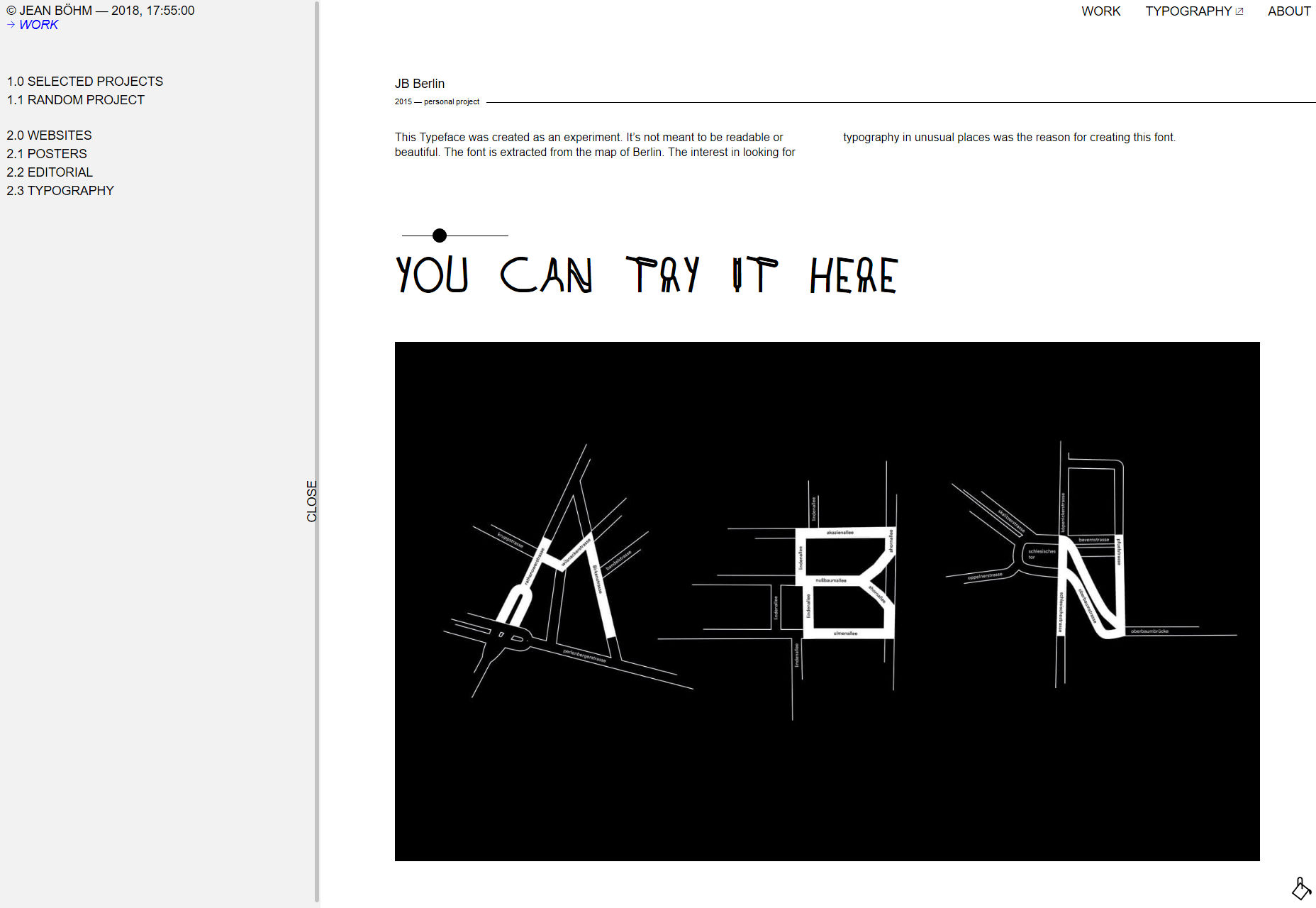
Jean Böhm
Jean Böhm’s portfolio is almost aesthetically brutalist, and focused on functionality. It’s all about focusing your attention directly on the work, to the point that you can collapse the sidebar navigation to see the images in as much detail as possible. This is function (almost) over form at its finest.
Platform: Static Site
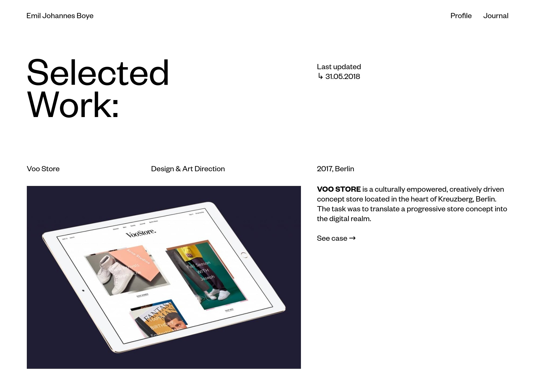
Emil Johannes Boye
Emil Johannes Boye is an excellent example of the way that typography can make that little extra difference between a good-looking design and a great-looking design. And this one looks great. Also, this is why good font rendering is so important.
Platform: WordPress
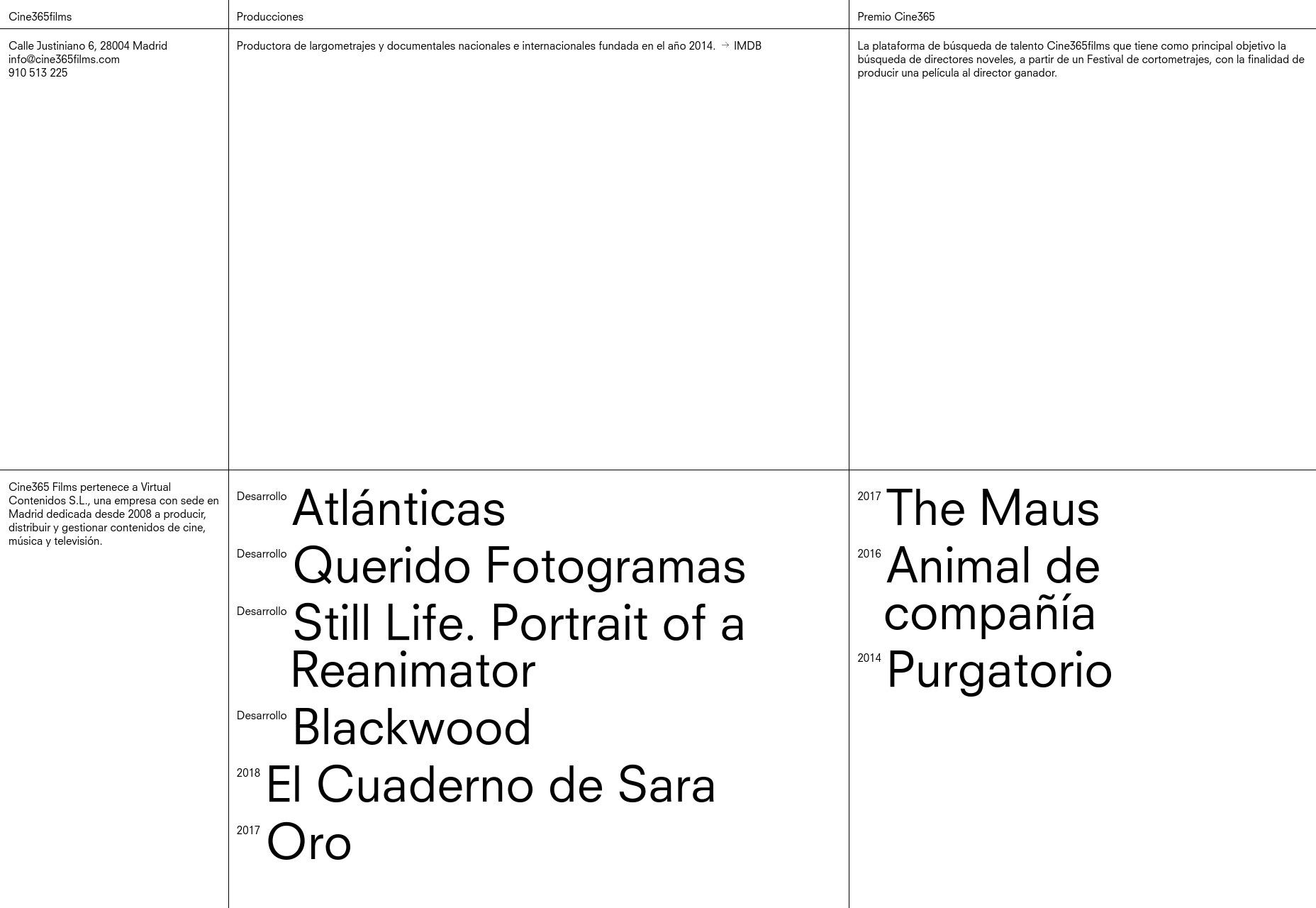
Cine365films
Cine365films is another one of those sites where the grid isn’t just a layout tool, it’s a defining part of the aesthetic. I happen to like that approach, but Cine365films has also added in some interesting bits, like their animated gradients.
Another thing to note is the implementation of their video players. Instead of giving them a full screen or a modal window, off the bat, they’re very specifically confined to the grid. Even going full screen, the grid and some of the text are still visible, which while odd, is clearly a choice they made to keep certain bits of information front and center.
Platform: WordPress
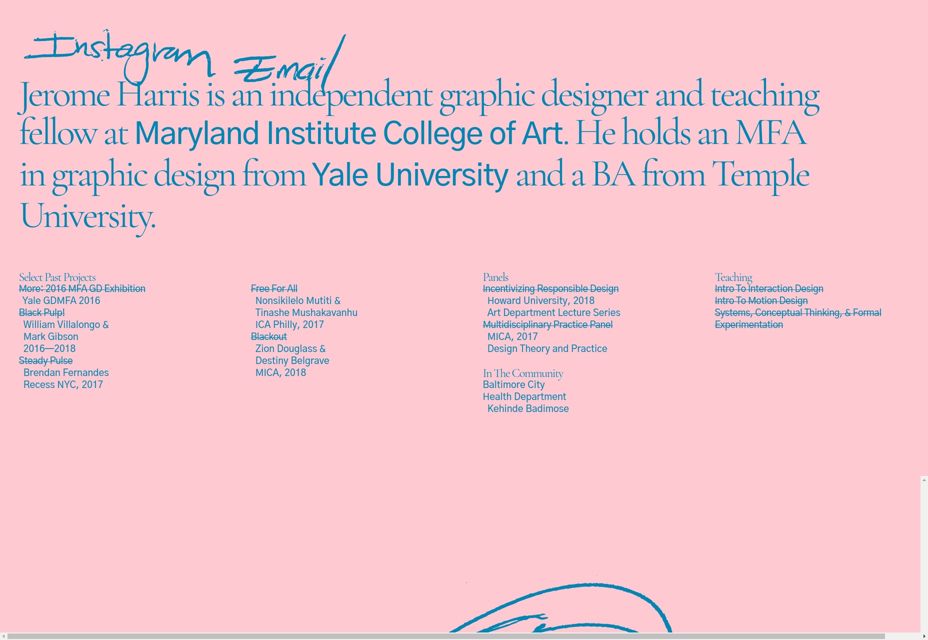
Jerome Harris
Jerome Harris is a teaching fellow in an art college, so his portfolio is particularly artsy, as you might expect. For all of that, it looks great, and I’m partial to the scrolling portfolio on the right. It’s just enough to give you a taste, while the links on the bottom left can give you more detail.
Platform: Static Site
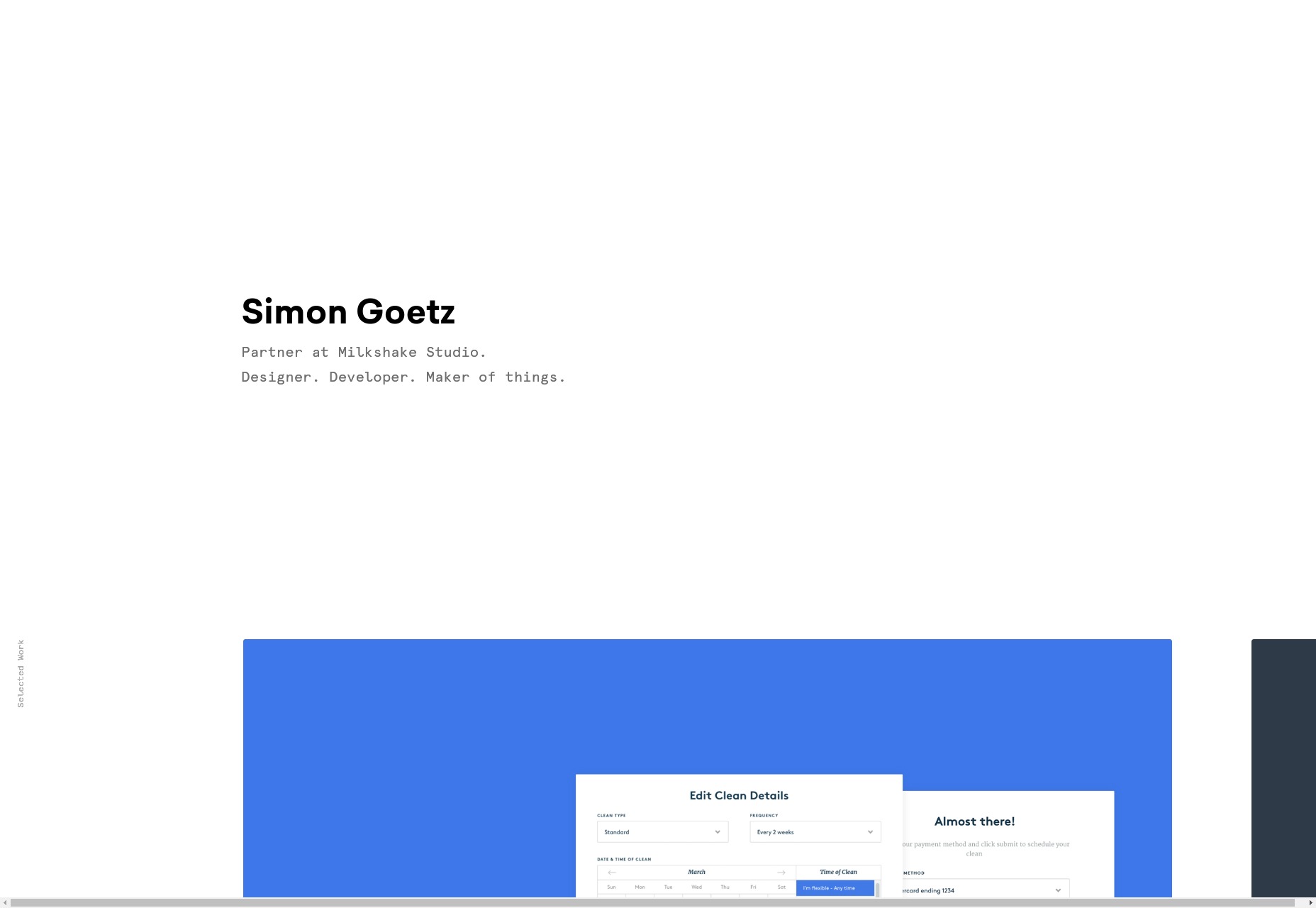
Simon Goetz
Simon Goetz has even more minimalism for us, and this time, it’s that super slick, kinda corporate simplicity that I like almost despite myself. Plus, I can never be mad at a designer who makes a horizontal layout work as well as Simon does.
Platform: Static Site
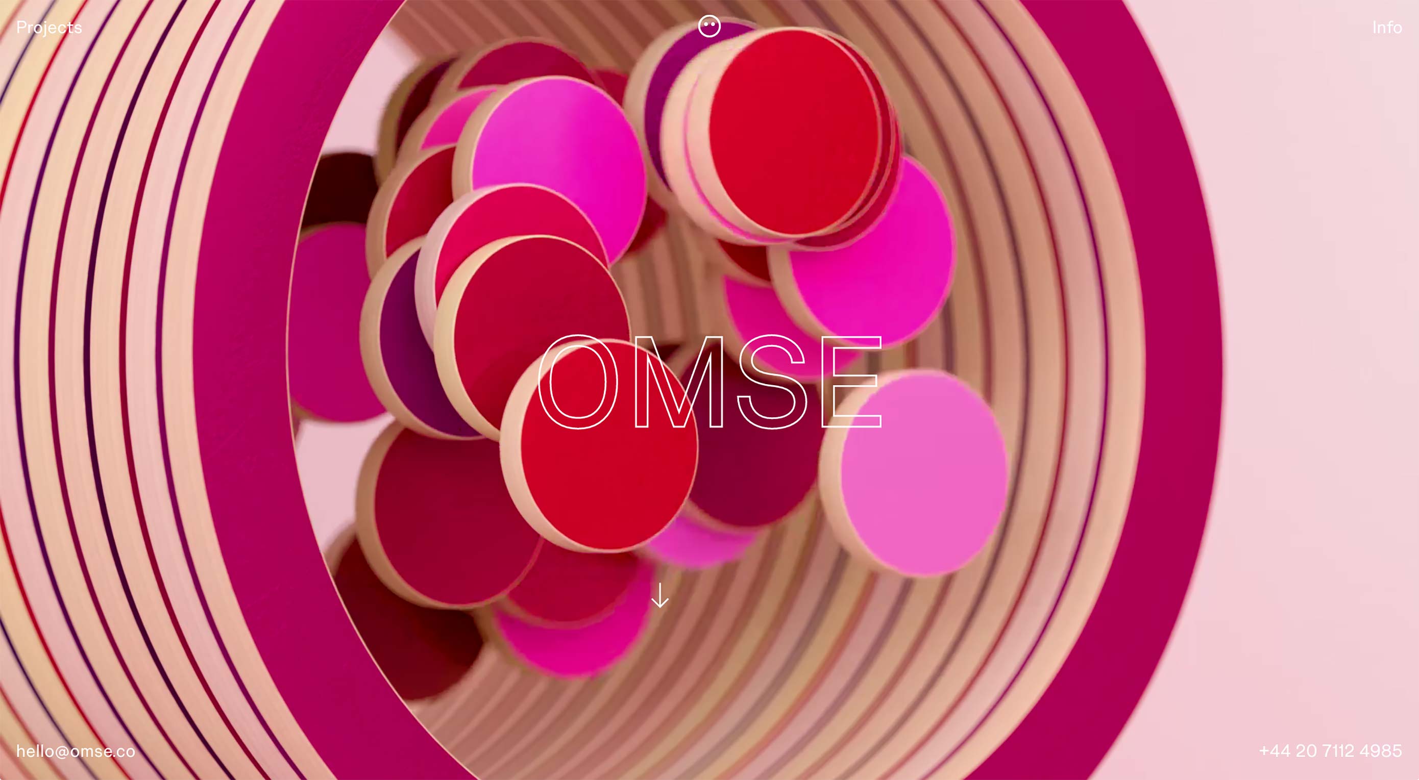
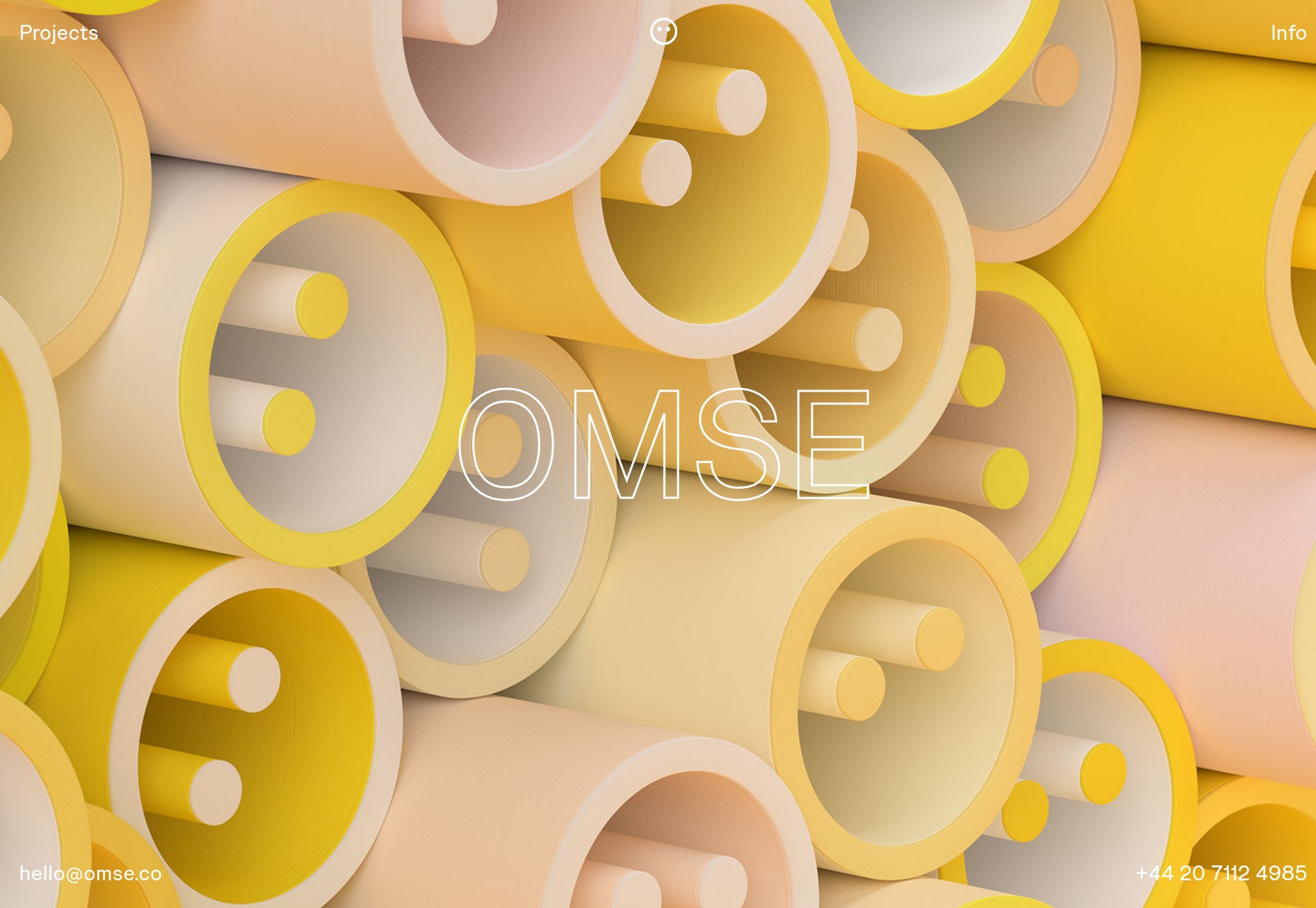
Omse
Omse is by far one of the most colorful sites on this month’s list, and it shows that the almost post-modernish style people seem to really like now need not be monochromatic. With a healthy dose of animation, the presentation-style site is fused with more staid design elements to create something that feels fresh.
Platform: WordPress
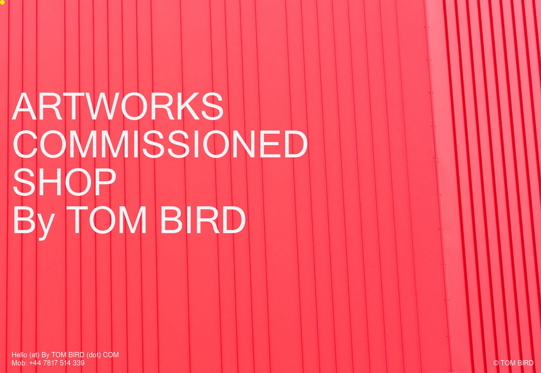
Tom Bird
Tom Bird’s photography portfolio is… well it’s a little predictable. The “post-modern photography collage” is strong with this one, and it’s a style that’s become increasingly popular with photography sites.
For all of that, it’s a good-looking site that showcases its work effectively. As I’ve said before, that alone is worth a look.
Platform: Static Site
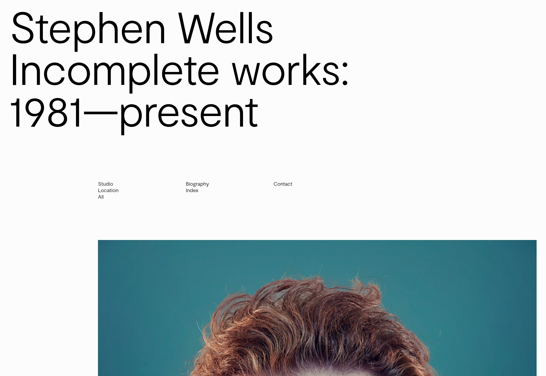
Stephen Wells
When you‘re looking at portraits, it’s all about the details, so it’s a darned good thing that Stephen Wells’ portfolio is designed with that in mind. Where many portfolios will show you a lot of smaller photos to save bandwidth, and give you an idea of a photographers overall style at a glance, this one shows off big ol’ photos so you can see those details in all of their pixelly glory. It’s a simple approach, but it’s perfectly suited to the work being shown.
Platform: Static Site
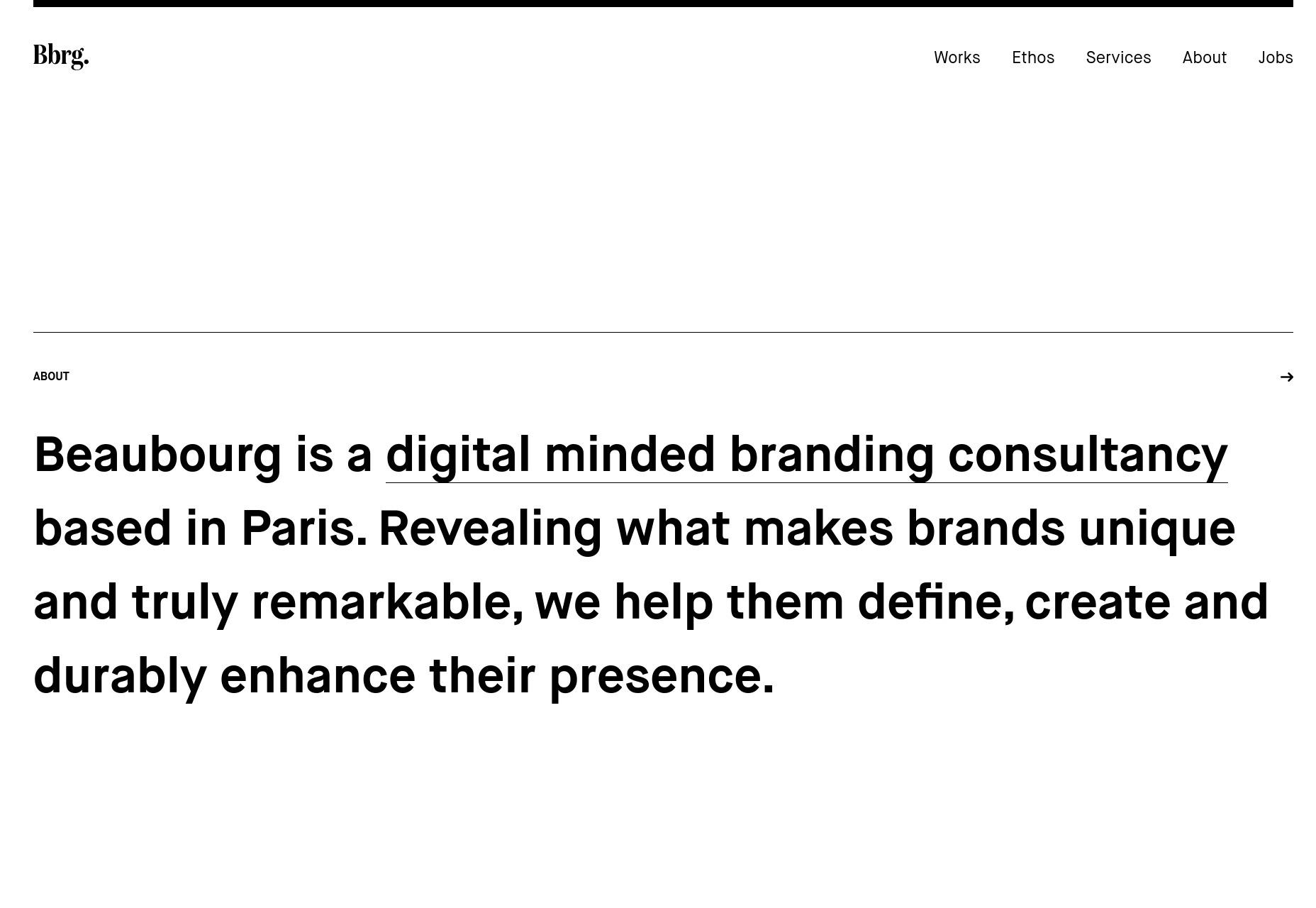
Beaubourg
Beaubourg is a dead-simple site with magazine-pretty type. The layout is also heavily magazine-inspired, making use of vertical space within elements differently than you might expect from a regular site. It’s touches like that which keep me excited to see the possibilities of Flexbox and CSS Grid.
Platform: Static Site (Probably)
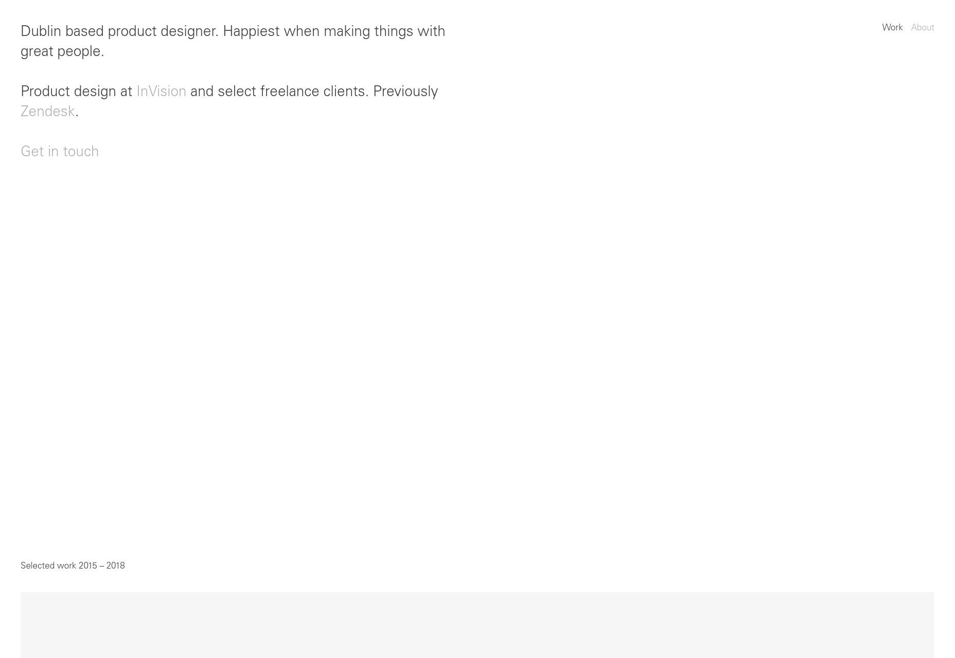
Jonny Belton
Jonny Belton’s portfolio is more of that Apple-inspired minimalism,complete with thin sans-serif type, and slight contrast issues. Well he works for Invision, so that’s about right, isn’t it? Well, contrast issues aside, the site is pretty.
Platform: Webflow
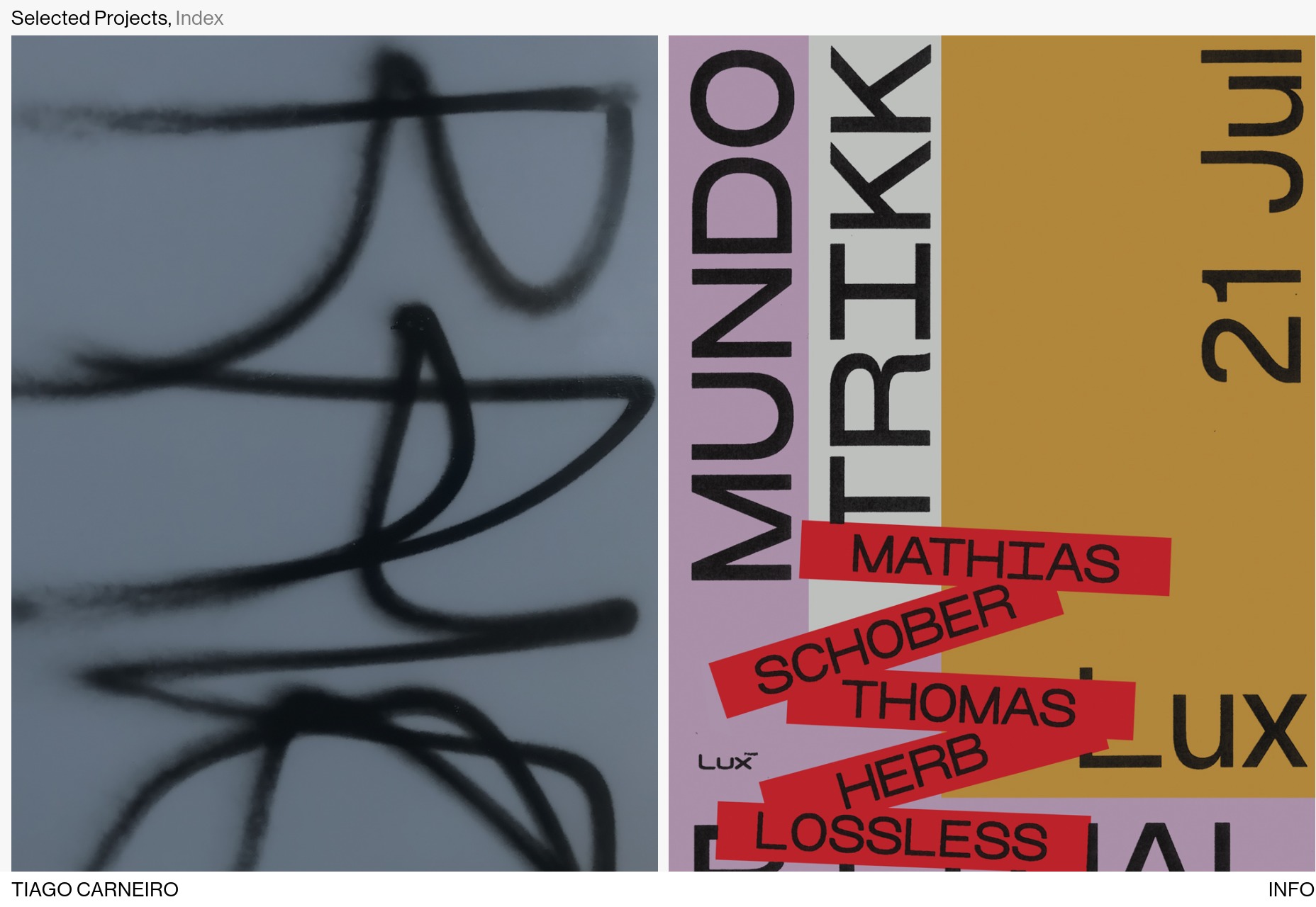
Tiago Carneiro
Tiago Carneiro’s portfolio has that touch of almost post-modern minimalism combined with an honest-to-god fade-into the background white gradient. Just look at the home page and scroll down to see what I mean. Man, I haven’t seen one of those in ages. Why did we ever stop doing those?
Platform: WordPress
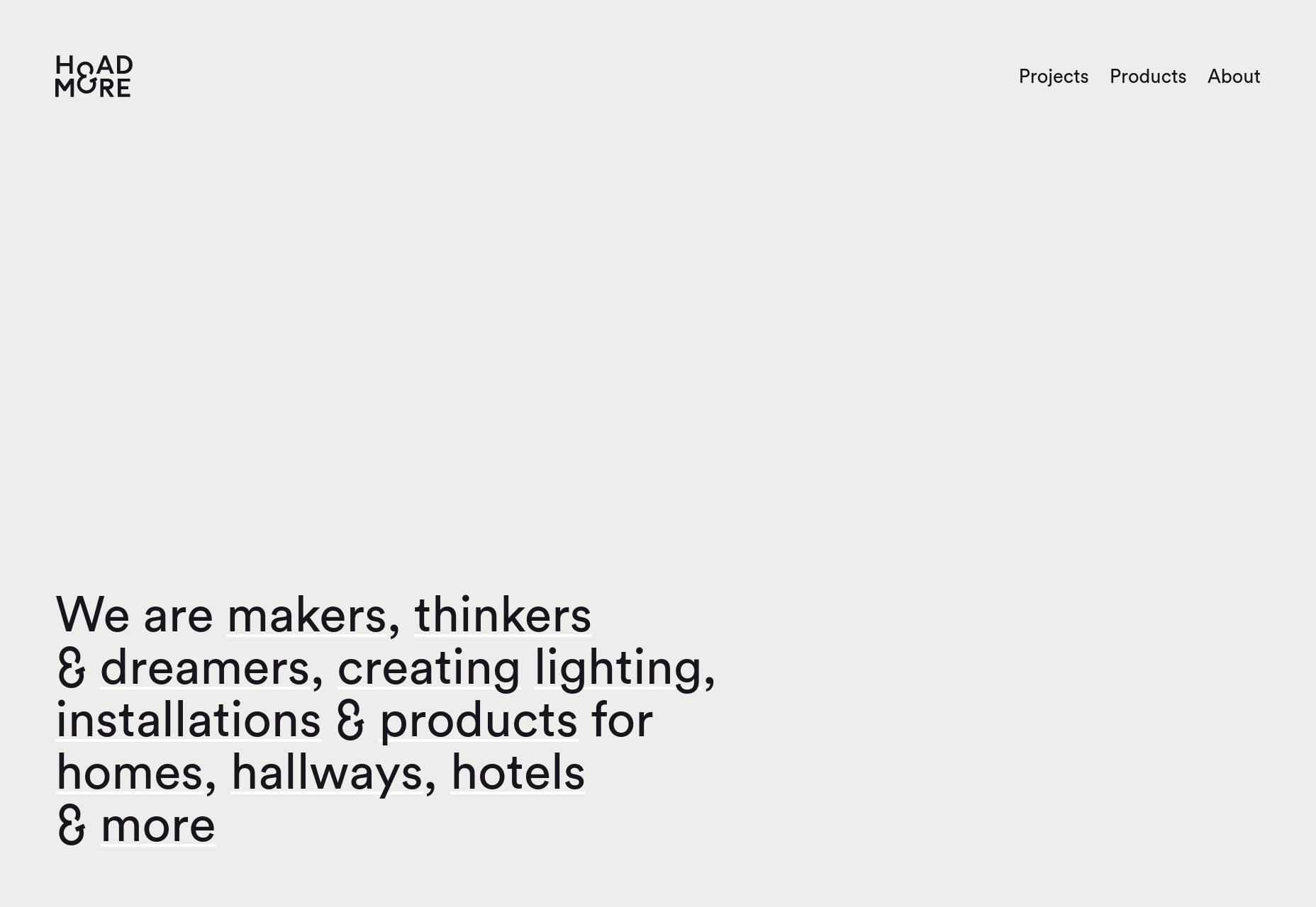
Hoad & More
Hoad & More is a lighting installation company that specializes in installing light, well… artistically. As such, their website focuses largely on showcasing photos of their work simply, and with as few words as possible. They’re lighting installations, you don’t want words.
I do like the half-and-half layout they use for the photos on the desktop version of the site. It allows you to look at one (vertical) photo at a time easily, without too much scrolling, and without shrinking the photos so much that you miss all of the detail.
Platform: WordPress
| Add Realistic Chalk and Sketch Lettering Effects with Sketch’it – only $5! |
p img {display:inline-block; margin-right:10px;}
.alignleft {float:left;}
p.showcase {clear:both;}
body#browserfriendly p, body#podcast p, div#emailbody p{margin:0;}
from Webdesigner Depot https://ift.tt/2zmDuMz
from WordPress https://ift.tt/2L2Jn35
No comments:
Post a Comment