Tuesday, May 31, 2016

How to Increase Conversion Rates with Google Shopping Feeds

If you sell tangible products online, you already know how crucial Google Shopping feeds can be. But did you know that with just a few simple tweaks, you can greatly improve your products’ visibility in shopping feeds and thus get your products viewed (and possibly purchased) by more customers – thereby increasing your conversion rate?

And perhaps the best part is that it doesn’t require any deep development or programming experience. Ready to learn how? Let’s take a closer look.

Improving Your Feed with Attributes

According to a report recently released by ROI Revolution, simply having a shopping feed is no longer enough. Your feed is your product’s packaging in a world where customers can’t always try it on or feel it. From their point of view, they’re putting themselves at a huge risk simply by choosing to potentially do business with you. A quality feed can show them that you’re just as invested in their satisfaction as they are.

A properly optimized feed means that you don’t just have more data than anyone else, but that your data is better quality.

Your individual product attributes can make a significant impact, so taking the time to do them properly can be the difference between “just browsing” and “I have to have that”. Of course, many merchants settle for filling the basics – title, description and keywords – with whatever’s on the label.

But even doing the bare minimum is doing a huge disservice to your product and sabotaging it before it even gets out of the gate.

So let’s look at how to properly optimize those points before moving on to the more technical aspects (it will be painless, I promise).

Title – Unless you’re the manufacturer of the product itself, don’t waste time or space putting in your company name. Customers don’t care. Use words that they would use when searching for the product, including the brand. Look at these shopping ads for the Samsung Galaxy S6 smart phone:

samsung-smartphones

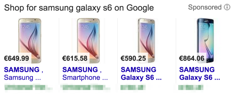
Image Source: Whoopapp

Here, the customer is most likely to search the exact brand and model – Samsung Galaxy S6. Since you only have 70 characters, it pays to prioritize since only 25 of those show in the feed. So prioritization goes Brand Name > Exact Type of Product > Features/Characteristics – so the full product listing ad might read “Samsung Galaxy S6 Android Smartphone 4G”

Description – Here it pays to look at your product from the perspective of the customer again. Since they are likely only scanning quickly to find a match, it’s a good idea to make your description as visually digestible and helpful as possible.  This is a great place to put features that may not have fit in the title. Here, you want to do your best to answer any questions a customer may have about a product before they click.

Keywords – this is the perfect opportunity to dig deep into those reports and see which words your customers are using to find your product in the first place. Look at the terms that convert best and use those in your description where applicable.

Make Optional Attributes Part of Your Feed

Oftentimes, retailers mistakenly assume that if an attribute is optional, it isn’t necessary. But according to the ROI Revolution Google Shopping report, just because it’s optional doesn’t mean you shouldn’t include it anyway.

Google has a quality score for feeds – and while we don’t know the “secret sauce” of what makes up the algorithm, we do know that products which have all their information complete will have a better quality score than those who do not.  And according to ROI Revolution, certain optional attributes can help further optimize your feed and improve its performance and quality score.

The Alphabet Soup of UPCs, MPNs and Brands

The Universal Product Code, Manufacturer Product Number and brand of your items won’t likely be searched for by customers. They will, however, be used by Google to group and optionally compare products, like the cookware below:

skillet-google-shopping

Image Source: ROI Revolution Google Shopping Feeds report

Here you can see that even big-name brands like Macys, Sur La Table and Bloomingdales haven’t exactly done their homework on optimizing their product feeds. But as the report notes, take a look at Austin Kayak. Not only is it a Google Trusted store, which is an added bonus, but it also highlights their offer of free shipping and no sales tax.

You’d be forgiven for cringing when the thought of being stacked up there with your competition comes to mind. But Google Shopping calculates sales tax and shipping as part of the total – found in the “Total Cost” column. Businesses which offer free shipping and no tax automatically become the lowest price – even if they hadn’t highlighted their offer

Now the question becomes, can Google find your products and accurately compare them with others in the same price/feature range? Not if you haven’t taken the time to fill in the alphabet soup of brand, UPC and MPNs.

Size (And Color, and Material) Matter

Merchants are reluctant to input their products’ sizes into their Google shopping feed because they feel like they have to painstakingly measure things like width, height and depth. But at this stage in the shopping experience, customers only need to know the basics.  Consider these examples from the report. Size is important on all of them, but only general information is there for filtering purposes.

comparing-sizes-google-shopping

Image Source: ROI Revolution Google Shopping Feeds report

The same applies to color. Even if one of your products is “charcoal grey” and the other is “ash grey”, customers are likely going to simply look for “grey” and filter their choices accordingly;  not to mention that even Google’s filtering options tilt toward the very basic:

sweater-google-shopping

Image Source: ROI Revolution Google Shopping Feeds report

Material is another matter. Like size, you don’t have to be specific. As the report notes, customers aren’t going to care (in the beginning) about your 90% organic cotton blend when they’re simply searching for “cotton”.

There are many other attributes you can set that will greatly enhance your product’s performance (and therefore its sales and conversions) in your feed, including custom labels. To learn precisely how to set these, you’re encouraged to download the official report from ROI Revolution’s website (email required).

Are You Using Your Google Shopping Feed to the Fullest?

It can seem overwhelming to dive head-first into the details of your shopping feed, but as this report has shown, it’s the little things that matter most. Whether you have 5 products or 5,000, taking the time to submit them right can make all the difference in search, product listing ads and paid ads.

Are you using Google shopping feeds for your own products? How has adding attributes improved your products’ performance overall? Share your triumphs with us in the comments below and let us know your thoughts!

About the Author: Sherice Jacob helps business owners improve website design and increase conversion rates through compelling copywriting, user-friendly design and smart analytics analysis. Learn more at iElectrify.com and download your free web copy tune-up and conversion checklist today! Follow @sherice on Twitter, LinkedIn or Google+ for more articles like this!

from The Kissmetrics Marketing Blog http://ift.tt/1XcrLoN


from WordPress http://ift.tt/1TUPu8T

Grab 25% off GraphicStock’s annual subscription

If you’ve ever done any kind of design work, especially on the web, you’ll know that a great source of stock images is an essential component in your toolbox. Very few clients can afford all-bespoke photography; nearly all companies need to use stock images at some point. So it’s essential that as a designer you have a reliable source of quality stock images to offer your clients.

And once you use a stock site, you’ll find that downloading one good image quickly leads to downloading a second, then a third, and then more. Whether you’re using photographs, illustrations, or just icons, the cost of many stock sites quickly mounts up.

A great source of high-quality images, that won’t weigh heavily on your budget, is GraphicStock. GraphicStock runs a subscription model, which means you can download as many files as you like, without paying more than the low subscription fee.

It’s essential that as a designer you have a reliable source of quality stock images to offer your clients.

Once you sign up for a GraphicStock subscription, you’ll have instant access to the entire graphicstock.com archive. You can download an unlimited number images per day, all royalty free, for personal and commercial projects. There are no hidden fees, the low subscription price is all you’ll ever pay.

Graphic Stock are so confident that you’ll love their service that they’ll allow you to cancel your subscription at any time. However, if you do decide to cancel, anything you’ve downloaded to date, is yours to keep, and use forever.

GraphicStock has a library of over 300,000 files, so you might think you’d struggle to find the perfect file, but they’ve introduced an advanced search feature that allows you to filter by orientation, and even by color. Further advanced search features allow you to find images with transparent backgrounds, or those that are supplied as a PSD, ensuring that the assets you download are easy to integrate with your project. What’s more GraphicStock’s library is divided into usable categories, like business, travel & transportation, and design elements. And when you’ve found a file you like, you can find complementary images by browsing based on the color palette of the file.

GraphicStock also provides project folders to keep your assets organized. You can create folders for different clients, along themes, to download later, and for any other breakdown. You can even share folders with clients or colleagues. It’s a great feature for making the most of your subscription.

With over 300,000 files at your disposal, if you download 10 files per day, every day of the year, you still won’t have exhausted the library until sometime around 2098—and of course, they’re still adding new files.

With art direction being one of the most in-demand skills on the web, and images helping designs stand out from the crowd, can you afford not to check it out?

For freelancers and design agencies, Graphic Stock is an amazing resource, because you never need to check the budget before downloading the image you need to finish up your design work; if you need it, just download it, without worrying about the extra fees, license options, and tie-ins that many other stock sites impose.

Whether you’re looking to illustrate a concept, tell a story, reinforce brand values, or just engage users, GraphicStock’s library gives you fast access to the assets you need. To experience GraphicStock for yourself sign up for a free seven day trial, during which you can download up to 20 images per day; that’s 140 premium stock images absolutely free.

To further sweeten the deal, GraphicStock are offering WebdesignerDepot readers 25% off their annual subscription. To take advantage of the offer, just click here.

If you’re looking for a source of high-quality images that won’t blow a hole in your wallet, you need to check out graphicstock.com.


[– This is a sponsored post on behalf of GraphicStock –]

Create Your Own Fonts in Minutes Right Inside lllustrator CC – only $24!

Source

p img {display:inline-block; margin-right:10px;}
.alignleft {float:left;}
p.showcase {clear:both;}
body#browserfriendly p, body#podcast p, div#emailbody p{margin:0;}

from Webdesigner Depot http://ift.tt/1TTXLtz


from WordPress http://ift.tt/1ZaiMSm

Monday, May 30, 2016

Essential design trends, May 2016

Nothing catches your attention like a high-drama design. Big images, unusual use of common elements or whitespace and adventure-based gameplay are different ways to introduce users to a project. Each of these techniques has an over-the-top feel that makes a strong first impression and encourages user interaction.

Here’s what’s trending in design this month:

1) One big photo

While collage style websites with plenty of photos or video headers are popular options, one big photo is making a comeback in homepage design. Characterized by one striking image without a lot of other effects, one large photo can carry a lot of weight and introduce users to the site content.

But the photo has to be of the highest quality and very interesting to entice users to keep clicking.

This can be a tough formula to solve.

Here are a few solutions:

  • Start with a defining photo. It needs to be interesting and somewhat different. (Avoid the hand holding a phone images for app launches or a person on a solid color background shots.)
  • Crop it tight.
  • Edit and play with color settings. Go for something a little more extreme, such as black and white.
  • Showcase your product or brand.
  • Keep other elements to a minimum. Consider only using a brand identifier, such as a logo, and short headline.
  • Move navigation out of the way.
  • Provide a clue for users so they know what action to take next, such as the arrow encouraging a scroll.
  • Make a dramatic photograph with the help of lighting, interesting backgrounds or stellar environments. (A professional photographer is likely required for this one.)
  • Play up the drama with typography is that oversized, undersized or uses a novelty typeface. But only use one of these techniques.

2) Sidebar navigation

While the most common placement for navigational elements is along the top of a website, that’s not a requirement. As long as it is clear to users as to how to use a site, navigation can live in a number of different places.

Sidebar-style navigation, often on the left side of the screen, is one such popular option.

This is a trend that’s come on quite quickly and is on a number of sites. From thin, almost not there styles to wider, almost oversized navigational elements in a sidebar arrangement, this placement makes a lot of sense because users read from left to right. So, left-hand navigation elements could be the first thing users actually read on the screen after they glance at the main headline or other large copy.

The trend stems from mobile navigation styles and is a logical step for desktop websites as well. For a while, we’ve experienced pop-out navigation from the side on small-screen devices. Seeking out navigation from the side has become a pretty commonly accepted user pattern for this reason.

As part of a broader picture, we are likely to see even more techniques that were mobile-based solutions make their way to screens of all sizes. Extending a small screen solution to all devices can save time and provide greater consistency in the look of a project. It’s also part of the mobile-first design strategy.

When it comes to sidebar navigation on larger screens, there are a few specific elements to consider.

  • Navigation needs to be somewhat obvious to users, which is why many sites still use the hamburger icon as a notation.
  • Navigation can pop-out from the left or right, but it can also be a distinct design element with a static placement.
  • Sidebar navigation can be part of the overall design rather than an aside to it. Note how the Quecha website integrates sidebar style navigation elements into the overall design.
  • Provide plenty of space so that navigational elements are clear and easy to read. Users should know what these words or icons are and that they are a path to getting around the website.
  • Be cautious of changing navigational styles between pages, unless you go back to a more standard top of the screen option on interior pages.

3) Interactive adventure

Designers are taking video, animation and storytelling to the next level with fun websites that take users on an interactive adventure. These story-based websites are for brands and businesses of all kinds, as well as for sites that are simply informative.

Each interactive adventure site tends to look quite different and can use any number of techniques to engage users. The common thread is a storyline where the user controls the action on the screen. This works with clicks, typing in commands and scrolling to engage the user in the story and help determine outcomes.

This interactive story type of website design is good for users and good for you. A good story can keep users on your site longer and clicking through links, engaging with content. This will help you establish a better connection with your audience.

Users like interactive stories because they can be fun and interesting. The trick is keeping the story short enough that a user can play and complete the game in a sitting. If they have to turn away, you might lose them.

Also consider the outcome of the interactive experience. What happens at the end of the interaction? Is it only related to the game? Or are you highlighting a product or service that users will want to come back to? If the answer is the latter, make sure to include a bypass option for users who have already played (or don’t want to play) the game but still want access to the content.

Conclusion

The theme in trending design this month is big drama. It takes great art, a good story and plenty of planning to pull off one of these techniques because they are so singularly focused on grabbing users with a quick impression. Is it a style that you would consider?

What trends are you loving (or hating) right now? I’d love to see some of the websites that you are fascinated with. Drop me a link on Twitter; I’d love to hear from you.

UX Flowchart Cards for Website Structure Planning – Only $24!

Source

p img {display:inline-block; margin-right:10px;}
.alignleft {float:left;}
p.showcase {clear:both;}
body#browserfriendly p, body#podcast p, div#emailbody p{margin:0;}

from Webdesigner Depot http://ift.tt/1qWV3Jw


from WordPress http://ift.tt/1X82sEg

Sunday, May 29, 2016

Popular design news of the week: May 23, 2016 – May 29, 2016

Every week users submit a lot of interesting stuff on our sister site Webdesigner News, highlighting great content from around the web that can be of interest to web designers. 

The best way to keep track of all the great stories and news being posted is simply to check out the Webdesigner News site, however, in case you missed some here’s a quick and useful compilation of the most popular designer news that we curated from the past week.

Note that this is only a very small selection of the links that were posted, so don’t miss out and subscribe to our newsletter and follow the site daily for all the news.

24 Clever 404 Error Page Designs


Walt Disney’s 16 Unconventional Rules for Winning Clients


Simple CSS Agree Button


3 Secrets Behind the Best Websites in the World


It’s Time to Bring Some Creativity Back to Web Design


Picking a Color for your Brand


Site Design: Pleasure to Burn


What to A/B Test When Building your Website


Google Aims to Kill Passwords by the End of this Year


The Start-to-Finish Designer


Let’s Reverse Engineer the Instagram Design Brief


The 100 Best Free Fonts for Designers


Tachyon: Design New UI Components Without Writing CSS


Bideo.js – Easy Background Videos in HTML5


How UX Designers Think and Work


Never Use Papyrus (AKA the New Comic Sans), Plus Alternatives


Infographic: Star Wars, a New Hope


New French Law Makes it Illegal to Email Employees After Work Hours


Why We Need the Humanities in Tech


OnTheGrid — Designer Curated City Guides


Stop Trying to Be Somebody


The Principles of UX Choreography


Building a Visual Language


Facebook Begins Tracking Non-users Around the Internet


Solving a Century-Old Typographical Mystery


Want more? No problem! Keep track of top design news from around the web with Webdesigner News.

LAST DAY: Watercolor Flowers Bundle of 400+ Elements – only $24!

Source

p img {display:inline-block; margin-right:10px;}
.alignleft {float:left;}
p.showcase {clear:both;}
body#browserfriendly p, body#podcast p, div#emailbody p{margin:0;}

from Webdesigner Depot http://ift.tt/25quWu1


from WordPress http://ift.tt/1NW41Sm