Wednesday, July 31, 2019

Are Design Pitches Worthwhile?

For most designers – freelance or in-house – generating new business can be a dreaded part of the job. But it necessary to maintain and sustain growth and find new clients. When it comes to finding design work, is there a best way to find jobs? Do you pitch for new business or rely on other methods to find work?

Reasons to Pitch for New Business

There are so many places that freelance designers can pitch for new business, including job boards, and content or design networks, or marketplaces. Some designers may pitch on social media as well.

But is it worth your time to post in these places to generate business?

For some designers, the answer is, “Yes.”

Pitching requires you to think about the type of work and clients you want to take on. This can be a valuable exercise that helps you grow your business strategically and with the type of work you want to do. If you plan to pitch, create specific pitches that respond directly to postings, avoiding generic “I can do any type of design” pitches.

For freelancers with limited time, this can be an ideal situation

Pitching works for designers that want to know exactly where they stand with projects and don’t want to deal with the management of them. Most pitches you submit in response to a job board or marketplace post will detail a specific design need, timeline, and payment for that work. You know everything up front and don’t have to negotiate terms or deal with scope creep. For freelancers with limited time, this can be an ideal situation.

Pitching can help you find an “in” with new clients and turn into long-term work. There are plenty of designers that have found good projects through Behance, Dribbble, and Upwork.

Pitching might be the only way for a new designer to build a strong portfolio. Depending on the stage of your career, this type of work can help generate clients, relationships, and projects that can lead to more work later.

Whether responding to ads and sending pitches is the right choices depends on you and the stage you are at in your career. It’s not for everyone, but for some designers, pitching can be totally worthwhile, and work better than cold calling or trying to generate new business in other ways.

Reasons Not to Pitch

Some designers hate pitching and find that the time spent looking for new business doesn’t generate enough income to support itself. That’s the top reason not to pitch. If you aren’t bringing in work with pitches, it could actually be costing you money. Analyze pitches sent, responses received, and clients you are actually working with. How much time do you spend on pitching versus revenue generated from actual work from pitching?

If the math doesn’t work out to a sustainable hourly rate, pitching might not be the best option for you. It can be a lot of work, without a large return.

Are you charging less or doing work that you’d never put in your portfolio?

When it comes to responding and pitching for projects, there’s almost always a “middle” company or organization that gets a cut of the payment for the job. If you can generate new business own your own, why pay that fee?

Sometimes pitching can feel spammy or doesn’t help you build more business. Are you cutting your worth to respond to a pitch? Are you charging less or doing work that you’d never put in your portfolio? If the answer to either question is yes, then pitching is probably not for you.

Other Ways to Generate New Design Business

Building a reputation as a designer and taking new clients from word-of-mouth recommendations and referrals is the top way most designers seem to want to generate new business.

But you have to have a fairly established client base and good network for this model to be sustainable. For a lot of designers, this often means that seeking outside work starts with responding to pitch requests while building more of a network and portfolio and then moving to other (more profitable) methods of generating new business.

So how do you generate design business?

There’s a funnel for getting design work for freelancers. At the big end of the funnel is work that’s mostly unsolicited and projects are often granted via pitch (such as marketplaces or job boards). These jobs don’t typically include long-term contracts or big fees. At the small end of the funnel is referrals and repeat client work. These jobs come from relationship building, often pay more and result in longer-term business for more experienced designers.

And then there’s everything in the middle:

  • Cold pitches: Soliciting work from clients via cold call, email, or with a pitch letter;
  • Events: Using speaking engagements or conferences to network and make connections that result in design work;
  • Advertising: Using paid advertising, a website, or email/mail to connect with potential clients that might need design services;
  • Social media: Generating business through social media channels by showcasing work or expertise or offering services;
  • Networking and feeders: Connecting with businesses or design agencies that can subcontract overflow work to you.

The reality is that almost every type of connection requires some type of pitch. The colder the pitch (or less connected you are to the potential client) the more work it will probably take to land the job.

Conclusion

So, we are back to the question at hand: Are pitches worthwhile?

Depending on your career stage, the answer is yes. For early career, or new freelance designers, pitching through marketplaces or job boards can help you grow a business on your own or provide just a little extra income from a side hustle.

For designers that are more established and already have a strong network, cold pitching isn’t the go-to option. In the end, most of us have responded to pitches at some point and either loved the simplicity of pitch and respond work or hated the lower income ratio often associated with these jobs.

Personally, pitching was a great way to establish my position in the field. And with years of experience to show now, work comes via referral. So yes, pitches can be worthwhile. They were a building block in my career and I expect many others share a similar experience.


Featured image via DepositPhotos.

Source

p img {display:inline-block; margin-right:10px;}
.alignleft {float:left;}
p.showcase {clear:both;}
body#browserfriendly p, body#podcast p, div#emailbody p{margin:0;}

from Webdesigner Depot https://ift.tt/2SU7Koh


from WordPress https://ift.tt/319SHJV

Monday, July 29, 2019

3 Essential Design Trends, August 2019

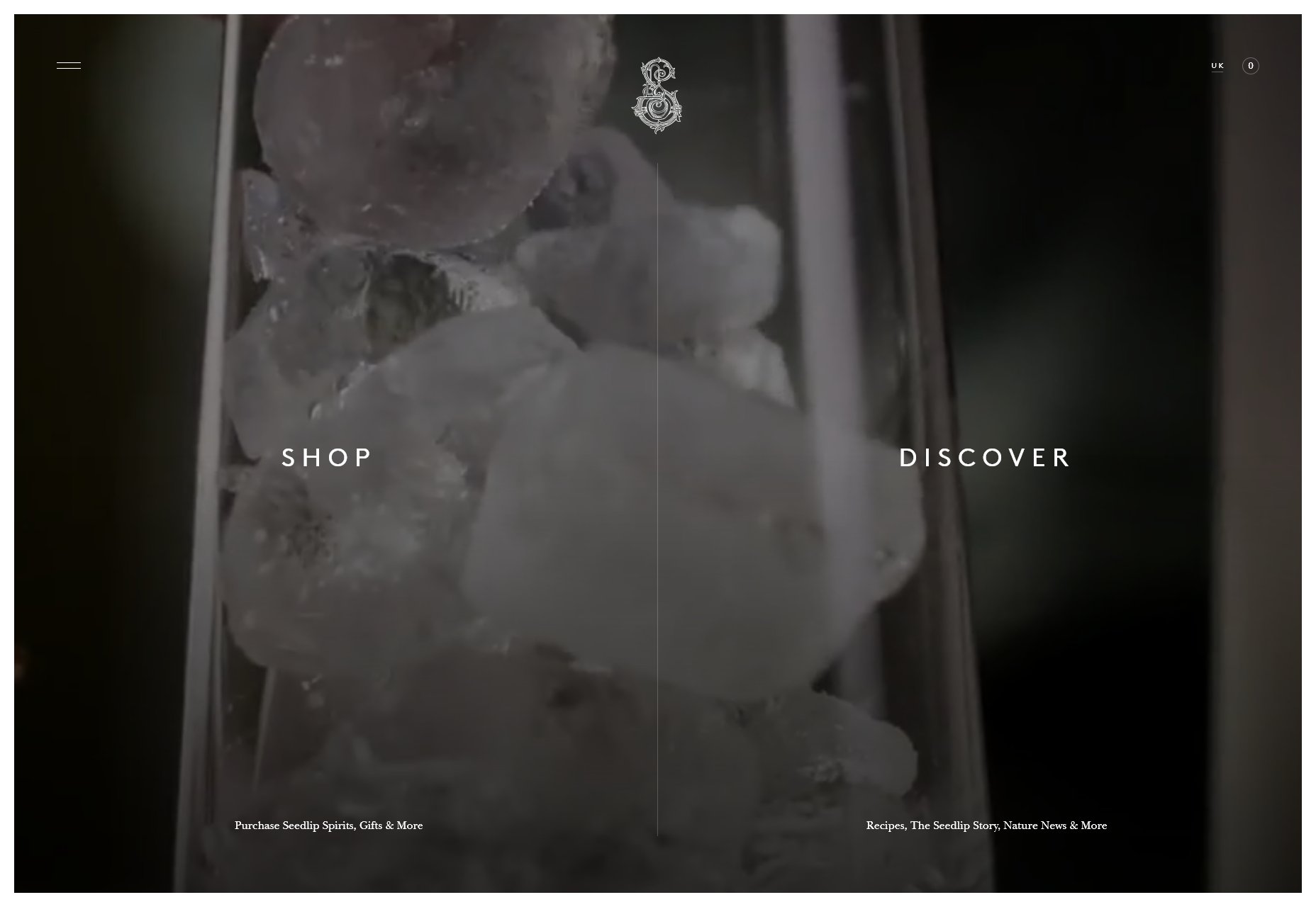
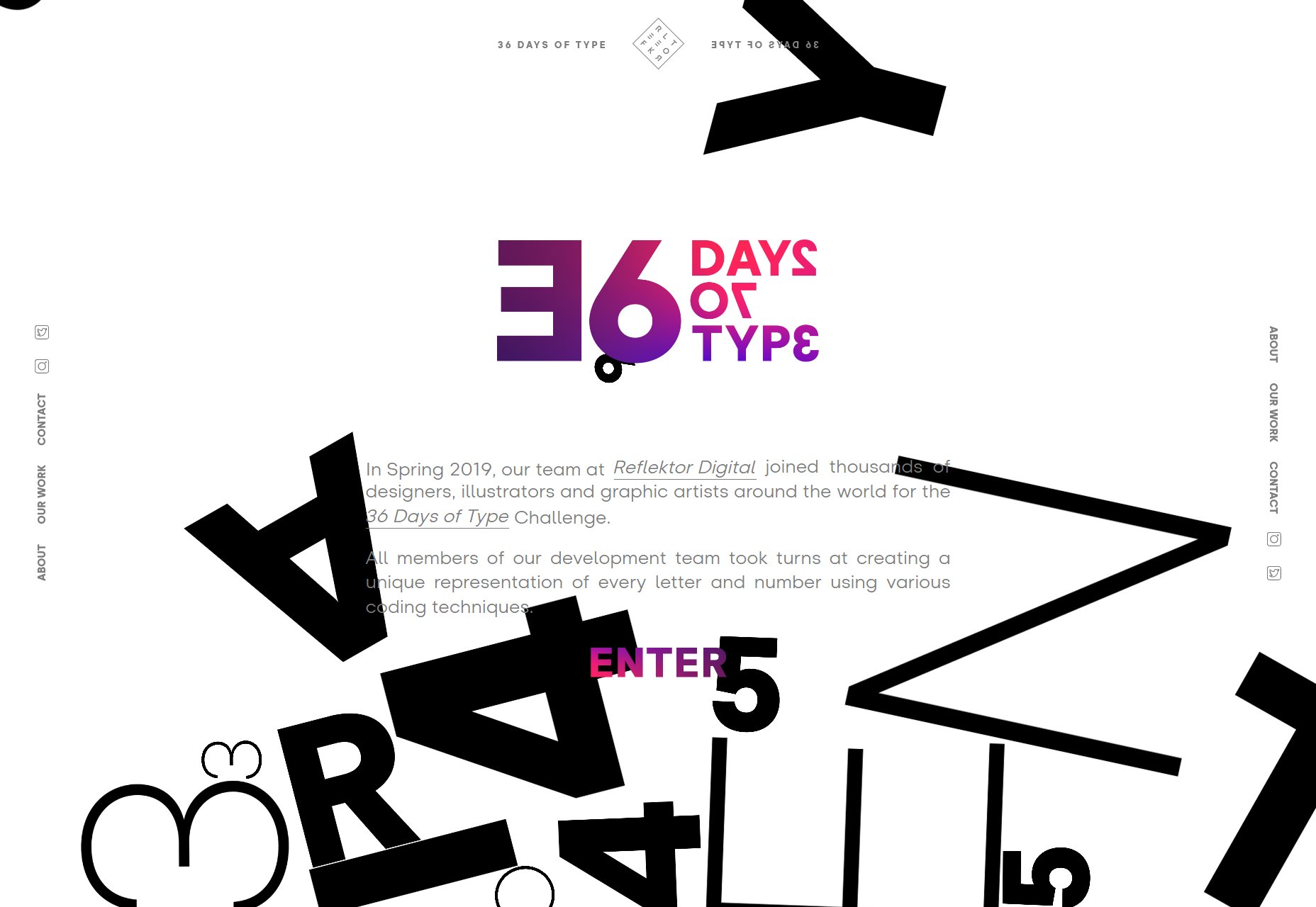
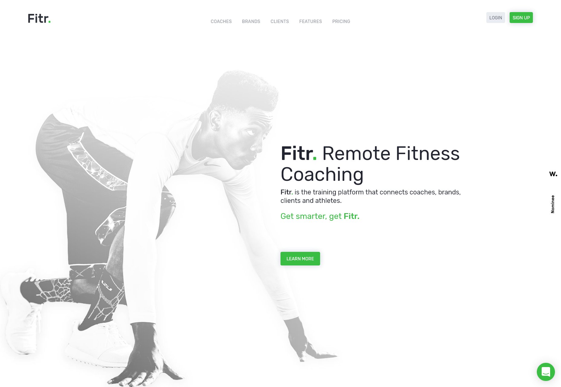
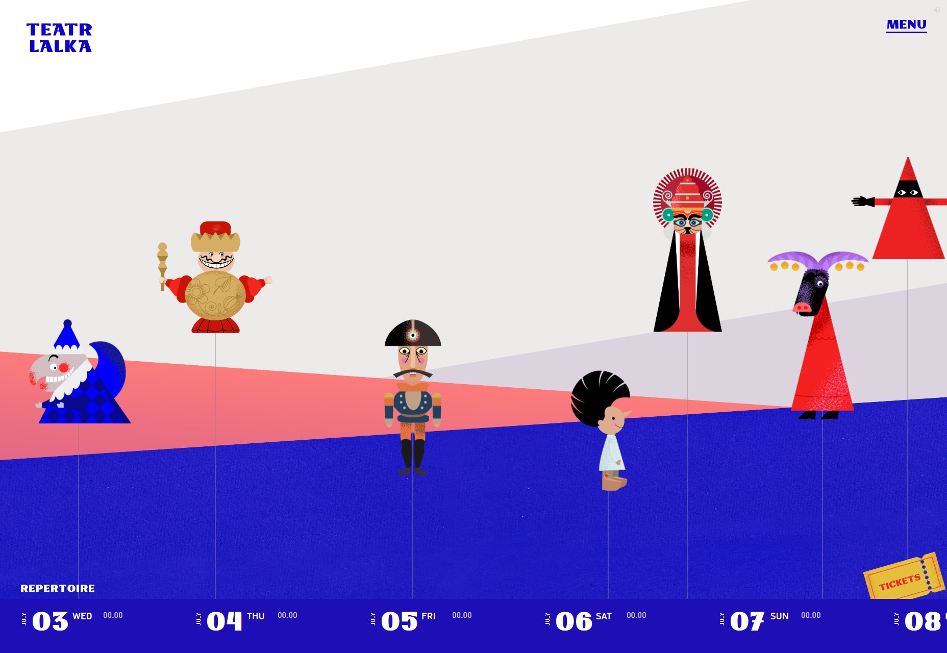
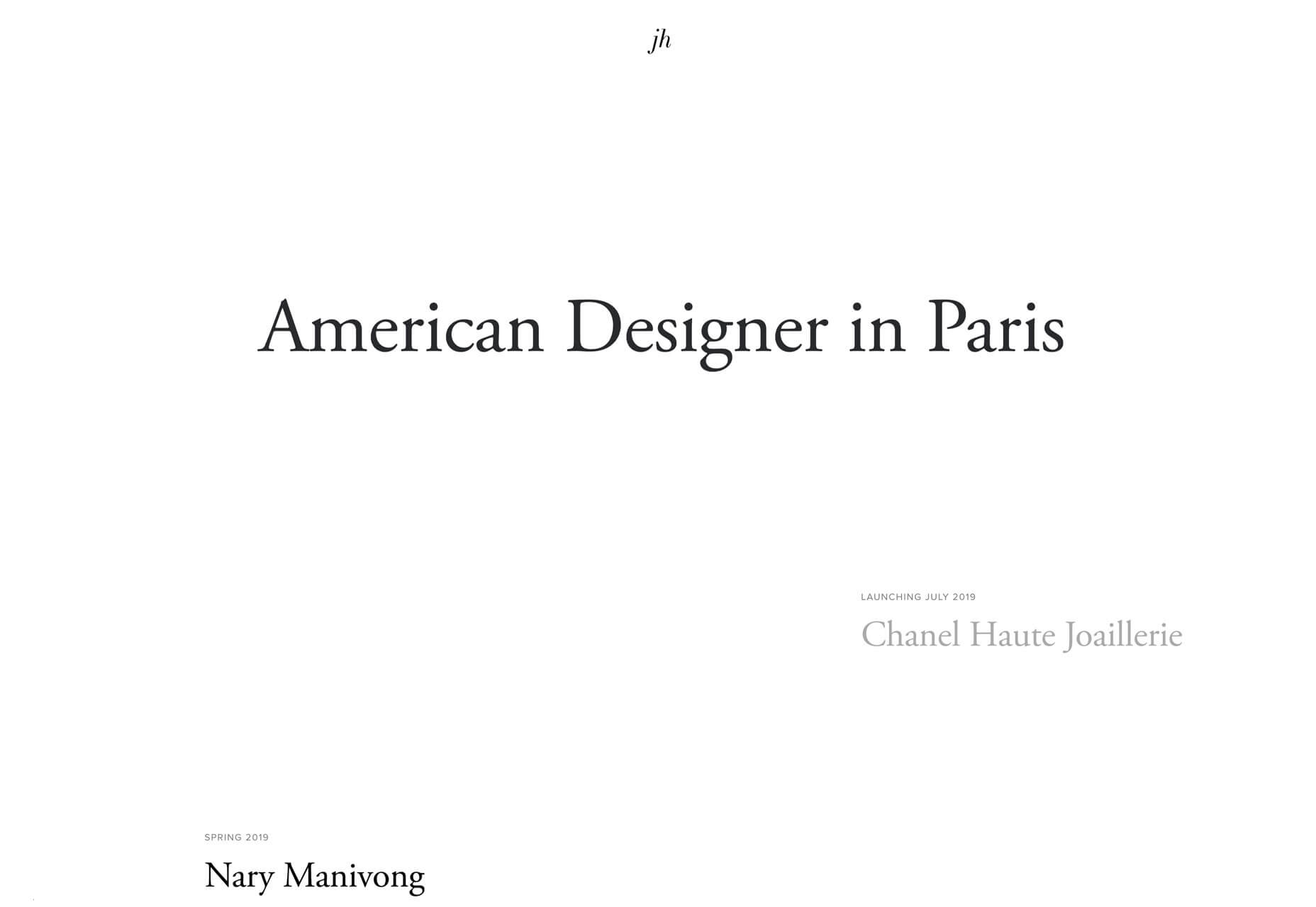
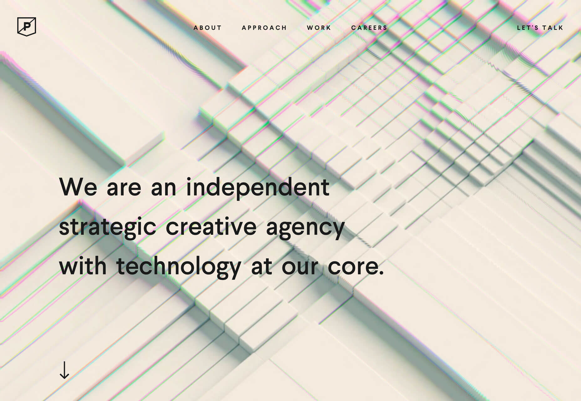
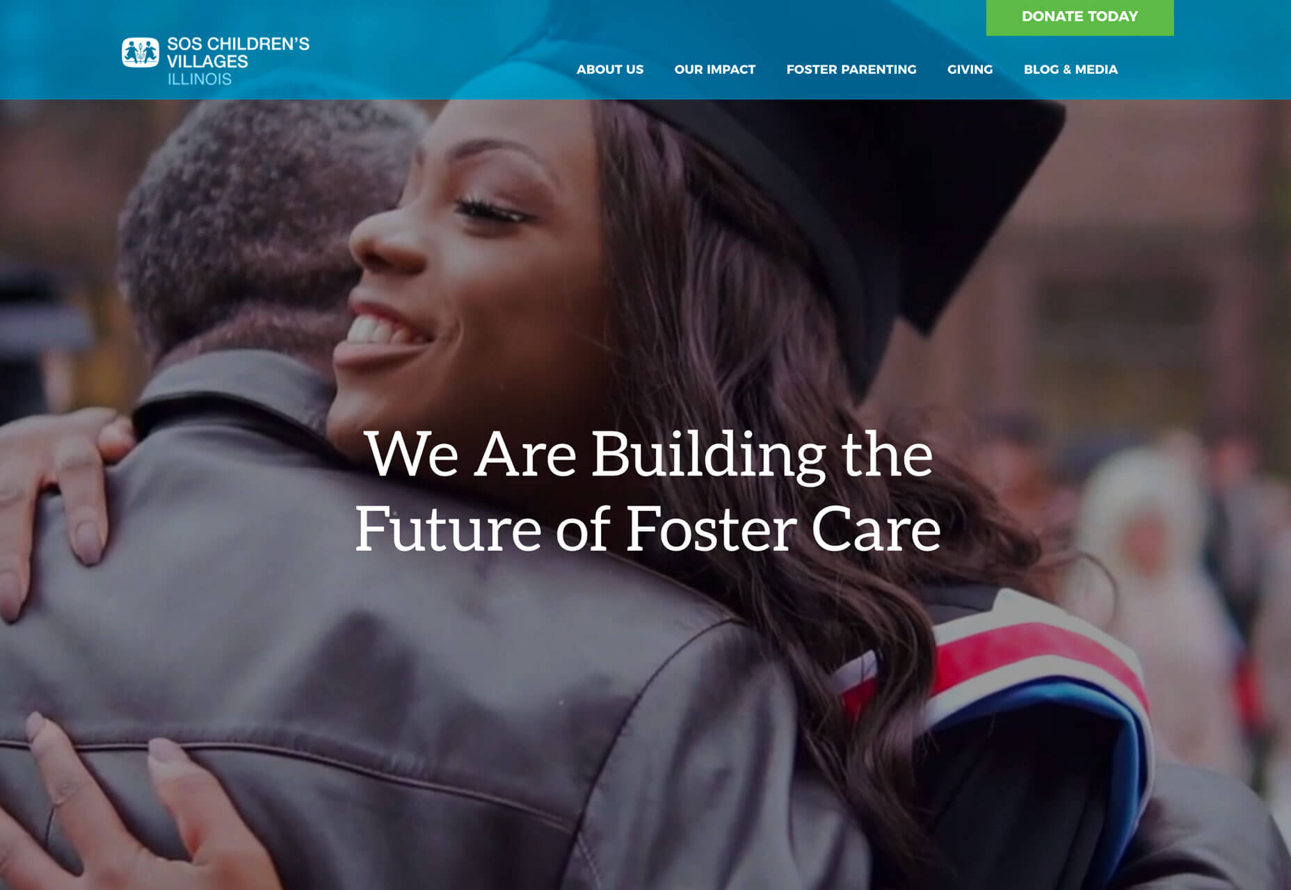
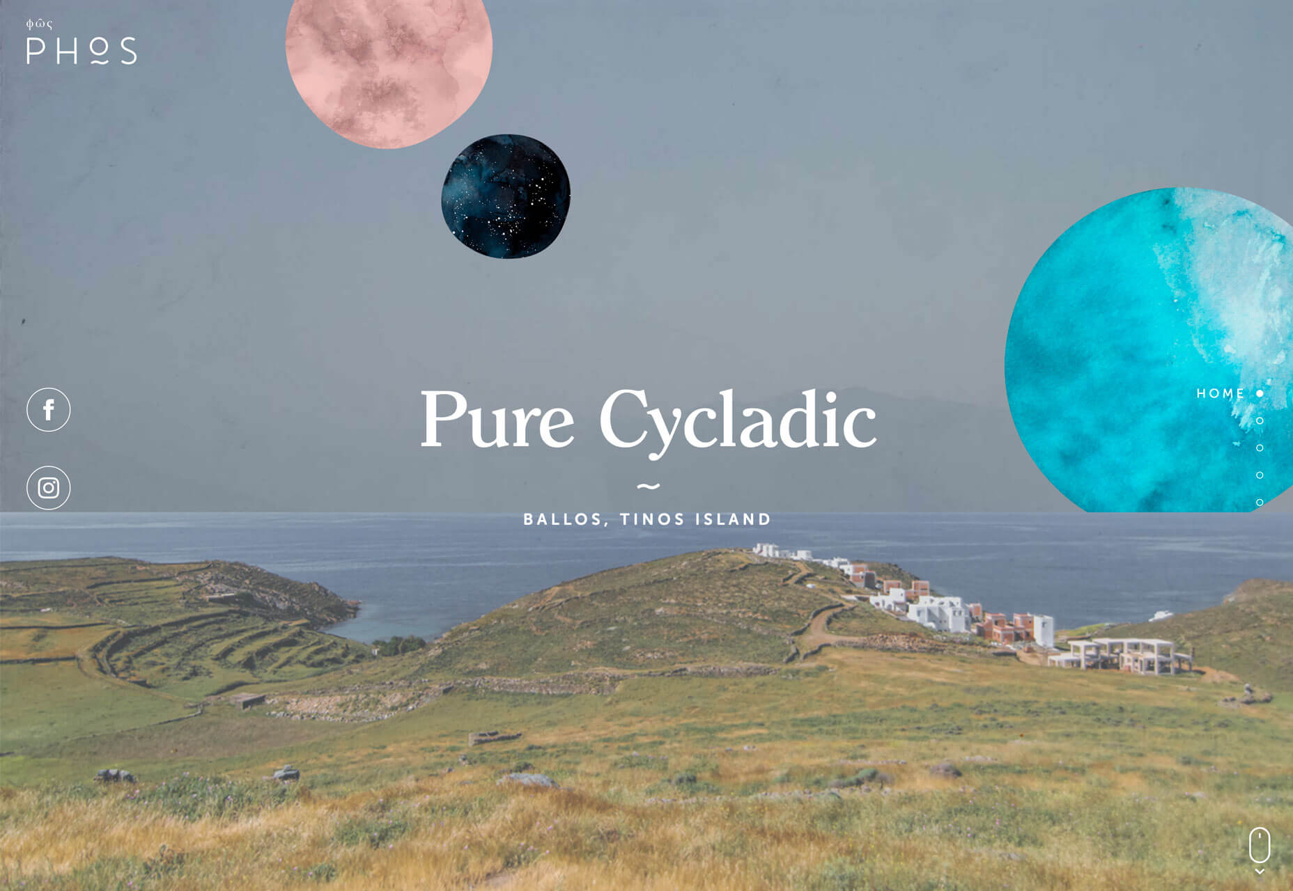
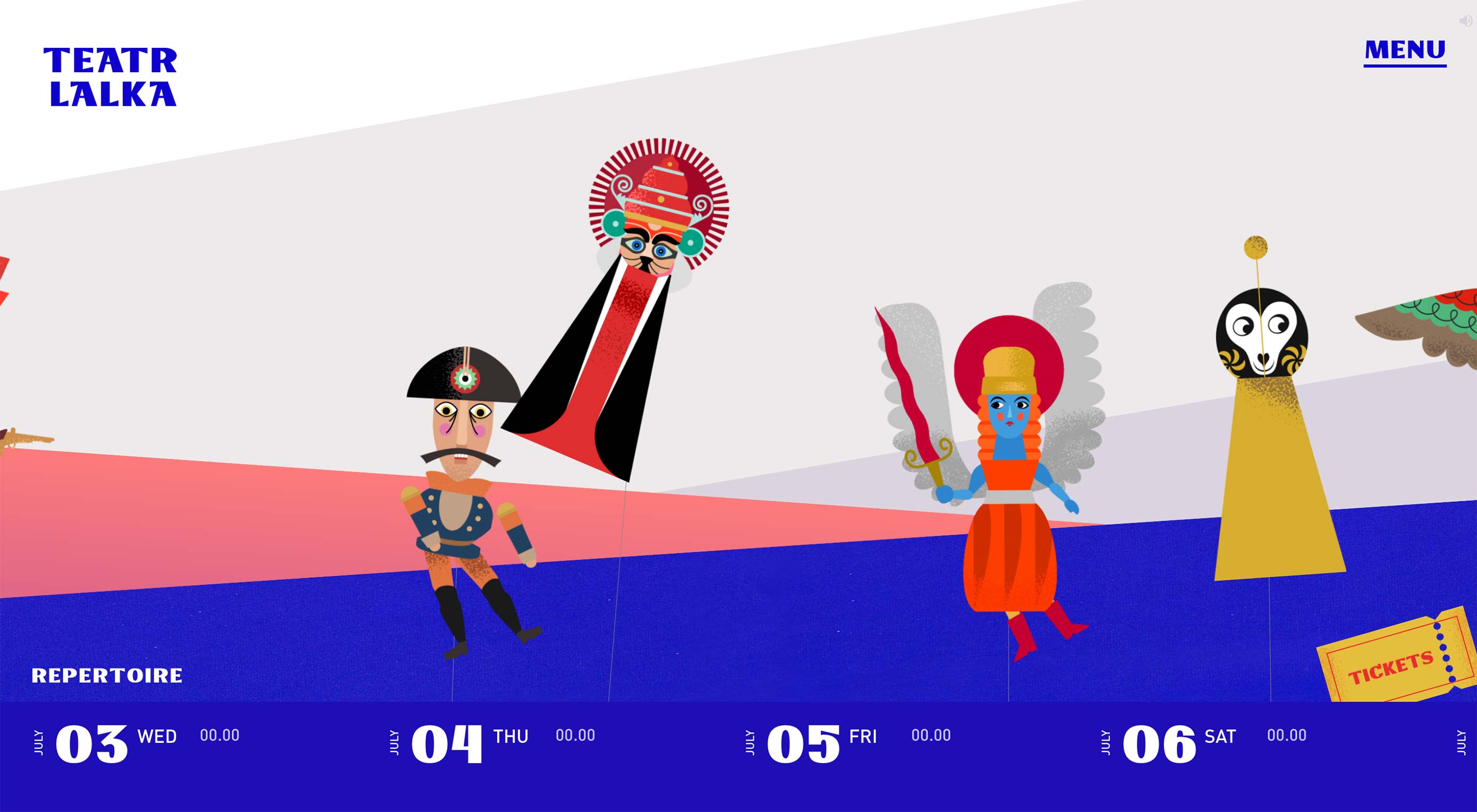
Each of the design trends we are spotting this month have to deal with over-the-top techniques. It’s interesting because these big effects don’t always pop on the radar of what’s trending, but these concepts almost begged to be featured with a large number of projects showcasing these design elements.

This type of trend is interested because designers either love them or hate them. Take a look and see if these are concepts you’ll use. Here’s what’s trending in design this month.

Exaggerated White Space

So much white space.

These websites feature exaggerated amounts of whitespace and strong minimal themes with very little color or design ornamentation. And if you are like me, you can’t stop looking at them.

How does a design with so little visual information work?

The design trick here is disruption. If you see one of these designs, they are vastly different than almost any other site you are visiting. That makes you stop, and look, and think about what you are seeing. With the right content it can be quite effective.

While each of the designs here use exaggerated amounts of white space and practically no color, they don’t all look the same and use complementary effects to get a message across.

VS+Company uses a subtle animation with text blocks that appear next to the oversized “POST” and “MGMT” lines. The text provides additional content and information about the website and uses a black color that makes it easy to read.

Lundqvist & Dallyn asks a question to pique user interest. The image on the home screen and throughout the scroll feature hover animations that encourage clicks.

Jillian Hobbs uses white space to help users hone in on the words – in this case project names – to interact with. It’s a risky concept for a design portfolio, but it did encourage clicking through to pages with the same visual pattern, but featuring images and color.

Sharp Edges and Lines

While brutalism has never fully taken off as a widespread design trend, it is influencing designers. Sharp edges and lines are one way that we’re seeing it manifest.

Most recently, projects have had a softer feel with gradient coloring, real images or illustrations, and softer shapes. The projects below feature more hard edges, thick lines and square shapes. These shapes can be paired with different elements to establish a feel. The result is a design trend that’s a little harder, stronger, and harsh. It almost demands that you look at it.

Future London Academy uses bold yellow and black to create the most brutalist feel of the collection. Even the typography has an edge to it.

Purple Rock Scissors has an animated twitch to the hard lines on its homepage, which creates a feeling of unease for users. Why is everything twitching and moving in this way? It almost forces you to scroll. All of the video clips on the site use the same effect, which feels a lot like what we are seeing with the TikTok social network.

The Unshift portfolio focuses on shapes and animation with almost no color to draw users in. The moving cube is intriguing and enough to generate interest.

Screen-Centered Headlines

Hero headlines aren’t a new trend at all. But have you noticed a shift in the placements of the big text on homepages?

It’s vertically and horizontally centered.

The placement makes sense when you think about it. The eye will go right to the middle of the screen and then spread out to other elements. But do you love the super symmetrical feel?

The other benefit to this design technique is for the mobile versions of websites. It fits just a nicely on a mobile screen as desktop. Conversely if the text is positioned strong to the left or right, it often has to be moved when you shift from a more horizontal to vertical screen orientation.

This is one of those neat trends that’s heavily influenced by technology and how we use and interact with devices online.

The only thing to be aware of with a trend like this is that while perfect symmetry is harmonious and visually appealing it might not work with all backgrounds or imagery. It can also start to seem somewhat boring if everyone does it.

Finally, think about the length of words and messaging. With too many characters this style can feel heavy and overwhelming and works best with short blocks of text, such as each of the featured examples below.

Conclusion

When it comes to over-the-top design ideas, what works for you, do you prefer color, space, or typography? While you can see some influences of these trends on each other, what makes them work is that the focus is on one strong design element.

Love these ideas or hate them, each project above has a design style that encourages users to take a second look and consider engaging with the design.

Source

p img {display:inline-block; margin-right:10px;}
.alignleft {float:left;}
p.showcase {clear:both;}
body#browserfriendly p, body#podcast p, div#emailbody p{margin:0;}

from Webdesigner Depot https://ift.tt/2ZgPjfS


from WordPress https://ift.tt/2OqqzRC

Sunday, July 28, 2019

Popular Design News of the Week: July 22, 2019 – July 28, 2019

Every week users submit a lot of interesting stuff on our sister site Webdesigner News, highlighting great content from around the web that can be of interest to web designers. 

The best way to keep track of all the great stories and news being posted is simply to check out the Webdesigner News site, however, in case you missed some here’s a quick and useful compilation of the most popular designer news that we curated from the past week.

Note that this is only a very small selection of the links that were posted, so don’t miss out and subscribe to our newsletter and follow the site daily for all the news.

Top 19 Web Design Trends for 2019


Savee.it


32 Best Blog Design Examples in 2019


We Built a GDPR Compliant Website Analytics Platform Without Using Cookies


Online Museum Tracks Photoshop’s Design History


The History of Web Design


How to Build a Vue Front End for a Headless CMS


4 Do’s, and 4 Don’ts of Making a Graphic Design Portfolio


The Beginner’s Guide to CSS


Inspiring UX Designer Portfolio Examples


Output: HTML’s Native Live Region Element


11 Tips for Presenting your UI/UX Designs to Non-designers


Narrowr – Share Just One Link Per Day


How to Fend Off Bad Client Ideas


Site Design: Zinacor


Airlines are Finally Fixing the Middle Seat


How to Find or Create your Brand Personality


Minimum Viable Design Process


A Tool to Create Printable UI Mockups and Wireframes Templates


29 Years of Adobe Photoshop Design History


Rooki.design – The Online Magazine for Design Students


The World’s Most-advanced AI Can’t Tell What’s in these Photos. Can You?


Design Tools are Holding Us Back


How to Test UX Design Early on in your Process


The Unlikely Origin Story of the Productivity Hack that Took Over Silicon Valley


Want more? No problem! Keep track of top design news from around the web with Webdesigner News.

Source

p img {display:inline-block; margin-right:10px;}
.alignleft {float:left;}
p.showcase {clear:both;}
body#browserfriendly p, body#podcast p, div#emailbody p{margin:0;}

from Webdesigner Depot https://ift.tt/2Zh82YO


from WordPress https://ift.tt/2GyLThh

Saturday, July 27, 2019

The 21 Psychological Elements that Power Effective Web Design (Part 1)

“We must ground our webpage designs in the customer’s psychology or risk losing business.”

— Flint McGlaughlin

(This article was originally published in the MarketingExperiments email newsletter.)

Think about your current landing page and ask yourself, “If I were to take my headline and put it on several other brands’ webpages, would it still apply to other businesses? In other words, is my landing page headline generic or specific?

Let’s take the following headline from a healthcare webpage as an example: “WE WANT TO HELP YOU”

How can we change this headline to make it more specific and unique to the services being offered?

This is just one of many thought exercises Flint McGlaughlin and his participants worked through together in a recent interactive session on web design.

Watch the replay to get insight into important page elements like determining your ideal customer — demographic vs. decision profiling, and the dangers of having more than one objective on your page.

Next week, Flint will continue the discussion, sharing tips on good page flow (layout), personality (look and feel) and customer connection.

You can download a copy of the infographic and use it as a template for creating your own web designs grounded in customer psychology. And we hope you’ll join us in the following weeks to come on YouTube Live as we show you how to use this framework to think about your page systematically in order to achieve consistent conversion lifts.

Related Resources

3:31 Website Development: How a small natural foods CPG company increased revenue 18% with a site redesign

7:36 Landing Page Optimization: How Aetna’s HealthSpire startup generated 638% more leads for its call center

13:12 How a Nonprofit Leveraged a Value Proposition Workshop to See a 136% Increase in Conversions

The Marketer as Philosopher Book: 40 brief reflections on the power of your value proposition by Flint McGlaughlin

The post The 21 Psychological Elements that Power Effective Web Design (Part 1) appeared first on MarketingExperiments.

from MarketingExperiments https://ift.tt/2Y9Mi4v


from WordPress https://ift.tt/2JZgxmd

Friday, July 26, 2019

5 Tips for Controlling Focus

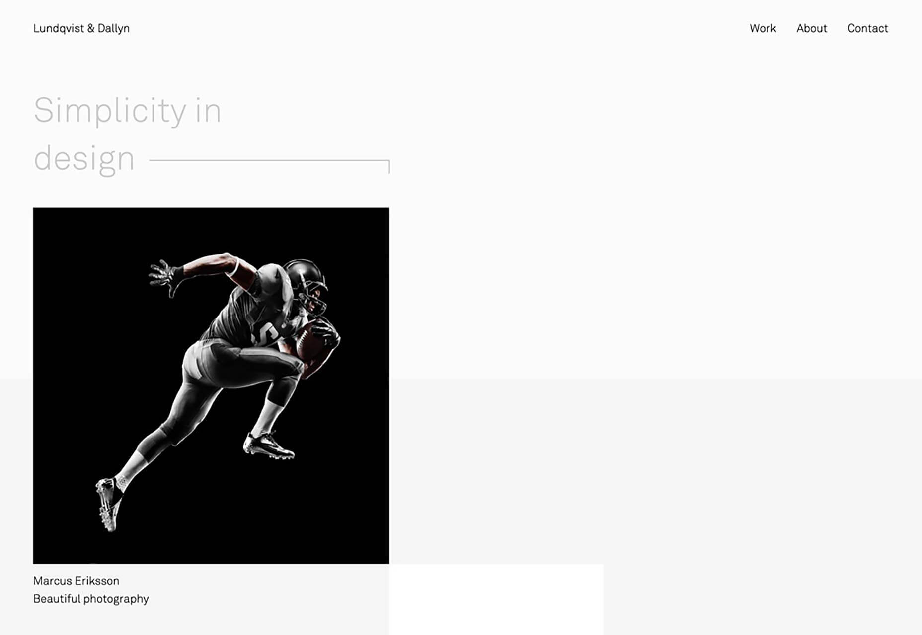
You’re going to have build your site in such a way that the eye is naturally drawn from one step to the next.

My sister used to accomplish controlling my focus by sternly, but calmly, telling me to “Get back to your schoolwork” anywhere from fifteen to forty times in a single day. But your users aren’t going to put on some music and “buckle down” to finish browsing your website, they need to be drawn in.

The Call to Action—that “Buy” button, for example—needs to look good.

1. Contrast

The first and easiest way to catch the eye is to use contrast. By “contrast”, I mean that the important elements of a design need to stand out from the rest in a meaningful way. See what I did there?

Now, there are several kinds of contrast to discuss:

  • Light/dark contrast
  • Color contrast
  • Size contrast
  • Contrasting styles

Most of these are fairly self explanatory, but let’s go over them.

Light/Dark

Light things stand out from dark things, and vice versa. Pretty simple, right? Well… that depends. If most of your site is pretty bright, then making your Call to Action big and dark (or at least a bit darker than everything else) makes sense.

However, there are lots of designs out there where high light/dark contrast is a feature of the entire layout, and that contrast is used to give everything a sense of structure. In that case, you’ll need to use another kind of contrast to direct people’s focus.

Color

Okay this one is self explanatory. A splash of color, or even just a different color, is enough to make things stand out. In this example, color is used to cut through a lot of typographical noise.

Size

Make the important buttons bigger than other buttons. Make your headline text bigger than other text. Size contrast can not only make things stand out, but also help to establish hierarchy in the page.

Style

A difference in style can be illustrated by something as simple as the bold text joke I made earlier. But to look at a more UI-focused example, let’s talk about “Ghost buttons”. Ghost buttons are buttons with an outline, but no background color, and they’re often used in combination with regular buttons, like on the home page of IndieGoGo:

I bet you can tell which button they really want you to click on. The stylistic contrast makes this clear.

2. Images

Whether we’re talking about photography, illustration, painting, or 3D graphics, images grab eyeballs. You can redirect anyone’s attention easily enough with a picture. The only real exception to this would be pictures that are surrounded by other pictures.

You can use images as the objects of focus on their own, of course, but you can also use them to draw the eye to other things, such as text or buttons placed on top of them. You didn’t think those were just pretty backgrounds, did you? That may have been how things started, but everything is a lot more calculated these days.

If you really want to go all out, place your call to action in such a way that it looks like the picture is pointing to it. This is what your manager would call “synergy”, and it tends to work, despite sounding so very corporate.

3. Animation

And if you think we like pictures, let me tell you about moving pictures. No but seriously, if there’s nothing more interesting going on in a room, my eyes will inexorably be drawn to any TV that’s been left on, no matter what’s playing. It could be sports, daytime talk shows, or even a soap opera, and I’ll have trouble looking away. Most of us would.

Motion just catches the eye that way. It started out as a survival reflex, and now we just have to know if Brian will ever regain his memory and marry Patricia, or if she’ll remain forever trapped by his evil twin Drake. Use that reflex to your advantage, by incorporating some light animation into things like buttons, helpful tooltips, and any text you really want people to read first.

4. Convention

Lastly, take advantage of your user’s default behavior patterns. As web users, most of us have been trained to look for navigation near the top, Calls to Action right under that, and more CTAs at the bottom. Putting important bits of information and functionality where people expect to find them is a perfectly valid strategy.

Also keep in mind whether you’re designing for people who read right-to-left, or left-to-right. English speakers, for the most part, will look at the left side of their screen first, for example. While there is something to be said for breaking the mold, never underestimate the power of simple yet deeply-ingrained habits.

5. Use Emphasis Sparingly

When everything is bold, bold text just tends to blur together, rather than burning important information into the user’s brain. When there are many pictures on a page, and you’re not running a photography portfolio, users may just get distracted. And don’t get me started on the overuse of animation. When everything’s moving, how do you expect them to read any of your text that’s more than a sentence long?

To really draw and focus your user’s attention on one or two things, you need to eliminate, or at least deemphasize things that might compete for their attention. Compete with other sites, not your own content.

Source

p img {display:inline-block; margin-right:10px;}
.alignleft {float:left;}
p.showcase {clear:both;}
body#browserfriendly p, body#podcast p, div#emailbody p{margin:0;}

from Webdesigner Depot https://ift.tt/2Mi1CoK


from WordPress https://ift.tt/2GwGc3v