Friday, February 28, 2020

5 Simple Responsive Blunders (And How To Avoid Them)

Nearly 49% of all the web traffic worldwide originates from mobile devices (excluding tablets). If you don’t design mobile-friendly websites, you’ll likely lose out on this massive chunk of your target audience. Additionally if you wish to improve your SEO, you can’t afford to ignore smartphones; Google gives priority to mobiles with mobile-first indexing.

All of this calls for responsive web design through which your website’s elements can adjust according to the screen dimensions. While creating your responsive design, you might end up making some common mistakes. To help you avoid them, we’ve put together some possible responsive design pitfalls and their solutions below.

1. Using Device Sizes as Breakpoints

According to OpenSignal, there were over 24,000 different Android devices in 2015; this number has increased in the past five years. As there are so many varieties device, the screen dimensions differ vastly too. To ensure that your website offers a seamless browsing experience on all devices, you need to get your breakpoints right. 

If you concentrate on just device size breakpoints in your responsive design, your website may not appear correctly on newer devices. Don’t restrict yourself to the dimensions of current devices for breakpoints. Instead, go for truly responsive designs that can adjust well on any screen size. 

If you concentrate on just device size breakpoints in your responsive design, your website may not appear correctly on newer devices

A great idea is to take up the mobile-first approach where you build your website for the smallest screens and then slowly scale it to larger screen sizes. If wearable devices are important for your website, you should start your designing with those instead. 

As you’re scaling up, your website design may start feeling strained. In such a situation, you can add media queries to it for making necessary changes. This will help your design remain comfortable at each step. You need to continue this process until you reach the largest screen sizes. Ideally, this would be up to 2800 pixels as most users have resolutions lower than this. 

Using this method, your breakpoints will be introduced only when they’re needed and not according to the device size. This can help you offer a seamless browsing experience to your visitors across all devices. You can use tools like LambdaTest or BrowserStack to check if your website renders well on new devices.

2. Not Considering File Sizes

Visual elements can make your website more attractive to users. However, you must be careful when you’re adding them to your website. They are typically larger than text files and can slow down your page loading speed. As your page loading time increases, so do your bounce rates. In fact, according to Akamai, the bounce rates increased by 6% when pages took 1.5 seconds more to load during the 2017 holiday season. 

It is thus necessary to optimize your images and videos to reduce their sizes. You could use tools like TinyPNG or  Compress JPEG to achieve this. If you’re a WordPress user, you can install the Smush plugin to get this work done for you. 

Minifying your CSS, HTML, and JavaScript files can help as well. You should also consider browser caching, which can increase page loading speed for return visitors. Lastly, remove all unnecessary 3rd party tools and JavaScript dependencies. To check your current page loading speed and find possible solutions, you can use Google PageSpeed Insights. You could also use the Mobile Site Speed Tool from Google to see how quickly your website loads on mobiles.

3. Not Using Adaptive Image Management

While the file size of an image is important, so are its dimensions. You may not worry about using images of different dimensions in conventional website design. However, when it comes to responsive design, missing out on image management can be catastrophic for your user experience. The last thing you’d want your visitors seeing is huge images on a small screen.

To avoid this pitfall, you should use adaptive image management techniques. You could go for the following methods to achieve this:

  • Resolution-based selection: Provide the same image with different resolutions;
  • Device-pixel-ratio-based selection: Make the images appear crisp and reduce perceptible artifacts based on screen sizes;
  • Viewport-based selection: Vary images based on devices used and their orientation;
  • Art direction: Change or crop the image based on the display to improve its viewing experience.

4. Hiding Content

missing out on image management can be catastrophic for your user experience

One of the biggest mistakes that you can make while creating a responsive design of your website is that of hiding content. You might do so to fit your website on a smaller screen or to increase your page loading speed. However, you must avoid it at all costs. Remember, people aren’t coming to your website just to look for a small sample. They want the same browsing experience that they get on desktops.

Your goal should be to provide them with this omnichannel experience. This is necessary because many of them may be accessing your website from multiple devices during a day. That’s why you must ensure that you maintain consistency of content in responsive design. You can, of course, prioritize the content differently across devices through progressive enhancement.

5. Keeping Consistent Navigation

Giving a consistent browsing experience to your visitors across all devices is of the utmost importance. However, absolute consistency isn’t good either. One of the biggest mistakes you can commit while trying to do this is that of keeping consistent navigation across all screen sizes. 

When your screen size reduces, a consistent navigation bar may end up occupying half the screen and might spoil the browsing experience altogether. You should consider shrinking the navigation with the screen size and could change it to a hamburger menu.

 Along with your navigation, button sizes and visual layouts should not remain consistent either. However, typefaces, links, and color treatments should be consistent. 

Final Thoughts

If you wish to reach your entire target audience, you can’t avoid responsive design. However, you must be careful while implementing it and avoid all the possible errors. Give your visitors a consistent browsing experience across all devices and don’t hide any information from them. Optimize your file sizes to improve your page loading speed. Additionally, use adaptive image management techniques to reduce or increase the image dimensions according to the screen sizes. 

Don’t keep your navigation consistent as it may spoil the browsing experience. The same rule applies to buttons and visual layouts too. Lastly, go for truly responsive designs and don’t restrict yourself to design breakpoints based on current devices. The key is to go mobile-first when you’re designing your website.


Featured image via Unsplash.

Source

p img {display:inline-block; margin-right:10px;}
.alignleft {float:left;}
p.showcase {clear:both;}
body#browserfriendly p, body#podcast p, div#emailbody p{margin:0;}

from Webdesigner Depot https://ift.tt/2wMScM3


from WordPress https://ift.tt/2Pyn4q9

Wednesday, February 26, 2020

Can Design Systems Work for Freelancers?

There’s a lot riding on your shoulders as a freelance designer. You have to play the part of salesperson, project manager, web designer, accountant, and more.

That’s why it’s critical to develop more efficient ways to work while maximizing results.

One way that agencies and even small teams of designers do this is through design systems. By taking the time to create a collection of design standards, reusable components, and documentation, everyone can work at a higher level at all times.

But is this something freelancers can take advantage of, or are design systems just a waste of your time?

Today, we want to take a look at what makes design systems so special and some reasons why it makes sense for freelancers to create them.

What Are Design Systems?

The easiest way to show you what a design system is (and why it differs from something like a style guide or UI pattern library) is to show you one of the most popular ones from the past decade.

This is Material Design:

Google released Material Design in 2014 as a way to bring consistency to all its properties. Its API also enabled designers and developers to utilize the design system with all its guidelines and components.

What makes Material Design — and any well-built design system — so effective is how robust it is. It includes:

  • A System that clearly explains the purpose and goals of it;
  • A Foundation that breaks down the key elements of the UI and carefully describes how each should be designed;
  • A collection of interactive Components that makes adding common UI elements to a website or app much easier;
  • A set of Resources and tools that help designers correctly apply Material Design styles and standards to their websites and apps.

With such a well-thought-out system and documentation, it becomes much easier to work on massive website projects or with a growing team of designers and other contributors. There’s no guessing when it comes to choosing:

  • Colors;
  • Typography;
  • Sizing and spacing;
  • Imagery and iconography;
  • Layout;
  • Motion;
  • Interaction;
  • Data visualization;
  • And so on.

The design system leaves no room for error as it’s all perfectly spelled out. What’s more, when the system is documented and captured in a tool like Sketch, making updates to it and collaborating with others becomes hassle-free.

But Can Design Systems Work for Freelancers?

This brings us back to our original question. My answer to that is yes… if your freelance business fits one of the following criteria:

You Specialize in Designing Larger Websites

Truth be told, you won’t really benefit from using a design system if you design smaller websites (we’re talking maybe five or six pages total). Instead, you could just use a content management system or website builder to save and reuse global components and call it a day.

For those of you who specialize in designing larger and more complex websites, you’ll certainly need a design system — even if it’s just you working on the project. The more pages you add to a site, the more chances you have to introduce an inconsistency.

Having a design system laid down from the get-go ensures that any additions or updates can be handled with ease. And for websites of this size, you’re likely to have a lot of this revisionary work to do as your clients scale their businesses and, in turn, their websites.

You Provide Monthly Maintenance

For many freelancers, the constant hustle required to find new website clients can be tiring. That’s why many of them offer monthly website maintenance plans to clients. The recurring and predictable revenue creates a safe buffer for designers while also making them an indispensable asset to clients.

For those of you who provide this service, a design system would be very useful — even for smaller websites with just a handful of pages. If you take the time upfront to create a design system, future updates to the site will take much less time and require less effort as you’ll have pre-designed components and rules to guide you.

You Have Plans to Scale Your Business

For some of you, your dream job is to work as a freelancer and have total autonomy and control for as long as possible. For others, the future looks a little different. Instead, you dream of building an agency, hiring a team of creatives to support you, and expanding into other profitable services and niches.

If this sounds like you, then using design systems makes perfect sense. That goes for designing large websites and small. If you can get yourself into the habit of using designing systems that dictate how you design now, scaling up to an agency will be a breeze.

You Have a Design or Marketing Partner

Many solo freelancers partner with other creatives to provide clients with more well-rounded solutions. It’s also good to know people who have skills unlike yours, so you have trustworthy recommendations to make when clients ask for help.

Whether you actively work in conjunction with one of these partners or you simply hand clients off to them when you’re done, design systems would be really useful. This enables you to set the rules for your client’s marketing style and ensures that your partners can maintain consistency with them even if you’re no longer involved.

This might not seem like it would be beneficial to you, but it is if and when those clients come back to you wanting more help (like a redesigned website or help with ongoing maintenance).

Wrap-Up

There are tons of ways to work more efficiently and to produce better quality websites. That said, not every productivity hack, tool, or technique is going to be right for you.

If you’re currently working as a freelancer and are intrigued by these design systems everyone’s talking about, carefully consider whether or not they actually make sense for you at this time.

If they don’t, don’t sweat it. You can still take advantage of the basic principles behind them. Create style guides. Compile a set of standard components you use from site to site. And document all of your processes. These are best practices every designer should have in their back pocket.


Featured image via Unsplash.

Source

p img {display:inline-block; margin-right:10px;}
.alignleft {float:left;}
p.showcase {clear:both;}
body#browserfriendly p, body#podcast p, div#emailbody p{margin:0;}

from Webdesigner Depot https://ift.tt/2uAFRdk


from WordPress https://ift.tt/2SYWB7i

Tuesday, February 25, 2020

Get to Yes: Three conversion lessons learned from FBI hostage negotiation

(This article was originally published in the MarketingExperiments email newsletter.)

“When it comes to data, simplify. Become an essentialist. Get beneath the data to the essence. Look for patterns. Patterns transform info into wisdom.”

— Flint McGlaughlin, Managing Director, MECLABS Institute

Not too long ago, the aunt of a prominent Haitian political figure was kidnapped and held for a $150,000 ransom demand. Hostage negotiator Chris Voss managed to convince the kidnappers to release the hostage for just $1471 dollars and a CD player. It’s a pretty incredible (true) story.

So how did he do it?

In this video, Flint McGlaughlin explains Voss(s) secret, pointing out three lessons that business owners, marketers — and anyone else who needs to negotiate a deal — can learn to increase conversion.

Remember, the goal of a webpage is to win a yes. A sale is simply a big yes. It is the sum total of a series of smaller yes(s) the customer makes while interacting with your business.

Just as Voss knew that one small “no” in the negotiation process could put the safety of the hostage in danger, we should be aware that a single “no” anywhere in the customer journey process can jeapardize the sale.

Watch the video to get the macro YES.

If you would like your own webpage diagnosed on one of our upcoming YouTube Live sessions, you can send your website info through this form, and we’ll try to fit it in.

Related Resources

The Hypothesis and the Modern-Day Marketer 

The Power of Perceived Value: Discover how a well-marketed banana & roll of tape produced a windfall

Website Development: How a small natural foods CPG company increased revenue 18% with a site redesign

MECLABS Quick Win Consult : Get personalized, detailed conversion marketing advice at an affordable price

The post Get to Yes: Three conversion lessons learned from FBI hostage negotiation appeared first on MarketingExperiments.

from MarketingExperiments https://ift.tt/2TjfMYm


from WordPress https://ift.tt/2SZ7GoW

A Step-by-Step Guide to Growing Your SEO Traffic Using Ubersuggest

There are a lot of tools out there and a ton of SEO reports.

But when you use them, what happens?

You get lost, right?

Don’t worry, that’s normal (sadly). And maybe one day I will
be able to fix that.

But for now, the next best thing I can do is teach you how to grow your SEO traffic using Ubersuggest. This way, you know exactly what to do, even if you have never done any SEO.

Here we go…

Step #1: Create a project

Head over to the Ubersuggest dashboard and
register for a free account.

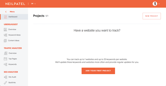
Once you do that, I want you to click on “Add Your First Project.”

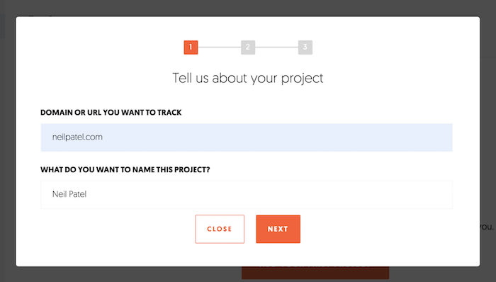
Next, add your URL and the name of your website.

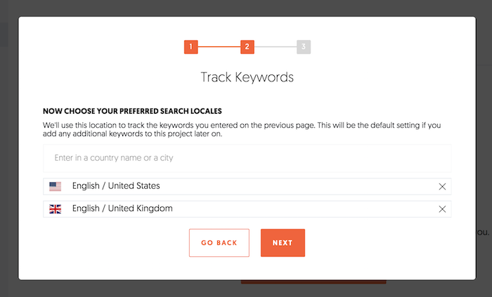
Then pick the main country or city that you do business in. If you are a national business, then type in the country you are in. If you are a local business, type in your city and click “Next.”

If you do business in multiple countries or cities, you can type them in one at a time and select each country or city.

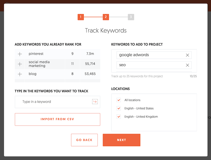
Assuming you have your site connected to Google Search Console, you’ll see a list of keywords that you can automatically track on the left-hand side. Aside from tracking any of those, you can track others as well. Just type in the keywords you want to track in the box and hit the “Enter” key.

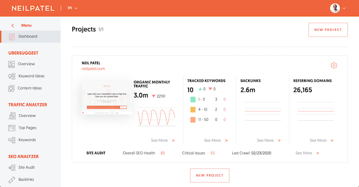
After hitting the “Next” button, you will be taken to your dashboard. It may take a minute but your dashboard will look something like this:

Click on the “Tracked Keywords” box and load your website profile.

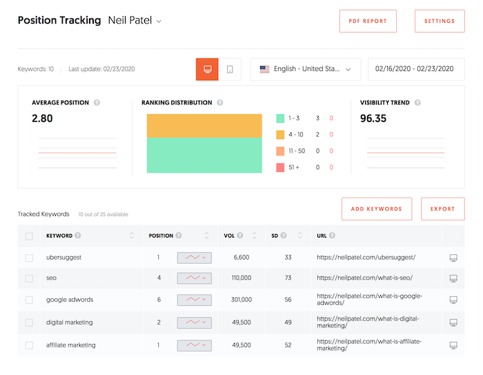
What’s cool about this report is that you can see your rankings
over time both on mobile and desktop devices. This is important because Google
has a mobile index, which means your rankings are probably slightly different
on mobile devices than desktop.

If you want to see how you are ranking on Google’s mobile index, you just have to click the “Mobile” icon.

The report is self-explanatory. It shows your rankings over time for any keyword you are tracking. You can always add more keywords and even switch between locations.

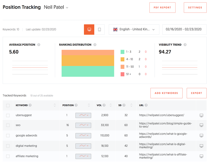
For example, as of writing this blog post, I rank number 4 on desktop devices for the term “SEO” in the United States. In the United Kingdom, though, I rank number 16. Looks like I need to work on that. 😉

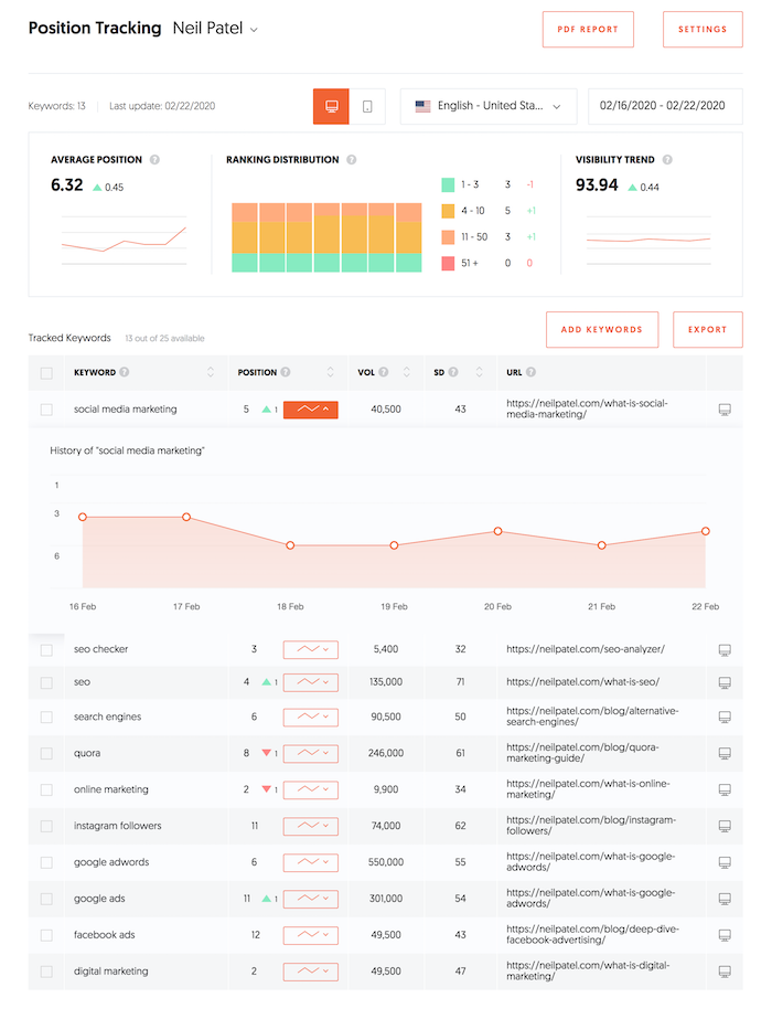
What’s cool about this report is you can drill down on any
keyword and track your rankings over time. For example, here’s what my site
looks like now…

The purpose of this report is to track your SEO progress. If you are heading in the right direction, your rankings should be going up over time.

Sure, some weeks your rankings will be up and other weeks it
will be down, but over time you should see them climb.

Step #2: Fixing your SEO errors

Once you have created your first project, it’s time to improve your rankings.

Let’s first start off by going to the “Site Audit” report. In the navigation, click on the “Site Audit” button.

Once you are there, type in your URL and click the “Search” button.

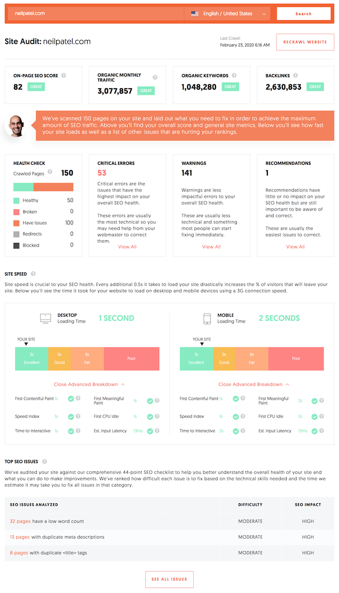
It can take a few minutes to run the report, but once it is
done it will look something like this.

Your goal is to optimize your site for as high as an SEO score as possible. Ideally, you want to be reaching for 90 or higher.

Keep in mind that as you add more pages to your site and it gets bigger, it will be increasingly harder to achieve a 90+ score. So, for sites that have more than a few hundred pages, shoot for a score that is at least 80.
As you can see above, I’m getting close to the 80 mark, so I’ll have to get my team to go in and fix some of my errors and warnings.

When looking at this report, you’ll want to fix your critical errors first, then your warnings if you have time. Eventually, you want to consider fixing the recommendations as well.
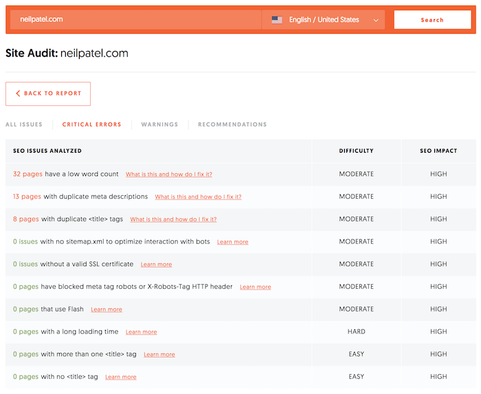
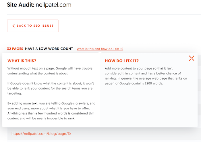
Click on “Critical Errors” if you have any. If not, click on the Warnings” option. You’ll see a report that looks something like this:

Your errors are probably going to be different than mine, but your report will look similar.

Click through on the first issue on the report and work your way down. The report sorts the results based on impact. The ones at the top should be fixed first as they will have the highest chance of making an impact on your traffic.

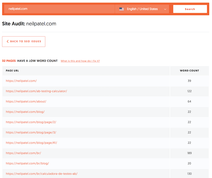
If you aren’t sure of what to do or how to fix the issue, just click on the “What Is This” and “How Do I Fix It” prompts.

Again, you will want to do this for all of your critical
errors and warnings.

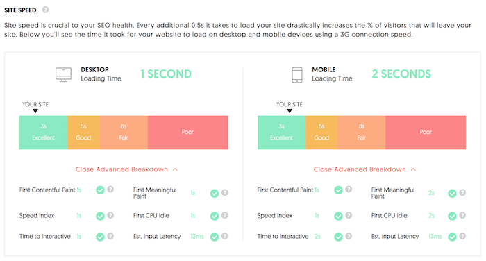
Once you do that, go back to the “Site Audit” report and scroll down to where you see your site speed results.

Your goal should be to get an “Excellent” ranking for both mobile and desktop devices. If you are struggling to do this, check out Pagespeed Insights by Google as it will give you a detailed explanation of what to fix.

If you are like me, you probably will need someone to help
you out with this. You can always find a developer from Upwork and pay them 50 to 100 dollars to fix
your issues.

After you fix your errors, you’ll want to double-check to make sure you did them right. Click on the “Recrawl Website” button to have Ubersuggest recrawl your site and double-check that the errors were fixed correctly.

It will take a bit for Ubersuggest to recrawl your website
as it is going through all of your code again.

Step #3: Competitor analysis

By now you have probably heard the saying that “content is king.”

In theory, the more content you have, the more keywords you will have on your site and the higher the chance that you’ll rank on Google for more terms.

Of course, the content needs to be of high quality and people have to be interested in that topic. If you write about stuff that no one wants to read about, then you won’t get any traffic.

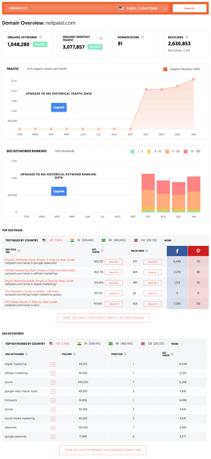
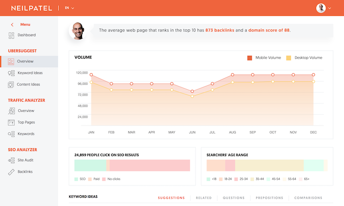
Now, I want you to go to the “Traffic Analyzer Overview” report.

Put in a competitor’s URL and you will see a report that
looks something like this.

This report shows the estimated monthly visitors your competition is receiving from search engines, how many keywords they are ranking for on page 1 of Google, their top pages, every major keyword they rank for, and the estimated traffic each keyword drives to their site.

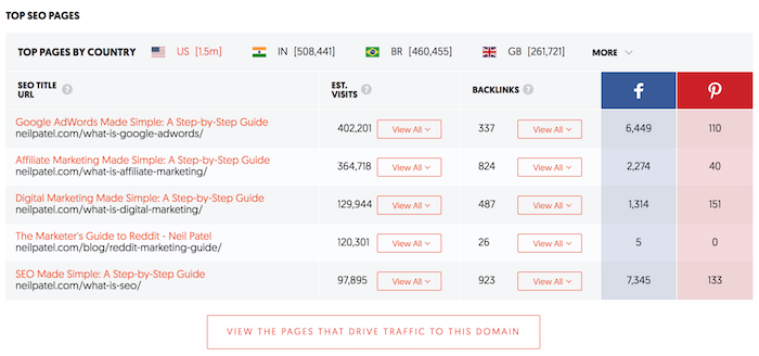
I want you to go to the “Top Pages” section and click the button that says “View The Pages That Drive Traffic To This Domain.”

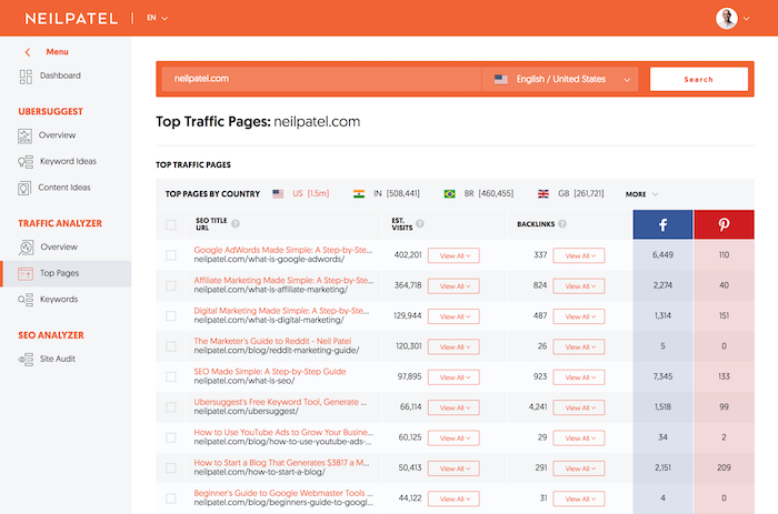
You’ll be taken to the “Top Pages” report.

Here, you will see a list of pages that your competition has on their site. The ones at top are their most popular pages and as you go down the list you’ll find pages that get less and less traffic.

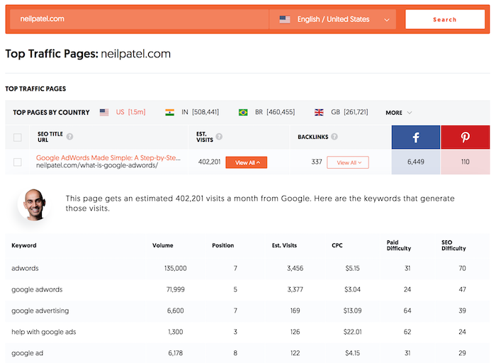
Now I want you to click “View All” under “Estimated Visits” for the top page on your competition’s site.

These are the keywords that the page ranks for.

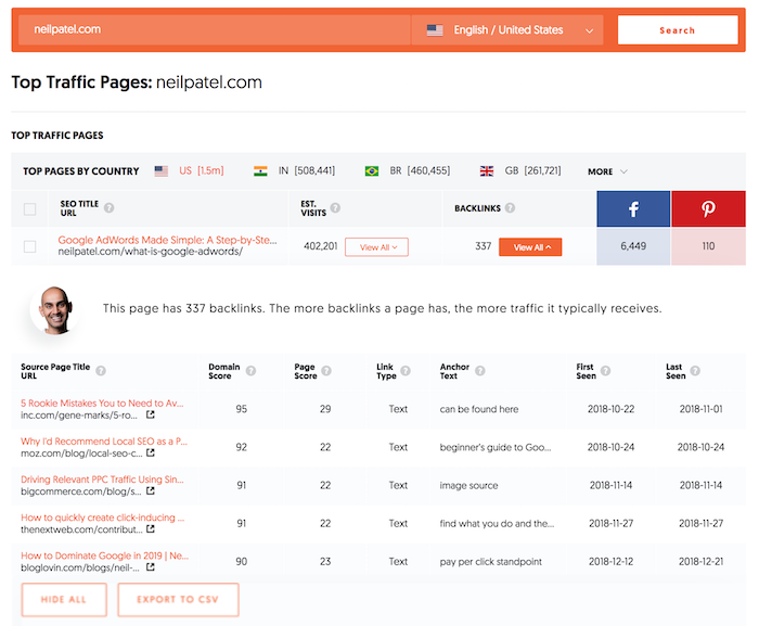
And you’ll also want to click “View All” under links to see who links to your competition.

Save that list by exporting the results (just click the export button) or by copying them.

I want you to repeat this process for the top 10 to 20 pages for each of your main competitors. It will give you an idea of the keywords that they are going after that drive them traffic.

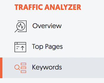
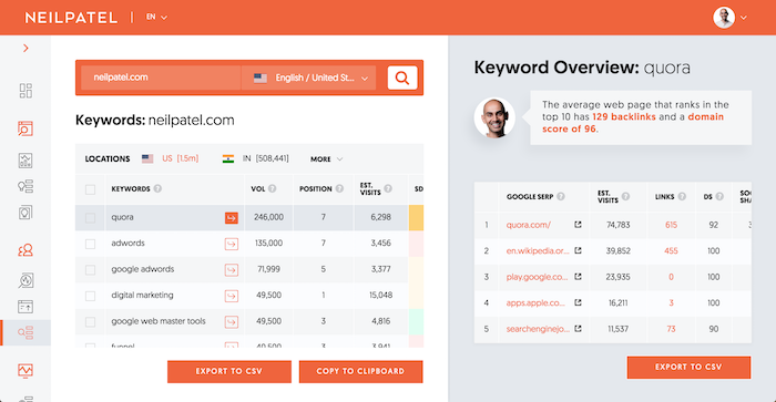
Next, I want you to click on the “Keywords” navigation link under the “Traffic Analyzer” heading.

You’ll see a list of all of the keywords your competitor ranks for and how much traffic they are getting for those keywords.

This list will give you an idea of the keywords that your
competition is targeting.

Now, by combining the data you saw from the “Top Pages” report and the data you got from the “Keywords” report, you’ll now have a good understanding of the type of keywords that are driving your competition traffic.

I want you to take some of those keywords and come up with
your own blog post ideas.

Step #4: Come up with blog post ideas

You can come up with ideas to blog on using a few simple
reports in Ubersuggest.

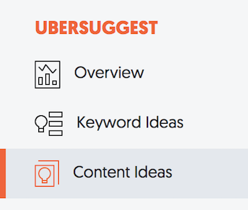
The first is the “Content Ideas” report. In the navigation bar, click on the “Content Ideas” button.

I want you to type in one of the keywords your competition
is ranking for that you also want to rank for.

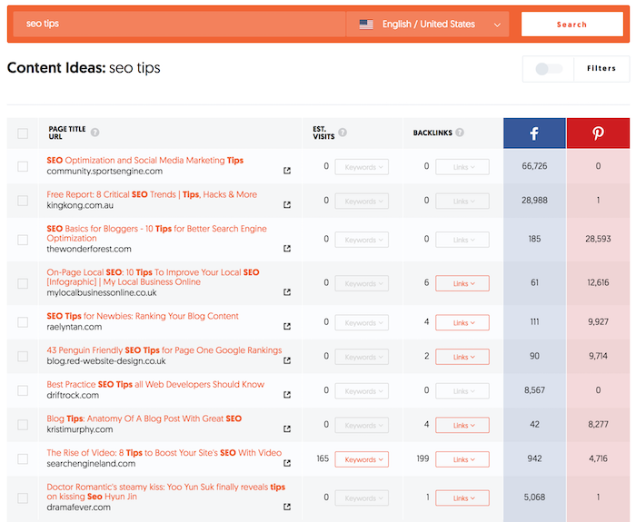
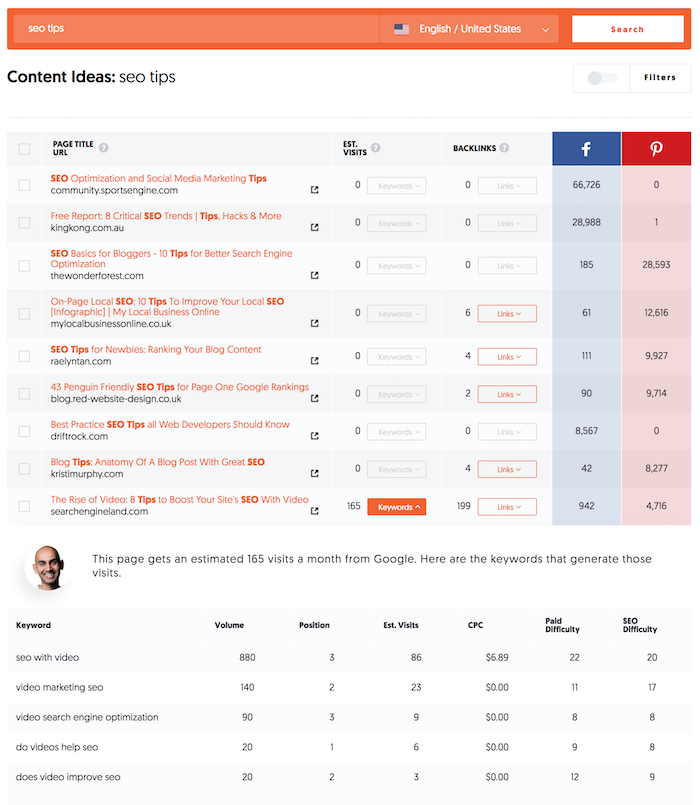
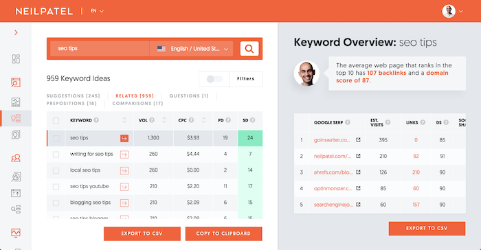
For example, I rank for “SEO tips.” If you want to rank for that term, you would type that into the content ideas report and hit the “Search” button.

You’ll then see a list of blog posts that have done well on that topic based on social shares, backlinks, and estimated visits.

It takes some digging to find good topics because ideally, a post should have all 3: social shares, backlinks, and estimated visits.

When you find a good one, click “View All” under “Estimated Visits” to see the keywords that the post ranks for.

If you write a similar post, you’ll want to make sure you include these keywords.

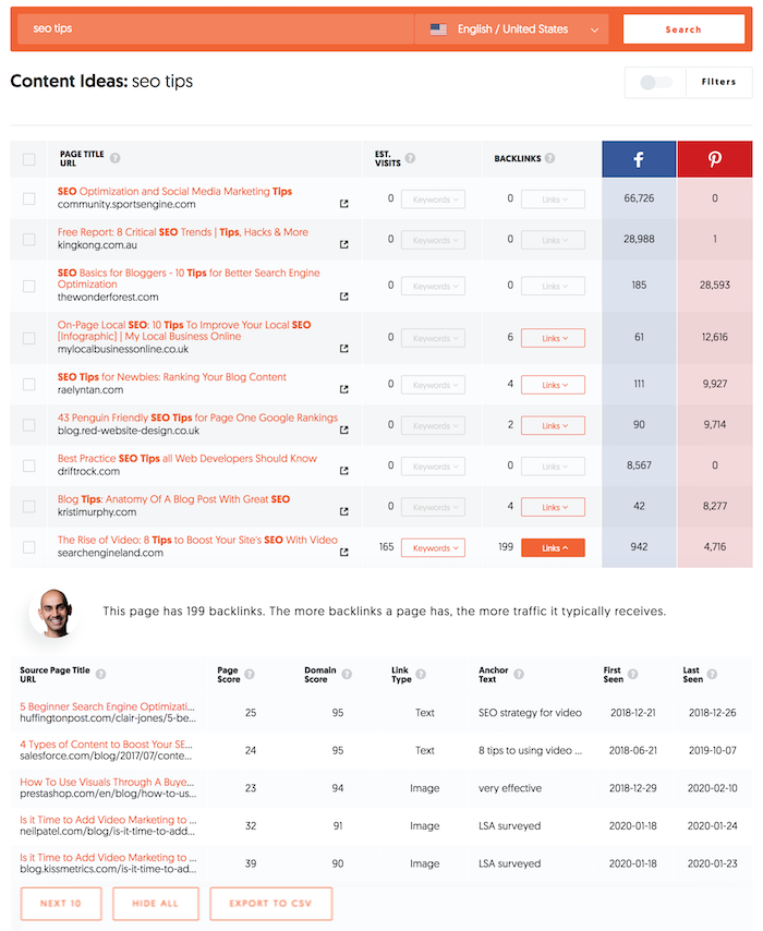
And you’ll want to click “View All” under links to see who links to your competition. Keep track of this as you will use it later. You can do this by copying the list or by clicking on the export button.

You can also get more ideas by going to the keyword ideas report. So, in the navigation bar, click on the “Keyword Ideas” button.

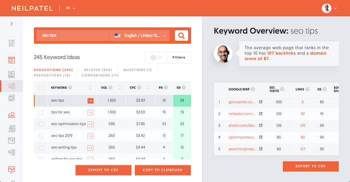
From there, type in keywords related to what your competition ranks for and you will see a list of long-tail suggestions that are similar.

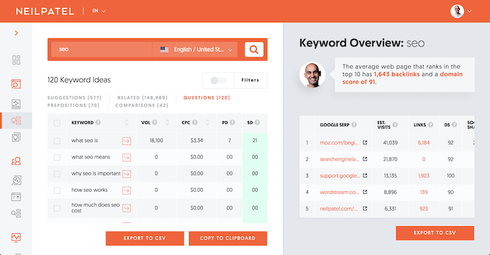
You can also click on the “Related” link in that report to see a bigger list of related keywords.

And you can click on “Questions,” “Prepositions,” and “Comparisons” to see even more keyword and blog post ideas.

Typically, the more search volume a keyword has the more
traffic you’ll get when you write about it.

Now that you have a list of keywords and topic ideas, it’s time for you to write and publish your content.

If you are new to writing blog posts, watch the video below. It breaks down my writing process.

Step #5: Promotion

I wish SEO was as simple as fixing errors and writing content based on popular keywords but it isn’t.

Remember how I had you create a list of sites that link to your competition?

You know, the ones you got from the “Top Pages” and “Content Ideas” reports.

I want you to start emailing each of the sites linking to your competition and ask them to link to you. See if someone else is linking to your competition. If they are, it shows you that they don’t mind linking to sites in your space. This means that there is a good chance you can convince them to link to you as well.

You’ll have to browse around their site to find their email. But once you do, send off a personal message explaining why your content will provide value to their readers and how it is different/better than what they are currently linking to.

In addition to that, I want you to go to the “Backlinks” report. In the navigation bar, click on the “Backlinks” option.

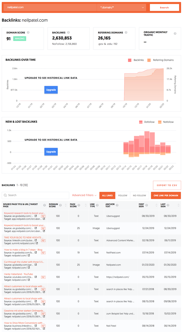
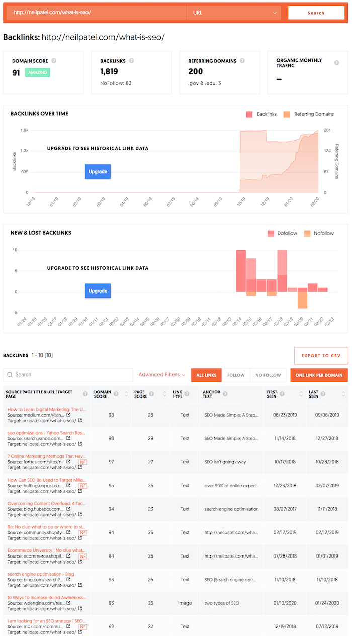
In this report, I want you to type in your competitor’s domain. You’ll see a report that looks like this:

You’ll be able to see their total link count, link growth over time, and, most importantly, a list of sites linking to your competition.

Now type in a URL of a blog post that your competition has written and that you know is popular (do this in the search bar). Next to it, in the search bar, change the drop-down to “URL” and click the “Search” button.

Once the report is done loading, you’ll see a new list of links pointing to that specific URL on your competition’s site.

I want you to do the same thing. Reach out to all of those
URLs and ask for a link as well.

When doing this, you’ll find that a lot of people will ignore you but you need to think of it as sales. You need to follow up and try to convince people. The more links you get, the higher your rankings will climb in the long run.

Even if you only convince 5 people out of 100 that you
email, it is still not bad as something is better than nothing.

Conclusion

My goal with Ubersuggest wasn’t to create too many reports, but instead, make the tool easy to use so you can generate more search traffic.

And as your rankings and traffic climb, you’ll see within your Ubersuggest dashboard how things are going.

What’s beautiful about this is that it will crawl your site automatically once you create a project. This way, when new SEO errors appear, Ubersuggest will notify you.

So, are you ready to improve your SEO traffic? Go to Ubersuggest and create a project.

The post A Step-by-Step Guide to Growing Your SEO Traffic Using Ubersuggest appeared first on Neil Patel.

from Blog – Neil Patel https://ift.tt/2SVWTvG


from WordPress https://ift.tt/2HUyArM