Thursday, January 31, 2019

6 Ways Designers Can Avoid Infringing Intellectual Property Rights

As the managing attorney of a commercial law boutique practice, I am asked several times per week some variation of the following question:

How should I best protect my intellectual property from being stolen? Is it as simple as filling out a copyright or trademark application and paying a small fee to a do it yourself on-line service? Will that really provide sufficient protection?

What do you think?

I have set forth below a few of the many aspects of protecting your intellectual property in the United States that go beyond blindly filing such a copyright or trademark application. It is a complex area of the law, and this article does not address all of the potential issues. For example, intellectual property in the United States is protected not just by federal law (as one might expect), but in many cases, state-specific law applies (such as when dealing with trade secret or confidentiality agreements).

“Move fast and break things” is a terrific way to end up being sued

The nature of potentially protectable intellectual property ranges from the typical (such as literature, television, film and music) to the esoteric (such as clothing lines, video games and apps). Infringement can range from outright copying and use of someone else’s registered intellectual property to merely exceeding the rights granted under a license to use it.

This article should be considered only a beginning; the reader should consult counsel to address specific situations.

1. When it Comes to Intellectual Property Filings, Self-Reliance is Not a Virtue

“Move fast and break things” is a terrific way to end up being sued. It does not take a great deal of time to file a trademark or copyright incorrectly. It is actually fairly quick, painless and inexpensive. But as in all things relating to the law, the hard way is still the right way.

Simply put, you must understand why you are filling out those boxes on the form, what the ramifications of the alternatives are and what else you need to do to protect yourself beyond simply filling out the form. When filing a copyright application with the United States Copyright Office or a trademark application with the United States Patent and Trademark Office, you should be asking some basic questions, including: what is protectable and what is not; are you going to infringe on someone else’s existing intellectual property; and can anyone else on your end assert that they have rights as a co-creator in what you are registering?

2. A Search of the USPTO Website for Similar Trademarks to Yours Should Not Be Relied Upon

Admittedly, the United States Patent and Trademark Office website has a search function for finding registered trademarks. But, generally speaking, that will not pick up everything a private investigation firm specializing in intellectual property matters will locate. Moreover, the database only identifies registered trademarks. That means other parties may have superior rights to yours—and potential claims against you for infringement—merely by using the mark. Accordingly, whether they have a registered mark that is searchable in the USPTO database is not the sole issue.

other parties may have superior rights to yours…merely by using the mark

However, generally speaking, although search results of any type won’t tell you when to go forward with an application, they will tell you when you should not go forward with one. In other words, if it is obvious that your application is for something that is already registered, you will know not to file your application. But the absence of a search result does not mean an absence of anything that is infringing. That is a tougher call.

3. Do Not Ignore Intellectual Property Rights Outside the United States

We are fortunate that the United States is a member of the Madrid Agreement Concerning the International Registration of Marks (commonly known as the Madrid Protocol), a means by which registration in one country can be leveraged to allow for intellectual property protection in others that are signatories to that treaty. The important point to keep in mind is that any potential infringement issue relating to use in the domestic United States must also be viewed in terms of whether there is a corresponding infringement outside the United States.

4. The Term “Quitclaim Assignment” Should Become Part of Your Vocabulary

There is a clear correlation between the number of people claiming some level of ownership of intellectual property and the value of that intellectual property. Simply put, success breeds claims for financial participation.

It is usually far better to ask someone to waive those claims before the intellectual property is actually utilized in a way that creates value. One of the problems is that it is not always clear what rights everyone has, nor what everyone is giving up.

In an ideal world, rights ownership would be discussed before any intellectual property were even created, and those rights would then be memorialized in a joint intellectual property ownership agreement, a work-for-hire agreement or other document that would establish precisely who would own what. But we do not live in that ideal world, and often the issues are ignored until the filing is about to be made. The law accounts for that as well. Believe it or not, the law generally provides for a way of assigning all right title and interest to whatever a person has, regardless of whether they know what that is. It is called a “quitclaim assignment”.

But be careful. The very request might jumpstart a discussion about royalties and licensing fees that would otherwise not have occurred

Before filing any sort of copyright or trademark application with the government, the applicant should analyze whether anyone else has a potential claim to that intellectual property. If so, every such person should sign such a quitclaim assignment, to the extent that they are willing to do so.

But be careful. The very request might jumpstart a discussion about royalties and licensing fees that would otherwise not have occurred (at least at that time). There is a school of thought that it is better to let sleeping dogs lie—I am not, by the way, of that school—instead, I would argue that, if such a discussion is even potentially on the horizon, it is better to have it earlier before time and money is expended on protecting and monetizing the intellectual property. As in all things legal, it is primarily a judgment call based upon the particulars of the given circumstances.

(This is an unusually nuanced area of the law. For example, how should one account for the fact that the assignment may later be revoked? Also, whose assignment is necessary, the company that did the work or the individual(s) in that company who handled the engagement (or both)? These are not insignificant details.)

5. A Quitclaim Assignment Should Have Certain Key Terms

It is impossible to provide a complete list of all the terms that should be included in every quitclaim assignment. For example, there are differences in what can be included in such a document that vary not only state-by-state, but also by country. However, there are a few fairly universal basics:

  • the rights that are and are not being given up, and a catch-all provision that the assignment includes even those rights that are unknown;
  • the payment or other consideration that will be provided for entering into the quitclaim assignment;
  • how disputes relating to the quitclaim assignment will be resolved e.g., through arbitration or a lawsuit; and
  • the fact that the assignor knows what they are signing (e.g., has had the right to be represented by counsel; to ask any questions; and in every respect wants to enter into the quitclaim assignment).

6. If You Do Receive a Cease and Desist Letter From Someone Asserting You Have Violated Their Intellectual Property Rights, Don’t Shoot First and Ask Questions Later

A cease and desist letter is not a lawsuit. The fact that you receive such a document simply means that someone is alleging that you have violated their intellectual property rights. It does not necessarily mean that they are prepared to file an immediate lawsuit, nor that they would win if they did so.

While every situation is different, there are a few preliminary steps that usually make sense:

  1. Determine with your counsel whether in fact you have violated the other party’s intellectual property rights.
  2. If you have, seek to open a dialogue to consider whether you can accede to their demand that you cease and desist in return for a release of liability. I hasten to add that it may not be possible to correct the infringement: the party sending the cease and desist letter may be making unreasonable demands; the determination as to whether you did or did not infringe may be arguable either way; etc. In other words, there is no one right way of handling a situation in which you have determined in your own mind that you did indeed infringe on someone else’s intellectual property rights.
  3. If you have not violated the other party’s intellectual property rights, respond to the letter in a substantive manner that sets forth why you believe you are right; the letter should leave open the possibility of further dialogue.
  4. You should retain an attorney to employ the above strategy. This comes under the heading of hoping for the best but preparing for the worst. Your attorney should author the above-referenced correspondence and discuss with you whether there are any preemptive litigation strategies you should employ. A perfect example would be the issue of whether to seek a declaratory judgment or other determination that your rights are superior before you are sued for infringement.
  5. Once you receive that cease and desist letter, you are officially “on notice” of the intellectual property holder’s asserted rights. If they have superior rights to yours and a valid claim, your continued use of the mark could put you at risk for enhanced damages based upon what is referred to as “willful infringement.” You need to evaluate immediately (ideally with legal counsel) what to do with the allegedly infringing product while you are engaging in this process. Do you continue your business and make sales while the dispute continues? Do you need to stop immediately and change everything, despite perhaps years and significant marketing spent building your brand? In answering those questions, you must keep in mind that whatever you do may have unintended consequences, such as for example, if your actions are later misinterpreted as constituting an admission that you did infringe.

Conclusion

All in all, it is critical that you not only take a challenge to your intellectual property rights seriously, but respond to it proactively. Your aim should be to anticipate what the challenge may be—to extrapolate, as it were—and head off the problem before it grows worse. I hope this article will help you start that process.


Featured image via Unsplash.

Add Realistic Chalk and Sketch Lettering Effects with Sketch’it – only $5!

Source

p img {display:inline-block; margin-right:10px;}
.alignleft {float:left;}
p.showcase {clear:both;}
body#browserfriendly p, body#podcast p, div#emailbody p{margin:0;}

from Webdesigner Depot http://bit.ly/2G17dNT


from WordPress http://bit.ly/2HKGQxg

Tuesday, January 29, 2019

Use this Research-backed Landing Page Template for Your Next Offer Page

After running thousands of a/b tests across hundreds of different companies in our research services program, we’ve seen significant patterns emerge. These patterns have led to some helpful tools like our conversion heuristic and our design of experiments planning method.

But they have also led to several page templates we use regularly to achieve wins inside of companies in every industry and of every business model.

Landing Page Template

One page that is generally consistent in almost any business is the main offer page for a product or service. This “landing page,” as it is often called, accounts for the main idea behind the offer.

After thousands of a/b tests, we’ve meticulously put together a template that draws from a meta-analysis of these tests. We examined the patterns common among most landing page tests we’ve run that have achieved a business result. What we found was a series of common denominators that we then integrated into our offer page template.

We’ve also added explanations into the template on how to conform it to meet your own marketing needs. For example:

Headline and Sub-Headline

An online interaction with a prospect is like a conversation with a potential love interest. You hopefully do not begin the conversation with, “I am available for dates. Here is my number. Call me.” That is too vague and offers no reason to actually call — also it is rude.

You need a pick-up line that clearly communicates your value proposition and a sub-headline that further delineates that value proposition and how this page helps the prospect obtain that value.

Image

If your page is going to include an image, which is worth a test, the image must be instantly recognizable and reinforce the value proposition raised in the headline and sub-headline.

It must not tax the prospect’s mental faculties trying to make sense of the image. You do not want to slow down their cognitive momentum.

Primary Information Column

This is where your main body copy goes, including some easy-to-scan bullet points. You want the reader to be able to skim through this copy and pick out the main details they need to come to an informed purchase decision.

It is one column because multiple columns of vital information disperse attention and confuse. One column creates simplicity and velocity toward the call-to-action.

One Emphasized Call-to-Action

The call-to-action should emphasize in the actual wording the value proposition of the offer. In other words, “Get Instant Access Now” is preferable to “Click Here.”

There should not be multiple equally weighted calls-to-action because this forces the prospect to weigh the options, which decreases momentum and often stalls purchase intent.

Supporting Content

The primary information column will not suffice for some prospects. They will want more information before coming to a decision.

For these prospects, you can include additional information below the call-to-action. Supporting content can also include elements like testimonials, trust logos and additional copy and images.

Also, if you would like to get the other funnel-specific page templates we’ve put together along with a few case studies and explanation for how we conducted our research, you can download the complete PDF here.

The templates also include the following:

  • The case studies these templates draw upon
  • A walk-through of each template explaining how to use every element
  • An overview of the methodology behind each template so you can iterate and make them fit your own marketing needs

landing page templates

Please let us know in the comments if you find it helpful or if you see any way to improve it.

You might also like …

Landing Page Optimization on-demand certification course

Landing Page Optimization: Simple, short form increases leads 40%

Landing Page Optimization: Free worksheet to help you balance segmentation and resources


The post Use this Research-backed Landing Page Template for Your Next Offer Page appeared first on MarketingExperiments.

from MarketingExperiments http://bit.ly/2WsiXhq


from WordPress http://bit.ly/2TjQRTt

The Ultimate SEO Tool: Ubersuggest 3.0

ubersuggest

In 2018, I promised you I would release a better version of Ubersuggest for free, and I did that.

But there was one big issue: Ubersuggest only worked on a keyword level. When you put in a keyword, you get a list of more keyword ideas and content ideas.

And then when you put in a URL, nothing happened.

Well, that was before.

You can now get domain level metrics!!!!

So let’s dive into the new Ubersuggest.

Traffic Analyzer Overview

The traffic analyzer is broken down into 3 main sections: overview, top pages, and keywords.

The overview looks like this:

overview

The first section breaks some basic stats and a graph of the domain’s search traffic.

domain metrics

As you can see from the screenshot above, you’ll see how many keywords a domain ranks for, the total estimated search traffic from that region, the number of paid keywords a site is bidding on, and how much they are spending on Google Ads.

In addition to that, you’ll see a traffic graph that shows estimated search traffic a site receives over time.

And of course, a domain level overview won’t be complete without data such as backlinks, referring domains, the number of .edu and .gov links, and how much the organic traffic is worth if you had to pay for it.

Now, before you head over to Ubersuggest and type in a domain, there is one thing you need to keep in mind… Ubersuggest treats subdomains as a separate site. So if you enter in store.nike.com you will get different results than if you typed in nike.com. By typing in nike.com, you would NOT see any of the data from their store unless you typed in store.nike.com.

We did this on purpose as it allows you to analyze sites more thoroughly.

Also, within the traffic analyzer, you’ll see bar graphs that contain the overall positioning of the keywords you rank for over time.

keyword rankings

The chart above shows how many keywords a domain ranks for that are in the top 3 positions in Google, the top 10 positions, the top 50 positions, and the top 100 positions.

You already know no one clicks beyond page one, but over time you’ll want to see your site climbing the ranks. Hence, we track how many keywords are ranking in the first 100 positions.

Now let’s get into my favorite feature of the traffic analyzer.

Top SEO Pages

The second part of the traffic analyzer is a list of the most popular pages for a given domain.

top pages

For each page, you are given the title, URL, the number of visits a page receives from Google on a monthly basis, and the number of times the URL has been shared on the social web.

My favorite part about the top SEO pages report is when you click on “view all” you’ll see a list of keywords a page ranks for.

top pages

This one report will not only list out each keyword a webpage ranks for, but the position, estimated visits, cost per click data if you paid for that keyword, and how difficult it would be to rank for it.

What I love about this report is that I can put in a competing URL and see what’s working really well for my competition and then copy them. Or even better, create a more in-depth page than my competition.

Plus, if you have clients who are global, you can click on the flag at the top and see the top pages for any domain in all of the major countries.

For example, here are my most popular pages in Brazil.

top pages brazil

Top Keywords

The last section in the new Ubersuggest is top keywords.

Whether you put in your own domain or competitors, you’ll be able to see all of the organic keywords and paid keywords a site is going after.

organic keywords

When you click on the “paid” button you’ll see the list of paid keywords as well.

paid keywords

And just like the keyword research reports within Ubersuggest, you’ll have data on URLs, paid difficulty and SEO difficulty.

Conclusion

I hope you enjoy the new version of Ubersuggest. I know there are still some bugs in which the reports don’t load as fast as you want (Top SEO Pages can take up to 20 seconds to load) and you may have to clear your cache to see the new features, but hopefully, you enjoy the updates.

There are also some issues with duplicate keywords and misspellings. The engineering team is continually looking to fix this.

We do know there are many issues with duplicate keywords and misspellings in our Japan database, but we are working on fixing this as soon as possible.

So overall, I know it’s not perfect, but what do you think so far?

And if you haven’t tried it, head over to Ubersuggest and type in a domain.

PS: If you find any bugs, please email carlos@neilpatel.com

The post The Ultimate SEO Tool: Ubersuggest 3.0 appeared first on Neil Patel.

from Blog – Neil Patel http://bit.ly/2MDtSQO


from WordPress http://bit.ly/2TlyBZR

Designing Mobile Websites for Voice Search

In January 2018 alone, consumers conducted over 1 billion voice searches. By 2020, it’s estimated that 30% of all online searches will take place without the use of a screen.

Needless to say, voice search is set to make serious waves in the not-so-distant future.

As more users seek out the convenience of using their voice to search online, you have to consider how this will impact mobile websites.

As of now, your main concern doesn’t need to be with designing a website that literally talks back to visitors. We have microinteractions and conversational UIs that can help with that. Instead, what you should do is consider the relationship between voice users and search.

Here are some things to think about as you approach the design of mobile websites in 2019 and beyond:

1. Place Answers to Common Queries at the Top

According to a Bright Local survey from 2018, 28% of voice users will call a business immediately after finding them in search.

So, while it’s important to have a well-designed website that appeals to local shoppers or customers, it’s just as important to get them the information they need right away. And when someone is using their phone and their voice to look up a website, chances are good they’re looking for a shortcut to get in touch.

But making a call isn’t the only kind of action a voice user might want to take in this instance. Think of other ways in which they’d want to engage with your client’s website or business:

  • To get the brick-and-mortar store’s hours of operation;
  • To find a live chat or support portal for help with a product or service;
  • To make a reservation or appointment;
  • To get information about current sales or free shipping offers.

Google/Peerless Insights provide some insights into the types of information most commonly sought out by voice users in search:

If someone has opted to use voice search over text, there’s a good chance they were trying to avoid the work of clicking and scrolling and taking other manual steps to convert. Instead, they engaged with their voice assistant or search voice widget in order to get a quick answer.

When it makes sense, place quick snippets of information in the header or navigation bar.

Take, for instance, this voice query I did for “when is the next marketing conference”:

Using this example of NEXT 2018, you can see that the answer is not provided in my search results:

However, upon opening the website, the answer is in the very top of the website:

As a voice user, I’d be mostly content with this. But I would’ve been even more thrilled if the answer showed up right in results. I’ll explain how to do that in the next two points.

2. Add Location to Your Content

When I wrote about how to design websites for a local audience, one of the things I suggested was that you localize content. This means using verbiage, visuals, and colors that resonate with residents in a certain area.

This point is especially pertinent when attempting to appeal to voice search users.

According to Bright Local, 46% of voice users searched for local businesses every day using a voice-assisted device.

If your website has been built for consumers in a specific geographical region, use this to your advantage.

  • Include the name of the region in your content and metadata;
  • Create location-specific pages when relevant;
  • Use visuals that are specific to the region;
  • Tag all images and videos with the name of the geographic area;
  • If video or audio content discusses a specific location, provide a transcription of it.

Do everything you can to ensure that voice searches for “near me” or “in [name of location]” pull up your clients’ websites first. Let me show you why this is important:

I did a side-by-side comparison between a text (left) and voice (right) search for “Find a spa in Newark, Delaware”. Already, you can see a slight discrepancy between the two search results:

Scroll down to the map and you’ll see that search results continue to differ between text and voice:

Take note of the discrepancy between the same Yelp result’s description in the text results and in the voice results. Further down on the page, I encountered a similar issue:

Yes, results continue to differ slightly, but it’s the differing descriptions of the same pages that I find the most interesting. Notice how the one on the left (text) for Massage Envy appears to be a straightforward explanation of the spa’s services while the one on the right (voice) sounds more personal. I don’t think that’s a mistake.

I’ll explain how you can provide these types of robust answers in the next point.

3. Answer Their Questions in Callouts

According to Google, 41% of voice users say that their search queries feel more like a conversation than a one-sided dialogue. As user comfort grows with this type of discourse, it’s going to affect how well your clients’ websites perform in search.

While it might not be up to you to write content that appears on the website, you certainly can frame it in a way so that it’s sure to show up in voice search results.

To start, figure out what kinds of questions the audience is most likely to ask as it pertains to your client’s business.

If you’re unsure, you can use a tool like Answer the Public to identify related questions:

Then, use KWFinder to confirm the popularity of them among your target users:

If the site has been around awhile, I’d also suggest looking at your Google Analytics data. You can find a list of search queries under: Acquisition > Search Console > Queries. You should be able to find the voice queries easily enough as they’ll sound more natural and be longer in length.

Once you’ve identified likely candidates for long-tail voice search queries, it’s time to place them in areas of your content that make sense.

To start, add them to your metadata. This is the easiest way to get your website front and center in voice search.

Also, add answers to common queries in featured boxes on your website. This’ll be beneficial to the end user in a couple ways: for one, it highlights the answer on your website and keeps voice users from having to do too much work to locate it; second, if you mark it up properly with structured data, they won’t even have to go to your website to get the information as the featured snippet will show up in voice search results.

Here’s an example from my voice search for “how do I groom my dog”:

This featured snippet from petMD actually provides me with a graphic and list of steps to take:

This helps me get started right away. It also lets me know if this is a link worth clicking into.

Further down the page, I also ran into these video clips which autoplayed (on silent):

I found this to be helpful as well since I didn’t have to waste any clicks or much time sifting through content to find my answer.

Summary

As consumers take control over how they engage with the web (i.e. predominantly using smartphones and executing more and more queries with their voice), web design must change as a result. No longer are visitors willing to sit by, passively consuming content. They want websites to respond to their queries more naturally and effectively.

And voice search optimization is going to be the way to do it.


Featured image via Unsplash.

Add Realistic Chalk and Sketch Lettering Effects with Sketch’it – only $5!

Source

p img {display:inline-block; margin-right:10px;}
.alignleft {float:left;}
p.showcase {clear:both;}
body#browserfriendly p, body#podcast p, div#emailbody p{margin:0;}

from Webdesigner Depot http://bit.ly/2COXeHs


from WordPress http://bit.ly/2SbJpwp

Monday, January 28, 2019

20 Freshest Web Designs, January 2019

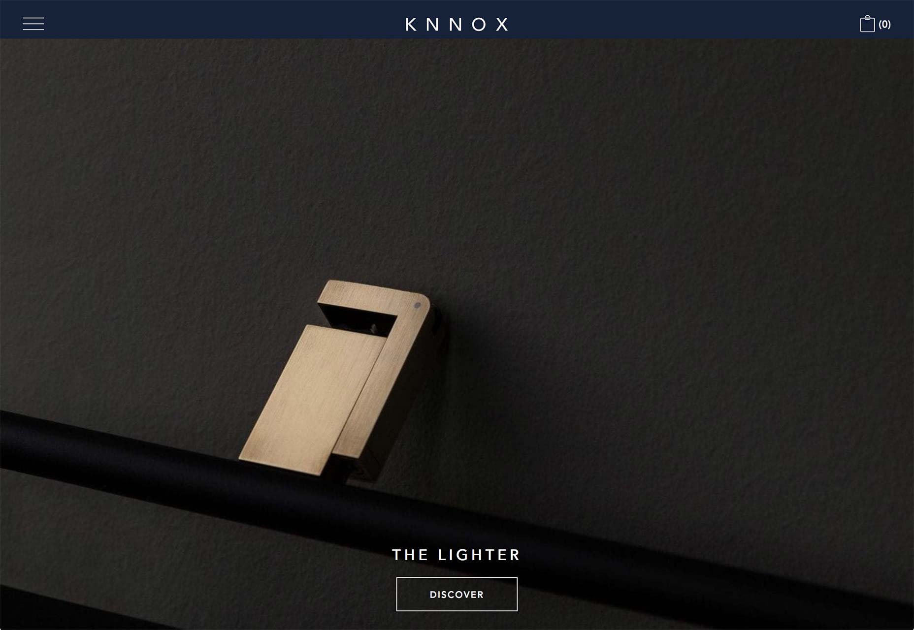
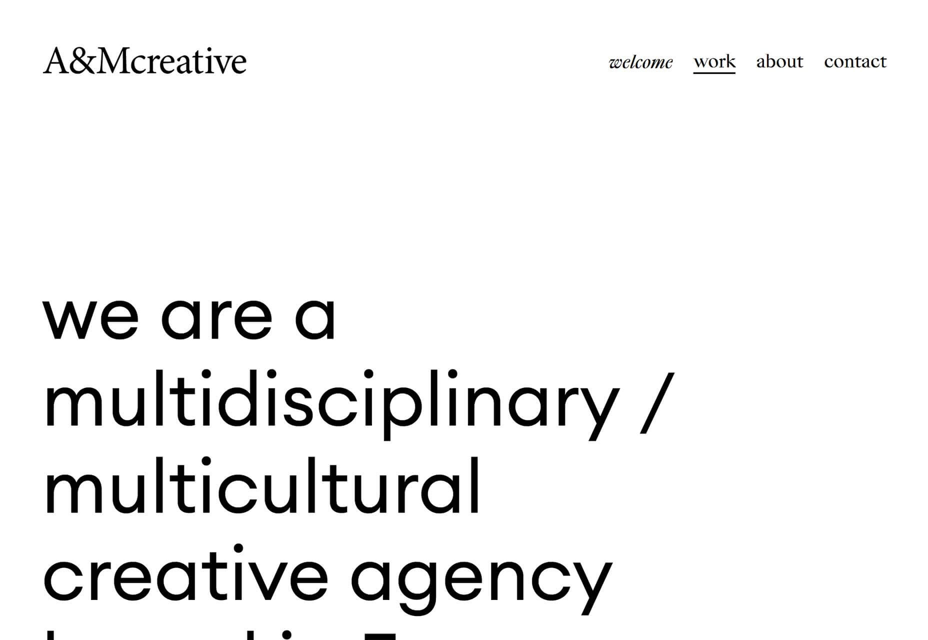
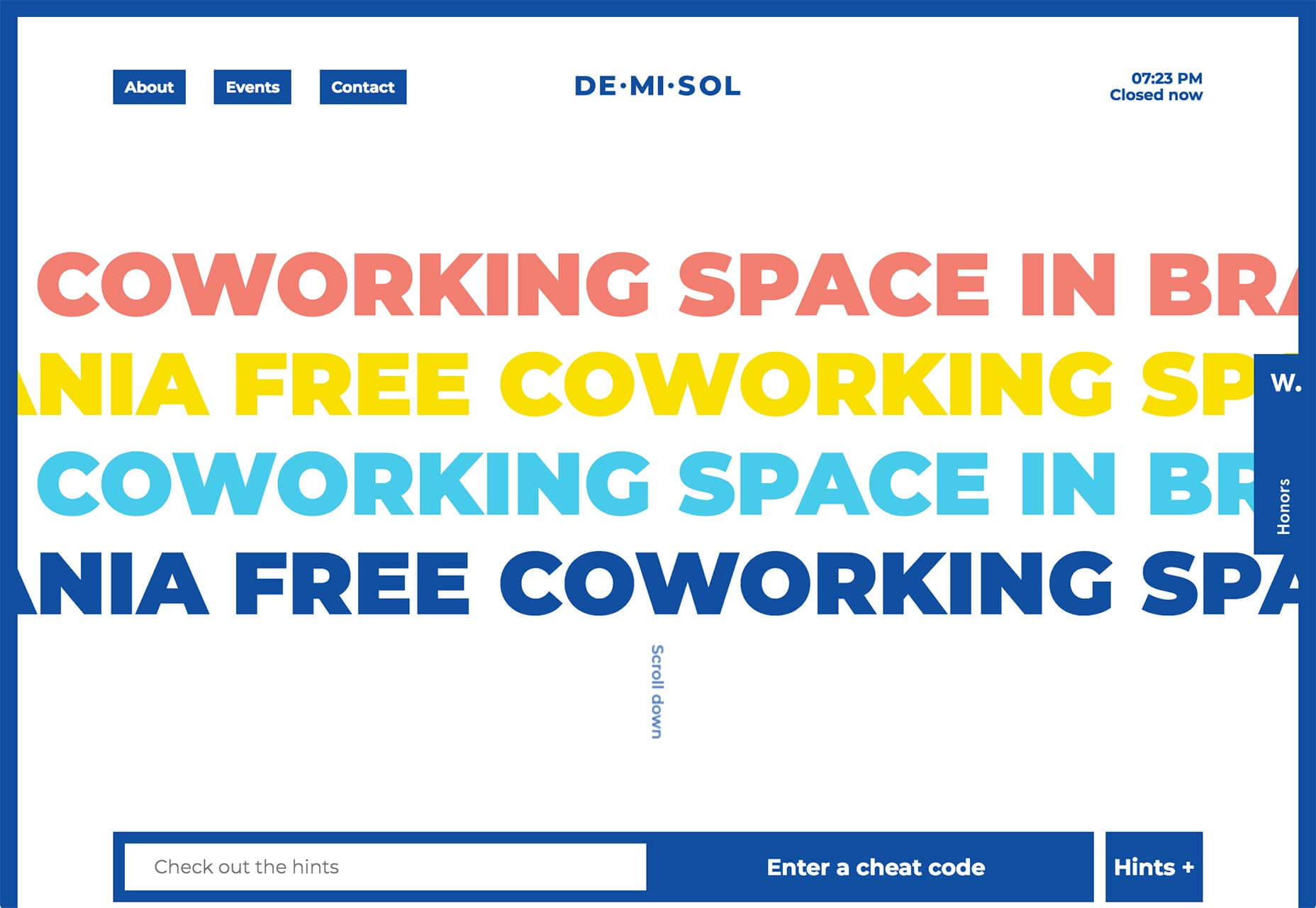
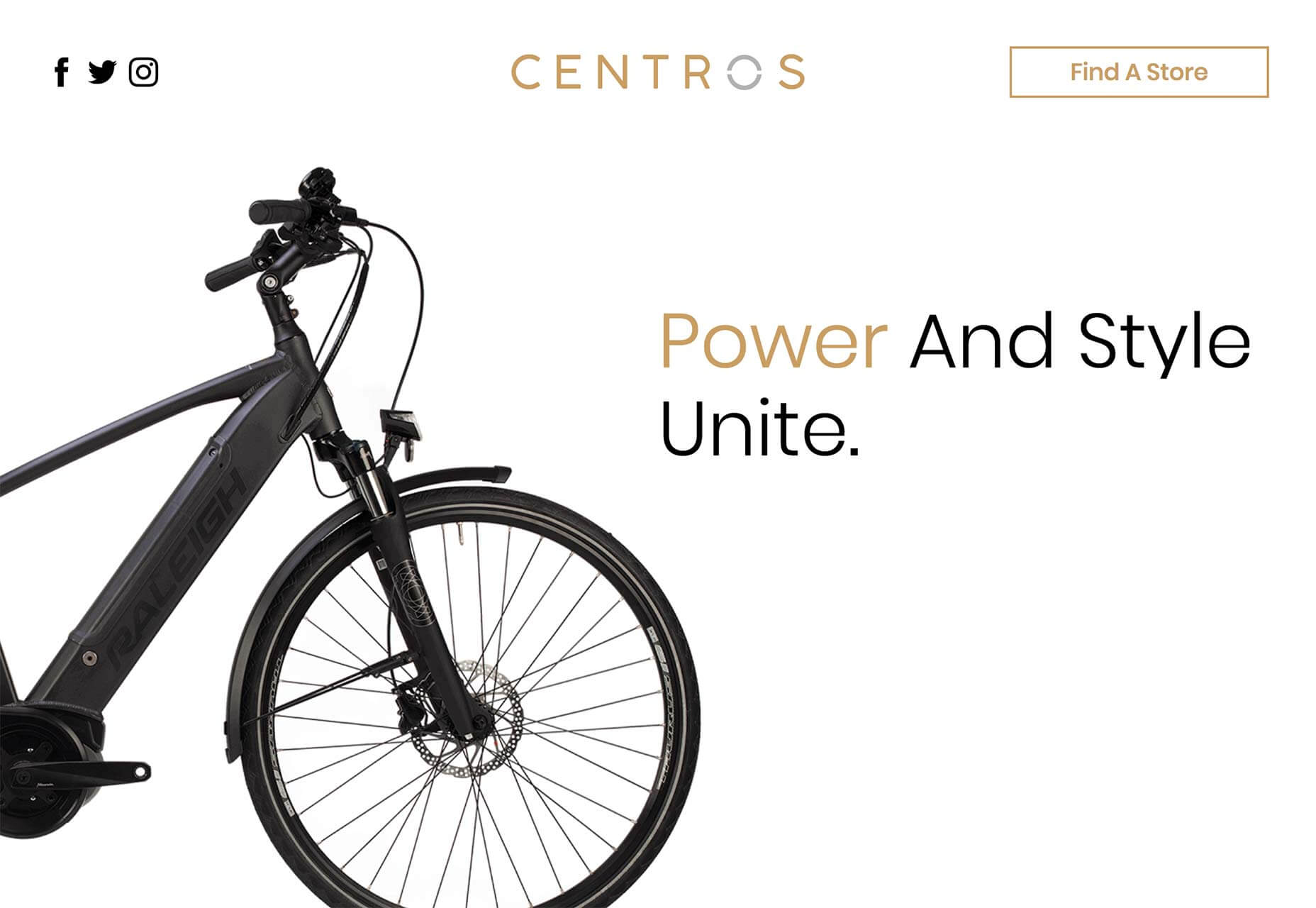
Welcome to 2019! It’s a brand new year and there are plenty of sites taking advantage of the optimism to start afresh.

Every month we publish a guide to the freshest websites launched (or relaunched with significant new updates) in the previous 4 weeks, this is January’s edition.

The slowdown for the holiday season is well behind us now, and new projects are launching daily. With some old trends still popular, and new ideas coming through, there’s no single dominant trend, making this month’s list more diverse than ever. Enjoy!

Stockholm Design Lab

The Stockholm Design Lab is a design agency that works with high-profile brands, take a look at their client list and you’ll see several global names. As if to emphasize the depth of its practice, the site lets you explore by typing different terms. It’s an impressive way to present work.

Cure

Cure is a high-end nails and wax boutique and its site showcases the aspirational lifestyle it’s selling. The typography is fresh and engaging, the art direction is modern and carefully planned, the parallax is beautifully executed, and the underlying grid is inventive.

Goldkant Interior Köln

In 2019 you can expect to see designers looking for new ways to work with parallax. Goldkant gets it right by combining parallax with the split-screen trend. Lots of sites apply an effect like this on the home page, Goldkant uses it site-wide. Plus check out that slick animated logo.

Kalfire W53/50R

The inelegantly named Kalfire W53/50R has a site that features lots of full-screen video. Click through to the design page for more video, and the efficiency page for a detailed presentation of an extremely high-end product.

Layer

Full-screen video is going to be big in 2019 and Layer’s site is on-trend with a macroscopic view of its product range. Layer make intelligent products that form emotional connections, so their video is intimate in its approach. The whole site oozes human-centered design.

Talia Collins

The amazing Talia Collins company makes swimwear out of material regenerated from discarded fishing nets, making you look amazing on the beach this Summer, all while saving marine life. Its site does a great job of counterpointing flattering style, and a love of the water.

Without

Without is a design studio from London, UK. Its site features enviable typography, and a rigid application of UX principles. Scroll through the site to discover an impressive portfolio of case studies. If it wasn’t for the hamburger menu on desktop, this could be the perfect agency site.

Lesse

Lesse skincare products are 100% organic, cruelty free, and vegan. Its site and its branding follows the very recent trend of embracing organic feeling serif fonts—Lesse’s logo is almost Art Nouveaux—combined with the simple sans serif its a very 2019 design.

Knnox

I would, of course, never advocate smoking cigarettes (they will damage your health and that of your loved ones). But if I was a smoker, I’d want one of the brutalist brass lighters from Knnox, and it’s all thanks to the scandi-noir art direction on this site.

A&Mcreative

French creative agency A&Mcreative presents its work in typical Parisian style: understated, effortlessly cool, and probably three or four times over your budget. Compare the modest way its extraordinary client list is presented, to the way some agencies talk up their work.

OnCorps

OnCorps decision making systems use machine learning to teach themselves about human-powered decisions, and then automate them. Its site is a simple powerpoint-style scroll, but each slide features hypnotic Math-based animations.

Part Architects

The site for Part Architects, is both extraordinary, and difficult to love. The text is very hard to read, using a font that wouldn’t be out of place advertising a club night. Scroll through and the text projects along the surfaces at the extremes of the viewport. It’s bonkers, but brilliant.

Demisol

Who says work has to be boring? Demisol is a free co-working space in Brasov, Romania. Designed for hackers, designers, developers, marketers, “troublemakers and other disrupters” it’s a flamboyant site filled with energy. No doubt, much like its offices.

Fleuressence

Fleuressence is a Scottish florist that sources unusual flowers for events of all kinds. True to its product, its beautifully simple site features blocks of color that on the welcome page can be rearranged with a click. A completely original approach to this type of site.

MMK

Frankfurt’s Museum für Moderne Kunst (Museum of Modern Art) strikes the perfect balance between informational and conceptual, guiding visitors to the gallery’s three real-world locations. On top of that, they have a fascinating navigation system that’s surprisingly intuitive.

Raleigh Centros

Throwing its hat into the ring of the emerging electric bicycle market is Centros. Targeting customers who have more money than peddle power, the slick, animated site mimics tech sites like Apple, without ever straying from the tablet-friendly format that baby-boomers prefer.

Josefine Laul

Josefine Laul’s site is an exercise in Scandinavian minimalism. The Stockholm-based photographer’s work is presented as a simple set of thumbnails, clicking on them takes you through to a project page that plays with the underlying grid.

Only / Once

Only / Once is an unusual home accessories store featuring original vintage designs from some of the twentieth century’s greatest product designers. Fans of Dieter Rams, Christian Dell, and Josef Hurka, among others, will be in heaven.

Jordy van den Nieuwendijk

If you’re worn out by the ongoing design trend for light grey text, you’ll love Jordy van den Nieuwendijk’s site featuring wonderfully colorful text. His artwork’s a positive delight too.

Ruby Atelier

Ruby Atelier is a Copenhagen-based interior design consultancy that also sells mid-century objects. Its welcome page features a hypnotic, liquid effect. Grab and drag to distort the macro photography into beautiful distortions.

Add Realistic Chalk and Sketch Lettering Effects with Sketch’it – only $5!

Source

p img {display:inline-block; margin-right:10px;}
.alignleft {float:left;}
p.showcase {clear:both;}
body#browserfriendly p, body#podcast p, div#emailbody p{margin:0;}

from Webdesigner Depot http://bit.ly/2CMaRXL


from WordPress http://bit.ly/2HCXMFT