
 There’s been a fairly big update to Behance, also known as DeviantArt for designers. Heck, I remember when I used DA for my portfolio. Good times.
Anyway… Behance. They’ve gone and updated what has to be the single most important aspect of their site: the portfolios. I mean, that’s what everybody is there for, no? They’re overhauled both the main portfolio view, as well as the experience of viewing individual projects in some small but important ways.
Portfolios
Customizable banners: You know those big image banners you get on sites like Twitter and Facebook? Behance has them too, now. Just upload a picture, crop it to your liking, and go. The stated purpose of these is to allow users to sort of set the tone, and get their branding right in there at the top.
Well, that’s the idea on all the other sites with the same feature, really. It’s a tried-and-proven technique. And if you don’t want a banner image, don’t upload one.
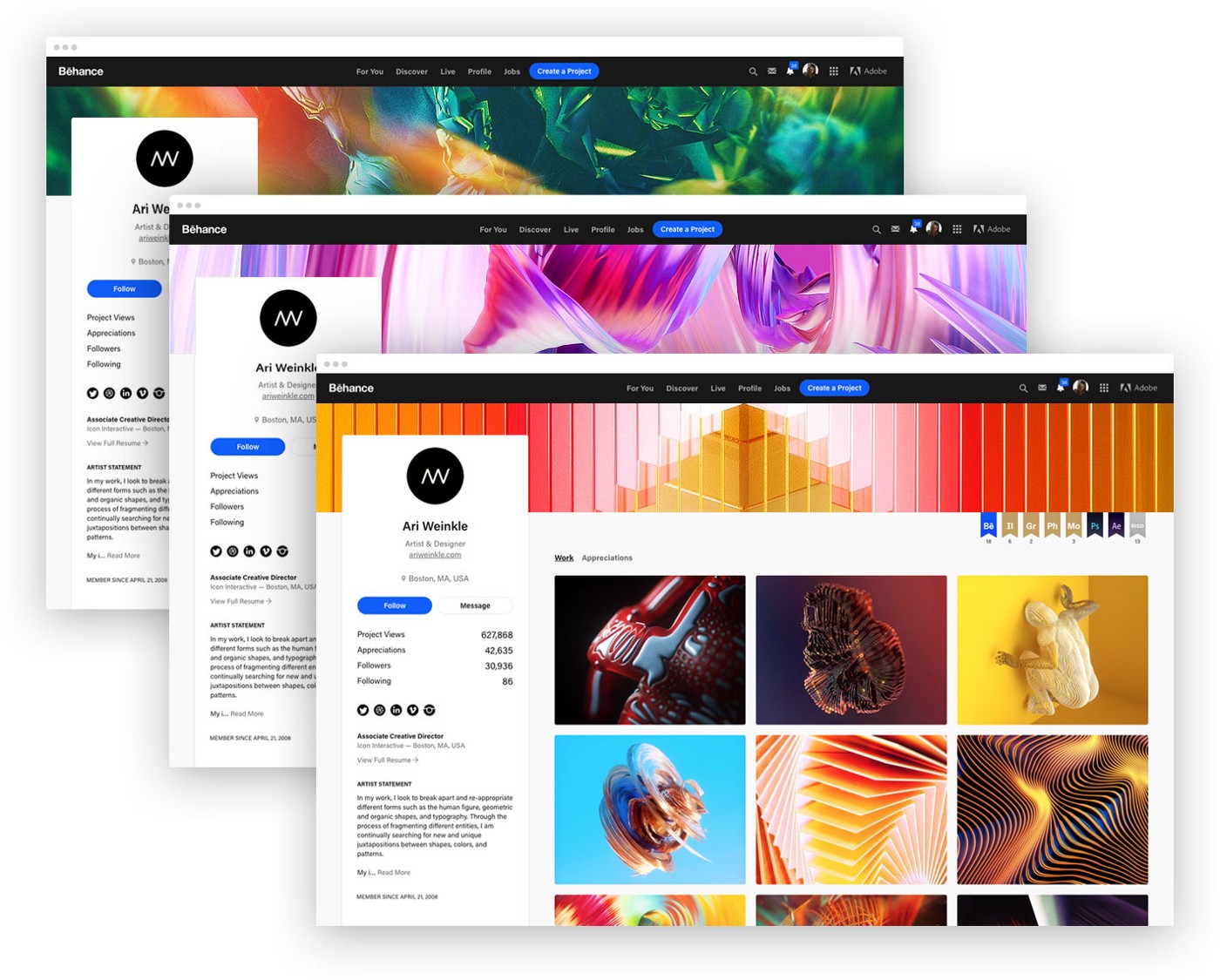
Bigger thumbnails: Not much to say, here. They took the old thumbnails, and scaled them right up. People get a better idea of what they’re looking at.

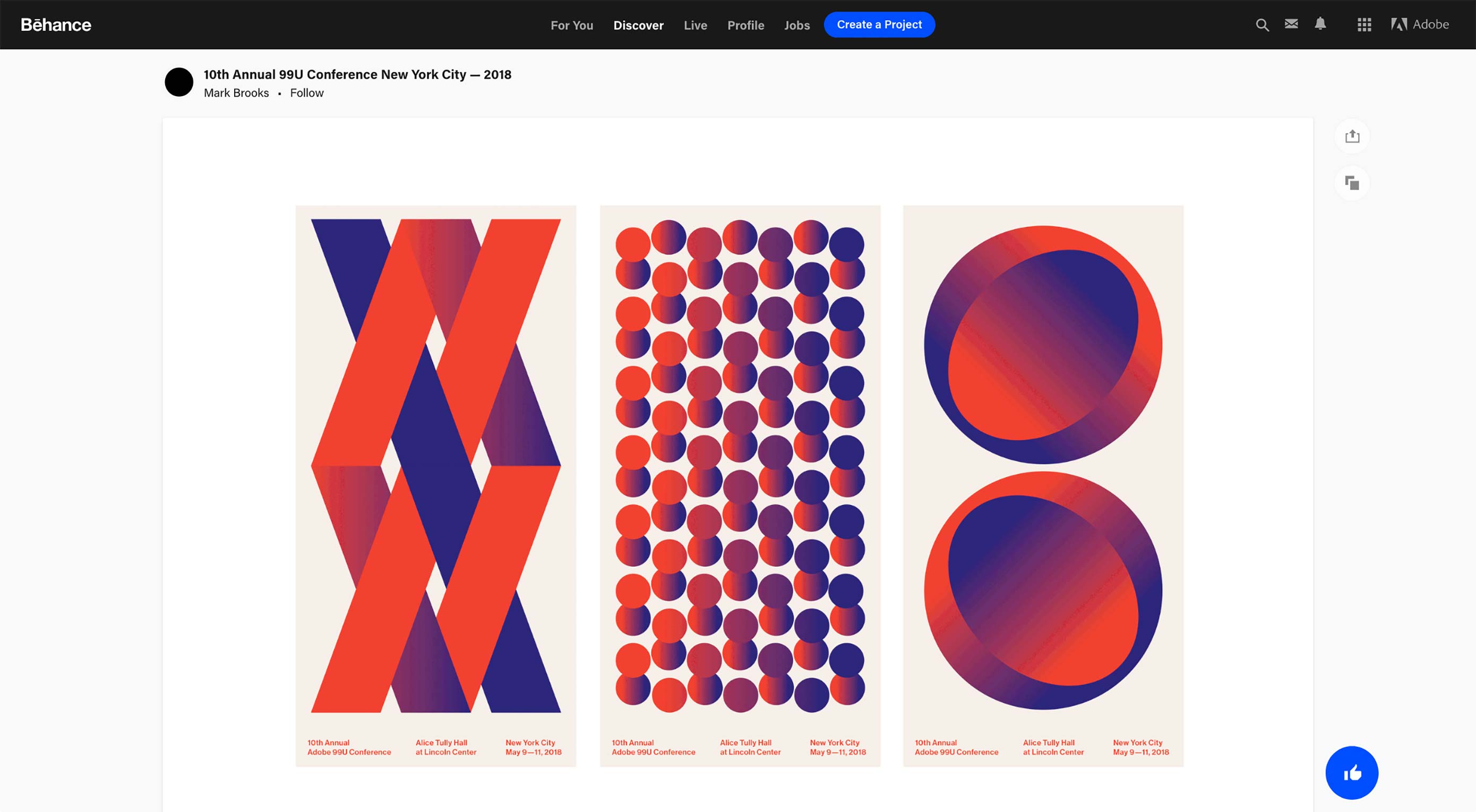
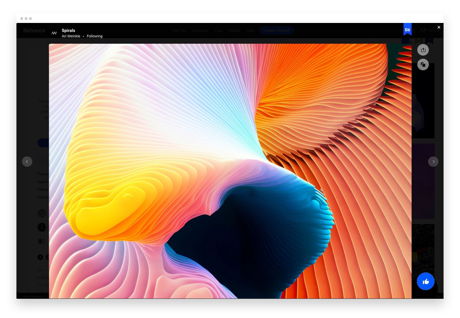
Projects
In their blog post on the update, Behance says, “… actions like Share, Save to Collection, Follow, and Appreciate are always present.” Basically, they kept this part of the UI very simple, and made the action buttons sticky, to reduce the effort it takes to interact with any particular project.
This is a simple but definitely good change. Projects tend to consist of one or more very, very long images, and scrolling can definitely take a while.
My Impressions
The whole experience is definitely tailored for desktop. That’s not to say people don’t look for designers on their phones, but if you really want to see the details, big screens make that easier. Adobe runs this show, so the decision is probably based on a fair amount of data telling them to cater to larger screens.
To be fair, any designer could probably have told them that. We might love our phones, but we work on desktops, laptops, and at the bare minimum, a big ole tablet. In fact, it would be fair to say that Behance is one of the few examples on the Internet where mobile-first design is… I’m going to say almost optional.
Beyond that, the changes just make sense to me. I do like it a lot when things are kept simple.
| Add Realistic Chalk and Sketch Lettering Effects with Sketch’it – only $5! |
p img {display:inline-block; margin-right:10px;}
.alignleft {float:left;}
p.showcase {clear:both;}
body#browserfriendly p, body#podcast p, div#emailbody p{margin:0;}
from Webdesigner Depot http://bit.ly/2sxVUnn
from WordPress http://bit.ly/2Rv1p5n
No comments:
Post a Comment