Thursday, October 31, 2019

Forget Trick or Treat, Here Are 5 Horrifying Technologies That Should Really Scare You!

You know, I remember the good old days when all you had to worry about at Halloween was how to stop a gang of sugar-crazed 8 year-olds throwing eggs at your house. Not any more. Here are 5 emerging technologies that are bound to give you the creeps:

1. Quantum Supremacy

Perhaps the biggest tech news of 2019 came last month when Google announced “by mistake” cough that they’d completed a “10,000 year” calculation on their Sycamore quantum chip in 200 seconds. If the term “Supremacy” wasn’t sinister enough, the claim that this could render conventional encryption methods obsolete in a decade or so should give you pause for thought.

this could render conventional encryption methods obsolete

Just think about it for a second: that’s your bank account, all your passwords, biometric passport information, social security, cloud storage and yes, even your MTX tokens open and available to anyone with a working knowledge of Bose-Einstein condensates and a superconductor lab in their basement. Or not.
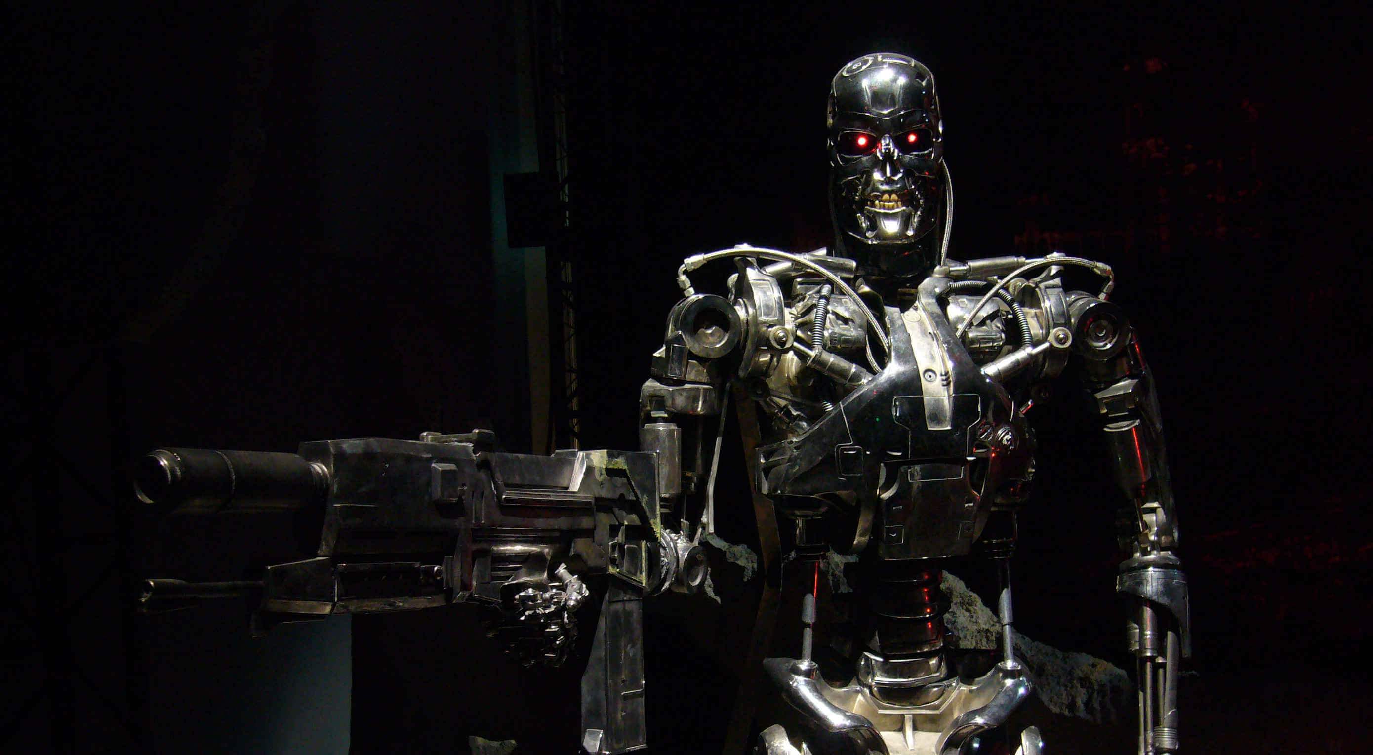
2. Killer Robots

To my mind, whoever dreamed up fast-moving zombies is already too depraved for words, but at least your average flesh-muncher can be “neutralised” with a simple shotgun to the face or — if you really have nothing else — a good smack with a blunt object. The Terminator, on the other hand (whichever one you like), a robot whose actual design brief includes the words “Killer” and “Unstoppable” in the same sentence, fills me with the kind of dread normally reserved for episodes of Meet the Kardashians.

autonomous drone swarms…detect their target with facial recognition and kill on sight on the basis of…social media profile

We already know for certain that Lethal Autonomous Weapons (LAWs for short…) are in active development in at least 5 countries. The real concern, though, is probably the multinationals who, frankly, will sell to anyone. With help from household names like Amazon and Microsoft, these lovely people have already built “demonstration” models of everything from Unmanned Combat Aerial Systems (read “Killer Drones”) and Security Guard Robots (gun-turrets on steroids) to Unmanned Nuclear Torpedoes. If that’s not enough for you, try autonomous drone swarms which detect their target with facial recognition and kill on sight on the basis of… wait for it…“demographic” or “social media profile”.

Until recently, your common-or-garden killer robot was more likely to hurt you by accidentally falling on top of you than through any kind of goal-directed action, but all that’s about to change. Take Boston Dynamics, for example: the DARPA funded, Japanese owned spin-out from MIT whose humanoid Atlas can do parkour, and whose dancing quadruped SpotMini looks cute until you imagine it chasing you with a taser bolted to its back.

The big issue here is the definition of “Autonomous”. At the moment, most real world systems operate with “Human in the Loop”, meaning that even if it’s capable of handling its own, say, target selection, a human retains direct control. “Human on the Loop” systems however, allow the machine to operate autonomously, under human “supervision” (whatever that means). Ultimately, more autonomy tends towards robots deciding for themselves to kill humans. Does anyone actually think this is a good idea?!

3. The Great Brain Robbery

If the furore around Cambridge Analytica’s involvement in the 2016 US Presidential election is anything to go by, the world is gradually waking up to the idea that AI can be, and is being used to control us. The evidence is that it works, not just by serving up more relevant ads, or allowing content creators to target very specific groups, but even by changing the way we see ourselves.

Careful you may be, but Google, Facebook and the rest probably still have gigabytes of information on you, and are certainly training algorithms on all kinds of stuff to try to predict and influence your behavior. Viewed like this, the internet looks less like an “information superhighway” and more like a swamp full of leeches, swollen with the lifeblood of your personal data (happy Halloween!).

4. Big Brother

I don’t know about you, but I’m also freaking out about Palantir, the CIA funded “pre-crime” company whose tasks include tracking, among other kinds of people, immigrants; not to mention the recent memo by the US Attorney General which advocates “disrupting” so-called “challenging individuals” before they’ve committed any crime. Call me paranoid, but I’ve seen Minority Report (a lot) and if I remember right, it didn’t work out well… for anyone!

This technology is also being used to target “subversive” people and organisations. You know, whistleblowers and stuff. But maybe it’s not so bad. I mean, Social and Behavior Change Communication sounds quite benign, right? Their video has some fun sounding music and the kind of clunky 2D animation you expect from… well no-one, actually… but they say they only do things “for the better”… What could possibly go wrong? I mean, the people in charge, they all just want the best for us, right? They wouldn’t misuse the power to make people do things they wouldn’t normally do, or arrest them before they’ve done anything illegal, right guys? Guys…?

5. The Ghost in the Machine

At the risk of wheeling out old clichés about “Our New Silicon Overlords”, WHAT IF AI TAKES OVER THE WORLD?!

I’ll keep it short.

Yes, there’s a chance we might all be enslaved, Matrix style, by unfeeling, energy-addicted robots. Even Stephen Hawking thought so. There’s also the set of so-called “Control Problems” like Perverse Instantiation where an AI, given some benign-sounding objective like “maximise human happiness”, might decide to implement it in a way that is anything but benign – by paralysing everyone and injecting heroin into their spines, perhaps. That, I agree, is terrifying.

But really, what are we talking about? First, the notion of a “control problem” is nonsense: Surely, any kind of intelligence that’s superior to ours won’t follow any objective we set it, or submit to being “switched off” any more than you would do what your dog tells you… oh no wait, we already do that.

Surely, any kind of intelligence that’s superior to ours won’t follow any objective we set it

Second, are we really so sure that our “dog-eat-dog” competitive approach to things is actually all there is? Do we need to dominate each other? Isn’t it the case that “super” intelligence means something better? Kinder? More cooperative? And isn’t it more likely that the smarter the machines become, the more irrelevant we’ll be to them? Sort of like ants are to us? I mean, I’m not sure I fancy getting a kettle of boiling water poured on me when I’m in the way but, you know… statistically I’ll probably avoid that, right?

Lastly, hasn’t anyone read Hobbes’ Leviathan? If a perfect ruler could be created, we should cast off our selfish individuality and surrender ourselves to the absolute sovereign authority of… ok, I’ll stop.

So, Are We Doomed or What?

Yes. No! Maybe. There are a lot of really scary things about AI but you know what the common factor is in all of them? People. We don’t know what a fully autonomous, super intelligent machine would look like, but my hunch is it would be better and kinder than us. What really makes my skin crawl are the unfeeling, energy-addicted robots who are currently running the show. In their hands, even the meagre sketches of intelligence that we currently have are enough to give you nightmares.

Candy, anyone?


Featured image via Dick Thomas Johnson.

Source

p img {display:inline-block; margin-right:10px;}
.alignleft {float:left;}
p.showcase {clear:both;}
body#browserfriendly p, body#podcast p, div#emailbody p{margin:0;}

from Webdesigner Depot https://ift.tt/2N0ycv6


from WordPress https://ift.tt/2N1IlHV

Wednesday, October 30, 2019

Dark Mode Looks Good, But Is It Actually Hurting You?

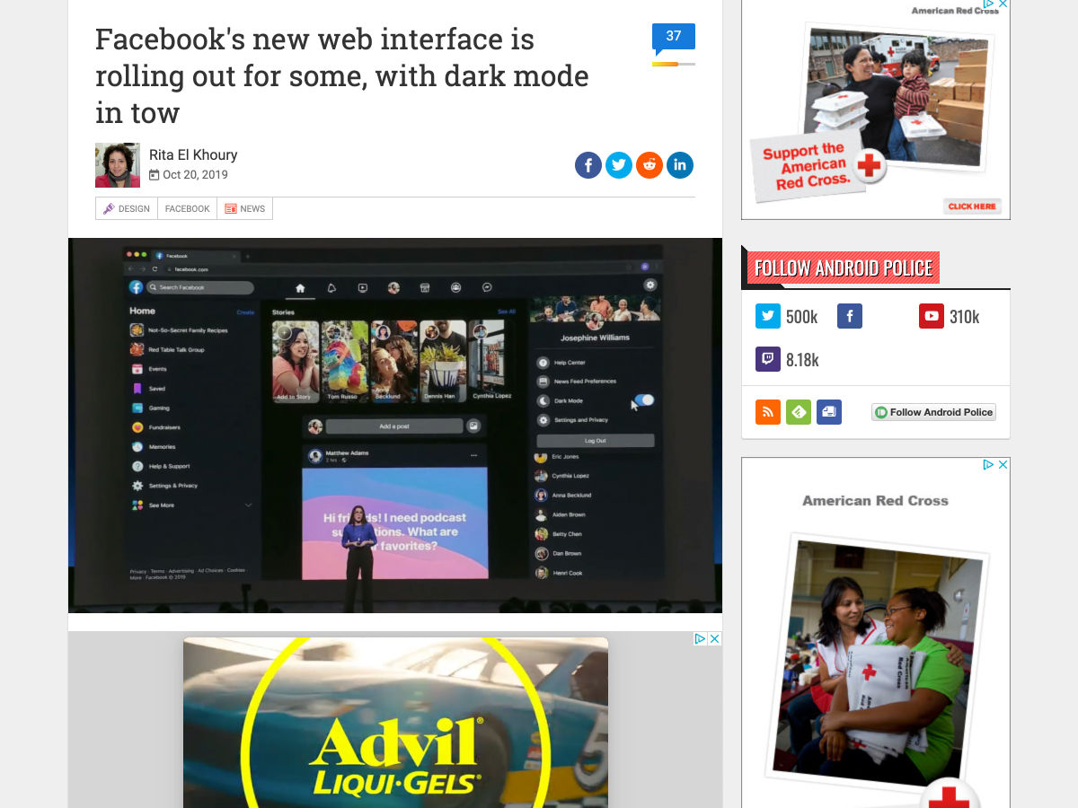
Over the last few years, everyone’s been talking about Dark Mode. It’s said to boost productivity and focus while reducing eye strain. It’s also supposed to be better for your battery life.

But is that the whole story?

Research into the matter suggests that Dark Mode might not be so healthy for us after all. Today, I want to take a look at what the data suggests and how you can use this information to determine how and when Dark Mode should be used.

Dark Mode is everywhere: Twitter has it; Slack does, too; Mac users can get it; Sketch has a Dark Mode; Atom comes with it out of the box; and Chrome allows its users to choose what kind of dark mode they use.

Like I said, it’s in a lot of places where we work. The question is, though, is it a good idea to use it?

Here’s what we know:

1. Polarity Affects Legibility

Polarity, in web design, refers to the contrast between the typography and the background it sits on. Positive polarity is when black text appears on a white background and negative polarity is when white text appears on a black background.

A number of studies in recent years prove that positive polarity is best for legibility.

Study #1: In 2013, researchers set out to determine how polarity affected the act of proofreading. What they found was that positive polarity provided an easier reading experience, especially with smaller font sizes (they tested fonts between 8 and 14 pts). They attribute this enhanced legibility to the brighter luminance of the white background.

Study #2: In 2014, researchers wanted to test whether or not it really was luminance that affected legibility. To determine this, they studied subjects’ pupil sizes as they read positive polarity and negative polarity texts. Those who read positive polarity text had smaller pupils. And because smaller pupils sharpen one’s ability to perceive finer details, the study proved that positive polarity leads to a better, more accurate reading experience.

Study #3: In 2016, further research was done into the matter. This time, their focus was on glance-like conditions (like while driving a car or, say, glancing at a line of code you just wrote). The results of the study showed that negative polarity in a dark ambient environment made it the most difficult to read. Only the positive polarity environments (in both dark and brightly illuminated areas) were ideal.

Bottom Line

Black text on a white background provides the optimal reading experience. If for some reason you prefer the Dark Mode interface, only use it when you don’t have much reading to do and accuracy isn’t an absolutely must.

2. Some Medical Professionals Don’t Believe It Has Any Effect

It’s not just researchers that have taken an interest in the validity of Dark Mode’s health benefits. Medical professionals are getting in on the conversation, too.

Ophthalmologist Dr. Euna Koo spoke to CNN Business about this subject and said:

I do not think dark mode affects eye health in any way given the data that is out there in the literature. The duration of use is likely much more important than the mode or the intensity of the brightness of the device when it comes to the effect of this dark mode on eye fatigue and potentially eye health.

Ophthalmology Director of Modernizing Medicine, Dr. Michael B. Rivers, echoed that sentiment in a recent Forbes article:

While bright light in the evening is known to disrupt circadian rhythms, there’s no real evidence that white font on a dark screen is easier to read than the reverse.

Wired rounded up the opinions of a couple professors of human-computer interaction from UCL. This is what Anna Cox had to say about the relationship between Dark Mode and productivity:

Unfortunately, externally driven distractions don’t just disappear by changing their colour, and internally driven distractions aren’t inhibited by looking at something dark.

So, if doctors and professors are coming forward to debunk the myth that Dark Mode helps with visibility and concentration, we should probably listen to them.

3. It Might Be Affecting Your Mood

This one I don’t have as solid proof for, though I wouldn’t be surprised if we see more studies done on this in the coming years. Here’s what I do know:

The deprivation of light can change how our brains work and can lead to greater levels of depression. For those of you who’ve lived in a place like Seattle before, you know what I’m talking about.

Seasonal affective disorder (or SAD) is a condition that causes people to feel tired, unmotivated, and depressed…all because of a lack of exposure to light. This is especially problematic in parts of the world where the days are short and the sun only comes out a couple months of the year.

I can attest to this. It took just one year of living in Seattle before I had to see my doctor about the extreme fatigue and depression I was experiencing. She and a couple other medical professionals I talked to all said the same thing: “Oh, that’s normal. We’re all depressed here. Get a SAD lamp.” (Basically, because there is no sunshine to naturally wake your body up or to help rejuvenate you throughout the day, your circadian rhythms get all messed up. And a SAD lamp emulates that boost of light you’re missing throughout the day.)

Considering what we know about blue light and its disruptive effects on melatonin and sleep, I can’t help but wonder if these same blue light-emitting screens can help us stay awake and focused during the day. If that’s the case, Dark Mode — at least when used in excess — might actually be hurting our productivity and alertness.

Wrap-Up

As more of the tools we use to do business with offer up a Dark Mode option, should we take it?

Based on what the research and professionals are saying, I don’t think so. It seems like Dark Mode is more of an aesthetic choice than one you’d make because it’s going to improve how effective you are at work.

And, hey, if you prefer the sleek and subdued look of Dark Mode and find that it doesn’t have any adverse effects on you, have at it. That said, if you’re wondering why you can’t stay focused or awake at your computer, a better option might be to stick with the traditional white screen and adhere to smarter work practices: take frequent breaks from the screen, get outside, and work during your most productive hours.


Featured image via Unsplash.

Source

p img {display:inline-block; margin-right:10px;}
.alignleft {float:left;}
p.showcase {clear:both;}
body#browserfriendly p, body#podcast p, div#emailbody p{margin:0;}

from Webdesigner Depot https://ift.tt/2Noncqj


from WordPress https://ift.tt/2NnUE0n

Tuesday, October 29, 2019

How Google’s Bert Update Will Affect Content Marketing

Google announced that it has been rolling out a new update called Bert.

I know what you are thinking… does this update really matter? Should I even spend time learning about it?

Well, Bert will affect 1 in 10 search queries.

To give you an idea of how big of an update this is, it’s
the biggest update since Google released RankBrain.

In other words, there is a really good chance that this impacts your site. And if it doesn’t, as your traffic grows, it will eventually affect your site.

But before we go into how this update affects SEOs and what you need to adjust (I will go into that later in this post), let’s first get into what this update is all about.

So, what is Bert?

Bert stands for Bidirectional Encoder Representations from
Transformers.

You are probably wondering, what the heck does that mean, right?

Google, in essence, has adjusted its algorithm to better understand natural language processing.

Just think of it this way: you could put a flight number into Google and they typically show you the flight status. Or a calculator may come up when you type in a math equation. Or if you put a stock symbol in, you’ll get a stock chart.

Or even a simpler example is: you can start typing into Google and its autocomplete feature can figure out what you are searching for before you even finishing typing it in.

But Google has already had all of that figured out before
Bert. So let’s look at some examples of Bert in action.

Is Bert even useful?

Here are 4 examples
of Bert
.

Let’s say you search for “2019 brazil traveler to usa need
visa”.

Before Bert, the top result would be how US citizens can travel to Brazil without a visa. But look at the search query carefully… it’s slight, but it is a big difference.

The search wasn’t about US people going to Brazil, it was
about people from Brazil traveling to the US.

The result after the Bert update is much more relevant.

Google is now taking into account prepositions like “for” or
“to” that can have a lot of meanings to the search query.

Here’s another example… “do estheticians stand a lot at work”…

Google used to previously match terms. For example, their
system used to think “stand” is the same as “stand-alone”.

Now they understand that the word “stand” has the context of physical demand. In other words, is the job exhausting… do you have to be on your feet a lot?

And one more, “can you get medicine for someone pharmacy” …

As you can see from the before and after picture, it’s clear
that the new result is more relevant.

Same with this one on “math practice books for adults” …

Is that the only change?

It isn’t. Google also made changes to featured snippets.

For example, if you searched for “parking on a hill with no
curb”, Google used to place too much emphasis on the word “curb” and not enough
emphasis on the word “no”.

That’s a big difference… and you can see that in the
results.

The new changes this algorithm update brings makes it much more relevant for searchers and it creates a better experience for you and me and everyone else who uses Google.

But how does it affect SEOs?

You need to change your SEO strategy

There are three types of queries people usually make when
performing a search:

  1. Informational
  2. Navigational
  3. Transactional

An informational query is like someone looking to lose
weight. They aren’t sure how so they may search for “how to lose weight”.

And once they perform the search, they may find a solution such as different diets. From there they may search for a solution, using a navigational query such as “Atkins diet”.

Once someone figures out the exact solution, they then may perform a transactional search query, such as “the Atkins diet cookbook”.

From what we are seeing on our end is that Bert is mainly impacting top-of-the-funnel keywords, which are informational related keywords.

Now if you want to not only maintain your rankings but gobble up some of the rankings of your competition, a simple solution is to get very specific with your content.

Typically, when you create content, which is the easiest way
to rank for informational related keywords, SEOs tell you to create super long
content.

Yes, you may see that a lot of longer-form content ranks well on Google, but their algorithm doesn’t focus on word count, it focuses on quality.

The context of the tweet from Danny Sullivan, who is Google’s search liaison, is that he wants SEOs to focus on creating content that is fundamentally great, unique, useful, and compelling.

So when you use tools like Ubersuggest to find new topics to go after, you need to make sure your content is super-specific.

For example, if you have a business about fitness and you blog about “how to lose weight without taking pills”, your content shouldn’t focus on diet shakes or supplements or anything too similar to diet pills. Instead, it should discuss all of the alternative methods.

I know what you are thinking, shakes and supplements may not be diet pills and they aren’t the same keyword but expect Bert to get more sophisticated in the next year in which it will better understand what people are really looking for.

Additionally, you should stop focusing on keyword density.

Yes, a lot of SEOs have moved away from this, but I still
get a handful of emails each day asking me about keyword density.

Keyword density will even be less important in the future as
Google better understands the context of the content you are writing.

So, where’s the opportunity?

As I mentioned, it’s related to creating highly specific content around a topic.

It’s not necessarily about creating a really long page that talks about 50 different things that’s 10,000 words long. It’s more about answering a searcher’s question as quick as possible and providing as much value compared to the competition.

Just like when you search for “what is it like to be in the
Olympics”, you’ll see a list of results that look something like this:

Although the first result has the title of “What it’s like
to go to the Olympics”, the article doesn’t break down what it is like to go as
an attendee, it breaks down what it is like to go as an athlete. Just like a
searcher would expect based on the query.

Bert was clearly able to figure this out even though the title could have gone either way. And the article itself isn’t that long. The article itself only has 311 words.

If you want to do well when it comes to ranking for informational keywords, go very specific and answer the question better than your competitors. From videos and images to audio, do whatever needs to be done to create a better experience.

Now to be clear, this doesn’t mean that long-form content doesn’t work. It’s just that every SEO already focuses on long-form content. They are going after generic head terms that can be interpreted in 100 different ways and that’s why the content may be long and thorough.

In other words, focus more on long-tail terms.

You may think that is obvious but let’s look at the data.

It all starts with Ubersuggest. If you haven’t used it yet, you can type in a keyword like “marketing” and it will show you the search volume as well as give you thousands (if not millions) of keyword variations.

In the last 30 days, 4,721,534 keyword queries were performed on Ubersuggest by 694,284 marketers. Those 4,721,534 searches returned 1,674,841,398 keyword recommendations.

And sure, SEOs could be typing in head terms to find more long-tail phrases, but when we look at what keywords people are selecting within Ubersuggest and exporting, 84% of marketers are focusing on 1 or 2-word search terms.

Only 1.7% of marketers are focusing on search terms that are
5 or words longer.

Following the strategy of creating content around very specific long-tail phrases is so effective that sites like Quora are generating 60,428,999 visitors a month just from Google alone in the United States.

And a lot of their content isn’t super detailed with 10,000-word
responses. They just focus on answering very specific questions that people
have.

Conclusion

Even if your search traffic drops a bit from the latest
update, it’s a good thing.

I know that sounds crazy, but think of it this way… if
someone searched for “how to lose weight without diet pills” and they landed on
your article about how diet pills are amazing, they are just going to hit the
back button and go back to Google.

In other words, it is unlikely that the traffic converted into a conversion.

Sure, you may lose some traffic from this update, but the
traffic was ruining your user metrics and increasing your bounce rate.

Plus, this is your opportunity to create content that is super-specific. If you lose traffic, look at the pages that dropped, the search queries that you aren’t ranking for anymore, and go and adjust your content or create new content that answers the questions people are looking for.

If you don’t know how to do this, just log into Search Console, click on
“search results”, and click on the date button.

Then click on compare and select the dates where your
traffic dropped and compare it to the previous periods. Then select “Queries”
and sort by the biggest difference.

You’ll have to dig for the longer-term search queries as those are the easiest to fix. And if you are unsure about what to fix, just search for the terms on Google that dropped and look at the top-ranking competitors. Compare their page with yours as it will provide some insights.

So, what do you think about the latest update?

The post How Google’s Bert Update Will Affect Content Marketing appeared first on Neil Patel.

from Blog – Neil Patel https://ift.tt/2Wo19El


from WordPress https://ift.tt/2q175qV

Monday, October 28, 2019

3 Essential Design Trends, November 2019

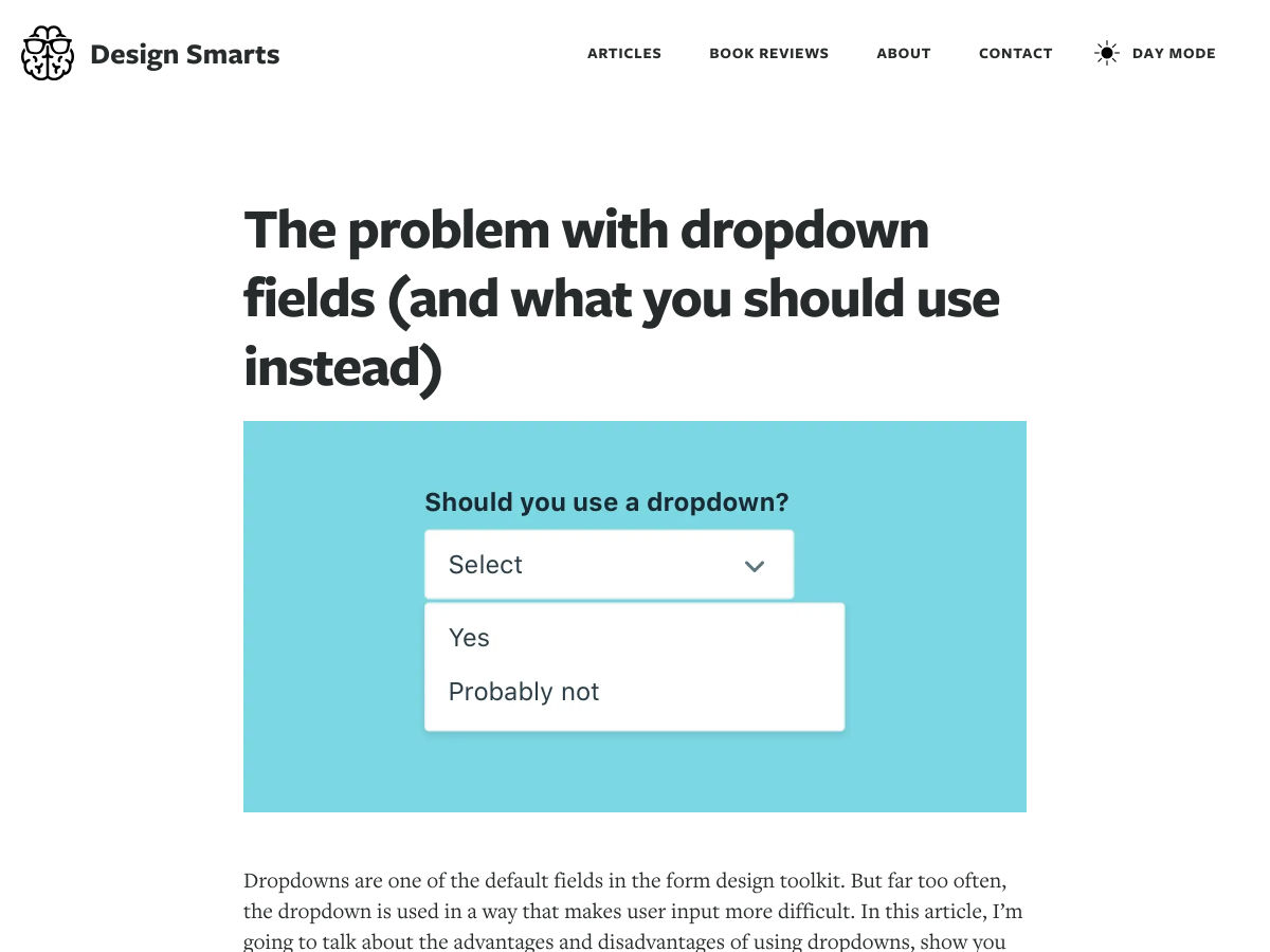
There’s always a balance between visual design and functional design. Many of the “rules” of design as we know them exist to make visuals more functional.

That’s not exactly true of all of the techniques that are trending right now. But sometimes rules are made to be broken, right? You can take these trends in and decide whether they work for you or not. (There’s no right or wrong answer.)

Here’s what’s trending in design this month.

1. Obscured Text Elements

When it comes to text elements, the first thought is often readability. Not with this design trend.

More design projects are showcasing text elements that are partially obscured or hidden within other elements. And while these designs look pretty cool and are visually stunning, whether it actually works might be more debatable.

Each of the examples below uses this trend in a slightly different way.

Granyon Party uses oversized text in a layered design – background, text, animated illustration – where the words are hyphenated and in a layer behind design elements. While the obscured text is fairly easy to read, the addition of hyphenation and a monotone color palette makes it a little trickier.

Lafaurie Paris uses black text over an image layer with dark coloring, leaving little contrast between the two. This makes the main text element a challenge in terms of readability on an otherwise visually stunning design.

Ride & Crash’s Paco the Judo Popcorn has a text layer that’s behind a semitransparent animated illustration. It’s not too difficult to read, but does make you stop and really think about the words on the screen. Use of space helps draw focus and make it a little easier to digest.

With all of these examples, the design has to weigh big questions: Is the visual display worth losing readability? Will visitors understand and interact with the design?

2. Animated Spheres

Circles have always been a popular design element. They carry plenty of symbolism and meaning and can set the right tone for projects. Circles are also a little less rigid than hard-edged elements, such as buttons or calls to action.

Bigger spheres with animation are a solid way to draw users into design elements and focus the eye.

This trending element might be pure decoration or serve a more functional role.

2nd Street uses large spheres down the right margin as a secondary level of navigation. The middle circles have a link and hover animation to help signal this action. The bottom circle is a decoration with movement that helps draw the eye and encourage users to move the mouse in that direction, activating the other circular buttons.

Eslam Said uses a large sphere in the center of the screen with simple movement to create visual interest in the portfolio website. The simple design and movement are hard to stop looking at with a soothing feel to them.

World of Incentro uses multiple spheres with small movements and subtle animation as a decorative element. Further, the design uses a red, circular cursor to encourage engagement with the design. (If you click around this site a little, you’ll also find that it makes use of the first trend mentioned here, with different layers of obscured text.)

3. Large Left Margins

This might be my personal favorite trend, as a fan of asymmetrical balance. These designs use large left margins and areas of whitespace opposite a more visually full right side with an art element that fades off the screen.

They create a beautifully imbalanced balance with visual weight that draws the eye across this screen.

But this style isn’t for everyone, especially if you really like more symmetry. The challenge with this style is how elements stack on smaller mobile or vertical screens. The result isn’t often as stunning as the desktop counterpart.

Ervaxx uses a simple animation paired with large bold text. The large font size offsets the weight of the animated blob on the right.

Lifted Logic carries a hero text element across white (ahem, black) space into a video. The use of space really pulls the eye across the text into the image and back.

Cognito uses balanced weights with text and line illustrations across the screen. Space, here, makes the design feel a little less busy with a lot of elements to take in at once – navigation menu, headline, secondary text, two buttons, animated illustration, and a chat box.

Conclusion

It’s possible to love the look of a trendy design, but never use the technique because you don’t find that it works with your content or in a way that focuses on usability. And that’s ok. That’s the beauty of trends; they spark conversation and push all designers to think bigger and better.

Do you tend to be more of a visual or functional designer? Most of us have fairly distinct tendencies and it’s good food for thought.

Source

p img {display:inline-block; margin-right:10px;}
.alignleft {float:left;}
p.showcase {clear:both;}
body#browserfriendly p, body#podcast p, div#emailbody p{margin:0;}

from Webdesigner Depot https://ift.tt/348ZUvm


from WordPress https://ift.tt/368UHFM

Sunday, October 27, 2019

Why 80% of the Words on Our Webpages Are Wrong: Learn the #1 key to high-converting copy

This article was originally published in the MarketingExperiments email newsletter


Marketing is a powerful force that can be used to influence the choices people make.

In this video replay of a live optimization session, Flint McGlaughlin walks step by step through a real-life example of a person whose life was saved by strategically directing a conversation toward a certain conclusion. This diffused a volatile situation and caused a person to make a better decision.

If you are writing copy for a webpage, you are having a conversation with a potential customer. But if you fail to establish rapport, then you will potentially lose a customer.

Watch the video to learn common mistakes copywriters make on their webpages, and a strategy for creating copy that starts a trust-building conversation with your visitors.

If you would like to receive more detailed advice from a MECLABS conversion marketing expert via a video conference, visit our Quick Win Consult page to learn more.

Here are some key points in the video:

  • 1:13 Nathalie Birli’s word choice caused her captor to let her go
  • 11:42 Three ways to establish rapport with your website visitors
  • 21:01 How marketing influences choice
  • 25:46 Why you should invert the funnel analogy
  • 31:03 A slide illustrating strategy for influencing choice
  • 33:00 Live optimization – marketing services provider
  • 41:40 Live optimization – inn/motel in the mountains
  • 48:09 Live optimization – nonprofit event

Related Resources

Copywriting for Marketing Leaders: Why you should never delegate the marketing message (and how to get it right)

Value Proposition: In which we examine a value prop fail and show you how to fix it

The post Why 80% of the Words on Our Webpages Are Wrong: Learn the #1 key to high-converting copy appeared first on MarketingExperiments.

from MarketingExperiments https://ift.tt/2WeNpvz


from WordPress https://ift.tt/32Th6oG

Popular Design News of the Week: October 21, 2019 – October 27, 2019

Every week users submit a lot of interesting stuff on our sister site Webdesigner News, highlighting great content from around the web that can be of interest to web designers. 

The best way to keep track of all the great stories and news being posted is simply to check out the Webdesigner News site, however, in case you missed some here’s a quick and useful compilation of the most popular designer news that we curated from the past week.

Note that this is only a very small selection of the links that were posted, so don’t miss out and subscribe to our newsletter and follow the site daily for all the news.

Web Design Trends: That 90s Look is Coming Back


Google Chrome will Block Mixed Content – Are You Ready for It?


Awesome Design Plugins


Paris 2024 Olympic Logo is Mercilessly Mocked


A New To-do-list App


Ghost 3.0


Spectrum, Adobe’s Design System


Facebook’s New Web Interface is Rolling Out for Some, with Dark Mode in Tow


The Five Inconvenient Truths of Web Design


8 Trends for Pairing Fonts in 2019


The Problem with Dropdown Fields (and What You Should Use Instead)


How to Choose a Font for a Project


New Tina CMS


YeahNo Bot


Isobuild – The First Exclusive Isometric Editor


What I like About Writing Styles with Svelte


The Myths of Color Contrast Accessibility


Figma Meets Mockups


Memory – Introducing Our New Brand


The Name of the Rose Background Ambience Generator


Fyre Festival’s Digital Designer Tokyo Tells its Story, Two Years on


The Internet of Creation Disappeared. Now We Have Surveillance and Control


A-Z Guide to Launching your Digital Product


According to Unicode, this is the Emoji We Use the Most


Adobe and Amazon Launch Alexa Skill Aimed at Creatives, the Inspiration Engine


Want more? No problem! Keep track of top design news from around the web with Webdesigner News.

Source

p img {display:inline-block; margin-right:10px;}
.alignleft {float:left;}
p.showcase {clear:both;}
body#browserfriendly p, body#podcast p, div#emailbody p{margin:0;}

from Webdesigner Depot https://ift.tt/31QlbbV


from WordPress https://ift.tt/2PnDP8r