Friday, May 31, 2019

Top 10 Color Pickers for 2019

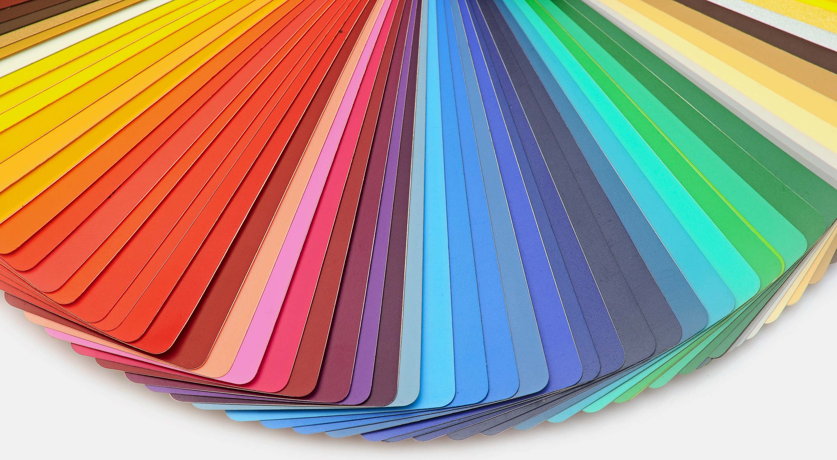
Saving color palettes you find online or as you’re working on a design is not always an easy process. You could use the browser’s Inspect tool to grab the hex code or grab a screenshot and use Photoshop later on to pull the colors from it.

Or you could simplify the process and grab a dedicated color picker tool that will allow you to grab color from any website, on desktop or on mobile without having to leave your browser window. Here are 10 best color pickers that will make it easy to save color palettes.

1. Instant Eyedropper

Instant Eyedropper is a free Windows-only tool that makes it easy to grab a color from anywhere on your screen. Once you install this lightweight app, it will sit in your system tray. All you have to do is click its icon and choose a color, then the app will copy the code to your clipboard. The app supports the following color code formats: HTML, HEX, Delphi Hex, Visual Basic Hex, RGB, HSB, and Long.

2. ColorPic

ColorPic is another lightweight Windows color picker tool that works with all major versions of Windows. It’s not a free program although it offers a free trial. It was designed to work specifically with high resolution screens and supports HEX, RGB, and CMYK color formats. You can save up to 16 colors in the palettes, and use 4 advanced color mixers to adjust the colors.

3. Eye Dropper

Eye Dropper is a browser extension that works on Google Chrome and any other Chromium-based browser. The extension allows you to quickly and easily grab a color from anywhere in your browser and displays it in HEX or RGB format. You can save colors to history and they are automatically copied to your clipboard when you pick a color. The extension is free to use.

4. ColorPick Eyedropper

ColorPick Eyedropper is the second-most popular browser extension that works in Chrome and Chromium-based browsers. What sets it apart from the Eye Dropper extension above is the ability to zoom in on any area of the browser window to help you focus in on the exact color you want. The app is free for personal use and it also has its own desktop app if you want a tool that works outside your browser window.

5. ColorZilla

ColorZilla is a Firefox extension that allows you to grab any color from any page that’s open in your Firefox browser window. This extension has a built-in palette that allows you to quickly choose a color and save the most used colors in a custom palette. You can also easily create CSS gradients. The extension is free and supports HEX and RGB color formats. It can also be used with a Chrome browser.

6. Rainbow Color Tools

Rainbow Color Tools is another free Firefox extension that makes color picking easy. The extension lets you easily pick a color and it also includes a website analyzer that extracts the color scheme from the current website’s images and CSS. It supports RGB and HSV color formats and allows you to save the colors into your own personal library that lets you tag images based on websites you picked colors from or your own tags.

7. ColorSnapper 2

The ColorSnapper 2 is a color picker for Mac users that helps them find a color anywhere on their screen. The app is invoked by clicking the menu icon or through a global shortcut and it has a unique high-precision mode for better accuracy. You can choose between 10 different color formats and control the app with gestures and keyboard shortcuts. The app is available in the app store and comes with a 14-day free trial.

8. Just Color Picker

Just Color Picker is a multi-platform utility for choosing colors. This tool allows you to pick colors, save them, edit them, and combine them into color palettes ready for use in other applications. It supports a wide range of color formats and includes a zoom tool for better accuracy, the ability to edit Photoshop and Gimp color swatches, and it can even calculate distance between two pixels.

9. iDropper

iDropper is a color picker for iOS devices. It’s compatible with iPhones and iPads so if you do design work on your iPad, you’ll easily be able to grab colors, save them, and use them in any application. You can save colors to your favorites and supports RGB, HEX, HSV, and CMYK format. The app is free to download and use.

10. Pixolor

If you belong to team Android, then be sure to check out the Pixolor app. When you enable the app, it shows a floating circle over other apps along with the color information beneath it. To copy the color code, all you have to do is click the Share button or tap outside the circle overlay. The app supports RGB and HEX color formats.


Featured image via DepositPhotos.

Add Realistic Chalk and Sketch Lettering Effects with Sketch’it – only $5!

Source

p img {display:inline-block; margin-right:10px;}
.alignleft {float:left;}
p.showcase {clear:both;}
body#browserfriendly p, body#podcast p, div#emailbody p{margin:0;}

from Webdesigner Depot http://bit.ly/2WHGVIx


from WordPress http://bit.ly/2W7IjzP

Thursday, May 30, 2019

How to Create Identity Guidelines That Empower Your Clients

I’ve never really enjoyed writing brand guidelines, I always felt it got in the way of the “real” design work i wanted to be doing. But I also really don’t enjoy designing a carefully thought out, beautifully executed logo only to see it used and abused by a poorly informed client. To work on creating a visual identity and then to send it out into the world with the equivalent of a hastily scrawled map on the back of a cigarette packet is woefully inadequate.

Through research and conversations with some world class identity designers I’ve found a solution to helping clients use their new visual identity to their absolute – a pattern library. We’ve all seen the beautiful digital UI kits, pattern libraries and style guides created by the likes of Mailchimp for their digital products, well its time to start creating similar for identity guidelines.

I’ve found the easiest solution is to establish and understand all the ways the identity is going to be used during the discovery stage. A real deep dive into what the client has in mind for the logo and second guessing uses they might not have thought of means there are no surprises and it can also really help inform the final design.

Here are some guidelines I’ve been using recently – these will all be included in the final identity pattern library.

For Use on Digital

A logo has to be responsive these days, it needs to work on all screen sizes so undoubtedly there will be several different versions of the logo — a desktop version, a different more simplified version for small screen sizes, possibly one for tablets. You may need an even more simplified version for use on the favicon in different sizes and and in different colors for various browsers.

For Use on Social Media

When using the identity in social media remember one size does not fit all on the various platforms — find out which platforms your client uses or may use. have test accounts set up on all the major platforms so you can test the usage as you are designing it. Some platforms use square images some use round. Nobody wants those black edges when the wrong shaped jpg has been used in a profile pic. Mock up each social media platform page to demonstrate how to use the logo and on twitter include a suggested theme color. Also suggest image styles to use in the profile header.

For Use in Emails

What about emails, do they need a file specific for an email signature or a few different versions for Mailchimp. Consider using thumbnail mockups of a couple of different mail chimp layout scenarios so the client can see which logo to use where.  

For Use on Imagery

Does the logotype need to overlay imagery, at what screen size? Again maybe different versions for different size imagery, what about dark imagery and light imagery — show which version to use on which. Demonstrate the type of photography that would be a good fit for them and that would work well with their logo.

For Use on Videos

Which logo needs to be used on videos if the logo is overlaying a video what size and opacity should they use?

For Use in Print

Demonstrate how the variations of the logo can be used on different documents from business cards to brochures, what backgrounds should  the white logo version be used on and what background should the colored version be used on. Whether there are any elements of the document that can be used alone for example shapes or an ampersand used in the logo. These don’t have to be long drawn out full blown documents but thumbnails and mock ups. Things that will enable the client as much as possible. Explain why a certain layout will work best.

Usage Variations

Is there a logotype version or just a logomark, is there a stacked version or a version with a strapline. When should these be used? Will the strapline be used on its own. How will this work? What will it look like? Again show real life scenarios.

Clear Labeling on Files

Label the files clearly and demonstrate their use in real life scenarios through mock ups and detail which file name should be used for which scenario.

Colors

Demonstrate the colors, contrast and variations and show how they can be used and explain why certain scenarios won’t work and demonstrate why. Explain when transparency is appropriate and when it isn’t. Think about what the client truly needs as opposed to what you’ve always sent out. Will they really need a black version of their logo? Might they use it incorrectly if you supply them with one? Explain when PNGs should be used and when Jpegs should be. Explain the color variations that will be experienced from print and digital. Include Hex, CMYK, RGB and Pantone where possible. explain why colors look different in print than digitally

Type

If type is used in the logo explain whether it’s appropriate to use it on other things such as websites, often it isn’t but I’ve seen clients use it because that is what there logo is in. So suggest typefaces that would work really well even if there is not a typeface used in the logo make suggestions for their other collateral.

Conclusion

More than anything I’ve found that mocking up in situ scenarios has been the most effective way of enabling the client. Together with the use of clear and concise language — communication is key. Label files clearly and in a way that will make sense to a client and then reference these in your guidelines so they are not left guessing which one to use. As well as supplying the appropriate files its important to demonstrate each of these versions in the identity guidelines don’t leave them guessing.

I know this seems like a huge amount of work but it is beneficial for everybody involved. The client will feel truly empowered and to go out and use the brand correctly, you will have provided a top notch service to your client, their beautiful new brand will be out in the world showcasing your stunning work  and you will have helped them create a sense of cohesion through everything which will not only reflect well on them but on you too.


Featured image via DepositPhotos.

Add Realistic Chalk and Sketch Lettering Effects with Sketch’it – only $5!

Source

p img {display:inline-block; margin-right:10px;}
.alignleft {float:left;}
p.showcase {clear:both;}
body#browserfriendly p, body#podcast p, div#emailbody p{margin:0;}

from Webdesigner Depot http://bit.ly/2HIjCWq


from WordPress http://bit.ly/2JKNrYN

Wednesday, May 29, 2019

How to Perform a Thorough SEO Audit in Less Than 3 Minutes

seo analyzer

They say there are over 200 ranking factors in Google’s algorithm.

But are you going to take the time to optimize your site for each and every single one of them?

Well, you should… but you probably won’t.

See, SEO has changed… it used to be that you could do a handful of things and rank well. Sadly, those days are gone.

Now you have to do every little thing and do it well to dominate Google.

So, I decided to make your job easier and release yet another new feature in Ubersuggest that audits your website for you in less than 3 minutes.

It’s called SEO Analyzer.

Introducing SEO Analyzer

If you want to find out what’s wrong with your website, you won’t have to do it manually anymore.

All you have to do is head over to the SEO Analyzer and put in your URL.

seo analyzer

How SEO Analyzer works

Once you put in your URL, you’ll be taken to a report that looks something like this:

seo analyzer

Once the report loads (it typically takes 3 minutes or less), you’ll see an overview like the image above.

The overview is broken down into 3 main sections.

Overview

overview

The first section shows you your on-page SEO score (the higher the better), your estimated search traffic, the number of keywords the domain ranks for, and how many backlinks the site has.

You’ll also see a message from me that breaks down how many pages were crawled and any SEO errors that were found.

When you click on any of those 4 boxes, it will take you to a more in-depth report.

Clicking on the on-page score takes you to a page that lists out your SEO errors. It looks something like this:

seo issues

Clicking on the organic traffic takes you to a report that shows you how well your site is performing.

traffic analyzer

Clicking on the keywords box shows you all of the keywords your website ranks for organically.

keywords

And clicking on the backlinks box shows you all of the sites linking to that domain.

backlinks

Site health

This is my favorite section of the site audit report. This is where you can really dig around and boost your rankings

site health

You can click on any of the four site health boxes and drill down into more reports.

This is important because you’ll want to first focus on clearing up any critical errors. From there, you’ll want to fix any warnings and then, finally, consider doing any of the given recommendations.

The health check box gives you an overview of the healthy pages and the ones that have issues or are broken or blocked or even redirected. By clicking on this box you’ll get taken to a report that lists all your SEO issues in detail.

seo issues

From there you can click on any of those issues and you’ll be taken to the exact pages that contain any SEO errors and what they are exactly. An example of this is pages with too long of a title tag.

long titles

If you aren’t sure on how to fix any of the issues, just click on “what is this and how do I fix it?” and a box like this will appear:

how to fix

And if you click on the critical errors, warnings or recommendations boxes, you’ll see reports just like the ones above. They will be broken down by how important they are.

hard easy

That way you’ll know which fixes have the greatest SEO impact and how hard they are to implement.

You should first focus on the ones that have the highest SEO impact and are the easiest to implement. And I took the liberty to prioritize the table for you, so all you have to do is start at the top and work your way down to the bottom.

Site speed

Speed is important. Not only do faster load times help boost conversion rates, but they also help boost your search rankings.

site speed

There are two sections to the site speed. The section on the left breaks down your desktop load time and the section on the right breaks down your mobile load time.

Site speed varies drastically by a person’s connection and computer, but the charts give you a rough range of how fast or slow your site loads.

Your goal should be to have your site load in 3 seconds or less for both mobile and desktop.

The report even breaks down which areas are slowing down your site speed.

For example, you could have an issue with “First CPU Idle”… and if you aren’t sure what that means, just hover over the question mark and the tool will tell you.

tool tip

Top SEO Issues

I know I said the report has 3 main sections, but the 4th section is just repeating the site health section.

top seo issues

You’ll see the 3 most important fixes that you should make to your site if you want higher rankings.

If you don’t have the time to fix everything, start off by fixing the 3 issues listed here. Those will give you the biggest bang for your buck.

Conclusion

So, what do you think about the SEO Analyzer report? Do you think it was a good addition to Ubersuggest?

I know I haven’t talked about the SEO Analyzer report much, but we’ve been working on it for 4 months now.

For now, the tool crawls the first 100 pages on your website, and eventually, our goal is to increase the limit to 500 or even 1,000. Technically we can do that fairly easily, but for the launch, I’ve capped it at 100 due to the sheer number of users I have and server load.

Give the SEO Analyzer a try and let me know what you think.

The post How to Perform a Thorough SEO Audit in Less Than 3 Minutes appeared first on Neil Patel.

from Blog – Neil Patel http://bit.ly/2XaXFo9


from WordPress http://bit.ly/2HGXfAS

5 Web Design Turn-Offs To Avoid

The Internet of today is a highly competitive place. With so many individuals and businesses spending money and time on digital marketing and SEO — trying to outperform their rivals and sit at the top of the Google heap — it’s harder than ever to get users to visit any given website over another.

Given the difficulty of acquiring new visitors, you might think that all the webmasters of the world would do everything in their power to provide a delightful user experience and ultimately retain each hard-won customer, but we all know that there are a number of unpleasant and off-putting bad habits that seem to crop up time and time again.

Let’s take a look at some of the most common offenders making users leave in frustration…

1. The Site is Too Slow

In a world where almost everybody has a super-powered smartphone in their pocket, the Internet has become synonymous with instant gratification. A user who might be idly wondering about some half-remembered trivia can have the answer delivered to them via Google within a few seconds, and if they want to contact a friend in another country thousands of miles away, they can do so basically as quickly as they can type the Facebook or Whatsapp message.

If the original click was motivated by nothing more than frivolous curiosity, the user is very likely to think, “ugh, never mind” and try somewhere else

We’ve all become spoiled by the speed and responsiveness of our hyper-connected world, and so when we click on a search result and sit on a blank loading page for three seconds or more it can seem like an eternity. If the original click was motivated by nothing more than frivolous curiosity, the user is very likely to think, “ugh, never mind” and try somewhere else.

The BBC reported in 2018 that they’d found that every additional second spent loading pages tended to cost them around 10% of their users, which in Internet terms is huge (by this measure, the passing of ten seconds can mean that your traffic is all but gone).

Google have also stated that according to their research, more than half (53%) of mobile users will abandon a site that takes longer than three seconds to load. After six seconds, it’s almost a guarantee that they’ll look elsewhere. 

Of course, the functional needs of the majority of websites are not very complicated — the average e-commerce store or blog site really has no excuse for taking longer than a couple of seconds to load.

2. Too Much Popup Clutter

We’ve all had the experience of clicking a link in our Google search results and being taken to a page that seems to be doing everything in its power to stop us from reading the content. Within two seconds, an enormous screen-filling popup will appear, along with — something familiar to all Internet users in the EU — a GDPR/cookie popup, giving you two things to click on at once.

Combined with a browser alert that “this website would like to send you notifications”, the overall effect is one of being bombarded with irrelevant nonsense that entirely buries the actual content you were trying to reach — content that you are now expected to excavate yourself by manually dismissing each of the popups.

The use of popups continues to be a divisive topic; some designers and advertisers cite significantly improved conversion rates thanks to their use, whilst others are put off by their potential for user irritation (with one study from 2013 finding that a startling 70% of people consider them annoying). 

However you feel about them, we can probably all at least agree that popups are often done badly. They may have their uses, but delivering too many at once and not respecting the user’s desire to see content that is relevant to their interests is more likely to result in a bounce than not.

As for GDPR and cookie notifications, whilst these are a legal requirement for all websites serving data to users from the European Union there are certainly ways of presenting them that are more disruptive than others — and web designers from outside the EU can sometimes forget that these messages can add another layer of visual clutter for a significant percentage of their audience.

3. Mobile-Unfriendliness

It’s remarkable to see in 2019, but many web designers still seem to treat the mobile version of a website almost as an afterthought. It’s still not uncommon to find a mobile site where items are misaligned, overlapping, formatted strangely or subject to some other oversight from the designer, all of which can signal to a visitor that your company doesn’t take the time to go over little details.

It’s worth remembering that catering for mobile users is not “serving a niche”, it’s now the most important part of the job. Statista reported that 52.2% of all Internet traffic happened on mobile phones in 2018 (up from 50.3% the previous year), proving that desktop browsing is actually now the less-used way to explore the web.

Coupled with Google’s algorithm change in March 2018 to prioritise mobile-first indexing, there is now no reason at all to neglect the mobile experience of your website. A low-quality mobile site can negatively affect your SEO performance as well as the experiences of your users, so it’s important to get it right.

4. Too Much Animation

We get it: animation looks great. Nothing says, “I’m a professionally-designed website!” like some nice smooth transitions, transforms and appearances, and well-deployed animation can breathe vital life into an otherwise static and sterile layout.

animation is a spice to be used sparingly

However, animation is a spice to be used sparingly and it can be distracting if overdone. Ideally it should support and draw attention to key content and call-to-action buttons – and not overwhelm the user with things popping up and swooshing around to the point that they’re too bewildered to read the actual text. 

Animated introductory screens, too, are great attention-grabbers when users first arrive on your site, but don’t make them sit through the same animation every time they want to return to the homepage. 

In general, the function of website elements shouldn’t be dictated by their aesthetic presentation; requiring users to wait for an element to appear or to become interactive because of an animation is not a great tactic, and this can cause users to resent the animation for getting in the way of what they’re trying to do.

For example, a returning user may know as soon as they arrive that they’re intending to click the “About Us” button, but making them wait while the navigation bar unhurriedly does a fade-in animation to show them the button before they can click is likely to cause irritation.

A related note is that some animations can cause accessibility problems; using a lot of moving parts or content that flashes can pose problems for some users (such as those who might have an attention deficit disorder), making it very difficult for them to concentrate on the content.

5. Autoplay Media

No discussion of irritating web design faux pas would be complete without mentioning autoplay media. It’s been the bane of web users since the early days of the Internet, but unlike status bar marquees and GIFs of CGI dancing babies it still hasn’t gone away.

There are ways to do it tastefully, but it’s so often misused that it certainly deserves a spot on our list. Whereas autoplayed MIDI music and Flash sites with audio were the scourge of the 1990s and early 2000s, the pox of today’s world is autoplay video. 

Many sites today will put a video playing next to the body text of an article or blog post — often this is entirely irrelevant to the content of the page, and if you close it before navigating to another page, it quickly reappears. Of course, this is highly distracting and often feels rather presumptuous (as though the website is saying, “hey, I know you clicked to read an article about digital design trends, but wouldn’t you prefer to watch this video of our glitzy charity gala?”)

Even worse, many sites preface these videos with automated advertisements which, given that the videos themselves are generally advertisements in one form or another in the first place, is tantamount to asking visitors to sit through an advert for an advert.

One small mercy, at least, is that modern browsers such as Chrome have been moving towards only allowing autoplay on videos which are either silent or muted, significantly curbing the frequency of the extremely annoying user experience of having unsolicited audio played at you.

Wrapping Up

Ultimately, all of the problems discussed in this article are issues of bad UX design. Every element of the site must be appraised for its impact on the function of the page: Does it help or hinder the user in finding what they’re looking for? Does it enhance or detract from the actual content of the page? Does it shorten or lengthen the process the user must undergo in order to complete a transaction?


Attracting users to your website is often no mean feat, and it makes sense to reward those who do arrive by anticipating their needs and treating both their time and their attention with the respect they deserve. In this way, well-treated users can become loyal repeat visitors, and a website can never, ever have too many of those.


Featured image via DepositPhotos.

Add Realistic Chalk and Sketch Lettering Effects with Sketch’it – only $5!

Source

p img {display:inline-block; margin-right:10px;}
.alignleft {float:left;}
p.showcase {clear:both;}
body#browserfriendly p, body#podcast p, div#emailbody p{margin:0;}

from Webdesigner Depot http://bit.ly/2VTpCj2


from WordPress http://bit.ly/2Mur5gv

Tuesday, May 28, 2019

4 Times When it’s OK to Trick Users

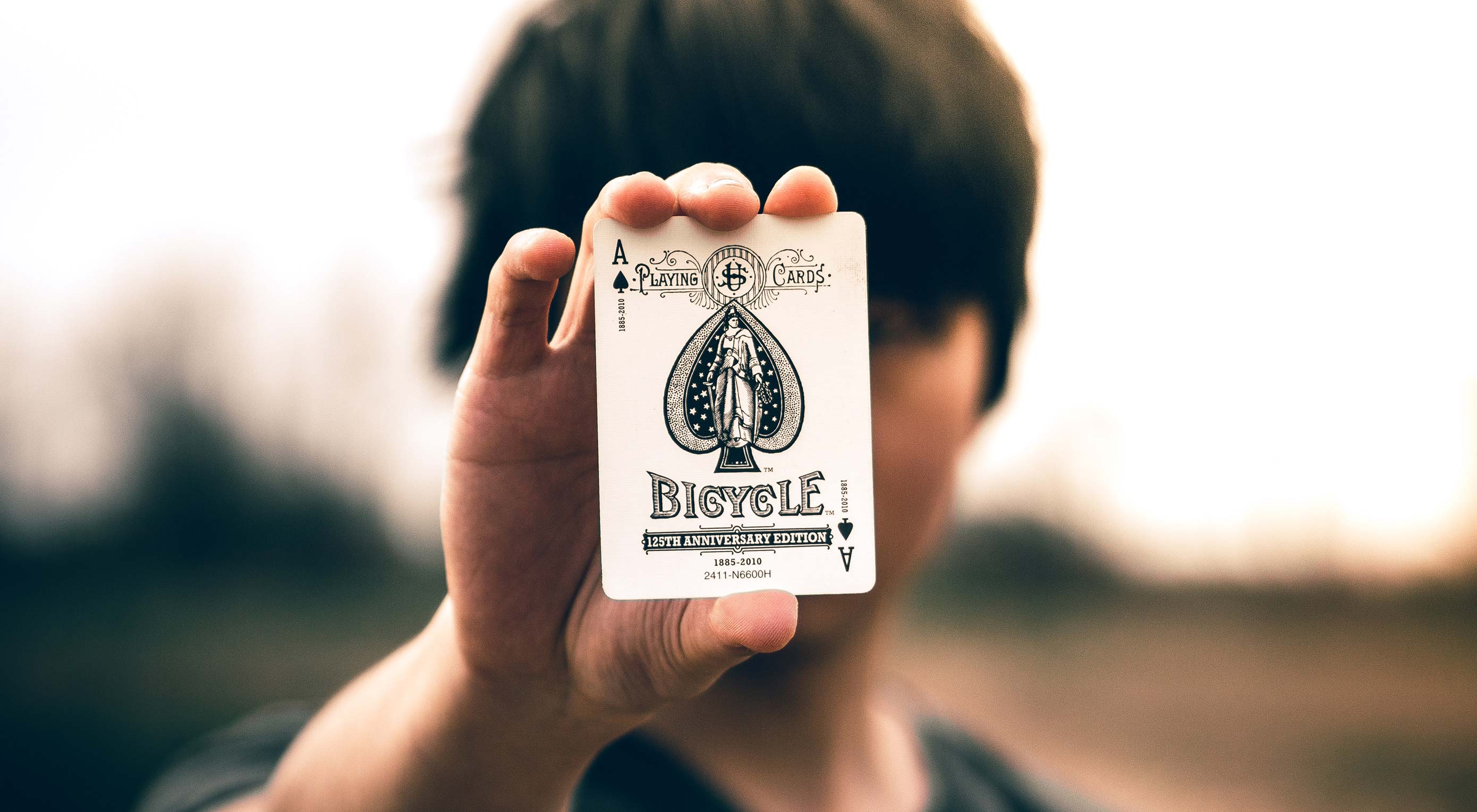
Tricking people can be… well… tricky. The problem, at its most fundamental level, is that people only like to be tricked when they expect to be tricked. Obviously, if you trick them and take money they never intended to give away, well that’s theft. They rightfully get angry. If you say, “Hey, wanna see a trick? Give me a dollar.”; well then they expect some David Copperfield-level magic, don’t they?

In fact, they demand it.

And that’s the thing about designing interfaces and websites, isn’t it? People want a certain amount of information provided to them, and then they want everything else to happen where they can’t see it. The amount of information they want to see will vary based on the skills of the user, but ultimately, they want to be “tricked”, at least a little bit.

These are the best, and maybe the only reasons you should ever be allowed to “trick” your users:

1. To Make Waiting Less Tedious

Waiting can be frustrating, and waiting for computers to do, “whatever they’re doing now, Gaaawwd!”, can be extra infuriating at times. That’s why God invented the loading icon.

distract the eyes with a spinny-thing, while reassuring the brain that something is happening behind the scenes

Loading and waiting icons, particularly the ones that don’t function as actual progress bars, are perhaps the oldest example of distraction-to-improve-the-UX. They distract the eyes with a spinny-thing, while reassuring the brain that something is happening behind the scenes… probably.

Of course, with time, we’ve developed all sorts of ways to make waiting seem like less of a chore. Simple transitional animations can give the browser a few extra milliseconds to load content from the next page or screen. Some more graphically heavy sites are (and I hate that this is still a thing), using animated splash screens as pre-loaders. Chrome gives you a game to play while you wait for your Internet to come back.

Pretty much all solutions involve some sort of animation, if I’m honest. Moving things around on the screen is probably the most effective distraction there is, outside of auto-playing audio. And well… don’t do that.

2. To Give New Context to Old Actions

I featured Kutia, a web development agency, in the May 2019 edition of our monthly portfolio showcase for a number of reasons, but mostly because of the way they “trick” the users into going to the contact page. Basically they just ask, “What can we help you with?”, and provide a number of potential answers for people to click on.

Answers include things like “I need a new WordPress website”, “I want to sell things online”, and others. All of these answers take them straight to the contact page, but they also give people an idea of what the agency can do for them. It also helps the user to focus on communicating their end goal to the agency.

Even when you figure out the trick, it’s helpful enough that I don’t see how anyone could get mad.

3. To Smooth Over Rough Edges in the Experience

The human eye is a strange and wonderful thing, but it’s not half as crazy as the bits of brain that have to interpret everything your eyes see. The brain filters out a lot of what we actually see to keep us from going nuts, or at least getting very dizzy. Even when you’re only moving your eyeballs, your brain “records” everything you see before your eyes twitch, and everything after. Everything seen while your eyeballs are moving fast is filtered out for your own sake.

We can do that with websites, too. Take lazy loading images, for example: It’s a great way to save bandwidth, but then you have to deal with the fact that users will probably see partially or completely empty stretches of website while they scroll.

Give them something quick-loading, big, bright, and shiny to look at for a second

Or what about when the content is there, but not all the styles have loaded yet, and your custom typeface is taking a second? A flash of un-styled text is, in my opinion, a lot better than missing text, but it’s still not ideal.

There are many ways to make these issues less jarring (with placeholders, and so on), but what about distracting the user? Give them something quick-loading, big, bright, and shiny to look at for a second. Throw in a paragraph for them to read while the first set of images right below the viewport load in advance.

If people just don’t see or really notice the rough bits, they may as well not exist.

4. To Entertain and Surprise People

This is, of course, the essence of stage magic right here. You distract them so you can surprise them, entertain them, delight them. The problem with this approach is that users generally don’t want to be too surprised by the websites they visit. They just want them to work.

An entertaining surprise can be very hard to pull off on the web for the simple reason that most users aren’t there to be wowed. They’re there to get something they need, and get out. “Surprises” are so often the result of bugs or bait-and-switch tactics, that most users would probably prefer that your site behave mostly predictably.

However, if you can give them a surprise they actually like, they’ll gladly forgive any tricks you pulled. The problem is that this is rare enough that I actually can’t think of any examples.

And That’s Pretty Much It

Look, there really aren’t a lot of good reasons for deceiving people outright, even if it’s only for a moment. By and large, transparency will get you a lot farther than tricks. The only times when it’s even remotely acceptable are those occasions when tricking the user’s brain actually makes their experience smoother, and their day a little better.

Anything else is fishy at best.


Featured image via Unsplash.

Add Realistic Chalk and Sketch Lettering Effects with Sketch’it – only $5!

Source

p img {display:inline-block; margin-right:10px;}
.alignleft {float:left;}
p.showcase {clear:both;}
body#browserfriendly p, body#podcast p, div#emailbody p{margin:0;}

from Webdesigner Depot http://bit.ly/2HG1sEM


from WordPress http://bit.ly/2WuKHEM

Monday, May 27, 2019

20 Freshest Web Designs, May 2019

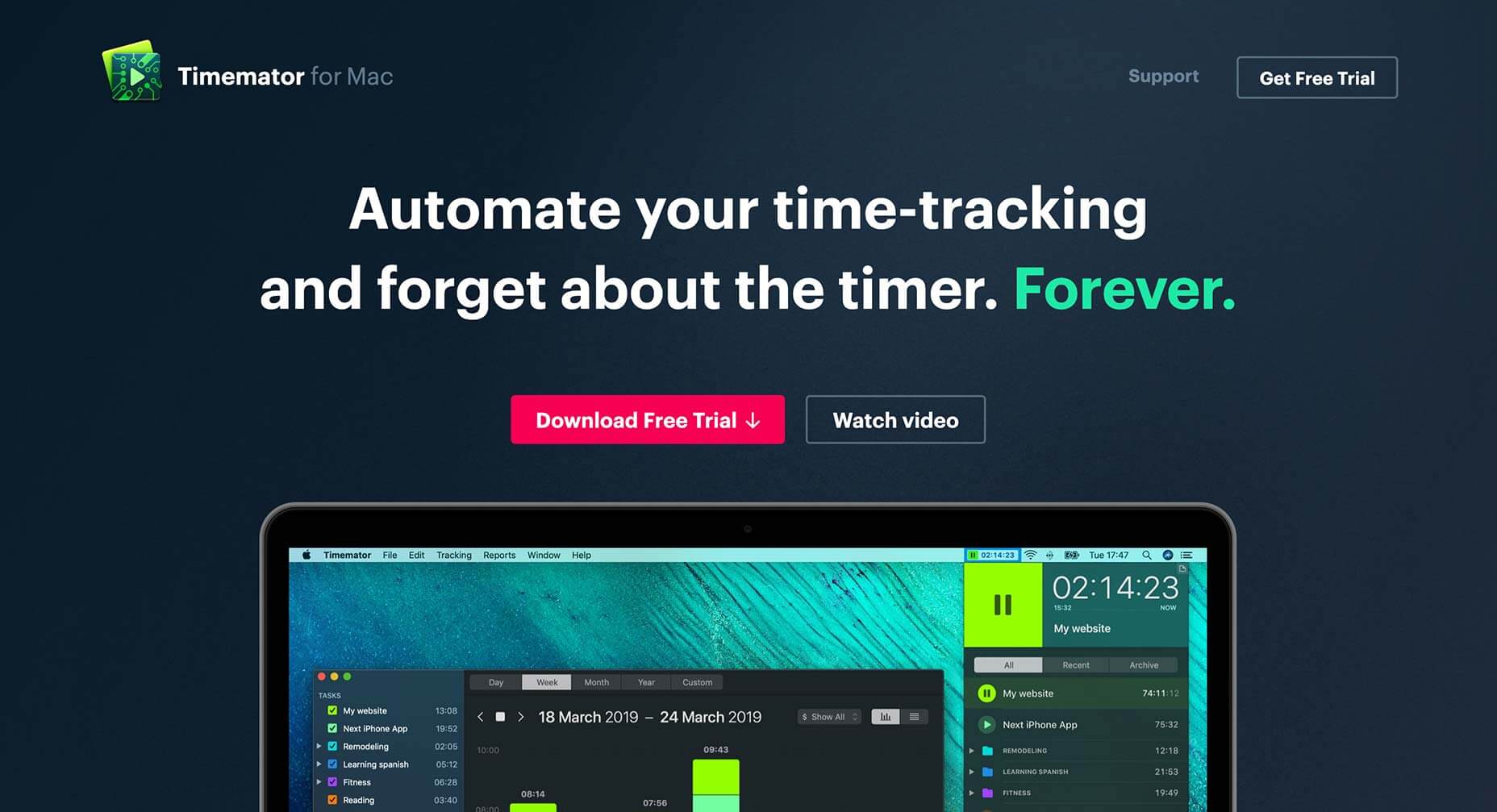
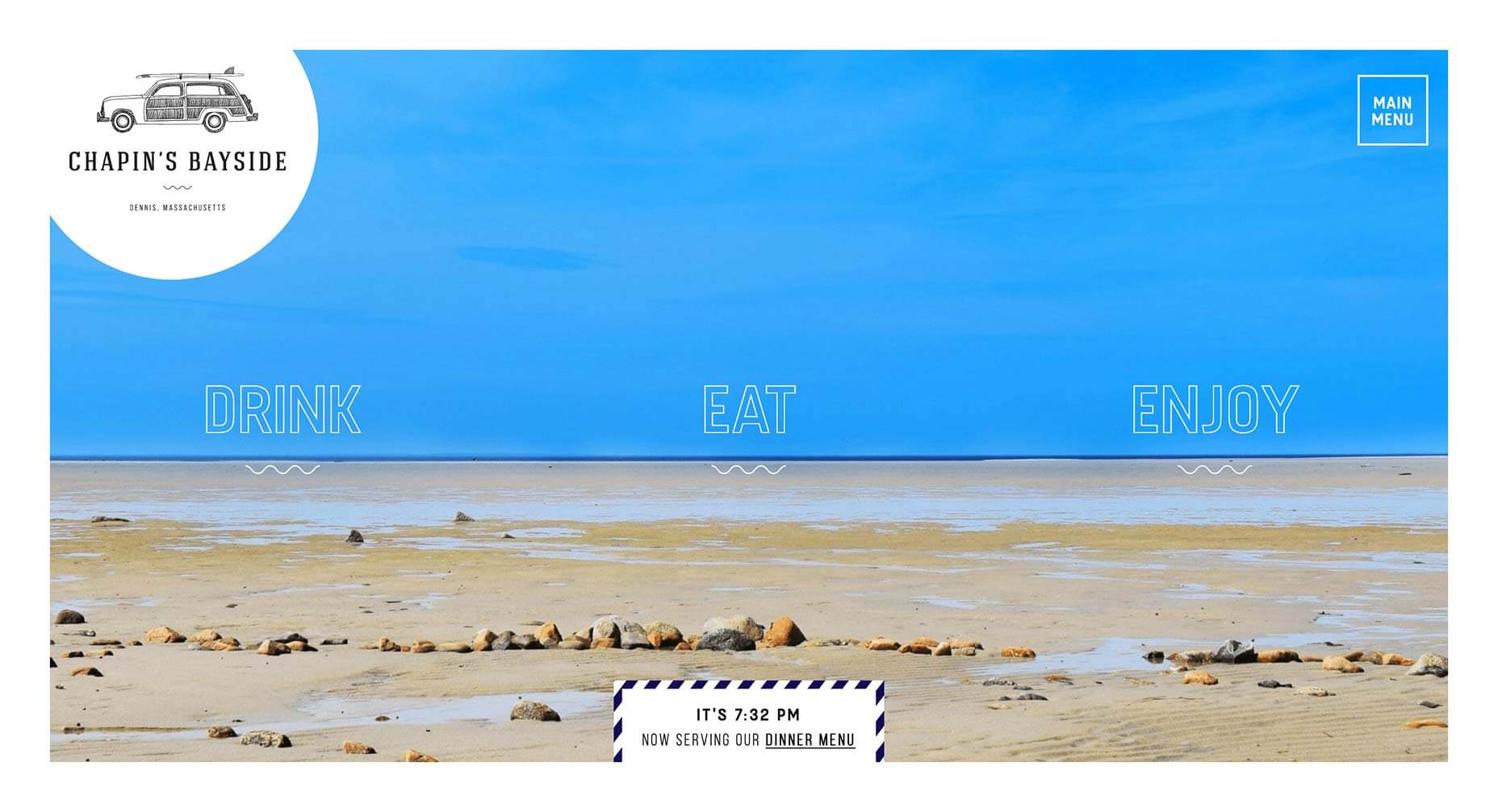
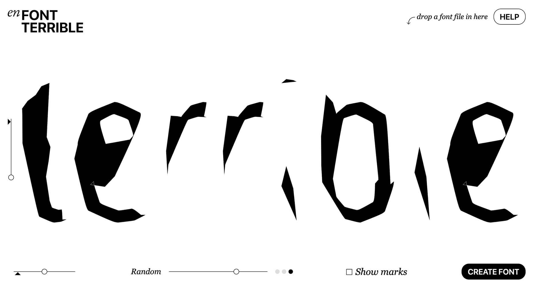
Welcome to our monthly roundup of the freshest web designs, released (or rereleased with significant updates) in the last four weeks.

This month’s selection eschews popular trends in favor of intelligent design that supports brand identity. As always, scrolling plays a big role, but parallax is less dominant than it normally is. Across the board, designers are opting for the less obvious choice, which gives us a rich variety to indulge in. Enjoy!

Playdate

The gaming world is awash with excitement over Playdate, a handheld gaming system due to launch in early 2020. This site does a wonderful job of focusing on the single CTA, and the copy does an awesome job of being exited about the product.

Studio Brave

It’s always a brave decision to open your site with fullscreen video, but in this case it works well—mainly because the work on show is of such a high caliber. Normally custom cursors are a turn off, but this one is fabulous.

40075

40075 is an interactive experience designed to help you discover exciting musical artists from around the globe. Artists profiled include Songhoy Blues, and Gily Yalo. It’s a great way to uncover music you might not have heard yet.

Plein

The site for Plein exudes simplicity, cleanliness, and wellbeing. Selling an innovative range of vitamin films that offer everything from alertness, to an improved immune system, the site is an excellent way to sell an intangible product.

Under

I’ve always been a sucker for a clever logotype, and the mark for Under, the Norwegian underwater restaurant, is one of the best. The site itself exudes the quality of Scandinavian design, proving that it’s simplicity that sells luxury.

Oas

The website for self-proclaimed “Swedish Resort Brand” Oas, does an incredible job of telling the brand’s story, helping it to stand out in a saturated market as one of the labels to watch. Nothing says vacation like palm tree print flip-flops.

Contrast Visuals

Contrast Visuals’ site takes a minimal approach to presenting its portfolio. There’s the simple menu toggling between “work” and “info”, and a native scroll through a very impressive client list of video and film work. Plus I love the animated logo.

Usual

Remember when we all laughed at the idea of brutalism being a thing? Welcome to Usual, a new approach to drinking wine that allows you to purchase single-glass sized bottles via an unusually modernist site for a luxury item.

Sonos

There’s a certain aesthetic, championed by Apple Music, Spotify, and others, that Sonos captures perfectly with its site. When you’re not a leading player in a market, perfecting an established style and making it your own is a superb tactic.

Type By

What designer doesn’t love a type-only site. It’s particularly easy when you’re a type foundry, but you still have to keep users engaged. This site for Type By, works entirely on tap and scroll, but there is something about it that is very compelling.

Golden Hum

Golden Hum is an LA-based sound design agency. Their site is a little difficult to navigate, but keep at it and you’ll be rewarded with some exquisite soundscapes all backed up with some incredible visuals.

PLN Group

The marketing of the PLN Group is a little too PR-speak for many people’s tastes, but there’s a great sense of style about their site, which manages to be both young and interesting, while still mirroring the corporate culture they’re pitching to.

Freakshow Maskerade

There seems to be a trend among newer wines to reject the luxury label and embrace the kind of marketing normally reserved for spirits. Freakshow has developed its own app allowing you to filter your selfies as characters from its labels.

RunHunters

RunHunters is a running app that’s all about exploring new areas, breaking out of your usual routine, and the site reinforces that message by breaking the UI out of the app screens. It’s been done many times, but rarely as effectively.

Keus

Sideways scrolling is a much-maligned approach, but it would be difficult to object to the way it is used on Keus’ site. This site manages to achieve what all good ecommerce sites aim for, an enjoyable way to browse.

Isabel

Isabel is a bar in Denver, Colorado. The site is super-grid orientated, but what’s really eye-catching is the use of blackletter for the branding. Seriously, any site that contributes to reclaiming blackletter is worth 5 minutes of your time.

Timemator

Timemator is an auto-time tracking tool for keeping a record of what you’re working on at any time. Its dark-themed site reminds us of various design apps and for this reason it perfectly pitches itself to its target customers, design professionals.

Seed

The attention grabbing aspect of Seed is the juxtaposition of micro- and macro-photography, but what’s really engaging is the story being told of the ecosystem that each of our bodies is made up of. It’s a positive, and enticing message.

Chapin’s Bayside

This simple site for a restaurant and bar in Dennis, Masschusetts, is packed with lovely details, like the subtle animation on the menu items, and the page transitions. It’s an understated piece of excellent design.

En Font Terrible

Back when the web was young, designers put up pointless sites, that presented interesting but ultimately useless ideas. It was fun. Harking back to that era is En Font Terrible, a site that will auto-generate a font you’ll never use.

Add Realistic Chalk and Sketch Lettering Effects with Sketch’it – only $5!

Source

p img {display:inline-block; margin-right:10px;}
.alignleft {float:left;}
p.showcase {clear:both;}
body#browserfriendly p, body#podcast p, div#emailbody p{margin:0;}

from Webdesigner Depot http://bit.ly/2VRmaFF


from WordPress http://bit.ly/2X8grg1