 It’s no surprise that some businesses are convinced that all they need is a Facebook page and some awesome paid posts in order to go viral. I get it. It’s relatively cheap. It’s easy. And they see it as a faster way to success than taking the time to build a website, grow an audience organically, and wait.
But social media virality is hard to come by and, when it does happen, can be short-lived.
Now, making a website or blog go viral? That can have long-lasting results for a business. But what exactly does it mean to make a website “go viral”? And is this something you need to worry about as a web designer?
A Word About What It Means to “Go Viral”
On the Internet, going viral happens when something — a social media post, a blog post, a video, a website — becomes so popular that word of it spreads like an actual virus. It almost becomes infectious, like anyone who comes in contact with it can’t help but be affected.
Think about something like The Ice Bucket Challenge or Pokémon Go.
These were some of the most popular cases of online virality in recent years. But where are they now?
The ALS Association is still working to raise funds for its cause (though through more traditional means now) and the augmented reality game is still kicking around. However, the fervor surrounding each died down almost as quickly as it began.
That’s because, by their very nature, viruses are short-lived.
Taking Inspiration from Viral Content
How many of your clients (or even prospects) ask how long it’ll take before their new website will make it to the top of search results? Or what the chances are that their blog will go viral?
Obviously, it’s your job to educate them on this before you go setting any expectations.
Make it clear that a website in the #1 position on Google isn’t some superficial status symbol. It’s achieved through lots of work done to and around the website. Google rewards quality, authority, and trustworthiness; not 15 minutes of fame.
If your clients understand the difference and agree that this is what they want, then explain to them that there are ways to design with viral-like qualities in mind. This way, you can still set their website up for widespread success, just with the more ideal approach of making it last.
1. Start with a Personal Visual Element
One of the things you’re going to find that viral brands have in common is that they draw you in with a personal element right off the bat. For example, do you remember the first commercial that Dollar Shave Club ran back in 2012? Let me remind you:
To date, this video has over 26 million views.
Dollar Shave Club has since been purchased by Unilever for $1 billion. If you’re looking for a brilliant example of viral marketing done well and that has staying power, look to this company.
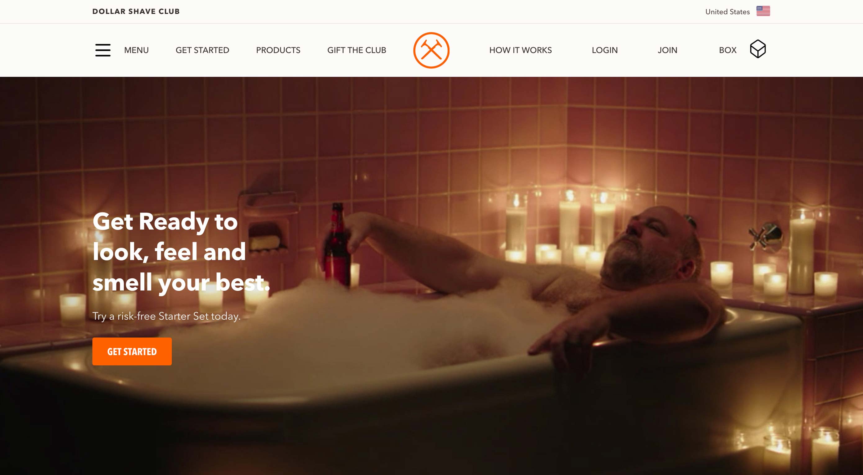
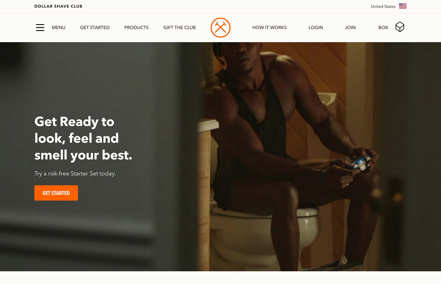
While you’re at it, take a look at the website today:
Dollar Shave Club continues to put people first in its branding. Unlike other brands that use super polished and staged photos or videos on their websites, Dollar Shave Club portrays man in his “natural” state. It’s a strong and memorable way to introduce visitors to the website. It also allows Dollar Shave Club to inject a little levity into its brand even if it no longer has any need for those viral videos.
2. Make It Hard to Look Away
Suffice it to say, viral content is not boring. While design choices like color and typography can certainly lend to the engagement factor of a website, you’re going to need to do more than that to get visitors’ attention and hold it.
Just be careful about how far towards “gimmicky” you go with it. I’m going to show you two examples from the same company to explain what I mean.
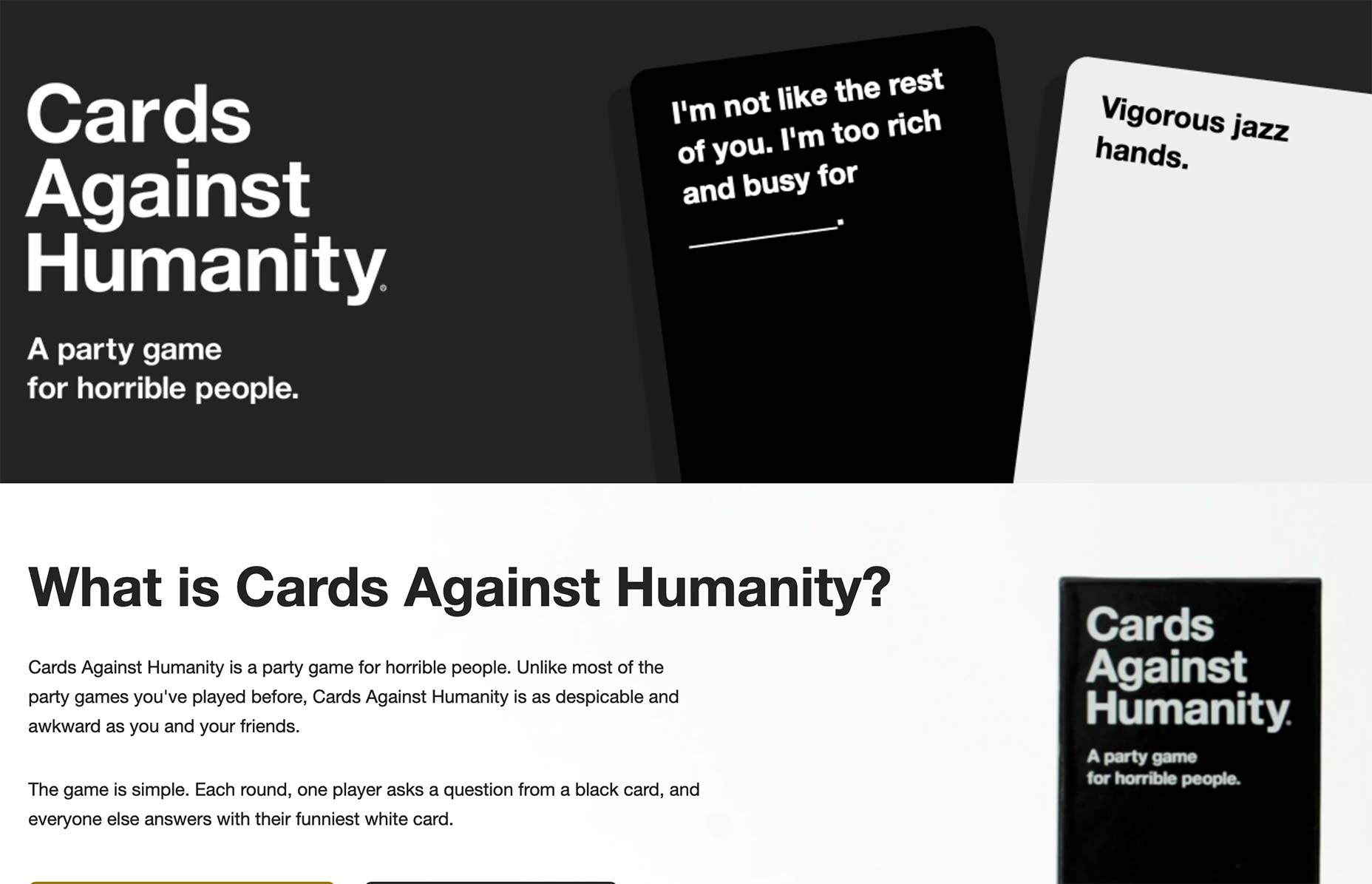
This is the Cards Against Humanity website:
This is a company that makes a living by selling adult card games. Its choice to show off some of the ridiculous card pairings that may occur over the course of a game is a brilliant design choice for the website.
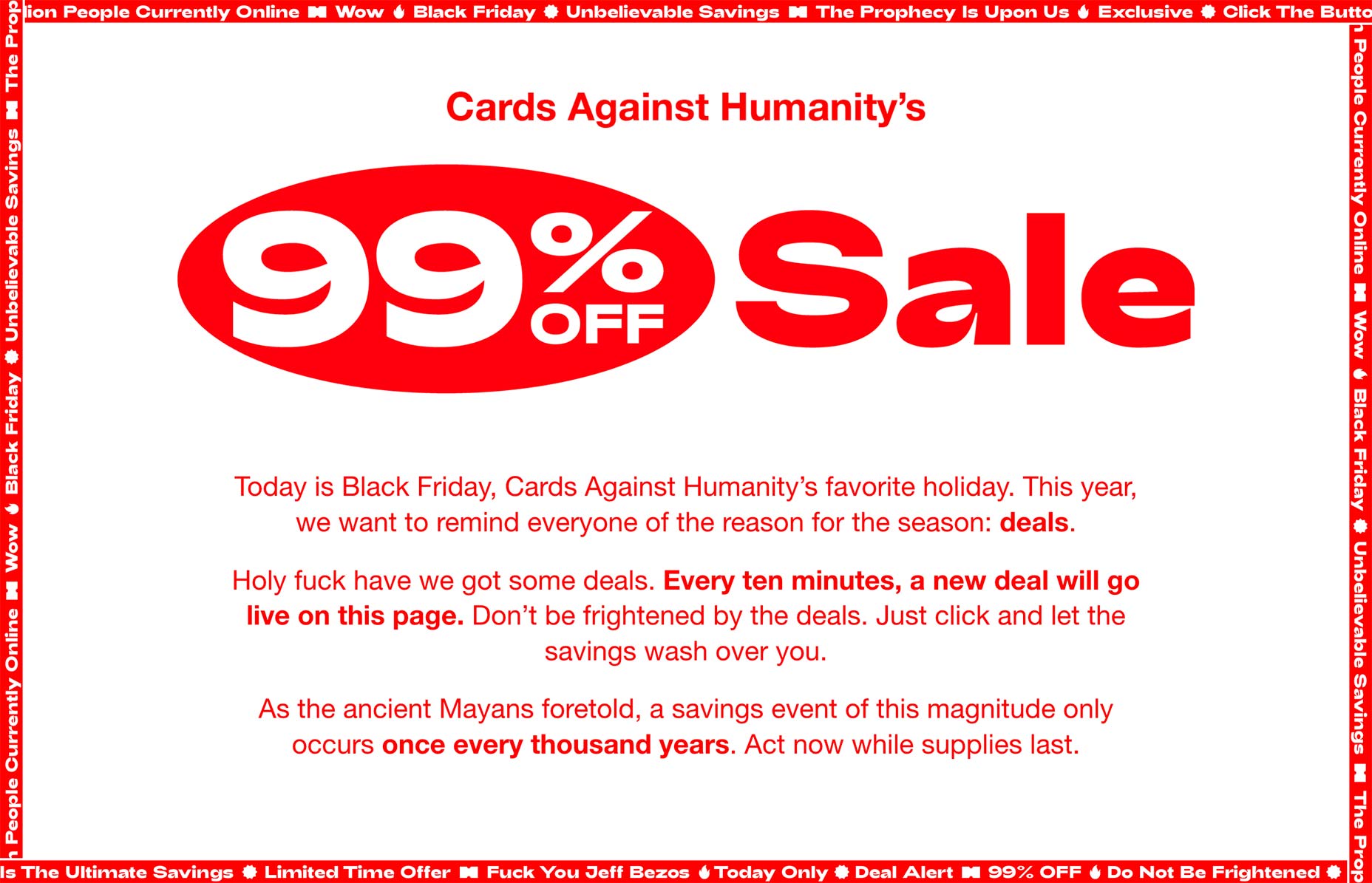
That said, the same company tends to go overboard on Black Friday, as it did in 2018 with the 99% Off Sale website:
The design of the website is pretty painful to look at. However, the sale’s gimmick only ran for 24 hours, so it’s not like the company was asking customers to return to the website again.
The lesson to take away from this? If you only want short-lived success with a website, feel free to go campy with the design. If you want more permanent success, delight visitors with subtle surprises instead.
3. Utilize Design Trends But Push Boundaries
Another thing to keep in mind about viral content and websites is that they tend to be risk-takers or, at the very least, have no shame. So, as you set about designing a website for a client that’s determined to make a huge splash from the get-go, you’re going to have to be okay with entering territory that’s never been covered before.
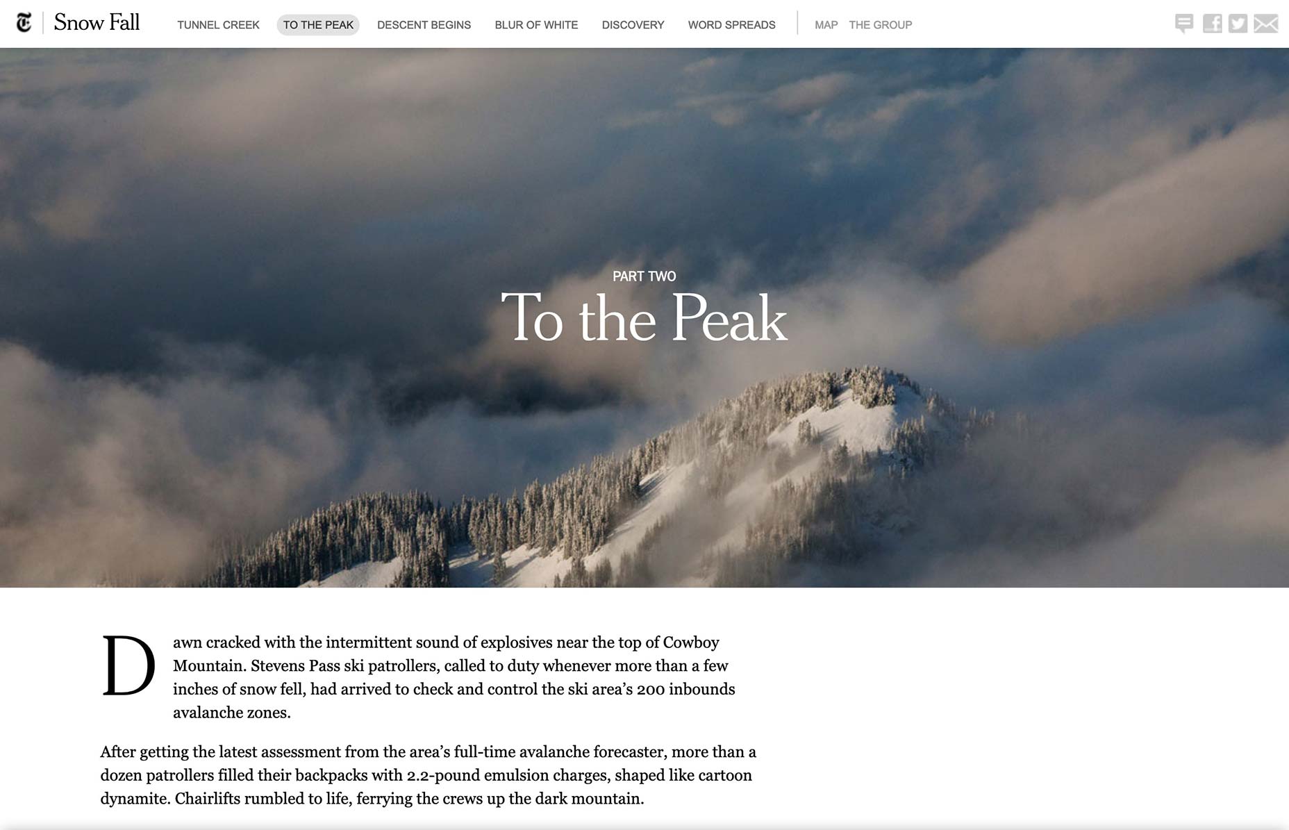
One of my favorite examples of this (and one of the reasons why I was so eager to get into marketing) was the Snow Fall piece published by The New York Times in 2012:
When this first came out, I remember how everyone was talking about it — even people who weren’t normally fans of reading The New York Times or long-form stories online. They just couldn’t believe that something that could’ve easily been a long and arduous piece to get through had almost become like a piece of digital art.
Looking at it today, you can see how a lot of what we’ve done in web design since — e.g. animation, parallax scrolling, and digital storytelling — comes from this brilliant gamble by the NYT. So, if there’s a lesson to take away from this viral piece of content, it’s this:
Don’t push boundaries for the sake of stirring up a reaction in the moment. Push boundaries to better the design and better the experience.
Wrap-Up
Really, what we need to do when clients start talking about going viral or shooting to the top of search overnight is to explain that turning your brand into a virus is not a good thing. The goal is to have long-term success; not become something that’s super popular only for a short while.
That said, while you can’t and shouldn’t make promises that you’ll design a website to go viral, you can talk to your clients about how you’ll utilize certain qualities of viral content to increase the desirability and shareability of their website.
| Add Realistic Chalk and Sketch Lettering Effects with Sketch’it – only $5! |
p img {display:inline-block; margin-right:10px;}
.alignleft {float:left;}
p.showcase {clear:both;}
body#browserfriendly p, body#podcast p, div#emailbody p{margin:0;}
from Webdesigner Depot http://bit.ly/2Vd8Dbd
from WordPress http://bit.ly/2WyJEQS

No comments:
Post a Comment