
 Welcome to our monthly roundup of the freshest web designs, released (or rereleased with significant updates) in the last four weeks.
This month’s selection eschews popular trends in favor of intelligent design that supports brand identity. As always, scrolling plays a big role, but parallax is less dominant than it normally is. Across the board, designers are opting for the less obvious choice, which gives us a rich variety to indulge in. Enjoy!
Playdate
The gaming world is awash with excitement over Playdate, a handheld gaming system due to launch in early 2020. This site does a wonderful job of focusing on the single CTA, and the copy does an awesome job of being exited about the product.

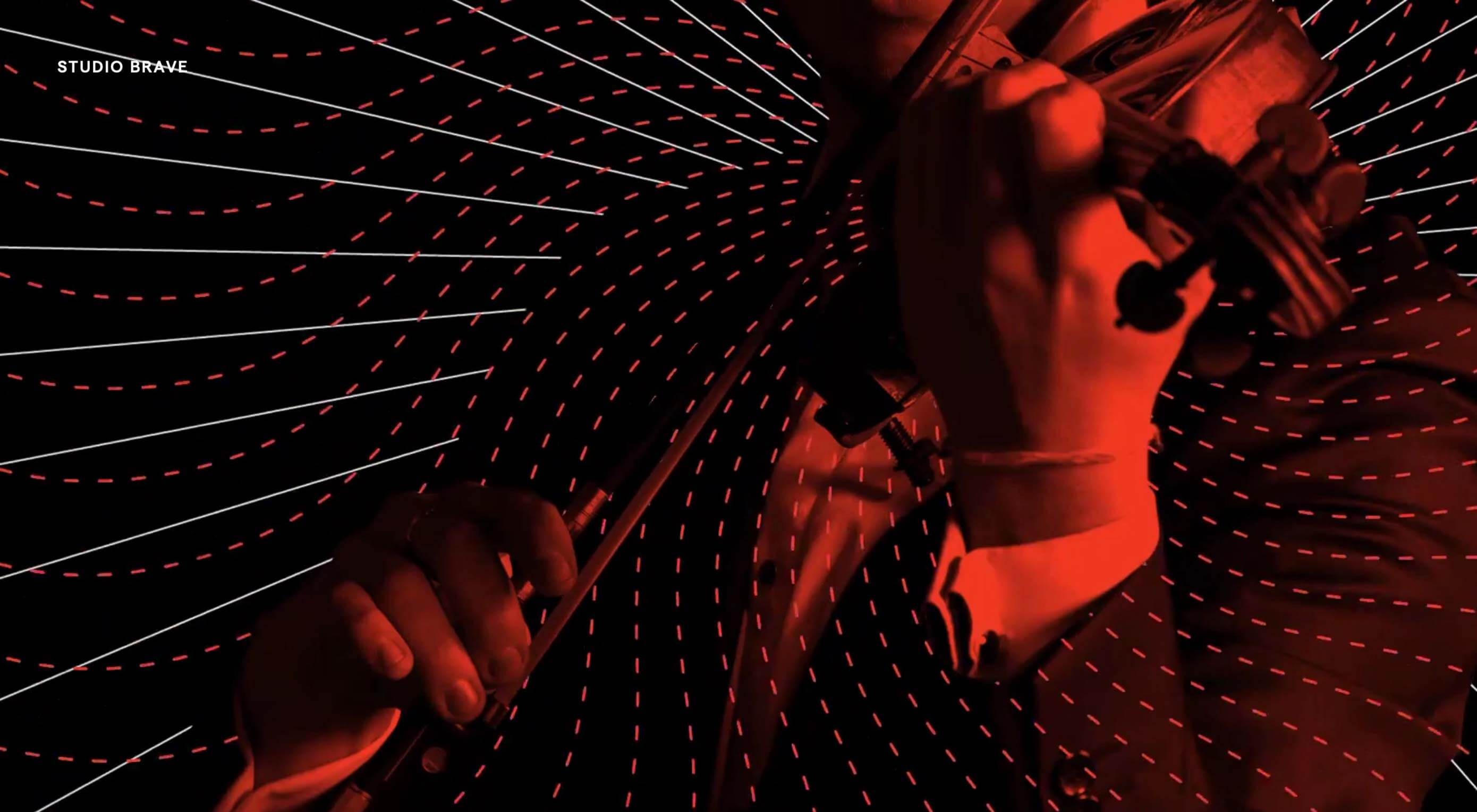
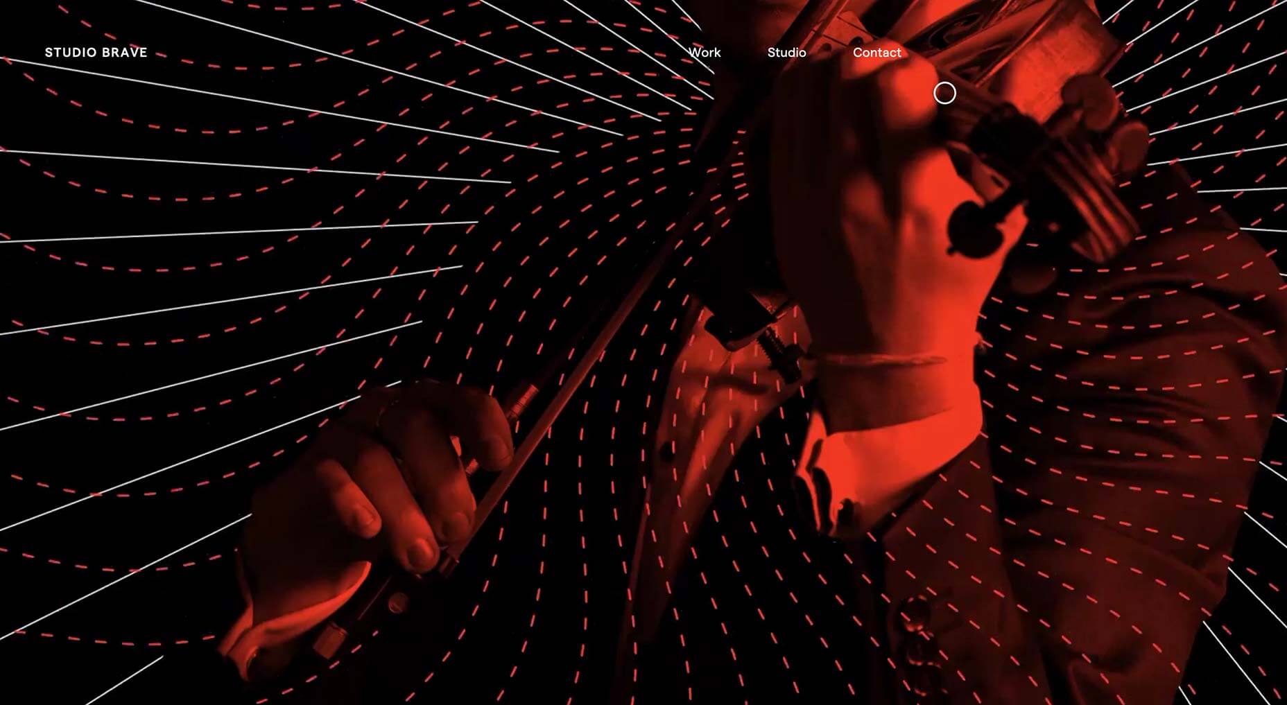
Studio Brave
It’s always a brave decision to open your site with fullscreen video, but in this case it works well—mainly because the work on show is of such a high caliber. Normally custom cursors are a turn off, but this one is fabulous.
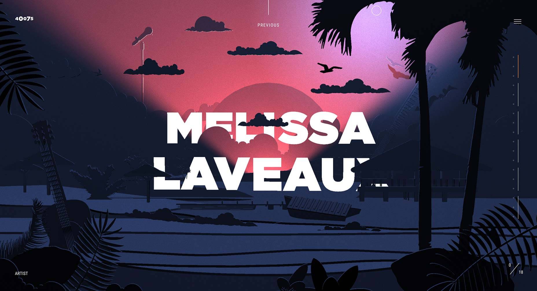
40075
40075 is an interactive experience designed to help you discover exciting musical artists from around the globe. Artists profiled include Songhoy Blues, and Gily Yalo. It’s a great way to uncover music you might not have heard yet.
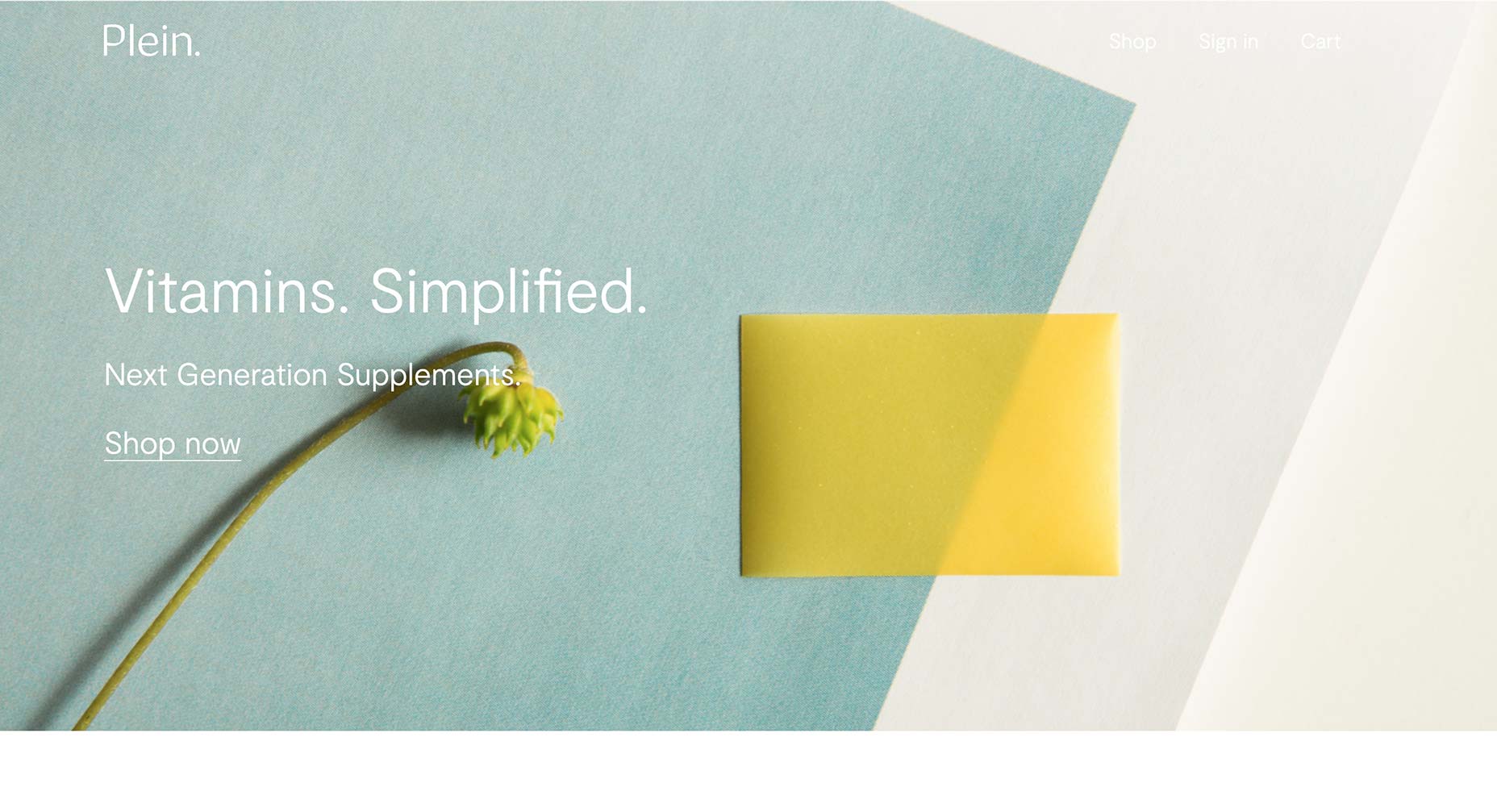
Plein
The site for Plein exudes simplicity, cleanliness, and wellbeing. Selling an innovative range of vitamin films that offer everything from alertness, to an improved immune system, the site is an excellent way to sell an intangible product.
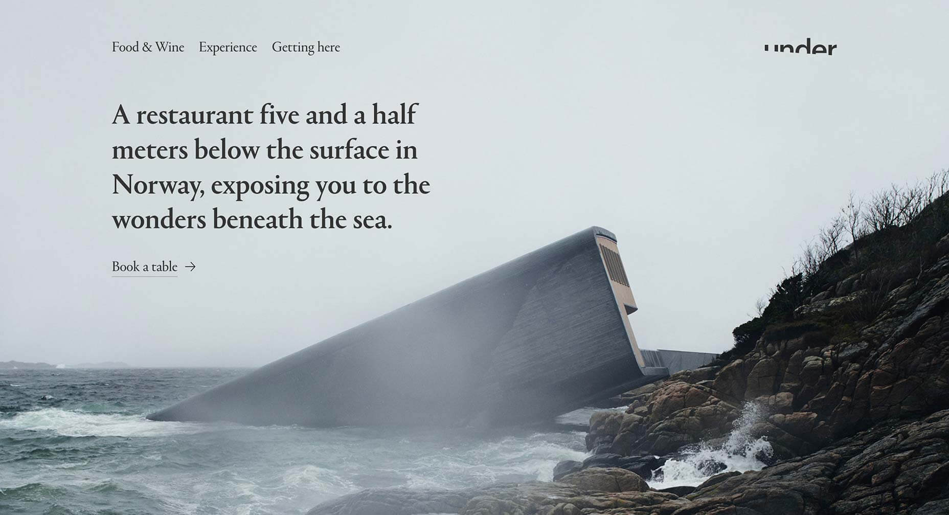
Under
I’ve always been a sucker for a clever logotype, and the mark for Under, the Norwegian underwater restaurant, is one of the best. The site itself exudes the quality of Scandinavian design, proving that it’s simplicity that sells luxury.
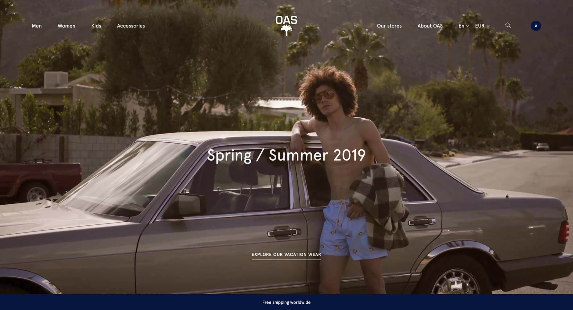
Oas
The website for self-proclaimed “Swedish Resort Brand” Oas, does an incredible job of telling the brand’s story, helping it to stand out in a saturated market as one of the labels to watch. Nothing says vacation like palm tree print flip-flops.
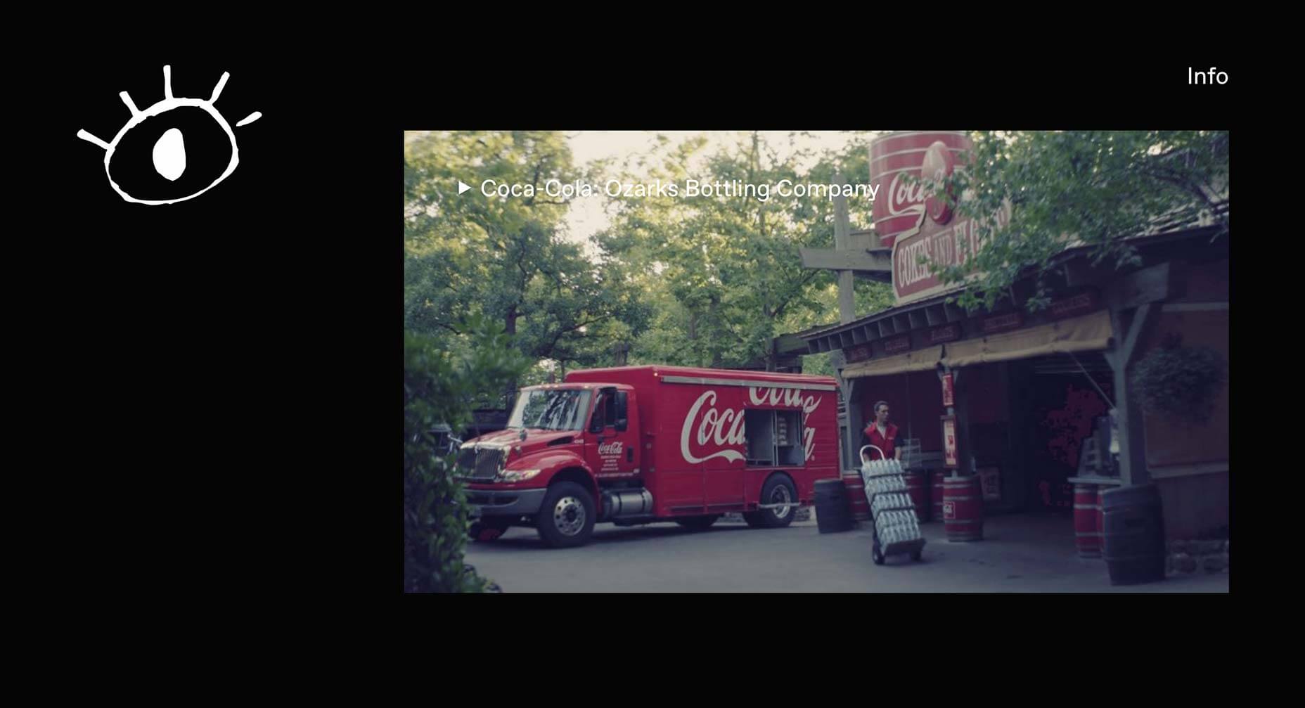
Contrast Visuals
Contrast Visuals’ site takes a minimal approach to presenting its portfolio. There’s the simple menu toggling between “work” and “info”, and a native scroll through a very impressive client list of video and film work. Plus I love the animated logo.
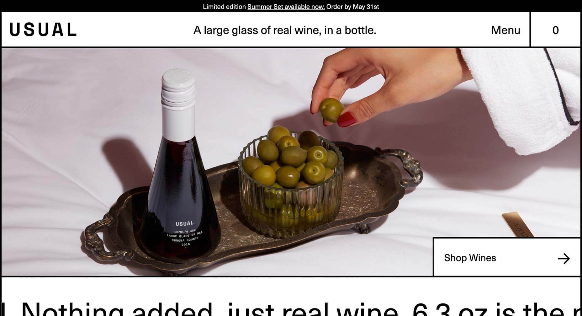
Usual
Remember when we all laughed at the idea of brutalism being a thing? Welcome to Usual, a new approach to drinking wine that allows you to purchase single-glass sized bottles via an unusually modernist site for a luxury item.
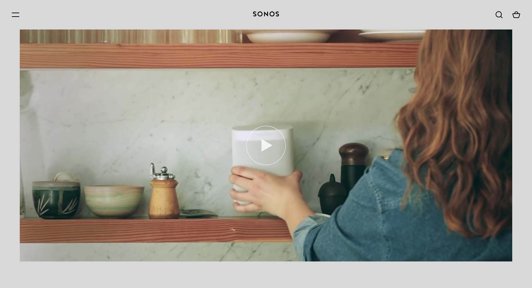
Sonos
There’s a certain aesthetic, championed by Apple Music, Spotify, and others, that Sonos captures perfectly with its site. When you’re not a leading player in a market, perfecting an established style and making it your own is a superb tactic.
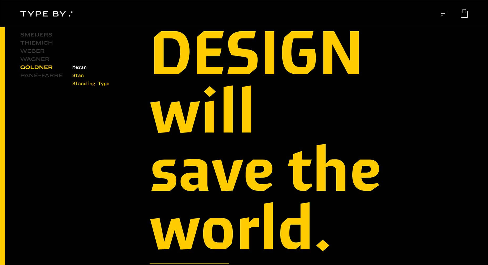
Type By
What designer doesn’t love a type-only site. It’s particularly easy when you’re a type foundry, but you still have to keep users engaged. This site for Type By, works entirely on tap and scroll, but there is something about it that is very compelling.
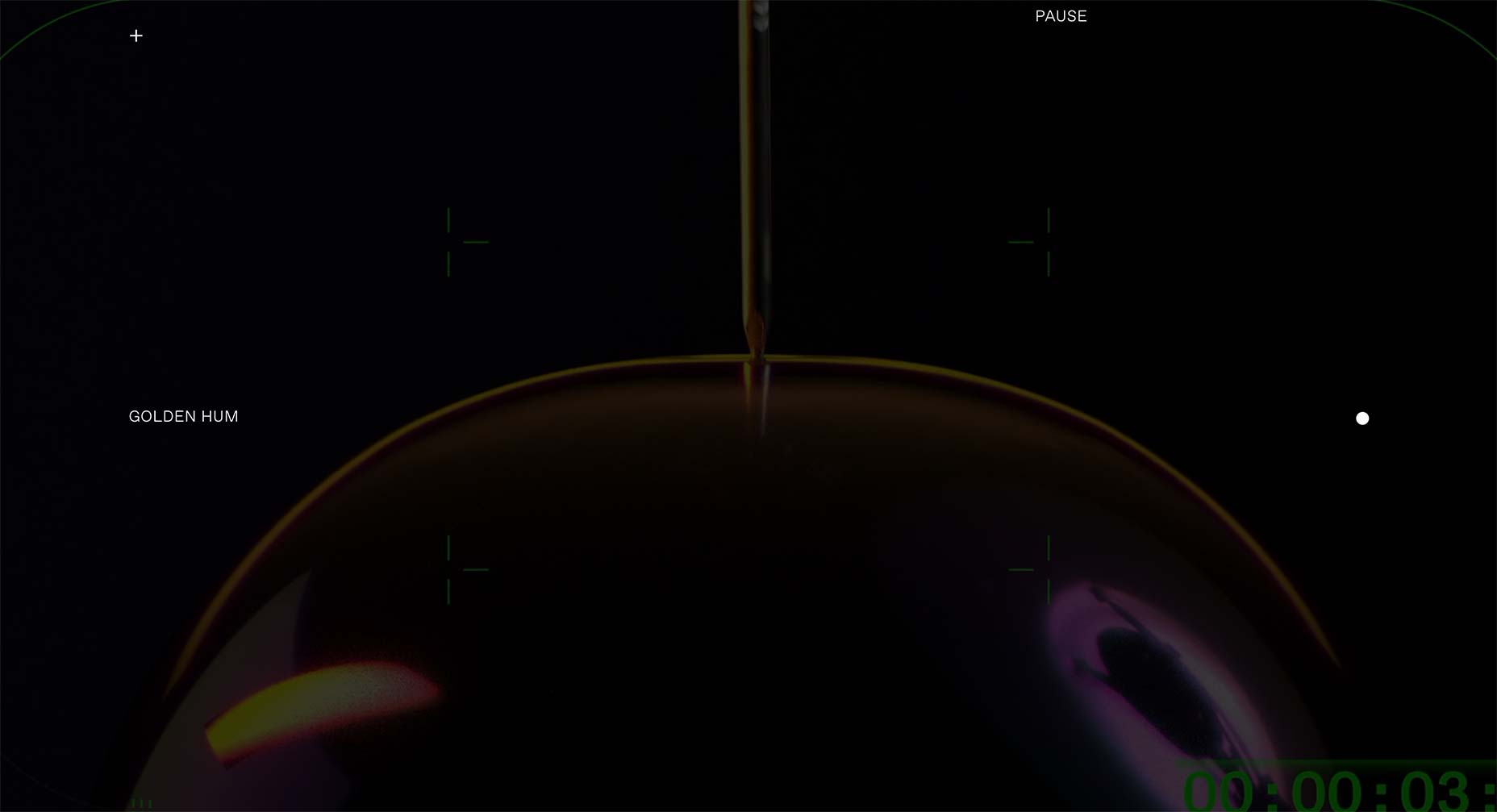
Golden Hum
Golden Hum is an LA-based sound design agency. Their site is a little difficult to navigate, but keep at it and you’ll be rewarded with some exquisite soundscapes all backed up with some incredible visuals.
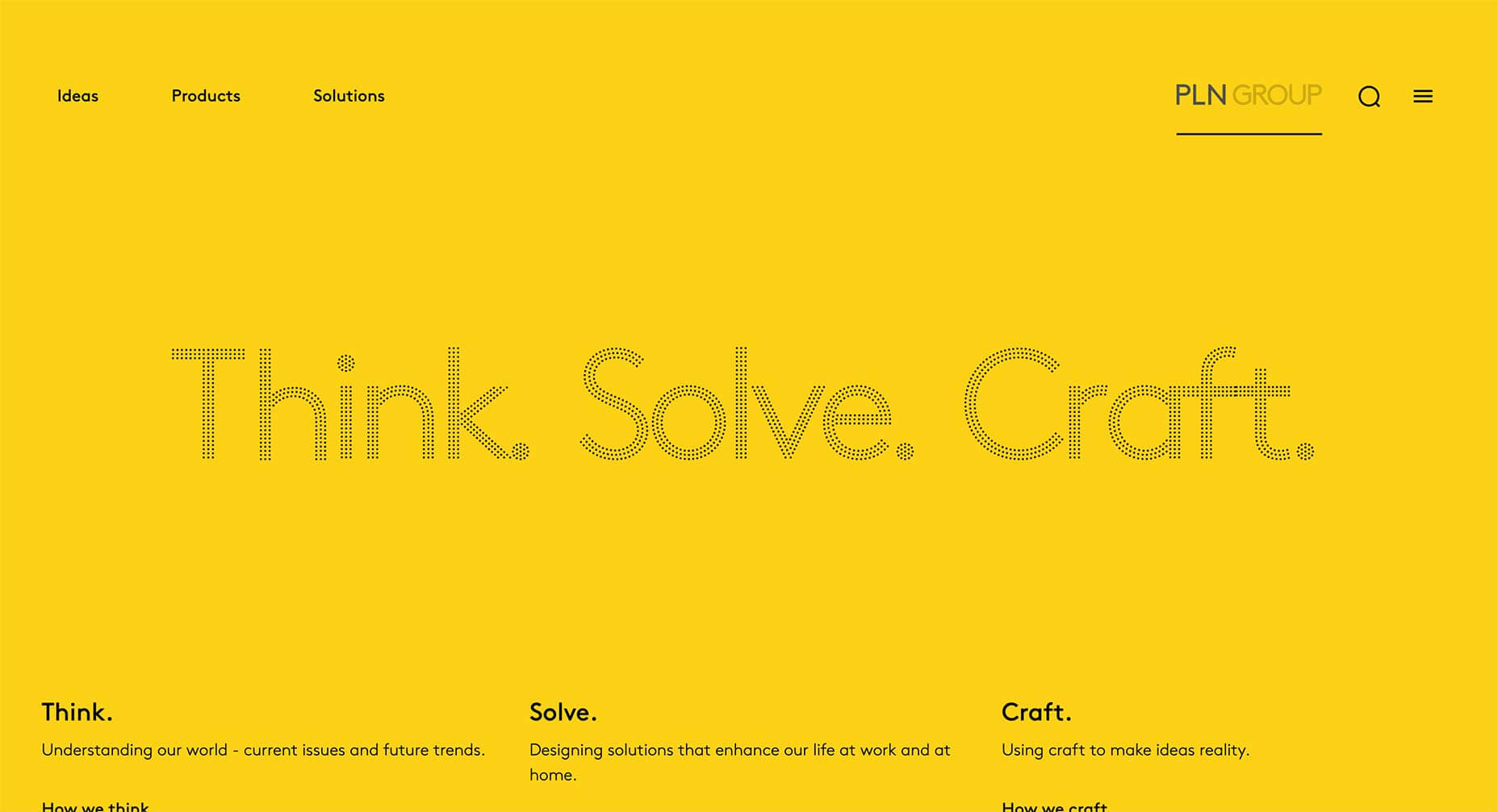
PLN Group
The marketing of the PLN Group is a little too PR-speak for many people’s tastes, but there’s a great sense of style about their site, which manages to be both young and interesting, while still mirroring the corporate culture they’re pitching to.
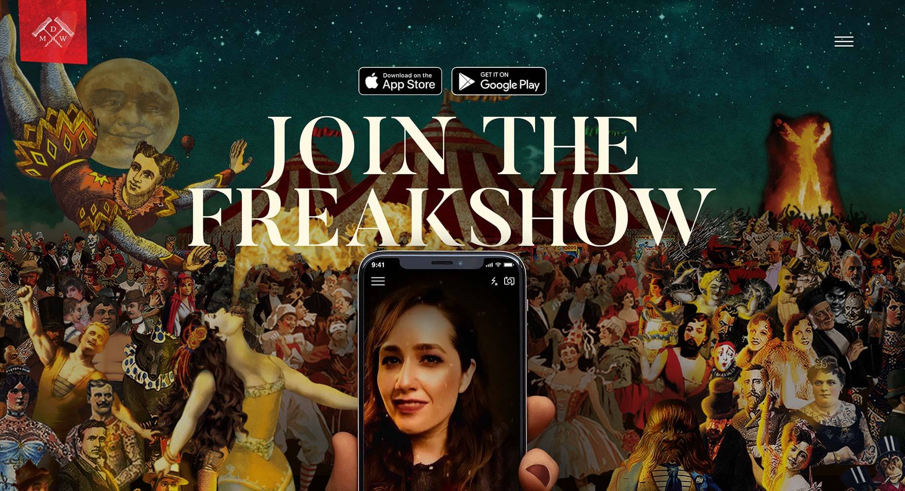
Freakshow Maskerade
There seems to be a trend among newer wines to reject the luxury label and embrace the kind of marketing normally reserved for spirits. Freakshow has developed its own app allowing you to filter your selfies as characters from its labels.
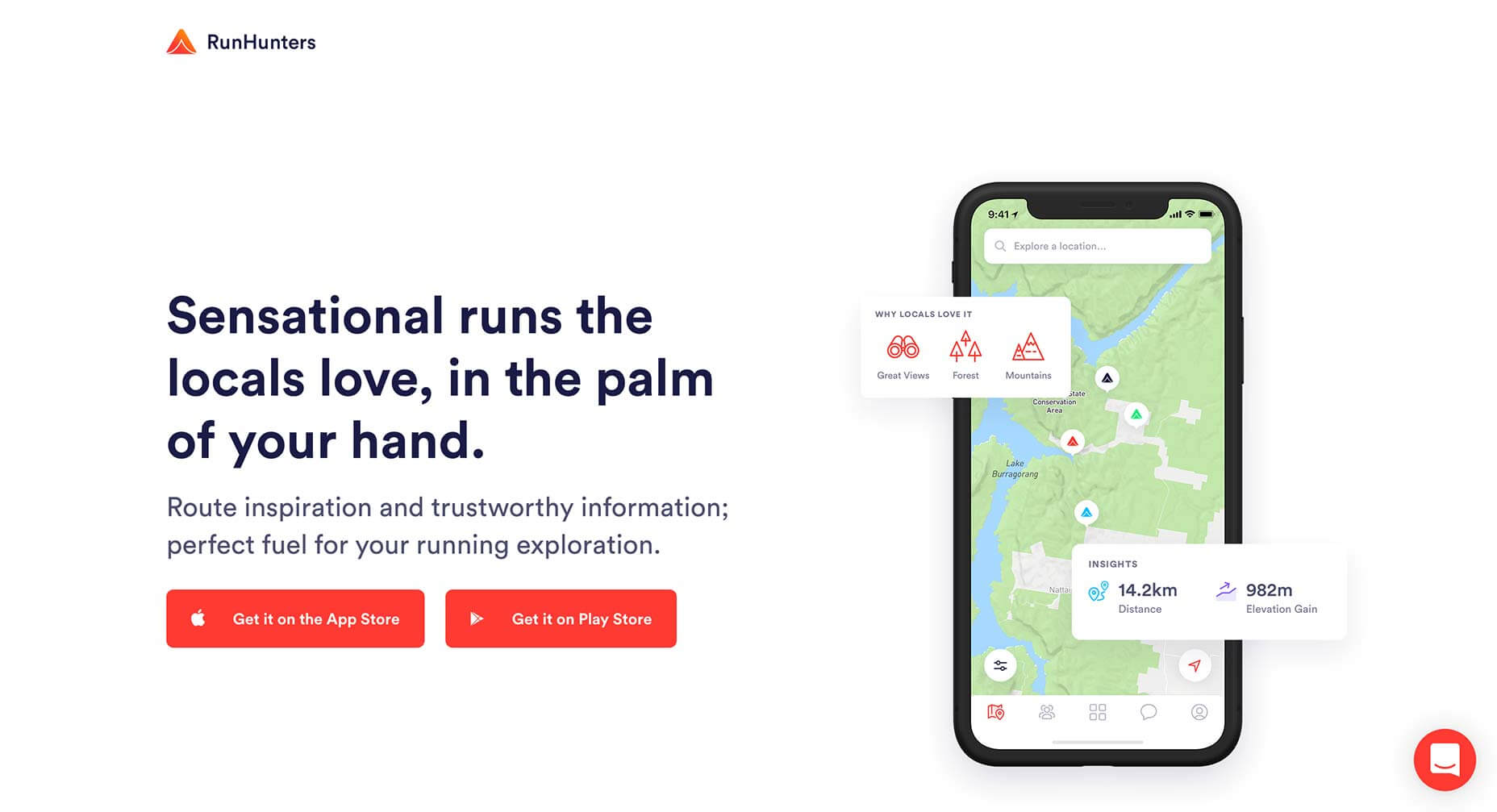
RunHunters
RunHunters is a running app that’s all about exploring new areas, breaking out of your usual routine, and the site reinforces that message by breaking the UI out of the app screens. It’s been done many times, but rarely as effectively.
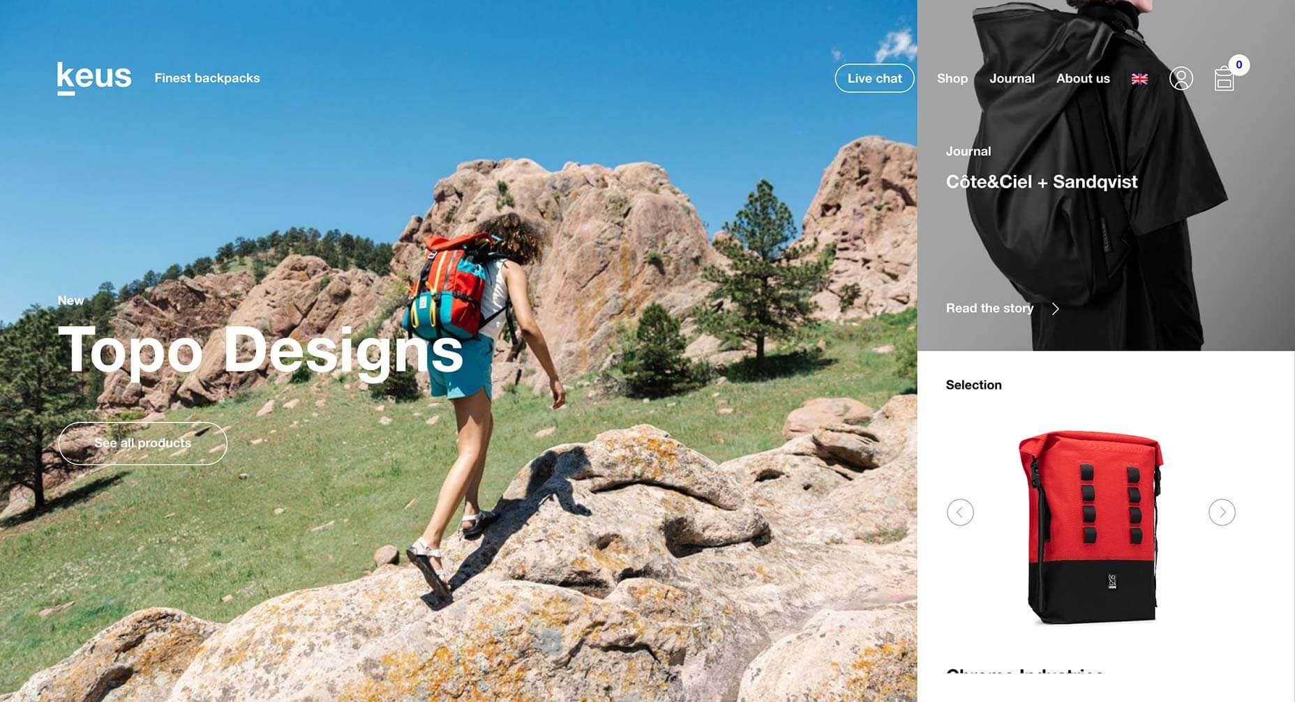
Keus
Sideways scrolling is a much-maligned approach, but it would be difficult to object to the way it is used on Keus’ site. This site manages to achieve what all good ecommerce sites aim for, an enjoyable way to browse.
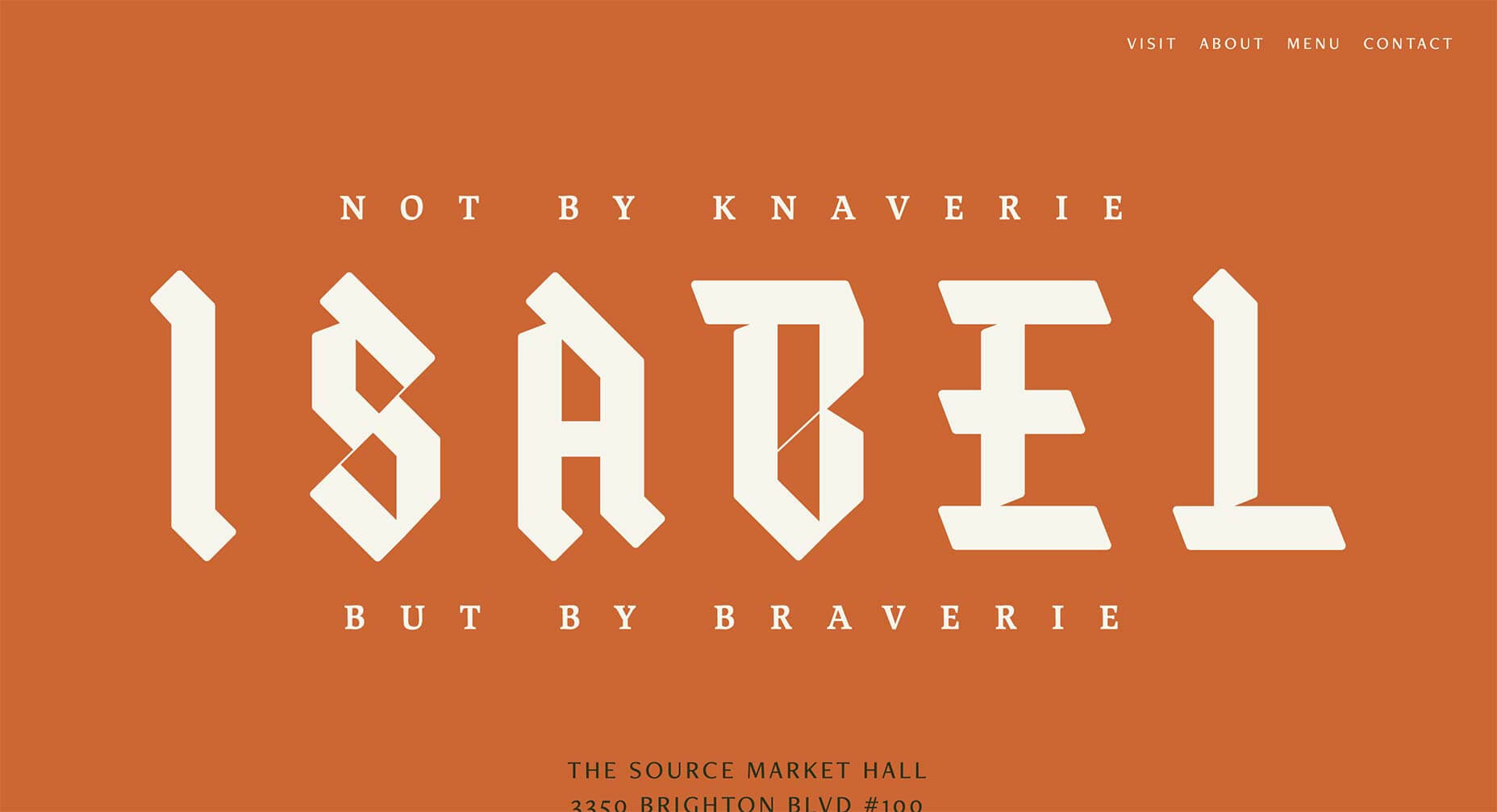
Isabel
Isabel is a bar in Denver, Colorado. The site is super-grid orientated, but what’s really eye-catching is the use of blackletter for the branding. Seriously, any site that contributes to reclaiming blackletter is worth 5 minutes of your time.
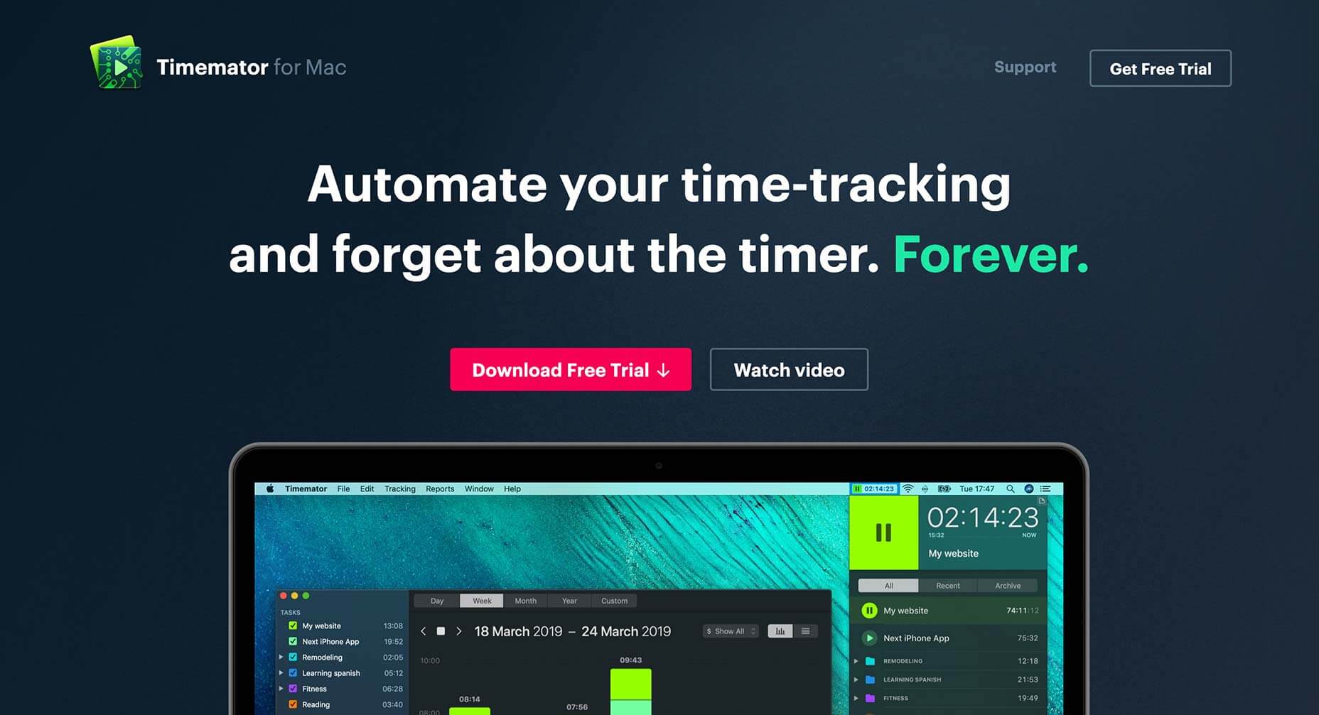
Timemator
Timemator is an auto-time tracking tool for keeping a record of what you’re working on at any time. Its dark-themed site reminds us of various design apps and for this reason it perfectly pitches itself to its target customers, design professionals.
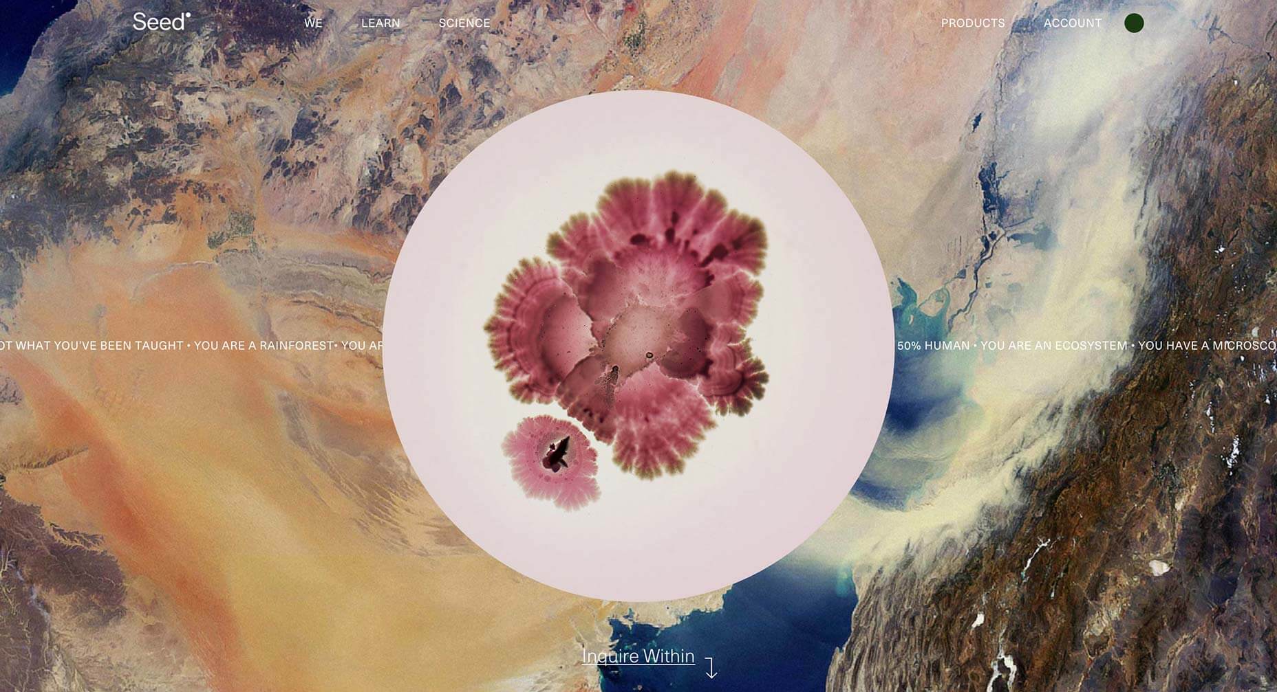
Seed
The attention grabbing aspect of Seed is the juxtaposition of micro- and macro-photography, but what’s really engaging is the story being told of the ecosystem that each of our bodies is made up of. It’s a positive, and enticing message.
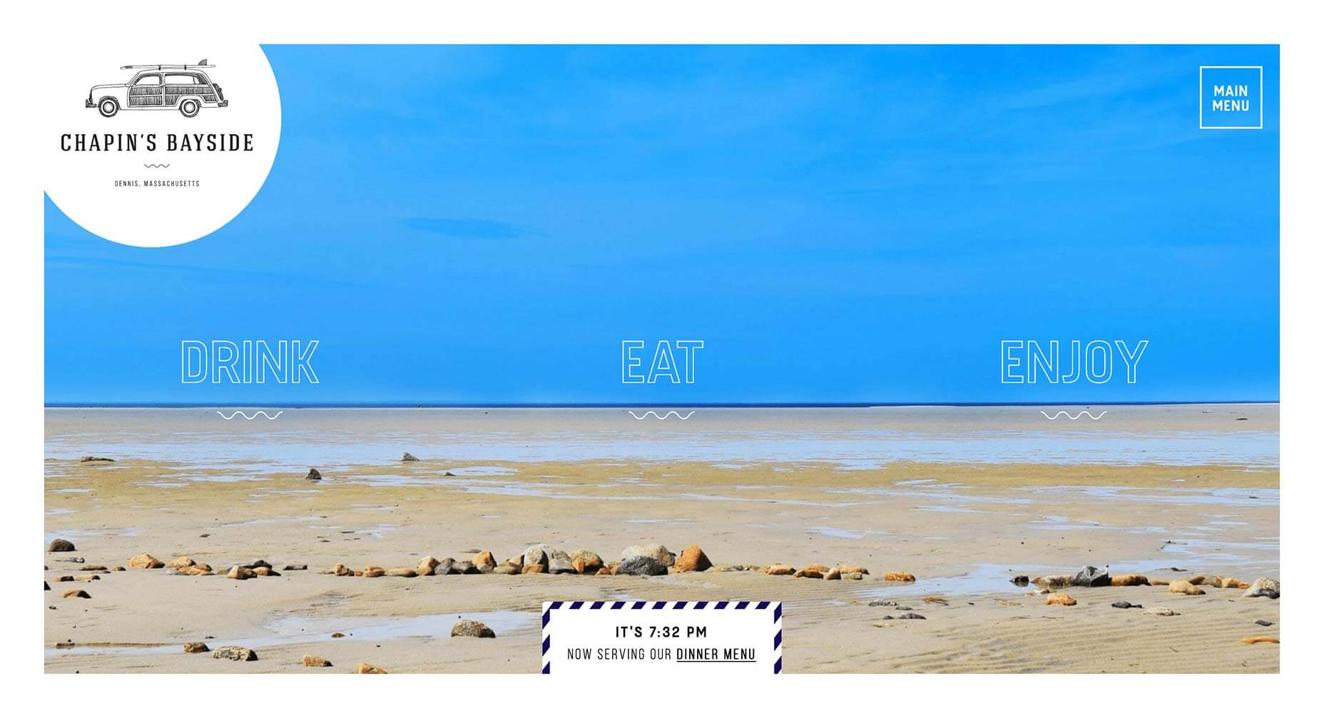
Chapin’s Bayside
This simple site for a restaurant and bar in Dennis, Masschusetts, is packed with lovely details, like the subtle animation on the menu items, and the page transitions. It’s an understated piece of excellent design.
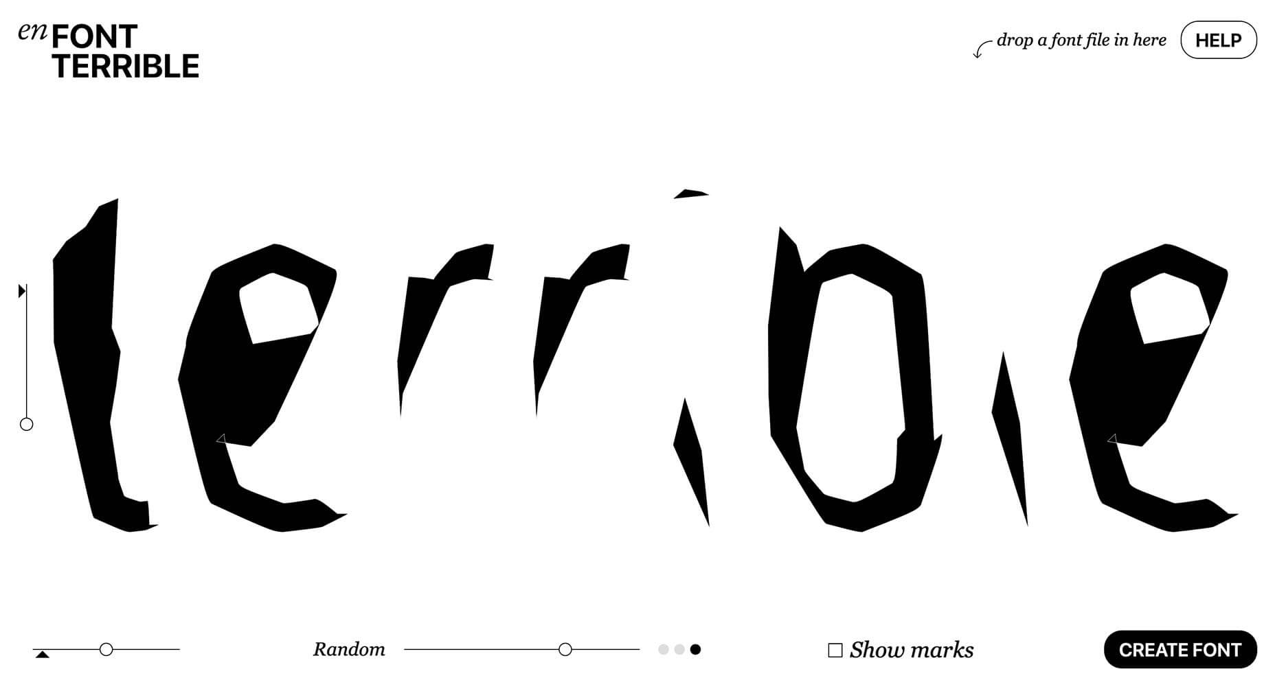
En Font Terrible
Back when the web was young, designers put up pointless sites, that presented interesting but ultimately useless ideas. It was fun. Harking back to that era is En Font Terrible, a site that will auto-generate a font you’ll never use.
| Add Realistic Chalk and Sketch Lettering Effects with Sketch’it – only $5! |
p img {display:inline-block; margin-right:10px;}
.alignleft {float:left;}
p.showcase {clear:both;}
body#browserfriendly p, body#podcast p, div#emailbody p{margin:0;}
from Webdesigner Depot http://bit.ly/2VRmaFF
from WordPress http://bit.ly/2X8grg1
No comments:
Post a Comment