Monday, December 30, 2019

The Art of Persuasion: How to Handle Clients With Mad Ideas

We’ve all been there. It’s 4pm on a Friday afternoon, you’re already in your “weekend outfit” (underwear and hoody combo) and you get an email. It’s Client X: Hey, erm, I’ve just had a couple of thoughts, can we talk?

Wearily, you reach for the phone.

Sure enough, the “couple of thoughts” become a rambling monologue on the virtues of asymmetric grid layout, mouse-controllable content and parallax scrolling (“that shouldn’t be too hard, right?”) which lasts for 90 minutes. They basically want this, on their budget of $1200.

If that wasn’t bad enough, of course you also know that what they’re asking for — even if you could deliver it on time and in budget — will make no sense at all to their users.

Don’t panic, here’s what you can do.

1. Make a Connection

Believe it or not, from a certain angle, there’s probably method to their madness. By discovering it, you’ll not only unlock ways to solve the problem, but develop your working relationship in a positive direction too.

Have you ever wondered why Client X wants their app to auto-play “We are the Champions” every time it loads? Maybe they’re trying to send a positive message about their company or looking for a lighthearted feel. Have they seen something similar that actually works? Are they trying to express their personality through the work they’re asking you to do?

In his book Nonviolent Communication, psychologist Marshall Rosenberg argues we can find resolution to any conflict by addressing the needs that underlie it, and urges us to start by acknowledging the other person’s reality.

Here’s how it works: don’t argue. At least not yet. Let them talk. Ask questions. Acknowledge what they’re saying. Listen. At the same time, try to build up a picture of what’s important to them at the emotional level. When you do talk, reflect back what you’ve understood. You’ll probably find the situation calms right down.

Maybe this seems time consuming. It is. But then again, so are those rambling “wouldn’t it be great if we…” phone-calls. You may as well put them to some use…

2. Sell Your Vision

From another perspective, in trying to persuade someone out of their mad idea, you’re really trying to sell them your own. As such, the psychology of selling has a lot to offer you, if that’s your cup of tea. Just remember: Your ability to sell is only as good as your understanding of the client. If you try to use a one-size-fits-all approach, it will sound naff. Invest time and effort in understanding what they really want, then find ways to link your sane ideas to it.

Be honest. Don’t try to sell something that isn’t going to satisfy. Most people will see through it, and the ones that don’t will leave the interaction feeling bitter.

Appeal to Emotion

Client X isn’t going to change their mind because of logical arguments. They’ve made their decision on a whim, a feeling. You can only really address it at the same level. Maybe they want people to respect their business: If so, use words and examples that evoke respect for your preferred idea: “Have you seen the Armani website? They’ve used more of a symmetric grid and it looks pretty strong don’t you think?”.

Pain, Problem, Solution

As any good salesperson will tell you, Client X’s unhinged desire for parallax scrolling arises first and foremost from pain, as in: “Jeez, this design is boring!”. They formulate this as a problem: “There’s not enough movement”. A (naive) solution follows: “We need more animation”.

You can use your understanding of the deeper need (more movement) to highlight the advantages of something simpler: “Yeah I see your point. We can also look at the colors and typefaces. Do any of these look more dynamic?”

Offer Choices

Sometimes, clients are challenging because they “want to be involved”. You can help them scratch that itch by offering choices, like the example above.

Tell a Story

Story is the difference between the value of my autograph, and the value of Neil Armstrong’s. You can dramatically increase the appeal of your vision by finding preferred brands that use it, or examples of work which went really well because of, say, grid layout.

3. Full Charm Offensive

Although you might feel like throwing your phone (or possibly them) out of the window, by giving Client X short shrift, you’ll probably dent their ego and leave them plotting ways to get revenge.

The more you nourish and protect your relationship with clients, the more they’ll respect and respond to you, and the easier your life will be. Here are some suggestions:

Put Your Effort in Early

By getting it right at the briefing stage, when the train-smash moment arrives, you can steer it towards a reasonable outcome.

Don’t be a Prima Donna

The days of the genius designer toiling away in secret are over: Clients want to be involved in the creative process and probably have a right to be. Co-creation in the planning stage will give the client ownership, and a warm feeling about you for letting them experience it. Once they’ve seen how complex the work is, they’ll probably be less inclined to chuck it, or haggle over the price as well.

Compromise

If the client insists on something that really won’t work, and won’t listen to your carefully crafted vision, you know what? That’s on them. You don’t need to fight it. If it involves extra work that wasn’t in your brief then say so, explain, and suggest alternatives. Work with the client. Find ways to identify what their real needs are, and work towards those. Keep track of decisions that are made, and who made them in case of blowback.

Over Deliver

Use your knowledge of the underlying (often unconscious) desires of the client to completely wow them. Go the extra mile in areas which will likely have big impact, even if these aren’t core priorities from a pure design perspective. Try to understand the client’s expectations and exceed them in any way you can.

Be Confident, not Abrasive

In most situations with clients, you genuinely are the expert. Share stories about your experiences in a lighthearted way, explain why you think that something will or won’t work. Smile, relax. Don’t be like Sheldon.

4. Be a Proper Professional

Painful as it may be, challenging clients, like plagues of fire-breathing locusts, are an unfortunate part of life as a web designer. Get prepared up front.

Nail the Brief

As well as specifying the finished product, do yourself a favor by going beyond it: discuss brand strategy. Get the client talking about their target market, and where this project fits into their global vision. Use mood-boards, even a design principles framework, to nail down hard evidence of what you’ve both agreed are the priorities. This will be important later on!

Establish a Point of Contact

Find out who will be the decision maker(s), and who will be communicating with you. Then you know who to contact when the project starts to drift towards fantasy land. If you’ve ever found yourself on a call to client X’s great Aunt Lilly who “went to design school once” and “knows all about UX”, you haven’t done this right!

Be Organised

If you’re not using a project or client management tool, you’re probably making it hard for yourself to keep track of things. With challenging clients, you’ll often need to quickly find that email where “he literally said the exact opposite of what he’s saying he said”, even if just for your own sanity.

Be Firm

Be flexible, but set limits. Use the evidence you’ve collected to make your points. Negotiate a budget increase if the work is out of spec, or politely say no if you need to. Give reasons and alternatives.

The Real Secret: Know Your Customer

It’s a cliché, but an important one: The better you understand the mad behaviour you’re seeing, the better you can influence it.

The fact is, everyone, even Client X, is coming from somewhere. Sure they’ve got a bit lost, but at the end of the day, just like you, they’re trying to reach their goals.

If you can bring yourself to find out where they’re coming from and where they’re going, you might be able to help. At the very least, you’ll keep your phone, and also yourself, the right side of the window.


Featured image via Unsplash.

Source

p img {display:inline-block; margin-right:10px;}
.alignleft {float:left;}
p.showcase {clear:both;}
body#browserfriendly p, body#podcast p, div#emailbody p{margin:0;}

from Webdesigner Depot https://ift.tt/2tax4O5


from WordPress https://ift.tt/37g1GfM

Sunday, December 29, 2019

Popular Design News of the Week: December 23, 2019 – December 29, 2019

Every week users submit a lot of interesting stuff on our sister site Webdesigner News, highlighting great content from around the web that can be of interest to web designers. 

The best way to keep track of all the great stories and news being posted is simply to check out the Webdesigner News site, however, in case you missed some here’s a quick and useful compilation of the most popular designer news that we curated from the past week.

Note that this is only a very small selection of the links that were posted, so don’t miss out and subscribe to our newsletter and follow the site daily for all the news.

Creating a Checkbox like it’s 2020


9 Web Design Trends for 2020


4 Essential Steps for Building a Website


10 Websites with Inspiring Micro-Interactions


Top Landing Page Design Trends You Should Follow in 2020


10 Things I Learned About SEO in 2019


Top 10 Logo Design Trends for 2020: Insights And Examples


Is Web Design Easier or Harder than it was 10 Years Ago?


React: Designer’s Guide to the Terminal


Creative 404 Page Designs


6 Design Factors Behind a Truly Successful Website


The 9 Best Interactive Design of the Year


UX Starter Crash Course


Iarcade: Free Arcade Script


How to Test Readability


Best Data Visualization Projects of 2019


5 Tips for a Great Presentation of your Design Projects


Guide to Email Automation Management


Color Theory and Contrast Ratios


Online Image Color Picker for Designers


3 Underused CSS Features to Learn for 2020


15 Illustrations to Share Winter Beauty and Christmas Magic


Manrope – Free Sans-Serif Variable Font


6 Steps for a Better Product Design Workflow


Winter Wonderland: 40+ Illustrations of Christmas and Winter


Want more? No problem! Keep track of top design news from around the web with Webdesigner News.

Source

p img {display:inline-block; margin-right:10px;}
.alignleft {float:left;}
p.showcase {clear:both;}
body#browserfriendly p, body#podcast p, div#emailbody p{margin:0;}

from Webdesigner Depot https://ift.tt/2Q7iLD5


from WordPress https://ift.tt/2QrfBZP

Friday, December 27, 2019

Metatags 101: A Simple Guide for Designers

One of my mottos in life, and in business is this: “If Google tells you to do something, you better get it done.”

And when it comes to using HTML meta tags for SEO, none of us should be messing around.

That said, you know how it is with Google search. The algorithms are always changing and what Google deems important one year easily falls by the wayside the next. Which is why some of the meta tags you might run into are nothing more than legacy remnants of what Google used to care about.

This guide will help you focus on the meta tags you absolutely need to use and what you can do with them.

What Are HTML Meta Tags?

The head of a web page contains a lot of information about the content found there. This is where you’ll find your HTML meta tags along with any CSS or JavaScript links that apply to the page.

Here’s an example of how the looks for a recent WebDesigner Depot post about CSS libraries:

You can glean a few important details about the page just from this snippet:

  • The (meta) title
  • The meta description
  • The meta content type and viewport

These are all meta tags. Most of the time, they’re written in HTML as a name/value pair. For instance

<meta property="og:title" content="15 Best CSS Libraries for 2019 | Webdesigner Depot" />

Essentially, meta tags are nothing more than data about your web page’s data. They never show up on the page. They’re just in the background, waiting for search bots to detect the HTML and use it to improve the page’s search result. They’re also useful for browsers, RSS feeds, and social media platforms that feed these details (and display the content) to users.

Which Meta Tags Do You Need to Use?

One could argue that all meta tags recognized by Google and other search engines are worth using. But like with everything you do in web design and development, you should pick your battles wisely.

So, rather than spend your time filling your web pages with every meta tag possible, familiarize yourself with which ones are available and which of them are worth using.

Title

HTML sample

<title>5 Ways to Beef Up Your WordPress Security Today</title>

What does it do?

This indicates the name of the page.

Do you really need it?

Yes, this one is non-negotiable as it tells search engines what the name of the page is.

This tag comes in handy if you want to tailor your title specifically for search results, too. So, let’s say you wrote a clickbait title so that visitors who see it on the site are compelled to click. Something like:

How to Earn a Six-figure Salary with Nothing More Than Your Laptop, Passport, and Your Best Friend

That title string is 98 characters long and there’s no way Google would ever display it in full. Rather than rewrite the title for your site, you can use the title tag to give Google one that’s more up to its standards, like:

<title>Earn 6 Figures with Your Laptop, Passport, and Your Best Friend</title>

That’s 56 characters, within Google’s title limit, and works just as well as the original

Description

HTML sample

<meta name="description" content="Tired of running on the hourly wage treadmill? Learn how to become a travel writer and influencer and make a six-figure salary today.">

What does it do?

This is a brief summary of what’s to be found on the page. In search, this is the page description that appears beneath the page title and URL.

Do you really need it?

Yep, this is another essential meta tag.

If you leave it up to Google to craft a description for the page, it will more than likely be nothing more than the first 160 characters of what it finds there. And if you have ads at the top of the page, image alt text, or anything else its machines can read, you might get stuck with a crappy meta description.

So, take the time to write one up.

Character Set

HTML sample

<meta charset="UTF-8">

What does it do?

This meta tag defines which character set the browser should use to interpret the content.

Do you really need it?

UTF-8 isn’t the only character set nor is it universally acceptable. So, make sure you’ve defined the default character set for your website using this meta tag.

If you’re unsure if your website needs a different character one, refer to this list. It’s safe to say that if the website is to be translated for an international audience, you’ll definitely need to use a different charset tag than UTF-8.

Hreflang

HTML sample

<link rel="alternate" href="http://mywebsite.com/en-au/" hreflang="en-au" />

What does it do?

This tag tells Google which language or regional dialect the content of the page is written in, so it can show it to the right users.

Do you really need it?

There are a few reasons to use this meta tag:

  1. When you’ve built an international website with different translated versions;
  2. When you’ve written the content in a specific dialect, like en-us vs. en-gb;
  3. When your page contains a mix of languages or dialects and you want each of them to be detected.

Viewport

HTML sample

<meta name="viewport" content="width=device-width, initial-scale=1">

What does it do?

It provides direction on how Google should render your page on all devices, but it’s especially important in this mobile-first world.

Do you really need it?

Yes. The viewport meta tag is one that Google has gone to great lengths to explain. Basically, if you don’t include it, or it’s used incorrectly, you could disrupt the viewing experience for users on mobile devices.

That’s why Google recommends setting the content to width=device-width, initial-scale=1 every time. If you try to introduce variables like minimum-scale, you could hurt the appearance of your website as it transforms from something as simple as portrait orientation to landscape.

Canonical Link

HTML sample

<link rel="canonical" href="https://mywebsite.com/blog/7-ways-to-beef-up-wordpress-security" />

What does it do?

When you have duplicate content on your website, or pages that are very similar to one another, the canonical meta tag tells Google which page is the original and should have traffic driven to it.

Do you really need it?

Google doesn’t take kindly to duplicate content. But let’s say your “5 Ways to Beef Up Your WordPress Security Today” piece is a rewrite of a post called “7 Ways to Beef Up WordPress Security” from 2015.

Rather than let Google penalize you for having lookalike content on your website (and, thus, trying to rank twice for the same thing), you’ll use this meta tag to show Google where the original lives.

This would also come in handy if you changed your URL structure and want to make sure all traffic goes to the most current link.

Robots

HTML sample

<meta name="robots" content="noindex,nofollow">

Or:

<meta name="googlebot" content="noindex,nofollow">

What does it do?

The robots meta tags tell all search bots (“robots”) or specific crawler bots (“googlebot”, “bingbot”, “duckduckbot”, etc.) how to treat a page. It usually has to do with how a page should be indexed.

Do you really need it?

By default, search engines are going to index and follow links on every page you create on your website.

There are a few reasons why you might direct the search engines to do otherwise:

  • noindex: Use this when you want to hide a page from search. (Do not rely on this for security, remember: it’s only a suggestion.)
  • nofollow: This is useful for blogs that accept content from contributors but don’t vet the content. That way, if affiliate links are planted on the page, Google won’t follow them.
  • nosnippet or max-snippet: This controls how your text, image, or video snippet appears in search.
  • noarchive: If there are older cached versions of a page, use this to prohibit search engines from showing them.
  • unavailable_after:[date]: This is a good one for a limited promotion, like around Black Friday sales. While you might want to drive traffic to the page from October to December, it makes sense to get it out of search once the holidays are done and the deals are no longer valid.

Google Site Verification

HTML sample

<meta name="google-site-verification" content="https://mywebsite.com" />

What does it do?

This is one of the methods you can use to verify your site ownership for Google Search Console.

Do you really need it?

You don’t need this meta tag if you’ve chosen one of the other options. For instance, you can verify site ownership through your Google Analytics tracking code or by updating your DNS record. If you’d prefer, you can just add the HTML meta tag to your header.

Twitter Cards and Open Graph (Social Media)

HTML sample

<meta property="og:type" content="article" /> <meta property="og:title" content="5 Ways to Beef Up Your WordPress Security Today" /> <meta property=”og:description” content="Tired of running on the hourly wage treadmill? Learn how to become a travel writer and influencer and make a six-figure salary today." /> <meta property="og:image" content="https://mywebsite.com/media/wordpress-security-lock/" /> <meta property="og:url" content="https://mywebsite.com/blog/5-ways-wordpress-security/" /> <meta property=”og:site_name” content="My Website" />

What does it do?

Open Graph meta tags (like the snippet above) tell Facebook and LinkedIn how to display the metadata for a page or post shared on those social media platforms.

Twitter Card meta tags do the same, except for Twitter and usually ask for your handle (@) as well.

Do you really need it?

It can help, but it’s far from essential. In my experience, when I fill in the basic metadata (i.e. title, meta description, featured image) for a page on my website, that’s exactly what shows up when I promote it on social.

Wrap-Up

This is by no means an exhaustive list of all of the meta tags that exist.

For instance, you might run into web pages that contain legacy meta tags like the ones that declare the author, copyright, or rating. These are no longer necessary and you shouldn’t waste your time on them.

What this is, is an exhaustive list of the HTML meta tags you should be using when it’s relevant to do so.

So, focus on letting the search engines know exactly what they need to index your page while keeping your HTML docs from getting overrun by unnecessary tags.


Featured image via Unsplash.

Source

p img {display:inline-block; margin-right:10px;}
.alignleft {float:left;}
p.showcase {clear:both;}
body#browserfriendly p, body#podcast p, div#emailbody p{margin:0;}

from Webdesigner Depot https://ift.tt/2SvBJEM


from WordPress https://ift.tt/2tauUhe

Wednesday, December 25, 2019

Should a Web Page Have a Single CTA?


Does adding multiple CTAs to your web pages just confuse your users? That’s a heavily debated question in the digital design space.

Some web designers believe that multiple CTAs give visitors more choice on how they convert. Others feel that leads can only handle a single CTA at a time without getting overwhelmed and abandoning ship.

So, what’s the truth?

Well, that depends. Every consumer has unique browsing habits, and different people act uniquely depending on the situation. That means that how you choose to use CTAs will depend on a lot of different things, including the client you’re working with.

While it’s true that multiple CTA buttons could lead to decision paralysis for leads, there’s also a chance that an extra CTA could keep someone moving further down the buying funnel if they’re not yet ready to purchase.

Perhaps the question isn’t “Should a web page have a single CTA?” but “When and why should a web page have just one CTA?”

Defining the Marketing Call to Action

Let’s start simple, by looking at what a CTA actually is.

A call to action is a button or link that tells the user on your website what to do next.

When a potential customer scrolls to the bottom of your landing page or home page, they might see a CTA telling them to “Create an Account”, “Buy Now”, or “Download Here”. CTAs are all about one thing: action.

The mystorytime.com website simply uses the CTA “Start” on its homepage:

Regardless of the end goal of your CTA, the goal is always to drive conversions. For instance, you might be encouraging:

  • Awareness: “Learn More”, “Find out how”
  • Consideration: “Download Now”
  • Decision: “Contact us”, “Book a Demo”
  • Retention: “Become a Member”, “Sign up Now”
  • Advocacy: “Share your Thoughts”

The most important thing to remember about CTAs is that every one of your marketing assets should have one. Without a CTA, you’re not pushing your customers to the next stage in their buying journey – which means that you have a roadblock on your path to conversions.

Think of it this way, WordStream found that a single CTA in an email increases clicks by 371%, and sales by up to 1617%. You want those kind of results for your web pages too!

Different Web Pages Require Different Numbers of CTA

Just because every web page should have a CTA, doesn’t mean that it’s a good idea to use the same strategy for everything.

Each asset in your digital portfolio, from your home pages to your landing pages plays a role in the customer journey. While some assets, like your homepage, need to give your audience members plenty of choice, others should be as focused as possible.

Let’s look at how many CTAs are appropriate for the different pages on your website.

Homepage CTAs

A homepage is going to have multiple CTAs because it’s the first page introducing customers to your brand and whatever you have to offer.

The people who visit a company or client’s homepage won’t necessarily have a single goal in mind. Some of them will want to learn more about a brand, while others will want to check out your client’s products.

Take a look at the King and Mcgaw homepage, for instance, there are plenty of options to click on:

With a homepage, you want to give customers as much freedom as possible. They’re at a stage in their buyer journey where they don’t want to be pushed into a single decision.

Sure, some customers might arrive on your website and decide to immediately buy something, but it’s not likely. Give leads a chance to enter a journey of nurturing with your client business before you push them into doing too much, too fast.

Product Page CTAs

Most product pages will have at least a couple of CTAs available, because there’s a chance that your site will have more than one kind of visitor. On the one hand, you could have a buyer that wants to add your product to their basket and continue browsing; On the other hand, you might have a lead that just wants to check out straight away.

Depending on the kind of product that your client is selling, you might even have people visiting a website’s product pages that just want to talk to a customer service rep. There are plenty of product pages out there that include a link to the contact page.

Check out this page from Karimoku Cat for instance. It comes with a link to both a product page, and an Amazon page, so customers can choose how they want to continue their journey.

Support Page CTAs

Support or contact pages on a website will also probably have a number of CTAs.

After all, most businesses don’t just give their customers the option to call a service rep when they have problems today. Instead, they might want you to design a page where users can answer their own questions through an FAQ, reach a chatbot, or connect with other users in a forum.

The onwards.agency support page comes with access to an email address for users, a phone number, and links to Google Maps, Twitter, and Instagram:

As a designer, you can choose whether to present those links as buttons, or just basic hyperlinks for customers to click on.

Landing Page CTAs

Now here’s where everything starts to change.

While many of the web pages on a site can get away with having more than one CTA button, your dedicated landing pages can’t.

A landing page isn’t just another part of a client website website, it’s focused strategy intended to drive specific action from a customer. Because of this, most landing pages should only stick with a single CTA that tells the audience member exactly what they want to do next. That’s the case with this simple Squeeze page here:

When your clients put a lot of time, effort and focus into getting their users to arrive on a certain page, it’s your job as a designer to make sure that they stay there. Focus on a specific conversion request that keeps the visitor focused.

If you do decide to place an extra CTA on a landing page, make sure it’s something that will drive a similar outcome to the fundamental call to action. For instance “Buy now” could be accompanied by “Enquire today”.

Choosing The Right Number of CTAs for Any Page

There’s a common belief in the digital design world that you should only ever design a web page around a single call to action. However, that’s just not the case.

While some pages should definitely have a single focus – others shouldn’t.

A single call to action is the best route for dedicated pages where you want your customers to do one thing and nothing else. Squeeze pages, landing pages and lead capture pages often perform better the more focused they are.

If a customer has clicked on an add or an email link to arrive at your landing page, there’s a good chance that they’re already ready to convert. There are other pages on a site that might require a single CTA too. For instance, a particular service page might just offer the option to send an inquiry to a team.

However, there is room in website design for multiple CTAs too.

A home page, store pages, and even contact pages might include more than one CTA button – and that’s okay.

It’s all about adhering to the experience your client needs at different stages in the buying cycle when they’re trying to reach their customer.

Source

p img {display:inline-block; margin-right:10px;}
.alignleft {float:left;}
p.showcase {clear:both;}
body#browserfriendly p, body#podcast p, div#emailbody p{margin:0;}

from Webdesigner Depot https://ift.tt/2s9RpDe


from WordPress https://ift.tt/3796gww

Monday, December 23, 2019

19 Best Portfolios of 2019

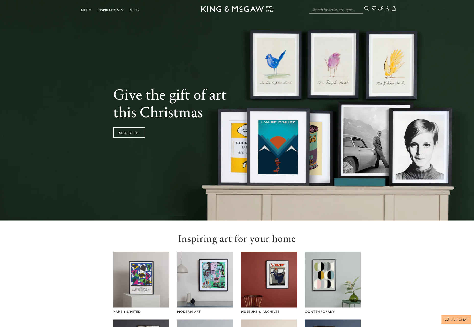
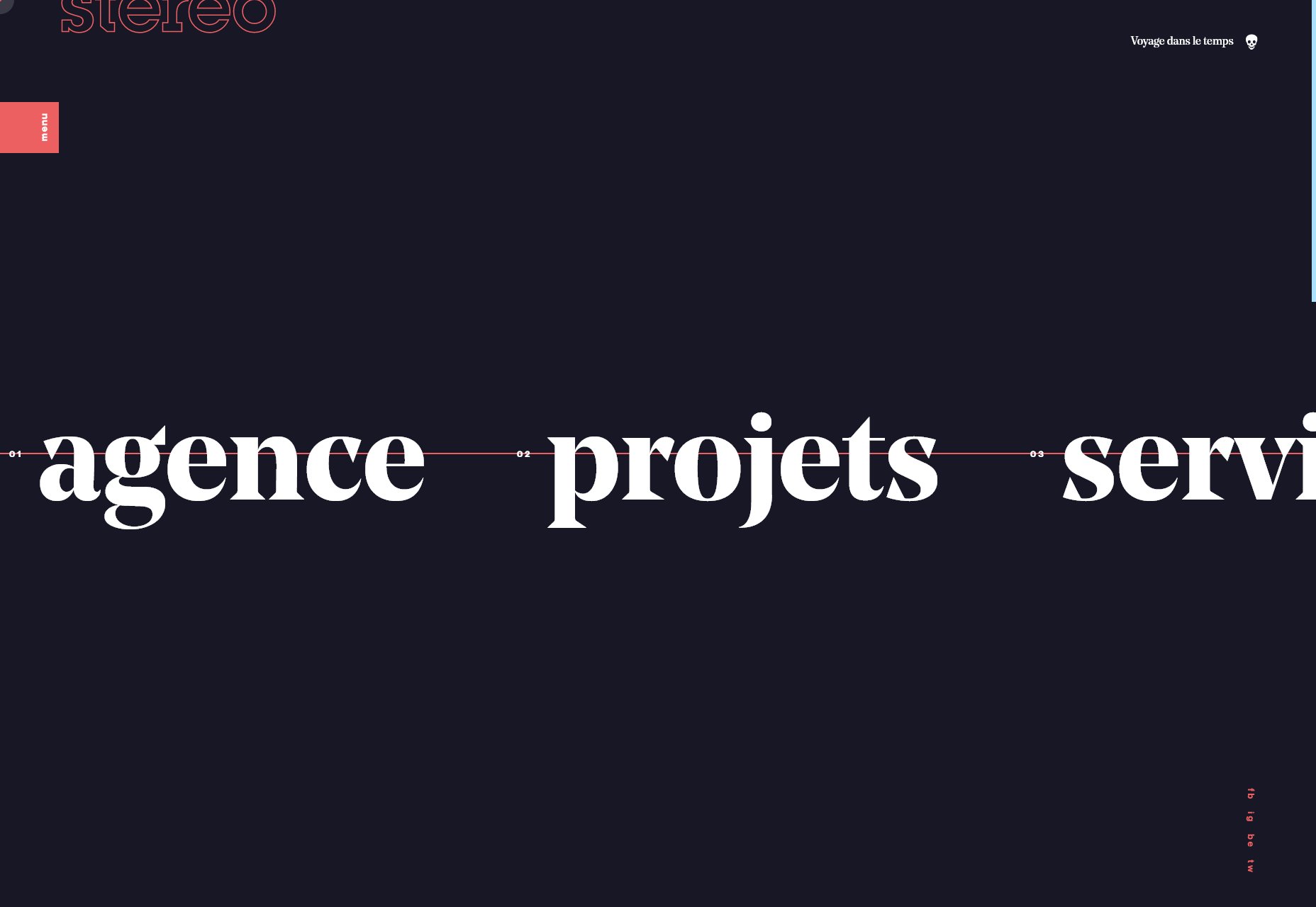
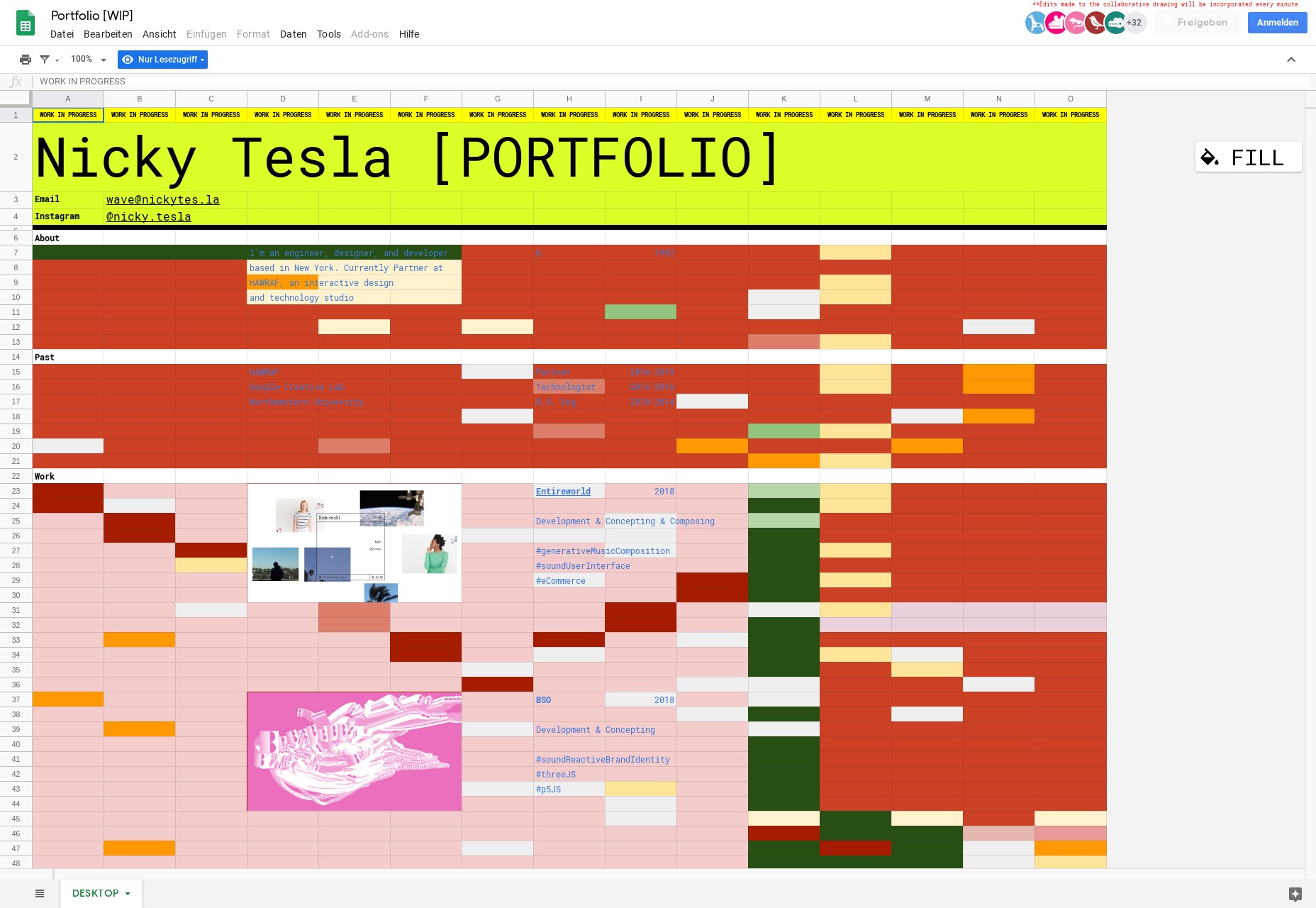
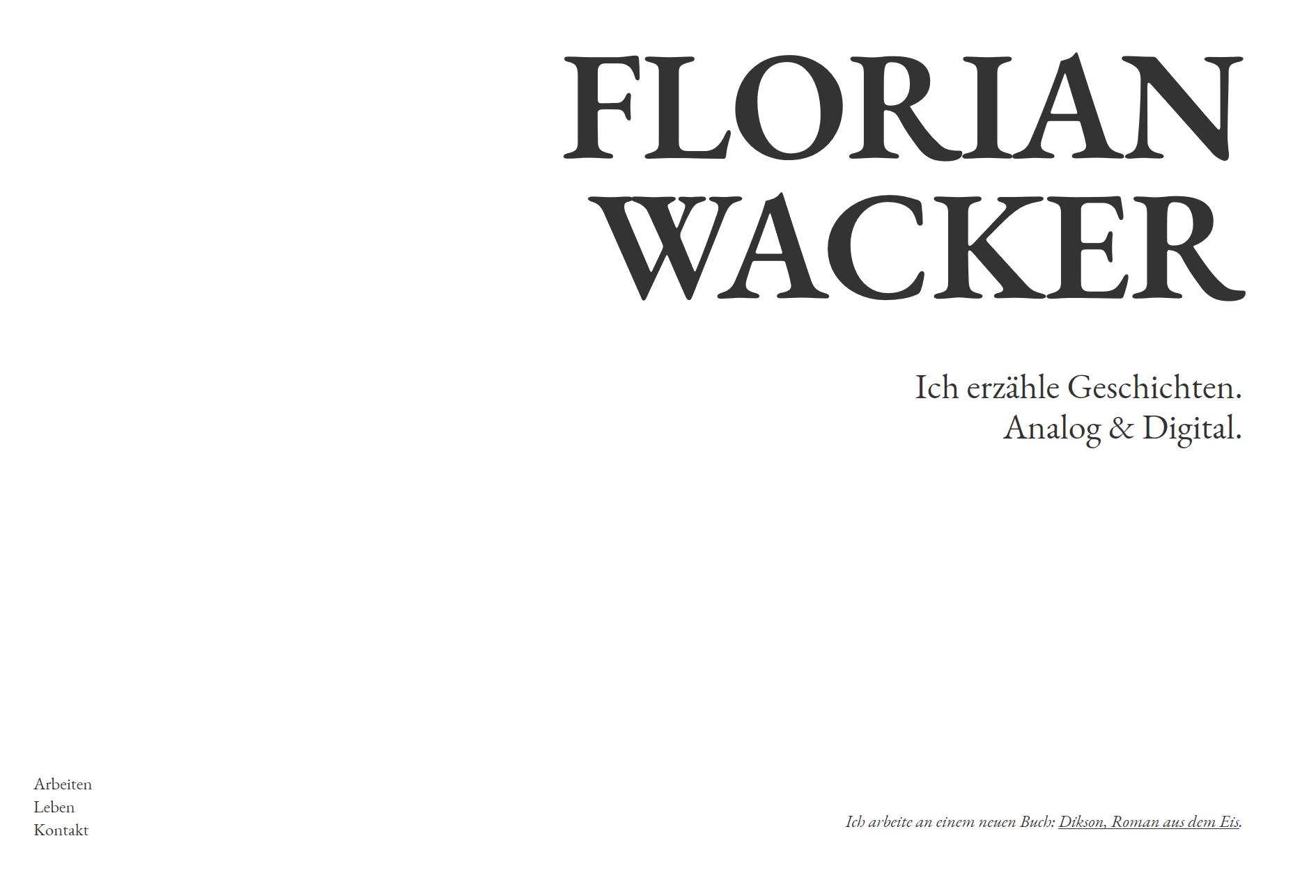
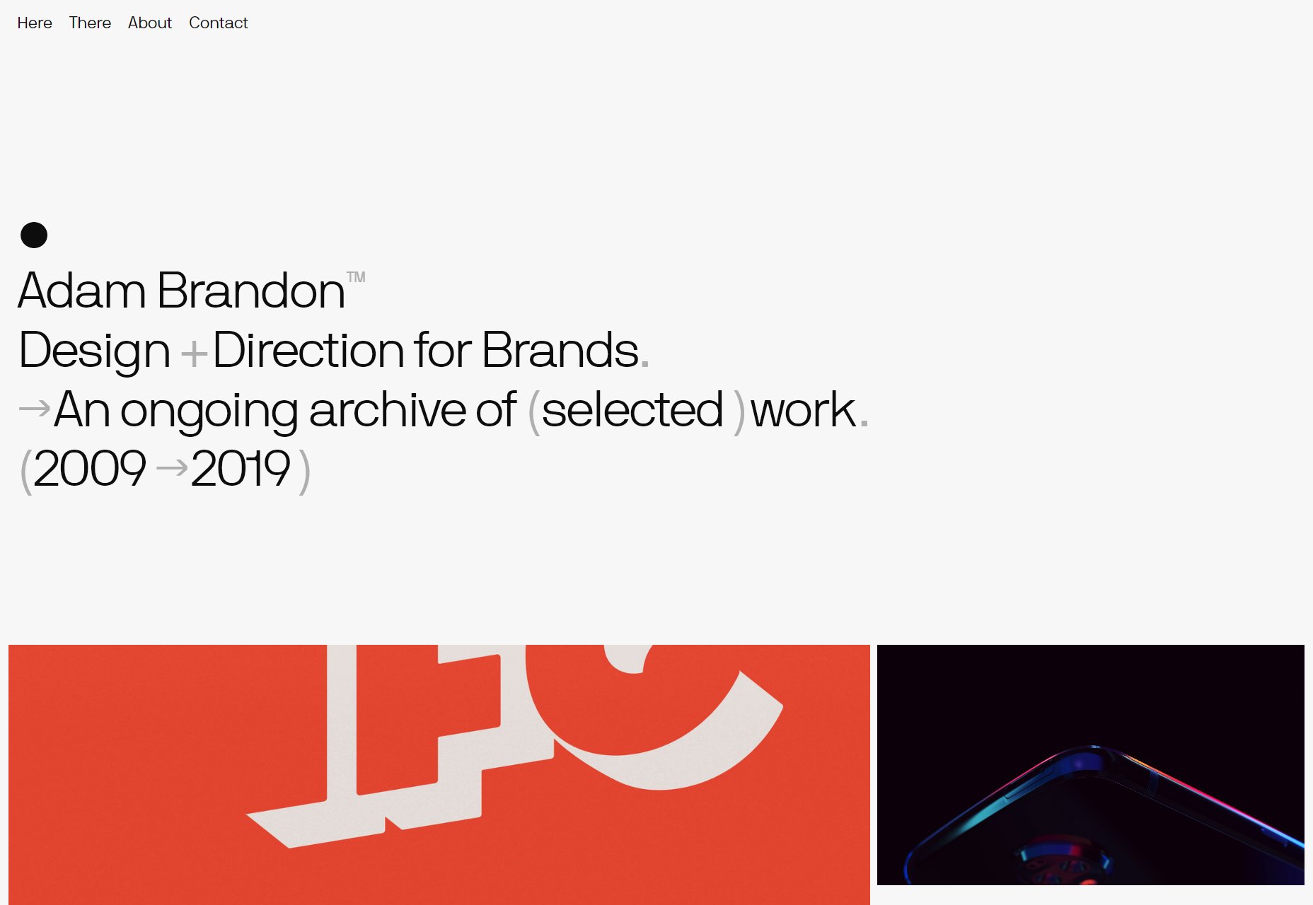
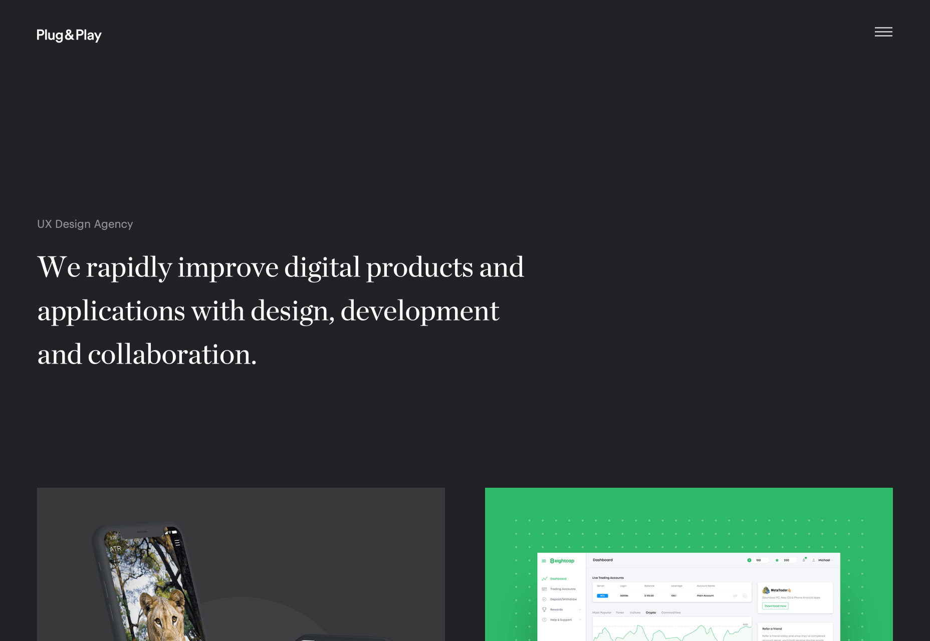
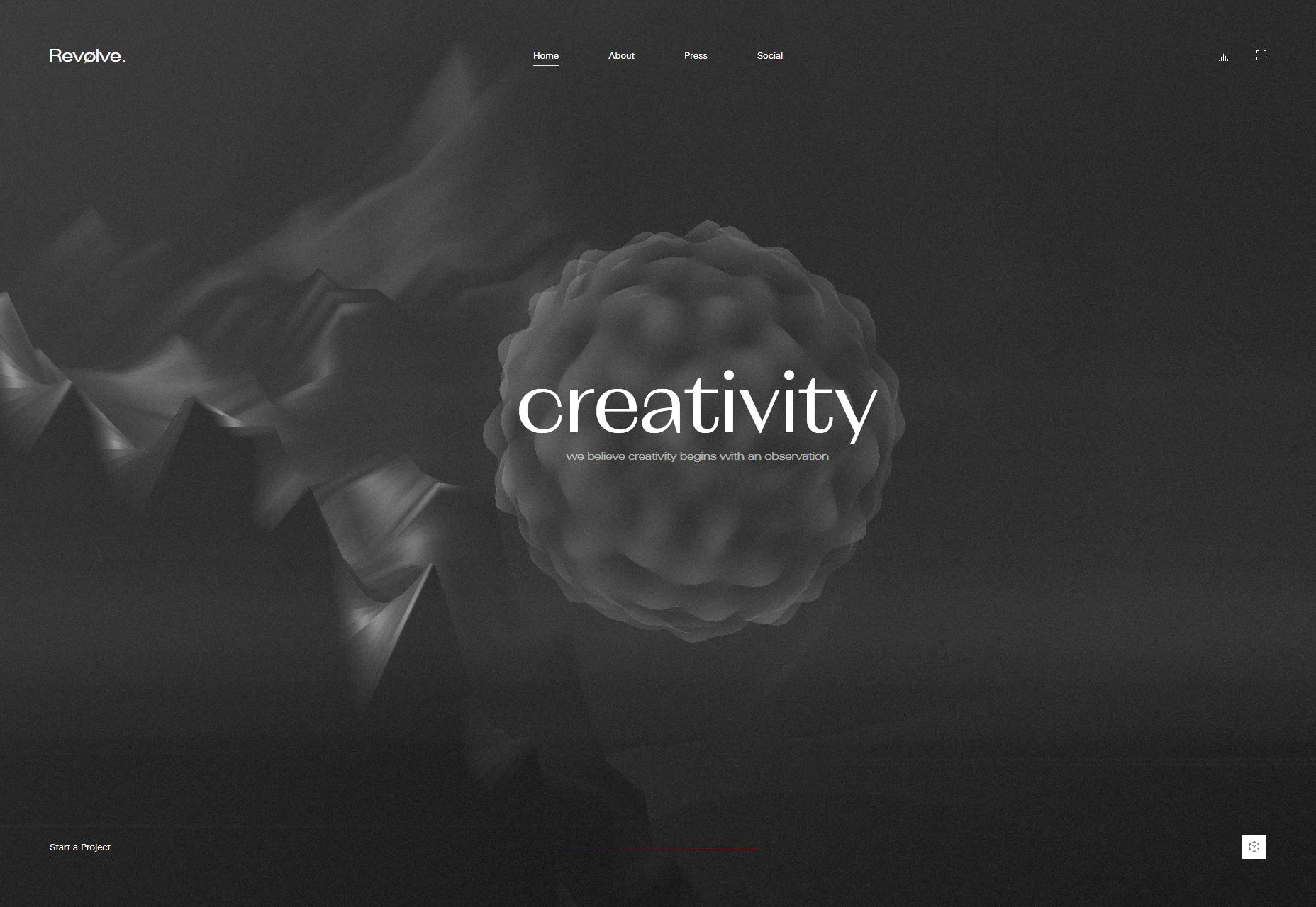
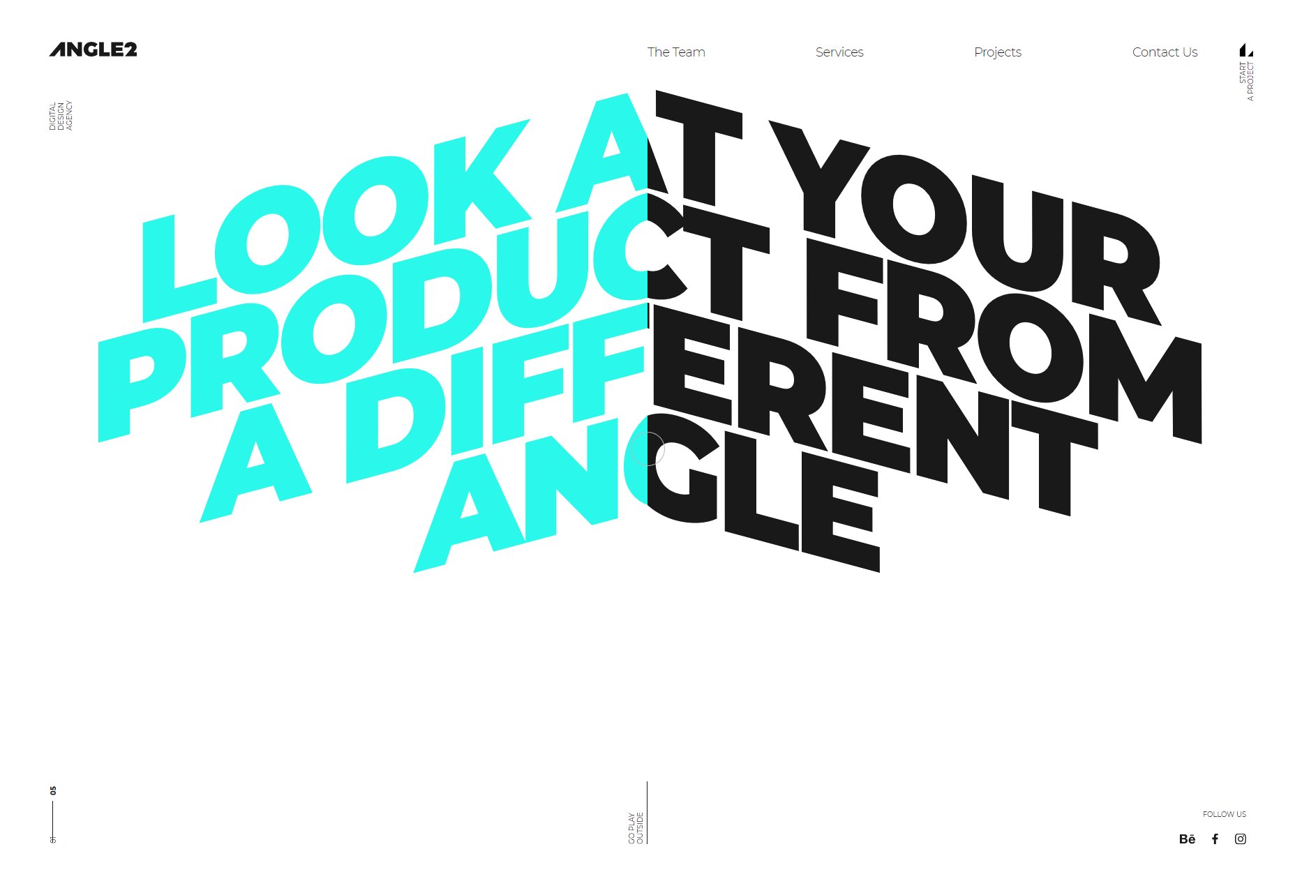
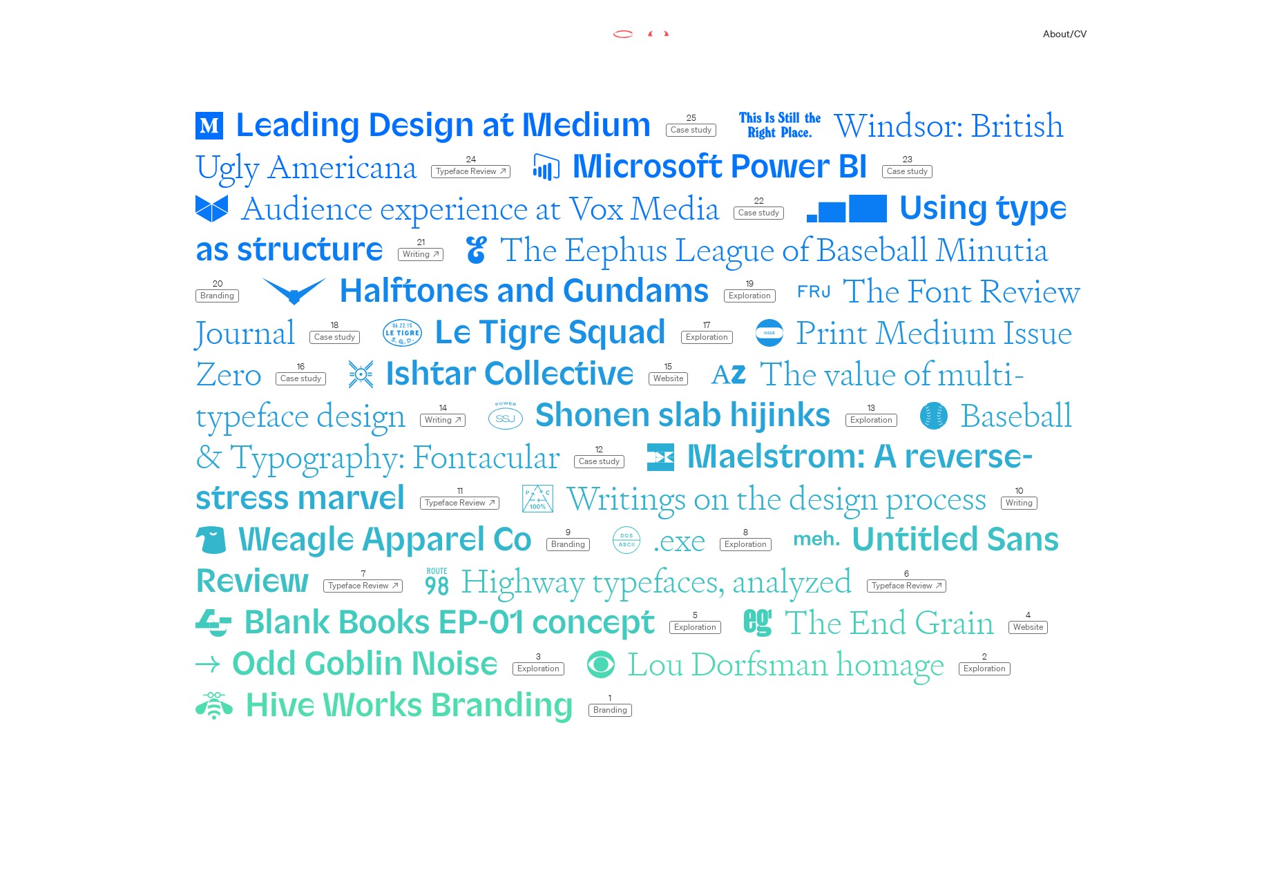
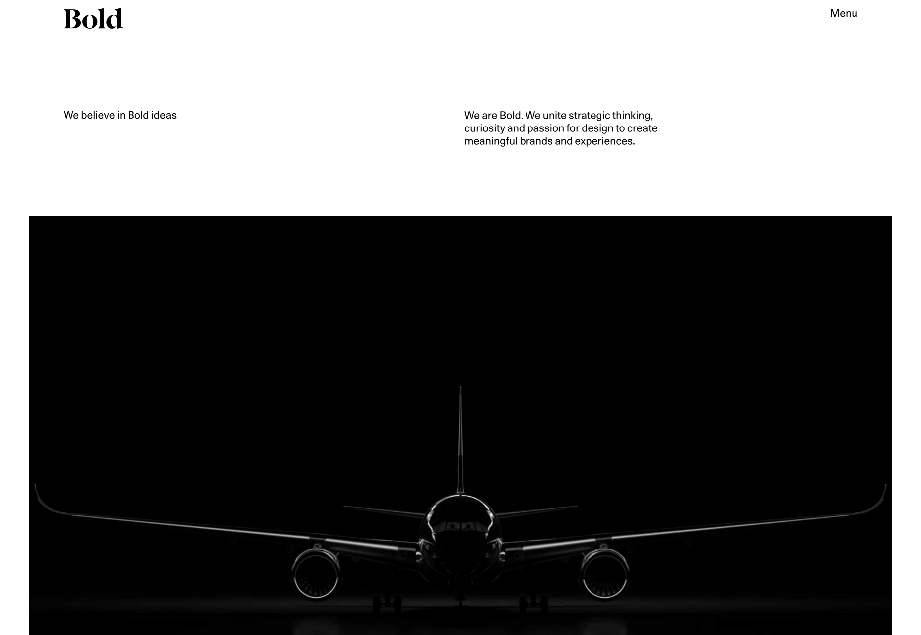
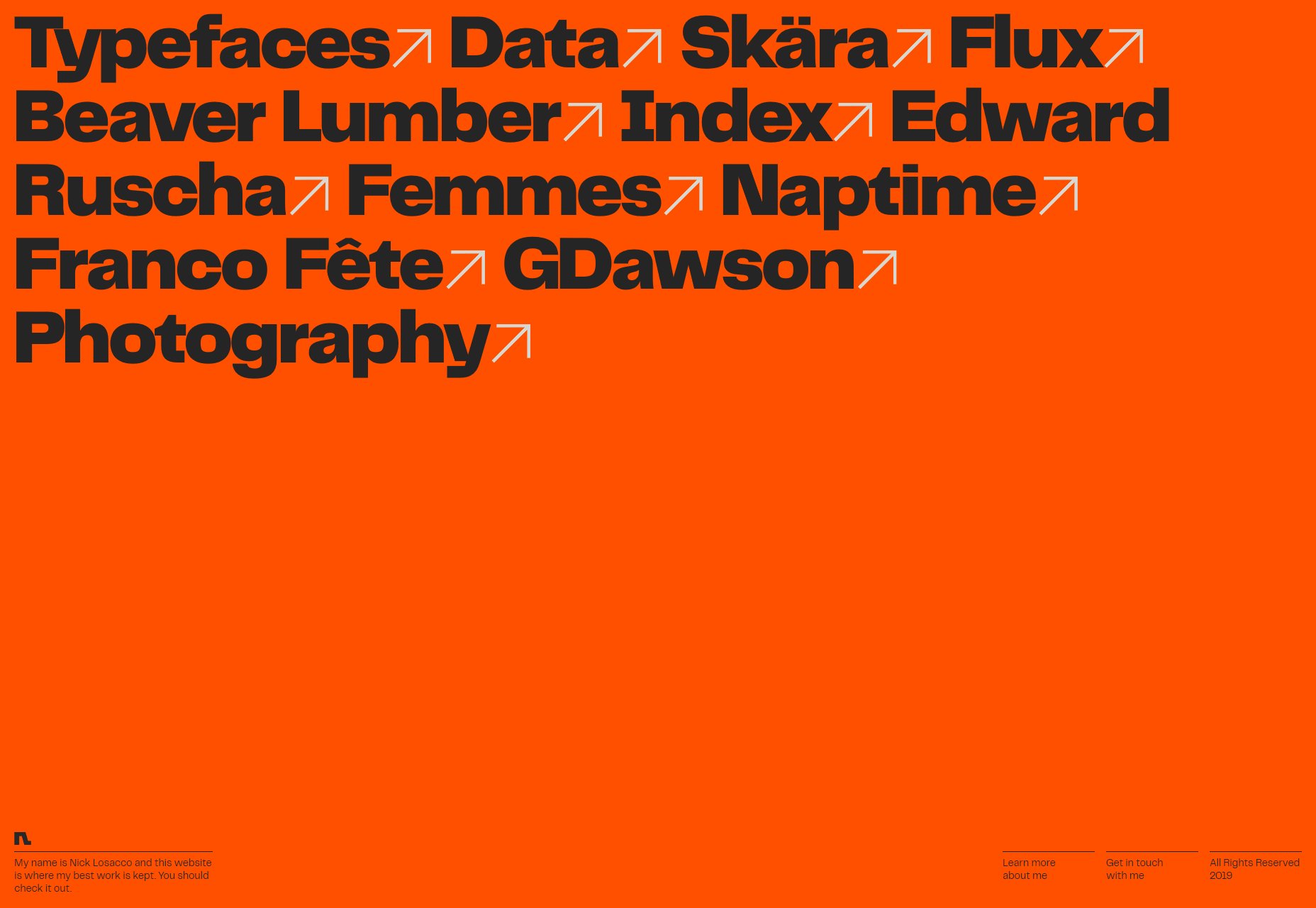
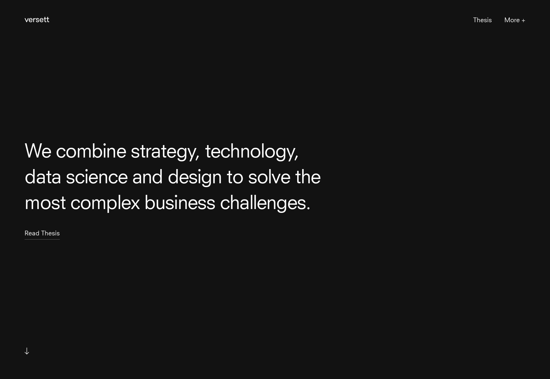
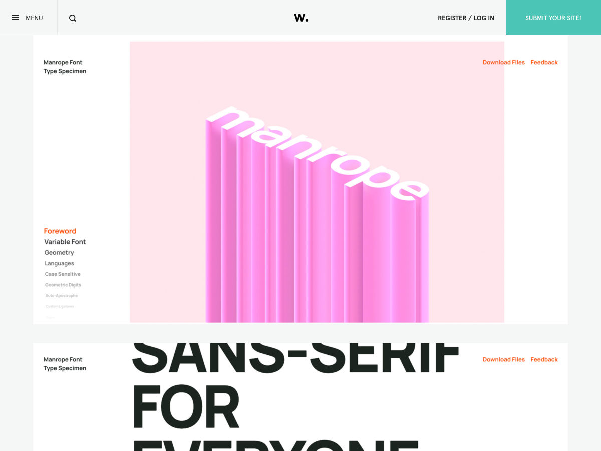
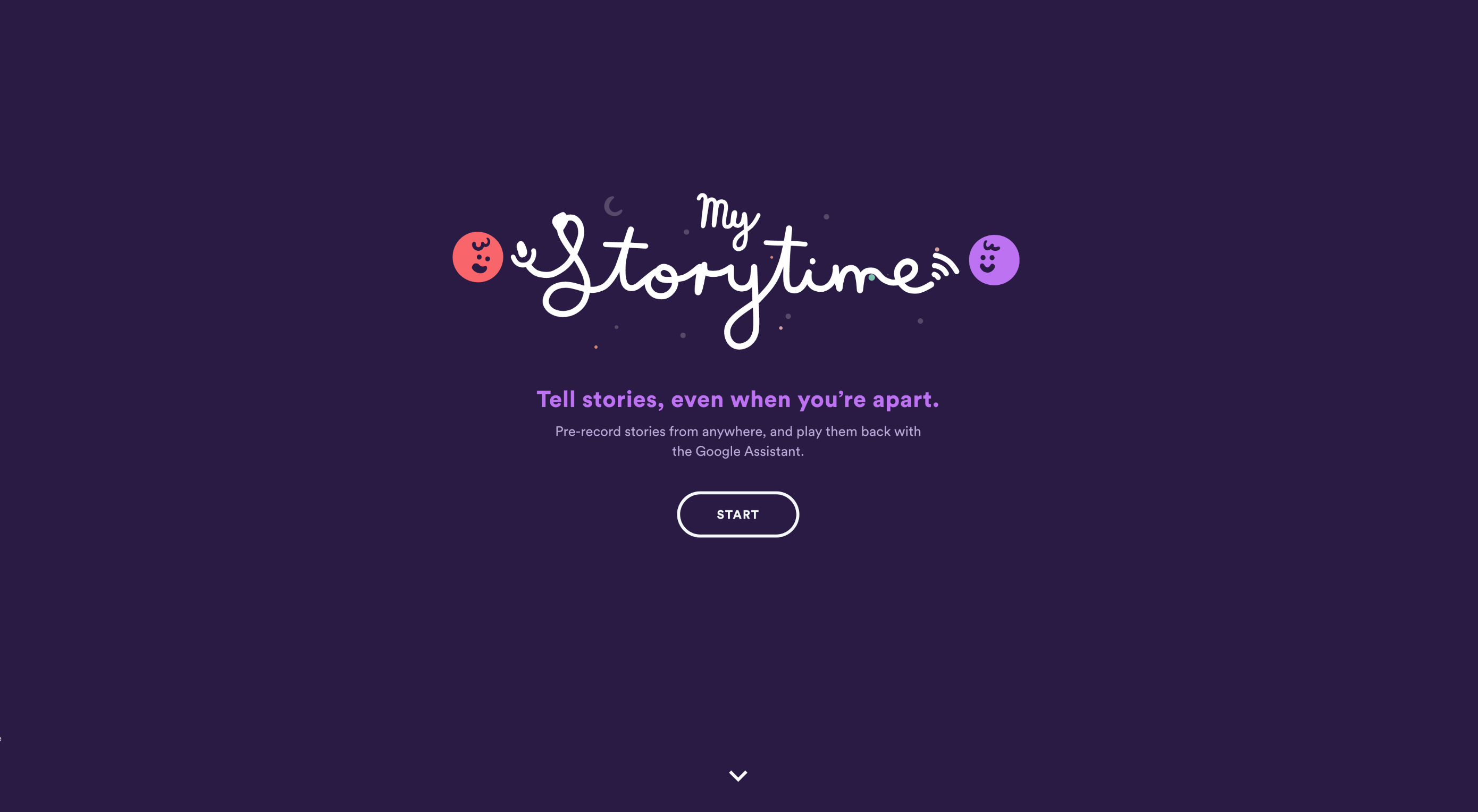
Every month we roundup the best new portfolios released in the previous four weeks. This month we’re looking back at the whole of 2019, and picking out 19 of our favorites from the last 12 months. There’s a mixture here of colorful and restrained, experimental and expected; the one thing they all have in common is an attention to details that creates an exceptional UX. Enjoy!

WTF Studio

If you’re going to name your business WTF Studio, you need a suitably WTF site. Able Parris is a NY-based creative director who’s more than happy to slap you in the face with colour and motion. What we really loved about this site is that once you’ve scrolled past the anarchic introduction, it’s actually very safe, very clear. Attitude doesn’t have to mean sacrificing UX.

Stereo

Stereo features smooth animation, a beautiful palette, and some really gorgeous type. What makes it stand out is the unusual navigation menu — it scrolls across the center of the screen like an old-style marquee. We also loved its sweeping animation as it transitions from state to state.

Eva Garcia

We weren’t just impressed with the portfolios of design agencies this year. Eva Garcia’s portfolio is a classic example of how to build a portfolio site. It’s brand-appropriate, intuitive to use, and lets the work come to the fore.

Kévin Chassagne

Kévin Chassagne’s site is a great example of a site that delivers excellent layout, and awesome animation, without relying on JavaScript. The JavaScript here is used for a few details, but you really lose nothing without it. Everything from the typography, to the colour scheme, to the simple UX are great for a portfolio when you’re potentially browsing hundreds of sites at once.

Nicky Tesla

Nicky Tesla’s portfolio is one of the most original of 2019. It’s a spreadsheet; it doesn’t just look like a spreadsheet, it actually is one; it’s a publicly available spreadsheet on Google, with a domain attached. It’s not the most beautiful portfolio you’ll ever see, but it is daringly committed to its core concept.

Florian Wacker

Florian Wacker’s portfolio features absolutely beautiful typography. This site wowed us back at the start of the year, when minimalism was still de rigueur. As a pitch to design agencies that value good typography, this is almost faultless.

Adam Brandon

More minimalism from the start of 2019 in the form of Adam Brandon’s portfolio. His client list is fairly formidable, with Netflix, Apple, Nike, and Ford in there. The site sensibly takes a step back and lets the work promote itself.

EVOXLAB

Evoxlab is an unusual site for us, in that it has gone out of its way to mimic powerpoint slides, which is bordering on skeuomorphism. Well, kinda. It certainly feels like a slideshow. We’ve included it because it’s really committed to the concept, and in this case it works.

Plug & Play

The agency site for Plug & Play is one of the least challenging sites we’ve seen in 2019. In many ways it verges on cliché, but that’s all intentional, because this site is about a simplified user experience. What’s more we love the way it transitions from dark mode to light, as you scroll.

Athletics

Athletics jumps right into fullscreen video case studies of work for clients like IBM. At that point, if you have the budget, you’re probably sold, but Athletics follows up with a grid of lower-profile, but equally exciting design work.

Revolve Studio

Revolve Studio’s site really stands out not because of the presentation-style user experience, but because it’s built in ASP.NET. It also stands out by not showing any work, which is an unusual approach that has been surprisingly popular over the last year.

Florian Monfrini

Florian Monfrini’s portfolio is an expanded, full screen, collage approach. It fills the space well, and was one of the sites that adopted this approach long before it became fashionable.

Angle2

We love the typography of Angle2. It’s another slideshow-style site, but it’s brought to life by the angles and skew of the typography. Despite the energetic feeling text, and the variety of designs — one per page — it always remains usable.

Florent Biffi

If 2019 was the year of a single effect, it was the year of rippling, liquid-style effects. One of the first we saw was Florent Biffi’s site, with huge, bold typography and a subtle rippling effect over the design.

Bethany Heck

We really loved the semi-brutalist approach of Bethany Heck’s portfolio. It’s just a collection of project titles, and in places the accompanying logos, that lead either to the site being referenced, or to an internal link with delightful typography.

Bold

Bold’s portfolio is a simple presentation with some exceptionally sophisticated details. We loved the way the border expands from the images as you scroll, creating the sense of zooming into a project. It’s a confident and understated portfolio that sells to big names, with big budgets.

Transatlantic Film Orchestra

The Transatlantic Film Orchestra make music for video. Its website opens with calm, dark, monochromatic visuals, and absolutely no auto-play audio, which is exactly the right approach. When we actually chose to play the audio, we loved the UI.

Nick Losacco

Nick Losacco’s site highlights a lot of different skills, not least his typeface design. The whole site relies heavily on bold typography and an acidic red background for its personality.

Versett

Versett’s portfolio is a clean, modern site, that leans towards a one-page approach without ever fully embracing it. It’s easy to scan if you’re a business comparing potential agencies, and we loved the “More+” menu option that herds you towards different options like product design, or launching a new company.

Source

p img {display:inline-block; margin-right:10px;}
.alignleft {float:left;}
p.showcase {clear:both;}
body#browserfriendly p, body#podcast p, div#emailbody p{margin:0;}

from Webdesigner Depot https://ift.tt/2rhrsAW


from WordPress https://ift.tt/36ZAmSW