Monday, June 4, 2018

3 Essential Design Trends, June 2018

Sometimes the most fun part of looking at design trends is when you start to notice subtle shifts in trends that create new design patterns altogether. Each of the trends this month is an evolution of something that’s been pretty popular, with an interesting spin.

Here’s what’s trending in design this month:

1. Full Screen Photo

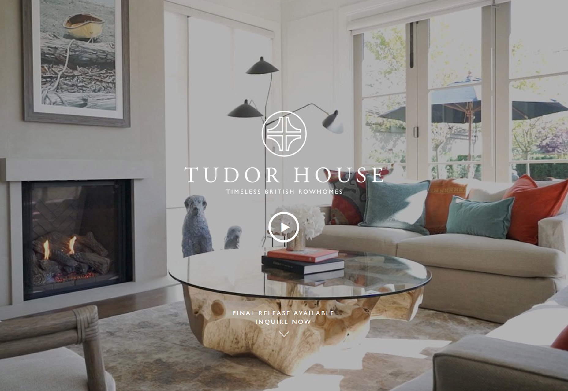
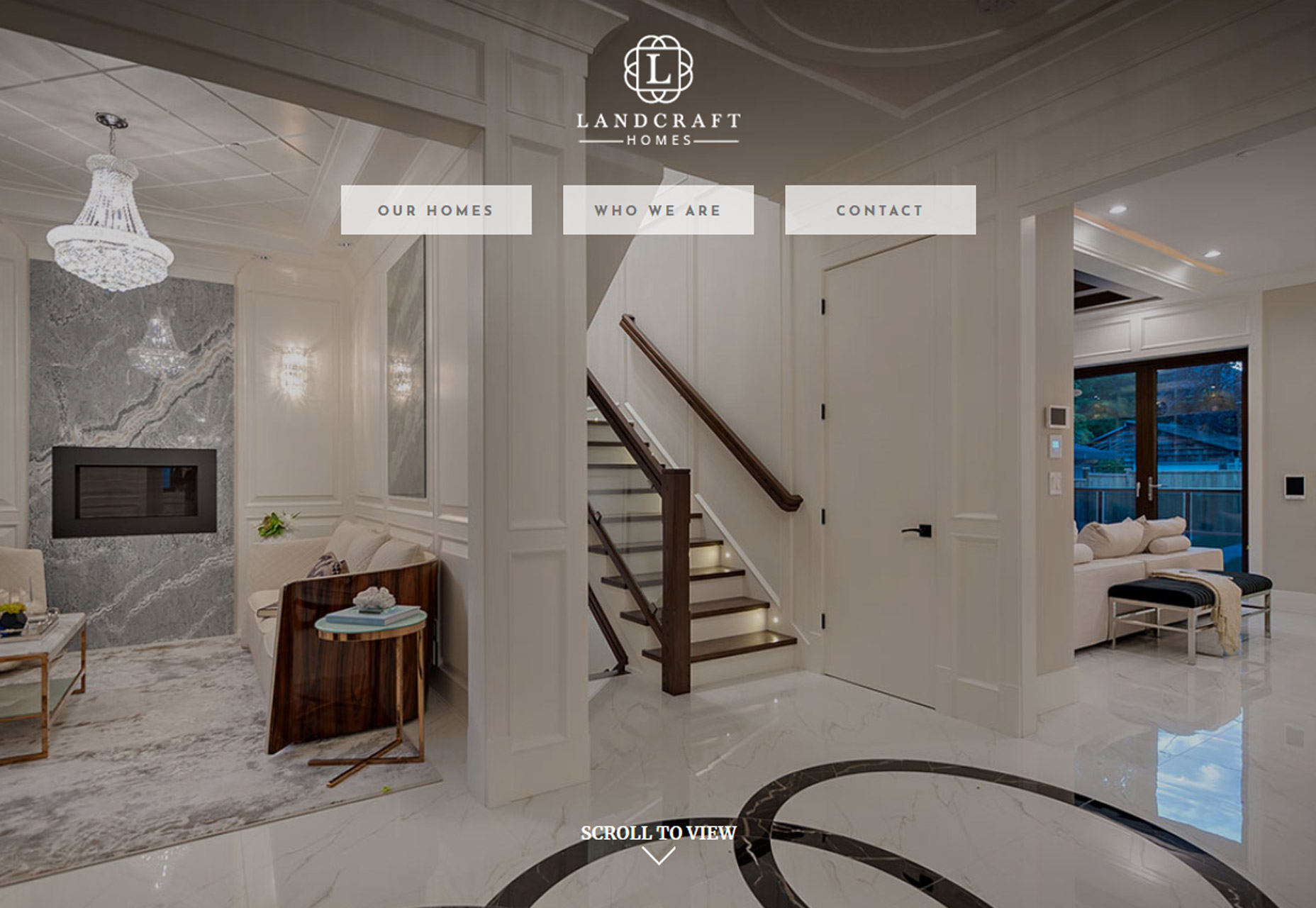
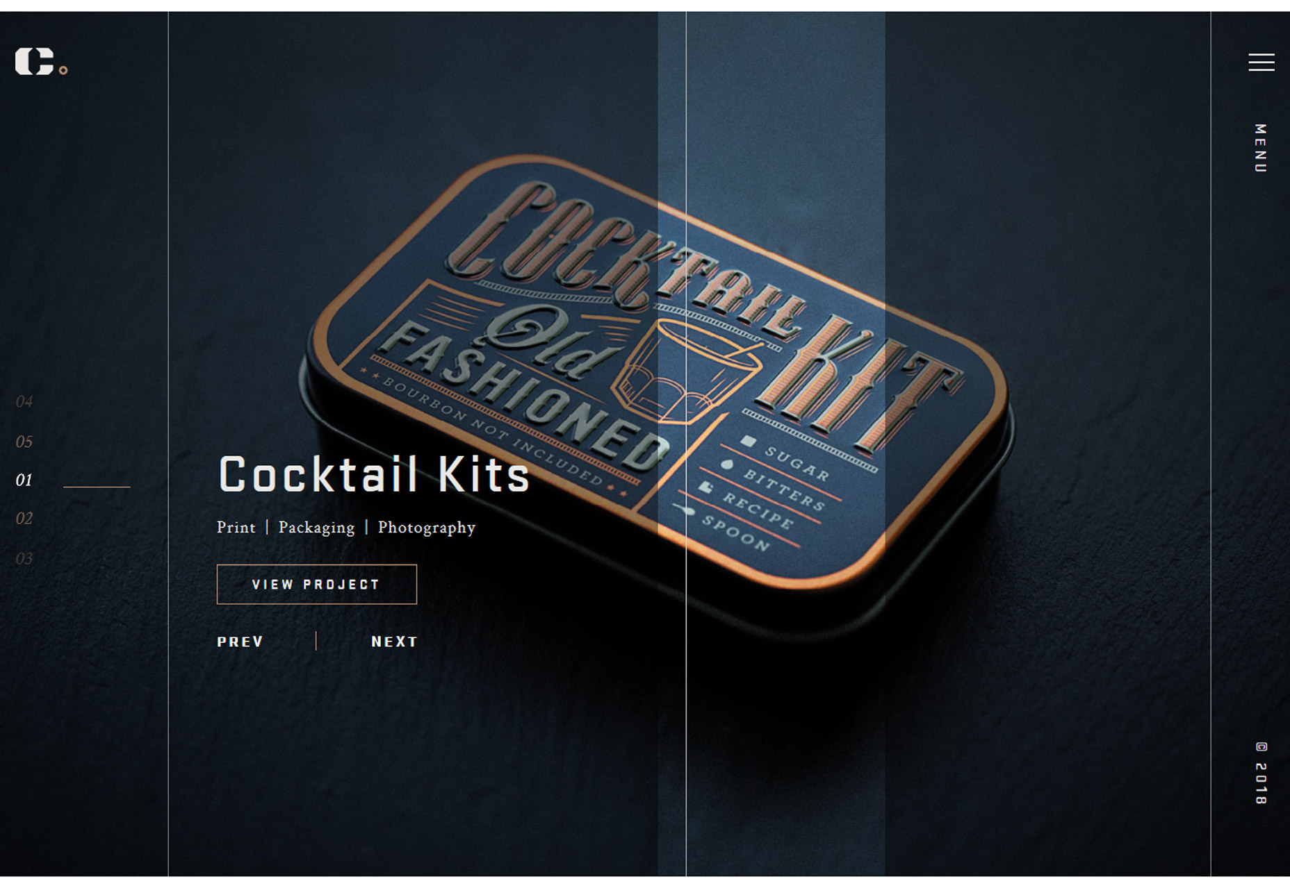
The oversized hero image gets even bigger with full-screen photo displays. The key element in this website design trend is that the home “screen” is stripped of other elements so that the photo fills the entire screen.

There aren’t separate space for navigation or other elements outside the image area. All elements are actually contained within the image. This design concept works best with a great image. Only the best, most striking and interesting photos can carry a design in this way because of a lack of other elements.

the image has to be a show-stopper

Most of the design examples below feature navigation that’s hidden within the image area – most commonly through use of a hamburger icon – and there are many other places to click or engage users. So the image has to be a show-stopper.

While these designs look great, they can present some usability challenges including lack of contrasting spaces for other elements, minimal use or space for messaging and user confusion as to what to do after coming to the page.

Additional design elements such as lines or user cues (“scroll for more”) can help. This type of design can work best for projects without a lot of content and strong visuals, of course.


2. New Take on Split Screens

Split-screen designs are something that we’ve noted in the trend category a few times at Webdesigner Depot – in the February version of this roundup and in a layout trends post as far back as 2015.  

The great thing about split screen designs is that they work with the responsive format beautifully. You get double content on desktop and stacked content on mobile screens. Regardless of device, the user doesn’t feel like he or she missed out on anything by changing device type.

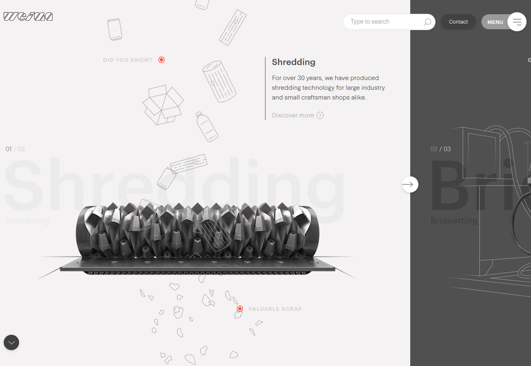
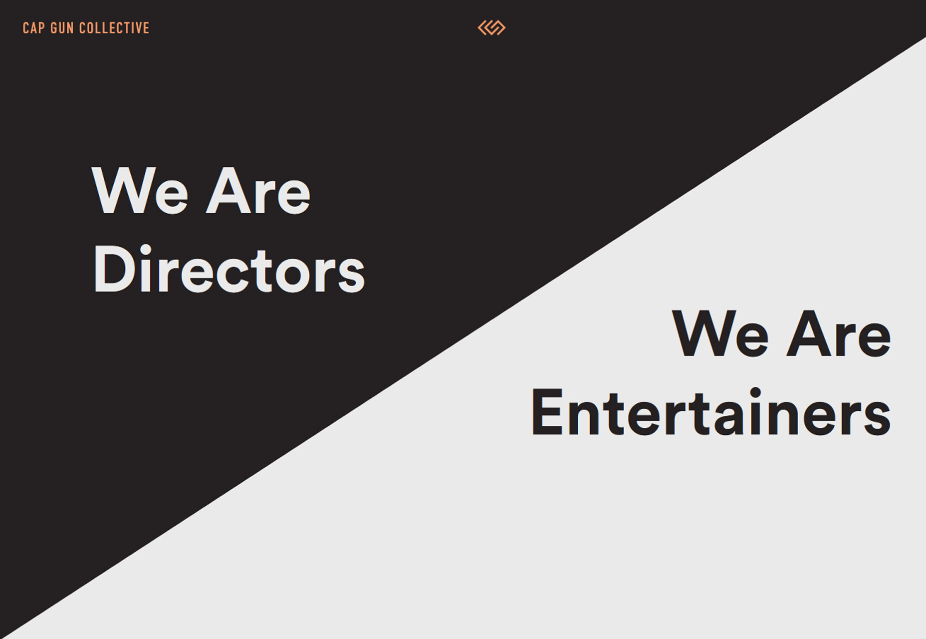
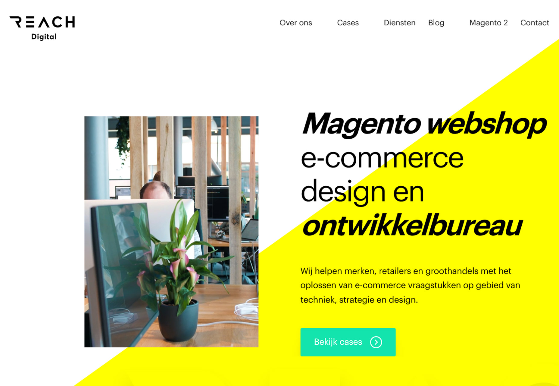
The function and form of split-screen designs hasn’t changed all that much, but there has been a shift to more asymmetrical and diagonal split screens. The simple change to the aesthetic (while maintaining the great functionality of dual-content design elements) is attention-grabbing and worth trying. From the bright white and yellow combination of Reach Digital to the simple black and white style of Cap Gun Creative to the quarter-panel split by Weima, each of the alternative spits is a little more interesting than the perfectly symmetrical splits that have dominated this trend for a few years.

The nice thing about split-screen projects is that they can work with almost any type or amount of content.

From small sites to masses of content, a split screen gives users a choice when it comes to how and what to engage with first in the design. Split-screen options provide a “this or that” user experience, engaging users as they make a binary choice while interacting with content along the way. It’s easy to understand from a user perspective and highly functional.


3. Color Overlays with Minimal Transparency

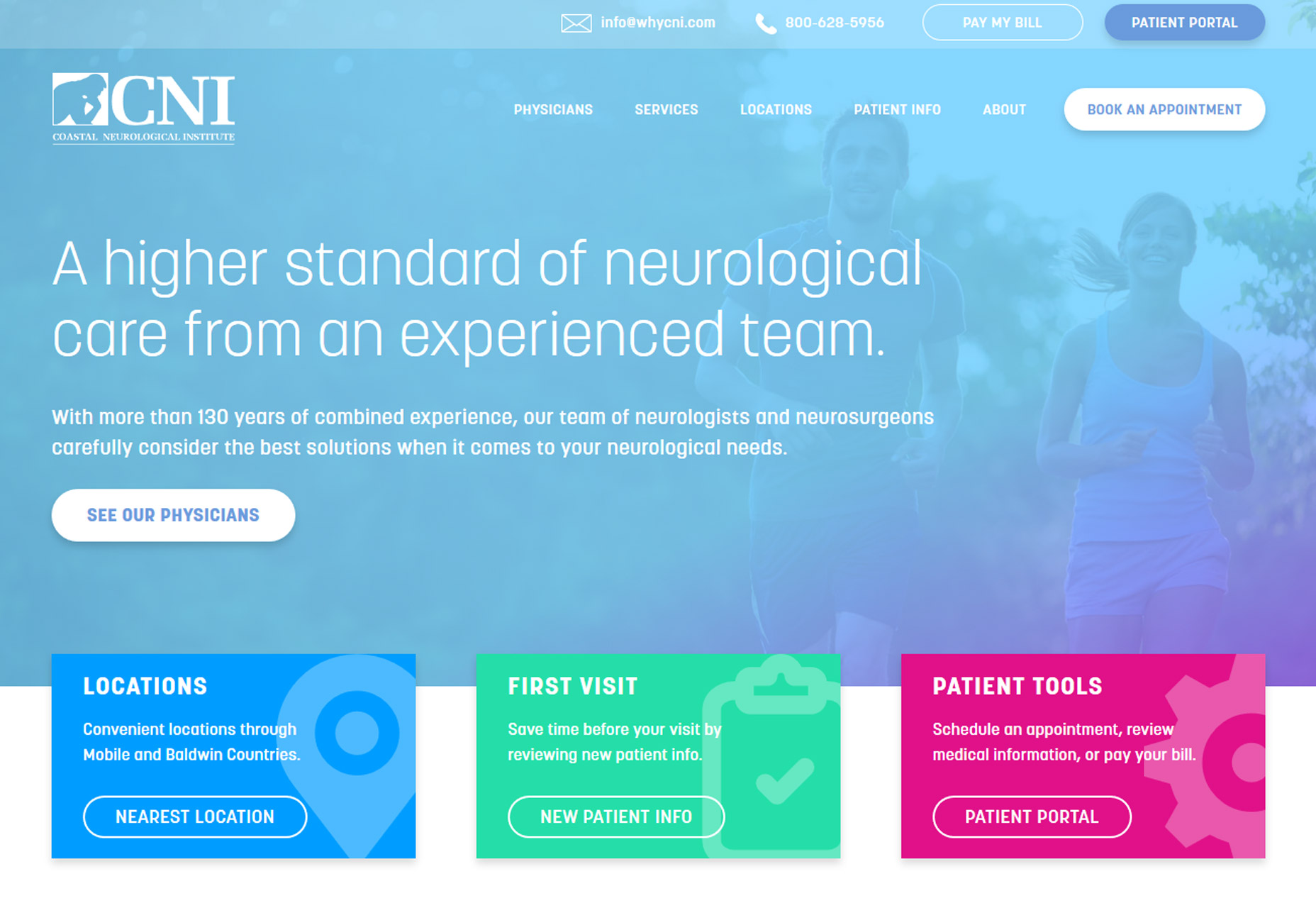
Another trend that’s become overwhelmingly popular is using a color overlay with transparency over photos or video. The technique is popular because it helps create a layering effect that can make it easier to include text and other elements on top of images with a more consistent level of color contrast.

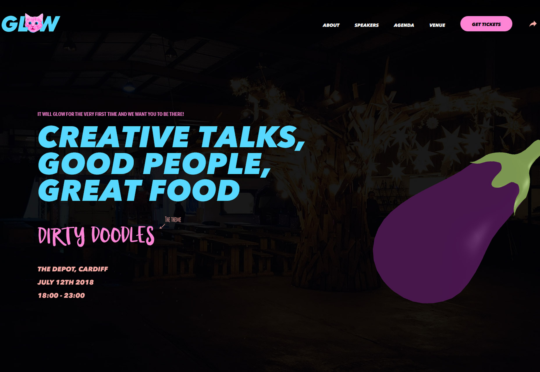
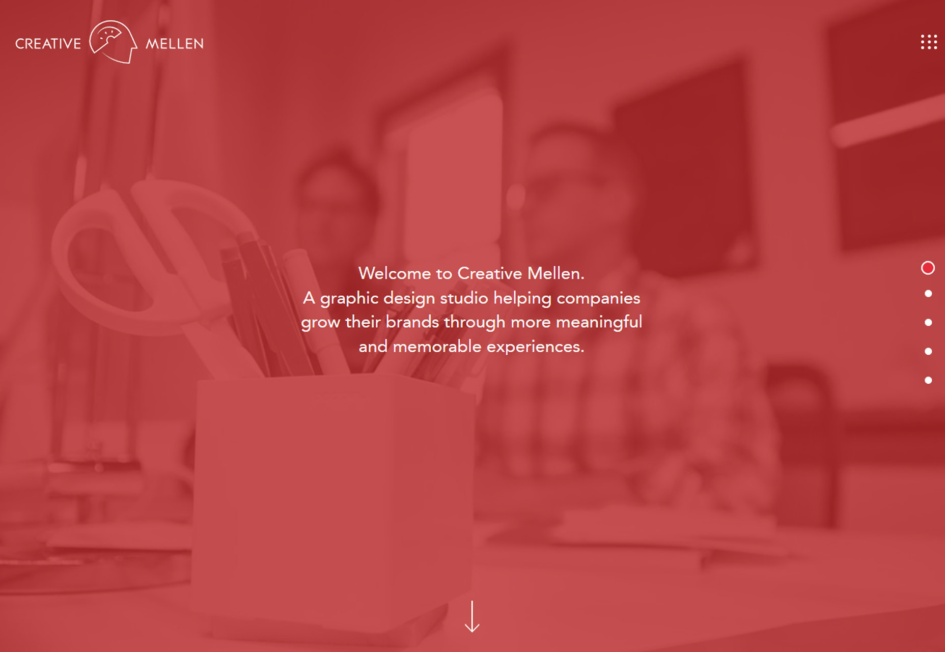
Designers are pushing the envelope with transparency options here so that the background element is hard to see at a glance. In each of the examples below, you really have to look closely to figure out what is happening in the image or how it pertains to the design. Two observations about this trend:

  • It looks pretty cool at a glance. There’s enough texture and depth from the overlay to have more visual interest than a single background color.
  • But … you lose any sense of what information the image contains. The transparencies are too “thick” to clearly discern the image without a lot of “work.” (And we know casual website users aren’t going to work to understand content.)

So that leaves us with the question as to whether this trend really works at all. Yes, it looks nice, but are you really providing information with the background image?

Don’t use this concept to make up for a sub-par image

Don’t use this concept to make up for a sub-par image. Do use this concept if you want to add depth and have an image that doesn’t need to be ready closely.

In each of the examples below, elements in the foreground are much more important to the overall messaging a goal of the design than the image beneath the color overlay. In each instance, the image is providing a hint of additional information but is not a key part of the message. It doesn’t really contribute to user understanding and is more of a visual accent than anything else.

This is a tricky technique. If you plan to use this trend in your projects, make sure you have just the right image and transparent overlay.

Gather plenty of feedback about what people can and can’t see in the image and whether using something that requires this much visual work is worth the effort. If users struggle with it, they will abandon the design and that’s not at all beneficial.


Conclusion

Pushing trend forward is a lot of fun and one of the things that can keep design fresh and eliminate that uniform look that sometimes happens when a technique gets too popular. How do you feel about these evolutions in design? Would you use them?

What trends are you loving (or hating) right now? I’d love to see some of the websites that you are fascinated with. Drop me a link on Twitter; I’d love to hear from you.

Add Realistic Chalk and Sketch Lettering Effects with Sketch’it – only $5!

Source

p img {display:inline-block; margin-right:10px;}
.alignleft {float:left;}
p.showcase {clear:both;}
body#browserfriendly p, body#podcast p, div#emailbody p{margin:0;}

from Webdesigner Depot https://ift.tt/2Lfz776


from WordPress https://ift.tt/2LY4696

Sunday, June 3, 2018

Popular Design News of the Week: May 28, 2018 – June 3, 2018

Every week users submit a lot of interesting stuff on our sister site Webdesigner News, highlighting great content from around the web that can be of interest to web designers. 
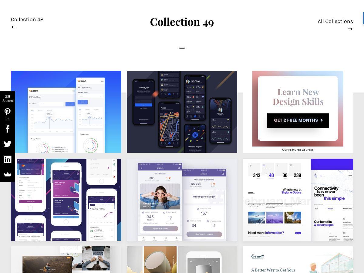
The best way to keep track of all the great stories and news being posted is simply to check out the Webdesigner News site, however, in case you missed some here’s a quick and useful compilation of the most popular designer news that we curated from the past week.

Note that this is only a very small selection of the links that were posted, so don’t miss out and subscribe to our newsletter and follow the site daily for all the news.

20 Inspiring Web & UI Designs


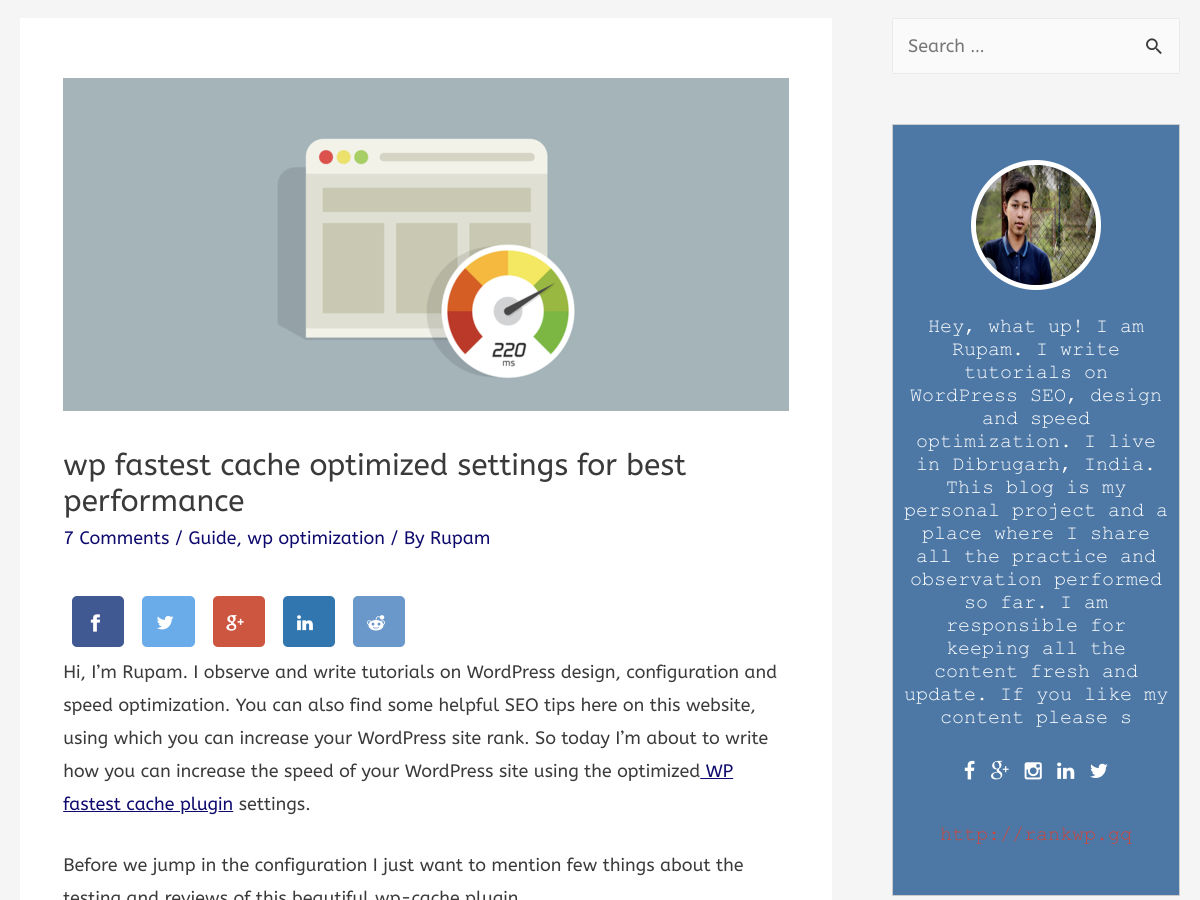
Load your WordPress Site in Less than a Second


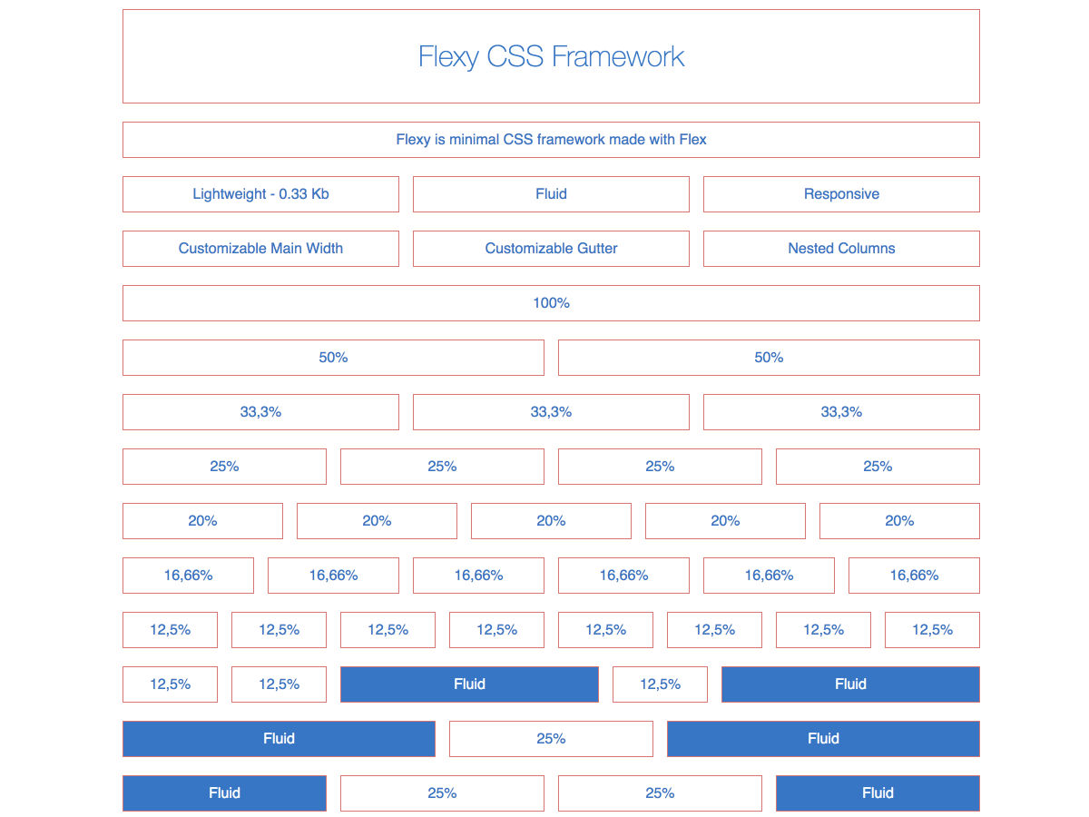
Flexy – CSS Framework


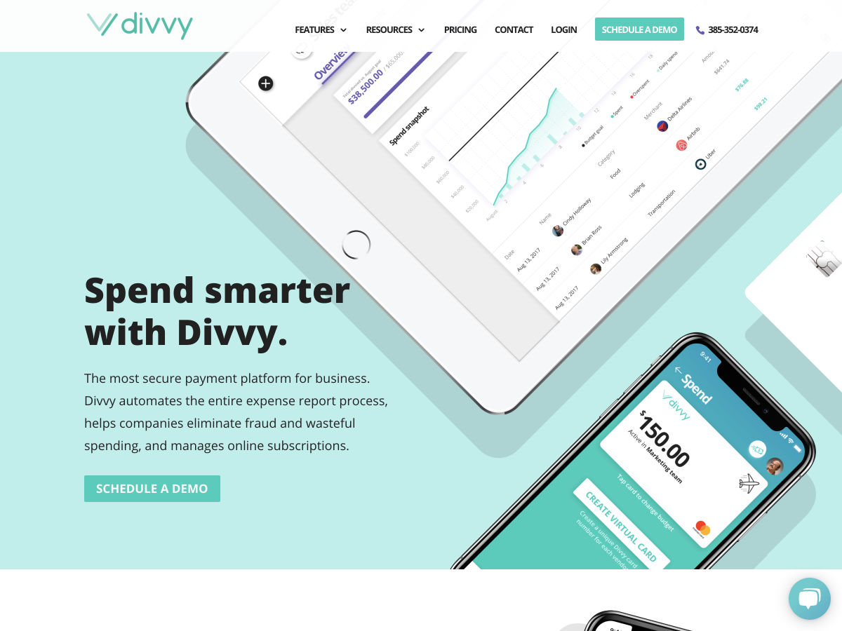
Divvy – Secure Payment Platform for Businesses


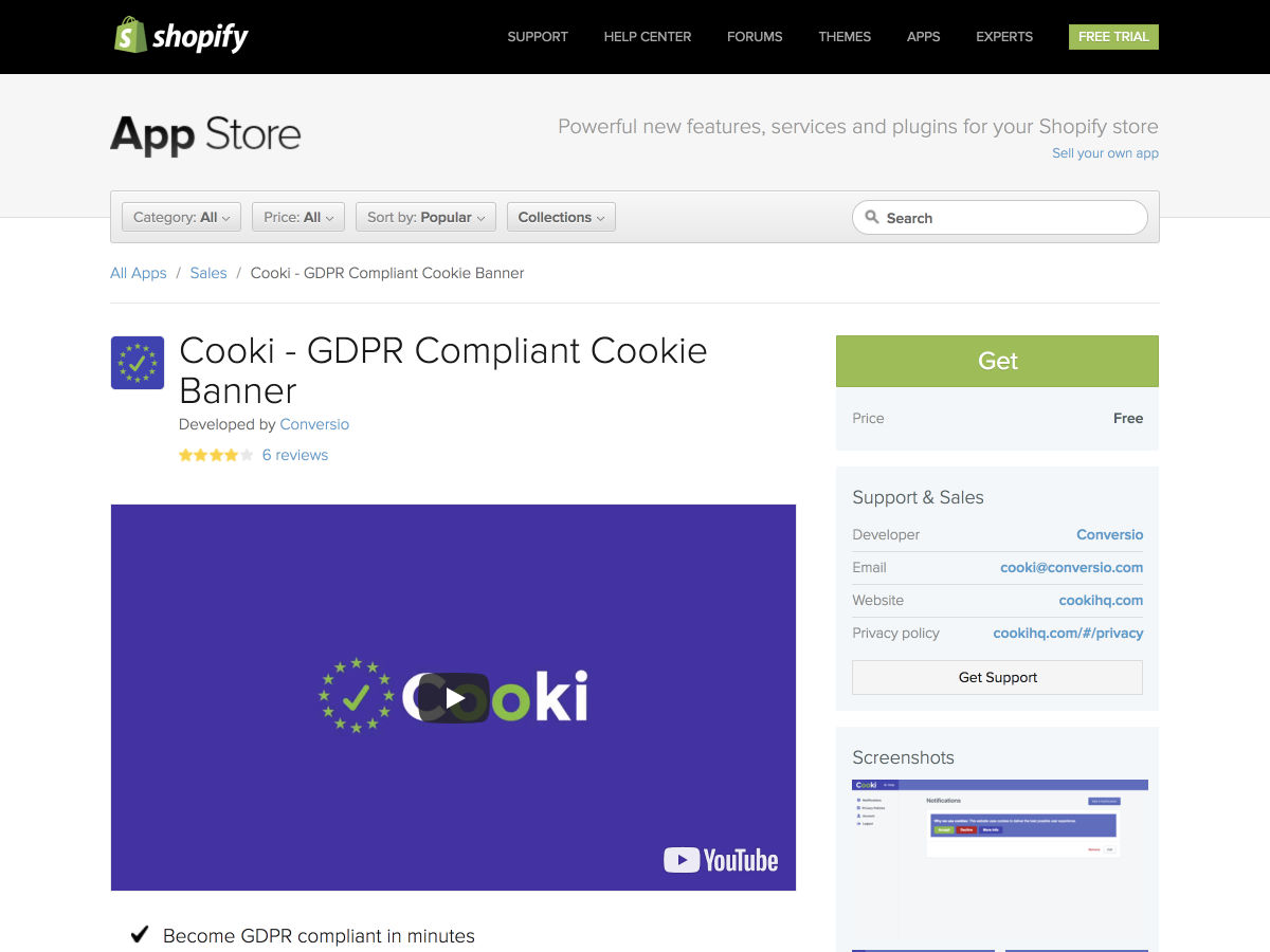
Cooki – GDPR Compliant Cookie Banners


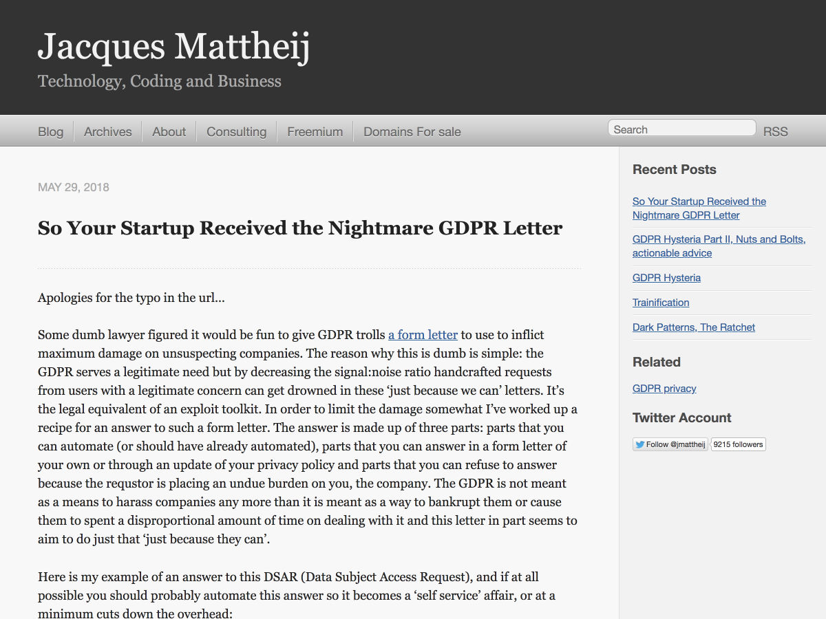
So your Startup Receive the Nightmare GDPR Letter


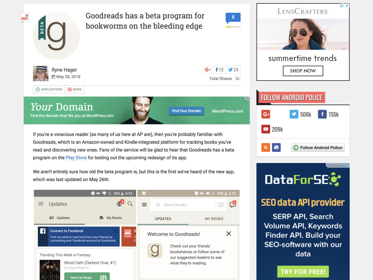
Goodreads has a Beta Program for Bookworms on the Bleeding Edge


Designing for Actual Performance


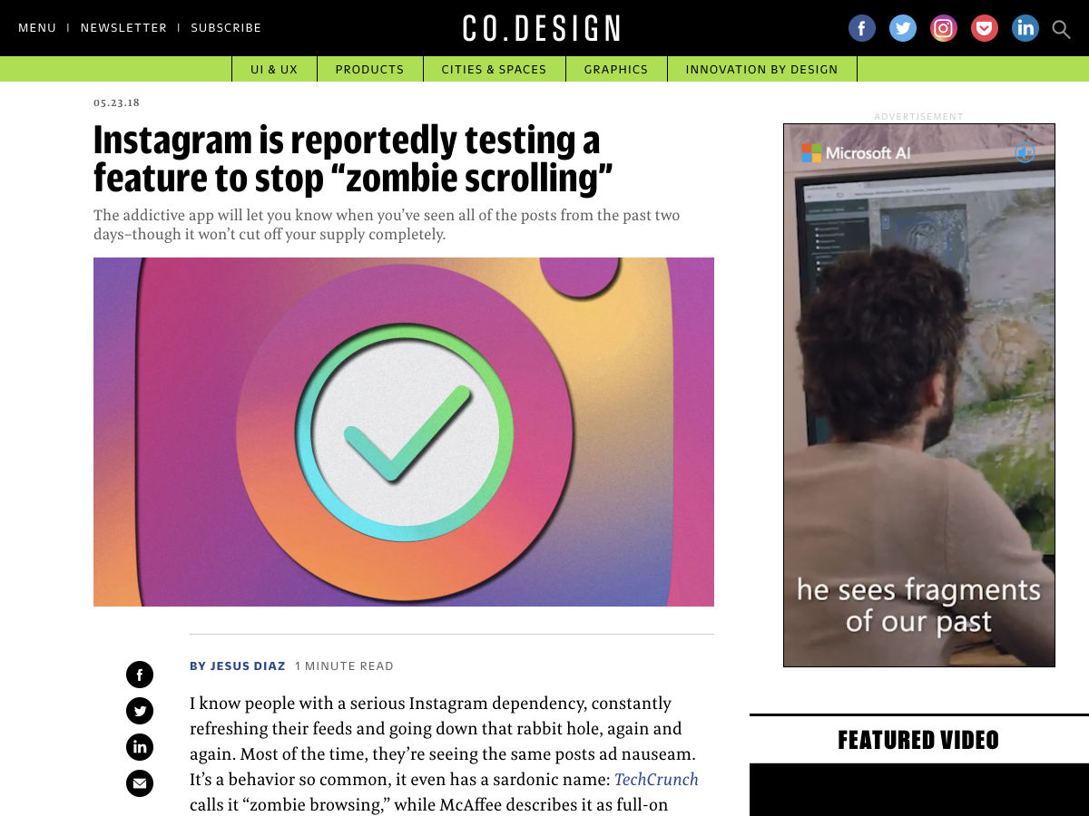
Instagram is Reportedly Testing a Feature to Stop ‘Zombie Scrolling’


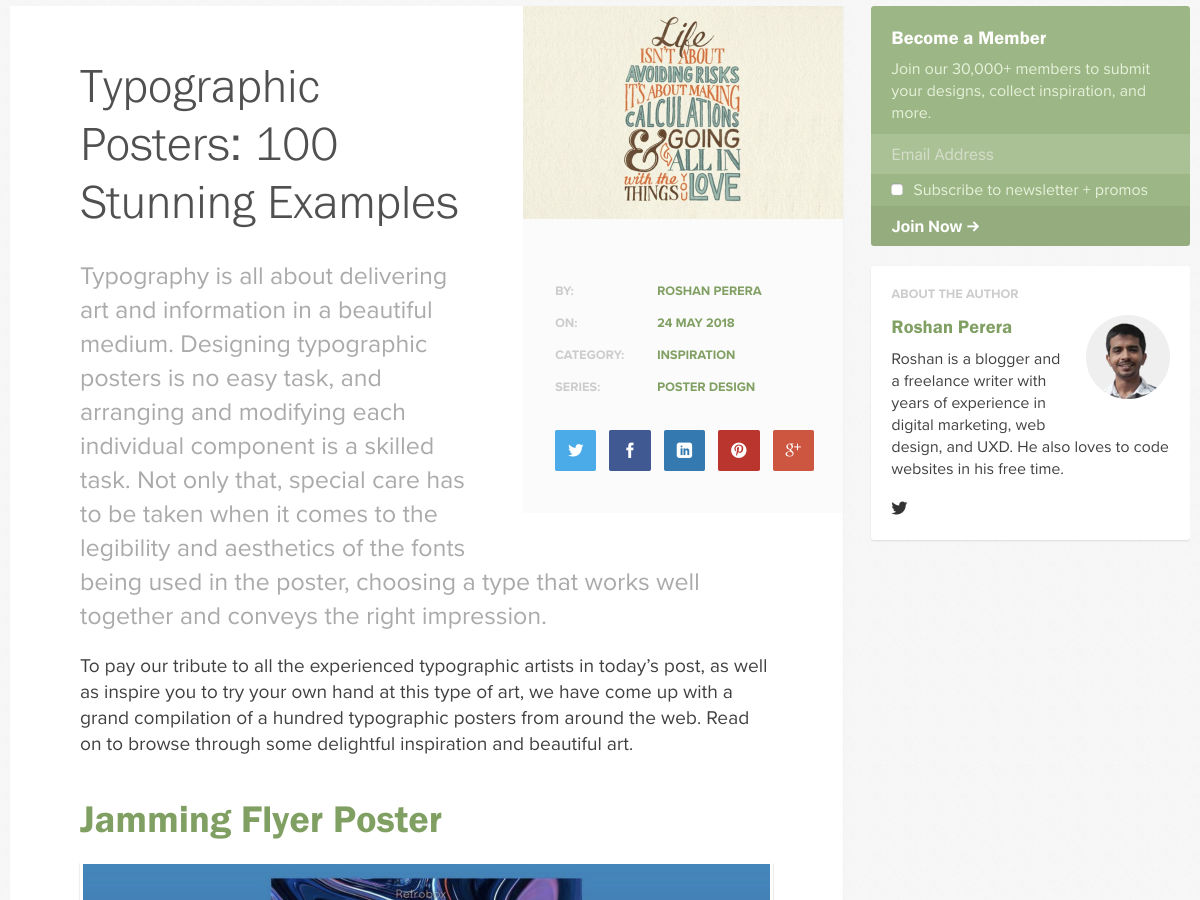
Typographic Posters: 100 Stunning Examples


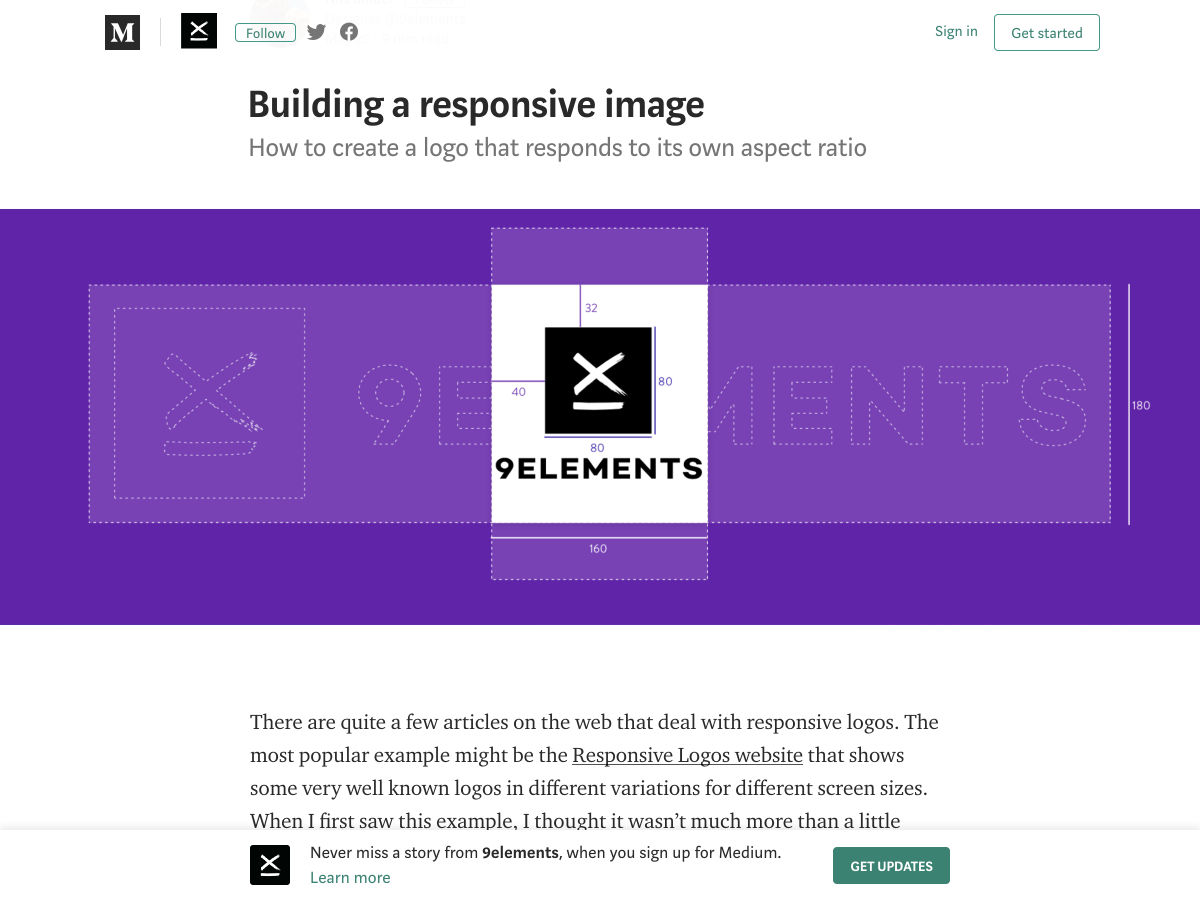
Building a Responsive Image


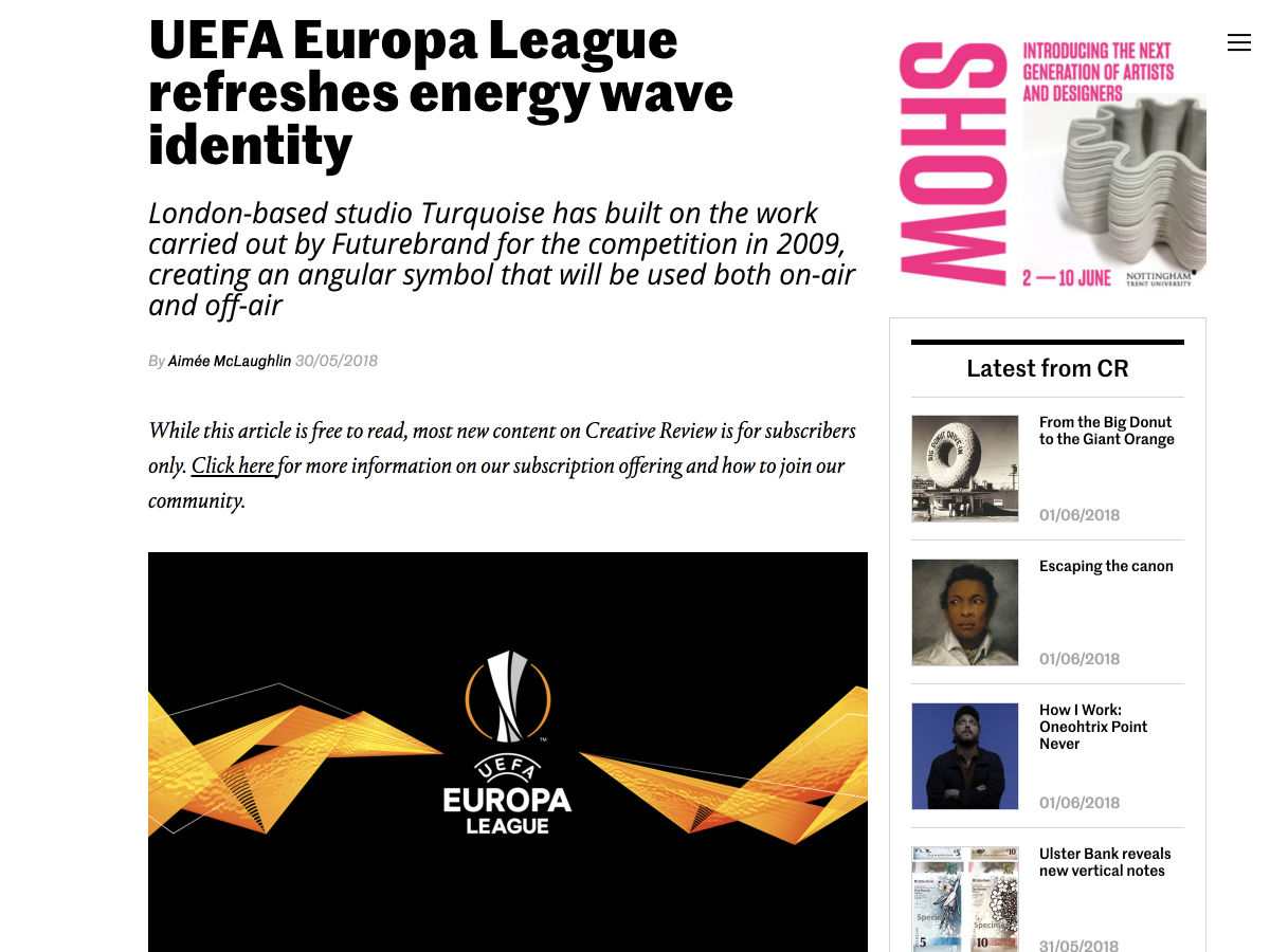
UEFA Europa League Refreshes Energy Wave Identity


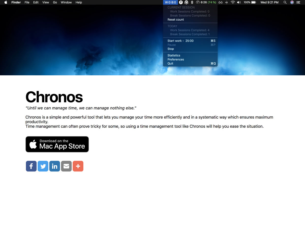
Chronos – A Simple Pomodoro Timer for MacOS


AI Ethics – A New Skill for UX-Designers


Rediscovering Apple’s 1987 Identity Guidelines


PatternFly – A Web UI Framework by RedHat


What is Holistic Web Design?


17 Delightfully Interactive Sites


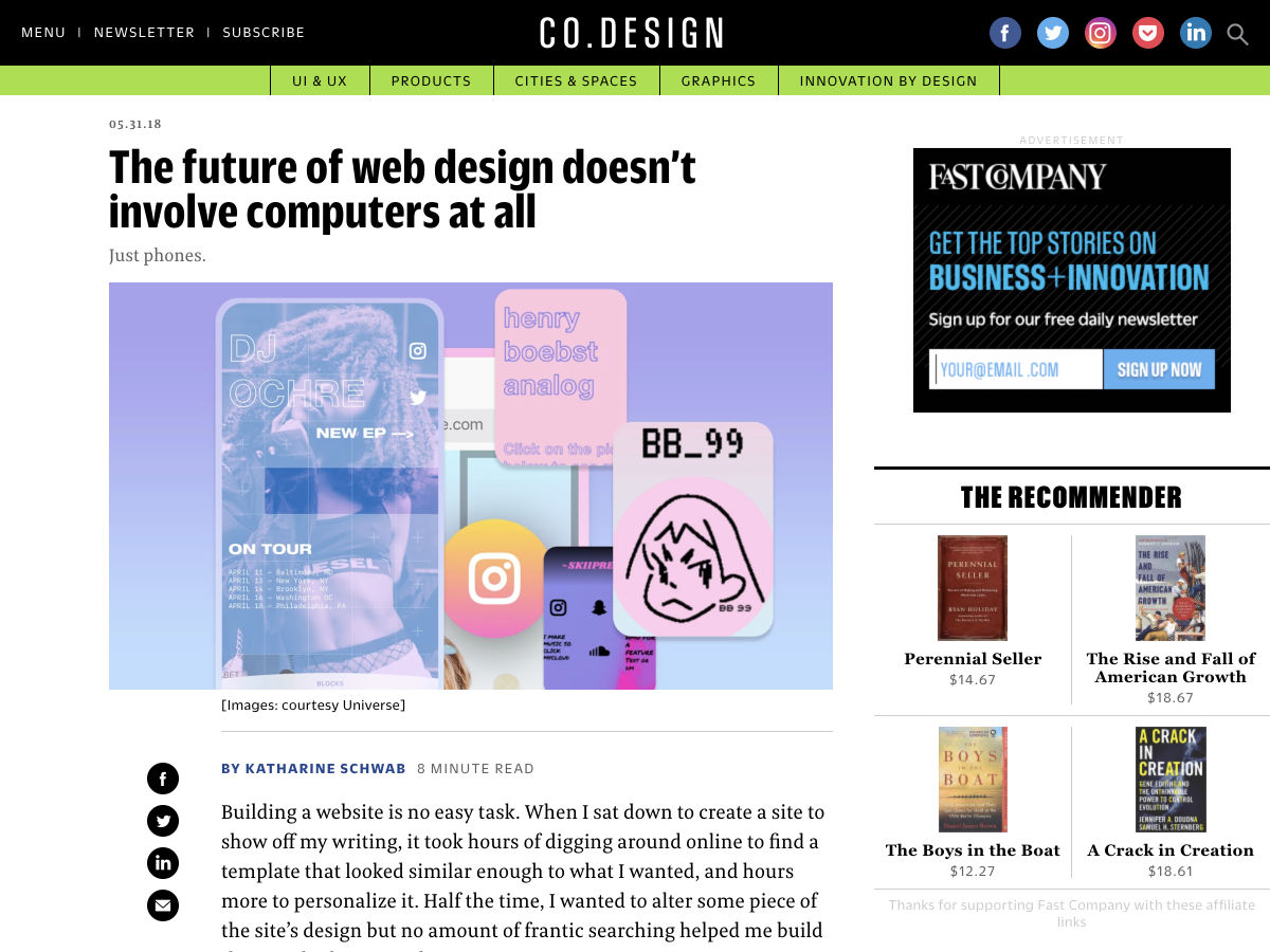
The Future of Web Design Doesn’t Involve Computers at all


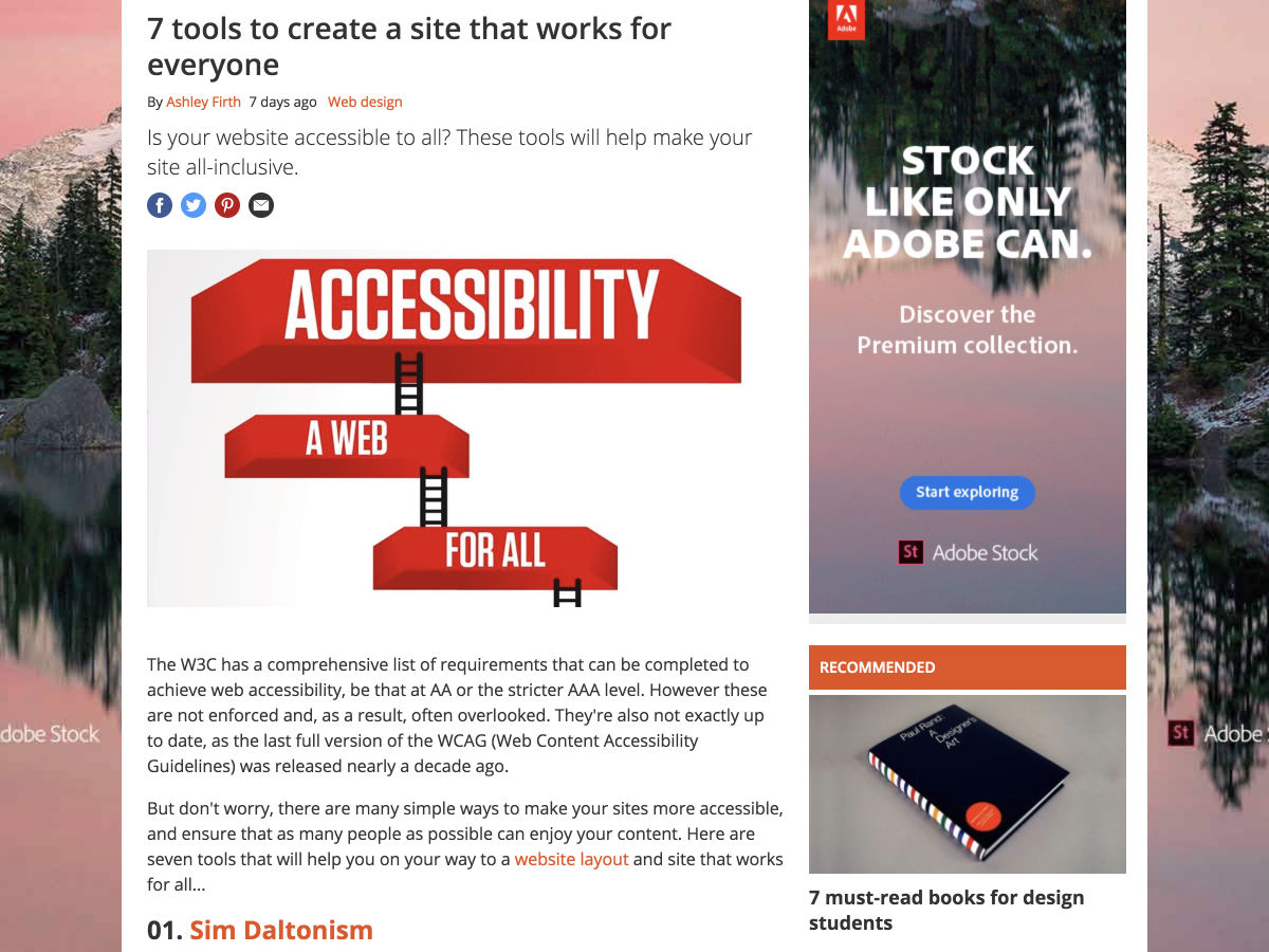
7 Tools to Create a Site that Works for Everyone


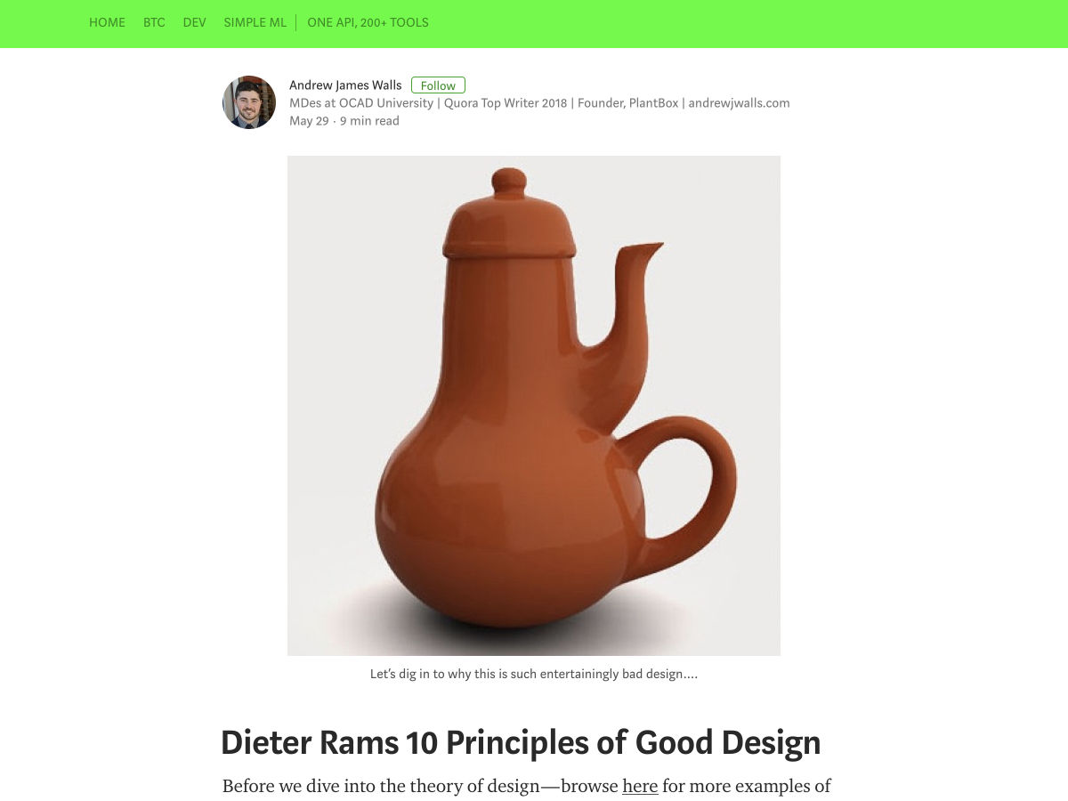
Dieter Rams 10 Principles of Good Design


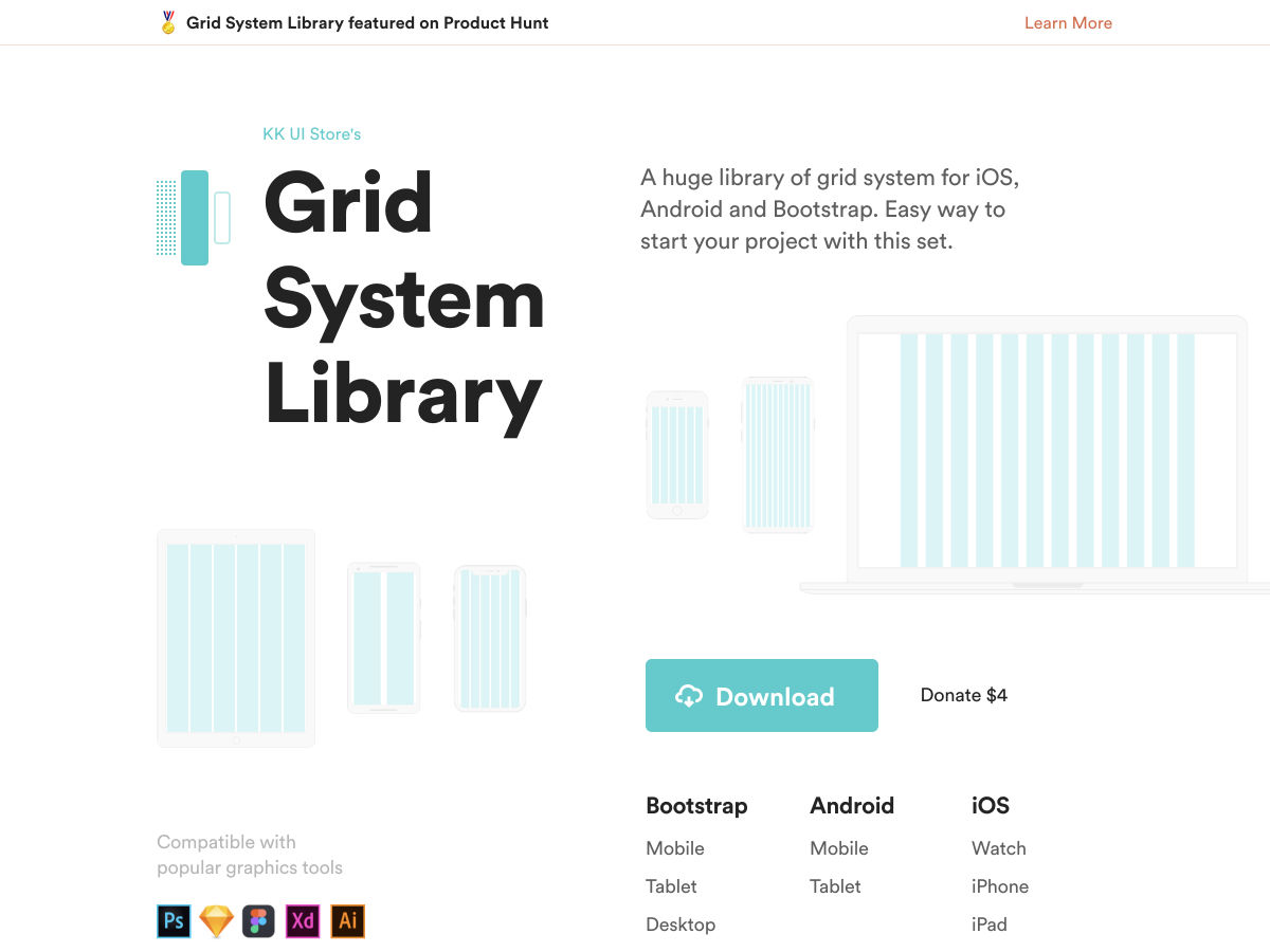
Grid System Library – Free Set of Grids for iOS, Android and Bootstrap


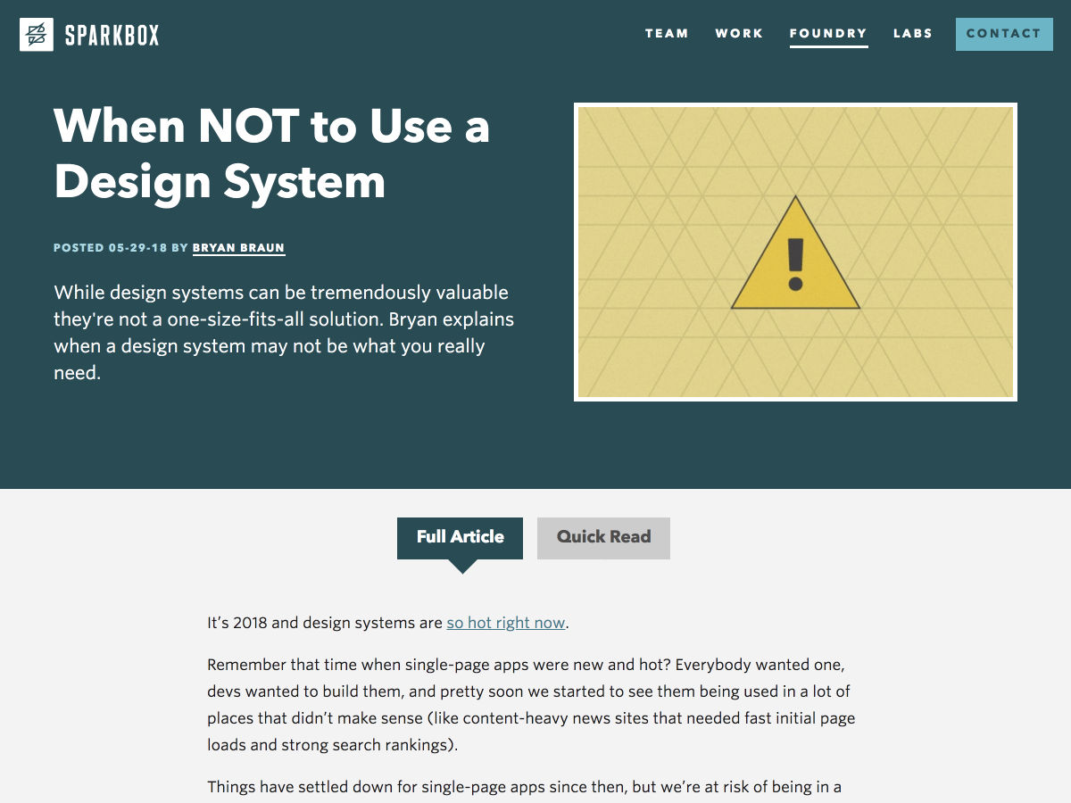
When not to Use a Design System


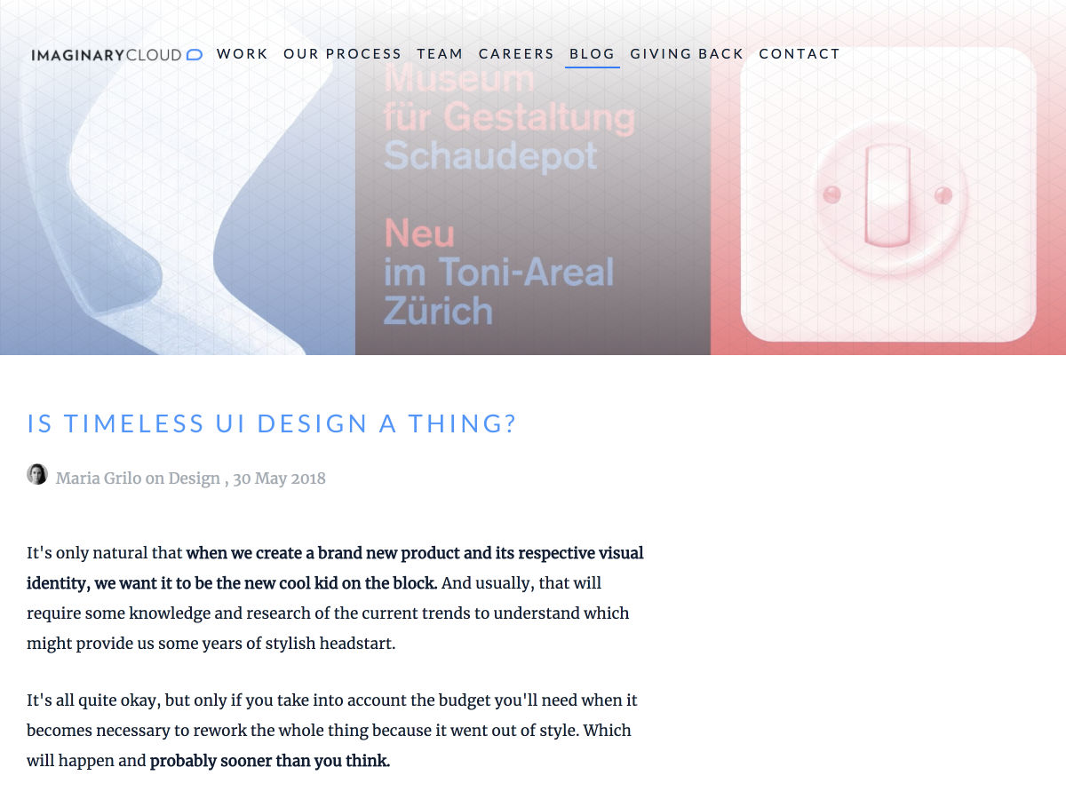
Is Timeless UI Design a Thing?


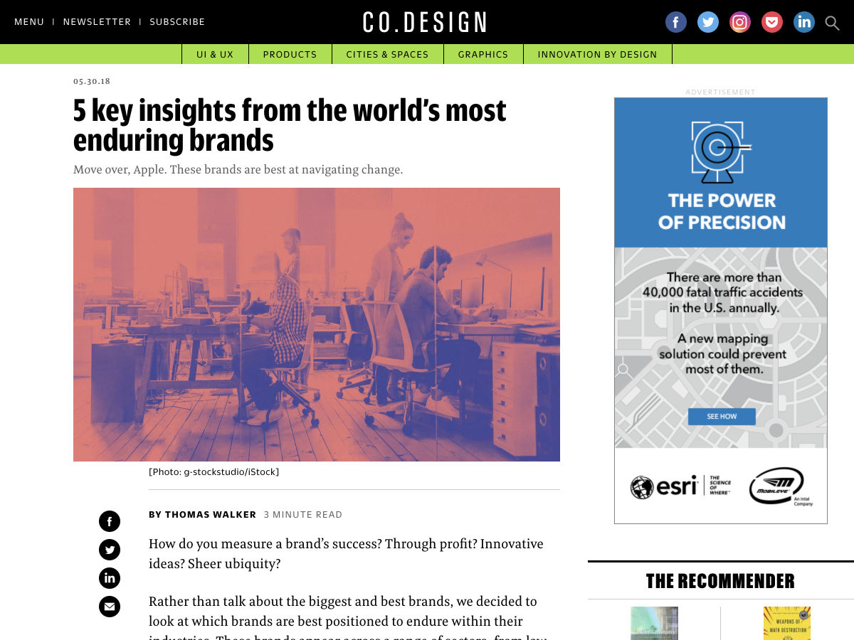
5 Key Insights from the World’s Most-enduring Brands


Want more? No problem! Keep track of top design news from around the web with Webdesigner News.

Add Realistic Chalk and Sketch Lettering Effects with Sketch’it – only $5!

Source

p img {display:inline-block; margin-right:10px;}
.alignleft {float:left;}
p.showcase {clear:both;}
body#browserfriendly p, body#podcast p, div#emailbody p{margin:0;}

from Webdesigner Depot https://ift.tt/2xE5wCr


from WordPress https://ift.tt/2sBIsPf

Saturday, June 2, 2018

Comics of the Week #435

Every week we feature a set of comics created exclusively for WDD.
The content revolves around web design, blogging and funny situations that we encounter in our daily lives as designers.

These great cartoons are created by Jerry King, an award-winning cartoonist who’s one of the most published, prolific and versatile cartoonists in the world today.

So for a few moments, take a break from your daily routine, have a laugh and enjoy these funny cartoons.

Feel free to leave your comments and suggestions below as well as any related stories of your own…

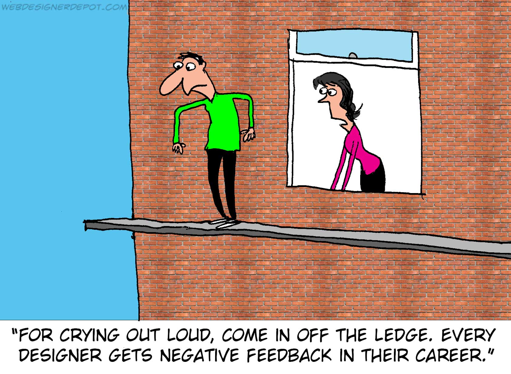
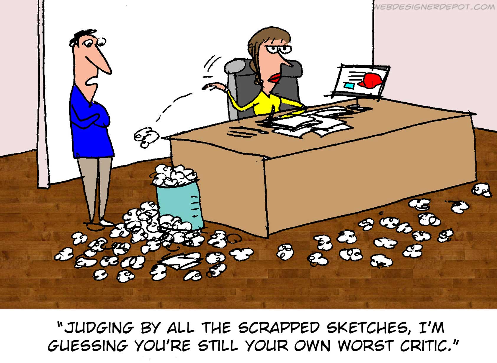
Own worst critic

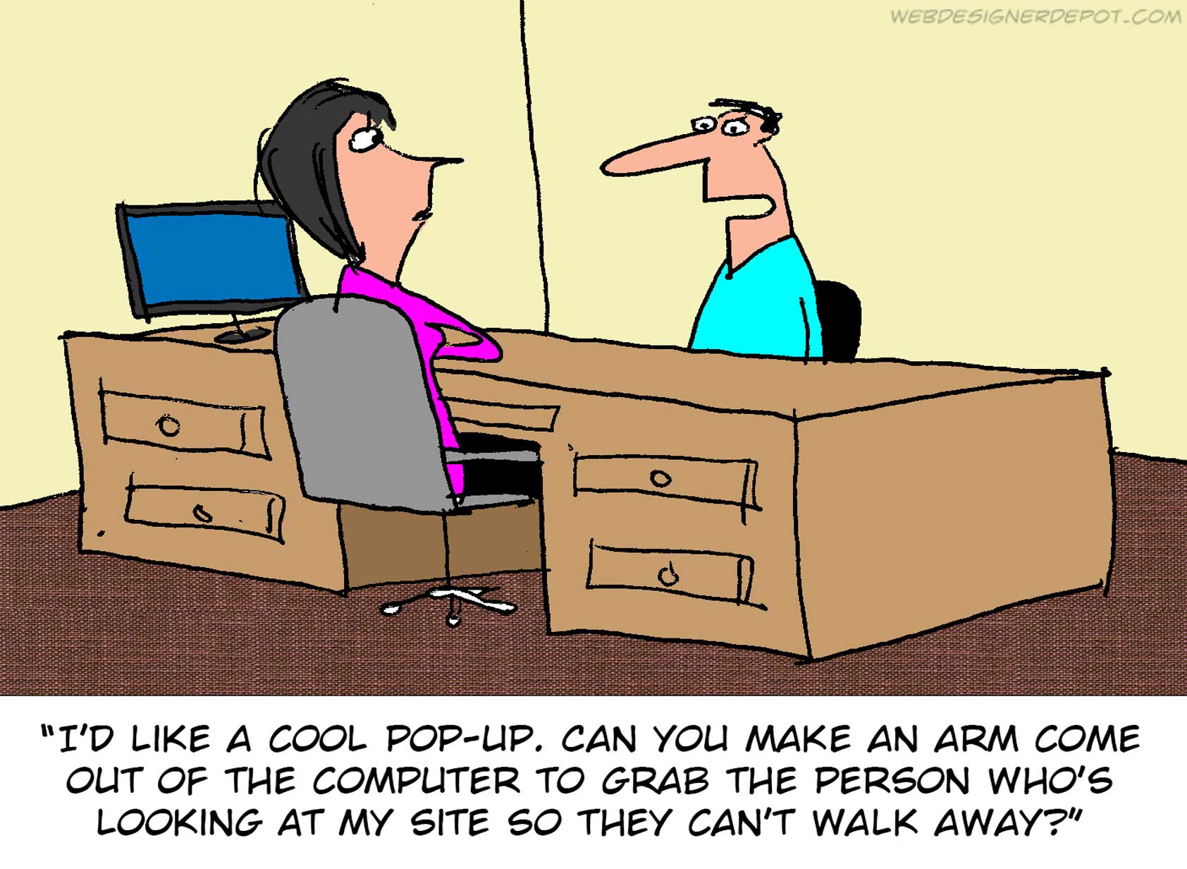
Intrusive ads


Sensitive designer

Can you relate to these situations? Please share your funny stories and comments below…

Add Realistic Chalk and Sketch Lettering Effects with Sketch’it – only $5!

Source

p img {display:inline-block; margin-right:10px;}
.alignleft {float:left;}
p.showcase {clear:both;}
body#browserfriendly p, body#podcast p, div#emailbody p{margin:0;}

from Webdesigner Depot https://ift.tt/2He29l9


from WordPress https://ift.tt/2J5hbzB

Friday, June 1, 2018

Introducing Alliioop: The Customer Marketing Platform (to Build an Awesome Customer Base)

Shopify, Facebook, FedEx and the likes have made it easier than ever to birth ecommerce brands. And that’s exactly what’s been happening. Three people in a garage can launch, look and execute like a 100+ person company of old. I’m not saying it’s easy, there’s way more to it than that, but the triangulation of tech, logistics and online-all-the-time buyers have certainly paved the way for the ecommerce boom.

Keep your customers from cheating on you

And, just as the number of ecommerce companies have exploded, so too has the consumer’s opportunity and willingness to switch brands. Consumers are inundated with Facebook and Instagram ads, and don’t bat an eye at the notion of switching from one shop to another, or to Amazon. And it won’t stop–unless you can establish your brand and value to make them loyal.

Repeat customers are your #1 asset for growth

One thing that hasn’t changed since the brick-and-mortar days, is the fact that customer loyalty and lifetime value are critical to company growth and long-term survival. And that has never been more true. While store location could practically drive loyalty before–now location don’t mean diddly. It’s how you interact with your customers and build a relationship with your brand that matters most.

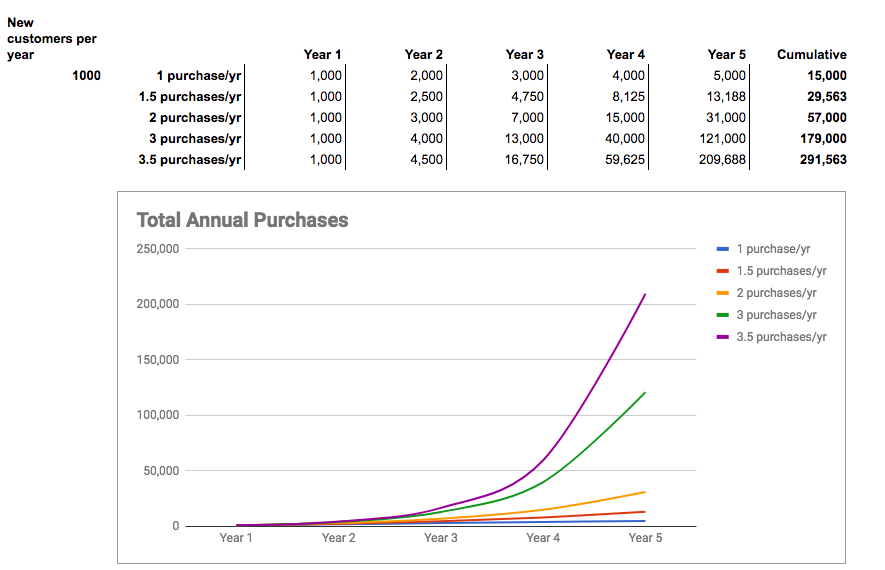
power of repeat purchases for ecommerceA graph illustrating the power of repeat purchases for your company growth

Build a brand your customers love

Getting customers to your site is one thing, but converting them into loyal, repeat customers is an entirely different challenge. That’s exactly why we created Alliioop. A customer marketing platform that makes it easy to engage each customer precisely the way they want and expect–and build a relationship that lasts forever.

Blanket emails won’t work

Alliioop is far from just another email marketing tool like Mailchimp. The biggest difference is Alliioop was built on a customer analytics platform. That means we can deliver deeper customer insights and more granular segmentation than ever before, so you can deliver messages that are more on target and stay personalized as you scale.

Building a kickass customer base

Clearly, building a large, loyal customer base takes time and effort–and both art and science. It requires that you understand what make customers tick, and not. It’s not always about sending discounts and special offers, though those do work. Delivering well timed content, advice, product recommendations, as well as those special offers is what adds value, builds appreciation and drives loyalty. We combined the key features in Alliioop to make it easy to catch people at the right time, with the right message.

Getting results with Alliioop

We’re thrilled with the results our customers are getting with Alliioop. They’ve seen immediate insights on how to engage their customers with highly targeted Facebook and email campaigns to increase conversions and sales.

Getting started and getting results is easy with our Shopify and Facebook integrations. Plus our pre-built reports, segments and campaigns come to life right after you turn it on, with these key capabilities:

Reporting: We’ve pre-built a suite of reports that will show you everything from high-level conversion metrics, to campaign performance, LTV and the details of every customer path. You get insights that will highlight what you should do next to increase conversions.

Segmentation: Sending highly targeted messages requires powerful segmentation. You can segment on anything and the segments are dynamic–meaning people are added and removed from segments in real-time–not stale, static lists.

Facebook: Keeping your Facebook Custom Audiences fresh and on target is cumbersome. We automatically add and remove people from your Facebook Custom Audiences based on their behavior. This keeps your audiences fresh and your ads more on target–and effective.

Email campaigns: Create and automatically send great emails that can be connected to your segments for highly targeted, timely delivery. Build flows that map to customer profiles and behaviors to get more clicks and purchases.

Automation: Driving all these engagements requires serious automation. Alliioop monitors all your customer behavior and triggers the engagements automatically. So as you build more granular targeting over time, we manage all the delivery so you can scale.

Alliioop is the first Customer Marketing Platform built from the customer data perspective and specifically for ecommerce. The power, simplicity and automation are combined in a platform that will scale your business and be as critical to your growth as your ecommerce platform is to your operations.

If you’d like to see how Alliioop can grow your ecommerce company, request a personal demo here

Enjoy!

About the Author: Brian Kelly is the CEO of Space Pencil. Space Pencil is the creator of Alliioop, Sherlock and Kissmetrics.

from The Kissmetrics Marketing Blog https://ift.tt/2kItpzD


from WordPress https://ift.tt/2J5sYOk