Friday, October 5, 2018

The Alternative Dictionary of Web Design Terms

It’s a universal truth that there’s more than one meaning to just about every word. This is doubly true for industry lingo. If you’re just getting started in web design, you need to know what everything really means, if you want to get ahead.

So here it is: here’s what the Secret Web Design Illuminati doesn’t want you to know. Read this article, and you’ll be able to dab on the haters with your hip new slang. Isn’t that swell?

.htaccess

A file that sits on your web server which, if ever touched, is perhaps the quickest and easiest way to break your whole site.

AJAX

The practice of making all your content dependent on JavaScript to load in the first place; this never goes wrong.

API

A system whereby enterprising young developers make money from your users’ data. Remember that you can always destroy them by “tweaking” the API for “performance” because you “hate chronological timelines”.

Accessibility

The practice of building websites that a human might, with a little time to study, actually be able to use.

Agile

A development methodology that advocates self-organizing teams and flexibility, allowing startups to more efficiently realize they’re building something that no one wants.

Back End

The part of a website where you deal with a lot of crap.

Backlink

Before experimenting with dogs, Pavlov trained online marketers to salivate whenever he said “backlink”. It still works.

Bandwidth

A measurement of the speed with which Google can access your personal data.

Bounce Rate

A measurement of the speed with which users realize you don’t have what they want.

Breadcrumbs

The contextual navigation pattern preferred by nine out of ten ducks.

CMS

The system that is supposed to solve all your problems and get you to the top of Google. This is accomplished by leaving it alone until an update breaks a plugin, or something.

CSS

That thing they want to implement with JavaScript, now.

Cache

Space on other people’s computers where you can temporarily store some of that crap from the Back End.

Call to Action

Begging the user for money and/or attention.

Code

The stuff they show on computer screens in the less-offensive Hollywood representations of hacking.

Comments (in Code)

In-jokes and clever insights that only total nerds will ever see. One day, someone will achieve true enlightenment, and the secret will written down as a code comment, and lost to an obscure GitHub repository.

DHTML

See: Deprecated

Deprecated

Anything we forgot how to use while we were learning Flexbox.

Design Research

Browsing Pinterest for a few hours to steal color palettes.

Design Thinking

Thinking, but like, when designers do it? If you’ve ever touched MS Paint, you can put this on your resume and ask for a raise.

Doctype

A needlessly complex way to tell the browser what kind of HTML you’re using. Seriously, <html version=”5″> would have worked just fine.

DOM, The

A useful reference word for programmers, and anyone who wants to sound a bit smarter.

Example: Can’t you just throw some more “div” thingies into my DOM, or something?

E-commerce

A fancier way to say that you’re selling stuff you don’t want on Ebay.

Fold, The

The part of the website everyone already knows to scroll past if they want to get to the good stuff.

Framework

The thing you’re supposed to learn instead of development languages, now…I guess.

Front End

The part of a website where you tell users what you think they want to hear, based on research, surveys, and indiscriminate guessing.

Graceful Degradation

The practice of building your website so it doesn’t completely fall apart at the first sign of a bug. Clearly superior to Progressive Enhancement. (See: Progressive Enhancement)

HTML

The easiest way to tell other people that you’re a coder, now.

iframe

You’d think these were Deprecated, but they’re not.

Image Map

One more thing that will never work on a responsive website without a jQuery plugin.

Inbound Marketing

See: Backlinks

Inheritance

The part of CSS that keeps confusing people.

JavaScript

The be-all and end-all. The ultimate development language. Will replace HTML and CSS because some people can’t be bothered to learn the simplest “languages” ever invented.

Landing Page

The page that designers let marketers have their way with so they won’t touch the actual home page. Landing pages typically outperform the painstakingly-crafted home pages, infuriating designers.

Meta Data

What we have to use while we wait for AI to get smarter.

Navigation

The quickest and easiest way for a customer to get lost.

Online Marketing

The business of lies, damned lies, and statistics.

Open Source

  1. A socially acceptable way to just use other people’s code. Also the greatest thing since sliced bread.
  2. I’d just like to interject for a moment. What you’re referring to as Linux, is in fact, GNU/Linux, or as I’ve recently taken to calling it, GNU plus Linux. Linux is not an operating system unto itself, but rather another free component of a fully functioning GNU system made useful by the GNU corelibs, shell utilities and vital system components comprising a full OS as defined by POSIX.
    Many computer users run a modified version of the GNU system every day, without realizing it. Through a peculiar turn of events, the version of GNU which is widely used today is often called “Linux”, and many of its users are not aware that it is basically the GNU system, developed by the GNU Project. There really is a Linux, and these people are using it, but it is just a part of the system they use.
    Linux is the kernel: the program in the system that allocates the machine’s resources to the other programs that you run. The kernel is an essential part of an operating system, but useless by itself; it can only function in the context of a complete operating system. Linux is normally used in combination with the GNU operating system: the whole system is basically GNU with Linux added, or GNU/Linux. All the so-called “Linux” distributions are really distributions of GNU/Linux.

Pixels

Work as a designer long enough, and you’ll start to notice when even one of these things is out of place. It will haunt you.

Progressive Enhancement

The practice of building your website so that it works anywhere, but looks better on newer devices and browsers. Clearly superior to Graceful Degradation. (See: Graceful Degradation)

Prototype

The terrible temporary code you write that will inevitably be used in the final project, and you’ll always be just a little bit ashamed.

RSS

See: Deprecated

[I’m just going to cry in the corner, for a bit.]

Responsive Design

The reason web designers have to do maybe three times as much work for each project as we used to.

Semantic Markup

The practice of writing HTML a human might, with study, actually be able to read.

Server-side

Anything that is officially the developer’s problem.

Sitemap

A thing that used to be used by people that is largely used by search engines, now.

Theme

A socially acceptable way to use other people’s graphical assets and code.

URL

U R Lost.

[Hehehe, ahhhh… the classics still get me.]

UX Design

Everyone is an expert in this, now. Apparently.

Usability

It’s like Accessibility, but for people who get embarrassed when they see wheelchair ramps.

Validation

  1. What we all desperately want from our fellow designers.
  2. See: Web Standards

Web Standards

A good idea that so many of us are outright ignoring.

XML

Oh right, that’s still a thing.


Featured image via DepositPhotos.

Add Realistic Chalk and Sketch Lettering Effects with Sketch’it – only $5!

Source

p img {display:inline-block; margin-right:10px;}
.alignleft {float:left;}
p.showcase {clear:both;}
body#browserfriendly p, body#podcast p, div#emailbody p{margin:0;}

from Webdesigner Depot https://ift.tt/2pD1Yd6


from WordPress https://ift.tt/2O5FMqt

Thursday, October 4, 2018

The Future of E-Commerce Platforms

The competition in the e-commerce market is fiercer than ever, as brands wrangle to outdo rivals by deploying the latest techniques and practices technology can offer. However, it’s hard to predict an industry-leader for a longer duration with the future of e-commerce constantly shifting.

This fast-paced evolution of e-commerce has not only expanded the digital footprint of online brands but also served as an impetus to accelerate the performance of shopping carts and increase revenues for online merchants.

Retailers aren’t the only ones affected. Platform developers are also facing the challenge of meeting the demands of multi-channel users. All these criteria along with the expectation of improved delivery times, customer service and greater product selection will define the future of e-commerce platforms.

1. Personalization & Customer Experience

E-commerce personalization and enhanced user experience will remain as the leading fundamentals of e-commerce. Customer purchase decisions will be influenced by a combination of showrooming and webrooming; product demos as well as the unique in-store experience being offered by retailers. Hence, e-commerce platforms will evolve continuously to offer the great versatility and depth-of-choice that comes with online shopping, along with the option of in-store purchasing, collection, or returns.

e-commerce platforms will evolve continuously to offer the great versatility and depth-of-choice

Creating a perfect profile of your customers is essential to fabricate a hyper-personalized shopping experience. For many years, retailers have relied on “online-to-offline,” or O2O business tactics that include online ads, coupons, and other enticements to nudge customers into the sales funnel. However, as consumers are growing more mindful, the O2O is slowly deteriorating and we’re starting to see what might be described as an “O2O 2.0” approach.

Walmart Inc. stores in China now allow shoppers to pay for their purchases via WeChat, a multi-purpose Chinese messaging, social media, and mobile payment application. Developed by Tencent, WeChat analyzes the data on consumers’ shopping habits and preferences to suggest shopping lists, coupons, and other items.

2. Integration of AI Systems

Rapidly changing and improving technology will define the next big step for the online-retail industry, which is the full automation of the processes across e-commerce platforms. AI systems integrated with e-commerce platforms can run algorithms to determine the optimum conditions for the sales procedure, highest converting design, etc. for every unique online shop. By using algorithms to effectively run tests, optimize settings and repeat the process on loop, retailers can maximize their web store capabilities and yield higher conversions.

It also anticipated that visual content will play a more important role in buying decisions. While internet giants like Google and eBay have already launched their own versions of visual search—which are still very much in their infancy—retailers like West Elm are also capitalizing on latest AI technologies to add similar functionality to their stores.

In future stores will allow shoppers to input their height, weight, complexion, favorite color etc, and then suggest clothing purchases based on those results.

Digital marketing and e-commerce gurus predict that e-commerce platforms will integrate artificial intelligence and machine learning technologies into the shopping experience. This will give retailers more control over the buying process by gathering and storing information about shoppers’ buying habits. In future stores will allow shoppers to input their height, weight, complexion, favorite color etc, and then suggest clothing purchases based on those results. Retailers could use augmented reality to allow customers try on clothes virtually and further suggest other clothing items like shoes or trousers to round out a complete outfit.

3. Measurement Across All Devices

Owing to the abundance of available devices, consumers are now actively engaging on multiple devices at once. This means that e-commerce platforms must create solutions that can help retailers to engage with customers on all fronts. Though a lot of e-commerce platforms like Magento and WooCommerce are already providing extensions that can easily create a native mobile app for your store; a seamless mobile checkout is still a challenge for many platforms.

M-commerce has already achieved the trillion dollar mark

M-commerce has already achieved the trillion dollar mark and will slowly overtake e-commerce in the near future. Moreover, updates from Google mean that the mobile version of your website will soon become a starting point for what Google includes in their index, and an important ranking factor. So in future, we anticipate e-commerce platforms will work on providing more innovative mobile-friendly solutions for retailers.

4. The Decline of Monolithic Platforms

Traditional e-commerce platforms are inflexible and do not support features for performing dedicated tasks. To further define the problem, the issues can be broken down into three broad categories:

  • The first issue is the wastage of resources, that comes with getting a powerful server to handle the load from seasonal shoppers, but which may otherwise remain dormant during the rest of the year.
  • Secondly, servers in a certain physical location may not be able to provide the performance and speed to customers in another country. This can be a major setback to efforts in converting global customers.
  • Lastly, by housing all required servers in one location, they become more vulnerable to online attacks, server crashes, and numerous other issues—especially if the servers lack a backup. It can lead to major complications and tarnish brand reputation as well as loss of income.

To enhance customer experience retailers need to incorporate all sorts of customer analytics into their offerings. The efficiency ratio of this procedure varies depending on the platform and presents its challenges.

Converting a monolithic web application into smaller and simpler services…increases your website’s efficiency and its ability to scale

Custom-built platforms can successfully address these issues, but it can be a daunting task requiring a big team of highly-experienced developers working on the development and continuous optimization. Converting a monolithic web application into smaller and simpler services not only increases your website’s efficiency and its ability to scale, but will also allow you to react more quickly to change.

Back in 2011, Best Buy broke down its monolithic website into separate web services. This immediately benefited both the company and its customers. (However; this can be an expensive option for small retailers, who more than likely will not be able to rationalize these costs.)

5. Using Hyperscale Computing

Hyperscale is not only cost-effective and provides more space for innovation, but it allows retailers to explore different solutions for individual services. Moreover, retailers will have more freedom in managing the expenses and will be freed from the need of making a permanent commitment. Retailers will be able to focus on development in areas that highlight their strengths and attract customers in a highly competitive market.

There is no debate that cloud computing has helped e-commerce entrepreneurs to save both time and resources. It has opened the world to consumers and online retailers. Walmart has spent more than five years and millions of dollars just to built its own internal cloud network; this clearly indicates their determination to grab a bigger slice of online shopping and is an inspiration for all online retailers to quickly move to cloud computing not only to increase their sales but to improve their in-store operations as well.

What the Future Holds

New technologies and the latest products are increasingly changing the manner in which most consumers shop online. Innovative devices, such as Google Home, are decreasing the number of steps required for completing a purchase. Consumers can create a wish list using Google Home and directly place their orders without even launching a web browser or other apps.

the most elaborate solution may not necessarily be the most effective

Social media channels have also become a big part of the online retail process. They have proven effective means of advertising products according to demographics and specific customer behavior. More importantly, customers can use the social media channels to gain direct access to the e-commerce platform. The future of these integration tools seems to suggest that soon customers may even be able to purchase by simply selecting a product image displayed on a social media channel.

While the complexities of e-commerce continue to increase, retailers are starting to learn the most elaborate solution may not necessarily be the most effective.

Reducing the e-commerce platform into manageable sections and utilizing consumer data to better develop functions to address specific customer behavior are approaches which will set retailers on the track to prepare for the near future of e-commerce.


Featured image via DepositPhotos.

Add Realistic Chalk and Sketch Lettering Effects with Sketch’it – only $5!

Source

p img {display:inline-block; margin-right:10px;}
.alignleft {float:left;}
p.showcase {clear:both;}
body#browserfriendly p, body#podcast p, div#emailbody p{margin:0;}

from Webdesigner Depot https://ift.tt/2PbugGu


from WordPress https://ift.tt/2zR5R3U

Wednesday, October 3, 2018

11 Must-Have Apps for Web Designers

One of the perks of freelancing is that you can work from pretty much anywhere. However, the pressures of staying connected to work may leave you stuck behind a computer all day anyway.

While there’s something to be said for the levels of productivity and output you achieve from a dedicated workspace, there’s no reason you can’t keep the momentum going while you’re out and about.

The following list of tools and mobile apps will help you run your web design business—and tackle various tasks associated with it—even when you’re on the go.

11 Best Tools and Mobile Apps for the Web Designer on the Go

Let’s say you’re on vacation and feel inspired in the moment. Do you mentally bookmark what you saw or heard in the hopes you can put it into practice when you’re back at work?

Or let’s say you’re at the doctor’s office, stuck in the waiting room with nothing to do and a looming deadline. Do you allow yourself to get stressed with each lost minute of work?

Or perhaps you prefer having multiple devices from which you can work. Having a smart device that complements your desktop activities would really come in handy then, right?

If you’re going to do this—take advantage of the ability to work from anywhere you want as a web designer—then your smart devices need to be equipped with the right kinds of tools.

Here are the 11 best tools and mobile apps you should have installed on your device right now:

1. HoursTracker

HoursTracker is a free time-tracking app.

For some of you, this will come in handy if you bill design clients on a per-hour basis. For others, you can simply use this as a way to keep yourself accountable. If your goal is to work a certain number of hours in a day, a time tracker will keep you committed to it.

2. LastPass

LastPass is a password management tool that’s great at saving you time repeatedly logging into the same websites and apps.

Every time you enter a new password into your mobile device, LastPass will give you the option to securely store those credentials. What’s particularly nice about this app is that it also works for desktop, so you can use the same account across both platforms.

3. Asana

Asana is another one of those productivity apps that works well across all your devices.

So, let’s say you’ve gotten into the habit of managing all client details, project tasks, and timelines in your Asana desktop app. With a quick installation of the mobile app, you can take all that pertinent business information everywhere you go.

4. Evernote

Have you ever found yourself out somewhere and wished you had a pen and paper to take down something you just thought of? Evernote is a secure way to store these notes, audio recordings, uploaded files, and screenshots all in one place.

If you’ve previously relied on your mobile device’s various note, photo, and storage apps to store this kind of information, you’ll find Evernote incredibly helpful in consolidating all your web design-related content into one location.

5. Google

Google Apps are a must-have for anyone wanting to quickly and securely communicate with team members, partners, and clients. Your access to Google Apps extends beyond Gmail, too.

This will enable you to continue creating documents, storing files in shared locations, and communicating with others no matter where you are.

6. Adobe Scan

Adobe has a fantastic set of mobile applications web designers should be taking advantage of. The first is Adobe Scan.

With this app, you can copy and convert any image into a PDF. This would be great for storing receipts from work-related travel. You could use this to scan hand-drawn wireframes or sketches. You could even use this to capture a prospective client’s business card on the fly, so you have a digital copy of their contact information for later.

7. Adobe Fill & Sign

When you’re outside of the office, that doesn’t mean all business dealings have to stop.

If you’re ready to get that next client project off the ground, Adobe Fill & Sign allows you to upload formal contracts and sign them, all from your mobile device.

8. Adobe Capture CC

Adobe Capture CC is perhaps my favorite mobile app for web designers.

As you can see, there are a number of things you can do with photos you’ve taken or uploaded to the app:

Two of the more interesting features, are Type and Colors. With Type, the app will zero in on any text that exists within the chosen photo. It will then display what it believes to be the matching typeface.

If you see really cool signage, flyers, bumper stickers, or anything else that catches your eye, you can use this mobile app to quickly decipher it for you. The Colors feature is another really neat one for web designers. When an image is uploaded to the tool, it will automatically select a complementary color palette.

This is not only great for using real-world settings as inspiration in your work, but it’s great for quickly generating color palettes.

9. Canva

With Canva, you can create all sorts of marketing and social media collateral.

Canva isn’t necessarily a tool you’ll be using for website design work. However, if you handle other marketing and design tasks for clients, this would be helpful to have on you at all times.

10. InVision

InVision may be a tool you already use to enhance your web design workflows.

With this mobile app, you can build prototypes and sketches and share them with your team and clients. It’s not only a great design tool, but it’s especially helpful when it comes to more effectively communicating and collaborating.

11. Dribbble

Dribbble’s mobile app is another tool every web designer should keep on hand.

Even though you’re out of the office, you can still look to a site like Dribbble for quick inspiration or for easy access to templates.

Wrap-Up

In summary, when you load up your mobile device with tools and apps for business, they should help you:

  • Communicate in real-time (or, at the very least, more quickly).
  • Provide high-quality work to clients even when you’re out of the office.
  • Maintain consistency between the work you do at home and the work you do on the road.
  • Stay productive even when you’re not surrounded by a distraction-free workspace.

If you’re hoping to make the most out of freelancing life (and digital nomadery), set yourself up with these must-have mobile apps for greater productivity and success.

Add Realistic Chalk and Sketch Lettering Effects with Sketch’it – only $5!

Source

p img {display:inline-block; margin-right:10px;}
.alignleft {float:left;}
p.showcase {clear:both;}
body#browserfriendly p, body#podcast p, div#emailbody p{margin:0;}

from Webdesigner Depot https://ift.tt/2zPhLvg


from WordPress https://ift.tt/2P6UoSV

Vivaldi 2.0 Released

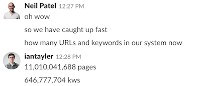
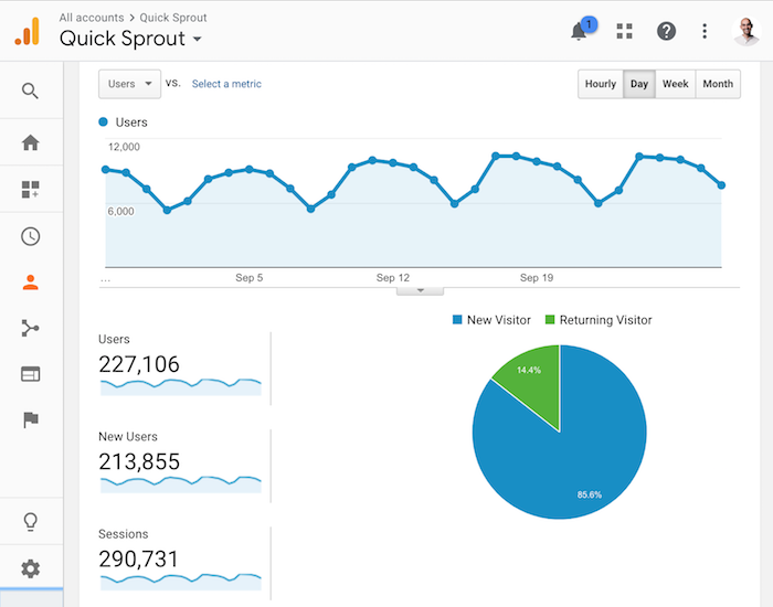
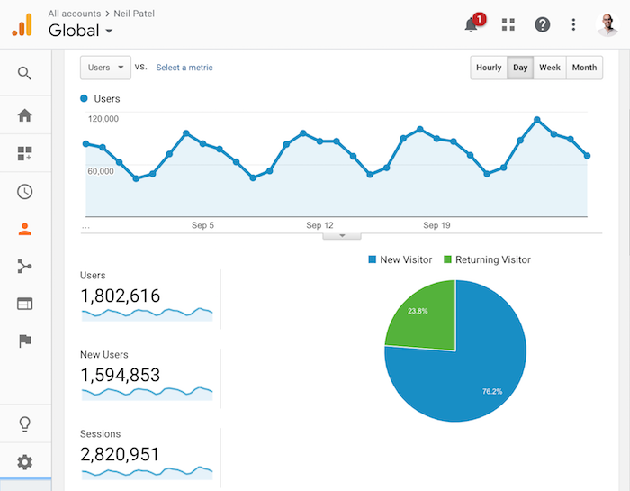
I’m not going to lie, I’ve been biased toward the Vivaldi project ever since its first release in 2015. While it has (until now) lacked the sort of polish that would make it my go-to browser on a long term basis, the developers have been chugging along steadily. Now, it’s looking pretty… well… pretty. And pretty stable/fast.

Plus, Vivaldi doesn’t track any of your data unless you opt in to the sync function (more on that below). In the blog post detailing their latest changes, they state:

Vivaldi has always honored its users’ rights to data privacy and protection. There is no need to collect your personal information. We don’t track you. Period.

I’m not saying they’re taking a veiled shot at Google, but they probably are.

Vivaldi Sync

If you use Vivaldi on more than one device, you can now opt in to Vivaldi Sync which does about what you’d expect it too. Privacy advocates need not freak out just yet, though. You can choose exactly what data you want to share. For example, you can share passwords, but not history, or vice versa. You get pretty granular control.

What’s more, it’s all encrypted end-to-end, so Vivaldi—barring some enormous mistake—never gets to actually see what’s in your data. And like I said, it’s opt-in. Signing into Gmail will only sign you into Gmail.

New Visuals

There’s been an overall visual refresh, the addition of several new themes and background images for new tabs, and of course it’s all very customizable, with easy ways to make your own themes. One interesting little feature of note is that you can schedule themes. That is, the browser can actually change its whole appearance at any time of day you specify. Plus, the current default theme feels compact, which I like very much.

Improvements to Panels

Like Opera before it, Vivaldi comes with a sidebar by default. It hold various panels for things like bookmarks, your recent history, file downloads, and more. There’s a custom note-taking app, and custom web panels that can keep any website you want handy.

One of the recent additions to this feature is suggestions, which basically just suggests commonly-visited sites for inclusion in your web panels. The panels can also float over your current web page, instead of using the split-screen approach.

Improvements to Tabs

Those who like Tab Tiling and split screen views: rejoice; you can now resize the various tabs by clicking and dragging. They’ve also made some additions to their Tab Cycler feature to help you find the tab you want faster.

Try It

I could go on, but I really shouldn’t. If you haven’t already given Vivaldi a look, do it. Give it a ten minute tryout, then clear your schedule a bit if you find something you like. If you spend a lot of time on the Internet, I bet you will.

Add Realistic Chalk and Sketch Lettering Effects with Sketch’it – only $5!

Source

p img {display:inline-block; margin-right:10px;}
.alignleft {float:left;}
p.showcase {clear:both;}
body#browserfriendly p, body#podcast p, div#emailbody p{margin:0;}

from Webdesigner Depot https://ift.tt/2yanMRb


from WordPress https://ift.tt/2RjY0T3

Tuesday, October 2, 2018

A Blog Isn’t a Blog, It’s a Business

I wrote my very first blog post on July 24, 2005. That blog post is no longer live because it was terrible.

The post was called, “Winning the Search Engine Marketing War.”

It was 412 words long, contained no images, no external links, and it didn’t provide much value because it didn’t teach you anything.

But you know what, back in 2005, the blog post was pretty darn good.

See, I wasn’t competing with a lot of blogs back then. Currently, there are well over 440 million blogs and back in 2011, that number was 173 million. And in 2005, the web was still so small that there were only 64 million websites (with only a small portion of them being blogs).

In other words, my first blog post was pretty darn good because something is better than nothing. People were just happy to get some information, even though it wasn’t great.

But over the years, blogging has changed. What it used to be in 2005, isn’t what it is today.

What blogging used to be

A blog used to just be a blog.

It was a place where you would share your personal experiences with the world. From photos of the places you traveled to and blogging about the food you ate to even sharing personal information about your family life…

In 2005, social networks weren’t popular. Facebook launched in 2004, but it wasn’t what it is now. And sites like MySpace focused heavily on music.

As social networks evolved, people realized it was easier to share personal stories on Facebook and Instagram than it was to write a whole blog post.

instagram stories

Over 250 million people share what they are doing in their personal life each day just on Instagram. All you have to do is talk (or look) into your phone for just a few seconds. It’s really that simple.

And that’s why more of you use social networks on a daily basis than a blog.

Just think of it this way… if you wanted to update your friends on your life, is it easier for you to just upload some pictures to Facebook or is it easier for you to write a blog post?

Of course, it’s easier to just upload some photos to Facebook. It’s why Facebook is so popular.

For that reason, people started to focus their attention on Instagram, Facebook, Twitter, LinkedIn, and Snapchat over blogging.

So why do people continually create more blogs?

There are many reasons why blogs have grown in popularity. As I mentioned above, there are well over 400 million blogs today.

The biggest reason why blogs have grown in popularity is that you are an end user and continue consuming the content that blogs put out.

Just in the United States alone, 42.23% of people from the ages of 18 to 49 read blogs.

united states reads

And because people want to read blogs, Google has no choice but to rank them. The average page that is listed on page one of Google has 1,890 words:

word count

There are many reasons you may want to create a blog, but from someone who blogs on a weekly basis and has been for 13 years, here are the main reasons to have a blog:

  1. You control your own destiny – social networks have restricted how many of your friends actually see your content. With a blog, you have more control over your destiny. You can collect emails to get people back to your site, you can build a push notification subscriber list, you can rank your content on Google… overall, it’s just easier to get a consistent stream of traffic from a blog than it is from a social profile because you aren’t relying on 1 traffic source. This is more important than ever because the top referring sites on the web are starting to send less traffic out to other sites.
  2. Paid ads are expensive – Google generate 6 billion dollars in ad revenue in 2005 and that number shot up to 95 billion in 2017. With ad costs continually rising, you have no choice as a business but to find other traffic channels. A blog is an obvious question as Google loves ranking text-based content. Just look at Wikipedia, they rank for everything and generate 5.4 billion visits a month.
  3. Marketing has moved to an omnichannel approach – there are currently 1,766,926,408 websites on the web. In 2005 that number was only 64,780,617. That’s a 2,627% increase. That means you as a business have more competition online, which gives consumers more choices. Why should someone choose you over the competition? Well, branding plays a huge part, if you can get a consumer to see or hear about your brand 7 times they are much more likely to be a customer. A blog creates another additional touchpoint.

A blog isn’t a blog, it’s a business

As more sites have come online, SEO has become more competitive. Yes, more people are using Google, but they are searching for the same popular terms.

With Ubersuggest, we have a database of 646,777,704 keywords.

word database

And out of those keywords, only 15,301,405 keywords generate a search volume of an excess of 10,000 searches per month.

As more people come online, it doesn’t mean that they search for brand new keywords. It just means that the popular terms get even more popular.

That’s why it is harder to get people to come to your site over the competition because you are competing with more companies to get those eyeballs.

See, as SEO has become more competitive, you have no choice but to treat it as a business. It takes time and money to produce content. It takes time and money to promote your content. And then once you have those visitors, it takes more time and money to convert those visitors into paying customers.

In other words, because it is so competitive, you won’t do that well unless you put in tons of time or money (or ideally both).

Just look at Quick Sprout, the marketing blog I don’t put much money into it. Even though it’s older than NeilPatel.com, it generates a lot less traffic.

quicksprouttraffic

NeilPatel.com blog generates 693% more traffic because I put over 6 figures into the blog each month (mainly in developing free tools and creating audio and video content), and I treat it like a business.

neil patel traffic

Conclusion

Look, I am not trying to persuade you into not building a blog. But I believe most companies should have a blog. And if you don’t have one, just follow this guide to get up and running.

A blog is the only way you are going to rank well on Google and generate traffic without directly paying for it by using Google AdWords or Facebook Ads.

But if you want to do well, you can’t treat your blog like a “blog”… you have to treat it like a business. If you don’t, then you won’t do well.

Here are the 3 important steps you need to take if you want to do well:

  1. Focus on writing amazing content consistently – it’s not about writing one or two amazing posts… you have to be consistently awesome. The market is so competitive, you can’t write 400-word blog posts as I did in 2005. Sure, if you are in a new niche with no competition, by all means, write 400-word posts, but the chances are you are going to eventually have some competition. And if you don’t have the time, you should just hire a writer to help you out.
  2. Promote your content – after you have content, you’ll have to promote it. Promotion isn’t easy but I’ve broken it down into 4 steps for you. Just follow them and you’ll do well.
  3. Focus on monetization last – most bloggers who get this far face one big problem… as their traffic increases their revenue typically stays flat. Just because you have more visitors, it doesn’t guarantee an increase in revenue. Towards the end of this blog post, I teach you how to convert those visitors into leads and customers. Follow them.
  4. Don’t forget about voice – I know I said you only have to follow 3 steps, but if you’ve followed all of them successfully, you’ll need to start thinking about voice. 40% of adults use voice search daily, so don’t take it for granted. Follow this guide to ensure that you capture the voice search market share before your competition.

What do you think about blogging? Are you going to start taking it seriously?

The post A Blog Isn’t a Blog, It’s a Business appeared first on Neil Patel.

from Blog – Neil Patel https://ift.tt/2zLXTcb


from WordPress https://ift.tt/2P3G1Pf

Monday, October 1, 2018

3 Essential Design Trends, October 2018

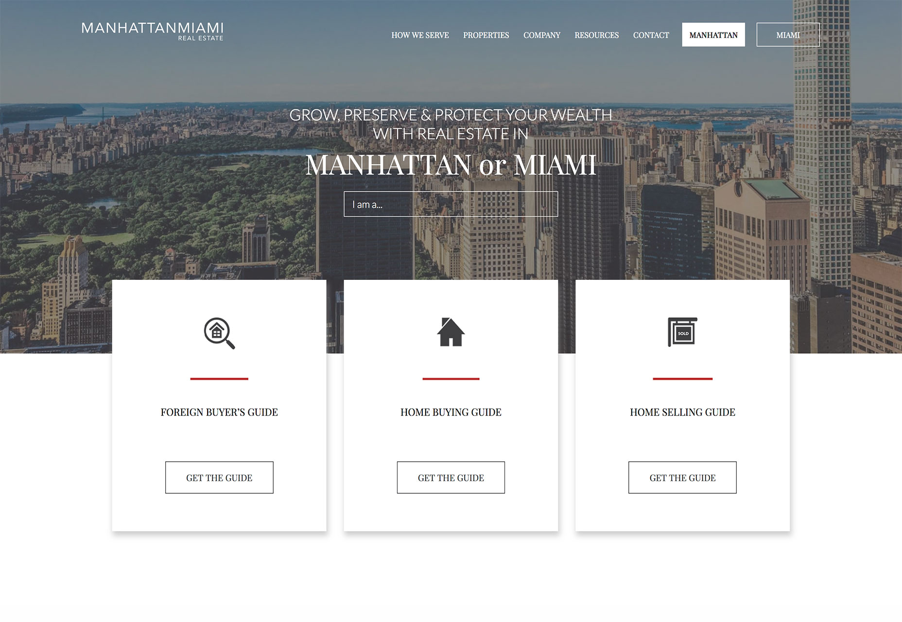
This month’s trends have something in common: You’ve probably seen all of these ideas before, maybe just presented in a slightly different way. Designers are returning to dark backgrounds, large headers and cards to encourage engagement, and get users interested in content on the screen.
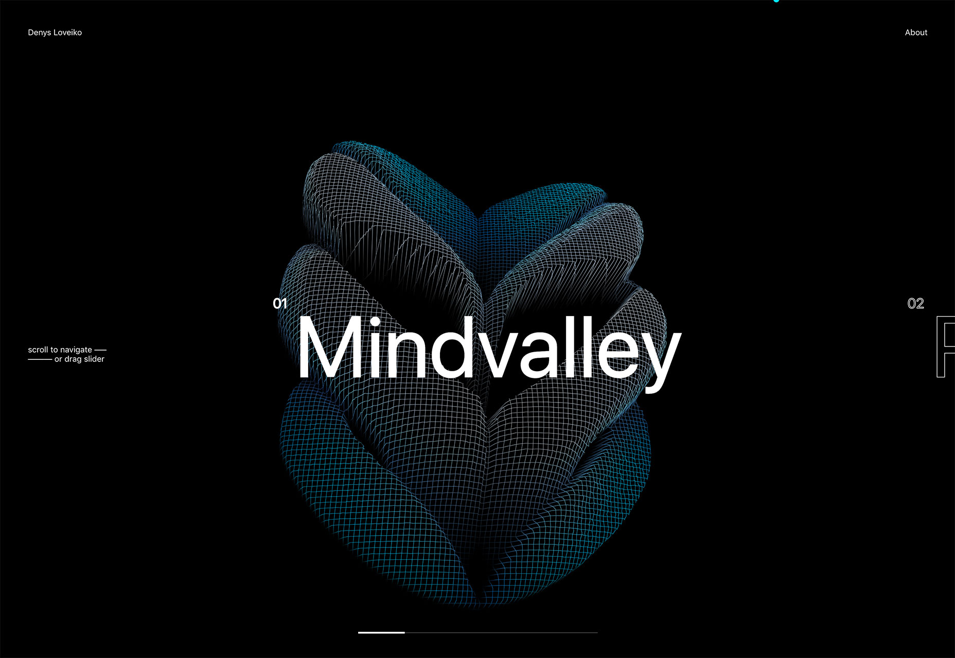
Here’s what’s trending in design this month:

1. Dark Backgrounds

It seems like designers were focusing on light, white minimal styles for a long time, but that era is starting to end. Dark backgrounds are making a comeback in a big way.

Dark backgrounds provide a design opportunity quite different from white

Maybe it’s the idea that cooler weather is coming. (Many of these dark backgrounds do have a cool feel.) Or maybe it’s just a shift in order to try something different. (Dark backgrounds provide a design opportunity quite different from white.)

Either way, it’s a trend that needs to stick around for a while.

Dark backgrounds can be used in so many different ways – and each presents an opportunity to create something in an entirely different way.

  • Black, flat background: A simple black background creates a wide open canvas. Denys Loveiko uses a black background to set the tone for animated elements and clean white typography. It’s sharp and easy to engage with.

  • Dark color background: Atlanta Brewing Co. uses a dark background with blue tones to emphasize its brand color and highlight the bright product designs. What’s nice about a dark color is that it is a little softer than a flat black background.

  • Dark color overlay background: While much of this trend does focus on single color backgrounds, an image overlay is just as effective. Here the dark background provides an opportunity to meet the men who are the subjects of the website but with room to feature elements such as text, a logo and call to action.

2. Heavy White Headers

While some designers are going all in with dark backgrounds, there’s still a lot of white space trending. Heavy white headers are replacing all white designs though.

This trend is exemplified by almost oversized headers that take up nearly half of the first screen, followed by other elements with more color, images or video.

a great way to create a minimal style and use high-value imagery at the same time

It’s a great way to create a minimal style and use high-value imagery at the same time. The white space does a great job of creating an easy first impression that gives room to branding and key messaging, while there’s something a little more engaging to look at beyond the initial glimpse.

This design style encourages scrolling. Most of these designs split the screen in such a way that the users sees the heavy white header and a portion of the next level of content at the same time.

Each of the examples below uses this technique in a slightly different way:

  • Anchour uses a heavy white header that encompasses about two-thirds of the screen with a significant text block. What’s important to note is the use of the graphic to point users up to the information above. This key directional helps ensure that website visitors look at the headline and text first, then scroll.

  • Ascend uses a half screen of white space to tell you what they do with two calls to action (based on which part of the audience you are from). Below is a full-screen video that shows the school in action. It’s a fun way to tell the story without overwhelming users with too much information at once.

  • 45royale takes another approach with a heavy white header followed by image tiles on a white background. The header still contains a logo, navigation and text block that highlights why users have come to the website. The text block at the top is oversized and has plenty of room around it, so that it’s easy to focus on.

3. New Application for Cards

Card-style interfaces got a lot of attention as Material Design was beginning to take off but kind of fell of the radar for a while. Cards are returning to projects again, but not in the use-them-for-the-whole-design kind of way. These cards are somewhat smaller and designed for specific interactions.

What’s nice about cards is that they do a good job of directing users to do something. When designed well, a card almost demands that the user click or tap it, making them a great tool to convert CTAs or aid navigation.

  • Manhattan Miami uses cards as calls to action for different types of users. The homepage features three cards, each with an action for a different segment of the audience. They are simple but attention grabbing because of the layered effect from the background.

  • Day of the Dead uses mini cards throughout the design to direct attention (note the arrow on the orange card to the links to the right of it) and provide additional information. Each tiny card includes a hover animation that further encourages clicks.

  • Malka uses cards in a different way altogether. The four cards at the bottom of the screen are actually navigation elements. The card that relates to the video reel that’s actually playing pops up a little higher and turns yellow. Users can also change cards (and video on the screen) by moving to the appropriate card.

Conclusion

I love new takes on classic design elements. That’s what this month’s design trends captures. And any of these techniques is pretty easy to incorporate into projects (always a bonus). 

Add Realistic Chalk and Sketch Lettering Effects with Sketch’it – only $5!

Source

p img {display:inline-block; margin-right:10px;}
.alignleft {float:left;}
p.showcase {clear:both;}
body#browserfriendly p, body#podcast p, div#emailbody p{margin:0;}

from Webdesigner Depot https://ift.tt/2y474To


from WordPress https://ift.tt/2NdX7rP