Come budget time, do you have an easy way to show all the results from your testing? Not just conversion lifts, but the golden intel that senior business leaders crave — key insights into customer behavior.
To help you do that, we’ve created the free MECLABS Institute Test Discovery Tool, so you can build a custom discovery library for your organization. This simple tool is an easy way of helping your company create a repository of discoveries from its behavioral testing with customers and showing business leaders all the results of your testing efforts. Just click the link below to get yours.
(no form to fill out, just click to get your instant download of this Excel-based tool)
In addition to enabling you to show comprehensive test results to business leaders, a custom test discovery library for your brand helps improve your overall organization’s performance. You probably have an amazing amount of institutional knowledge stuck in your cranium. From previous campaigns and tests, you have a good sense of what will work with your customers and what will not. You probably use this info to inform future tests and campaigns, measure what works and build your knowledge base even more.
But to create a truly successful organization, you have to get that wisdom out of your head and make sure everyone in your marketing department and at your agencies has access to that valuable intel. Plus, you want the ability to learn from everyone in your organization as well.
(no form to fill out, just click to get your instant download of this Excel-based tool)
This tool was created to help a MECLABS Research Partner keep track of all the lessons learned from its tests.
“The goal of building this summary spreadsheet was to create a functional and precise approach to document a comprehensive summary of results. The template allows marketers to form a holistic understanding of their test outcomes in an easily digestible format, which is helpful when sharing and building upon future testing strategy within your organization. The fields within the template are key components that all testing summaries should possess to clearly understand what the test was measuring and impacting, and the validity of the results,” said Delaney Dempsey, Data Scientist, MECLABS Institute.
“Basically, the combination of these fields provides a clear understanding of what worked and what did not work. Overall, the biggest takeaway for marketers is that having an effective approach to documenting your results is an important element in creation of your customer theory and impactful marketing strategies. Ultimately, past test results are the root of our testing discovery about our customers,” she explained.
(no form to fill out, just click to get your instant download of this Excel-based tool)
Here is a quick overview for filling out the fields in this tool (we’ve also included this info in the tool) …
![]()
Click on the image to enlarge in new window
How to use this tool to organize your company’s customer discoveries from real-world behavioral tests
For a deeper exploration of testing, and to learn where to test, what to test and how to turn basic testing data into customer wisdom, you can take the MECLABS Institute Online Testing on-demand certification course.
Test Dashboard: This provides an overview of your tests. The info automatically pulls from the information you input for each individual test on the other sheets in this Excel document. You may decide to color code each test stream (say blue for email, green for landing pages, etc.) to more easily read the dashboard. (For instructions on adding more rows to the Test Dashboard, and thus more test worksheets to the Excel tool, scroll down to the “Adding More Tests” section.)
Your Test Name Here: Create a name for each test you run. (To add more tabs to run more tests, scroll down to the “Adding More Tests” section.)
Test Stream: Group tests in a way that makes the most sense for your organization. Some examples might be the main site, microsite, landing pages, homepage, email, specific email lists, PPC ads, social media ads and so on.
Test Location: Where in your test stream did this specific test occur? For example, if the Test Stream was your main site, the Test Location may have been on product pages, a shopping page or on the homepage. If one of your testing streams is Landing Pages, the test location may have been a Facebook landing page for a specific product.
Test Tracking Number: To organize your tests, it can help to assign each test a unique tracking number. For example, every test MECLABS Institute conducts for a company has a Test Protocol Number.
Timeframe Run: Enter the dates the test ran and the number of days it ran. MECLABS recommends you run your tests for at least a week, even if it reaches a statistically significant sample size, to help reduce the chances of a validity threat known as History Effect.
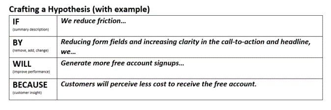
Hypothesis: The reason to run a test is to prove or disprove a hypothesis.
Do you know how you can best serve your customer to improve results? What knowledge gaps do you have about your customer? What internal debates do you have about the customer? What have you debated with your agency or vendor partner? Settle those debates and fill those knowledge gaps by crafting a hypothesis and running a test to measure real-world customer behavior.
Here is the approach MECLABS uses to formulate a hypothesis, with an example filled in …
![]()
# of Treatments: This is the number of versions you are testing. For example, if you had Landing Page A and Landing Page B, that would be two treatments. The more treatments you test in one experiment, the more samples you need to avoid a Sampling Distortion Effect validity threat, which can occur when you do not collect a significant number of observations.
Valid/Not Valid: A valid test measures what it claims to measure. Valid tests are well-founded and correspond accurately to the real world. Results of a valid test can be trusted to be accurate and to represent real-world conditions. Invalid tests fail to measure what they claim to measure and cannot be trusted as being representative of real-world conditions.
Conclusive/Inconclusive: A Conclusive Test is a valid test that has reached the desired Level of Confidence (95% is the most commonly used standard). An Inconclusive Test is a valid test that failed to reach the desired Level of Confidence for the primary KPI (95% is the most commonly used standard). Inconclusive tests, while not the marketer’s goal, are not innately bad. They offer insights into the cognitive psychology of the customer. They help marketers discover which mental levers do not have a significant impact on the decision process.
KPIs — MAIN, SECONDARY, TERTIARY
Name: KPIs are key performance indicators. They are the yardstick for measuring your test. The main KPI is what ultimately determines how well your test performed, but secondary and tertiary KPIs can be insightful as well. For example, the main KPI for a product page test might be the add-to-cart rate. That is the main action you are trying to influence with your test treatment(s). A secondary KPI might be a change in revenue. Perhaps you get fewer orders, but at a higher value per order, and thus more revenue. A tertiary KPI might be checkout rate, tracking how many people complete the action all the way through the funnel. There may be later steps in the funnel that are affecting that checkout rate beyond what you’re testing, which is why it is not the main KPI of the test but still important to understand. (Please note, every test does not necessarily have to have a main, secondary and tertiary KPI, but every test should at least have a main KPI.)
Key Discoveries: This is the main benefit of running tests — to make new discoveries about customer behavior. This Test Discovery Library gives you a central, easily accessible place to share those discoveries with the entire company. For example, you could upload this document to an internal SharePoint or intranet, or even email it around every time a test is complete.
The hypothesis will heavily inform the key discoveries section, but you may also learn something you weren’t expecting, especially from secondary KPIs.
What did the test results tell you about the perceived credibility of your product and brand? The level of brand exposure customers have previously had? Customers’ propensity to buy or become a lead? The difference in the behavior of new and returning visits to your website? The preference for different communication mechanisms (e.g., live chat vs. video chat)? Behavior on different devices (e.g., desktop vs. mobile)? These are just examples; the list could go on forever … and you likely have some that are unique to your organization.
Experience Implemented? This is pretty straightforward. Has the experience that was tested been implemented as the new landing page, home page, etc., after the test closed?
Date of implementation: If the experience has been implemented, when was it implemented? Recording this information can help you go back and make sure overall performance correlated with your expectations from the test results.
ADDING MORE TESTS TO THE TOOL
The Test Dashboard tab dynamically pulls in all information from the subsequent test worksheets, so you do not need to manually enter any data here except for the test sequence number in Column A. If you want to create a new test tab and the corresponding row in the “Test Dashboard,” follow these instructions:
-
- Right click on the bottom tab titled “Template – Your Test Name Here.” Choose “Move or Copy.” From the list of sheets, choose “Template – Your Test Name Here.” Check the box “Create a Copy” and click OK. Right click on your new “Template – Your Test Name Here (2)” tab and rename as “Your Test Name Here (7).”
- Now, you’ll need to add a new row to your “Test Dashboard” tab. Copy the last row. For example, select row 8 on the “Test Dashboard” tab, copy/paste those contents into row 9. You will need to make the following edits to reference your new tab, “Your Test Name Here (7).” This can be done in the following way:
- Manually enter the test as “7” in cell A9.
- The remaining cells dynamically pull the data in. However, since you copy/paste, they are still referencing the test above. To update this, highlight select row 9 again. On the Home Tab>Editing, select “Find & Select (located on the far right)>”Replace,” or use “CTRL+F”>Replace.
- On the Replace tab of the box, enter Find What: “Your Test Name (6)” and Replace with: “Your Test Name (7).”
- Click “Replace All”
- All cells in the row should now reference your new tab, “Your Test Name (7)” properly.
(no form to fill out, just click to get your instant download of this Excel-based tool)
Special thanks to Research Manager Alissa Shaw, Data Scientist Delaney Dempsey, Associate Director of Design Lauren Leonard, Senior Director of Research Partnerships Austin McCraw, and Copy Editor Linda Johnson for helping to create the Test Discovery Library tool.
If you have any questions, you can email us at info@MECLABS.com. And here are some more resources to help with your testing …
Lead your team to breakthrough results with A Model of your Customer’s Mind: These 21 charts and tools have helped capture more than $500 million in (carefully measured) test wins
Test Planning Scenario Tool – This simple tool helps you visualize factors that affect the ROI implications of test sequencing
Customer Theory: How we learned from a previous test to drive a 40% increase in CTR
The post Get Your Free Test Discovery Tool to Help Log all the Results and Discoveries from Your Company’s Marketing Tests appeared first on MarketingExperiments.

from MarketingExperiments https://ift.tt/2SECDwG
from WordPress https://ift.tt/2DeBLdH

 Every week users submit a lot of interesting stuff on our sister site Webdesigner News, highlighting great content from around the web that can be of interest to web designers.


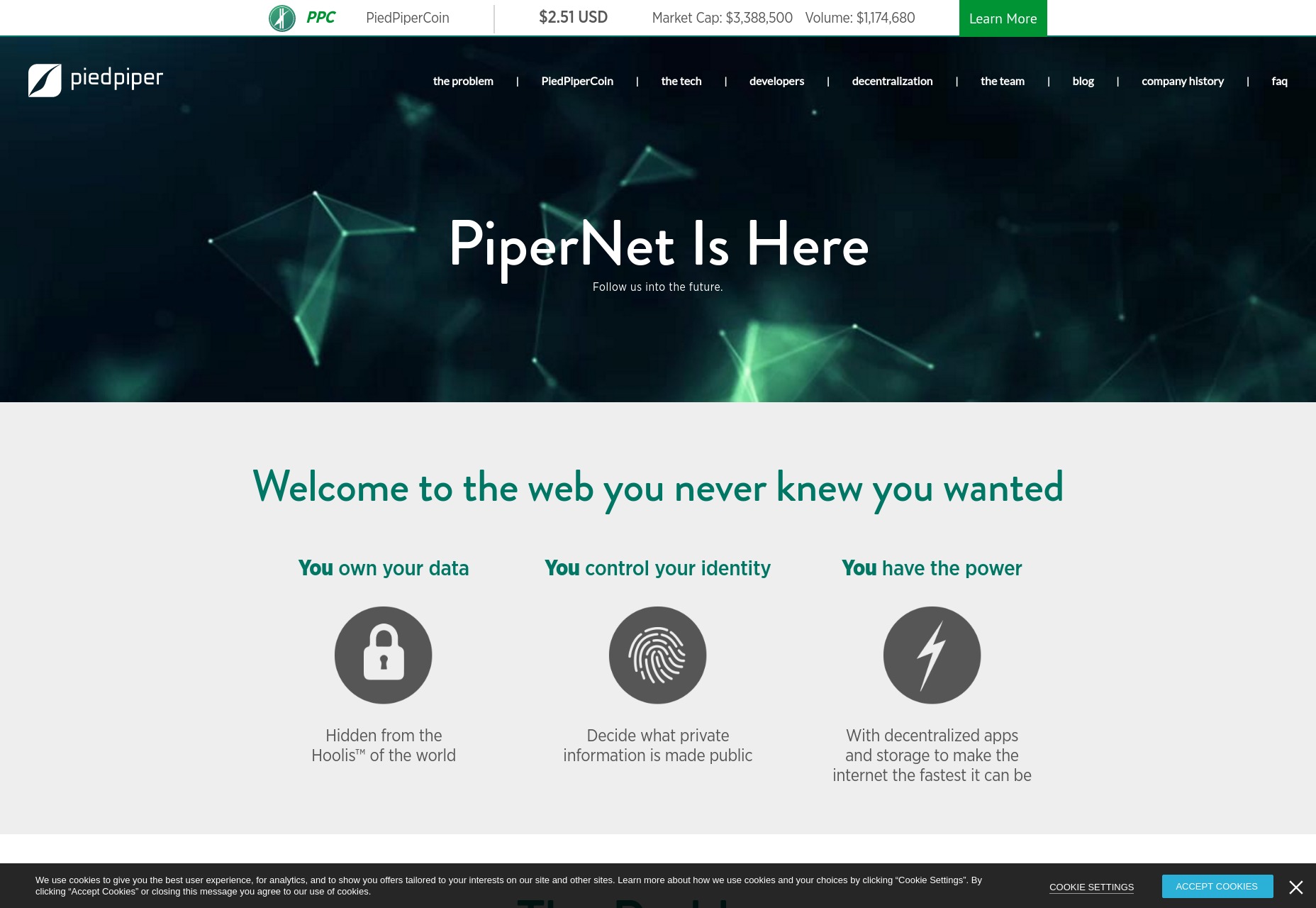
 There’s a moment that every tech nerd in every corner of the tech industry knows all too well. It’s that moment when you see that some movie or TV show has decided that your area of tech is relevant to the story, and by golly they plan to butcher it in the cheapest and most simplified way possible.


 In
In 


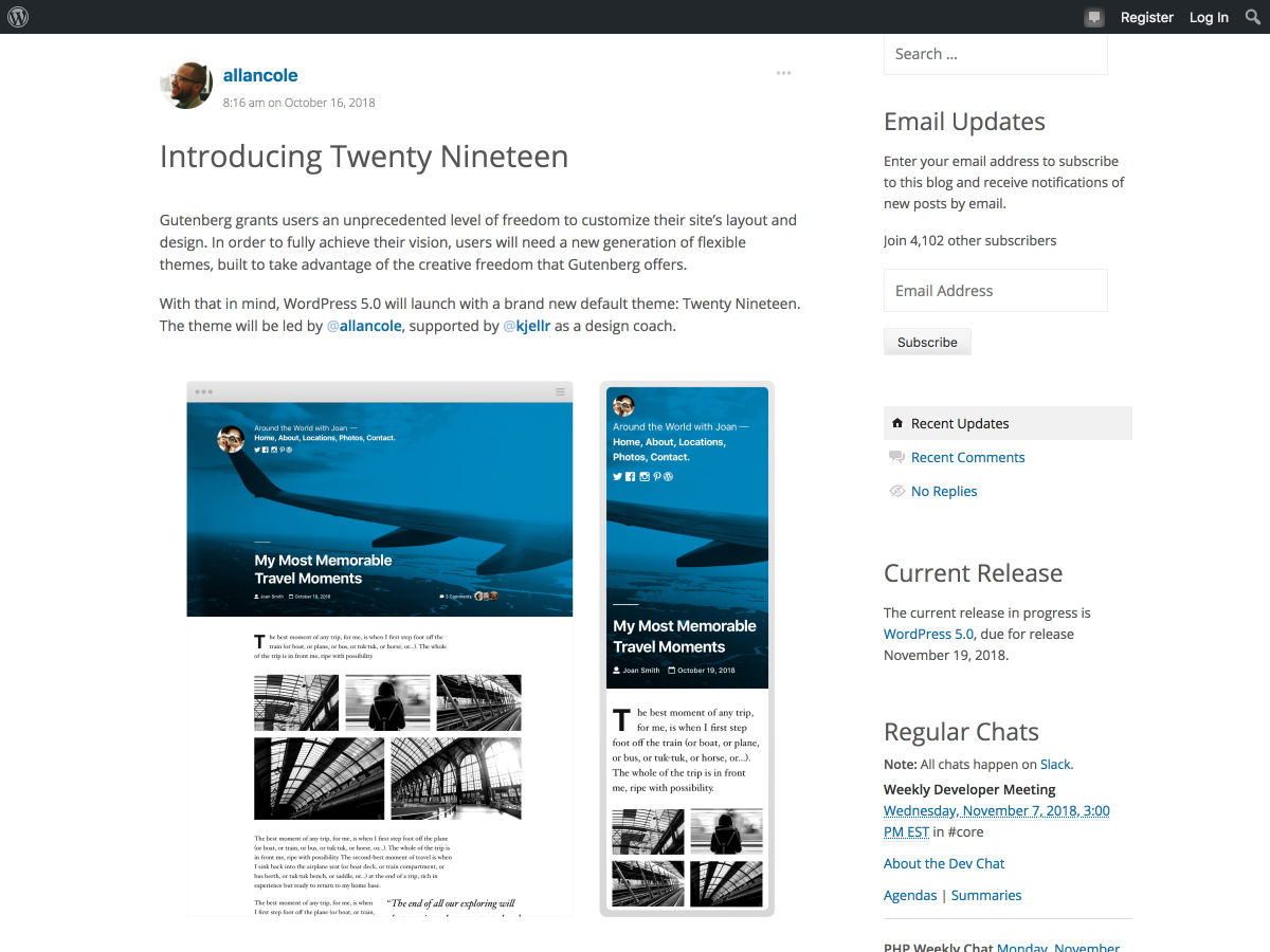
 Winter is coming, and so is WordPress 5.0. From some of the chatter about Gutenberg—the new content editor in WordPress—you might be led to believe that it’s worse than White Walkers. Others of us are more cautiously optimistic. We can all agree on two things: dragons are cool, and a lot of theme developers are going to have some work to do.