When you look at me, what do you see?
Someone who is a marketer… maybe even an entrepreneur.
As you may already know, I’ve co-founded a handful of companies. I’ve received a handful of awards from people like President Obama and the United Nations. And I am a New York Times bestselling author. The list keeps going on and on.
In other words, most people see me as successful.
But what if I told you that behind that success is a bunch of failures?
Sure, overall, I’m up, and my successes have more than made up for my failures. But just like everyone else, I have failed many times.
And many of the failures were so big that they cost me a lot of money
In other words, I’ve screwed up a lot. But what helped me do so well was that I was able to learn from my mistakes and avoided making the same ones over and over again.
Today, I thought I would do something a bit different. I want to share with you the biggest marketing mistakes I have made. Hopefully, you will learn from them and avoid making the same mistakes as me.
Here we go…
Mistake #1: Spending $400,000 on Facebook fan page likes
I used to have the philosophy with social networks that the best thing you could do was build up your following.
If you have more followers, then whenever you have a message that you want to put out there then, hopefully, thousands of people will see it.
But you know what’s common with all social networks… not just the ones Facebook owns?
They all have a pattern or restricting your reach. And by doing that, it leaves you no choice but to spend money on ads.
But me, being a smart aleck, I thought I would outsmart Facebook by continually growing my fan page. That way after I built up a good user base, I wouldn’t have to spend money on ads.
Boy was I silly.
I am not saying you shouldn’t spend money on ads, but with any social network, you should avoid spending money to build up a community. Just think of it this way…
Why would you spend money to build up a community when you can’t control if they will see your message?
This is one of the biggest and silliest marketing mistakes I have ever made. History has proven that social networks continually change their algorithms and restrict your reach, yet I still blew money trying to build up a community.
The two big lessons I want you to take away from this first mistake are:
- Have a direct ROI – If you are going to spend any money on ads, make sure it is cash flow positive. Trying to get an indirect ROI on your ad dollars is silly unless you are willing to experiment and potentially lose a lot of money.
- Be cautious, not slow – Every major marketing channel has algorithms. Start off small and as long as the numbers work out, scale up as fast as possible.
Mistake #2: Picking too small of a niche
In business, we call it total addressable market (TAM)… you want to go after a big TAM.
It’s really hard to own 100% of a market no matter how small or big it is. It’s much easier to own 1% of a market. So you should go after a huge market so your 1% is worth something meaningful.
In marketing, everyone talks about how you need to pick a niche. But here is what people don’t tell you… it takes almost the same amount of effort to market a business in a small niche as it does to market a business in a much bigger market.
So, why not go after a big market as it will help you make more money?
With one of my earlier startups, Crazy Egg, we created a heatmap solution that helps show you where people clicked on your site.
Eventually, we added mouse tracking, A/B testing, and a handful of other features.
But we should have done that years before. If we had done it sooner, the company would have easily been double the size, just like how Optimizely generates over 100 million a year in revenue.
What’s crazy is that there isn’t much more work to expand our marketing to include keywords like A/B testing from an organic or even paid perspective. It also isn’t hard for us to write blog posts on these new areas.
Sadly, this mistake is one I’ve made one too many times. I kid you not, my net worth would have an extra 0 at the end if I just chose big enough markets from day 1.
Now there are a few ways to figure out if the market you are going after is large enough:
- Google Trends – type in the space you want to go after. Look for verticals that are bigger than “digital marketing” as a rule of thumb.
- CrunchBase – look to see if there are any venture funded competitors. If someone has raised over 10 million dollars, the chances are it is a big enough market.
- Publicly traded companies – if you have any competitors that are public, look at their market cap. The bigger the number, the better. Keep in mind that most publicly traded companies offer multiple products and services, so this number is usually inflated.
Mistake #3: Not all search traffic is the same
NeilPatel.com isn’t my first blog. Technically it’s my third.
And because it was the last marketing blog I created I was able to do things a bit differently because I was able to learn from my previous blogging experiences (I had more money).
The way I grew NeilPatel.com was simple… type in a competitor URL into SEMrush, see what their top pages where, and then write better versions of it.
Once I did that, I would then go to tools like Ubersuggest, find popular keywords that I wasn’t going after, and then create content focusing on all of those terms.
That strategy has helped me get over 3 million monthly visitors of which 1.8 million of them are unique.
But what’s wrong with that strategy?
Well, first of all, not all traffic is equal. But that wasn’t my mistake because I was smart enough to look for keywords that had a high cost per click, as that is a leading indicator that the keyword is more valuable.
The big mistake I made was not focusing on regions. When doing keyword research and competitive analysis using tools like SEMrush I focused on creating content that would generate traffic from the right keywords… but I never looked at regions.
I am Indian, and I love India. But traffic from India doesn’t generate me anywhere near the amount of revenue as traffic from the United States.
Now here are my traffic stats per region:

As you can see, the United States is my most popular region, but it is not the majority. Over time it has gotten better as now when I do keyword research, I focus all of my effort on the United States.
Even when I find popular articles written by my competitors, I plug them into Ahrefs, and I look at the traffic stats per region before deciding on whether or not I want to create something similar.
Mistake #4: Traffic doesn’t mean anything if it doesn’t convert
The last startup that I created was called KISSmetrics. It didn’t work out as well as I wanted, and I eventually bought some of their assets.
I raised over 17 million dollars and we were off to a fast start. We even had some Fortune 500 companies who were interested in potentially acquiring us early on.
When we started, our traffic was up and to the right.

And then came a competitor, Mixpanel, who copied a lot of our features and didn’t know marketing as well as me. Just look at their traffic stats:

Considering that we had almost 3 times more traffic than them, how much do you think KISSmetrics was worth during our peak?
Let me give you a hint… Mixpanel’s last valuation that they announced was $865 million!

So, what do you think? Maybe we were worth double them… or at least the same valuation.
Nope. Guess again.
We weren’t even worth 10% of their value.
That’s when I realized that the real formula to marketing isn’t just who is getting the most eyeballs, it’s about focusing on monetization.
Don’t just focus your efforts on traffic acquisition, focus on conversion optimization. It’s the area I didn’t spend enough time on early on.
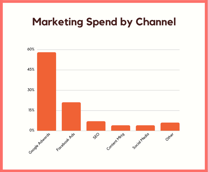
And to give you an idea of how many companies are making this mistake… I interviewed 208 companies that generate over a million bucks in revenue. Here’s where they are spending their marketing dollars.
And here are the channels producing the biggest ROI.
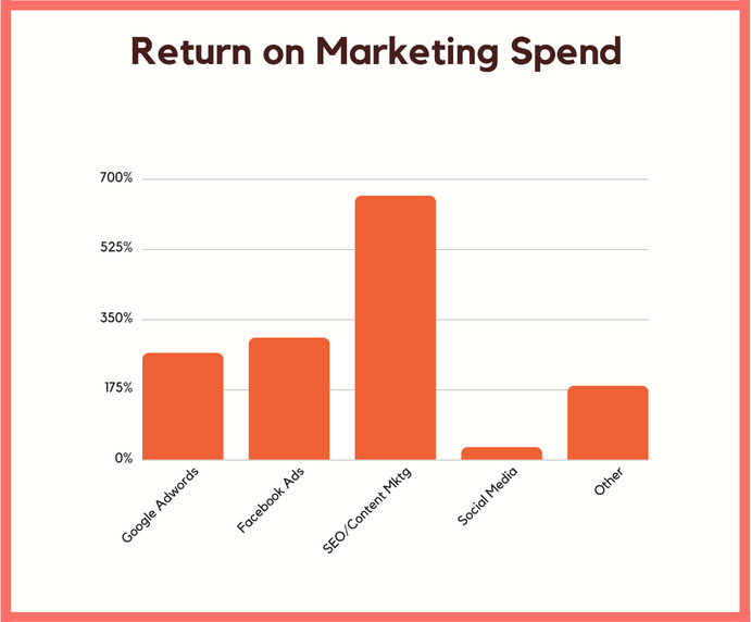
Do you see what’s wrong?
SEO produces a higher ROI than paid advertising for most businesses, yet very little budget gets allocated to it.
And what you don’t see in the chart, as it is classified in “other,” is conversion optimization produced the biggest return, yet very few companies spend money on it.
Mistake #5: Not monetizing early enough
Speaking of monetization, I also make this mistake too often.
I love giving everything away for free and then when it comes time to monetize, my numbers don’t look as good as they should.
It’s not that I don’t know how to monetize. It’s more so that I’ve trained my users to expect everything for free.
The moment you switch things up, the numbers never look as great.
I learned this lesson from Ramit Sethi. When I launched my first ebook course on Quick Sprout, I couldn’t generate more than $30,000 a month. Don’t get me wrong, that’s good money, but not when you are generating over 200,000 unique visitors a month.
On the flip side, I monetized NeilPatel.com much earlier than Quick Sprout and, of course, I got better at marketing and entrepreneurship at the same time.
But when I released an ebook/training course (I no longer sell it), I was able to generate $650,000 a month from just 450,000 visitors during my peak.
As the course got older, my monthly revenue dropped but it stayed around $381,722.
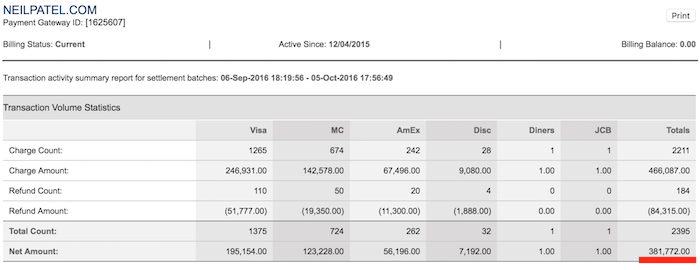
The point I am trying to make is don’t wait too long before you monetize.
There is nothing wrong with charging for a product or a service. But if you wait too long before you start charging, people will have this notion that it will be free forever and they won’t be as likely to convert in the future no matter how good you are at marketing.
Mistake #6: Taking people for granted
I have a skill set that I have always been good at. Can you guess what it is?
It’s making websites popular. 
Just because I know how to make a website popular (and I can even convert those visitors into customers) doesn’t mean I am going to be successful.
I’ve always tried to run my companies lean in which I never wanted to have more than 50 employees.
Over the years, I’ve more than surpassed that number and I have hundreds of people working for me. But I should have done that much sooner.
Without people, you won’t grow that fast no matter how much of a scalable business you have.
You need great operators and managers if you want to see fast growth.
For example, my business partner, Mike Kamo, doesn’t know marketing as well as me. I have more experience as an entrepreneur and I’m more book smart.
Yet every time he takes my traffic and monetizes it, he generates more revenue from the same traffic than I do. And again, I know more about marketing and business than him.
But because he is great at hiring and building up people, he is able to generate more revenue from the same amount of traffic.
For example, he hired Nick Roshon as our VP Sales, who is amazing. In December, which is one of the worst months for us due to holidays, Nick’s team closed $1,585,093 million in revenue.
Not too shabby for a 30-day period!
And even Nick knows, without his team, he wouldn’t have had a good December. It’s all about the people and you shouldn’t ever forget that.
If you want to grow fast you need to hire people. Hire people who are process oriented and know operations well. Don’t be afraid of headcount… remember teams build great businesses, not individuals.
Just look at Elon Musk, he’s one of the most brilliant people of our times, but without his team, Tesla and SpaceX wouldn’t be as big as they are today.
Mistake #7: Control your own destiny
As an SEO, I have ranked for some of the most competitive terms on the Internet. And I am not just talking page 1… I’m talking the number the #1 spot on page 1.
Some of the terms I have ranked for over the years are online gambling, online poker, web hosting, credit cards, and auto insurance to name just a few.
Those are super competitive terms!
All of the sites that ranked for those terms generated me a nice amount of money from ads and lead generation.
But do you know what? It didn’t last forever.
Eventually, those sites stopped ranking for one reason or another and my income went down to 0.
Sure, some of the ranking drops I deserved because I used black hat techniques to get there, but over time I learned to only use white hat tactics and to think long term. I still lost revenue, however, due to circumstances out of my control.
With some of those sites, I was pulling in over $100,000 a month in affiliate income.
And sadly, I’ve had similar issues with Facebook Ads and even Google AdWords.
I was making a killing and for no reason I got my ads pulled because Facebook thought they were politically related when they had nothing to do with politics.
In other words, sometimes things go wrong even when you do all of the right things. And there is little you can do about it.
This has taught me to have an omnichannel approach to marketing. Sure, you know me as an SEO, but I do a lot more than SEO.
Just look at NeilPatel.com, I have text-based content, video content, a podcast, and even free tools.
I never rely on 1 traffic channel anymore.
Even the people I surround myself with are skilled at other marketing channels than just SEO. My head of paid, Chris, is amazing at Facebook Ads and Google AdWords. Funny enough, he is an ex-Facebook employee.
The point I am making is you are going to have ups and downs with your marketing. But if you want your business to be a bit steadier, diversify your marketing. Don’t just stick to one channel. Heck, I even recommend doing things like releasing free tools so you aren’t reliant on any channels.
And now my free tool generates 213,967 unique visitors a month.

Conclusion
Just like I did, you are going to make mistakes. All entrepreneurs, including Elon Musk and Mark Zuckerberg, make mistakes.
This is fine. Don’t worry about it.
But what separates the great entrepreneurs from the mediocre ones is that they learn from their mistakes and avoid making the same ones over and over again.
You have a list of some of my big marketing mistakes above. Learn from them and avoid making the same ones as me.
Have you made any big marketing or entrepreneurial mistakes?
The post 7 Marketing Mistakes That Nearly Broke Me… Literally appeared first on Neil Patel.


from Blog – Neil Patel http://bit.ly/2SPxv8g
from WordPress http://bit.ly/2LYHAx7

 Every human being needs, rather desperately, to feel accepted. They don’t necessarily need to feel accepted by everyone, but they do need to feel accepted by someone. It’s a part of our nature, and nature in general. Even as I type this, my cat Cleocatra is demanding that I give her attention, and if I don’t, she’ll leave my room in a huff.


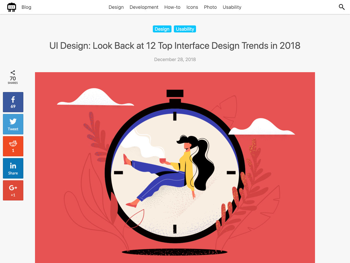
 New year, new design trends!



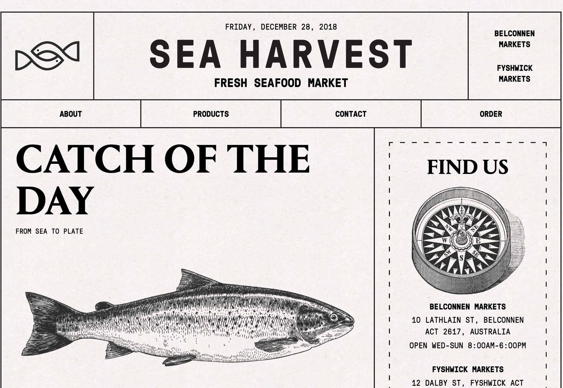

 Every week users submit a lot of interesting stuff on our sister site Webdesigner News, highlighting great content from around the web that can be of interest to web designers.