Tuesday, May 5, 2020

8 of the Top WP Multipurpose Themes That You Can Use

More than a few multipurpose WordPress themes have become big sellers in recent years, and for a reason.

Actually, for several reasons.

One reason is they serve as excellent toolkits for web designers who have large and varied clienteles.

The best multipurpose themes, like those presented here, are popular for other reasons as well.

  • They are uniformly responsive, SEO friendly, and flexible.
  • Most are either reasonably, or very easy to work with.
  • Most offer a host of design materials and options, including inspirational demos or concepts.

Unless you have a project for which only a specialty theme could provide what you need, any one of the following multipurpose themes should serve you well.

1. BeTheme – Responsive Multi-Purpose WordPress Theme

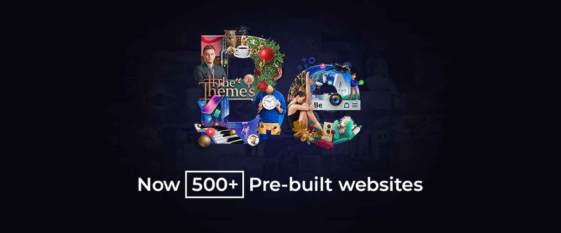
In the multipurpose WordPress theme world, BeTheme is an all-star. Bigger doesn’t always mean better, but this, the biggest of all WordPress themes with its 40+ core features, including 500+ pre-built websites, brings plenty of quality tools to the table.

BeTheme is in fact one of the top 3 WordPress themes in use today.

  • Be’s 500+ pre-built websites are customizable, responsive, and cover the entire range of industry sectors, key business niches, and all the popular website types and styles.
  • The other core features, including the Muffin Builder, Admin Panel, Layout Generator, shortcodes, and grid, header, footer, and other design options give Be’s users all the flexibility they need.
  • Since key UX features are incorporated into each pre-built website, using one not only helps get the website-building process off to a fast start, but often makes it possible to have a website up and running in as little as 4 hours.

Click on the banner to visit BeTheme and make it a point to check out a few of the pre-built websites.
2. Total WordPress Theme

Sometimes a website building tool offers something extra; something new and different you can’t quite put your finger on – like a “wonderous” design experience.

You can have a wonderous experience when you take advantage of Total’s case, using a building-block approach to create a website

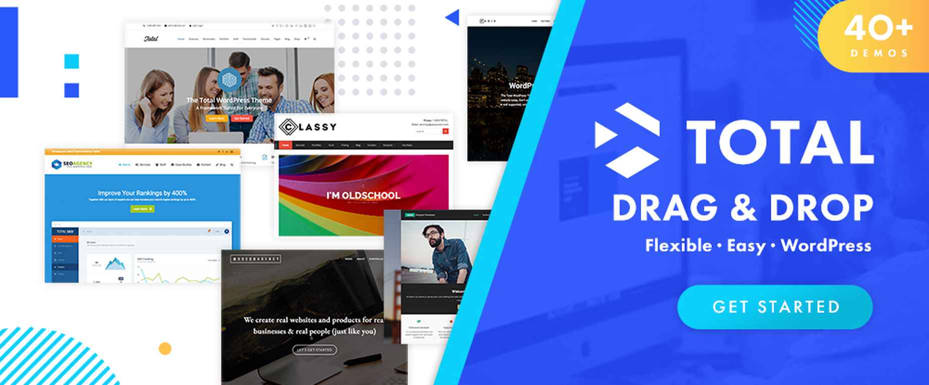
  • Total’s 90+ drag and drop customizable website-building elements make the design process as smooth and easy as can be.
  • 500+ styling options and 40+ pre-made demos provide all the design flexibility you’re ever apt to need.
  • With respect to editing, the Visual Composer editor and Total’s Theme Customizer give you both frontend and backend editing capability.

Total is also developer friendly. Click on the banner to find out more about the wonderous design experience that could be yours.
3. Avada Theme

When you’re trying to decide on which multipurpose theme to use and you’re having trouble doing so because they are looking too much alike, you can always use sales as a tiebreaker.

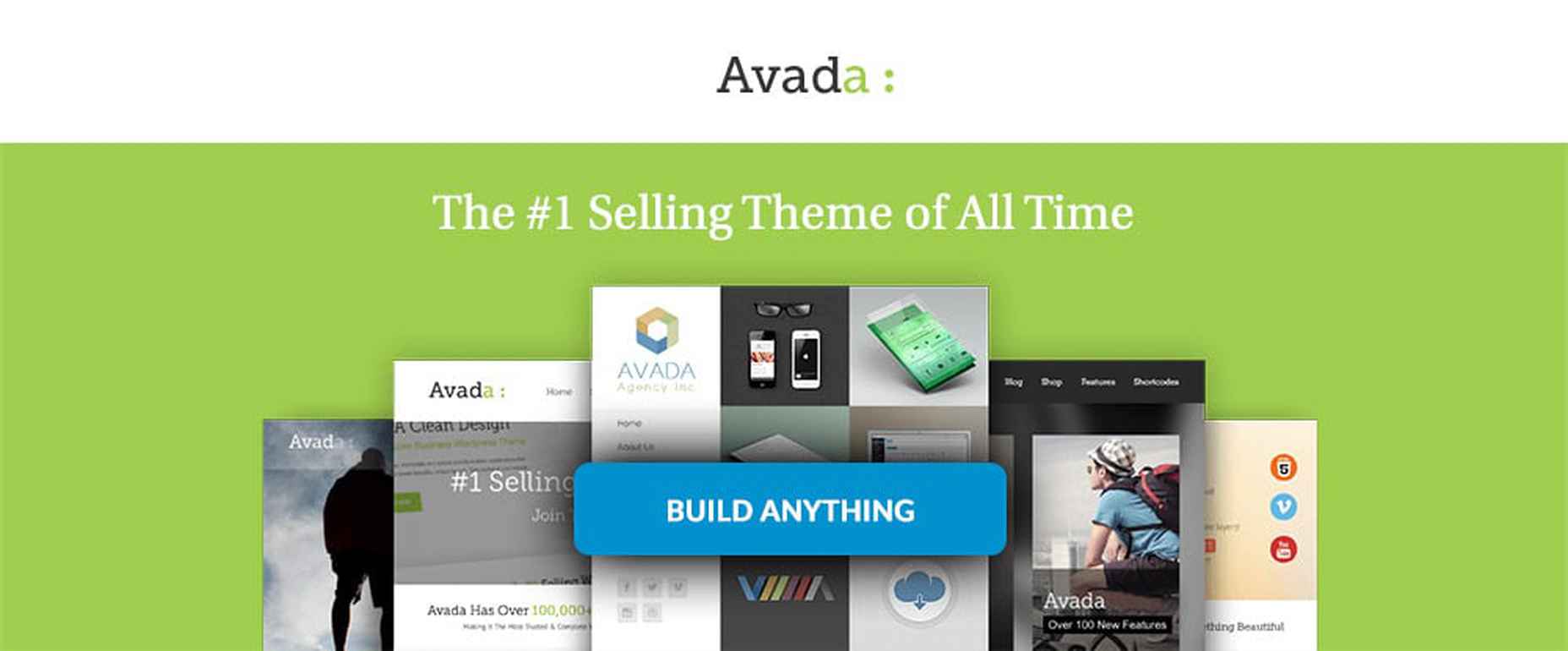
Avada is the all-time best selling theme on the market. That says a lot of course, but there are a host of other good reasons for choosing this WordPress theme.

Like:

  • 40+ one-click portable demos to get your website-building project up to speed;
  • total access to all the popular WordPress plugins;
  • a Core Fusion toolbox featuring $200 worth of website-building tools;
  • easy access to a wide range of page and design options.

Avada is 100% responsive, optimized for speed, and WooCommerce compatible.

Click on the banner to learn more.
4. Kalium

Ease of use can be an important factor in selecting a multipurpose theme. Kalium is exceptionally easy to use for novices and experts alike. It has the best rating that we ever seen from all the premium themes.

  • Kalium is compatible with all the popular WordPress plugins.
  • Elementor, WPBakery Page Builder, WooCommerce, and Slider Revolution, Layer Slider, Advanced Custom Fields PRO, WooCommerce Product Filter and other premium plugins come with the package for free.
  • Kalium is 100% responsive and SEO friendly.
  • Kalium is ideal for building blog and portfolio websites, it has 35,000 customers and offers first-class customer support.

Visit the site to find out more.
5. TheGem – Creative Multi-Purpose High-Performance WordPress Theme

This multipurpose theme, the Swiss Army knife of web design tools, is ideal for web designers looking to build eCommerce or business websites, or magazine, blogging, and portfolio sites.

Key features include:

  • Highly customizable and performant WordPress theme, perfect for professionals and beginners
  • 400+ beautiful pre-built websites and templates for any purpose and niche.
  • TheGem Blocks: a selection of more than 300 section templates that can make website building a simple, straightforward process.
  • a unique collection of WooCommerce templates accompanied by the WPBakery page builder.

Click on the banner to find out more.
6. Uncode – Creative Multiuse WordPress Theme

Uncode is the pixel-perfect solution for agencies, businesses, bloggers, and creative types in need of creating an attention-getting portfolio site.

  • The user-built website showcase demonstrates that if you can think of it, you can build it.
  • Uncode’s 70 pixel-perfect concepts are not only useable, but inspirational as well.
  • A powerful Frontend Editor together with more than 400+ Wireframes can serve to streamline website design workflows.

Click on the banner to see for yourself everything Uncode has to offer.
7. Movedo Premium WordPress Theme

Ease of use can be a strong selling point. That happens to be the case with most premium multipurpose themes. Movedo takes things a step further. Movedo makes website-building fun. Try incorporating these cool design elements in your website and see for yourself.

  • Unique animations
  • Dynamic parallax effects
  • Sophisticated scrolling

Click on the banner to learn more about Movedo and why it rocks!
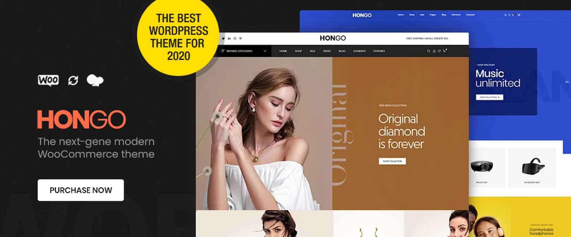
8. Hongo – Modern & Multipurpose WooCommerce WordPress Theme

Hongo was developed with businesses, bloggers and WooCommerce stores in mind. This theme utilizes WPBakery custom shortcodes and WordPress’s Customizer to give you all the flexibility and customizability you’ll ever be likely to need.

Hongo’s features include:

  • 11 ready one-click importable store demos;
  • a cool selection of 250 templates;
  • 200+ creative elements;
  • detailed online documentation.

Hongo has a number of other helpful features as well. Click on the banner to learn more about this premier multipurpose theme.
Multipurpose WordPress themes give users what they need in terms of tools and flexibility to create websites of any style and use. The only problem you’ll likely encounter trying to zero in on a multipurpose theme that will fully address your unique or special needs is when you’ve reviewed so many they begin to look alike.

Since it can take valuable time to find what’s right for you given the huge number of multipurpose themes on the market, we hope to make your search easier by bringing this selection of premium multipurpose themes to your attention.


[– This is a sponsored post on behalf of BAW Media –]

Source

p img {display:inline-block; margin-right:10px;}
.alignleft {float:left;}
p.showcase {clear:both;}
body#browserfriendly p, body#podcast p, div#emailbody p{margin:0;}

from Webdesigner Depot https://ift.tt/2Yx8nZX


from WordPress https://ift.tt/3djGN6E

Monday, May 4, 2020

3 Essential Design Trends, May 2020

The state of the world around us can greatly impact website design. From emotional changes that correlate to the feel of a design to information and data to deliver, the impact of the worldwide COVID-19 pandemic is making its way into projects (intentionally or not).
Here’s what’s trending in design this month.

1. “Unbalanced” Use of Space

Space can be a huge influence on a design project. It impacts visual flow and can drive engagement.

As of late, many designs have taken a more balanced and symmetrical approach to using space, but that’s changing again with more websites that feature an “unbalanced” use of space. (And it’s quite nice.)

We are calling this trend “unbalanced” because open space may or may not use a counter-weight to keep the design from feeling lopsided. There are a lot of different ways to do it: with white space, in images, with layers and how elements are stacked, and with patterns. This can be a rather challenging technique because responsive breakpoints can dramatically change how space appears if you aren’t careful.

Each of these projects tackles “unbalanced” space in a different and equally neat way.

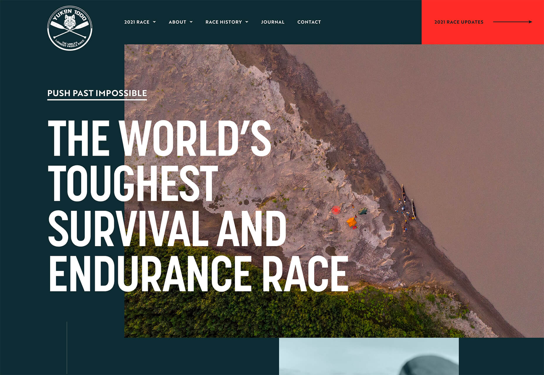
Yukon 1000 creates two different bits of unbalanced space in two different ways:

  • On the left side of the screen with background white space that the image does not extend into and includes text layers.
  • In the image itself with a distinct shape and plenty of open space on the water.

Both of the elements are unbalanced when they stand alone, but combined the open space on the left and open space in the image pull the eye back to the middle content area of the design.

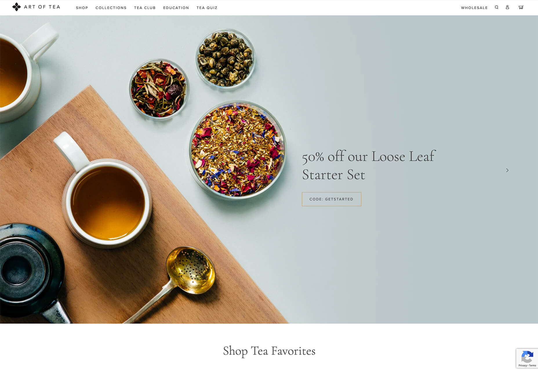
The Art of Tea website uses space in the image with nice stacking and the use of shapes in the positioning of objects in unbalanced space. Note how packed the left side of the image is compared to the bleakness of the right side. Even the text only extends partway across.

This aesthetic helps pull your eyes first across the screen to read the text, and then down past the scroll.

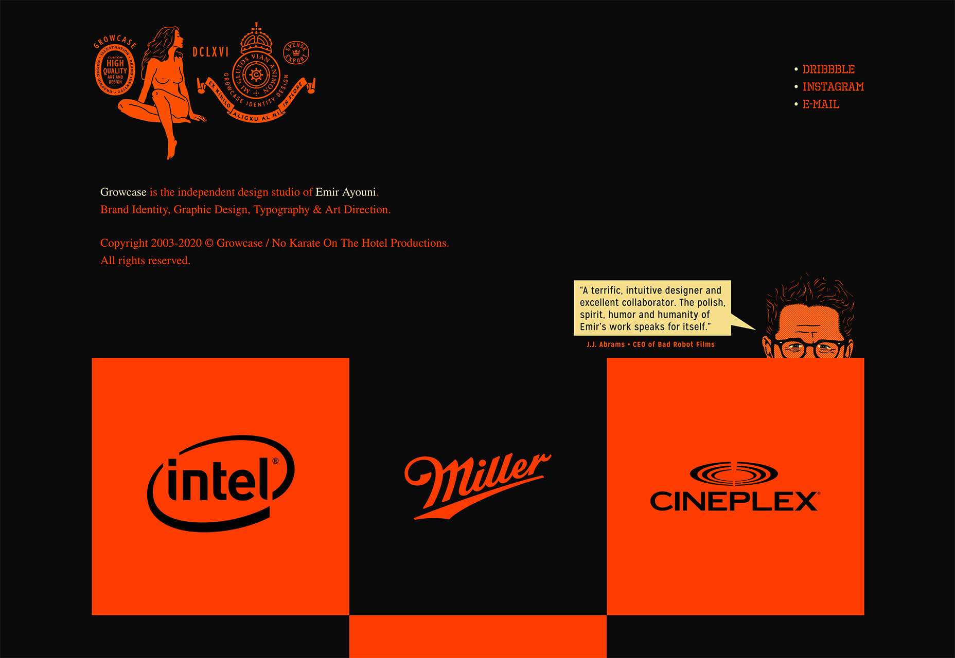
Growcase could be a case study in the use of space itself, but focus on the top of the screen. The brand identity stretches about one-third of the way across and is met by nothing other than a small social media/portfolio link trio.

There’s also a lot of space below it and negative spaces with each of the portfolio blocks. The black areas pull you through the design, whether you are ready to move through it or not.

2. New Image Slider Concepts

It has been all that long ago that website designers had all but declared sliders to be dead.

They’re back.

But they look a lot different and are much more interesting.

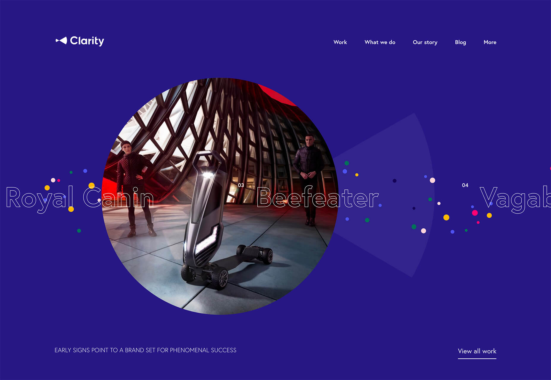
Trending in slider design is using sliding elements with interesting animations and shapes that don’t look like sliders. What’s interesting is the commonalities between them – even though they look spectacularly different.

Each of these slider examples:

  • Uses a circle pointer that expands when you hover on a click element
  • Visual cues, such as navigation arrows, are present
  • Each site features some type of portfolio content
  • Slider images are allowed to stand alone and aren’t covered up with words or other elements

Additionally, each example has a few fun tricks of its own.

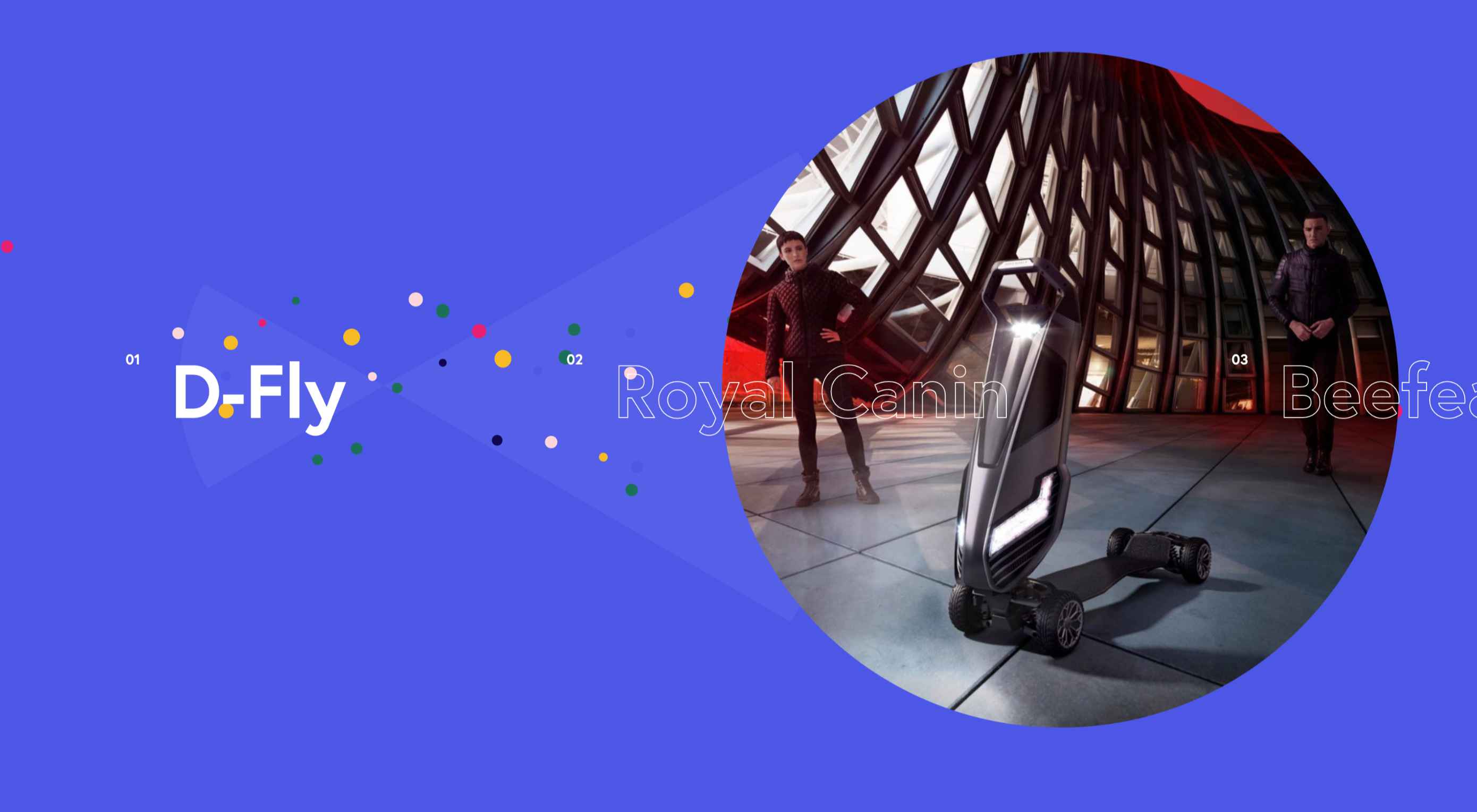
Clarity uses a slider that moves automatically based on mouse position and all of the images, appear within the circle frame.

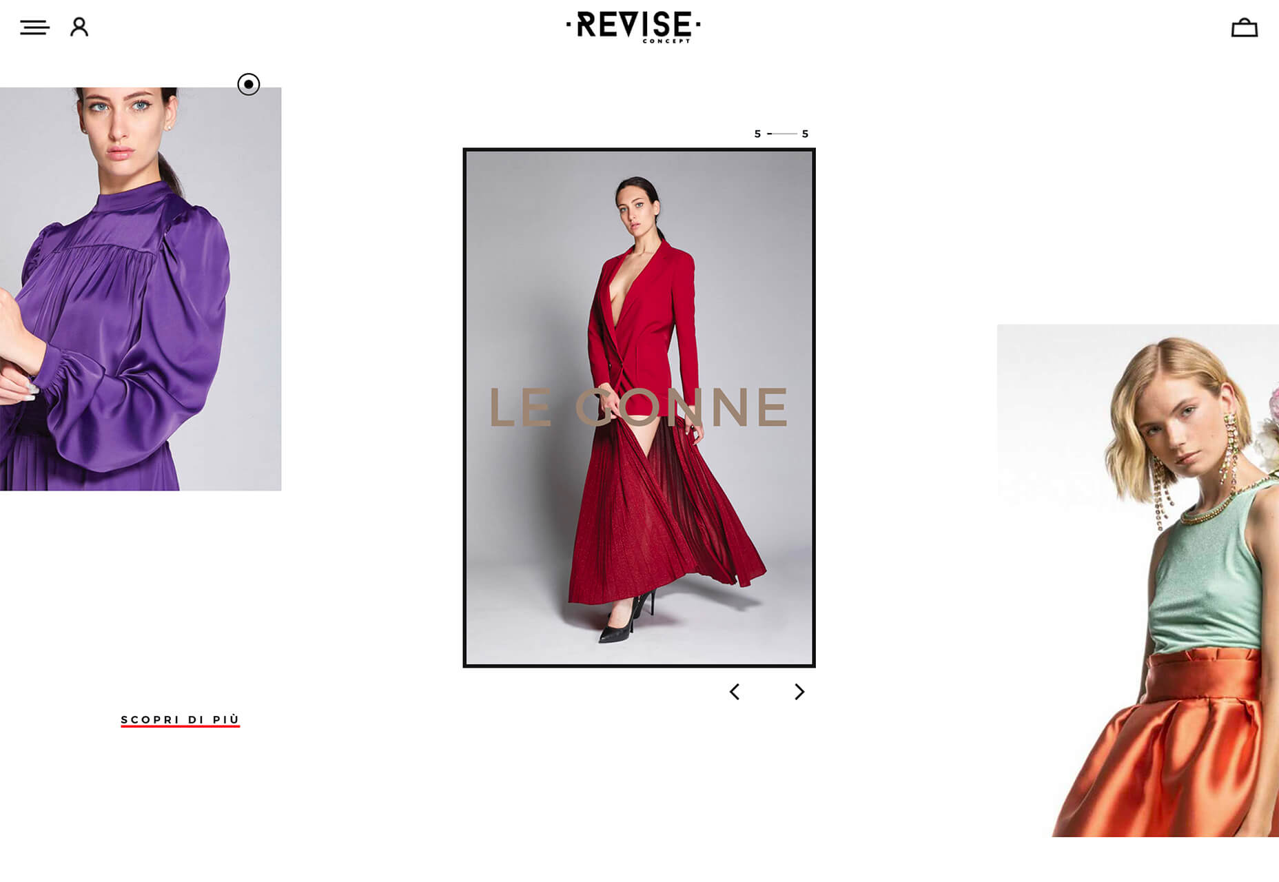
Revise Concept also uses an automatic scrolling slider with images that move in a diagonal fashion. You can also use the arrows to scroll forward and back on your own.

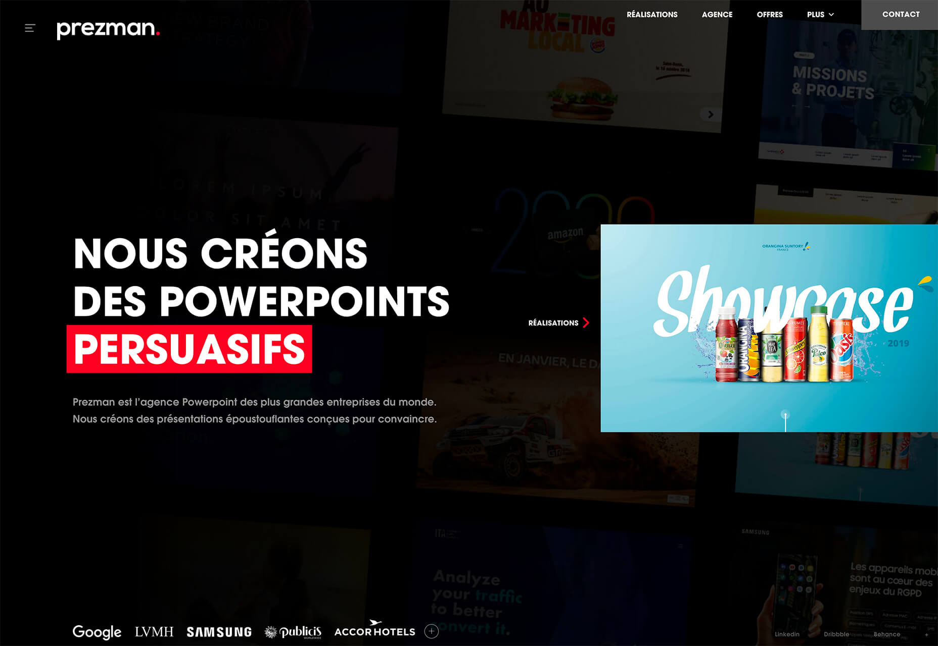
Prezman only previews the slider on the homepage, but click over and it expands to full screen to show a variety of portfolio pieces with simple, but neat, animation.

3. Coronavirus Data

The most obvious sign of the coronavirus on website design is in the number of websites that contain information about the virus. Trending seems to be website designs that provide different types of data visualizations about COVID-19.

Google has a page (that’s simple in true Google form), but these examples take the data to new visual levels. Data visualizations vary in data presented — local versus worldwide — and in how the information is put together.

While these sites all have distinct purposes, they provide nice examples of how to handle large amounts of data well in a visual format.

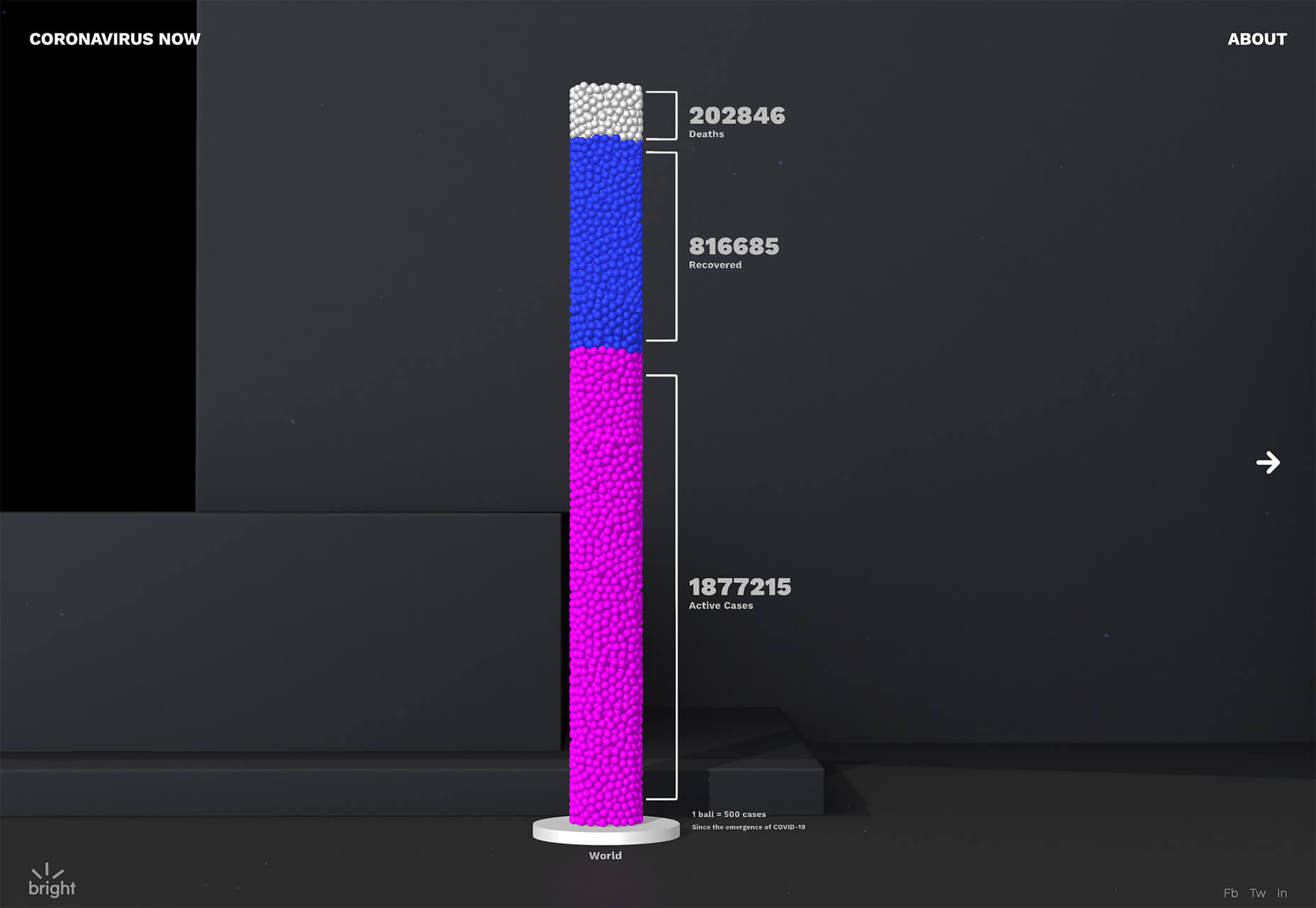
Coronavirus Now takes a variety of data and uses virtual jars of balls to show proportional relationships between three data points. What’s really neat about this design is the use of animation and labelling to make data understandable.

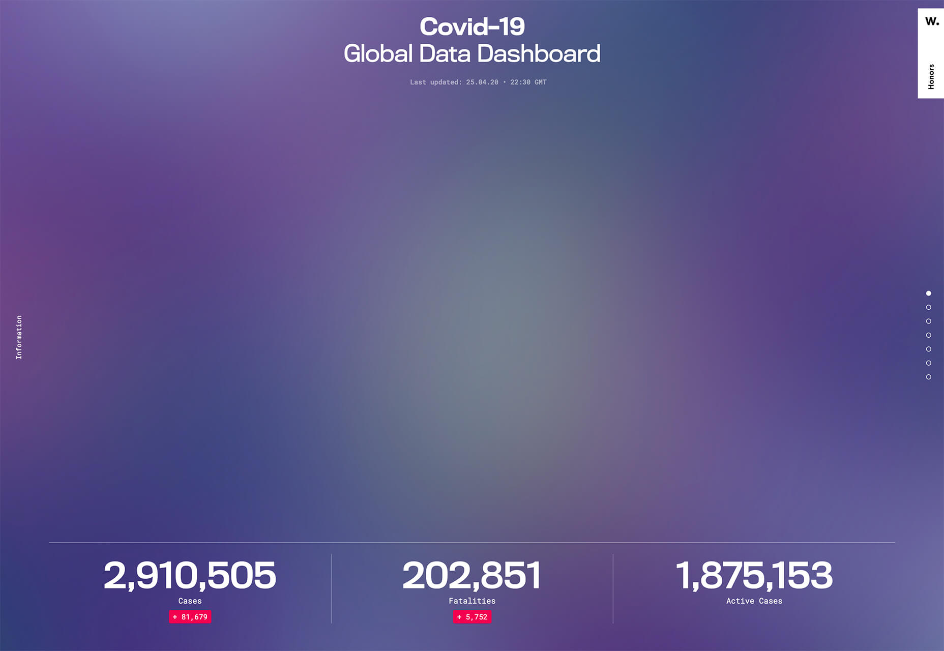
COVID-19 Global Data Dashboard breaks down different information and data points in a variety of chart types – bar, circle, and more. Using different visualizations can make it easy for people who understand and comprehend data in different ways better understand the information.

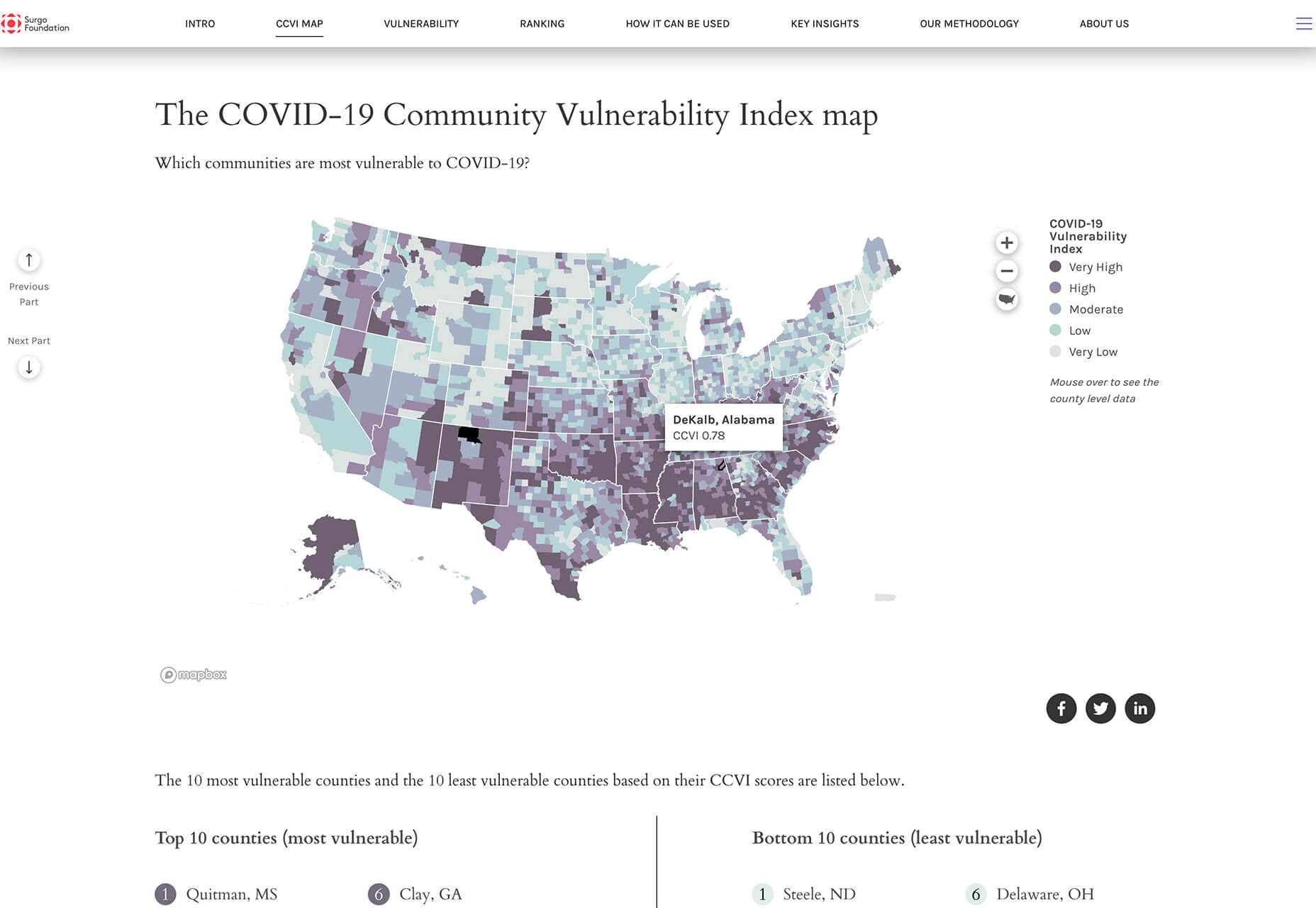
COVID-19 Community Vulnerability Index Map uses a mapping system to show where potential outbreaks could happen. Using map data can be a more understandable way to visualize complicated data.

Conclusion

While two of these website design trends have nothing to do with the coronavirus, we will start to see more things that are influenced by this worldwide health issue. Pay attention, and it’s likely that design will start to shift to elements with fewer large groups of people, face mask use and imagery will be more mainstream, and even colors might fade to more subdued hues. We are already seeing the impact on design and it is likely to continue to influence trends.

Source

p img {display:inline-block; margin-right:10px;}
.alignleft {float:left;}
p.showcase {clear:both;}
body#browserfriendly p, body#podcast p, div#emailbody p{margin:0;}

from Webdesigner Depot https://ift.tt/2Wt0x0A


from WordPress https://ift.tt/2SwB70W

Sunday, May 3, 2020

Popular Design News of the Week: April 27, 2020 – May 3, 2020

Every week users submit a lot of interesting stuff on our sister site Webdesigner News, highlighting great content from around the web that can be of interest to web designers. 
The best way to keep track of all the great stories and news being posted is simply to check out the Webdesigner News site, however, in case you missed some here’s a quick and useful compilation of the most popular designer news that we curated from the past week.

Note that this is only a very small selection of the links that were posted, so don’t miss out and subscribe to our newsletter and follow the site daily for all the news.

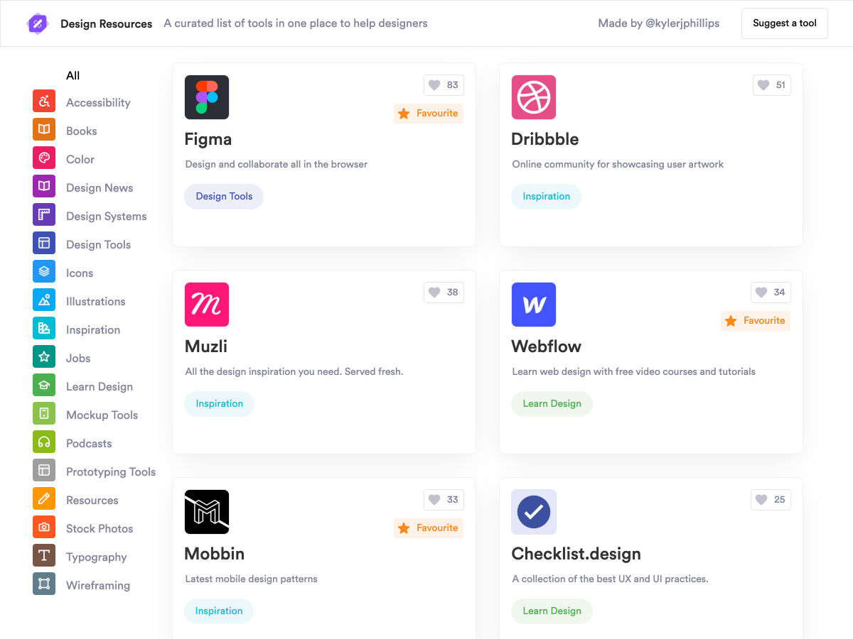
Design Resources – Curated List of Tools for Designers


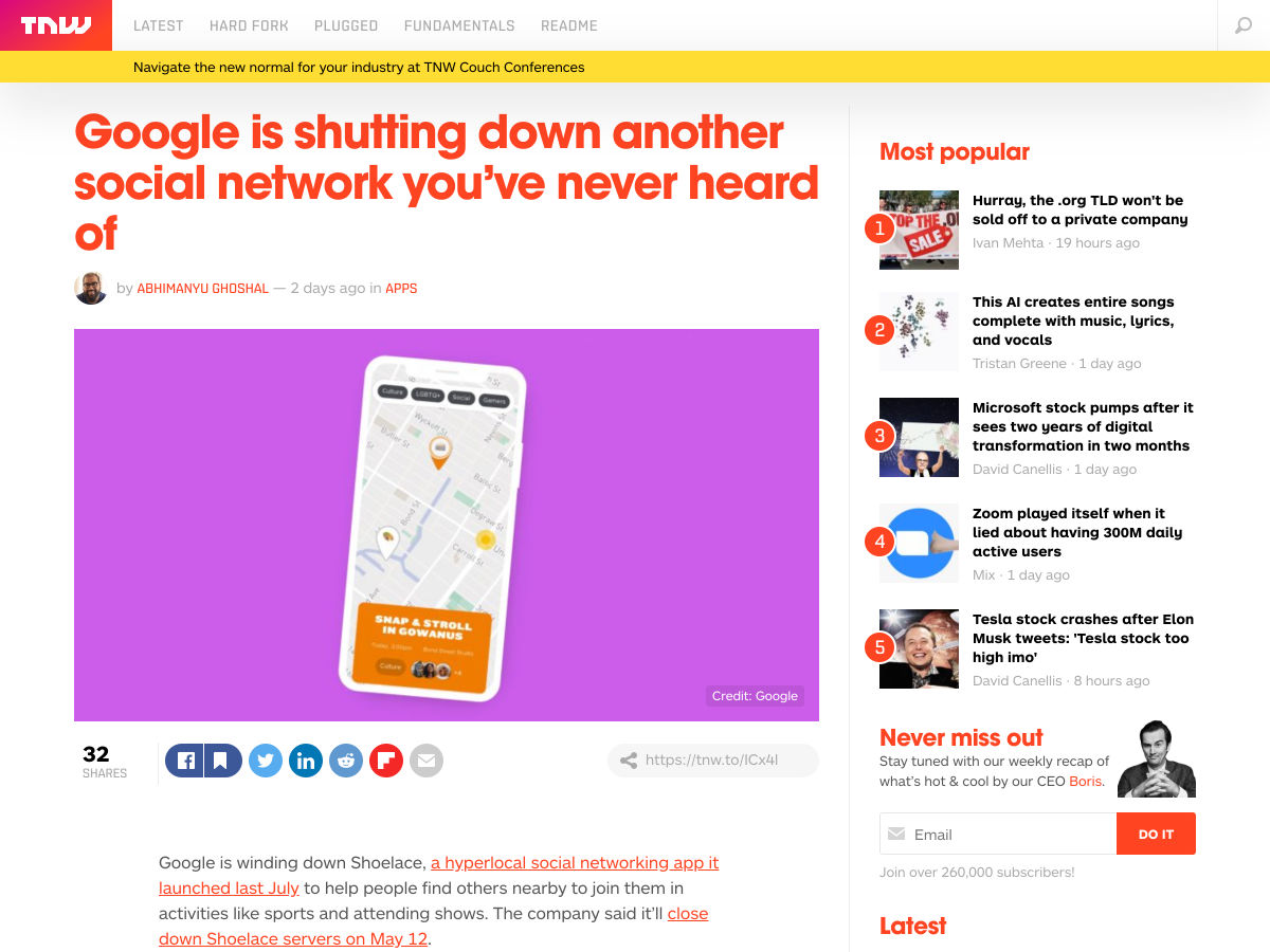
Google is Shutting Down Another Social Network You’ve Never Heard of


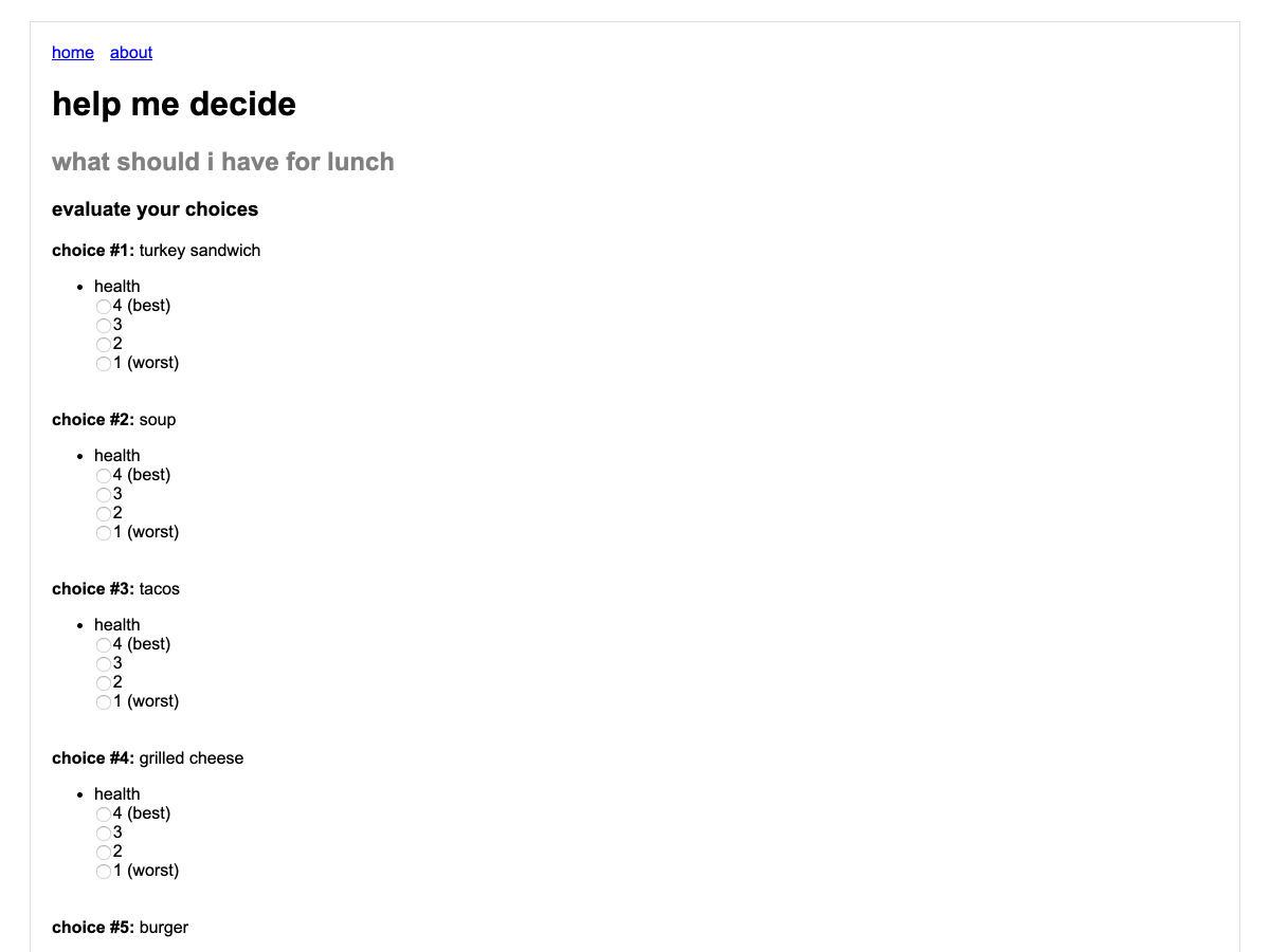
Help Me Decide Please


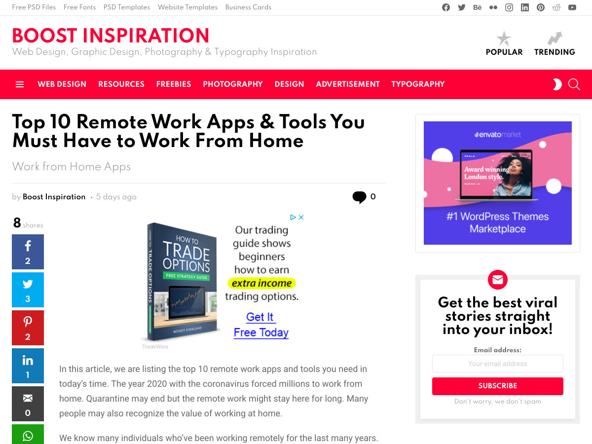
Top 10 Remote Work Apps & Tools


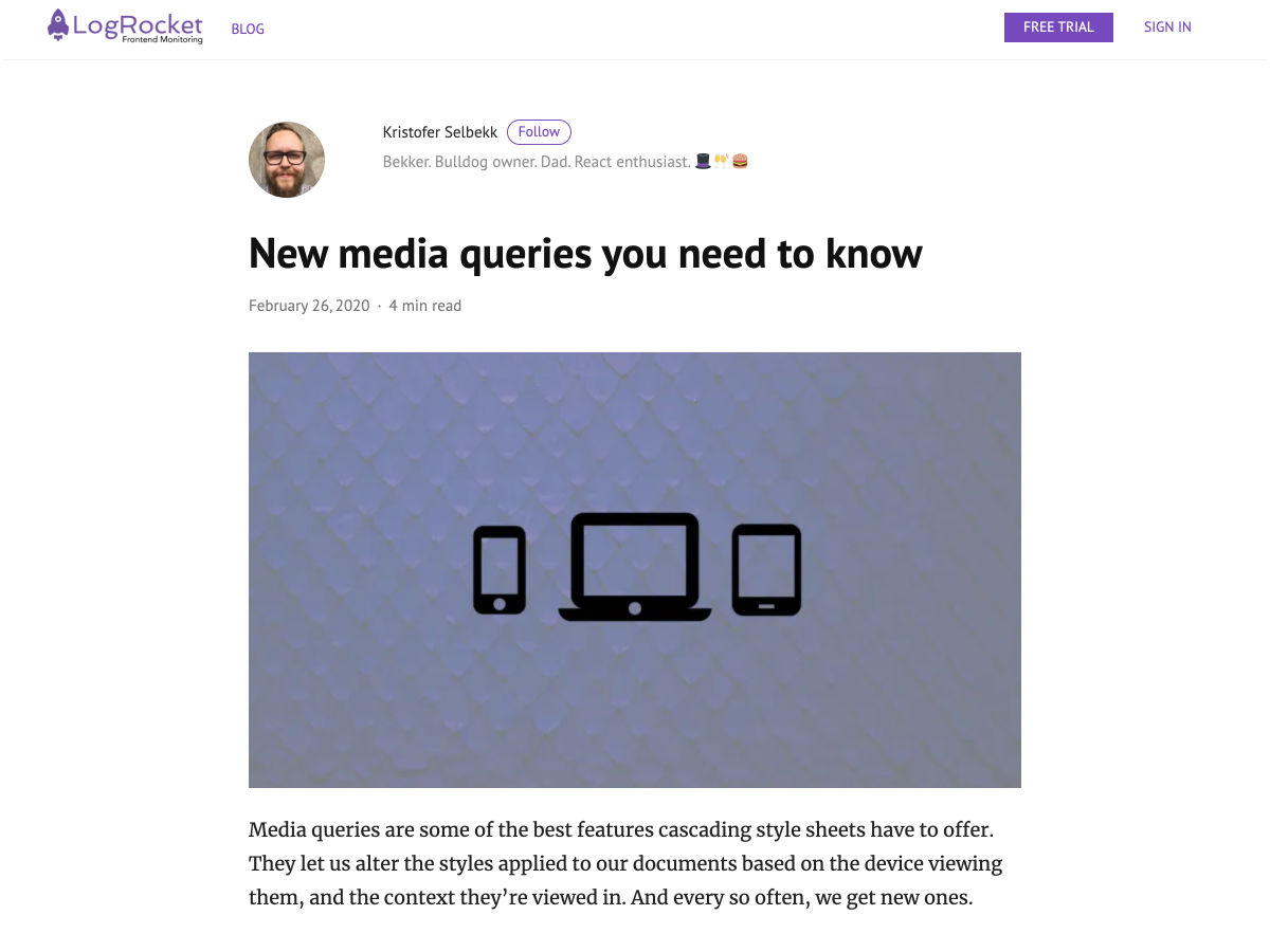
New Media Queries You Need to Know


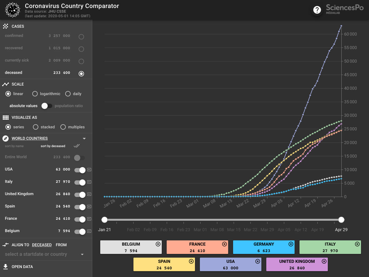
Coronavirus Country Comparator


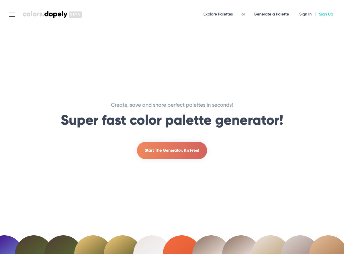
Dopely Colors – Super Fast Color Palette Generator


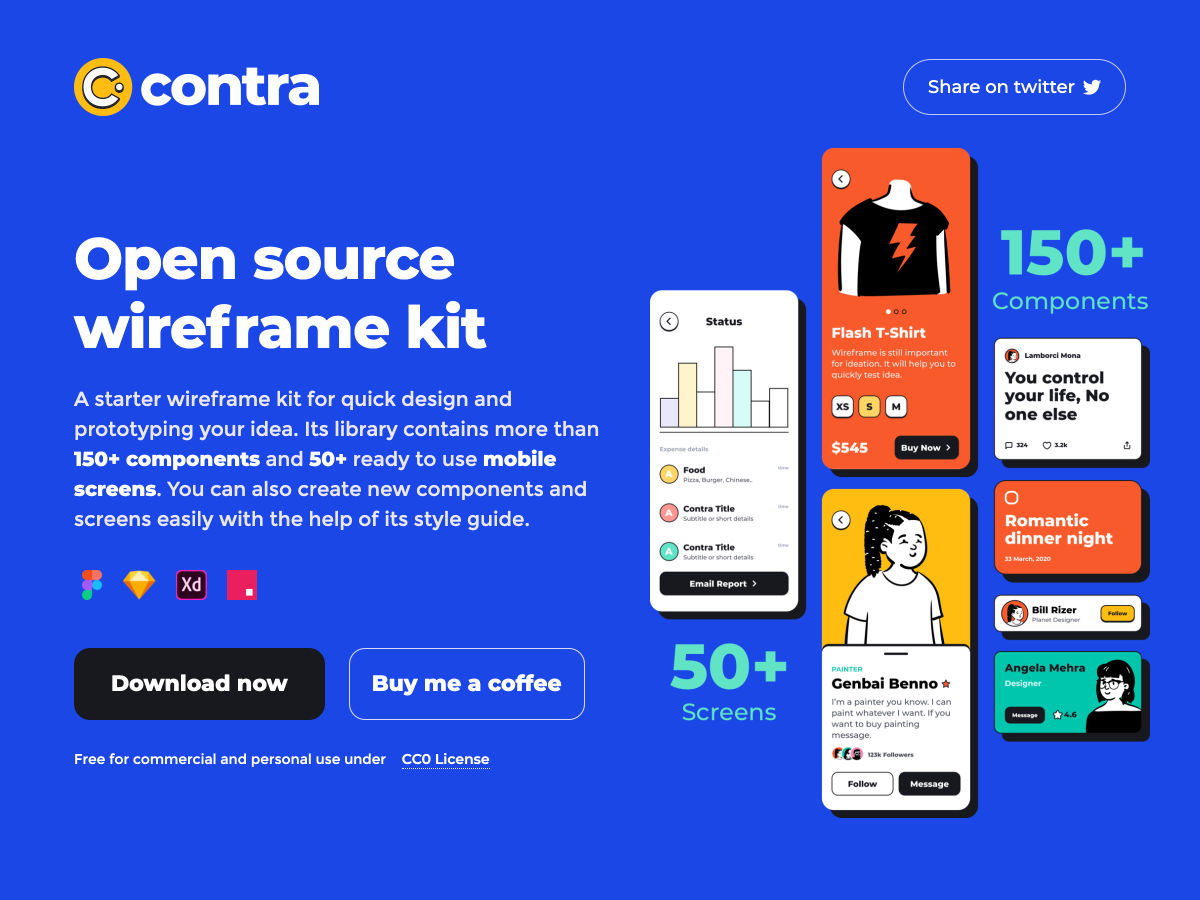
Contra Open Source Wireframe Kit


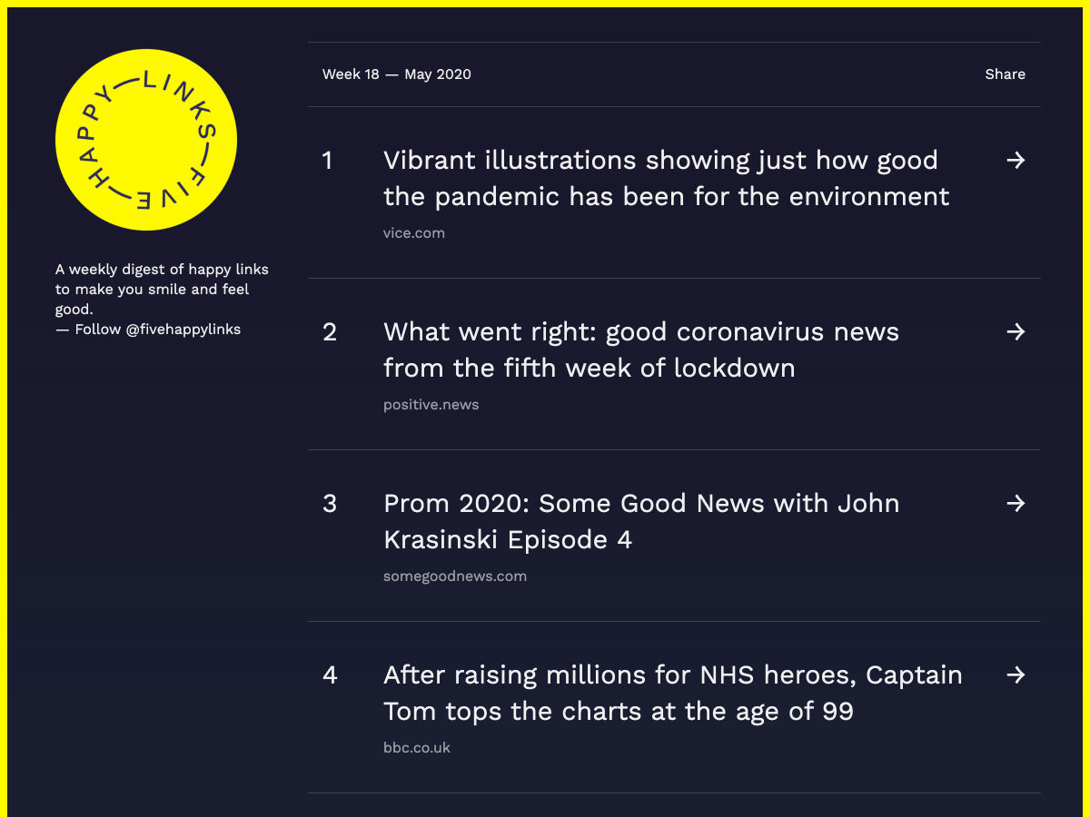
Five Happy Links


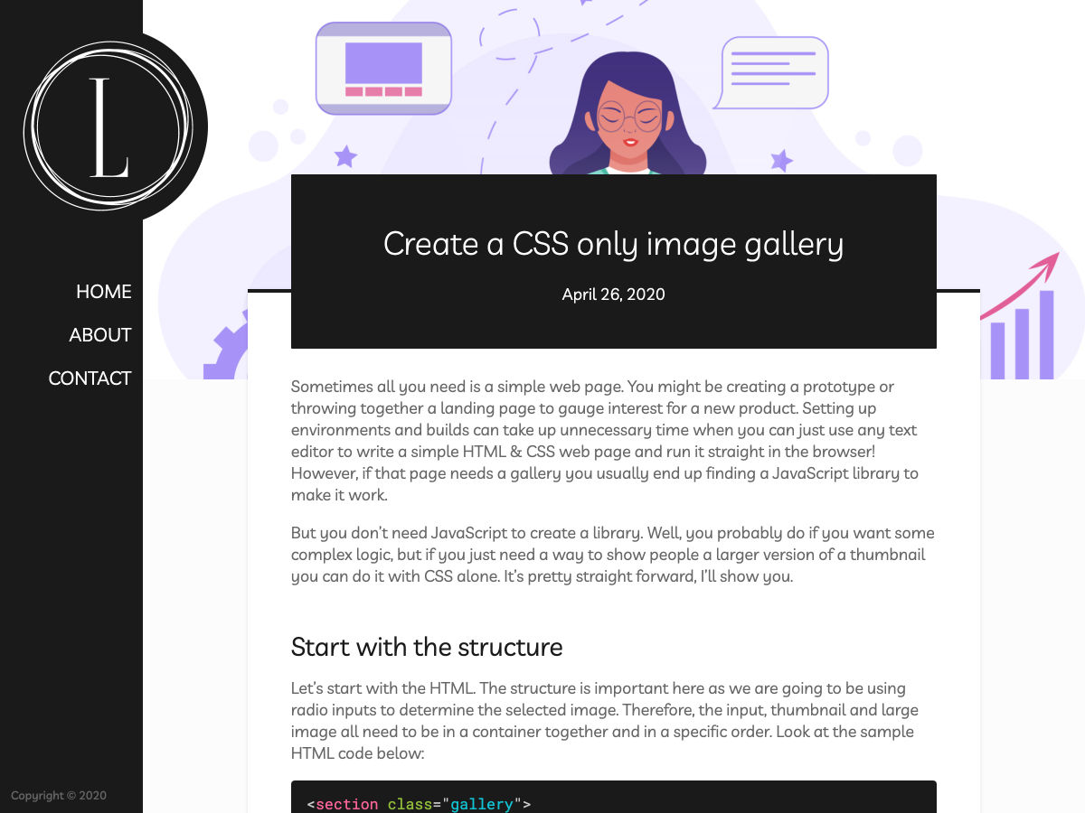
Create a CSS Only Image Gallery


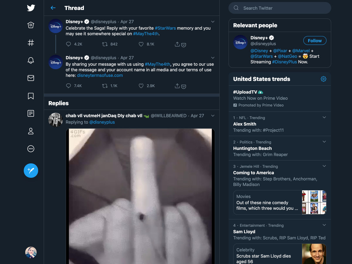
Disney is Claiming Anyone Who Uses a Twitter Hashtag is Agreeing to a Disney TOS


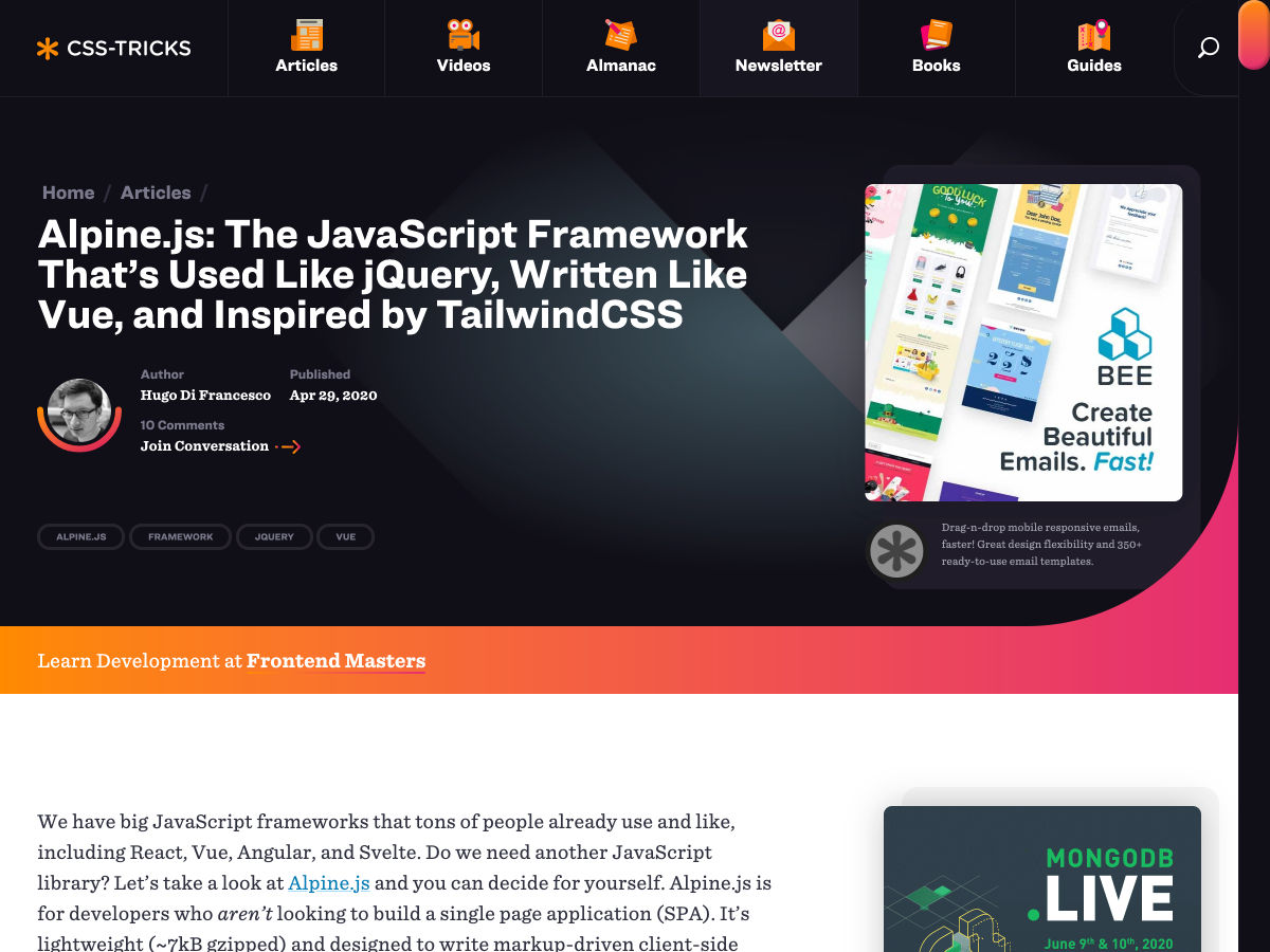
Alpine.js: The JavaScript Framework That’s Used like JQuery, Written like Vue, and Inspired by TailwindCSS


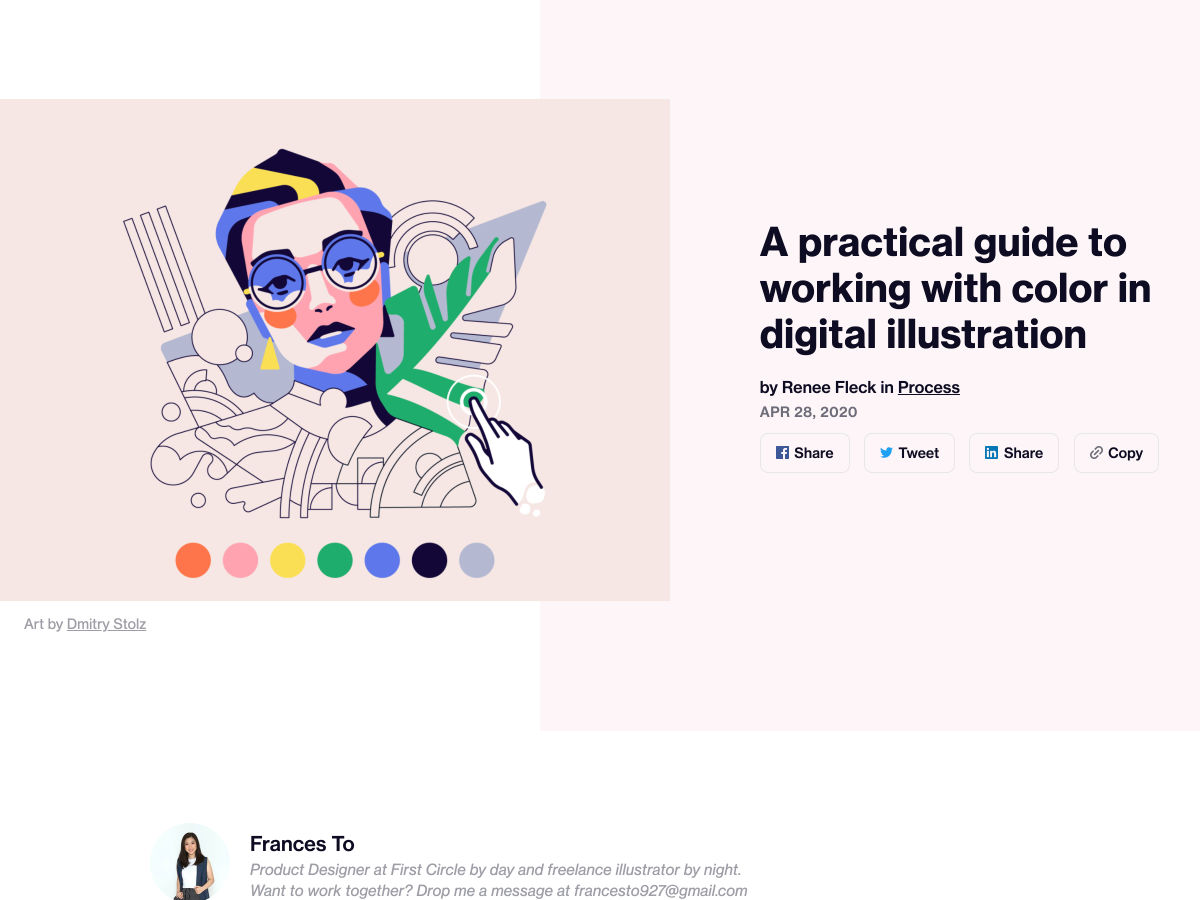
How to Choose the Right Colors for your Illustrations


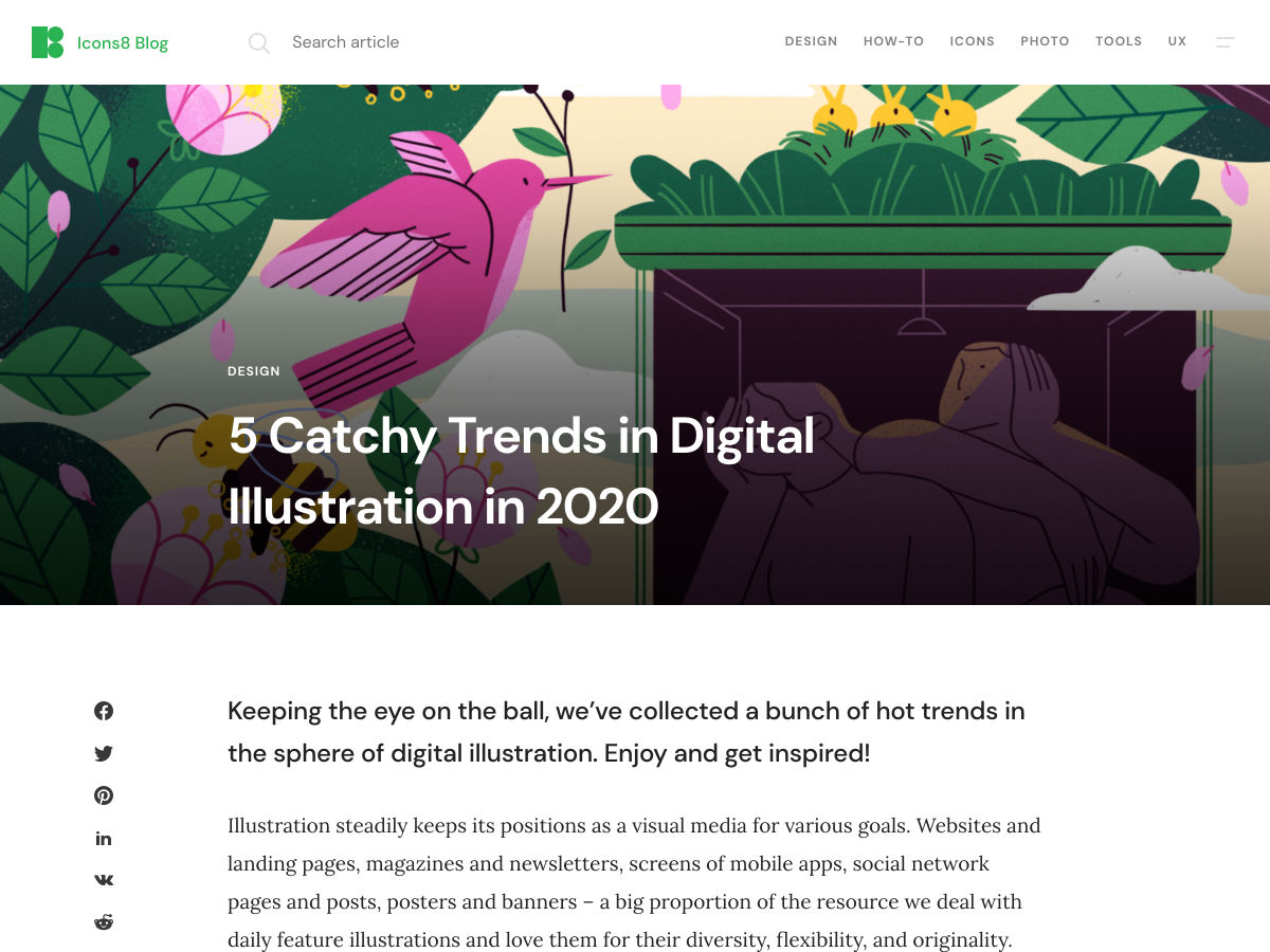
5 Catchy Trends in Digital Illustration in 2020


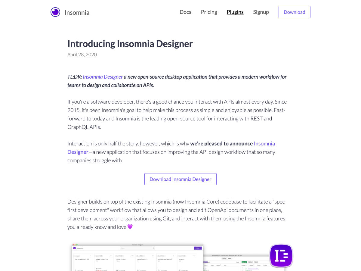
Introducing Insomnia Designer


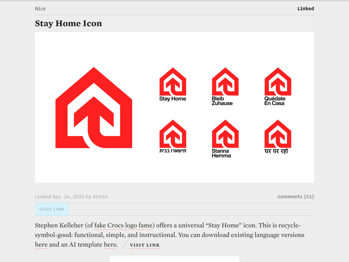
Stay Home Icon


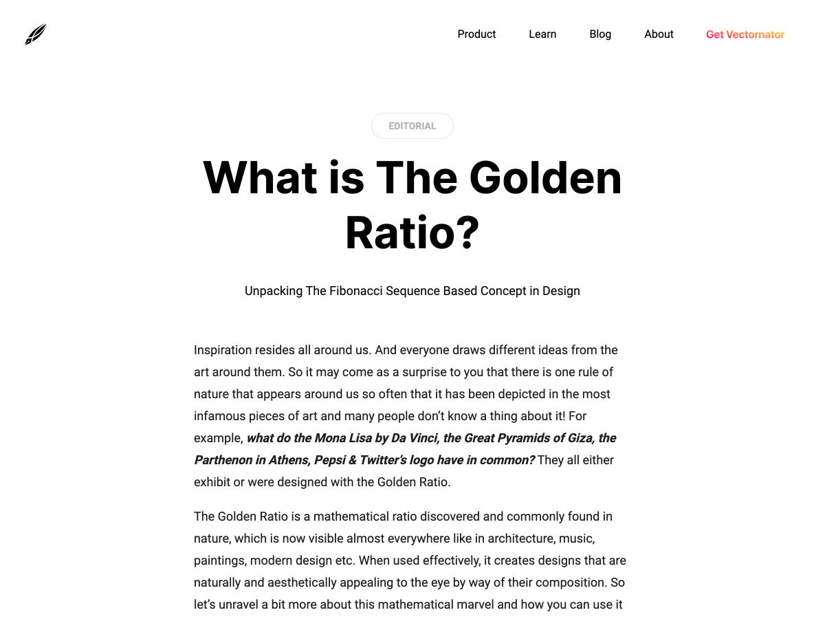
Unpacking the Golden Ratio in Design


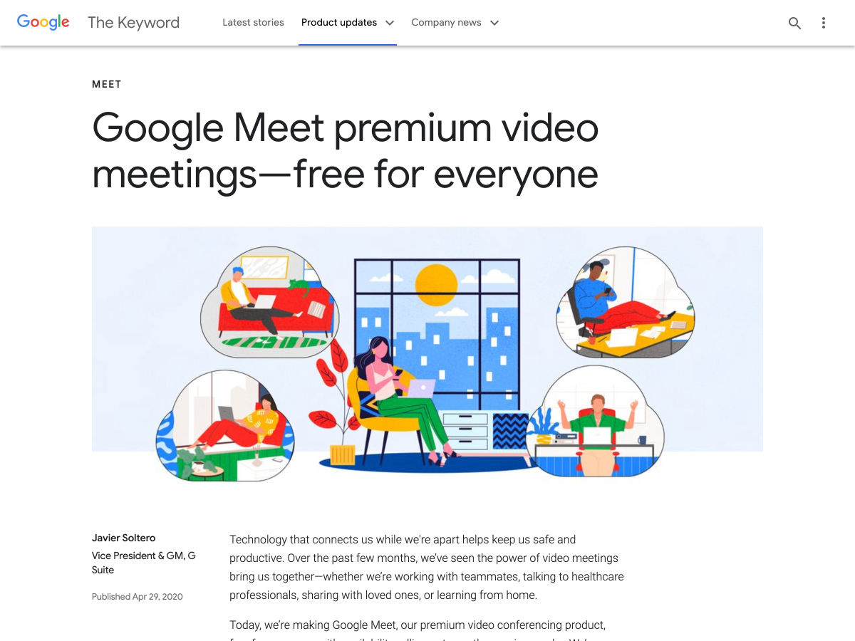
Google Meet Premium Video Conferencing is Now Free for Everyone


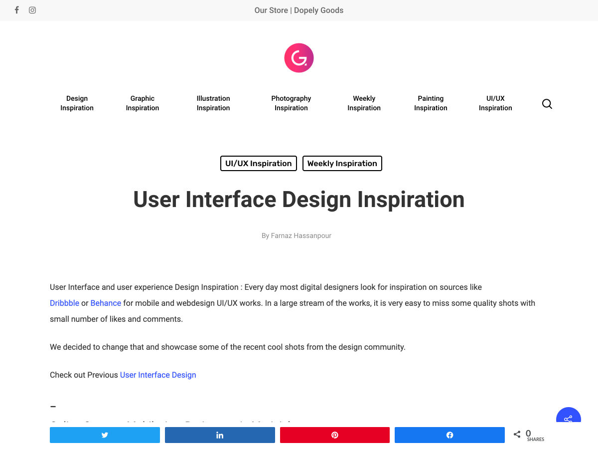
User Interface Design Inspiration


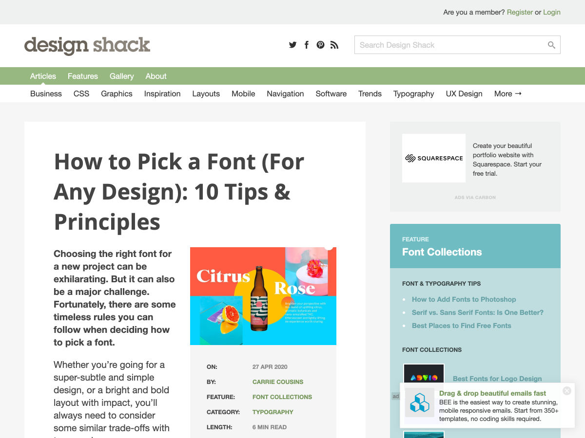
How to Pick a Font for any Design


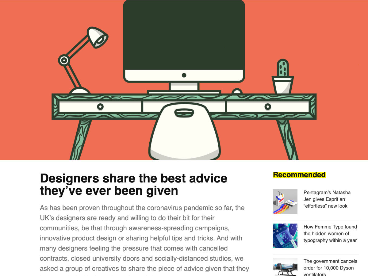
Designers Share the Best Advice They’ve Ever been Given


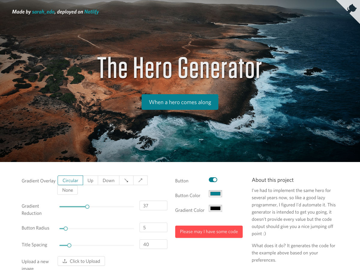
The Hero Generator


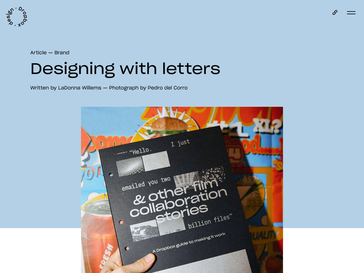
Designing with Letters


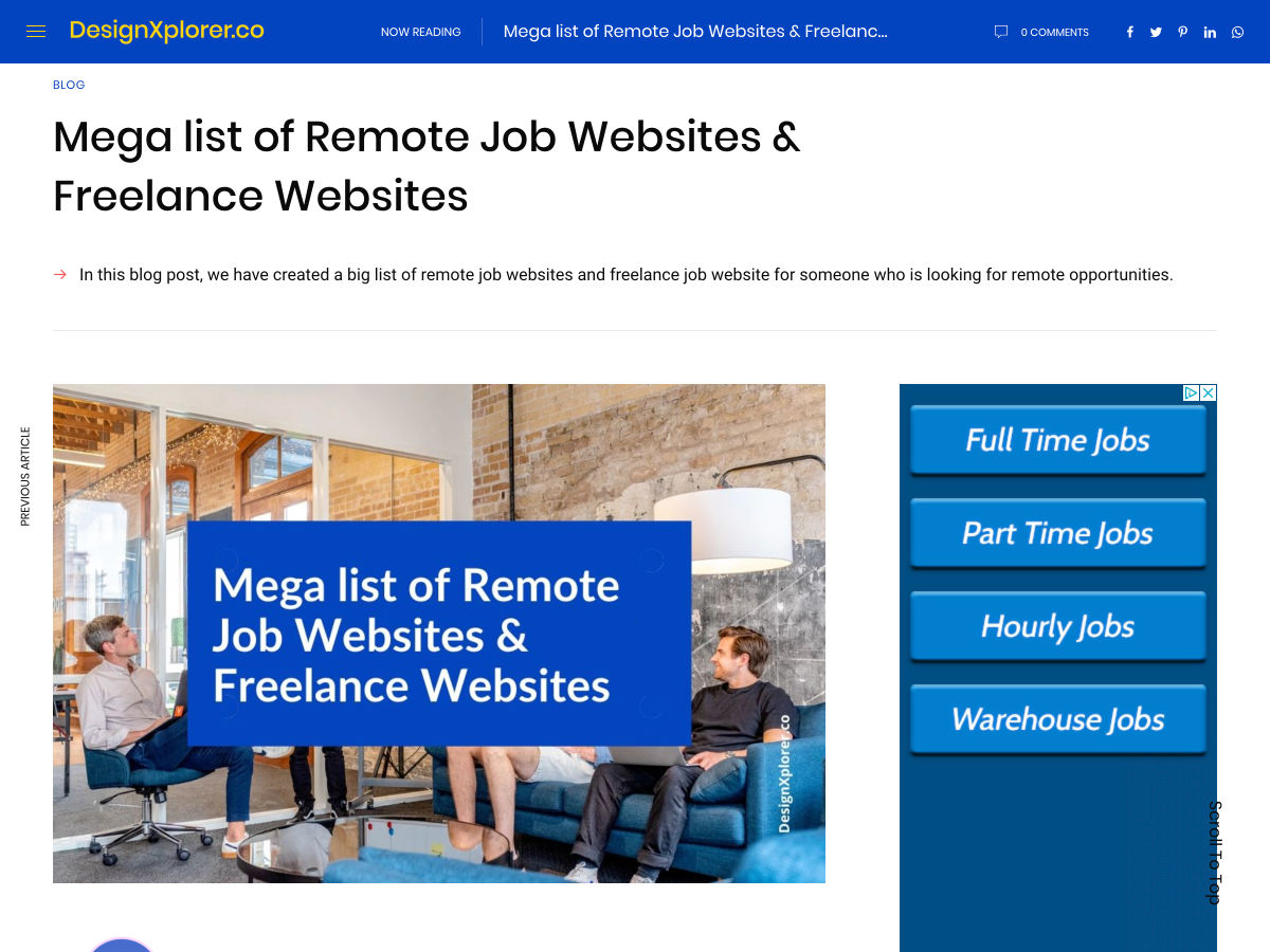
Mega List of Remote Job Websites & Freelance Websites


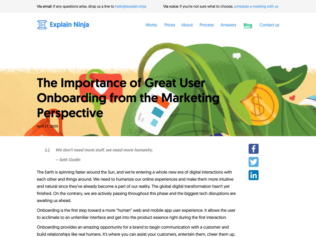
The Importance of Great User Onboarding


Want more? No problem! Keep track of top design news from around the web with Webdesigner News.

Source

p img {display:inline-block; margin-right:10px;}
.alignleft {float:left;}
p.showcase {clear:both;}
body#browserfriendly p, body#podcast p, div#emailbody p{margin:0;}

from Webdesigner Depot https://ift.tt/2z68hgW


from WordPress https://ift.tt/2VZ41ce

Friday, May 1, 2020

8 Best CMS for 2020

Content Management Systems are arguably the internet’s most powerful web development tool. In a rapidly growing market where every business under the sun requires a website that is not only fully functioning, but optimised, easy to update regularly, and implement the latest features, the right CMS is important.
As a web developer it can be easy to stick to the CMS you know – even if there are potentially better ones out there. With such a busy schedule, websites to be made, and money to be earned, the desire to find something new is quite frankly near the bottom of the pile.

That’s is why we have worked to put together a list of some the most new and notable (or older but still just as worthy) CMS systems for 2020. After all, with a new year, why not learn a new CMS too?

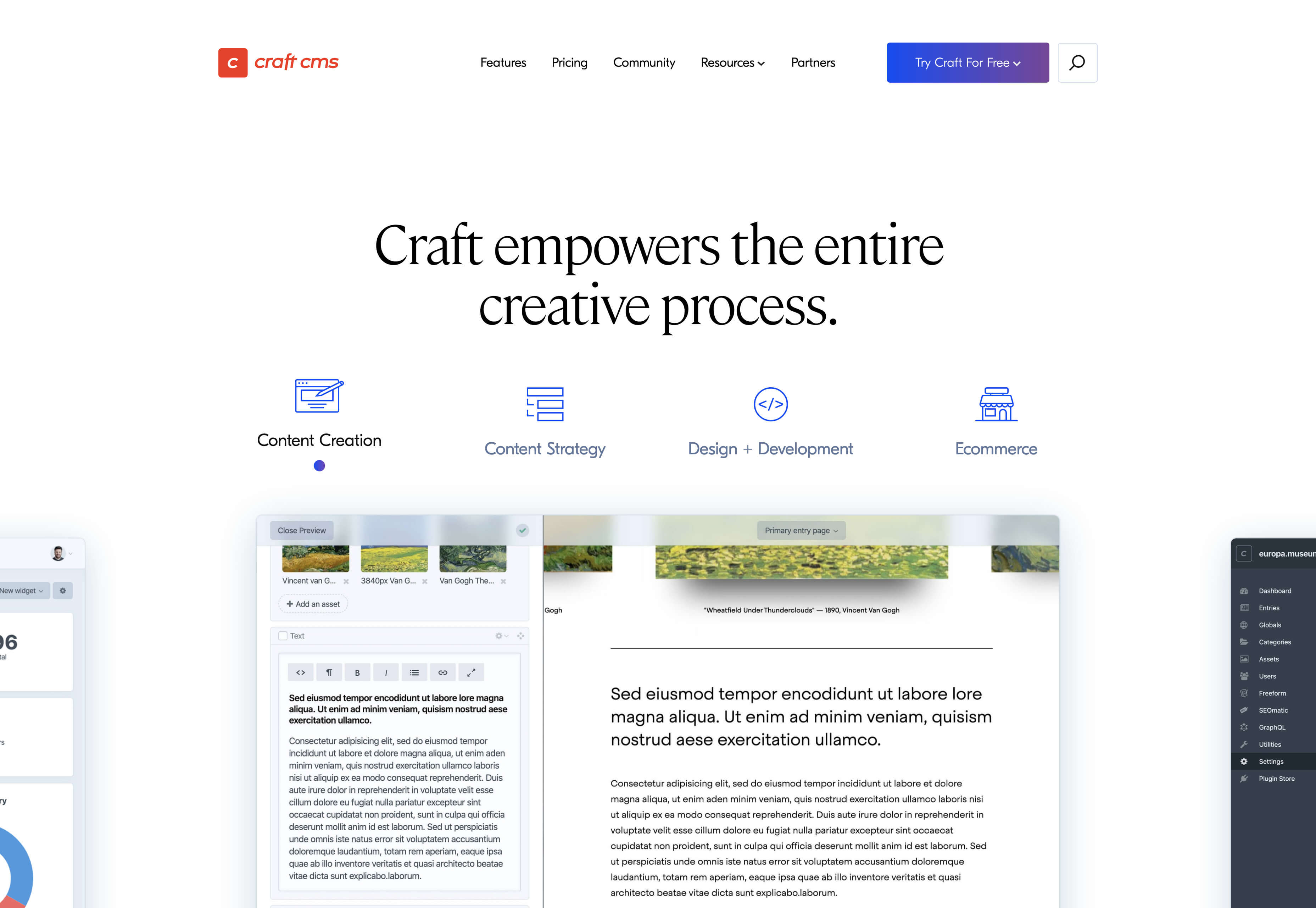
1. Craft

Craft is a content-first CMS system that is both flexible and user-friendly. Ideal for web designers it is totally customisable and gives control over everything including all your own HTML.

You only need one Craft installation to manage multiple sites’ content, making it ideal if you have multiple projects on the go. Alternatively, you can use it as a content API for any sites you may look after. There are multiple tools and features built to optimise performance alongside regular releases and bug fixes.

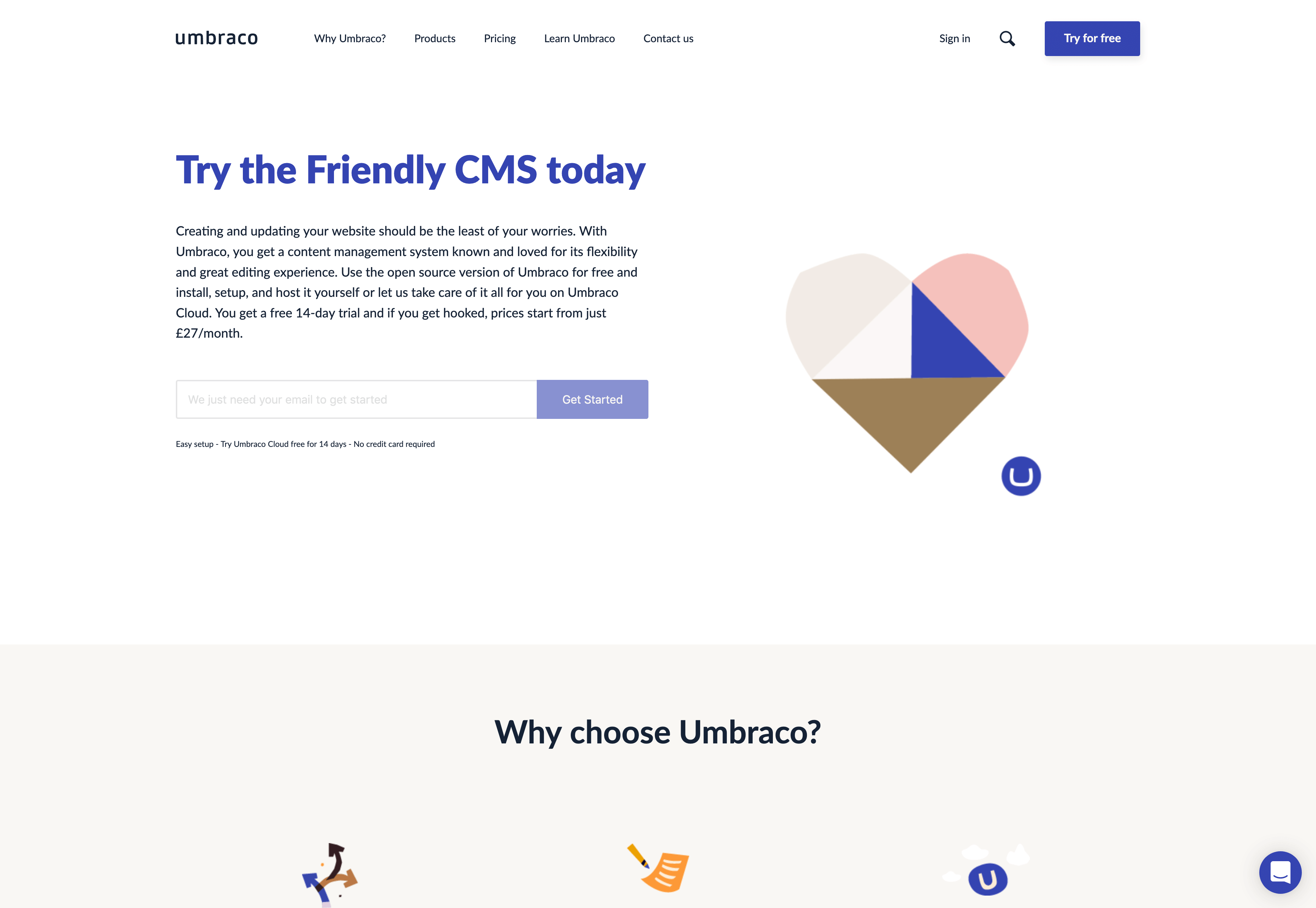
2. Umbraco

Umbraco is a great open source Content Management System that is built on .NET technology and used to run enterprise-level websites for a range of large, multinational organisations. Some examples include Microsoft, McDonalds and Mercedes Benz — giving you a clue at just how trusted this CMS system is. One of the benefits of Umbraco is that you can build an integrated site that can feed content from other digital platforms. It uses Microsoft stack and Microsoft Windows servers meaning it integrates well with third party systems and also benefits from the core security protection built into this.

It is a CMS that doesn’t require you to add lots of your own custom HTML — a plus if you’re not a fan of custom coding. You can manage multiple sites from the same CMS, upload and manage media files, build forms and use a drag and drop visual page editor to craft content quickly and simply.

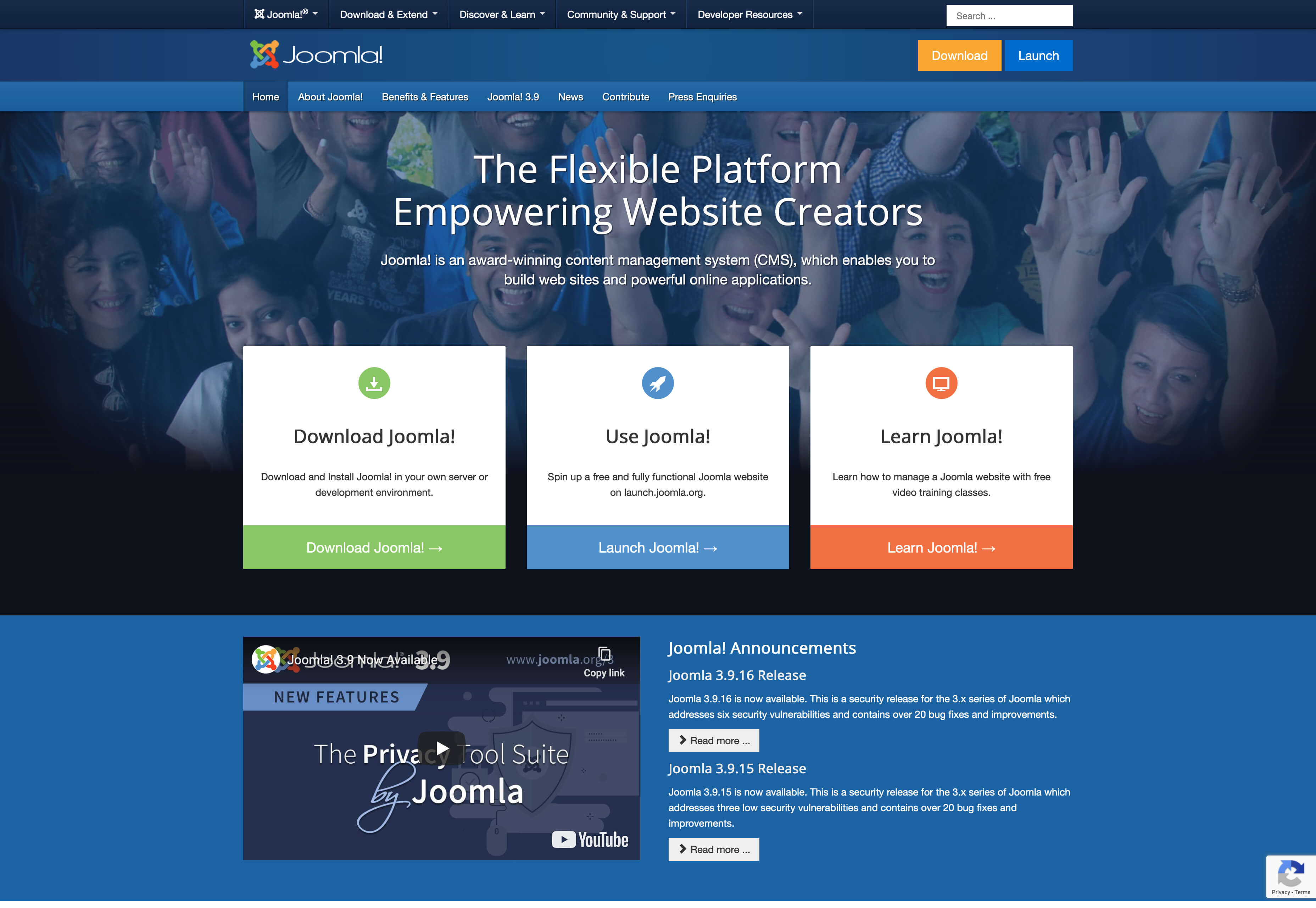
3. Joomla

Ranked as the second top CMS system in the world by CMS Crawler, Joomla is proven to be one of the most popular Content Management Systems out there. Joomla can be seen as more complex as it requires a certain amount of coding knowledge, for example to develop or customize components, modules and plugins.

A point to note when using Joomla is that you don’t get limitations with themes and templates – you can use multiple templates on one site. This means if the client wants a totally different layout for a blog than for their primary pages it is easy to do.

You can have different types of content displayed on one page and the backend is often praised for being well organised. You can easily add new menus and articles, as well as restrict access to certain content on specific pages if you so desire. Joomla also has the function to make a website multilingual from the off — something that is useful for websites that are read and used worldwide.

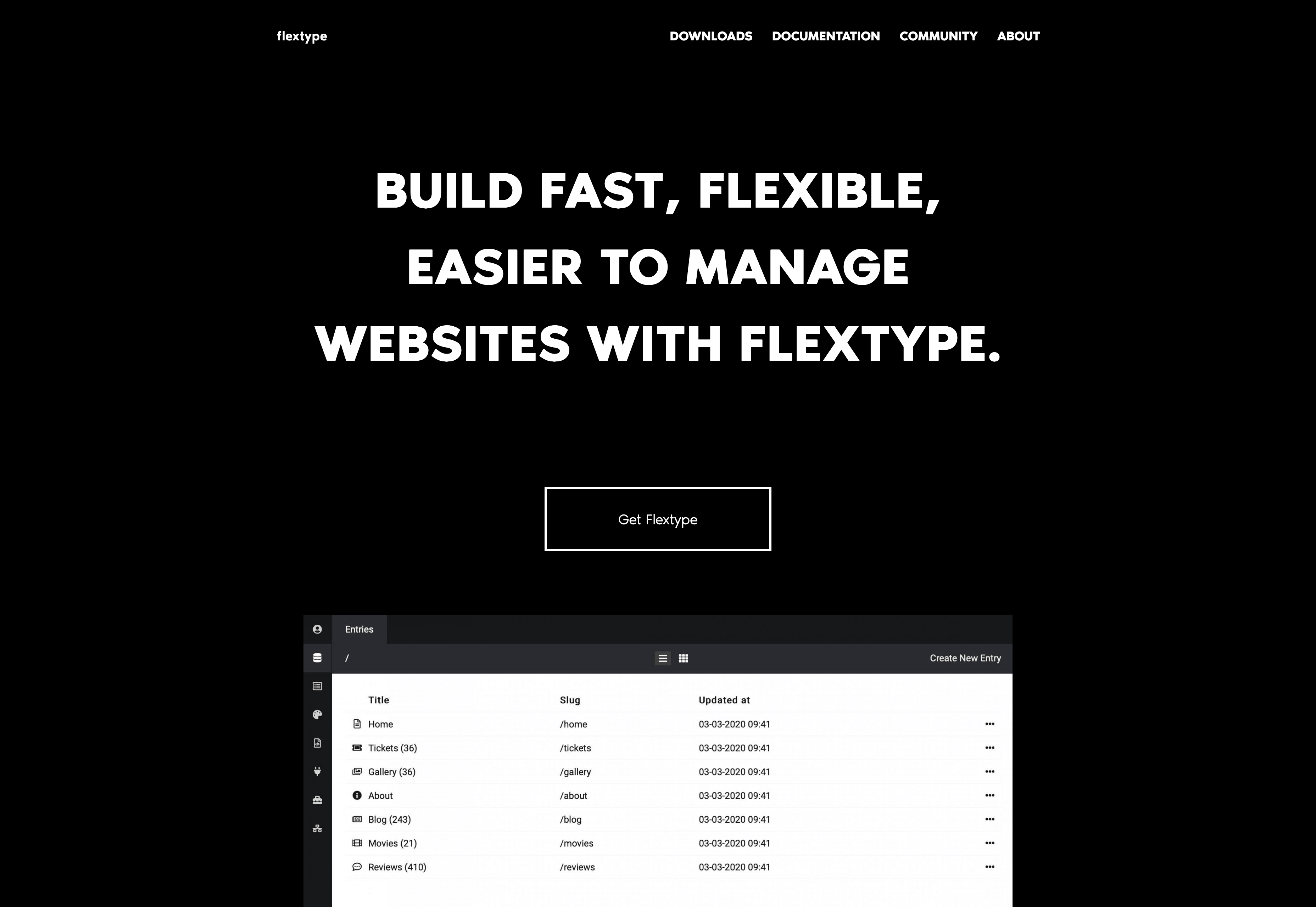
4. Flextype

Flextype is still relatively new to the game having launched in 2018, however this doesn’t mean it should be underestimated. An open source solution, its purpose is to provide a free web design programme without the unnecessary complexities often found in other CMS systems.

One of the great advantages is that it’s a flat file CMS so if you need to change hosting providers you can simply zip up your website content and extract it somewhere else, without the messy database exports. It also means you can define custom fields for any of your entries and it is easy to edit going forward. Other key technologies it uses is Slim PHP to help you quickly write simple yet key web applications, Twig templating to aid with coding, and the Doctrine Project for optimum database storage and object mapping.

5. Vapid

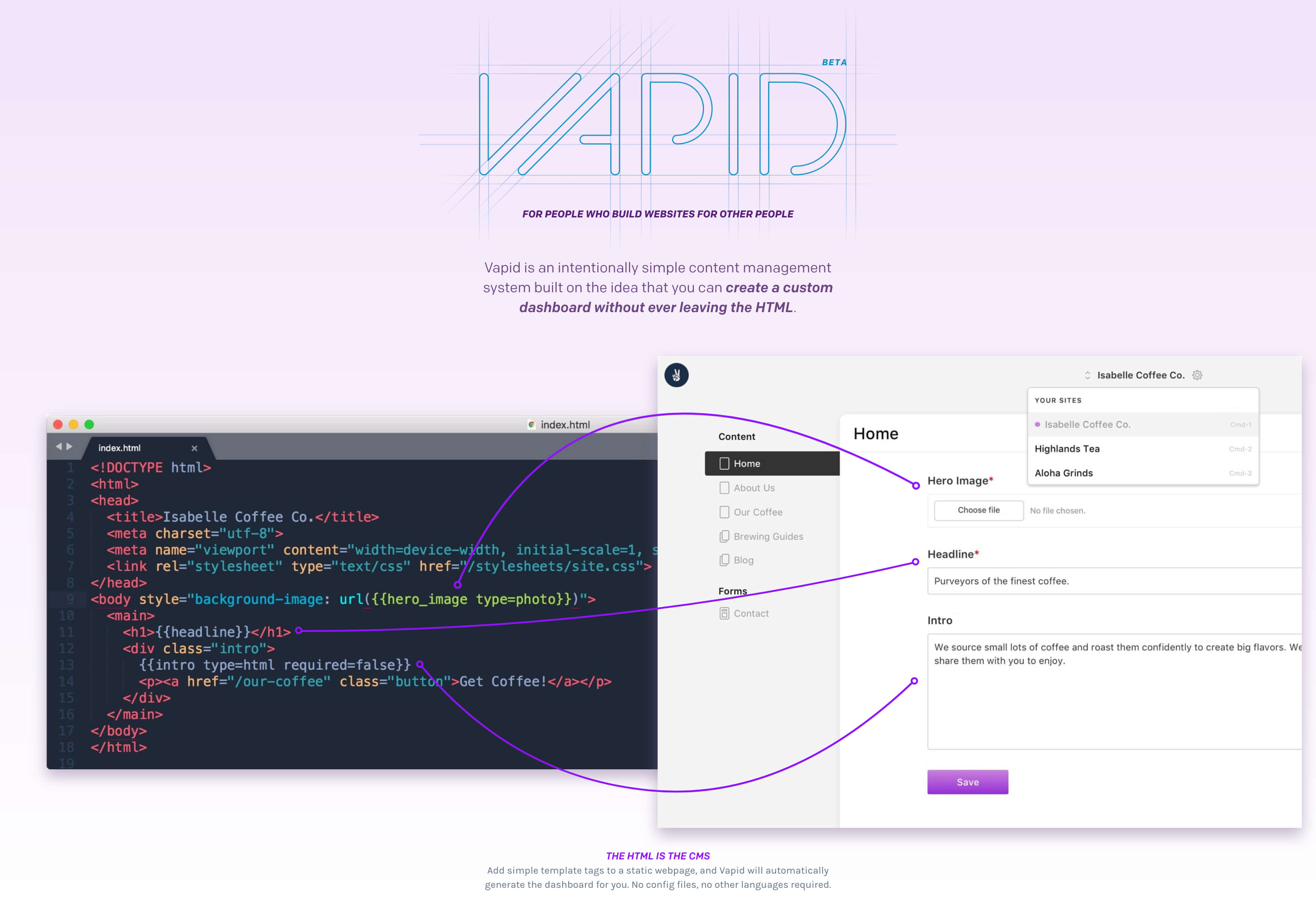
Vapid is an intentionally simple Content Management System that describe itself as “for people who build websites for other people.” It is a system which is built on the idea that you can create a custom dashboard without ever leaving the HTML, as the HTML is the CMS, and Vapid automatically generate the dashboard for you.

It’s essentially a combination of static site builders with an additional dashboard to make it easy for users to edit content. It’s a great CMS for those who want to build a lot of customisable, relatively simple websites, but it doesn’t have the flexibility of more complex CMS systems.

6. Magnolia

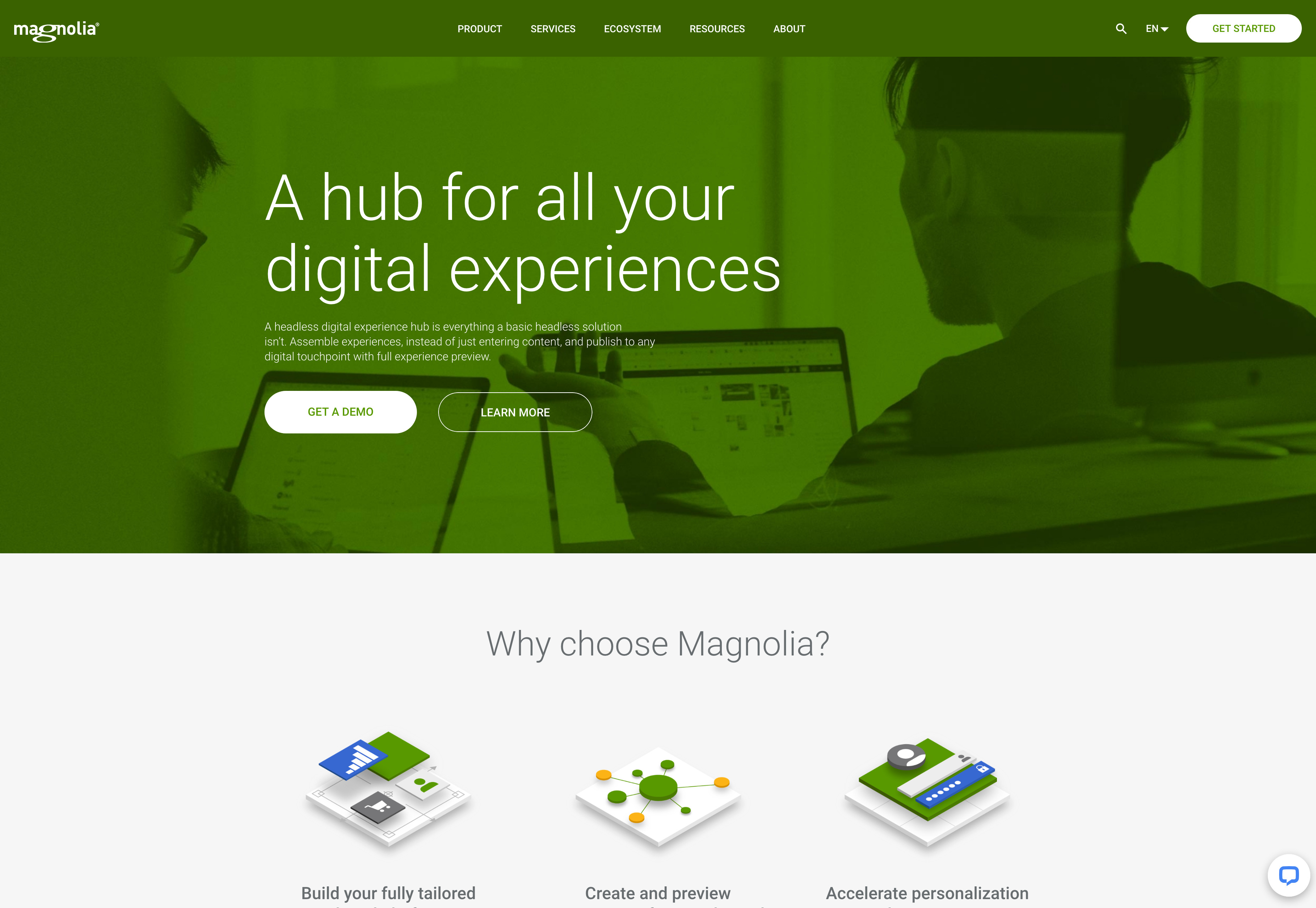
Magnolia is one of the longer standing players in the field, having first been established over 15 years ago. It is a fast and easy system to use with powerful capabilities for creation, management and delivery of personalised experiences across channels.

It has an omnichannel content hub allowing you to integrate all your channels in one. It integrates access to all content without needing to migrate and works with AI to automatically tag assets — ideal for metadata and improving your SEO. It has a DX architecture which is secure, scalable and cloud ready, and a Headless CMS — ideal for easy yet powerful development of your sites.

Inspired by frontend development practices it uses slim YAML configuration to accomplish the most common CMS tasks meaning there is low code. Everything is configured in text files, so you don’t need to worry about GUI or exporting configuration. This is an easy to use system that has been designed with simplicity yet top functionality in mind.

7. MotoCMS

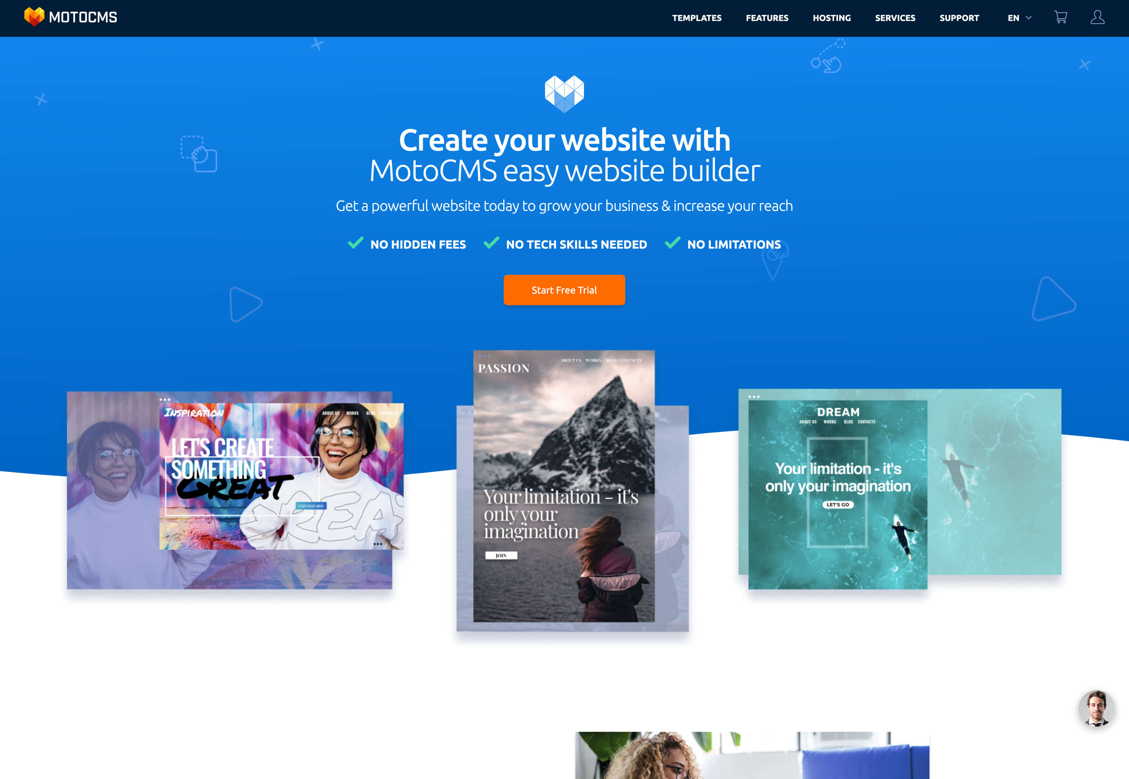
MotoCMS is another easy CMS system to pick up and use. No coding skills are required, it works via a simple visual drag and drop editing, eCommerce plugin and responsive design.

There are four simple steps to follow: you choose a template, customise it and add content, add custom SEO and analytics, then publish and promote it online.

There are ready made templates for a number of professions as well as additional integrations and plug-ins. It is also easy for optimising for search, with advanced SEO settings and optimised tools designed to give sites the best chance of ranking right from the off. Sites will load lightning-fast and it is easy to manage, meaning if you have multiple clients it’s still a smooth process.

8. Concrete5

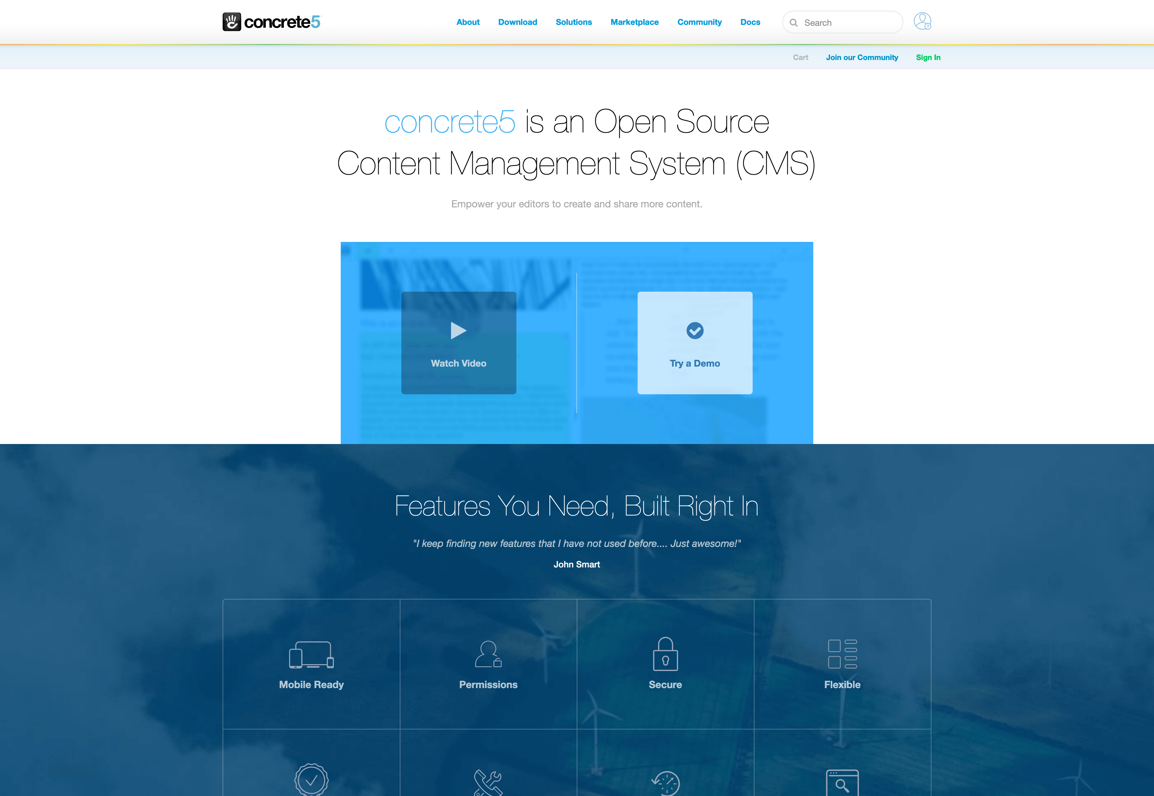
Concrete5 is a mobile-ready open source CMS designed to allow you to build a website without coding. It is best known for its well-implemented in-content editing and is often the choice for web projects where end user buy-in is particularly difficult.

It was first released in 2008 and has rapidly grown in popularity. It’s easy to add additional functionality with their marketplace add-ons so customising isn’t too difficult. Certain features such as the sitemap are native and not via plugins (which can sometimes slow sites down) — a further plus point for this CMS.


Featured image via Unsplash.

Source

p img {display:inline-block; margin-right:10px;}
.alignleft {float:left;}
p.showcase {clear:both;}
body#browserfriendly p, body#podcast p, div#emailbody p{margin:0;}

from Webdesigner Depot https://ift.tt/2SnMCHY


from WordPress https://ift.tt/2yWcxzI