Monday, July 30, 2018

3 Essential Design Trends, August 2018

From light and bright designs to complex data visualizations and a new take on polygons, this month’s design trends are anything but ordinary. And they are so practical you can deploy them on single pages or for a complete design overhaul.

Each of these trends shows and evolution of styles that’s been progressing for some time: minimalism to white and light color schemes, data “everything” to data visualization for the web, and a fresh look at poly shapes.

Here’s what’s trending in design this month:

1. White and Light Color Schemes

White and light color schemes seem to be popping up everywhere. (We could probably have dedicated an entire post to this design trend because there are so many designs featuring this color trend.)

The main characteristic of this design trend is an aesthetic that uses a predominant white or light color scheme. This includes the background, images and even other foreground elements. While white is a popular option, color palettes featuring soft grays, cool cream tones, and even some hardly noticeable pastels are equally impressive.

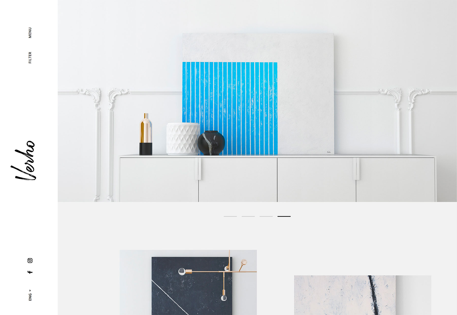
The trick to using this design technique is incorporating other elements so that you don’t just end up with a “plain” white background. Including imagery that also is light or features a lot of white can bring the design together pretty seamlessly, such as the example from Verho.
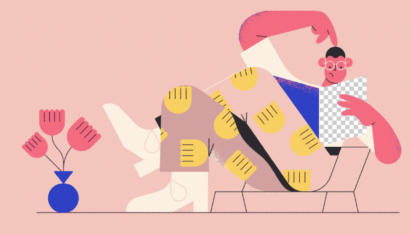
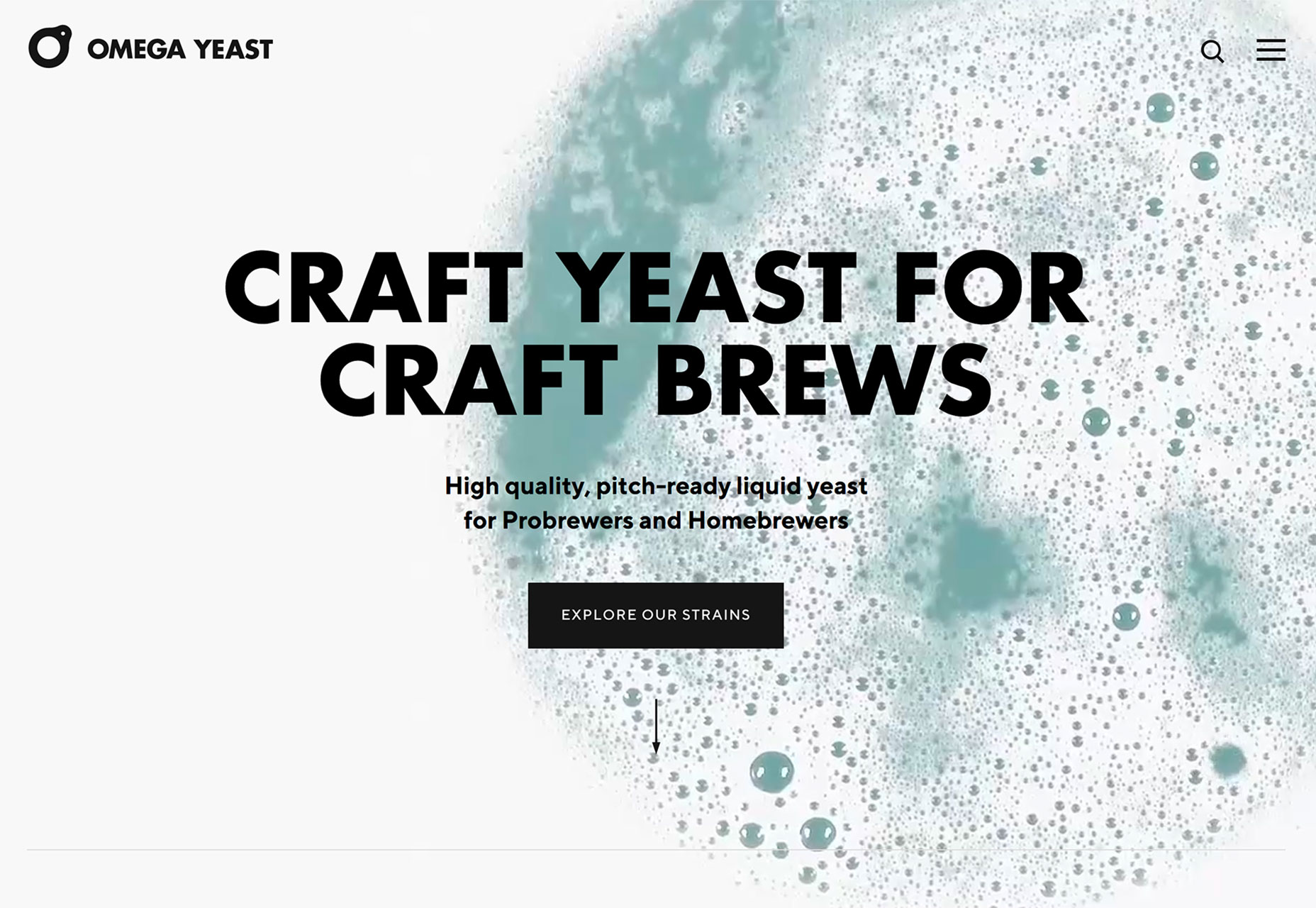
But there’s no rule that images are the only way to implement this design trend. Working with video (such as Omega Yeast) or an illustration (Alexandra Elisa) can be equally engaging.
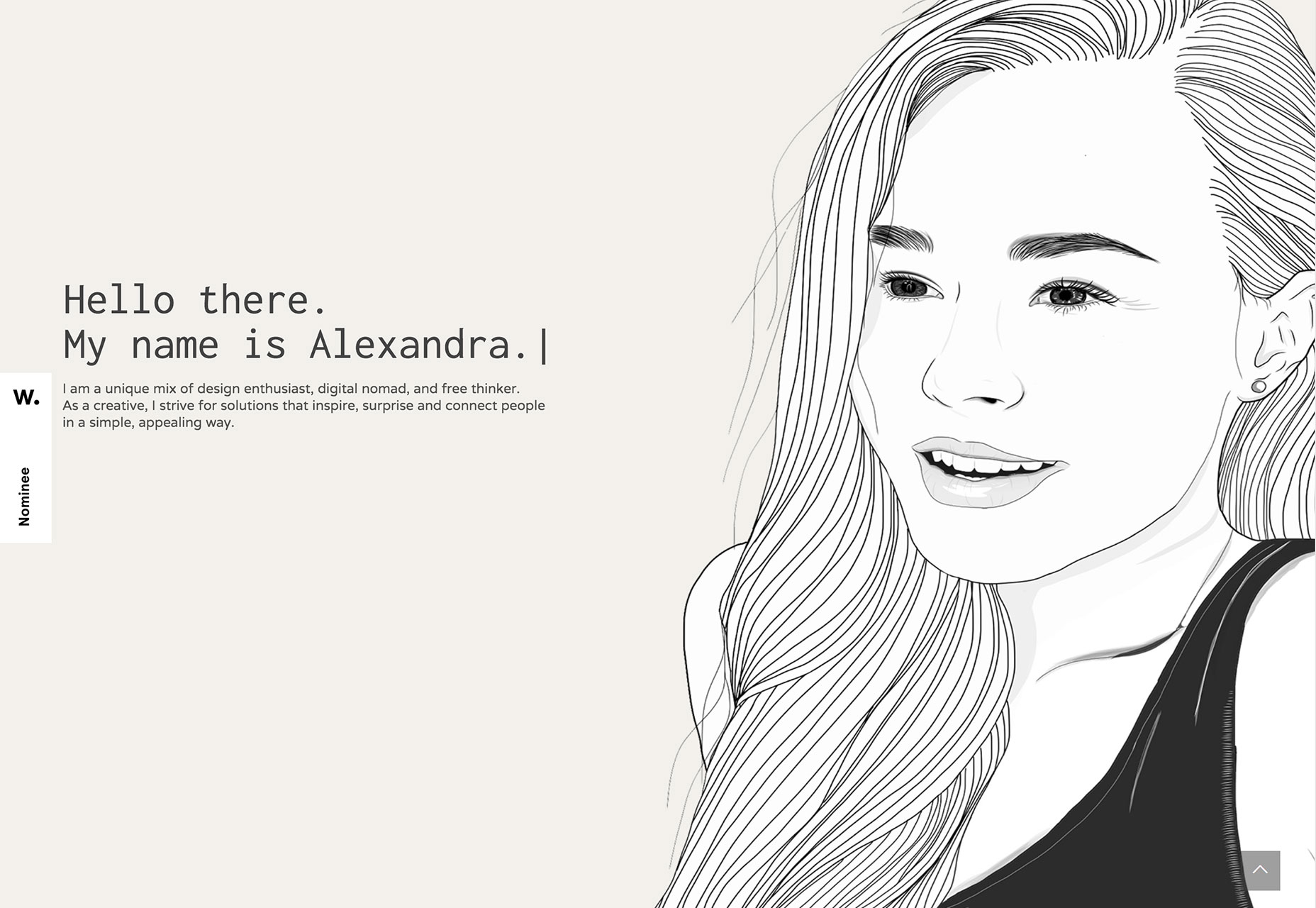
Use this design trend for a full website theme or opt for a section or page with a light to white design to add particular emphasis to that area. Just make sure to go with a dark text option so that lettering is easy to read.

Add an extra layer of emphasis with a bright colored button or single element so that users find the most important part of the design right away. Consider accent colors in the style of minimalism rather than full color options; a simple one-color concept can work amazingly well.

2. Data Visualization

Data, data everywhere.

Or that seems to be the case anyway.

With such an emphasis on data and information gathering and delivery across industries to provide valuable and reliable information, it’s no real surprise that more designs are featuring large-scale data visualizations.

From maps to charts to interactive animations, a solid data visualization can help a user better understand a topic or information and provide an engaging (and memorable) way to learn about something.

The downside is that it can be a rather large undertaking to manage all that data. Look for a method that allows you to showcase information in an up-to-date manner without the stress of constant management. Automated tools can help. (Google Charts is simple and pretty powerful.)

There are so many different ways to create, embed and include data visualizations in a website design. The most engaging websites using this trend have dynamic information presented in the most interactive formats.

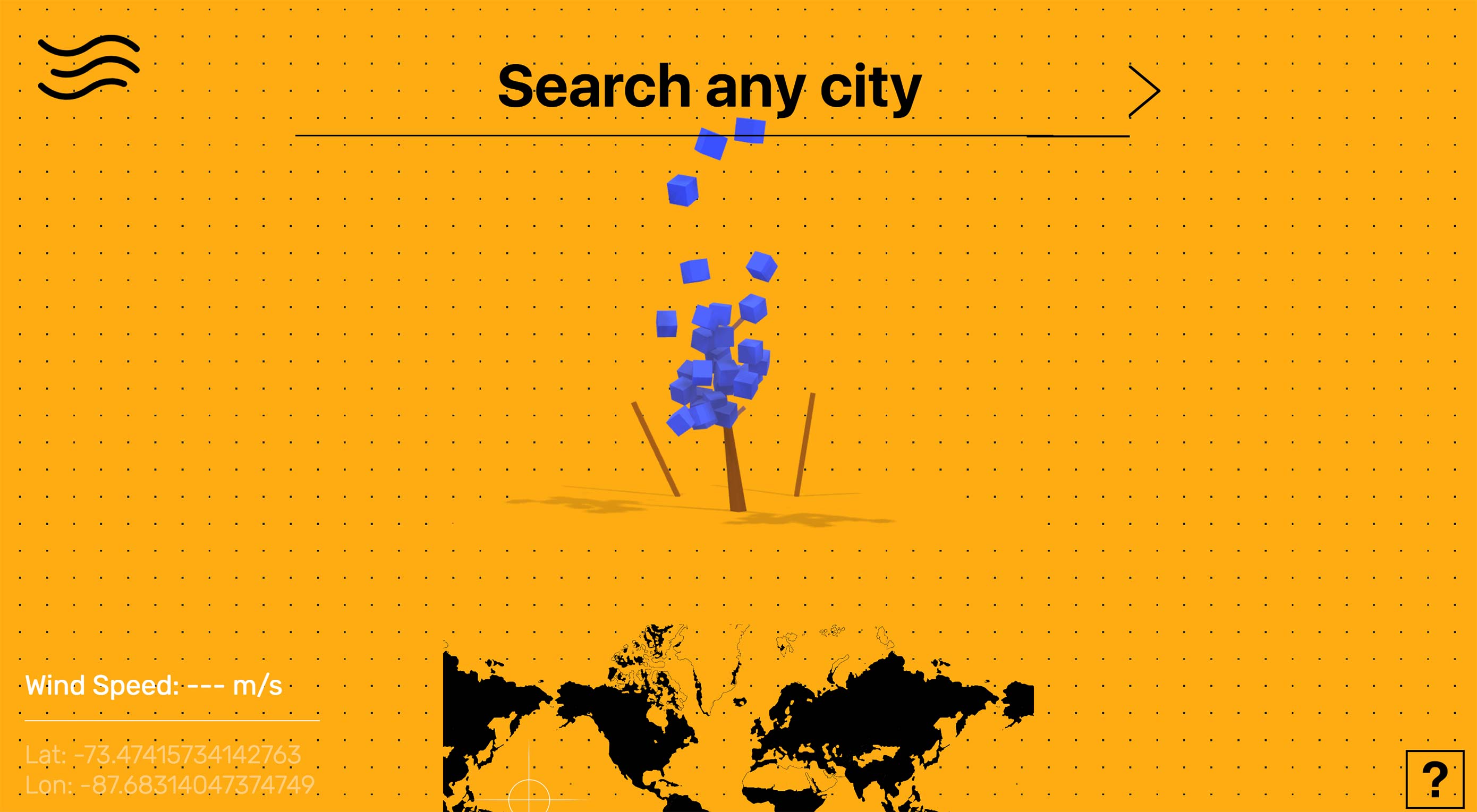
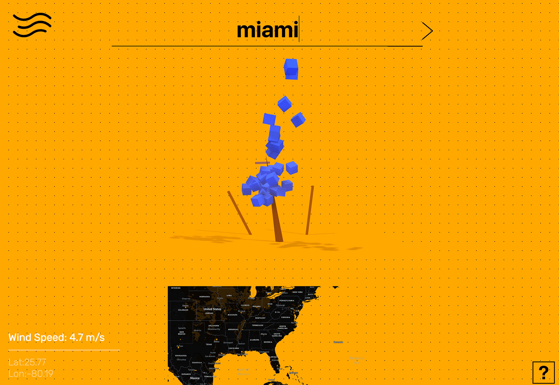
Tree Tree Tree starts by asking the user to enter the location they are interested in learning more about. The result shows the wind speed using a tree with boxes that “blow” as speed increases. Users can also engage using the map at the bottom of the screen. This is data that is begging to be interacted with.
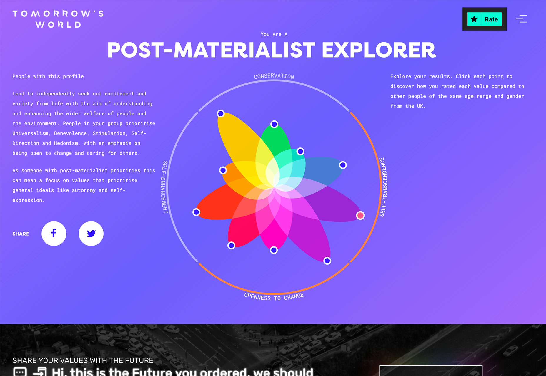
Tomorrow’s World starts with a survey that the user completes and ends with a cool visualization of how those answers compare to others. The data visualization is a tool to help the user learn about him/herself and the world around them. 
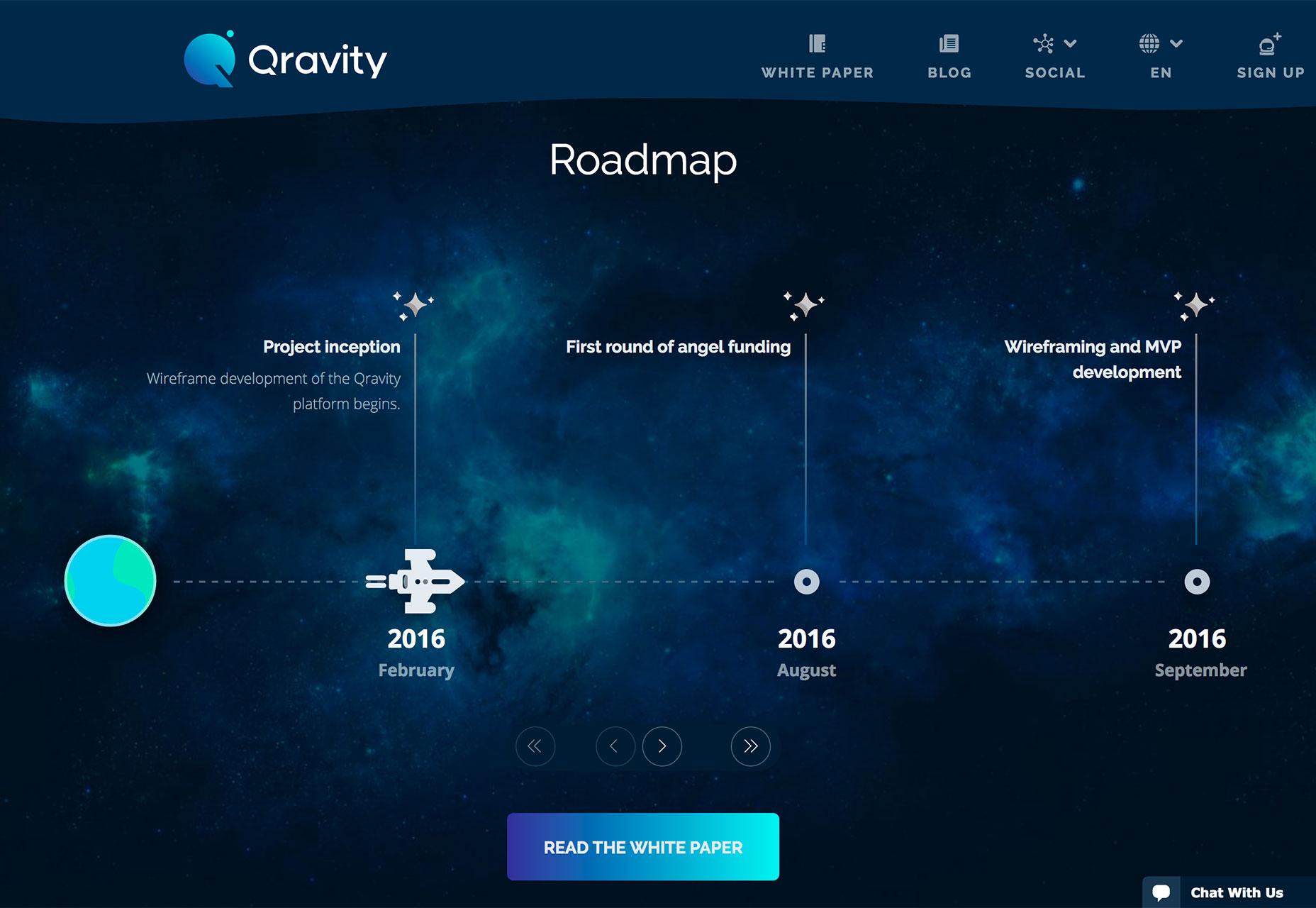
Qravity has multiple points of data entry in its website design. One of the most interesting might be the animated timeline below the scroll. This method of organizing information (dates and events) in a visual way makes the information so much easier to understand than a simple list.
3. Polygons 2.0

Polygon shapes in website design were everywhere in late 2017 and earlier this year. That trend continues but with a different look. Rather than piles of packed polygons to create backgrounds or other design elements, designers are picking a handful of polygons and supersizing them.

These oversized shapes add a fun and funky design element that matches almost any style of project. They can be part of an overall design pattern, accent on a homepage or interesting shape container element for an image or text.

What’s great about poly shapes is that they are a little different than the standard rectangles of circles that are more common and can immediate attract the attention of a user for that reason. These shapes also have a more modern feel because they are different.

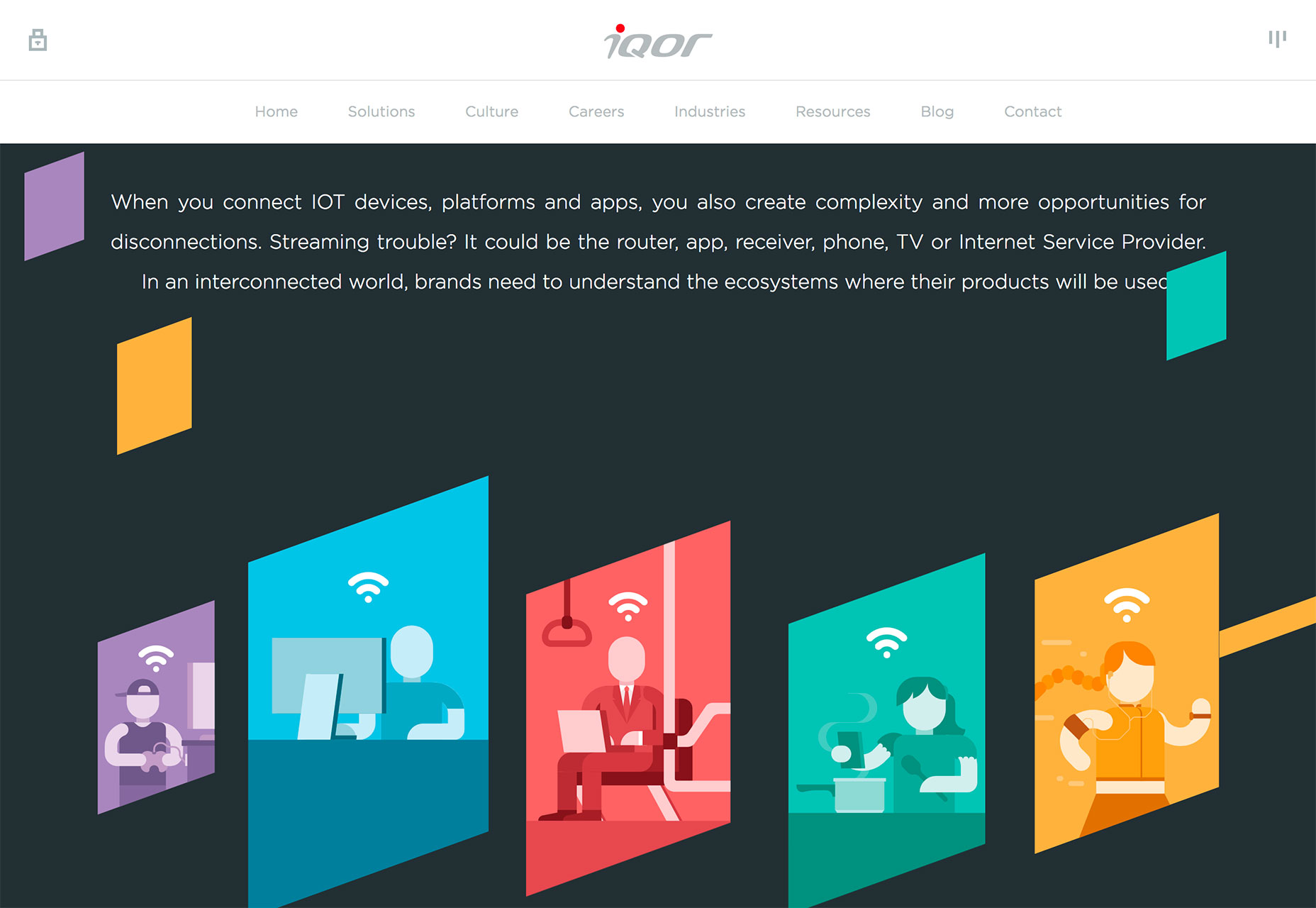
Polygons can feature shapes that have more distinct angles and sides such as the sharp animated triangle to the right side of The Alan Turing Institute website, simple lines that overlap for a more traditional poly feel (Evoluted) or simple shapes that help raw users into specific content (Iqor).
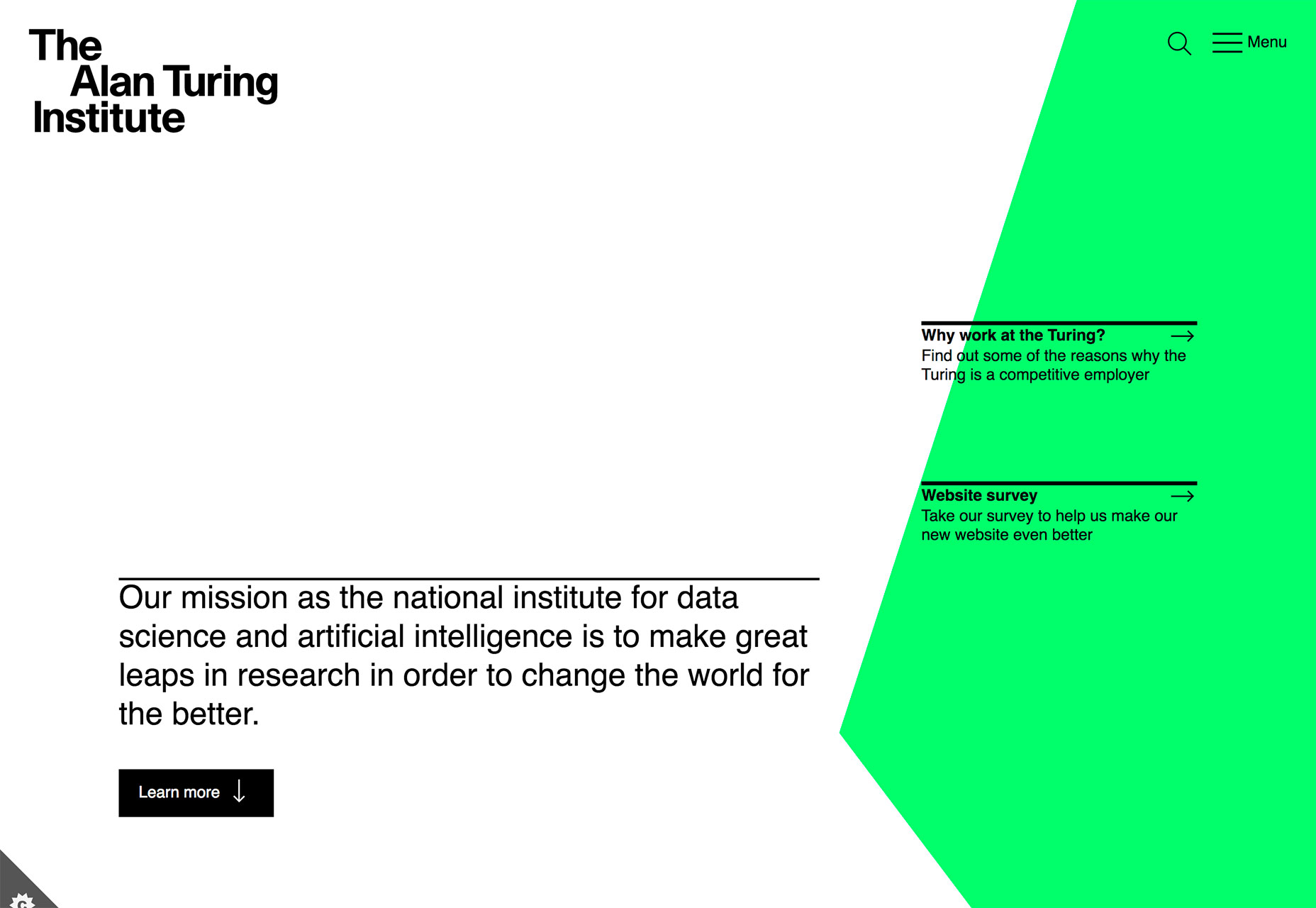
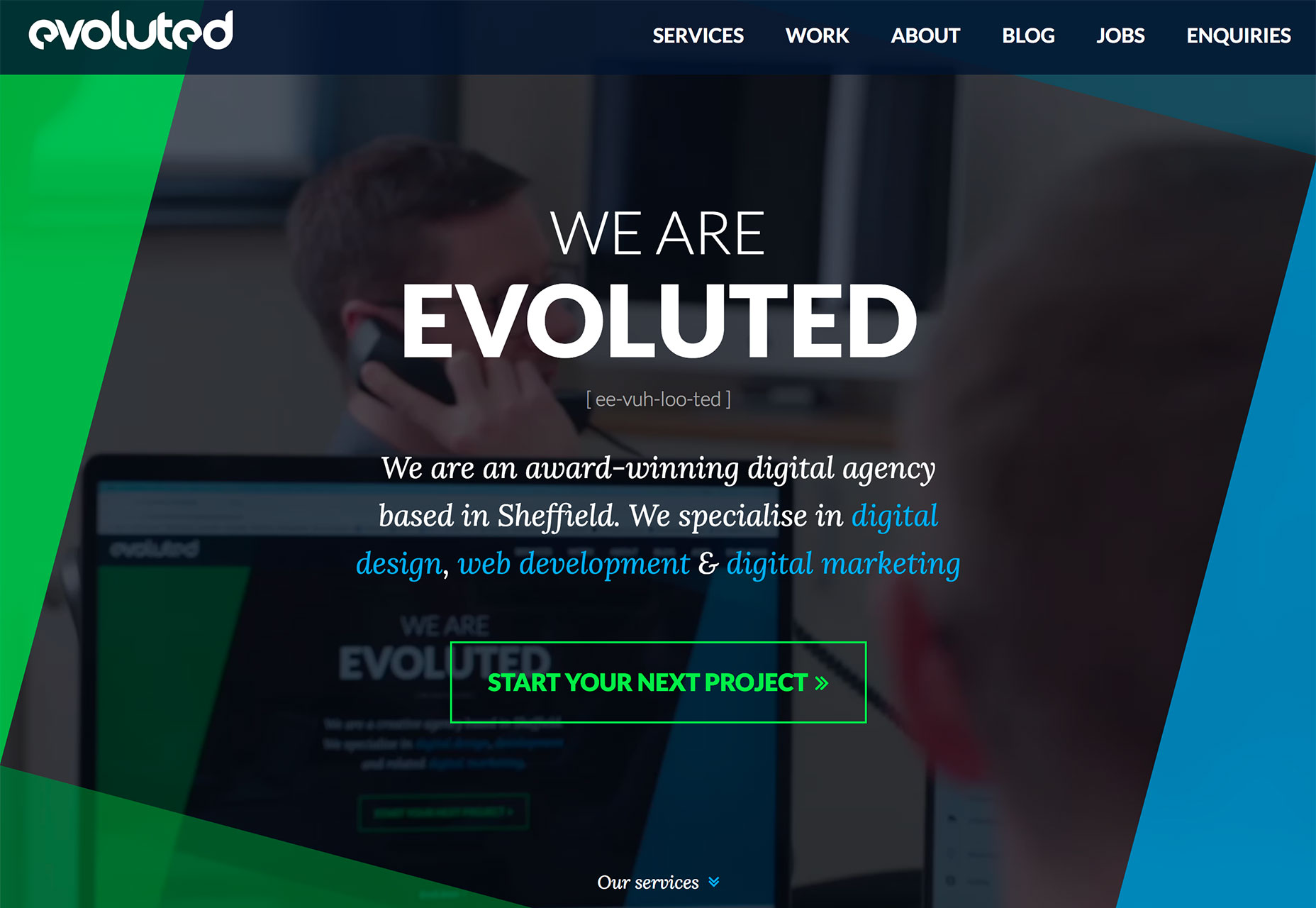
Because poly shapes are such a distinct design element, most projects feature them with bright color for even more emphasis. Just be wary of trying to fit elements inside of tilted or odd shape configurations; this can make elements to text difficult to read.

Polygons are best suited as a background or accent element, not necessarily as a home for messaging or key content items.

Conclusion

Personally, I love the white and bright design trend. With the heat of summer in full swing, these designs are appealing in so many ways. I like how versatile they are as well. A light color scheme is so readable with dark text and can work for almost any type of design project.

What trends are you loving (or hating) right now? I’d love to see some of the websites that you are fascinated with. Drop me a link on Twitter; I’d love to hear from you.

Add Realistic Chalk and Sketch Lettering Effects with Sketch’it – only $5!

Source

p img {display:inline-block; margin-right:10px;}
.alignleft {float:left;}
p.showcase {clear:both;}
body#browserfriendly p, body#podcast p, div#emailbody p{margin:0;}

from Webdesigner Depot https://ift.tt/2K7xOX5


from WordPress https://ift.tt/2mUdy28

Sunday, July 29, 2018

Popular Design News of the Week: July 23, 2018 – July 29, 2018

Every week users submit a lot of interesting stuff on our sister site Webdesigner News, highlighting great content from around the web that can be of interest to web designers. 
The best way to keep track of all the great stories and news being posted is simply to check out the Webdesigner News site, however, in case you missed some here’s a quick and useful compilation of the most popular designer news that we curated from the past week.

Note that this is only a very small selection of the links that were posted, so don’t miss out and subscribe to our newsletter and follow the site daily for all the news.

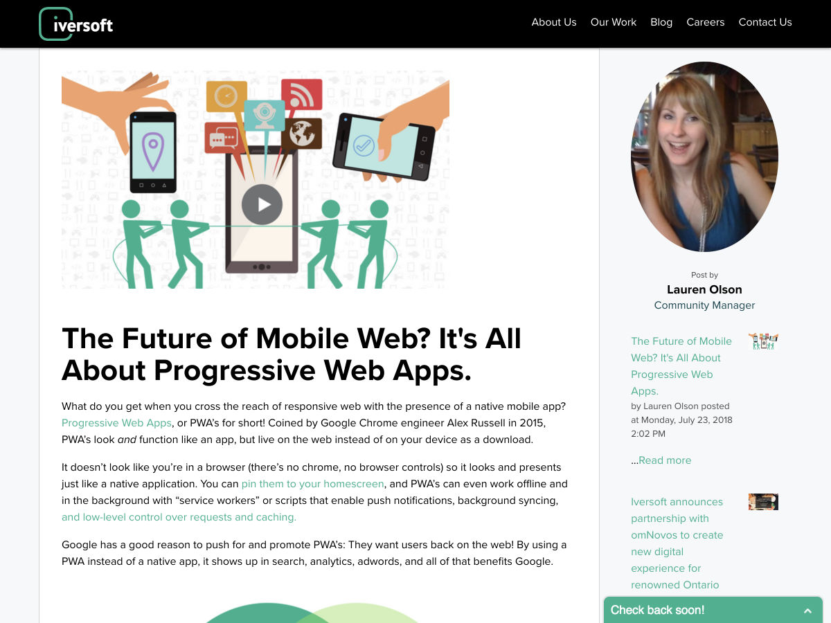
The Future of Mobile Web? It’s all About Progressive Web Apps


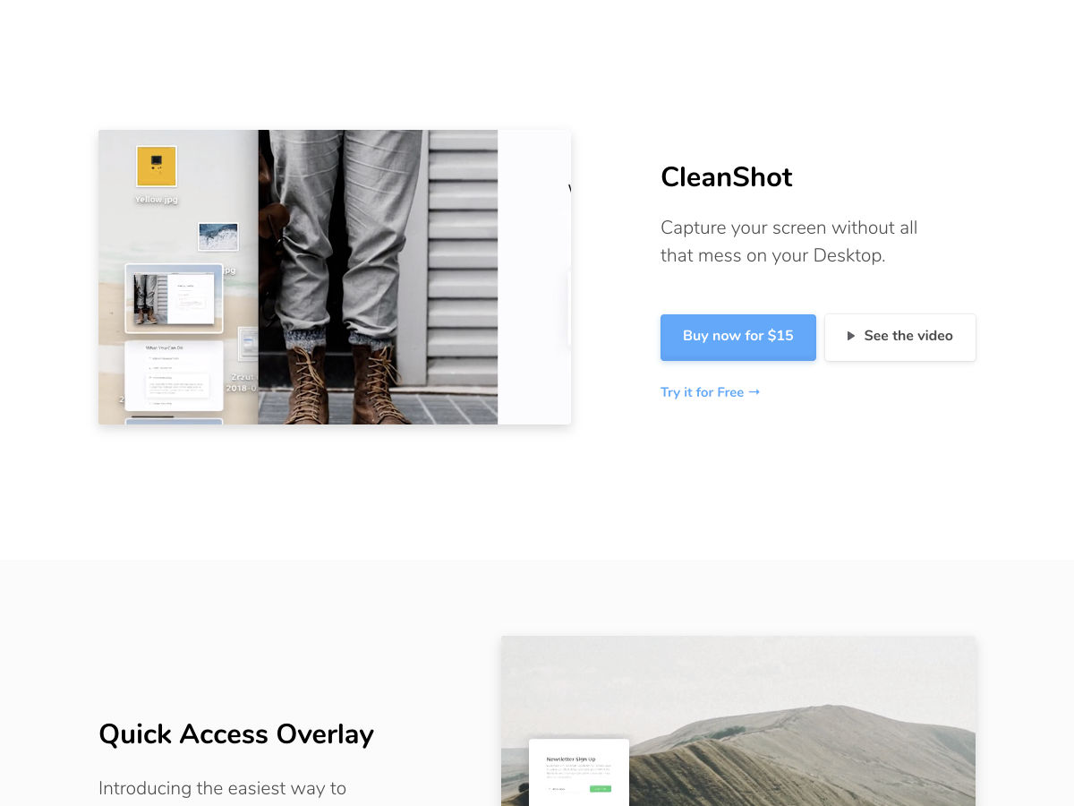
Finally… Capture your Screen Without all that Mess on your Desktop ✨


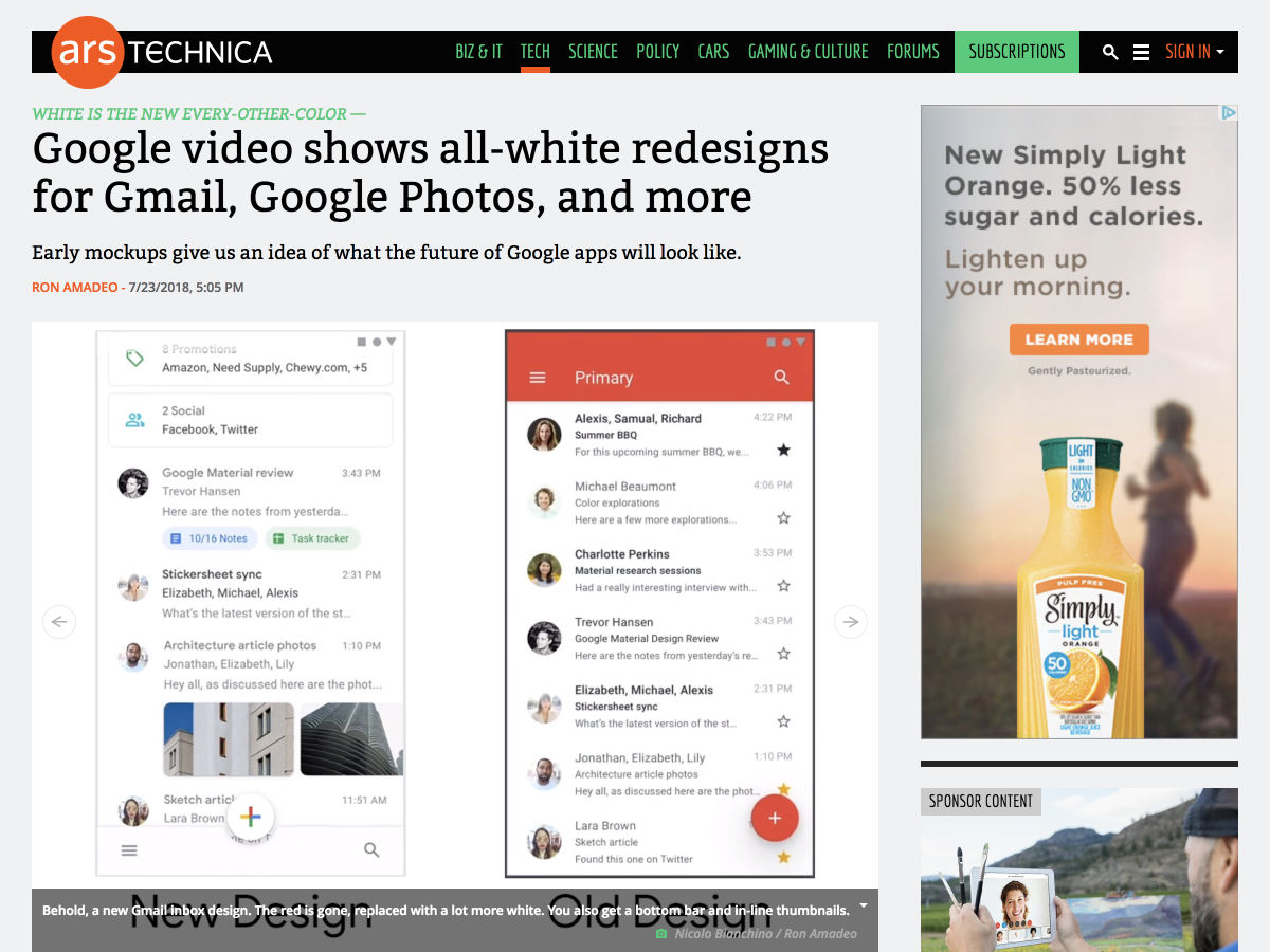
Google Video Shows All-white Redesigns for Gmail, Google Photos, and More


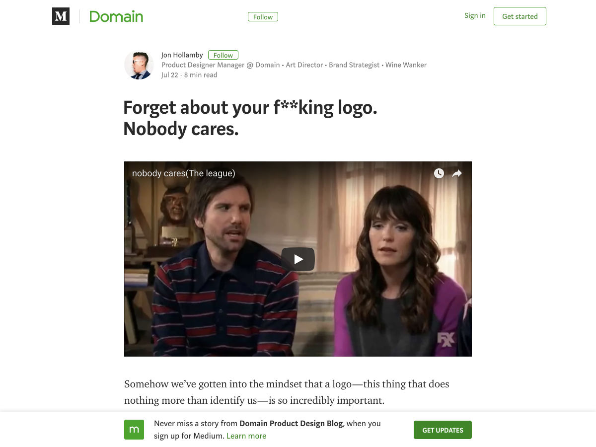
Forget About your Logo. Nobody Cares.


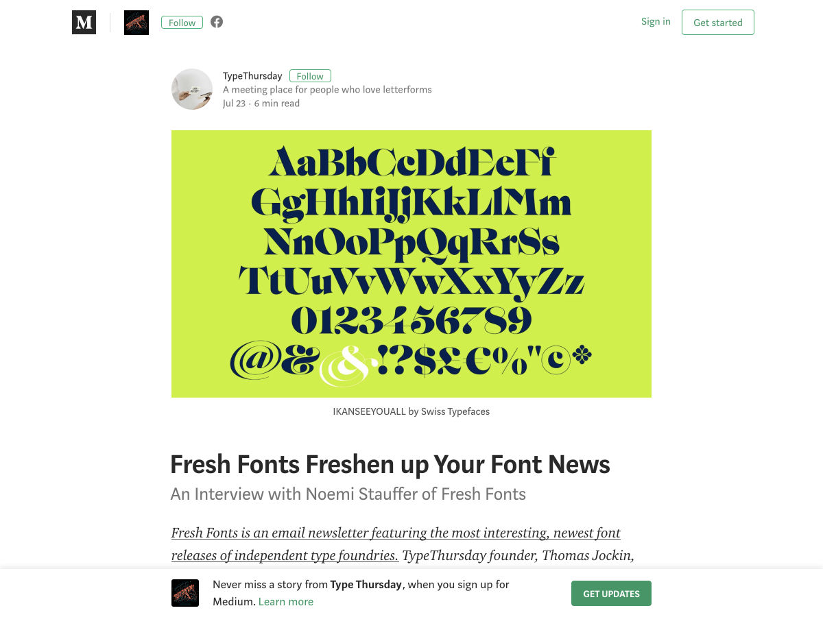
Fresh Fonts Freshen up your Font News


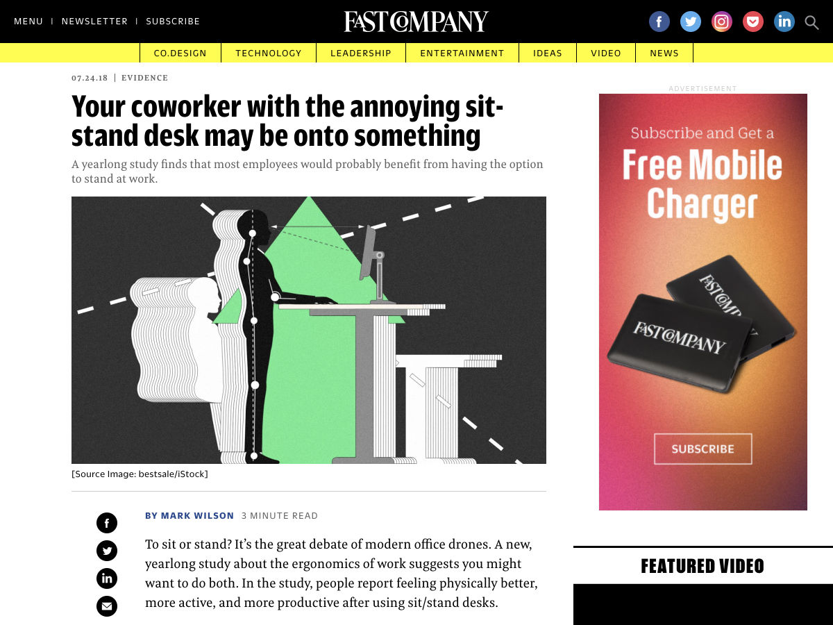
Your Coworker with the Annoying Sit-stand Desk May Be Onto Something


20 White Texture Background Graphics


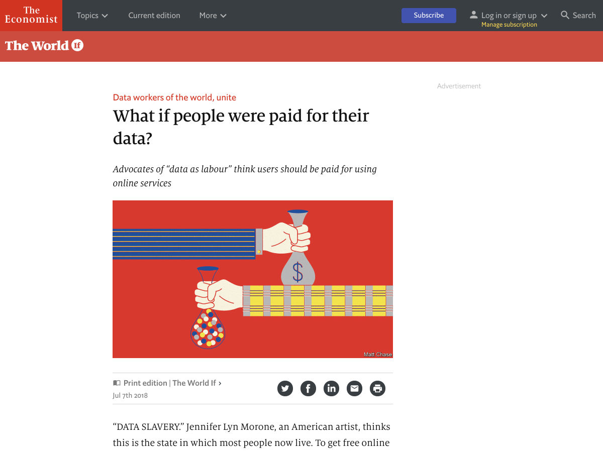
What if People were Paid for their Data?


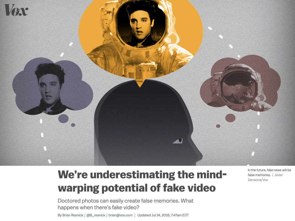
We’re Underestimating the Mind-warping Potential of Fake Video


5 Ways to Take Better Control of your WordPress Website


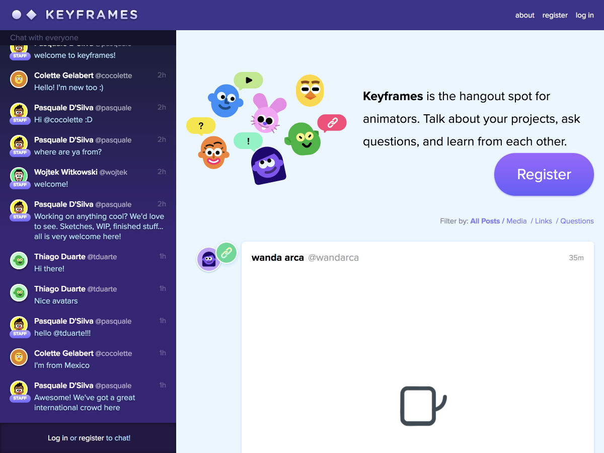
Keyframes: A Community for Animators


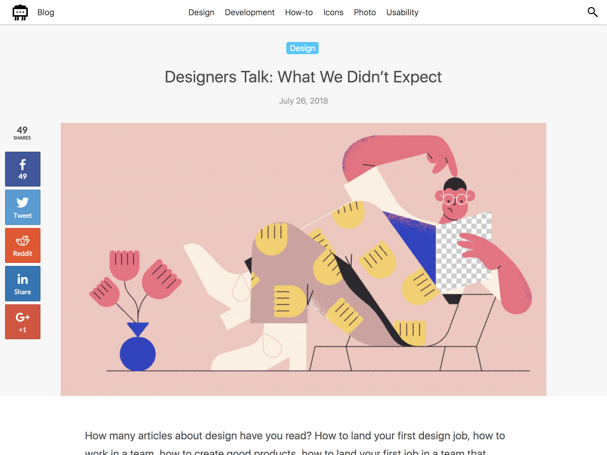
Designers Talk: What We Didn’t Expect


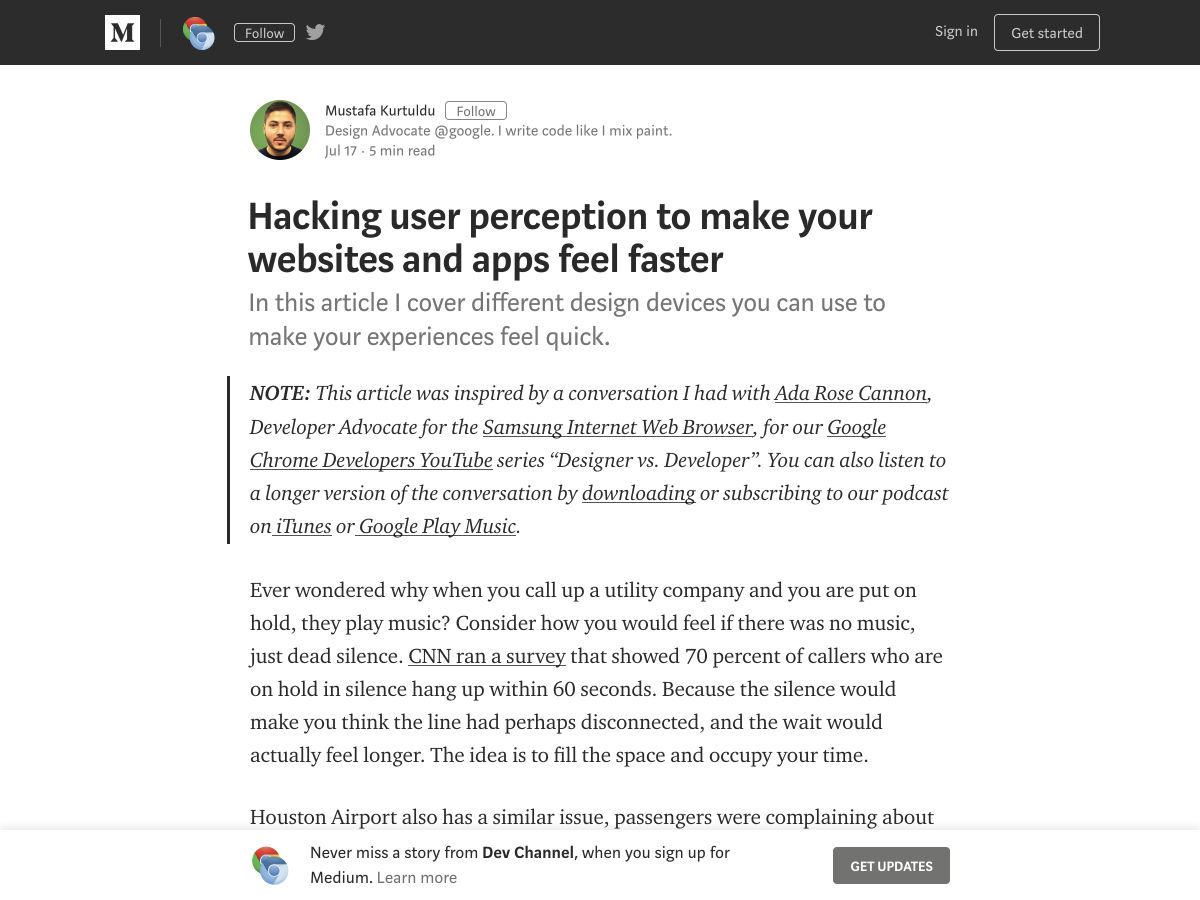
Hacking User Perception to Make your Websites and Apps Feel Faster


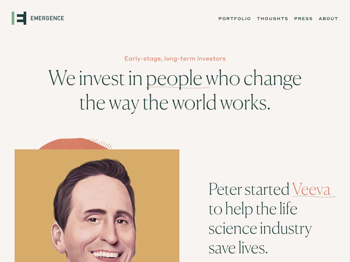
Site Design: Emergence


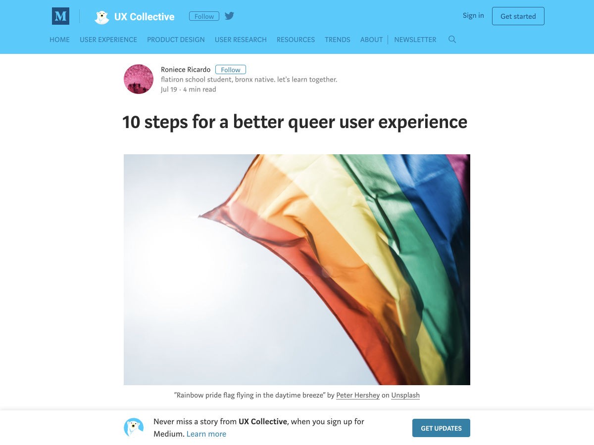
Queer UX Experience


How to Give Project Estimates—and When not to Estimate at all


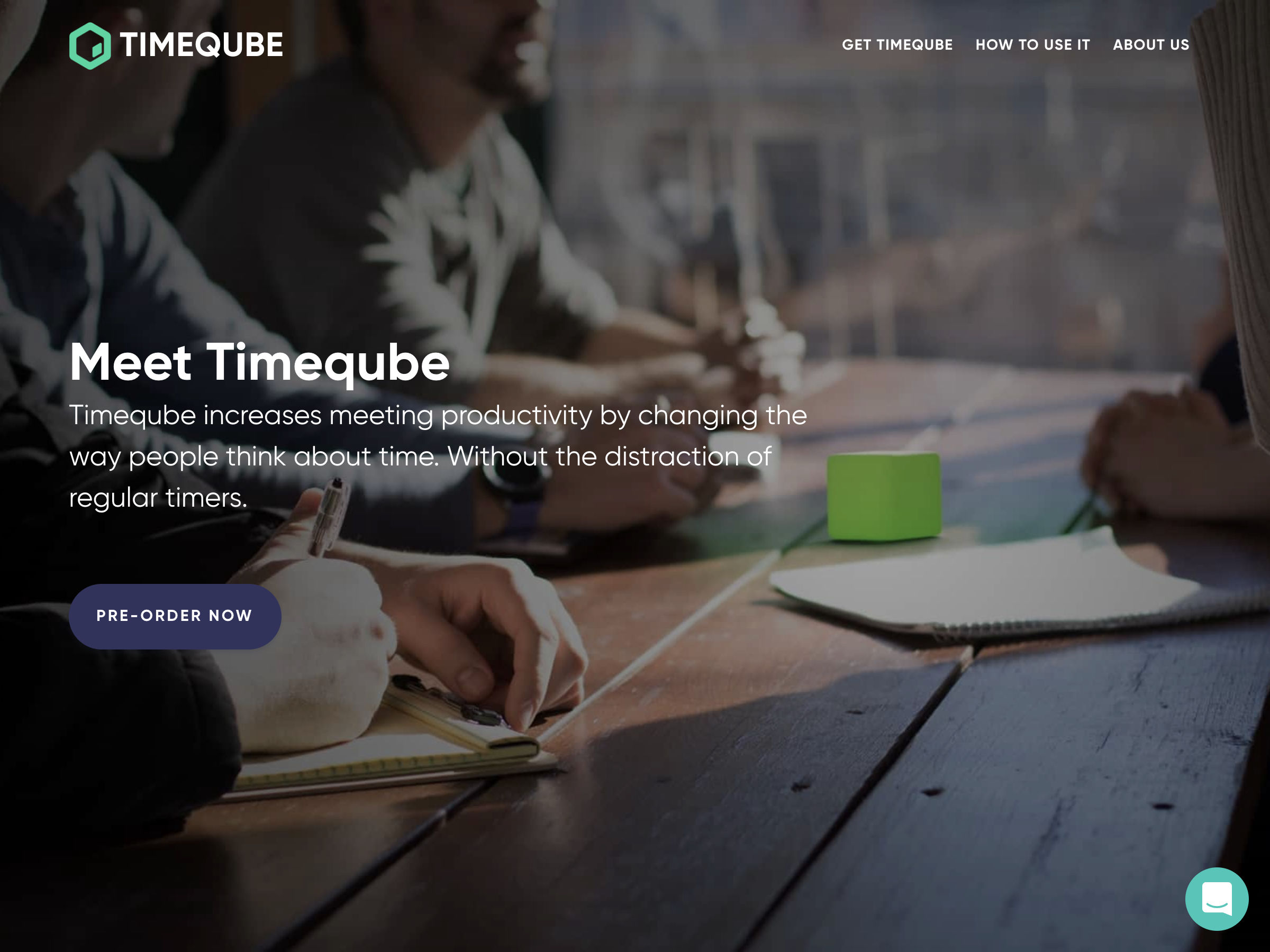
Timeqube – Beautiful Timer that Helps Waste Less Time in Meetings


8 Logo Design Cliches You Should Avoid


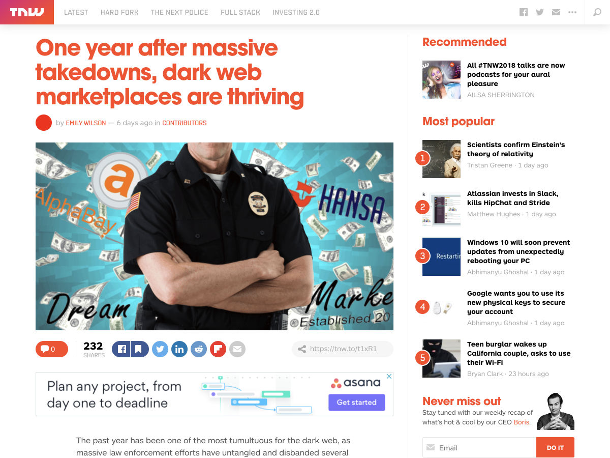
One Year After Massive Takedowns, Dark Web Marketplaces are Thriving


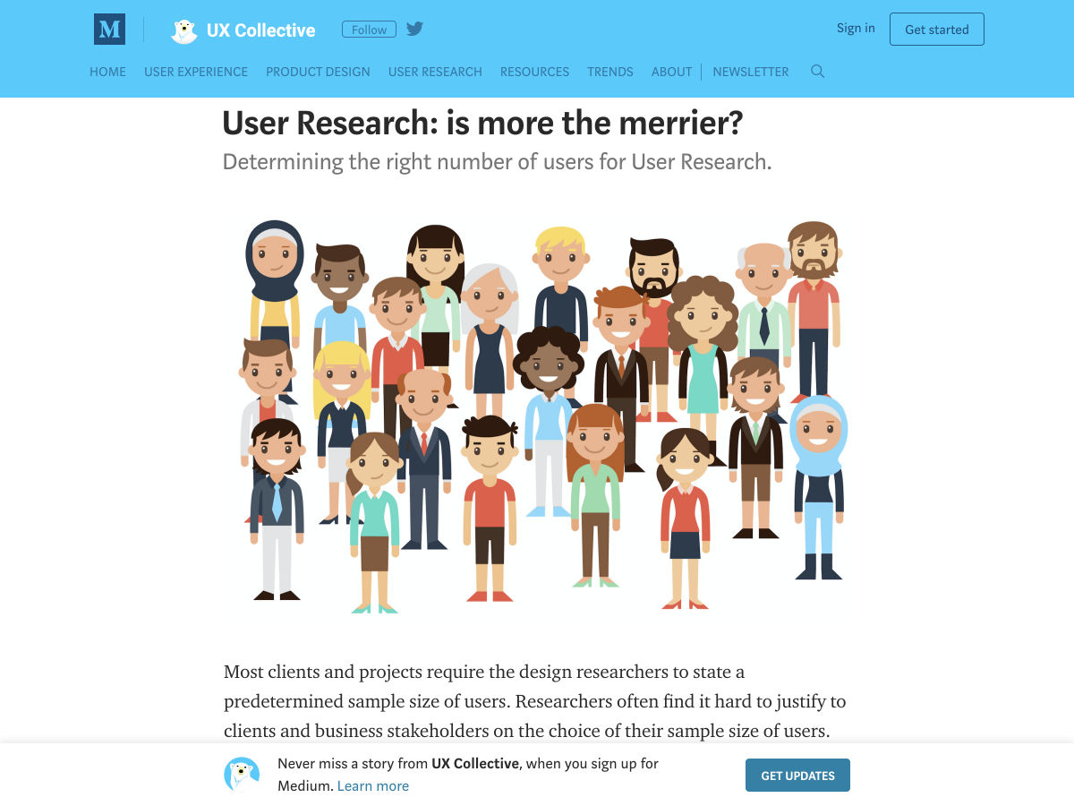
User Research: Is More the Merrier?


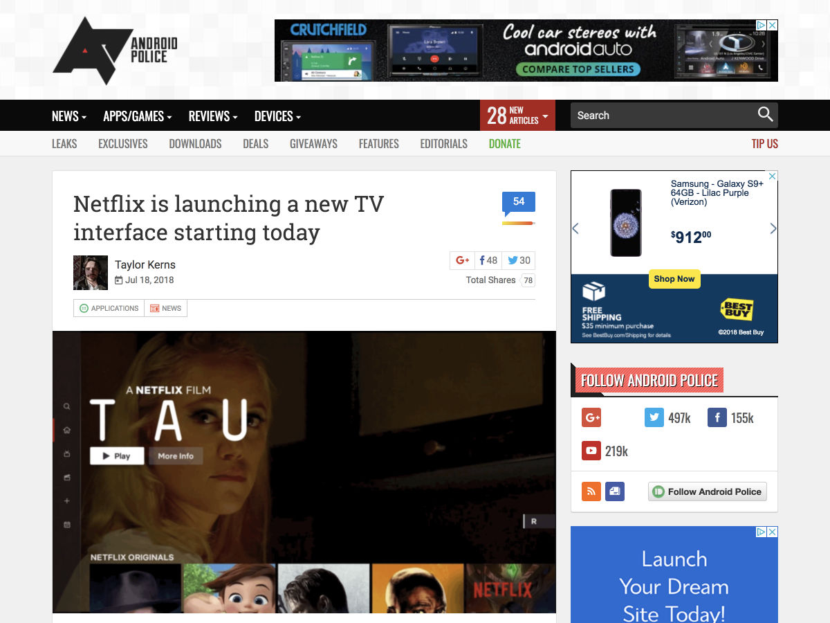
Netflix is Launching a New TV Interface Starting Today


How We Improved Our Landing Page Conversion Rate by 500%


Why Logo Placement is Essential to your Company Website


7 Design Lessons from Silicon Valley’s Most Important Failure


Adobe Shares Pantone’s Summer Trending Colours


Want more? No problem! Keep track of top design news from around the web with Webdesigner News.

Add Realistic Chalk and Sketch Lettering Effects with Sketch’it – only $5!

Source

p img {display:inline-block; margin-right:10px;}
.alignleft {float:left;}
p.showcase {clear:both;}
body#browserfriendly p, body#podcast p, div#emailbody p{margin:0;}

from Webdesigner Depot https://ift.tt/2uVJsiY


from WordPress https://ift.tt/2OqeAzm

Friday, July 27, 2018

7 Elements of Good UX in 2018

UX is a crucial component of modern web design, and users’ expectations are constantly shifting. Though we cannot see into the future, changes made throughout the last decade indicate that adjusting for user needs has never been more crucial. To get ahead in the ever-changing mobile app sphere, designers have to be proactive at all times.

Let the following 7 UX trends be your guide to help prep for both the present and the future of UX design:

1. Journey Simplification

Users typically engage with websites or applications with a specific intention in mind, which they want to achieve as soon as possible. The most user-friendly applications and websites strive to simplify a user’s journey with time-saving designs. The essence of such designs is that they reduce the number of steps users have to take in order to achieve their goal. This should be done by presenting applicable information in an easy-to-use format and providing a smooth navigational flow. A time-saving design can incorporate several key aspects, including:

  • Linear Design. Linear design is a structured journey containing an established layout for beginning-middle-end points. It enables users to do one action at a time at each point in their journey. The consistent flow helps viewers discern how much time is necessary to complete the task.
  • Anticipatory Design. An anticipatory design attempts to recognize a user’s needs to swiftly and efficiently accommodate them. It reduces the chances of friction that make it difficult for users to complete their intentions.
  • Progressive Disclosure. If your website or application contains a lot of information, you might want to adopt a progressive disclosure technique to enhance user experience. Progressive disclosure makes information visible solely when users need it, which ensures viewers are not bombarded with information or distracted by content that is irrelevant to their goal.
  • Context-Based Information. Displaying only the most relevant information specific to user context is instrumental in creating an optimal user experience.

2. Focus on Content

Properly organized and readily available content is key to making websites and mobile applications appealing to their expected users. Recent trends concentrate on eliminating unnecessary distractions and instead, shining the spotlight on what is truly relevant: content.

Creating content-centered experiences involves either using a design highlighting content or having the content itself frame the design. Your ultimate goal should be to ensure there is nothing obstructing a user’s exposure to your website or application’s content. Designers typically begin by removing excessive visible clutter, which helps them concentrate on the essence of the message they want to convey. Visual features of this design strategy include:

  • Precise Visual Order. A well-ordered design facilitates and expedites a user’s ability to comprehend content. Powerful visual signals, such as using dissimilar colors for call-to-action links, are great means of guiding a user’s focus on specific interactive features and significant information.
  • Operative Decluttering. Eliminating irrelevant and otherwise useless details helps magnify important information, creating a more concentrated experience.
  • Whitespace. Increasing the amount of space between content grants it room to breathe and dramatically enhances a user’s experience.

3. Improved Personalization

Personalization is a technique embedded within the strategy of time-saving designs. Understanding the importance of the shift from creating generic experiences to individually targeted experiences is an aspect of UX that deserves extra emphasis. As businesses look for new means of crafting individualized brand experiences, the effort to understand the wants and needs of users on a deeper level continues to develop.

With the help of individualized data and advances in machine learning, technology is becoming capable of adjusting automatically for specific users. One of the most popular models of individualization seen in contemporary applications and websites is the incorporation of personalized recommendations based on user behaviors. These suggestions improve the chances that a user will take action when they visit your site. Among the many techniques to enhance personalization, the following methods are some of the most common:

  • Basing Content on User Location. Because many people use their digital devices while on the road, websites and applications should use the device’s area data to present content related to the user’s geographical location. As a result, the information presented is personalized to the environment surrounding each user.
  • Specific User Interface. A major goal of personalization will be adjusting the layout of a website or application based on the individual needs of a certain user. Following how a user interacts with a digital device and what issues they encounter, in conjunction with their specific data, is a goldmine of information. With it, applications and websites will be able to decide how to adapt the site for the user.

4. Humanization

Due to the impact of technology such as touch and voice recognition on smartphones and other digital devices, people now expect to interact with digital products in the way they would typically interact with another human. This means designers should start striving to create websites and applications that offer a more human experience for users.

The popularity of humanizing digital experience is correlated to connecting with user emotions. The key to humanizing digital experiences is by allowing users to feel connected to their devices in an emotional way. Different ways designers are attempting to provide consistent reactions and humanize the digital experience include:

  • Sharing emotions with face recognition
  • Micro-interactions
  • Creating natural means of interacting with apps
  • Mimicking emotions in feedback

5. Biometric Authentication

Applications and websites can make identity verification easier by replacing conventional means of entry. As bio-metric technology becomes more available it will be capable of recognizing a person’s identity based on particular characteristics. This will create an effortless authentication process for users.

Instead of having to manage an assortment of passwords for different websites and applications, biometrics can verify users with facial or voice recognition or fingerprints. This is an advancement with the potential to bolster security for businesses and users.

6. Video Content

The trend of video content is becoming increasingly vital in creating the optimal user experience. Designers can maximize the potential of their video content by keeping the following tips in mind:

  • Adjust for Portrait Frame. Since mobile phones are used in portrait orientation almost 100% of the time, all video content, and content in general, should be adjusted for this frame.
  • Adjust Video for Short Attention Spans. Modern means of displaying important information must be timely. With the use of formatting methods such as 360-degree videos and Facebook live, designers can present crucial information in a convenient manner.
  • HD Images and Videos. Providing a full-screen experience is essential, but so is providing top-quality images and videos. The quality of the videos on your website or application will have a major influence on user experience, so ensure images and videos are not pixelated and appear in HD.

7. Voice-Based Interaction

As the hardware devices we use to access the web become more streamlined, so should the UX. The latest smart phones, tablets and even laptops are losing more and more buttons every generation. This progression has caused UX to go through one unique development: voice user interface (VUI).

VUIs have become integrated in most major technology, such as products from Google, Amazon, Apple, and Microsoft. A large percentage of web searches are done by voice, with the number projected to rise throughout 2018. With your users almost definitely using tech from one of these innovative VUI pioneers, it might be a good idea to see how your website can benefit from adapting.

Add Realistic Chalk and Sketch Lettering Effects with Sketch’it – only $5!

Source

p img {display:inline-block; margin-right:10px;}
.alignleft {float:left;}
p.showcase {clear:both;}
body#browserfriendly p, body#podcast p, div#emailbody p{margin:0;}

from Webdesigner Depot https://ift.tt/2JWByut


from WordPress https://ift.tt/2LG2405

Thursday, July 26, 2018

5 Ways to Lower Your Site’s Barrier to Entry

The internet, like most activities on the planet, has a barrier to entry. You need at least one brain—conscious and functioning at a level high enough to tap or click on stuff—and a working Internet-enabled device. You need access, in one form or another, to an Internet service provider. And that’s really about it.
In an ideal world, that’s all you need. People without functioning eyeballs can use screen readers. People without hands have other input devices for their computers. People with crappy computers have… access to an ever-shrinking percentage of websites.

Wait… what?

Here’s the thing, each individual website, depending on how it’s built, can either increase its barrier to entry, or keep it at a bare minimum. Every time you implement a feature or technology that not everyone has access to, you raise the barrier a bit. You’re essentially kicking people off of your website. I suspect that, for the most part, you’d really rather not.

Well, you don’t have to.

1. Follow HTML and CSS Best Practices

This is the obvious one. You see, I’m hardly the first person to think of these problems. Web industry experts have been thinking about these things pretty much since the beginning. HTML and CSS have guidelines and rules in place to increase the accessibility of every website built with them.

Follow those guidelines. Use the Alt text. Use the right HTML elements for the right content. It doesn’t just help you maintain code, it helps screen reader apps navigate your site. Make sure all information conveyed with color is available without color. Heck, here’s a list.

2. Test for Accessibility

The guidelines alone won’t cut it. You need to test these things out. Grab a blind friend, or use a screen reader while wearing a blindfold if you have to. Test your site in different lighting conditions. Glasses on or off. Turn off the colors on your screen. Try apps that simulate various forms color-blindness.

These conditions (especially various forms of visual impairment) are a lot more common than you might think, so this is important. Also, make sure your site can be navigated by keyboard, where possible. Some devices for the disabled mimic keyboard input rather than mouse input, so that should be considered. Plus, some people just prefer keyboards.

3. Embrace Backwards Compatibility

A lot of people in the world still access the Internet via Internet cafes. Some by old phones. Others via gaming consoles. On these devices, not all of your usual browser features will be supported. “People with crappy hardware” isn’t a protected class, but if you’re selling a five-dollar-a-month service, is there any reason they shouldn’t be able to access it?

But what if you’re selling a luxury item? We expect people with money to have good computers, right? Well, massive corporations are known to use use old hardware and software, when they can get away with it. It’s entirely possible that there are people with six-figure salaries sitting in an office right now, browsing on a computer with Windows XP and an outdated version of Firefox because their phone is about three inches too far away. It happens.

Recently, I saw someone mention that CSS Grid has reached 70% compatibility. That’s fantastic, and designers should start using it more. But 30% of Internet users is a damned large number, and your site shouldn’t completely break if CSS Grid (or any other feature) isn’t supported. Your content should be structured in such a way that if everything goes straight to Hell, at least you have a usable, if almost entirely vertical, layout.

4. Speed and Performance

Speaking (again) of old phones and computers, loading speed and processing speed are absolutely barriers to entry. The longer your site takes to load at all, the worse it will be for spotty mobile networks, for the weirdly large number of people that still use dial-up, and for the even larger number of people with bad Internet because their provider has a local monopoly.

And even taking new devices into account, there are phones and mini-laptops still being made that sport old atom processors, and 1-2 GB of RAM. The longer your site takes to process, the worse it is for them. Yes, most Internet users are mobile these days, but they don’t all have iPhones.

5. Watch Out For Cognitive Overload

As a general rule, the busier and more visually overwhelming your site is, the more effort it will take your users to focus. The more effort it takes them to focus, the less they will want to be there. I’ve literally left sites just because the first thing I thought when I saw them was, “I just can’t deal with this right now. Nope. I’m out.”

Now in some cases, you actually want as much information on a page as you can reasonably squeeze in. One of the clearest examples of this is in eCommerce. But in eCommerce, they’re usually careful to organize the wealth of information very carefully, and categorize it all so you can find it easily. Even so, I usually feel pure relief when I finish up a “shopping trip” on Amazon.

Simply put, dealing with information (and deciding what to do with it) takes mental energy. The more mental energy used to process what you’re seeing, the higher the barrier to entry is. There is, of course, a balance to be struck. You don’t want to provide so little information that everything seems vague. Just, every time you add a bit of text, an animation, or a full blown widget (I love saying “widget”), ask yourself what the effect on the user’s cognitive load will be.

It will directly impact whether or not they feel like coming back.

Add Realistic Chalk and Sketch Lettering Effects with Sketch’it – only $5!

Source

p img {display:inline-block; margin-right:10px;}
.alignleft {float:left;}
p.showcase {clear:both;}
body#browserfriendly p, body#podcast p, div#emailbody p{margin:0;}

from Webdesigner Depot https://ift.tt/2A8yICZ


from WordPress https://ift.tt/2LqIuph

Wednesday, July 25, 2018

Product Pages Tested: How carefully pinpointing customer anxiety led to a 78% increase in conversion

The following research was first published in the MECLABS Quarterly Research Digest, July 2014.

 Product pages are a staple in nearly every business website in existence. Oftentimes, they represent the final hurdle before a prospect clicks “add to cart” or fills out your form. Therefore, if we can improve the performance of these key pages, we can see substantial increases in conversion and sales.


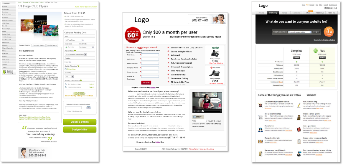
Figure 1.1

Look at the three pages in Figure 1.1. What do they have in common?

Granted, there could be multiple correct answers to this question. However, one similarity may have escaped your notice: anxiety. In every page, especially product pages, certain elements raise the anxiety level of the prospect. This should concern you for two very good reasons:

  1. In our experience, when we correct for anxiety, we see gains.
  2. The needed correction often involves only simple and small changes.

z

Figure 1.2


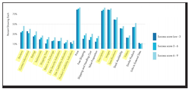
In the Marketingsherpa E-commerce Benchmark Study, we found ecommerce marketers are employing a variety of page elements that can be used to reduce anxiety (Figure 1.3).

Figure 1.3 – Page elements used by successful and unsuccessful ecommerce companies on product pages.
Anxiety-reducing elements highlighted.

We tested four of those minor elements to correct specific points of anxiety on the same page and to help us understand the interplay of anxiety and the corrections we make.

Experiment: Which anxiety correction had the biggest impact?

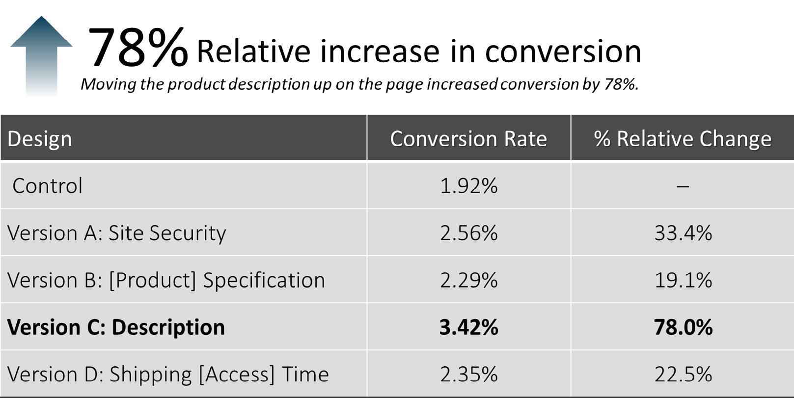
The experiment sought to improve the sales of e-books from a well-known retailer in the market. Our approach was to test four different variations of the product page against the control, with each treatment correcting for a different form of hypothesized anxiety:

  • Version A: Adjusting for anxiety regarding site security (Figure 1)
  • Version B: Adjusting for anxiety that the e-book would not be compatible  with their reading device (Figure 2.2)
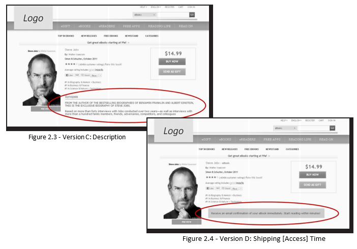
  • Version C: Adjusting for anxiety that the e-book would not be of interest or value to them (Figure 2.3)
  • Version D: Adjusting for anxiety regarding the shipping time frame of the e-book (Figure 4)

What does your instinct tell you? Which, if any, of the corrections would most improve conversion?

The result: Version C was the winner, increasing conversion by 78%

After our complete analysis, we discovered three key principles as to why Version C was victorious, as well as what we can learn from the success of the other treatments.

How to correct for anxiety on product pages

Key Principle #1. Every element we tested on the page overcorrected some type of customer anxiety, with various elements performing more effectively than others.

It is crucial to note that while Version C produced the largest increase, each treatment page outperformed the control.  In other words, in every case where we took steps to alleviate customer anxiety, conversion went up. These results underscore the importance of this effort, as well as the relative ease with which gains can be achieved.

It is important to note the use of the term “overcorrect” here because anxiety is not always rational. You may know that flying in a plane is statistically safer than riding in your car, but, for many of us, our anxiety level is much higher in an airplane. Is it rational? No. Is it still very real? Yes. You may see no reason for concern about a given aspect of your page, but that does not mean anxiety is absent for customers.

Key Principle #2. The effectiveness of each corrective is directly related to how it matched the specific concern in the mind of the customer.

While all cases of anxiety correction produced lifts, one change impacted conversion significantly more than the others. Version C overcorrected for a concern that was most immediate to the prospect at the time. Therefore, it is crucial to discover the specific anxieties your customers are experiencing on your product pages. Among a plethora of options,  we have found some standard minor corrections you can make for specific anxieties:

Source                                                                             Correction

Product Quality Anxiety  ———————————> Satisfaction Guarantee

Product Reliability Anxiety  —————————–>  Customer Testimonials

Website or Form Security Anxiety  ——————->  Third-party Security Seals or Certificates

Price Anxiety  ————————————————>  Low-price Guarantee

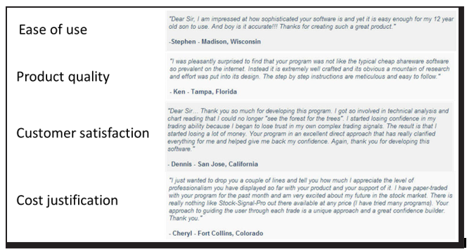
Additionally, customer testimonials can be used to alleviate several different concerns. You want to choose testimonials that specifically deal with the point of anxiety the customer is experiencing (Figure 3.1).

Figure 3.1 – Examples of testimonials addressing specific points of customer anxiety


Key Principle #3. Location plays an important role. You can more effectively correct anxiety by moving a corrective element within close proximity to where the concern is experienced.

As in real estate, location is of utmost importance when correcting for anxiety on product pages. If you are correcting for form security concerns, you want the correction element right where the customer must click to submit the form. In Version C, we simply added a plot synopsis above the fold rather than farther down the page, and it led to the biggest jump in conversion. It’s not always about creating new elements, but instead, placing existing ones in a location that better serves the thought sequence of customers.

Overcorrecting for product page anxiety

Anxiety is lethal to product page conversion. It is always present, and it is not always rational.  By overcorrecting for predictable or discovered customer anxiety, you will empower more prospects to complete the sale.

The effectiveness of an anxiety corrective is dependent on two essential factors:

Specificity – How specific is the corrective to the source of anxiety?
Proximity – How close is the corrective to the moment of concern?

If you can identify the main cause of anxiety on the page and implement an overcorrection element in close proximity, you are on your way to higher conversion and more sales.

Related Resources

Landing Page Optimization: Addressing Customer Anxiety

MECLABS Research Catalog — Learn about other experiments performed in the MECLABS Laboratory

MECLABS methodology

Conversion Rate Optimization — Read how anxiety plays a role in building the “Ultimate Yes” to conversion

Online Testing: 6 Test Ideas To Optimize The Value Of Testimonials On Your Site

To learn more about anxiety and the factors that affect it, enroll in the MECLABS Landing Page Optimization Online Certification Course

The post Product Pages Tested: How carefully pinpointing customer anxiety led to a 78% increase in conversion appeared first on MarketingExperiments.

from MarketingExperiments https://ift.tt/2v161SE


from WordPress https://ift.tt/2uOKtZZ