 The global market keeps getting bigger and bigger, which should be good news for web designers – but there’s a catch.
The clients you can expect to serve are more sophisticated and want creative websites, not just the regular HTML and CSS.
You can’t deliver just anything and expect them to be happy. You’ll also have some serious competition to contend with. As a consequence, your website must adequately address an ever-growing need for improvements. Like in flexibility, responsiveness, and conversion optimization.
Fortunately, the cloud has a silver lining; and a bright one at that. Tools to meet these challenges and address them head on are readily available. With the most notable case in point being Be Theme, the largest and most versatile WordPress theme of them all.
With a tool like Be Theme at your fingertips, you’ll be more than able to successfully handle any challenge that comes your way.
Then, it’s simply a matter of following these 5 simple steps to design creative websites. They are eye-catching, impressive in their ability to convert visitors to users and guaranteed to put smiles on your clients’ faces.
5 Steps to Building Astoundingly Creative Websites
Step 1: Choose a Mesmerizing Color Palette
The color palette you use can make a difference between a so-so website and an attention-getting one. Choosing one should not be difficult if you follow a few simple rules:
- its colors need to attract instant attention;
- they need to be on-brand, and;
- the color palette you select needs to visually support the message your app or website is designed to convey
Artist features BOLD color touches that will instantly attract attention.
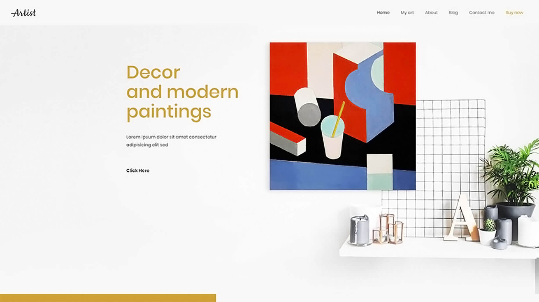
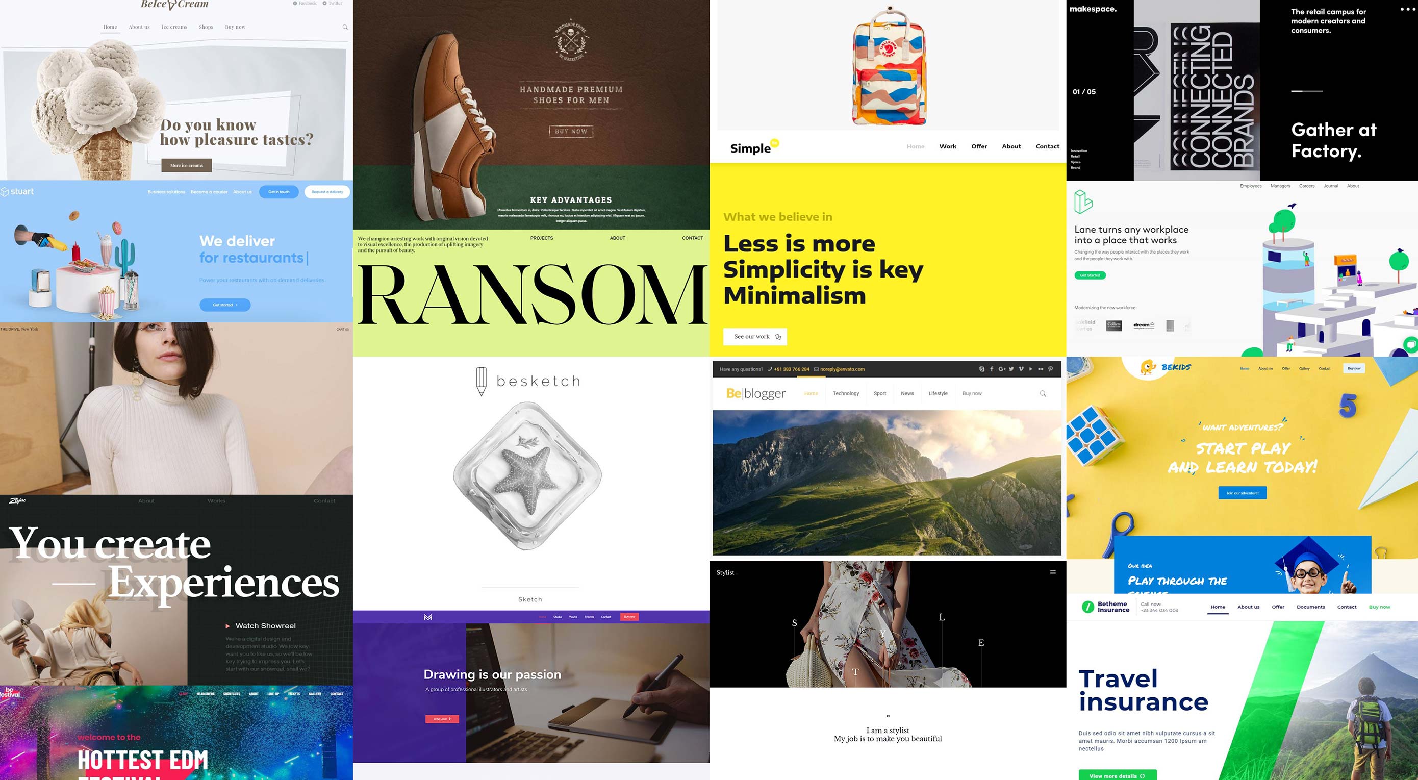
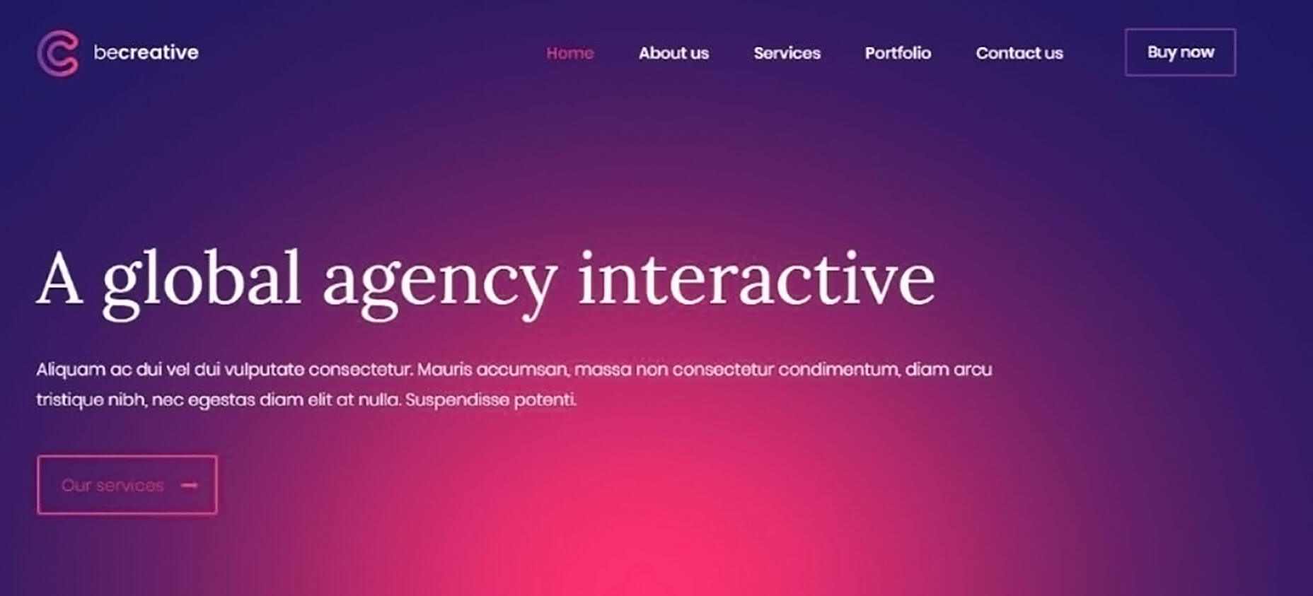
This Be Theme pre-built website is another great example of what can be accomplished with an eye-grabbing color palette.
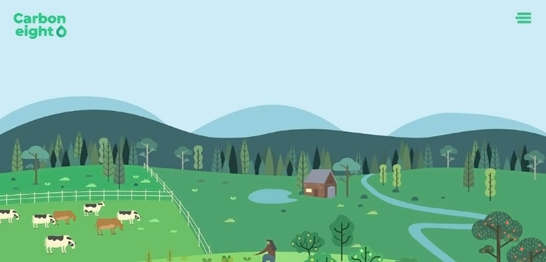
Carbon8 is an example of how to align the color palette with the website’s brand. It is done with its clever use of various shades of green. Note how the deep green element draws visitor’s eyes to the center of the page.
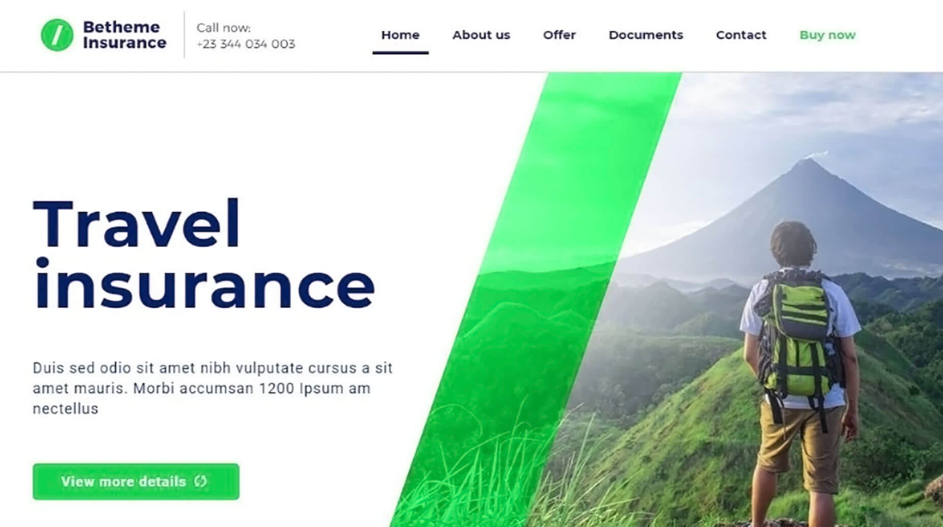
BeInsurance features a subtle, crisp color palette. It perfectly reinforces a strategy of using crisp, clear images to gain the clients you need.
BeFestival is a great example of using a color palette designed to appeal to a larger audience.

Step 2: Display Crystal-Clear Photos and Images
This step should be obvious. A crystal clear presentation suggests the business behind it goes the extra mile. That is when it comes to clearly present their products and services. Using the best images you can get your hands on can give you an extra edge over the competition.
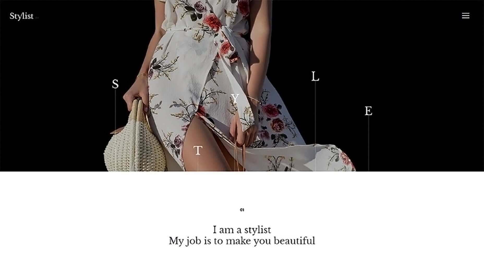
BeStylist is an example of the advantage of displaying images with flair. The crisp image definitely supports the intended message.
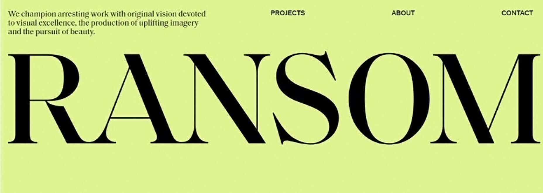
Or, try something like RansomLTD; minimalist, yet crisp and powerful.
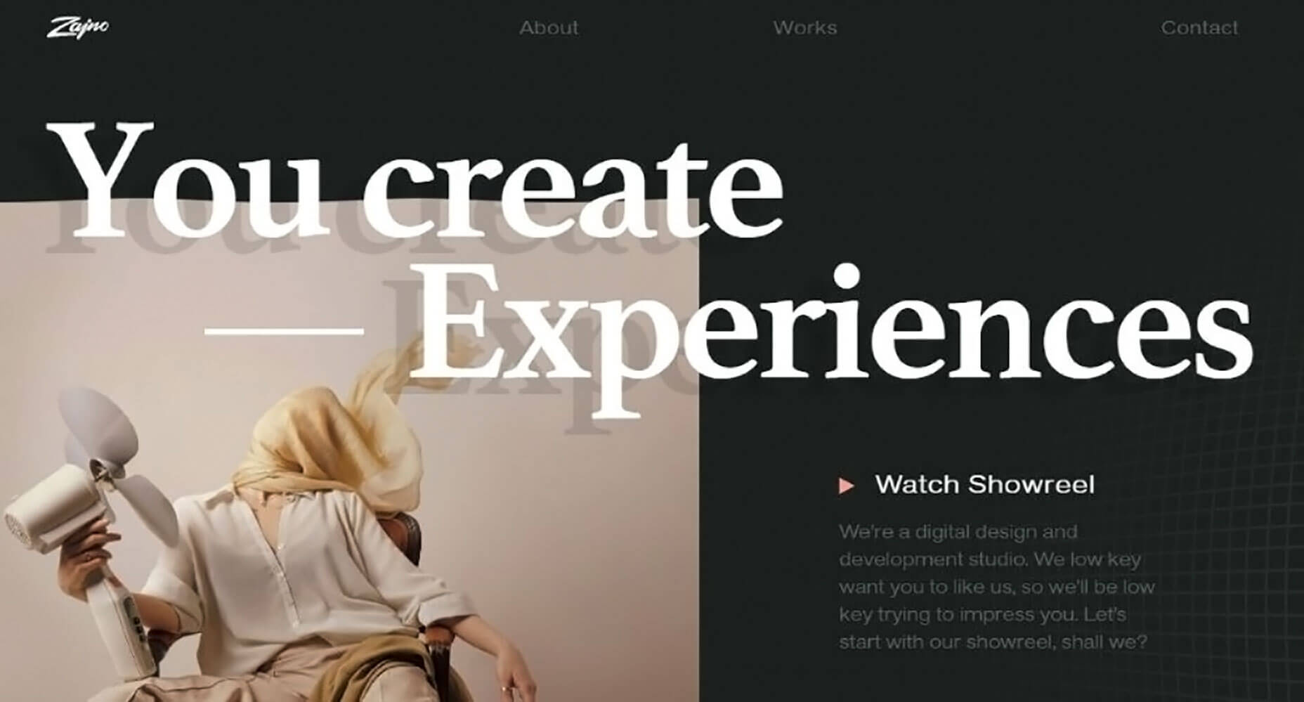
A pre-built website like Zajno illustrates how crystal-clear pics can be used to display your creativity.
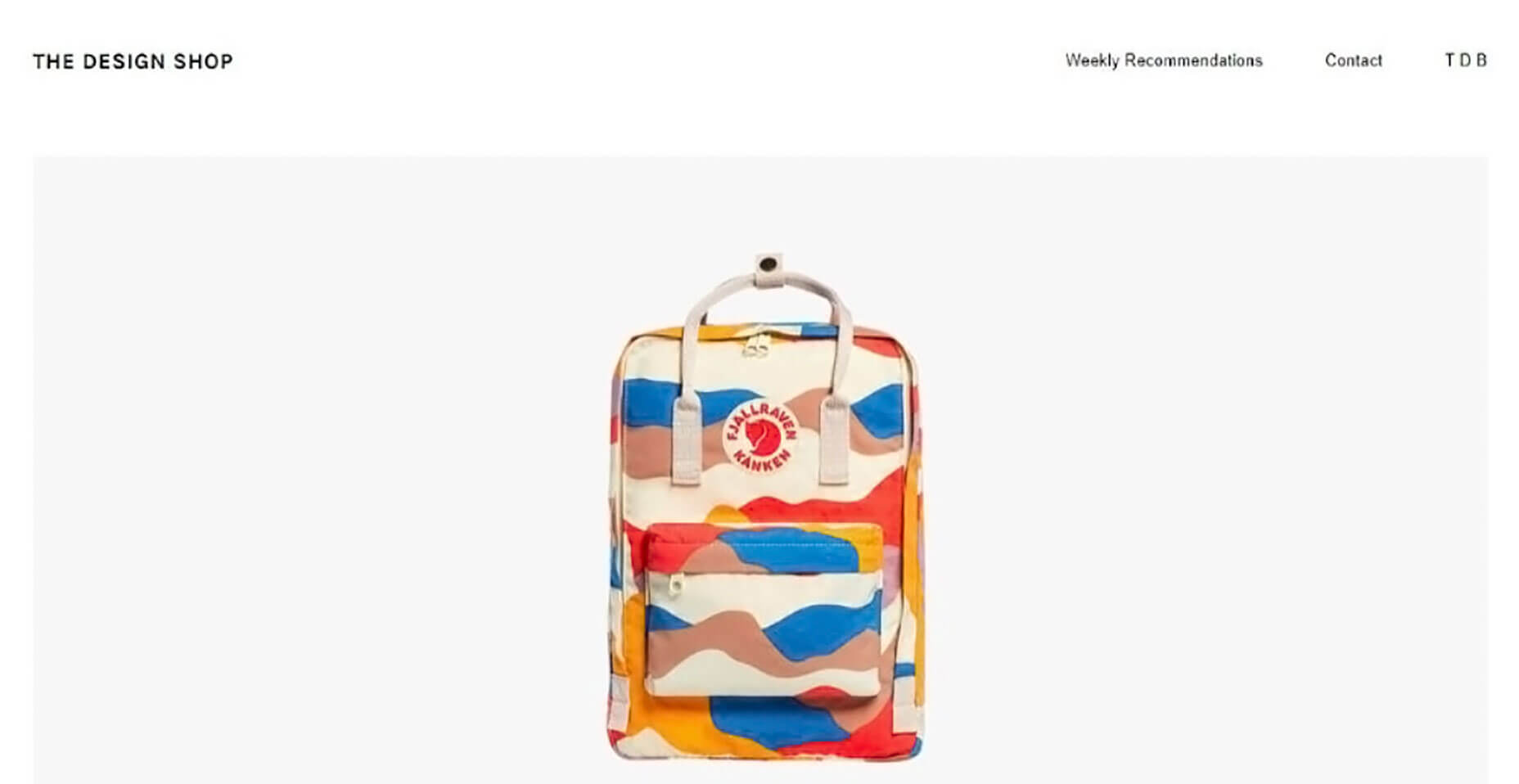
The Design Shop employs flair and creativity to entice visitors with crisp and compelling images of your products.
Step 3: Show Visitors How Your Creativity Benefits Them
Creativity isn’t about you. It’s about serving your visitors. It can be extremely effective when it helps them imagine themselves actually using your product or service.
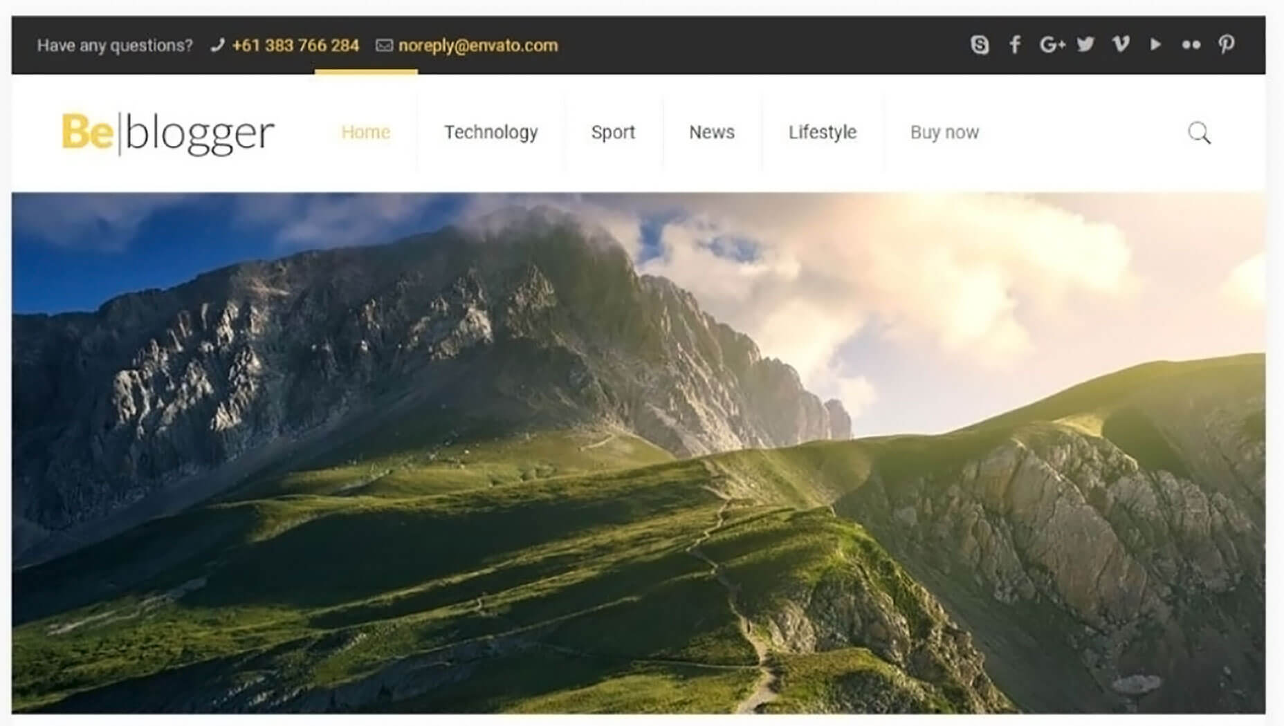
BeMarketing’s homepage video illustrates another way to show people how they can benefit from using your products.
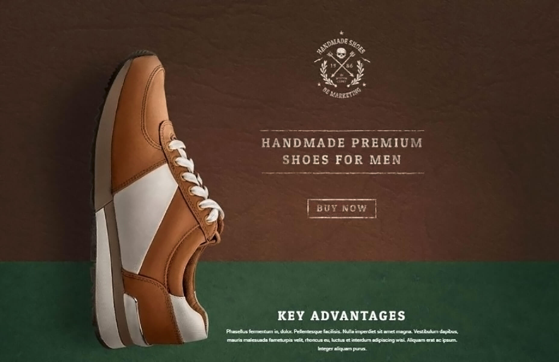
Lane illustrates a fabulous approach you can use to express your structural design perspectives.
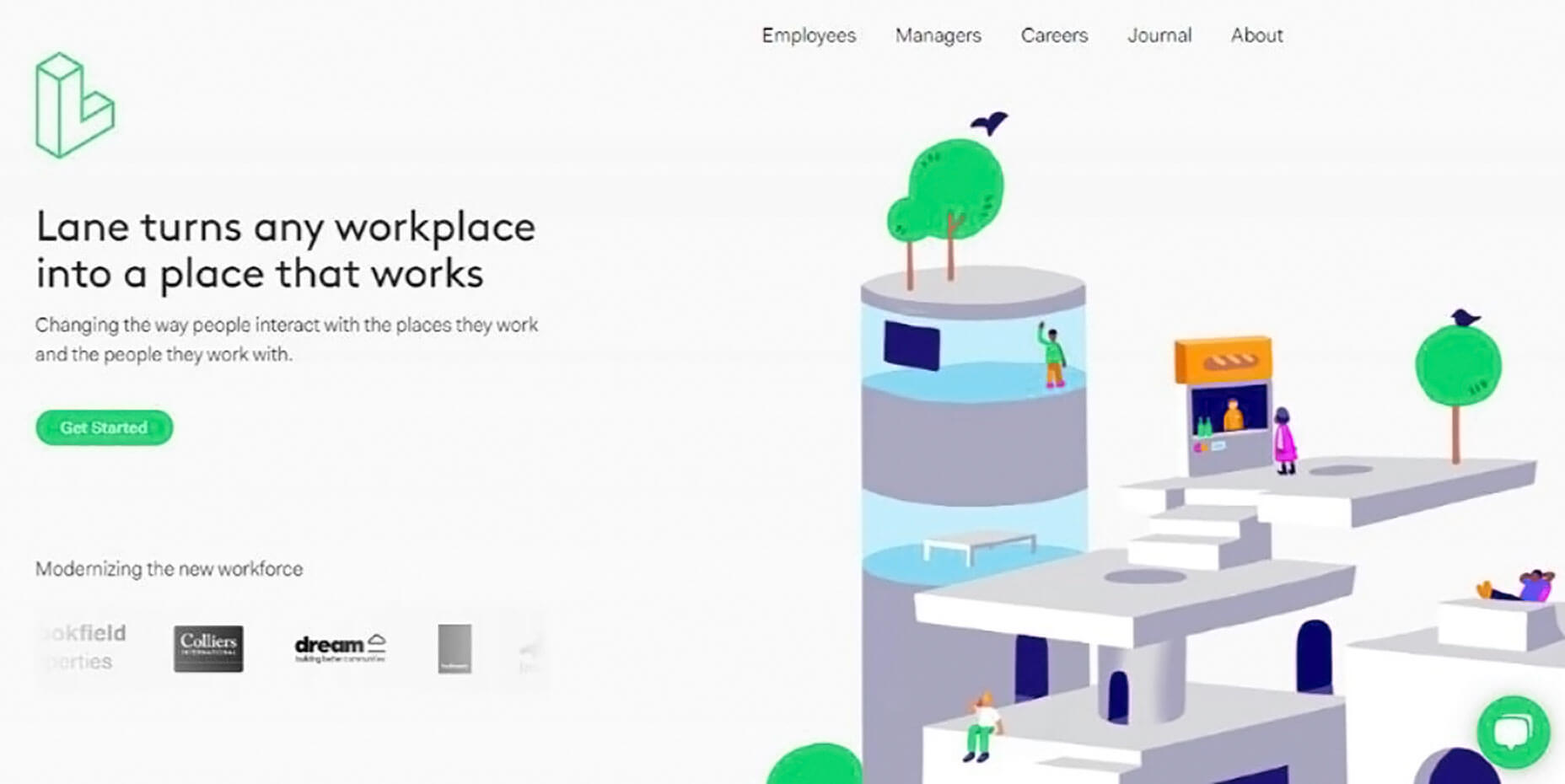
BeSimple takes a minimalist approach. It’s the typography and way the text is presented rather than the text itself that’s effective.
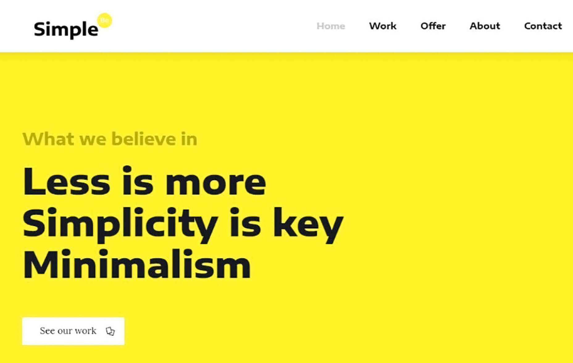
BeTravelBlogger provides the basis for a travel blogger’s dream site. You can use it to present your travel adventures and escapades with a super-cool layout of graphics and snippets.
Step 4: (Over)use “White” Space
Yes, it’s true. White space is a design element you can sometimes overuse without causing harm. In fact, in many cases “more is better”, as is obvious in the following examples.
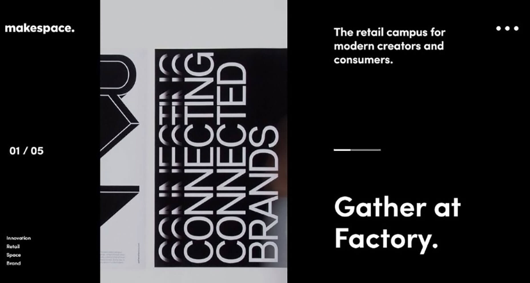
Makespace has a clean design that allows the eye to focus on key elements, imagine, and create.
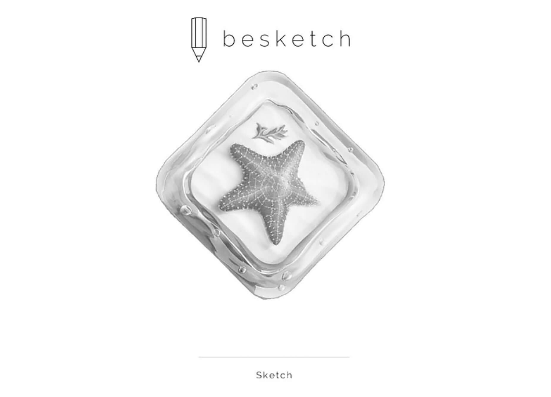
BeSketch & The Drive New York are two examples where plenty of white space is used to great effect.

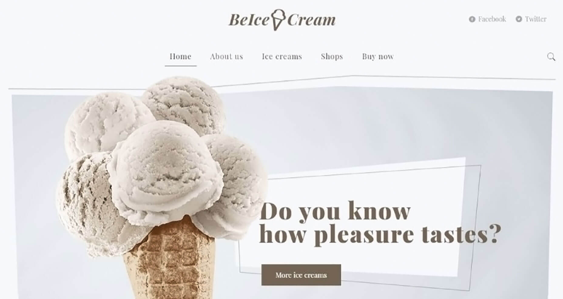
When white space is part of the brand it can really help to drive the message home. BeIcecream is an extreme example of how plenty of white space can be used to great effect.
Step 5: Make Your CTAs Grab Them By The Eyeballs
If you don’t have CTA buttons that can’t be ignored, your website isn’t going to convert as many visitors into users as you hoped or planned. You want those buttons to be big, bright, and bold enough to make people feel they absolutely have to be clicked on.
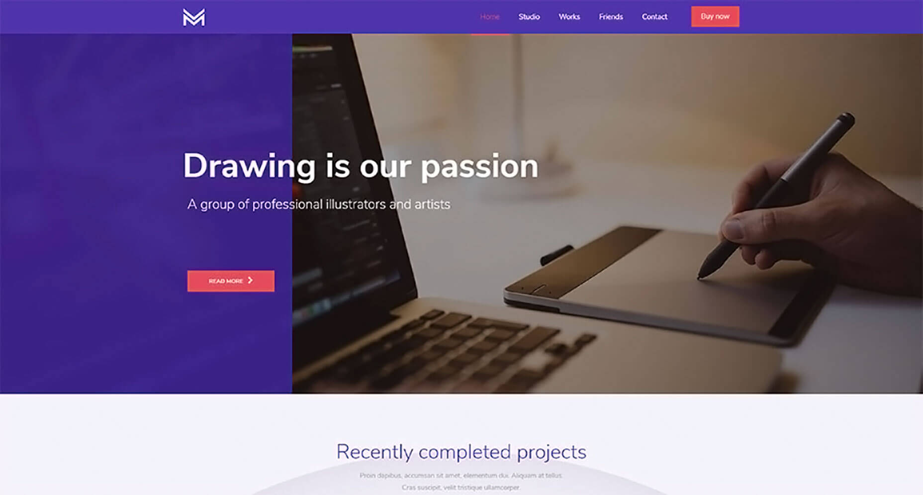
BeDrawing’s CTA button is above the fold as it should be, and it clearly stands out. You can’t help but notice it the instant you’ve finished reading the headline. Its centering on the page makes it serve as a gate that invites visitors to enter.
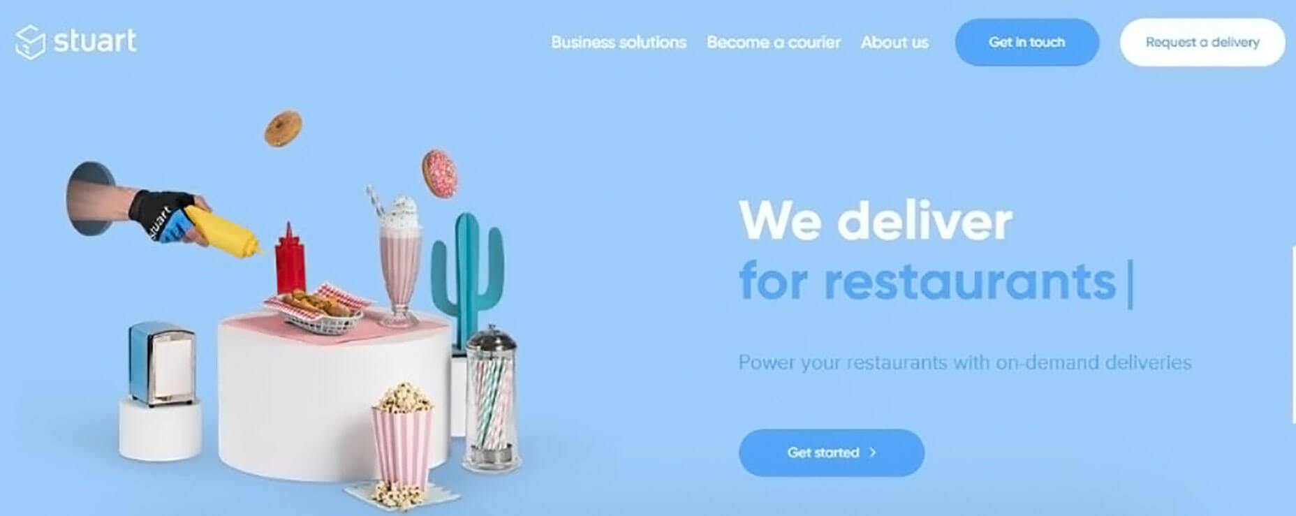
Stuart makes effective placement and use of 3 clearly defined CTA buttons.
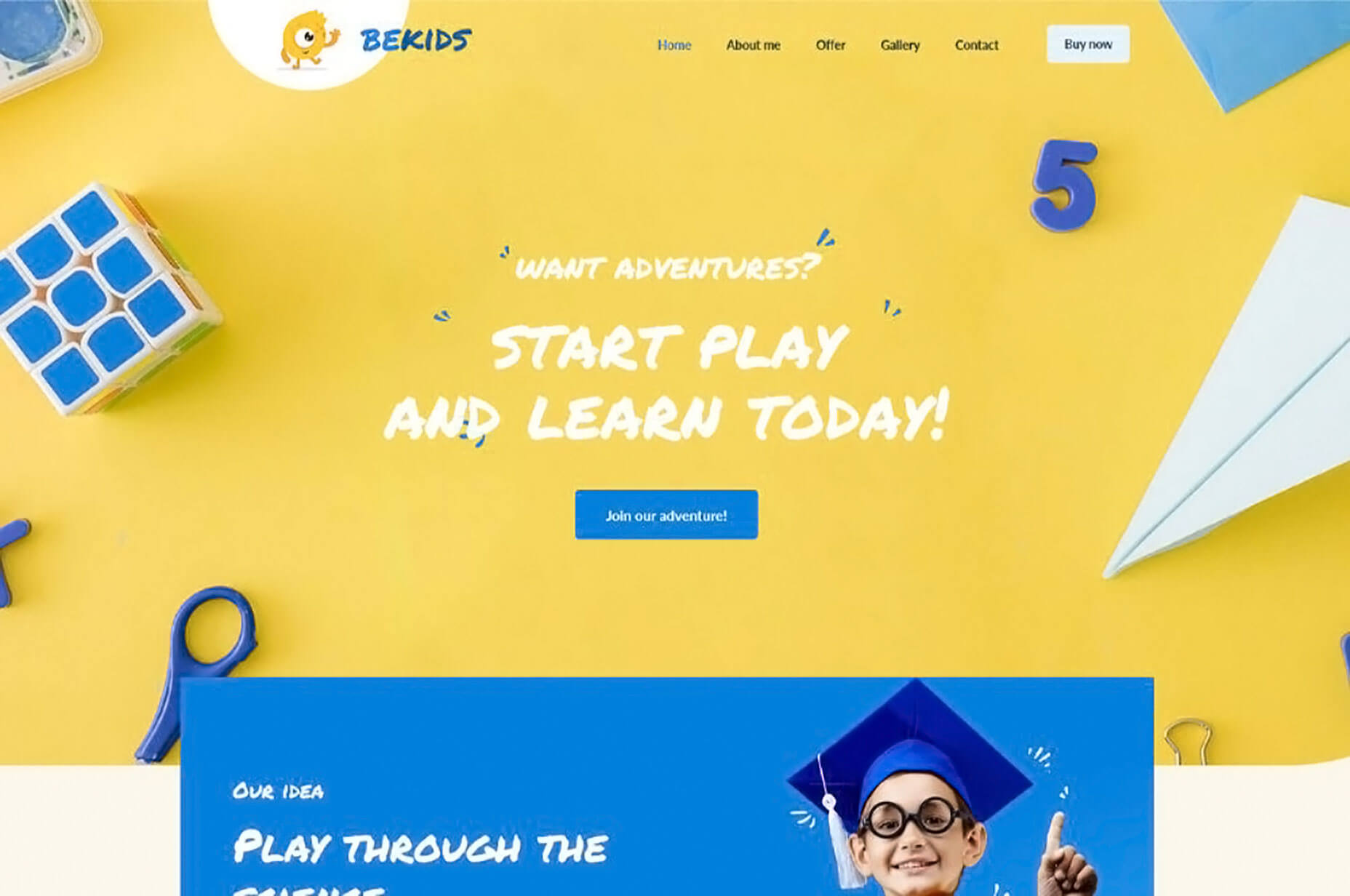
Your CTA can match other elements on the page and still easily attract attention. A great example of this is BeKids, where the color of the button matches the color of other hero section elements.
Building Creative Websites – a Summary
Follow these surefire steps (with the help of a surefire website building tool) and you’re well on your way to satisfying the most demanding of clients. Crisp, stunning visuals, a cleverly chosen color palette and the clever use of white space, images that enable visitors to see themselves using your products, and the all-important bold and beautiful CTA buttons give you the combination for success.
Success typically breeds additional work. Sometimes web design is not as much fun as it used to be. If you suddenly find yourself juggling projects and deadlines to the point you’d be better off using pre-built websites.
You’ll find the most generous gallery of more than 450 creative websites on Be Theme that you can customize to your liking. Start using them now and you’ll never have to worry about juggling projects and deadlines!
[– This is a sponsored post on behalf of Be Theme –]
p img {display:inline-block; margin-right:10px;}
.alignleft {float:left;}
p.showcase {clear:both;}
body#browserfriendly p, body#podcast p, div#emailbody p{margin:0;}

from Webdesigner Depot https://ift.tt/2lhFeAD
from WordPress https://ift.tt/2kRiSpy

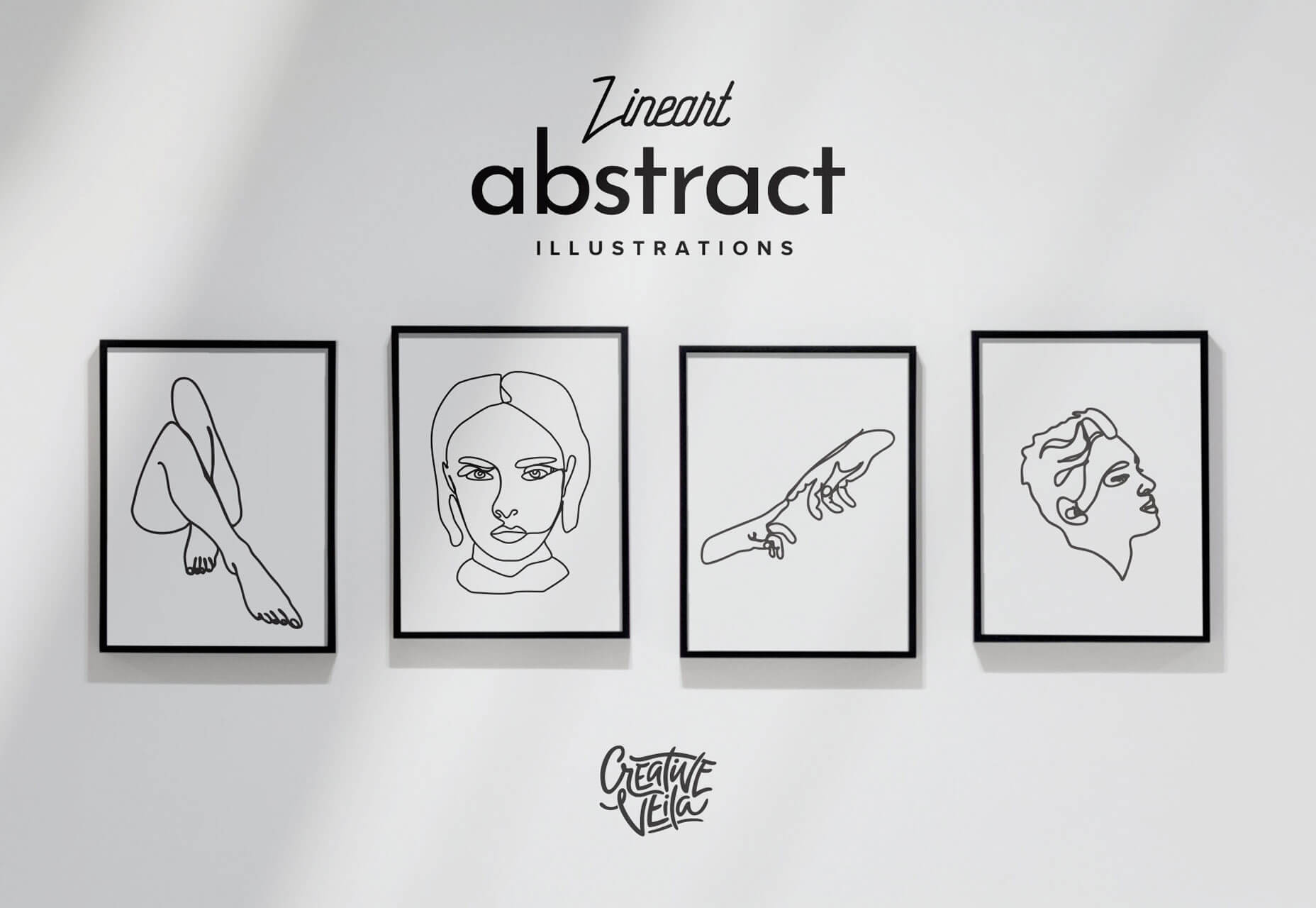
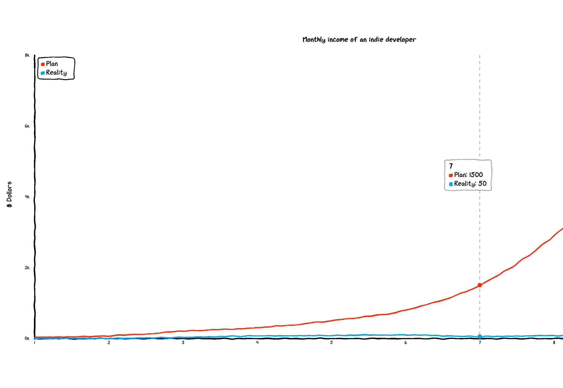
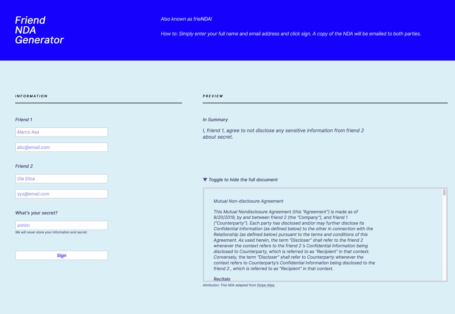
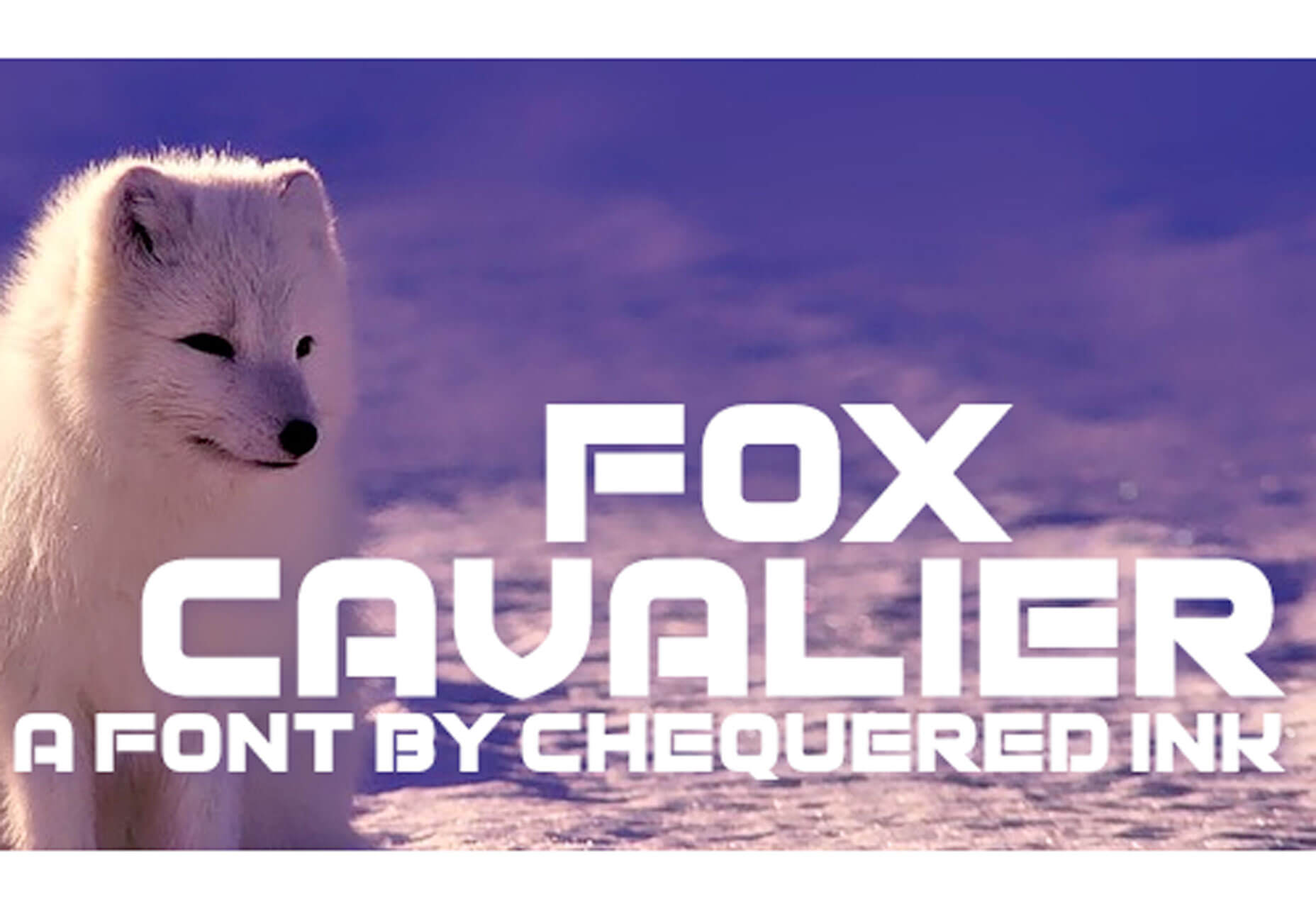
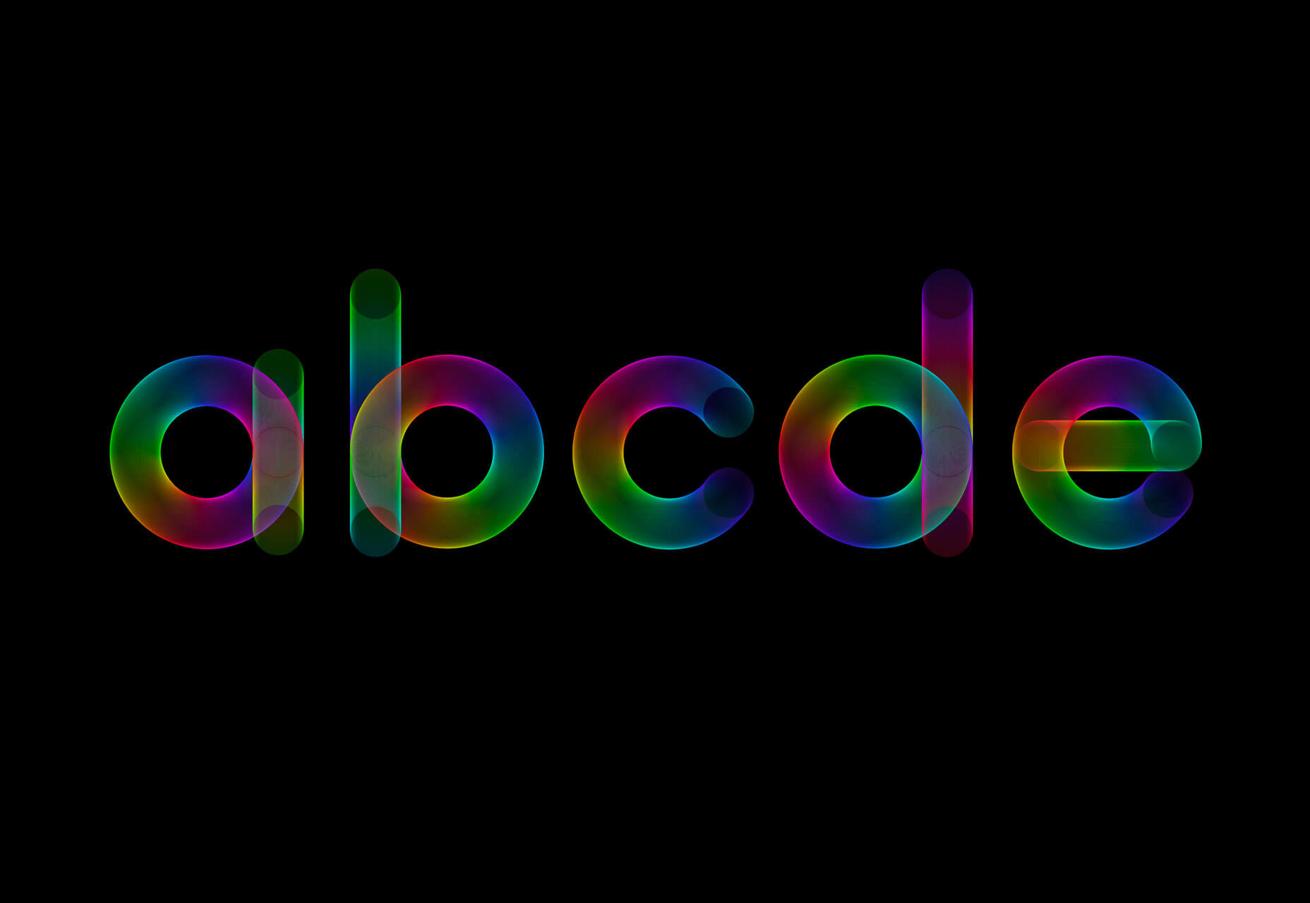
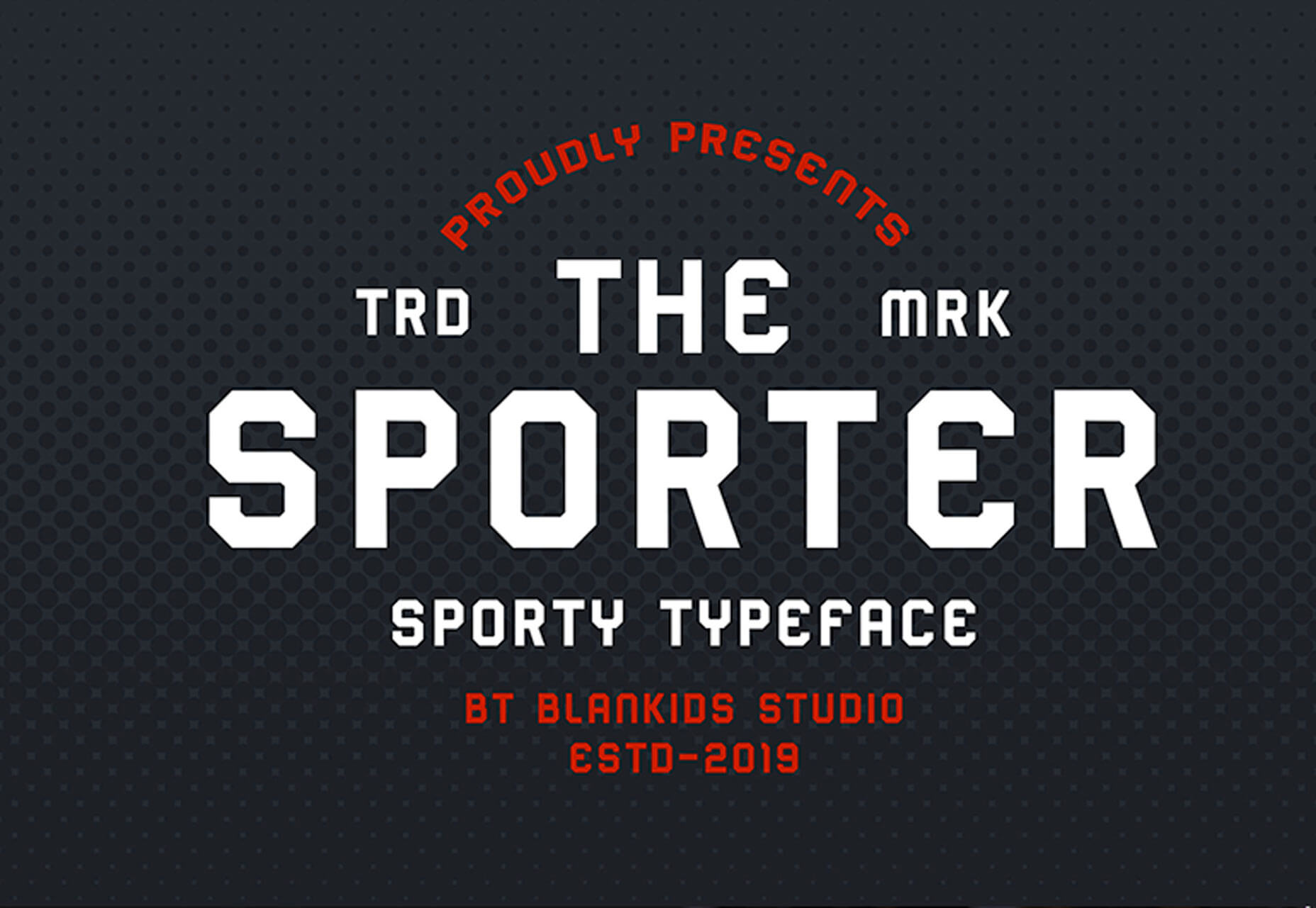
 While there aren’t as many new tools out there to play with right now, the ones available are a lot of fun. From tools to help speed up workflows and manage productivity, to creative gamification and funky typefaces, these new tools for designers will make you want to stick to your desk.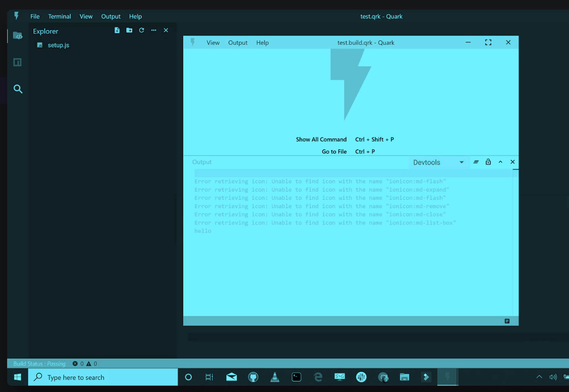
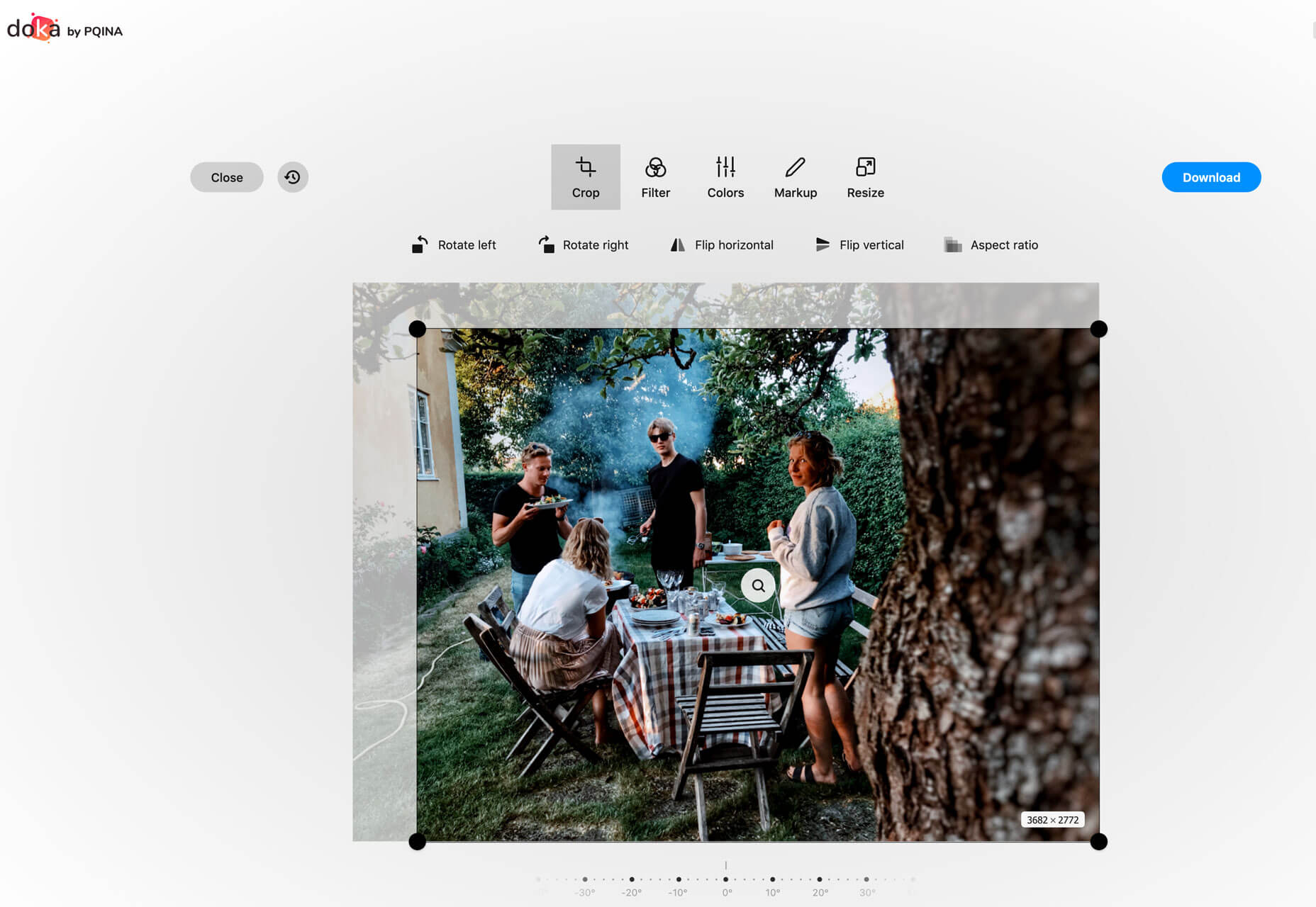
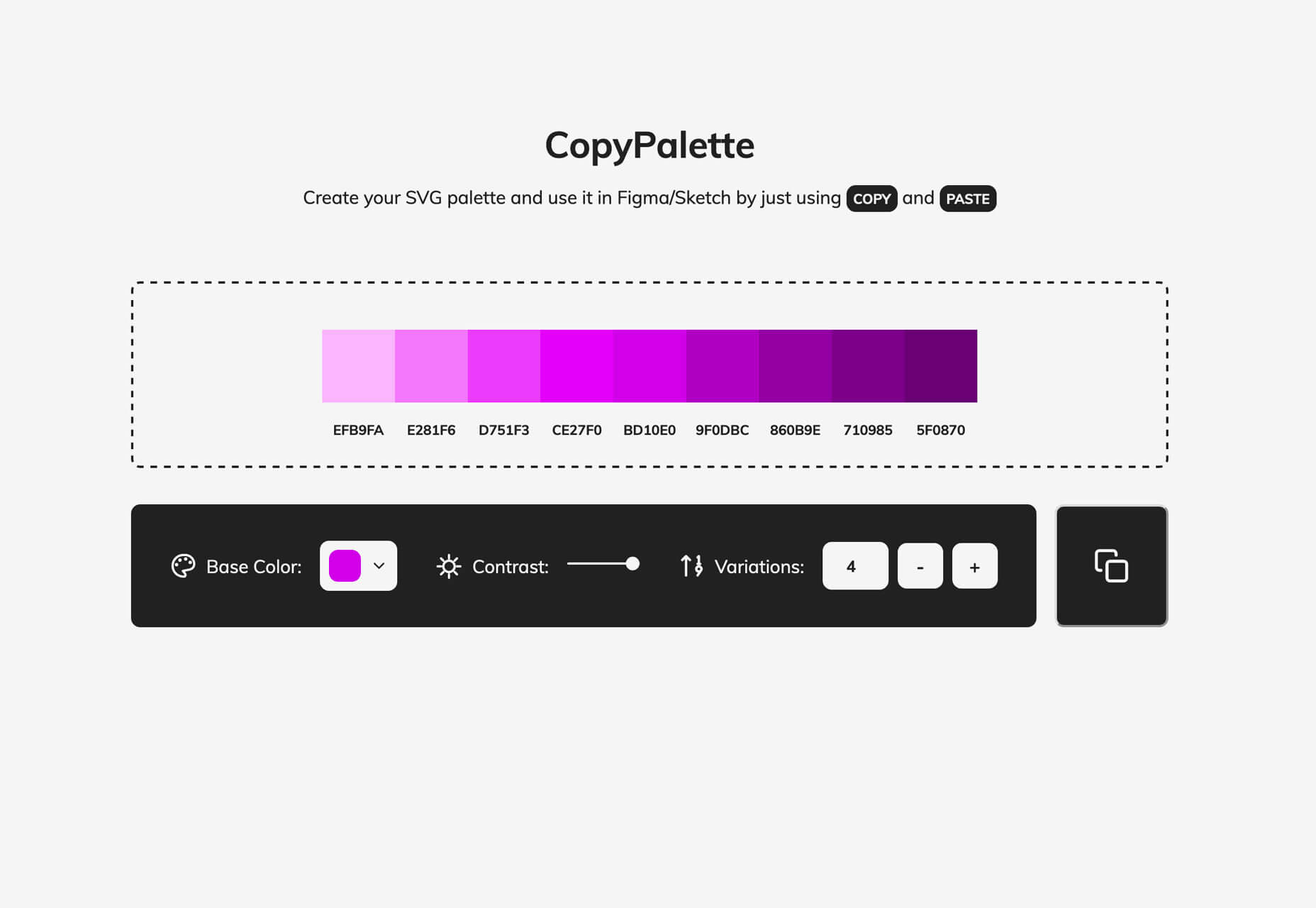
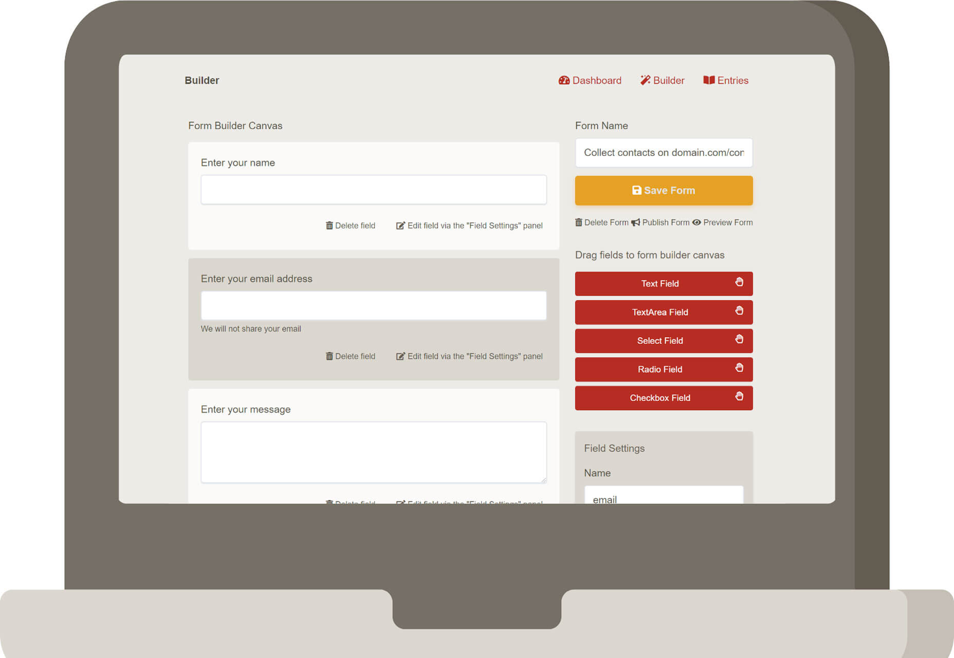
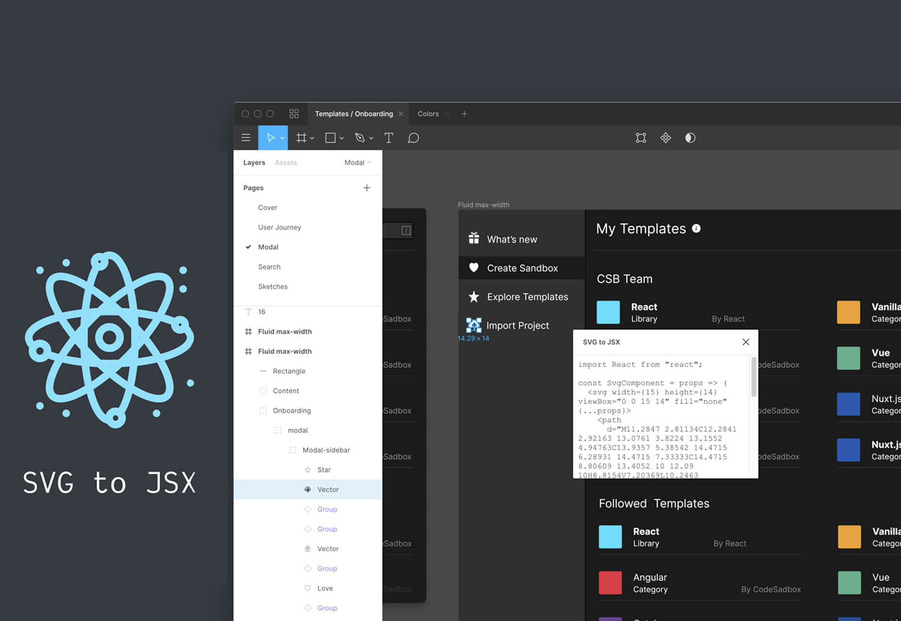



 Every week users submit a lot of interesting stuff on our sister site Webdesigner News, highlighting great content from around the web that can be of interest to web designers.