Friday, October 25, 2019

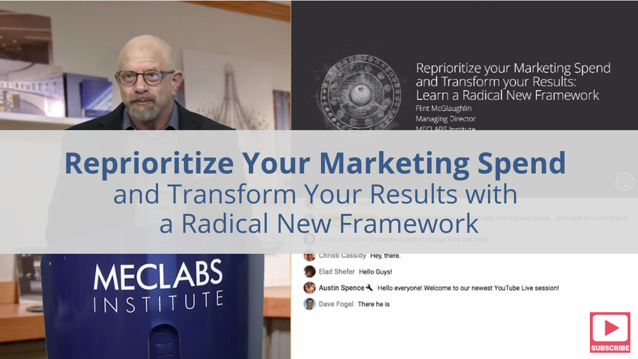
Reprioritize Your Marketing Spend and Transform Your Results: Learn a radical new framework

“Never solve a product problem with marketing. Screaming louder is not going to help your case very much. Make sure you have something to say before you say anything at all.”


— Flint McGlaughlin

(This article was originally published in the MarketingExperiments email newsletter.)

What if you cut your budget 60 percent but achieved four times the profit?

In this video, Flint McGlaughlin reveals a new heuristic for achieving more performance with less investment. He challenges the classic approach to budgeting, identifying serious errors in our rationale, and provides a methodical system for prioritization.

Whether you’re a small entrepreneur or the CMO of an enterprise, this series can help you optimize your marketing strategy, budget, and planning.

In this first part, you will learn:

• How reversing the direction of your spend can double its impact.
• How to use your value proposition as a force multiplier (maximizing the effectiveness of your media spend)
• How to pay for a web project with “found money” before you invest a dollar in development
• Why the structure of your agency and most vendor relationships is optimized for their gain and not yours
• Why we spend too much too fast on advertising, and how to reinvest the money to produce a stronger ROI

Here are some key points in the video:

  • 06:27 Better versus more
  • 12:27 The Marketing Priority Heuristic (thinking tool) explained
  • 19:40 Optimize your spend for mathematical impact
  • 23:40 Mathematical demonstration of how to maximize revenue by reprioritizing your expenditures
  • 40:29 How to use your value proposition as a force multiplier
  • 45:47 How much to allocate to media and testing
  • 48:00 Summary of an optimized spend sequence
  • 48:50 Why the structure of your agency and most vendor relationships is optimized for their gain and not yours
  • 49:29 Case study – Business software company

Related Resources

Marketing Research Chart: How are marketing departments allocating budgets?

Technology Investment Chart: High-revenue businesses prefer web marketing tech 13% more than low-revenue businesses

Marketing Budgets: Majority of organizations increasing landing page optimization budgets

Five Tips From a Personal Care Industry CEO for Setting (and Getting Approval for) Your Marketing Budget

Advice From Three Digital Marketing Experts on Building Your Budget

Omnichannel Marketing Chart: The biggest challenges to marketers’ omnichannel strategies

The post Reprioritize Your Marketing Spend and Transform Your Results: Learn a radical new framework appeared first on MarketingExperiments.

from MarketingExperiments https://ift.tt/35MsYdN


from WordPress https://ift.tt/2JhCImP

5 Unexpected UX Design Skills to Help You Level Up

Whenever a hiring boom like this happens, you have to consider how it could work against you. Sure, there are more job openings. However, that means that more UX designers (and designer wannabes) are going to come out of the woodwork, trying to snag up the highly coveted gigs.

So, let’s assume that you’re all starting from the same place: with the baseline skills UX designers are expected to have like empathy, user testing, and wireframing. How are you going to differentiate yourself from the lookalike UX designers who all promise to do the same thing?

You set yourself apart with additional and unexpected skills.

1. Information-Gatherer

There’s a lot of emphasis put on UX designers to be good communicators. But communication is a broad term that could refer to how designers collaborate with their teams, discuss results with clients, or conduct user testing.

Ask the right questions the first time

With user input playing such a critical role in the decision-making process, it’s a good idea for UXDs to drill down even further into their skillset. Being able to conduct successful user or client interviews as well as formulating questionnaires and surveys is just as important.

Ask the right questions the first time and you’ll find it becomes easier to move all the pieces into place as you build or refine an experience.

2. Feedback Wrangler

There’s no such thing as a one-man team in UX design. You have to collaborate with UI designers, UX writers, coders, marketers, clients, and users. Which means you need to be an adept feedback wrangler if you want to succeed in this role. That goes both for handing out feedback as well as receiving it.

This also means becoming efficient in feedback wrangling because not only will you give and receive it in person, it’ll be coming through a variety of channels, too. So, being able to organize and give proper priority to feedback and communication within your team and with others will be incredibly important.

3. Emerging Technologist

It’s one thing to be a skilled UXD in this day and age. It’s another thing to be able to make a lifelong career out of it, which means always having your eye on what’s coming down the road.

45% of managers said they’ll be hiring UX designers with VR skills

As you know, technologies and trends are always changing. If you get stuck in one place, it’s going to be mighty hard to find work as a designer when your peers have made the pivot.

So, one thing you should pay close attention to in the coming years is emerging technologies like AI, machine learning, AR, and VR. In that Adobe report cited earlier, 45% of managers said they’ll be hiring UX designers with VR skills and 37% will hire AR-skilled designers over the next few years.

4. Ethical Designer

One of the problems you might run into with designing apps is the matter of ethics. Specifically, the kinds of apps that see users engage with them over long stretches (like games) or repeatedly throughout the day (like social media).

Yes, you want to design the perfect experience that inspires users to regularly engage with your app. But do you want it to be such an addictive experience that it becomes detrimental to their health?

As tech addiction and sleep deprivation caused by improper use of technology become greater issues in our society, UX app designers may need to adopt more ethical approaches to their work.

5. Cross-Disciplinarian

One of the skills UX designers are most commonly associated with is empathy. But that usually means having such a deep understanding of what your users want so that you may design the right experience for them. What about empathy for the people you work with though?

If you think about it, the decisions you make affect your teammates. You design an experience that the UI designer then has to visualize. Or that your UX writer has to put words to. Or that your coder has to translate into something usable for the web. Is it fair to design an experience without understanding the actual work it takes to make it a reality?

If you haven’t dabbled in CSS or JavaScript, if you haven’t done any writing recently, if you haven’t been involved in the marketing of websites you build, it might be a good idea to get your hands dirty now. Not only will it give you a better understanding of how everything fits together, it will allow you to design experiences that don’t constantly test the limits of what your team can do.

Use Your Unexpected UX Design Skills to Level Up

It is, of course, important to master the baseline set of skills as a UX designer. Without that solid foundation, additional skills above won’t be able to give you much assistance in your race to the top. That said, if you are already a skilled UX designer and you’re ready to level up, these unexpected UX design skills could give you what you need to edge out the competition.


Featured image via Unsplash.

Source

p img {display:inline-block; margin-right:10px;}
.alignleft {float:left;}
p.showcase {clear:both;}
body#browserfriendly p, body#podcast p, div#emailbody p{margin:0;}

from Webdesigner Depot https://ift.tt/340uHuo


from WordPress https://ift.tt/2BIW5ku

Wednesday, October 23, 2019

How to Add Sound to Your Site, Without Infuriating Users

Once in a while, every professional comes across a challenge so great, so ridiculous, that they just can’t help themselves. They just have to go for it. It’s like the story of David and Goliath… if David was just bored and Goliath wasn’t threatening his entire nation. As for me, I’m about to argue for putting sounds on a website, and discuss how to do it right.

Yeah, I know… I’m one of the “Never Ever Autoplay Sounds on Your Site” people. Even so, here we are. And I’m not going to cheat by talking about embedded video, podcasts, or Soundcloud wrappers. I’m also not going to talk about background music or even just ambient background sounds, because all of those are still evil, in my opinion.

Even looking for examples about sites with sound done right is nigh-impossible, because all of the search results are either music-focused examples, or articles about how you should never, ever use sound.

But as much as it rankles me to admit it, there are cases for adding sound to your websites and apps…on occasion…in very specific cases…look, I will not be held responsible for any customers you might lose, okay? This is an intellectual exercise, and it should go without saying that whatever you do, there should be a way to turn it off forever.

The Case for Adding Sound

Notifications and Alerts

Few things let you know that you should be paying attention like a fairly high-pitched noise. Teachers have their fingernails on the chalkboard, phones have their ringtones, and cats and babies use very similarly pitched sounds specifically to drive us mad/get what they need from you. Interface and product designers made use of this principle long before personal computers were even a thing. It’s effective.

I think these are only acceptable for chat conversations, or for notifications that users specifically request. When you’re waiting for information, and you need to pay attention the moment it arrives, an alert sound might well be appreciated.

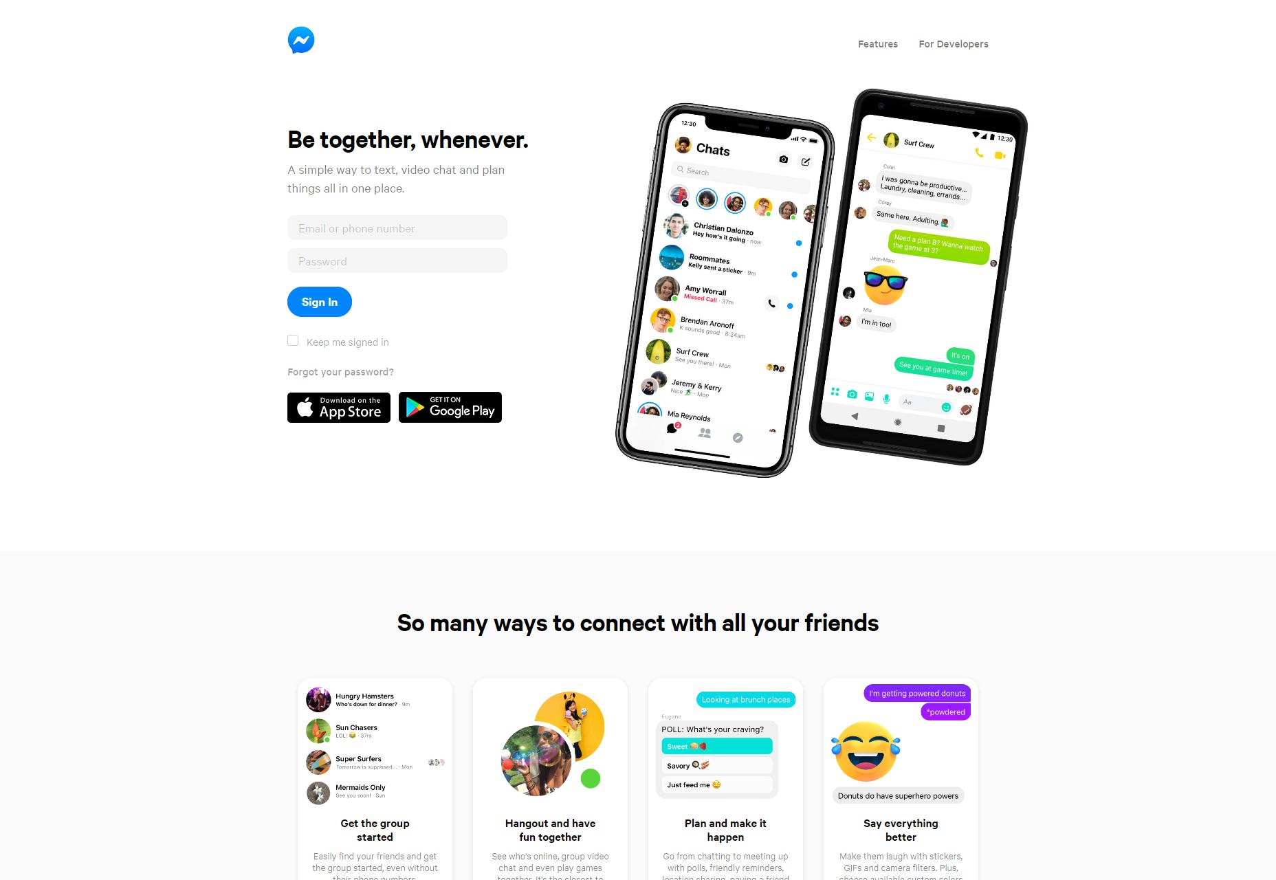
Examples include everything from Facebook Messenger and Slack, to news aggregators, to dating apps of all kinds.
Success Alerts

One pattern we might use a little more in our web and app design is actually a little bit of sound to tell people things went right. Those of us gamers, at least, often have fond memories of victory music that played every time you won a battle, or completed a level. If you can find a short “success” sound that evokes nostalgia and a dopamine hit instead of just annoying people, you may have a winner.

Accessibility Enhancement

Alert sounds are all well and good, but what about using the power of audio to help people with, say, sight problems? Sure, there are screen readers and such, but if you know that a large portion of your user base have vision problems, you might consider giving them optional audio cues to make things easier.

Think of “clicking” sounds on buttons, a tone that changes pitch when you use click and drag on a slider, a general sense of haptic feedback that might usually be represented by animation. To people with poor vision, sound is a very useful form of skeuomorphism.

Artistic Experiments

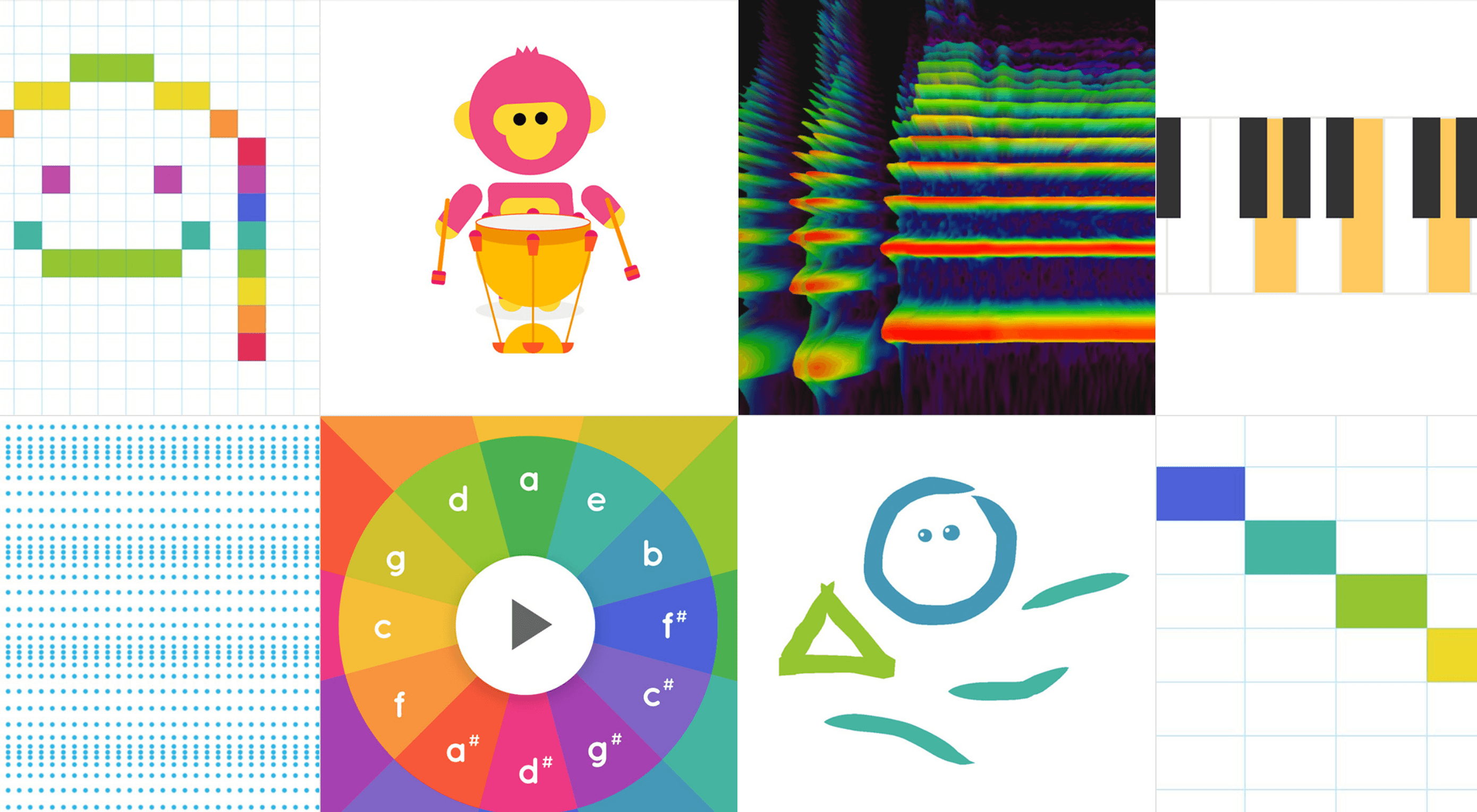
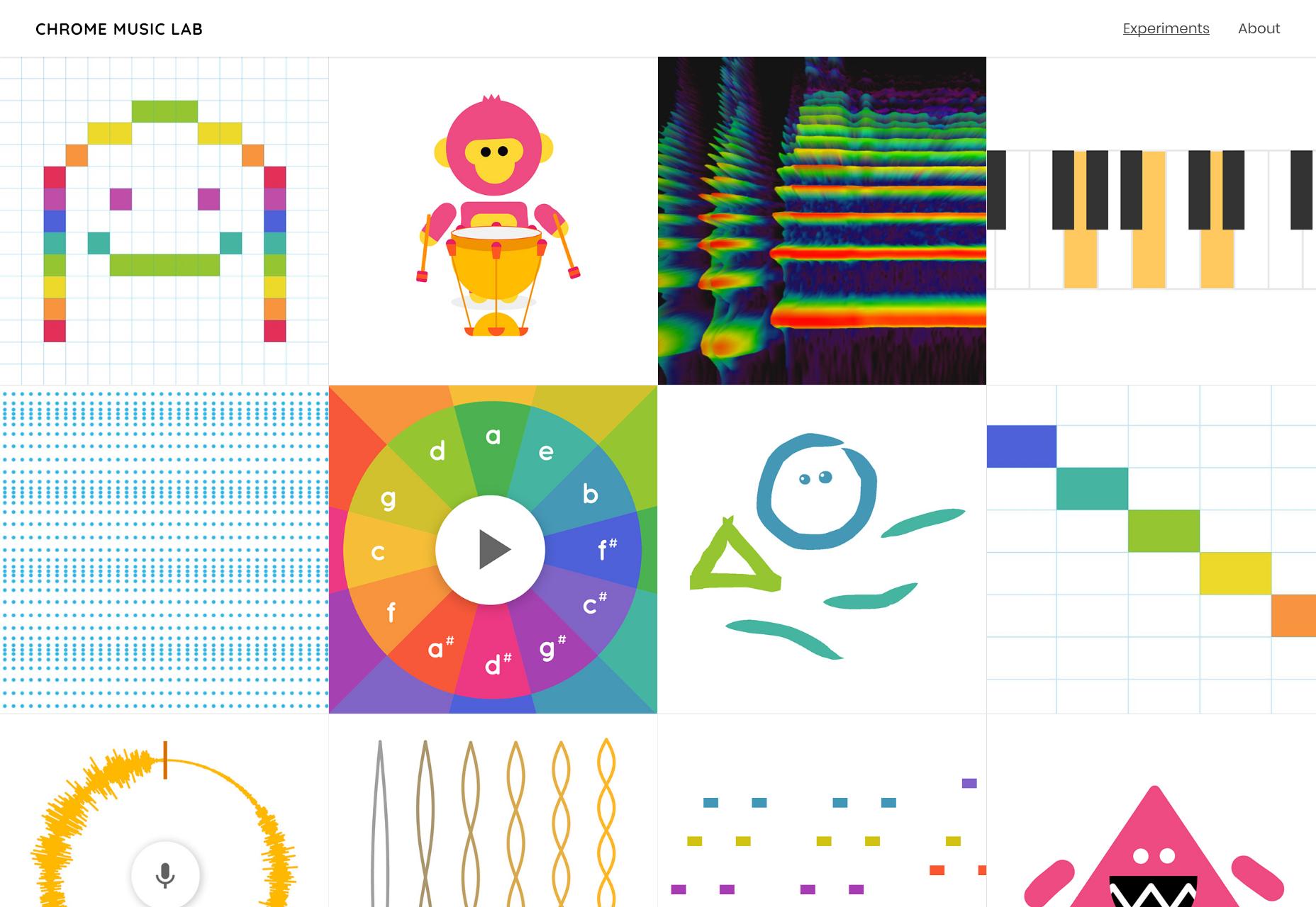
And then, of course, we have the sort of thing that might be in the “experimental” section of your portfolio, or on your CodePen profile. Here’s a site full of them: Chrome Music Lab.
General Tips for Implementing Sound

Actually Playing the Sounds

JavaScript is sort of the only way to do it. Sure, you can just embed a sound with HTML5, but that will only provide you with an audio player. If you’re trying to integrate sound into your UI in a more functional way, JS is the only way to do it. I mean, sure, technically we still have Silverlight, but who’s going to go back to using plugins?

If you’ve never intentionally added sound to your own page before, or just aren’t that familiar with JS, here’s how to play a sound on click. Now, that’s all well and good, but what if your users are having trouble finding the buttons to click on them in the first place? You might want to look at this tutorial from CSS-Tricks about how to play sound when someone hovers over an element.

You Still Have to Try Not to Annoy People

Always, always, always give people a way to shut sounds off, for good. The next question is, of course, whether you should have sound on by default. My vote? No… well, in most cases. Again, if you expect to have a lot of visually impaired people on your site, you might consider making sounds play by default, and putting in a big “You can turn these sounds off off, please don’t run away!” notice front and center.

And Lastly…

Sound files can, depending on their quality, hit people real hard, right in the bandwidth. Use a CDN for your bandwidth, and cache the heck out of any sound files for the sake of your users’ bandwidth. Next, have a look at at Aural style sheets, and think real hard about how your site is presented to screen readers.

And would you look at that? I’ve just about convinced myself that sound on the Internet is a good idea. I should probably stop, now.

Source

p img {display:inline-block; margin-right:10px;}
.alignleft {float:left;}
p.showcase {clear:both;}
body#browserfriendly p, body#podcast p, div#emailbody p{margin:0;}

from Webdesigner Depot https://ift.tt/2BzZ9zj


from WordPress https://ift.tt/2N9l3ip

Tuesday, October 22, 2019

Hi, I’m Neil Patel, Co-founder of NPDigital. Ask Me Anything!

Today, I thought I would do something a bit different, as 66.9% of my website traffic is brand new.

For those of you who don’t know, my name is Neil Patel and I’m
the co-founder of a digital marketing agency called, NPDigital, where we help companies of all
sizes get more traffic and sales.

I’ve been an entrepreneur for roughly 18 years now and most
of the companies I co-founded have been in the software arena, specifically the
web analytics sector.

And now, I’m back at it with Ubersuggest, my latest software
company.

In addition to that, I’ve angel invested in dozens of companies. Some have done well, and others haven’t.

Overall, I’ve been blessed with a few successes that have
made up for my failures plus more.

So today is your day to ask me any questions you have, and I will do my best to answer it. You can ask me about entrepreneurship, marketing, or anything else. I’ve dealt with class-action lawsuits, an FTC investigation (which I passed), and I’ve lost out on acquisitions from Fortune 1000 companies because of stupidity on my part.

All I ask of you is. Please keep your question as short as possible. One to two sentences max as I will get hundreds of comments (potentially even 1,000 or more).

So, what can I answer for you?

The post Hi, I’m Neil Patel, Co-founder of NPDigital. Ask Me Anything! appeared first on Neil Patel.

from Blog – Neil Patel https://ift.tt/31wYN76


from WordPress https://ift.tt/32CrsZD

Monday, October 21, 2019

Introducing 15 Best New Portfolios, October 2019

All the signs are that web design is entering a phase of exuberance, with clashing colors, rapidly changing graphics, and dense layouts replacing the minimalism that’s dominated digital design for the last decade. Portfolios are beginning to adopt this maximalist approach, but never fear, for those who aren’t quote ready for full-on retina burn on a Monday in late October, we’ve included a few beautifully minimal sites for you to enjoy.
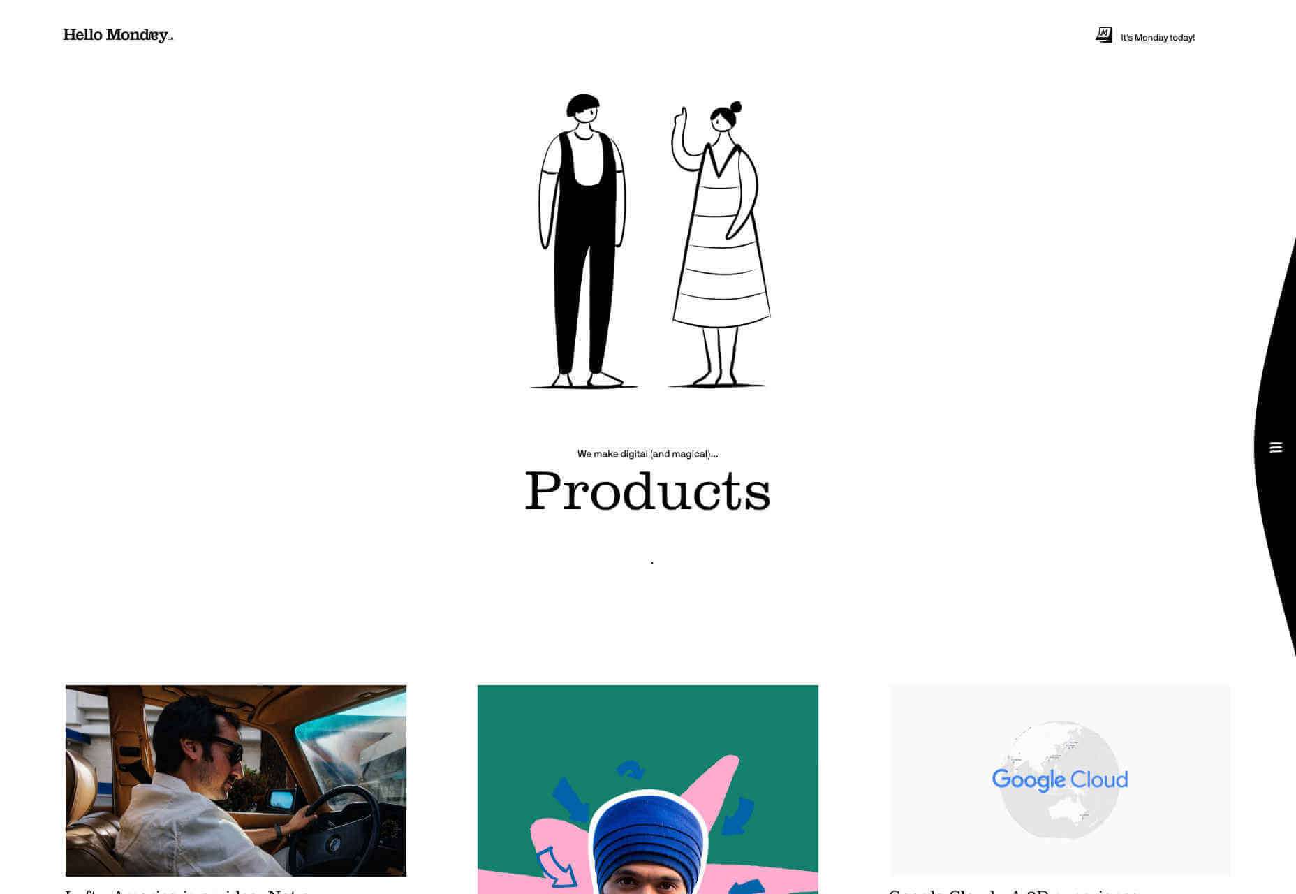
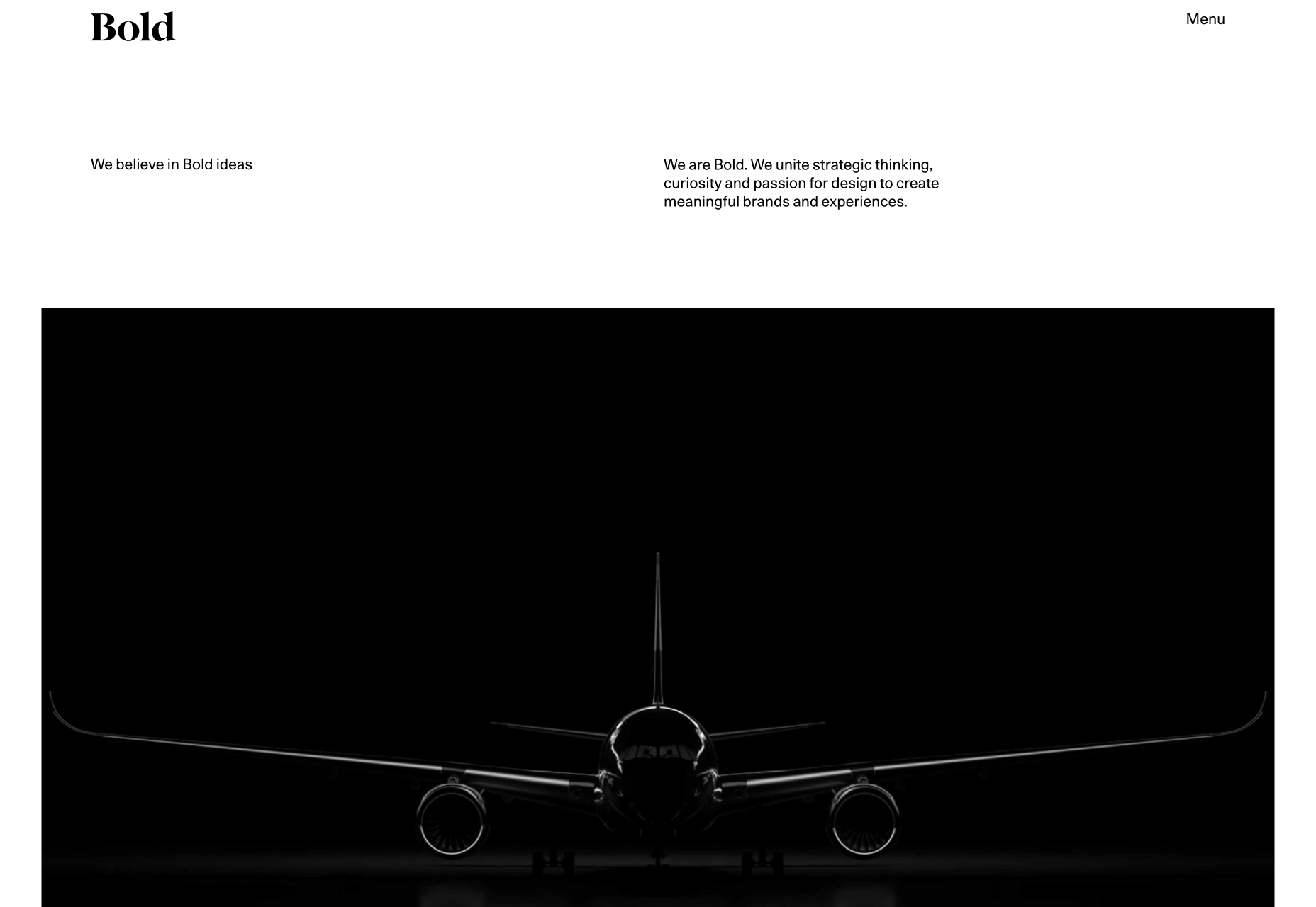
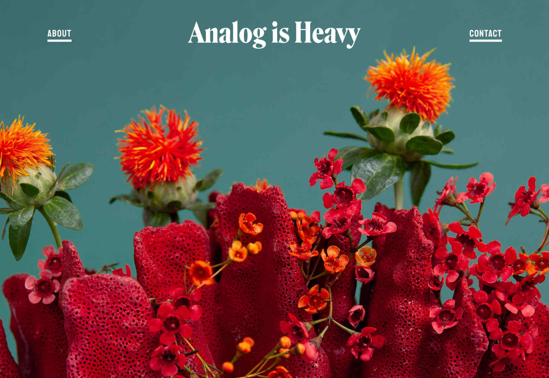
Hello Monday

Hello Monday’s site is utterly charming, with a delightful animation that I could watch for hours. The work section of the site is a masonry-style vertical grid, which is less easy to browse than you would expect, thanks to the number of projects. The best parts of this site are the little details: I love that they tell you how many days it is until Monday, and the way that hamburger menu slips away as you scroll is super-slick.

Bold

Bold’s portfolio is about sending a powerful message. It’s the website equivalent of huge shoulder pads, and an enormous, solid gold smartphone. The way the border expands from the featured images, giving you the sense of zooming into the project is inspired. It helps to have huge-name clients as social proof, but this site is excellent at inspiring confidence in the designers behind it.

Analog is Heavy

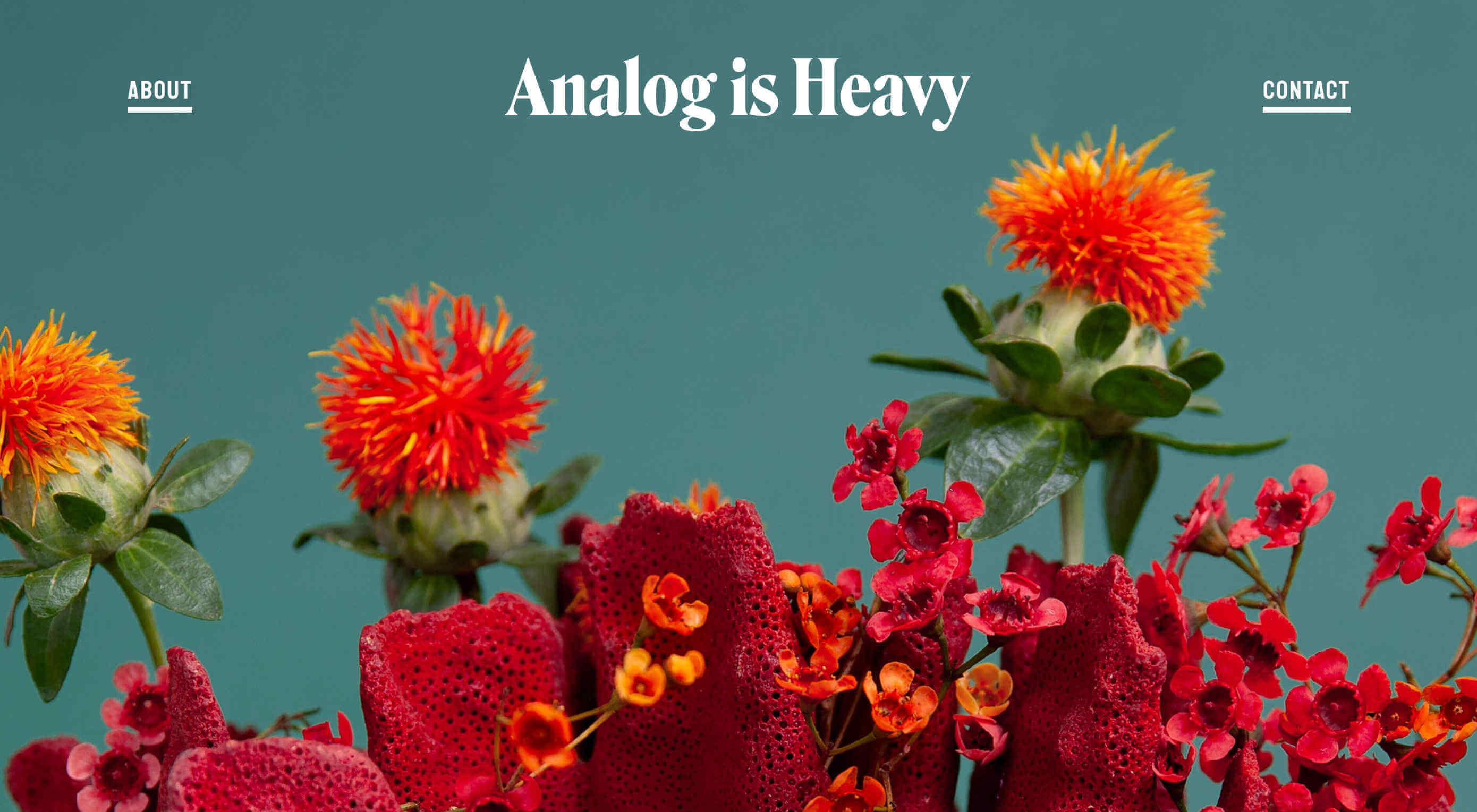
Analog is Heavy is a creative photography practice that works with design studios to hone brand messages with high-quality product photography. Its approach to a portfolio is a vertically aligned grid of images, and that’s it. Targeting design agencies means that they’re speaking to an audience of visually educated professionals, giving Analog is Heavy the freedom to let its work sell itself.

Athletics

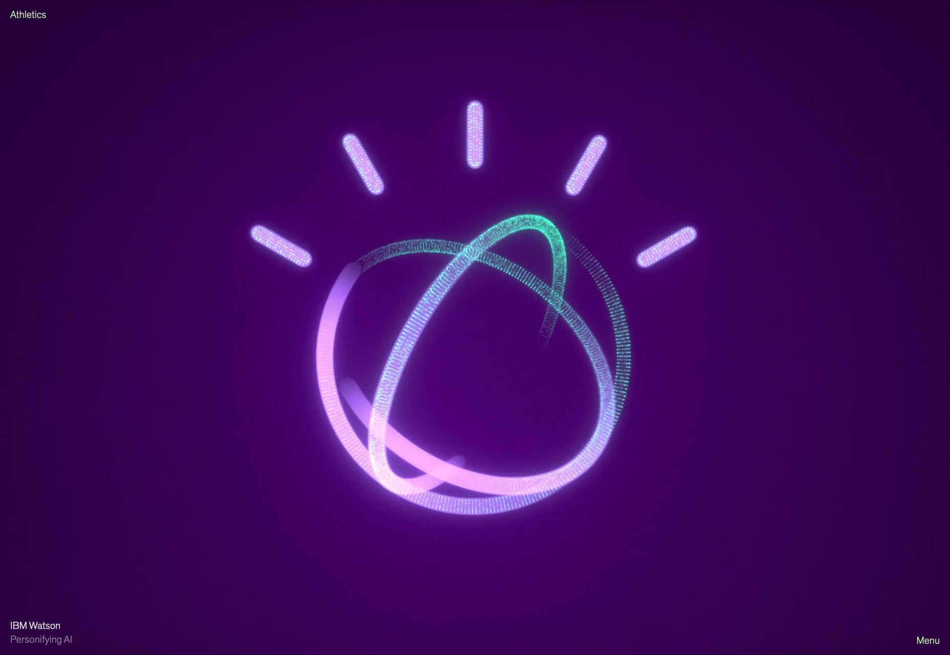
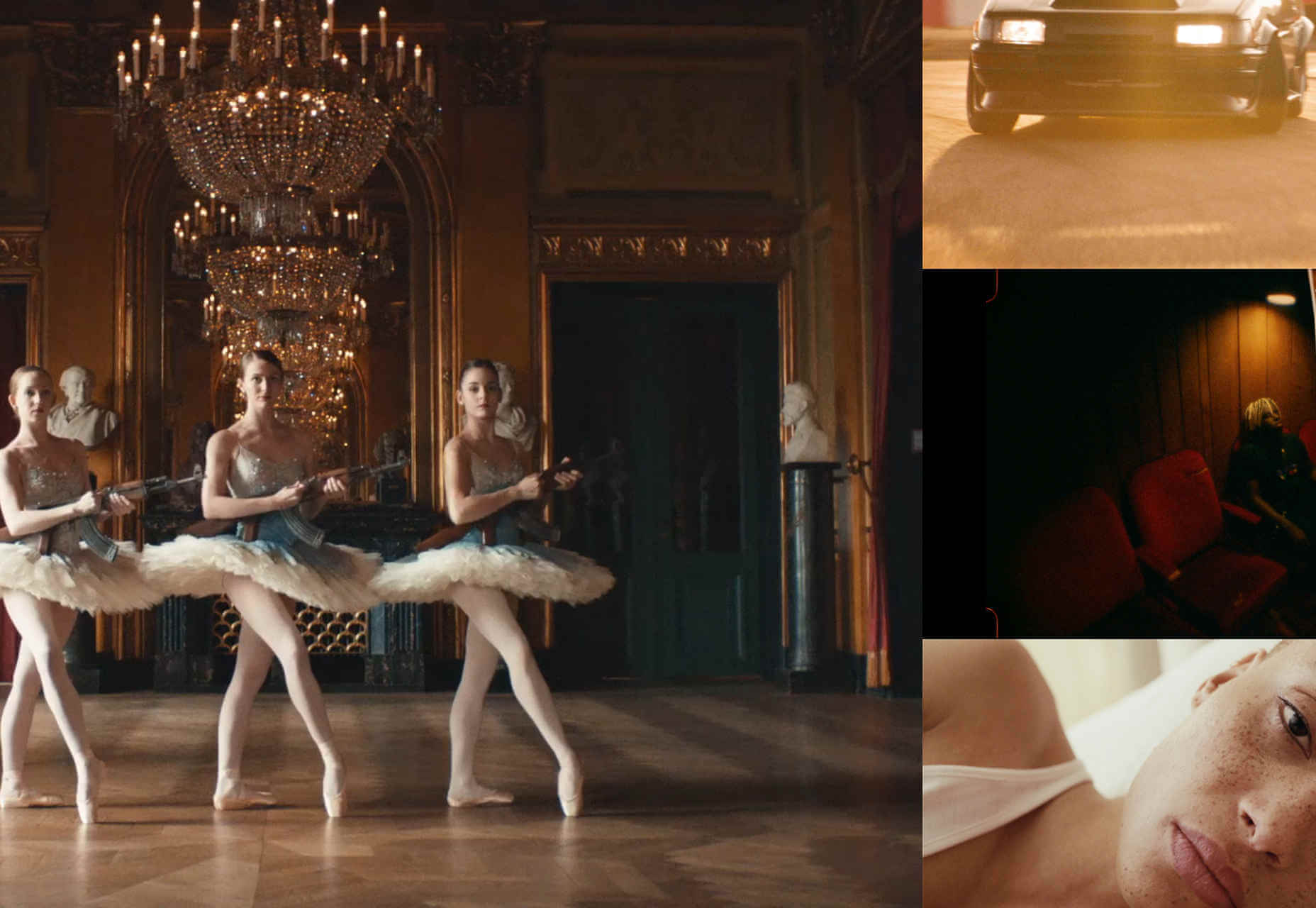
Another big agency, with a client list to kill for, Athletics jumps right into fullscreen video case studies of its work for clients like IBM. One trend with many of these portfolios is that work is cherry-picked to be showcased and then less-exciting work is linked to below the initial presentation. In Athletics’ case this means an interesting grid of lower-profile, but equally exciting work.

Brittany Chiang

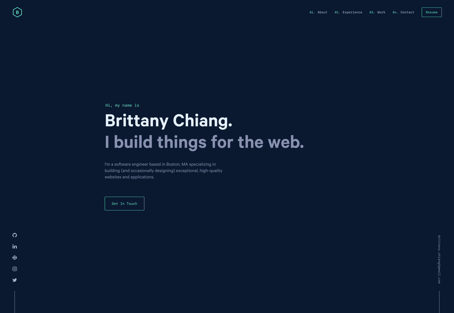
Brittany Chiang builds things for the web. How’s that for a no-nonsense approach? This great little site feels very app-orientated thanks to the dark-mode color palette and the monospaced typeface. Its a single-pager, which are increasingly rare these days, and the simplicity of it works really well. Brittany has out UXed plenty of dedicated UX designers, by being true to herself.

Shohei Takenaka

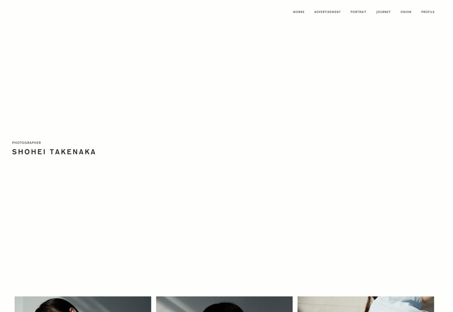
As the web drifts towards maximalism, it’s great that there are still calm, simple, minimalist masterpieces to admire. Shohei Takenaka’s site is beautiful, with restraint, attention to detail, and ample whitespace. The subtle underlines on the menu text, and the images protruding into the white space to encourage scrolling, as well as the way the color bands are grouped when you scroll, are all perfect examples of clever UI design.

Aristide Benoist

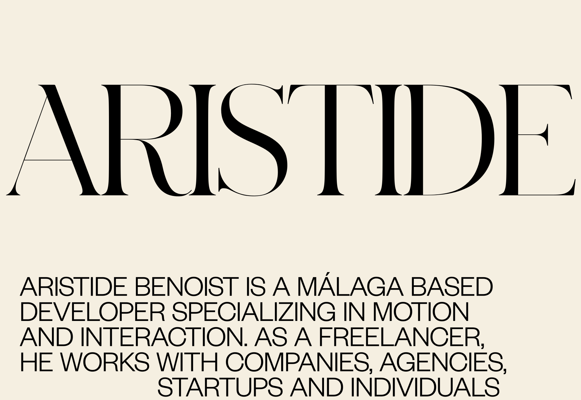
Aristide Benoist’s portfolio features some beautiful typography. It’s great to see a developer take an interest in the finer points of design. The all-caps sans-serif text is a little too much to cope with in large amounts, but here it works just fine. My favourite part of the site is the transition from thumbnail to case study. Hover over the list of projects and a little flag-like ribbon will appear, click on it and it expands into a full project image, delightful!

WTF Studio

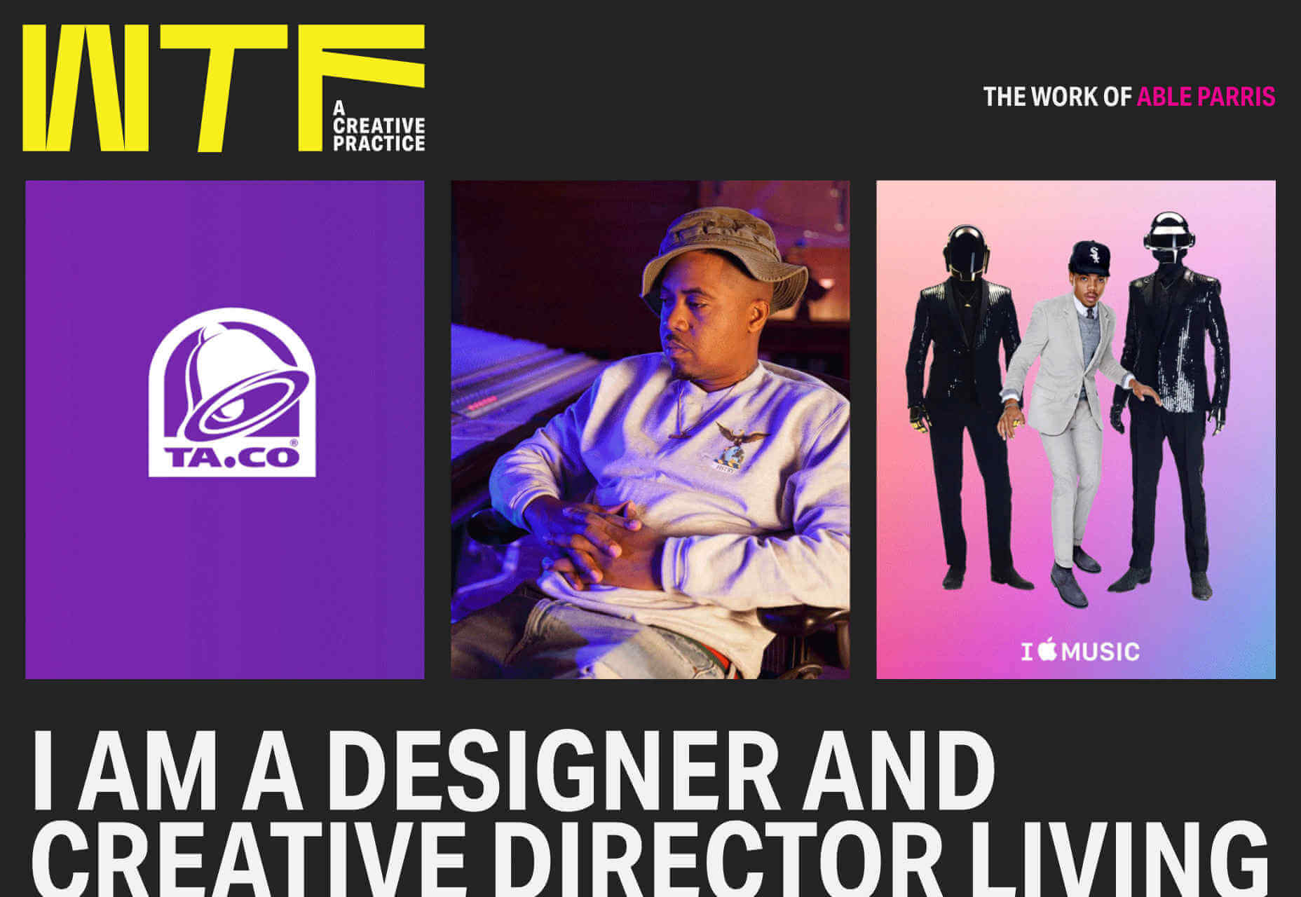
WTF Studio’s portfolio is as in-yer-face as the name suggests. A front for NYC-based creative director Able Parris, the site slaps you in the eyes with color and animation the moment it loads. But scroll down past the anarchic introduction and you’ll find a series of projects for household names presented as individual case studies. It’s exactly what big brands like to see: creativity and safe hands.

Jim Schachterle

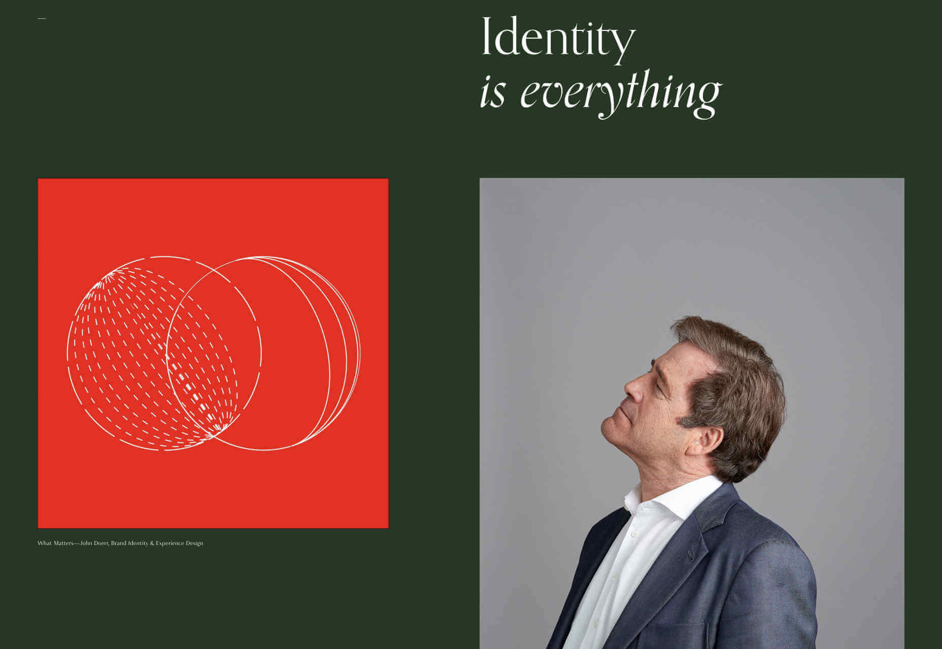
Jim Schachterle’s site takes an approach that we don’t normally see: he’s opted for a dark green background. That simple choice, alongside the carefully paired project shots make for a sophisticated, and distinct style. Unfortunately the choice of typeface doesn’t work in places, at 12px the detail in the design is lost altogether, swapping it out for a simpler sans-serif whenever the font-size was under 18pt would have been a better choice.

Swwim

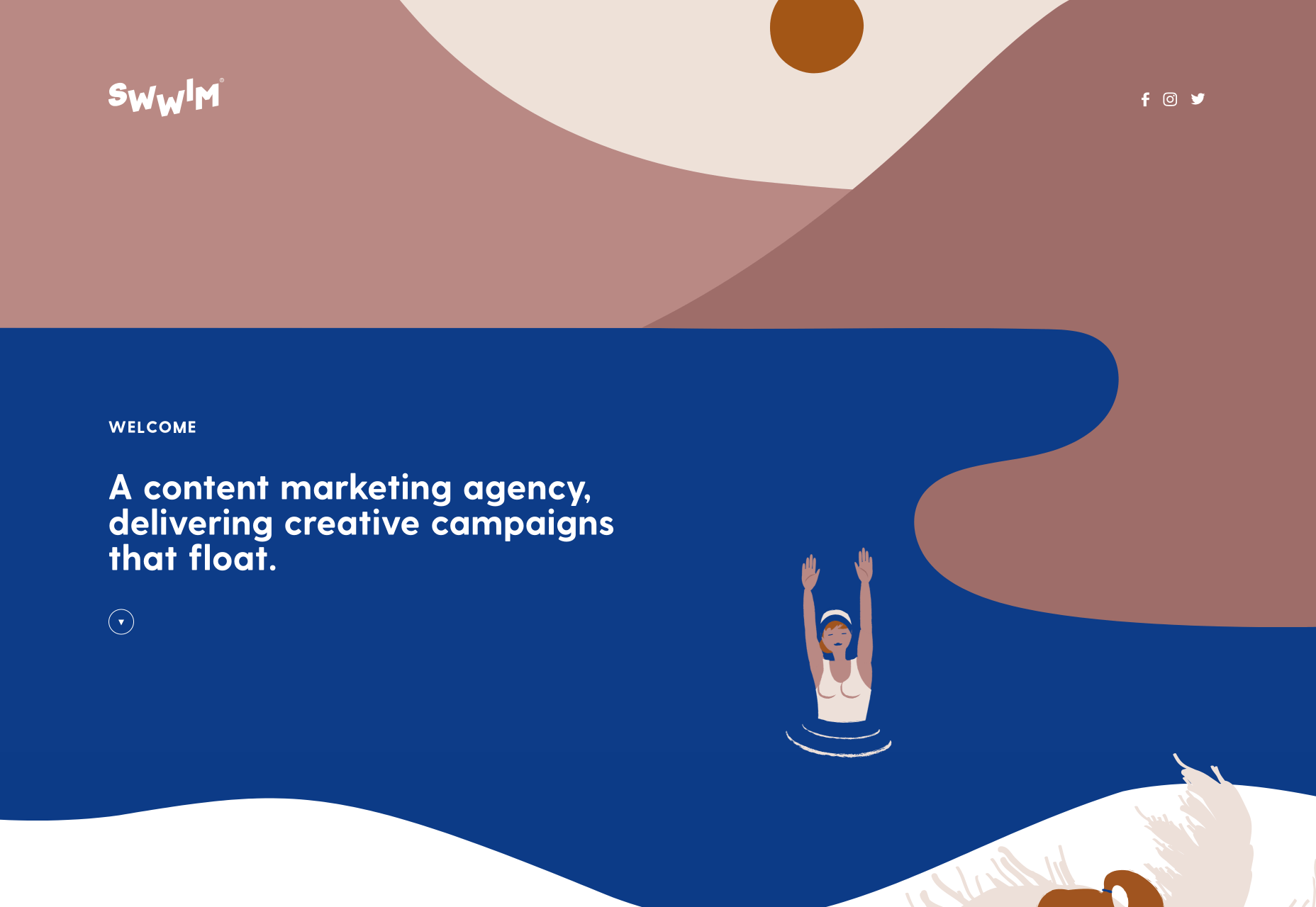
Perhaps it’s the chilly Northern climate at this time of year, but this Saint-Tropez looking site for Swwim warms my heart. The rounded sans-serif is an interesting choice — most designers would aim for sharp lines to emphasize precision. I adore the logotype, and its frivolity is echoed throughout the site in section titles. The less-subtle animation feels a little forced, but the wave motion is enticing, and brand-appropriate.

Hadrien Mongouachon

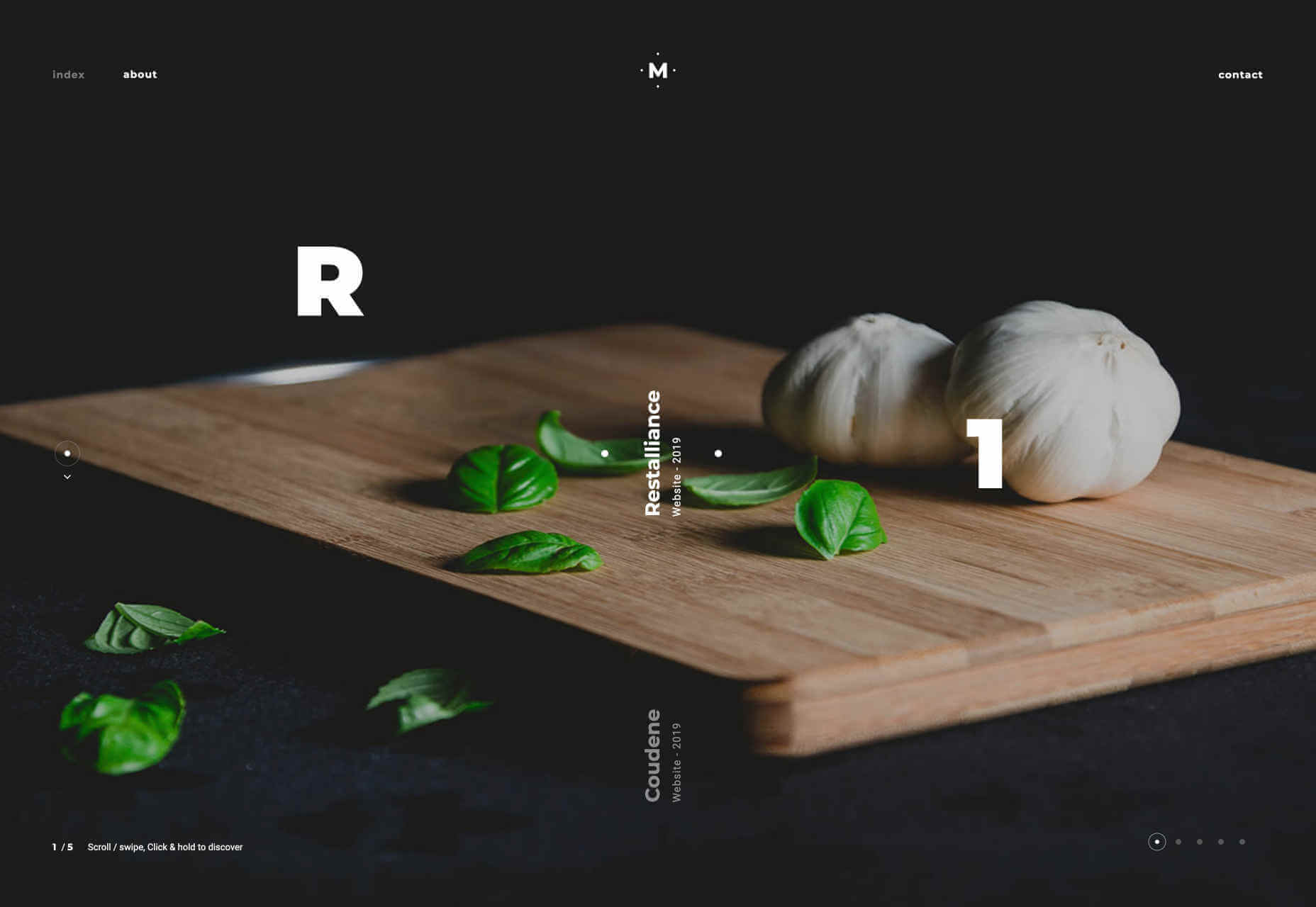
Hadrien Mongouachon is a freelance developer, so it makes perfect sense for him to demo his skills front and center on his site. He’s opted for a variation of the highly-trendy liquid effect, and it works really well. I’m not convinced by the sideways type — it only works in print because you can tilt the page — and the usability is a little compromised by the click-hold action. Once you’re accustomed to the site, it’s fun to traverse.

Butchershop

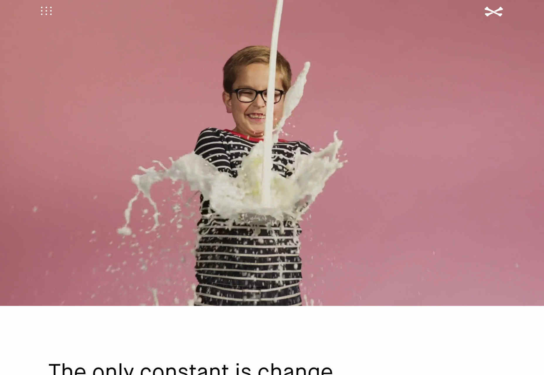
Butchershop is another design agency relying heavily on a video reel to sell its brand work. What’s really interesting about this site, is all the things it does “wrong”: the logo mark is positioned top right instead of top left, the title of its homepage is “Home”. It keeps breaking with received wisdom, so either they know something we don’t, or they didn’t get the memo about UX being a thing — you decide which.

Nikolas Type

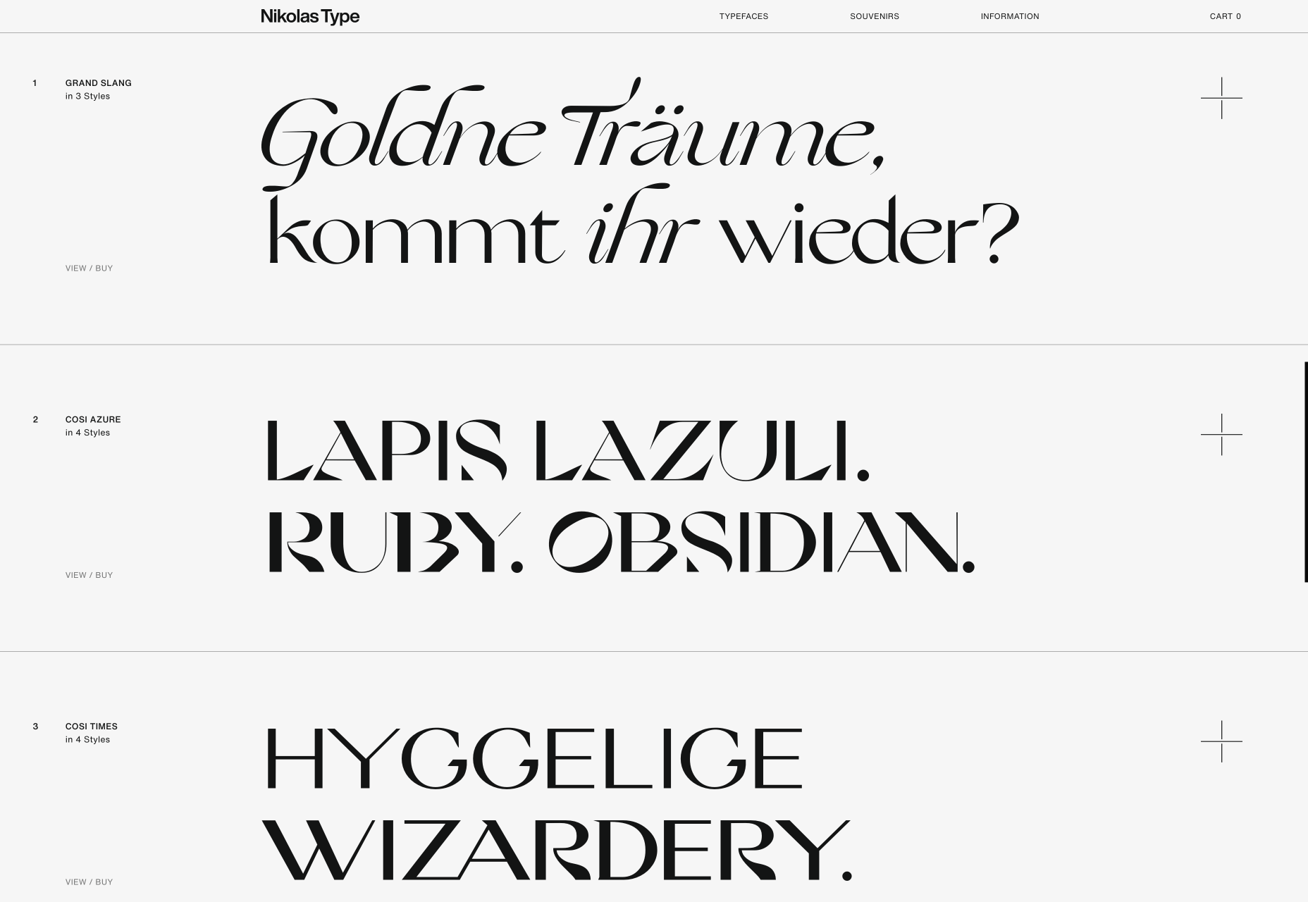
It’s rare that we get to enjoy a purely type-based portfolio, because design work is visual, but this minimal showcase is Nikolas Wrobel’s Type Foundry, Nikolas Type. Click through to the product pages and you can edit the preview text. Thanks to the foundry being a small independent, it’s able to show some lovely samples that bring the type to life, something that larger foundries often fail to do.

Jam3

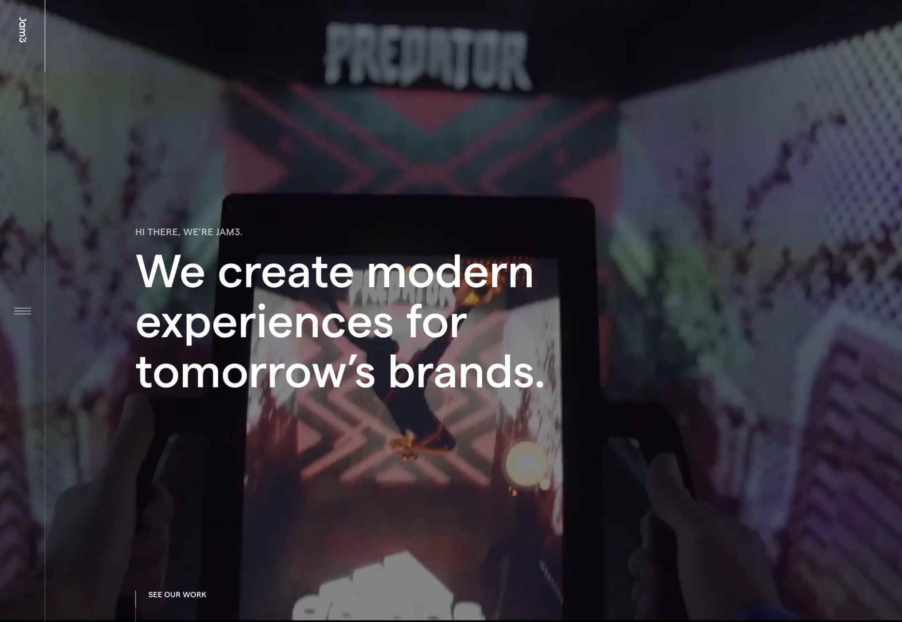
It seems video (not static images) are now a must for any portfolio site. Agencies want companies to see real-world experiences, and understand what the working relationship is like. Jam3 is no exception, but scroll past the looping video and you’ll find a rigorously organized set of projects. The menu isn’t easy to locate, but I do like agencies opening up about their approach, and culture. Plus there’s a cool bubble effect hovering over the menu items.

New Land

There’s a tendency among motion graphics and video firms to be slightly mysterious about who they are, and what they do — perhaps it comes from the high-concepts of advertising. New Land’s target audience probably do know who it is, because this is the kind of company that you don’t hire without some prior-knowledge. Interestingly the site is geared around tablet and mobile preferred interactions, as if intended to be passed around a meeting.

Source

p img {display:inline-block; margin-right:10px;}
.alignleft {float:left;}
p.showcase {clear:both;}
body#browserfriendly p, body#podcast p, div#emailbody p{margin:0;}

from Webdesigner Depot https://ift.tt/32yugat


from WordPress https://ift.tt/2P8mO1M

Sunday, October 20, 2019

Popular Design News of the Week: October 14, 2019 – October 20, 2019

Every week users submit a lot of interesting stuff on our sister site Webdesigner News, highlighting great content from around the web that can be of interest to web designers. 
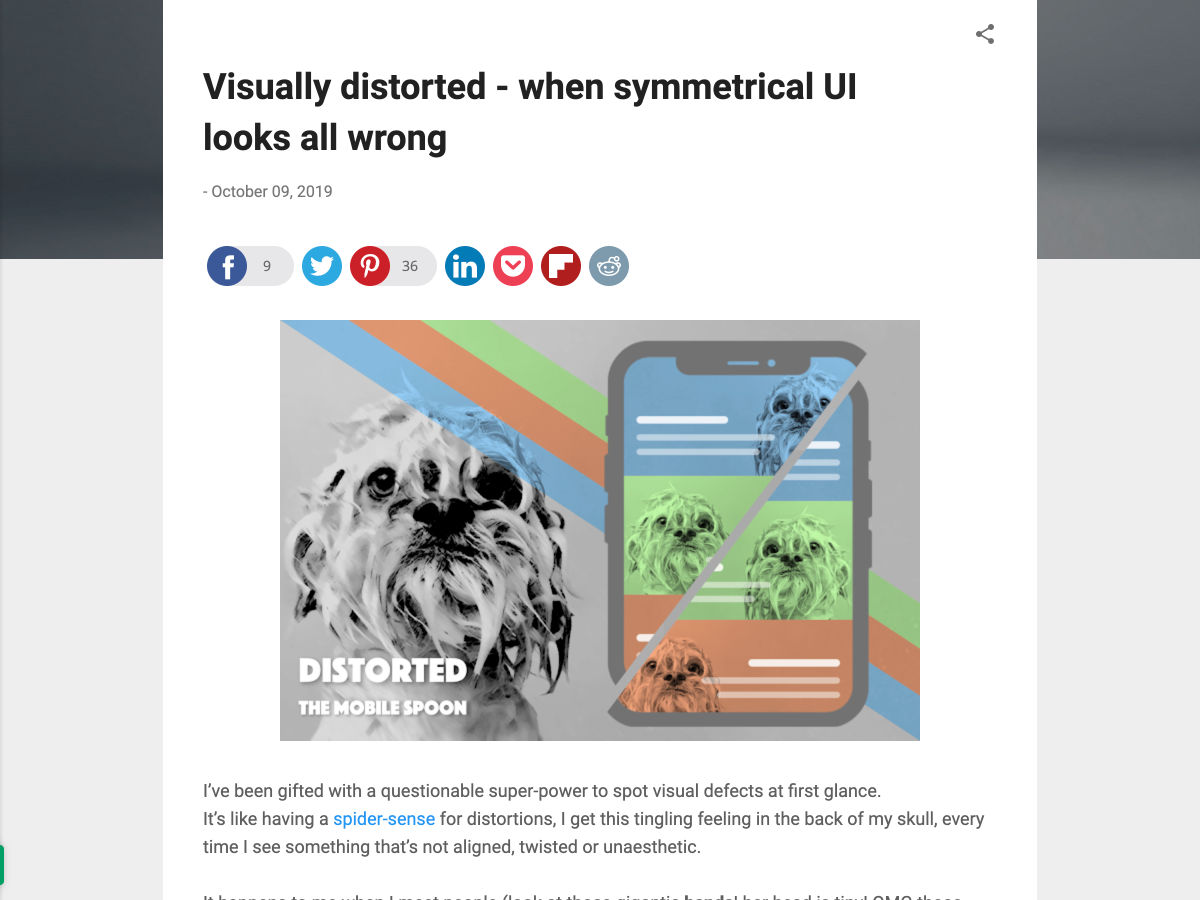
The best way to keep track of all the great stories and news being posted is simply to check out the Webdesigner News site, however, in case you missed some here’s a quick and useful compilation of the most popular designer news that we curated from the past week.

Note that this is only a very small selection of the links that were posted, so don’t miss out and subscribe to our newsletter and follow the site daily for all the news.

Visually Distorted – When Symmetrical UI Looks all Wrong


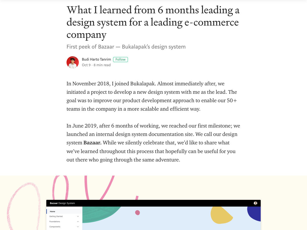
What I Learned from 6 Months Leading a Design System


10 Small Design Mistakes We Still Make


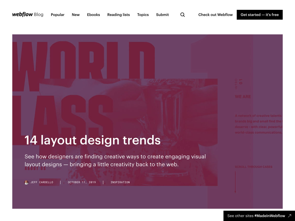
14 Layout Design Trends


Culrs Mac App


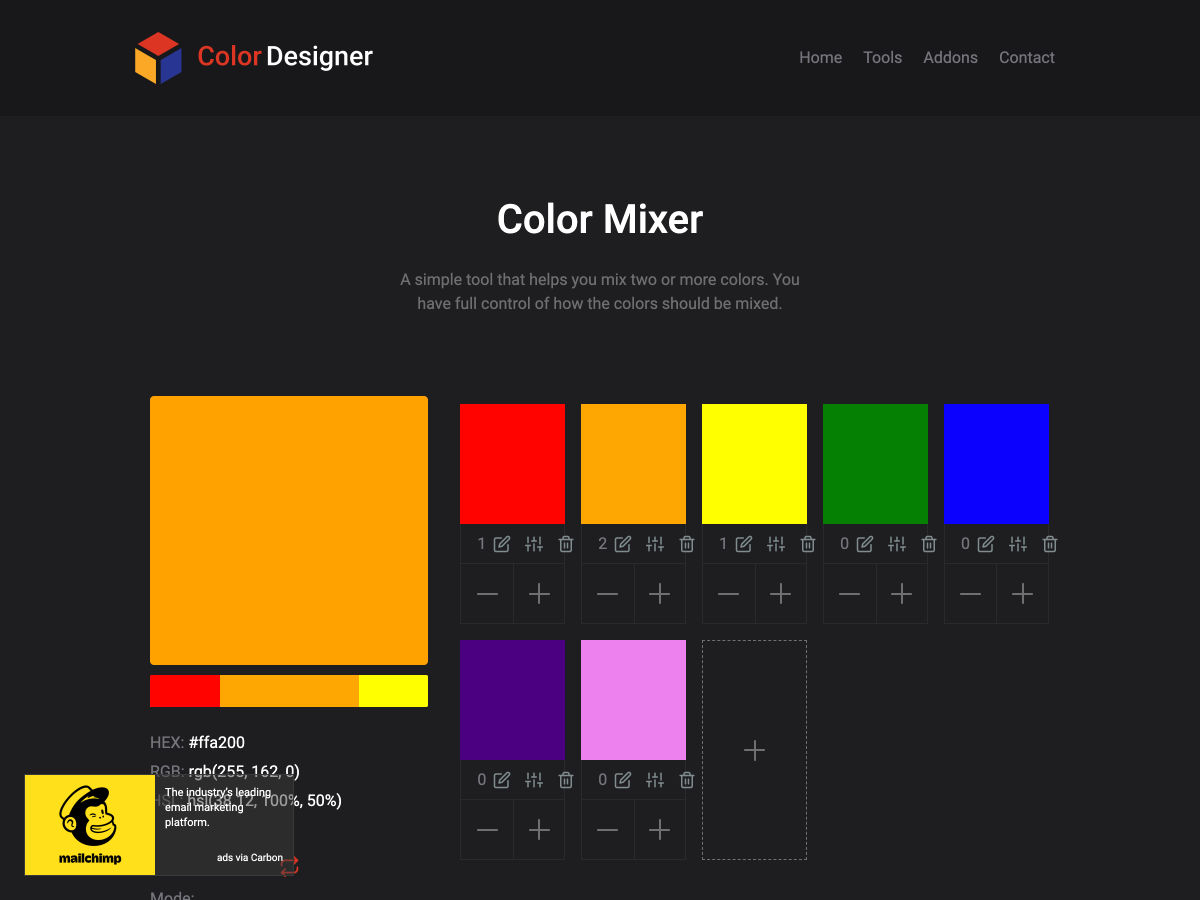
Color Mixer – A Simple Tool that Helps You Mix Two or More Colors


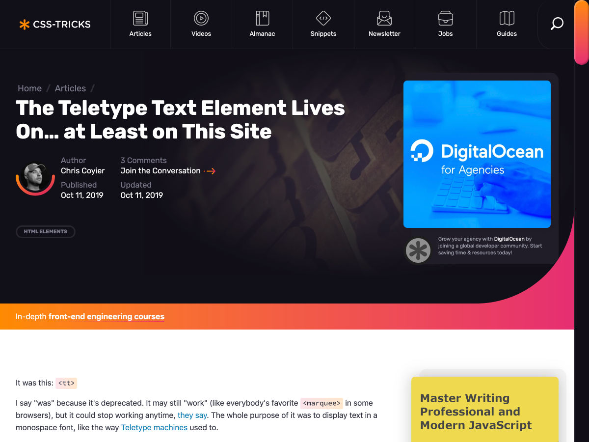
The Teletype Text Element Lives On… at Least on this Site


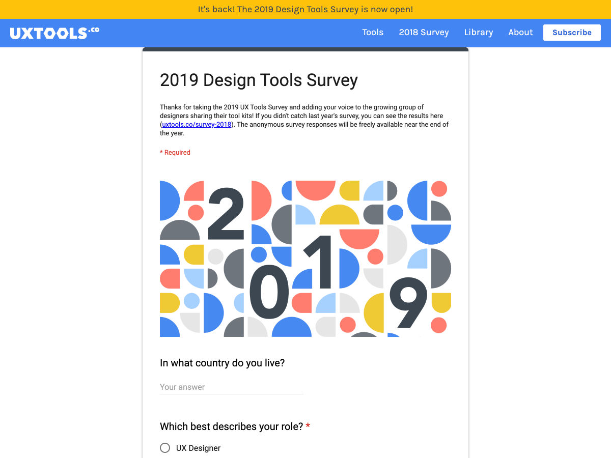
2019 Design Tools Survey


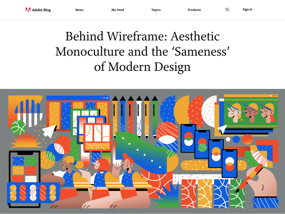
Why Does Modern Design all Look the Same (and Should It?)


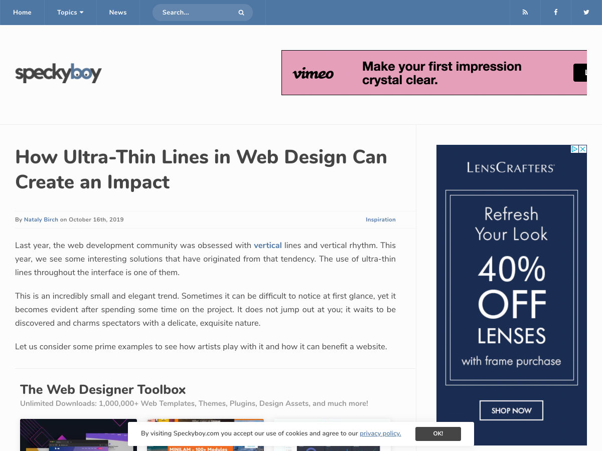
How Ultra-Thin Lines in Web Design Can Create an Impact


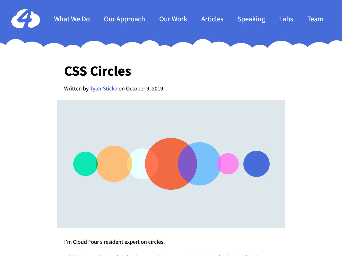
CSS Circles


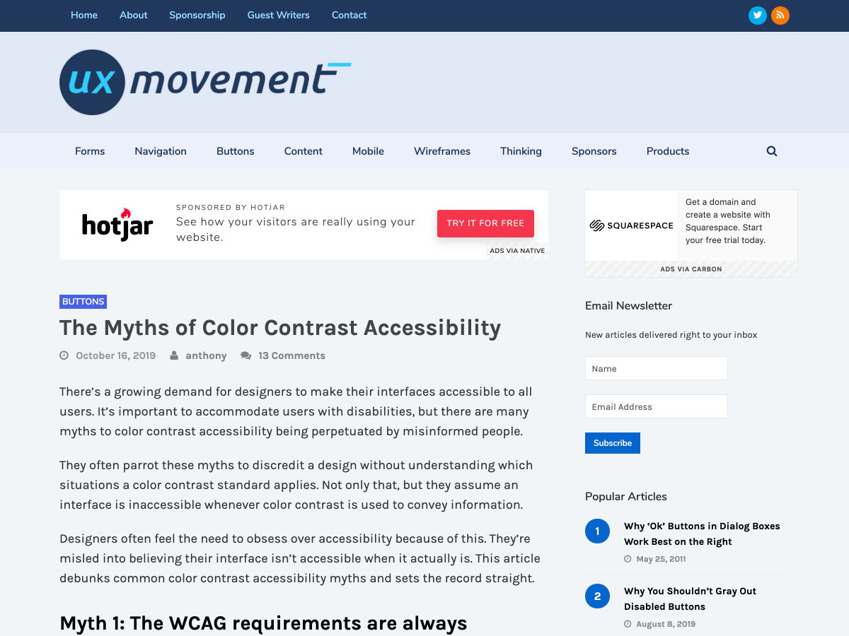
Debunking Color Contrast Accessibility Myths


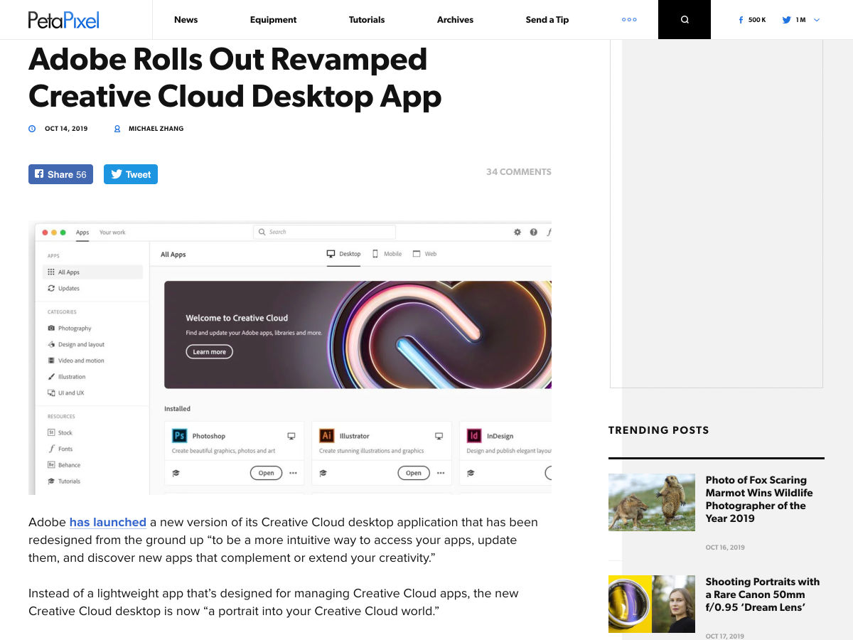
Adobe Rolls Out Revamped Creative Cloud Desktop App


16 Hours to Launch — a Breakdown of How I Designed, Built and Launched a Product Over a Weekend


We’re not Designing for Screens


Why Consistent Writing Makes You a Better Designer


What Makes a Great Design Leader?


8 Essential Principles of Good Business Card Design


The Freelance Life


Practicing Ethical Design


When GoFundMe Gets Ugly


How to Interview Designers


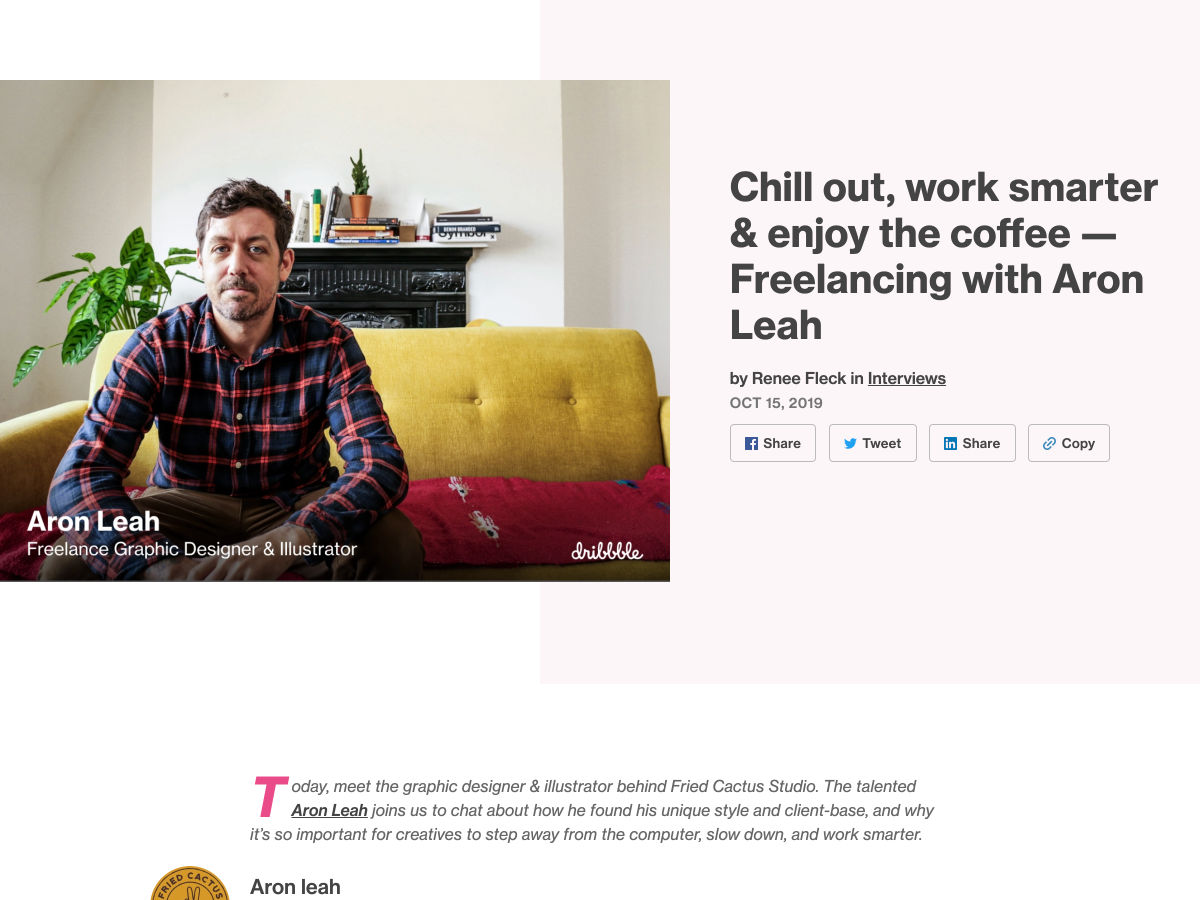
Chill Out, Work Smarter & Enjoy the Coffee – Freelancing with Aron Leah


How Frontend Developers Can Empower Designer’s Work


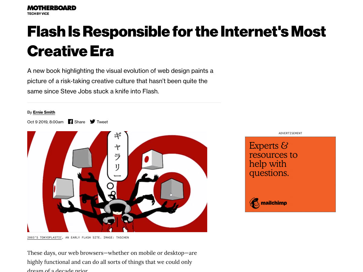
Flash is Responsible for the Internet’s Most Creative Era


Want more? No problem! Keep track of top design news from around the web with Webdesigner News.

Source

p img {display:inline-block; margin-right:10px;}
.alignleft {float:left;}
p.showcase {clear:both;}
body#browserfriendly p, body#podcast p, div#emailbody p{margin:0;}

from Webdesigner Depot https://ift.tt/31uvQIU


from WordPress https://ift.tt/2P4rZQq