Monday, February 24, 2020

Introducing 15 Best New Portfolios, February 2020

Each month we publish a roundup of the best new portfolios, launched in the previous four weeks, by freelancers, agencies, and other creative professionals.

This month’s edition is packed with color and animation. Almost every site in this list animates some part of its interface, and many are dependent on animation entirely. You’ll find tons of great interaction design, but the real trend in 2020 is that personality is making its way back into our sites.
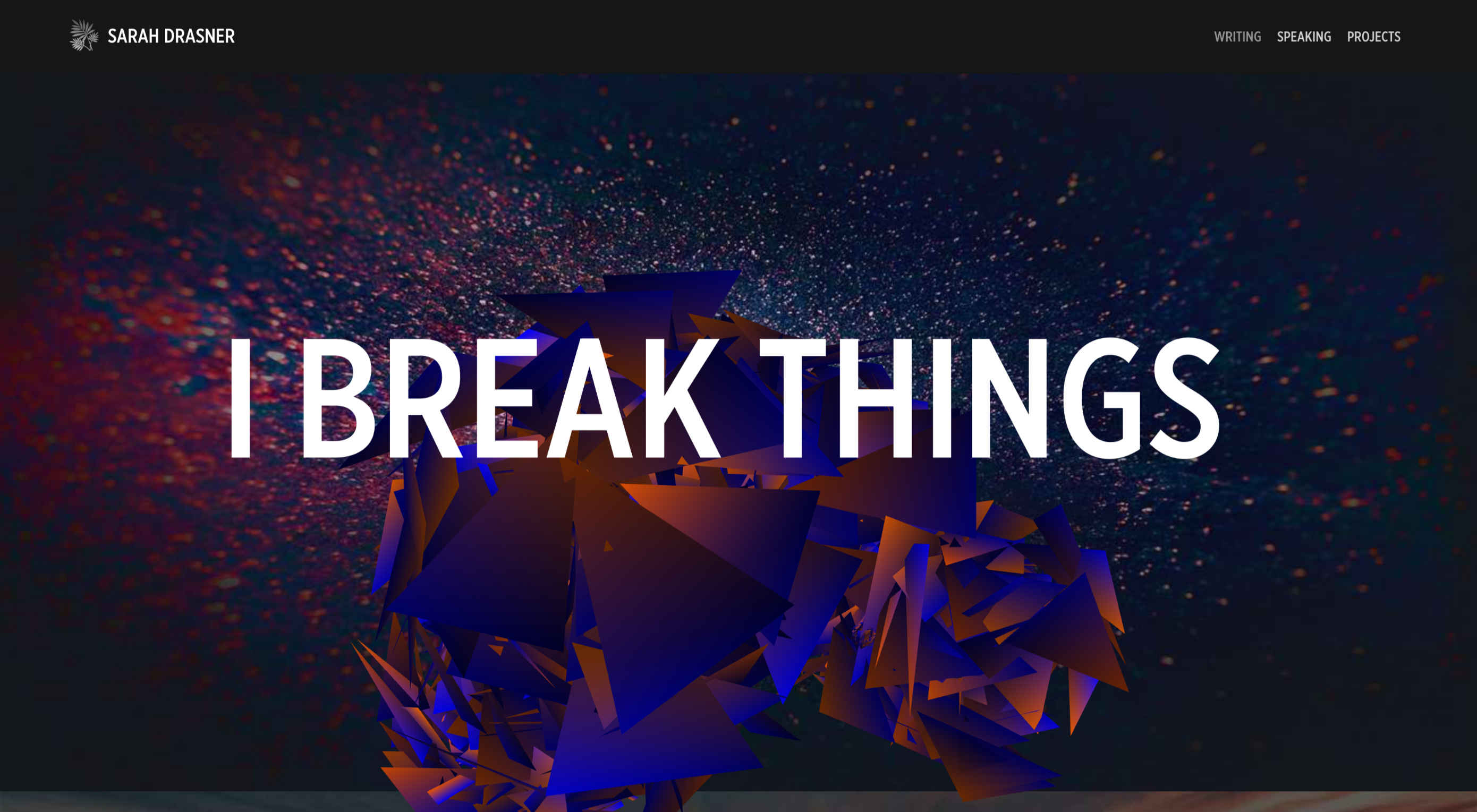
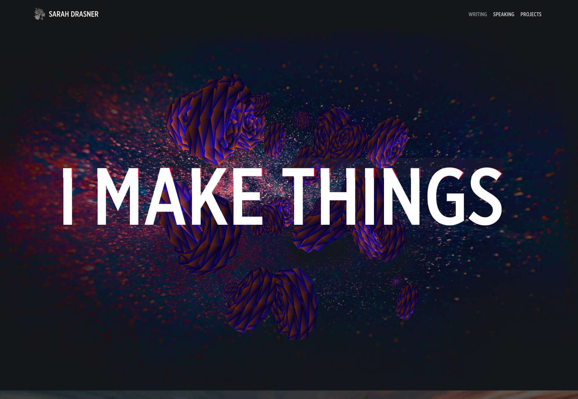
Sarah Drasner

Sarah Drasner’s personal portfolio site is wonderful because it conveys the simple joy she feels in technology. It opens with large type stating, “I Make Things.” But hover over it and you’ll find that she also says, “I Break Things”. The coded flowers that burst open for the break animation are delightfully rebellious. The whole site is packed with personality.
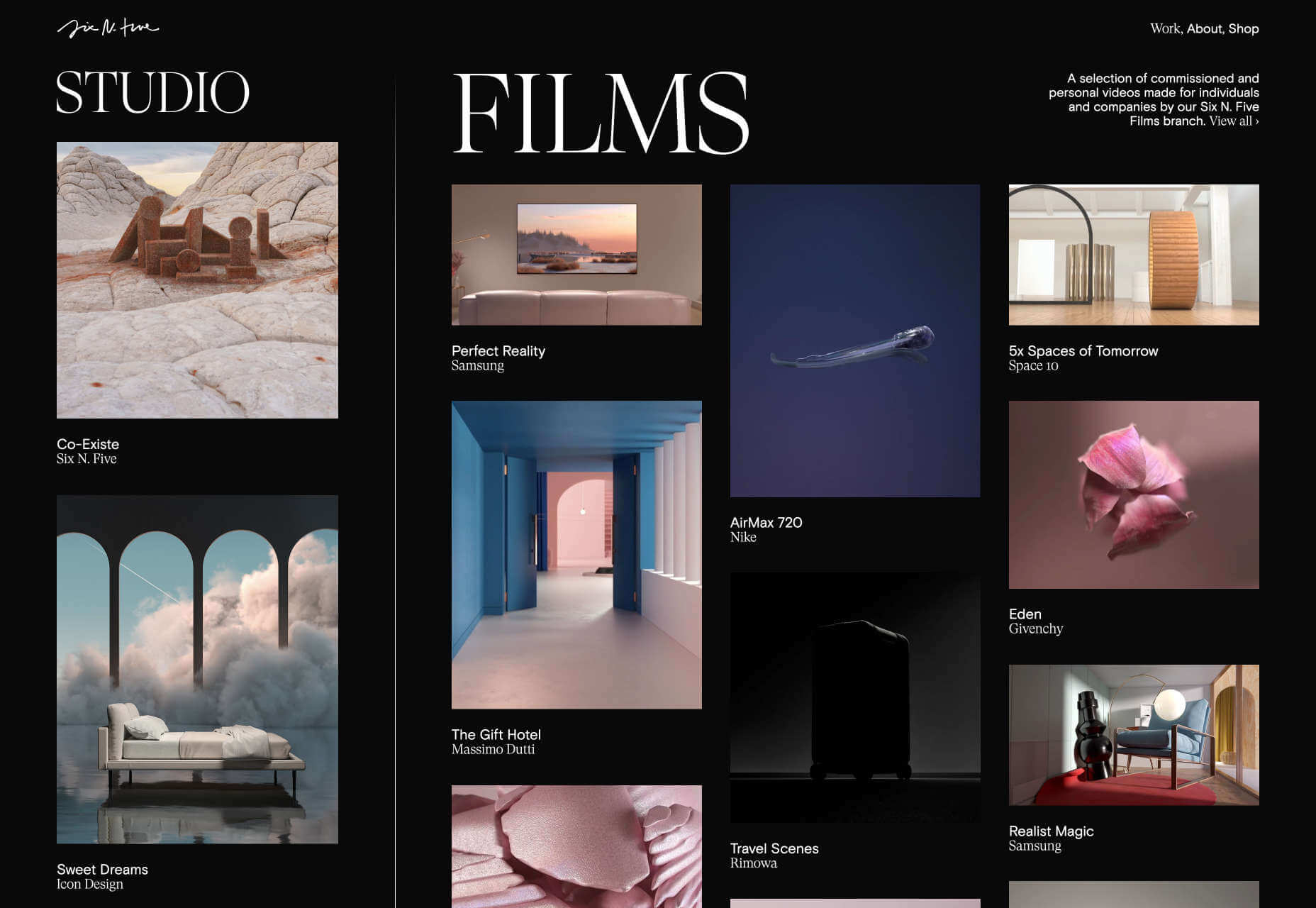
Six N. Five

The interaction design, especially the light-dark transition on Six N. Five’s portfolio site is something to behold. Cursor to the left, or right, to switch from studio work to films. Scroll through some exceptional work, and hover over thumbnails to see a preview. What we really love is the simplest of touches: when you scroll past the bottom of a case study, it automatically returns you to the home screen.
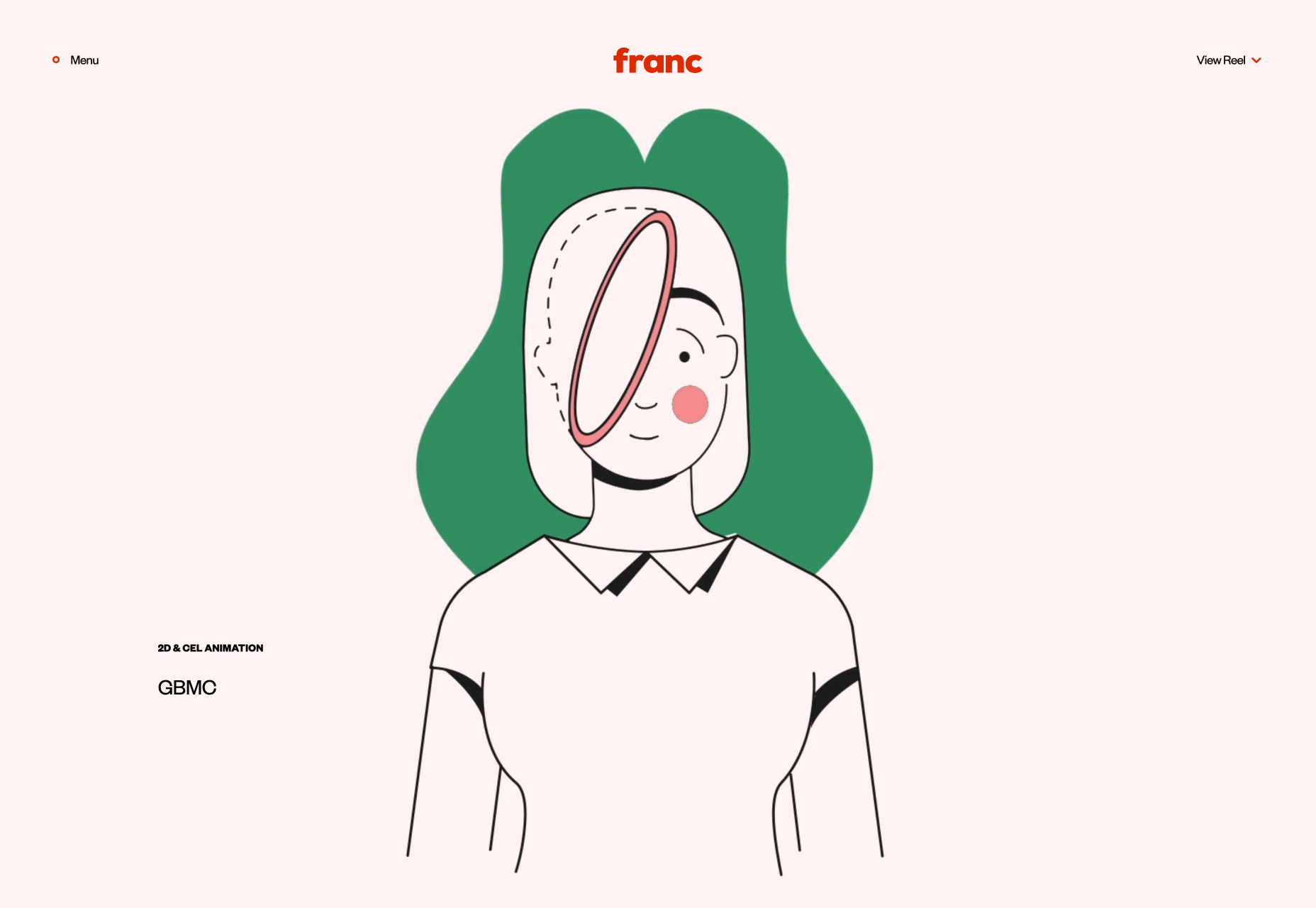
Franc

We have two agencies called Franc/Frank this month. This time, it’s an animation studio with a uniquely engaging, linear style. Franc’s work includes cell animation, which appears to be increasingly rare these days. The contemporary edge is provided by the very 2020 color palette, with bold hues cutting into softer, ice-cream pastels.
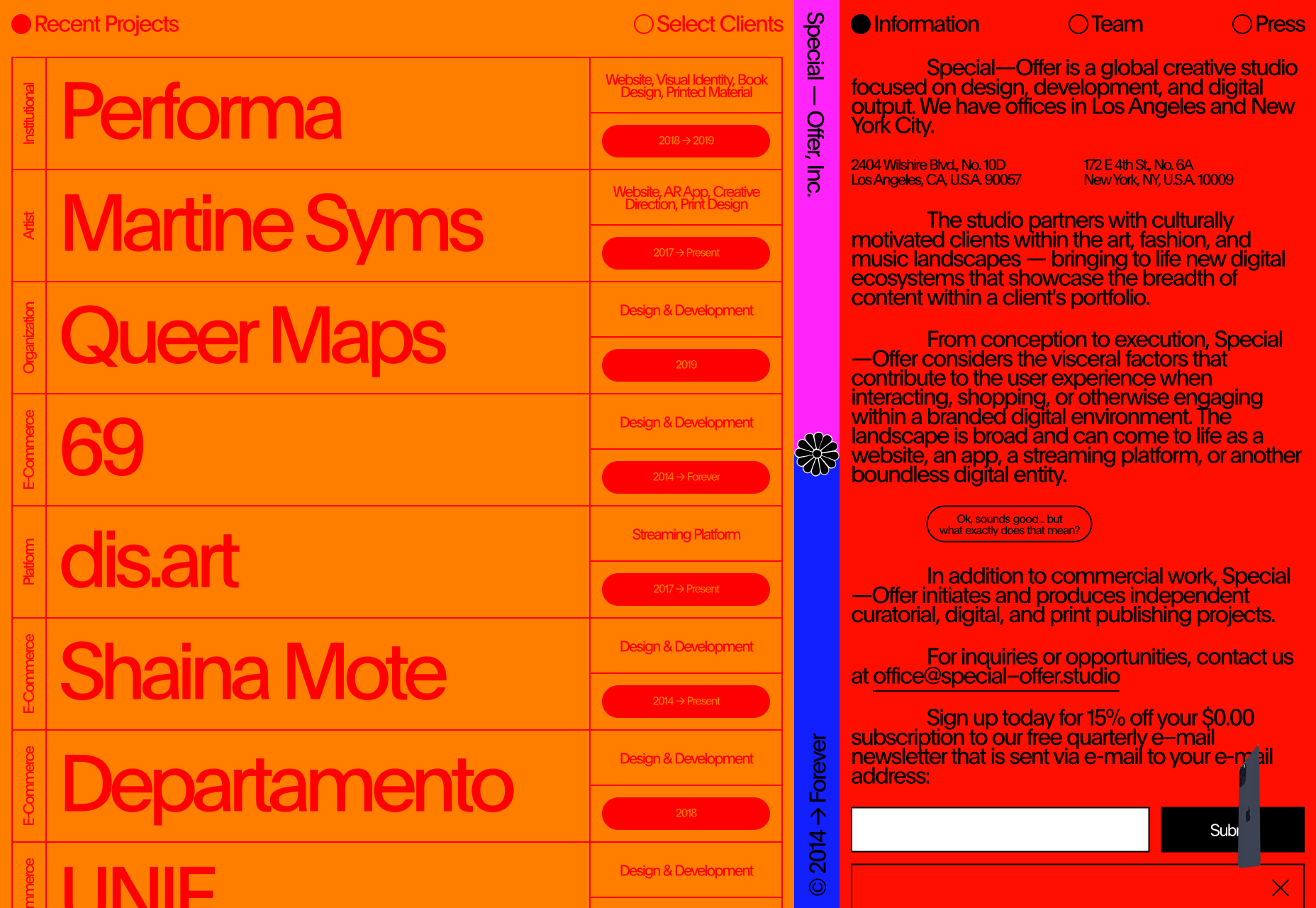
Special Offer, Inc.

The portfolio for Special Offer, Inc. could be a prototype for the colorful brutalism trend that we’ve carried over from 2019. The red on orange typography is by most measures, a real no-no, but as a way of searing the site into your eyeballs it does an awesome job. The overwhelming amount of content is part of the confident attitude, a minimalist site just isn’t right for many agencies, and it’s great we have so many options in 2020.
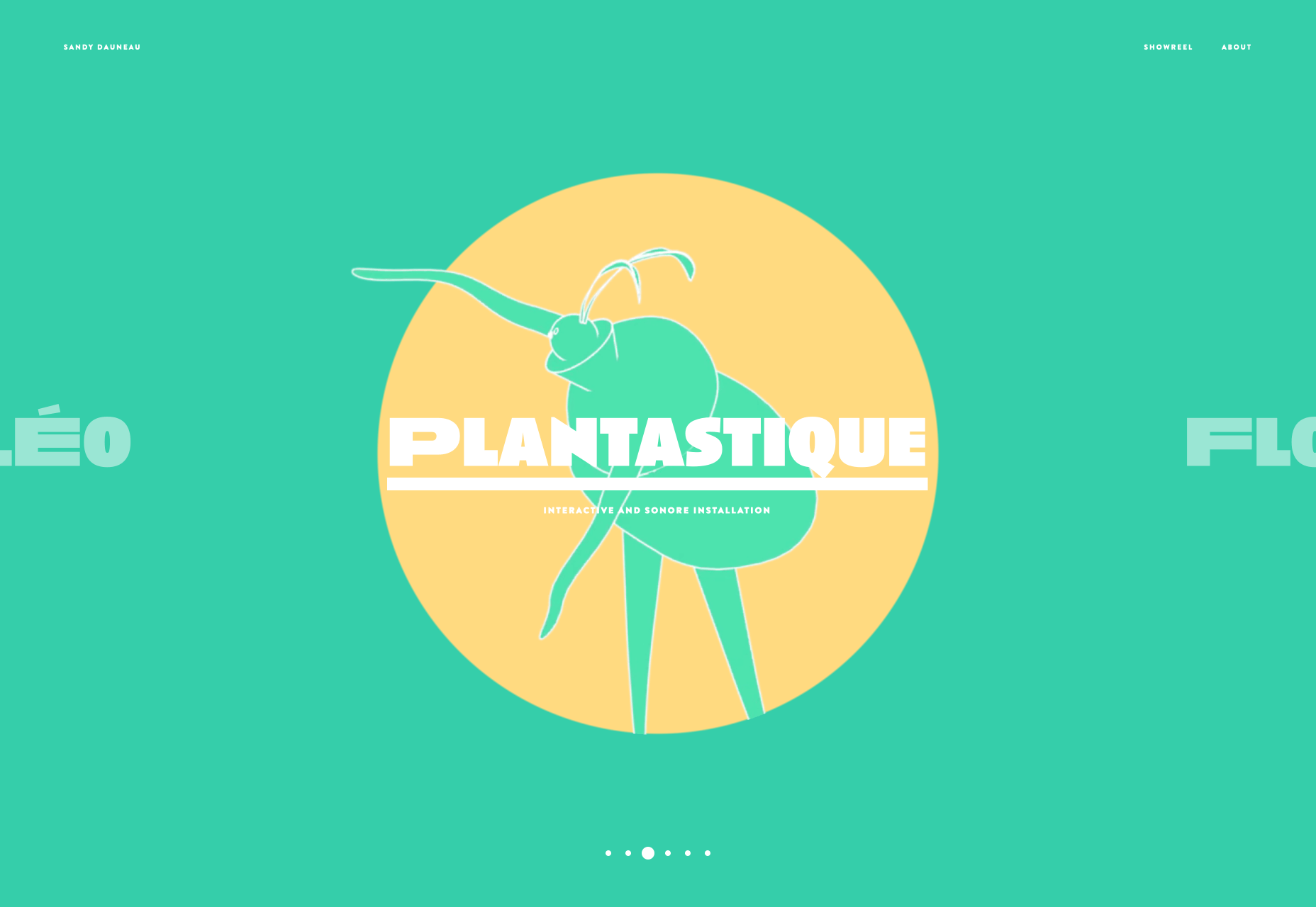
Sandy Dauneau

Sandy Dauneau’s portfolio is centered around her beautifully emotive animation, with a slider that offers various projects to enjoy. It features some really expressive typography, but nothing here outshines her delicate, and expertly observed animation. Make sure you check out her showreel, which really convey’s the best of her current work.
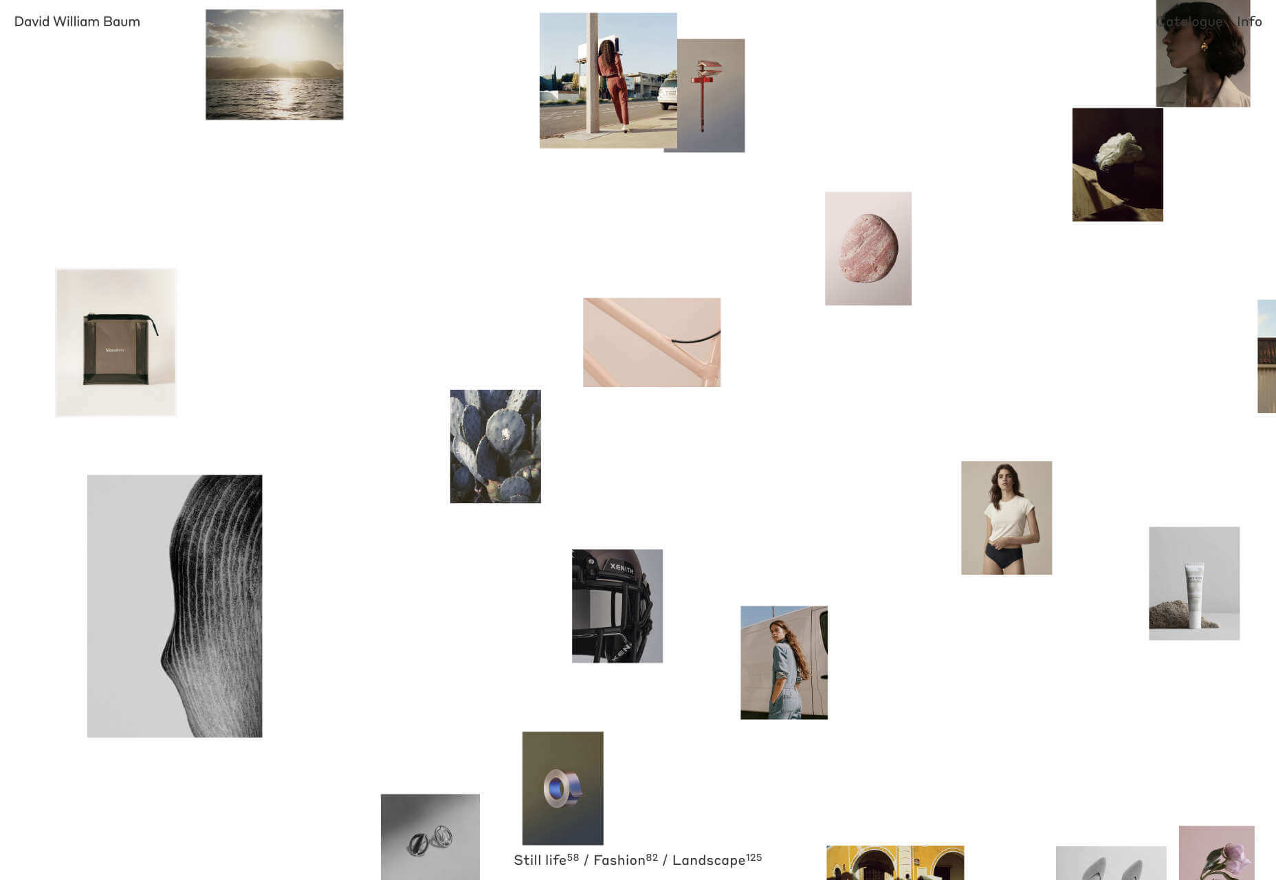
David William Baum

It’s difficult for photographers to come up with new ways of presenting their work. There’s only so many ways you can present a grid of thumbnails. The portfolio of David William Baum does an excellent job of solving this, with a moving grid of photos that responds to your cursor, then a stack of images to scroll through when you click a set, which feels a lot like flicking through a collection of printed hand-held photos.
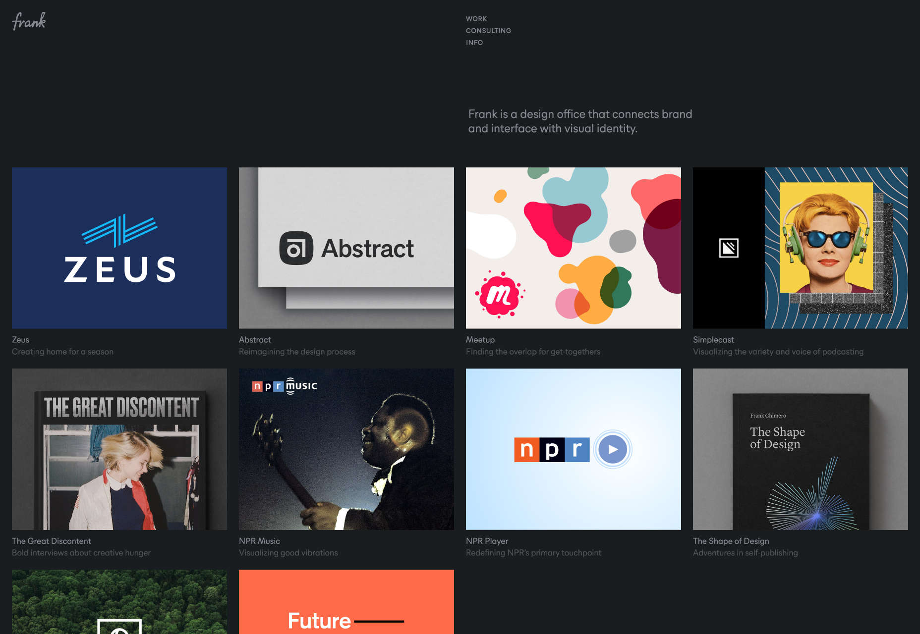
Frank

When we’re designing portfolios, it’s easy to get carried away with all kinds of different effects like liquid effects and hover states. Fancy effects help get you noticed by design agencies, but if you’re a design agency selling to business, what works is simplicity. Frank has done an amazing job of keeping its portfolio simple, not because simplicity like this is difficult, but because it’s brave.
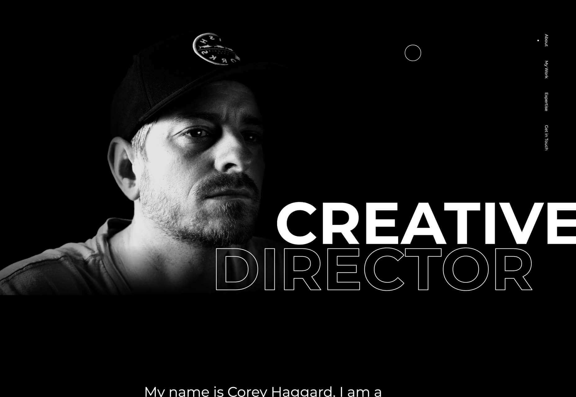
Corey Haggard

Corey Haggard has taken more of a traditional single-pager approach to his portfolio. He’s hopped on the out-sized typography trend, and if you click on any of the thumbnails on his site you’ll be rewarded with a flag-style enlarge effect, but basically this is a no-nonsense portfolio that shows off some inspiring work, and is well-worth a few minutes browsing.
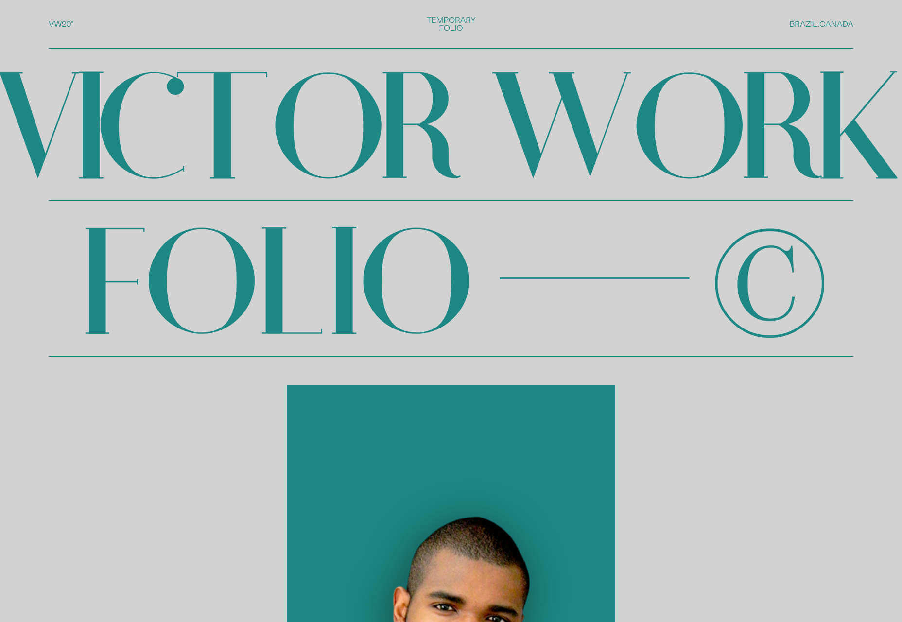
Victor Costa

Victor Work 20’ is the 2020 portfolio of Victor Costa, a Brazilian designer/developer based in Toronto. Scroll through and you’ll find some nice flag effects on the portfolio thumbnails. What we really like is the cool wavy line transitions as you scroll from one area of the site to the next — it’s an awesome way to section sites, without subjecting us to hard, horizontal lines.
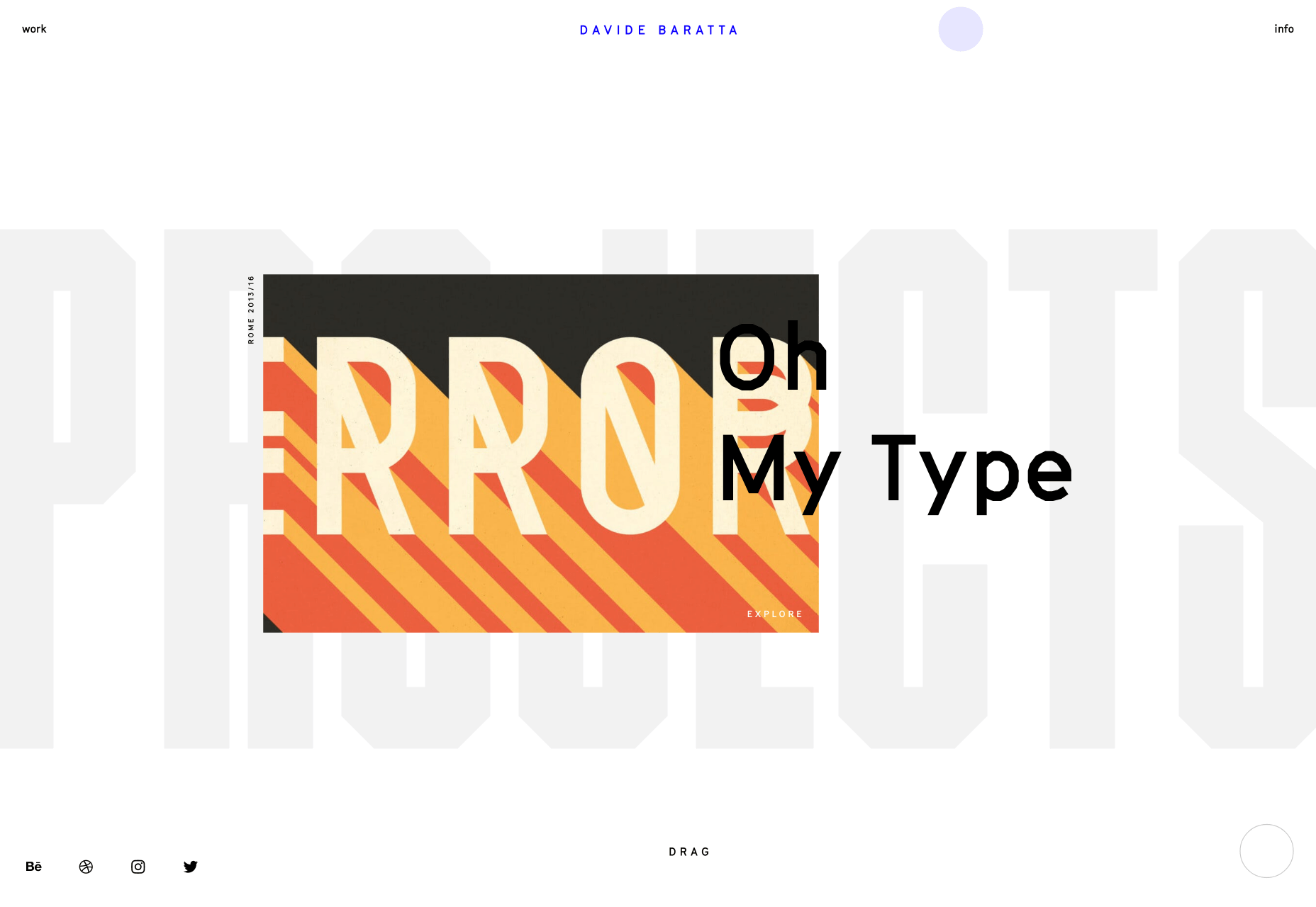
Davide Baratta

Davide Baratta’s site is one of the new breed of portfolio sites that really only work well on touch screens. If you check it out on a tablet, or a large-screen mobile device, it’s awesome. The simple slide back and forth, with taps for further exploration, feels like a native experience. A lot of time and effort has gone into making this site feel effortless. There’s also some great lettering in there.

Pierre Mouchan

It’s all about generative art these days, and Pierre Mouchan’s site is no exception. With a nod towards out-sized typography, what really grabs your attention is the giant pulsing blob in the center of the screen; it’s enough to trouble Steve McQueen. Each blob on the site represents a project and you can click on each for more info. It even works surprisingly well on mobile.
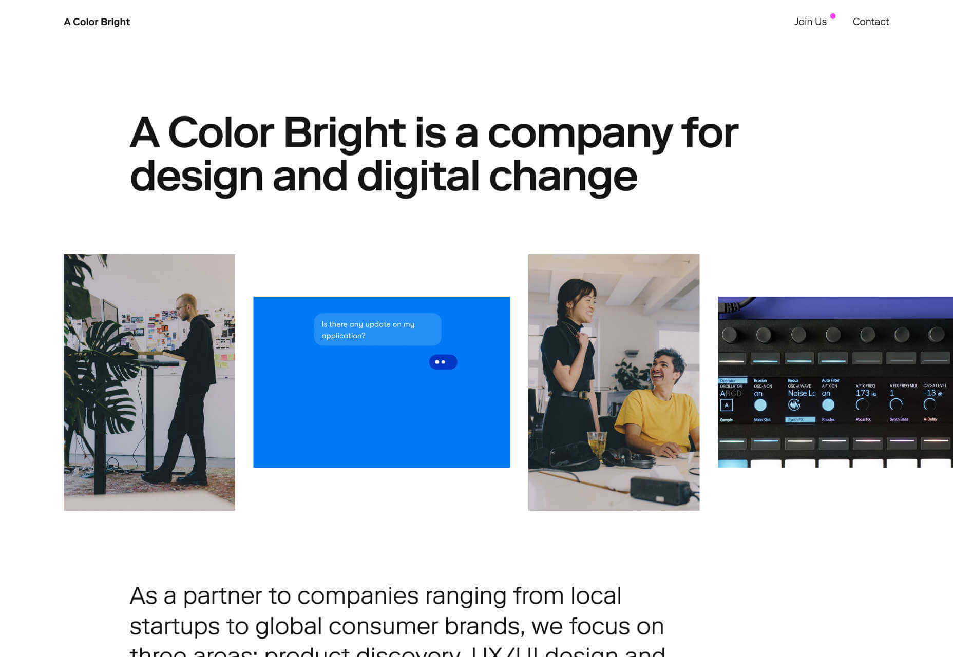
A Color Bright

It’s all very well presenting beautiful animation if that’s your focus, but what if your focus is on user experience? A Color Bright is a Berlin-based design agency that provides UX/UI design, product development, brand growth, and other digital design. Its portfolio is all about the potential of the user, with a focus on the dynamics of the team you’ll be working with if you hire them.
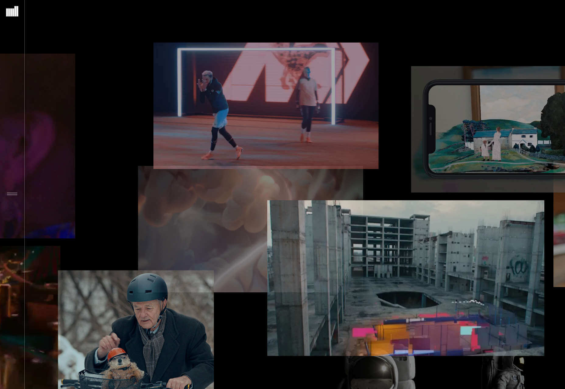
The Mill

The Mill’s site is a visual overload of motion design, VR, animation, and video. It works as a collection precisely because the lack of hierarchy allows you to delve in on a whim. Each video thumbnail links through to a case study, and the quality of the clients (Nike, Jeep, HBO, Spotify…) means that wherever you click you’ll be rewarded with a high-profile project.
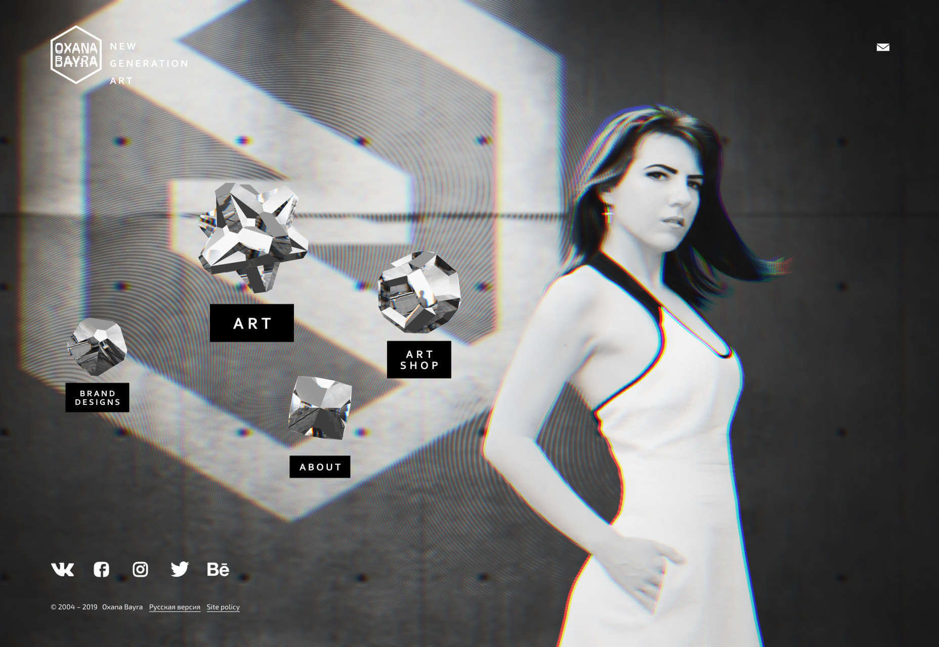
Oxana Bayra

Oxana Bayra’s portfolio opens with glitch-effect artwork that’s growing increasingly popular. Cursor over one of the crystalline objects — each of which features expertly coded artwork — and the glitch-effect grows stronger. Bayra’s won dozens of awards for her generative art and design work, and much of it is on display in her portfolio.
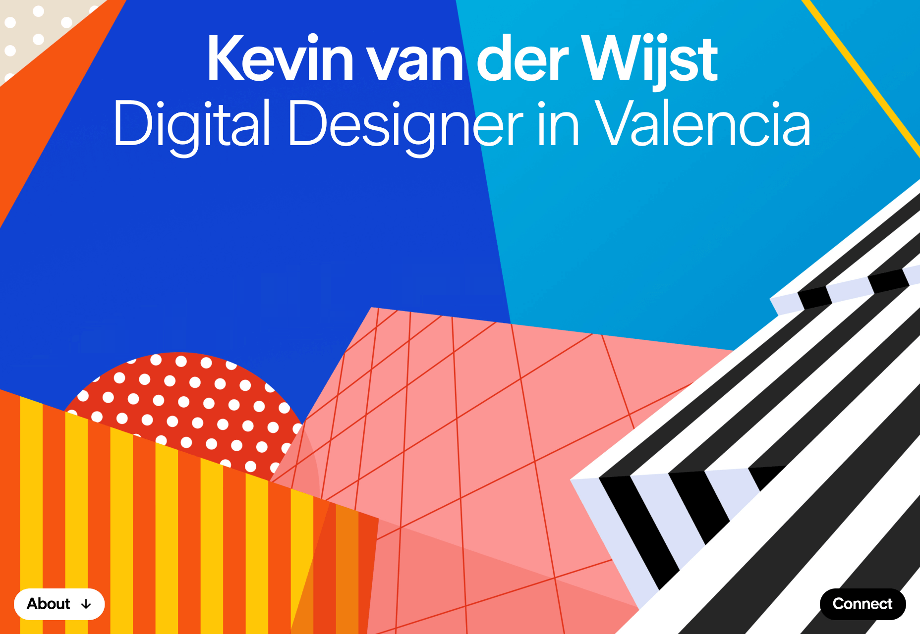
Kevin van der Wijst

Kevin van der Wijst is a digital designer based in Valencia, and you can feel the influence of that sunny Spanish city in his site. In recent decades Valencia has become known for some of the most extraordinary public architecture in the world, and the geometric shapes of van der Wijst’s portfolio echo the shapes of sunlight on buildings. If you cursor over it, you’ll see there’s a liquid mouse trail effect, as if the buildings were reflected in pooled water.

Source

p img {display:inline-block; margin-right:10px;}
.alignleft {float:left;}
p.showcase {clear:both;}
body#browserfriendly p, body#podcast p, div#emailbody p{margin:0;}

from Webdesigner Depot https://ift.tt/37XSM6t


from WordPress https://ift.tt/2TeakpG

Sunday, February 23, 2020

Popular Design News of the Week: February 17, 2020 – February 23, 2020

Every week users submit a lot of interesting stuff on our sister site Webdesigner News, highlighting great content from around the web that can be of interest to web designers. 

The best way to keep track of all the great stories and news being posted is simply to check out the Webdesigner News site, however, in case you missed some here’s a quick and useful compilation of the most popular designer news that we curated from the past week.

Note that this is only a very small selection of the links that were posted, so don’t miss out and subscribe to our newsletter and follow the site daily for all the news.

Free Vector Images for Commercial Use for Web Designers


5 Things I Wish I’d Known as a Young Web Designer


CSS Color Extractor


See the Logos AI Generated for Apple, Google, and Uber


8 Best Free Font Resources for Designers


Google Design Resources


20 Company Website Designs to Inspire your Small Business


What’s Coming in WordPress 5.4 (Features and Screenshots)


AI Songwriter – These Lyrics do not Exist


Plastic Humans – Just Another Illustration Set


What Designers Can Learn from Etsy’s Minimalist Icons


10+ Best Online Code Editors


Website SEO: How to Optimize your Content for Google


Web Design Best Practices for your Next Website Project


How to Design User Onboarding: Tips and Practices


13 Best Sites for Downloading Illustrations


Neumorphism - the Zombie Trend


Tips for Web Designers Who are Looking to Raise Brand Awareness


Earth View – Get 1000 Beautiful Google Earth Landscape Photos Free


3 Types of Feedback to Ignore


Page Builders Might not Be a Good Idea


Behavioural Science is a Powerful Design Tool


Consistency is Key – How to Build a Figma Design System


What is an “Aha!” Moment and How to Find It?


The Biggest Mistakes I Made as a New UX Designer


Want more? No problem! Keep track of top design news from around the web with Webdesigner News.

Source

p img {display:inline-block; margin-right:10px;}
.alignleft {float:left;}
p.showcase {clear:both;}
body#browserfriendly p, body#podcast p, div#emailbody p{margin:0;}

from Webdesigner Depot https://ift.tt/2SRAmjz


from WordPress https://ift.tt/2STIb8G

Friday, February 21, 2020

3 Strategies to Follow When Your Site is Failing

Here are 3 strategies you should consider if your website is struggling. We’ll cover:

  • Web analytics and split testing
  • In-person testing
  • Simplifying your sales process

If possible, implement these strategies ahead of time before you run into any issues. I’m going to cover why these strategies are effective and what they are good at resolving.

1. Analytics and Split Testing

If you don’t know when or where your users are leaving, then you’re missing ou; this is extremely unhelpful if you are selling something.

Analytics will let you see the average amount of time spent per page, and which page your customers are exiting your website from.

If a user views your website and leaves after visiting your homepage without going any further, then you know exactly what to change. If they are spending an excessive amount of time navigating through simple parts of your sales process, then you know something may be wrong, and you should address it.

AB split testing…is particularly good at resolving weak points on your website where visitors are…changing their minds

Depending on which page of your website they are on, you may want them spending more or less time on it. An abnormally high amount of users abandoning their shopping cart might mean your checkout isn’t providing the user with a positive experience.

AB split testing refers to displaying different versions of the same page to different visitors. It is particularly good at resolving weak points on your website where visitors are leaving or changing their minds about going ahead with what you want them to (e.g. buying a product).

Let’s say we have 2000 page visitors, and 70% are leaving immediately from the landing page, and 600 are proceeding forward (30% click-through rate). Instead of presenting one landing page to all visitors, we display two landing pages and show one landing page to half the visitors, and the second landing page to the other half.

We make some changes to the original landing page and send some of the users to the new version and some to the original version. We do this to see if the new landing page will have a better click-through than the original, 30%.

A quick example for a skydiving company: Group A visitors see ‘Book’ in a smaller sized button, whereas Group B visitors see ‘Skydive NOW!’ in a larger sized button. If the ‘Skydive NOW!’ button improves the number of bookings the site receives, we could consider using Group B as the new control and further work on optimising the booking page, perhaps by creating a modification in which ‘Skydive NOW!’ has a different color scheme or is placed in a different position on the page.

This could be a minor re-design, such as changing the color of a button, to something more enticing, or a major re-design.

You can also display more than two versions of a page simultaneously, making multiple modifications, displaying three or more versions to different users. In this case, we would have the original version, A, and two or more modified pages B, C … so on. This can make split testing quicker by immediately testing multiple possibilities but it adds complexity to the process.

2. In-Person Testing

In-person, or remote testing, is a strategy in which you recruit a user to test your website by undertaking various tasks e.g., Buy a specific product and ship it to your home, or find some specific information on your website.

This should be done regularly during the web building process as by doing so when you launch your website, you might uncover major or recurring problems that could have been prevented. If you do it in early development stages, you can use the information from the test to plan before you start building things that don’t work!

If your website is already live and you overlooked testing beforehand, it’s not too late

If your website is already live and you overlooked testing beforehand, it’s not too late. You can still employ a handful of individuals to test it now.

In-person testing is typically done where you supervise an individual and instruct them to carry out certain tasks and take note of how they are navigating your website by seeing the way they browse the page and/or move their mouse. Ask them to think out loud. You should also ask them why they selected that option over another, what they liked about a particular feature, etc. 


If you already know which areas of your website need to be worked on, but you’re unsure of how to improve on it, you could ask your tester for specific insight.

I typically choose three users for testing, as it’s quick, easy, cheap, and manages to uncover lots of flaws I may have overlooked. Having more users testing the website can be beneficial, but typically most users end up pointing out the same weaknesses.

This is an effective strategy because having a handful of people test your website is like having someone read over your writing. You may not pick up on your own mistakes, but someone else will. It’s also important to note that the way (you), a web-designer browses the web is different from how the average person browses the web. You may have a perfect understanding of what is happening on your website because you created it. Still, someone who is using it for the first time won’t have the same knowledge and experience as you and will try to undertake tasks in the simplest, most intuitive way.

Remote testing is the same principle as in-person testing but executed remotely. This may save you the hassle of meeting up, but might mean that you need to use software (such as a camcorder) to monitor their browsing, along with voice or video calling, to discuss the process with them.

3. Simplifying Your Sales Process

Are you taking care of your customers and guiding them through their purchases?

What happens after your user lands on your website? Is there a good value proposition (product, service, or information that is appealing) compelling them to purchase?

Excellent, now you need to make sure the process is transparent and straightforward.

Be upfront about any extra fees or shipping costs. Let them know how long shipping may take. Customers want to feel like they can trust you.

Customers want to feel like they can trust you

Write out an FAQ (Frequently Asked Questions) addressing common concerns a potential customer may have. E.g., Let’s say I’m buying a dual SIM mobile (two sim cards, one mobile), I want to know which country the product is from, I want to know about the warranty, I may especially want to know details about the phone will store numbers from different cards.

Have an FAQ section addressing general sales questions and a product-specific FAQ. Along with that, address the product specifications and show high-quality photos or videos.

When the customer is satisfied with what they’ve selected, make the checkout process easy. Allow guest checkout if it’s a suitable option for your website. 

Show your customers you care about them and create reasons for them to want to share your website and products. Once you’ve made your sale, send them a follow-up email or little thank you. This will lead to more engagement and a repeat customer. Remember, selling a product isn’t the end goal. Making someone become a lifelong customer is, and you need to facilitate that.


Featured image via Unsplash.

Source

p img {display:inline-block; margin-right:10px;}
.alignleft {float:left;}
p.showcase {clear:both;}
body#browserfriendly p, body#podcast p, div#emailbody p{margin:0;}

from Webdesigner Depot https://ift.tt/39Uo6Vq


from WordPress https://ift.tt/2P88K7J

Wednesday, February 19, 2020

6 Best Browsers for Developers in 2020

On the surface, web browsers seem very similar. They all provide you with a relatively straightforward way to get online and search for the content that you need. 

However, the more time you spend building your skills as a designer/developer, the more you’ll recognize the need for a unique kind of browsing experience. Fortunately, we’ve found some of the best browsers for web developers, to get you started.

Let’s take a look at what each option can offer.

Firefox Developer Edition

Among developers, Firefox is probably the world’s most popular browser.

On it’s own, Firefox is a pretty powerful browser. Deemed a lot faster than the average web browser, Firefox helps you to track down information and create stunning websites in a fraction of the time of something like Edge. 

However, if you really want to get the next-level Firefox experience, then it’s worth upgrading to Firefox’s own developer edition. 

Like Google Chrome for Developers, Firefox’s Developer Edition comes built for the open web. 

Additionally, with Firefox Developer Edition, you get access to a next-generation CSS engine (written in RUST), an inactive CSS system that grays out CSS declarations that don’t impact the page, and more. There is also a host of “Firefox DevTools” to access. 

With your new browser, you can access a best-in-class JavaScript debugger, a Master CSS Grid, and various other features too. In fact, Firefox is the only browser that is specifically built with tools that help developers to build and design with their own CSS grid. These tools make it easier to visualize information, display area names, and preview transformations too.

Polypane

Finally, Polypane is a unique kind of browser, specifically designed for developers and designers. This browser is a cross-platform solution and Devtool that experts can use to develop, test, and debug sites as quickly as possible. 

Created to help developers and designers increase both the quality of their work and their productivity, Polypane is packed full of useful features. What’s more, it works with any code editor and technology stack. 

In an age where user experience is more important than ever, Polypane helps companies to build higher-quality websites through everything from WordPress, to Drupal and Angular. 

Because tools for developing and debugging are built into the browser already, you don’t have to worry about finding and adding extra extensions.

For those who aren’t sure about using a new and proprietary browser experience, Polypane does come with a free trial. However, as with most specialist tools for web developers, you will need to pay if you want to continue accessing advanced features long-term. 

On the plus side, like Google Chrome’s developer edition, Polypane benefits from regular updates, so you know that you’re always going to be on the cutting edge of the web industry. 

What’s more, you can also access different packages depending on whether you’re using Polypane as an individual or an agency.

Google Chrome for Developers

Google Chrome stands out as one of the world’s most widely used browsers. 

Chrome has more than 58% of the market share, according to the latest estimates. With figures like that, it must have something special to offer. 

While Chrome might be particularly popular among everyday consumers, it also has something special to offer people in the web development and design world too. For instance, Google now has it’s own “Chrome browser for Developers” product. 

Created for the open web, Google Chrome for Developers helps professionals to design websites that are specifically optimized for the next version of the digital world. With Google Chrome, you can test cutting-edge APIs for web-based platforms in real-time.

What’s more, Google Chrome is packed with endless tools and add-ons that you can implement into your browser. That includes PHP consoles for WordPress, screenshot tools for collecting web design inspiration, and even LastPass for password control. 

Not only do you have endless opportunities to get creative with Google Chrome, but you also have access to updates that happen on a weekly basis, so you know you’re always on the cutting edge. 

Opera

Opera might not be as popular as Chrome or Firefox for developers, but it has a number of benefits to consider. If you’re not looking for too many advanced development features, then Opera could give you everything you need for a quick and effective experience online. 

Numerous stress and speed tests have placed this browsing solution right in the middle of the pack. You’re not going to get life-changing performance with Opera, but you will get a connection and browsing experience that you can rely on. 

Unlike Chrome and Firefox, Opera also relies more heavily on in-built features. That means that you don’t need to worry about adding extra functionality to your browser on your own. 

The Opera Developer browser gives today’s design experts a chance to get started with some of the latest tools and features as they roll out from Opera. 

If you want to be on the cutting edge of early experiments with web browsing, the developer stream is a perfect choice. However, it’s worth noting that some of the developer features you can access from this browser won’t be as stable as they should be.

Blisk

Blisk is an interesting alternative to many of the major browsers on the web today. 

Compared to Opera, Chrome, and Firefox, Blisk doesn’t have nearly as much attention online. However, it may be worth consideration if you’re a growing developer. This browser is specifically designed to give designers a development-first workspace where they can develop and test modern applications as quickly as possible. 

Blisk is the only developer-focused web browser that allows you to access all of the functionality you need for creating sensational online experiences. You can view what your website or app is going to look like on virtually any phone design, from Google Pixel, to the iPhone. What’s more, there are viewing options in landscape or portrait mode too. 

Blisk also shows mobile and desktop designs side by side, so you can compare the UI that users will get whenever they approach a website – no matter where they’re connecting with you from. Other features include:

  • State of the art URL and scroll sync: Blisk automatically synchronizes scroll and URL positions for desktops and mobiles. 
  • Auto-refresh: Whenever you save code changes when working in a browser, Blisk will refresh your tabs and update CSS changes. 
  • DevTools: Blisk delivers DevTools similar to Chrome, you can launch separate DevTools for mobile and desktop and use them to simultaneously inspect the performance. 
  • Error notifications: Blisk automatically monitors potential page errors in JavaScript and resources that fail to load. 
  • Page inspector: Blisk delivers page inspector tools, powering quick inspection of any element on mobile or desktop.

Safari for Developers

Believe it or not, Safari for Developers is a very powerful tool – depending on the kind of websites and online experiences that you want to build. Although this browser option isn’t quite as broad or comprehensive as some of the other options we’ve mentioned so far – it has its benefits. 

For instance, Safari is the best way to make sure that your sites are going to perform amazingly on iPhone, Mac, and iPad technology. 

As Apple becomes an increasingly popular brand around the world, Safari will allow you to connect with viewers in a very specific landscape. Additionally, the Safari developer edition helps you to experiment with a host of advanced features too. 

With Safari for Developers, you can add things like Apple Pay to websites, giving customers more ways to check out online. This could be an excellent way to increase conversions for your ecommerce clients. 

Additionally, picture-in-picture functionality means that you can float a video window from Safari over your desktop or a full-screen app. This makes it easier to follow specific guidelines when you’re working in Safari. 

Safari even has it’s own tab on the Mac App store, where you can explore things like Xcode for creating unique Safari extensions that work specifically for Apple customers.

Exploring Different Development Browsers

As a developer, you’re going to need a very unique selection of tools within your browser to help you get the most out of your designs. 

The average browser simply won’t give you the advanced experience that you need online. That’s why it’s important to experiment with solutions ranging all the way from Google Chrome for developers, to modern solutions like Blisk. 

Whether you decide to go for something tried-and-tested, like Firefox, or something a little more innovative, you’re sure to find that a developer-focused browser helps you to accomplish more. 

Source

p img {display:inline-block; margin-right:10px;}
.alignleft {float:left;}
p.showcase {clear:both;}
body#browserfriendly p, body#podcast p, div#emailbody p{margin:0;}

from Webdesigner Depot https://ift.tt/39LCKht


from WordPress https://ift.tt/38EZoba