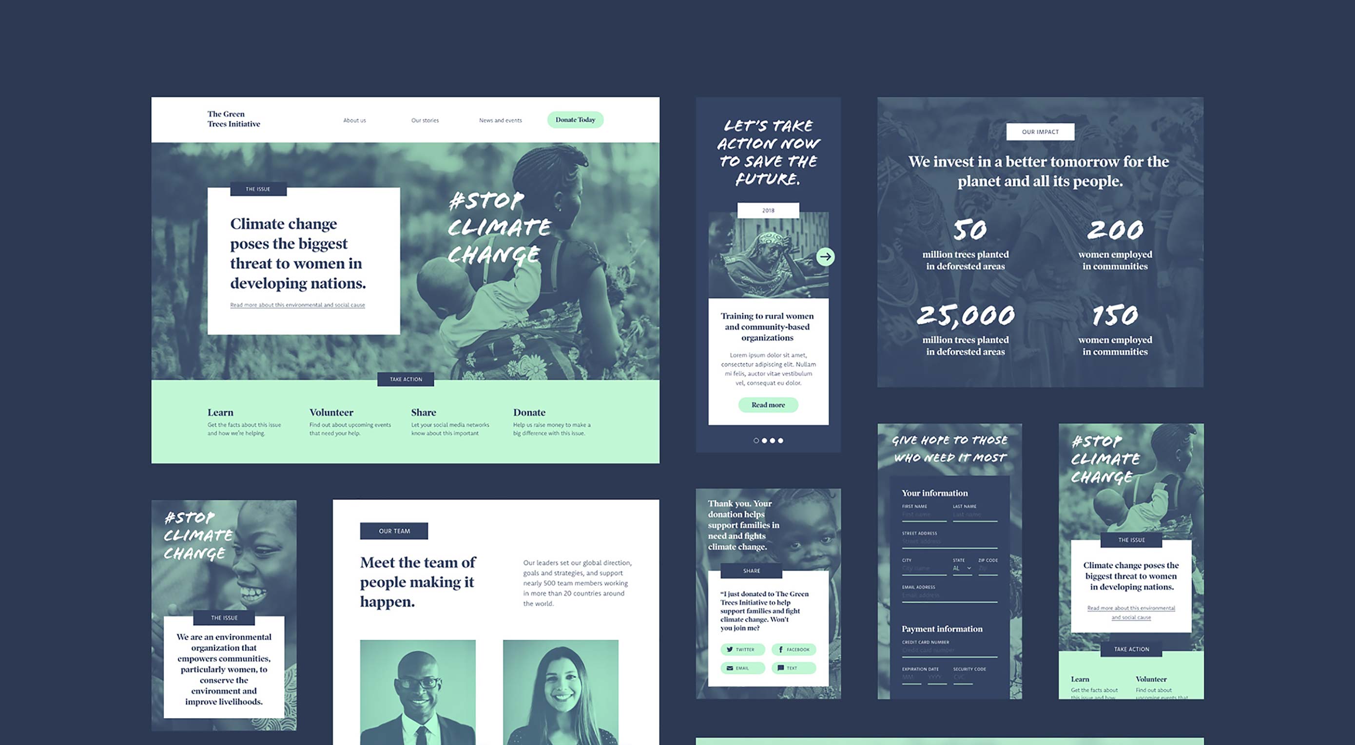
 Halting climate change; distributing wealth around the globe; achieving social, racial, sexual, and gender equality; ending violence; there are so many challenges in today’s world. The web can be an incredible vehicle for change, and Adobe are lending a helping hand with an incredible, free UI kit for Adobe XD.
The UI kit has been created by Brooklyn-based designer, Meagan Fisher. Her goal was to help non-profits publish better websites; which in turn helps the non-profits to advocate for their cause more effectively, increasing user engagement and driving donations; which in turn helps the non-profits to help more people.
I’m so excited to share that I’ve created another free UI kit for @AdobeXD; this one is for a responsive website for non-profits. My hope is that people will use it to give charities better websites, and to help them help more people!


https://t.co/pHpIUcPYFm #AdobePartner pic.twitter.com/XATDrx08yc
— Meagan Fisher Couldwell (@owltastic) October 16, 2018
https://platform.twitter.com/widgets.js
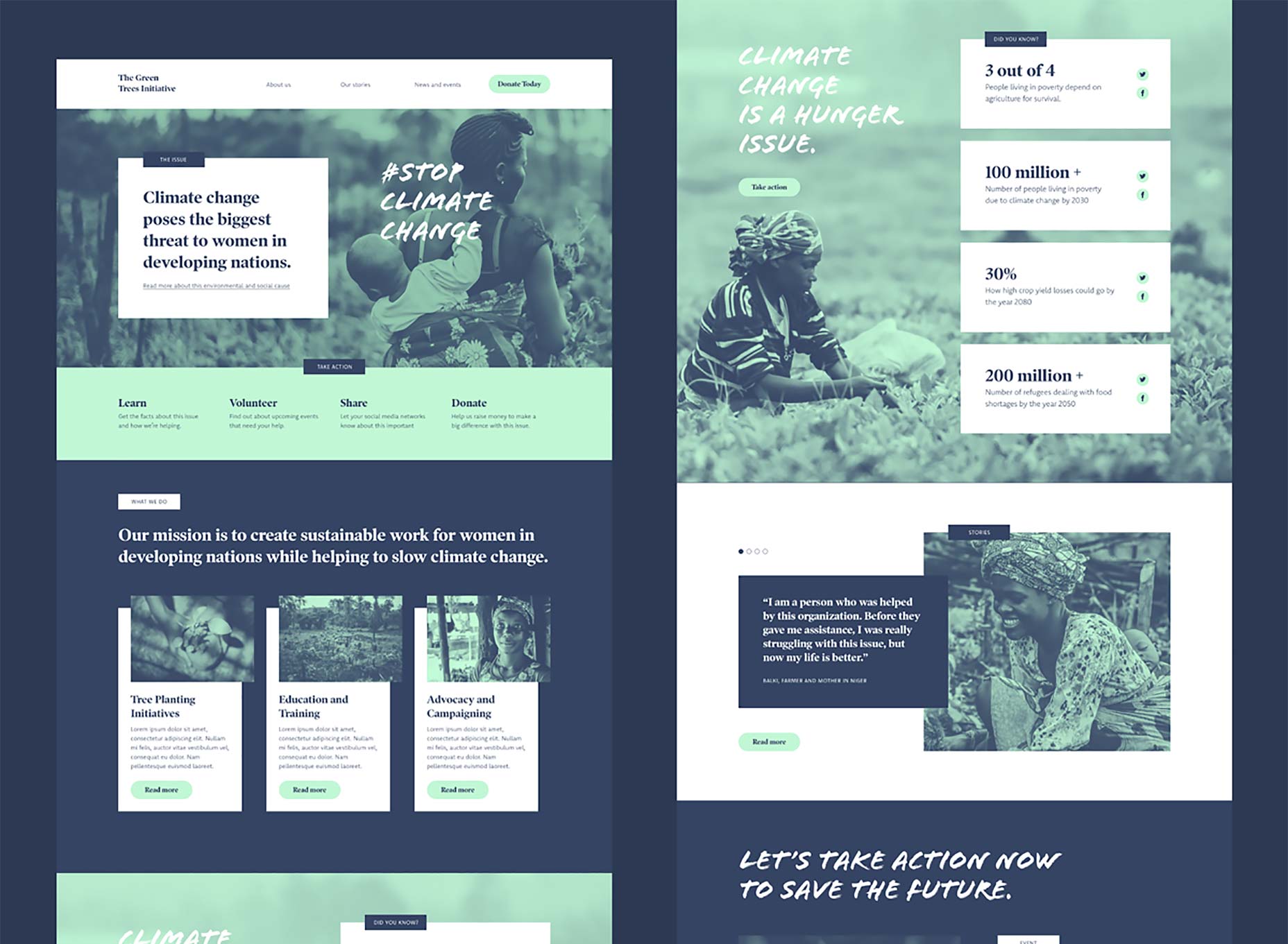
Although the UI Kit uses the example of a charity addressing the food-shortage implications of climate change, the kit would actually work for any fact-based campaign, whether it be gun control, voter empowerment, deforestation, or a youth drop-in centre; no matter what kind of non-profit you’re designing for, this a great starting point.
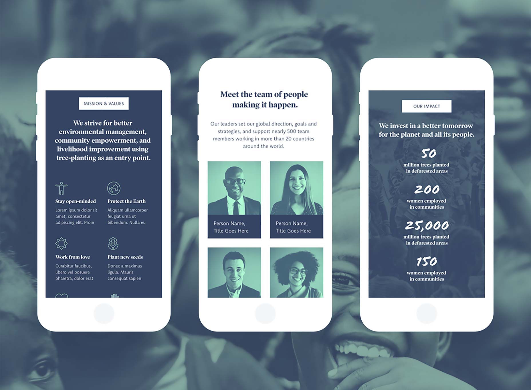
Because the non-profit sector is so broad, the UI Kit has been designed to be highly versatile. It is a fully prototyped, responsive website design, that employs known best-practices.
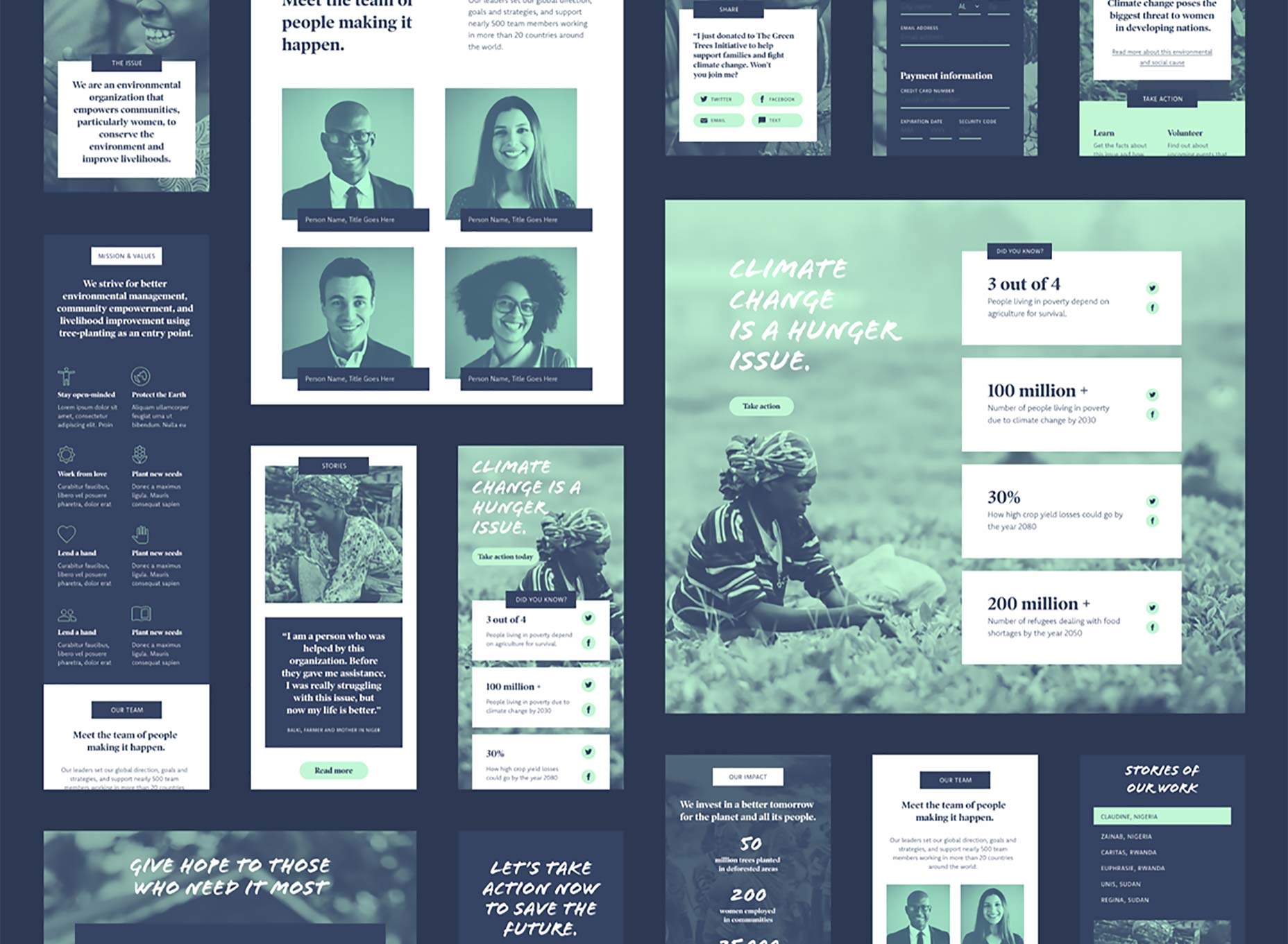
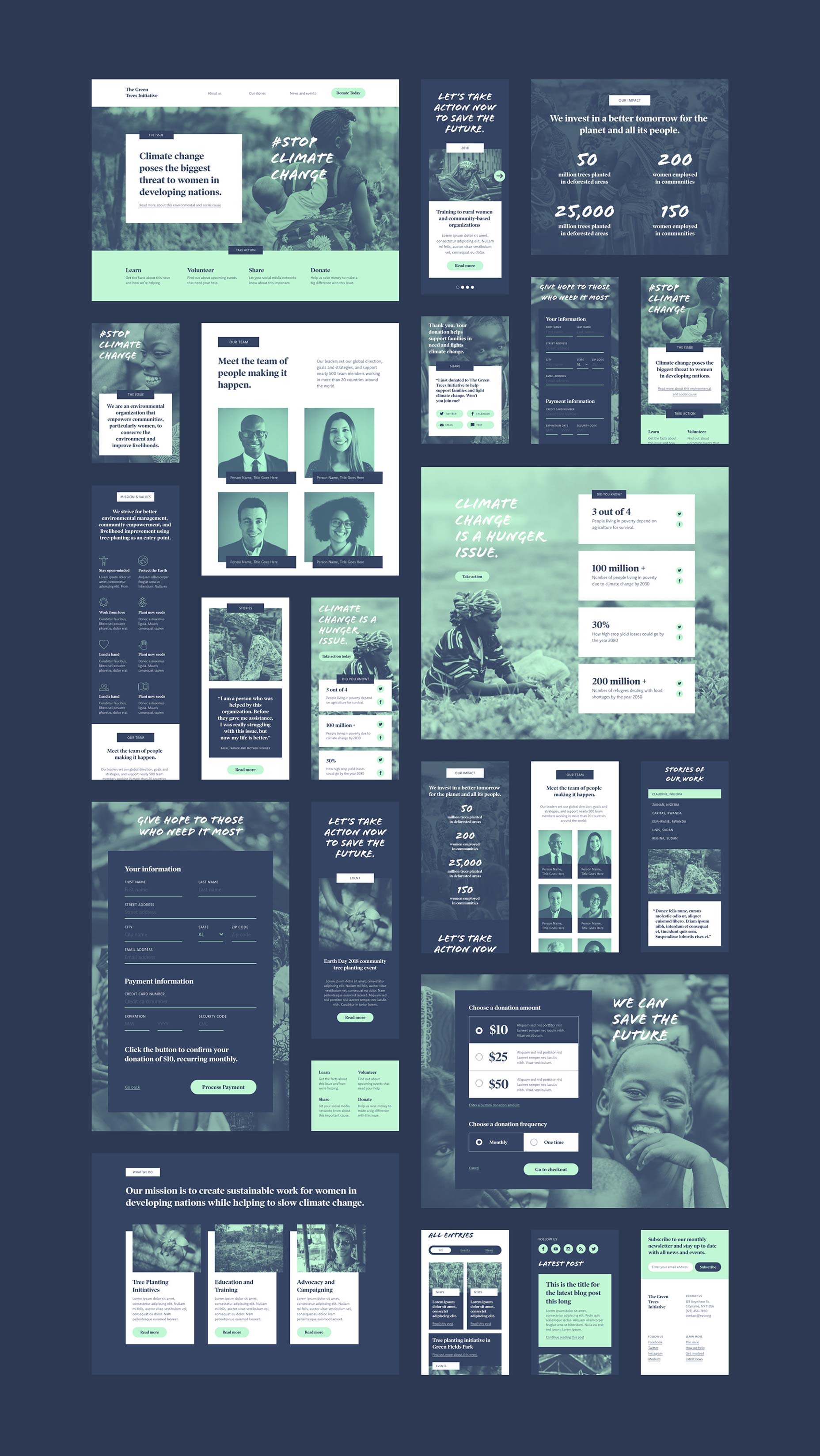
Included in the UI Kit are key pages like home, about us, resources, stories, news, events, get involved, and even a carefully crafted donation flow. You’ll find everything you need for a non-profit website, and if there’s anything missing, Adobe XD’s assets panel makes it simple to generate new pages using the existing customizable elements.
The most visually striking thing about the UI Kit is its original color palette. Bucking the trend for hot colors, the UI Kit uses a cool palette of deep, desaturated blue (#354463), and bright, mint green (#C1F7D5). You can change this easily in Adobe XD, but the sophisticated look is both modern, and serious—absolutely appropriate for the task at hand.
The UI kit uses three fonts to convey its message: Flood is a brush script that humanises the text, bringing it back to real people with real problems; Poynter is used for headlines, it’s a media-savvy typeface that works great for newspapers because it has a sense of no-nonsense certainty; Komet is used for the main text, it’s a highly-readable sans-serif with humanist touches.
Even if you’re not currently working for a non-profit, this is a great way to jump into Adobe’s flagship UX project and see what all the fuss is about Adobe XD. If you haven’t tried XD yet, you’re in for a treat. You can download it for free, for Windows, or for Mac. The latest version, released to coincide with October’s MAX conference includes design for voice, and automated artboard transitions.
You can take a closer look at this great free UI Kit on Behance, or download it for free and start creating.
[— This is a sponsored post on behalf of Adobe —]
| Add Realistic Chalk and Sketch Lettering Effects with Sketch’it – only $5! |
p img {display:inline-block; margin-right:10px;}
.alignleft {float:left;}
p.showcase {clear:both;}
body#browserfriendly p, body#podcast p, div#emailbody p{margin:0;}
from Webdesigner Depot https://ift.tt/2PXBGko
from WordPress https://ift.tt/2FxxHqW

No comments:
Post a Comment