Monday, December 31, 2018

19 Predictions for Design in 2019

Happy New Year to one and all! At this time every year we like to publish our predictions of what the web industry will be up to over the coming twelve months. It also serves as a chance to reflect on where we’ve been.

This year, I’ve decided to be a little more ambitious and come up with the click-baitey total of 19 predictions for 2019 (that’s 13 more than last year). Consequently, some of the predictions may be less likely than others, but I stand by them all. Speaking of last year…

How Did I Do in 2018?

This time last year I made 6 predictions for 2018. They were:

  1. Skeuomorphism Strikes Back: I argued that skeuomorphism in UI design lends itself to affordances, and communicates function; consequently it would return in 2018. We may not be calling it skeuomorphism, but look around. I’ve scored myself a point for that one.
  2. The Agonisingly Slow Demise of WordPress: I said that WordPress would decline, I hedged my bets by saying it would take more than a year, but that it’s a dated technology that’s not fit for purpose. And then along came Gutenberg. Nil points.
  3. 2018 Will be the Year of AR: Was this just wishful thinking? We all know how awesome—in the literal sense of the word—both VR and AR can be, but very little reality was augmented in 2018. Again, no points.
  4. The End of Online Advertising: Last year I said that we’d see the end of online advertising; advertising doesn’t work, and alternate payment models are emerging. Granted, we still see adverts everywhere, but Medium’s clap-o-meter has not only sustained, but grown Medium; the Guardian’s voluntary contributions is now a proven model. I’m giving myself 0.5 points for that one.
  5. Flamboyant, Responsive Lettering: I suggested that the design world’s love of lettering, coupled with what we’ve learned about SVG would lead to typographic beauty unlike anything we’ve seen. I’ve seen something approaching this a couple of times, but 99.99% of the web is using whatever geometric sans Google Fonts recommends. No points again.
  6. We’ll Abandon AI in Favor of Craft: My long-standing skepticism over the viability of AI led me to suggest that we’d reject AI in favor of craft skill. Craft skill certainly influenced visual design, but AI is still the Holy Grail of 4/5 startups, so I’d be clutching at straws to score myself any points for that one.

19 Predictions for Design in 2019

So in my predictions for 2018 I scored a pathetic 1.5 out of a possible 6. Buy hey, that’s 25%, which means at least 4.75 of what follows are (probably) nailed-on certainties. Which ones will it be?

Prediction 1: Sound Input

2019 will be the year of voice input, that much seems certain; when Adobe XD starts offering voice prototyping you know the technology has arrived. But I’m going to go further and say that sound input—whether that be detecting a user’s environment, or reacting to audible taps (instead of a touch screen)—will explode in 2019.

Prediction 2: A Return to Difference

Branding is bland, websites are bland, typography is bland; Google looks like Tesla looks like Amazon looks like Arby’s looks like Adidas; no more. 2019 will be the year that business realises that long-term engagement requires a distinct brand identity.

Prediction 3: The End of Social Media, the Rise of Homepages

I’m not suggesting that Facebook will be a dim and distant memory by this time next year, what I am suggesting is that the increasing competency of site builders, and the increasing number of adults who grew up comfortable with the web, will mean more people choose to take control of their online content by building and hosting their own homepages.

Prediction 4: The End of the Grid

The grid as a tool for laying out elements is always going to be useful, but it’s unlikely to have the same self-referential cool that it had in 2018. After all, when the CSS Working Group finally gave us gradients the first thing we did was embrace flat design. They’ve given us CSS Grid, so that’s organic, gridless design for the next few years.

Prediction 5: More Unicorns

When I first started on the web, being able to design and code was the norm. Over the years, the increasing complexity of the two disciplines means that people have specialized in one or the other and the notion of doing both has been dismissed as fantasy. But here’s the thing: most of the time, taking a holistic approach produces better results, and younger designers are catching on.

Prediction 6: More Expressive Animation

Animation is everywhere, thanks largely to CSS. But the relatively few effects available to us, and the constraints of responsive design, mean that animation is often employed for its own sake. In 2019 designers will begin to push animation into new, more expressive directions.

Prediction 7: Ethical Design

It’s impossible to avoid our impact on the environment, and upon one another’s well-being. Ten years ago design was selfish, five years ago design was asking where it stood ethically, next year we’re going to start seeing the fruits of that debate, as designers apply ethics to their design process.

Prediction 8: Pseudo-VR

VR has captured our cultural imagination, but there are still substantial technical hurdles to overcome. Bridging the gap between our love for the technology and our ability to implement it will be pseudo-VR design elements; 3D environments—possibly even reactive 3D environments—that give us the impression of VR, without the need to don a helmet.

Prediction 9: Responsive Design 2.0

It’s been a while since we started thinking about different viewports. The last year or two has been quiet on that front. But responsive design was such a fundamental shift in attitude that it’s inconceivable that we’ve solved every issue; something new is just around the corner…perhaps even a solution for the hamburger menu conundrum.

Prediction 10: Clearly Defined Tribes

Human beings seem to need to form tribes, and web professionals are no different. You might be a Sketch devotee, or an XD aficionado, you might love WordPress, or prefer Shopify. The last few years have seen a huge growth in tools, the ones that survive will be the ones that complement each other; so much so that we’ll not be picking tools, but picking toolkits.

Prediction 11: Video Replaces Images

We’ve been posting huge bandwidth-busting images on our landing pages for years; we know it’s a terrible idea, we do it anyway. The natural conclusion of that trend is, far from reducing size, to add more, and the only realistic way of making our sites even slower is to swap out huge images for huge videos.

Prediction 12: Vue.js Takes Over

There’s a long-standing argument over which JavaScript framework is better: React or Angular. While acolytes of those two duke it out in blog comments, Vue.js has quietly been growing. Version 3.0 is expected in 2019, and if you haven’t checked it out already, this year’s the perfect time.

Prediction 13: The Resurgence of Analog

The biggest trend of the last few years has been the slow, steady move away from anything that looks too digital, in favor of design that looks constructed by human hands. Last year I called this craft, but I’m going to go “double or nothing” and say that in 2019, designers will be working on paper first, digital second.

Prediction 14: 3D Gradients

Gradients have been back in our toolkits for a while—for some of us, they never left—and 2019 will see a continuation of that trend. What will be new, is how gradients will be used: No longer a simple decorative element, gradients will be used to create the illusion of three dimensional space.

Prediction 15: Design Gets Redefined

Designers have (apparently) “won a seat at the table”. But there are a finite number of chairs, so handing one to designers means taking it from someone else. Consequently, we’re likely to see marketers begin describing themselves as “marketing designers”, PR professionals describing themselves as “relations designers”. Us? We’ll be recategorised as “visual designers”.

Prediction 16: Enabling Websites

Most of us would like to think that we design sites that enable positive user experiences, but more often than not clients brief designers to create sites that keep customers at arm’s reach. In 2019, sites that block users instead of enabling them will be outperformed by anyone that actively works to empower consumers.

Prediction 17: The Decline of Flat Illustration

Flat illustration—pioneered by brands like Atlassian, long before the trend emerged—has been popular for a while, frankly, because it’s so easy to do adequately (if not well). Like the fashion for bland sans-serifs that often accompanies this style, it’s a trend well past its use-by date.

Prediction 18: The Reinvention of Design Frameworks

It’s nigh-on impossible to keep reinventing the wheel; there’s only so many times that you can solve the same problem. From Material Design to Bootstrap to Foundation, things have been quiet on the design framework front recently. But the concept is sound, so expect a host of upgrades to be unleashed, sooner or later.

Prediction 19: EX Design

As always, UX will be at the heart of what we do in 2019, and as always someone will try and come up with a new term to redefine what we’ve all been doing for years. Last year was the year of the “Product Designer”, 2019 will be the year of the “Emotion Designer” (yeah, I know…).

Looking Forward to 2019

So, is the web the place you want to be for the next 12 months? Does it sound challenging? Fun? A little scary?

The one thing we can be sure of is that the web gets a little better every year: the tools we have to work with take away more of the grunt work and leave us to be creative, the code we produce gets cleaner and easier to maintain, good content is easier to find than spam, we’re actively engaged in making the web as inclusive as possible.

Trust me, this time next year you’ll be looking back and thinking that 2019 was one of the best years of your working life. So uncap yourself a fresh Sharpie, delete your unsorted bookmarks, clean your screen for the first and only time this year, and let’s get started.

Add Realistic Chalk and Sketch Lettering Effects with Sketch’it – only $5!

Source

p img {display:inline-block; margin-right:10px;}
.alignleft {float:left;}
p.showcase {clear:both;}
body#browserfriendly p, body#podcast p, div#emailbody p{margin:0;}

from Webdesigner Depot http://bit.ly/2EVFZa1


from WordPress http://bit.ly/2EYnT7g

Sunday, December 30, 2018

Popular Design News of the Week: December 24, 2018 – December 30, 2018

Every week users submit a lot of interesting stuff on our sister site Webdesigner News, highlighting great content from around the web that can be of interest to web designers. 
The best way to keep track of all the great stories and news being posted is simply to check out the Webdesigner News site, however, in case you missed some here’s a quick and useful compilation of the most popular designer news that we curated from the past week.

Note that this is only a very small selection of the links that were posted, so don’t miss out and subscribe to our newsletter and follow the site daily for all the news.

Six Tips to Build Better Design Systems


How to Quit Acting like an Amateur Designer


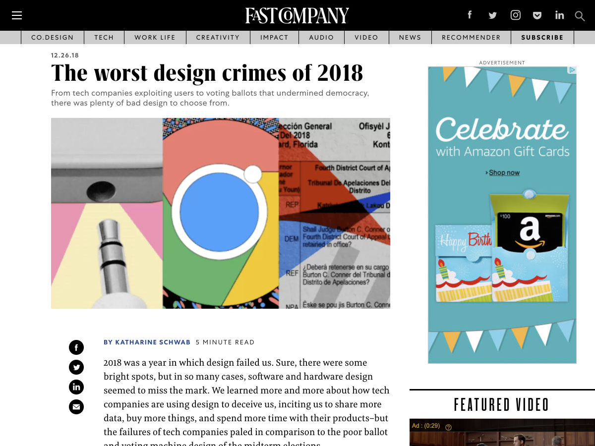
The Worst Design Crimes of 2018


Evolution of a Landing Page


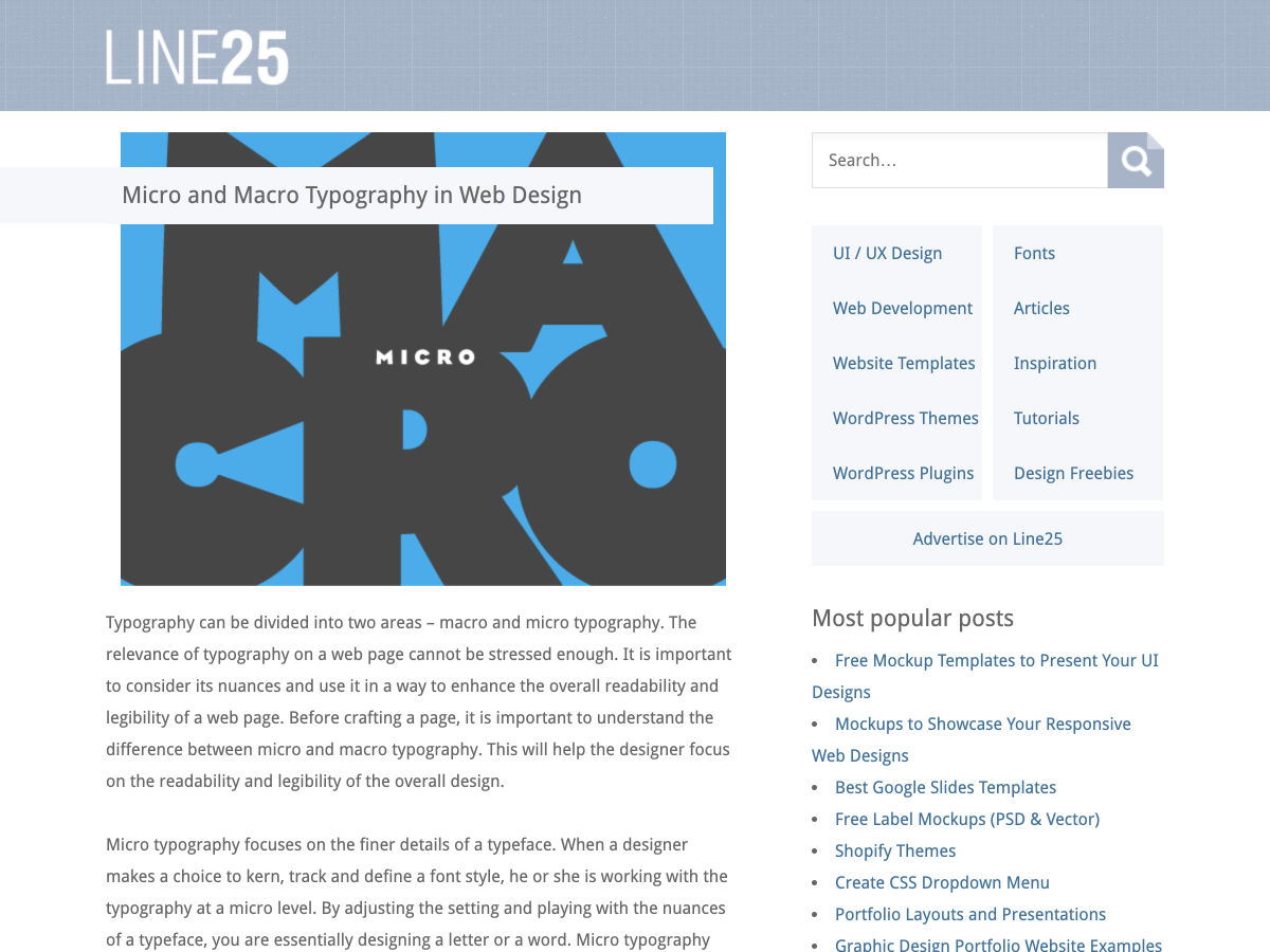
Micro and Macro Typography in Web Design


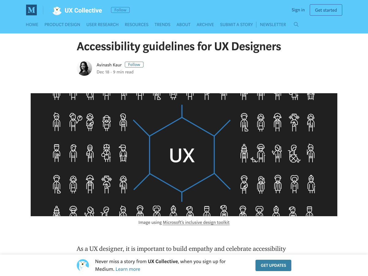
Accessibility Guidelines for UX Designers


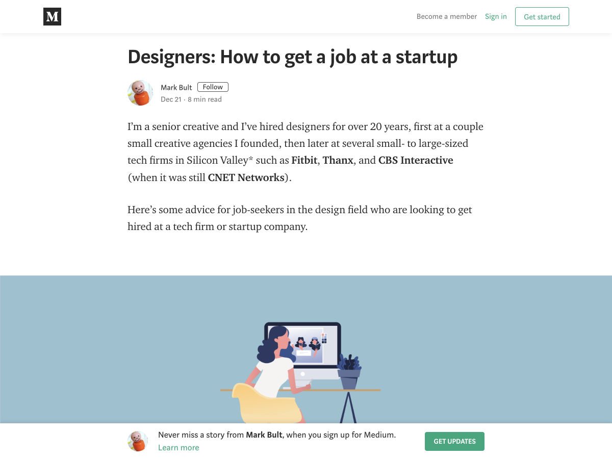
How to Get a Job at a Startup


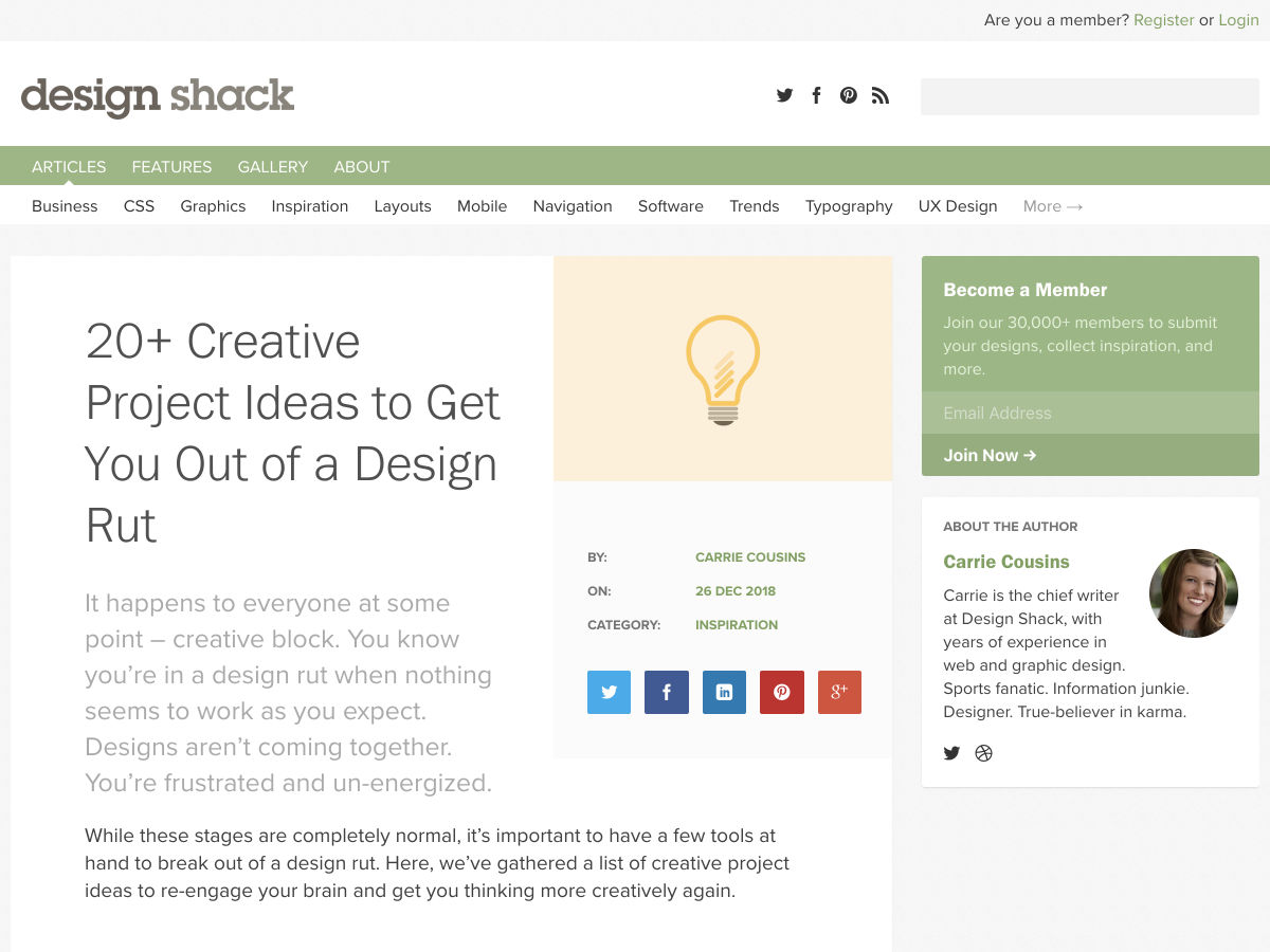
20+ Creative Project Ideas to Get You Out of a Design Rut


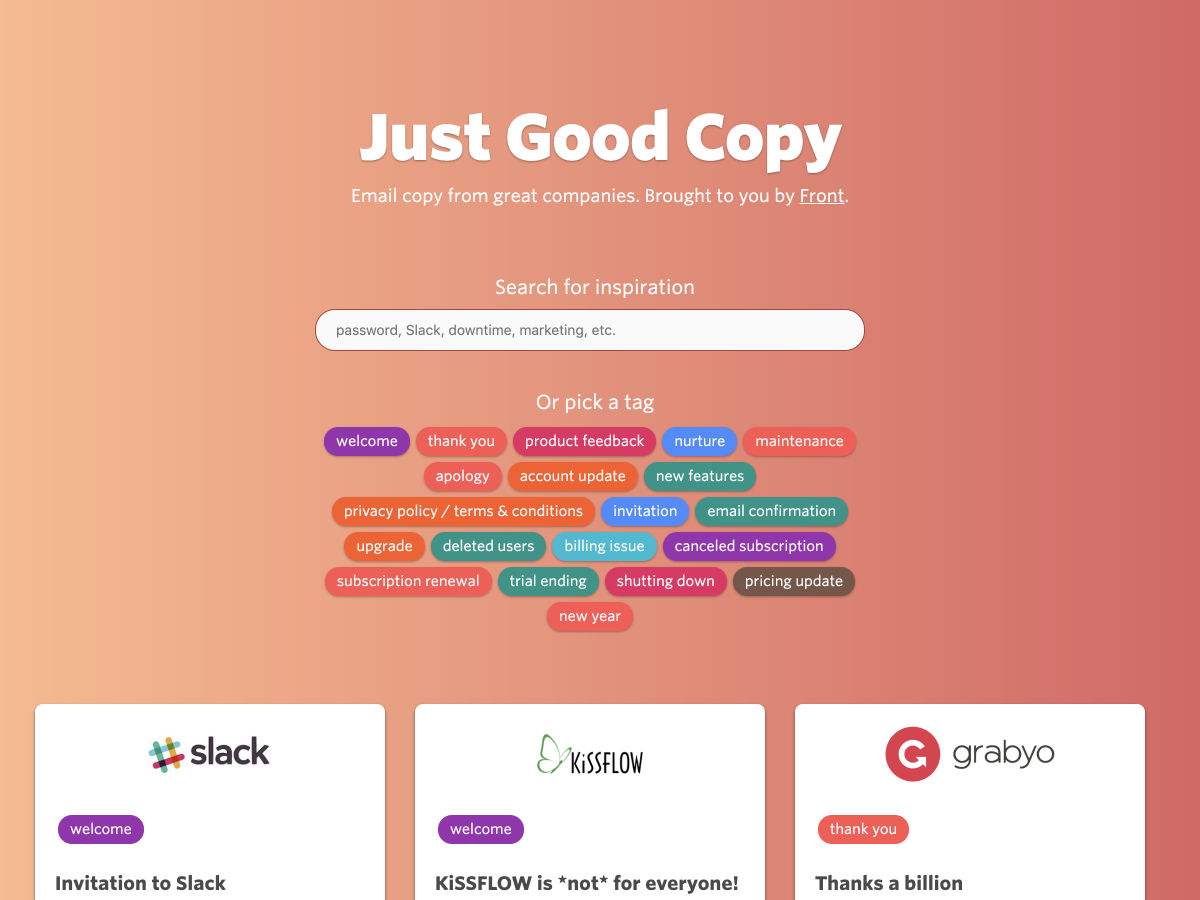
Inspiration: Good Email Copy – Email Copy from Great Companies.


Designers Talk: How to Be Unique in 2019


“Should We even Be Here?”: Three Perspectives on Imposter Syndrome


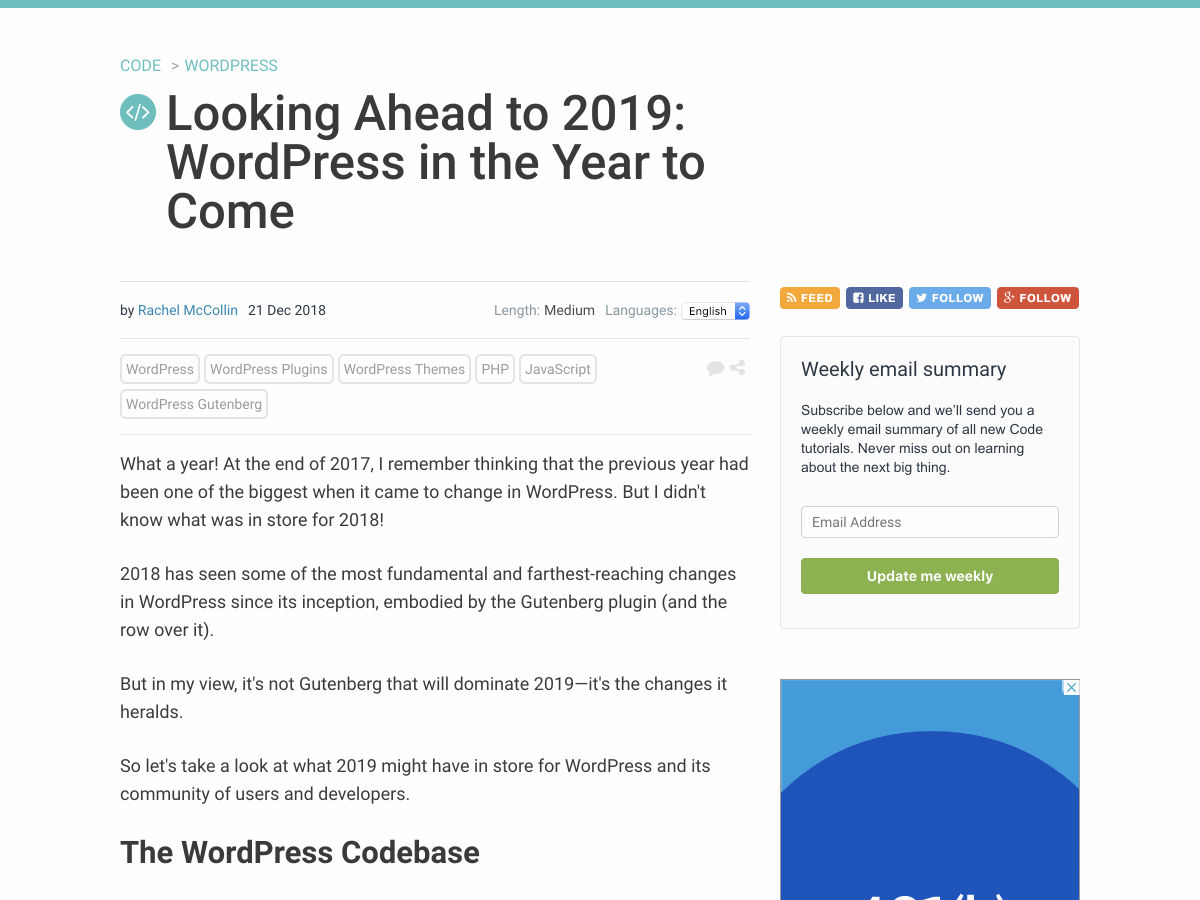
Looking Ahead to 2019 – WordPress in the Year to Come


Quick and Simple Image Placeholders


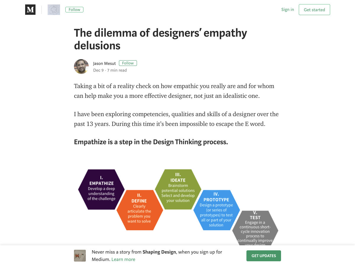
The Dilemma of Designers’ Empathy Delusions


Designing your Site like it’s 1998


Awesome Demos from 2018


Learning Design from Musicians


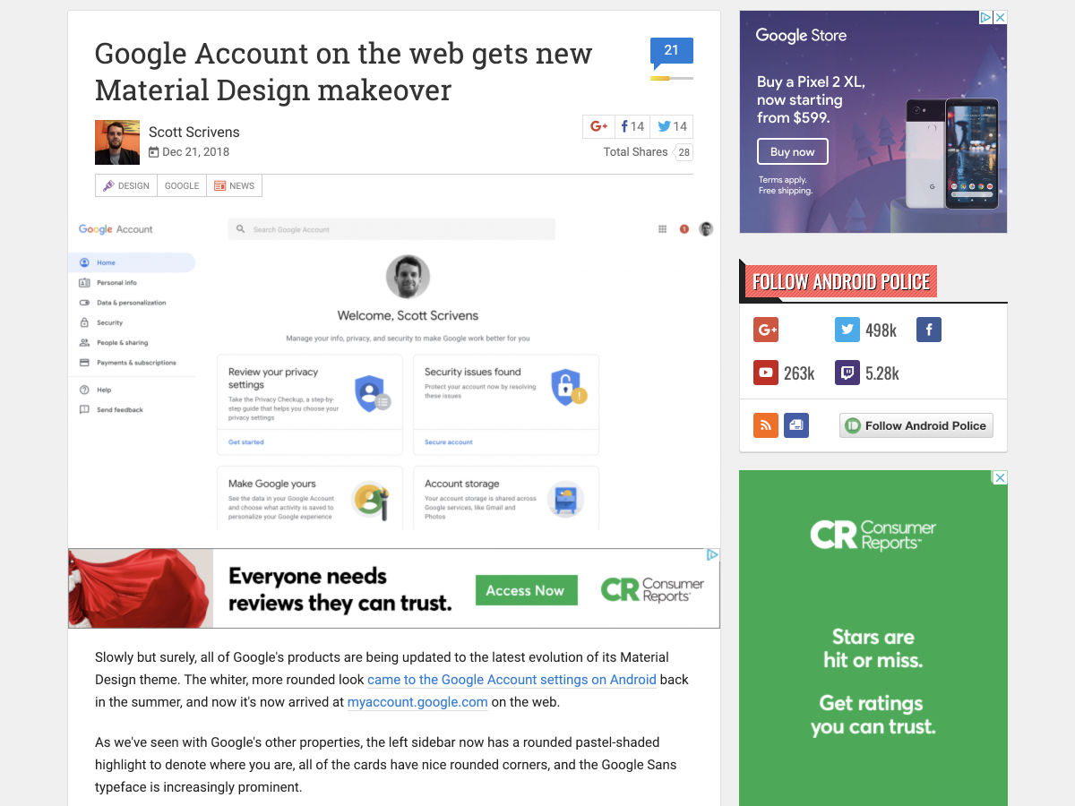
Google Account on the Web Gets New Material Design Makeover


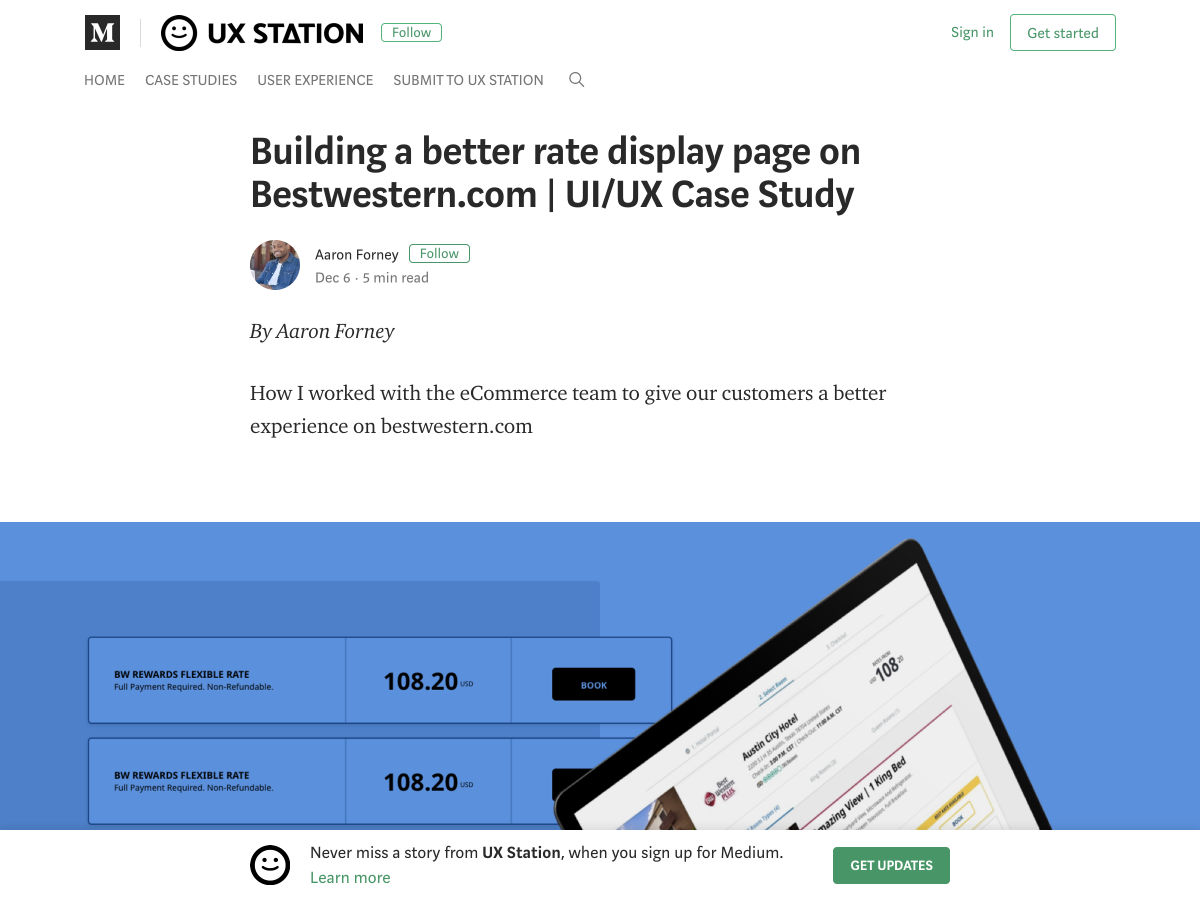
Building a Better Rate Display Page for Customers


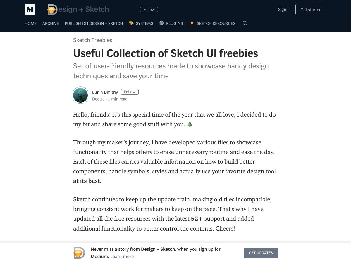
Useful Collection of Sketch UI Freebies


The Best and Worst Identities of 2018, Part 2: The Best Reviewed


How to Deal with a Creative Meltdown


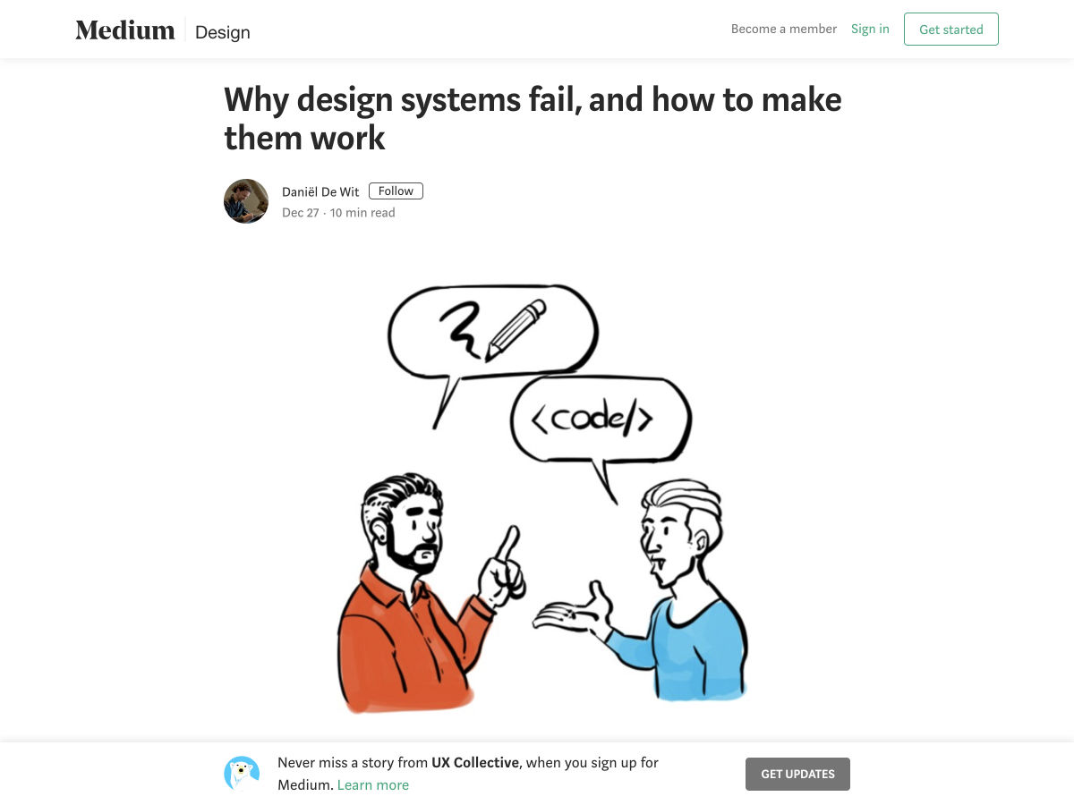
Why Design Systems Fail, and How to Make Them Work


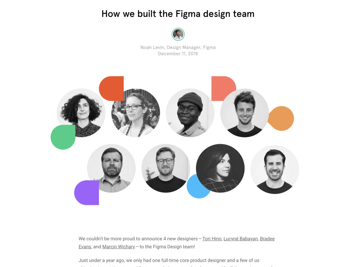
How We Built the Figma Design Team


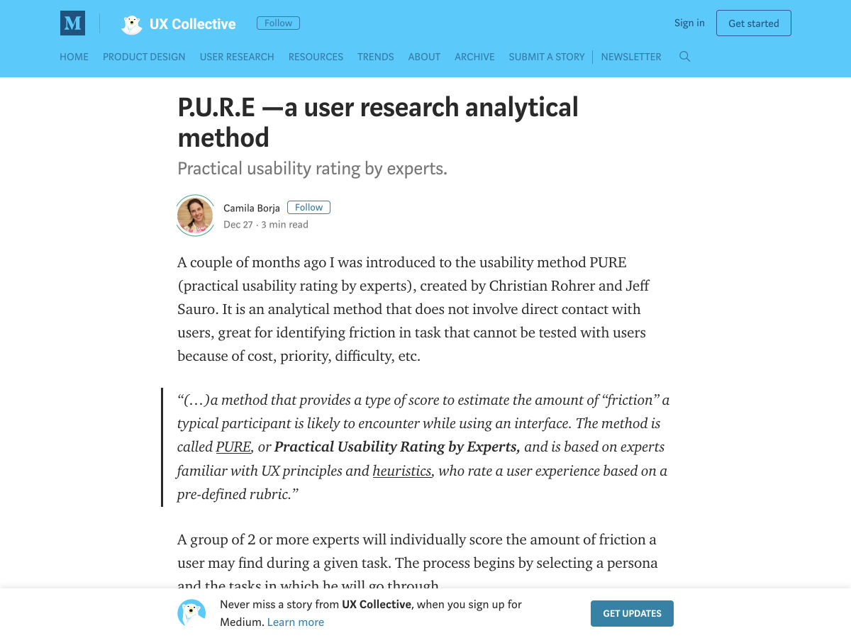
P.U.R.E -a User Research Analytical Method


Want more? No problem! Keep track of top design news from around the web with Webdesigner News.

Add Realistic Chalk and Sketch Lettering Effects with Sketch’it – only $5!

Source

p img {display:inline-block; margin-right:10px;}
.alignleft {float:left;}
p.showcase {clear:both;}
body#browserfriendly p, body#podcast p, div#emailbody p{margin:0;}

from Webdesigner Depot http://bit.ly/2RmEng4


from WordPress http://bit.ly/2BRMrvI

Friday, December 28, 2018

20 Hints That It’s Time to Take a Holiday

Everyone needs time off, and this is especially true for creative professions. The brain is like any other organ in your body: when it gets tired, it doesn’t work nearly as well. Keep going when your brain is tired, and it’ll start thinking daft thoughts like, “Maybe if I put some cocaine in my Adderall CoffeeTM, I can invent the next great framework after I finish up this site for my uncle’s business.”

Very rarely is anything of worth accomplished in that state of mind, and when it is, it’s an accident. You need rest. You need a long holiday, then a few days of vacation when you get back to recover from the holiday. Go. Do it. Doctor’s orders.

Here are a few handy clues to let you know when you absolutely need that rest:

  1. When the kerning in a movie title ruins the rest of the movie for you.
  2. When you ironically make the client’s logo take up half the page.
  3. When you forget to be unironic, and submit that version of the design.
  4. When the client signs off on it and says, “Good job! It’s like you read my mind!”
  5. When you’ve slept on your keyboard often enough to figure out which bit of it is most comfortable, and leaves the most flattering indentations in your face.
  6. When you’ve actually memorized all of Photoshop’s shortcuts. All of them.
  7. When you find yourself making songs out of inspirational design quotes, e.g. “Keeeep iiit siiiimple, stuuupiiid…” [This is to be sung as a country song of some kind.]
  8. When you actually sing those “songs” out loud…
  9. …in front of people.
  10. When you start coming up with your own inspirational design quotes because the ones you have just aren’t doing it anymore.
  11. When you’d rather spend hours going through your inspiration collection than actually designing anything because actually designing a thing means making decisions and making deciSIONS MEANS YOU COULD FAIL AND OH MY GOD YOU’RE JUST NOT SURE YOU CAN HANDLE ANOTHER EMAIL FROM THE CLIENT ASKING FOR MORE REVISIONS YOU ONLY HAVE SO MANY IDEAS TO WORK WITH and how the hell do you just make something pop anyway?
    Or maybe that’s just me.
  12. When you find yourself looking for typographical ways to represent a small panic attack…and you succeed.
  13. When you’ve run out of CSS/JS frameworks to try. Take fifteen minutes off and there’ll be another one along. Take a week off, and you’ll have plenty to do when you get back.
  14. When you seriously consider just deleting all the HTML/CSS and starting over for the fourth time.
  15. When you seriously consider bringing up file naming syntax in a meeting.
  16. When you realize that no file should ever be labeled with the word “final”. That kind of growth as a person should be rewarded.
  17. When you start to envy developers. Developers have to use math, and should never be envied.
  18. When you start to speak aloud in ways reminiscent of your marketing copy, e.g. “Wanna go out with me? I’m a dating rockstar/ninja!”
  19. When you see things misaligned in real life and think, “Who would just leave it like that? That’s 200 pixels off! What is that in ems, anyway?”
  20. If you’re thinking of printing this article out and posting it in the office.

And finally…

Bonus round – here’s a classic: Any time someone says anything like “My nephew/daughter/middle school teacher could do that in PowerPoint for free.”

That’s right. By the power vested in me by absolutely no one, I declare that any designer who hears anything like that should get a week of vacation, no questions asked. I’m off for a few days. Don’t call me.


Featured image via DepositPhotos.

Add Realistic Chalk and Sketch Lettering Effects with Sketch’it – only $5!

Source

p img {display:inline-block; margin-right:10px;}
.alignleft {float:left;}
p.showcase {clear:both;}
body#browserfriendly p, body#podcast p, div#emailbody p{margin:0;}

from Webdesigner Depot http://bit.ly/2RlEaK7


from WordPress http://bit.ly/2GMgtGH

Thursday, December 27, 2018

How to Stop SEO Disasters During Website Migration

After many weeks and months of preparations, you are ready to go; you’ve done everything that you needed to do to make sure that the design and development of the new site has been put together perfectly and you are happy to move forward.

So you press the launch button (because that’s how it works, right?), you sit back and congratulate yourself and your colleagues on relaunching the new website successfully…

…only to see the organic traffic has plummeted.

You look in fear, but then stop for a second because everyone knows that a site relaunch can sometimes cause an initial slump in organic traffic. You assume that it’s normal.

But after days, weeks and months, the traffic doesn’t recover, and panic sets in…

This is a potential reality for anyone who is relaunching a website. Amidst all the excitement with the new design and new features, not everyone thinks about the consequences that could happen if you don’t plan it effectively, especially from an SEO perspective.

In order to minimise any potential disasters, there’s a simple step-by-step process that you should follow in order to make sure that the periods before, during, and after the launch go smoothly and to better your long-term SEO strategy.

What Qualifies as Website Migration?

Google is surprisingly not very specific about moving sites and what it involves. They have two pages: one for site moves with URL changes and one without URL changes.

But it can actually get a lot more detailed and complex than that.

Let’s look at some of meanings of website migration and what it can involve:

  • you are changing domains and are planning to move from one domain to another e.g. during a rebrand;
  • you are going international and require to change the TLD (Top Level Domain) e.g. from .co.uk to globally recognised .com;
  • you want geo-specific TLDs and sub-folders e.g. .com/uk, .com/fr, .com/ca;
  • you are going to undertake structural changes e.g. changing the internal linking, changing the site hierarchy, changing the user journey;
  • you are changing from HTTP to HTTPS;
  • you are going to change the CMS (content management system) or platform you are currently on;
  • you are redesigning a website completely;
  • you are changing the mobile setup by applying AMP (Accelerated Mobile Pages) or PWA (Progressive Web Apps);
  • you are going through content changes e.g. adding/removing pages, introducing new languages, consolidating pages.

What to be Aware of Before Starting the Migration

Every migration is different, but there are some things that you need to be aware of before you even touch the website:

  • Work out your strategy – Do you need to do this? Why? What are you hoping to achieve? What are your objectives?
  • Who is going to be involved in this project? Get them involved as early as possible – whether you like it or not, you can’t do it alone. Make sure you talk to the relevant stakeholders to understand how it can impact them and how they can help to minimise disruptions. And the earlier they can be involved, the better.
  • Get professional SEO consultations to help you – much of the tasks listed below will involve someone with SEO expertise before, during and after the site has relaunched.
  • Get professional UX and CRO consultations to help you – you also need to follow the important elements of UX e.g. what kind of impacts certain design changes are going to have on user engagement and how it will affect conversion rates.
  • Looks aren’t everything – in the middle of all the excitement about building something visually stunning, make sure it doesn’t come at a usability or SEO cost. Sure, add a bit of flair and style to it, but don’t go over the top.
  • Get everyone to test – all the stakeholders should help with testing. This also applies if you have the development site already set up and are available to test.
  • Put time aside for fixing bugs and errors after launch – no, you can’t relax after you’ve done your bit
  • Site migration is not a solution for penalty – if you are suffering from any algorithmic penalties, it will not disappear during the migration. This will need to be fixed manually.
  • Never migrate your site during peak seasons – so if your busy period is Christmas, then don’t migrate the site between October and January

Before You Rebuild Your Website

  1. Crawl all URLs using tools like Screaming Frog SEO Spider and Sitebulb
    • Compile a list of all the URLs and add traffic performance (visits, bounce rates, exit rates, conversion) to use as a benchmark post-launch;
    • Eliminate any duplicate/low quality contents by redirects or improving them;
    • Check for broken links;
    • Check for broken pages;
    • Make sure all the relevant pages are accessible to search engines;
    • Make sure all the pages are accessible to humans (blind users, mobile users, browser compatibility).
  2. Compile the list of the new URLs.
  3. Plan out your new URL structures and site hierarchy/architecture.
  4. Carry out keyword research for every single page.
  5. Compile a list of your top keywords and note their rankings.
  6. Update or create new content for the new pages and include relevant keywords.
  7. Map out the 301 redirects from old to new URLs (and avoid redirect chains) in a spreadsheet.
  8. Identify and compile a list of your most important backlinks.
  9. Measure the page speed using tools like GTmetrix and WebPageTest.org.
  10. Set-up the new social media profiles if you are rebranding the name.
  11. Register and configure the new domain in Google Search Console.
  12. Carry out usability testing to prevent bad experiences from happening on new site.
  13. Plan your relaunch campaign – “hey we launched a new website” should happen soon after the launch rather than later. Who can help you with that? Current customers/clients/suppliers/bloggers/PRs etc.

During the Redesign

  1. Block development site with meta noindex tag or robots.txt to prevent duplication issues on Google.
  2. Make sure web analytics are implemented and tested on all pages.
  3. Publish the new URLs and content on the development site.
  4. Add/update title tags, meta description and alt texts to new pages.
  5. Add Google Tag Manager.
  6. Add any necessary retargeting and remarketing codes e.g. Facebook Pixels and Google Remarketing.
  7. Set up and verify your new Google Search Console account.
  8. Remove or update internal links which are pointing to broken or removed pages.
  9. Update your XML sitemaps and have it ready to submit on Google Search Console.
  10. Update all canonical tags and self-canonicalize all new pages.
  11. Update all internal links.
  12. Update your robots.txt.
  13. Create a custom 404 page.
  14. Crawl the site and verify that all 301 redirects are working.
  15. Add schema to create rich snippets opportunities.
  16. Add Open Graph fields for further rich media experience.
  17. Ask the relevant stakeholders to help with testing.
  18. When nearing the relaunch, attempt to organize usability testing for small amount of traffic or by using focus groups to iron out any issues.
  19. Ensure the site is compatible on most popular browsers and mobile devices.
  20. Ensure the site is accessible to visually-impaired users.

After the Relaunch

  1. Submit a change of address via Google Search Console.
  2. Submit new XML sitemap.
  3. Update all social media bios with new URLs.
  4. Crawl the new site and check that the redirects are working, all internal and external links are working, and fix any 404 pages.
  5. Crawl the list of URLs that you have extracted originally and verify their redirects.
  6. Add annotations on Google Analytics to make sure you know when the site has relaunched and subsequent changes.
  7. Update backlinks with new URLs by contacting those who have linked to you.
  8. Continuously monitor the web traffic, engagement and conversion as well as page speed.
  9. Test the mobile friendliness of your site using the Mobile Usability feature of Google Search Console.
  10. Benchmark those performance metrics against the old site.
  11. Reach to the authoritative sites that link to you and ask them to update the link to the new site.
  12. Monitor the indexed page count via Google Search Console and using the site: search on Google.
  13. Monitor your search rankings over time.
  14. Keep control of the old domain just in case of any issues.
  15. Organize new usability testings of the new site.
  16. Launch your relaunch campaign.

Choosing to Migrate or Not

Relaunching can be a good thing as it allows you to deliver the best user experience possible for your audience, a chance to refresh your brand and improve the bottom-line for your clients.

But that is only if you do it for the right reason and you plan the site migration properly.

You know the old saying by Benjamin Franklin: “if you fail to plan, you are planning to fail”.

If you plan and execute your relaunch successfully, this will give you the best chance of catching any problems as early as possible and to make the process a smooth one.

Because you do not want to go through the headache of a botched migration.


Featured image via DepositPhotos.

Add Realistic Chalk and Sketch Lettering Effects with Sketch’it – only $5!

Source

p img {display:inline-block; margin-right:10px;}
.alignleft {float:left;}
p.showcase {clear:both;}
body#browserfriendly p, body#podcast p, div#emailbody p{margin:0;}

from Webdesigner Depot http://bit.ly/2GQFwZs


from WordPress http://bit.ly/2AkCTsX

Wednesday, December 26, 2018

Quiz: Could You Become a Design Consultant in 2019?

According to a recent QuickBooks survey, the #1 reason freelancers go into business for themselves is because it lends them the freedom to shape their own career path.

Whether you’ve done freelance web design work for a few months or a few years, there may come a time when you feel bored, unchallenged, or limited by it. When that happens, do you keep charging along because it’s what you originally set out to do? Or do you work on turning your career path into something that better aligns with your goals and job preferences?

One possible career pivot I want to present to you today is web consulting. Be sure to scroll down and take the quiz to see if this is a smart move for you!

Designer vs. Consultant: What’s the Difference?

A web designer or developer is someone who actually gets their hands dirty. They’re the ones who use coding and design skills to build a website from the ground up. Projects usually only last a couple months, unless maintenance services are offered afterwards.

A web consultant is an advisor for those in need of or who already have a website. They can provide a one-time assessment to clients or work as a dedicated advisor and guide.

Consultants specialize in the total landscape—from user persona research to optimization of a website and related marketing activities post-launch. As such, a web consultancy enables you to offer as little or as much as you’d like, unlike web design services which are a bit more rigid in nature.

In fact, selling consulting as an add-on to your web design plans could prove quite lucrative in and of itself. Not only would you become a total end-to-end provider of website services, but this would help you retain clients over longer periods of time.

Plus, as website builder tools grow more and more popular, you may find that many of the clients you would’ve easily sold design services to a year ago now confidently believe they can build a website on their own. And they have a point. Builders have greatly simplified the work that goes into creating professional-looking websites.

What these builders haven’t been able to do, though, is teach everyone how to choose the right color palette for accessibility or the right typeface for mobile users. Nor do page builders explain the importance of things like security and speed in the grand scheme of SEO. They may remove the need for someone to do hands-on work on a website (at least in your clients’ eyes), but they haven’t taught these DIY users the why of it all.

Take the Quiz: Are You a Designer or a Consultant?

I don’t mean to make this a completely black-or-white question. I believe that you can still build websites for a living while also providing occasional consulting to clients. Or vice versa. In fact, performing a mix of duties might be the perfect way to spice up your workday while bringing some much-needed stability to your income.

Use the following quiz to shed some light on whether or not website consulting is a viable path for you:

https://www.webdesignerdepot.com/wp-content/plugins/wp-fs-polls/widget/poll.js.php?v=2

If you’re an implementer through-and-through, consulting isn’t a good choice for you.


https://www.webdesignerdepot.com/wp-content/plugins/wp-fs-polls/widget/poll.js.php?v=2

If you’re not happy with the job anymore, it’s time to look at another career path, like consulting.


https://www.webdesignerdepot.com/wp-content/plugins/wp-fs-polls/widget/poll.js.php?v=2

Consultants are inherently great at project management. If you don’t have the skills or interest, don’t go down that path.


https://www.webdesignerdepot.com/wp-content/plugins/wp-fs-polls/widget/poll.js.php?v=2

Small business owners would appreciate the guidance, but won’t be able to afford your services. Enterprise-level companies will want the total package from you, so unless you have an agency, it may be best to hold off on approaching them.


https://www.webdesignerdepot.com/wp-content/plugins/wp-fs-polls/widget/poll.js.php?v=2

If you’re not a people-person, consulting will be a very bad fit.


https://www.webdesignerdepot.com/wp-content/plugins/wp-fs-polls/widget/poll.js.php?v=2

Consultants aren’t just people-persons. They’re also know-it-alls (but in the good sense).


https://www.webdesignerdepot.com/wp-content/plugins/wp-fs-polls/widget/poll.js.php?v=2

Consultants are voracious learners. They have to be if they want to provide guidance that’s well-informed and valuable.


https://www.webdesignerdepot.com/wp-content/plugins/wp-fs-polls/widget/poll.js.php?v=2

Unless you plan on providing one-off consulting services to clients, planning to consult, design, and develop by yourself just isn’t sustainable.

Is Web Consulting for You?

Not everyone is cut out for web consulting. And that’s fine. There are other ways to provide high-priced and recurring services to clients. Like selling website support or maintenance services.

But if you’re unhappy with what you’re doing now, don’t let your discontent affect the quality of your work. Find a way to fix it by pursuing a career path that makes the most sense for you.


Featured image via DepositPhotos.

Add Realistic Chalk and Sketch Lettering Effects with Sketch’it – only $5!

Source

p img {display:inline-block; margin-right:10px;}
.alignleft {float:left;}
p.showcase {clear:both;}
body#browserfriendly p, body#podcast p, div#emailbody p{margin:0;}

from Webdesigner Depot http://bit.ly/2ESjnYX


from WordPress http://bit.ly/2Q570d0

Monday, December 24, 2018

The State of Web Design, December 2018

Hey there, WDD Readers. Once more, I have spent a whole lot of my life online. My New Year’s resolution is to stay inside and keep doing that. I feel I shall probably succeed.

I have lived and breathed Internet stuff all year, and once again, I don’t even know how much I don’t know. The Internet holds untold numbers of secrets, most of them fairly dull, some of them delightful, and some of them are disgusting enough to inspire a certain awe and respect.

It’s a world unto itself. In my little corner of this world, I’ve once again noticed a few trends, and that’s what I’m here to write about today.

Aesthetic Fusion

Have you ever had Japanese food in Mexico? I’ve consulted with the experts (that is to say, actual Japanese people), and they’ll tell you that the Japanese food here is nothing at all like the real thing. Mexicans took Japanese food, and gave it their own spin, because apparently deep-fried sushi with some avocado in the middle sounded like a good idea to someone down here.

Heck, it sounds good to me. I love avocado as only a millennial raised in Mexico can.

Some people call this “fusion”—others have less complimentary names for it—and it’s happening in web design, too. Over the last couple of years, distinct design aesthetics burst onto the scene, and people went all out for brutalism, postmodernism, and more. Trends were popping up out of seemingly nowhere and taking on a life of their own, at speed.

This last year, though, it seems the emergence of distinct trends has slowed down. I’ve seen a lot more aesthetic fusion going on, with post-modern elements being mixed into fancy, elegant and serif-heavy designs, classical minimalism being given a hint of brutalism, and so on. It’s an interesting twist, and these fusions may eventually become aesthetic schools in their own right, one day. I’ll be watching with interest.

The Return of the “Business” Aesthetic

I’ve also noticed an upswing in the number of sites (including non-business sites) that look a bit… well… old. Not vintage or retro, but purposefully dated back to that era when almost every template was a “business” template.

Don’t get me wrong, these sites are built with things like Flexbox and CSS Grid, and they are clearly polished to a level consistent with everything we know about design now. But the bones of the design are old, maybe a little boring, and very business-friendly.

My theory is that after so much artsy design, some customers are asking their designers to go back to something a little more comfortable and familiar. It probably doesn’t help that many of the more experimental design trends can suffer in the usability and accessibility departments.

My prediction: This trend will continue, but only to a point. Some clients will be more concerned with standing out while other will just ask for something that works, and looks like something they expect of a professional business.

We’re Hardly Hearing About VR Anymore

VR is not dead, but we are hearing less and less about it, especially in regards to web design. Though it has been heralded as the next frontier for just about every kind of media, we’re seeing a general slowing of the industry. It is, for now, a niche.

the prophets of the past couple of years got their burning bushes a little too early

It’s not that the platform doesn’t have potential, it’s that the hardware is still prohibitive. It’s prohibitively expensive. It prohibits easily switching from VR to non-VR tasks. It’s nigh-impossible to use outside for a variety of reasons, where most people who aren’t us nerds spend a lot of time.

VR is coming, but the prophets of the past couple of years got their burning bushes a little too early, I think.

Front-end Code is More Developerized

Last year, I went over the battle being waged between groups I called the Experimentalists and the Standardistas. The Experimentalists are currently on a rising tide, buoyed by an influx of back end developers who are attempting to rewrite front end code in their image.

Seriously, the idea of CSS-in-JS used to be a joke, a subject of April Fool’s jokes and satirical articles. People aren’t joking about it so much anymore. The Standardista camp is blaming efforts to “developerize” front-end code on devs who never learned the original concepts and intent behind the way HTML is written, or things like the cascade.

the idea of CSS-in-JS used to be a joke, a subject of April Fool’s jokes and satirical articles

I think that’s more of a symptom than a cause, though. I blame the now nearly-constant demand for full-stack developers. While it’s certainly helpful to know a bit about how “the other side” works, there seems to be a rising aversion to specialization in the job market. As a generalist myself, I can understand that. But specialists exist for a simple reason: the Internet is too darned big for any one person to ever really be able to do it all on their own.

(It’s fairly obvious that I lean towards Standardista myself, isn’t it?)

Content Gets Blocky

I’d be remiss, nay, downright negligent if I didn’t address this: While some CMS creators are focusing on simple, text/Markdown-only solutions (which absolutely have their place), web content in major CMS options seems to be going increasingly the way of LegoTM. It started with more limited CMS like Medium, and is being expanded upon in newer iterations, like WordPress’ Gutenberg.

Block-based content is that most elusive of solutions: a compromise. It combines some flexibility and choice on the part of the user with a degree of control for the designers and developers. It can’t stop bad decisions (few things can stop the really bad ones), but I believe with all my little designer heart that it’s the way forward.

I guess we’ll see where it takes us. Same time next year?

Add Realistic Chalk and Sketch Lettering Effects with Sketch’it – only $5!

Source

p img {display:inline-block; margin-right:10px;}
.alignleft {float:left;}
p.showcase {clear:both;}
body#browserfriendly p, body#podcast p, div#emailbody p{margin:0;}

from Webdesigner Depot http://bit.ly/2T6qD6h


from WordPress http://bit.ly/2EIKzYY

Sunday, December 23, 2018

Popular Design News of the Week: December 17, 2018 – December 23, 2018

Every week users submit a lot of interesting stuff on our sister site Webdesigner News, highlighting great content from around the web that can be of interest to web designers. 
The best way to keep track of all the great stories and news being posted is simply to check out the Webdesigner News site, however, in case you missed some here’s a quick and useful compilation of the most popular designer news that we curated from the past week.

Note that this is only a very small selection of the links that were posted, so don’t miss out and subscribe to our newsletter and follow the site daily for all the news.

10 Exciting Web Design Trends You Can’t Hide from in 2019


Inspirational Websites from 2018


You’ve Seen this Font Before, but You Probably Don’t Know its Name


Google Design’s Best of 2018


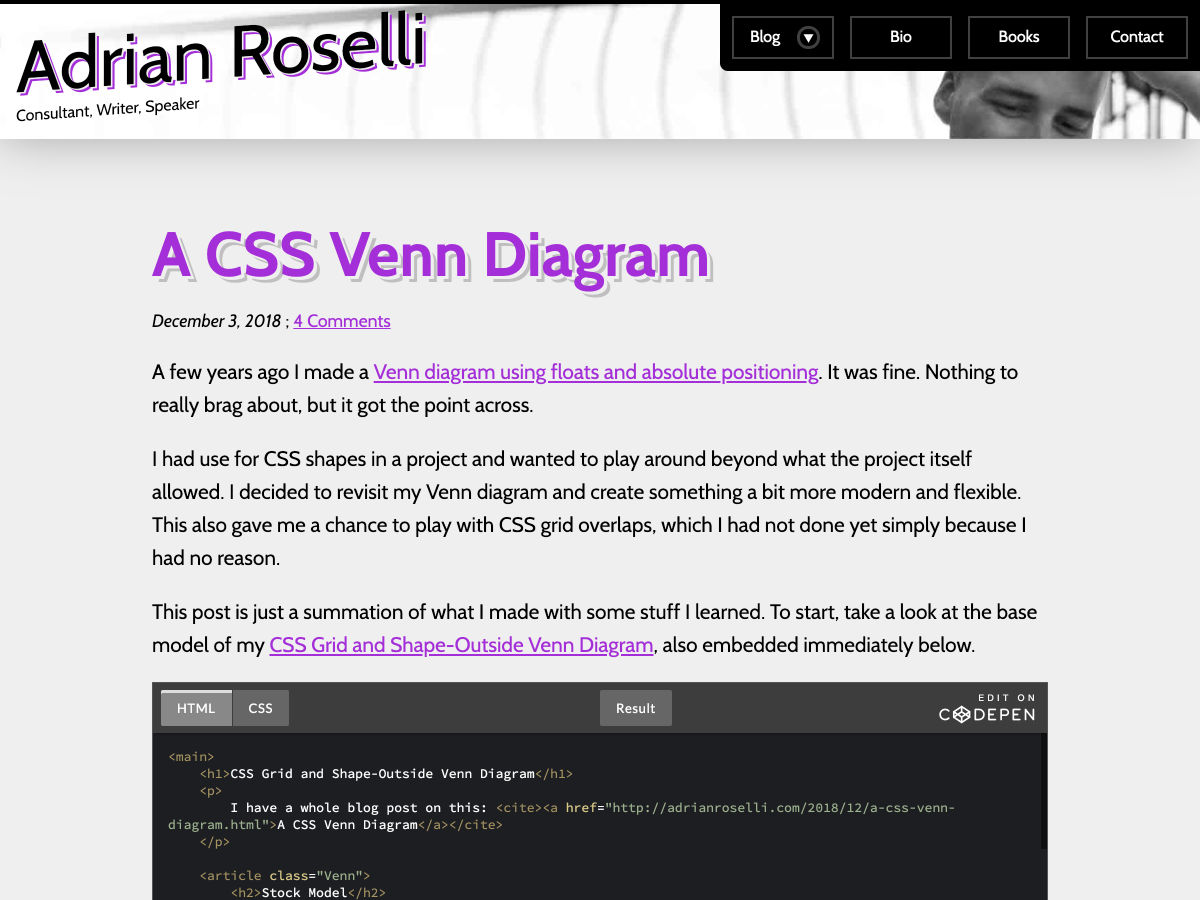
A CSS Venn Diagram


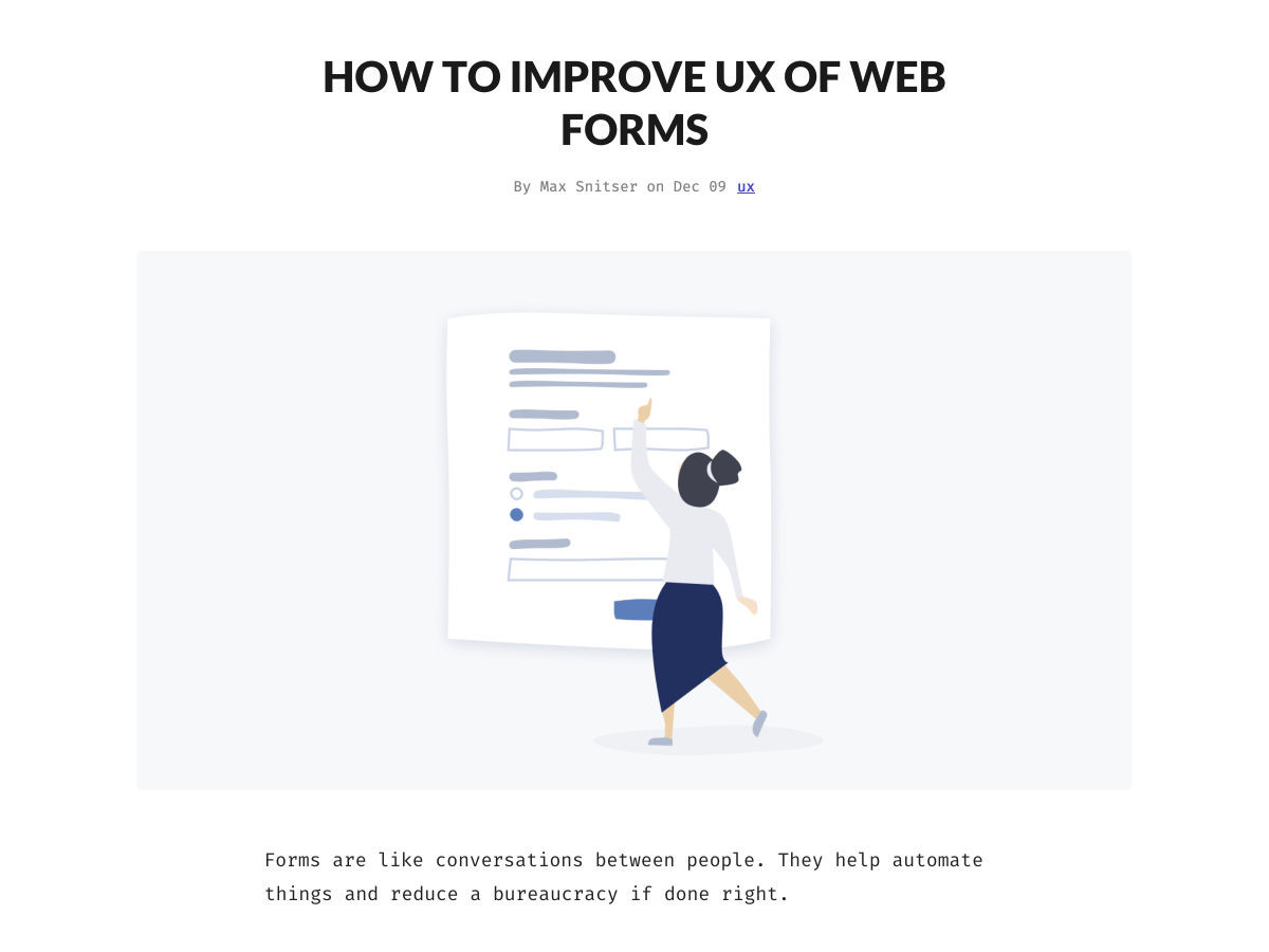
How to Improve UX of Web Forms


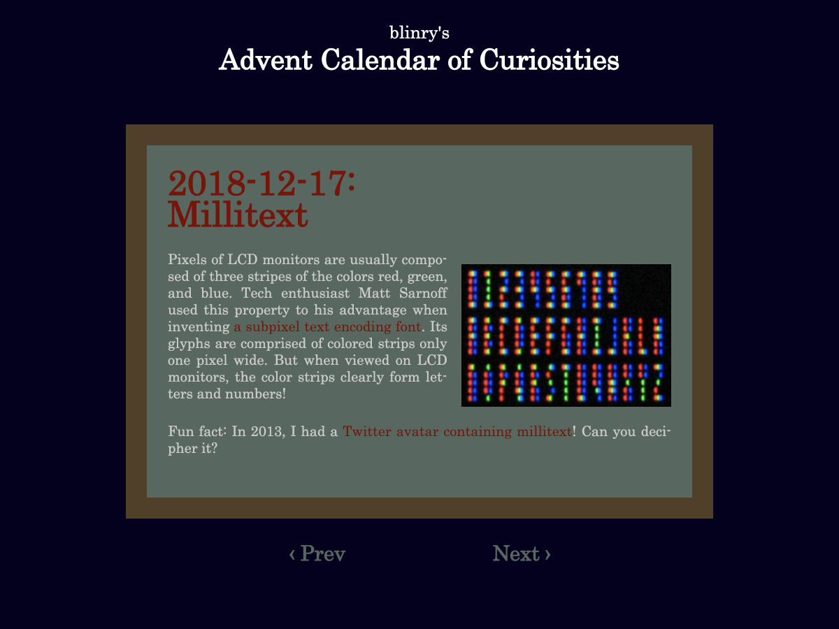
Millitext, a 1px Wide Font (LCD)


The 9 Big Design Trends of 2019


19 Typography Tips that will Change the Way You Design for the Mobile Web


Embracing Open Design in 2019


We Should Replace Facebook with Personal Websites


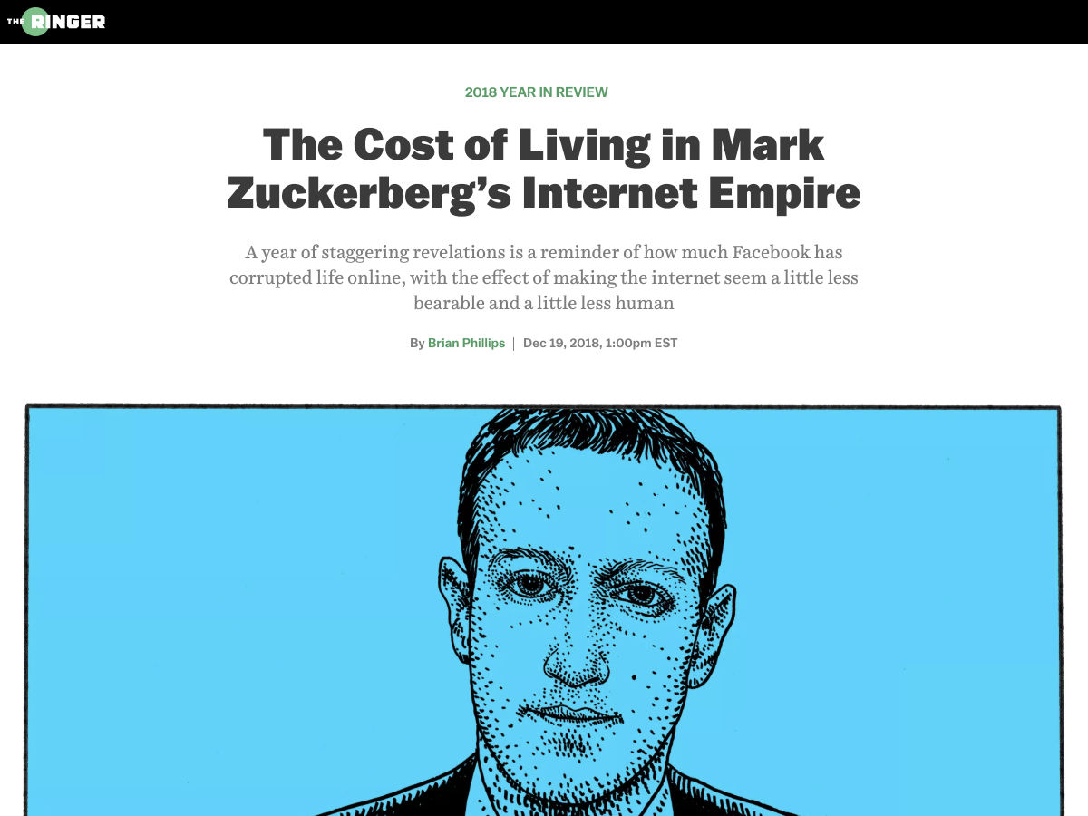
The Cost of Living in Mark Zuckerberg’s Internet Empire


Redesign, but Make it Satire


10 Diagrams to Help You Think Straight About UX Research


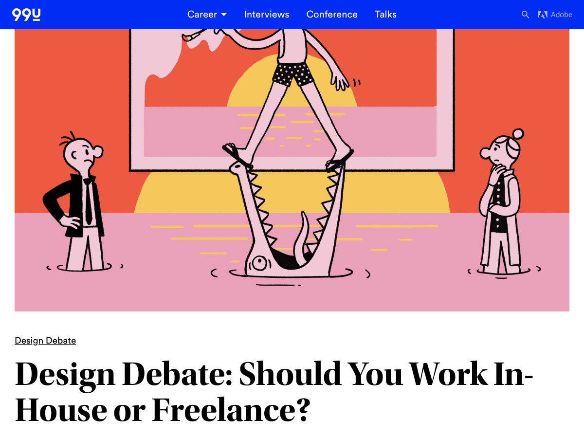
Design Debate: Should You Work In-House or Freelance?


Our Favorite UX Initiatives this Year


How to Delete Facebook Without Losing your Friends and Photos


My Struggle with Colors


Spotify.design


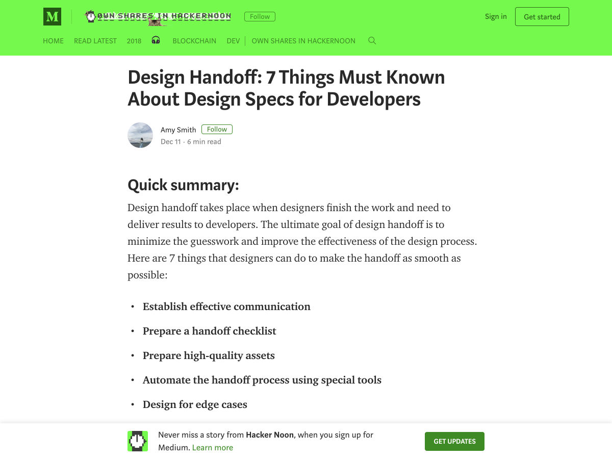
Design Handoff: 7 Things Must Known About Design Specs for Developers


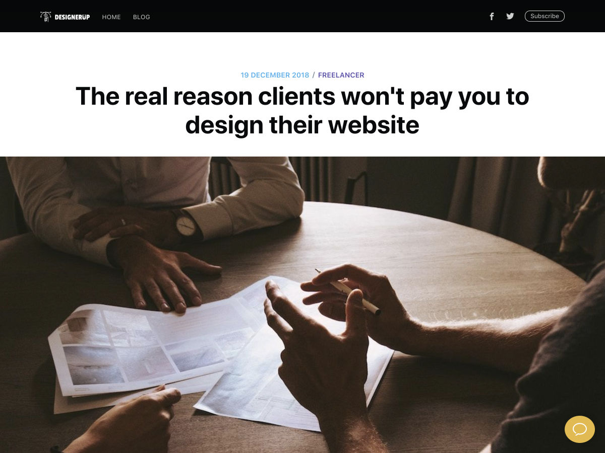
The Real Reason Clients won’t Pay You to Design their Website


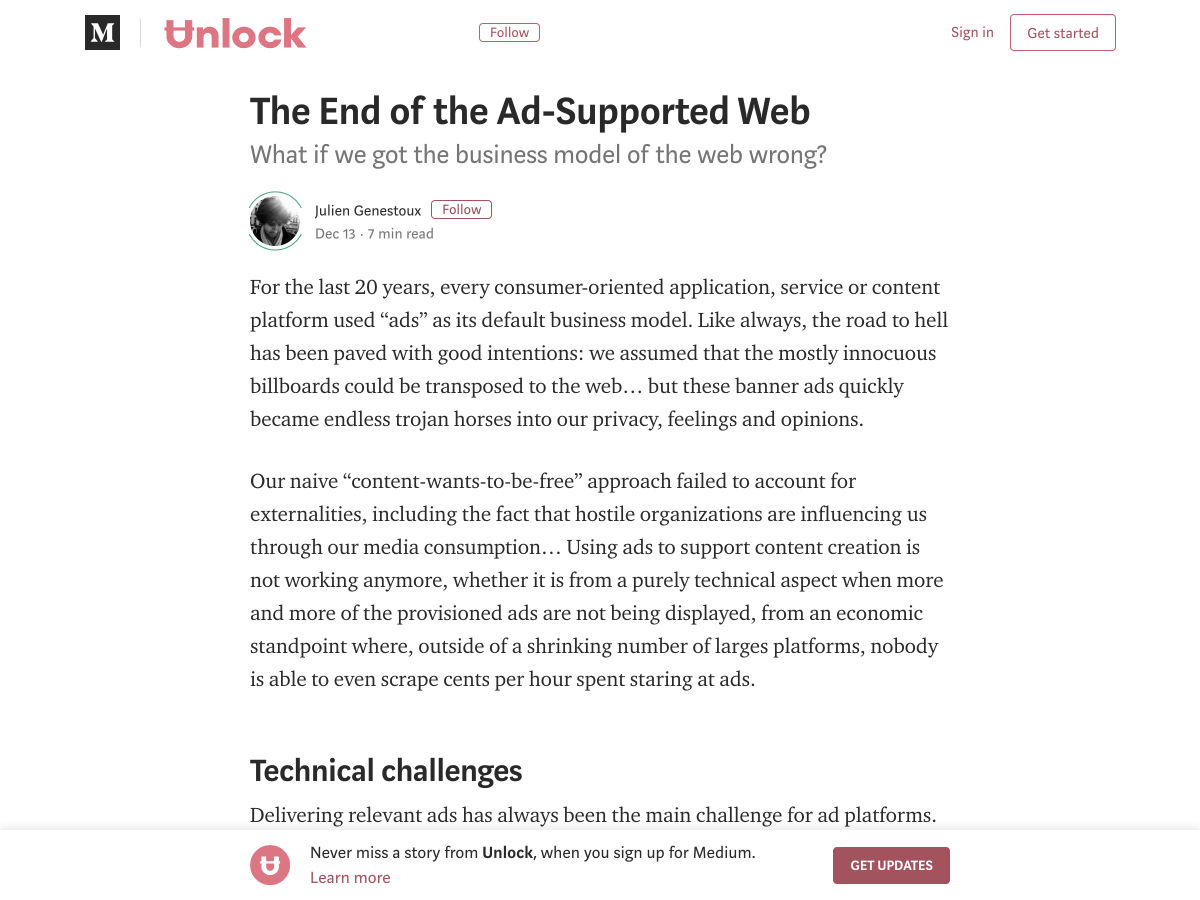
The End of the Ad-Supported Web


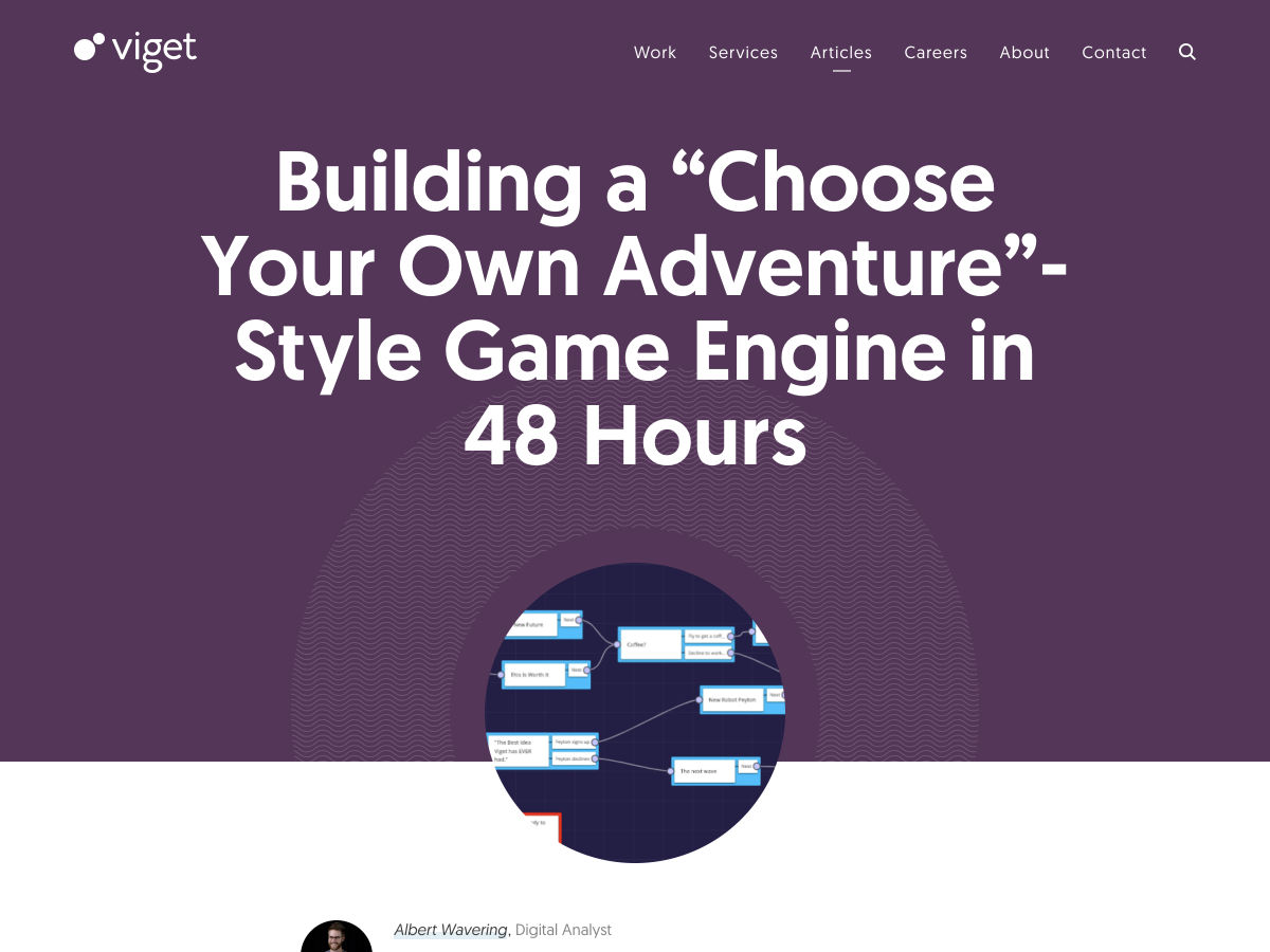
Building a “Choose your own Adventure”-Style Game Engine in 48 Hours


Everything I Learned in 10 Years of Blogging


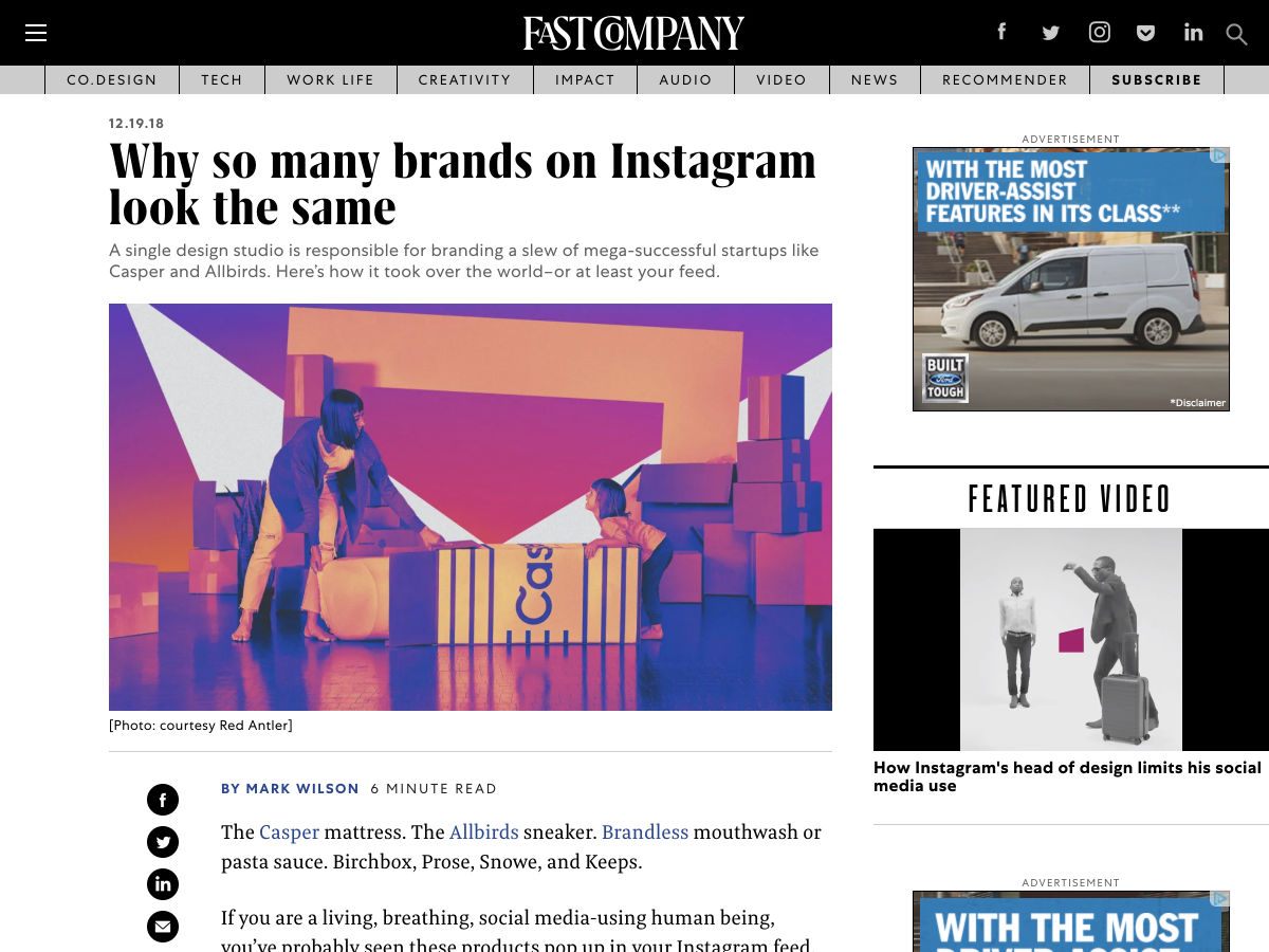
Why so Many Brands on Instagram Look the Same


Want more? No problem! Keep track of top design news from around the web with Webdesigner News.

Add Realistic Chalk and Sketch Lettering Effects with Sketch’it – only $5!

Source

p img {display:inline-block; margin-right:10px;}
.alignleft {float:left;}
p.showcase {clear:both;}
body#browserfriendly p, body#podcast p, div#emailbody p{margin:0;}

from Webdesigner Depot http://bit.ly/2Si4xxE


from WordPress http://bit.ly/2rMZ06O