
 This month, we are looking and some rather obvious visual trends in web design. While some trends are rooted more in the user experience or cool JavaScript, others are purely aesthetic. That’s what you’ll see on the list this month.
From color to shapes to a style of photography, here’s a look at what’s trending this month.
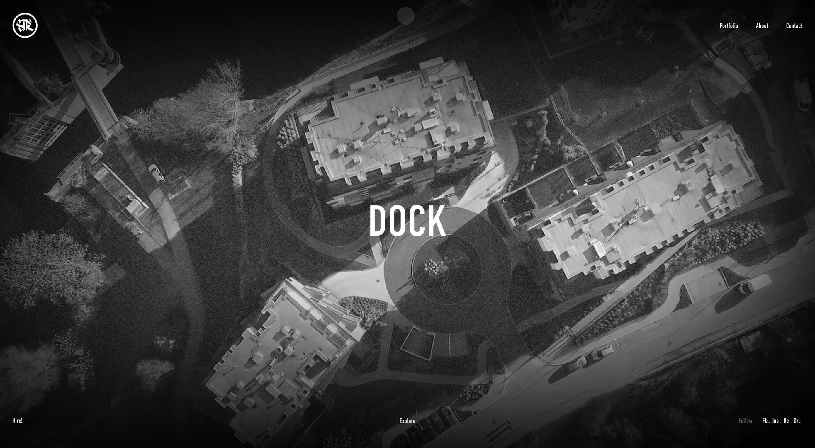
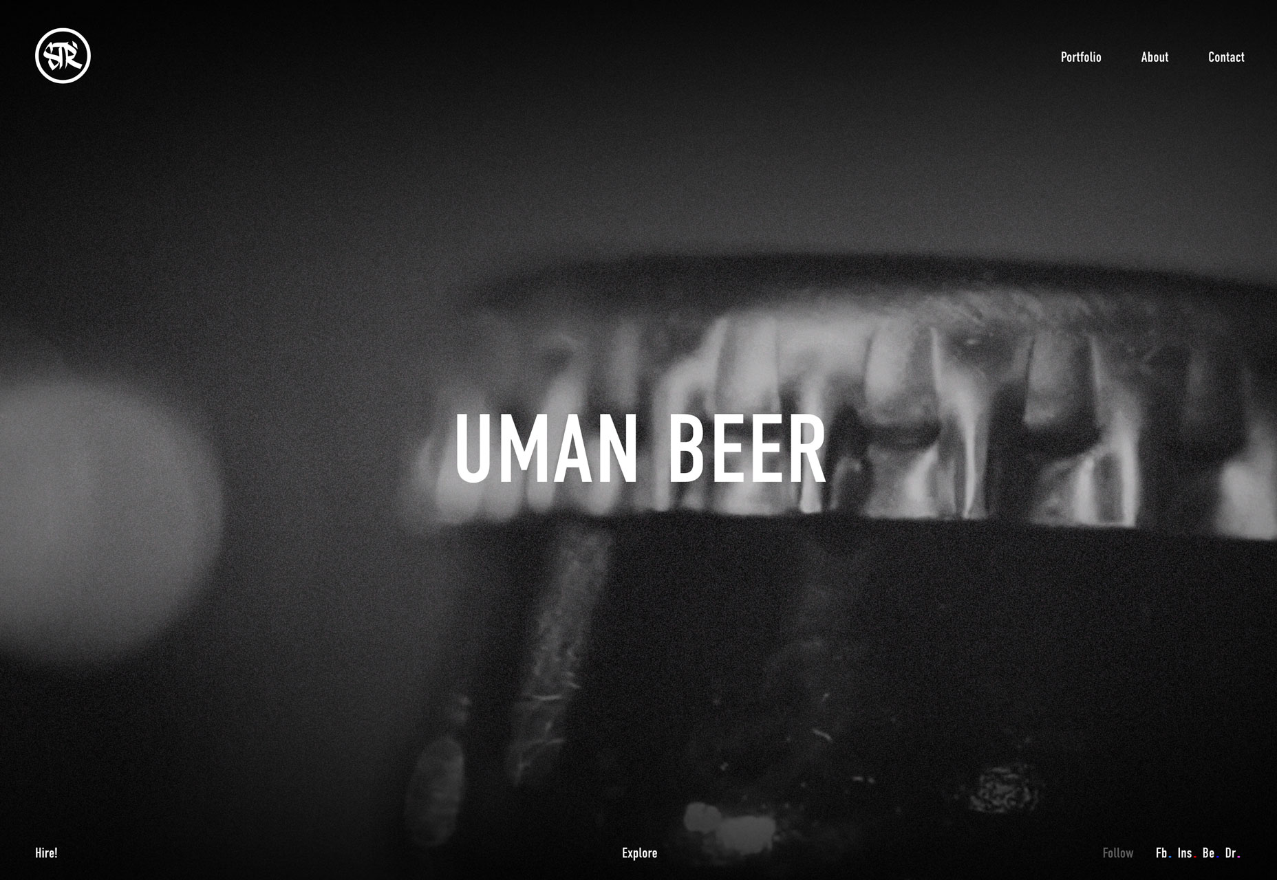
Black and White
Black and white design patterns are timeless and classic. They have a feeling of sophistication that can work with projects of all kinds.
And while most people immediately think “black and white” photos, black and white patterns can extend to other elements in a website design as well – navigation, typography, video, etc.
The neat thing about black and white website designs is that unlike print, where black and white was the common standard for newspapers, books and magazines for a long time (and still to some degree today), it stands out because of the lack of color. The richness of black and white on a screen allows for depth of visuals as well.
Each of the examples below uses this color – or lack thereof – to help bring attention and focus to the messaging on the websites. Black and white in these examples also creates a certain emotional feel for the user.
When planning a black and white design, you can go all in with no other color at all or pick an accent color, such as American Documentary, to help drive eyes to focal points or calls to action on the screen. There’s no right or wrong choice here. The decision to use color (or not) in a black and white design pattern is based on what you want users to accomplish with the design and the experience they should take away from it.
If you clock through each of the examples below, you can see how each uses a different technique to create engagement:
Igor Starodub: Video
Eum Ray: Glitchy animation
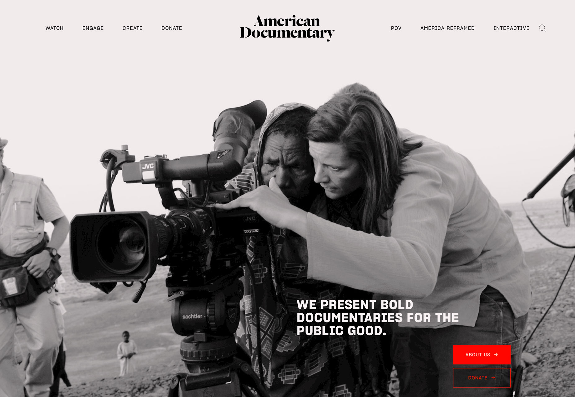
American Documentary: Color accents
Circles
Designing with circles is not new. The “perfect” shape is pleasing to the eye and is even part of Google’s Material Design standards – you’ve surely noticed all those round buttons.
When it comes to using circles in website design projects, it’s important to think about the meaning of this shape. It can add an extra layer of content to your design.
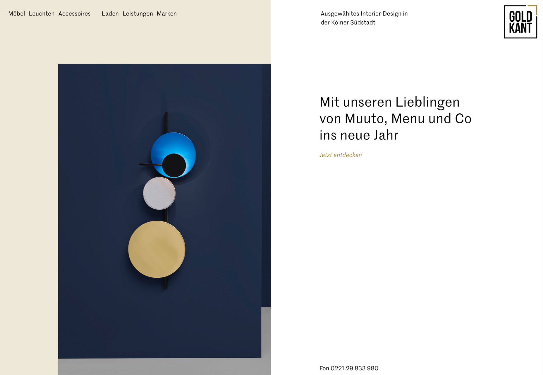
Gold Kant uses circles in a photo. It’s a little less in your face than as a UI element, but the aura of harmony and energy is there.
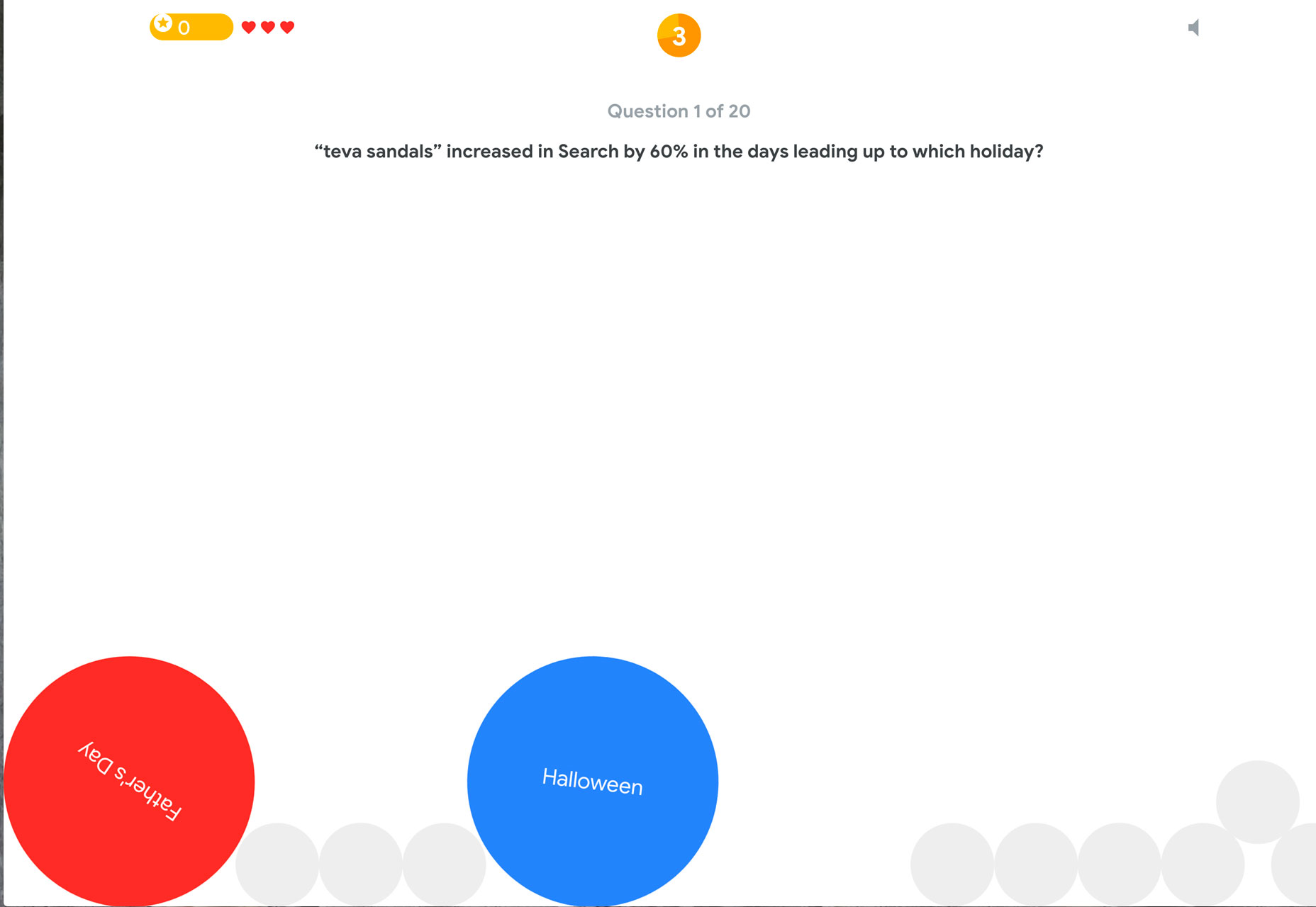
Google’s Game of the Year uses on-brand circles to entice users to click on answers to game questions. The circles in the game mimic the colors and sizes of circles in Material Design interfaces and re-emphasize that circles – in the land of Google – are meant to be interacted with.
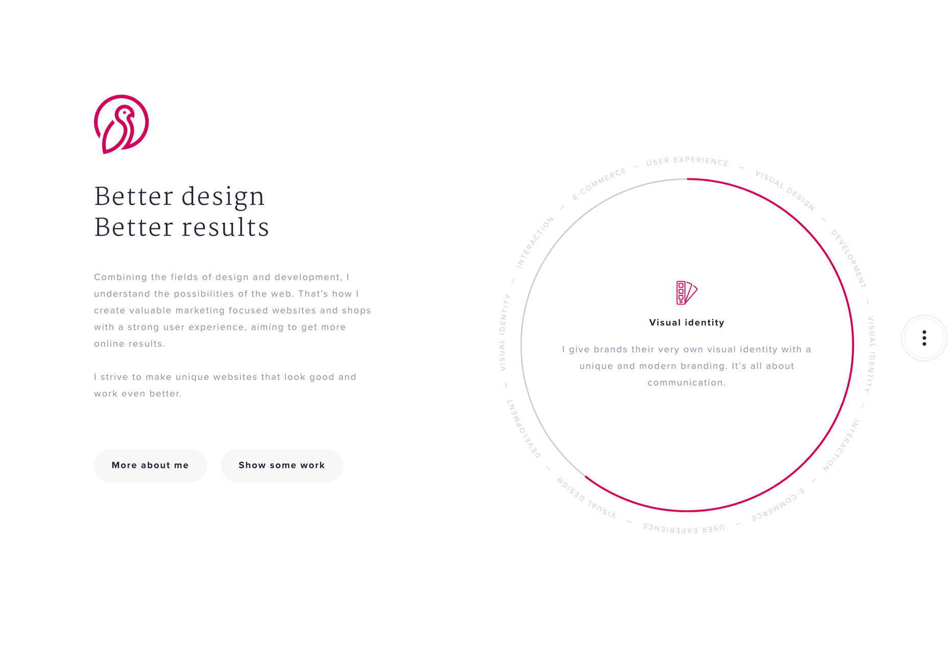
Marjin W. Bankers uses a circular logo and giant circle to represent types of work performed. Both circles imply motion – the logo circle because it is open and the bigger circle because the colored bar is moving in the form of a wheel.
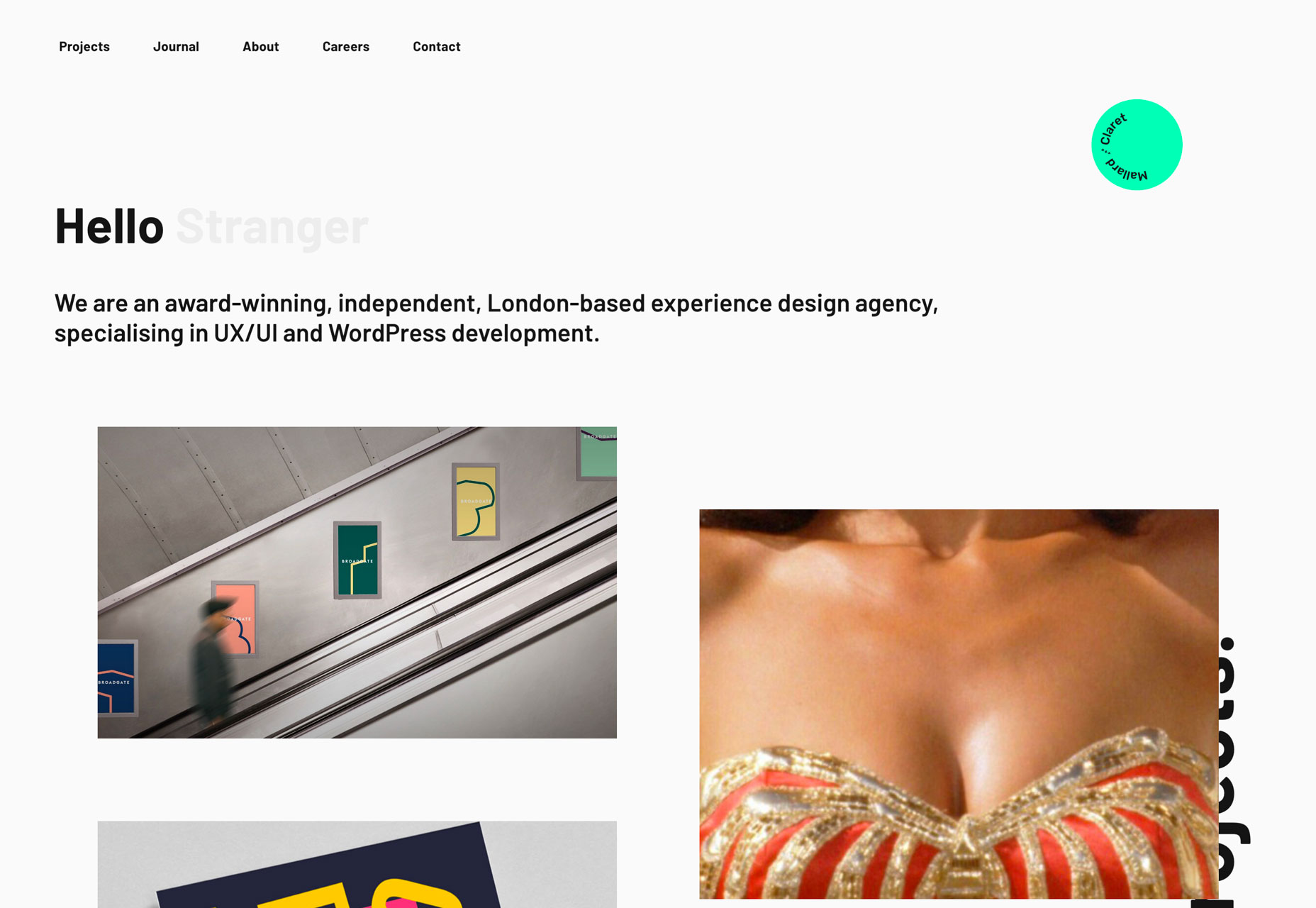
“Faceless” Photos
An element of engaging design is to include faces of people in images. It can help users connect.
Then why are so many projects using “faceless” photos? Each of the examples below features imagery with people in it, but no faces.
This style of website design and photo selection has a real purpose: It allows users to picture themselves in the scenes that are displayed. You might be the person getting your hair cut or one of a few friends at a table having fun at a meal. Or you might just be intrigued by the series of images without that eye-to-eye connection.
When there’s a face on the screen, users’ eyes will naturally pause almost to make eye content with the subject of the image (particularly if the image and face is large). Without this pause – as quick as it might be – users will continue to scan the complete design. They might see something they wouldn’t otherwise, and it can add a different focal point to the image.
While this faceless photo style doesn’t work for everything, it can be effective. Use this concept for more general ideas that don’t need a strong emotional tug.
And if you are planning a faceless design, have that conversation with the photographer so that images are composed with this in mind. Just cropping off a head will not result in the same charming effects and could actually end up quite jarring.
Another use for faceless photos? If you have to use stock images, this can be an effective trick. It can hide all-too-common stock models so your design doesn’t look canned.
https://www.whatsyourgusto.com/embed/#?secret=DBArcEIy0c
Conclusion
The nice thing about visual trends is that you can incorporate them into other trending elements, or with each other. Black and white photography, for example, is something that’s been used for decades across all design disciplines; plus you can pair it with some cool UX effects to really make the project stand out.
What trends are you loving (or hating) right now? I’d love to see some of the websites that you are fascinated with. Drop me a link on Twitter; I’d love to hear from you.
| Add Realistic Chalk and Sketch Lettering Effects with Sketch’it – only $5! |
p img {display:inline-block; margin-right:10px;}
.alignleft {float:left;}
p.showcase {clear:both;}
body#browserfriendly p, body#podcast p, div#emailbody p{margin:0;}
from Webdesigner Depot http://bit.ly/2D6bTOx
from WordPress http://bit.ly/2D6NYi4
No comments:
Post a Comment