 In this month’s collection of the freshest web designs from the last four weeks the dominant trend is attention to detail.
You’ll find plenty of animation, in fact, almost every one of these sites uses animation to a greater or lesser degree. Let’s dive in:
Globekit
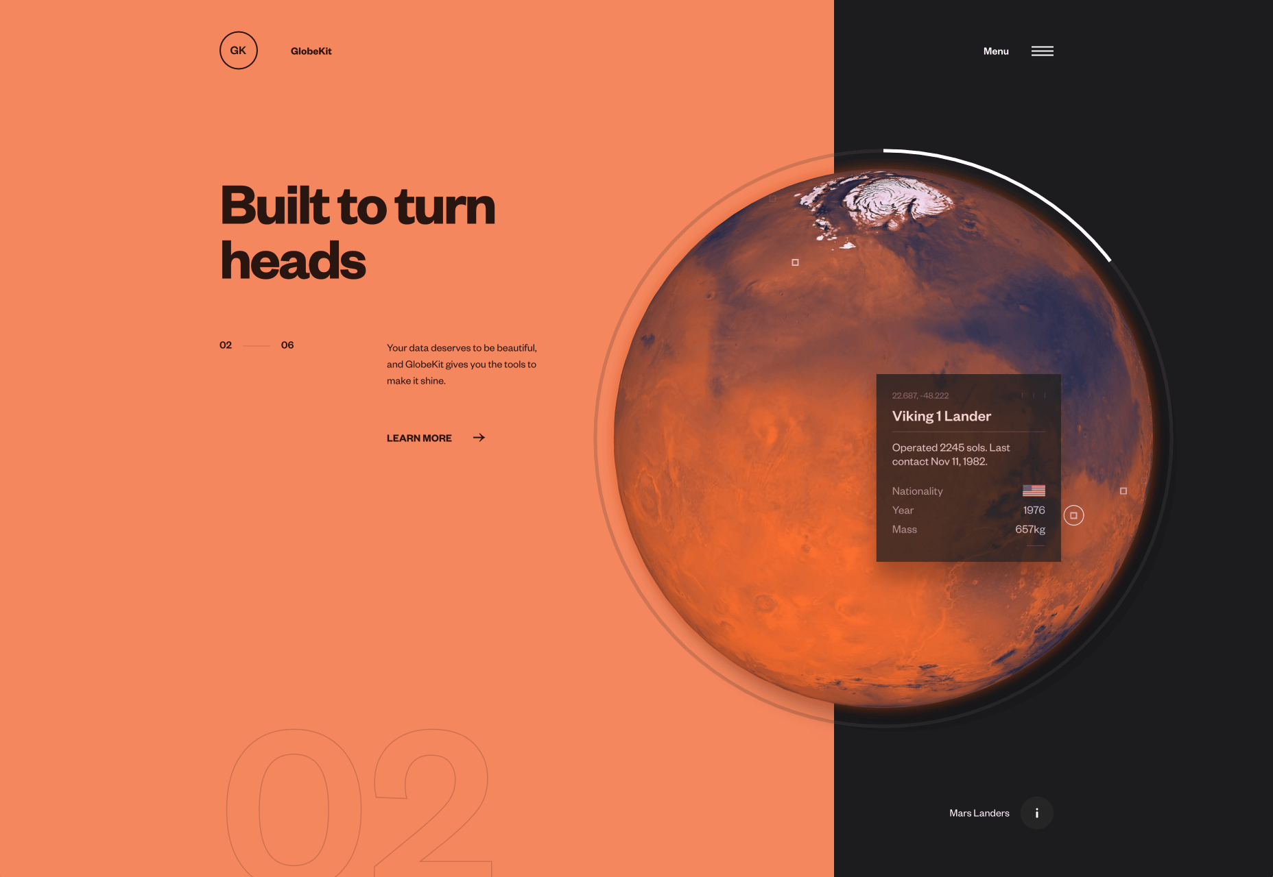
Globekit is a tool that allows developers to quickly create animated and interactive globes and embed them on web pages. Its site features some exceptional 3D animation.
Yolélé
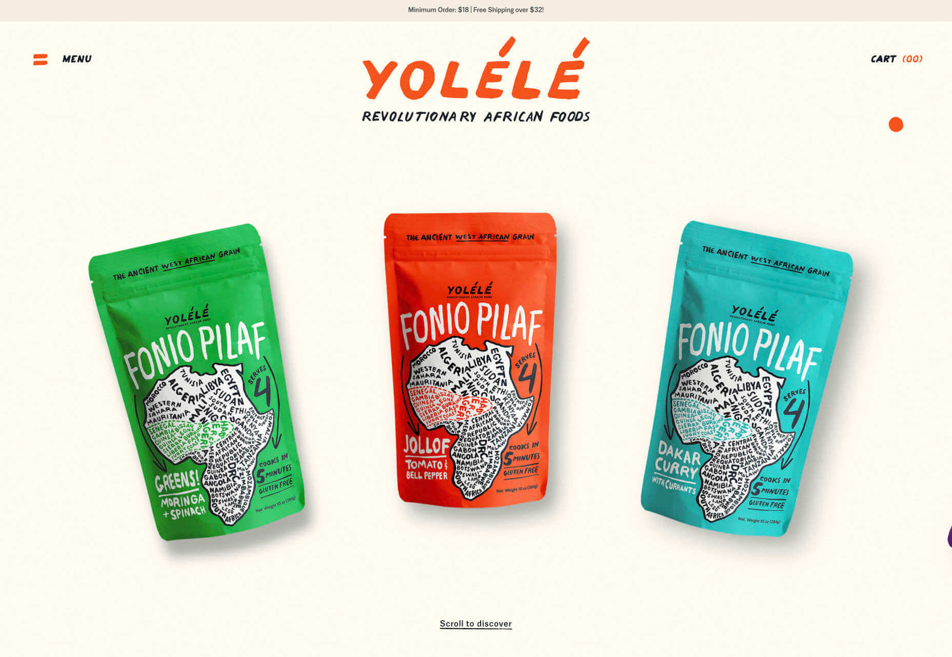
Yolélé is food company built around fonio, a West African super grain. Its site features a great page transition, and the landing page carousel is one of the few examples of horizontal scrolling we’ve seen work well.
Begonia
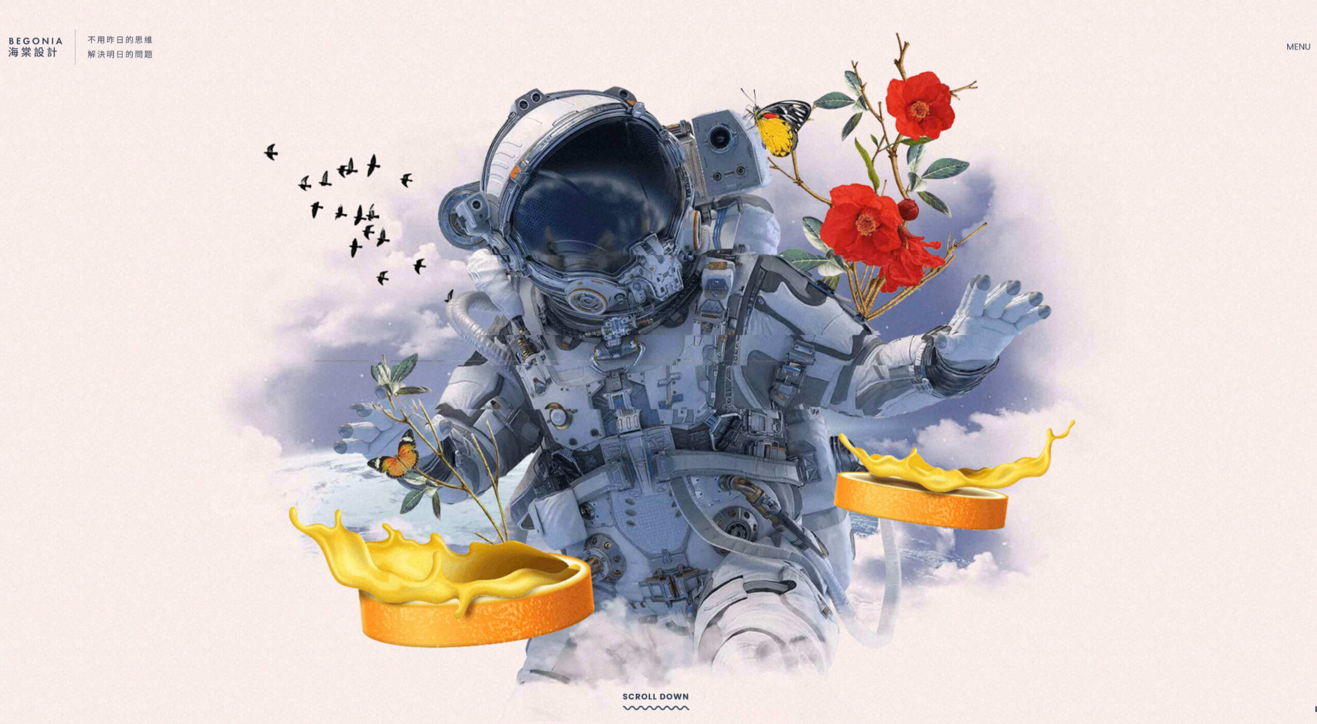
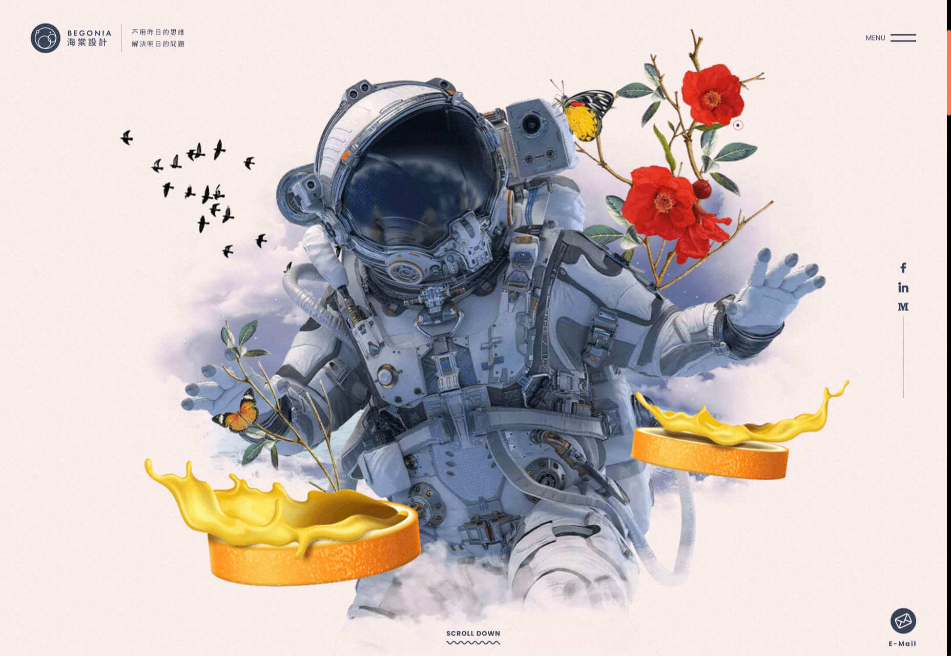
Begonia is a Taiwanese design agency with an impressive client list. Its site features animated typography, a super bold splash screen, and some surreal artwork. There’s so much here, it’s almost overwhelming.
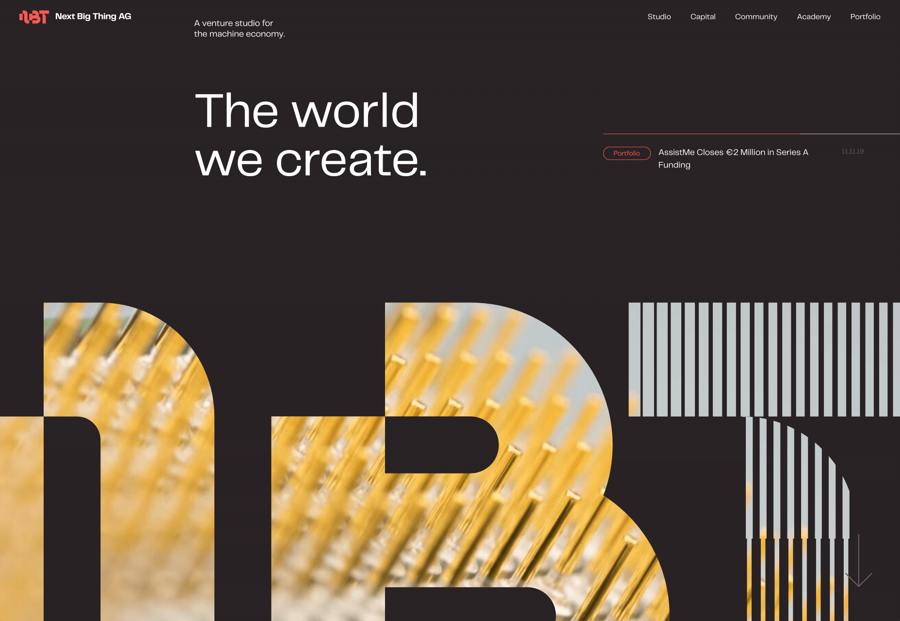
Next Big Thing
Next Big Thing is an agency supporting the full lifecycle of start-ups. Its site is clearly targeting tech-based clients, and there are some lovely transitions. The masked hero transition on scroll is delightful.
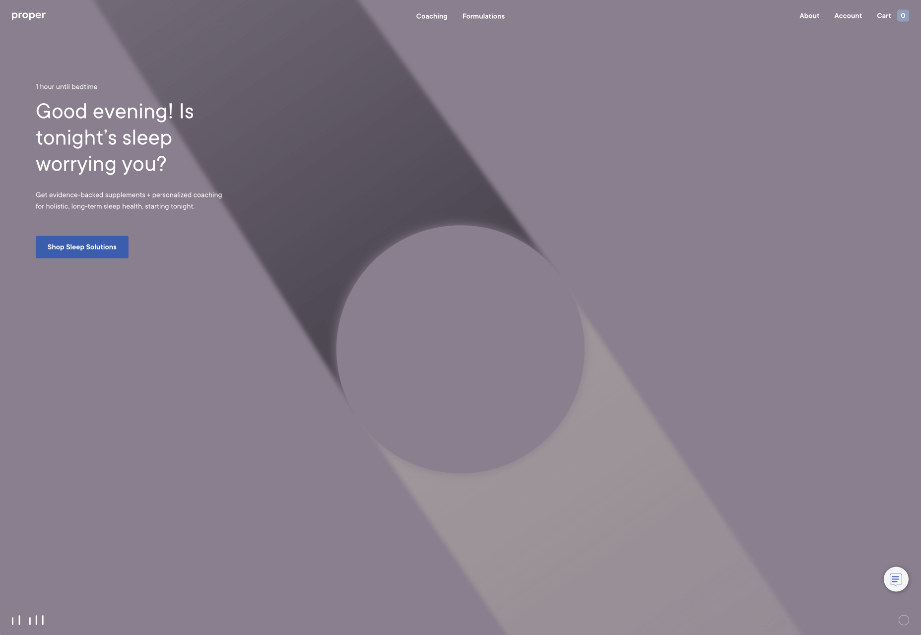
Proper
We all have every reason for the odd sleepless night right now, but regular sleep is essential for our health. Proper offers sleep solutions from coaching to supplements on its subtly shaded site.
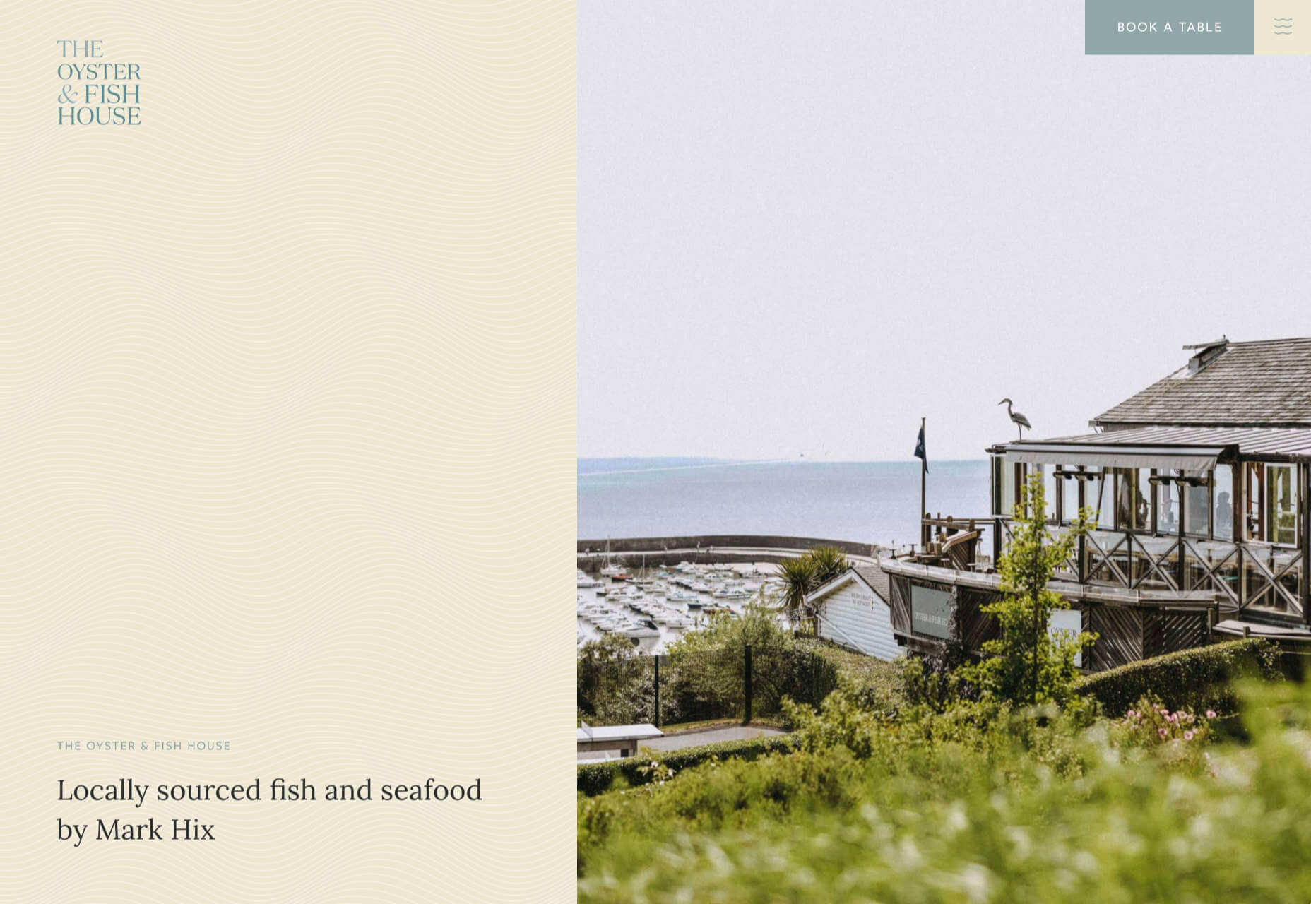
The Oyster & Fish House
The site for The Oyster & Fish House is packed with some delightful details. We love the subtle wave textures, the photography has a nostalgic feel, and the typography is perfectly sophisticated.
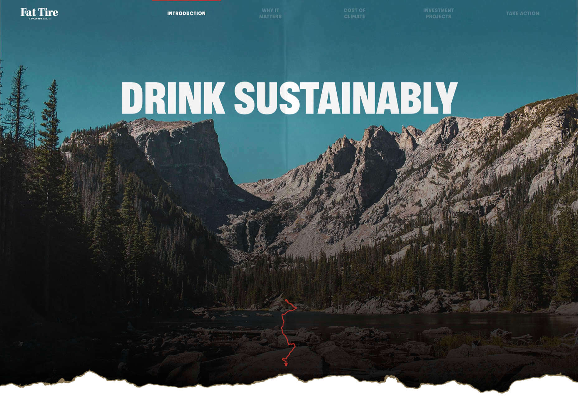
Drink Sustainably
Fat Tire produces America’s first certified carbon neutral beer, and Drink Sustainably has been produced to explain the concept. We love the vintage advertising style of the artwork.
Treaty
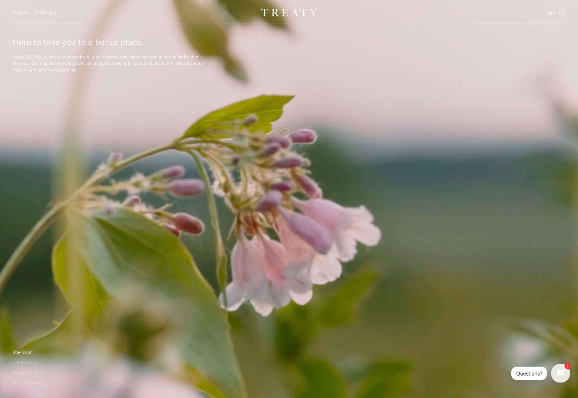
It seems like every week there’s a new CBD brand launching. What we like about Treaty’s site is the slick fullscreen video, the inclusion of botanical illustrations, and the really brave use of whitespace.
Studio Louise
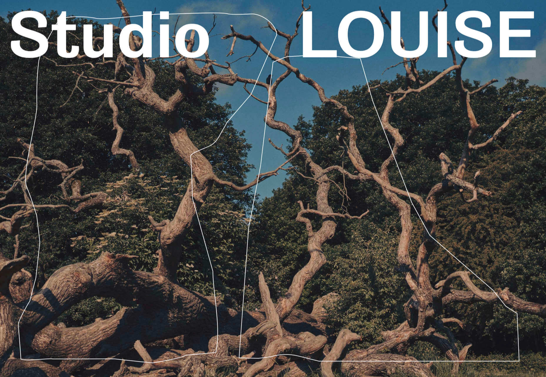
You’re greeted on Studio Louise’s site by a shot of trees with two random shapes; as you scroll the shapes morph and relocate to the top right corner, and you suddenly realize they’re an “S” and an “L”, cue: smiles.
Wünder
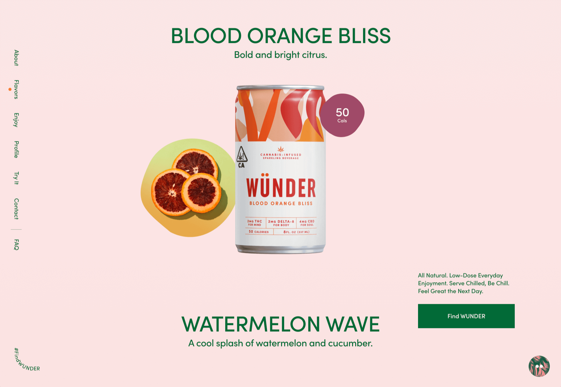
Another site for a CBD product, this time a vibrantly branded sparkling beverage. Wünder’s site features enticing photography, an on-trend color palette, and credible typography.
Seal + Co
Some professions lend themselves to exciting, aspirational sites, and some companies are accountancy firms. However Seal + Co’s site creates the impression of a modern, capable, and imaginative firm.
DocSpo
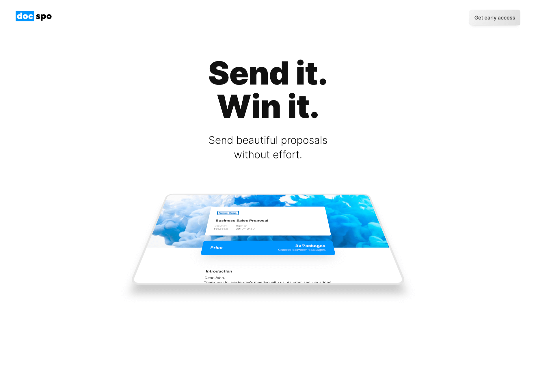
There is some lovely, 3D animation on the DocSpo site. The company is a Swedish startup enabling digital business proposals, and its site is bold, Appleesque, and packed with nice details.
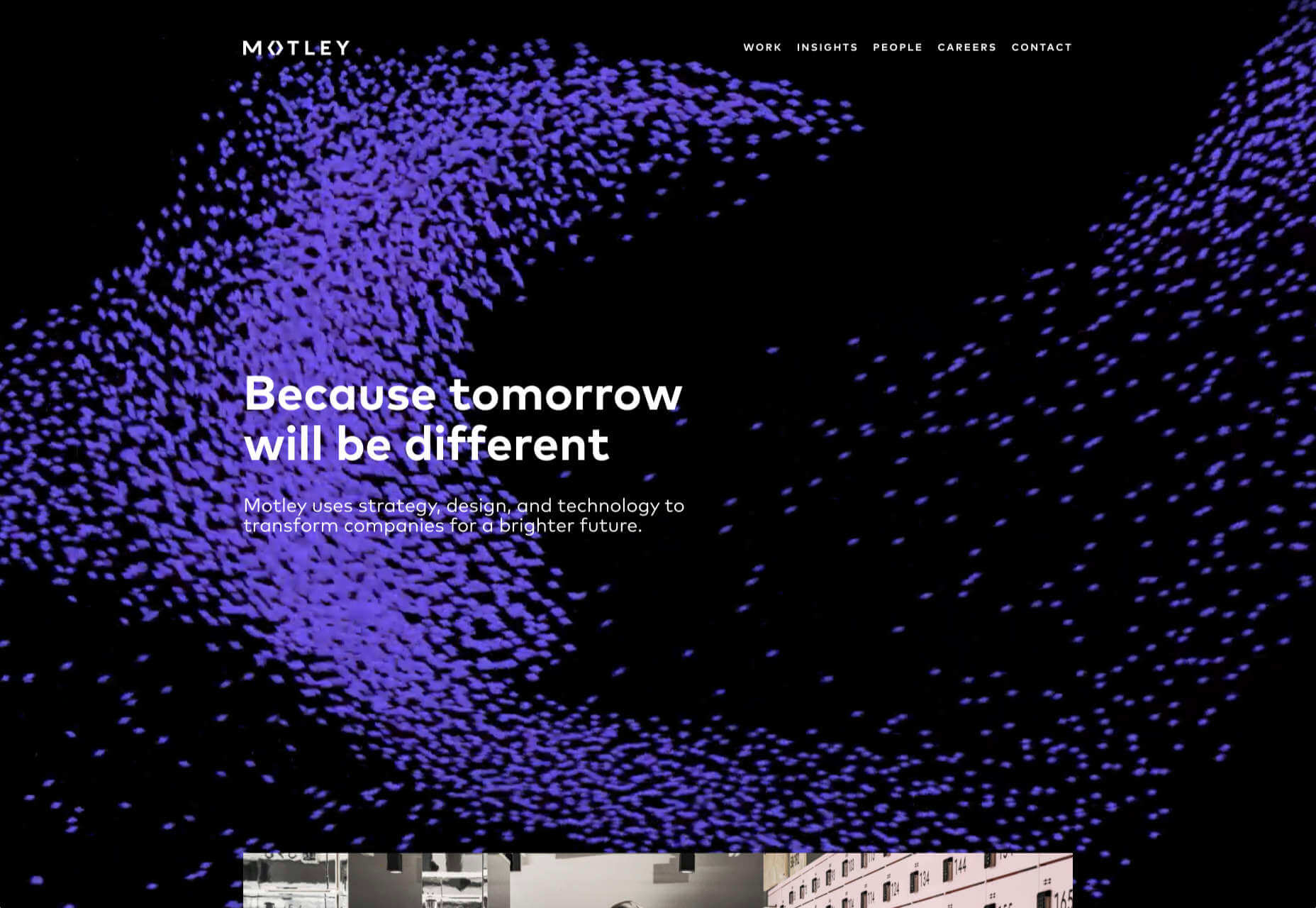
Motley
We never get tired of particle effects, like the one employed by Finland-based agency Motley. There’s some superb work in the portfolio, and it’s great to see a blog using Old Master paintings for thumbnails.
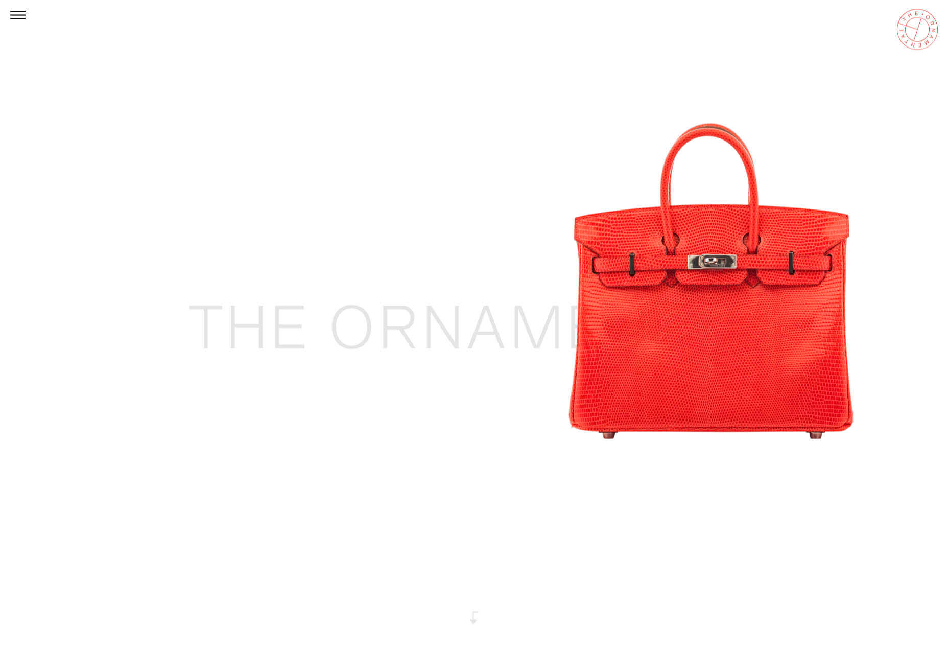
The Ornamental
The Ornamental sources leather goods for wealthy individuals, and luxury lifestyle firms. Its site is minimal, with some drool-worthy handbags. We particularly liked the image zoom hover effect in the store.
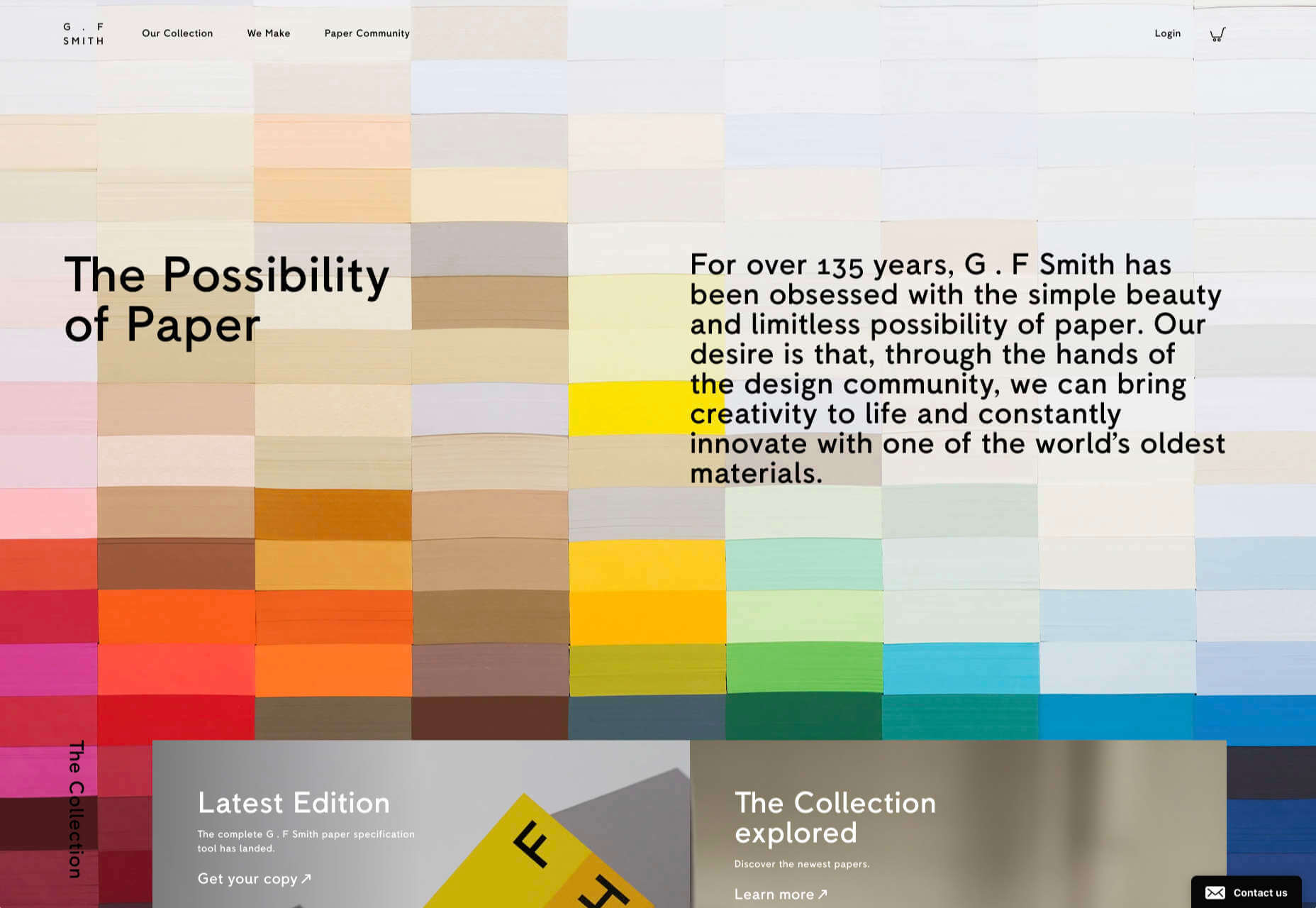
G.F Smith
G.F Smith is one of the world’s leading paper suppliers. Its redesigned site is much simpler than its last, with some lovely touches, like the varied paper photography when you hover over product thumbnails.
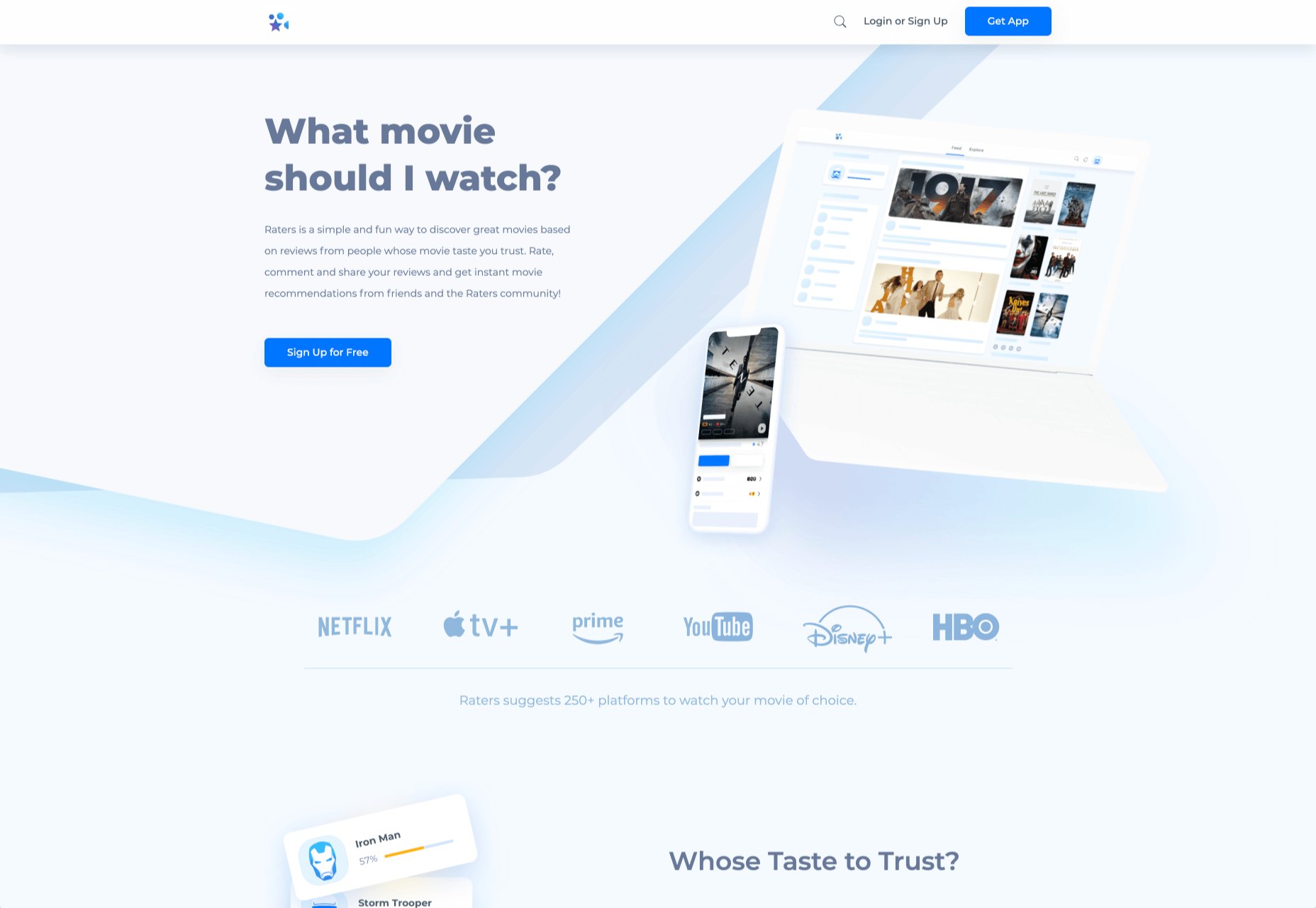
Raters
Raters is a new app that lets you discover new movies via reviews from people you trust. This simple site does an exceptional job of previewing the app, across multiple device sizes.
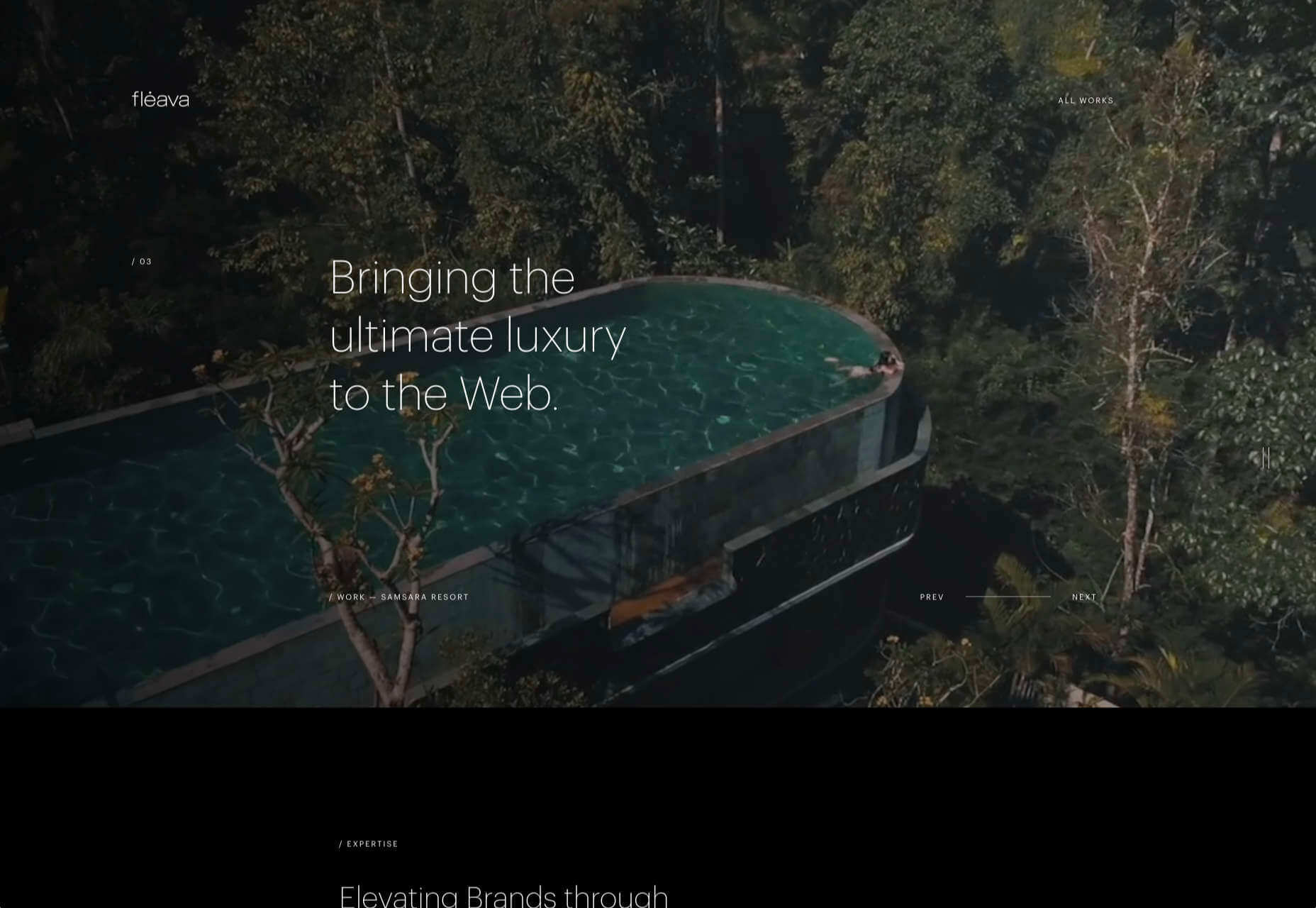
Fleava
There’s a whole heap of nice interactive details on Fleava’s site, from the cursor-following circles when hovering over links, to the way the thumbnails are squeezed when dragging through projects.
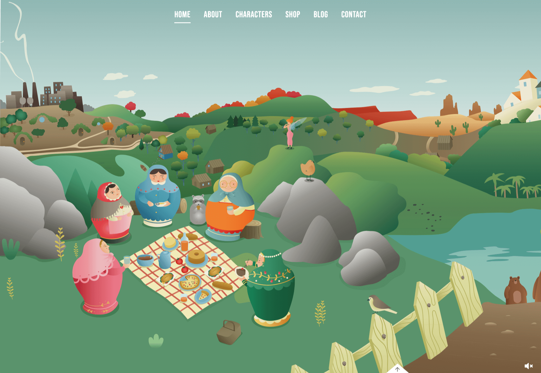
The Story of Babushka
A babushka doll is a traditional Russian toy, made up of dolls, nested inside dolls. The Story of Babushka uses the toy as a metaphor for growth in this children’s book, and the accompanying animated website.
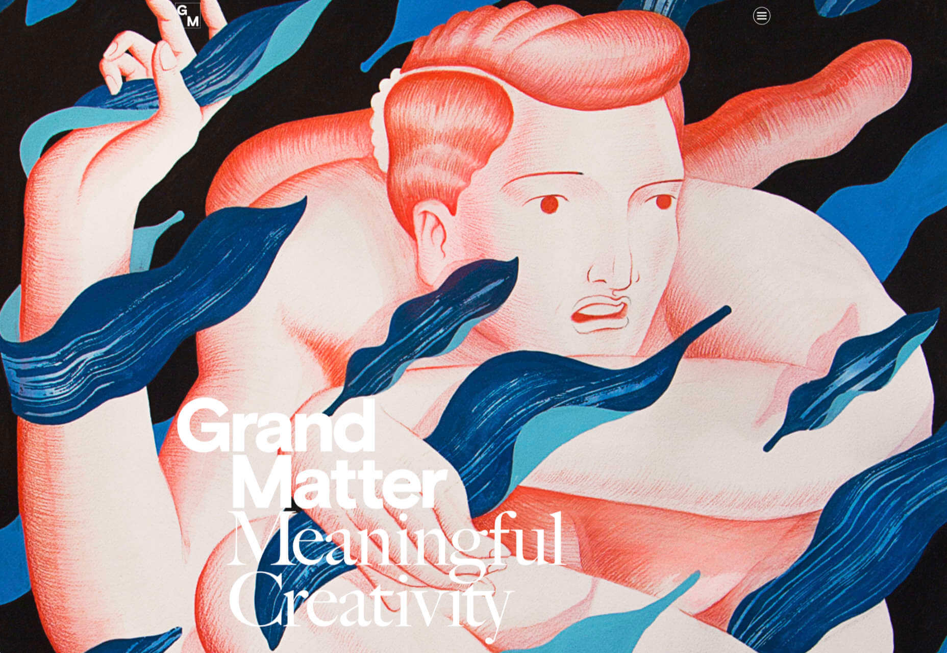
Grand Matter
After the uniformity of the 2010s, there are a wealth of illustration styles being explored across the web. Grand Matter is an artist agency that represents some amazing talent, and we love the illustration they chose themselves.
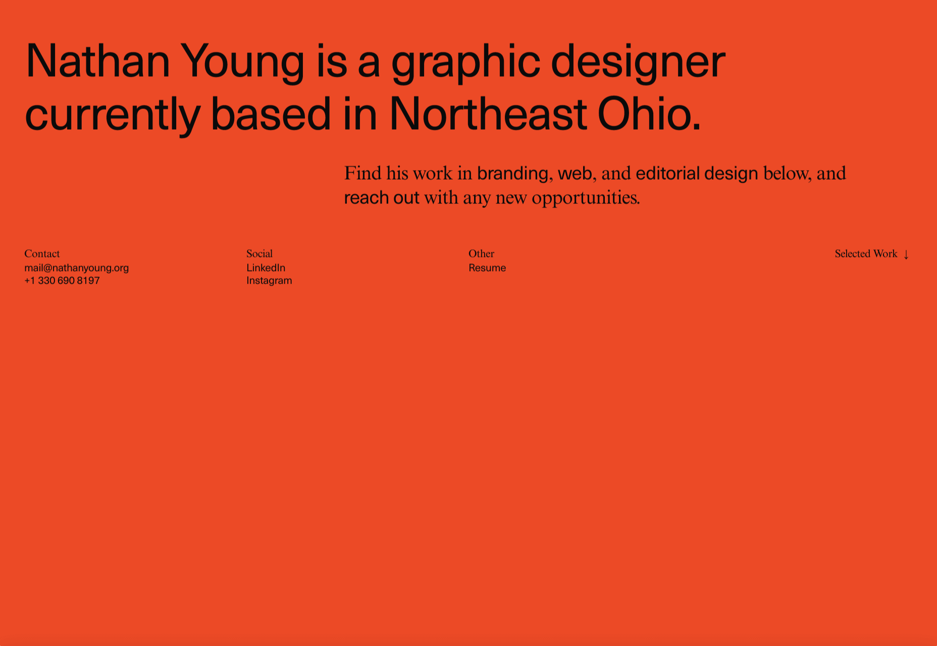
Nathan Young
Nathan Young’s site does exactly what it needs to do: Providing case studies for his design work. The fade-out on scroll is a simple device that elevates the whole site experience.
p img {display:inline-block; margin-right:10px;}
.alignleft {float:left;}
p.showcase {clear:both;}
body#browserfriendly p, body#podcast p, div#emailbody p{margin:0;}
from Webdesigner Depot https://ift.tt/3hoLNJn
from WordPress https://ift.tt/32hVzH7


No comments:
Post a Comment