Tuesday, April 3, 2018

Technical SEO: Why It’s Becoming More Important Than Any Other SEO Tactic

No website can stand without a strong backbone.

And that backbone is technical SEO.

Technical SEO is the structure of your website.

Without it, everything else falls apart.

Imagine you wrote the most amazing content in the world. It’s content that everyone should read.

People would pay buckets of money just to read it. Millions are eagerly waiting for the notification that you’ve made it available.

Then, the day finally comes, and the notification goes out. Customers excitedly click the link to read your amazing article.

That’s when it happens:

It takes over 10 seconds for your web page to load.

And for every second that it takes for your web page to load, you’re losing readers and increasing your bounce rate.
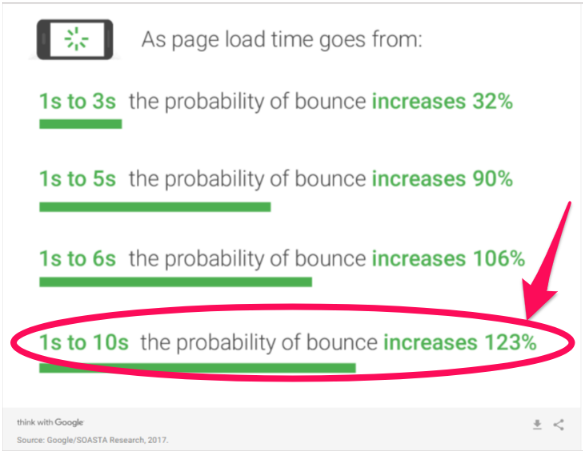
page speed and bounce rate

It doesn’t matter how great that piece of content is. Because your site isn’t functioning well, you’re losing precious traffic.

That’s just one example of why technical SEO is so critical.

Without it working, nothing else really matters.

That’s why I’m going to walk you through the most important aspects of technical SEO. I will explain why each one is so crucial to your website’s success and how to identify and resolve problems.

The future is mobile-friendly

First, let’s talk about mobile devices.

Most people have cell phones.

In fact, most people act like their cell phone is glued to their hand.

More and more people are buying and using cell phones all the time.

I actually have two of them. I own a work cell and a personal cell.

This is becoming more common as “home phones” become a thing of the past.

Google has recognized this trend. They’ve been working over the past few years to adapt their search engine algorithms to reflect this new way of life.

Back in 2015, Google implemented a mobile-related algorithm change.

People started calling it “mobilegeddon.”

This was only the beginning of Google moving the focus from computer-based browsing to mobile-based.

On November 4, 2016, Google announced their mobile-first indexing plans.

Google’s mobile-first indexing could be a game changer.

Mobile traffic is now more popular than desktop traffic.
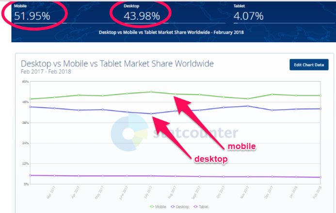
mobile vs desktop traffic

And even more importantly, about 57% of all visits to retail websites come from mobile devices.

You can see why Google’s intention is to begin using the mobile version of websites for rankings.

Just to make sure you knew they were serious, Google reminded us of this change on December 18, 2017.

Why do we care what Google is doing?

They own almost 93% of the mobile search engine market.
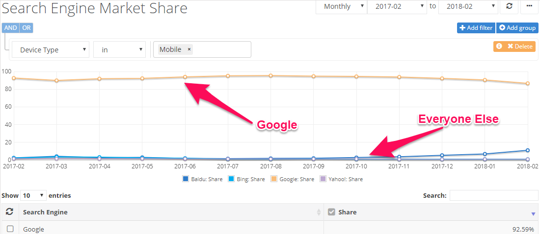
google owns the search engine market

In fact, mobile-first indexing has created enough conversation among marketers that it’s one of the key topics of this year’s Pubcon conference.

https://platform.twitter.com/widgets.js

You need to make sure that your site is ready for this change.

The easiest way to do this is to have a responsive site or a dynamic serving site that knows to adjust to screen size.
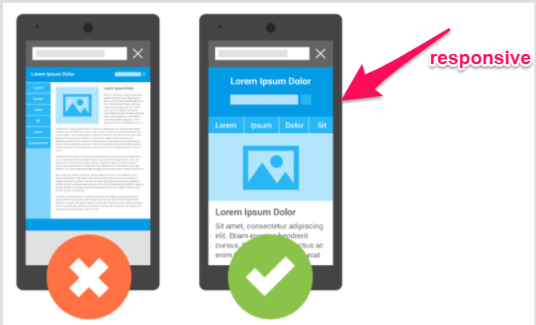
responsive vs unresponsive mobile site

If you have a separate site for mobile, you need to do the following:

  • Make sure that the mobile version of your site still has all of the critical content, such as high-quality pictures, properly-formatted text, and videos.
  • Your mobile site needs to be structured and indexed just like a desktop site.
  • Include metadata on both versions of your site: mobile and desktop.
  • If your mobile site is on a separate host, make sure it has enough capacity to handle increased crawling from Google’s mobile bots.
  • Use Google’s robots.txt tester to make sure Google can read your mobile site.

You might already have some of those covered, but it’s important to be sure your site is ready for mobile-first.

Speed is critical to success

Whether you’re running a desktop site or a mobile one, speed is critical.

If I have to wait for a site to load, I’m going to leave it.

Like I said before, load time is a major reason that people abandon pages and sites. With every second it takes for your page to load, more people are giving up on it.

If your website loads too slowly, readers will just click back to the search engine and try the next relevant link.

This is called “pogo-sticking.” And Google hates pogo-sticking.

If Google sees that people are leaving your page within the first five seconds of landing on it, they’re going to drop you down in the search results.

It won’t matter how great everything else is if you don’t have enough speed built into your sites.

Have you been focusing your SEO efforts on bounce rates, customer engagement, or time on site?

If so, you should be focusing on site speed because it will impact all of those metrics, too.

How can you know if your speed isn’t up to par?

There are a number of online sites that can test this for you.

A quick online test from WebPagetest or Google’s PageSpeed tools can give you a general idea of how your site is measuring up.

A more advanced tool I like is GTmetrix. It will help identify exactly what is slowing down your site.
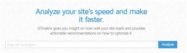
analyze your sites speed

Make sure you test multiple pages. One page might load blazing fast, but you could be missing four that are slow as molasses.

Aim to test at least ten pages. Choose the pages that you know are the largest and have the most images.

Here are some common reasons a site has speed issues:

  • The images are too big and poorly optimized.
  • There is no content compression.
  • The pages have too many CSS image requests.
  • Your website is not caching information.
  • You’ve used too many plugins.
  • Your site is not using a CDN for static files.
  • Your website is running on a slow web host.

You might not be able to get a perfect score on Google’s PageSpeed Insights the first time, but you can certainly improve it.

Site errors will tank your rankings

Site errors are frustrating.

It doesn’t matter if we’re talking about customers or search bots. No one likes site errors.

Site errors are most often a result of broken links, incorrect redirects, and missing pages.

Here are a few things you need to keep in mind in regard to site errors.

You need to deal with 404 errors.

When’s the last time you clicked a link on your search engine results and ended up seeing an ugly 404 error page?
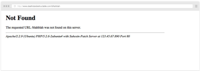
not found 404 page

You probably clicked “back” immediately and moved on to the next link.

404 error pages will increase customer frustration and “pogo-sticking.”

As I mentioned above, Google hates this.

You don’t want to have 404 errors on your website. But here’s the reality:

Every website is going to have 404 errors at some point. Make sure you know how to fix them.

For the occasions when you miss 404 errors, make sure that you at least customize your error pages.

Make sure you’re using 301 redirects properly.

A 301 redirect is a permanent redirect to a new page.
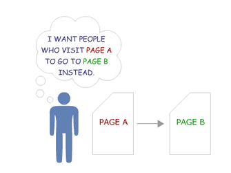
301 redirect

A 302 redirect is a temporary redirect.
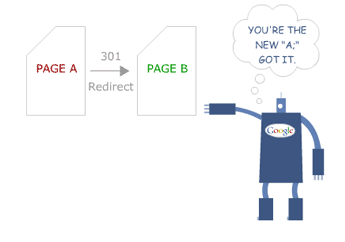
302 redirect

Using a 302 instead of a 301 can affect your readers and your search result rankings.

If you use a 301 redirect, search engines give the new page the same “trust” and authority that the old page had.

This means that if your old page was at the top of search engine rankings, your new page should take over that ranking. Of course, this is assuming that everything else is the same.

If you only use a 302 redirect, the bots see it as temporary.

Before 2016, this meant Google did not give the new page any of the old authority.

Currently, Google says that any 30X redirect will keep the same page ranking.
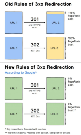
old and new rules of 3xx redirection

Despite the reassurance from Google, there is still some doubt about whether this is true or not.

The fine print in the image above says, “proceed with caution.”

The risk is that leaving a 302 redirect active for too long will make you lose traffic.

It won’t matter how outstanding your other SEO tactics are.

It’s not worth the risk.

Even using 301 redirects can negatively impact your search engine rankings.

This is because they can slow down your site speed. They can also signal that there is a problem with the structure of your website.

Google sees this as an issue. They don’t want to send traffic to sites they believe will be hard to navigate.

Anything that hints that your website is not user-friendly is going to harm your search engine rankings.

Find and fix your broken links.

You’re on a web page, you’re reading an interesting article, and it has a link to something you want to know more about.

You click the link, and nothing happens.

You’re probably slightly annoyed, right?

What happens if you experience this a few times on the same website?

I’m going to guess that you’re not going to be happy. I know I wouldn’t be.

It’s easy to end up with a broken link. You could have external links to pages that the webmaster has moved or shut down.

It can happen to anyone.

So how do you find them fast and fix them before they impact your customers and your rankings?

Don’t worry. It’s not as complicated or time-consuming as you might fear.

You just need to use the two tools and follow the four steps from this article.
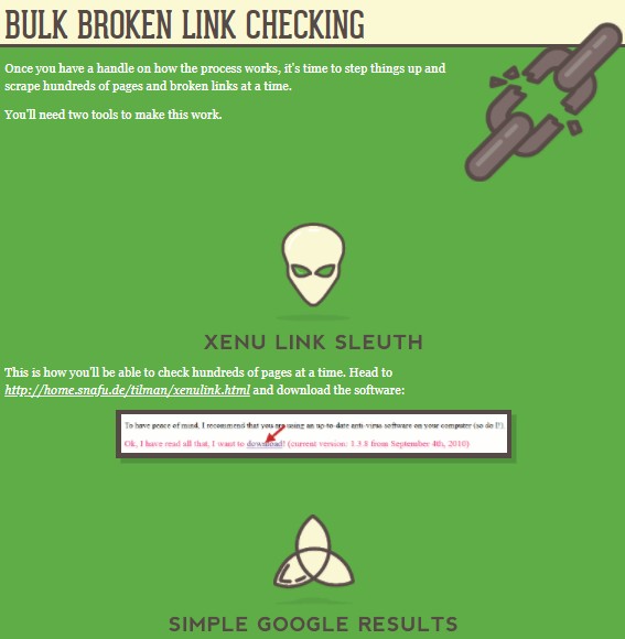
bulk broken link checking

Watch out for duplicate site content.

There are two major problems with duplicate content.

One is having content that is the duplicate of someone else’s.

This problem should be obvious. Someone has plagiarized.

Google is constantly trying to improve their ability to detect duplicate content, and they’re getting pretty good at it.

Unfortunately, the bots aren’t high-tech enough to know which of you ripped off the other, so Google will penalize both of you.

To help you avoid penalties, you can use Copyscape to make sure the content on your webpage is not too close to any other web pages.
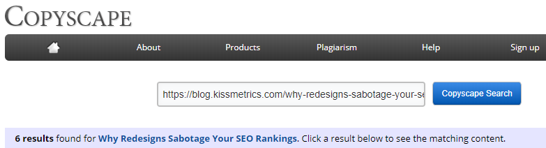
copyscape

The second problem is that if you have too much duplicate or repetitive content on your own website, it can be really annoying for your regular, dedicated fans.

No one wants to read five different blogs that all basically say the same thing.

If your readers find that your articles are too similar, they will just stop following you.

After all, they’ll begin to believe you don’t actually have anything new to say.

Duplicate content within your site may not just be from a lack of ideas.

It can also be a result of page refreshes or updates (if your update is on a “new” page with a new URL).

So, how can you find out if you have duplicate content?

Siteliner can help you find any duplicate content on your own website.
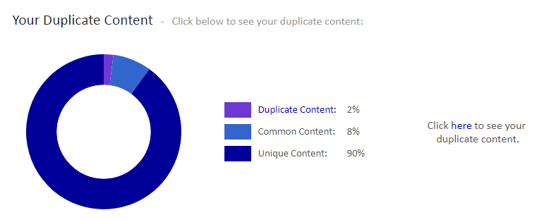
your duplicate content copyscape

If you find duplicate content on your site, the easiest solution is to delete it.

But remember: You can’t just hit the delete button if the page is already indexed.

Remember the discussion above about site errors!

If you are about to delete an indexed web page, be sure to use a permanent 301 redirect.

What if you don’t want to delete a page? After all, we know too many redirects can be bad as well.

The next best option is to add a canonical URL to each page that has duplicate content.

canonical URL

This will tell search engines that you know that your site has indexed pages that are duplicate content, but that there is one version that you want the search engine to direct visitors to.

Know about other website errors.

Like I mentioned above, poor website structure will hurt your rankings.

Make sure you’ve built your website with properly-structured data.

This means using categories and web page groupings that make sense.

Solid structure helps improve the searchability of your site.

For example, what if I want to know if you’ve written an article on technical SEO?

I’m not about to scroll through hundreds of blog posts looking for one on that topic. Instead, I will go to the search box and type in my keywords like I would on a search engine.

If you structure your website properly, it will show me any articles related to that subject. Not only that, but it will pull them up quickly.

It’s a lot easier for your site to find relevant articles if it only has to search through a category rather than your entire website.

Remember that speed is one of the top issues for sites. Structured data allows users and bots to find related articles faster.

Building your structured data (which some refer to as schema markup) isn’t all that technical.

Schema.org exists for the sole purpose of helping improve the schema markup of websites.

welcome to schema

How does schema impact your search results?

It helps describe your content to search engines.

That means that it helps Google understand what your website is really all about.

It also helps Google create rich snippets.

Here’s a normal Google snippet:

normal google snippet

Now, check out a Google rich text snippet.
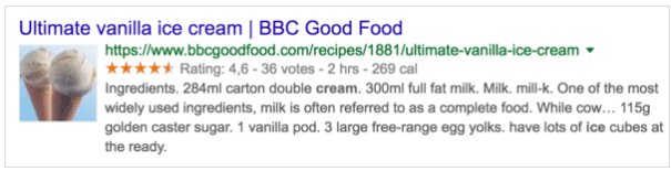
google rich text snippet

You can probably guess which one has a better click-through rate.

This isn’t about content or on-page SEO. This is all technical SEO.

Some other technical site errors you need to watch out for are:

  • Page sizes that are too large
  • Having issues with using meta refresh
  • Hidden text occurring on your pages
  • Unending data, such as calendars that go out for 100 years

Never ignore crawl errors

Search engines send bots to crawl your site all the time.

A crawl error means the bots found something wrong that will impact your search engine ranking.

First, make sure that you have a working sitemap and that your web pages are all indexed.
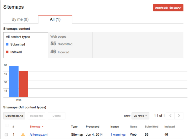
sitemaps website console

If Google can’t read a sitemap, then it can’t even try to crawl your site.

It won’t know your site even exists.

Avoid being the lost, forgotten soul by making sure you have an XML sitemap on your website.

Of course, step two is providing that sitemap to the search engines.

Once you’ve done this, the search engine should be able to index your pages.

This basically means filing them for review so they can measure them against all other similar pages and decide how to rank them.

If you get a no index error, it means that Google didn’t register your pages.

If they’re not registered, they will not appear on the search engine results page.

Even with the best content in the world, your traffic will be nonexistent if you don’t show up on search results pages. If you don’t believe me, look at these statistics:
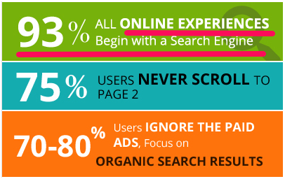
all online experiences begin with a search engine

One common reason that pages don’t index properly is URL issues.

Make sure that your URLs aren’t too long or messy.

Avoid having any URLs that have query parameters at the end of them.

Other indexing problems could be title tag issues, missing alt tags, and meta descriptions that are either missing or too long.

Beyond indexing issues, there are other kinds of crawl errors.

In many cases, the error is due to one of the site content errors that I talked about in the last section.

Other types of crawl errors are:

  • DNS errors
  • Server errors (which could be a speed issue)
  • Robots failure
  • Denied site access
  • Not followed (which means that Google is unable to follow a given URL)

Image issues can cause you a lot of problems

Visual content is a vital part of content marketing and on-page SEO.

The problem is that this on-page SEO strategy can often lead to technical SEO issues.

Images that are too large can tank your speed and make your site less mobile-friendly. Broken images can also hurt the user experience, increasing page abandonment.

You know you need lots of high-quality images. But now I’ve just told you that the very thing supposed to help your rankings can hurt them.

What do you do?

It’s easy. Just smush your images with Smush Image Compression and Optimization.
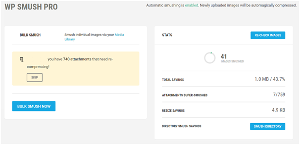
wp smush pro

This plugin will shrink your images down so that their size doesn’t slow down your site.

The best part is that it can do this without impacting the image quality. You get the faster load, without sacrificing beauty.

You can also use WP Super Cache for creating a static image of your website. It’s a similar WordPress plugin to Smush Image Compression and Optimization.

Super Cache can lessen the amount of data your site uses and speed up your load time.

What about broken images?

Searching for broken images is the same as searching for broken links. You want to use a tool that can search your site for any broken images.

Most tools that check for broken links can also check for broken images.

Are your images using alt attributes? Since you might not always catch broken images right away, this can be helpful.

You can use a website like SEO SiteCheckup to see if you’ve set up alt attributes on your site.
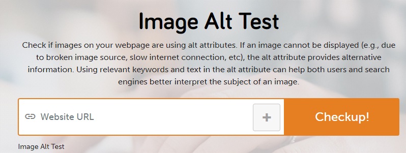
image alt test

If your image ends up broken, the alt text provides alternative information.

Security matters more now than ever before

Google has been cracking down on security.

You used to be able to assume that http:// would be at the start of every website address.

But that’s no longer the case.

Google has warned that as of July 2018, Chrome will begin to warn users if a site is insecure.
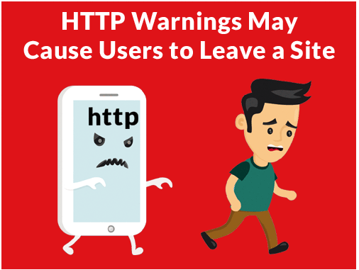
http warnings may cause users to leave a site

No matter how excellent your content is, customers are less likely to click through to a website when a browser warns them that it might be unsafe.

If your address is still using http, you could begin losing traffic fast (if you aren’t already).

Chrome is the browser with the largest market share in the world.
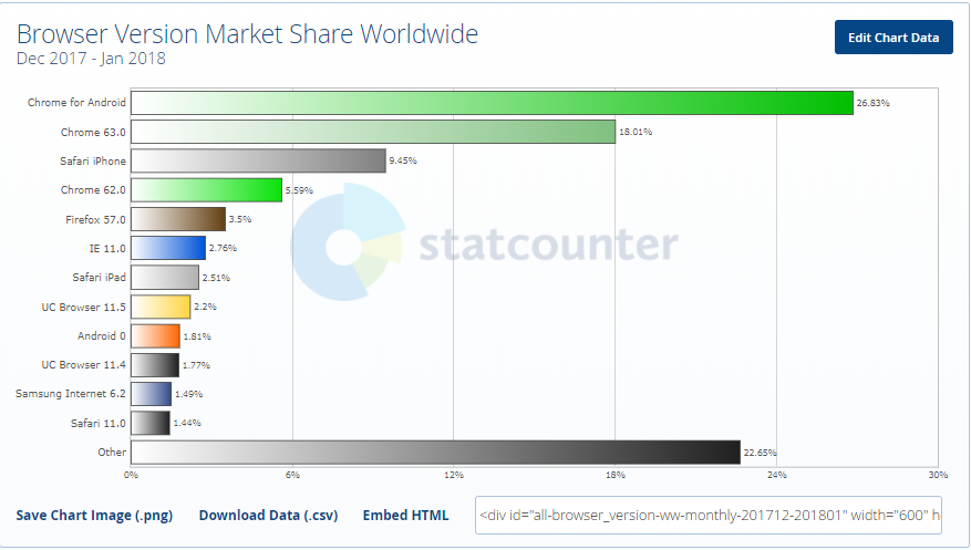
browser market share worldwide

Google has already made it pretty clear that they prefer https sites.

Just take a look at how Chrome already highlights the security of https sites:

There are different types of SSL, so you’ll want to be sure you do your research to pick the right one for your site.

Conclusion

There are three different aspects of SEO, and technical SEO is the most important of the three.
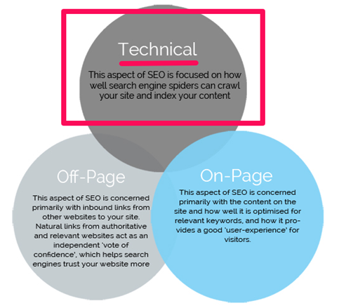
three types of seo

SEO guidelines are constantly changing.

Every time a major search engine significantly updates their algorithm, SEO has to adapt.

But the good news is that the frequency of changes for Technical SEO is lower than the others.

After all, it’s not like search engines or readers will suddenly decide they’re okay with slower speeds.

If anything, you will see the average acceptable speed continue to drop. Your site simply has to be faster if you want to keep up with SEO demands.

Your website has to be mobile-friendly. This is only going to become more important over time, too.

It has to work without errors, duplicate content, and poor images.

Search engines also have to be able to crawl it successfully.

These things are all critical.

They are crucial to your success on search engines and with actual readers and customers. If you want to prioritize your SEO efforts, make sure you tackle the technical aspects first.

As I’ve mentioned several times, it won’t matter how amazing your on-page SEO is if you fail at technical SEO.

It also won’t matter how great you are at off-page SEO if you’re horrible at the technical stuff.

Don’t get overwhelmed by the idea of it being “technical” or complex.

Start with the big, critical aspects discussed above and tackle them one problem at a time.

How have you found success with technical SEO on your site?

About the Author: Neil Patel is the cofounder of Neil Patel Digital.

from The Kissmetrics Marketing Blog https://ift.tt/2JfEALb


from WordPress https://ift.tt/2JgBmHt

The Psychology of Price in UX

As humans, we tend to rely heavily on one piece of information when we make decisions. We often anchor on the first piece of information we are introduced to and judge all subsequently received information in relation to it.

The first piece of information offered automatically becomes the anchor, from which subsequent judgements are made. Anchoring is the persuasive practice of creating a reference point around which we as designers want all other information to be judged and compared to.

Anchoring in the Real World

Do this test at home: Find 3 bowls. Fill one bowl with cold water, the second with hot water and third one with lukewarm water. Now, stick one hand in the cold water and the other one in the hot water and keep them there for 30 seconds or so. Now put both of your hands into the lukewarm bowl. What you will feel now is that one hand will feel the water is warm, the other one that it’s cold.

Nothing is cheap or expensive by itself, cost is always relative.

It’s about the contrast. The same principle applies to price and other comparisons. Nothing is cheap or expensive by itself, cost is always relative. So how can we establish a comparison that makes your price seem cheap?

Once you’ve seen a 150 dollar burger on the menu, 50 dollars sounds reasonable for a steak. What’s the best way to sell a 2,000 dollar wristwatch? Right next to a 12,000 dollar watch. 4 dollars seem expensive for a beer in a run down grocery store, but cheap at a luxury hotel. This mental process has a name. It’s called anchoring & adjustment.

How Anchoring & Adjustment Works

Within milliseconds, we evaluate a price, as either high or low. So how do we determine whether a price is high or low? The obvious answer is that it depends on the context and situation. While that is true, it is probably not entirely in the way, you think it does.

We tend to go through a standard process, when we make a determination whether something is cheap or expensive. When seeing a price, people either consciously or subconsciously generate a reference price; the reference point, from which subsequent judgements are made and the price people would expect to pay for a specific product; the anchor.

The reference price is based on a combination of factors such as past purchases, the prices of your competitors products, and the time and place.

we gladly accept more expensive beer prices at a fancy night club at 1 AM than we would accept at an outlaw hillbilly saloon

For example, we gladly accept more expensive beer prices at a fancy night club at 1 AM than we would accept at an outlaw hillbilly saloon.

If a product is more expensive than the reference price, then people will perceive the price of the product to be high. Similarly, if a product is cheaper than the reference price, then people will perceive the price as being low.

It seems like a very simple and very intuitive process. And it is, for the most part, but once we start breaking down the adjustment process, you will notice several opportunities. In particular, there are three places where you can make your price seem lower than if you think anchoring and adjustment into your game plan:

  1. How your price is perceived as consumers generate their reference price
  2. How the reference price is perceived as consumers pull your price into comparison with their reference price
  3. In the actual comparison as consumers examine the gap between your price and the reference price

Let’s examine all three:

1. Maximizing the Generated Reference Price

One strategy is to try to maximize the reference price customers generate to begin with. If your goal is to reframe the reference price people generate toward a higher numerical value, you can follow one of these two strategies:

  1. initiate negotiations with a high number;
  2. pricing your new offer lower than the old.

Initiate Negotiations With a High Number

If you are negotiating, it makes sense for sellers to initiate by setting a high anchor. By setting a high price as anchor point, the likelihood of the final settled price being closer to that range is higher.

A very common application of this anchoring strategy is when shops show the “suggested retail price”. By showing the suggested retail price next to a sale price, the sale price is anchored to the suggested retail price, which is the reference.

What wouldn’t have seen as a big deal without a comparison, suddenly seems like a bargain. A cheap price doesn’t become cheap, unless we compare it with a more expensive alternative. Setting a fair suggested price gives the customer a true sense of value. It won’t prevent low offers, but it will keep more buyers in your ballpark.

Exposing higher prices, even for unrelated products, anchor people toward the higher end of the price spectrum. So instead of just showing one product, show what else you have in store that are priced higher.

Pricing Your New Product Lower Than Your Old Product

Anchoring effects occur subconsciously, so consumers don’t need to spend conscious mental energy contemplating a numerical anchor. The mere exposure of a higher number is all that is needed to trigger an anchoring effect that will result in a higher reference price.

When launching a new and more expensive version of your current product, your current product will naturally set the reference price of the new version. If you are introducing a new version of a product that currently costs $19 dollars, and want to sell your new version for $25, the most intuitive thing to do, would be to lower the price of your older version in order to sell out.

However, if your objective is to sell as much of your new version as possible, that strategy might not lead to the best results. Instead, raising the price of your old product will raise people’s reference price, and in turn enhance the perceived value of your new product. In other words: you will release your new product into more favorable conditions.

If you choose to lower the price of your old product, you will reinforce the lower reference price and make your new product seem more expensive.

2. Pulling a Low Price into Reference Price Comparison

For your offer to seem cheap, your objective is to pull in a lower price into the comparison—to reframe your price toward a lower numerical value. If your goal is to let users pull in a lower reference price, you can follow one of these three strategies:

  1. Use partitioned pricing and split up your price into smaller bits
  2. Offer customers to pay in smaller increments
  3. Highlight the daily equivalence to anchor people to the lower end of the spectrum.

Partitioned Pricing

Even when people know it’s not really an accurate comparison, exposing people to lower numerical values will still alter their comparison process

One way to reframe your price toward a lower numerical value is by utilizing “partitioned pricing” – breaking up your total cost into multiple components. This will allow you to anchor people on your base price, rather than on the true total costs.

Research shows that it’s usually more effective to separate shipping and handling fees. That way, when you show a lower numerical base-price, people will be more likely to pull that number into the comparison rather than considering the overall costs.

Even when people know it’s not really an accurate comparison, exposing people to lower numerical values will still alter their comparison process.

When people compare your price to a reference price, they’ll be more likely to pull your base price into the comparison. But beware, if the common baseline includes shipping costs and is prominently marketed by competitors, this tactic might backfire.

Offer Payments in Increments

Another way to reframe your price is to give people the option to pay for your product in smaller increments rather than one lump sum. This will help anchor people on the small price.

If you are selling an online video course for $150, splitting it up into 3 chunks of $50 dollars, alters people’s comparison process. Instead of comparing your full price of $150, customers will compare your increment of $50 to competitor’s lump sum price of, for instance $130. This makes your product seem more appealing.

It’s not that your customers are stupid; they know that comparing $50 and $130, isn’t an accurate comparison

It’s not that your customers are stupid; they know that comparing $50 and $130, isn’t an accurate comparison, but subconsciously the small increment price sneaks into their comparison.

In South America, paying in installments is common practice. Breaking a $659 product into 12 installments of $84 makes the action of buying easier, as the customer anchors to the reference price of $84 rather than of the $659.

Daily Equivalence

Another way to reframe your price is to mention its daily or monthly equivalence. If you have a monthly subscription price of $29.99, reframe the price as $1 per day.

Your regular price should remain your primary focus. But, the simple act of mentioning its daily equivalence, anchors people toward the lower end of the price spectrum.

At Lynda.com, the subscription price is prominently displayed as a monthly price, even though you are billed yearly.

If you find it hard reframing your price into a specific daily cost, the same effect can be achieved by comparing your price to a petty cash expense, such as a cup of coffee.

3. Emphasizing the Gap in the Actual Comparison

The last strategy is to maximize the perceived distance between your price and higher reference prices; to emphasize the gap. Here, one tactic is to add a “decoy product”—to let other products act as reference prices.

The researcher, Dan Ariely, observed the concept in the Economist back in 2008. In an ad selling subscriptions, they gave customers three choices:

  1. An online subscription for $59
  2. A print subscription for $125
  3. Getting both for $125

Which offer do you think was the most popular? Dan Ariely tested the options on 100 students, who answered what plan they would choose: most people wanted the combo deal. Nobody wanted the print subscription in the middle—as it made no sense at all to choose something less for the same price.

If you have an option that nobody wants, you might think the obvious thing to do would be to leave it out. This is why Dan Ariely did another version of the offer, where he eliminated the middle option and gave it to another hundred students.

In the second study, the most popular option became the least popular option, and the least popular became the most popular. What was happening was the useless option in the middle was useless in the sense, that nobody wanted it, but it wasn’t useless in the sense that it helped people figure out, what they wanted. In fact, relative to the option in the middle – the “get print for $125”, the “print and web for $125” looked like a fantastic deal and as a consequence, people chose it.

We often don’t know our preferences that well. And because we don’t know our preferences that well, we are likely to be influenced by external forces.

Putting it all Together: Designing Pricing Tables

There are several tactics in which you can utilize the anchoring and adjustment principle to make your offer seem cheap to the customer:

  • introduce partitioned pricing;
  • offer payments in increments;
  • show the daily equivalence;
  • initiate negotiations with a high precise number;
  • you can raise the price of your previous product when introducing a new one;
  • offer a decoy product.

Lets see how some of these tactics have been applied in the design of one of the most used design patterns online: pricing tables.

  • Highlight differences and not similarities in your offerings in order to allow proper comparison.
  • Create a middle-of-the road best-deal offer. You will want to use the other offerings as anchors to this deal.
  • Show daily or monthly equivalences if you’re in doubt that users will think your monthly or yearly subscription cost might seem too expensive.
  • Add a decoy. Your cheapest offering is your lowest anchor. Make it decent, but not overly attractive. This will help make your preferred offering seem like a much better deal. By creating the feeble base offering, your customer becomes anchored to a minimum price. A slightly more expensive but hugely more valuable plan will then look like a steal.
  • Keep comparisons to a minimum. Be careful adding more then 4-5 options. You want to make the process of comparison as easy as possible.
  • Don’t scare people away. No two customers are the same. One might just be interested in a small corner of your product, while another will find value in its entirety. Make sure that you don’t scare people away who weren’t going to buy your own preferred option in the first place.
  • Always test. Some of these suggestions seem bizarre and some don’t work all the time. Oftentimes theory and practice don’t align. This is why I recommend A/B testing everything you do.
Add Realistic Chalk and Sketch Lettering Effects with Sketch’it – only $5!

Source

p img {display:inline-block; margin-right:10px;}
.alignleft {float:left;}
p.showcase {clear:both;}
body#browserfriendly p, body#podcast p, div#emailbody p{margin:0;}

from Webdesigner Depot https://ift.tt/2GUfkeW


from WordPress https://ift.tt/2Eeu2Z9

Monday, April 2, 2018

5 Reasons Why Nobody is Engaging With Your Social Posts (and How to Fix it)

3 Essential Design Trends, April 2018

Shapes and typography are two elements that can add a lot of impact to a website design project even when they don’t always occupy the greatest amount of space. How to design shapes and typography with a little extra something is definitely on the trends radar this month, with plenty of projects using this concept.
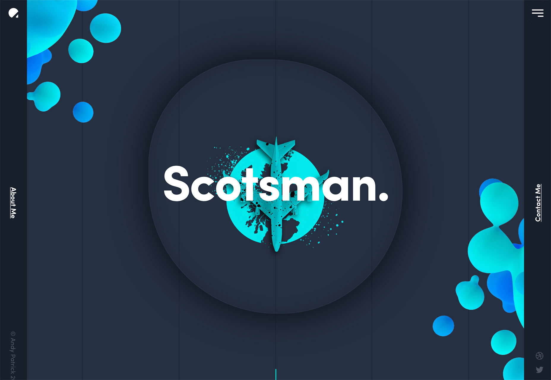
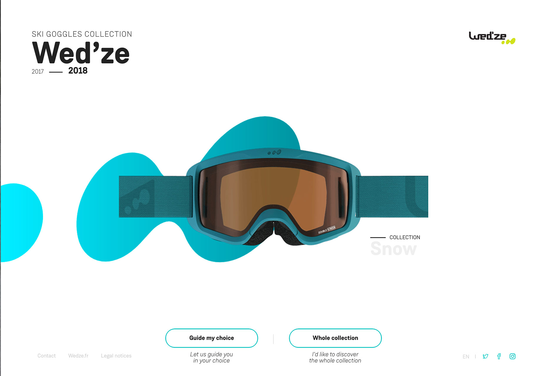
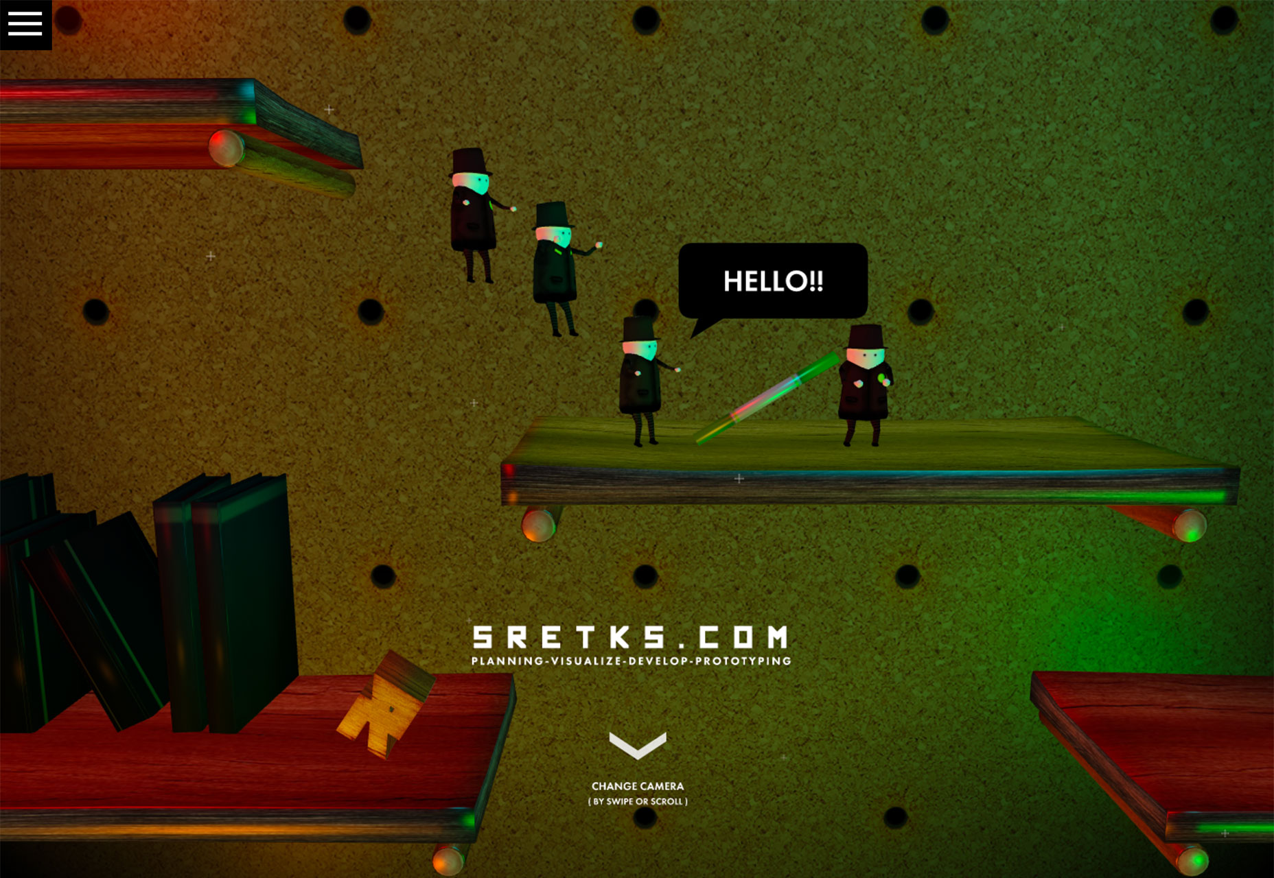
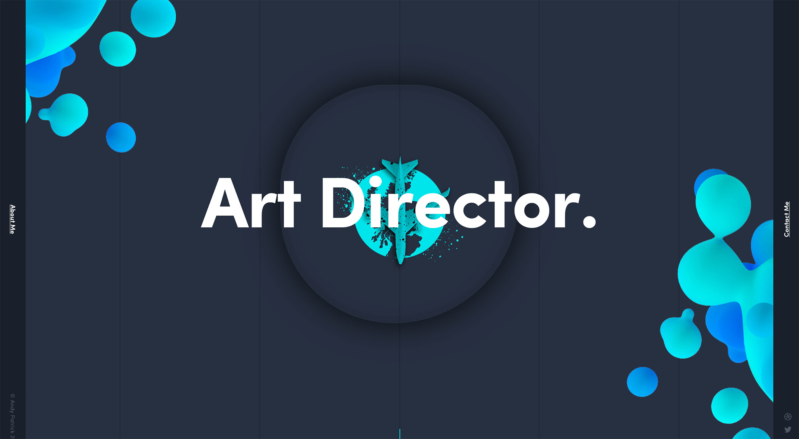
Here’s what’s trending in design this month:

1. Bubbles and Blobs

Loose shapes without clearly defined forms are showing up all over the place. While most of these shapes are somewhat round in nature, that’s not always the case.

Often these “blobs,” for lack of a better description, serve as accents to draw the eye into a project and highlight specific content (most notably the main headline). What’s neat about using these blobs is that every project looks different, even when using the exact same concept.

Shapes can be pretty much any color, although subtle gradients are especially popular, as are bright color choices. Shapes can be soft and fluid or more intentional and sleek.

Designers are using blobs to frame the canvas, highlight elements to create depth, include a hint of animation in a place that might otherwise feel static and incorporate a design element that’s just a little bit funky. All of these reasons lead the design to the same result—a key visual entry point for users.

Whether your shape is more of a bubble – more round and bouncy design element—or blob—a more shapeless, fluid element—it can be a fun and visually interesting way to draw users in. These shapes can also serve as a visual “thread” between elements and pages in the design. This technique is particularly helpful when the content or images don’t have an obvious flow.

2. “Floating” Rectangles

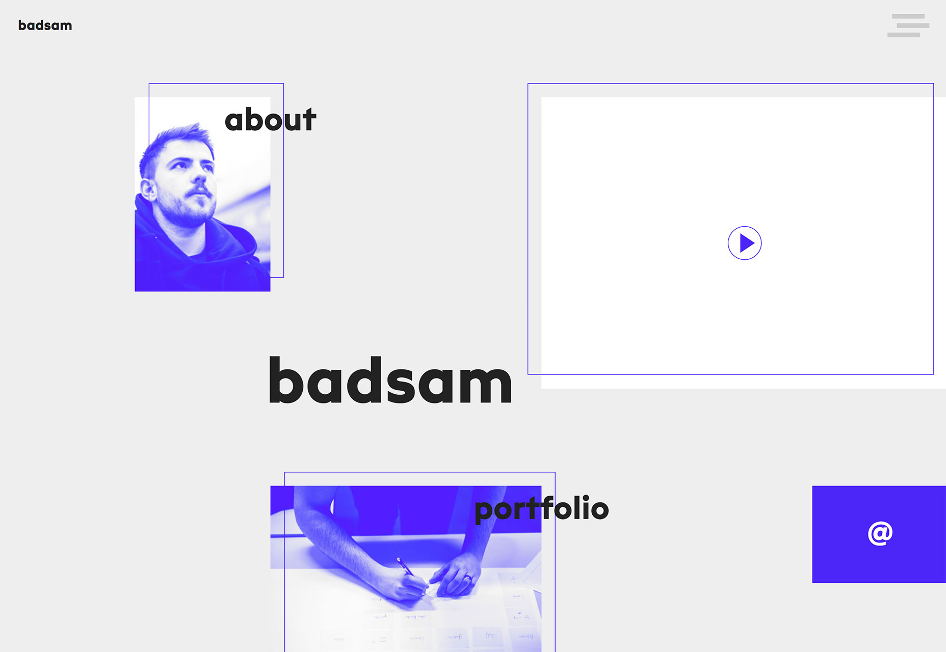
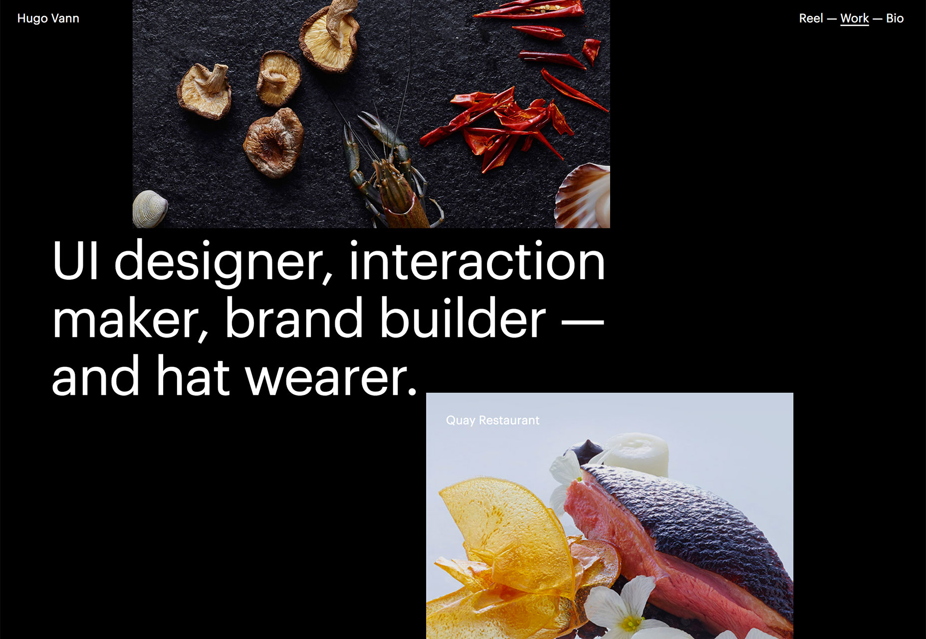
Here’s another website design trend that doesn’t have a real name, but seemingly off-grid floating rectangles are officially a thing. From simple portfolio pages to brand website designs, this technique is everywhere.

Maybe because it creates fun layers that work well with parallax scrolling animation, a trend that’s been going strong for a while now.

What’s really nice about this style is that it allows each image or rectangular frame to have an identity of its own. The concept is similar to the popular card-style that was a major part of Google’s Material Design documentation. The key difference here is that the design feels less structured and a little more organic.

The fluidity of the designs is visually appealing and encourages interaction because users will want to see what comes next or what’s in the rest of the rectangular containers. As you can see from the examples, many of these designs feature floating rectangles that fall into and off of the canvas, this technique creates a bit of mystery and can prompt users to interact.

What might be the best part of this design trend though is that it works with practically any type of content. Floating blocks can be as simple or complex as the content dictates. The concept works with just a handful of blocks or many. It works with oversized blocks to create depth or multiple smaller blocks to draw users into different types of content.

The key is that there’s opportunity to use this trend in many different ways to create a custom design that uses the trend but doesn’t have a cookie-cutter feel to it.

3. Image-Filled Typography

The final trend of the month is a lot of fun for all the amateur typographers out there. Designers are opting to fill type (or create layers that replicate the look of an image fill) with thick block-style letters.

While there’s nothing particularly new about this idea, the interpretation of the concept is. All three of the examples below use some type of text fill with a moving image.

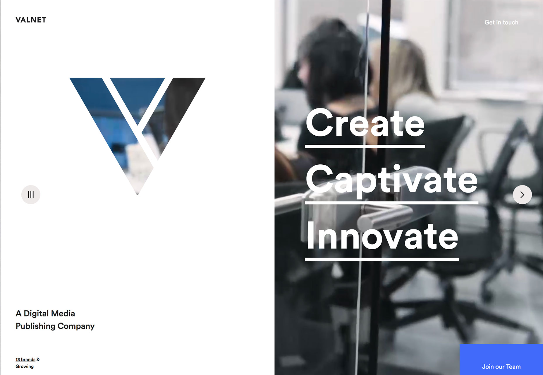
Valnet cuts out its signature “V” in a white frame on the left side of the homepage design. In the background a video loop plays. The image in the letter is part of the video in the background. It’s a nifty effect that gives the designer a way to use a more vertical framework without an odd-shaped video frame.

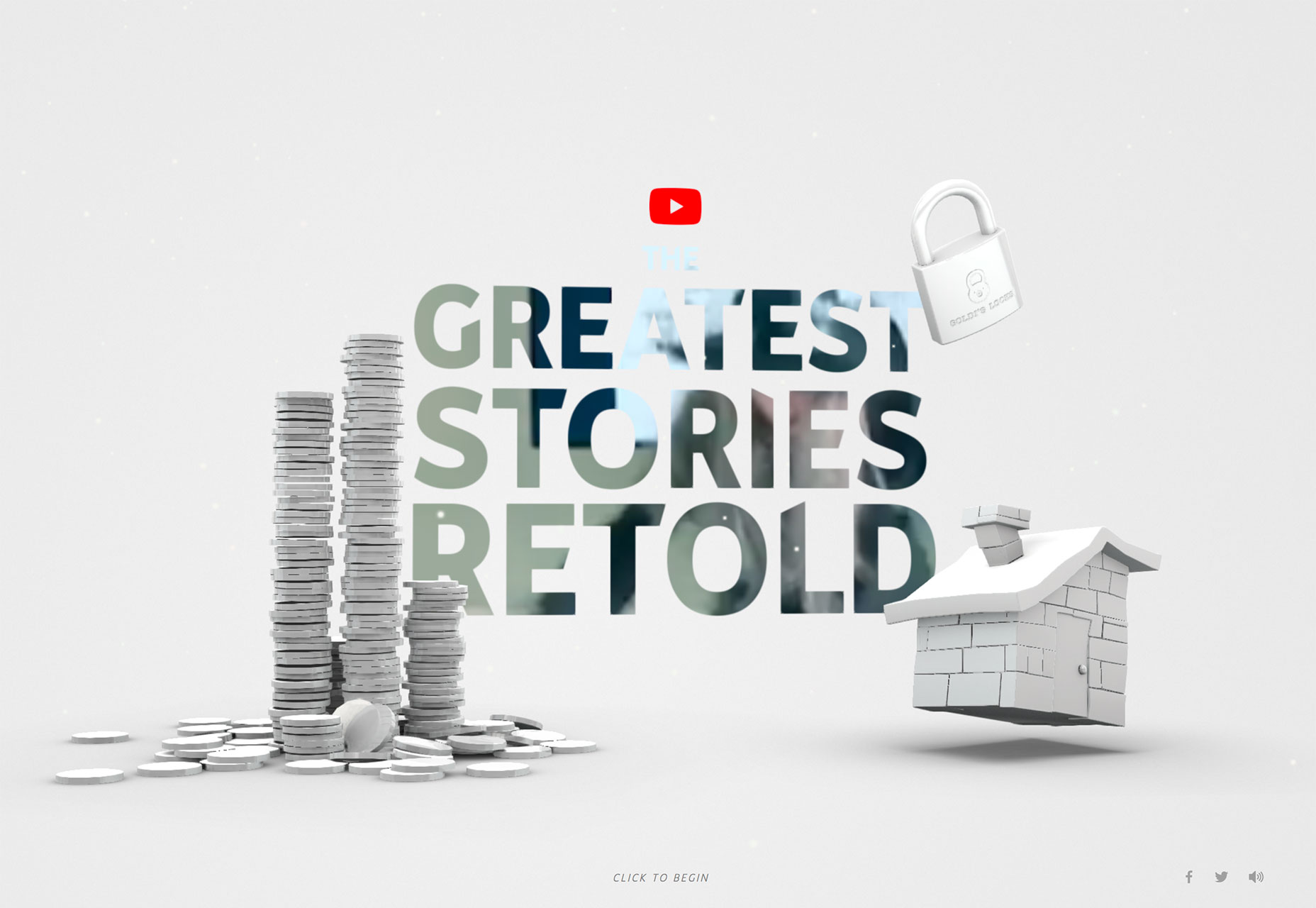
The Greatest Stories Retold uses that same concept but leave a lot more to the user imagination. There’s video b-roll running in the background, but it really only creates a sense of motion and color in the star design. What it does do is entice users enough to click and really get into the website design and content.

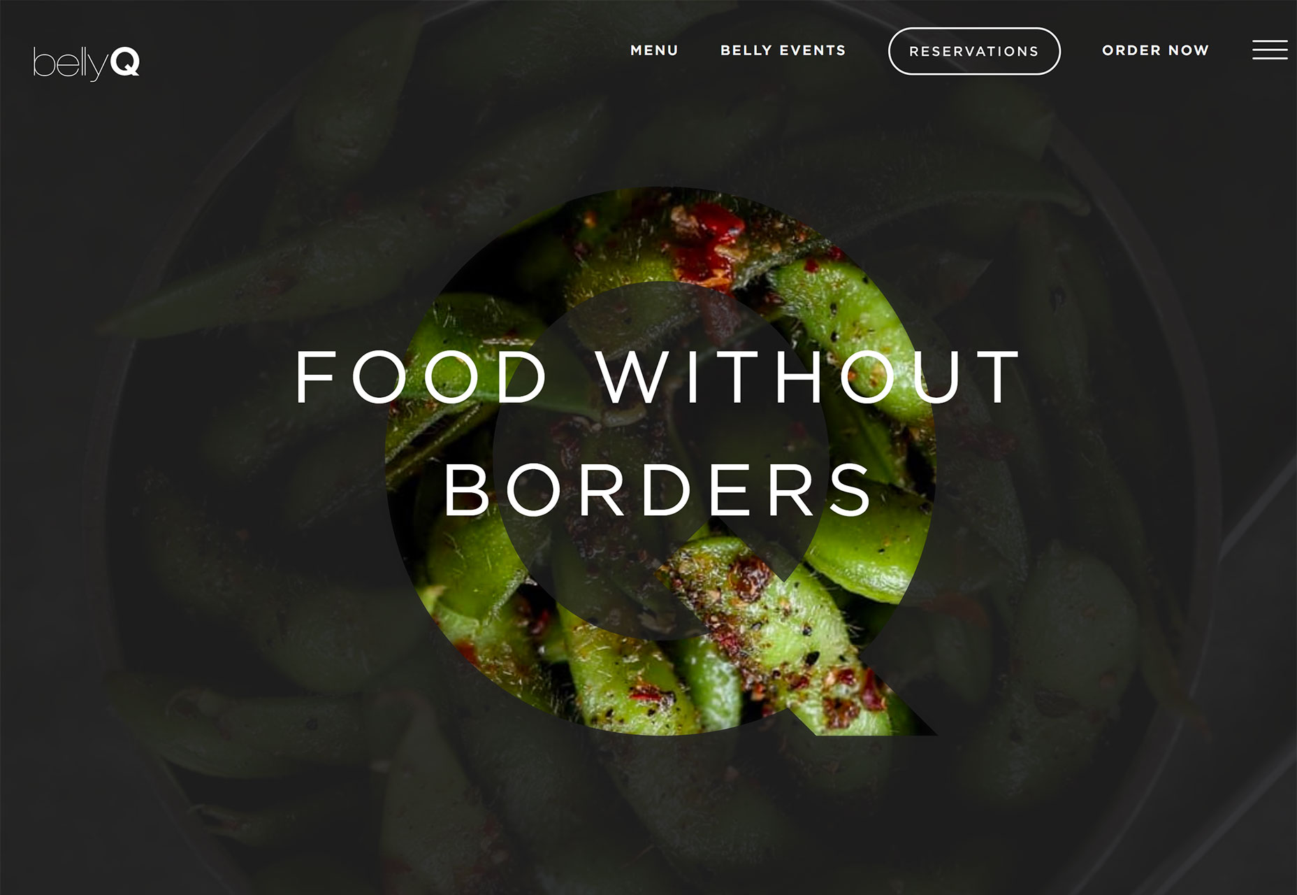
Belly Q uses still photos that zoom in and out to create subtle movement. The foreground has a dark overlay and the only full, bright color part of the design is inside the letter “Q.” The layering effect is simple and creates a great point of emphasis. Even with still images, the simple movement helps draw the eye and create a focal point for users to understand the name and brand of the site they are viewing, and encourage them to learn more.

A technique such as using animated fill in lettering has an innate sense of mystery. These designs almost beg users to click around the site to get a better idea for what’s in the image. Most users are highly visual and this small question mark in the design can actually encourage interaction. Just make sure to make the interaction easy to understand and complete so that you don’t leave users feeling frustrated or lost.

Conclusion

Which of these trends can you see yourself using in upcoming projects? Each of these design solutions can work for small uses, such as a homepage or landing page design, or extend to a full-scale project visual plan. An while each of these techniques is trendy, they aren’t so tied to a single element or idea that they’ll look dated immediately.

What trends are you loving (or hating) right now? I’d love to see some of the websites that you are fascinated with.

Add Realistic Chalk and Sketch Lettering Effects with Sketch’it – only $5!

Source

p img {display:inline-block; margin-right:10px;}
.alignleft {float:left;}
p.showcase {clear:both;}
body#browserfriendly p, body#podcast p, div#emailbody p{margin:0;}

from Webdesigner Depot https://ift.tt/2GL1DPr


from WordPress https://ift.tt/2Il8xbh

Sunday, April 1, 2018

Popular Design News of the Week: March 26, 2018 – April 1, 2018

Every week users submit a lot of interesting stuff on our sister site Webdesigner News, highlighting great content from around the web that can be of interest to web designers. 
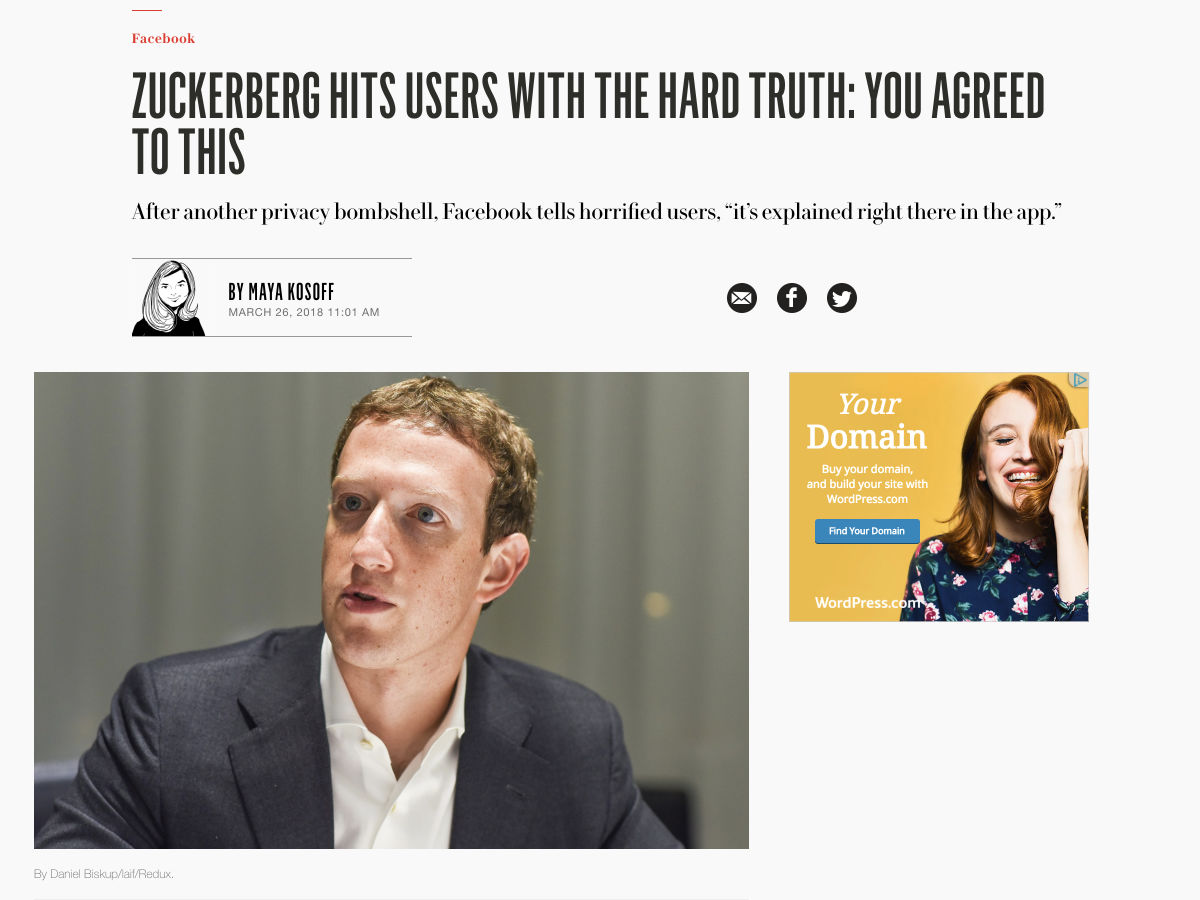
The best way to keep track of all the great stories and news being posted is simply to check out the Webdesigner News site, however, in case you missed some here’s a quick and useful compilation of the most popular designer news that we curated from the past week.

Note that this is only a very small selection of the links that were posted, so don’t miss out and subscribe to our newsletter and follow the site daily for all the news.

Zuckerberg Hits Users with the Hard Truth: You Agreed to this


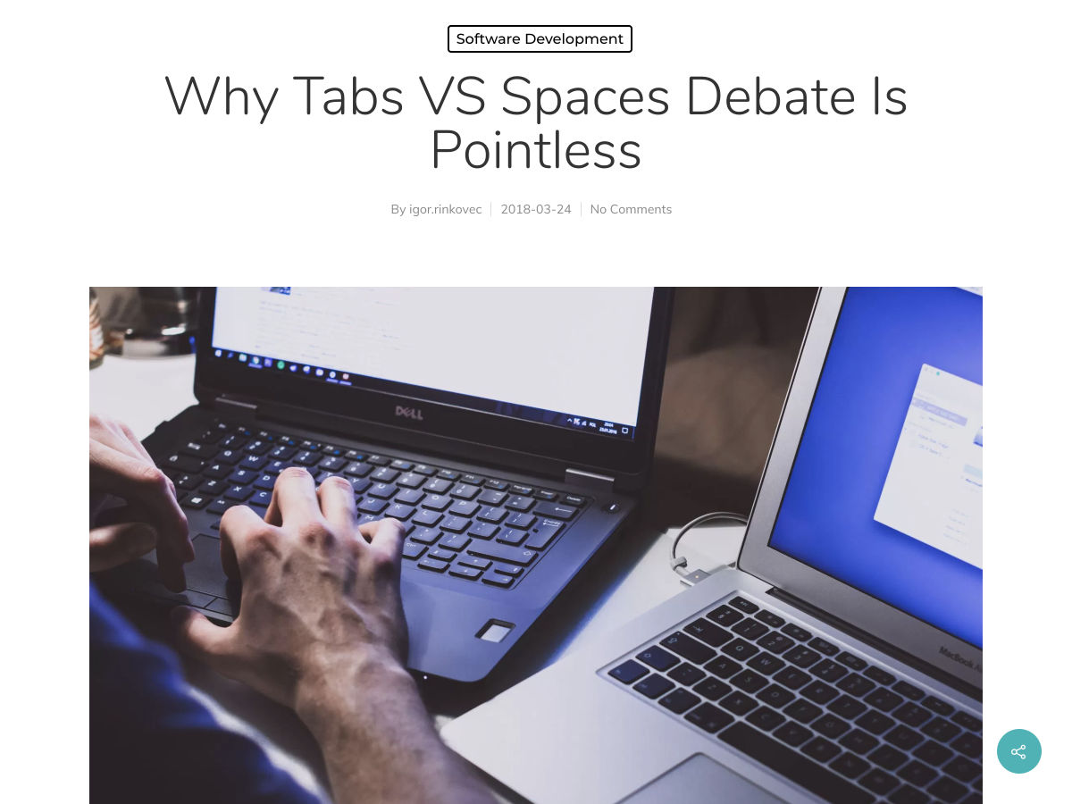
Why Tabs VS Spaces Debate is Pointless


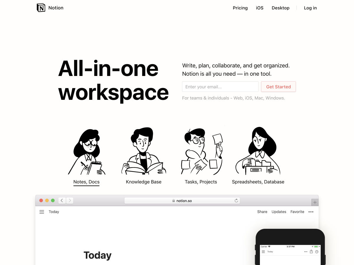
Notion 2.0


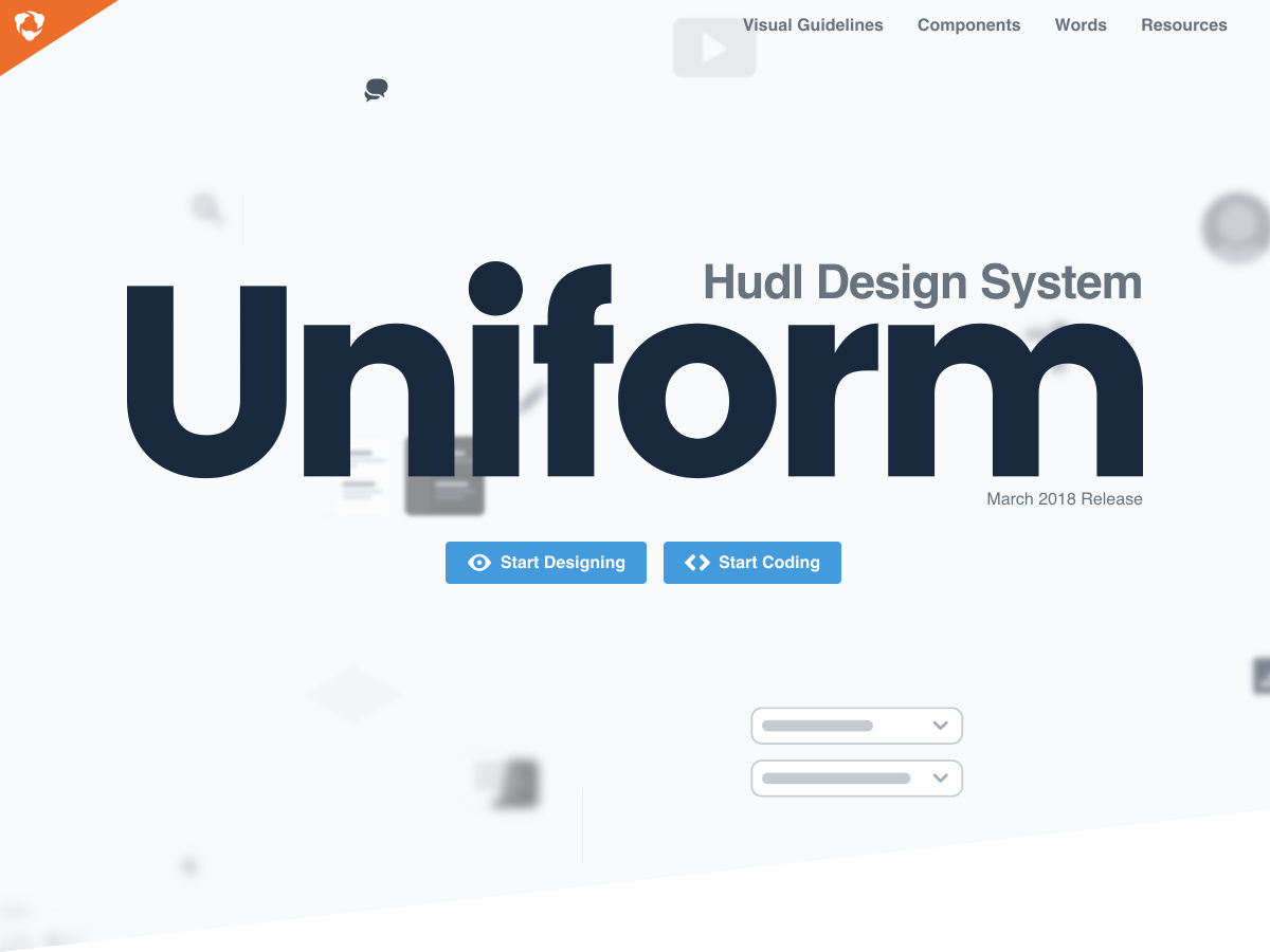
Design System: Uniform


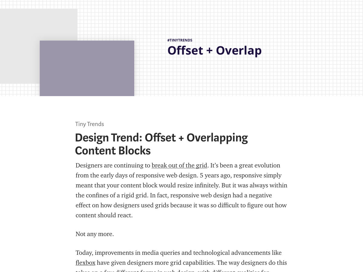
Design Trend: Offset + Overlapping Content Blocks


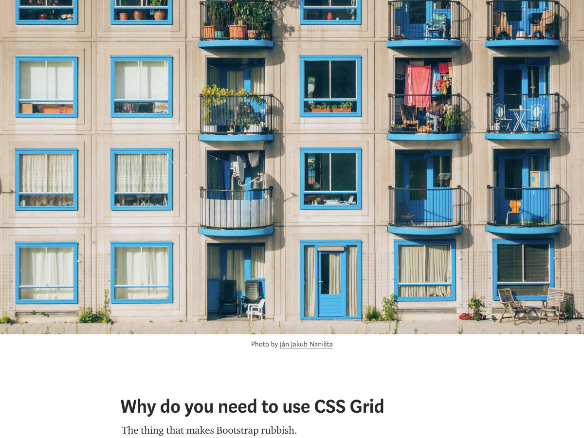
Why do You Need to Use CSS Grid


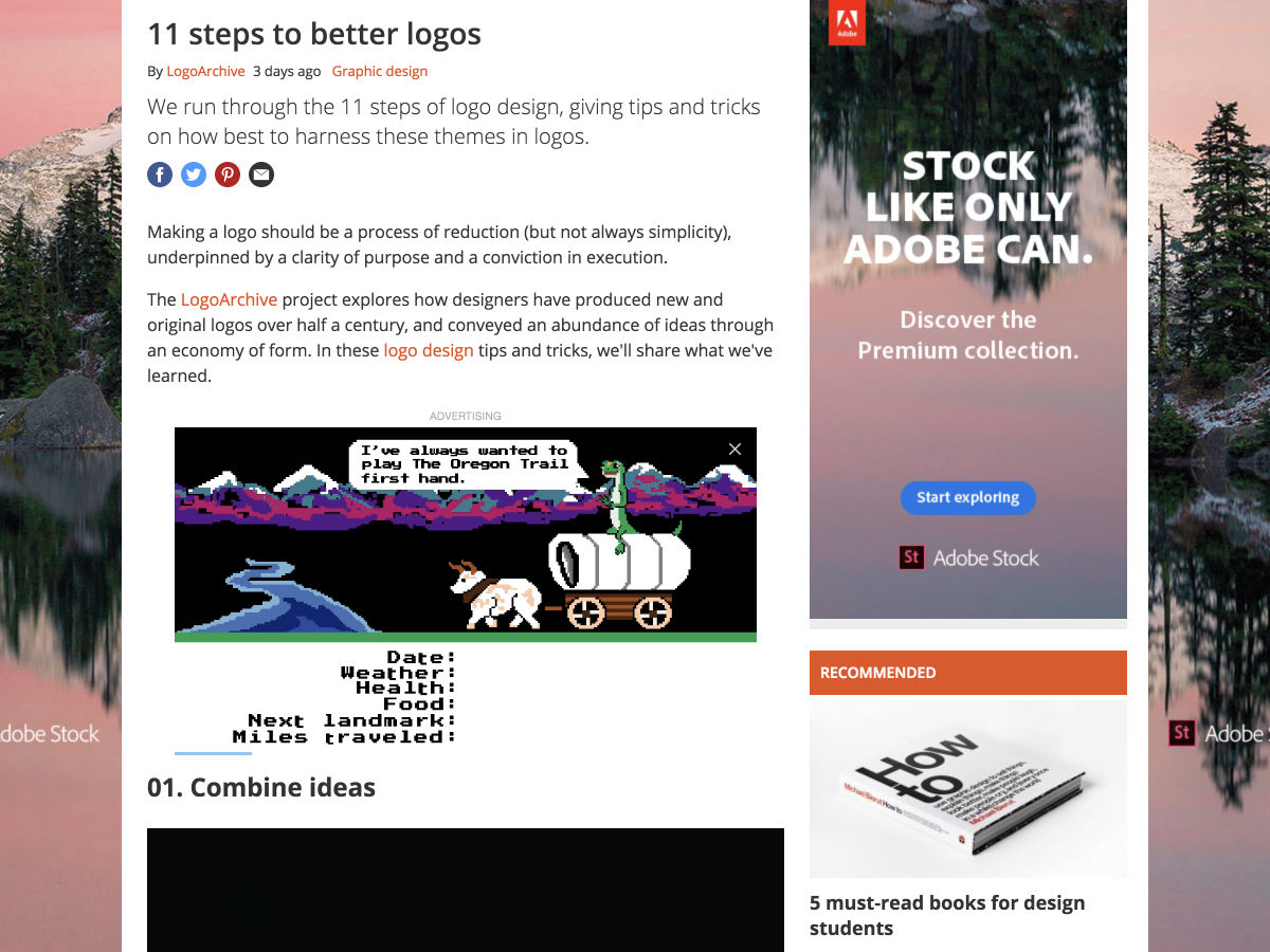
11 Steps to Better Logos


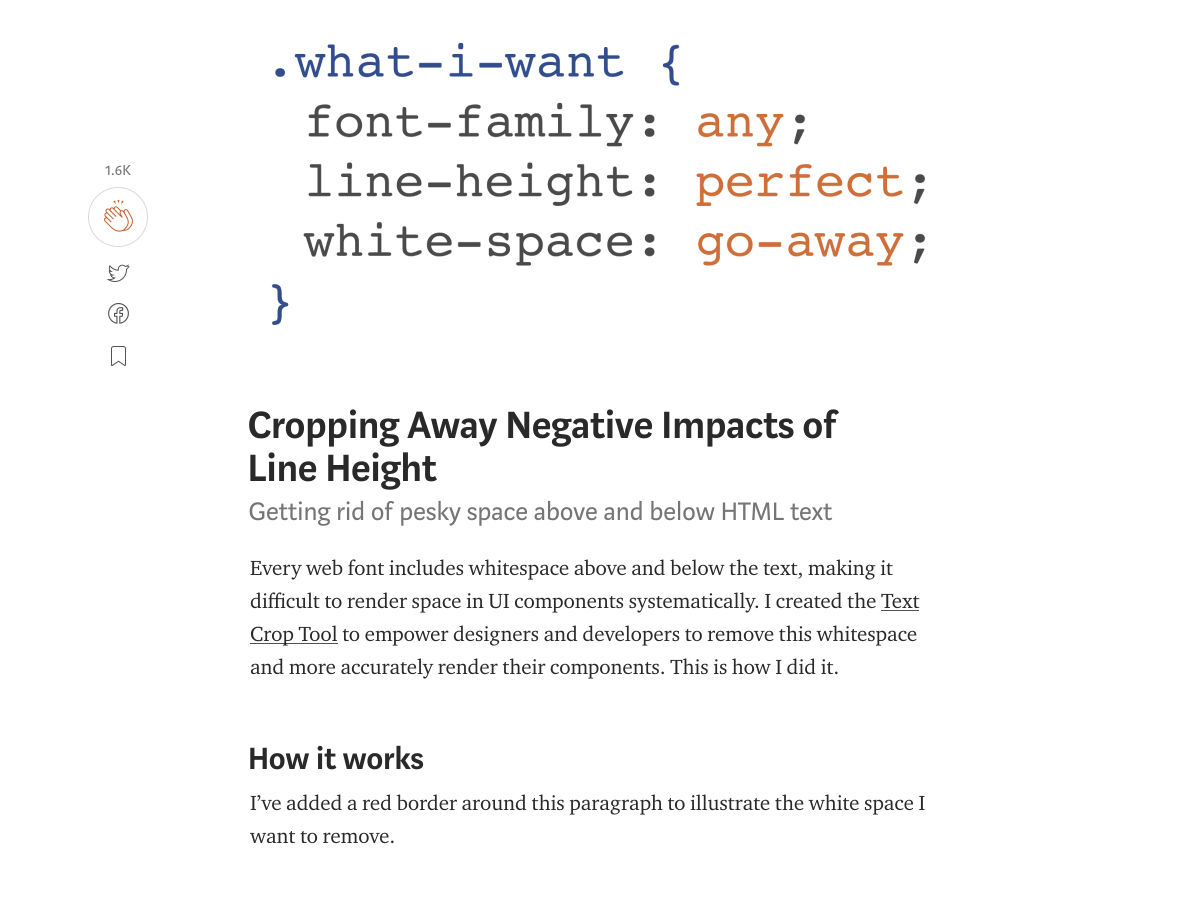
Cropping Away Negative Impacts of Line Height


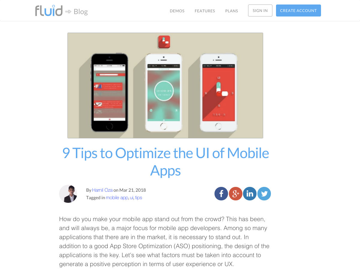
9 Tips to Optimize the UI of Mobile Apps


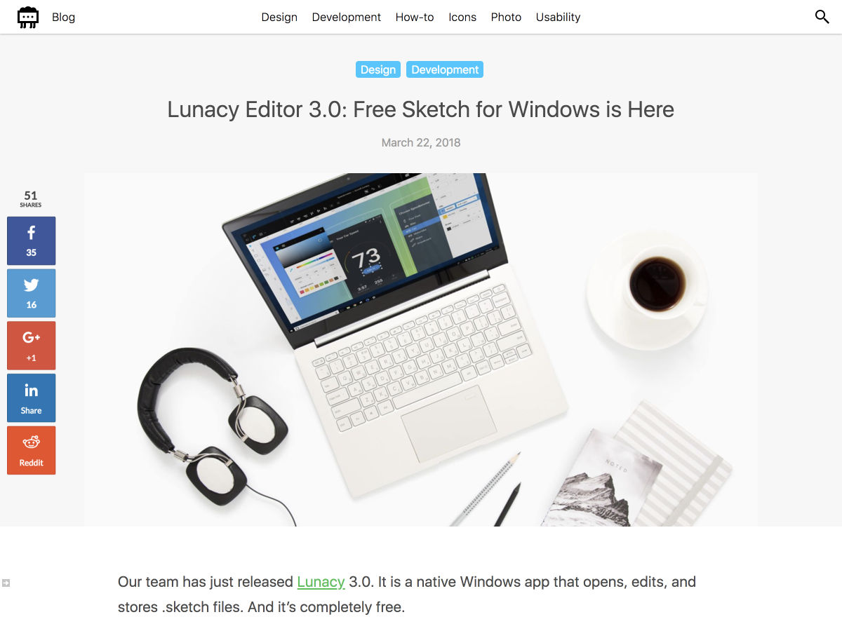
Lunacy Editor 3.0: Free Sketch for Windows is Here


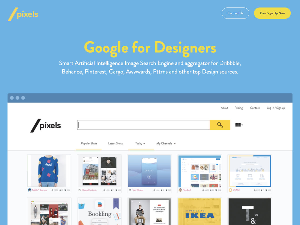
SlashPixels: A Google for Designers


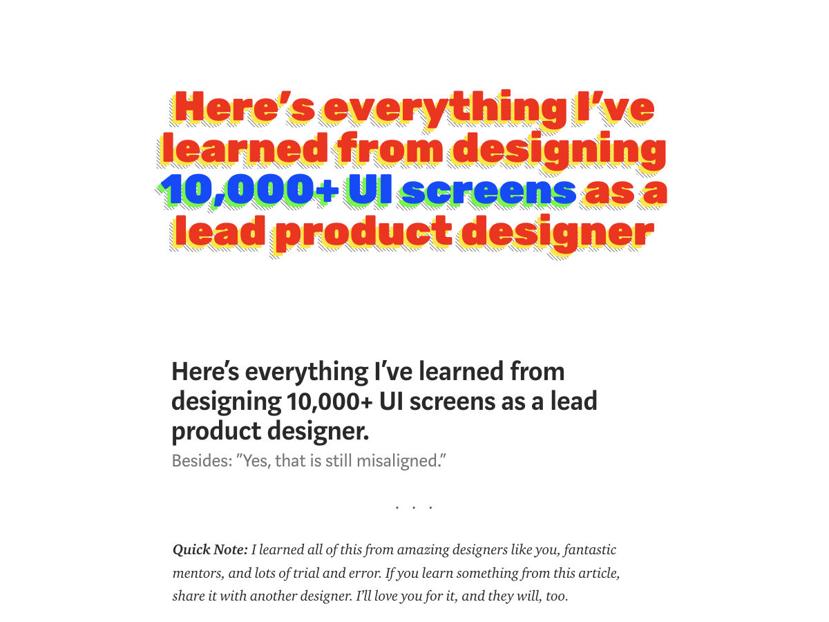
Here’s What I’ve Learned from Designing 10,000+ UI Screens as a Lead Product Designer.


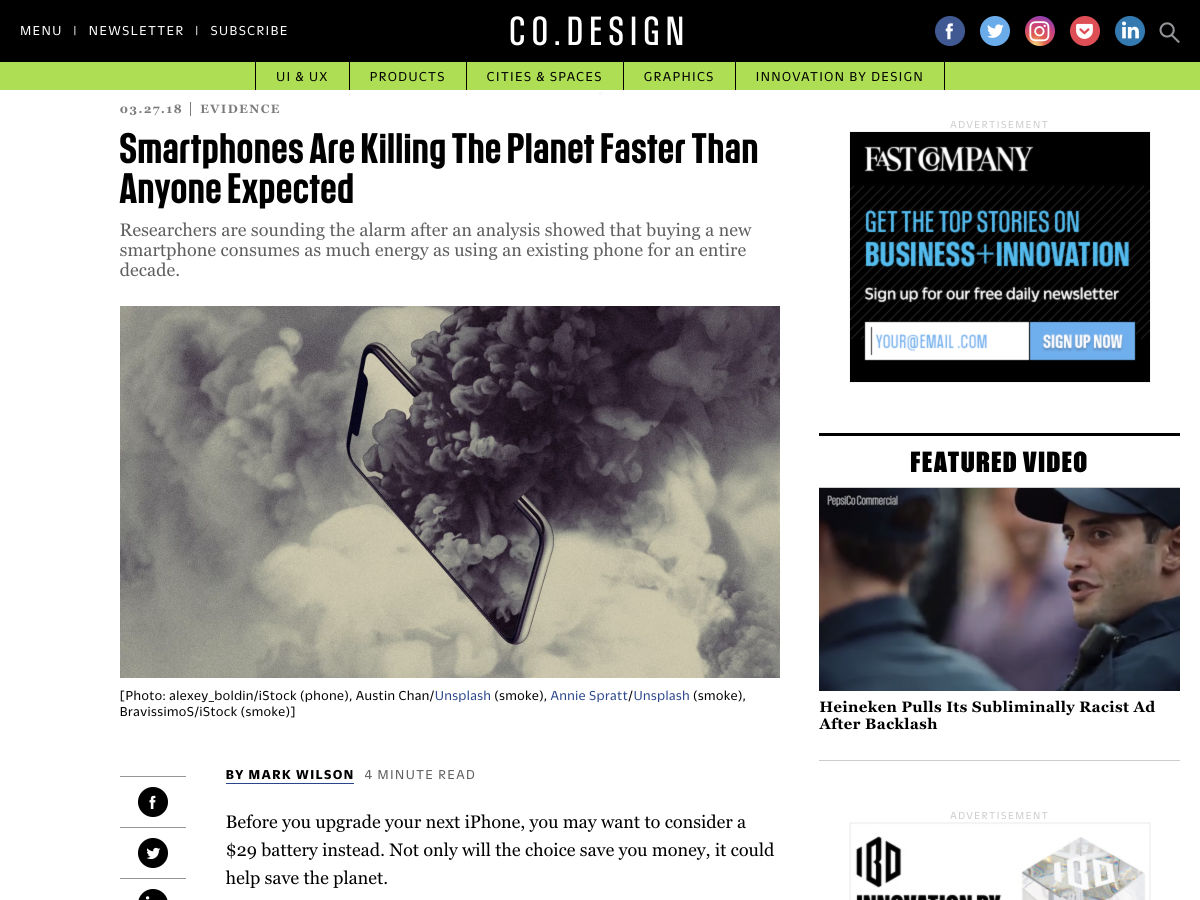
Smartphones are Killing the Planet Faster than Anyone Expected


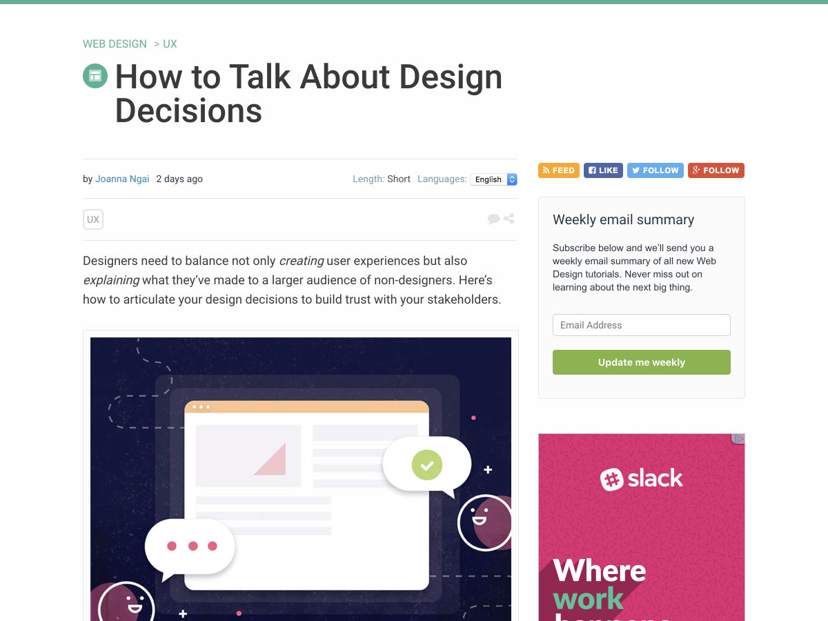
How to Talk About Design Decisions


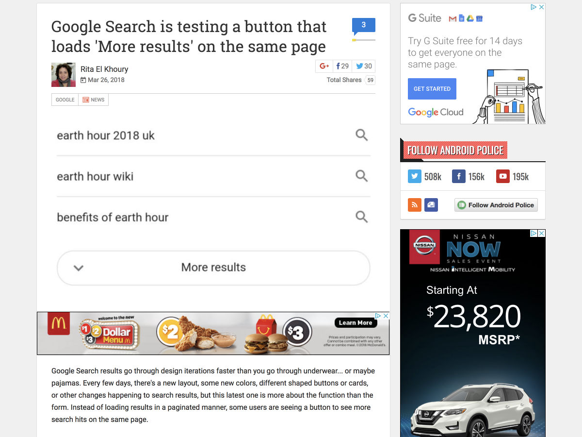
Google Search is Testing a Button that Loads ‘More Results’ on the Same Page


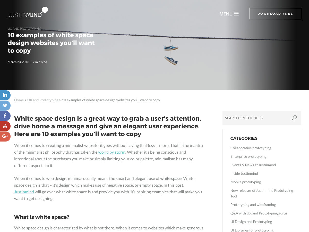
10 Awesome White Space Designs to Inspire You


Changing the Way We Build the Web, Together


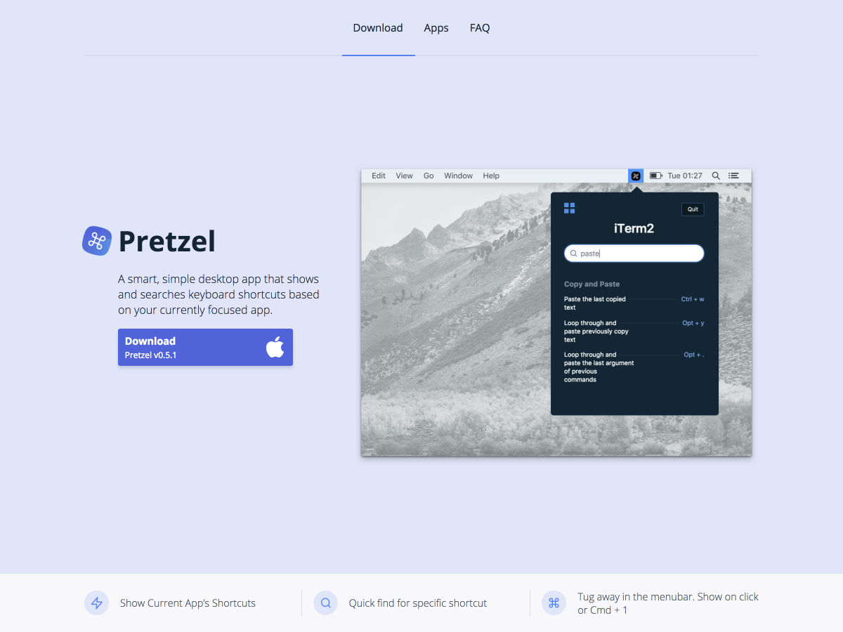
Pretzel – Keyboard Shortcuts for the App You’re Currently Using


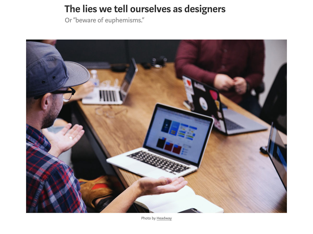
The Lies We Tell Ourselves as Designers


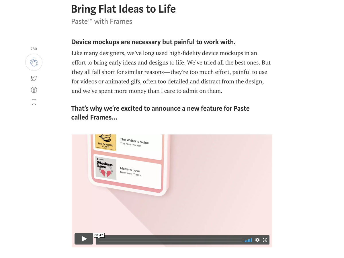
Paste with Frames: Bring Flat Ideas to Life


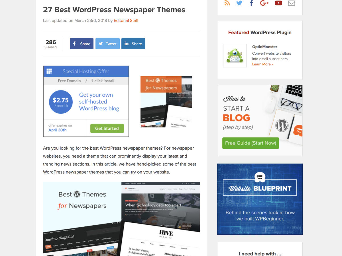
27 Best WordPress Newspaper Themes


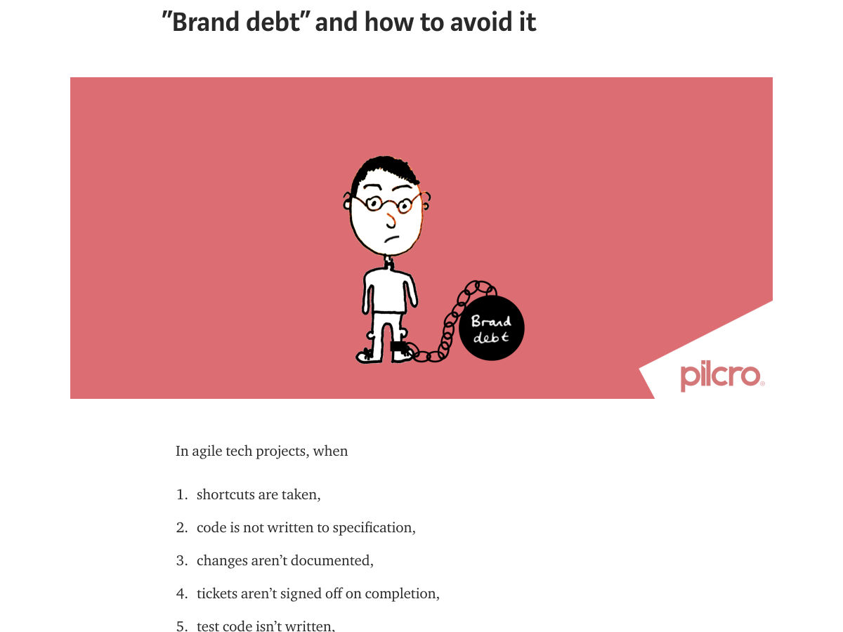
“Brand Debt” and How to Avoid it


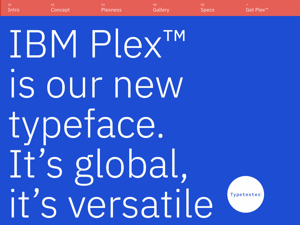
Site Design: IBM Plex


Gradient° – Deep Learning Platform Built for Developers


Prevent Facebook from Tracking You all Over the Web with this Firefox Extension


Want more? No problem! Keep track of top design news from around the web with Webdesigner News.

Add Realistic Chalk and Sketch Lettering Effects with Sketch’it – only $5!

Source

p img {display:inline-block; margin-right:10px;}
.alignleft {float:left;}
p.showcase {clear:both;}
body#browserfriendly p, body#podcast p, div#emailbody p{margin:0;}

from Webdesigner Depot https://ift.tt/2GZOEqM


from WordPress https://ift.tt/2pVpzWX