
 Shapes and typography are two elements that can add a lot of impact to a website design project even when they don’t always occupy the greatest amount of space. How to design shapes and typography with a little extra something is definitely on the trends radar this month, with plenty of projects using this concept.
Here’s what’s trending in design this month:
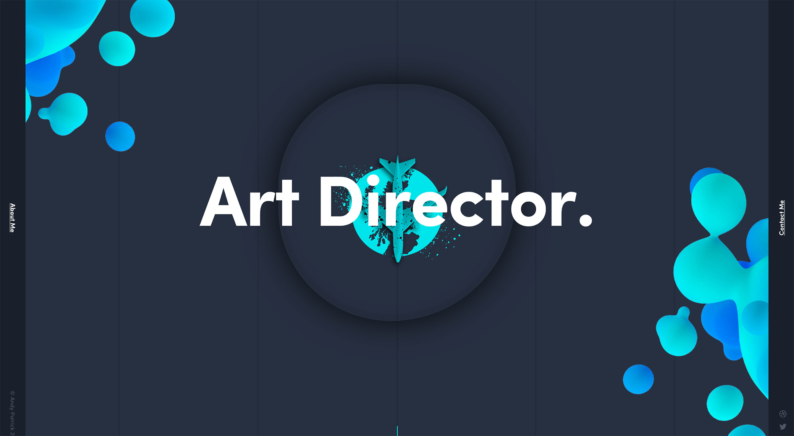
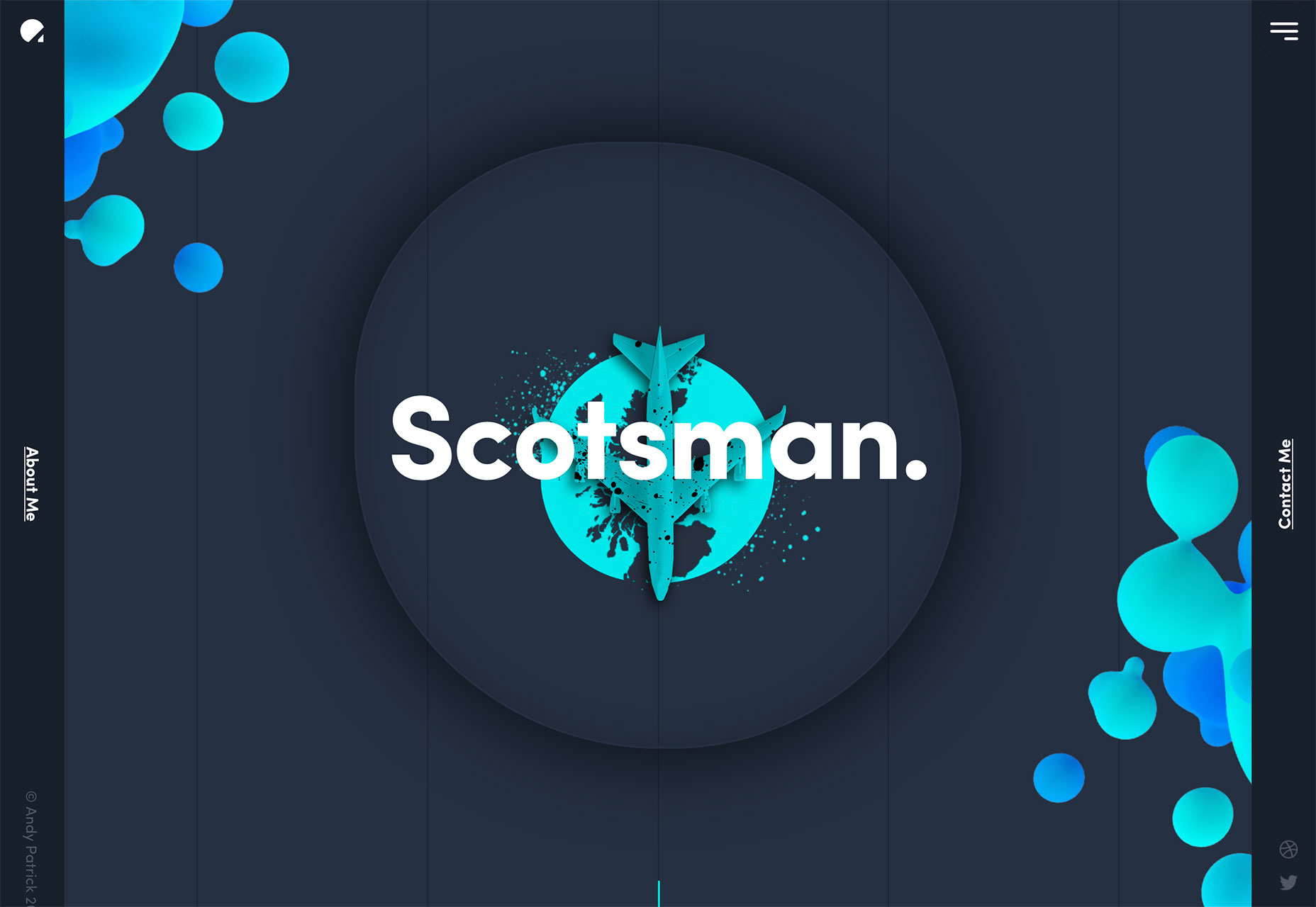
1. Bubbles and Blobs
Loose shapes without clearly defined forms are showing up all over the place. While most of these shapes are somewhat round in nature, that’s not always the case.
Often these “blobs,” for lack of a better description, serve as accents to draw the eye into a project and highlight specific content (most notably the main headline). What’s neat about using these blobs is that every project looks different, even when using the exact same concept.
Shapes can be pretty much any color, although subtle gradients are especially popular, as are bright color choices. Shapes can be soft and fluid or more intentional and sleek.
Designers are using blobs to frame the canvas, highlight elements to create depth, include a hint of animation in a place that might otherwise feel static and incorporate a design element that’s just a little bit funky. All of these reasons lead the design to the same result—a key visual entry point for users.
Whether your shape is more of a bubble – more round and bouncy design element—or blob—a more shapeless, fluid element—it can be a fun and visually interesting way to draw users in. These shapes can also serve as a visual “thread” between elements and pages in the design. This technique is particularly helpful when the content or images don’t have an obvious flow.
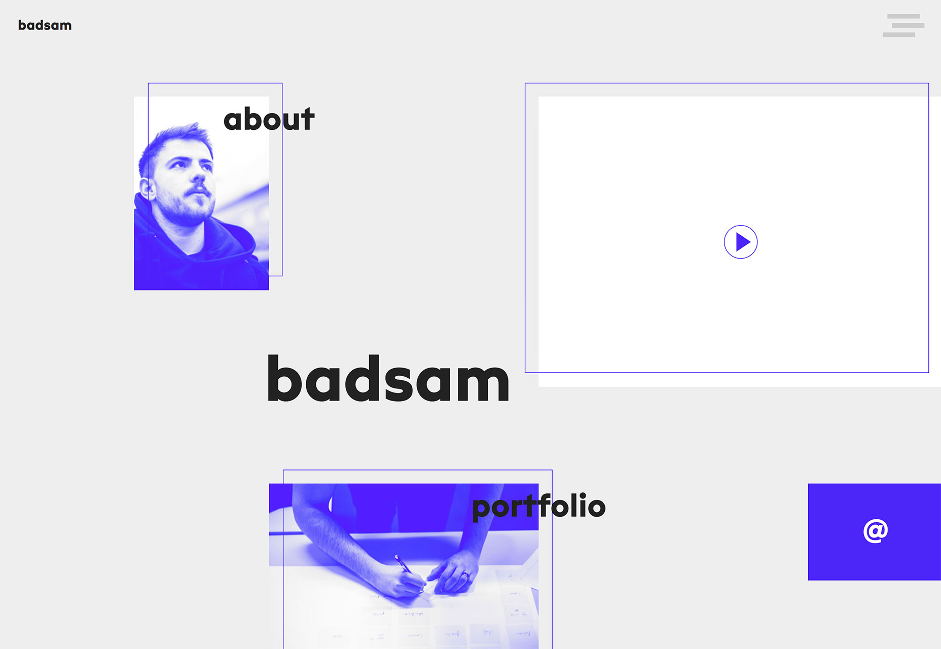
2. “Floating” Rectangles
Here’s another website design trend that doesn’t have a real name, but seemingly off-grid floating rectangles are officially a thing. From simple portfolio pages to brand website designs, this technique is everywhere.
Maybe because it creates fun layers that work well with parallax scrolling animation, a trend that’s been going strong for a while now.
What’s really nice about this style is that it allows each image or rectangular frame to have an identity of its own. The concept is similar to the popular card-style that was a major part of Google’s Material Design documentation. The key difference here is that the design feels less structured and a little more organic.
The fluidity of the designs is visually appealing and encourages interaction because users will want to see what comes next or what’s in the rest of the rectangular containers. As you can see from the examples, many of these designs feature floating rectangles that fall into and off of the canvas, this technique creates a bit of mystery and can prompt users to interact.
What might be the best part of this design trend though is that it works with practically any type of content. Floating blocks can be as simple or complex as the content dictates. The concept works with just a handful of blocks or many. It works with oversized blocks to create depth or multiple smaller blocks to draw users into different types of content.
The key is that there’s opportunity to use this trend in many different ways to create a custom design that uses the trend but doesn’t have a cookie-cutter feel to it.
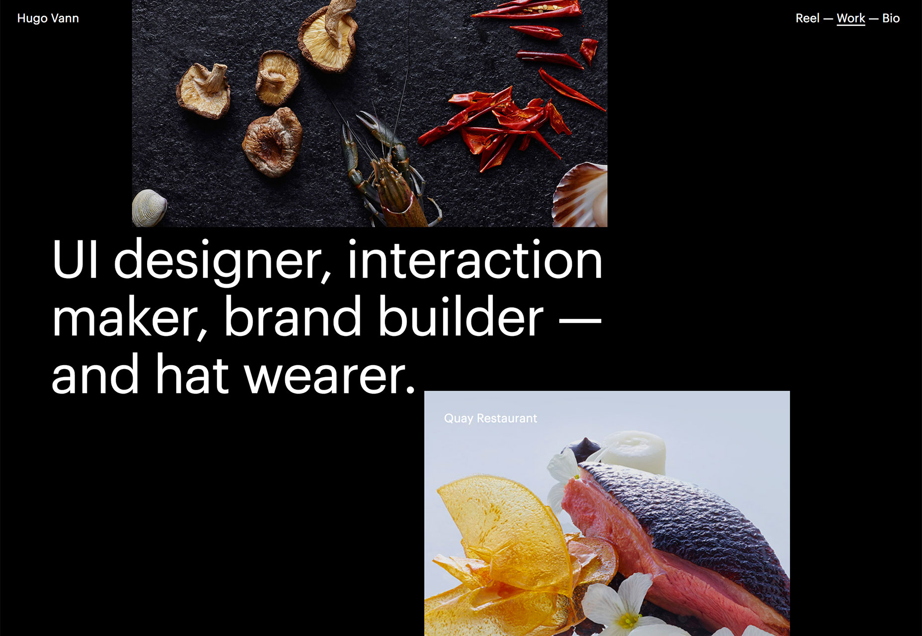
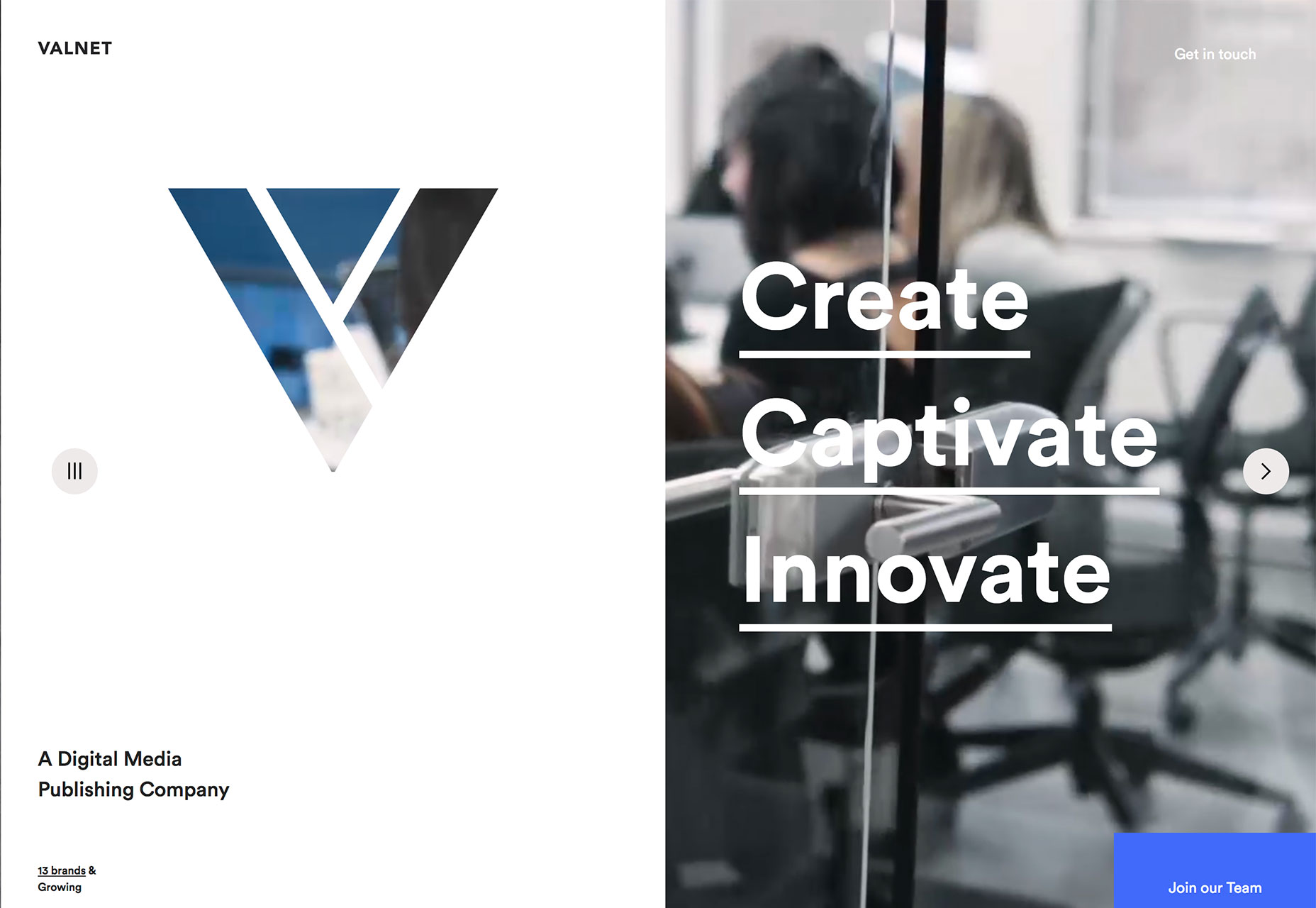
3. Image-Filled Typography
The final trend of the month is a lot of fun for all the amateur typographers out there. Designers are opting to fill type (or create layers that replicate the look of an image fill) with thick block-style letters.
While there’s nothing particularly new about this idea, the interpretation of the concept is. All three of the examples below use some type of text fill with a moving image.
Valnet cuts out its signature “V” in a white frame on the left side of the homepage design. In the background a video loop plays. The image in the letter is part of the video in the background. It’s a nifty effect that gives the designer a way to use a more vertical framework without an odd-shaped video frame.
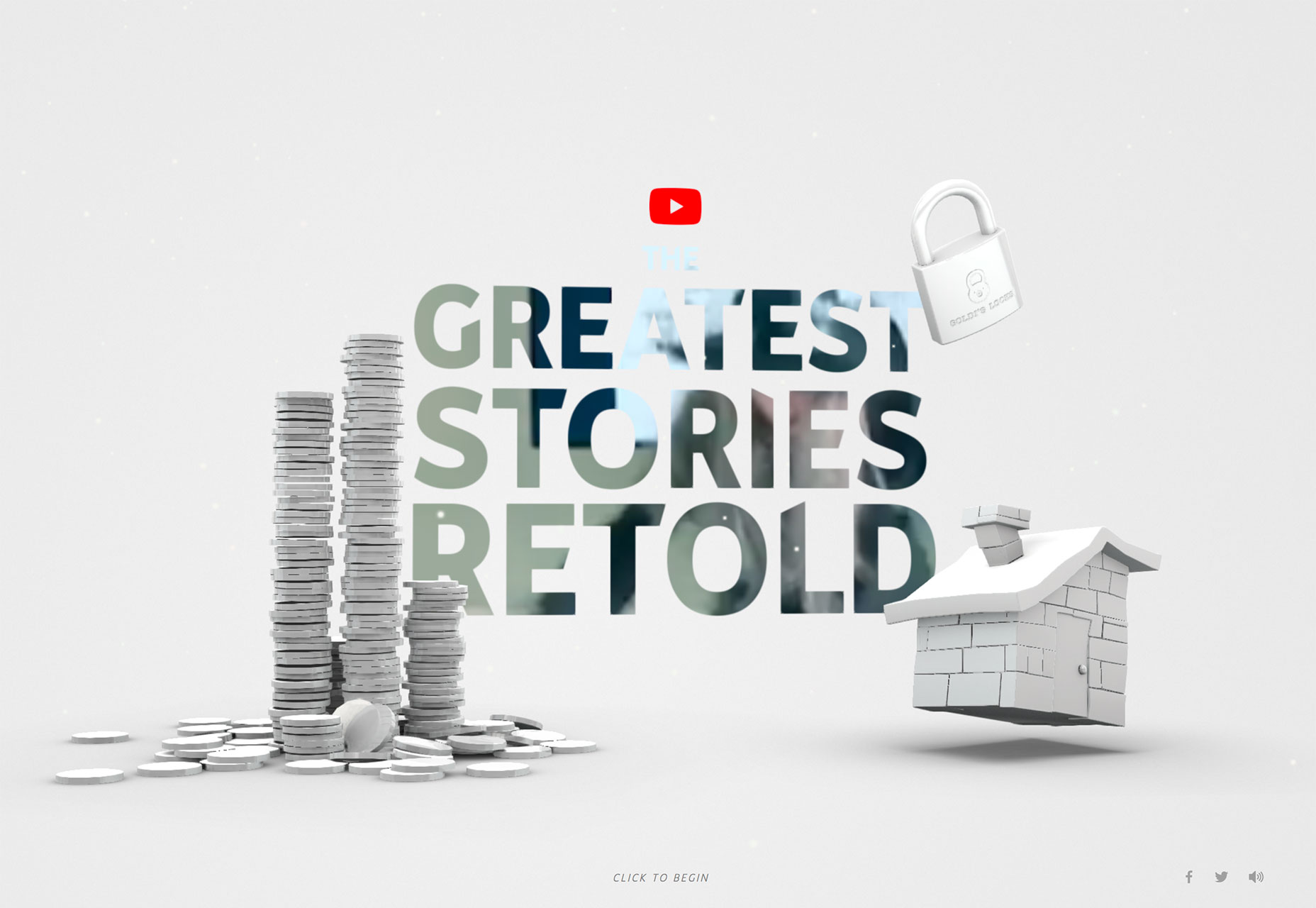
The Greatest Stories Retold uses that same concept but leave a lot more to the user imagination. There’s video b-roll running in the background, but it really only creates a sense of motion and color in the star design. What it does do is entice users enough to click and really get into the website design and content.
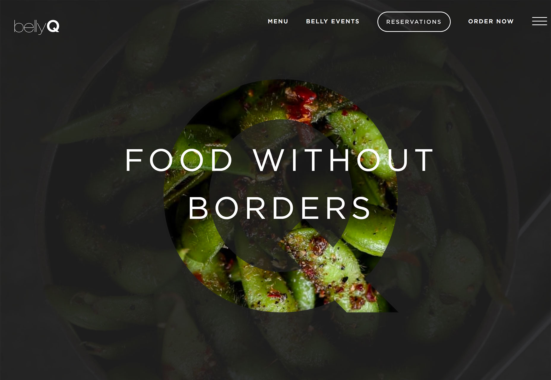
Belly Q uses still photos that zoom in and out to create subtle movement. The foreground has a dark overlay and the only full, bright color part of the design is inside the letter “Q.” The layering effect is simple and creates a great point of emphasis. Even with still images, the simple movement helps draw the eye and create a focal point for users to understand the name and brand of the site they are viewing, and encourage them to learn more.
A technique such as using animated fill in lettering has an innate sense of mystery. These designs almost beg users to click around the site to get a better idea for what’s in the image. Most users are highly visual and this small question mark in the design can actually encourage interaction. Just make sure to make the interaction easy to understand and complete so that you don’t leave users feeling frustrated or lost.
Conclusion
Which of these trends can you see yourself using in upcoming projects? Each of these design solutions can work for small uses, such as a homepage or landing page design, or extend to a full-scale project visual plan. An while each of these techniques is trendy, they aren’t so tied to a single element or idea that they’ll look dated immediately.
What trends are you loving (or hating) right now? I’d love to see some of the websites that you are fascinated with.
| Add Realistic Chalk and Sketch Lettering Effects with Sketch’it – only $5! |  |
p img {display:inline-block; margin-right:10px;}
.alignleft {float:left;}
p.showcase {clear:both;}
body#browserfriendly p, body#podcast p, div#emailbody p{margin:0;}
from Webdesigner Depot https://ift.tt/2GL1DPr
from WordPress https://ift.tt/2Il8xbh
No comments:
Post a Comment