
 Reddit, the self-proclaimed ‘front page of the internet’ is getting its first redesign since the heady days of IE7, and George W. Bush’s presidency.
First announced over a year ago, the challenge for Reddit’s in-house team of 22, has been how to update the platform to appeal to new users whose expectations are much evolved from the early web, without alienating old Reddit users comfortable with the status quo.
Reddit has often been hailed as an example of a site that prospers without design; if Reddit can thrive with the same old clunky UI, then why should any company invest in design services. In actuality Reddit established itself using an early version of iterative design. Most of its most recognizable features were developed and integrated without the pomp and ceremony of a full redesign.
Reddit currently serves …4.5% of the human race
Then in 2008, everything stalled. The original founders—now back at the helm—were replaced by a series of CEOs unable to cope with the demands of a site the scale of Reddit. If anything, 2018’s redesign is a return to the approach that first secured Reddit’s place on the web.
Reddit currently serves almost a third of a billion users—that’s just shy of 4.5% of the human race. When taking on a redesign of this size, only one thing is really certain: some users will love it, others will hate it, others will wait and see what others think and then furiously retweet opinions late into the night.
If you redesign Reddit…you’re inherently changing the internet.
~ Diego Perez, Reddit’s Head of Design, speaking to Wired
From a design perspective, it’s always difficult to critique a design without being party to the brief, without sitting in on the feedback meetings, without a detailed understanding of what the challenge is for Reddit. Like a game of Jeopardy! we have the answer, what matters is whether it matches the question.
Reddit’s design challenge is more complex than most because as a site, it had been left to seed. A wild west of different communities, each with their own ideas, the new site design has to unify them all, without threatening the independent spirit that makes them what they are.
Wired have published the inside story of the redesign, which is a fascinating read, but certainly glosses over the more challenging parts of the process. Reddit we’re told, employed just two UX researchers to assess the onboarding experience; their research process was to wander around outside Reddit HQ approaching different people with their laptops.
With a decade of neglect, an opinionated user base, and fewer resources than many startups, it’s a minor miracle that Reddit’s design team delivered anything at all.
it’s a minor miracle that Reddit’s design team delivered anything at all
As of today, 1% of users will see the new design. Over the coming months the new design will be rolled out globally. There are three design options for users to choose from: Classic view (basically old Reddit with the new features added), Card view (how most users will use the site), and Compact view (for scanning content quickly). In any other context I’d take the view that three different ‘designs’ indicate a difference of opinion in the design process that hadn’t been properly resolved. In Reddit’s case it feels like an acknowledgement of the different needs of different groups.
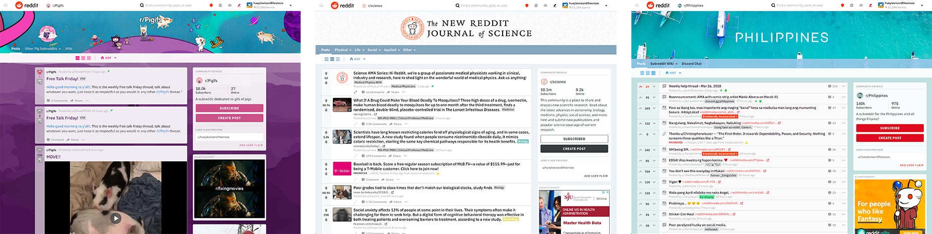
Card view (left), Classic view (center), Compact view (right)
Snoo, the site’s mascot has also received an update. Now, instead of standing around looking dopey, he’s dynamic and expressive. The reimagining of Snoo, and its integration into the brand from illustrations to Snoomojis, is excellent. While a cutesy mascot is not everyone’s cup of tea, if you’re going to do it, you may as well do it well.
The UI design is not entirely successful though. The menu bar has been replaced by a menu stuck to the top left corner of the UI. These types of menus are popular with designers—they crop up a lot on design showcases—but rarely test well with users. I’d be surprised if that decision isn’t revoked at the next iteration.
Much of the redesign is intentionally invisible, with efforts being diverted into areas that only Reddit users will notice, such as the ability to post text and images in a single post, or the introduction of WYSIWYG controls for formatting. The most significant design changes are the less obvious ones: the welcome decision to ignore Material Design, posts opening in modals instead of new windows, the stylistic distinction between internal and external links.
Reddit’s redesign is almost invisible. Like most successful redesigns it strikes a judicious balance between where the site is, and where it wants to be.
https://www.webdesignerdepot.com/wp-content/plugins/wp-fs-polls/widget/poll.js.php
| Add Realistic Chalk and Sketch Lettering Effects with Sketch’it – only $5! |
p img {display:inline-block; margin-right:10px;}
.alignleft {float:left;}
p.showcase {clear:both;}
body#browserfriendly p, body#podcast p, div#emailbody p{margin:0;}
from Webdesigner Depot https://ift.tt/2GTlJY2
from WordPress https://ift.tt/2GxQwGm
No comments:
Post a Comment