Friday, July 5, 2019

How to Code a “Click to Tweet” Button

With Instagram, Snapchat and other “young” social media platforms taking over the internet, Twitter still remains one of the most popular marketing channels.

It has around 326 million active users per month which means that your target audience is likely using it. This is why you should at least consider using it as a marketing channel for your business. Having Twitter as one of the main marketing channels is not only going to help build awareness of your brand but can also drive traffic to your website and make your articles go viral.

How can this be achieved? Well, it’s a pretty straightforward tactic that some of the top bloggers are using. The idea is that within your blog post you have short pieces of content that are catchy and people like them. Those pieces of content can then be easily tweeted. (For example, it could be a quote from someone who is an authority in your niche, or a statistic that you feel is likely to be shared by your visitors.)

So, let me show you how you can have “click to tweet” buttons added automatically to every quote in your article.

Before we get started, let me say that this is a medium-advanced technique. If you’re using WordPress you can use a ready-to-go plugin that will serve the same purpose.

Creating “Click to Tweet” Buttons with JavaScript

Let’s assume that we want to turn from this article about conferences that says “According to webdesignerdepot.com …” into a tweetable block.

Given that we have the following html structure:

<article id="article">
<blockquote>  I only ever go to marketing conferences to meet new people and listen to their experiences. Those people never include the speakers, who are generally wrapped up in their own world and rarely give in the altruistic sense. </blockquote>
</article>

Here is how we would create a click to tweet button:

Step 1

We need to collect all the <quote> and <blockquote> elements from our article when the document loads:

document.addEventListener("DOMContentLoaded", function() {
  // Step 1. Get all quote elements inside the article
  const articleBody = document.getElementById('article');
  const quotes = [...articleBody.querySelectorAll('quote, blockquote')];

Step 2

Create additional variables to store the current page url, tweetable url and a ‘click to tweet’ button:

  let tweetableUrl = "";
  let clickToTweetBtn = null;
  const currentPageUrl = window.location.href;

Step 3

We need to iterate over all the quote elements that we want to make tweetable and append a “click to tweet button” for each of them:

  quotes.forEach(function (quote) {
    // Create a tweetable url
    tweetableUrl = makeTweetableUrl(
      quote.innerText, currentPageUrl
    );

    // Create a 'click to tweet' button with appropriate attributes
    clickToTweetBtn = document.createElement("a");
    clickToTweetBtn.innerText = "Click to Tweet";

    clickToTweetBtn.setAttribute("href", tweetableUrl);
    clickToTweetBtn.onclick = onClickToTweet;

    // Add button to every blockquote
    quote.appendChild(clickToTweetBtn);

  });  
});

Step 4

Add 2 missing functions: makeTweetableUrl, that will create a tweetable URL, and onClickToTweet that will act as our event listener and open a window for the tweet (once the button is clicked):

function makeTweetableUrl(text, pageUrl) {
  const tweetableText = "https://twitter.com/intent/tweet?url=" + pageUrl + "&text=" + encodeURIComponent(text);
  return tweetableText;
}

function onClickToTweet(e) {
  e.preventDefault();

  window.open(
    e.target.getAttribute("href"),
    "twitterwindow", 
    "height=450, width=550, toolbar=0, location=0, menubar=0, directories=0,scrollbars=0"
  );

}

Here it is working on CodePen.

Creating “Click to Tweet” Buttons with jQuery

Now, let me show you a slightly different way to get the same result that you can implement if you’re using jQuery.
Here is the code:

$(document).ready(function() {

  // Get all quote elements inside the article
  const articleBody = $("#article");
  const quotes = articleBody.find("quote, blockquote");
  let tweetableUrl = "";
  let clickToTweetBtn = null;

  // Get a url of the current page 
  const currentPageUrl = window.location.href;

  quotes.each(function (index, quote) {
    const q = $(quote);
    // Create a tweetable url
    tweetableUrl = makeTweetableUrl(
      q.text(), currentPageUrl
    );

    // Create a 'click to tweet' button with appropriate attributes
    clickToTweetBtn = $("<a>");
    clickToTweetBtn.text("Click to Tweet");

    clickToTweetBtn.attr("href", tweetableUrl);
    clickToTweetBtn.on("click", onClickToTweet);

    // Add button to every blockquote
    q.append(clickToTweetBtn);

  });
});

function makeTweetableUrl(text, pageUrl) {
  const tweetableText = "https://twitter.com/intent/tweet?url=" + pageUrl + "&text=" + encodeURIComponent(text);
  return tweetableText;
}

function onClickToTweet(e) {
  e.preventDefault();
  window.open(
    e.target.getAttribute("href"),
    "twitterwindow", 
    "height=450, width=550, toolbar=0, location=0, menubar=0, directories=0, scrollbars=0"
  );
}

As you can see, the code is the same, except that it takes advantage of jQuery’s functions to simplify the code we have to write. Here’s the jQuery version working on CodePen.

Conclusion

As you can see, creating a “click to tweet” button doesn’t require much time but it can be a great way to encourage your visitors to share your content on Twitter.

I hope this tutorial was helpful and you learned something new. Feel free to use this piece of code and implement it on your website.


Featured image via DepositPhotos.

Source

p img {display:inline-block; margin-right:10px;}
.alignleft {float:left;}
p.showcase {clear:both;}
body#browserfriendly p, body#podcast p, div#emailbody p{margin:0;}

from Webdesigner Depot https://ift.tt/2Xtn6G1


from WordPress https://ift.tt/2L3Rzn9

Thursday, July 4, 2019

Should You Be Using JQuery 3?

Back in April, jQuery 3.0 was released with all the pomp and ceremony of a British monarch on the 4th of July (happy Independence Day to all our American readers). There have been a flurry of minor releases since then, with the current version being 3.4.1.

We’ve had a few weeks to poke around, and check out the new features, and more importantly the now deprecated features. What we found was a modern library that defied a few of our expectations.

It’s Not Bloated

There are quite a few myths built up around jQuery, not least that it is bloated and slow. There’s some sense to this, containing as it does code that you probably won’t need. However this is true of all libraries, frameworks, and 3rd party scripts; unless you’re using something so niche that there is nothing superfluous wrapped up in the code, then there will always be a few bytes here and there that aren’t required.

drop a jpg and you’ll probably have room to spare

But let’s keep this in proportion: the raw, minified, production version of jQuery is 88kb, if you opt for the slim version without Ajax and the effects, then it’s just 71kb.

If you’re working to a strict size quota it’s relatively simple to squeeze 71kb out of a few images. Better yet, drop a jpg and you’ll probably have room to spare.

It’s (Probably) Not Cached

One of the greatest benefits of jQuery circa 2014, was that it was all but ubiquitous. Almost every site took advantage of this by linking directly to the jQuery CDN meaning that more often than not it was cached in the user’s browser – you could, in effect, use it for zero size cost.

jQuery usage has dipped in recent years, thanks in part to rival libraries, and thanks in part to the belief that vanilla JavaScript is superior. Fewer sites are linking to the CDN, fewer browsers have the file cached, and so it will probably need to be downloaded before it’s available.

The problem is compounded by the release for version 3, because although plenty of legacy sites are still loading jQuery from the CDN, by their nature they aren’t linking to the current version. The jQuery team have gone to great lengths to help you upgrade but project cycles and code adoption means that jQuery 3.n is probably at least several years away from comprehensive coverage.

You Don’t Need to Know Vanilla JavaScript

One of the most oft-repeated myths – or perhaps I should say ‘untruths’ in this case – is that you should learn vanilla JavaScript before you can use jQuery well.

View jQuery as a set of training wheels

I detest this view. I understand the logic; if you learn the underlying logic of the language, you’ll understand what’s happening behind the scenes and have a nuanced understanding of your code. People who perpetuate that view have forgotten what it feels like to be trawling Stack Overflow at three in the morning struggling to understand why document.getElementsByClassName needs a [0] on the end.

Yes, you do need to understand language basics, like variables, loops, conditionals, operators, and so forth; you’ll need to know those with or without jQuery. View jQuery as a set of training wheels, it does the hard stuff for you, so the easy stuff has a chance to become second nature.

I would argue that if you want to learn JavaScript, you should learn jQuery first. It will hold your hand through the tougher tasks (like Ajax) while you practice your fundamentals. And I say that as someone who spends a great deal of time coding vanilla JavaScript.

There’s No Longer a Rich Ecosystem

There was a time when jQuery developers were queuing up to deliver time-saving, feature-pushing, bolt-ons. That’s no longer the case.

The web has moved on, and the gun-for-hire developers are chasing more lucrative markets, like Shopify, or WordPress. Legacy jQuery plugins (should) still work, and in the case of version 2.n plugins – thanks to the jQuery team’s commitment to backwards compatibility – will (probably) not break using 3.n. (Do make sure to test with the development version of jQuery and check your console, if you’re going down this route.)

There will undoubtedly be some kind of market for jQuery 3.n plugins, and those developers who deem it financially worthwhile to update their code will do so. So for plugins, the release of jQuery 3.0 may actually prompt a long-overdue cull.

Should You be Using jQuery 3?

For many of us, jQuery is a tool we used years ago, and have since moved on. There are better tools for handling Ajax; jQuery still doesn’t play nice with SVG, making its use for DOM manipulation increasingly limited; there are copycat libraries that mimic the best aspects of jQuery, like the selectors, without packaging up everything else.

jQuery isn’t going to challenge Vue.js, or AngularJS. jQuery is no longer the must-befriend big kid on the block. What jQuery does is simplify JavaScript’s verbosity and enable inexperienced JavaScript coders to maximize their use of the language.

If you’re new to JavaScript, or if you’ve tinkered with it before without ever being able to do anything really cool, then jQuery is still exactly what you’re looking for.


Featured image partly via Unsplash.

Source

p img {display:inline-block; margin-right:10px;}
.alignleft {float:left;}
p.showcase {clear:both;}
body#browserfriendly p, body#podcast p, div#emailbody p{margin:0;}

from Webdesigner Depot https://ift.tt/32cZ8xx


from WordPress https://ift.tt/2RSStDB

Wednesday, July 3, 2019

How to Rescue Bad Brand Assets

Just imagine it, you walk into your office, and you get a notification: your client has just dropped everything you need into your cloud storage provider of choice. The copy brings tears of joy to your eyes, the images are crisp, clean, and huge. The logo is a work of art, and the client has sent a note saying, “Actually, we don’t need you to finish up for another three months, but why don’t I just pay you double right now?”

And then you wake up.

The truth is that your deadline is the same, but they’re “just wondering if you could speed things up a little”, the provided images are 640×480 and just blurry enough to be annoying, the logo is an abomination made in Word, and the brand’s colors remind you of those awful school uniforms you used to wear.

some people have a talent for picking the absolute worst shades of brown, yellow, and green for their brand

Okay, now I’m just being mean, but it’s a sad reality that we often have to work with sub-par assets in web design projects. Logos don’t always look great, and some people have a talent for picking the absolute worst shades of brown, yellow, and green for their brand. It’s enough to make you throw your hands in the air flamboyantly and shout, “I just can’t work with this!”

But what about all those times when you don’t have a choice, and your clients refuse to let you completely redo their branding? You know, most of the time. Well, you do have a few options.

Ugly Logos

Just kind of ignore the logo as much as you can, really. I mean, obviously, it needs to be there, probably in the upper-left, or in the upper-middle. But just sort of… leave it there. There’s not much you can really do about a logo. The users need to see it, and the client will definitely be annoyed if it’s not there.

if there was ever a time to push back when the client asks you to make the logo bigger, this is it

However, if there was ever a time to push back when the client asks you to make the logo bigger, this is it. And where a lot of sites will incorporate the logo mark into other aspects of the design, this time, it’s staying in its designated spot. Maybe if the rest of the site looks drastically better than the logo, it will give the client pause, and perhaps even a reason to get it redone.

Thankfully, few logos are ever truly that ugly, at least among clients who can afford you. Overcomplicated and hard to see at small sizes? Yes. Generic and boring? Sure. But WordArt-ugly? Thankfully that’s not as common as it once was.

Ugly Colors

Colors are another story, and for every color combination that sparks joy, Marie Kondo-style, there’s a combination that sparks nausea. But hey, brand guides are brand guides, and you gotta follow the brand guide.

The best thing to do is to use the colors, but as sparingly as possible. Many colors are only truly terrible when they’re in close proximity to each other, so use some (probably literal) white space to your advantage. Keep them apart, and use them only for emphasis.

Will your client ever demand that you make the entire background puke-green? It’s possible. Even then, maybe you could get away with using a gradient to minimize any negative effects.

Low-Quality Images

Once again, embrace the white space. If all you have to work with are a bunch of very small images, make that small size look intentional. Make those tiny images the center of attention, and pray most of your users aren’t using retina screens. You can get away with a lot if you make it look like you planned it all from the very beginning.

if Instagram has taught us anything, it’s that excessive filtering can make any old photo look like it’s supposed to be art

Another way to do this is to use the images as large, blurry backgrounds. This works best with landscapes and macro shots, though. That company “team portrait” doesn’t work as well for background material, sadly.

Lastly, if Instagram has taught us anything, it’s that excessive filtering can make any old photo look like it’s supposed to be art. Sometimes. Add some film grain, desaturate the photos, and maybe throw in some harsh, spotty lighting. Users can’t judge what can barely be seen.

I’m only half joking.

Legacy UI Elements & Widgets

Now this is a rare situation, but on occasion, a client might have some leftover UI assets that they really, really love. Maybe they designed their first shiny Web 2.0 button in Xara 3D nearly twenty years ago, and they just have to use it. Maybe they have a favorite graph showing how their business works.

Again, this isn’t common, but you may find yourself having to work around it. For the example of the graph, I’d put a full-on skeuomorphic, photo-realistic picture frame around it. I’d treat it like a piece of the company’s history. An approach like this could also work for the example of the button.

When All Else Fails, Lean Into the Ugly

Brutalism is a thing. It’s like I said before: you can get away with a lot if you make it look like you fully intended to use butt-ugly color palettes, low-quality images, or even ‘90s clipart. That’s right, you can make clipart work. I’ve seen people do it.

Embrace the aesthetic, and call it retro, or call it ironic, I don’t care. I mean—and I admit, this is the example I use every time I talk about less-than-pretty design—people still love Craigslist. Making the website work is more important than making it beautiful. Giving the user what they want, when they want it, is worth a million high-resolution photos, and Jon-Hicks-designed logos.


Featured image via Unsplash.

Source

p img {display:inline-block; margin-right:10px;}
.alignleft {float:left;}
p.showcase {clear:both;}
body#browserfriendly p, body#podcast p, div#emailbody p{margin:0;}

from Webdesigner Depot https://ift.tt/2LzYqV8


from WordPress https://ift.tt/2LvjJqR

Tuesday, July 2, 2019

The Myth of the Brand Promise

How do you strengthen a struggling brand?

Rebranding is a quick fix. But that’s like painting a house instead of fixing the wiring or a faulty foundation. Rebranding alone doesn’t provide lasting results.

Another frequent error is to make brand promises. This will only serve to create doubt. People will naturally want to counter your claims. Then you find yourself in a defensive position, trying to prove your value.

In this YouTube live replay, Flint McGlaughlin explains that the power of a brand is in the customer’s mind, not in a company’s claim; that a brand, in the most classic sense, is simply the aggregate experience of the value proposition. The marketer’s task is to craft observations for the customer. These will produce a series of positive conclusions about your brand, which will power the decision that you’re trying to get the customer to make.

Watch the video to learn how to create a powerful brand so that the customer’s initial impression matches your company’s desired conclusion.

This article was originally published in the MarketingExperiments email newsletter

Related Resources

Marketing Leadership: Aligning the entire team around the unifying vision is an integral part of project management

A Model of your Customer’s Mind: Get these 21 charts and tools that have helped capture more than $500 million in (carefully measured) test wins.

The Trust Trial: Could you sell an iChicken?

The post The Myth of the Brand Promise appeared first on MarketingExperiments.

from MarketingExperiments https://ift.tt/2KLjf0e


from WordPress https://ift.tt/303cH0v

7 Google Analytics Reports That Show How Your Blog is Really Performing

real time

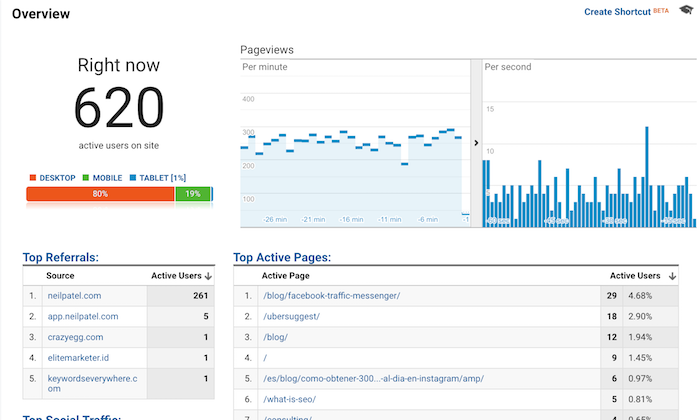
When you log into Google Analytics, what do you look at?

Chances are you see something like the image above that shows you how many people are currently on your blog.

Well, that was easy to guess because that’s the report Google Analytics gives you once you log in. 😉

But which reports do you look at on a regular basis?

I bet you look at two main reports…

The “Audience Overview” report and the “Acquisition Overview” report.

audience overview

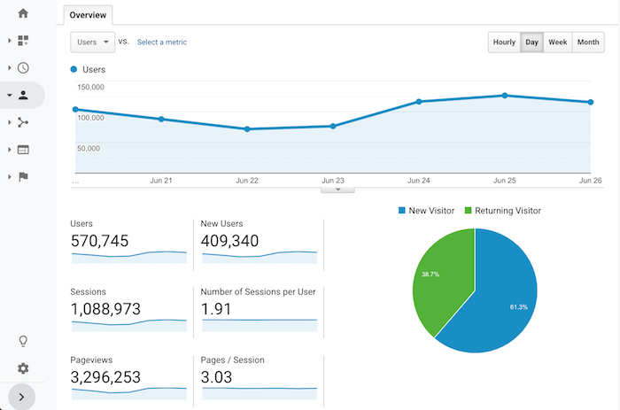
Sure, every once in a while, you may dive into your top pages or the specific organic keywords that drive your traffic. But even if you do that, what are you actually doing with the data?

Nothing, right?

Don’t beat yourself up over it because most content marketers just look at reports and numbers and do little to nothing with the data.

If you want to figure out how to grow your blog and, more importantly, your revenue from your blog, there are 7 reports that you need to start looking at on a regular basis.

Here they are and here is how you use them…

Report #1: Cohort Analysis

What do you think is easier to accomplish… get new visitors to your blog or getting your visitors to come back?

It’s easier to get people to come back to your blog, yet everyone focuses on new visitors.

I bet less than 99% of your blog readers turn into customers or revenue, so why not focus on getting those people back and eventually converting them?

Before we get into how to get people back to your blog, let’s look at how many people are returning to your blog.

Within the Google Analytics navigation, click on “Audience” and then “Cohort Analysis”.

Once you land on that report, you’ll see a graph that looks similar to this:

cohort graph

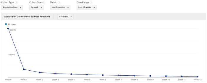
Under the “Cohort Size” drop-down menu, select “by week”. Under “Date Range”, select “Last 12 weeks”.

Once the data loads, you’ll see a table that looks something like this:

cohort table

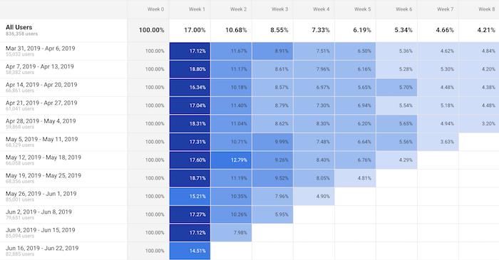
What this table shows is the percentage of your visitors that come back each week.

On the very left it will always show 100%. Then in the columns to the right, you’ll see week 1, week 2, week 3, etc.

This shows the percentage of people who come back to your blog each and every week after their first visit.

For example, if this week you had 100 people visit your blog and in the week 1 column, it shows 17%. That means of the initial 100 people, 17 came back. Under week 2 if you see 8%, that means of the initial 100 people, 8 people came back in week 2.

Naturally, this number will keep getting smaller, but the goal is to get people back as often as possible. That increases trust, social shares, potential people linking to you, and it even increases the odds that the visitor will convert into a customer.

number of visits

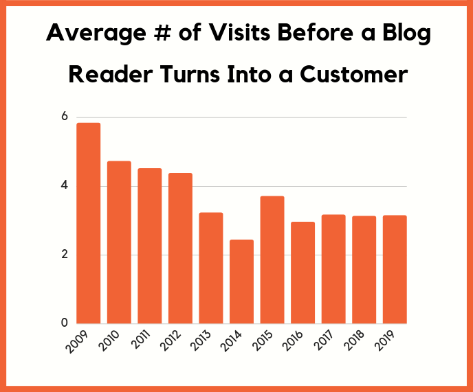
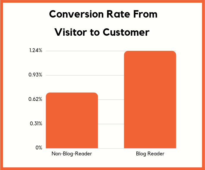
The average blog reader needs to come back 3.15 times before they turn into a customer. That means that you need to retain readers.

Just think of it this way: If you get thousands of new people to your blog each and every single day but none of them ever come back, what do you think is going to happen to your sales?

Chances are, not much.

You need to look at your Cohort Report and continually try to improve the numbers and get people coming back.

So the real question is, how do you get people to come back?

There are 2 simple ways you can do this:

  1. Start collecting emails – through free tools like Hello Bar, you can turn your blog readers into email subscribers. Then as you publish more content, you can send an email blast and get people back to your blog.
  2. Push notifications – by using tools like Subscribers, people can subscribe to your blog through their browser. Then every time you release a new blog post, you can send out a push and people will come back to your blog.

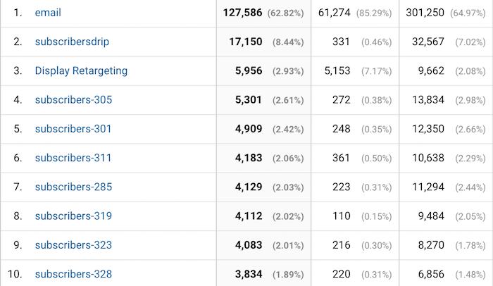
These 2 strategies are simple and they work. Just look at how many people I continually get back to my blog through emails and push notifications.

repeat visits

Report #2: Benchmarking

Ever wonder how you are doing compared to your competition?

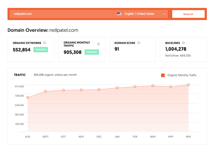
Sure, you can use tools like Ubersuggest, type in your competitors URL, and see all of the search terms they are generating traffic from.

ubersuggest neil patel

But what if you want more? Such as knowing what percentage of traffic your competitors are getting from each channel. What’s your bounce rate, average session duration, or even pageviews per channel?

bench marketing

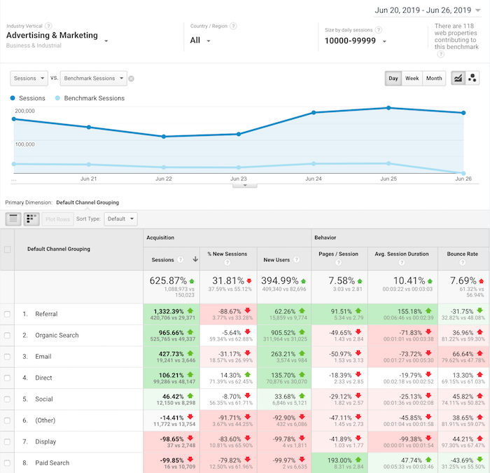
Within Google Analytics navigation, click on “Audiences” then “Benchmarking” then “Channels”.

Once you do that, you’ll see a report that looks like the one above.

Although you won’t have specific data on a competing URL, Google Analytics will show you how you stack up to everyone else within your industry.

I love this report because it shows you where to focus your time.

If all of your competitors get way more social traffic or email traffic, it means that’s probably the lowest hanging fruit for you to go after.

On the flipside, if you have 10 times more search traffic than your competition, you’ll want to focus your efforts on where you are losing as that is what’ll probably drive your biggest gains.

The other reason you’ll want to look at the Benchmarking Report is that marketers tend to focus their efforts on channels that drive the most financial gain.

So, if all of your competition is generating the majority of their traffic from a specific channel, you can bet that channel is probably responsible for a good portion of their revenue, which means you should focus on it too.

Report #3: Location, location, location

Have you noticed that my blog is available in a handful of languages?

languages

Well, there is a reason for that.

I continually look at the location report. To get to it, click on “Audience” then “Geo” and then “Location”.

location

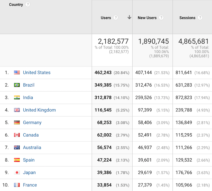
This report will tell you where the biggest growth opportunities are for your blog.

Now with your blog, you’ll naturally see the most popular countries being the ones where their primary language is the one you use on your blog.

For example, if you write in English, then countries like the United Kingdom and the United States will be some of your top countries.

What I want you to do with this report is look at the countries that are growing in popularity but the majority of their population speak a different language than what you are blogging on.

For me, Brazil was one of those countries. Eventually, I translated my content into Portuguese and now Brazil is the second most popular region where I get traffic from.

This strategy has helped me get from 1 million visitors a month to over 4 million. If you want step-by-step instructions on how to expand your blog content internationally, follow this guide.

Report #4: Assisted conversions

Have you heard marketers talk about how blog readers don’t convert into customers?

It’s actually the opposite.

conversions

Those visitors may not directly convert into a customer, but over time they will.

But hey, if you have a boss or you are spending your own money on content marketing, you’re not going to trust some stats and charts that you can read around the web. Especially if they only talk about long-term returns when you are spending money today.

You want hard facts. In other words, if you can’t experience it yourself, you won’t believe it.

That’s why I love the Assisted Conversions Report in Google Analytics.

In the navigation bar click on “Conversions” then “Multi-Channel Funnels” and then “Assisted Conversions”.

It’ll load up a report that looks like this:

assisted conversion

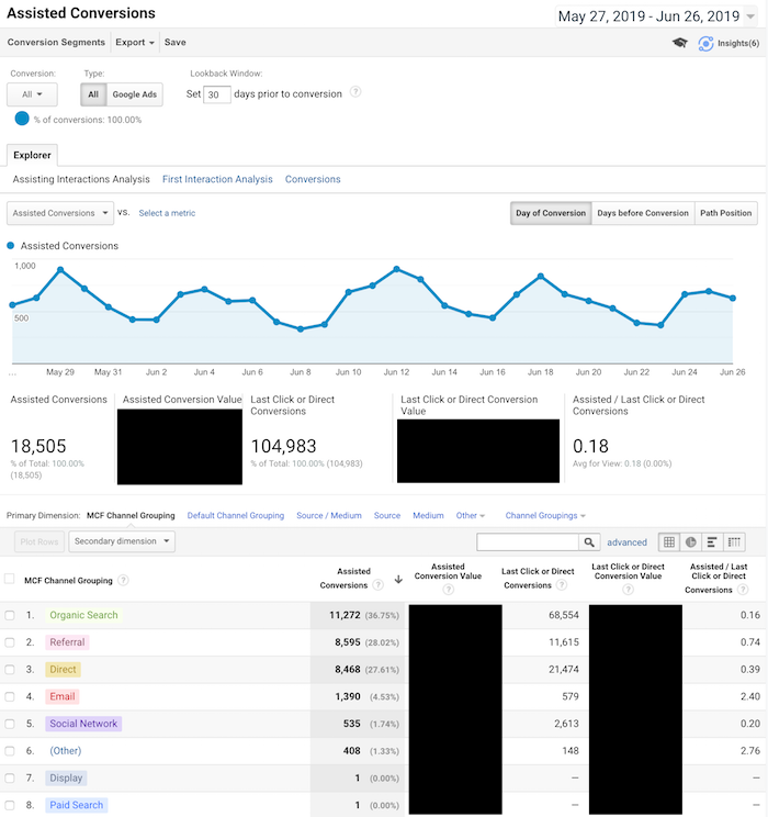
This report shows you all of the channels that help drive conversions. They weren’t the final channel in which someone came from but they did visit your blog from one of these channels.

In other words, if they didn’t visit or even find your blog from one of these sources, they may not have converted at all.

Now when your boss asks you if content marketing is worth it, you can show the Assisted Conversions Report to show how much revenue your blog helps drive.

The other beautiful part about this report is that it tells you where to focus your marketing efforts. You want to focus your efforts on all channels that drive conversions, both first and last touch.

Report #5: Users flow

What’s the number one action you want your blog readers to take?

I learned this concept from Facebook. One of the ways they grew so fast is they figured out the most important action that they want people to take and then they focused most of their efforts on that.

For you, it could be someone buying a product.

For me, it’s collecting a lead and that starts with a URL.

But I found that people interact with my blog differently based on the country they are coming from.

In other words, if I show the same page to a United States visitor and from someone in India or even the United Kingdom, they interact differently.

How did I figure that out?

I ran some heatmap tests, but, beyond that, I used the Users Flow Report in Google Analytics.

users flow

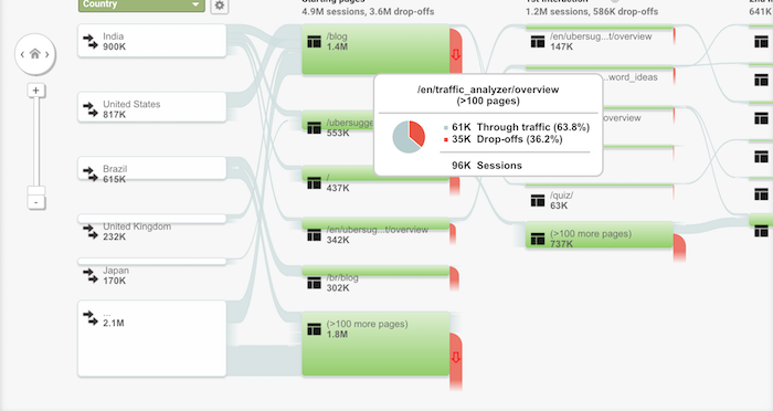
In your navigation click on “Audience” and then “Users Flow”.

Within the report, it will break down how people from each country interact with your blog and the flow they take.

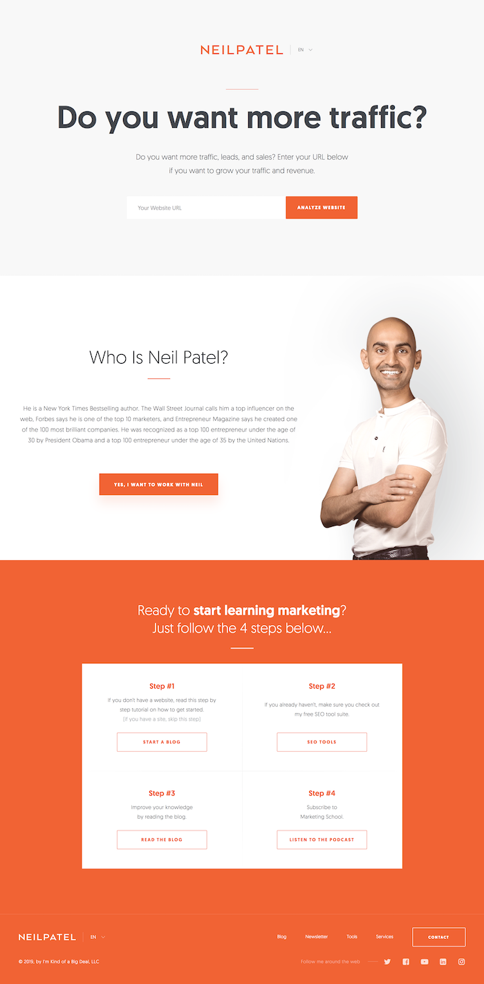
I then used it to adjust certain pages on my blog. For example, here is the homepage that people in the United States see:

us home page

And here is the homepage that people from the United Kingdom see:

uk home page

The United Kingdom homepage is much shorter and doesn’t contain as much content and that’s helped me improve my conversions there.

And of course, in the United States, my audience prefers something else, hence the homepages are different.

The Users Flow Report is a great way to see how you should adjust your site based on each geographical region.

Report #6: Device overlap

Blog content can be read anywhere and on any device. From desktop devices to tablets to even mobile phones.

The way you know you have a loyal audience isn’t just by seeing how many of your readers continually come back, but how often are they reading your blog from multiple devices.

For example, you ideally want people to read your blog from their iPhone and laptop.

The more ways you can get people to consume your content, the stronger brand loyalty you’ll build, which will increase conversion.

Within the navigation, click on “Audience” then “Cross Device” and then “Device Overlap”.

device overlap

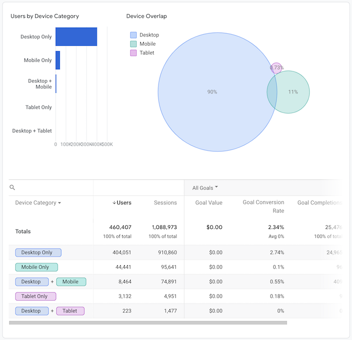
I’m in the B2B sector so my mobile traffic isn’t as high as most industries but it is climbing over time.

And what I’ve been doing is continually improving my mobile load times as well as my mobile experience to improve my adoption rates.

I’m also working on a mobile app.

By doing all of these things, people can consume content from NeilPatel.com anywhere, which builds stickiness, brand loyalty, and then causes more assisted conversions.

A good rule of thumb is if you can get the overlap to be over 6%, you’ll have a very sticky audience that is much easier to convert.

That’s at least what I can see with all of the Google Analytics accounts I have access to.

Report #7: User Explorer

To really understand what makes your blog readers ticket, you need to get inside their mind and figure out what their goals are and how you can help them achieve each of those goals.

A great way to do this is through the User Explorer Report.

Click on “Audience” and then “User Explorer”. You’ll see a screen that looks like this:

user explorer

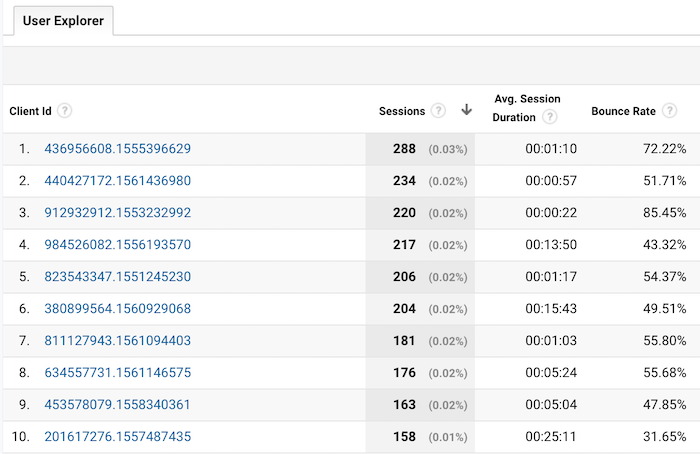
This shows you every user who visits your site and what they did. You can click on a client id to drill down and see what actions each user performed on your blog.

user explorer

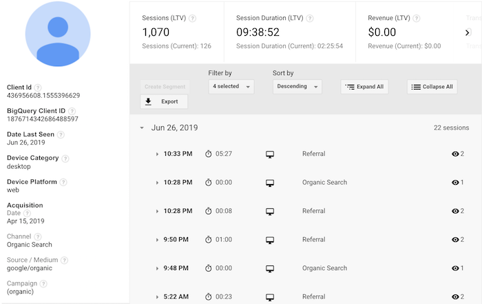
From there, you can click on a time to see exactly what they did each time they visited:

user explorer

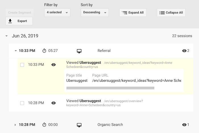
What I like to do with this report is to see how the most popular users engage with my blog. What are they reading? What pages are they spending the majority of their time on? What makes them continually come back? How did they first learn about my blog?

By comparing the most popular blog readers with the least popular, I am typically able to find patterns. For example, my most loyal blog readers typically find my site through organic traffic and then subscribe to my email list.

Then they keep coming back, but the key is to get them to opt into my email list.

That’s why I am so aggressive with my email captures. I know some people don’t like it, but I’ve found it to work well.

So I focus a lot of my efforts on building up my organic traffic over referral traffic and then collecting emails.

Look at the patterns that get your most popular users to keep coming back and then adjust your blog flow so that you can create that pattern more often.

Conclusion

Yes, you should look at your visitor count. But staring at that number doesn’t do much.

The 7 reports I describe above, on the other hand, will help you boost your brand loyalty, your repeat visits, and your revenue.

I know it can be overwhelming, so that’s why I tried to keep it to just 7 reports. And if you can continually improve your numbers in each of those reports, your blog will continually grow and eventually thrive.

So what Google Analytics reports do you look at on a regular basis?

The post 7 Google Analytics Reports That Show How Your Blog is Really Performing appeared first on Neil Patel.

from Blog – Neil Patel https://ift.tt/2Xiez3x


from WordPress https://ift.tt/2KTGghA

Monday, July 1, 2019

Free Download: Sabrva Classic Font

Sabrva, by Sigit Dwipa, is a quality ornamental classic font. This font was designed to work as a perfect companion font or simply as a strong standalone typeface. Give your design a classic style touch with Sabrva, the perfect font choice for powerful projects – watermarks, signatures, photography, logos, business cards, quotes, album covers. Free for personal use! For commercial use please go here.

Please enter your email address below and click the download button. The download link will be sent to you by email, or if you have already subscribed, the download will begin immediately.

Download files

I agree to receive weekly newsletters from WebdesignerDepot.com. Unsubscribe at any time. See our Privacy Policy. Your email will not be sold/rented (unsubscribe at any time).

Source

p img {display:inline-block; margin-right:10px;}
.alignleft {float:left;}
p.showcase {clear:both;}
body#browserfriendly p, body#podcast p, div#emailbody p{margin:0;}

from Webdesigner Depot https://ift.tt/2FIyqmI


from WordPress https://ift.tt/2XFB3jc

3 Essential Design Trends, July 2019

This month we’re taking a close look at above-the-scroll presentation. It’s the first thing you see, and the first impression a user has when they type in your URL. So, it’s a logical place to spot trends in website design.

Here’s what’s trending in design this month.

1. Text That’s Almost Hard to Read

With so much focus on readability and accessibility, this trend might be a little surprising. Designers are experimenting with hero text elements that are difficult to read.

It’s not that the text elements are unreadable; you just have to stop and think about them for a minute.

Why would this technique work? Text in these instances is more of an artistic element, and while the words have meaning, they draw our attention because of visual components. Text is designed to make you look longer on purpose.

Each of the examples below does this in a slightly different way.

MetaView uses a split screen design with text elements that change color on the split screen. On the left, color is muted and more transparent while it is bolder and lacks transparency on the right. The words are readable but you definitely need a few extra seconds to process them.

Perfection includes two layers of text. An oversized foreground layer makes you think about the letters that are missing from the screen to fill in the words. A pale, soft background layer is behind it and the words are turned 90 degrees, also making you look closely to understand the message.

Next Creative Co. mixes an outline font into the mix with animation and a gradient stroke border. While this might be the least difficult to read element of this set of examples, it shows distinctly how a design like this forces you to slow down to read. Your brain processes “Let’s make it” rather quickly, and almost takes the full duration of the animation to understand the final word in the phrase.

2. In Your Face Faces

It’s hard to find a more immediate way to connect with a user than with a striking image. Using a face to convey emotion creates an even more distinct connection.

The in-your-face-faces design trend does that with stunning close-up images of people. The visuals create an immediate focal point and impact. The user feels something right away before even beginning to process the words or other information on the screen.

What’s nice about this trend is that it is designed to connect users to content.

With each of the examples below, you might find it hard to look away. You look first at the face on the screen and with something like the Coulee Creative design, you may even smile a little. It piques curiosity. You start to scan the rest of the design to find out what it is about.

And this trend has you. It’s easy to get engulfed in a design with such a strong, striking visual from the start. Each of these examples has an extra element as well, with animation that keeps adding interest to the faces.

Coulee Creative includes multiple people making a variety of faces, Muax has a scroller of images (although the pictured image is the most in your face), and Roobinium uses a glitchy animation as the character turns to look directly at the user.

3. All the Text to the Left

For a while, the trend in hero headers was to use large text in the middle of the screen. You’ll still see a lot of that in designs. (It’s one of those concepts that never gets old.) What is beginning to gain steam is a more one-sided layout with all the text on the left side of the screen, while imagery and graphics are on the right. It’s tempting to call it left-aligned, but it’s more than that.

This layout creates a different type of symmetry when appropriately weighted. The elements on the left and right sides of the screen need to feel equal in weight so that the eye travels across the information well.

Responsive design has really powered this trend. (Visit the mobile versions of the Creact and Few designs, below, to see it in action.)

Text and image elements stack on smaller screens. The left-most element – here text – floats to the top of the design on small screens. This provides excellent display for messaging above the scroll on a small device while maintaining the consistent look and design that desktop users experience.

What really makes all this left-hand text work is that it’s not flat. Each of the websites uses stunning typography and color to make the most of what could easily be a boring display.

Conclusion

Just because something is trending doesn’t always mean that the design is “good.” It doesn’t mean that it’s bad either. Trending designs just show new techniques and visual elements that are popping up more regularly.

It can be fun to go back a few months and look at trending elements and see if the trend has grown of fizzled. Of the ones above, I expect the “in your face faces” to stick around for a while. This image style is so impactful.

Source

p img {display:inline-block; margin-right:10px;}
.alignleft {float:left;}
p.showcase {clear:both;}
body#browserfriendly p, body#podcast p, div#emailbody p{margin:0;}

from Webdesigner Depot https://ift.tt/2xkjtCv


from WordPress https://ift.tt/2FK5xGB