Monday, October 14, 2019

20 Freshest Web Designs, October 2019

You’ll find a few other trends, and sites that ignore trends altogether, in our roundup of the freshest web design this month, but it’s hard to ignore the vibrancy that’s taking over. Enjoy!

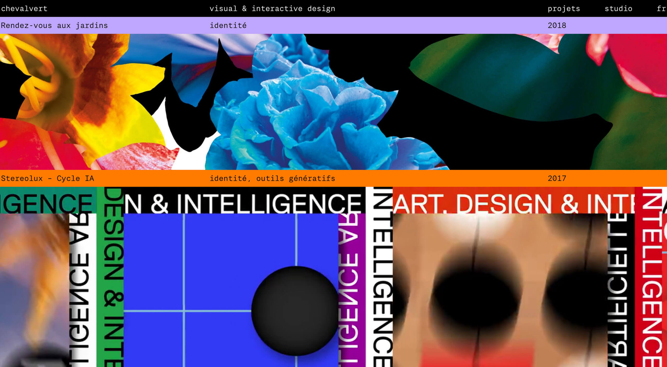
Chevalvert

Chevalvert is a French design agency whose site visually bombards you from the moment it loads. The maximalist approach is visually overwhelming in places, and individual work can be hard to distinguish, but what the site conveys brilliantly is the creative passion and courage of the agency.

#24HourAce

We’ve been vibing on minimalism for a decade or more, but recently a more anarchic, more colorful, more visually aggressive style has taken hold. #24HourAce for Gucci is the embodiment of this maximalist trend with crazy animation, color, and glitch effects. More is more.

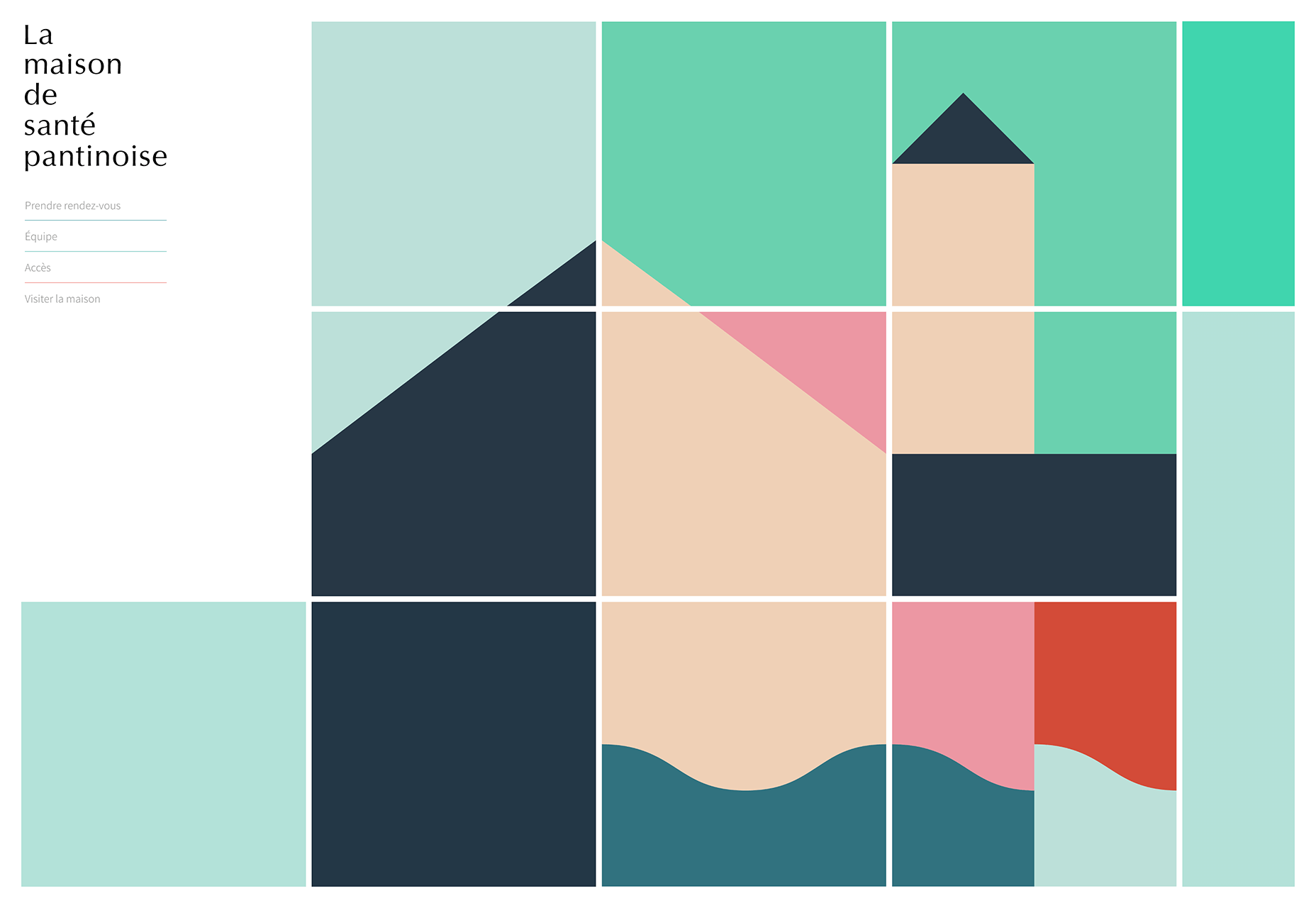
La Maison de Santé Pantinoise

The web’s not all clashing colors and glitch effects. The site for La Maison de Santé Pantinose, a medical practice in a Parisian suburb, calms potentially anxious patients with pastel tones and simple color block animation that sensitively illustrates the conditions treated at the practice.
Ride & Crash

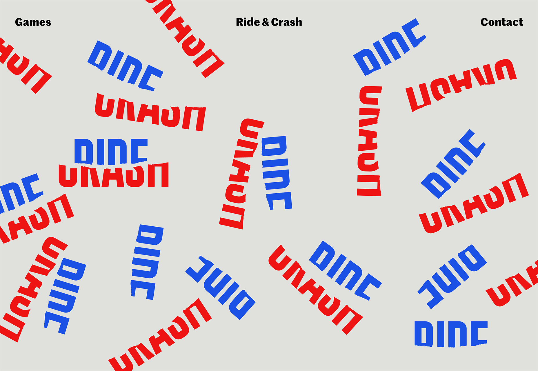
Back to anarchy, with Ride & Crash’s energy-packed site. From the variations on its deceptively simple, but carefully drawn logotype, to the text that transforms from gibberish as you scroll, everything about this site communicates creative confidence, admirable in a young project.
Collage Crafting

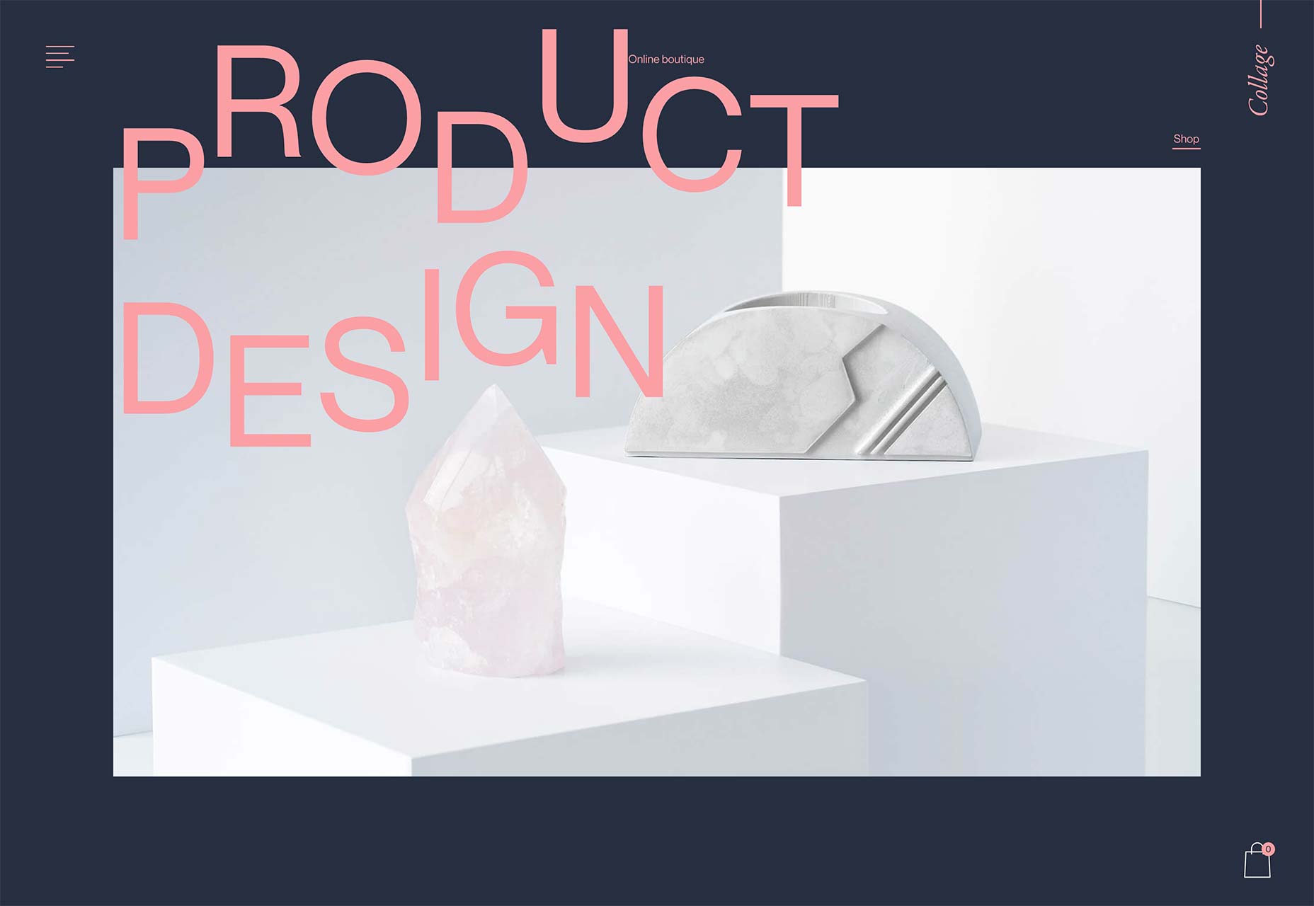
As if keen to demonstrate that modernist typography can also be expressive, Collage Crafting’s landing page text explodes deliciously as you scroll. But what I really love is the way the hover effects combine in the product page, making the box appear to slide from one item to the next.
Genesis Block

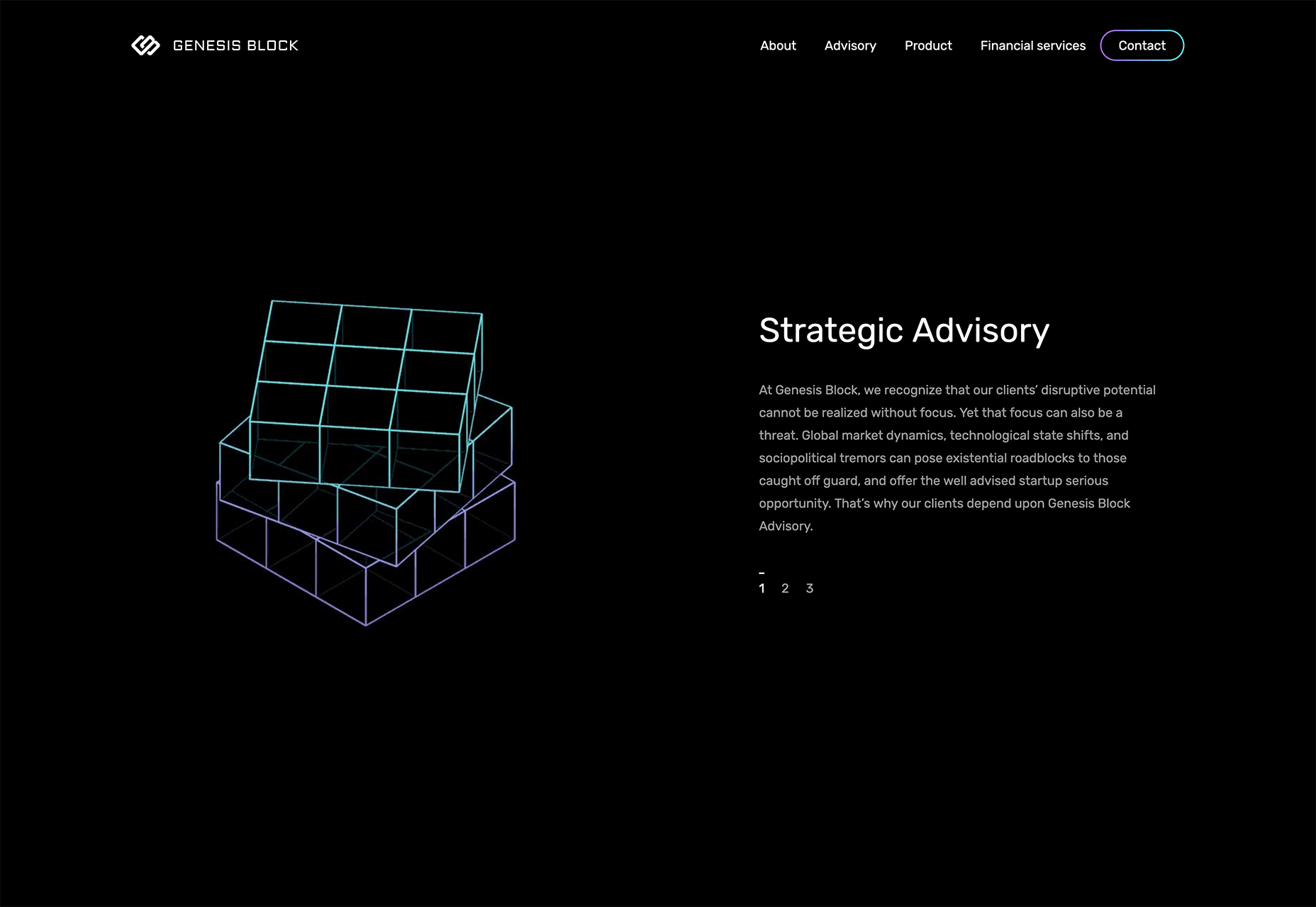
Genesis Block is an impressive site for a fintech company. The line art illustrations reach another level by using gradients to promote the feeling of three dimensions, and the animation that’s tied to the window scroll — not least the animated Rubik’s Cube — is all presented expertly.
Dropmark

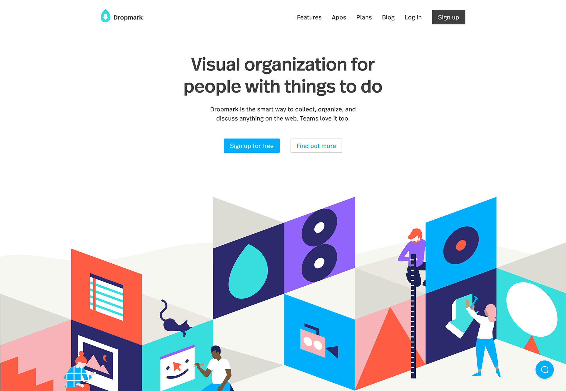
Until the growth of maximalism the biggest trend on the web, favoured by SaaS, was animated blocks of complementary color, looping to produce low file size, high interest motion on a site. Dropmark uses the trend to frame its landing page and divide up the generous whitespace.
Olivia Palermo

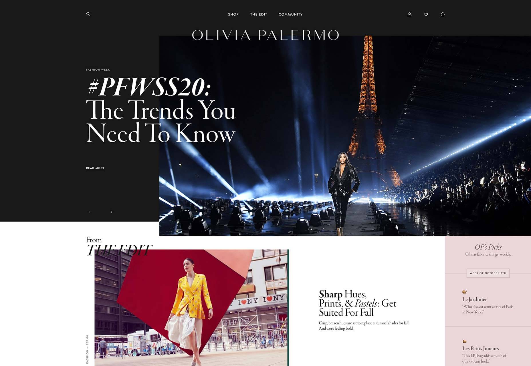
As soon as CSS grid was announced we were promised it would herald new web design layouts that broke out of simple RWD grids, and we’re finally starting to see some. Olivia Palermo uses a complex grid to present a fashion magazine-style site that’s vibrant, dynamic, and engaging.
Hest

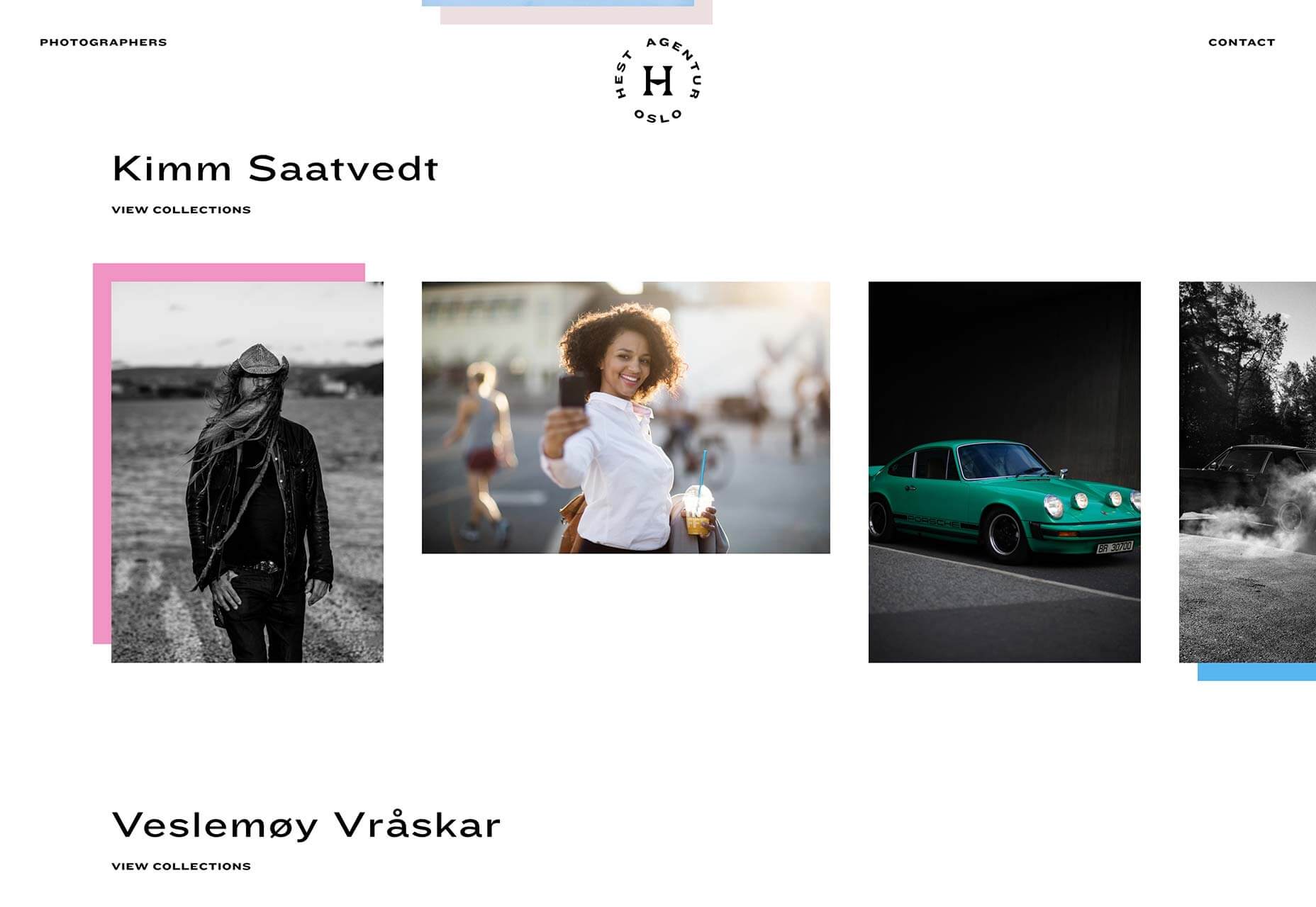
Hest is a Norwegian photography agency and presents its photographers’ work in a standard way. But in places, the designers have added a sharp drop shadow in pastel, breaking up the grid and creating a sense of depth. It’s such a simple trick, but amazingly effective.
Kaohsiung Music Center

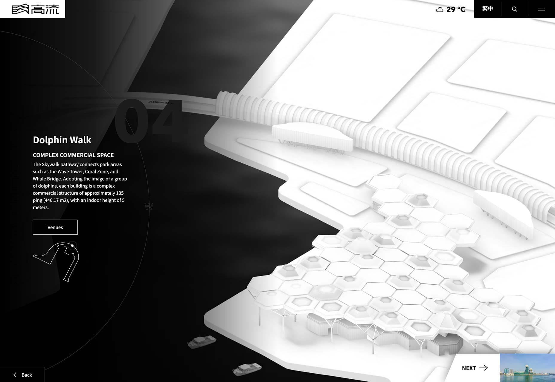
From the moment the brand mark animates as a loader, it’s clear that the Kaohsiung Music Center site is something special. The impressive three dimensional site for a Taiwanese music venue features a flyover of the site based on architects’ renderings. It feels game-like in its futurism.
Ooma

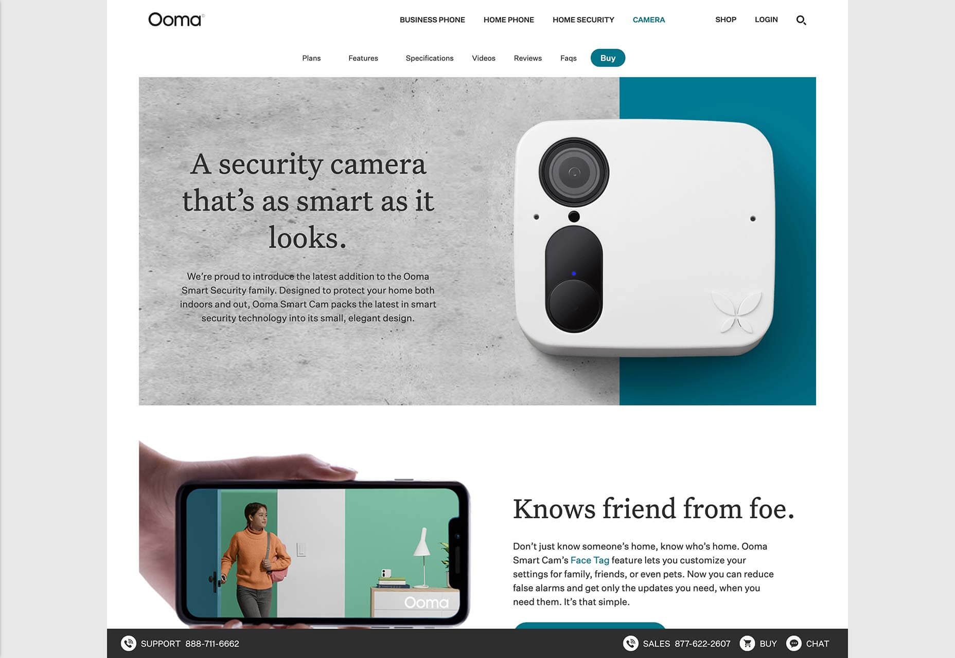
Ooma makes cloud-based home communications services, from security cameras to entry systems. The clean landing page for its home security cameras uses an alternating alignment to create a predictable and reassuring rhythm, perfect for those looking for a safety solution.
Déplacé Maison

Using heavy black outlines and halftone shading, Déplacé Maison’s art directions evokes the feel of graphic novels. An aesthetic reinforced by the lettering-style typography. It’s a look that makes you feel that you couldn’t fail to find adventure in these shoes, exactly what their customers want.

Guzema

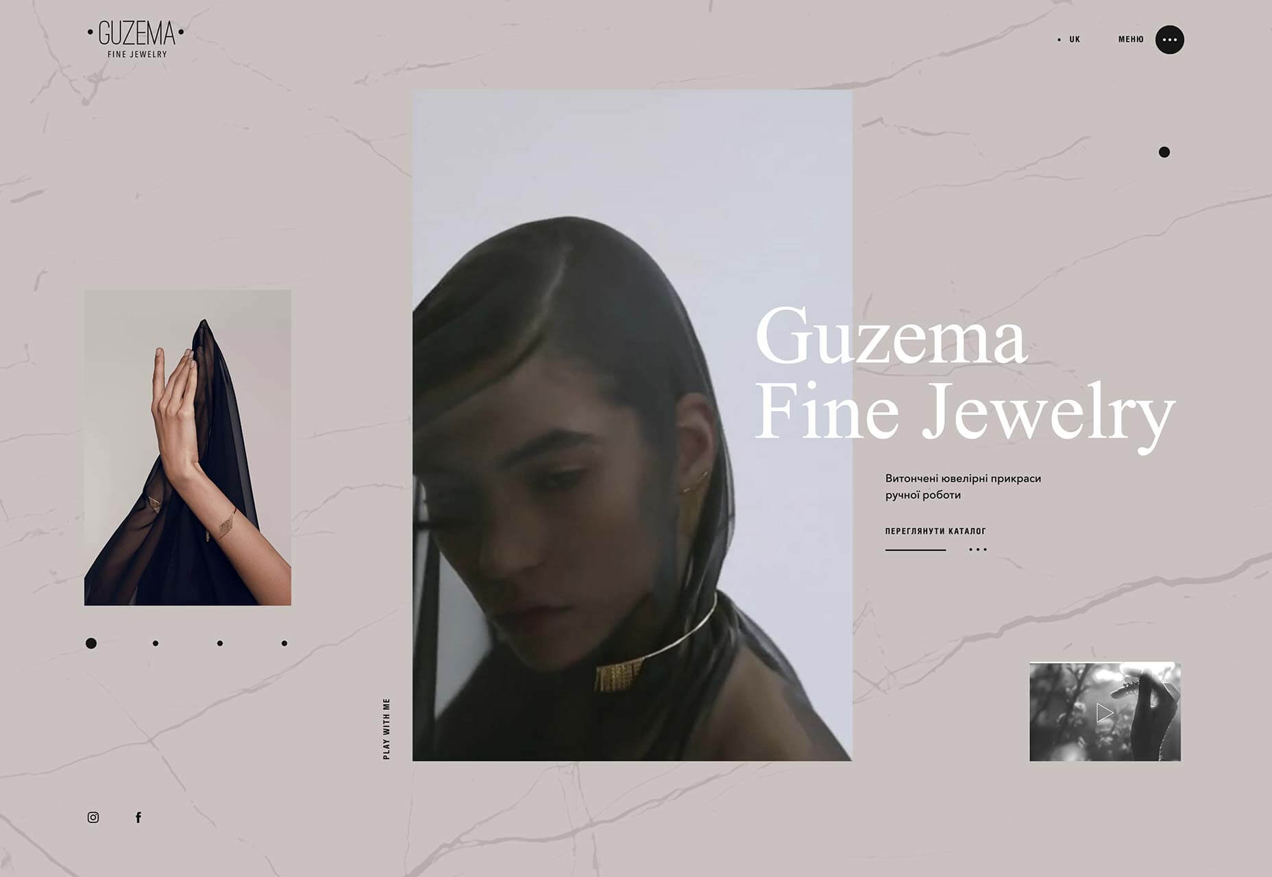
Guzema Fine Jewelry mixes images, text, and video to create a design packed into little boxes, that feels part-browsing experience, part-gift receiving. It’s slow, which is usually a disaster online, but for luxury goods, the sense of anticipation actually adds a positive edge to the experience.
Trux Studio

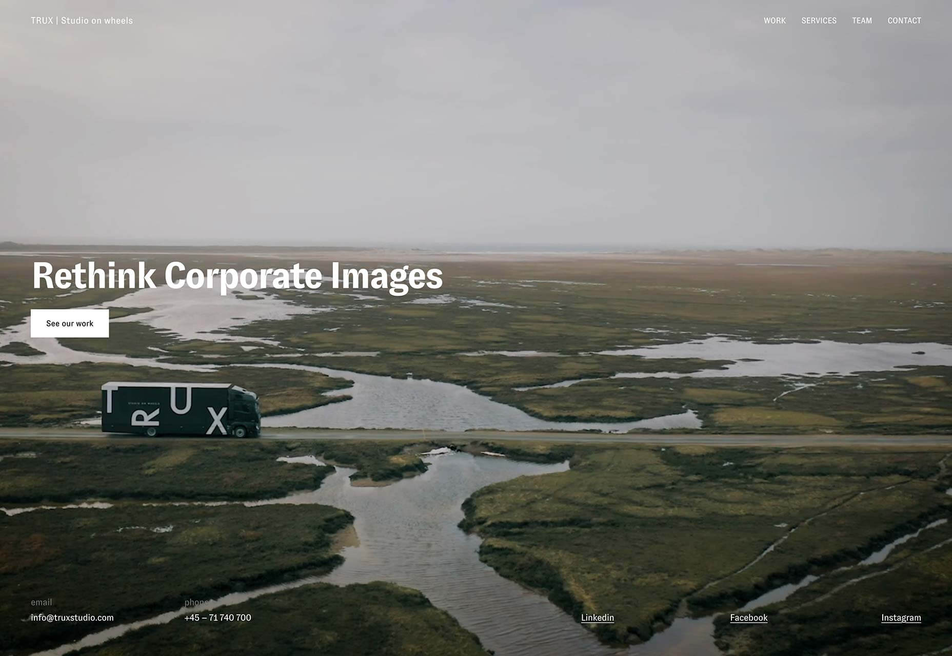
Trux Studio’s site opens with a full screen video that clearly explains the Danish business’ unique offering. Packing a portrait studio into the back of a lorry, the team travels to your location to shoot corporate portraits. It’s a shame for us they couldn’t pack it all into a plane.
Black Futurism 2019

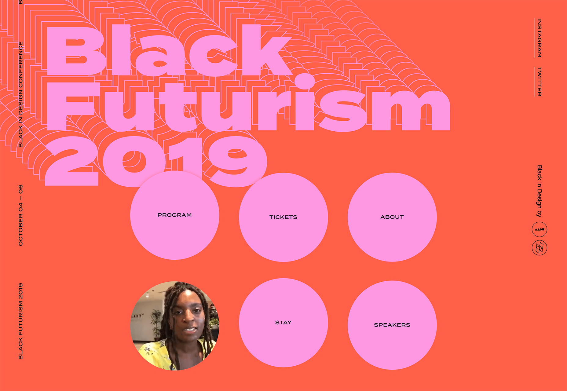
Black Futurism is a conference that took place at the start of October. Organized by the Harvard University Graduate School of Design’s African American Student Union, it’s about exploring liberation and equality through design, and this promotional site is a simple, powerful statement.
Starface

Spots, zits, pimples, and all manner of skin ‘imperfections’ can be crippling on your self-confidence, especially among younger people. Starface is an awesome company that is rebranding its spot treatment as something to be celebrated with its super-positive site.

Old Spitalfields Market

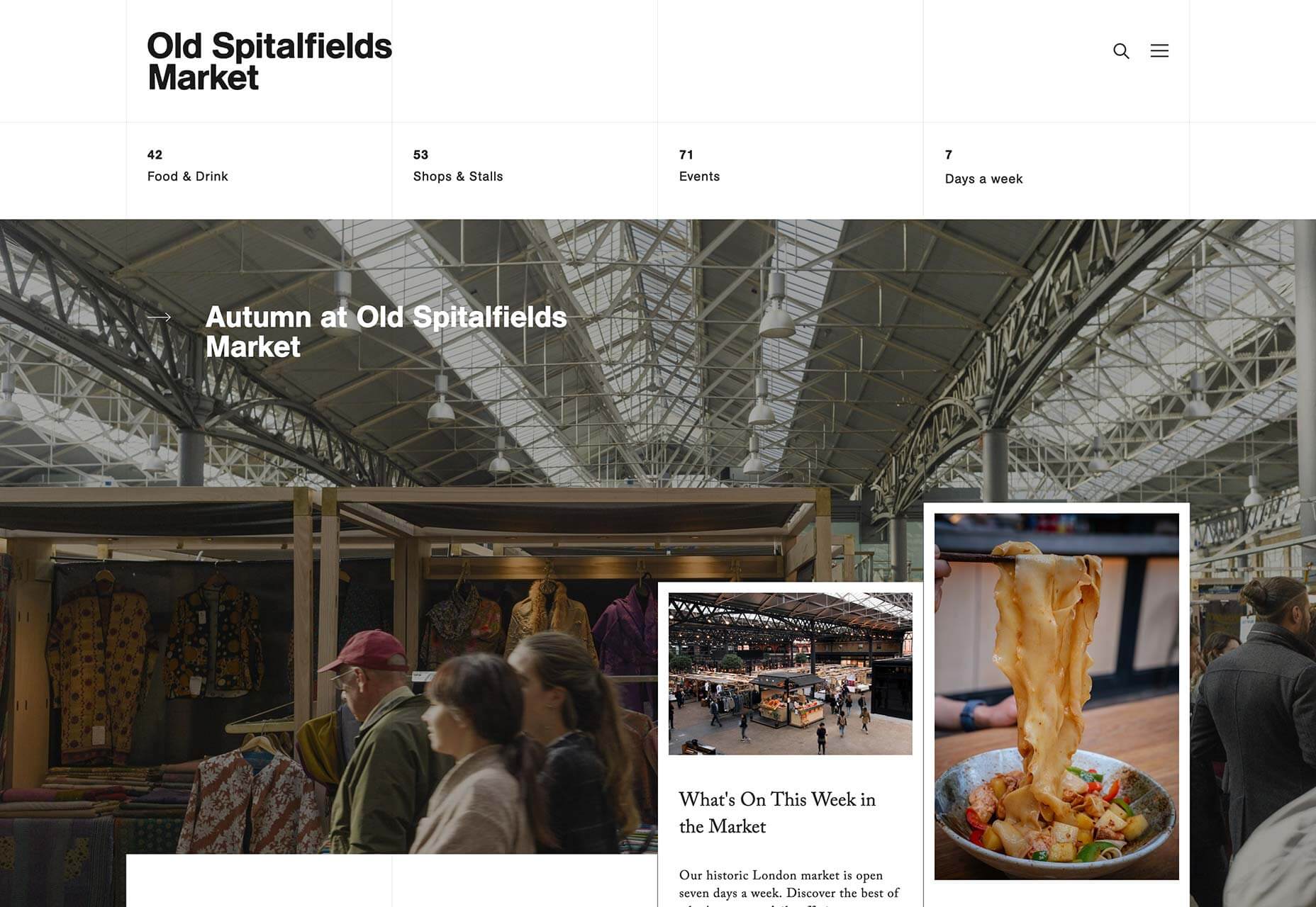
Old Spitalfields Market is a fashionable covered market in East London. Its site uses a classic modernist grid to divide up the page. The grid transforms as you scroll, with different sections pausing, while others glide past. It’s a technique that’s repeated across the sumptuous site.
Graf Lantz

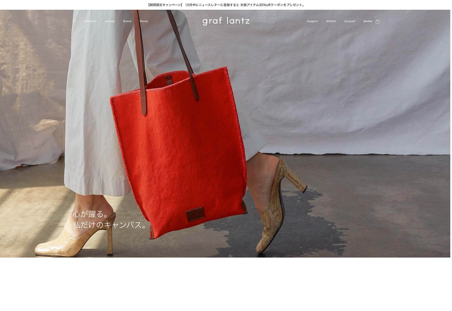
Graf Lantz is an LA-based company producing cute accessories that they market directly to customers in Japan with this dedicated site. It’s fascinating to compare the company’s approach to the Japanese market, with its .com. The Japanese, it seems, love liquid transition effects.
Two Robbers

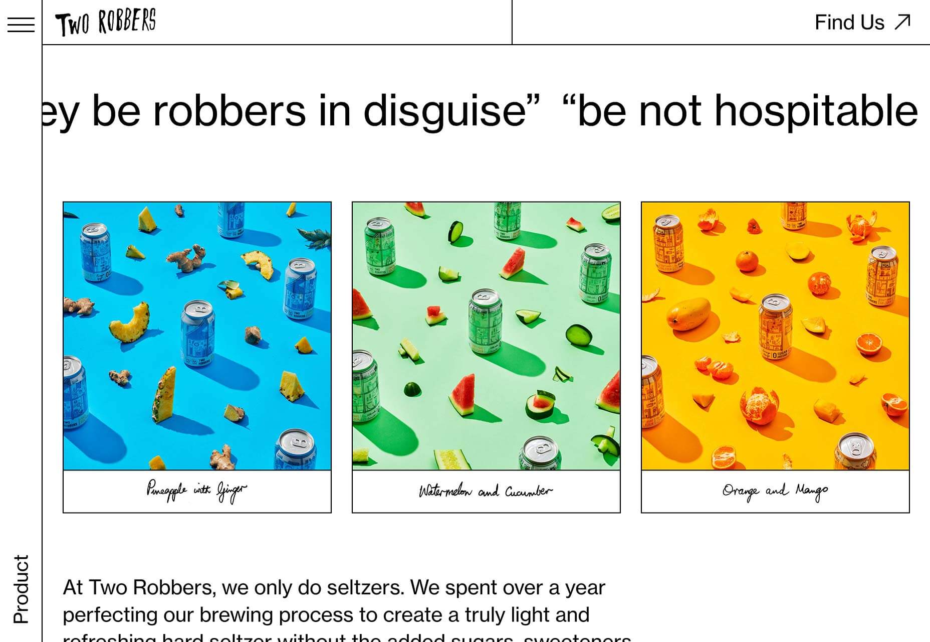
Convinced the Brutalist trend was destined to be short-lived? Proving there’s life in the harsh style yet, Two Robbers is a site for hard seltzers brewed in Philadelphia. The stark site emphasizes the unique flavors of the drinks by contrasting the black and white with bursts of color.
2nd Street Clothing

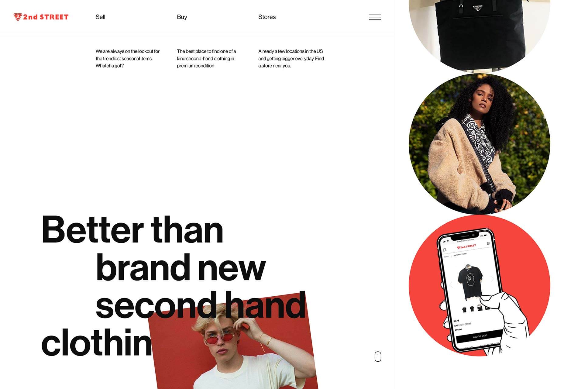
Finally, the maximalism trend returns in full effect for the 2nd Street Clothing site, but you’ll have to scroll to see it. With reversed text, colourful animation, spinning images and video, it’s a young, energetic style. This site won’t look the same in a year, which makes it perfect for right now.
Source

p img {display:inline-block; margin-right:10px;}
.alignleft {float:left;}
p.showcase {clear:both;}
body#browserfriendly p, body#podcast p, div#emailbody p{margin:0;}

from Webdesigner Depot https://ift.tt/2peUVu1


from WordPress https://ift.tt/2phMUo8

Sunday, October 13, 2019

Popular Design News of the Week: October 7, 2019 – October 13, 2019

Every week users submit a lot of interesting stuff on our sister site Webdesigner News, highlighting great content from around the web that can be of interest to web designers. 
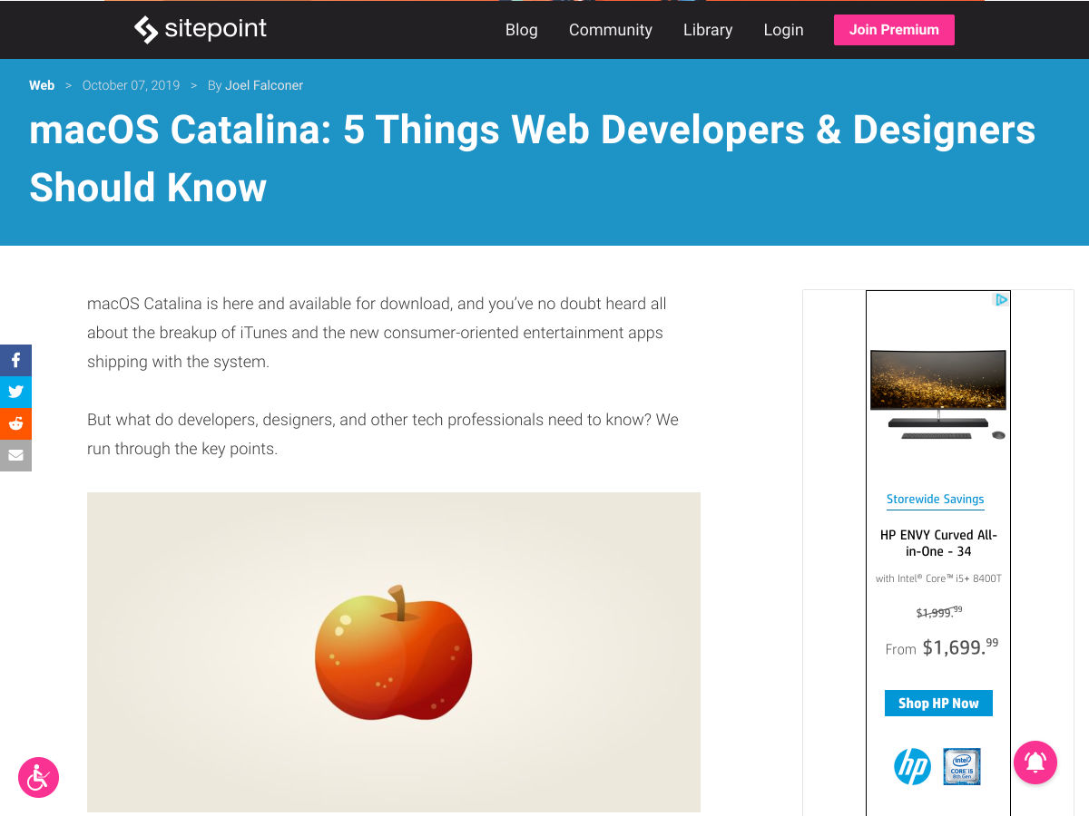
The best way to keep track of all the great stories and news being posted is simply to check out the Webdesigner News site, however, in case you missed some here’s a quick and useful compilation of the most popular designer news that we curated from the past week.

Note that this is only a very small selection of the links that were posted, so don’t miss out and subscribe to our newsletter and follow the site daily for all the news.

MacOS Catalina: 5 Things Web Developers & Designers Should Know


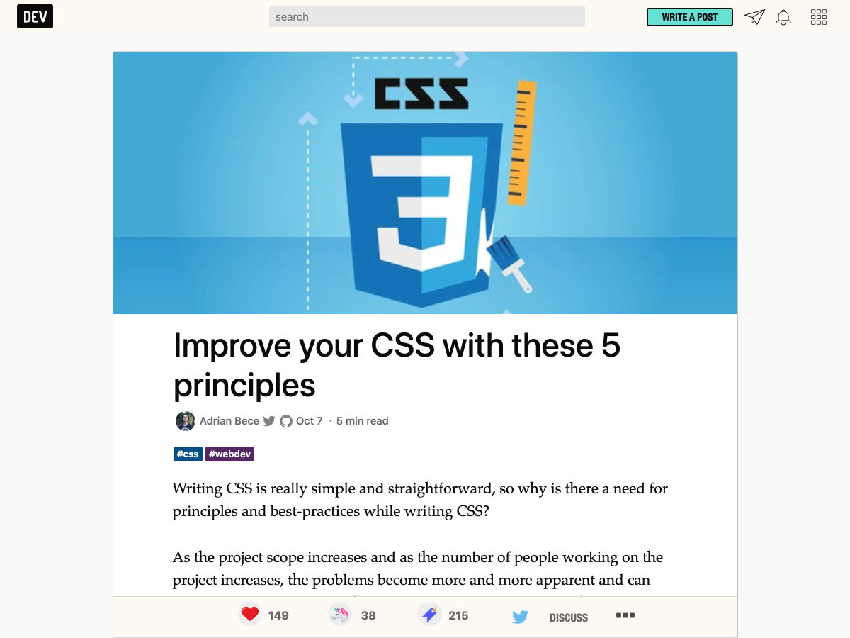
Improve your CSS with these 5 Principles


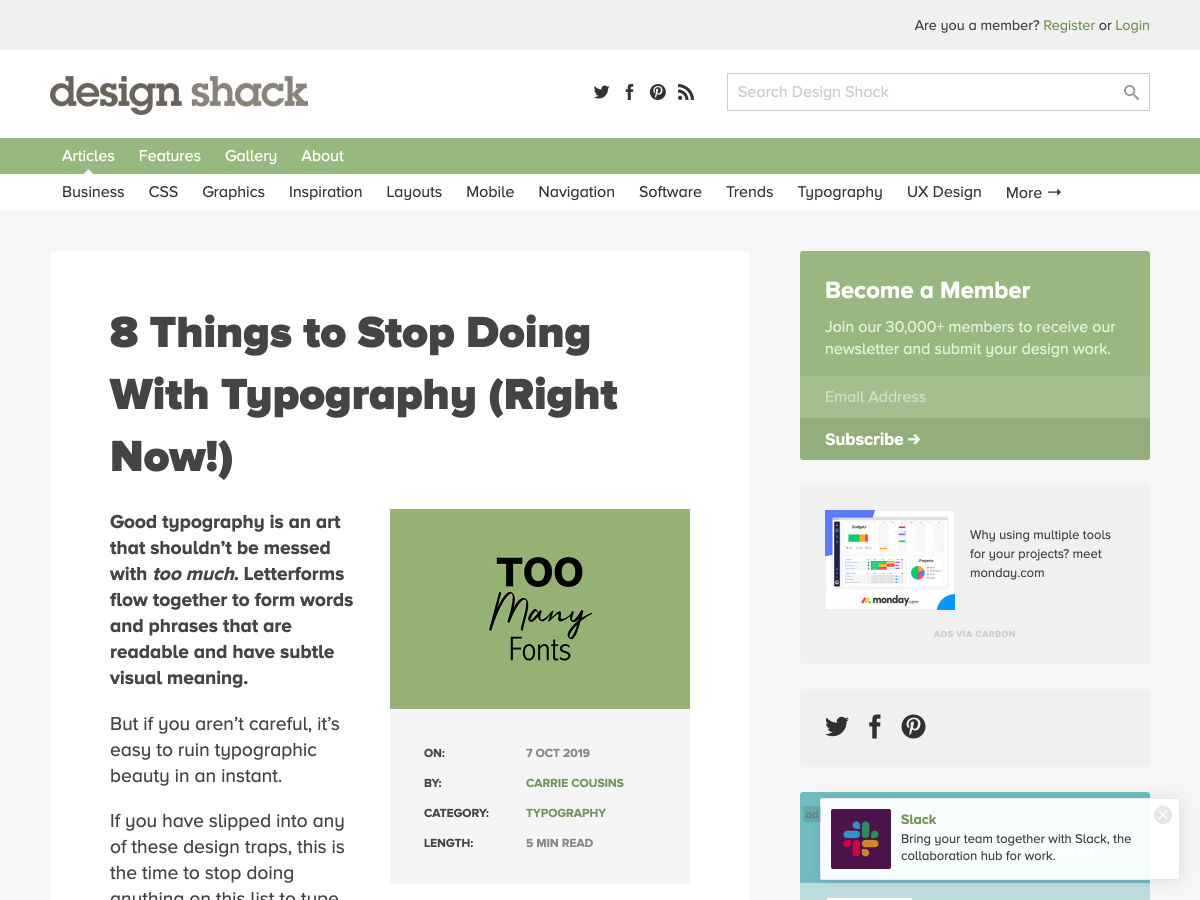
8 Things to Stop Doing with Typography (Right Now!)


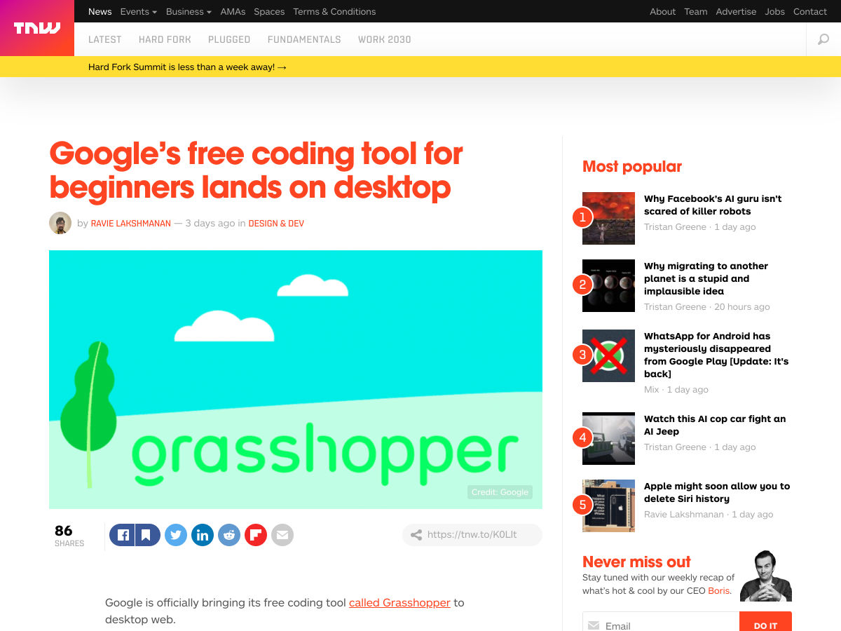
Google’s Free Coding Tool for Beginners Lands on Desktop


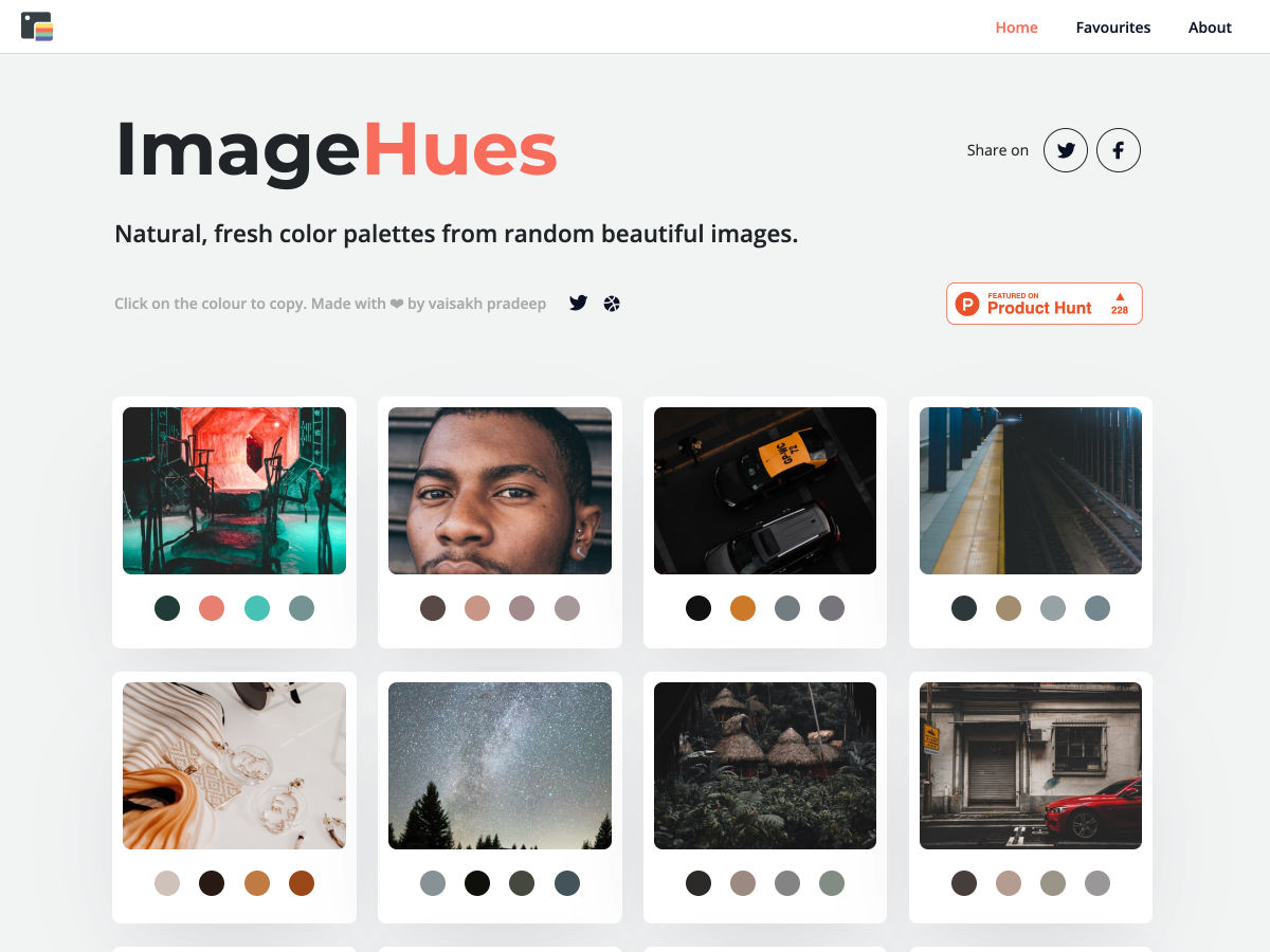
Natural Color Palettes from Random Beautiful Images


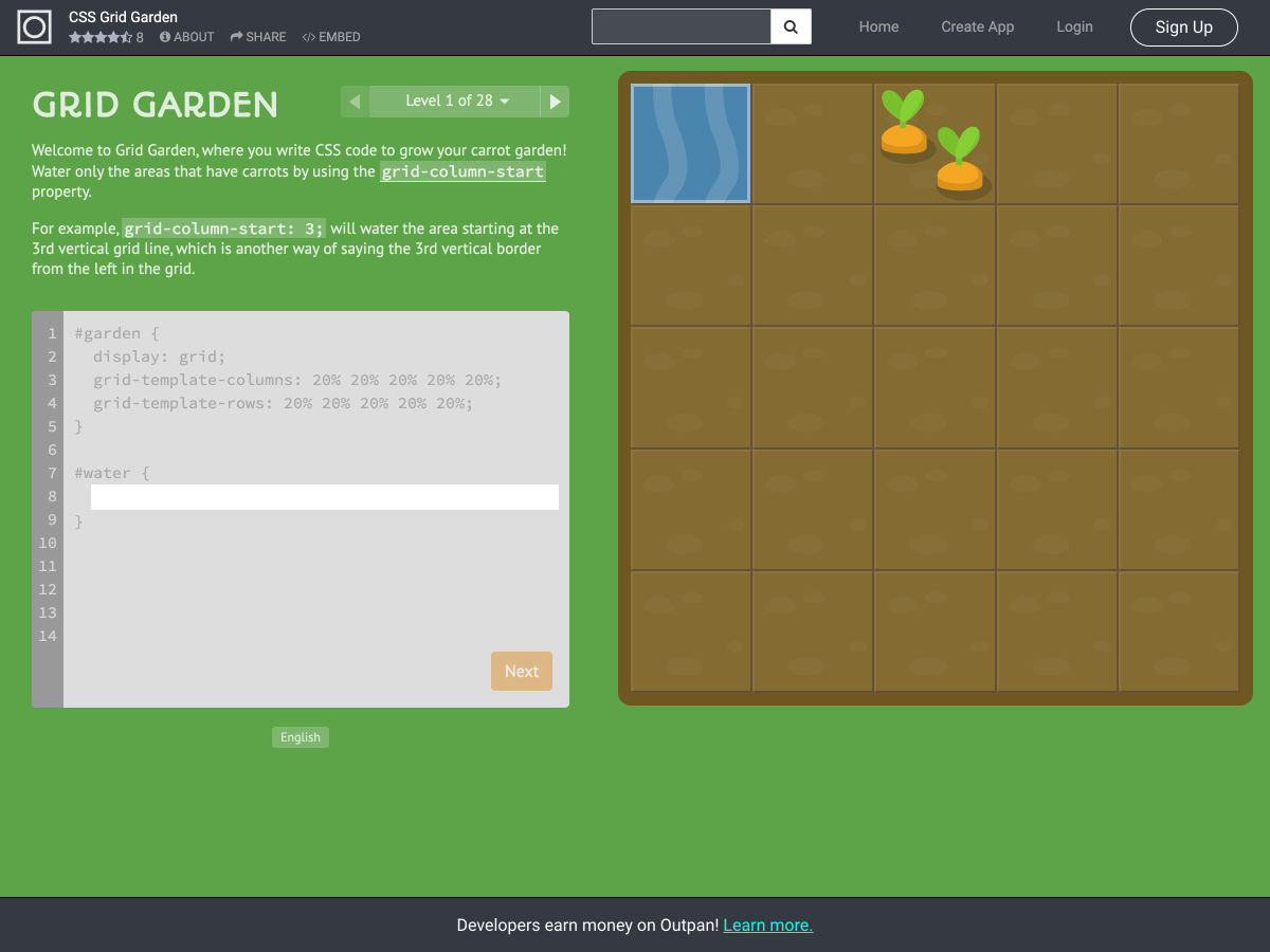
CSS Grid Garden


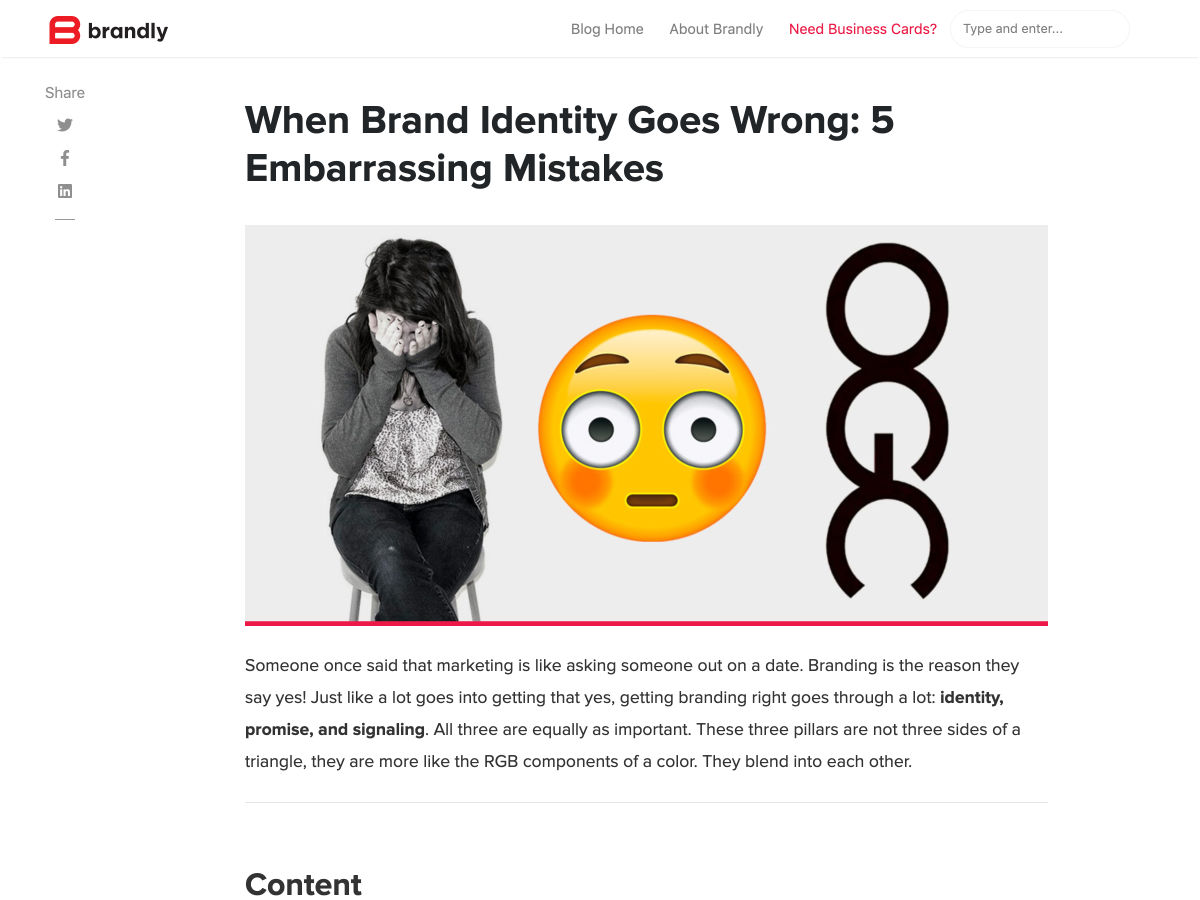
When Brand Identity Goes Wrong: 5 Embarrassing Mistakes


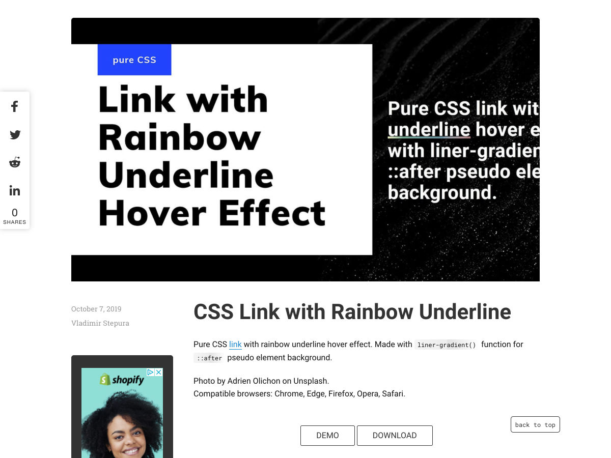
CSS Link with Rainbow Underline


Figma Introduces Smart Animate and Advanced Transitions


Spacing, Grids and Layouts


Dear Designer, It’s Time to Rediscover your Whiteboard


Feeling Sassy Again


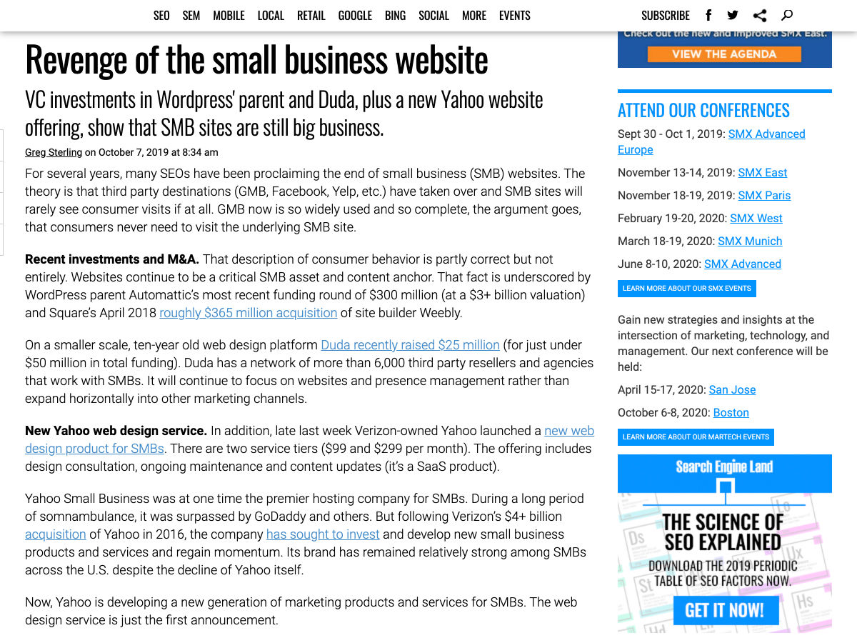
Revenge of the Small Business Website


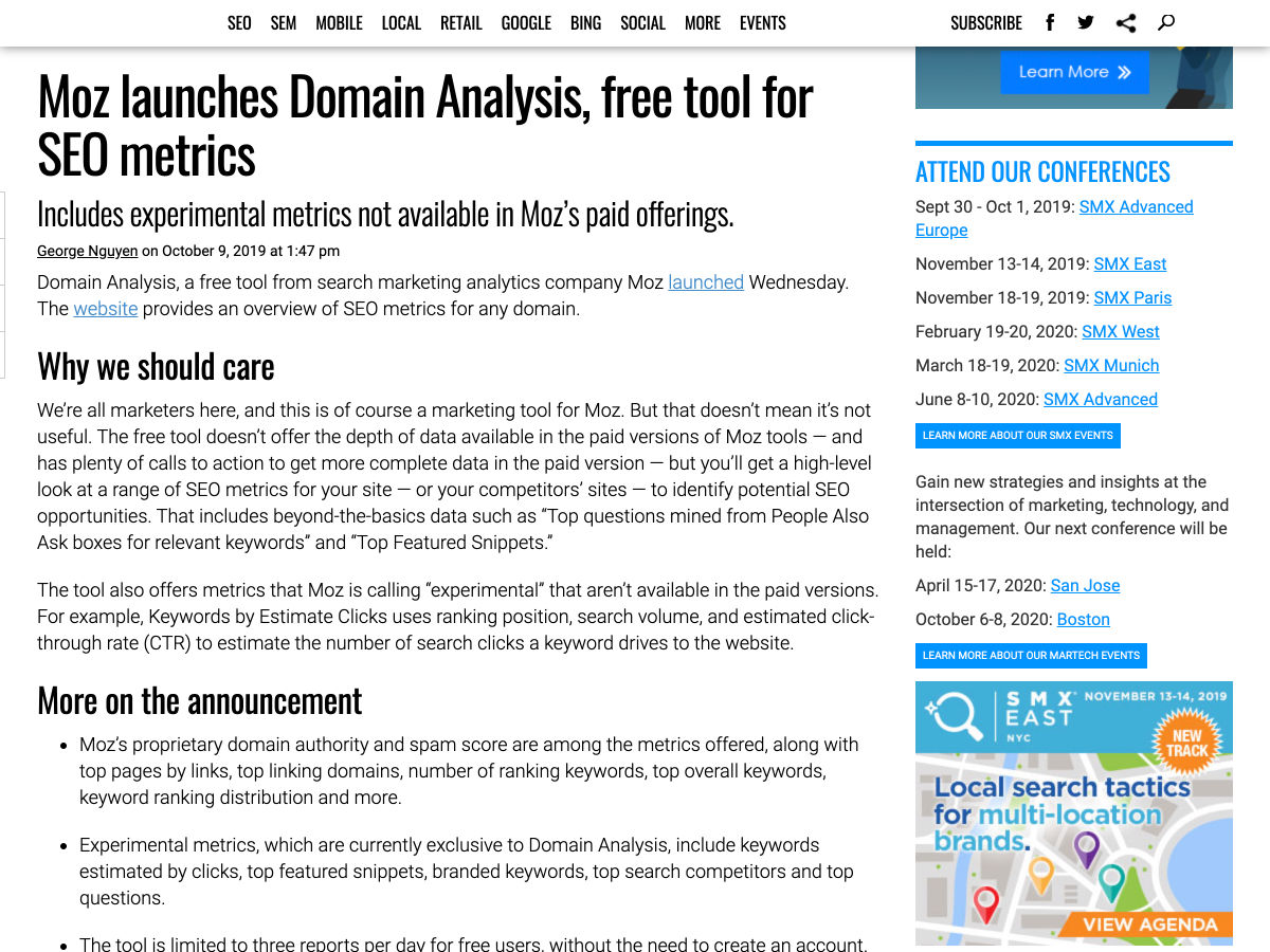
Moz Launches Domain Analysis, Free Tool for SEO Metrics


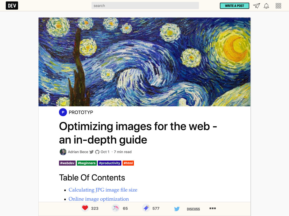
Optimizing Images for the Web – An In-depth Guide


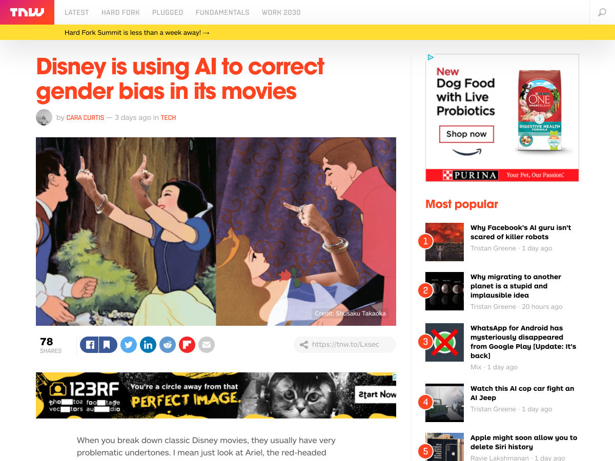
Disney is Using AI to Correct Gender Bias in its Movies


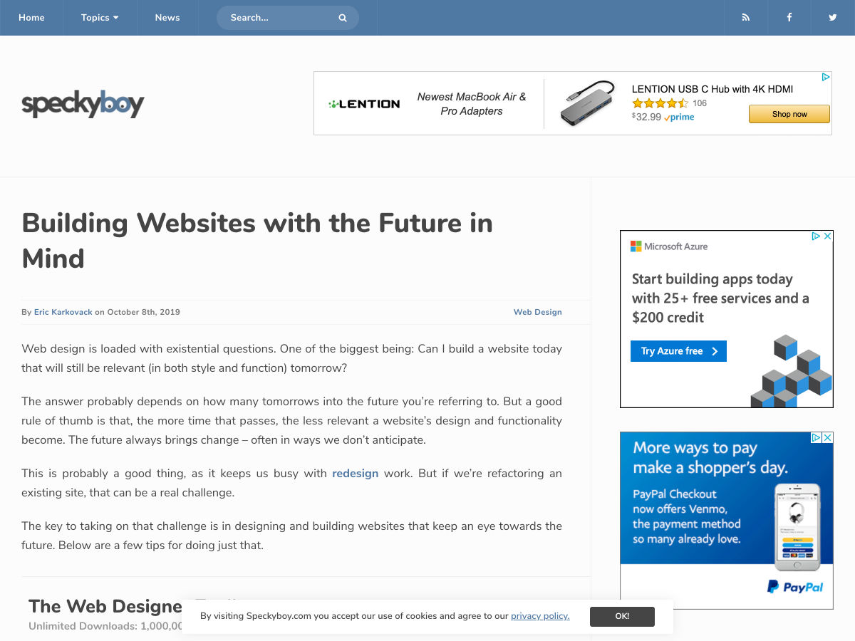
Building Websites with the Future in Mind


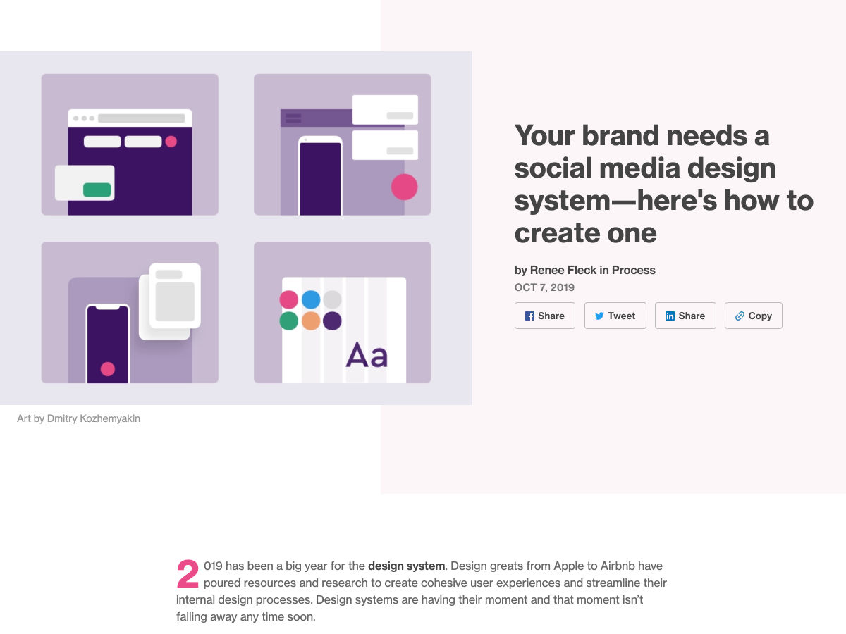
Your Brand Needs a Social Media Design System-here’s How to Create One


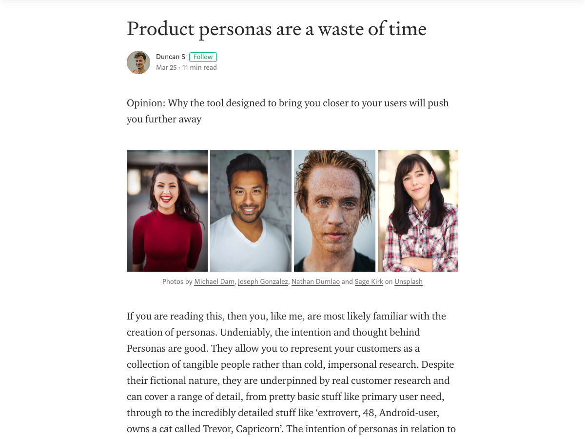
Product Personas are a Waste of Time


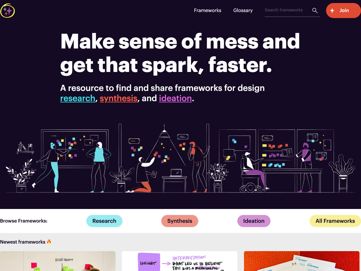
UX Frameworks – Make Sense of Mess and Get that Spark, Faster


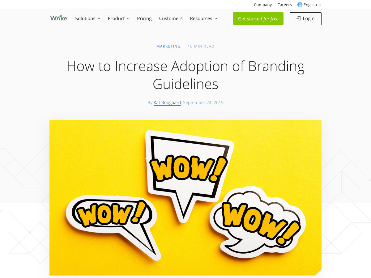
How to Increase Adoption of Branding Guidelines


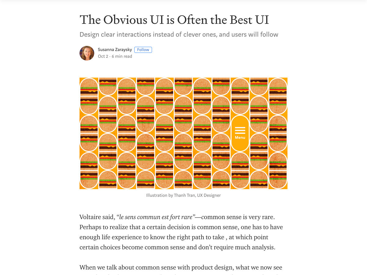
The Obvious UI is Often the Best UI


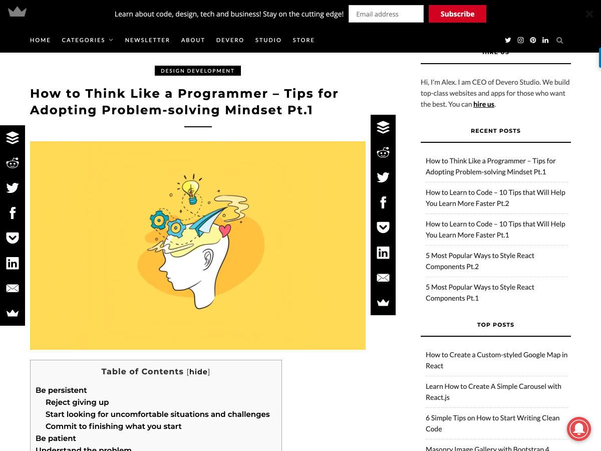
How to Think like a Programmer


Dear Ueno: What’s your Design Process Like?


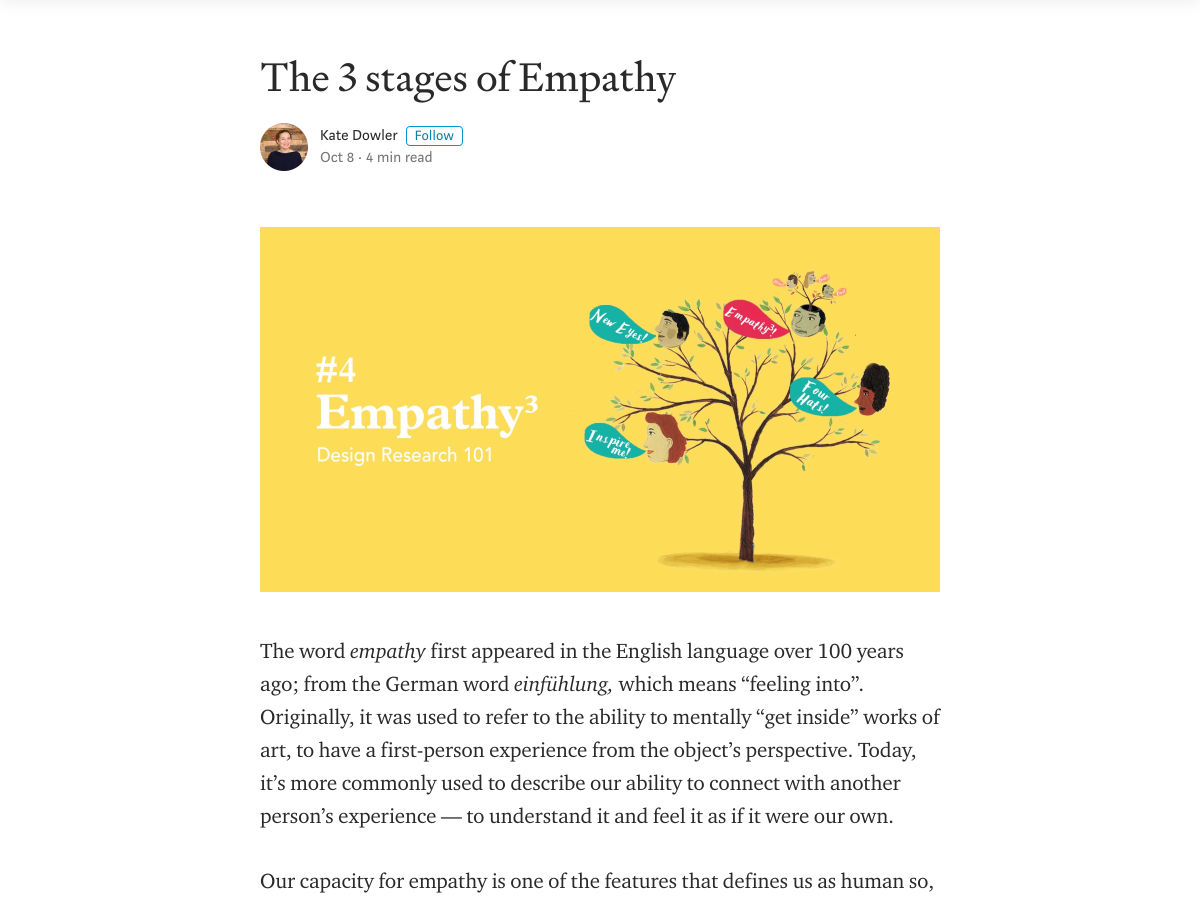
The 3 Stages of Empathy


Want more? No problem! Keep track of top design news from around the web with Webdesigner News.

Source

p img {display:inline-block; margin-right:10px;}
.alignleft {float:left;}
p.showcase {clear:both;}
body#browserfriendly p, body#podcast p, div#emailbody p{margin:0;}

from Webdesigner Depot https://ift.tt/31bZmCY


from WordPress https://ift.tt/2oBvcMg

Friday, October 11, 2019

Are You Too Old to Be a Web Designer?

There’s nothing nice about asking the question “How old is too old to …?” So, I’m going to start by getting the answer out of the way, right now: 

You’re never too old to… 

…become a web designer…

…transition from web designer to UX designer…

…become a full-stack designer-developer powerhouse…

…or do whatever the heck it is you want to do.

Whatever your goal might be, age isn’t going to hold you back. The only thing that’s going to do that is you.

Are You Too Old to Discover New Skills?

For every time you’ve heard someone blame age for a negative outcome — You’re forgetful? It must be old age! — you’ve likely heard a story about someone who didn’t let age hold them back from learning something new. Like the grade school dropout who not only earned their high school diploma but a university degree decades later. Or the immigrant who had little knowledge of the native tongue, only to launch a successful enterprise in their new home.

The brain is an incredibly powerful muscle. You just need to know how to make the most of it. Here’s how:

Tip 1: Lean into Your Confidence

Many times, one’s ability to learn a new skill is contingent upon how confident they feel in it. For instance:

If you tell yourself, “I’m too old to learn something new at this stage in my life”, where’s the motivation to make the effort? In this case, it becomes a self-fulfilling prophecy wherein, if you fail, you can brush it off as a matter of age. 

When, really, you should be thinking, “If I do X, Y, and Z, I can master the skills necessary to get to the next level.” By thinking through what’s needed and systematically tackling it as you would any other process, you’re more likely to taste success in the end. 

Tip 2: Broaden Your Horizons

There was a paper published in 2016 on the matter of cognitive functioning as we age. It suggests that the real reason our cognitive abilities decline as we get older is because of the way we learn. Specifically, the paper contrasts the methods by which we learned as children to how we learn as adults.

As kids, we’re encouraged to learn as much as we can about as many different things: languages; sciences; history; math; art; etc. 

As adults, we’re encouraged to become specialists: doctors; lawyers; writers; web designers; accountants; etc. 

It’s when we close our brains off and narrowly focus our attention on one career, or area of interest that we harm our ability to learn something new. So, don’t be afraid to dabble in various hobbies or to read up on new topics. It’ll keep your cognitive functioning strong and allow you to learn new skills with ease.

Tip 3: Embrace Newness

Scientific American published results of a study in 2008 that revealed how we “learn by surprise”. 

Essentially, the study revealed that our brains — more specifically, the hippocampus — are able to acquire and retain knowledge much more effectively when it’s new. What’s more, if a concept or skill we’re already familiar with is placed in a novel context, it becomes easier for us to memorize and retain it, too.

In other words, it’s a good thing to look beyond your current skill set. By learning new things, you’ll give your brain the ability to absorb new skills and knowledge more effectively. 

Tip 4: Exercise Your Brain

Dr. Ipsit Vahia of McLean Hospital says: 

When you exercise, you engage your muscles to help improve overall health. The same concept applies to the brain. You need to exercise it with new challenges to keep it healthy.

In a field like web design that’s constantly in flux, with new tools and techniques entering the picture, it’s actually easy to get into the habit of “working out” your brain. 

Sign up for the occasional online course to brush up on your JavaScript skills. Attend a local web design or development meetup and trade tips. Challenge yourself with projects that allow you to test out new skills and refine old ones. Just find something that lights a fire under you, and pushes you to do more, not less, with your web design career. 

Wrap-Up

There are two big takeaways here. The first is this: 

Don’t let fear hold you back.

you’re going to have to work for it…that’s true of anyone who enters this industry, regardless of age

If you’re nervous that the web design space is a young person’s game and there’s no place for you in it, you’re looking at it the wrong way.

Think about it: whether you’re 40, 50, 60, or beyond, you have decades more experience than your youthful counterparts. They may have abundant amounts of energy and an innate tech-savviness, but many of them can’t compete with your business-savviness, time management skills, and professionalism. 

The second thing to take away from this post is this: 

Never stop learning. 

If you want to switch gears and become a web designer, you’re going to have to work for it. And keep working at it. But, in all honesty, that’s true of anyone who enters this industry, regardless of age. 

The web is an ever-changing space that none of us should take for granted. If we don’t stay up on the latest trends and continually work on refining our skills within it, we won’t do very well. 

So, stop wondering if you’re too old to learn a new skill and start working on acquiring it!

Source

p img {display:inline-block; margin-right:10px;}
.alignleft {float:left;}
p.showcase {clear:both;}
body#browserfriendly p, body#podcast p, div#emailbody p{margin:0;}

from Webdesigner Depot https://ift.tt/2VxNt9r


from WordPress https://ift.tt/2OEB1U4

Wednesday, October 9, 2019

Is Emerging AI Too Smart to Design for Me and You?

Currently, the answer is a resounding, “What? No… why would you even ask?” But this article isn’t about current AIs. True artificial intelligence is a long, long way off; and frankly, if we run face-first into the singularity, I doubt that our digital progeny will be interested in building interfaces for us.

Learning algorithms are getting a lot smarter, and the number of things we can do with them is rapidly expanding. Current implementations have massive flaws: facial recognition produces an uncomfortable number of false positives; AI-based recruiting means that resumes have to be built around keywords; YouTube’s algorithm is a dumpster fire. But the overall trend is toward smarter and smarter AI.

But can that AI ever design for regular people? Let’s get speculative, baby!

The Big Problem for AI Designers

I mean, can regular people even truly design things for other people? Well yes, but we collectively get it wrong about as often as we get it right. If we can instill in an AI a very cynical view of our human cognitive abilities, then we can probably teach them to design for us.

If we can instill in an AI a very cynical view of our human cognitive abilities, then we can probably teach them to design for us

It’s not because “people are dummies, hurr hurr”, although that’s a part of the issue. Mostly, though, our cognitive and reasoning skills just get impaired all the time, by dozens of different things. The human brain is a marvel in pretty much every sense of the word. We don’t currently have computers with anything like the brain’s capacity for adaptation, and few server warehouses that even approach the brain’s estimated.. well… capacity (as in storage) at least not according to the higher estimates.

The problem with our brains is that they’re being used by every part of our body, all the time. Then bits of them are constantly dying off and being reborn. And then the rest is being used to worry about things you did ten years ago, so you don’t have to worry so much about what’s going on right now.

Compared to computers, even people who don’t have ADHD are easily distracted.

AI, on the other hand, is focused like a laser. You tell it to look for keywords, and it finds them. You tell it to look for x, y, and z, and adapt itself based on what it finds, and it will do that. That’s one reason why Microsoft’s AI, Tay, got real racist, real fast, when exposed to Twitter.

Set an AI to find the “Buy” button on a web page, and so long as it has somewhat flexible criteria of what constitutes a “Buy” button, it will probably find that button quickly. Set the world’s smartest human to perform the same task, and they just might get lost on the way because they don’t navigate through raw code, keywords in hand, like a bot does. They might get distracted by a shiny ad, a knock at the door, or the existential dread that they usually manage to ignore.

Bringing real people to the point of sale, or at least to the point of your website, is a bit like herding cats, even at the best of times. Teaching an AI to provide multiple paths to multiple objectives, which objectives to prioritize, and how to do it without alienating the human users is a complex endeavor to say the least. It would literally have to be programmed to account for the fact that, for the species that invented computers, sometimes we’re not all that bright, or logical, or efficient, or focused, or driven… you get the picture.

Even the best of us have many moments of intellectual prowess that can be most charitably described as “interesting”. Uncharitable descriptions of those moments may contain lots of four-letter words.

The Project Specs

So we have to teach an AI all of the things that humans have been doing for millennia: We have to teach them about what humans consider beautiful, and how to adapt to those constantly-changing aesthetic standards. We have to teach them to be efficient, but not so efficient that it makes people uncomfortable. We have to teach them to account for our distractibility, our sense of whimsy, and every other factor that we can possibly imagine.

even the most accomplished anthropologists would never claim to understand the whole human experience

Someone even posited that we might have to train them to “think dumber” in order to design for us. I personally think it’s going to be a lot more complex than that. We’re going to have to train AIs in one discipline that we’ve had trouble teaching to people: empathy.

Designer AIs of the future—if we want them to be as good as or better than us—aren’t just going to have to factor in all the potential issues we can think of; we’ll have to teach them to recognize new and unfamiliar human circumstances (and sometimes new and unfamiliar human failings) in order to adapt and design a workaround. We can’t possibly train them in the worldwide human experience. For one, that experience keeps changing, and two, even the most accomplished anthropologists would never claim to understand the whole human experience.

Some of the more arrogant programmers might make that claim, but we’ll just keep them locked up in Silicon Valley where they belong.

Conclusion

Given the complexity of the task, I’d argue that we either have to be content with template-based AI-made designs that never get better than “decent”. Or, we have to invent a full-on artificial consciousness, and hope that we have something they want that we can provide in return for the best UIs this world has ever seen.

But honestly, that almost seems like a waste of a good killbot.


https://www.webdesignerdepot.com/wp-content/plugins/wp-fs-polls/widget/poll.js.php

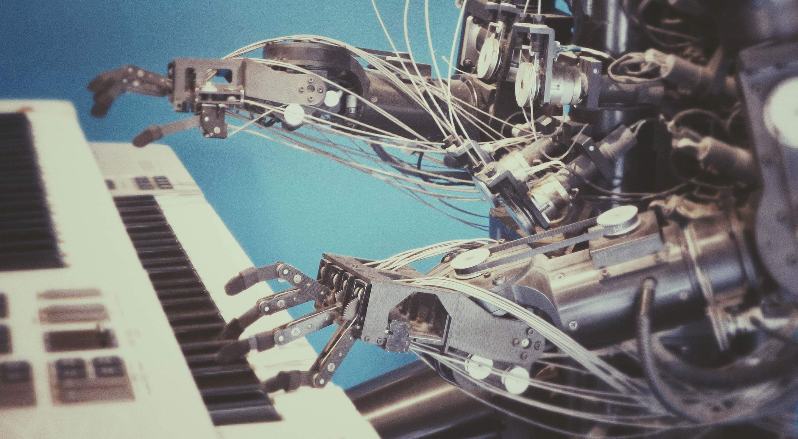
Featured image via Unsplash.

Source

p img {display:inline-block; margin-right:10px;}
.alignleft {float:left;}
p.showcase {clear:both;}
body#browserfriendly p, body#podcast p, div#emailbody p{margin:0;}

from Webdesigner Depot https://ift.tt/32124fV


from WordPress https://ift.tt/2AT4KjQ