 Inclusive web design is more than just building a website that’s accessible for impaired individuals. Inclusivity means creating an environment (physical or digital) that’s welcoming of all people regardless of their: Age; Race; Ethnicity; Gender; Sexual orientation; Socioeconomic status; Body shape; Physical or mental impairment; And so on…
But let’s be honest: it’s not always easy to find photos that feel inclusive — whether they come from stock photo websites or your clients.
Today, I’m going to examine the state of diversity in stock photography and then I’m going to provide you with some alternative options so you don’t feel as stifled or limited by what you’ve traditionally worked with.
Is Diversity in Website Imagery Still an Issue?
There was a time when this was the kind of imagery we were accustomed to on the web:
But this video of Emilia Clarke (and Vanity Fair) poking fun at business stock photography was only just filmed in 2018. So, does that mean we still have a problem on our hands when it comes to the quality and diversity of stock photography?
Cheesiness aside, there does still appear to be a systemic problem with diversity when it comes to stock photography.
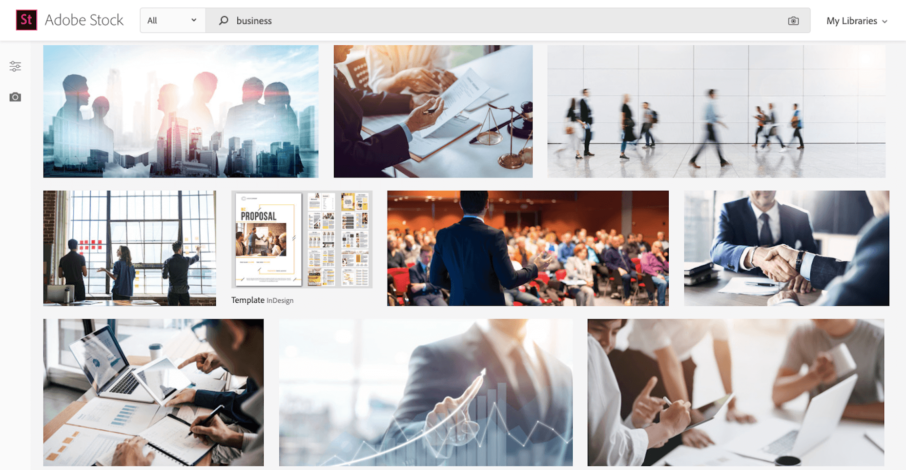
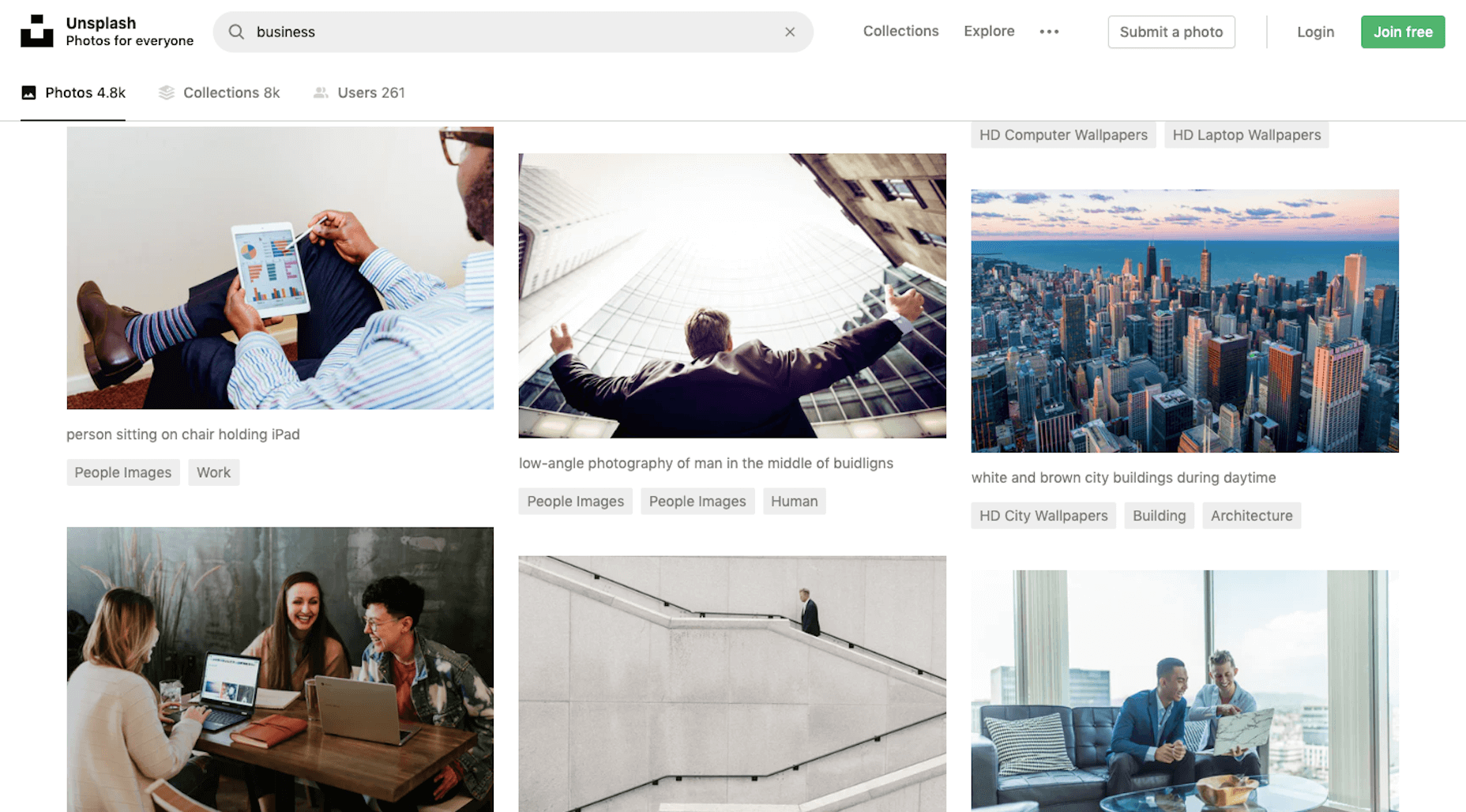
I went to the most popular stock photography sites and ran a search for “business”. These were some of the photos from the first page of results:
I think some of these sites are doing a much better job than they were in the past in terms of aggregating diverse-looking photos.
That said, there’s still a lot of white-washing here. And, not just that, but look at the focus of many of these seemingly diverse photos. Many of the speakers, bosses, handshakes, people looking over others’ shoulders… are white men.
Then, there’s the office spaces themselves that don’t quite look diverse either. I mean, you know this. I know this. Right now, I’m working from the kitchen of an Airbnb I’m renting for four months. What does your work environment look like? Does it look similar to those sleek high rises or swanky coffee shops often featured in stock photos?
Part of the problem may be that marketers are only just starting to make a concerted effort towards more diverse representation.
A Shutterstock survey from 2017 asked marketers in the US, UK, and Australia about inclusion of diverse visuals in their campaigns. Each market was asked different questions with the exception of the following:
Is it important to represent modern day society in marketing imagery?
These were the responses:
- US: 41%
- UK: 51%
- Australia: 45%
On average, the responses in the survey averaged somewhere between 40% and 55% when asked about whether they were featuring more women, racially diverse models, non-traditional families, etc.
But is it enough to have 50% of marketers working towards a more diverse web?
You saw the photo samplings from above. I think a lot of people are really trying to be more inclusive as they build websites and marketing campaigns. But without good enough source material to start with, it could be a struggle. So, let me present you with some alternatives.
Option 1: Expand Your Stock Photo Repository
Unless you’re building a website for a SaaS or a newspaper, how likely is it you’ll be able to get away without using images? Not very likely.
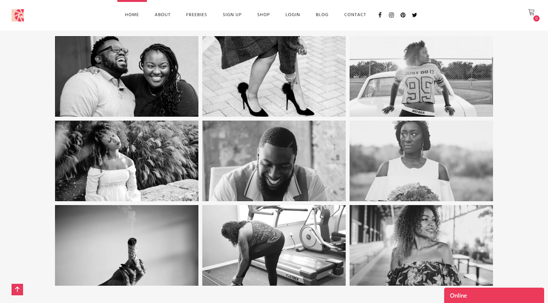
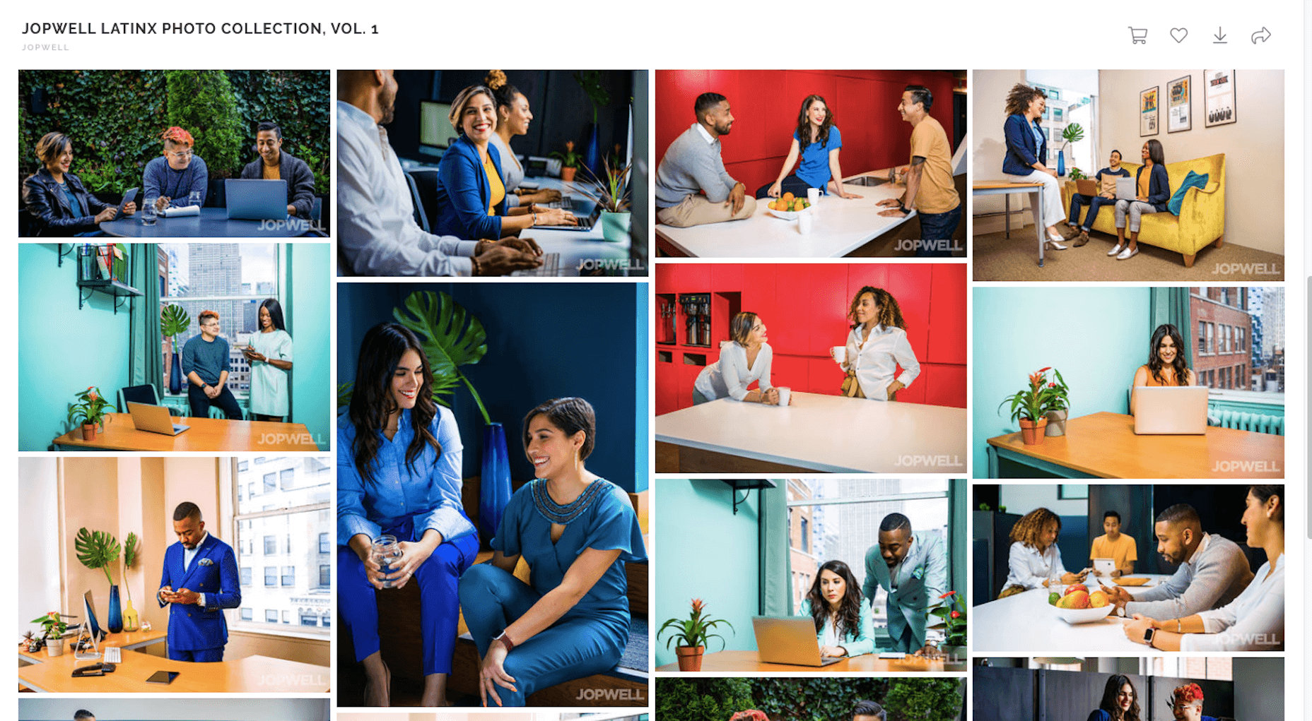
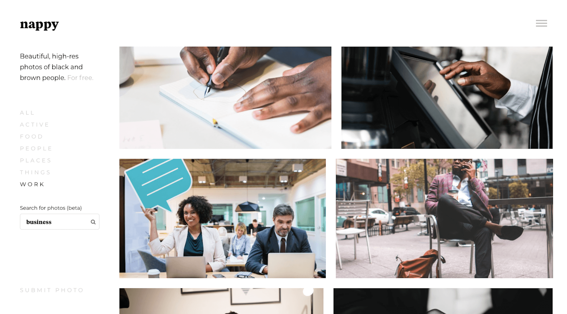
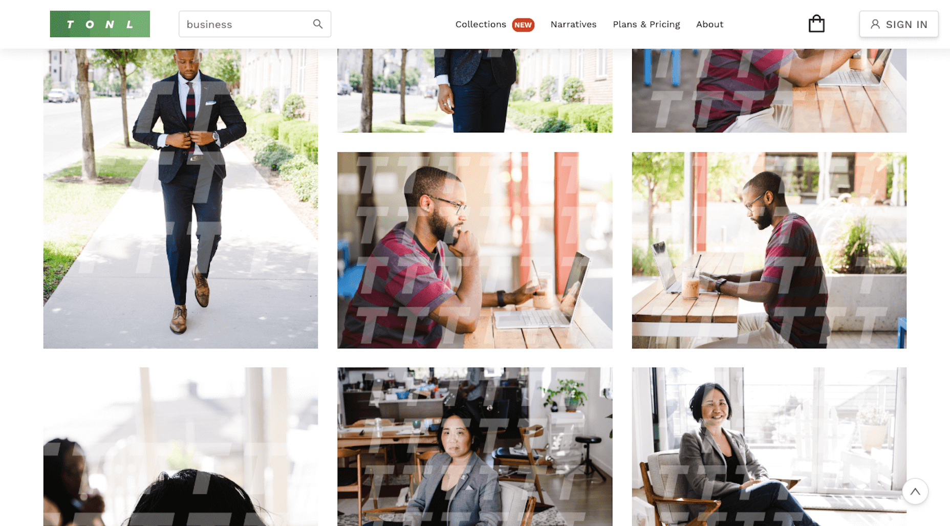
If you rely on popular sites whose repositories still contain images from 2010, it’s time to shake things up. Here are some stock photo sites that have gone out of their way to build a collection of diverse imagery for the web.
When possible, I searched for “business” to give you a sense for how each of these sites compare to the ones I showed you before:
Getty Images ShowUs Project (with Dove and Girlgaze)
Option 2: Try Some UGC
Visitors go to websites and hope to see something they can identify with. That doesn’t mean that every image you choose has to be 100% diverse. That would be impossible.
But what may be more feasible is to leverage user-generated content (UGC) to provide a more diverse and realistic set of photos for your website.
Of course, this assumes that the website you’re building is for a company that already exists and is out there selling their product or service. If that’s the case, that’s great.
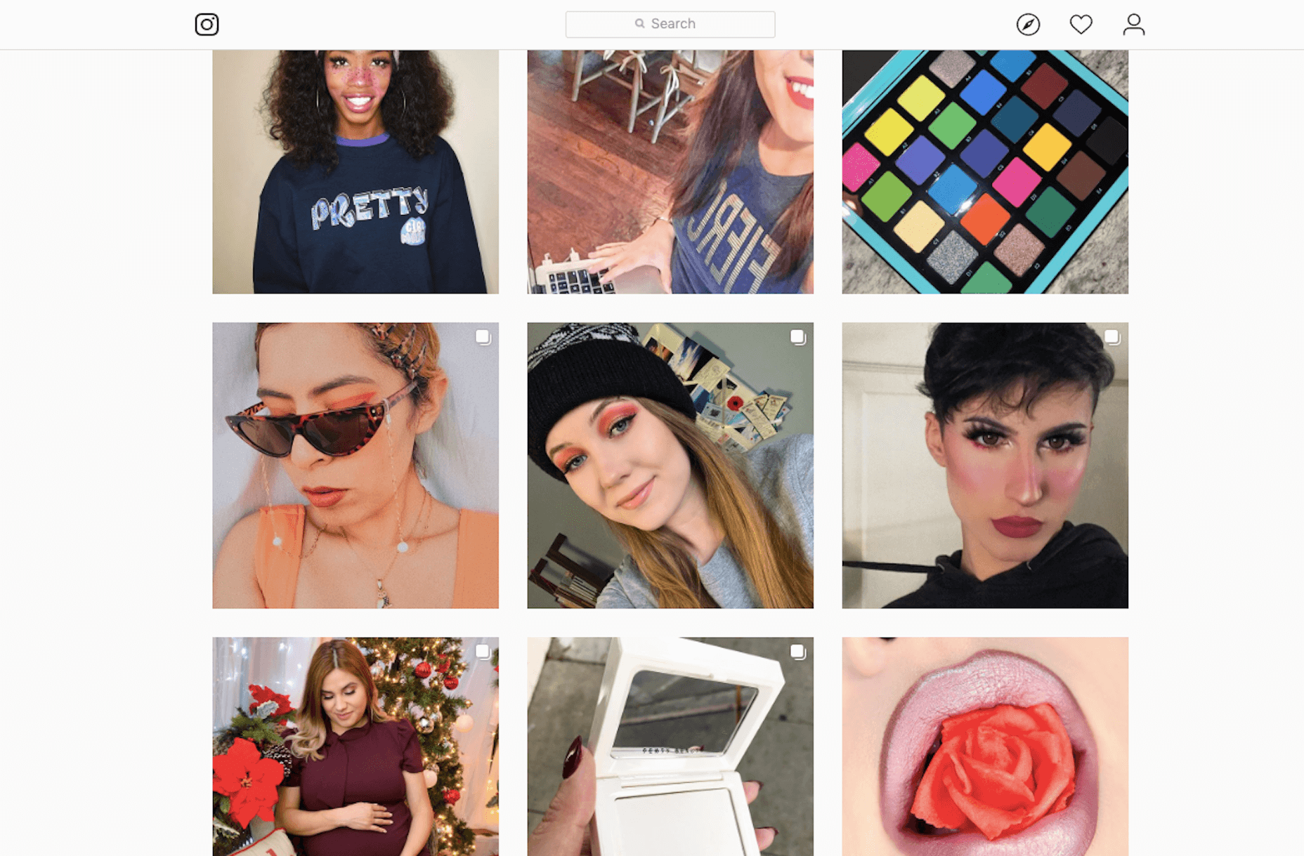
Hop on social media — Instagram and Pinterest would be good places to start — and see if you can locate some high-quality photos for the site (with permission to use them, of course). If the company has an avid fan base, it shouldn’t be too difficult to find tagged photos. For example, a brand like Sephora could go to its tagged photos on Instagram and find a smattering of diverse faces and environments:
Now, if you’re building a website for a brand new company, you can still use UGC to your advantage.
In that case, you’d turn to social media. However, look for photos that the competition (big or small) has been tagged in. What does their user base look like? What sort of environments do they appear in? Are there any insights or inspiration you can take away from these photos that would help you pick stock photos that well-represent the audience you’re targeting?
The customer base you’re targeting is already out there talking about the brands they like and showing off their happy purchases, events they’ve attended, etc. Why not use this publicly available information to find out more about who exactly the website should represent?
Wrap-Up
Of course, it’s not all on you to create an inclusive looking or sounding website. Your clients have to prioritize diversity internally — and that’s certainly not up to you to fix. But what you can do is focus on how the images you choose for your site play into the overall image of the brand.
Start by broadening your search for stock photography. If clients provide you with photos, have a discussion with them about diversity and provide tips on how to shake things up if their visuals come in lacking it. And, again, don’t be afraid to do some research on social media and see if UGC can be of some help!
p img {display:inline-block; margin-right:10px;}
.alignleft {float:left;}
p.showcase {clear:both;}
body#browserfriendly p, body#podcast p, div#emailbody p{margin:0;}
from Webdesigner Depot https://ift.tt/37oxoHQ
from WordPress https://ift.tt/2QbXSGG




No comments:
Post a Comment