 The web has made it all too easy for consumers to look up anything and everything they’re interested in or have questions about. “Pet stores near me.” “Best web hosting 2020.” “Tom Brady net worth.”
And it’s with this easy access to data that consumers have grown pickier about who they do business with. Because if they can get answers to all the other questions in their lives, why can’t they find out everything there is to know about a company they intend to buy from?
As such, we’re going to see more companies lean more towards honest and straightforward approaches than they have in previous years… And that means web designers need to be ready to help clients communicate that transparency through their websites.
What Web Designers Can Do to Help Brands Build Trust
Transparency and trust go hand-in-hand in the minds of consumers. A report from SproutSocial provides additional insight into why it’s so important to them.
Although the report focuses on transparency in social media, at its core it’s looking at how brand transparency translates into consumer trust.
Here is one of the key takeaways:
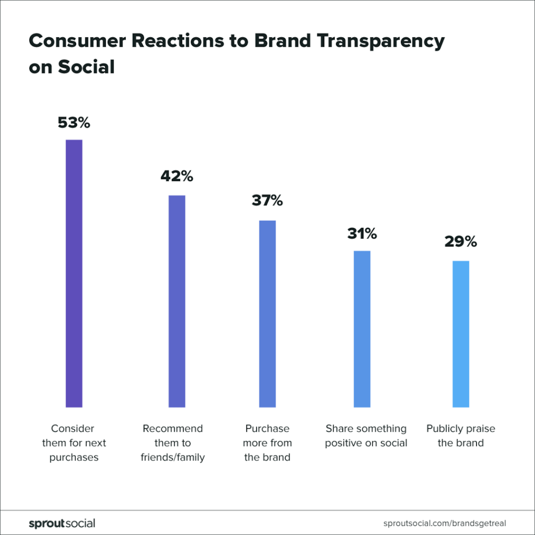
When brands are honest with consumers about things like their internal workings, pricing, values, and so on, their customers become more loyal. And, not only that, they become active advocates for the brand.
As for what your visitors and prospects consider as “transparency”, here are the most common things they look for:
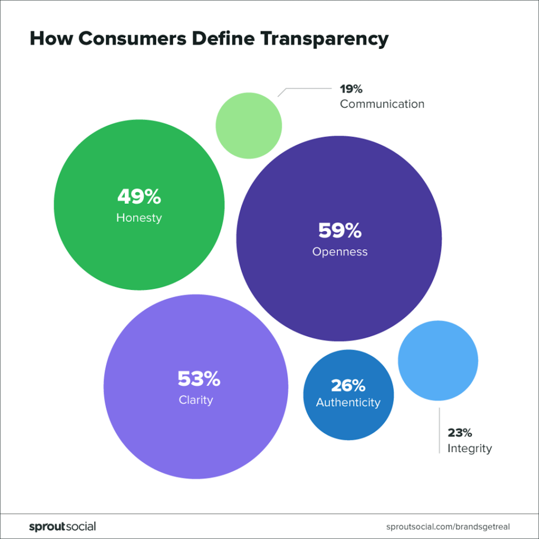
We can use this information to better present information on clients’ websites. Here’s how:
1. Be Clear About the Solution First Thing
53% of consumers define brand transparency as clarity. And what better way to be clear than to address their pain and provide your solution right away?
In fact, you could take a page out of RE/MAX’s book and take all other distractions out of the way:
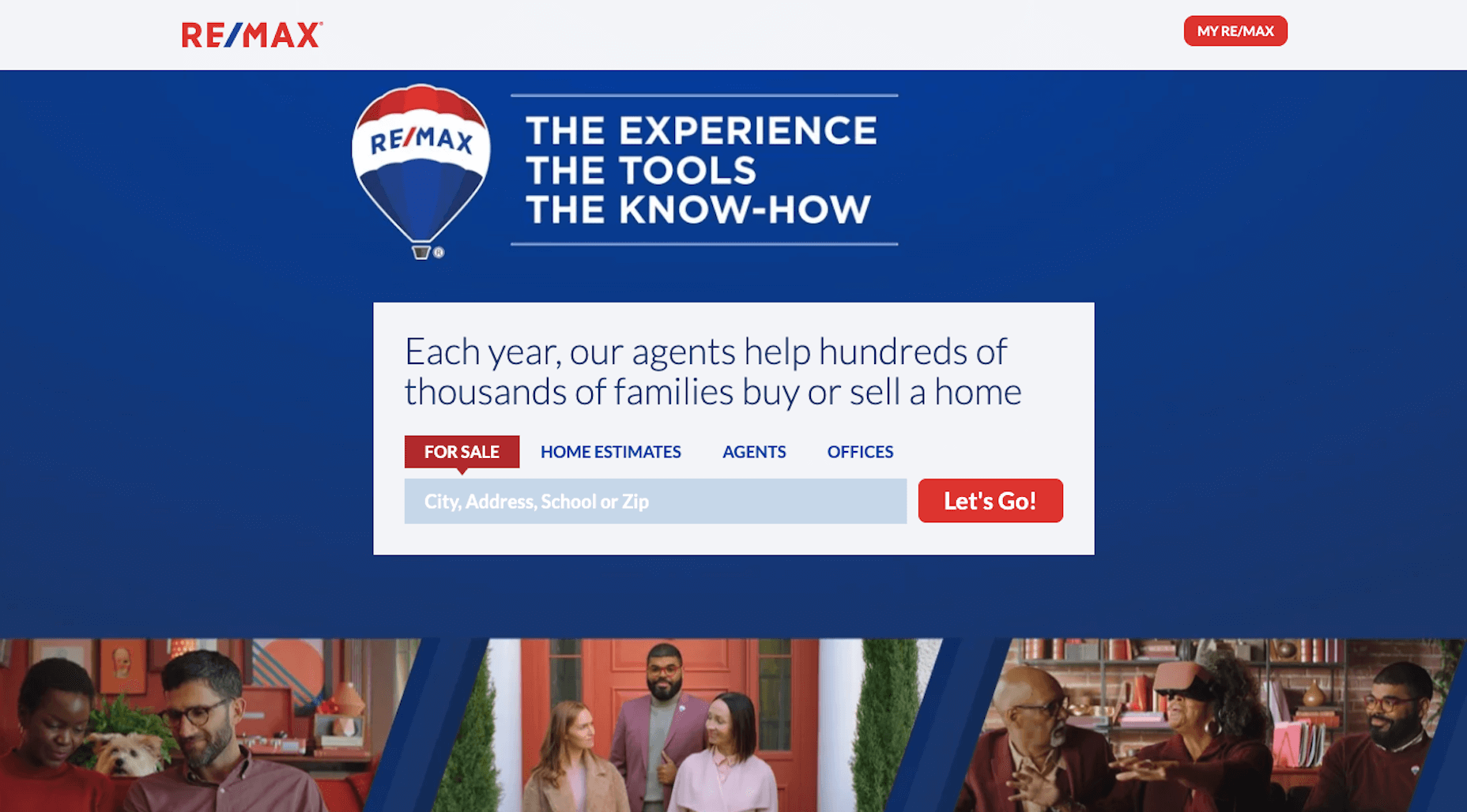
There is no navigation for the RE/MAX website save for the customer portal link. While you might not be able to get away with that exact design choice on your website, you could tuck your navigation under a hamburger menu to make sure the main thing in view is the call-to-action.
By removing other options from view, and painting a very strong argument for why your solution works (e.g. “Each year, our agents help hundreds of thousands of families buy or sell a home”), there’s no reason for visitors to get right to it. You’ve created the shortest, easiest, and clearest pathway to their pain relief.
2. Openly Display Customer and Client Reviews
One of the problems with displaying testimonials on a website is that the clients’ words are filtered through the company before they reach prospective clients’ eyes. In addition, brands obviously only want to share the most flattering of reviews, which can lead to some deception (whether intentional or not).
More than anything, consumers want brands to be open (59% of those surveyed defined transparency as openness). So, we need to do away with these overly flattering portraits of brands and start being more honest with prospects.
For service-based businesses, the solution is simple:
- Encourage clients to leave reviews on the company’s Google or Facebook business page. You can put a link to those pages on the website so visitors see that honest reviews are welcome.
- Use a reviews widget to display your online reviews — the good and the bad — on your website.
For ecommerce businesses, this is a little easier to implement as product reviews are commonplace. So long as there’s no manipulation of the data and visitors are able to see true reviews, there’s not much else to do than to configure a product reviews and ratings system like the one Olay has:
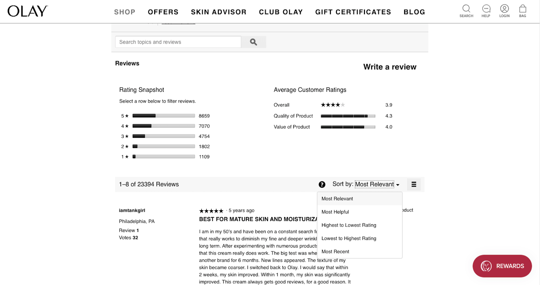
When you include reviews on your website, make sure a ratings sorting feature is included. That way, if customers want to see what all the bad reviews are saying, they can quickly get to them.
3. Maintain Integrity When It Comes to Data Collection
Privacy has been a major concern for consumers for years. But companies (and their web developers) found a solution amidst the release of GDPR: the cookie consent bar.
The only problem is that the cookies consent request was everywhere. And as tends to happen with consumers, banner blindness has led to more and more visitors ignoring those requests and clicking “OK” or “Allow” simply to get them out of the way.
Blind acceptance of a website’s privacy policies is not good for the brand nor the consumer. So, what some websites do now to appeal to the 23% of people who consider integrity the most important part of transparency is this:
- Use just-in-time privacy notices that display only when visitors are about to share their information.
- Include a “Do Not Sell My Personal Data” link at the bottom of websites as Tide does.
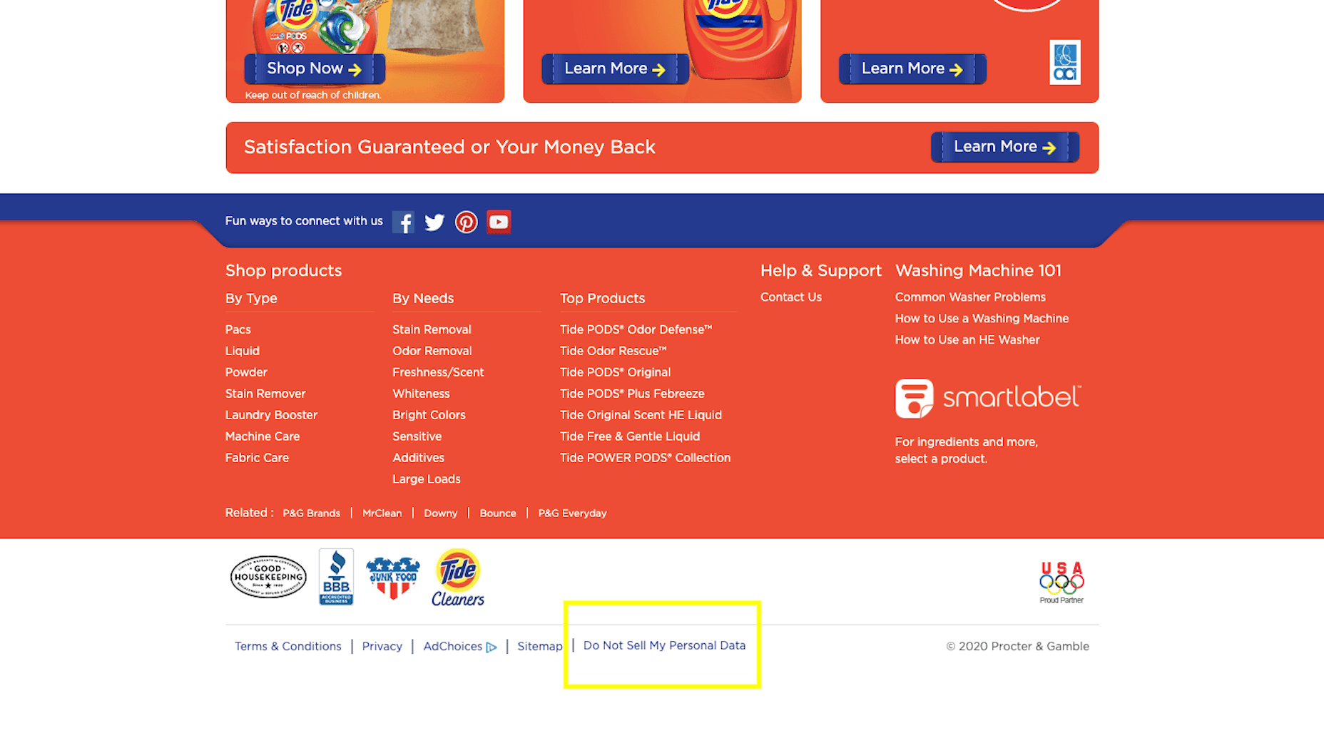
With the passing of the California Consumer Privacy Act, these statements enable California residents to indicate which tracking cookies they want to enable:
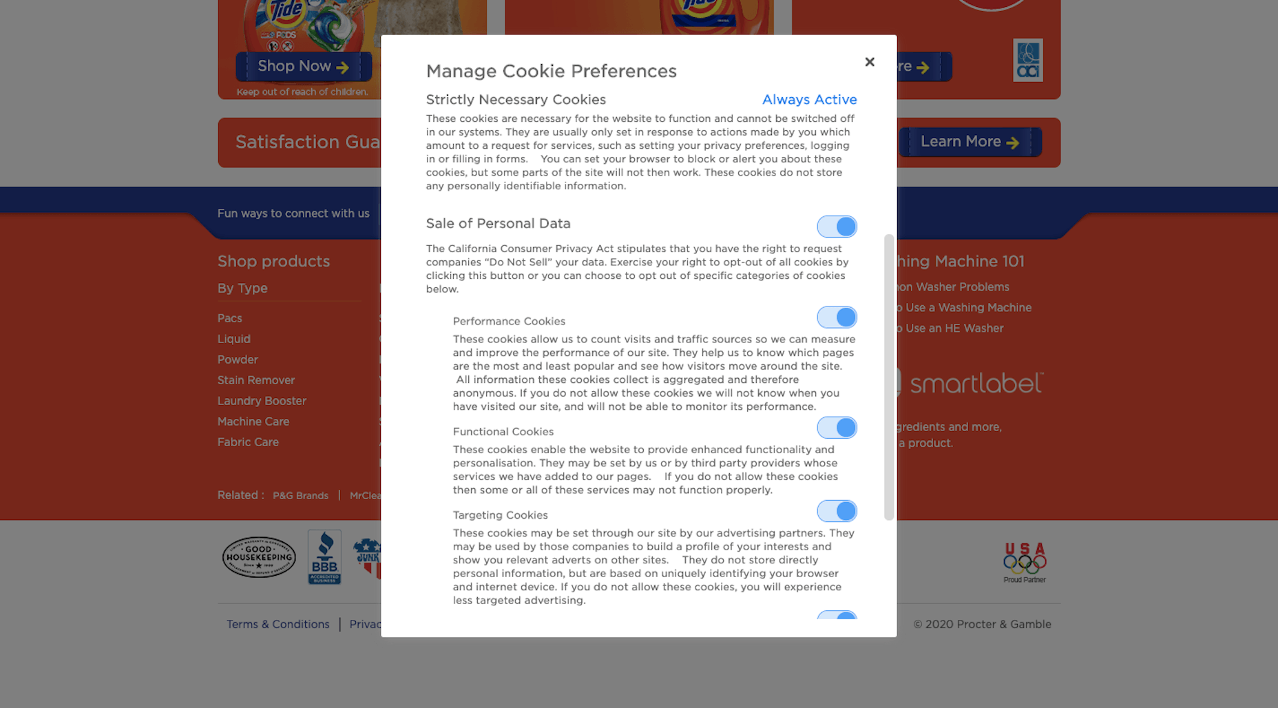
There are some cookie consent tools that provided for this level of user control, but not all — which is why this CCPA statement is a big step in the right direction.
4. Be 100% Honest About Pricing and Other Fees
It’s not always easy for consumers to decide what they’re going to spend their money on, what with the variety of options and distractions suggesting it might be better spent elsewhere. So, when your website provides pricing that seems too good to be true, don’t be surprised when they abandon the purchase when they discover it really is.
With 49% of consumers equating transparency with honesty, you can expect unexplained discrepancies between the ticket price and the price at checkout to cause issues for your brand.
When designing product-related pages on an ecommerce site, consider the best way to inform your shoppers without compromising the on-page experience.
Ticketmaster, for instance, does an amazing job of this.
For starters, this pop-up is what visitors see before they ever get a chance to look at ticket prices for upcoming NFL playoff games:
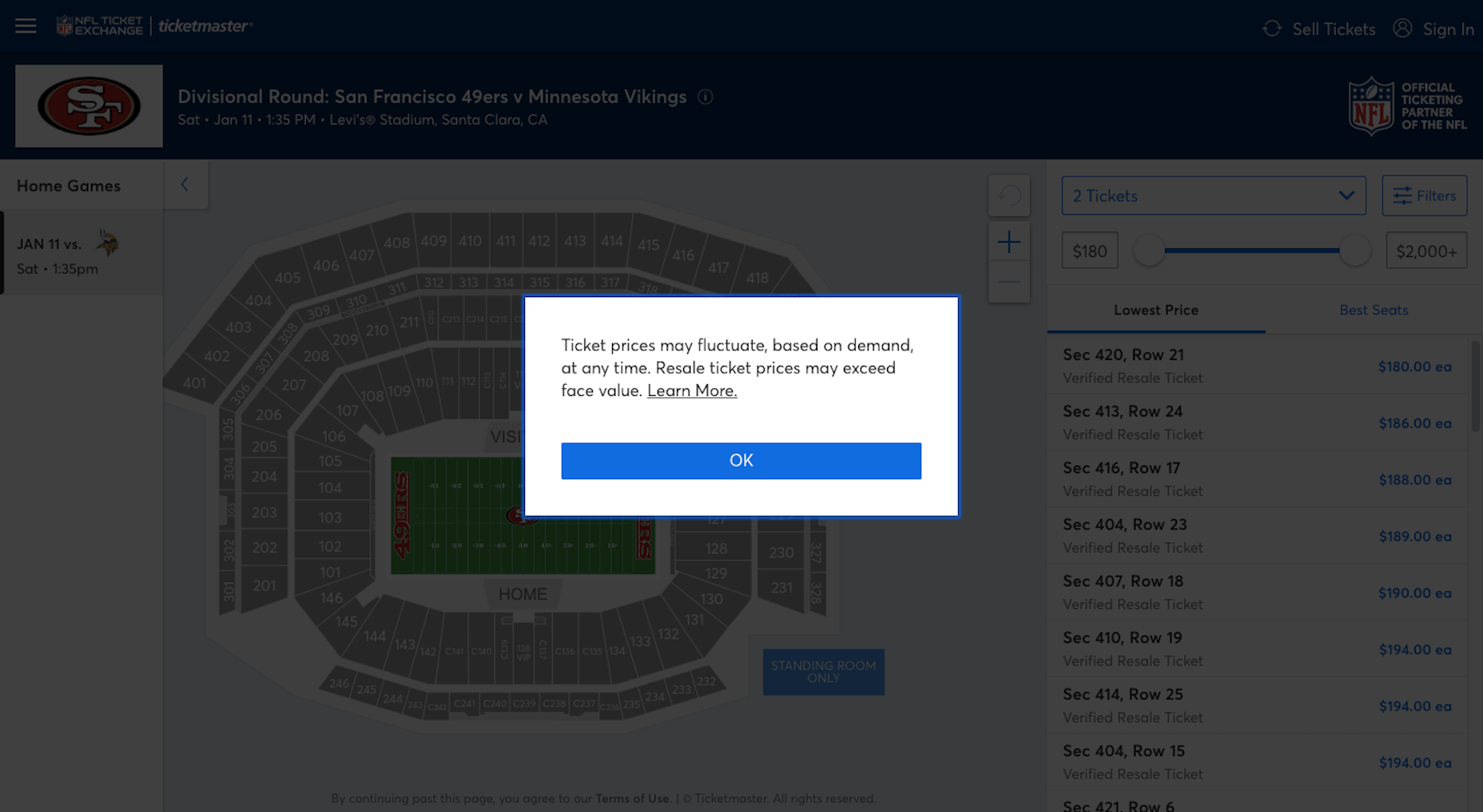
It’s just one way the website prepares them for any surprises.
Another way the site handles this well is with this well-placed reference to ticket fees:
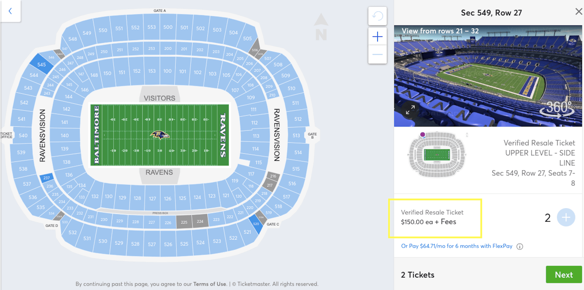
The word “Fees” is a hyperlink that takes customers to the FAQs — one of many places they can go on the site for pricing-related questions:
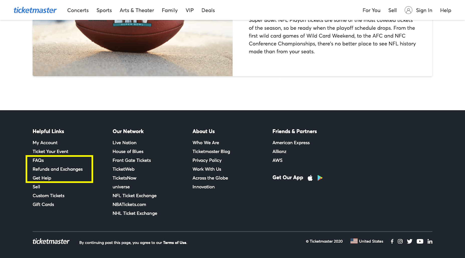
Then there’s this accordion dropdown before checkout that details the fees that bring the total from $360 to $424:
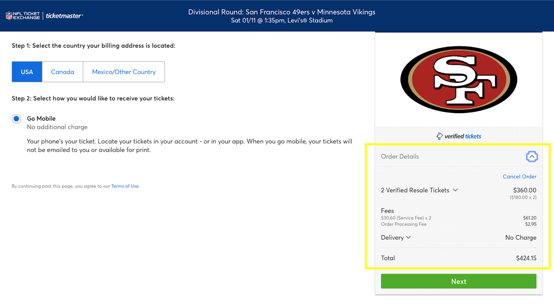
This way, Ticketmaster customers are 100% prepared for what they’re about to find when they pull out their credit card to pay.
If your website has a high cart abandonment rate, there’s a good chance the issue has to do with the final costs. So, if your website hasn’t gently reminded them along the way of what they’ll pay, it’s time to build in more of that along the journey.
Transparency and Trust: Making the Connection for Your Clients
It’s understandable why consumers want to give their money to trustworthy brands. There are just too many options out there today. Why should a purchase ever require a deep-dive analysis into every company, every option, every product or service? By finding brands they can trust, their lives become much easier.
As a web designer, you have an important role to play in bringing prospective customers or clients to that conclusion.
Featured image via Unsplash.
p img {display:inline-block; margin-right:10px;}
.alignleft {float:left;}
p.showcase {clear:both;}
body#browserfriendly p, body#podcast p, div#emailbody p{margin:0;}
from Webdesigner Depot https://ift.tt/3dV5oPo
from WordPress https://ift.tt/3e1XcwH

No comments:
Post a Comment