 For many professionals looking for new work opportunities, they know that prospective employers are going to ask for proof of their credentials; where they went to school; how long they worked in the field; who they worked for; a résumé communicates these details nicely.
For web designers, though, a list of jobs and accolades isn’t sufficient.
Imagine if you created a resume that listed off your skills and experience as a designer:
- I have 10 years of experience building responsive websites;
- I’m an Adobe certified expert;
- I’m proficient in HTML, CSS, and JavaScript.
None of these things would mean much to prospective clients unless they themselves are designers or developers. It’s the same reason you don’t talk to clients using web design “speak”. They want to know what you’re going to do for them, not how you do it.
Below, you’ll find five signs that it’s time to update or redesign your portfolio website again:
Sign #1: Business Has Been Slow
There are many reasons why business may be slow for you. What I’d suggest is taking a look at your Google Analytics account to get a sense for why.
Do You Have Steady Traffic?
If the answer is “no”, then there’s an issue with visibility in search. You’ll need to address either your indexing issues or problems with SEO to fix the problem.
Is Your Bounce Rate High (>90%) & Time on Page Low (< 10 seconds)?
There’s likely something wrong with loading speeds. Check your speed through PageSpeed Insights and Google will tell you how to repair the issue.
Do You Have Traffic But Zero Leads?
Then the issue is most likely your portfolio. Even then, there are so many things that could be happening here. The work samples might be underwhelming, outdated, or not geared towards the audience you’re targeting. The copy might be too confusing or vague. Next steps might be unclear or inaccessible (like a broken contact form).
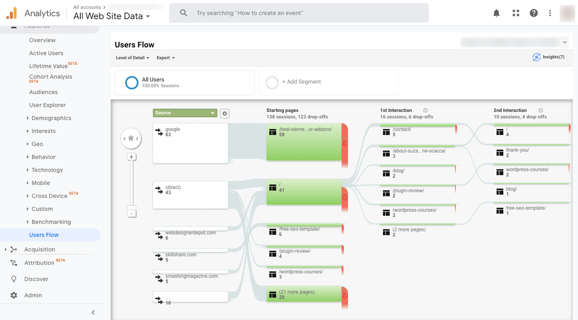
Use Google Analytics to look at your Users Flow (under Audience > Users Flow):
This will help you visualize where your traffic is going within your portfolio site and to see where most of it is dropping off. If you find that people are viewing your work, but aren’t taking action, then it’s definitely time to give the site a rework.
Sign #2: Business Has Been Extremely Busy
When you first built your portfolio website, you probably selected the best of the best to represent your body of work, right? But that was then. What about now?
As business picks up, it’s easy to lose sight of your portfolio because you’re so busy tending to clients that need help. However, if you want to keep those numbers up, then you should make time to update your portfolio so it accurately reflects your best work up to the minute.
Let me show you an example:
This is 10up’s “Work” page as of May 2020:
Helen Keller International, Politico, WCG, FiveThirtyEight Live Blog, The Saturday Evening Post, and Investor Place are the first samples you see.
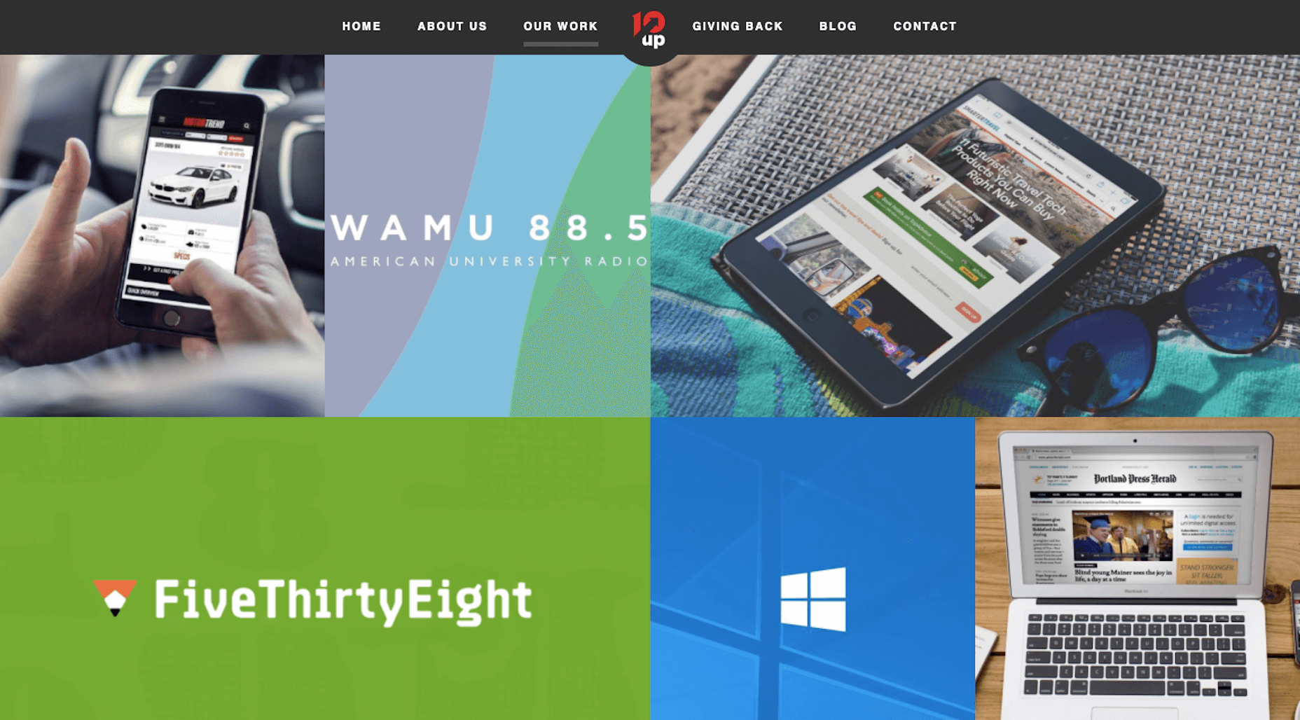
Now, let’s go back to February 2019. This is what the “Work” page looked like then:
Motor Trend, WAMU.org, Smarter Travel, FiveThirtyEight, Windows Launch Event, and Maine Today Media are in the top spots.
If you scroll down the page as it stands today, you’ll find these projects there. It takes about three scrolls to find them. So, it’s clear that 10up updates its portfolio at least once or twice a year with fresh work.
Sign #3: You Recently Acquired a New Skill
A portfolio should be a reflection of your current skill set. And what that translates to is showing off websites that align with current web design practices and ideals. It also means redesigning your website so that it accurately depicts what’s going on with web design today.
Considering how quickly design trends come or go, this means you’ll need to update your portfolio site about once a year or so. It doesn’t need to be a major overhaul, but it should at least help you “sell” new clients on more modern designs and website features. For example:
Client: My friend has a chatbot on her site and she said it’s been a big help in getting her more appointments. Is that something we can do?
You: As a matter a fact, it is. And it’s something I’ve personally had a lot of success with.
You would then show the prospect your portfolio site equipped with a chatbot.
That said, you don’t need to litter your site with all the trendy new features. All you need is a portfolio site that reflects the very best in design today.
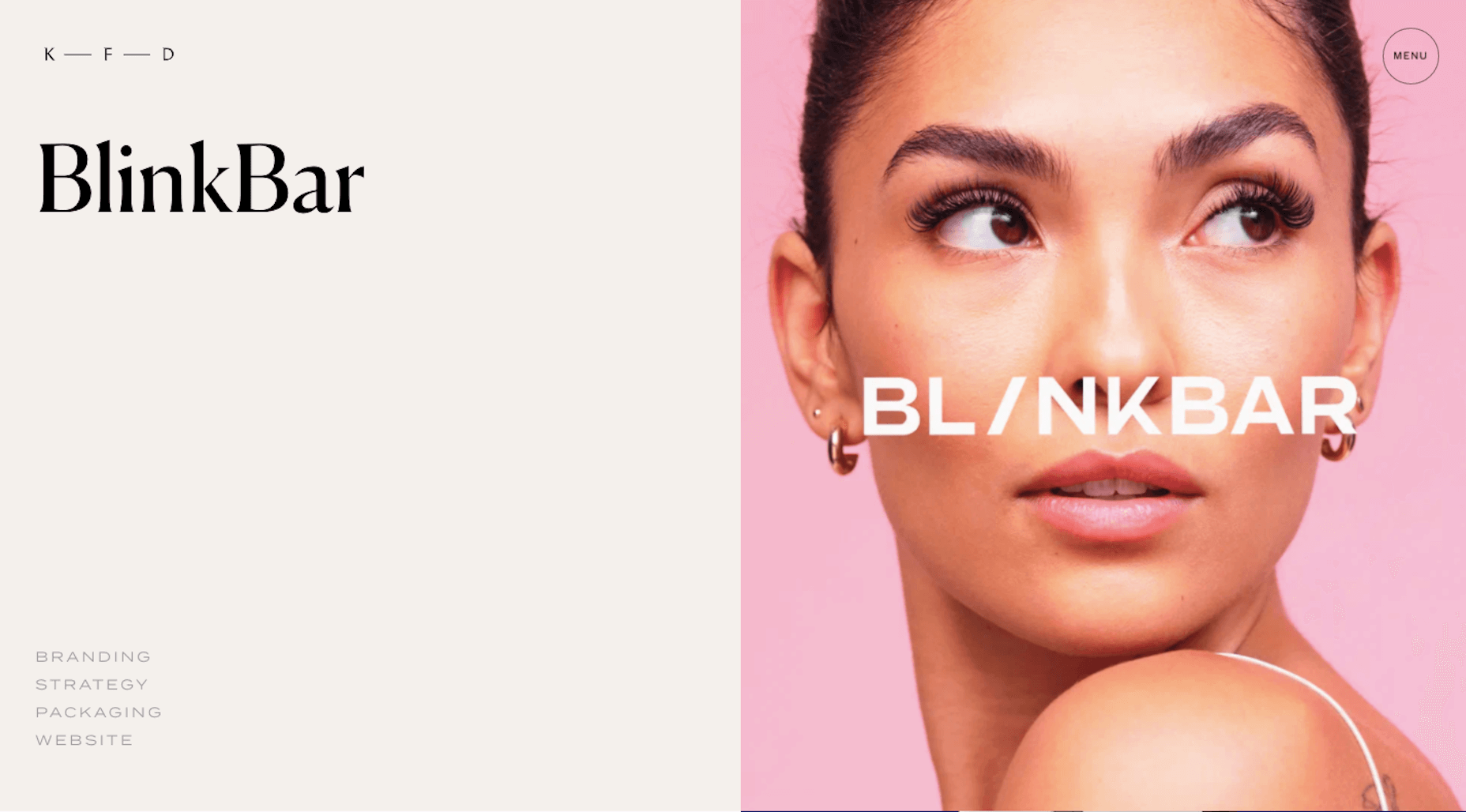
The portfolio website for Kati Forner Design, for example, went under the knife to reflect this type of modernization of design:
This was how the website looked in 2019:
And this is how the studio’s “Works” were displayed:
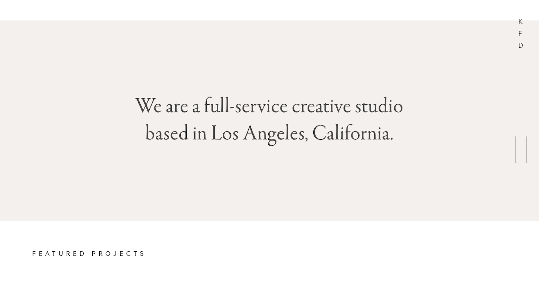
It’s an attractive website and one I’m sure did very well with its target audience. That said, a lot changes over the course of a year, so it’s no surprise to see that the studio has adopted a new look in 2020:
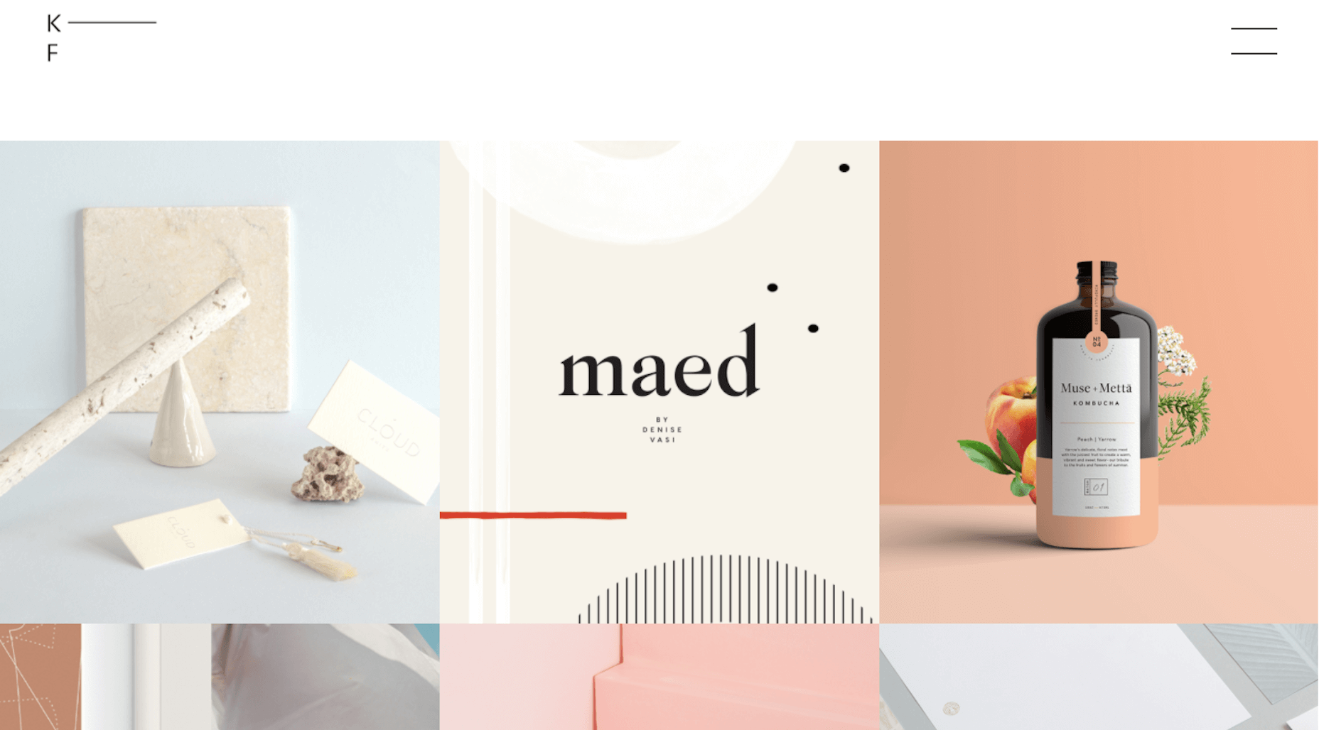
The same goes for its portfolio page:
The style of the website and portfolio page have a bolder and more confident look to them these days. This could be a reflection of the times and it very well could be a reflection of a change in their audience demographic. Both are valid considerations when updating a portfolio website.
Sign #4: You Recently Switched Niches
For web designers that work on their own, it makes a lot of sense to niche down. By carving out a singular niche for yourself, it’s easier to find clients as you’re not having to sell yourself as a jack of all trades or to constantly be changing gears from job to job.
Design agencies, on the other hand, may decide that it’s worth catering to various niches because they have the amount of capacity to do so. And that’s fine, too, so long as the resources and expertise are there.
Regardless of which boat you find yourself in, a change in niche or an addition of a new one is not unheard of. When that happens, though, your portfolio website needs to reflect this change.
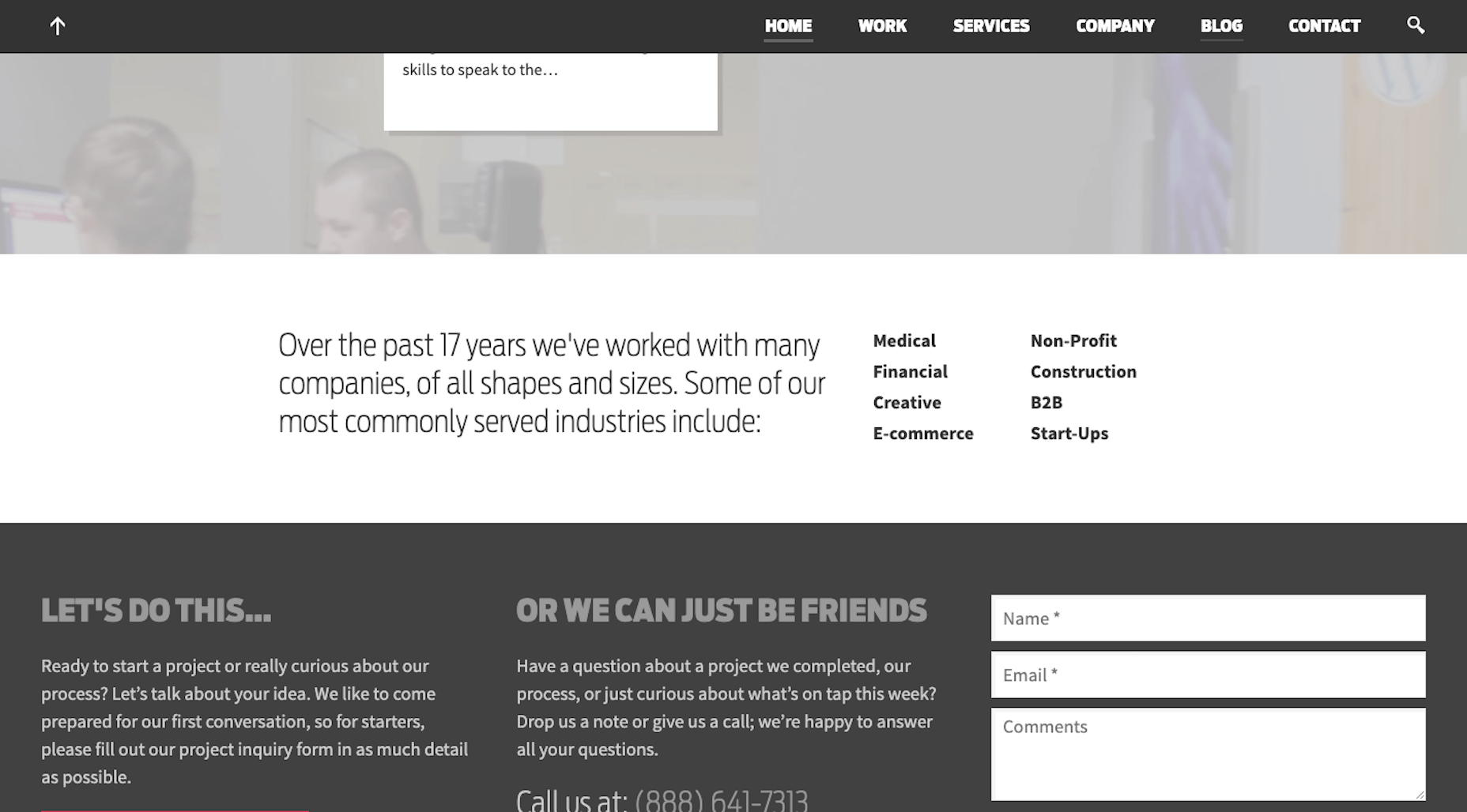
Let’s look at the example of Gravitate Design.
This was Gravitate’s areas of expertise in 2016:
- Medical
- Financial
- Creative
- E-commerce
- Non-Profit
- Construction
- B2B
- Start-Ups
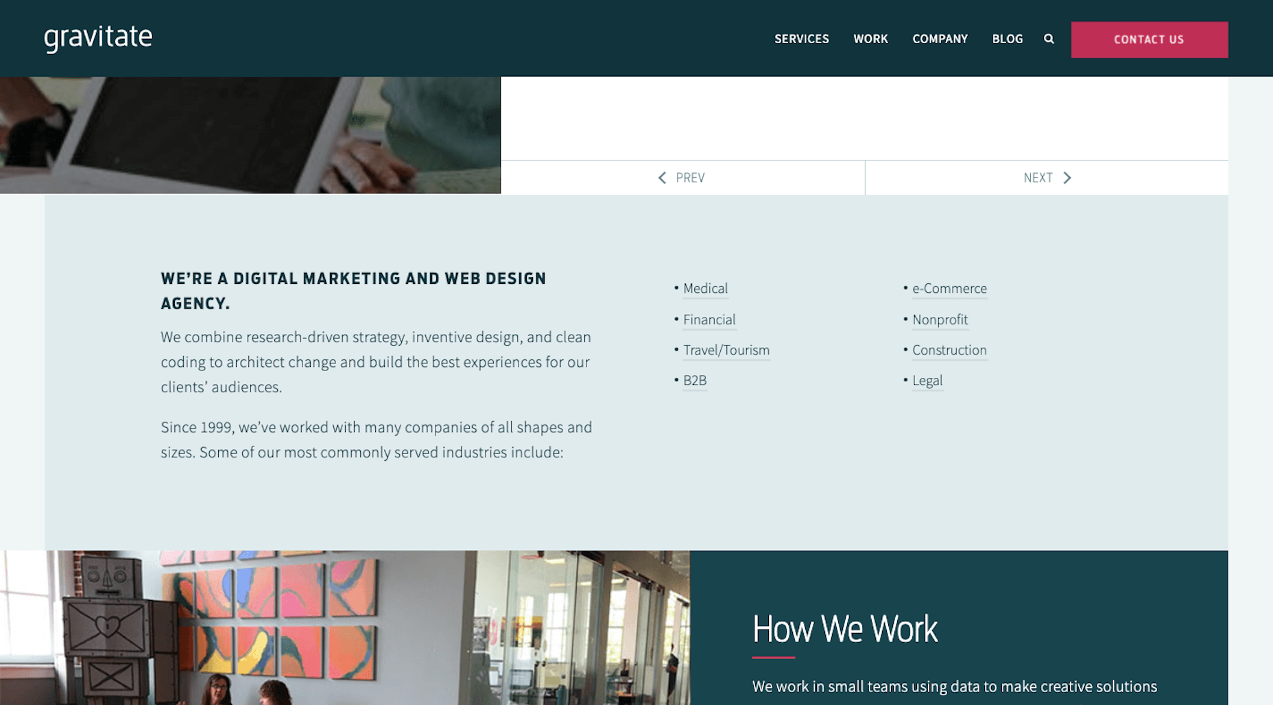
Let’s fast forward to 2020. The list of niches has changed (as has the overall look of the site):
- Medical
- Financial
- Travel/Tourism
- B2B
- e-Commerce
- Nonprofit
- Construction
- Legal
Creative and Start-Ups are now gone. In their place are Travel/Tourism and Legal — and each page comes with information on how the agency serves the niche, information on a sample project, and a custom contact form.
Whenever it comes time to change up your niche, just make sure you’re prepared with all of the details needed to sell prospective clients on it.
When In Doubt, Update Your Portfolio Website
I know it’s not easy finding the time to give your design business the love and attention it deserves. But your portfolio website is something you can’t afford to ignore. It’s the web designer’s version of a résumé and it’s an essential part of your marketing and sales strategy.
Just keep in mind that a portfolio website is just like any other website. There’s no setting it and forgetting it. It needs to be updated so that it’s always the most accurate reflection of your body of work, skills, and area of expertise.
Even if you take a few hours every year to look in on it and make sure the design, copy, and samples are up to snuff, that may be all you really need to do to maintain it.
p img {display:inline-block; margin-right:10px;}
.alignleft {float:left;}
p.showcase {clear:both;}
body#browserfriendly p, body#podcast p, div#emailbody p{margin:0;}
from Webdesigner Depot https://ift.tt/2XqKb9o
from WordPress https://ift.tt/2LTKtjG



No comments:
Post a Comment