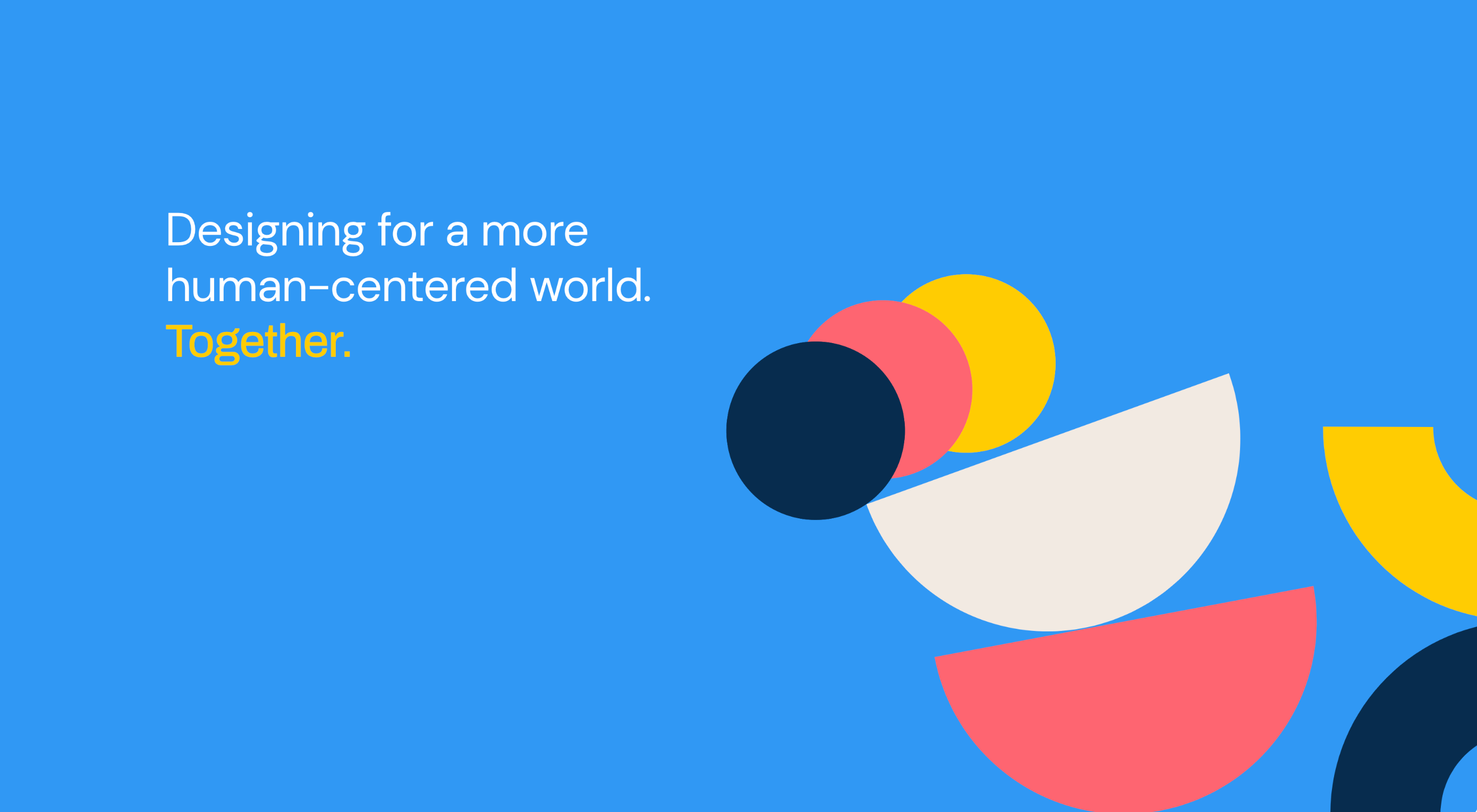
 Design can make a statement. It evokes feeling and can encourage thought and conversation. That’s the common theme among the three trends in website design this month.
Each trend is rooted on the time and place where we live and includes elements that provoke thought. Kudos to these designers and design teams for jumpstarting conversations. Here’s what’s trending in design this month.
1. “Taking a Stance” Design
From social to environmental issues, design projects are echoing the sentiments of their audiences and organization in a way that take a stance on an issue.
Once taboo, this is becoming increasingly used as a technique for brands who are no longer worried about turning off a certain segment. The goal is to rally the core audience and people who feel the same way about an issue or cause.
There’s also a secondary thing happening here. Some designs aren’t really position based, but use imagery and language that resonates with a movement to associate with that feeling.
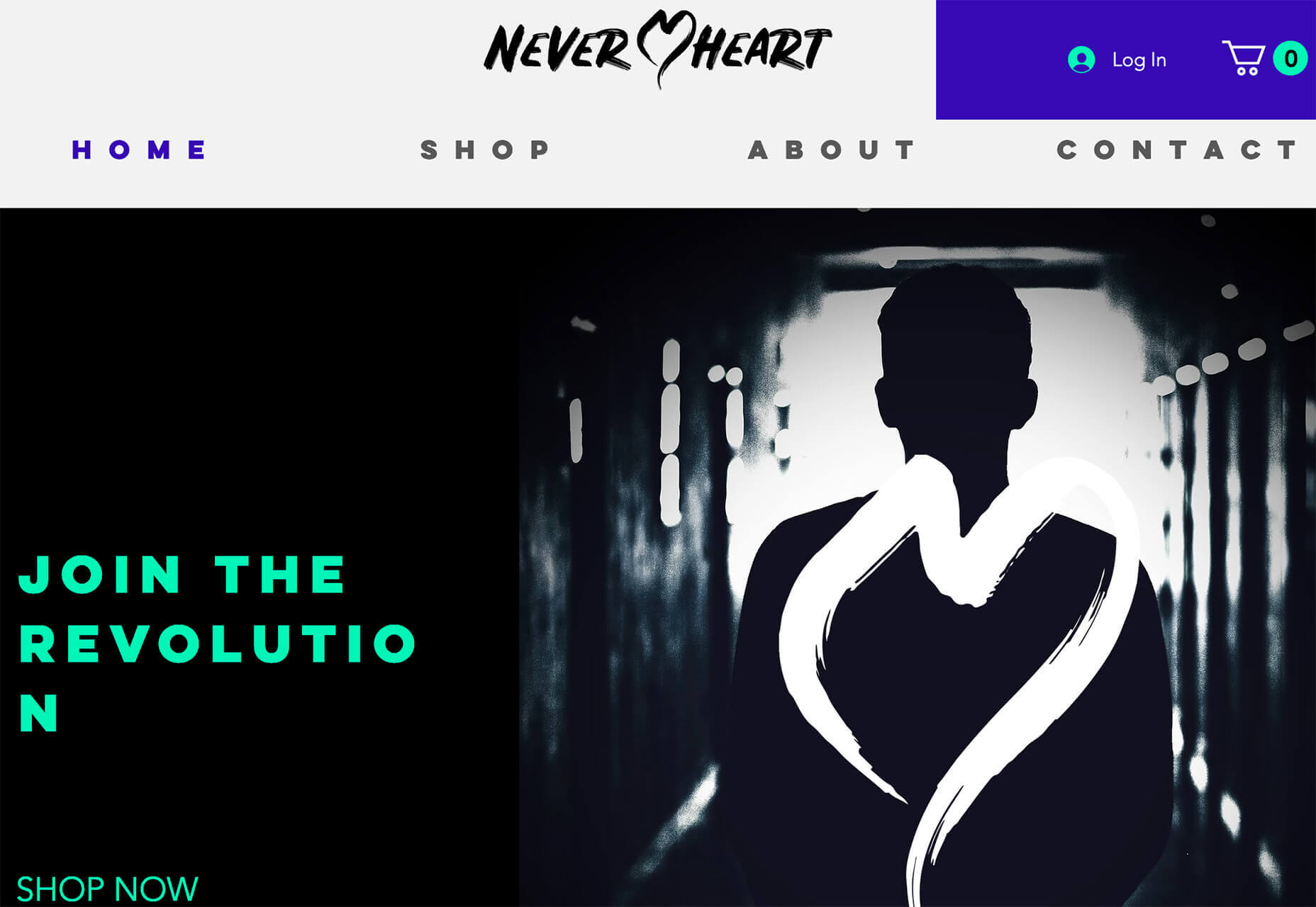
Never Heart uses “Join the Revolution” and a dark image with a heart to tug at your feelings. It can help create an association to a cause that you believe in without stating that cause directly. The design feels strong and inviting while making you feel like part of something.
Skye High uses “powerful” twice in the headline to convey a particular messages to women. The agency is looking to work with “powerful” women. It’s a timely statement and message that could resonate with a lot of business-women at various levels of their careers.
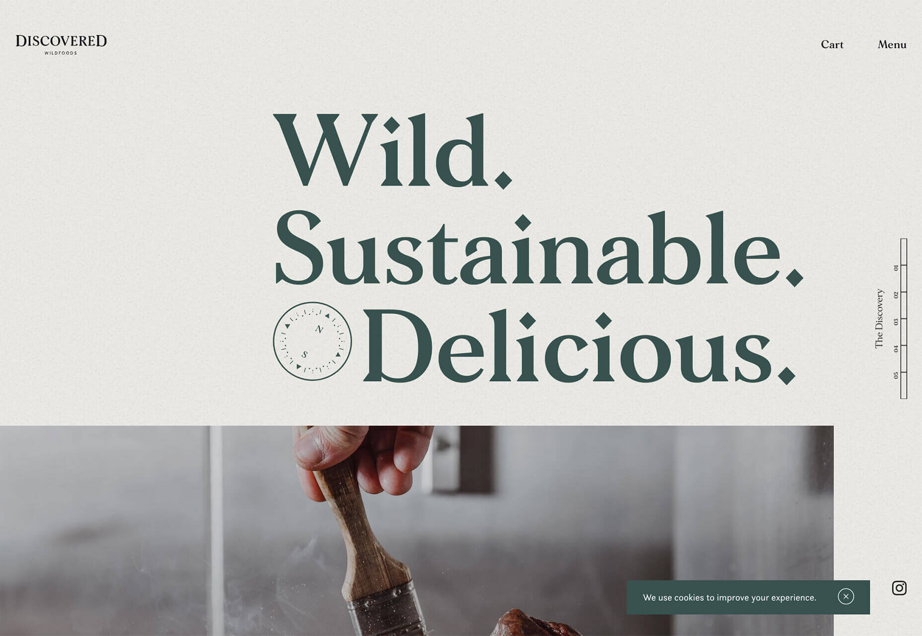
Discovered Wildfoods is a brand that is rooted in sustainability. The corporate model and responsibility of the brand shows through in the website. This type of design helps connect people with mutual feelings to the brand and products.
It’s refreshing to see more websites and brands embracing social causes and issues. It can be tricky for a number of reasons. But for some brands, it pays off.
2. Abstract Art Elements
If you are worried about a lack of images, or not sure how to portray images in an appropriate way due to the worldwide pandemic – groups or not, masked or not – abstract art elements can be the solution.
Widely used for startups and apps, more abstract design elements are everywhere. It’s an easy way to create strong visual interest without photography.
The most common use of abstract art elements is often in the form of geometric shapes with animation. This is something that almost anyone can understand and simple shapes and movement can be quite stunning when done well.
The good news is this aesthetic can work for almost any type of website. Try it for a redesign when you don’t have photography that feels appropriate in the current environment or if you want to create focus for content that drives website visitors to the words or scroll. This works with more abstract concepts when they are simple and help you move quickly from the visual to text.
Here’s how each of the examples handles abstract art elements:
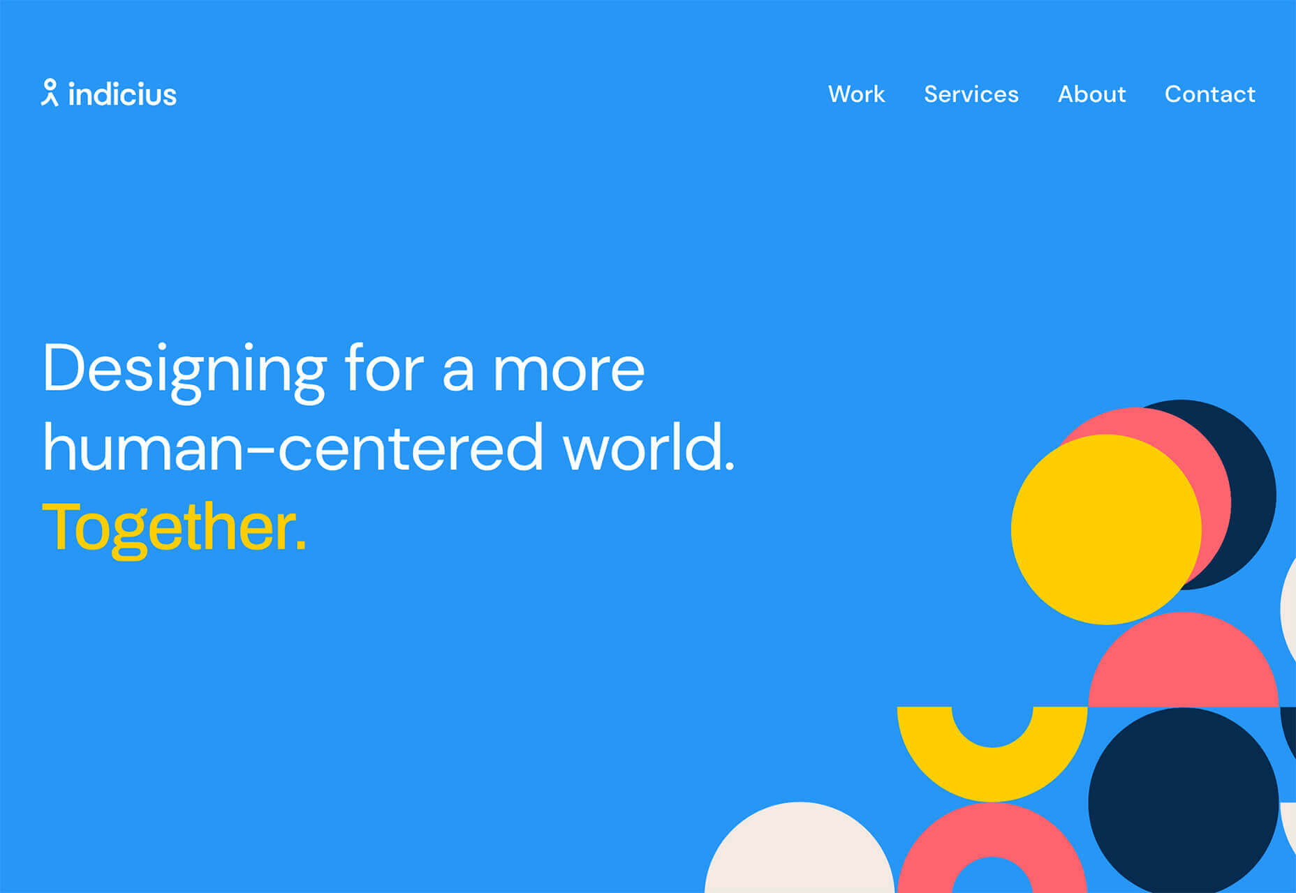
Indicius uses bouncing circles that move toward text and down the screen to drive users to the headline and scroll action.
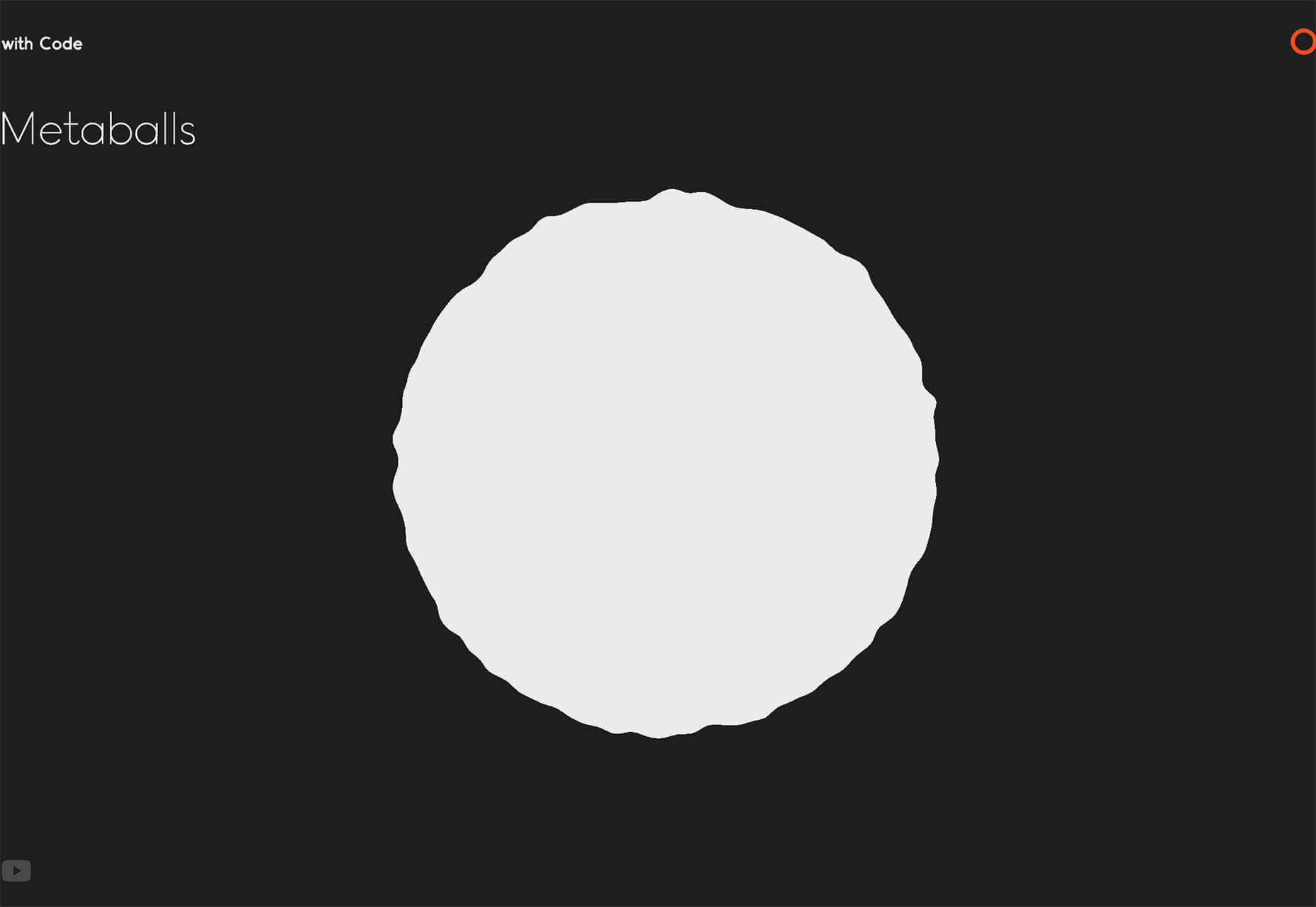
With Code uses a fun fuzzy circle with different animations to draw you in.
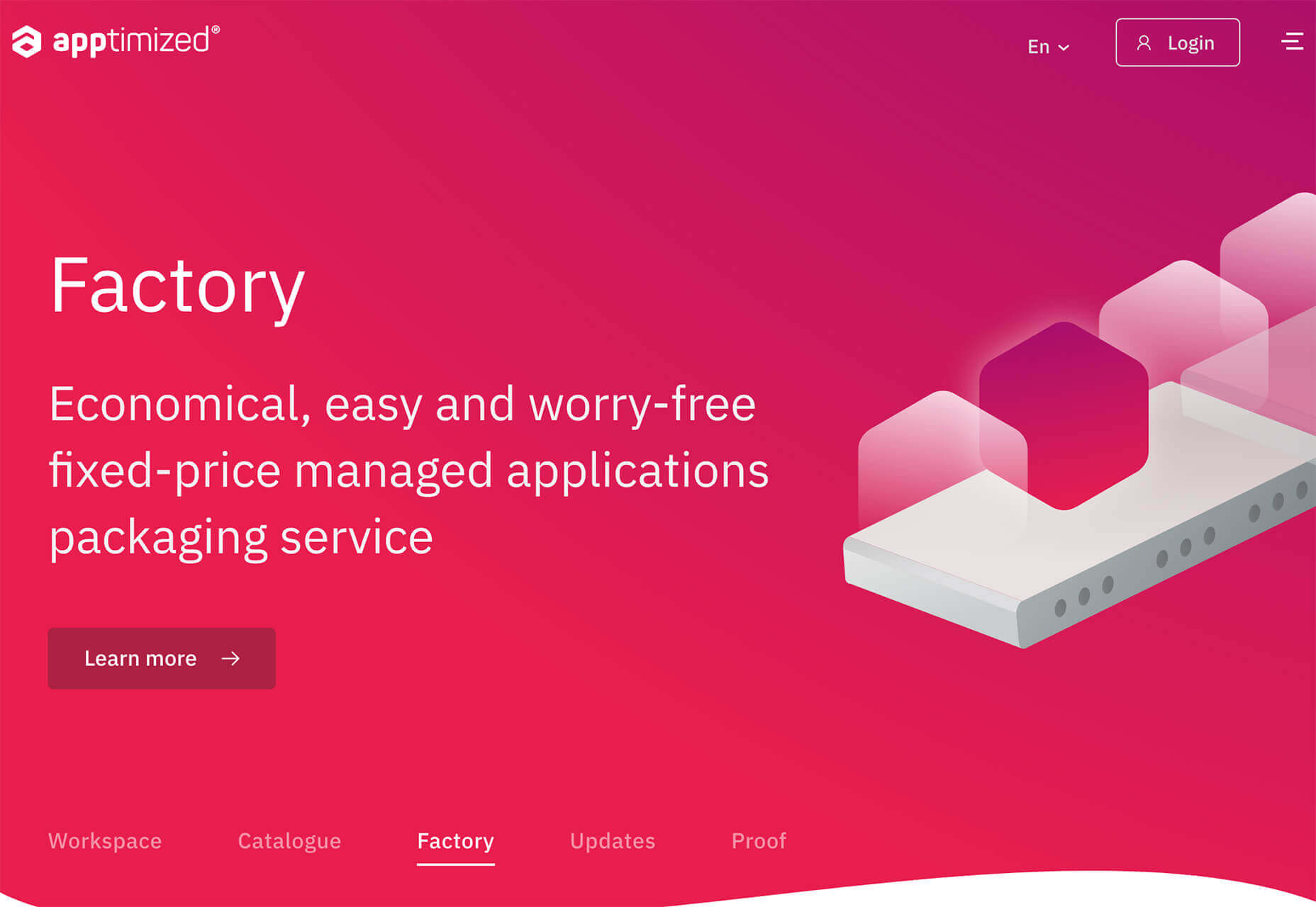
Appimized uses bright color and a monotone scheme with geometric shapes to sell its services.
3. Images That Make You Think
This might be the most visually interesting, and thought-provoking, website design trend we’ve seen in a while. These designs all feature images with a little something different or unusual that make you think.
There are a lot of different ways to do this – marry photographs and illustrations, create imaginary imagery, animations or effects, visual tricks that play on depth perception or create pseudo-3D effects.
The commonality is that the visual is so striking and unusual that website visitors stop and engage with the design. What do the “oddball” visuals mean? What message do they convey? How did they do that?
All of the questions could be associated with this different style of visual representation.
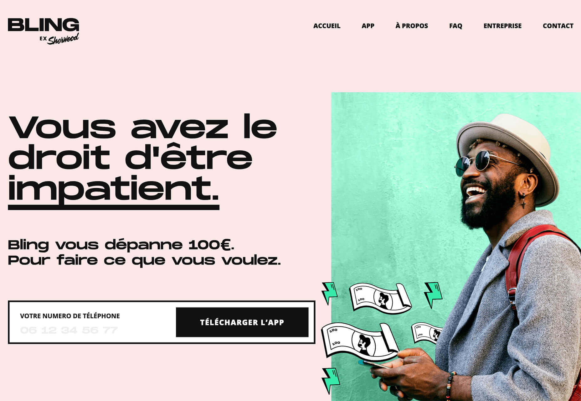
Bling uses a combination of a photo with illustrated animated elements to draw the eye. The yin and yang between reality and fantasy is quickly evident and makes you want to know more. (It doesn’t hurt that the animation uses dollars and lightning.)
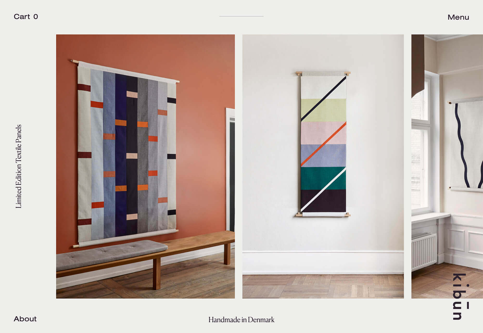
Kibun is interesting because the photo choices create an optical illusion of depth. It matches the content of the design well because the website features artistic textile panels with an artistic design. The illusion is in the angles and coloring of photographs and their placements on the screen. The only downside of this design is that it loses the artistic panache on mobile because the images stack.
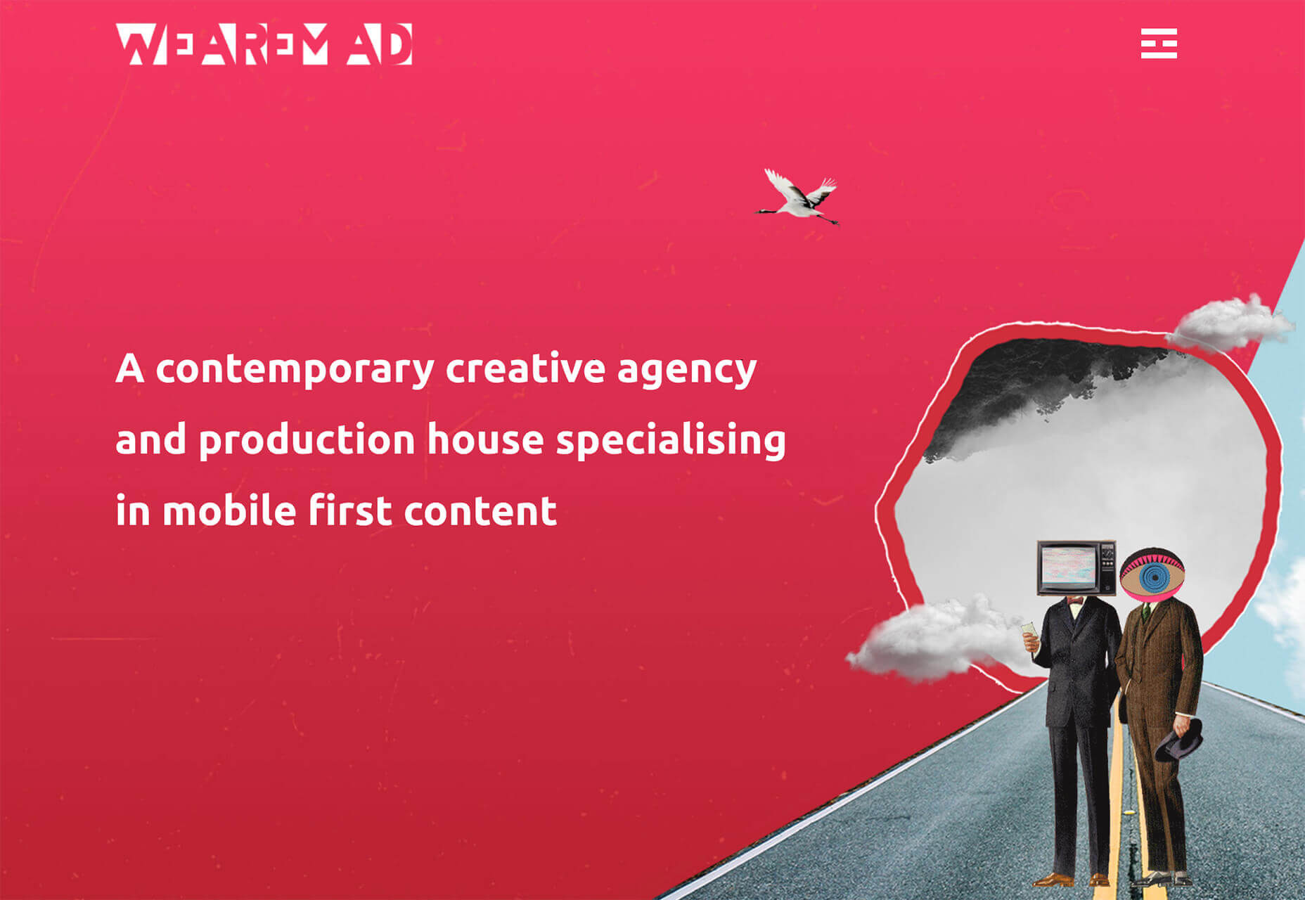
Oddball images can sell. We Are Mad stands out because it uses a contrived image, but doesn’t go oversized with it. The more subtle placement is ideal and arguably more attention-grabbing.
Conclusion
Website design can be a powerful thing, as these trends and examples show. Don’t discredit the power of choices in color, imagery, animation, and text when creating a digital experience. Design can mean a lot of different things depending on the audience as these examples show.
At the same time, these design trends are powerful and meaningful. They provide context into our world, our time, and our feelings. Don’t be afraid to experiment and make a statement with your design work. Just remember to keep in mind all potential impacts (positive and negative) before taking the project live.
p img {display:inline-block; margin-right:10px;}
.alignleft {float:left;}
p.showcase {clear:both;}
body#browserfriendly p, body#podcast p, div#emailbody p{margin:0;}
from Webdesigner Depot https://ift.tt/3ldAsNL
from WordPress https://ift.tt/2SpJc7e


No comments:
Post a Comment