
 By most terms of reference, 70 years is a long time…70 years ago, copywriter David Ogilvy decided to part ways with his former business partner, Edmund Mather; together, they had made up what was known as Ogilvy & Mather. This decision meant moving from London, where the company originated, to Manhattan, where the name of the company would change to just Ogilvy.
Now, as of June 2018, Ogilvy has announced a complete rebranding.
For a company that prides itself on “Making brands better” it hasn’t necessarily had it easy. The rebrand has been two years in the making; with the new face lift has come staff changes, new designs, and new financial reporting standards.
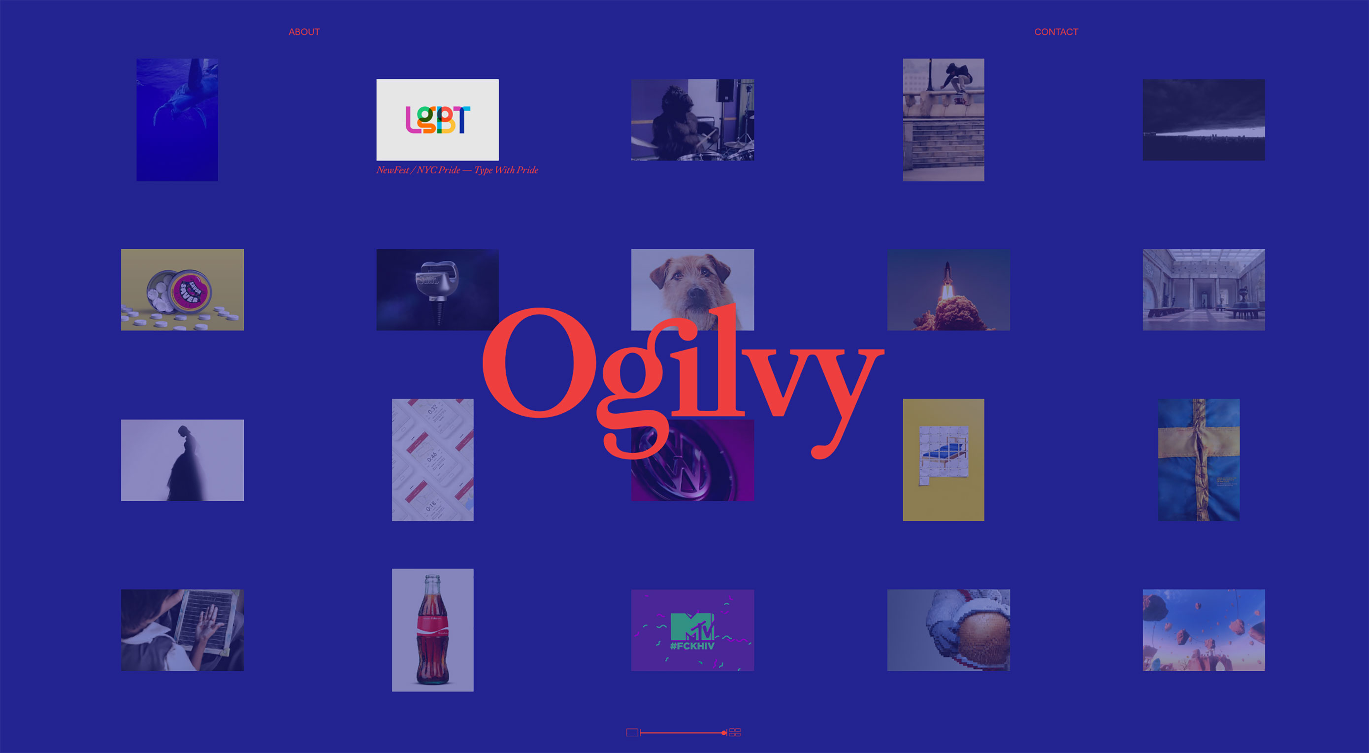
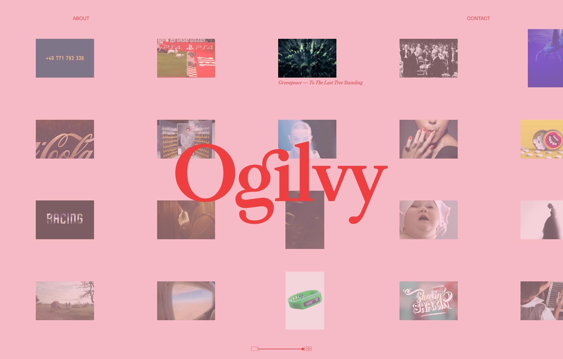
At the heart of this massive change is a new logotype, design, and colors. All of this can be viewed on its newly designed website.
When you visit the website, the new logotype is front and center. You’ll quickly be drawn into the moving images that are gracefully moving from right to left as you navigate through the new site. Each image now represents a case study of work. It’s also added an image resizing bar at the bottom, so you can get as few as two stories at a time on the page, or as many as a couple dozen. As if that’s not detailed enough, when you hover your mouse over any story, it changes the background to a random color, and the logo from black to red.
Brian Collins, founder and CCO at Collins design firm (and the former CCO of Brand Integration Group at Ogilvy), worked closely with Ogilvy to help create this new look:
The Ogilvy experience is about the relentless pursuit of excellence…Its [Ogilvy’s] clients, its team members, its partners—they all feel the same drive that ignites the whole company.
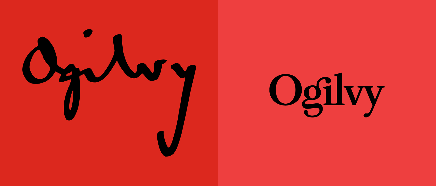
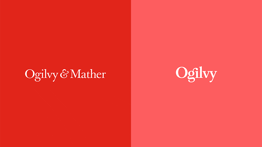
The old Ogilvy logo (left) and the new (right).
The lettering has changed from cursive, complex lettering to a more modern, more legible serif typeface. The colors have changed from a bright, vibrant red, to a more relaxed and calm red. According to its press release, this is to symbolize Olgilvy’s desire to be more modern while also paying tribute to the principles that got it where it is.
With all of this visual change came new principles. Ogilvy and Collins worked diligently to create the new positions based on five key values. These principles helped them determine the values of leadership within the newly branded company.
The change didn’t stop there. Many of the company’s sub-brands have been collected under one name. Among the absorbed names are OgilvyOne, Ogilvy PR, Social@Ogilvy and Ogilvy CommonHealth Worldwide.
To replace these divisions, the company has created 12 “crafts” (Creative, Strategy, Delivery, Client Service, Data, Finance, Technology, Talent, Business Development, Marketing and Communications, Administrative, and Production) and six “core capabilities” (Brand Strategy, Advertising, Customer Engagement and Commerce, PR and Influence, Digital Transformation, and Partnerships) that act as characteristics, values, and guidelines.
Now, the company operates as one. They’ve combined all of their marketing divisions. Ogilvy Enterprises, the successor to OgilvyRED will continue to work across all parts of the newly reworked organization.
“This is the next chapter, not the last chapter,” said worldwide chairman and CEO John Seifert. “This isn’t the Ogilvy you know,” he said, referring to how different the company will be after all the changes. According to him, there were much needed changes due to how complicated the organization had become.
14 specialists would walk into a room with slightly different Ogilvy business cards
Seifert explained that he wants the company to be centralized like it’s never been before. He said that it really reached the point of needed change when “14 specialists would walk into a room with slightly different Ogilvy business cards”, of course referring to how out-of-touch everyone was with the goal and the heritage of the company.
The company has also promised to bring more women on board. According to Seifert, Ogilvy’s looking to hire a substantial number of women all across the board in order to close the gender-gap.
Tham Khai Meng, current CCO of Ogilvy summarized it by saying this:
We are building on the creative heritage of David Ogilvy to fuel our future.
It’s very clear that Ogilvy aims to be better and more focused than ever before. From a design standpoint, their new logotype and website are now more visually appealing. It’s simple, yet effective. The new rebranding has been a huge success and will keep the company at the vanguard of design for years to come. It’s a daunting task to change a company from the inside out, but Ogilvy appears to have accomplished it beautifully, and it will only benefit from the ambitious change.
https://www.webdesignerdepot.com/wp-content/plugins/wp-fs-polls/widget/poll.js.php
| Add Realistic Chalk and Sketch Lettering Effects with Sketch’it – only $5! |
p img {display:inline-block; margin-right:10px;}
.alignleft {float:left;}
p.showcase {clear:both;}
body#browserfriendly p, body#podcast p, div#emailbody p{margin:0;}
from Webdesigner Depot https://ift.tt/2sIFw43
from WordPress https://ift.tt/2Hub02s
No comments:
Post a Comment