
 When looking at good design, I often look for things that aren’t totally obvious. There’s an instinct that you like something before you know why. That’s the common thread among this month’s three essential design trends.
From animations that delight and take projects to the next level, to white space that makes a design so approachable, to dark color overlays that enhance readability, these trends contribute to better user experiences.
Here’s what’s trending in design this month:
1. Next-Level Animation
Nothing makes you want to click around and engage with a website like a delightful animation.
While full-screen video is still one of the most popular animated effects of the year, other opportunities for animation can be just as impressive. Use animation to bring attention to certain elements, create the scene for your story and grab user attention or prompt continued engagement with an interesting way to navigate a design. Each of these techniques is used in the examples below (you should definitely click through each to see the animated effects in action).
What makes a good animation? Here’s how each of these designs takes animation to the next level:
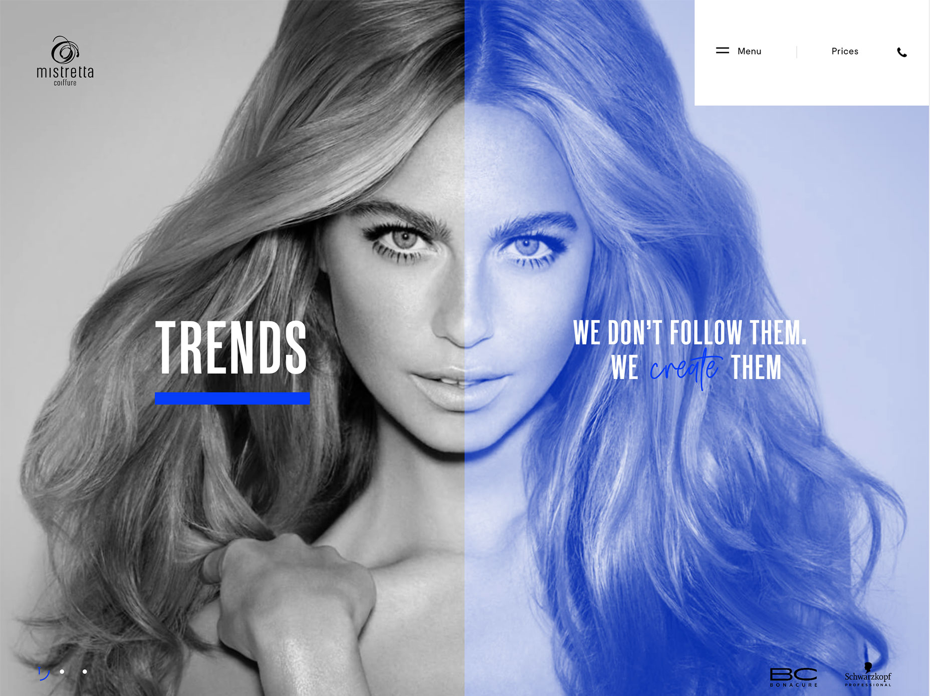
Mistretta Coiffure uses a water effect over still images so that the whole background seems to be right below the surface of a pool. Text elements are static to ensure readability. The effect isn’t overwhelming and it’s something that feels unique to the content of the website for a salon—which uses a lot of water.
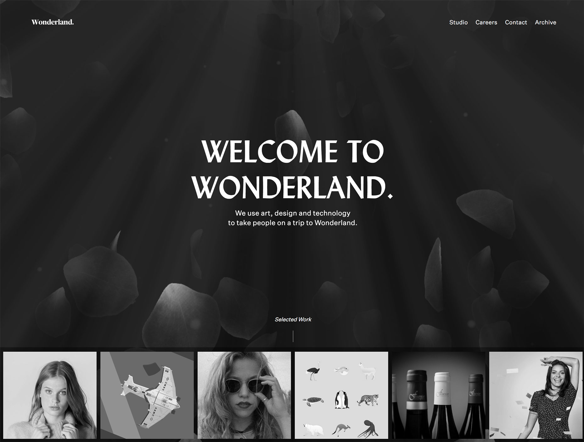
Wonderland uses animation in a more interactive way, meaning users have to engage to activate it. Each of the photos in the row across the bottom of the screen serves as a secondary navigation element. Hover over any one and it pops up into a larger element and impacts the background as well. This instance of a cool hover animation can help encourage users to interact more with the design.
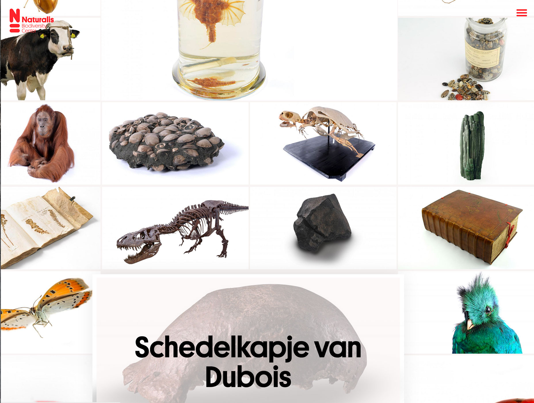
Naturalis Topstukken takes a completely different approach—every card in the design is part of the complete website. User-controlled animation allows you to drag and drop elements on the screen to enter different parts of the website. It almost feels like a game. The design is highly engaging and for those that don’t quite “get it” the screen scrolls on its own after a few seconds to encourage that first click.
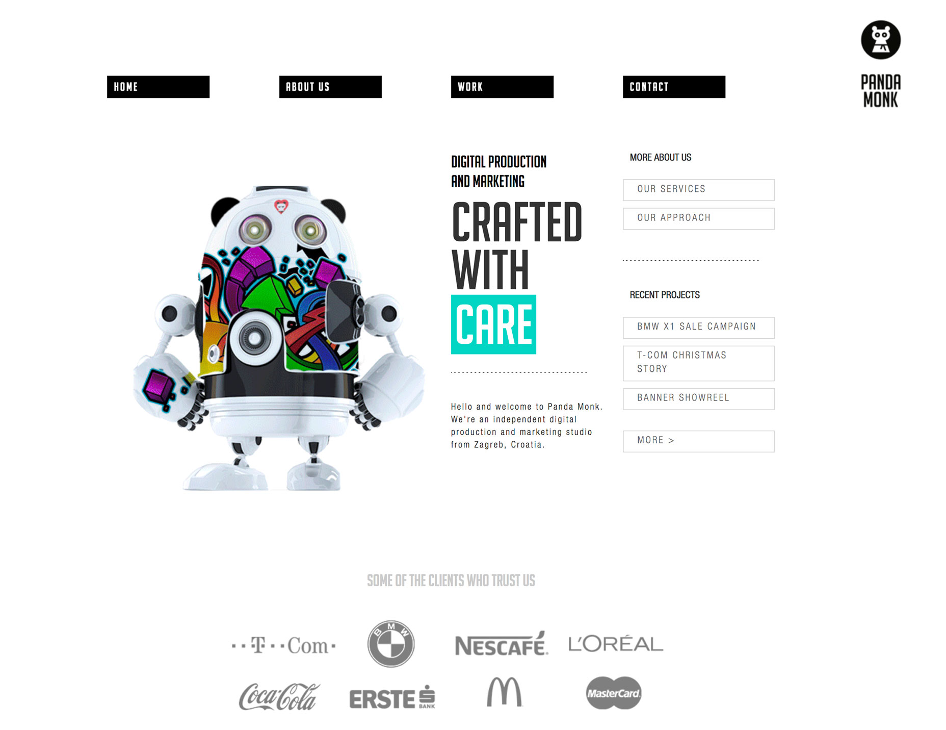
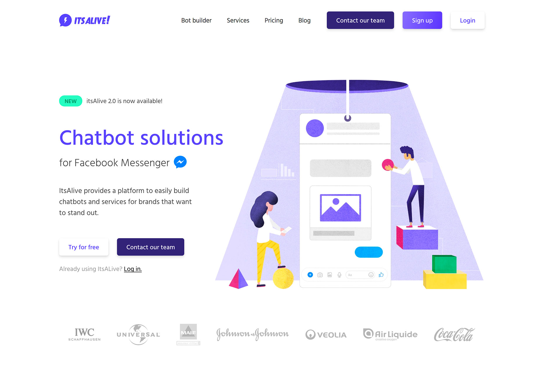
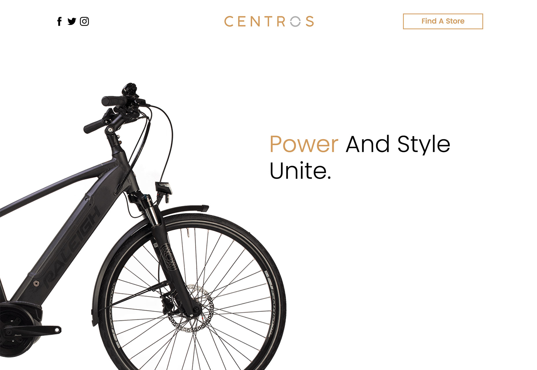
2. Large White Margins
One of the most dramatic—and easy—ways to draw attention to a design or specific element is through appropriate use of white space. While many designs have trended toward more packed full-screen designs recently, there’s a growing shift back to open space.
And there’s a reason for it.
This technique and design make content the focus for users. Elements surrounded by white space are obvious focal points. The simplicity and balance of such as design is easy to engage with and isn’t overwhelming to the user.
Maybe one of the best things about a design with so much white space is that it feels approachable. The clean white space in the design does draw you in.
Think about some of the color associations of white—purity, light, goodness, perfection, cleanliness, safety—all of these are inviting and welcoming feelings that come with an open white background.
Looking at the examples below from Panda Monk, It’s Alive, and Centros, it’s easy to see how this feeling comes from each of the designs. It’s as if each website is inviting users to engage and learn more.
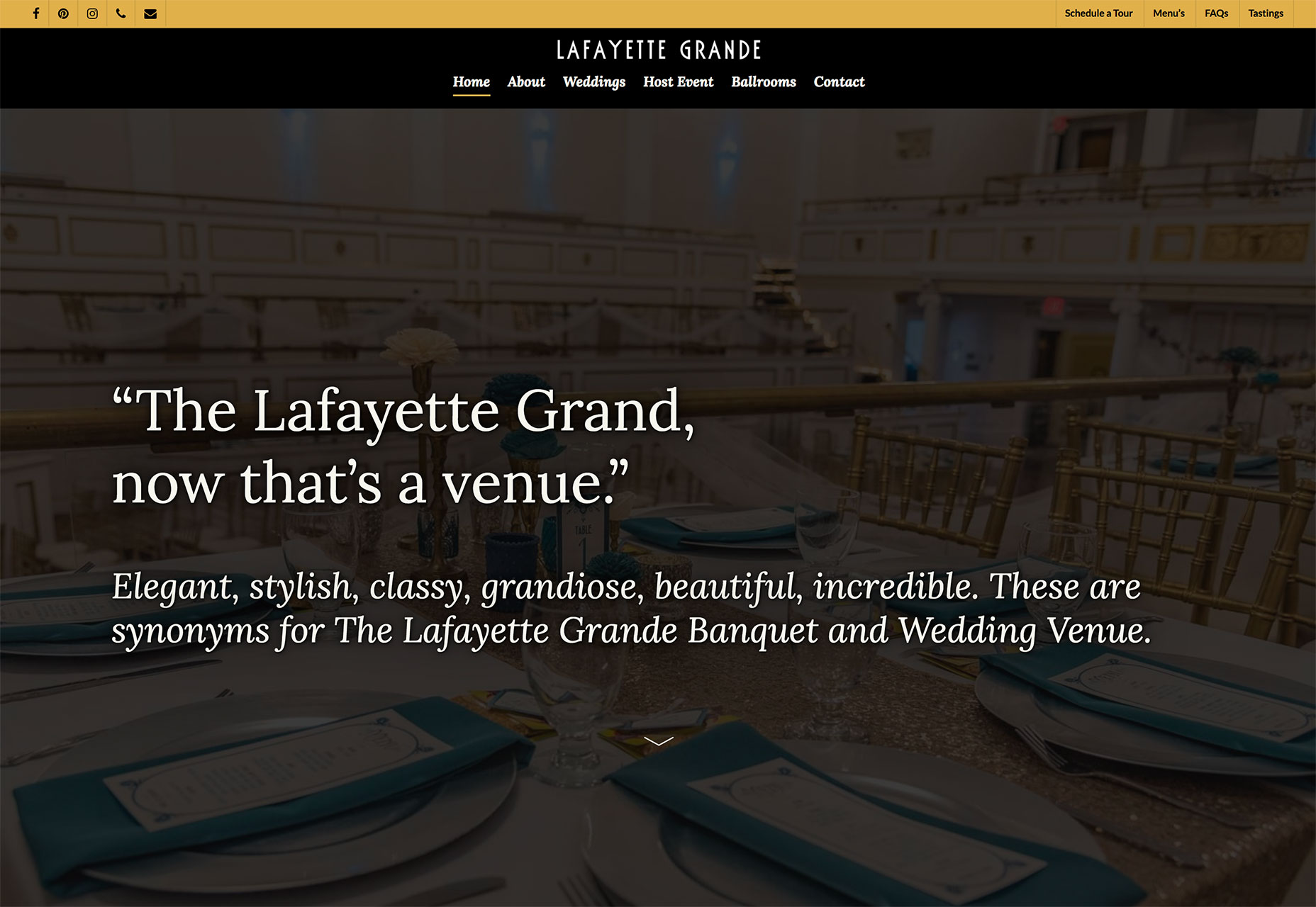
3. Dark Color Overlays
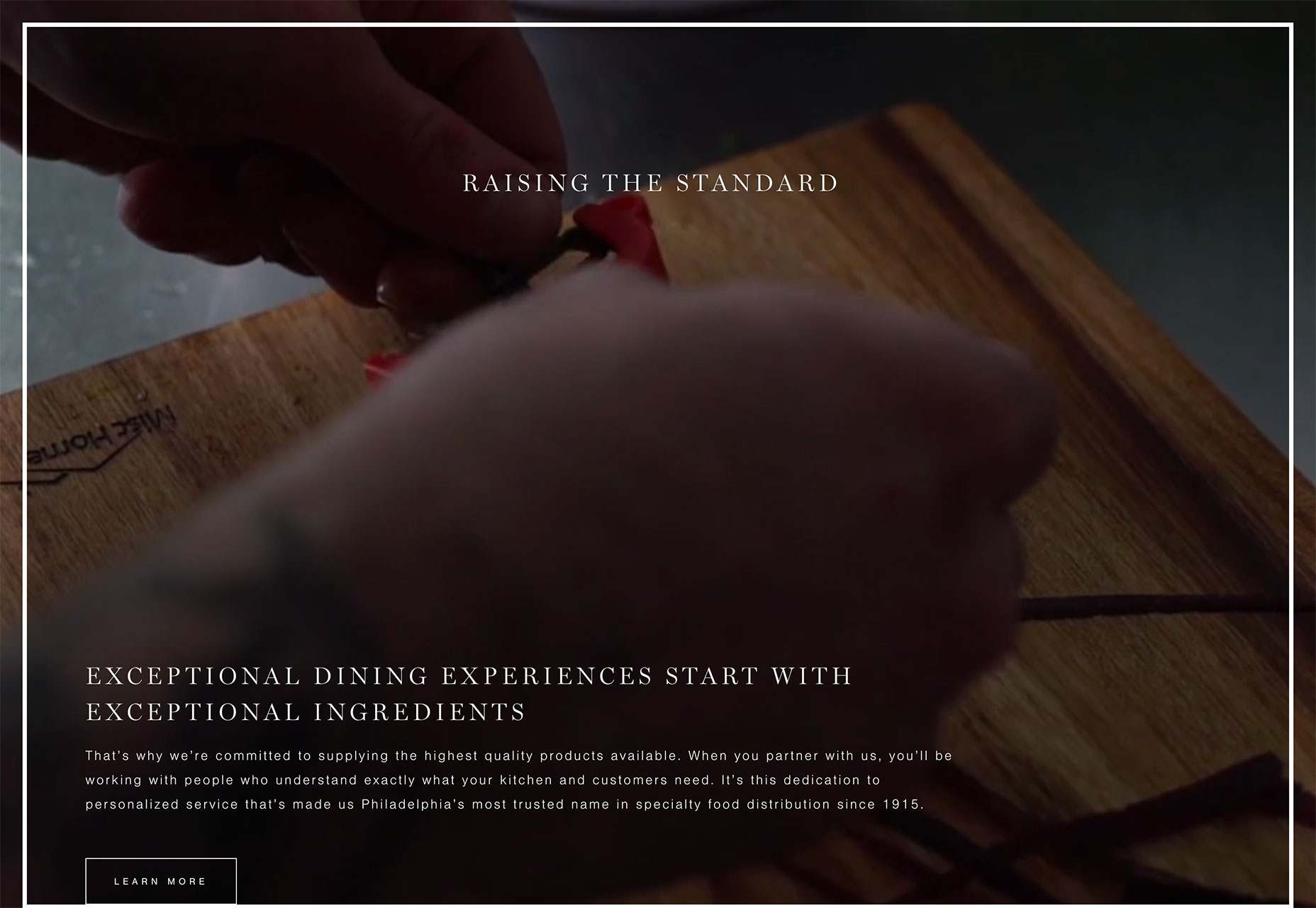
One of the website design trends that’s been popular is use of dark backgrounds in design projects. That trend has extended to the foreground with dark color overlays on images as well.
While this technique can look cool and help emphasize brand colors, there’s another key reason for using dark color overlays. This technique can help make text elements more readable over photos or backgrounds elements with varying light and dark colors.
Each of the examples below uses this concept in a slightly different way:
Lafayette Grande frames an image with a dark color overlay with a double-stacked navigation menu using brand colors. It creates a solid frame that then drives users down to the main headline.
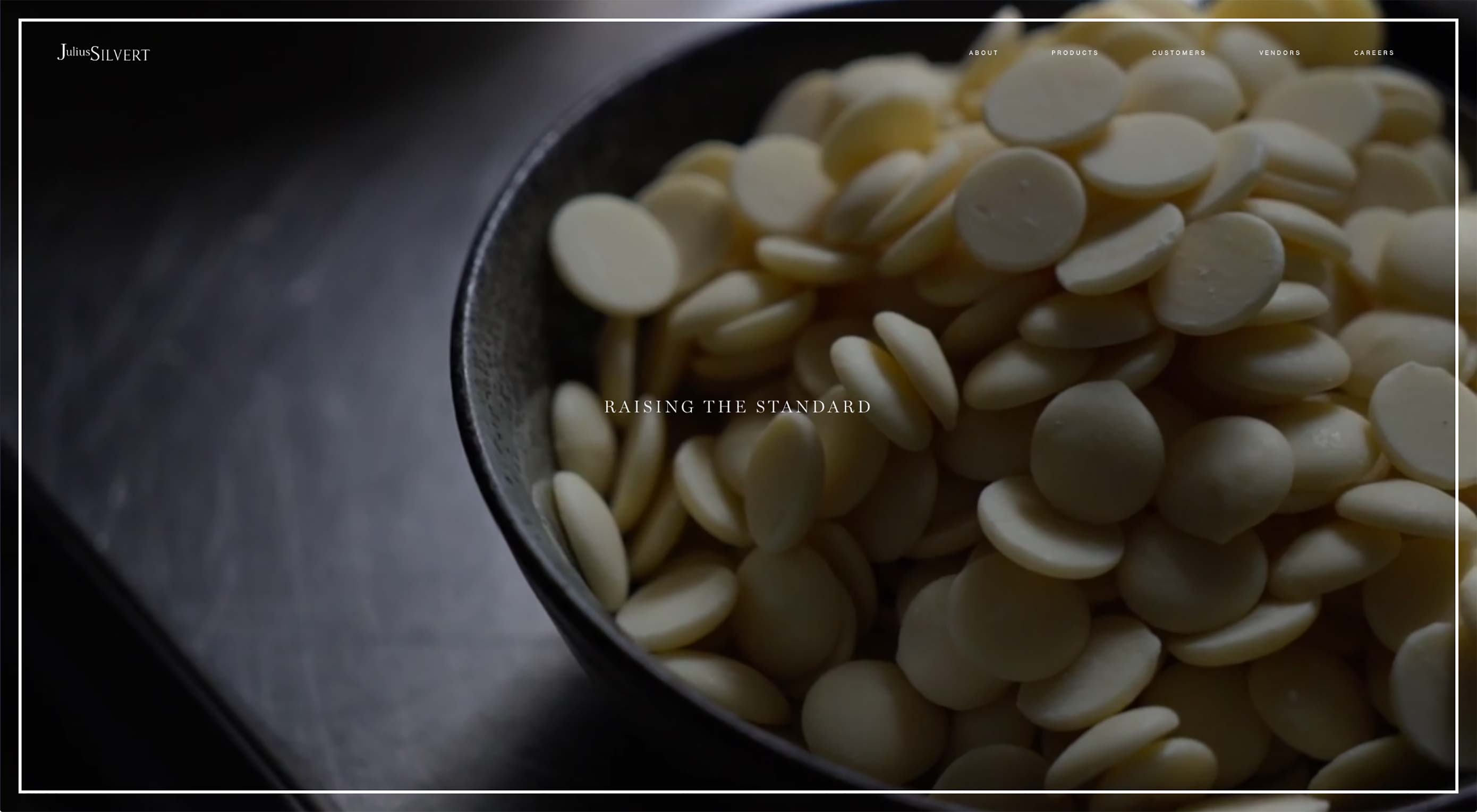
Julius Silvert uses a full screen video b-roll background where all of the images have a mostly transparent dark color overlay. On scroll, the overlay darkens to a mostly saturated box so that text is easy to read while the video still runs in the background. This is a great solution to the probable presented by moving images—it can be tough to find a good place to put text elements so that they are easy to read at all times. The dark color overlay solves this problem nicely.
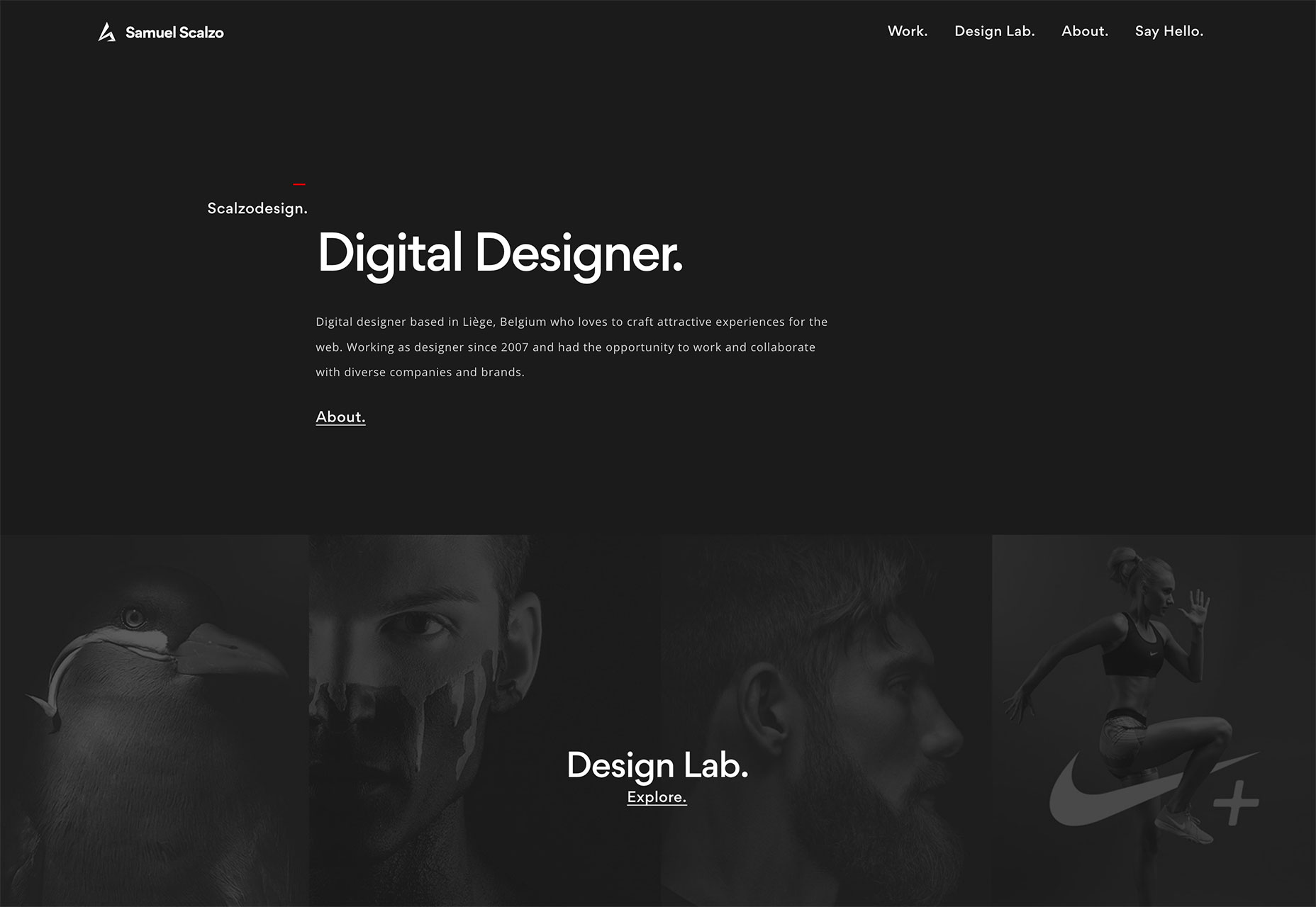
Scalzo Design uses a dark background plus dark color overlay on images to draw users into his portfolio. The overlay shows that there are visual elements to explore but maintains a focus on the words first, before users get too deep into visual content. This leaves users with the information that Scalzo is a designer first and showcases the work second for a strong first impression.
Conclusion
While some of the animated techniques featured here are more complex techniques, you can start small with a similar idea. The key to using any trendy design element is that it works with the content in the design, contributing to the overall message.
| Add Realistic Chalk and Sketch Lettering Effects with Sketch’it – only $5! |  |
p img {display:inline-block; margin-right:10px;}
.alignleft {float:left;}
p.showcase {clear:both;}
body#browserfriendly p, body#podcast p, div#emailbody p{margin:0;}
from Webdesigner Depot https://ift.tt/2Q2NSNH
from WordPress https://ift.tt/2Q4R8YD
No comments:
Post a Comment