
 Before you ever sit down to design a website for a client, you develop user personas that are representative of their target audience. Once you’ve established an identity for the main user (or users), you can more easily shape an experience that caters to their needs and motivations.
But what do you do when the target audience isn’t so clearly defined into one or two neatly packaged personas?
Take a website like Zappos, for instance.
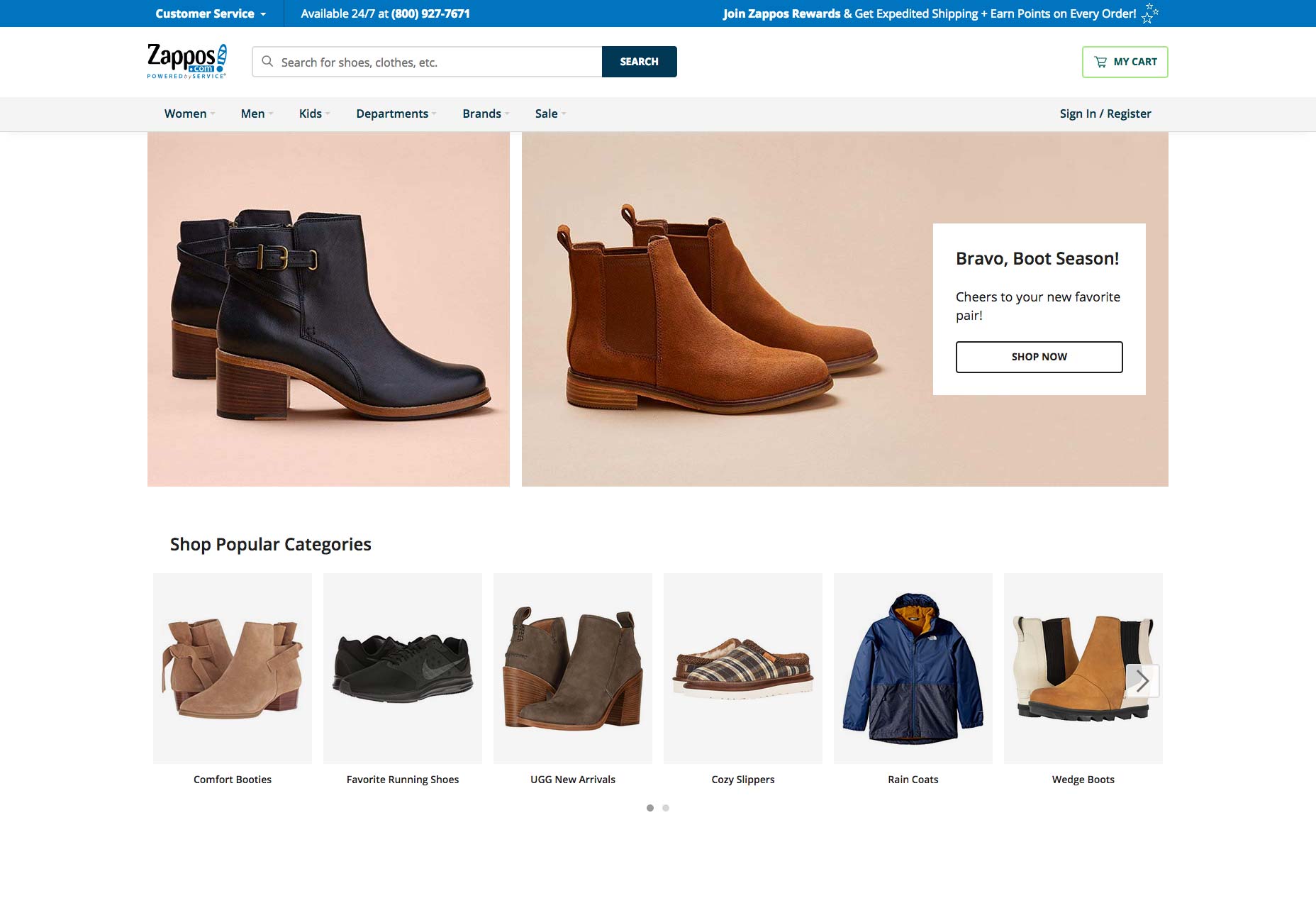
Zappos serves customers all over the world. So, how does one go about designing a website for an unidentifiable audience? Granted, you would know they’re interested in purchasing shoes and accessories online, but that’s about it.
Today, I’d like to address the matter of geography in web design as it’s an important one to consider and could have a significant impact on your conversion rate if not handled properly.
How to Design for a Global Audience
You might think it’s easier to design a website that appeals to international consumers than, say, one that targets users in a smaller geographic region. After all, if you’re not focused on targeting one segment of the population, then anything goes, right?
Not so fast…
Great care must be taken when designing a website that’s meant to appeal to an international audience. Here are 7 ways in which you can safely design for and appeal to a broader, global audience:
1. Make Translation Easy
Unless your website speaks directly to an audience located in a region of the world that speaks the same language, it’s better to plan for a space on your site that allows for quick translation. For many websites, a language/country widget appears in one of the four corners of the site—in the header or the footer.
Ideally, so long as visitors can find it easily, it doesn’t matter where you add it to the design.
For instance, this is the Smart car website:
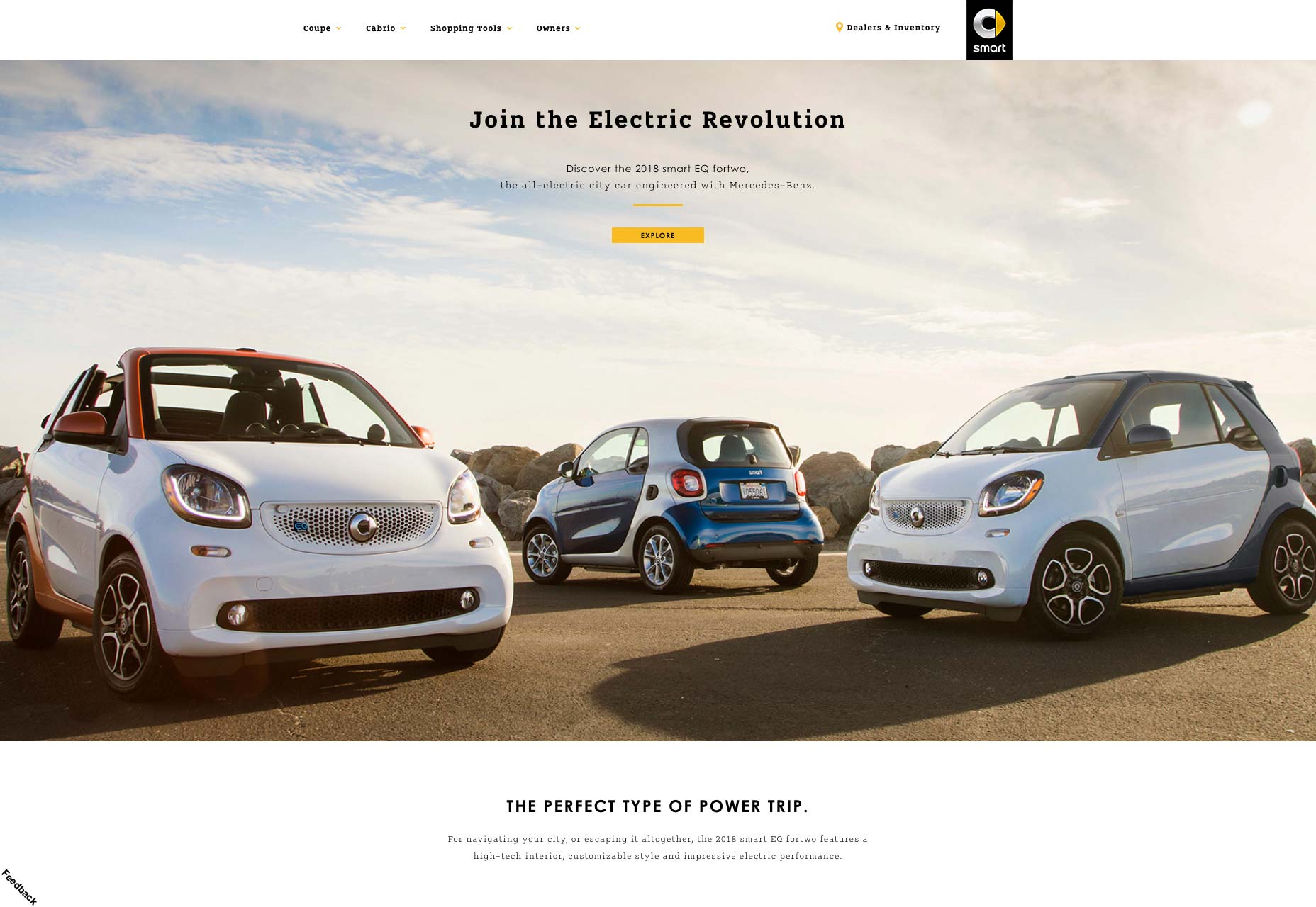
In the bottom-left corner of the page, users can select their Country/Region. This makes the site go from something like this in English:
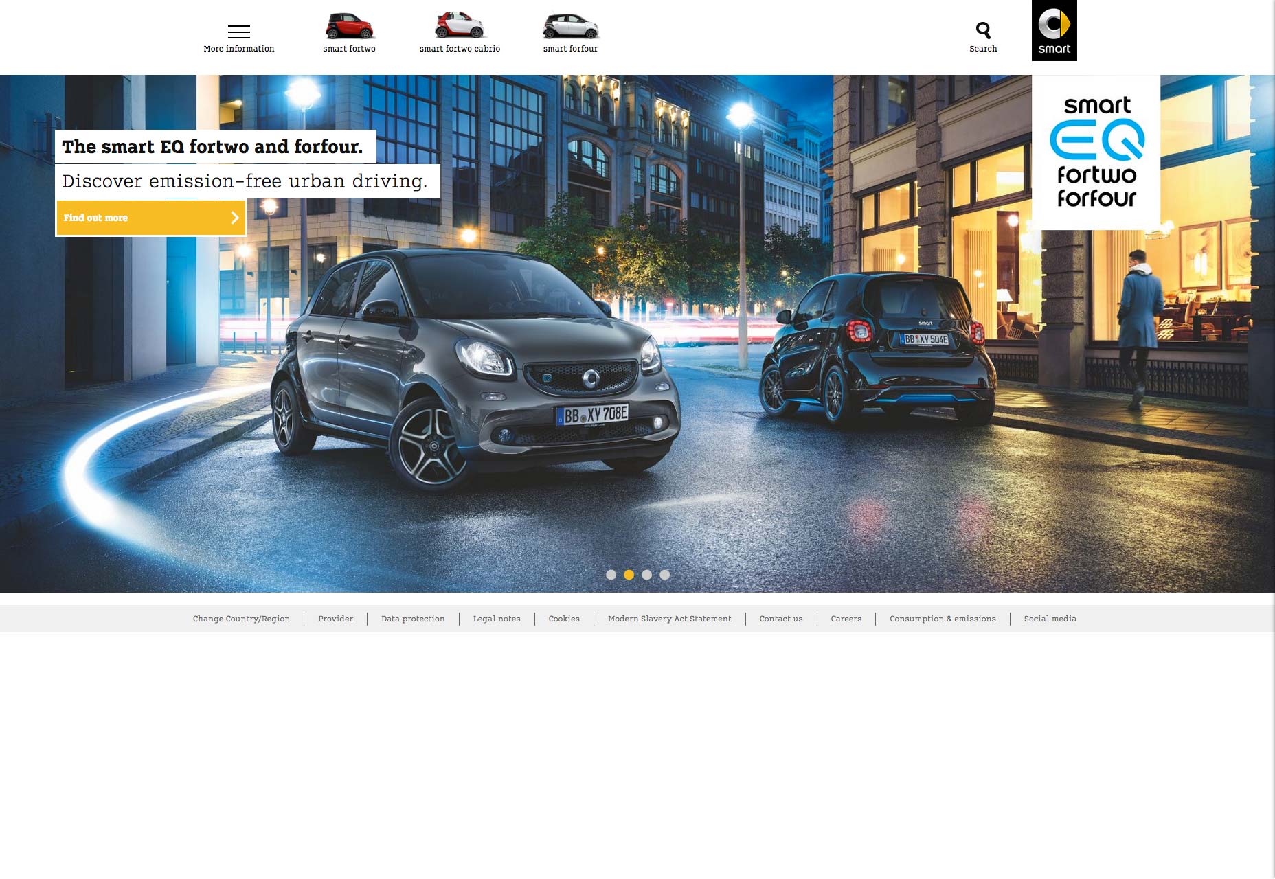
To something like this for Russian speakers:
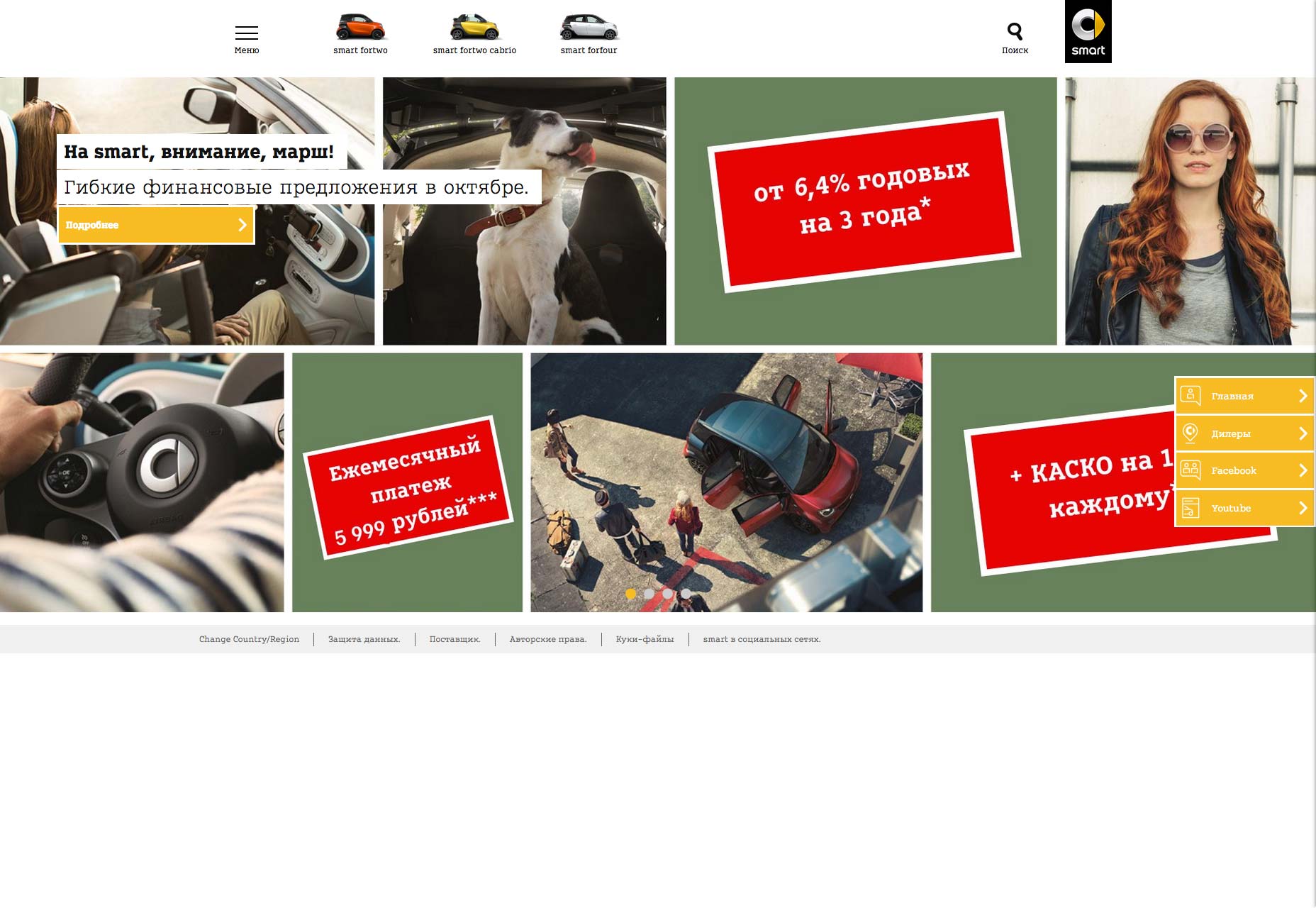
Not only does this translate the website for users, but it also provides them with localized information, targeted at their geographic location.
2. Keep Design Minimal
Because you’re designing for a large, international audience, you have to be very careful with certain design factors that might not be perceived the same way from country to country. (I’ll discuss each of those a bit further down below.)
To ensure that your design:
- Doesn’t offend anyone;
- Is accommodating of other languages and cultures;
- Plays well with browsers and devices for users around the globe;
- Performs just as well for someone located next door as someone located halfway across the world.
Use a minimal design.
This allows you to present a clean and simple narrative that won’t be disrupted by any number of factors that could get in the way.
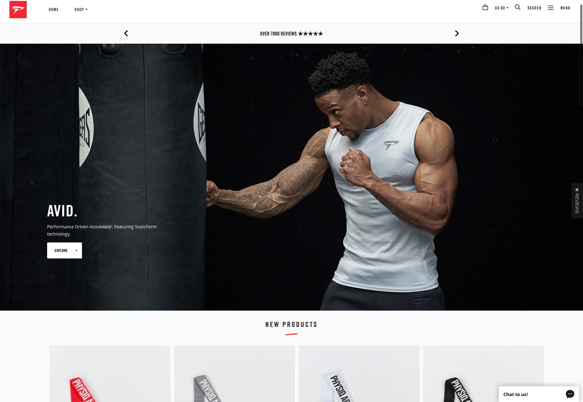
Take Physiq Apparel, for example. There isn’t much needed in the way of text as the strong image speaks for itself. The navigation also contributes to this overall uncomplicated and universally appealing design.
3. Watch the Layout
Thanks to responsive design, we don’t really have to worry about strange layouts not translating well from one user’s device to another’s. That said, when you take a website that’s written in one language and put it into another, you do have to think about layout and spacing in a way that you wouldn’t for monolingual sites.
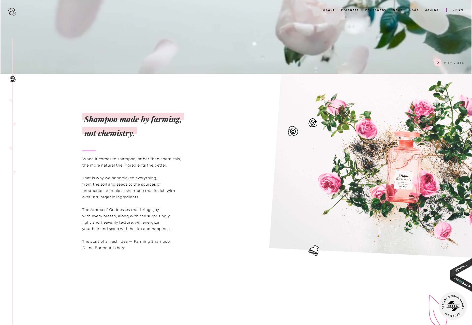
Diane Bonheur’s website is the perfect example of this.
Here is the English version of the site:
Now, slowly scroll down and compare the same section in Japanese:
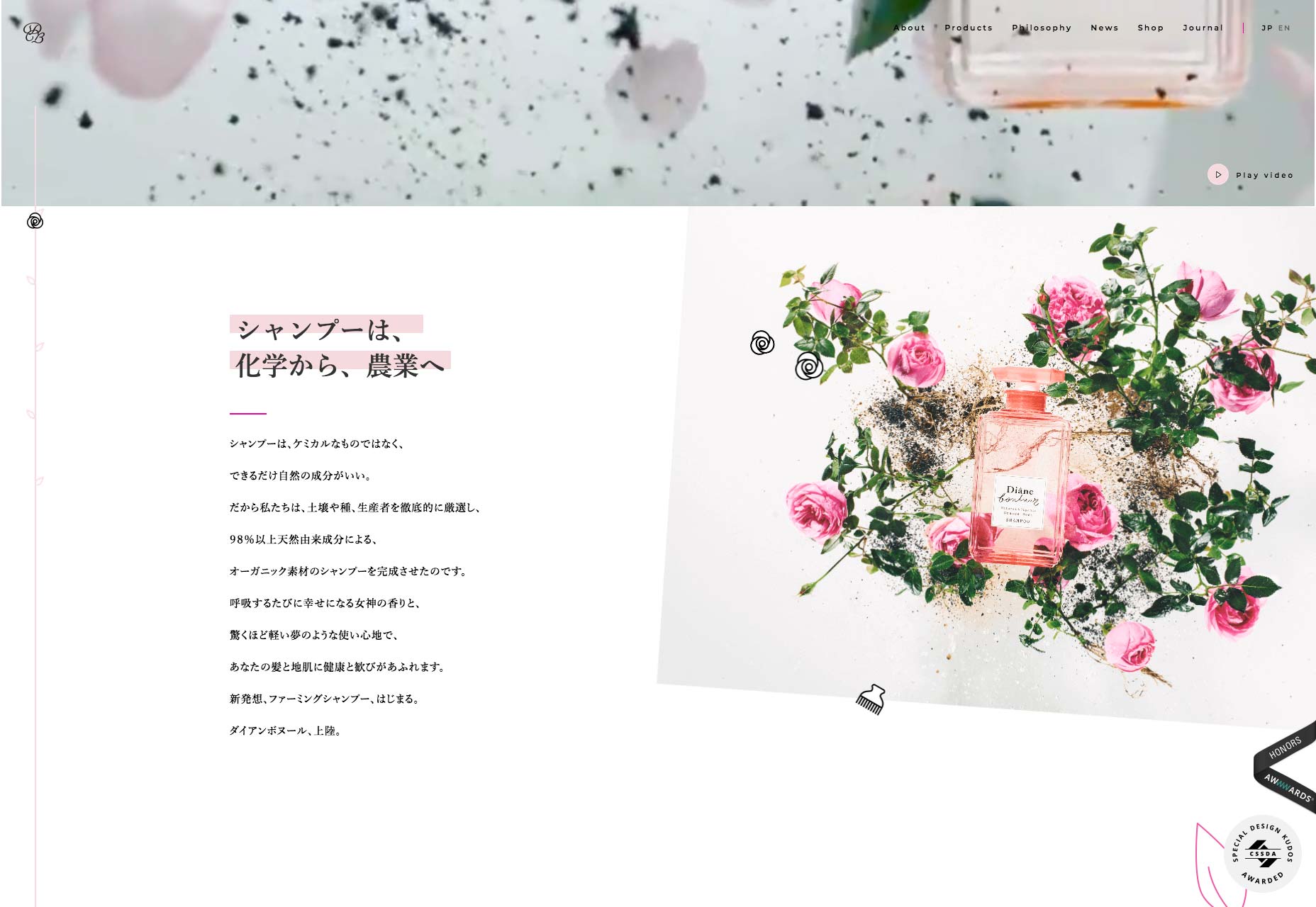
The design is slightly off for both because of how much room each of the languages need. For starters, they’re not identical translations, which leads to a variation in number of lines. And, because they use different character sets, spacing is much different, which actually leads to more of the pictures being revealed for Japanese visitors.
Varying alphabets. Text direction (right-to-left, top-to-bottom, etc). Length of translations. Pay close attention to these subtle distinctions between languages, so you can plan the design for to work well with all of them.
4. Use Safe Colors
Understanding something like complementary color contrast makes sense in the work of every web designer. As does the matter of using colors that work well in terms of accessibility. But what about the psychology of color and how that translates in other countries? That’s why major e-commerce sites like Amazon, Zappos, and Walmart use neutral-colored interfaces.
Their logos have color within them as do the products sold on the websites, but each of these sites plays it safe by avoiding major swatches of color that could hold a negative connotation for some users.
5. Personalize But Don’t Localize Images
Images are another element to be careful with as you don’t want to isolate or unintentionally offend any of your audience if you’ve favored one geographic segment over another. As such, when choosing images for your site, consider personalizing images for the different geographic subdomains, but don’t localize them.
Here’s what I mean by that: Belmond uses this video to welcome visitors to its English landing page:
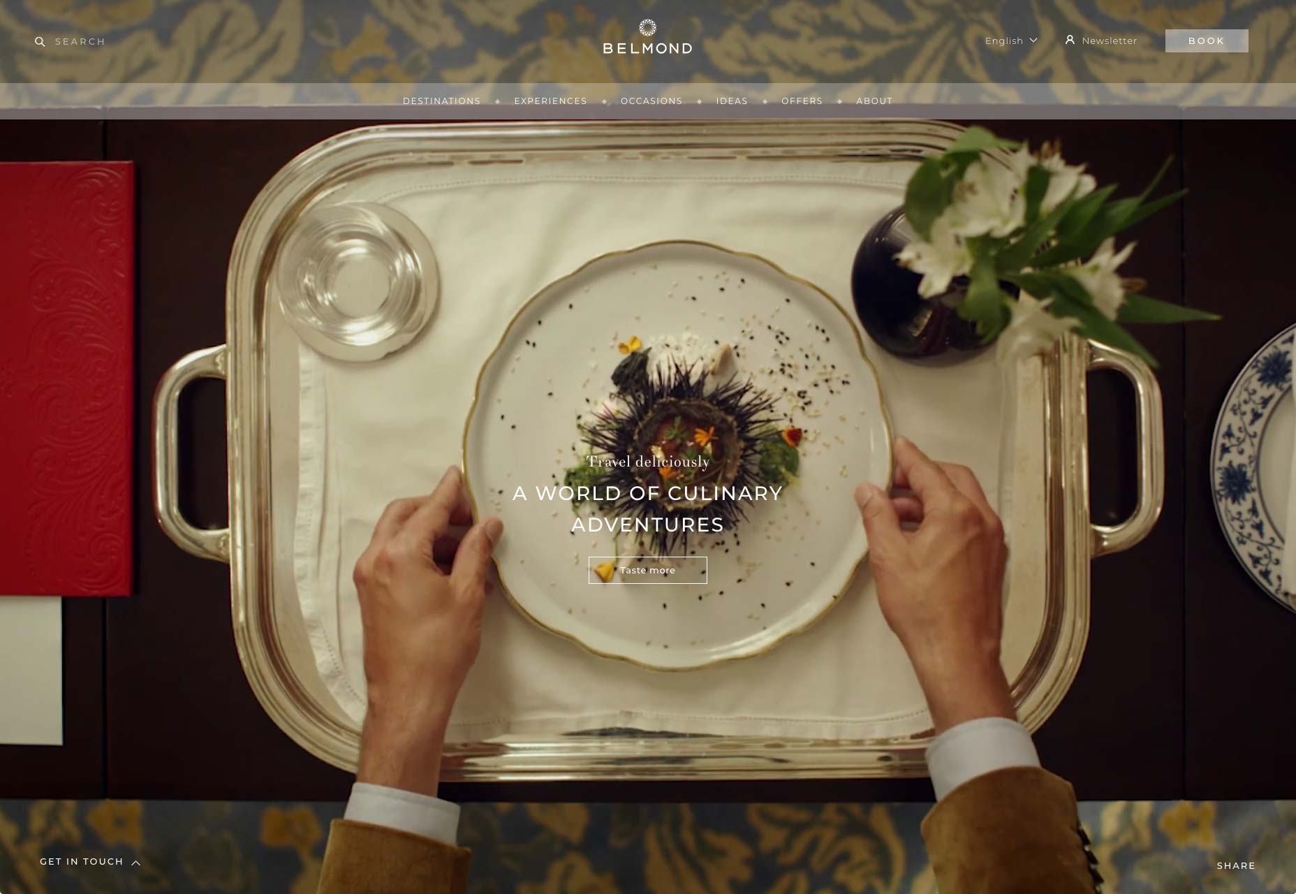
For other speakers, it uses a variety of welcome images, including this one:
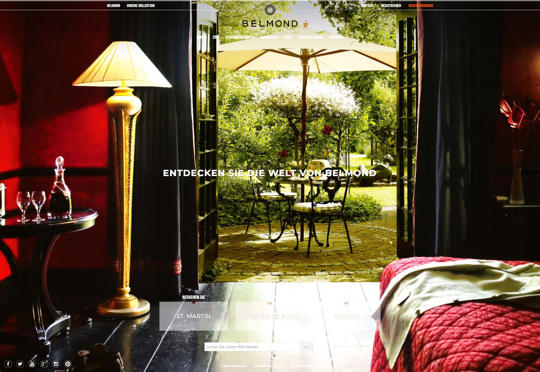
Instead of putting the focus on people that are representative of the cultures or geographic areas this site targets, the designer is highlighting the experience sold here.
6. Be Careful with Shorthand
When designing e-commerce sites for English speakers, there are certain icons your users likely recognize that allow you to establish a sort of shorthand for headers:
- Three horizontal lines laid atop one another for a hamburger menu;
- A shopping bag holding the place of the online shopping cart;
- A magnifying glass for search.
While it’s okay to use some symbols to cut down on clutter, you have to be careful about which ones you use on international websites. If you can’t guarantee that each symbol included in the interface will be understood, it’s probably best to spell each of those elements out as Bellroy has done:
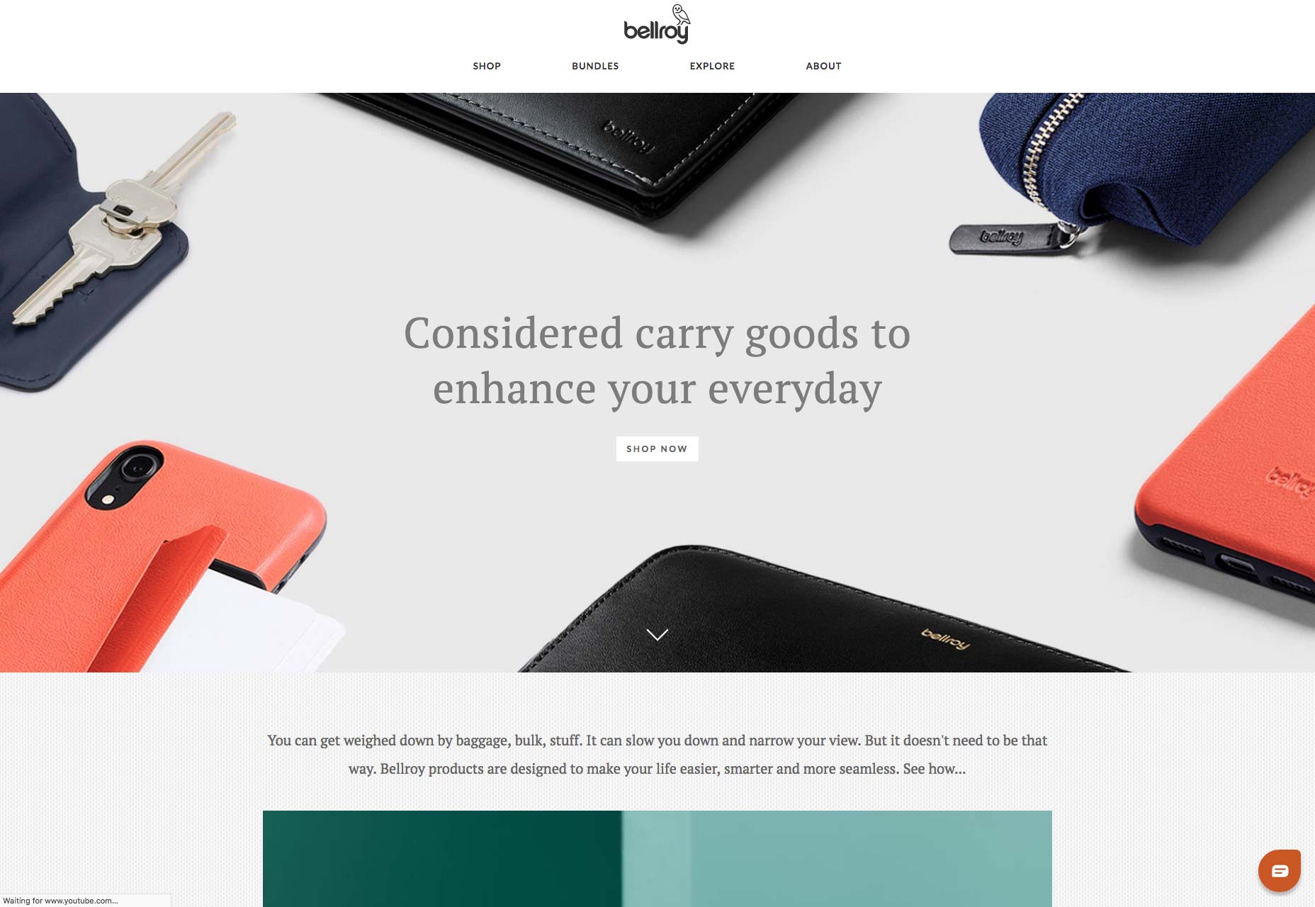
As you can see towards the bottom-right, Bellroy does still use a symbol for live chat. However, since this icon is encapsulated in a button-like design element, this is fine. Users will be prompted to engage with it, unlike the header which needs to remain simple in design.
7. Simplify Contact Form Design
Unless you want to build out specially designed contact forms for each language your site is translated into, it’s best to use a universally friendly form design.
Here is a good example of this:
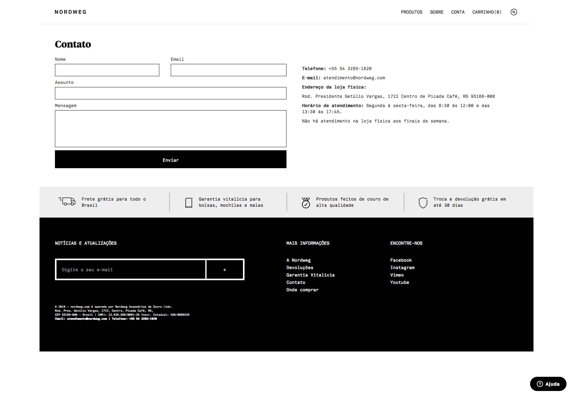
As you can see, Nordweg keeps it simple. Each element of the form is clearly and simply labeled outside the field (which is good for accessibility, too). And, more importantly, it isn’t formatted in a way that suits one user over another.
Take, for instance, contact forms that ask for a First Name and Last Name, and in that specific order. In some cultures (like Japan), that logically wouldn’t make sense as the last name should appear first and you might run into issues with users providing their last name as a first name and vice versa.
Or what about addresses? You ask for the Street, City, State, and Zip Code… but those fields don’t apply in every country. Even if they do, they aren’t always formatted the same way. The same goes for phone numbers.
So, be careful about how you design contact forms. They should be something your users want to fill out and not something that makes them question whether you cater to customers in their geographic region.
Where in the World Is Your Audience?
To design a website that’s welcoming of all visitors, it requires a certain degree of sensitivity and balance. The 7 tips above will get you started in thinking the right way towards your global users.
For those of you who design websites for the opposite end of the spectrum, stay tuned for my next article which handles designing for the local consumer.
| Add Realistic Chalk and Sketch Lettering Effects with Sketch’it – only $5! |  |
p img {display:inline-block; margin-right:10px;}
.alignleft {float:left;}
p.showcase {clear:both;}
body#browserfriendly p, body#podcast p, div#emailbody p{margin:0;}
from Webdesigner Depot https://ift.tt/2z7SZok
from WordPress https://ift.tt/2D5c3bg
No comments:
Post a Comment