
 Welcome to our roundup of the best websites launched (or relaunched with major updates) in the last four weeks.
This month’s offering sees the end of Winter and the beginning of Spring, and many sites this month reflect that change with rich colors. To counter that, there’s some high-contrast black and white work on show. You’ll also find innovative uses of images and video. Enjoy!
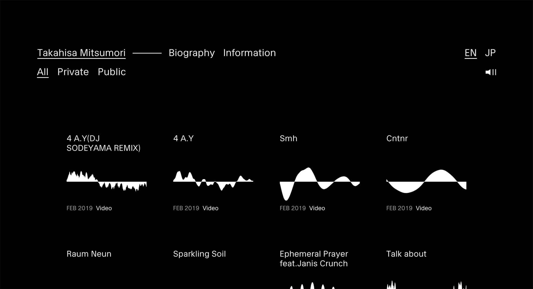
Takahisa Mitsumori
A leading exponent of digital music, Takahisa Mitsumori is a Japanese musician now based in Berlin. His simple site blends minimalist Japanese graphic design, with a Swiss Design approach to create an intriguing visual interpretation of his sounds.
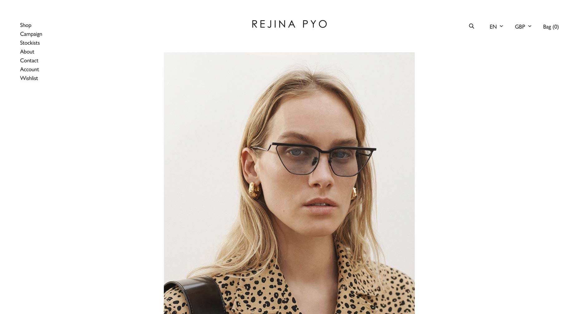
Rejina Pyo
A lot of designers acknowledge the merits of negative space, but how many truly embrace the concept? Rejina Pyo’s site is an exemplary example of how to use white space to frame images, giving the whole site a modern, sophisticated look.
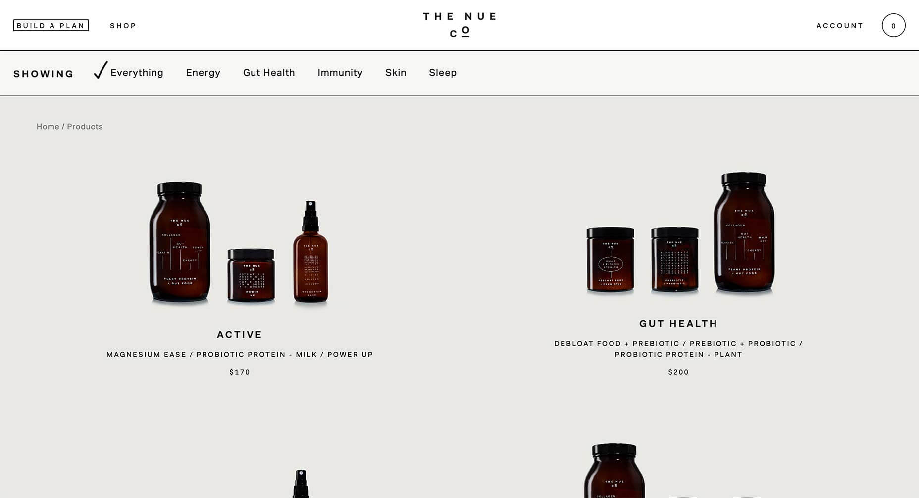
The Nue Co.
With so much color on the web in recent months, its startling when you encounter a black and white, high-contrast approach. The Nue Co. uses a little subtle color in its product images, but the whole site is mostly black and white, and all the more impactful for it.
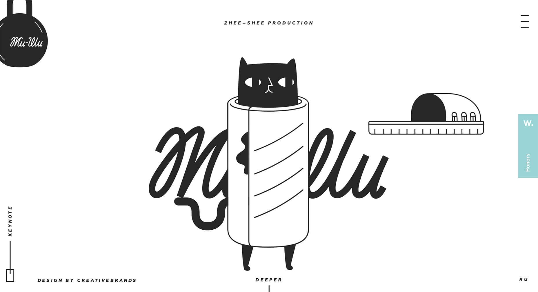
Zhee-Shee Production
Illustration is a huge trend for 2019, but so many designers are following the same patterns, resulting in derivative work. But not Zhee-Shee Production, whose charming, witty illustrations manage to straddle corporate interests, and pop culture.
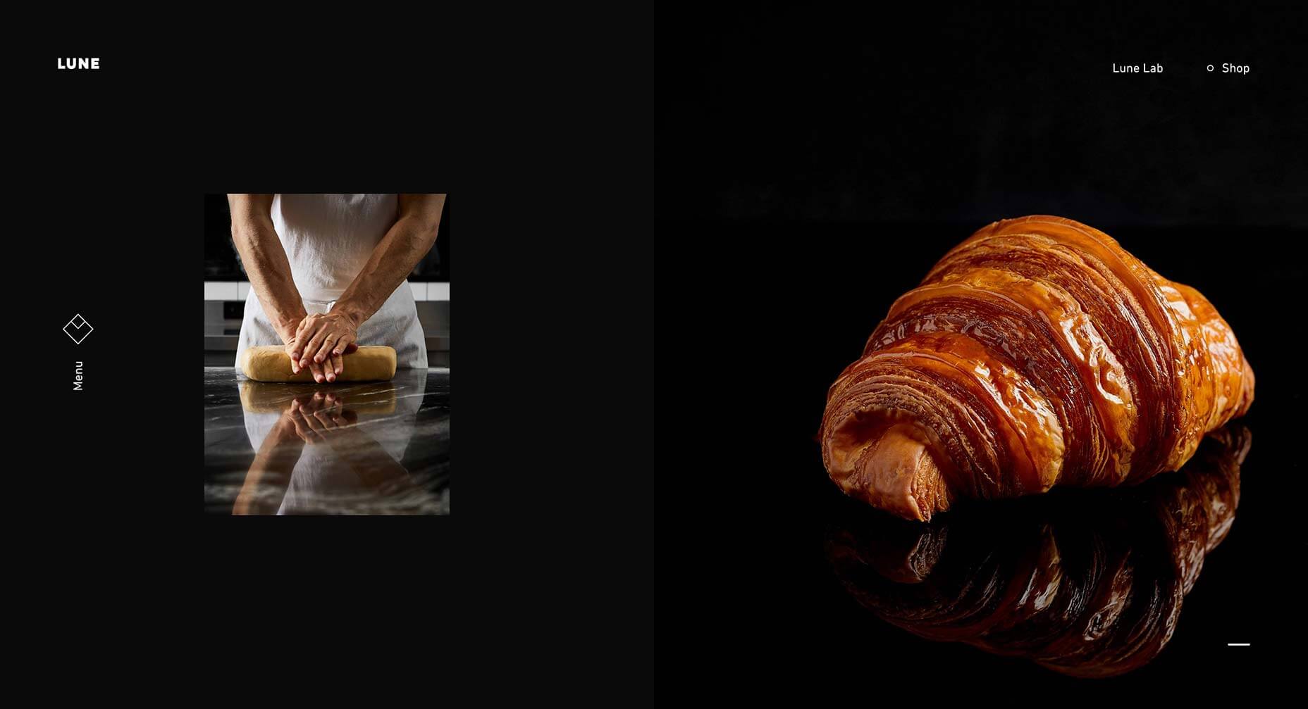
Lune Croissanterie
Some people take themselves far too seriously, and Lune Croissanterie may fall into that trap. The Melbourne-based company isn’t a shop, or a factory, it’s an experience dedicated to the perfection of the croissant. It’s the most committed pastry site I’ve ever seen.
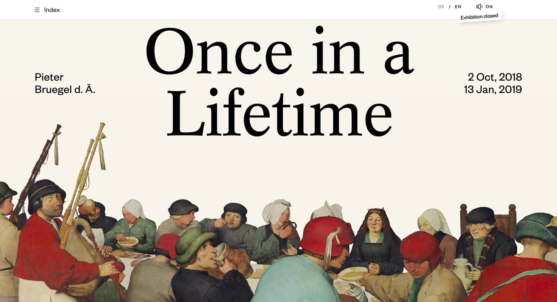
Bruegel: Once in a Lifetime
This magnificently animated site for an exhibition of works by Pieter Bruegel the Elder, takes enormous liberties with the Flemish master’s artwork, but wonderfully captures the spirit of his anarchic, surprising, and honest depictions of everyday life.
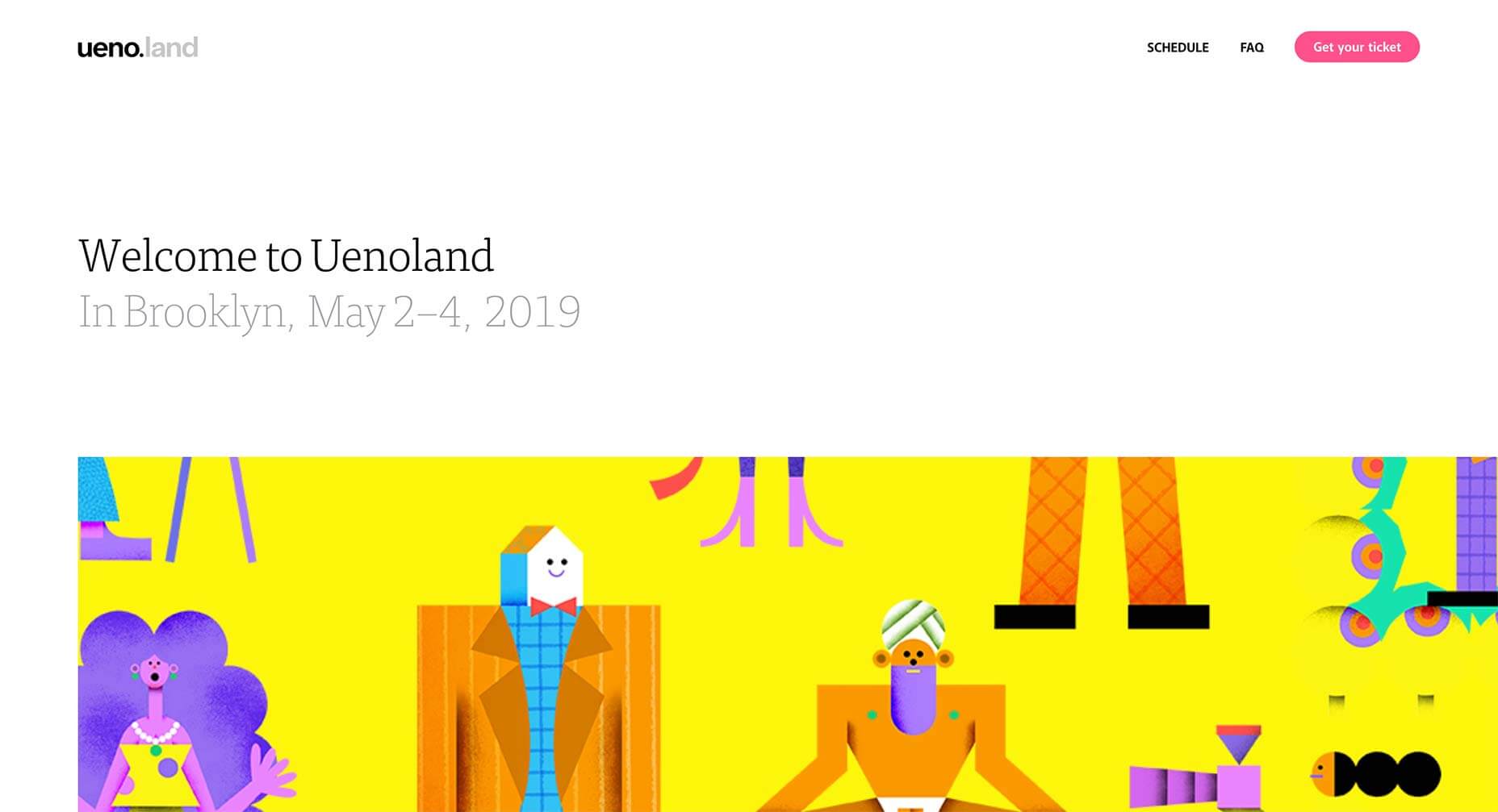
Uenoland
Uenoland is a design conference taking place in Brooklyn from the 2nd to the 4th of May. Its one-page site has a design-centric Medium feel, with on-trend illustrations, and a clear type hierarchy. One of the few times when over-indulging design trends is an appropriate approach.
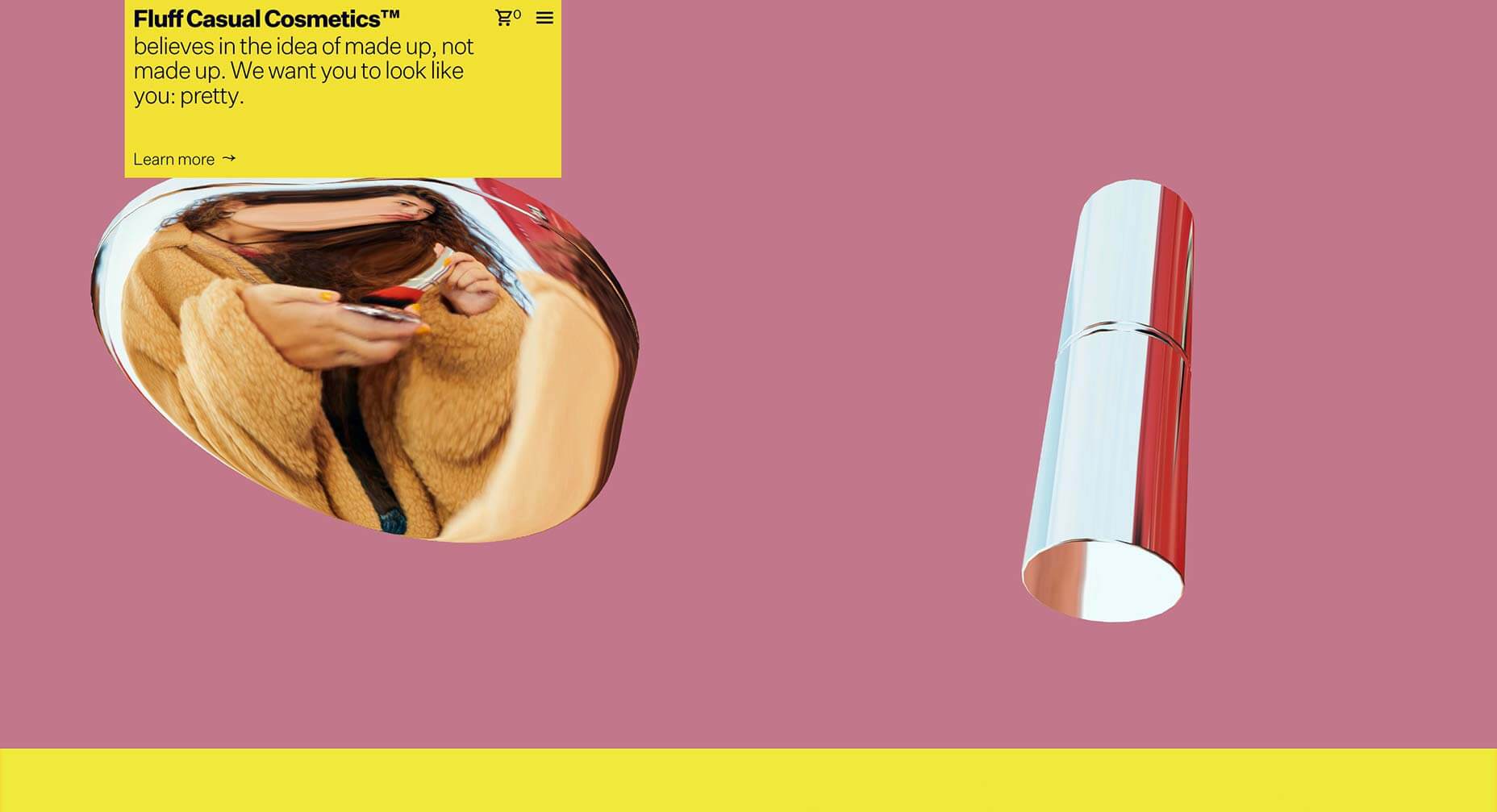
Fluff
Fluff Casual Cosmetics are on a mission to make you, look like you. Its daring approach is designed to appeal to a much younger audience than many cosmetics companies, and its use of programmatic animation, and moving videos perfectly target that demographic.
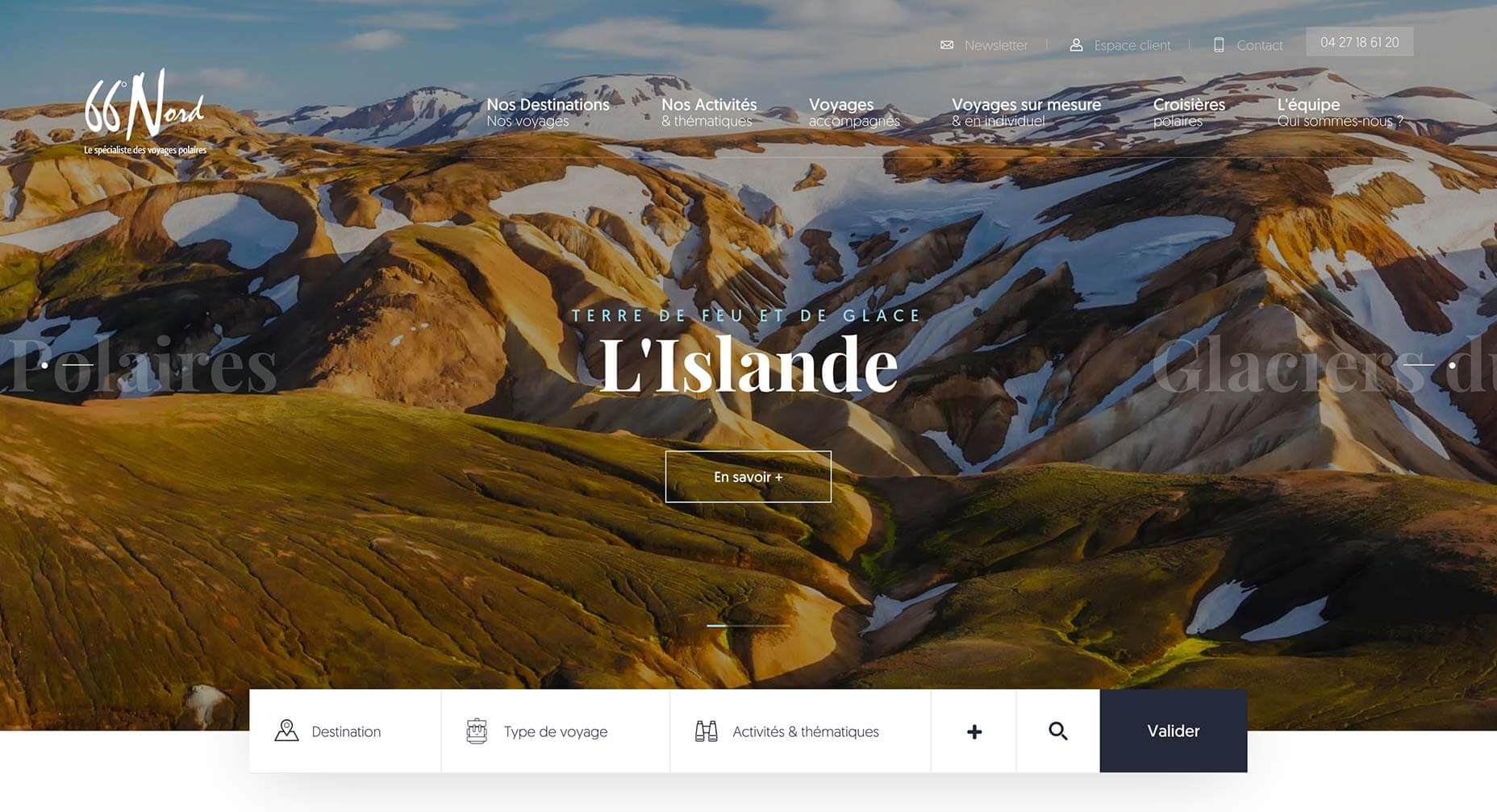
66 Nord
Take a trip to the poles with 66 Nord, a travel company specializing in trips to the arctic and antarctic circles. There are options from Russia to Alaska, and the site’s incredible photography does an outstanding job of selling these awe-inspiring vacations.
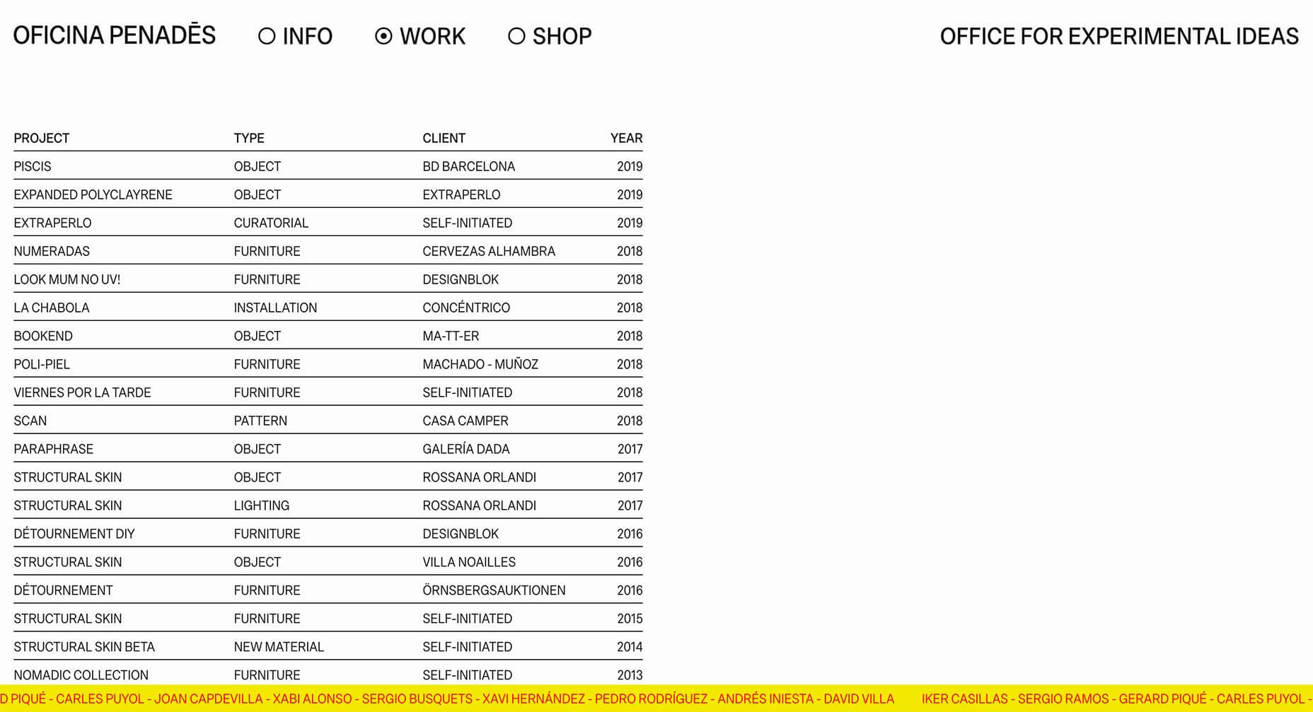
Oficina Penadés
Brutalism has been hanging around for a while now, and as design trends go, it’s a little hard to swallow. The industrial quality of the style can be jarring and inaccessible. However in the case of Oficina Penadés’ site, it perfectly encapsulates the work on show.
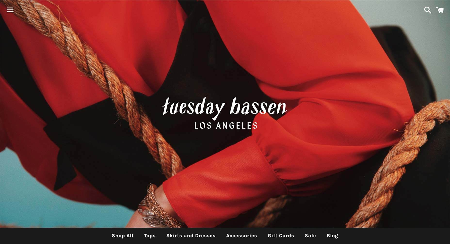
Tuesday Bassen
Sometimes what a site needs to lift it out of the ordinary and into the realms of greatness, is a bold choice of typeface. Tuesday Bassen is one such site; the simple Shopify-powered store for the LA-based brand is delightful thanks to some great art direction, and that beautiful branding.
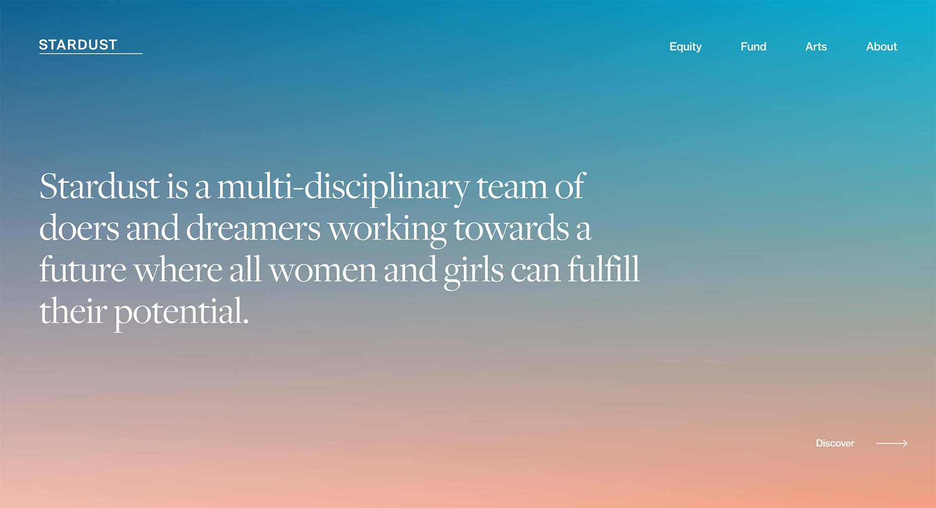
Stardust
Stardust uses a carefully considered gradient to mimic the look of the sky at dawn. The positive visual reinforcement of its message plays out beautifully as you scroll. And check out that clever, animated hamburger menu—it’s explained, and then tucked away.
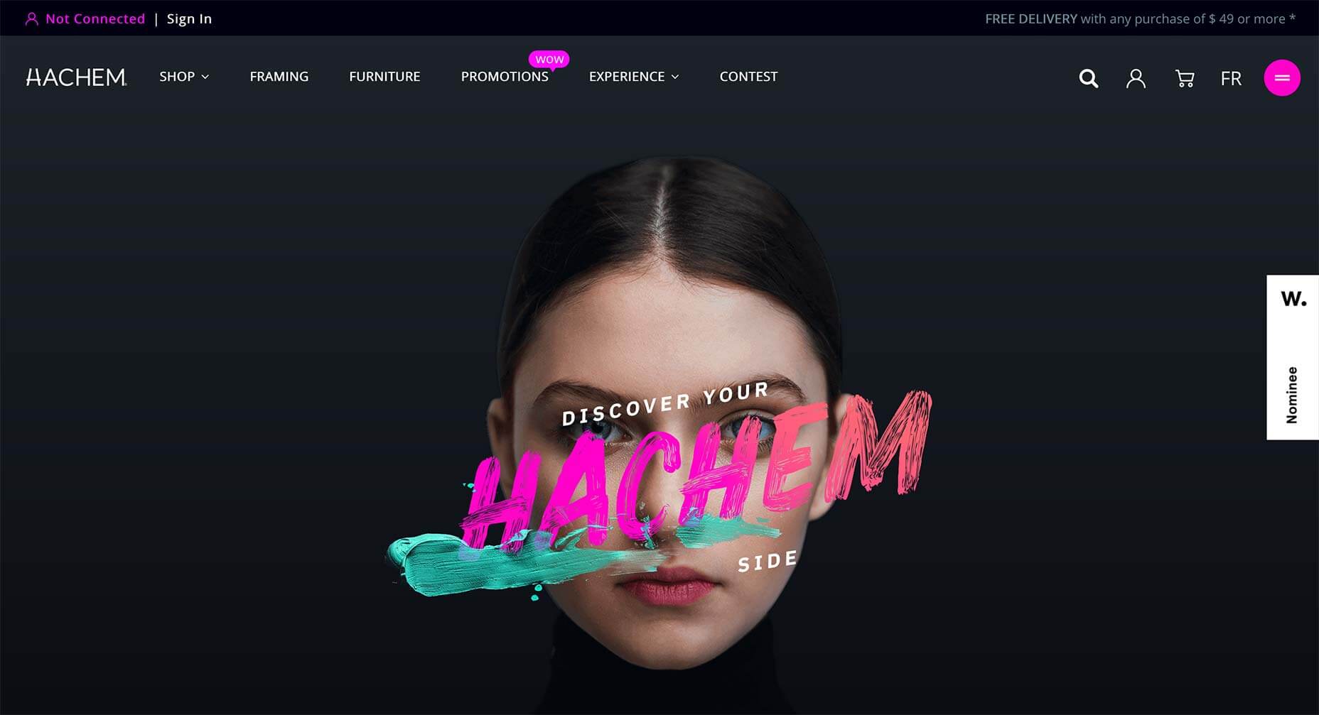
Hachem
We’ve been living in a white and grey, with a touch of blue, world for so long that when we see color it hits us right between the eyes. Hachem is an art supplies store, so you’d expect some creative daring, and the hues and lettering on display deliver exactly that.
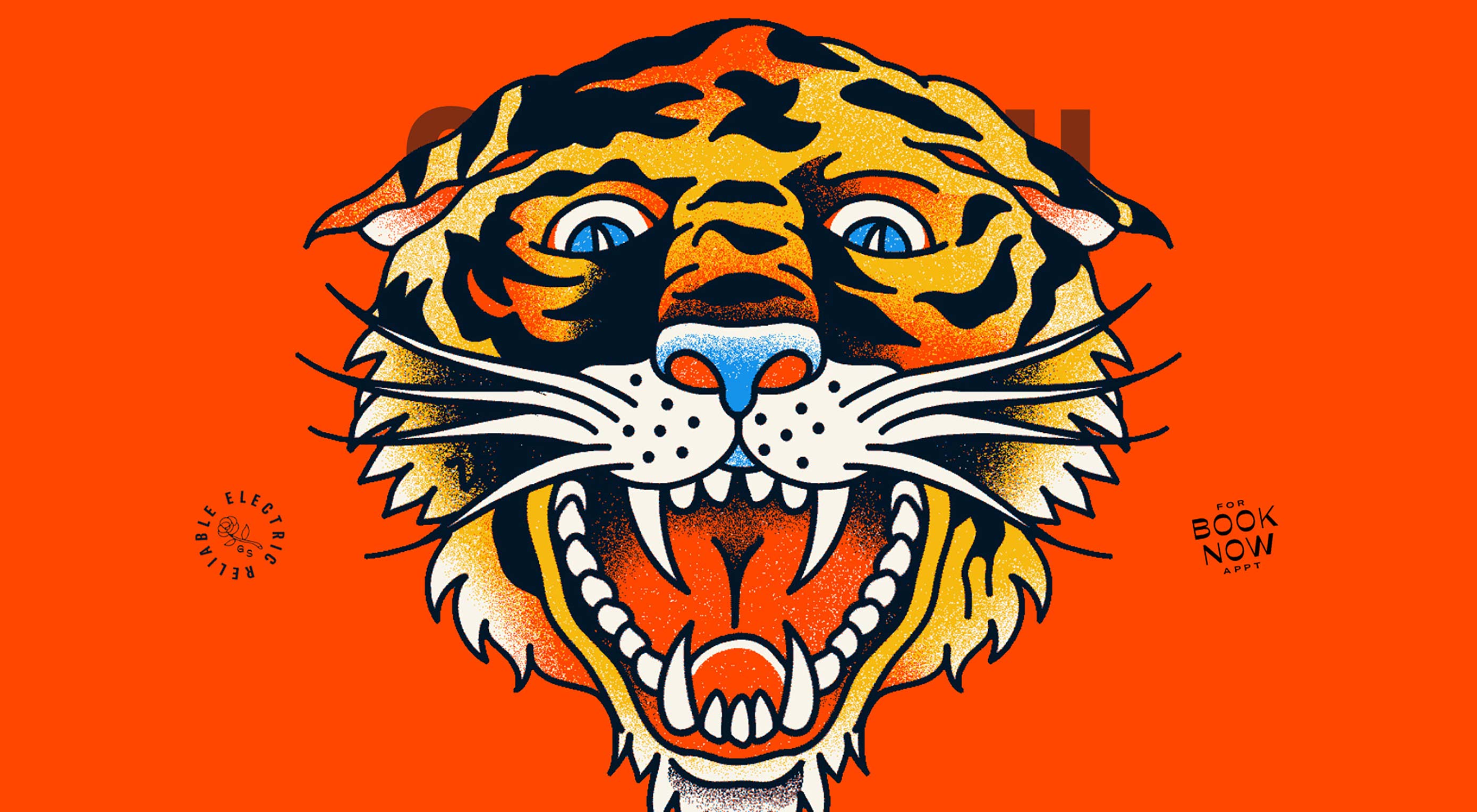
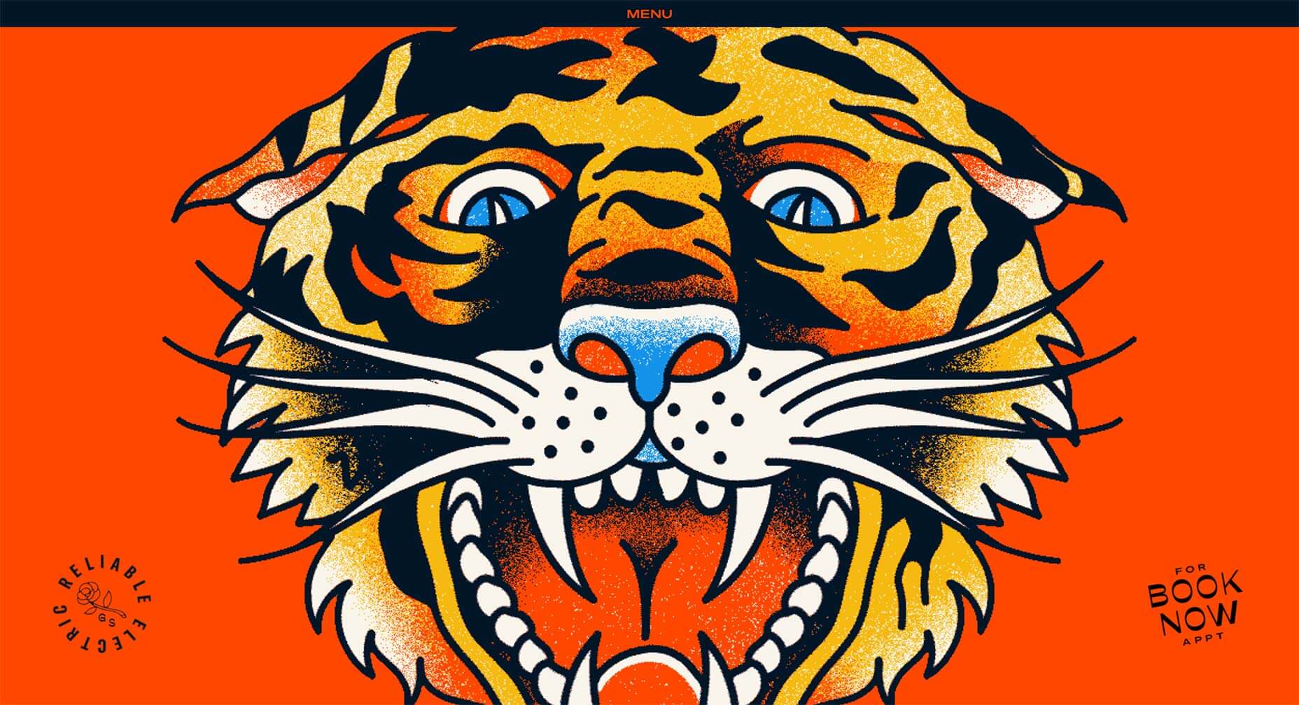
German Shible Tattooing
The exciting thing about web design right now, is that we’re leaving behind the era of cold, minimal design, and infusing our work with personality. I love the bold, some might say eclectic, font pairings on German Shible Tattooing. Don’t forget to tap that tiger’s nose.
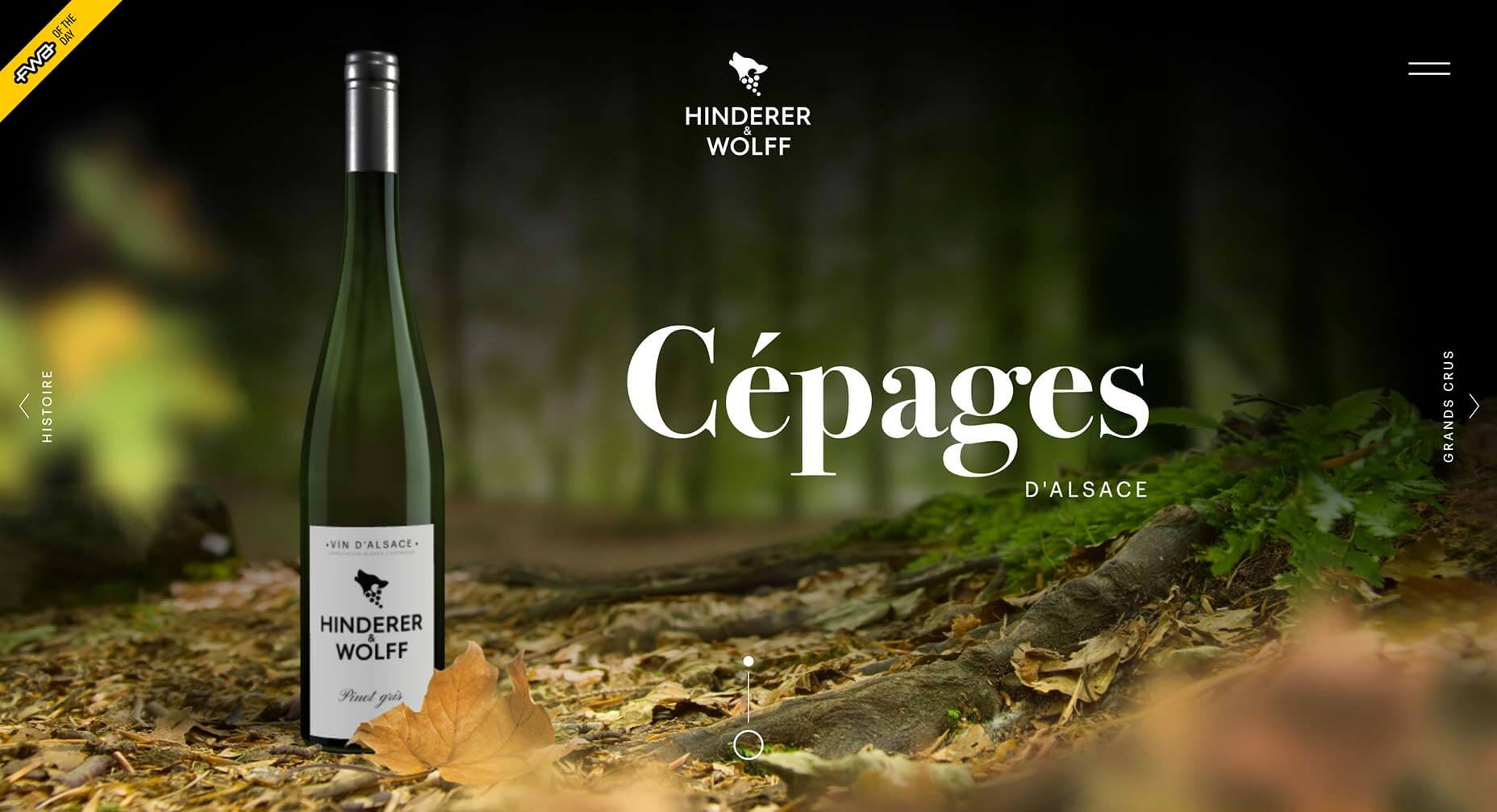
Hinderer & Wolff
Designers often make the mistake of thinking that effective UX means eschewing fancy 3D effects, but not so! Simple to understand products, and especially luxury products, benefit from some bells and whistles. Hinderer & Wolff’s impressive site is a joy to explore.
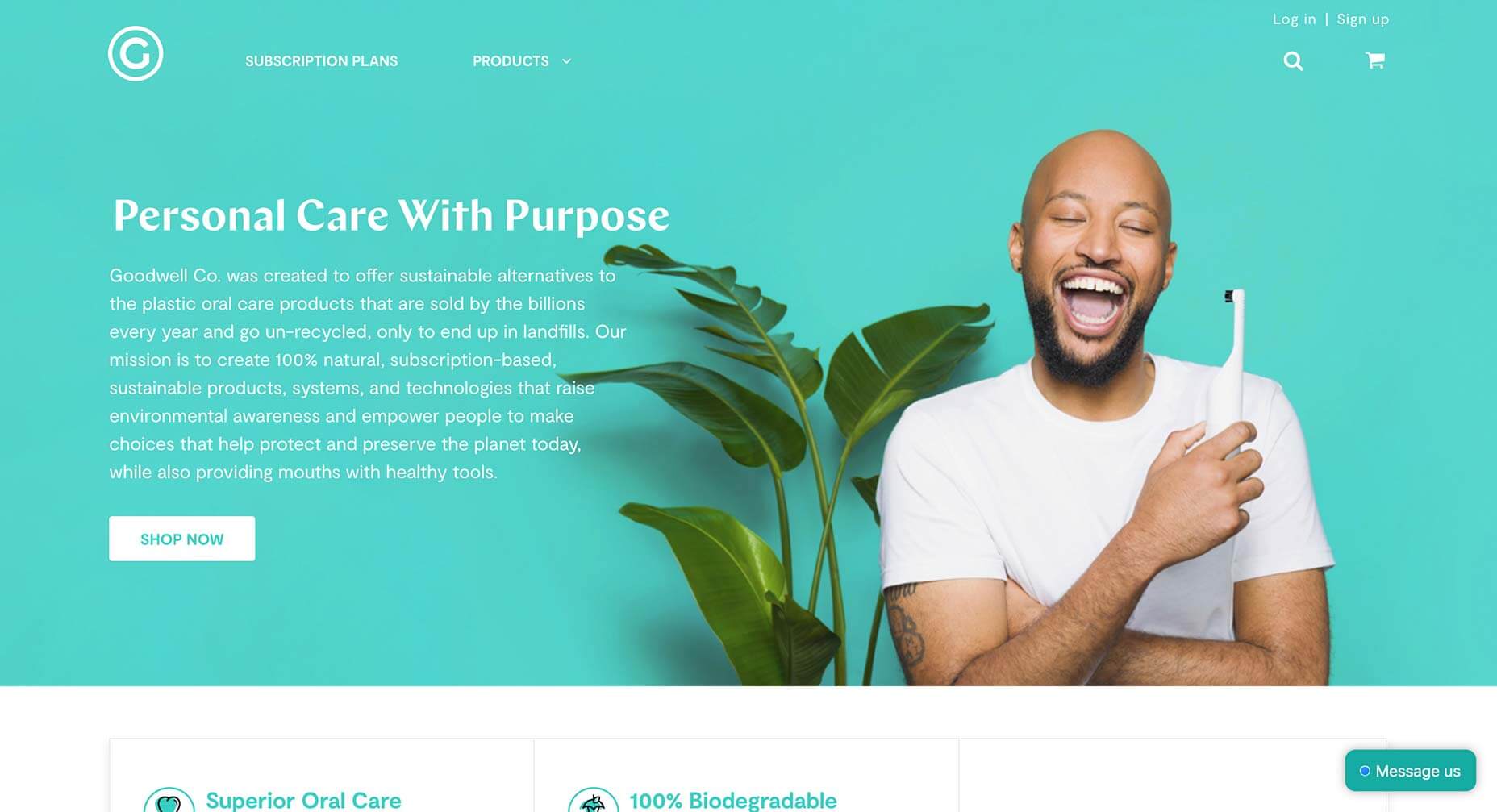
Goodwell Co.
Goodwell Co. is dedicated to replacing the plastic dental care products that fill landfill sites, with sustainable products that are good for the environment. Its site is simple, to convey its simple message, and the positivity of the message is reinforced with color.
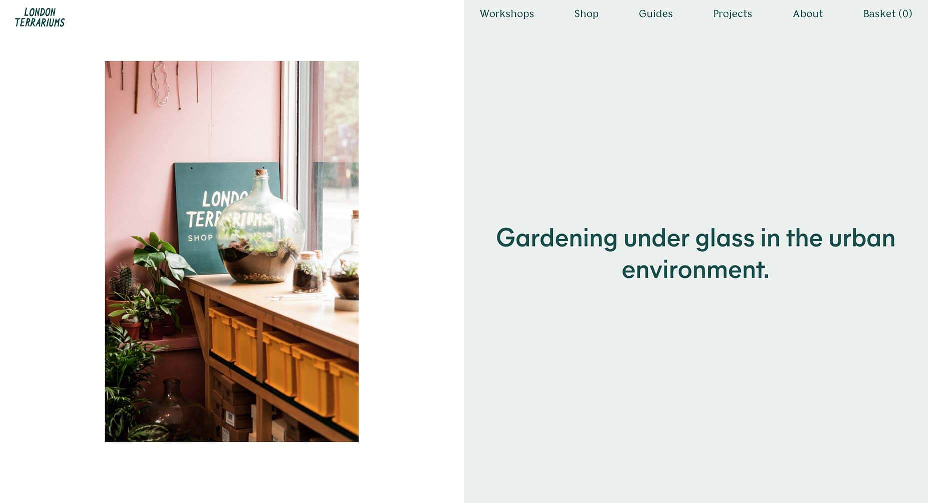
London Terrariums
Brilliantly employing the split screen trend, the site for London Terrariums scrolls through text on the right of the screen, while fading images in and out on the left side. It’s a simple and effective approach to presenting a minimal amount of content engagingly.
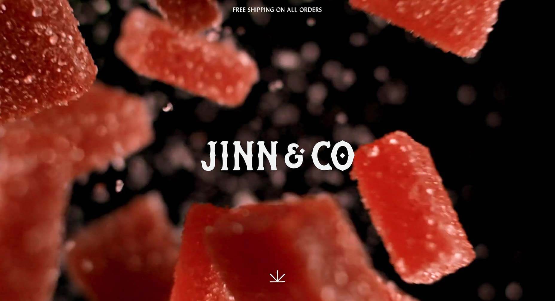
Jinn & Co.
The fullscreen macroscopic video of Jin & Co.’s artisanal confections is more than enough to sell the desirable candy. The inclusion of broad spectrum hemp oil explains the purse-busting price tag, but they sure do look good, especially the mango-guava and lychee jellies.
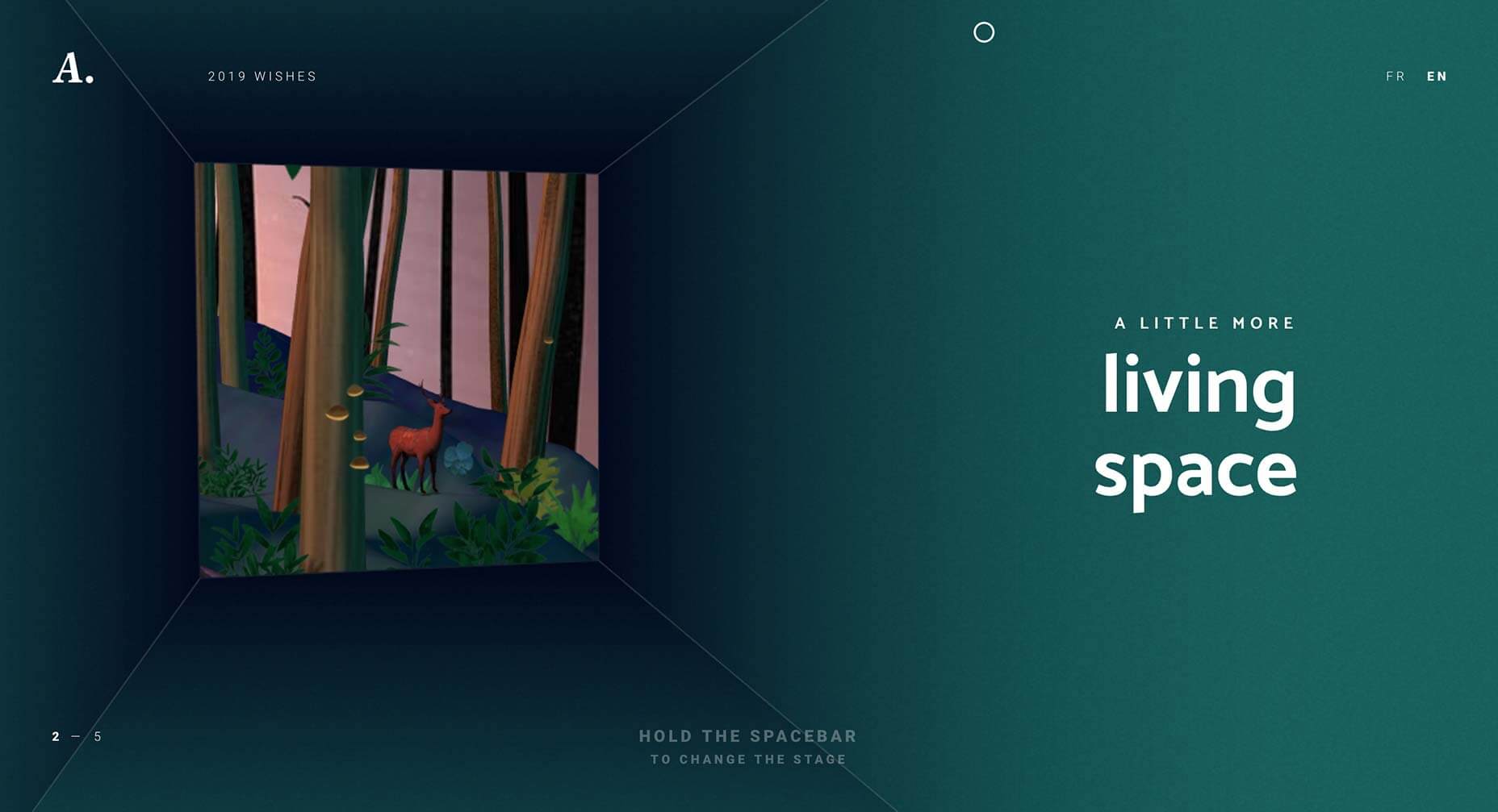
Les Animals: 2019 Wishes
This site is a lovingly created set of wishes illustrated and animated for 2019. Alongside the charming visuals, you’ll also find the sort of careful interaction design that you would expect from a digital agency of this calibre. It’s a joy to use.
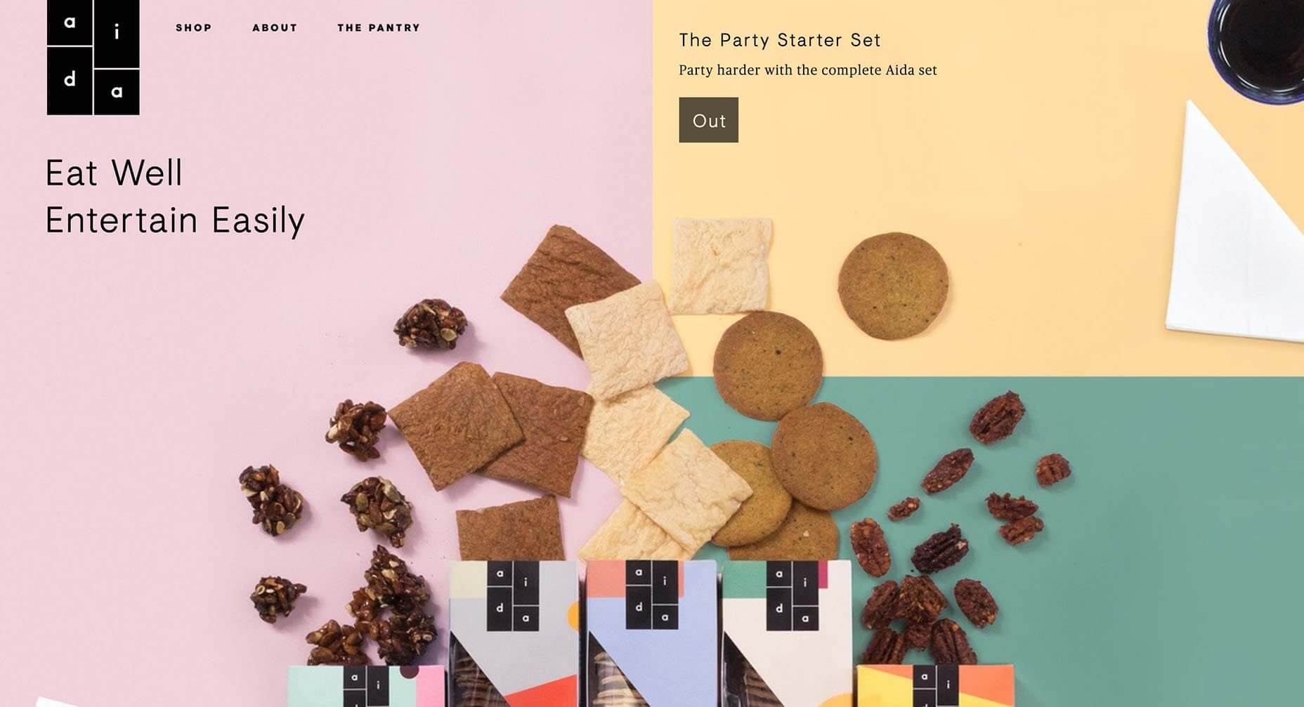
Aida
Just because you’ve reached the age where nibbles are more common at your parties than shots, doesn’t mean you shouldn’t party hard. Aida is a NY-based party food and accessories company with a fun, morning-after style of art direction.
| Add Realistic Chalk and Sketch Lettering Effects with Sketch’it – only $5! |
p img {display:inline-block; margin-right:10px;}
.alignleft {float:left;}
p.showcase {clear:both;}
body#browserfriendly p, body#podcast p, div#emailbody p{margin:0;}
from Webdesigner Depot https://ift.tt/2CCisZw
from WordPress https://ift.tt/2UV5mOj
No comments:
Post a Comment