
 We’re heading into the Summer season where traditionally everyone gets a little more lax about life. Even the website designs seem lighter with more whitespace and simple designs.
That translates into a few trending elements as well. We’re seeing plenty of navigation elements with a new twist, circles and perfectly symmetrical grids seem to be making a comeback. Here’s what’s trending in design this month.
1. White Nav on a Color Background
Aside from the hamburger menu, when was the last time we really thought about trends in website navigation? This small part of the design is a necessity but not often the primary concern in many projects. People don’t often get excited about a row of links.
But this trend is exciting. Designers are mixing up the standard navigation menu with a light background and dark text in favor of a reverse style design. And it’s quite nice.
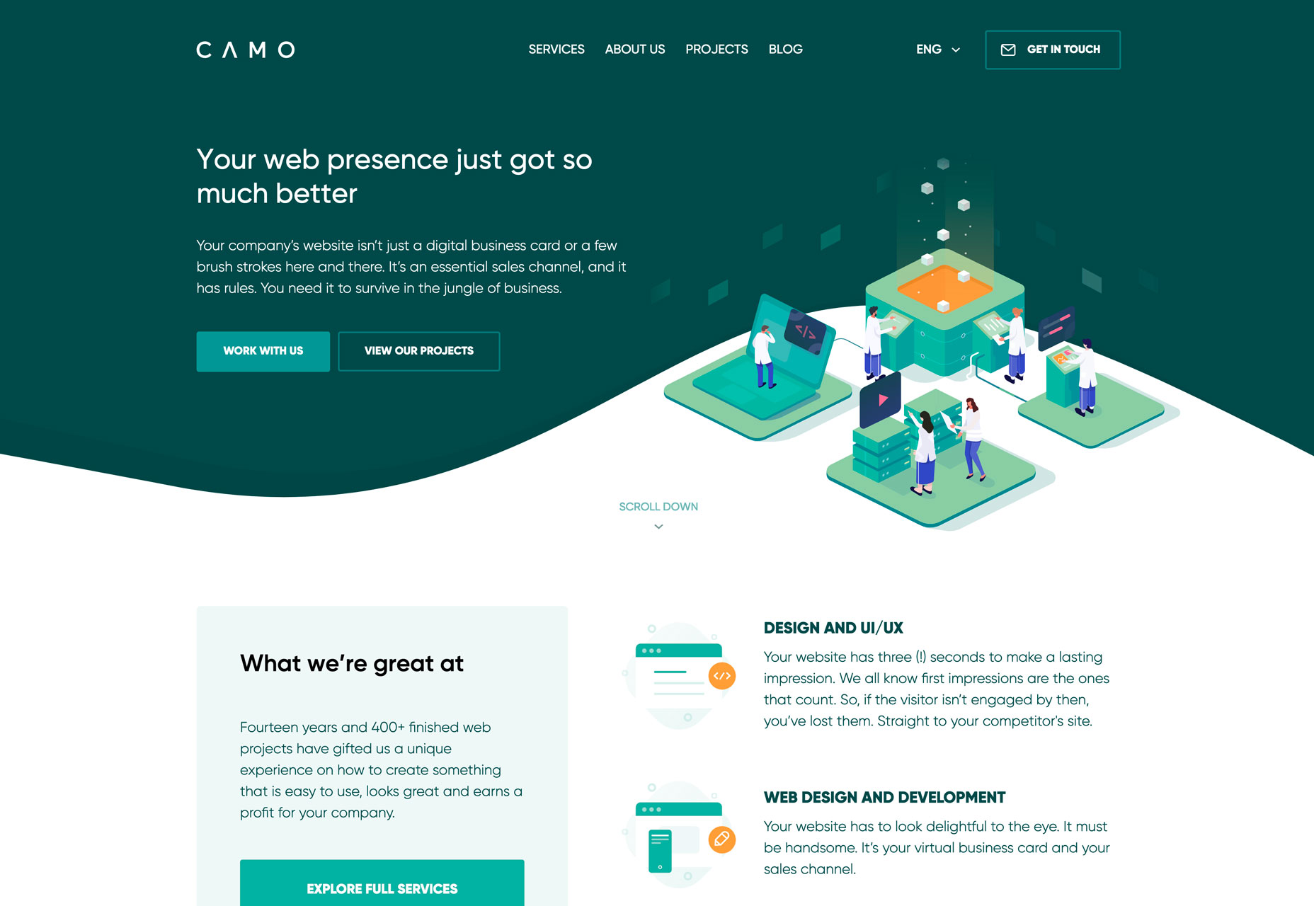
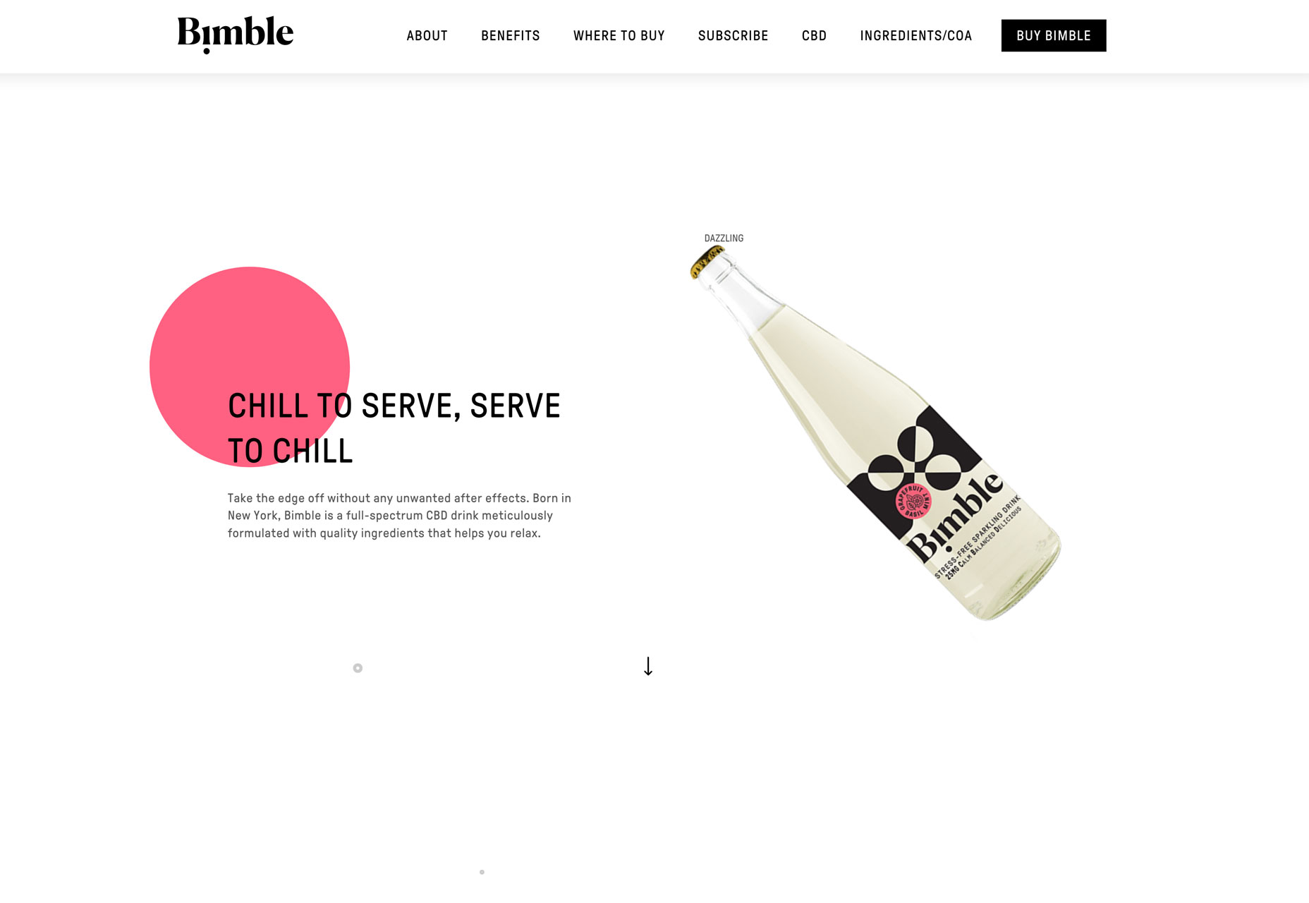
Each of the designs below features navigation elements in a dark color container background. Camo uses a more oversized background element that extends in to the main canvas as well for a two-tone hero header.
What’s cool about this style is color actually brings focus to the design in a different way. First, the eye is drawn to the large white space that is the main part of the design. Then, they eye moves to the colorful area and scans navigational elements.
This is a highly usable pattern because navigation elements can be a clue for users as to what the website is about. This row of small words can help someone decide if they want to stick around and learn more or bounce.
Color, in this trend, provides an opportunity for them to linger for just a few seconds longer and potentially explore more of the website design.
2. Circles
Circles in website design are one of those trends that seems to roar in and fade… and repeat. This shape seems to dominate design for a while and then vanish quickly.
There’s no real reason for this phenomenon — maybe it is true of most design trends — but it seems most obvious with circles. Remember how obsessed design projects were with them as Material Design was really heating up?
The best thing about using circles in design is that it’s a trend that doesn’t rely on other trends. Use circles for almost any part of the design, from navigational elements to a divot to catch attention to an animated display. There’s really no set of rules for using this shape effectively.
Circles work because of the meanings associated with them. Because circles don’t have an identifiable beginning or end, they seem to move, like a wheel. The shape is sometimes seen as feminine, and is culturally associated with love, energy, and power. You can almost see these things in each of the project below.
Bimble uses a big colorful circle to draw attention. You might note further use of circles in the product packaging. It’s pink with a feminine association and the description relates to harmony (relaxation).
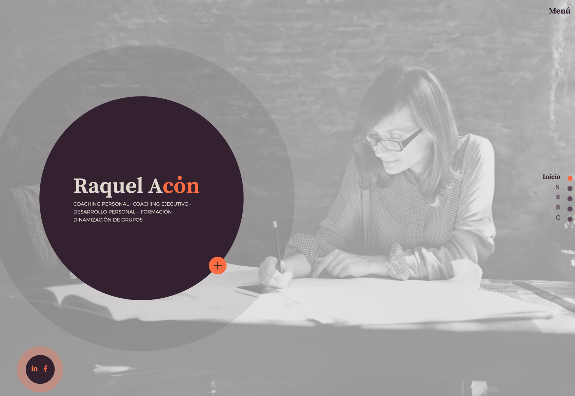
Raquel Acon’s website uses multiple circles to imply movement (or change as it may be from a personal coach) as well as harmony.
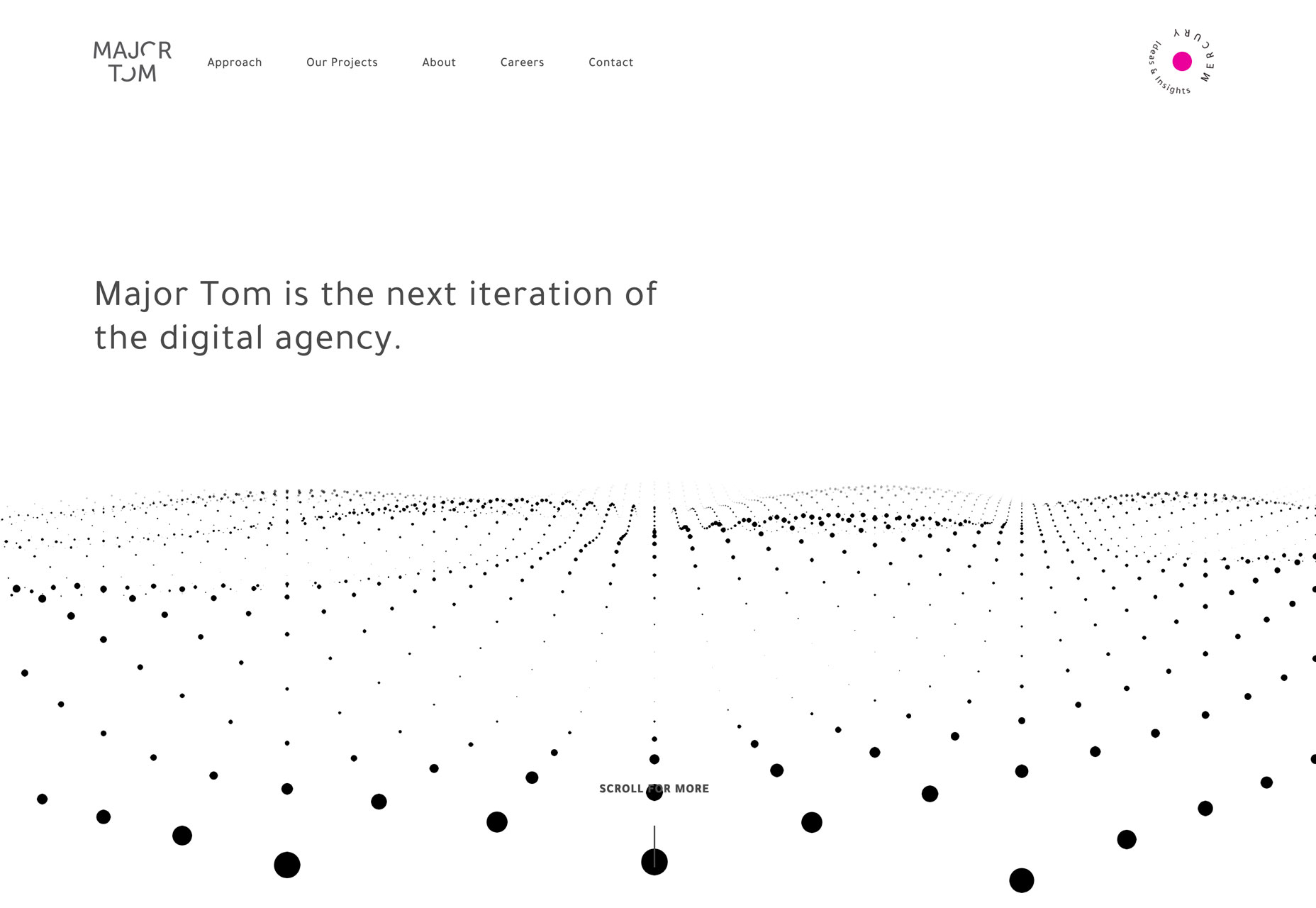
Major Tom uses circles in motion, creating a distinct and powerful energy with animation and a stark color palette.
3. Perfect Grids
Projects seem to be packed with all kinds of grids these days. And every one seems to have a slightly different take on the same idea. This trend blows up some of that and goes back to a more basic symmetrical stacked grid to showcase multiple elements.
While more recent trends have used grids that featured masonry styles or loose representations or overlapping elements, these more perfect grids are balanced and harmonious.
While there’s nothing flashy about this trend, it is perfect for blocks of content that are hard to organize or connect visually. That’s why this style of grid works great for portfolio sites.
But it’s not just for portfolios. Here, there’s portfolio, product and payment gateway websites. Each uses the same concept in different ways.
Gabriel Alves uses a mix of still and moving images to showcase projects in an almost square grid. Each element features a hover overlay with additional information.
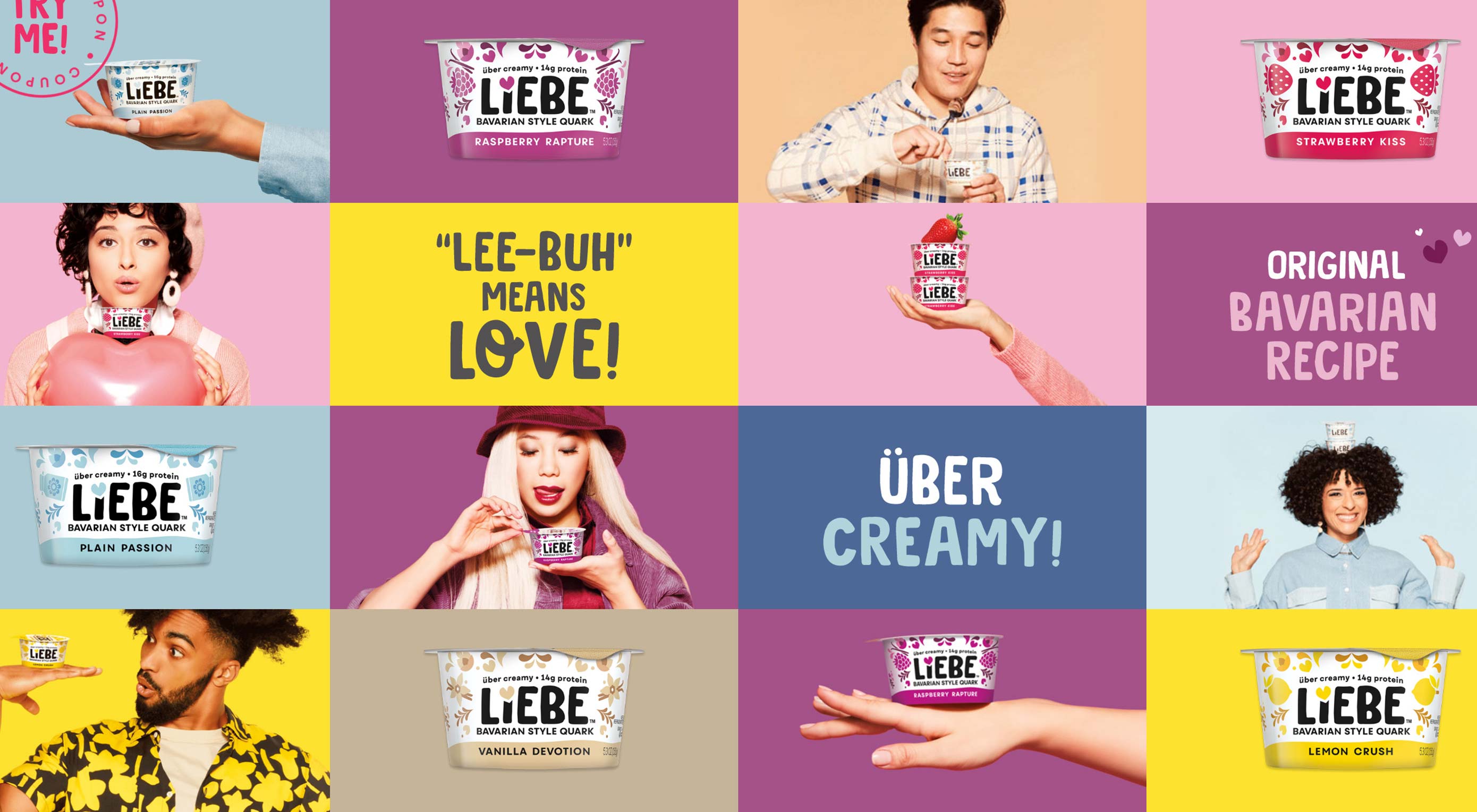
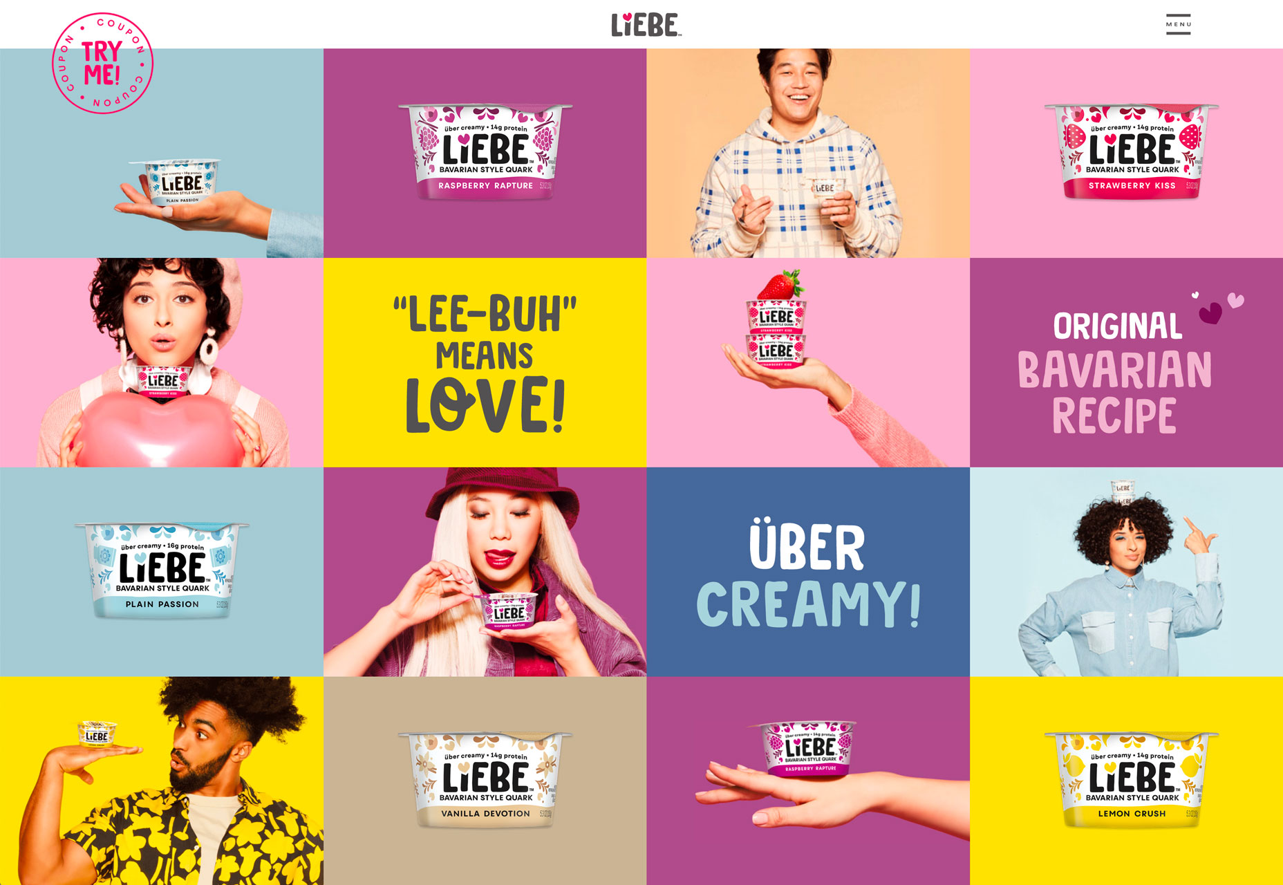
Liebe Quark’s full screen grid features colorful mixes of images and text, but nothing is actually clickable. It’s like a giant picture, although it you watch closely elements behave independently with touches of animation.
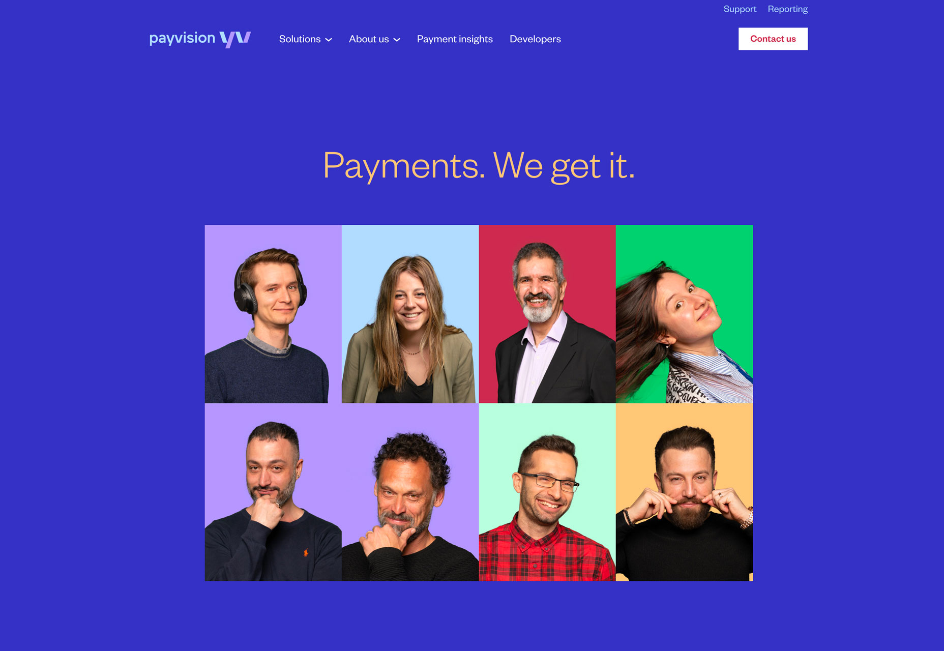
Payvision uses a more vertical photo grid to highlight team members. The grid isn’t a full screen option like the other examples, rather it uses a grid in the center as a focal point.
The one thing all of these grids have in common is that elements are equally weighted in terms of color and depth on the screen. Each grid element fills its own space and touches corresponding elements without whitespace in between.
These grids work as a complete unit to provide a distinct visual entry point to the design.
Conclusion
My favorite trend in this collection this month is probably the use of circles. This simple shape has so much meaning and can be used in so many different ways. (You might not even notice the circles if you aren’t directly looking for them.) This shape is so usable and practical, I am surprised we don’t see even more of it.
| Add Realistic Chalk and Sketch Lettering Effects with Sketch’it – only $5! |  |
p img {display:inline-block; margin-right:10px;}
.alignleft {float:left;}
p.showcase {clear:both;}
body#browserfriendly p, body#podcast p, div#emailbody p{margin:0;}
from Webdesigner Depot http://bit.ly/2I8XALq
from WordPress http://bit.ly/2YZpMao
This is perfect design trends. I got some ideas here. I will implement it on one of my website and it named as one of the best web design company
ReplyDelete