Friday, August 30, 2019

5 Secrets for Creating Successful Mid-Level Pages

Designing mid-level feature pages is one of the hardest parts of building or revamping your website. How do you divide your business into neat, tidy sections? How many categories should you use? Does it make sense to combine this feature with that one? How do you find the optimal balance of text, images and graphics? What keywords should you target? Are you building these pages for humans to buy your products or search engine crawlers to rank you higher? 

I could go on, but it’s a safe bet that your head is already spinning. Developing the optimal information architecture design for your business can be a major struggle — but it’s definitely one worth putting the time, energy and resources into getting right.

Here are six tips to design better mid-level feature pages:

1. Organise Your Information Architecture into the Right Categories

Instead of rushing to get a new website up as fast as you can, spend some time thinking deeply about natural categories that align with your products, services, and core values. An hour’s brainstorm and quick sketch will probably not suffice here.

proper due-diligence before building out mid-level pages will save you countless headaches down the road

Discuss with your team. Look at your competitors’ sites. Consult an SEO consulting service. Think about providing your customer with the best possible browsing experience. Consider the most important keywords that you want to rank for. Doing proper due-diligence before building out mid-level pages will save you countless headaches down the road.

When we started building mid-level feature pages for our PDF SaaS app, we thought long and hard about how to organise mid-level feature pages so users could access the information that they were seeking quickly and intuitively. After a ton of research and countless conversations with people who brought different vantage points, we decided on three overarching feature page categories: “Create PDF,” “Edit PDF,” and “Convert PDF.” These broad categories covered the three main services that we provide and allowed the flexibility for us to build out 22 more specialised mid-level pages for specific features like compression, and format conversion.

2. Keep it Simple 

You are passionate about your business and want to share your whole story with prospective clients. It’s natural to try to include everything on your mid-level feature pages, but that is a recipe for clutter and confusion. Design a clean, consistent markup that includes a healthy balance of text, images and infographics. Readers tend to skim (or completely skip) text-heavy sections. Try to use bullets, integrate graphics and err on the side of brevity whenever possible.

Make sure that your layouts are consistent across all mid-level pages. People usually notice different layouts on similar level pages. Whether they note the differences consciously or not, the inconsistencies give off an unprofessional vibe and should be smoothed out before going live. We developed a template that was easy to replicate for each additional mid-level page. Each mid-level page follows the same blueprint which simplifies navigation:

  • a header
  • a drag-and-drop upload button
  • three steps of directions
  • two or three images
  • a brief explanation of the specific feature
  • options to explore other features near the bottom of the page

3. Match Each Mid-Level Page With a Primary Keyword That You’re Targeting

Keyword research is an essential step in constructing effective information architecture. Knowing the most important search terms that you want to rank for will help you develop site structure and content that drives the right traffic to your site and keeps it there. There are lots of good tools out there to research search volume and identify related keywords. We used Google Keyword Planner, SEMRush, CanIRank and a few other keyword research tools to figure out the most valuable keywords we should go after. One of the nice things about these three tools is that they give you search volume reports on related keywords as well. Oftentimes, the keyword you expected to be best actually isn’t, and a similar iteration turns out to be a better fit. 

Most of us seasoned website architects aim to match each mid-level feature page with a high-volume keyword that is valuable to our business. By targeting specific related keywords, you are signalling to Google and other search engines what your website is about, and building topical relevance for your site. As you build out multiple mid-level pages targeting specific keywords related to your business, you will boost both your page relevancy (for each individual page) and overall website relevancy. This will help you improve your SERP rankings for the keywords that matter most to your business and drive traffic into your conversion funnel.

Remember to have only one primary keyword per page. The primary keyword should be featured prominently in your H1 header and also used consistently throughout the page. In addition, you should include several “secondary” keywords that are related to the primary keywords. Using your favorite keyword research tool, identify a primary keyword, several secondary keywords, and other related keywords to build your page around. Be cognizant not to have separate mid-level pages targeting similar keywords. It’s easy to have two pages “cannibalisze” each other — which will drive both pages’ rankings down.

4. Include a Clear, Catchy, Concise Call-to-Action

You’ve designed the perfect information architecture, done your keyword research, matched each page to a high-volume keyword, and written stellar content that includes the right balance of keywords. Finally, it’s time to let out a big sigh of relief, right? Well, not exactly. After doing all this work, it would be a shame not to nail your call-to-action. 

After doing all this work, it would be a shame not to nail your call-to-action

After all, your goal is not merely to get traffic to visit and stay on your mid-level page; it’s to move them further down the conversion funnel and actually buy your product or service! Be strategic with your language and graphics to encourage users to try out your service, sign-up for your newsletter, enter a contest, share on social media or take whatever action you want them to take. We have a big “Click to upload” button at the top of the page for users who just want to take action quickly without reading in more detail about the feature. For more investigative readers, we have other “Upload your file” buttons conveniently positioned in the middle of the page content. Our goal is to make using our software so simple and intuitive that users always can easily navigate their way further down the conversion funnel.

5. Design For Your Audience(s)

So in this long haul of building mid-level pages, are search engines or humans our primary audience? Reasonable minds disagree on this one, but for our purposes today, I recommend targeting both — because you will not be successful targeting one but not the other. 

Think about the key steps in your customer’s journey. She hears about a cool new product that you sell and decides to check it out. She searches for it on Google. If your page isn’t optimized properly to rank highly and catch her eye, it really doesn’t matter how amazing or persuasive your content is. Conversely, if your page is optimized to rank atop page 1 but includes a lacklustre call-to-action, you will have a high bounce rate and fail to convert in ways that bring your business tangible value.

Always keep the big picture in mind and design your mid-level feature pages to meet the needs of search engines and humans.


Featured image via DepositPhotos.

Source

p img {display:inline-block; margin-right:10px;}
.alignleft {float:left;}
p.showcase {clear:both;}
body#browserfriendly p, body#podcast p, div#emailbody p{margin:0;}

from Webdesigner Depot https://ift.tt/2zzgW8E


from WordPress https://ift.tt/2LiQ3LJ

Wednesday, August 28, 2019

The Marketer as Philosopher: 3 ways to achieve excellence in yourself and in your marketing

“A great marketer is a customer philosopher.”

— Flint McGlaughlin, Founding Director, MECLABS Institute

(This article was originally published in the MarketingExperiments email newsletter.)

The internet is full of
resources trying to help marketers with the mechanics of their job, but very
few are focused on the marketer as a person
and the unique experience you have every day in your work.

In this session, Flint McGlaughlin
aims to help marketers re-envision their role. He wants you to understand what
you are capable of doing with your marketing expertise so that you not only
produce a new level of results for your organization, but add meaning to your
work.

Why? Because we see marketing abused. Many people think marketing is just talking people into buying things, pushing them to do something. But true marketing helps people make the right decision. So the marketer must escape the negative connotation of the role and embrace the power of marketing as a force for positive change in our world.

Watch the video and get inspired to start your day with purpose. And if you’re in a hurry, here are some key points in the video: [

  • The importance of having a methodology over a list of tips (2:12)
  • Headline optimization (7:08)
  • Form optimization (12:35)
  • The power of marketing as a positive force for change in the world (17:19)
  • The marketer as customer philosopher (28:08 )
  • Beware of de-emphasizing people as technology increases in marketing. (35:15)
  • Experience a Quick Win Intensive with MECLABS to become a better marketer (45:25)
  • Live optimization (47:45)

You can follow along with
this FREE infographic:

How To Create a Model of Your Customer’s Mind


Related Resources

Landing Page Optimization: How Aetna’s HealthSpire startup generated 638% more leads for its call center

The Zen of Headline Writing

The Marketer as Philosopher: 40 Brief Reflections on the Power of Your Value Proposition

Quick Win Intensive: Get MECLABS scientists to help you find the fastest way to drive a major revenue increase

The post The Marketer as Philosopher: 3 ways to achieve excellence in yourself and in your marketing appeared first on MarketingExperiments.

from MarketingExperiments https://ift.tt/2L0AFVf


from WordPress https://ift.tt/32aQjDi

How Prevalent is Dark UX?

Iconic comedy duo Mitchell and Webb once asked a very important question: “Are we the baddies?” Given that, at the time, they were dressed in Nazi uniforms with skulls on their hats, and looked like rejected villains from a Wolfenstein game, the answer was something of a foregone conclusion.
But what about us? No, no web or UX designers that I know of have ever invaded Poland, or done any of the more horrifying things that Nazis are known for, thankfully. But then, we’ve got a whole field of design called “dark UX”, and that’s… concerning. In other words:

It sure feels like dark UX is everywhere…

“Are we the baddies?” How bad is it these days? It sure feels like dark UX is everywhere, with companies trying to get their hands on your cash no matter the cost.

The generally accepted definition of dark UX is something along the lines of: Intentionally malicious, deceitful, or even just highly manipulative design patterns that try to trick you into doing something you otherwise wouldn’t.

I think, to answer that question, we need to establish that the first bit—the intentional malice, deceit, or manipulation—is the defining characteristic of dark UX. Just getting people to do something they might otherwise not… it’s not always a bad thing — doctors and especially dentists, try to do that all the time, to varying degrees of success.

Marketing, even, introduces you to ideas and products you may not otherwise know about, and so would not otherwise buy. While marketing can very often feel scummy, I am forced to admit that there is technically nothing wrong with putting your brand out there.

But when designers (and the companies that hire them) flat-out disregard the will, and/or well-being of the users, that’s when we have a problem. Let’s look at some classic examples, several of which come courtesy of the Dark Patterns twitter feed, because websites never behave badly when you want to take screenshots:

Opt-Out Newletters (or Even Purchases!)

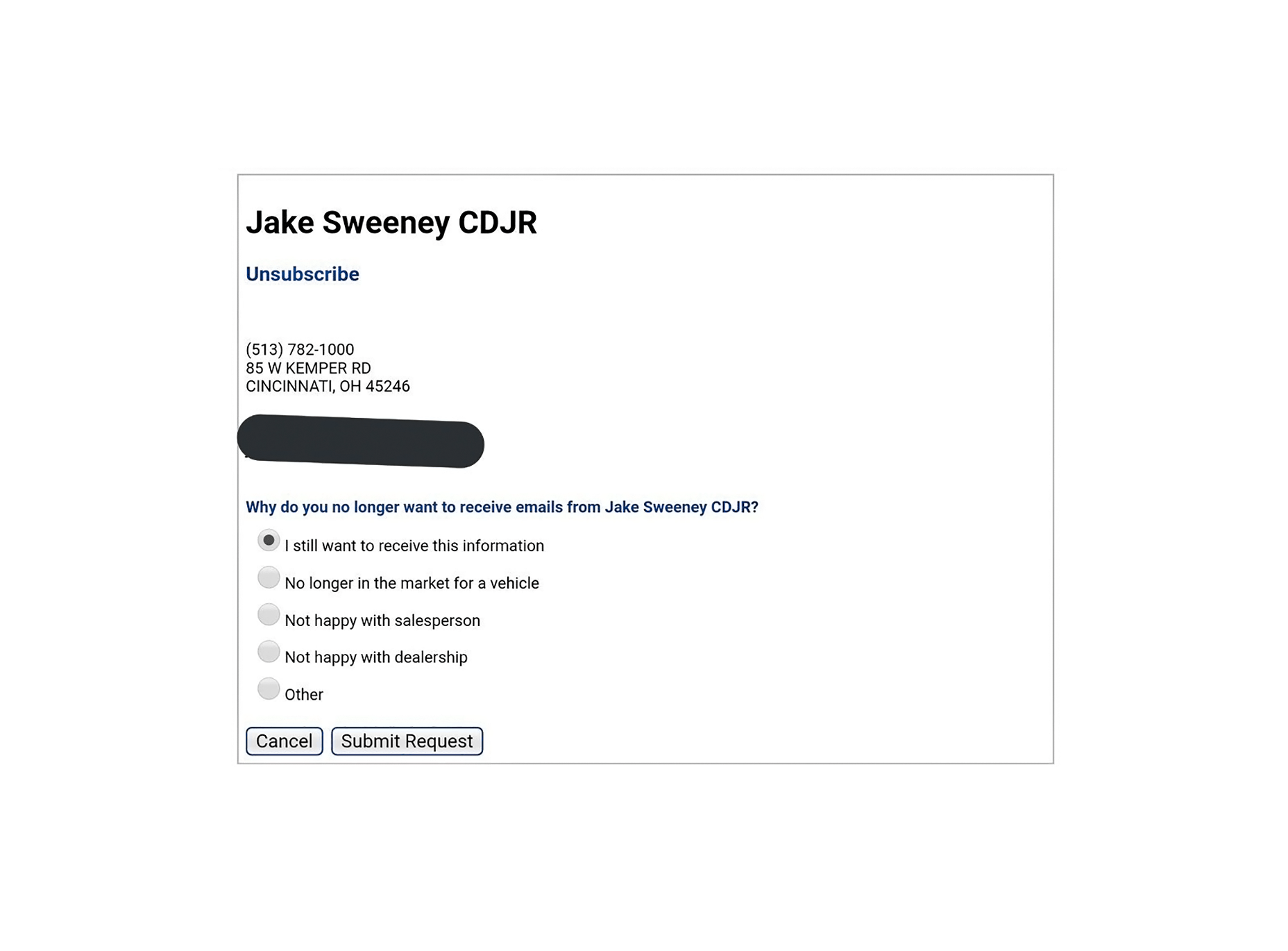
Sign-up forms often come with the option to get their newsletter pre-selected. I’ve also run into airlines that have some of their add-on services pre-selected during the ticket purchase process. Forgetting to unselect those is an expensive mistake to make.

But then there’s this process for unsubscribing from an email newsletter, which is pretty flagrant:

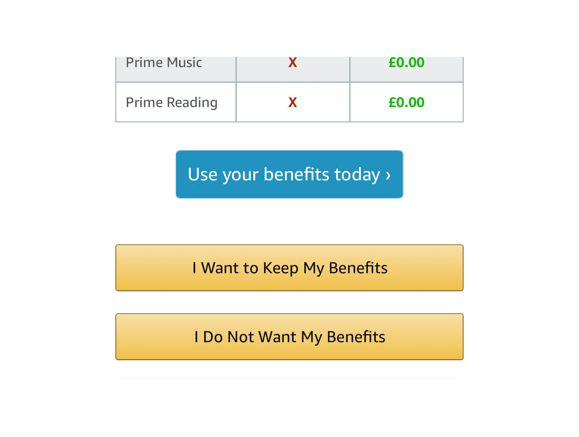
Scummy “No” Buttons

You know, the ones that say things like: “No, I don’t want to better my life immeasurably by receiving these product offers. By clicking this button, I acknowledge that my life is worthless, my children will be left homeless, and I am a terrible person.”

Even Amazon is doing it:

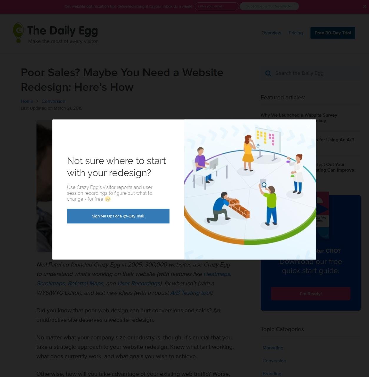
The Complete Lack of “No” Buttons

Then there are the people that don’t even include a “no” button, or an “exit” button. I’ve had it happen with Google Play Music sometimes giving me no way to listen to my music unless I either sign up for their family plan, or refresh the page. I couldn’t get a screenshot of that, so here’s one of CrazyEgg doing something similar:

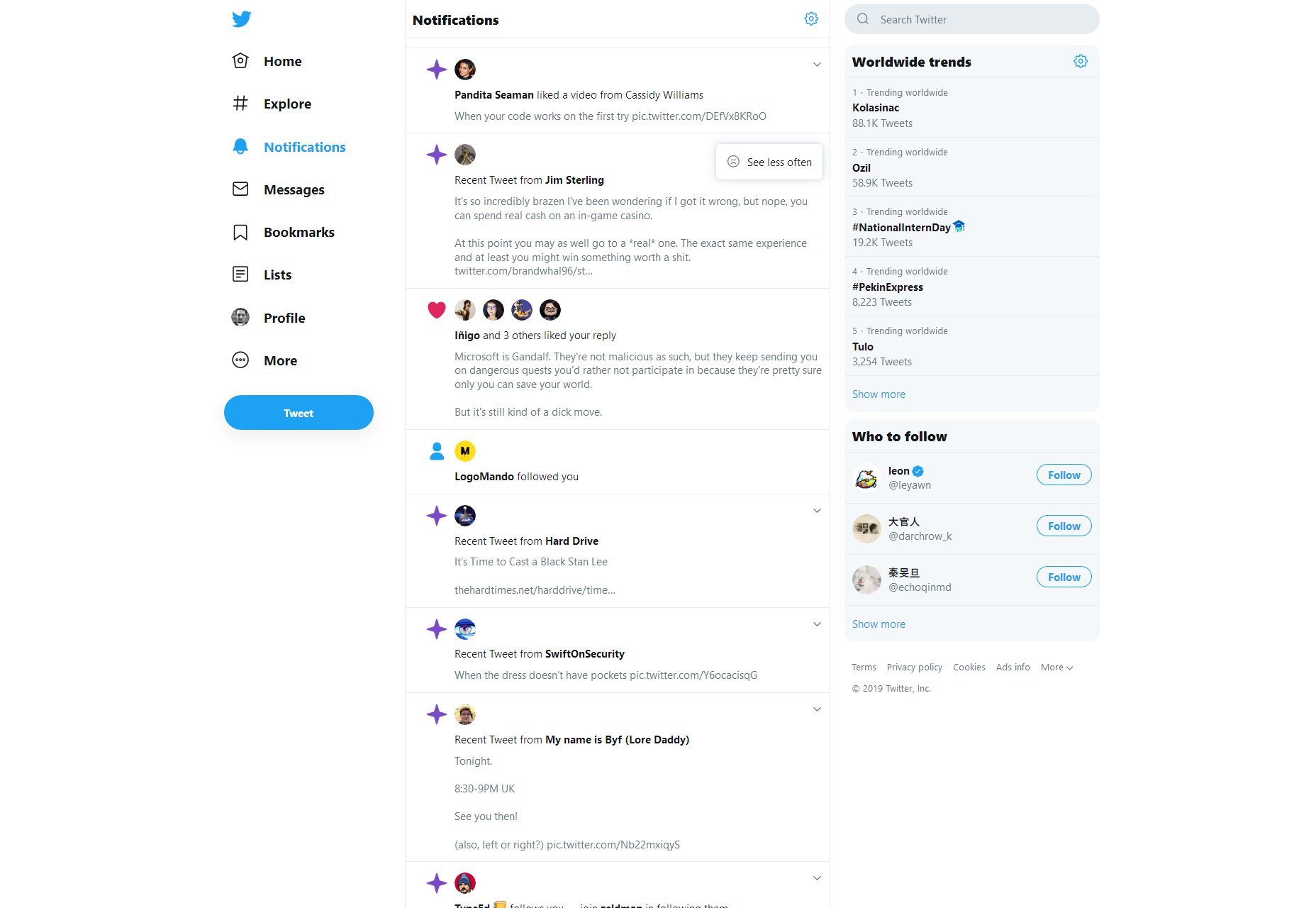
Also, Twitter won’t even let you turn off their more annoying features. There’s only a button to “see less” of them, and no one’s sure if it actually works.

Intentionally Frustrating Products

Recently, I reviewed a service named Smashinglogo (no relation) for another website. See how I’m not linking it? That’s for a reason. It’s supposed to be an AI-based logo generator and… well it does that. But you have to depend almost entirely on the AI to randomly give you the logo you want. The customization features are minimal, and partially random too.

But the site makes very sure to tell you that you can hire one of their professional designers to finish up your logo at any time. It just costs a bit more.

This sort of design is actually a notorious problem in the world of video games, and not just the mobile titles. Middle Earth: Shadow of War launched as a very grindy sort of game that took a long time to complete, but you could make it easier on yourself by purchasing “just a few, simple time savers” on top of buying the full-priced game. Assassin’s Creed: Odyssey took flak for pretty much the same reason. It wasn’t too bad if you like playing all the side quests in a game, but it was still a problem.

Predatory Features/Mechanics

We can look to video games for even more examples. Mobile games introduced the idea of the “loot box”, a purchase which will always grant you some sort of digital reward within the game. But what you get is randomized, so you can never be sure of getting what you want. They’ve made their way into 60 USD desktop titles as well, and they’re specifically designed to tap into the gambler’s instinct.

It used to be just an industry controversy, but now governments the world over are looking into this situation

It used to be just an industry controversy, but now governments the world over are looking into this situation, with UK Mainstream outlets like the BBC documenting what happens when someone who has compulsive gambling tendencies gets suckered in by video games, which are supposed to be comparatively “safe”.

Dark UX is Everywhere…Oops

I wish I had better news. Look, it’s not that the majority of websites are necessarily using dark UX patterns. I frankly couldn’t find any hard data on that, but I doubt it. Is all their marketing honest? I don’t know about that, but I don’t think that most websites are trying to trick users into clicking stuff.

But not every website is Amazon, Twitter, or Google. While most sites may not have dark UX, a lot of the biggest sites and products do, affecting a number of people that is potentially in the billions.

I’d like to think designers are mostly good people, but the ones employed by bad companies have done a lot of damage. What can we do to correct this? Either we can burn it all down and try to develop a post-money society, or we can try to convince our corporate overlords that treating people right will net them more money in the long run.

I’ve always believed that true (brand) love is better than Stockholm Syndrome. Now we just need to convince everyone else.


Featured image via DepositPhotos.

Source

p img {display:inline-block; margin-right:10px;}
.alignleft {float:left;}
p.showcase {clear:both;}
body#browserfriendly p, body#podcast p, div#emailbody p{margin:0;}

from Webdesigner Depot https://ift.tt/2Uccsyc


from WordPress https://ift.tt/32bj0QF

Monday, August 26, 2019

How to Wireframe a Landing Page: 6 steps

Creative Essentials: Professional Tools That Make My Work Better

My name is Suzanne Scacca and I am a tool snob. 
Before I became a writer, and before I entered the world of marketing and web design, I was a long-time project manager. And although I could’ve stepped into any of my project management jobs and simply executed the tasks employers asked of me, I was never happy with the status quo. 

We’re living in an amazing time for technology and I knew there would always be a better way to work, if only we could find the right tool for it. And that’s the key, isn’t it? Finding tools that are right for the job and that are right for you. 

Adopting the wrong-fit tools can do a lot of harm to one’s productivity and success, which is why we should all be picky about what we use. It’s also why we should be loyal to tools once we’ve found ones we know we can trust. 

There are 13 tools I’m 110% dedicated to and use on a daily basis. These tools help me write, optimize websites, and even create fake web pages in order to demonstrate points I’m trying to make or to show how tools work in my articles. I also rely on a number of communication and productivity apps to keep me on top of things without being overwhelmed or distracted by them. 

Curious to see how a tool junkie runs her day? Check these out:

1. Google Apps

Google is pretty much the central hub of my business. I do all my major communicating through it with Gmail. 

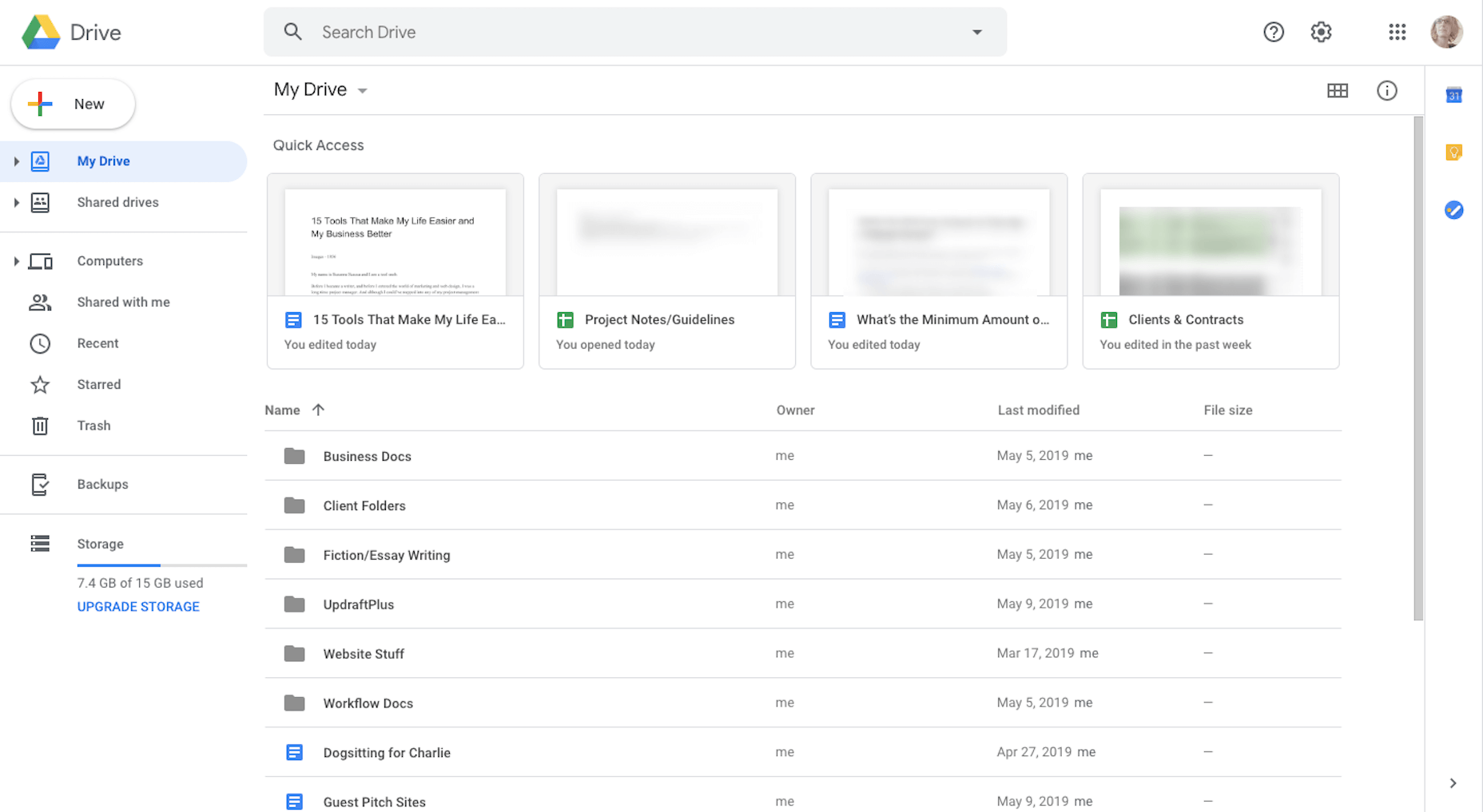
I do all my note-taking, brainstorming, writing, editing, and content collaboration in Google Drive. 

I’ve also integrated a number of my applications with Google (like Zoom, Asana, and Zoho), so I have fewer steps to take as I move things from one platform to another. 

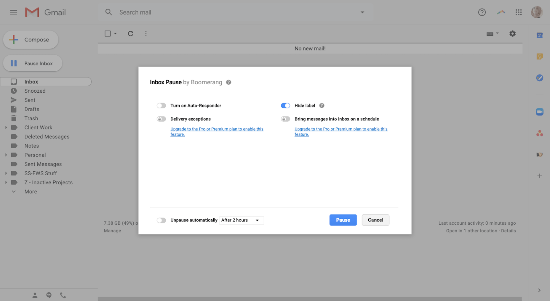
2. Boomerang for Gmail

Because I worked as a project manager for so long, it’s my natural instinct to reply to messages and tackle new tasks the second they hit my inbox. This is a major problem for me as a writer because once I lose track of what I’m working on, it takes a couple minutes to get back into the swing of things.

That said, I can’t focus if my Gmail isn’t at Inbox Zero. It’s just how I operate. 

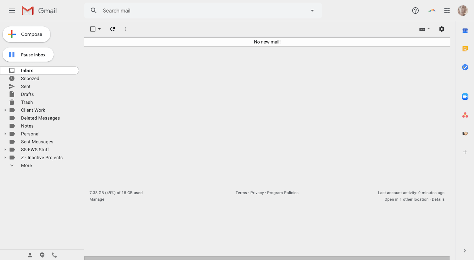
So, I fake it with Boomerang for Gmail

What it does is it prevents new messages from entering Gmail and holds them in a hidden queue for me. While it took some getting used to, it’s actually helped me become less dependent on email during the workday. I also use it at night and on the weekends when I really shouldn’t be working anyway. 

Another cool feature is that I can schedule my emails. That way, if I want to wait on sending something to a client or prospect, but don’t want to forget about it, I can schedule it to go out when I want it to.

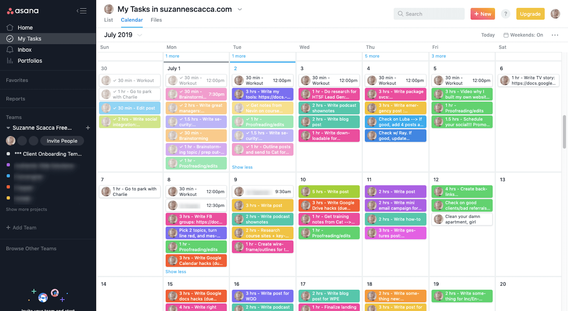
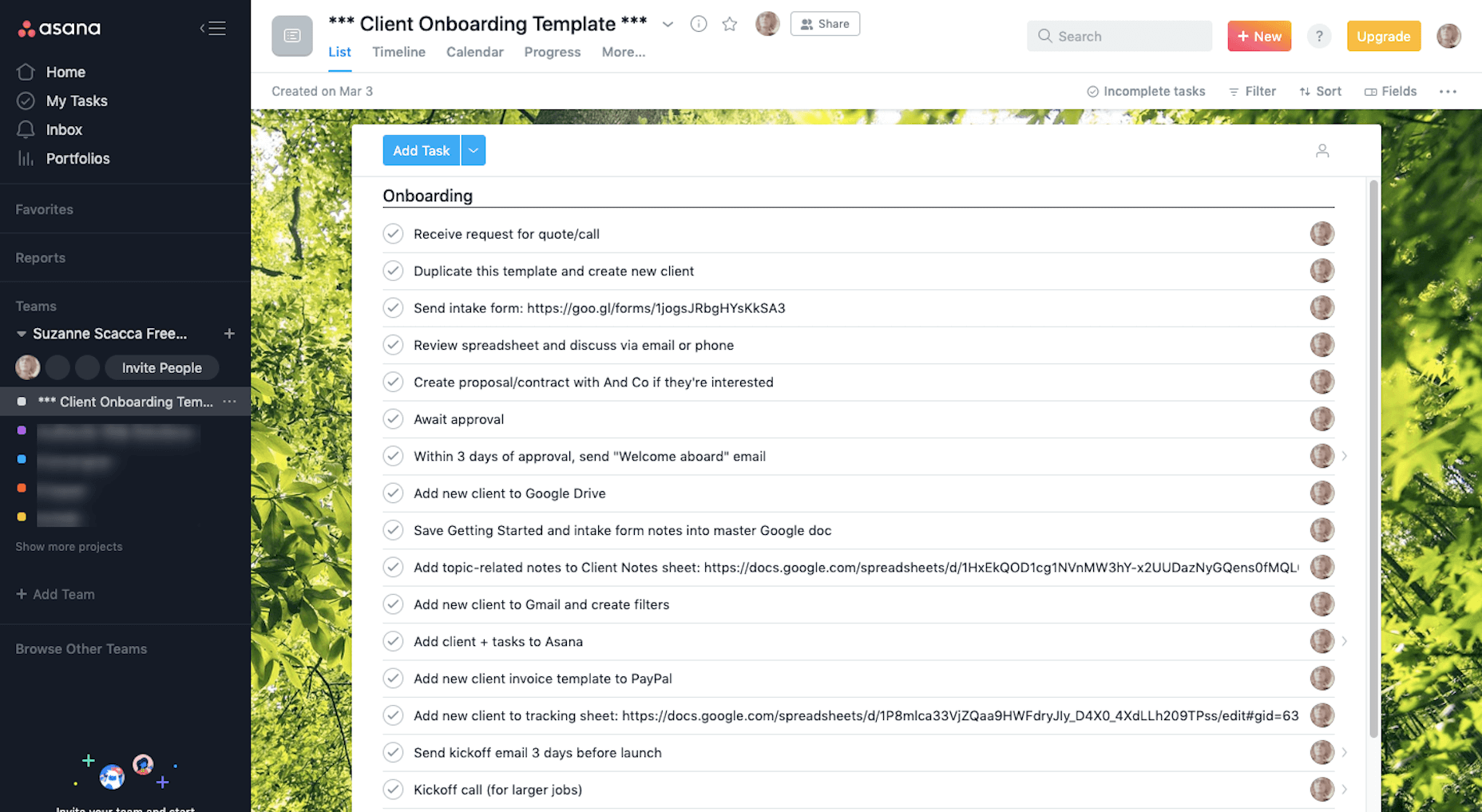
3. Asana

I’ve used enough project management systems to know what works for me and what doesn’t. And Asana has nearly everything I need.

With color-coded “Teams” for each of my clients and an easy-to-use system of creating and completing tasks, Asana gives me great relief that I’ll never miss an assignment or deadline.

I also create templates for different parts of my workflow here, too.

I don’t know what I’d do without Asana. As I’ve scaled my business, I’ve worried that something will inevitably fall through the cracks, but this tool always helps me keep my head on straight.

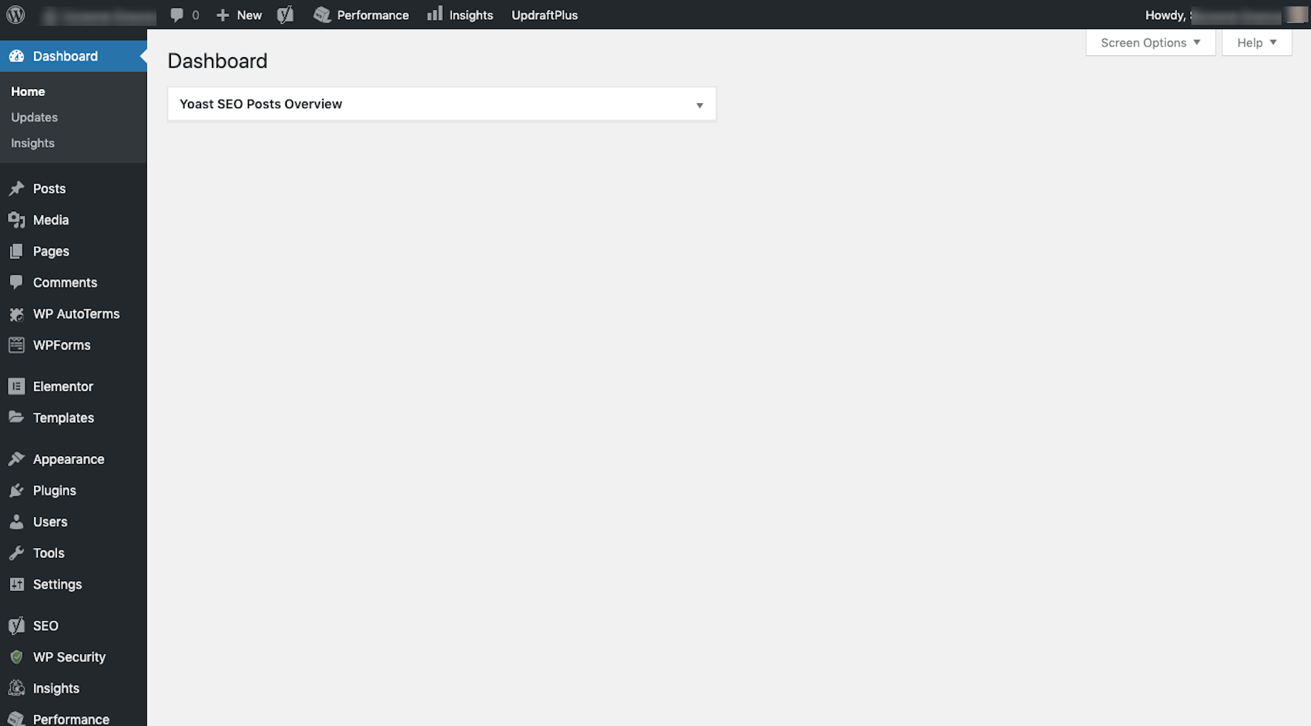
4. WordPress

I’ve been a WordPress user for almost 10 years. First, it was to create websites for myself. Then, I worked for an agency where I created, documented, and refined our processes inside and outside of WordPress. Now, I write guides on how to build websites, use plugins, and customize themes. 

I occasionally help small business owners build WordPress websites, in addition to running my own. I also upload and optimize blog content I write for clients that have WordPress websites. 

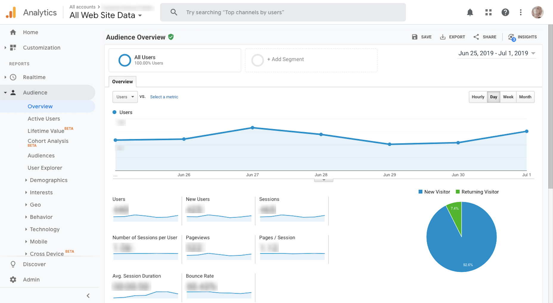
5. Google Analytics & 6. Google Search Console

I use Google Analytics weekly to measure my website’s stability and overall reception with visitors. 

I also use Google Analytics to determine what kind of topics to write for my clients.

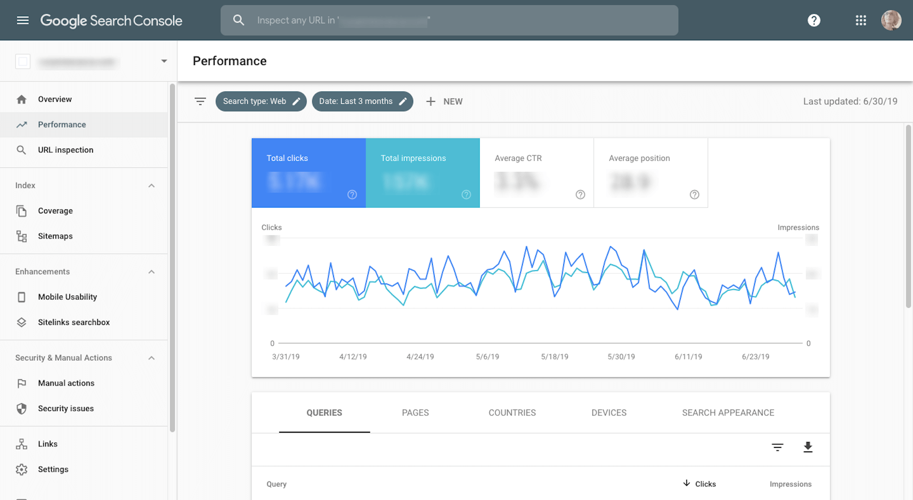
I use Google Search Console in conjunction with Google Analytics. (It’s very rare I’ll go into one without accessing the other.)

While Google Analytics tells me most of what I need to know about my website traffic and how they’re responding to my content, I need Google Search Console to help me fill in the searchability and ranking piece.

7. My iPhone

It’s very difficult for me to work without my iPhone since I’m constantly having to take screenshots of mobile websites or apps for articles. Because of this, I’m very easily tempted by distractions. 

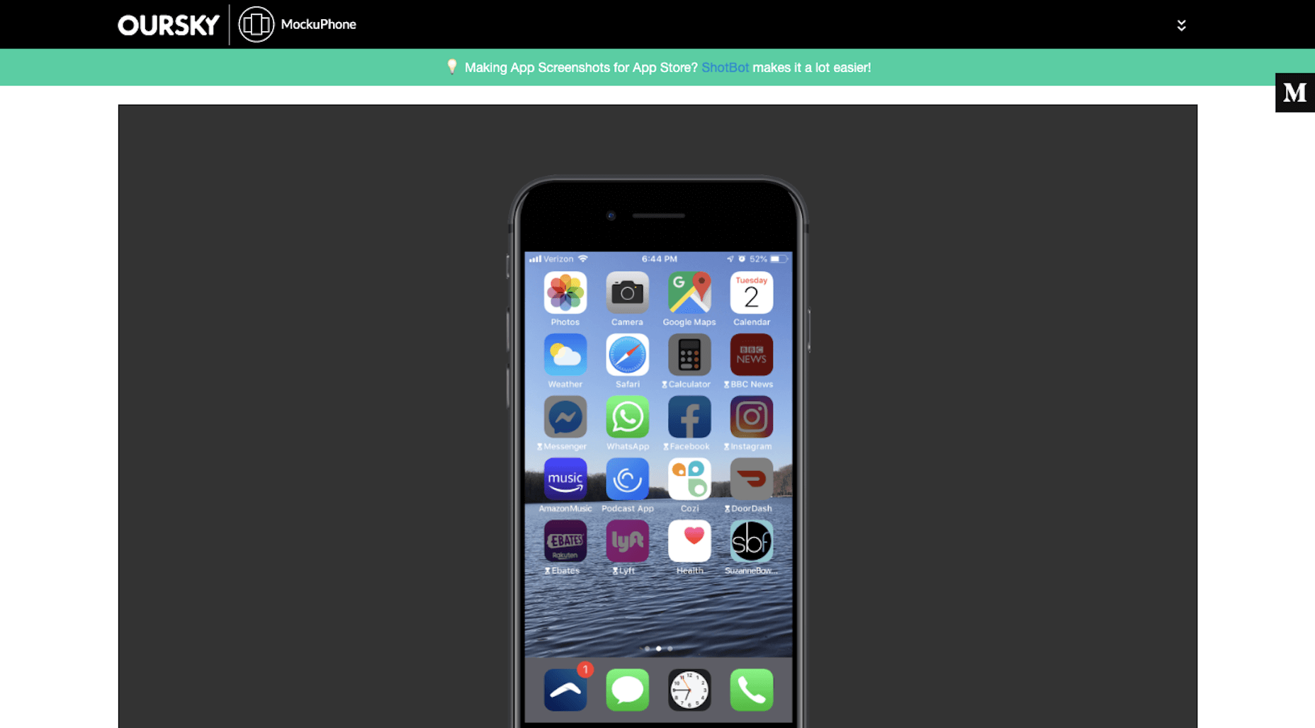
But then I discovered the iPhone’s distraction free mode that makes my phone look like this: 

I’ve set limits on how long I’m allowed to access certain apps for and turn off all notifications on them until the workday is over. It’s been great for helping me focus on what I need to do in the browser and then encouraging me to put the phone away when I’m done.

8. Local by Flywheel

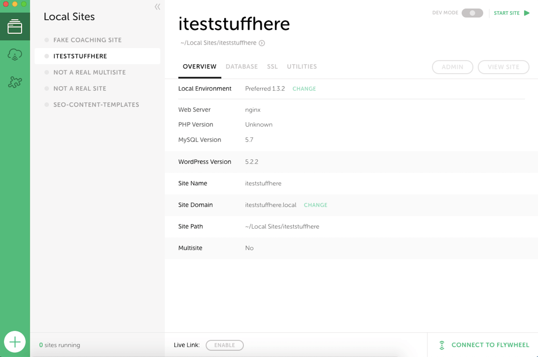
On occasion, I write articles or film videos that teach others how to use WordPress. Since I don’t want to use my own website to demonstrate these lessons, I use Local by Flywheel to create my simulations.

Essentially, it allows me to set up a local installation of WordPress so I can safely build anything I want. If I were still working on websites for clients, I’d be using this to safely handle updates and edits for their sites, too. For now, though, it’s just my playground.

9. KWFinder

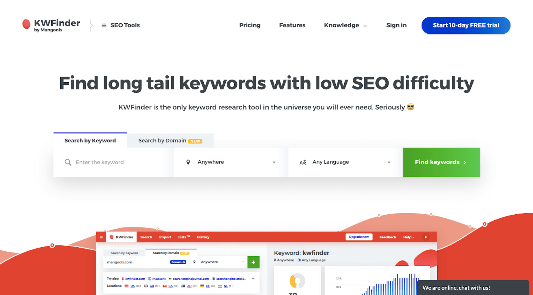
As part of my writing services, I optimize the content I write for search. Now, there’s a lot more to SEO than just keywording. However, I do always use KWFinder to ensure that the keywords I’ve chosen will help my clients’ content rank well in search. 

What’s more, because I write for a number of clients in Australia, I can filter my keyword lists for that specific audience. That way, my optimizations aren’t skewed to the wrong people, at least geographically speaking. 

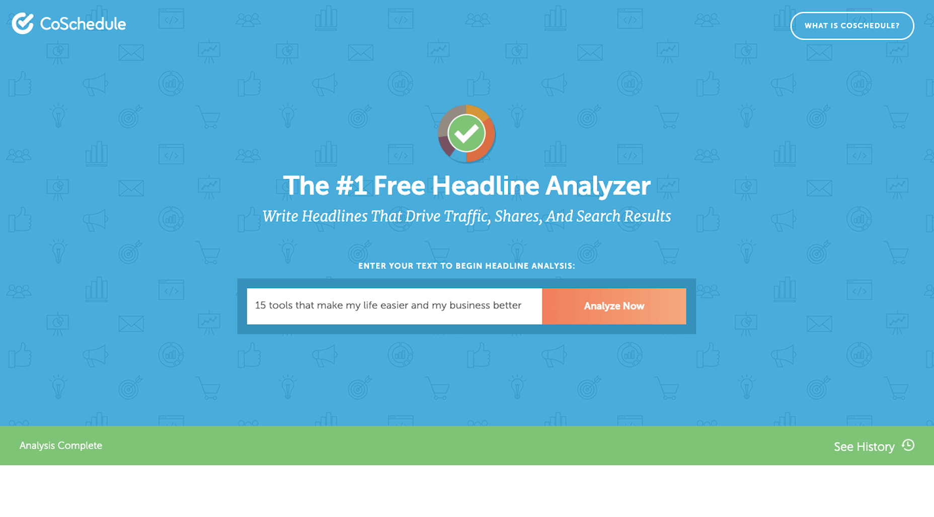
10. CoSchedule Headline Analyzer

I like to think of blog titles as gatekeepers. They appear in search results on behalf of our pages and posts. They appear in social media, attached to said pages. And they appear in RSS feeds, easy to miss if they don’t stand out from the content all around them. 

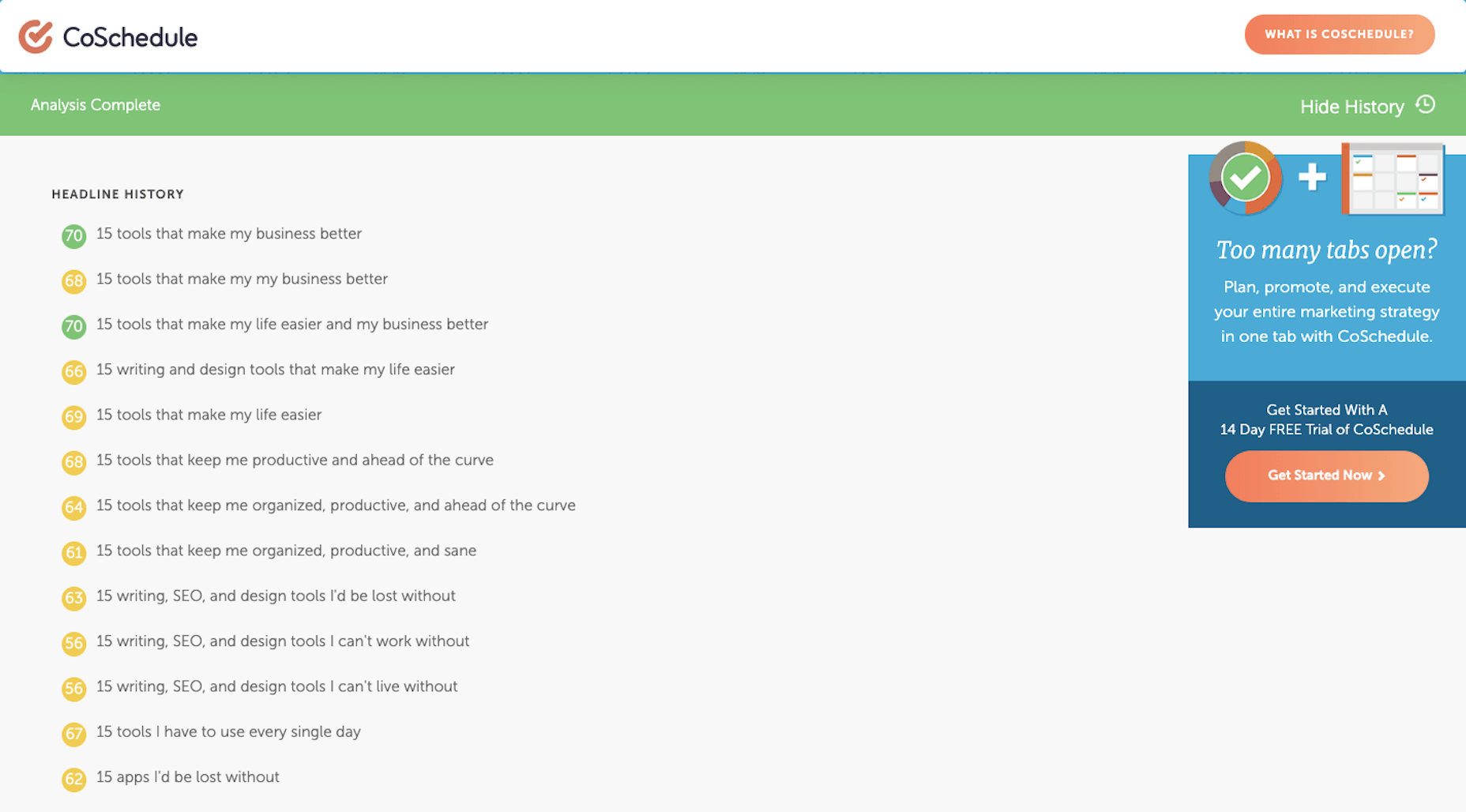
So, whenever I write something new, I break out the CoSchedule Headline Analyzer and run a test.

Every time I enter a new title, it saves and scores it for me. Red is bad, yellow is okay, and green is good.

While it can take some time finding the perfect combination of power words and title structure to get it right, it’s worth it. Without a strong headline, I can’t help my clients get clicks or reads.

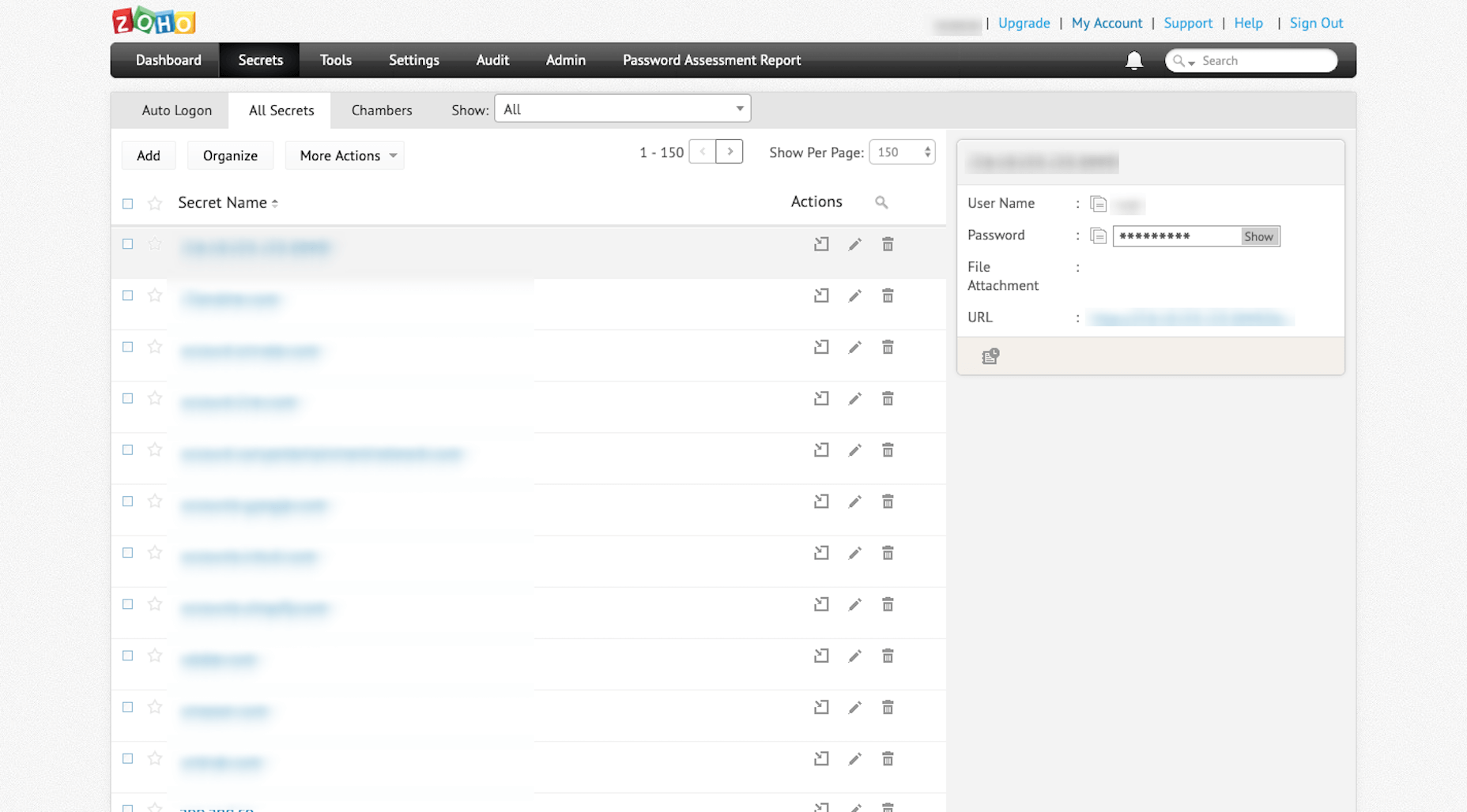
11. Zoho Vault

I’m not going to name names, but there was a different password manager I used for years before Zoho Vault

However, after they experienced a server outage last year, it corrupted all of the login and password records I had stored there (along with countless others). Because their customer support disappeared during and after the outage, and because I had to spend hours recreating passwords for all of my tools as a result, I decided to switch to a provider I knew and trusted: Zoho.

Since I log in and out of over a dozen tools every day, it’s absolutely critical that I have a way to quickly generate super-strong passwords and store them somewhere safe. Zoho Vault is the one that takes care of that for me now.

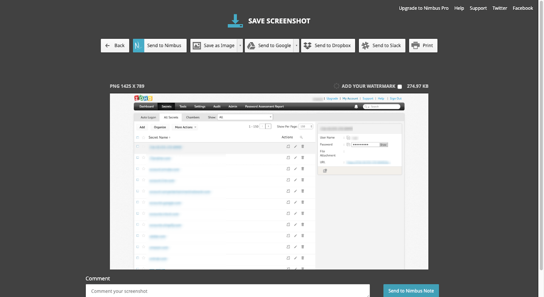
12. Nimbus Capture

Sometimes I feel like my job is “professional screenshot-taker”. As such, I need a tool that will take all kinds of screenshots for me: 

  • Selected areas of a screen
  • A full screen
  • An entire browser window
  • And video

What I like even more about Nimbus Capture is that it allows me to edit and annotate my screenshots before I ever save them to the file type of my choice. 

13. MockUPhone 

When I do screenshoting from my mobile phone, I don’t really like to share the raw portrait files from it. It’s not that there’s anything wrong with them. It’s just that they’re usually too tall and force readers to scroll in order to view the entire image. 

That’s why I use MockUPhone. It automatically places my screenshots into an iPhone UI. It also adds a horizontal buffer so it sits more comfortably within my content on a page. (You can see an example of this under “My iPhone” above.)

Wrap-Up

I remember a time when Excel spreadsheets and sticky notes were the best way to stay organized, productive, and sane. Needless to say, I’m really grateful for all of the tools that power my business and improve the work I do for clients on a daily basis. I can’t imagine being a freelancer and making any sort of profit without them.


Featured image via Unsplash.

Source

p img {display:inline-block; margin-right:10px;}
.alignleft {float:left;}
p.showcase {clear:both;}
body#browserfriendly p, body#podcast p, div#emailbody p{margin:0;}

from Webdesigner Depot https://ift.tt/2HF20dV


from WordPress https://ift.tt/2ZsSUa7

Sunday, August 25, 2019

Popular Design News of the Week: August 19, 2019 – August 25, 2019

Every week users submit a lot of interesting stuff on our sister site Webdesigner News, highlighting great content from around the web that can be of interest to web designers. 
The best way to keep track of all the great stories and news being posted is simply to check out the Webdesigner News site, however, in case you missed some here’s a quick and useful compilation of the most popular designer news that we curated from the past week.

Note that this is only a very small selection of the links that were posted, so don’t miss out and subscribe to our newsletter and follow the site daily for all the news.

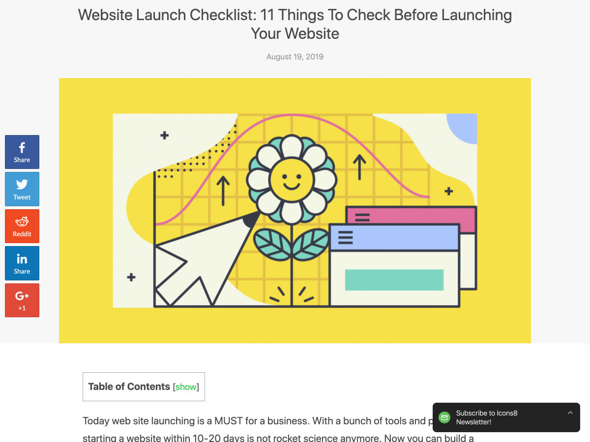
Website Launch Checklist: 11 Things to Check Before Launching Your Website


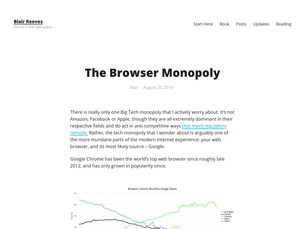
The Browser Monopoly


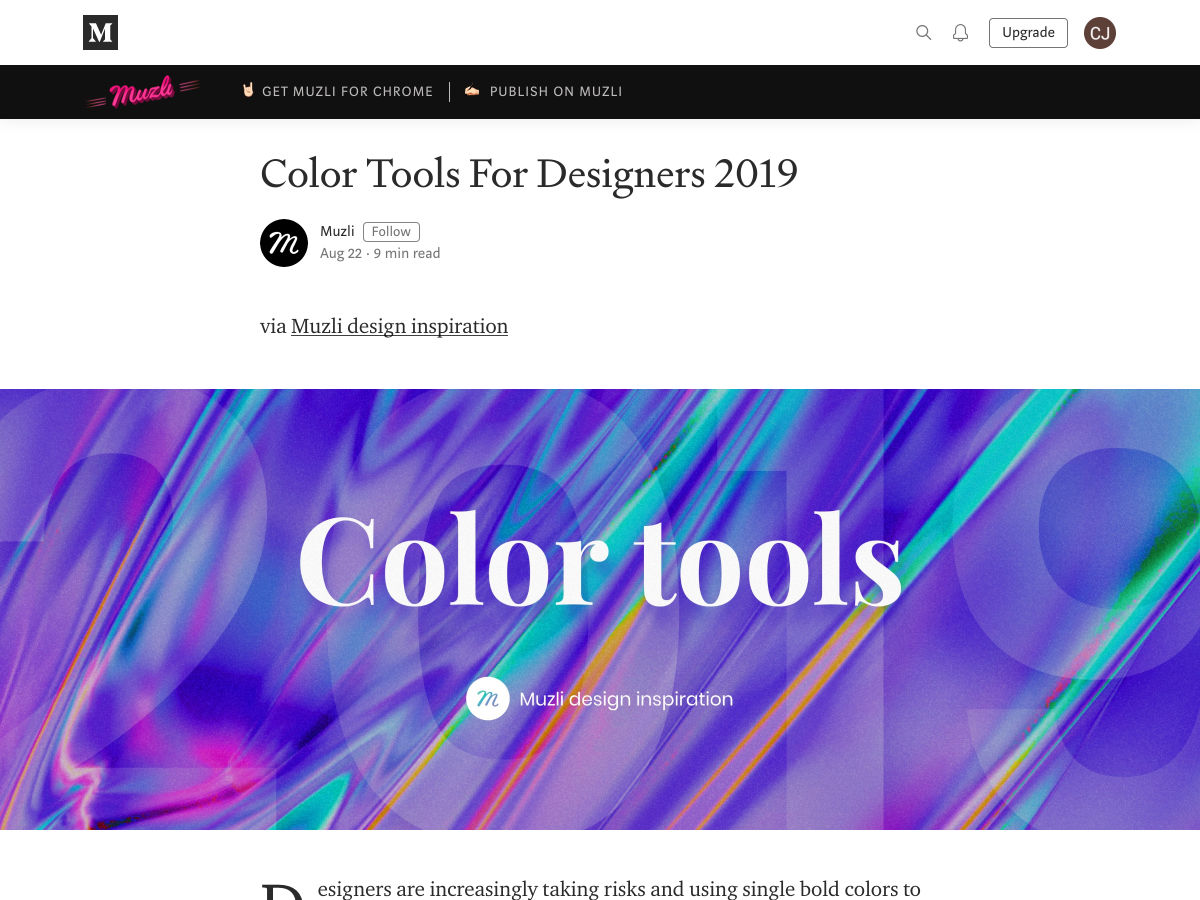
Color Tools for Designers 2019


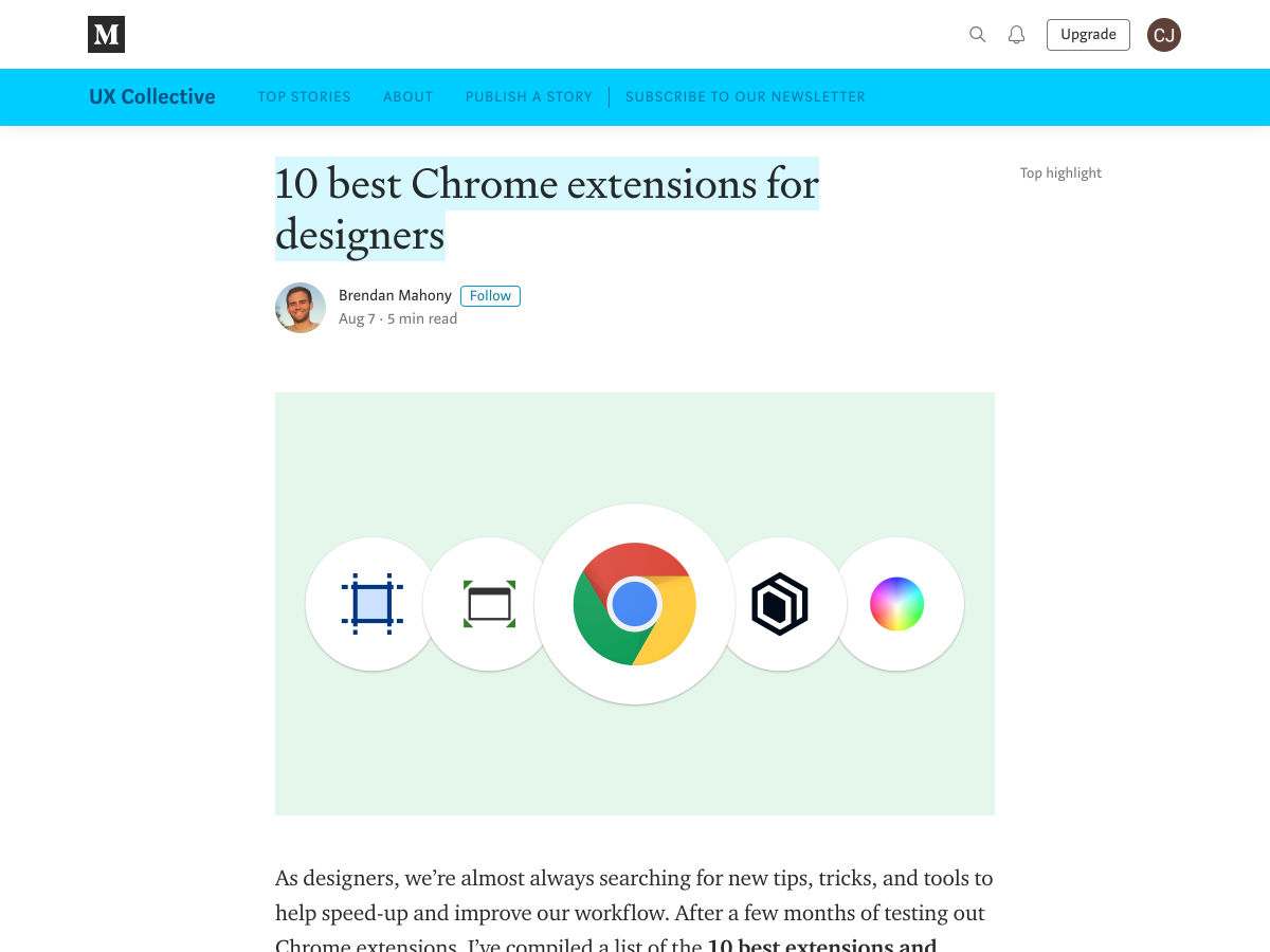
10 Best Chrome Extensions for Designers


Should We Still Be Selling Responsive Web Design?


Bond 25: British Spy Returns with a Slick New Logo


The Power of Visual in Product Design


What UX Writers and Designers Can Learn from Street Signs


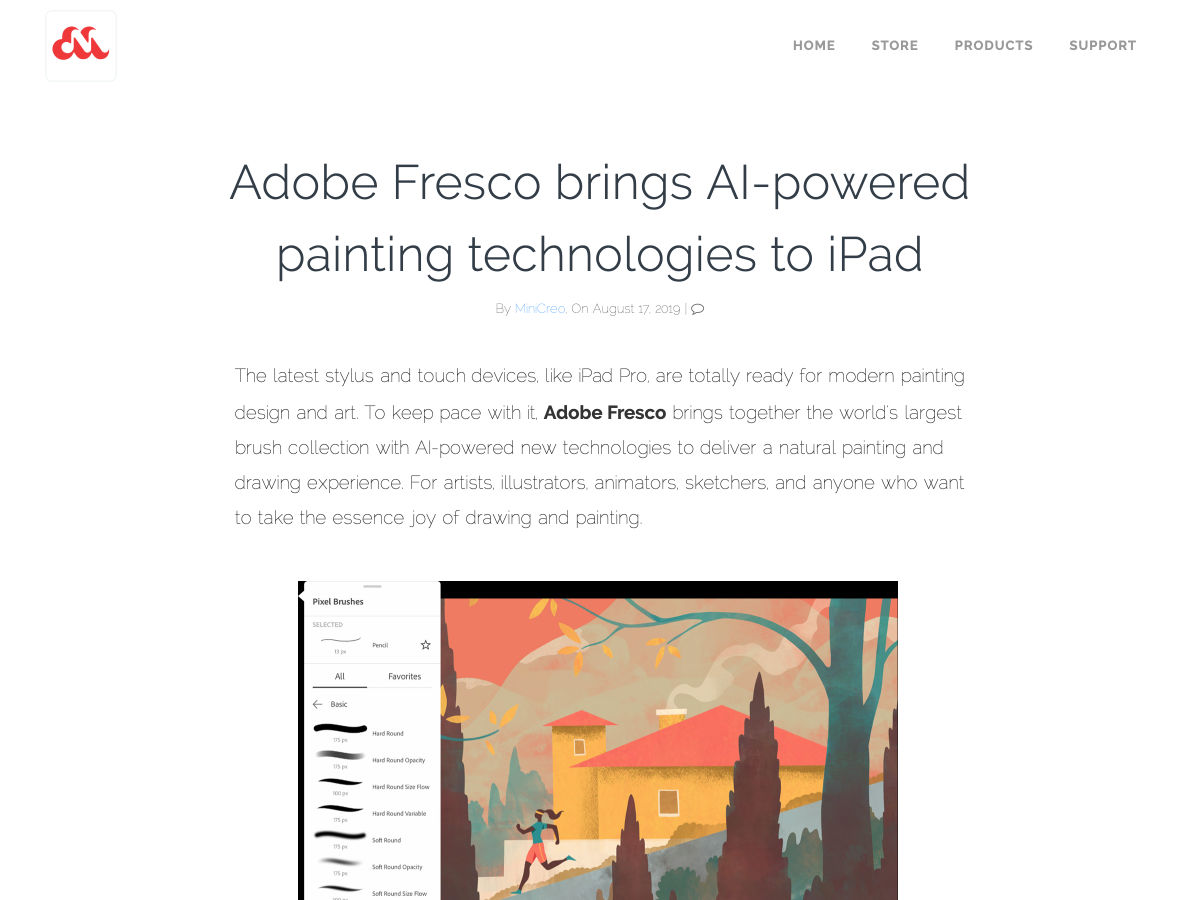
Adobe Fresco Brings the Best Watercolor and Oil Paint Strokes to iPad


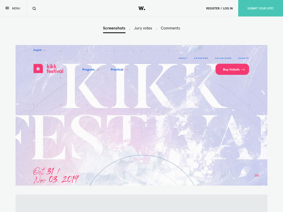
Site Design: KIKK Festival 2019


The Pros and Cons of Building Websites with Third-Party Products


When You Need to Show a Button’s Loading State


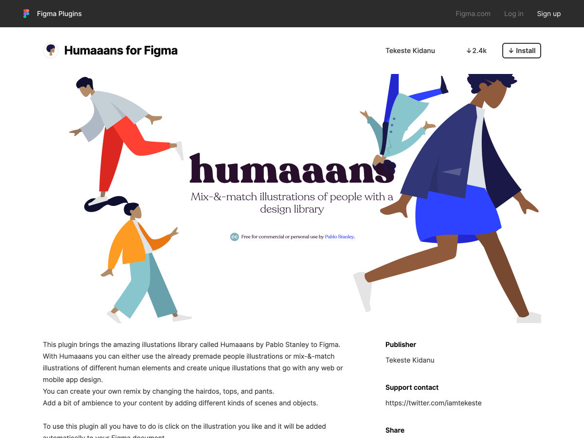
Humaaans for Figma


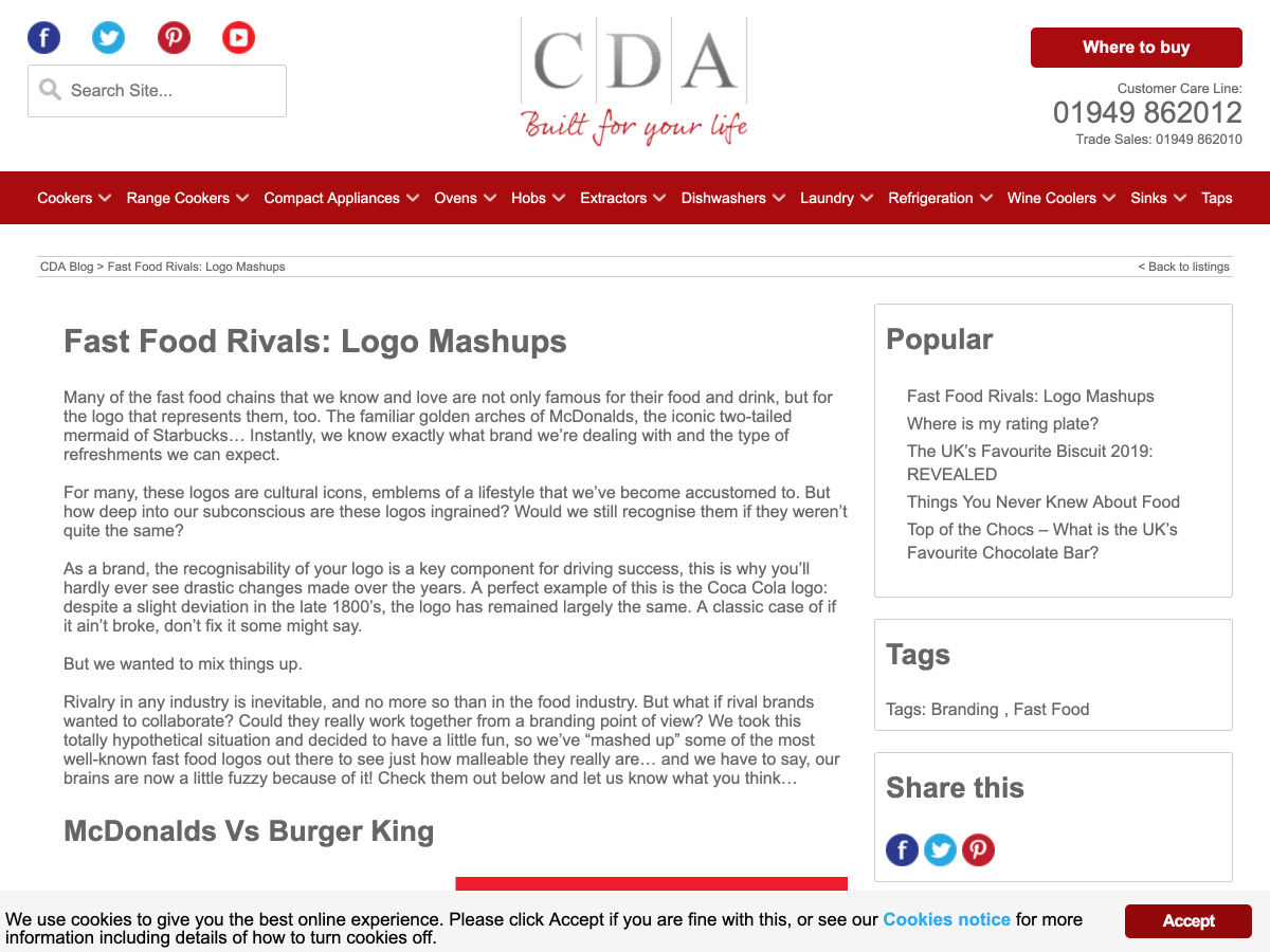
Fast Food Rivals: Logo Mashups


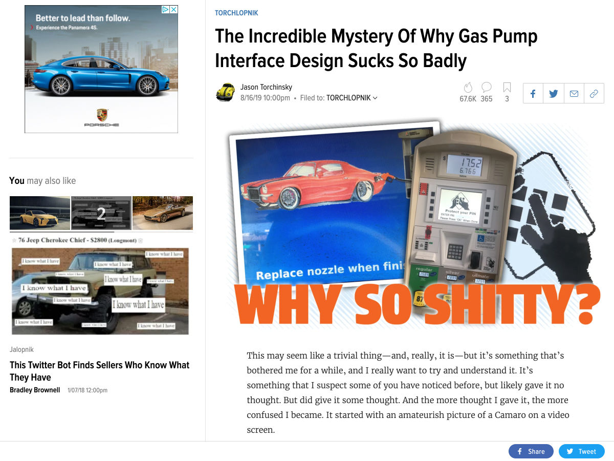
The Mystery of Why Gas Pump Interface Design Sucks so Badly


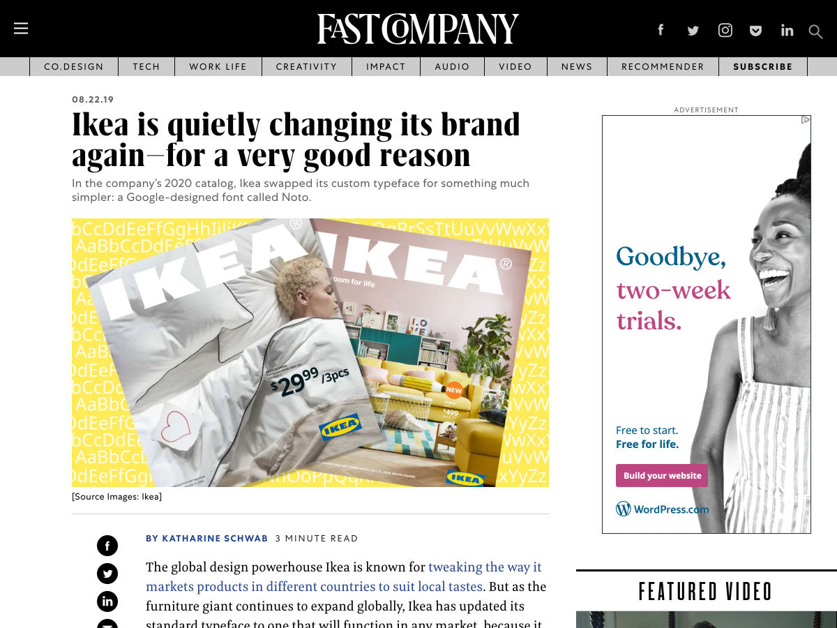
Ikea is Quietly Changing its Brand Again-for a Very Good Reason


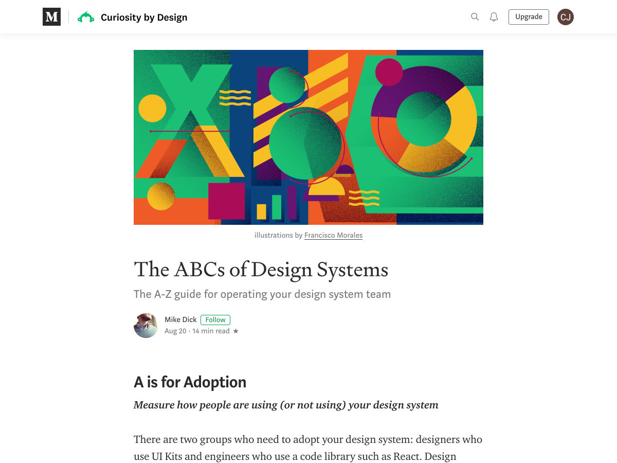
The ABCs of Design Systems


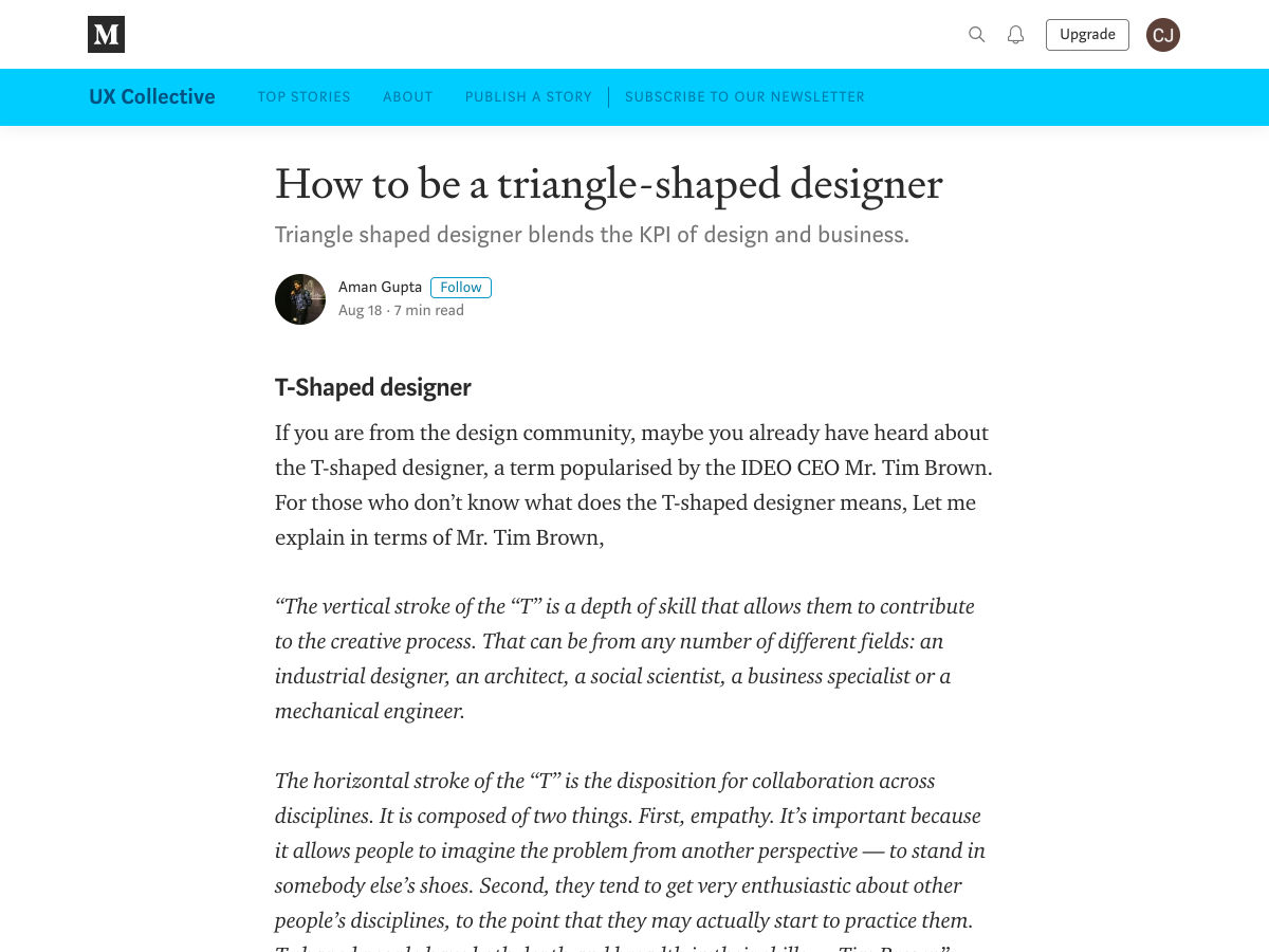
How to Be a Triangle-shaped Designer


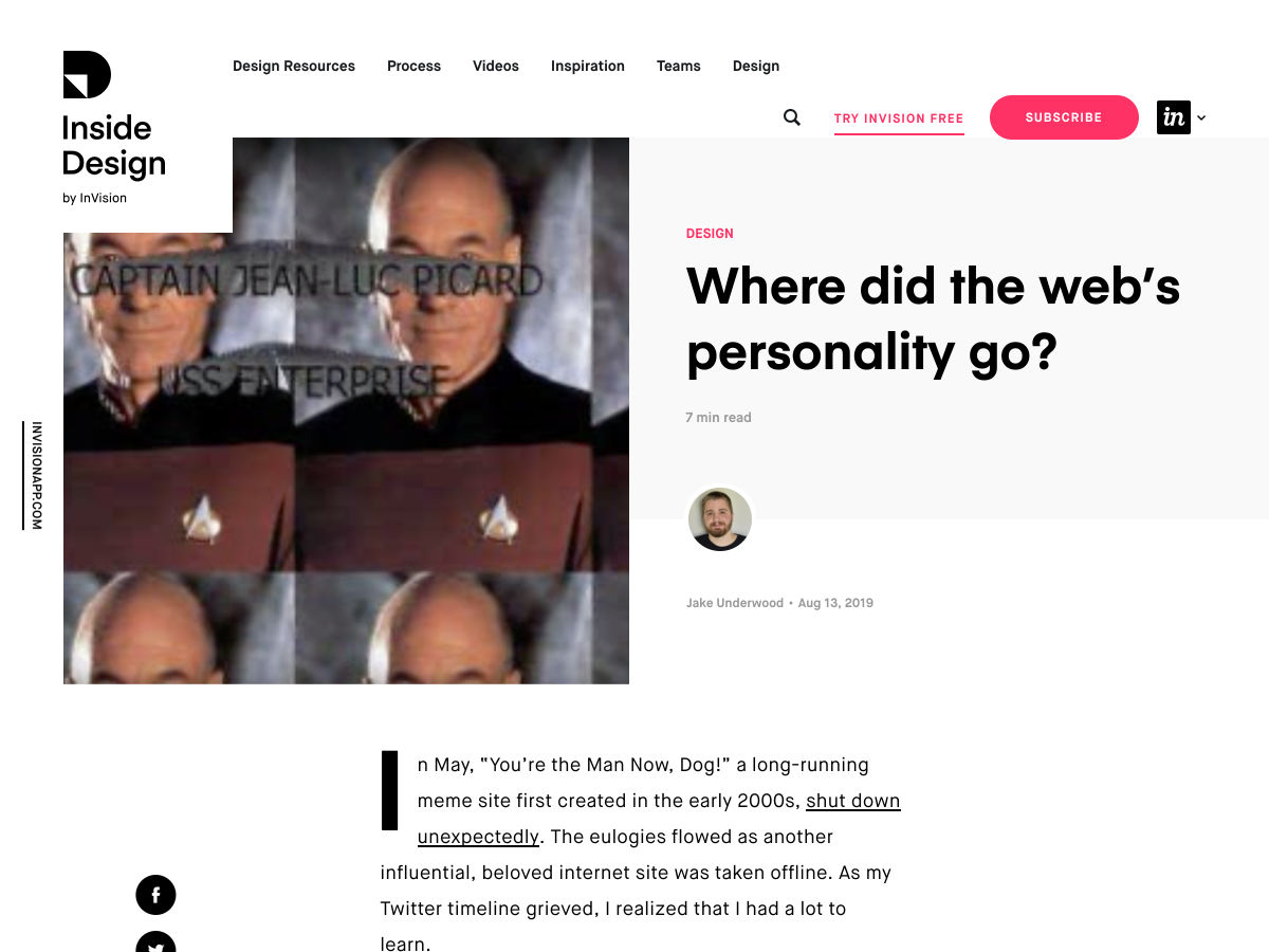
Where Did the Web’s Personality Go?


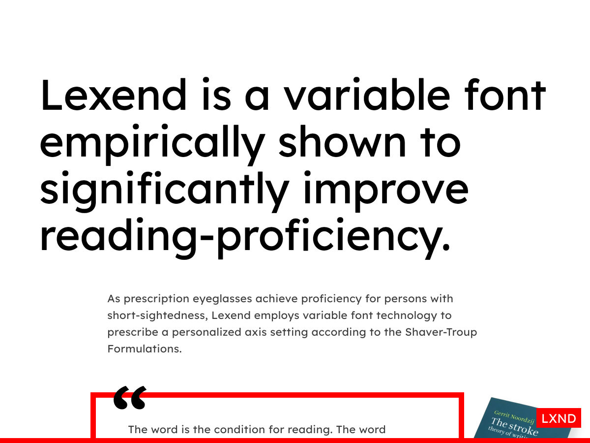
Lexend – A Variable Font Designed for Reading


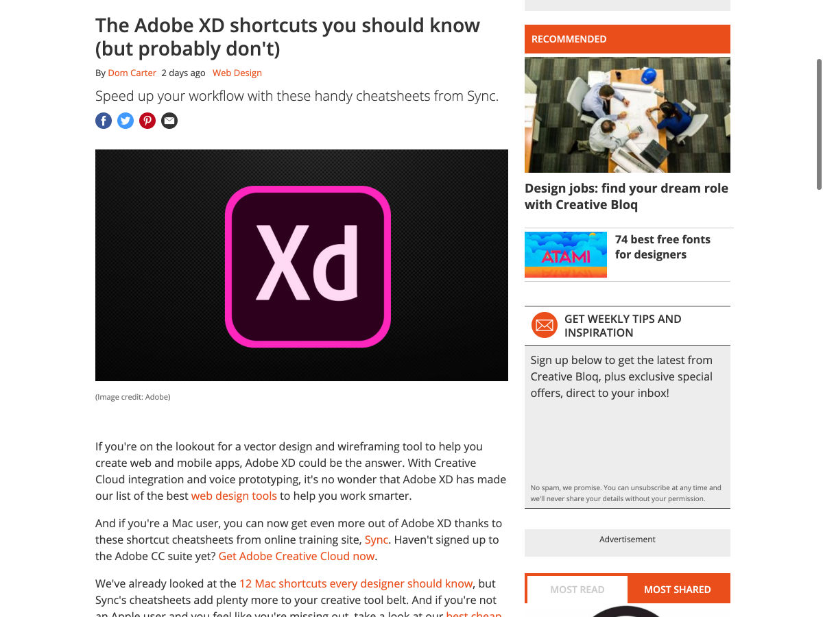
The Adobe XD Shortcuts You Should Know (but Probably Don’t)


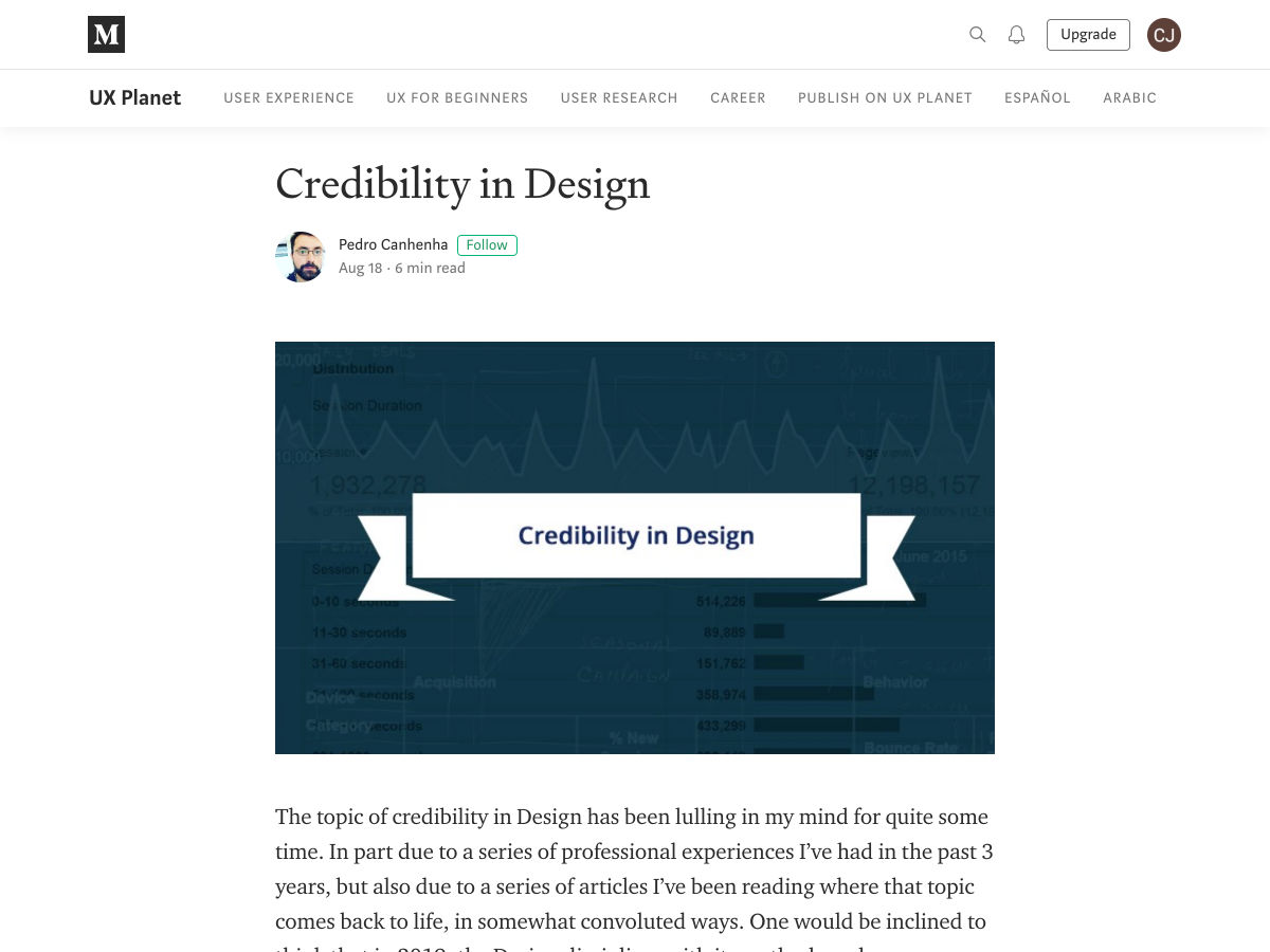
Credibility in Design


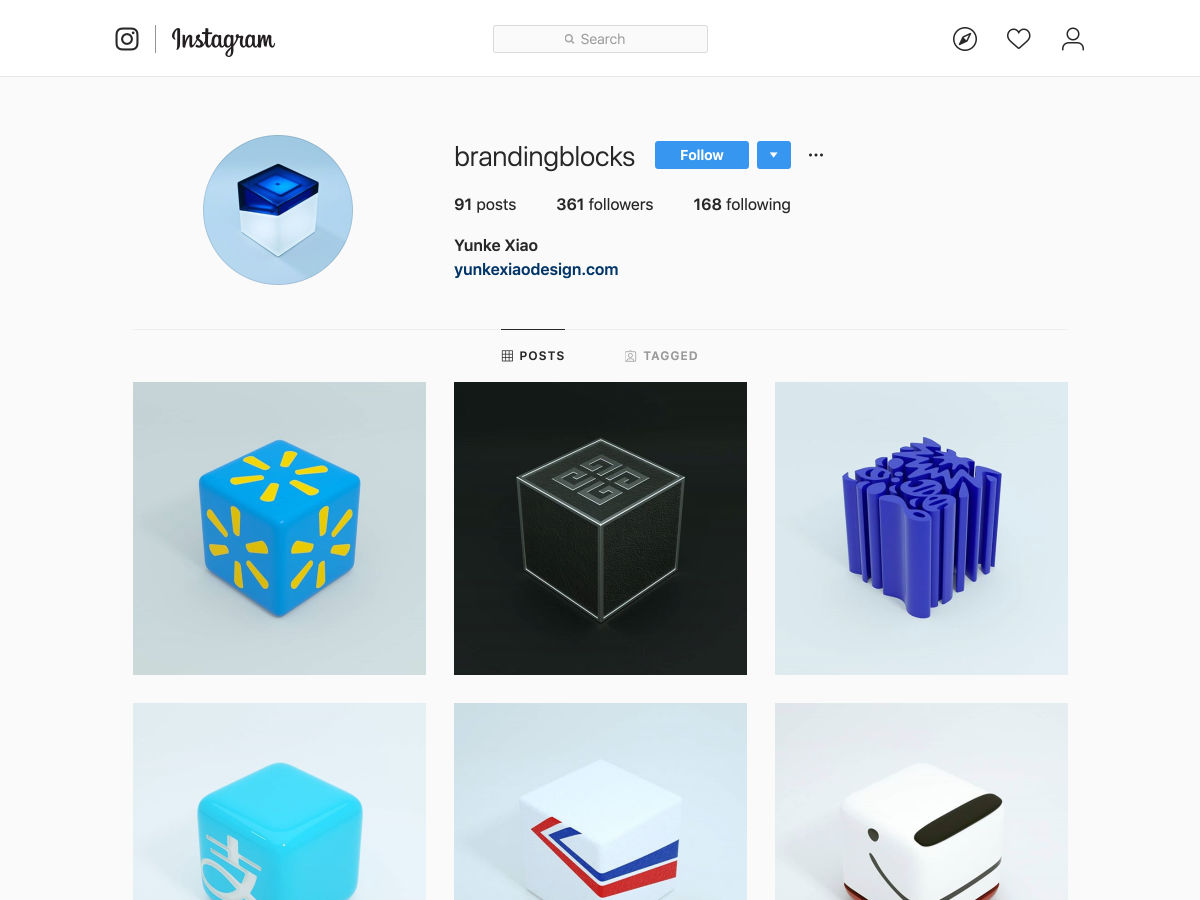
Branding Blocks


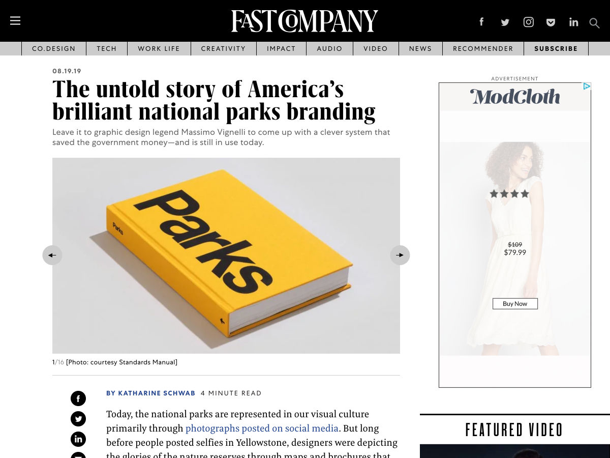
The Untold Story of America’s Brilliant National Parks Branding


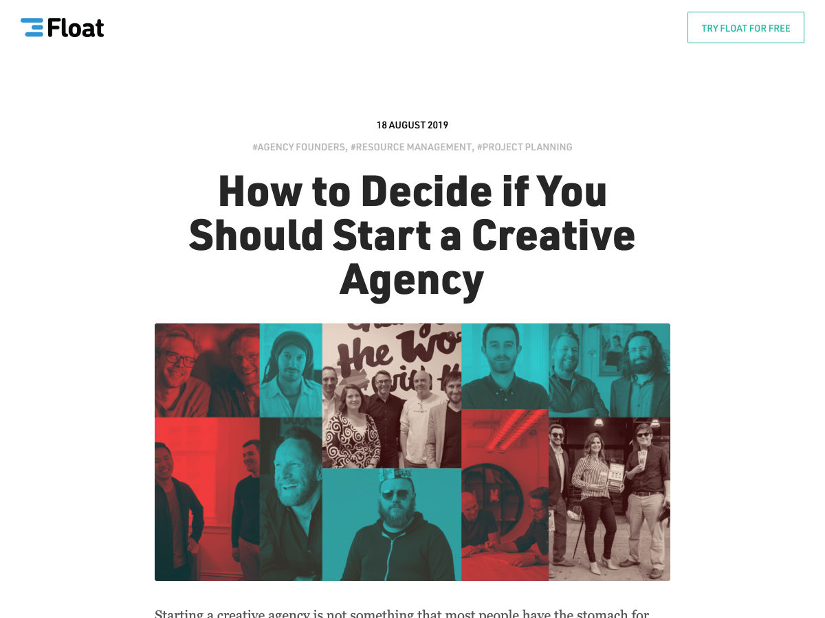
Should You Start a Creative Agency?


Want more? No problem! Keep track of top design news from around the web with Webdesigner News.

Source

p img {display:inline-block; margin-right:10px;}
.alignleft {float:left;}
p.showcase {clear:both;}
body#browserfriendly p, body#podcast p, div#emailbody p{margin:0;}

from Webdesigner Depot https://ift.tt/2MAoGzO


from WordPress https://ift.tt/3237eI4