
 Two of these three trends comes with some usability concerns but are a lot of fun to look at and play with. Would you take the risk of trying one of these design techniques? The third trend (up first in this list) is a new take on bold color palettes that shifts from some of the colors that have been overwhelmingly popular for a while.
Here’s what’s trending in design this month.
Warm Colors, Especially Reds
Warm colors – especially red tones – are back in!
As a point of reference, warm colors are vivid and bold and can sometimes be overwhelming because they can occupy and fill space will a feeling of fullness. Warm colors include reds, oranges, and yellows. They are all on the same part of the color wheel, which can be divided into warm and cool colors (blues, greens, and purples).
The nice thing about these warm colors is that they are bold without the same levels of brightness that have been popular for a while. They aren’t as overpowering as brights on smaller and darker screens and really set a different tone for the design that’s a little more serious.
Each of the examples below uses a warm (red) color palette in a different way.
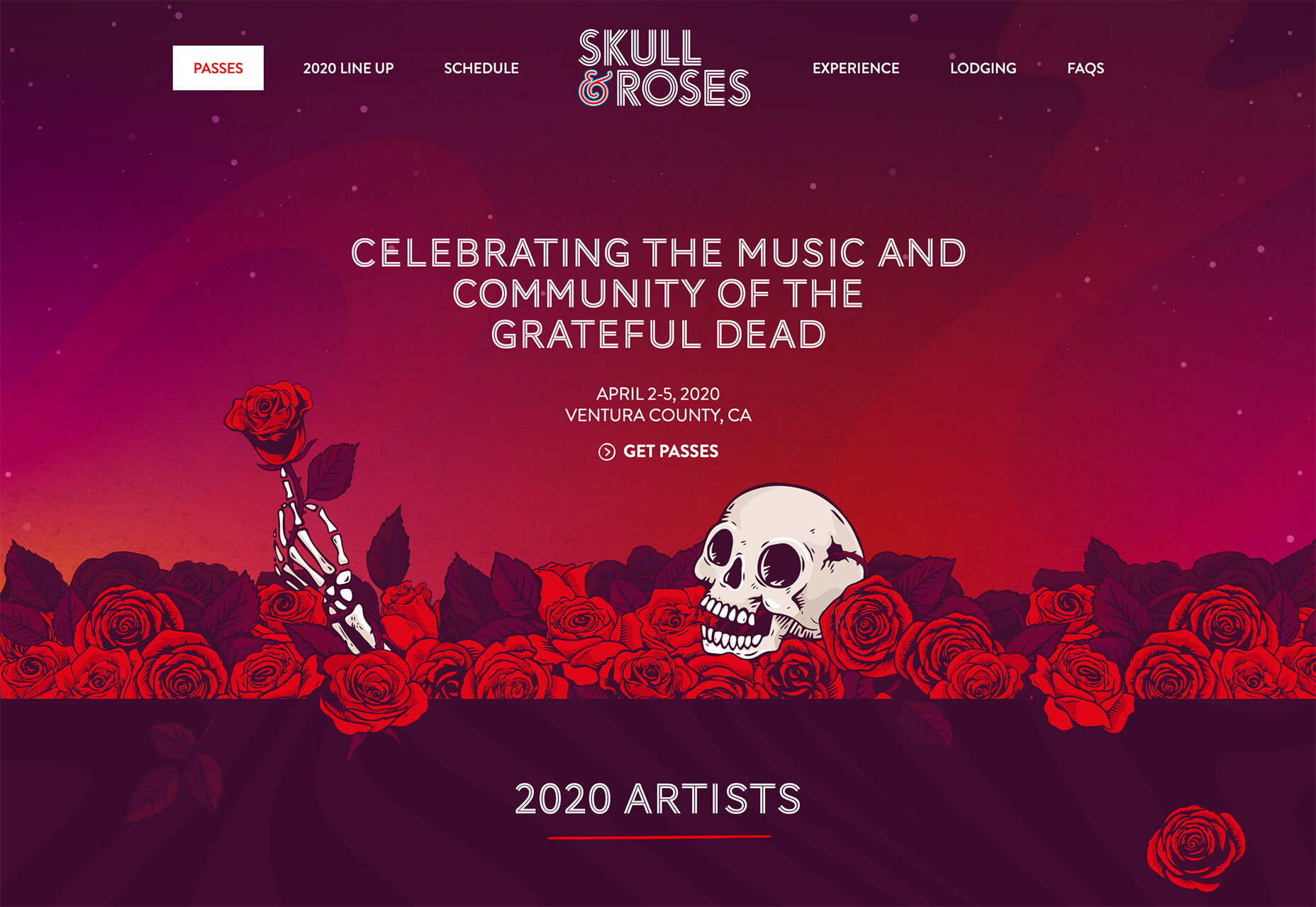
Skull & Roses uses a red and purple (warm and cool) palette to create contrast and fun gradients and color.
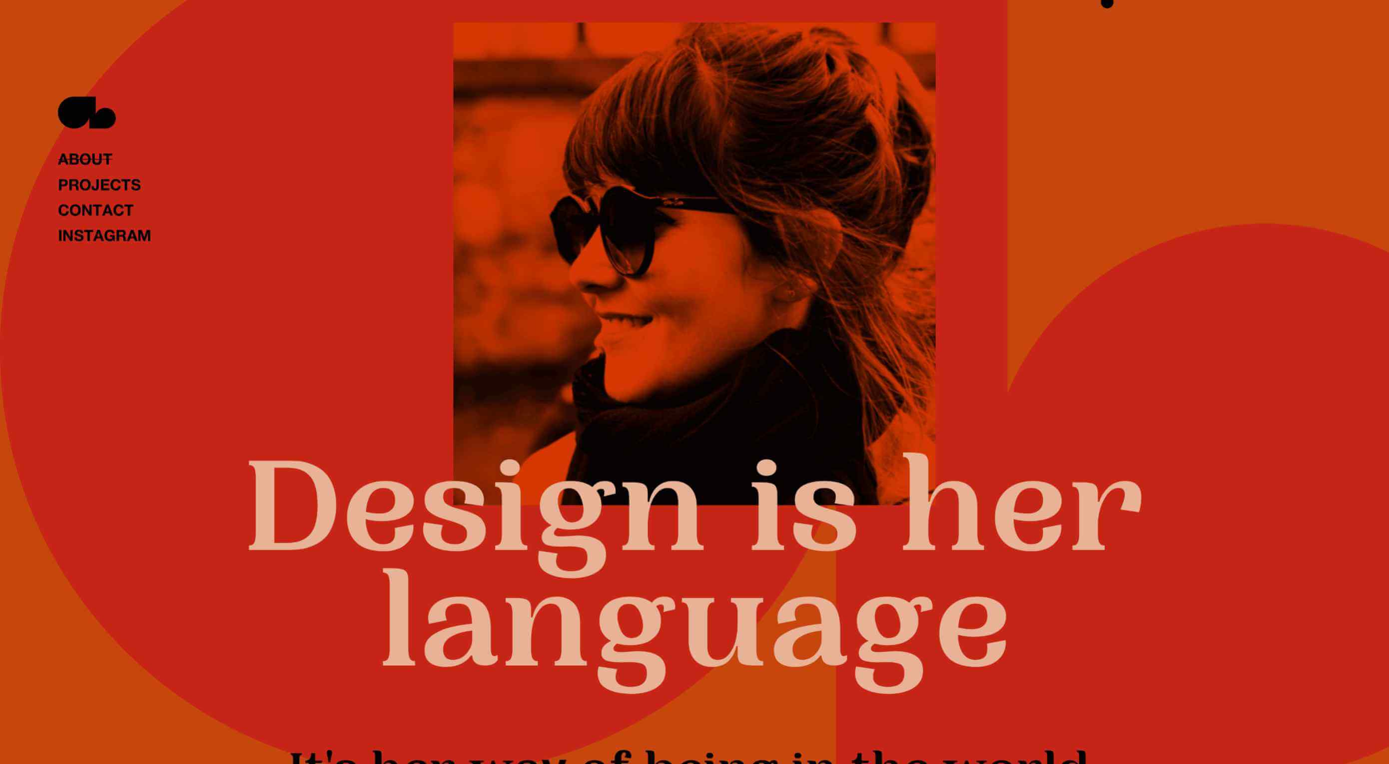
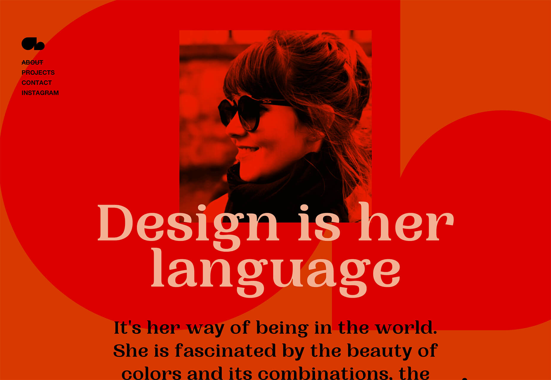
Amanda Braga uses a full red monotone color palette for the about page of her portfolio site. It’s bold, in-your-face, and demanding of attention. Even the photo has a red color cast on it.
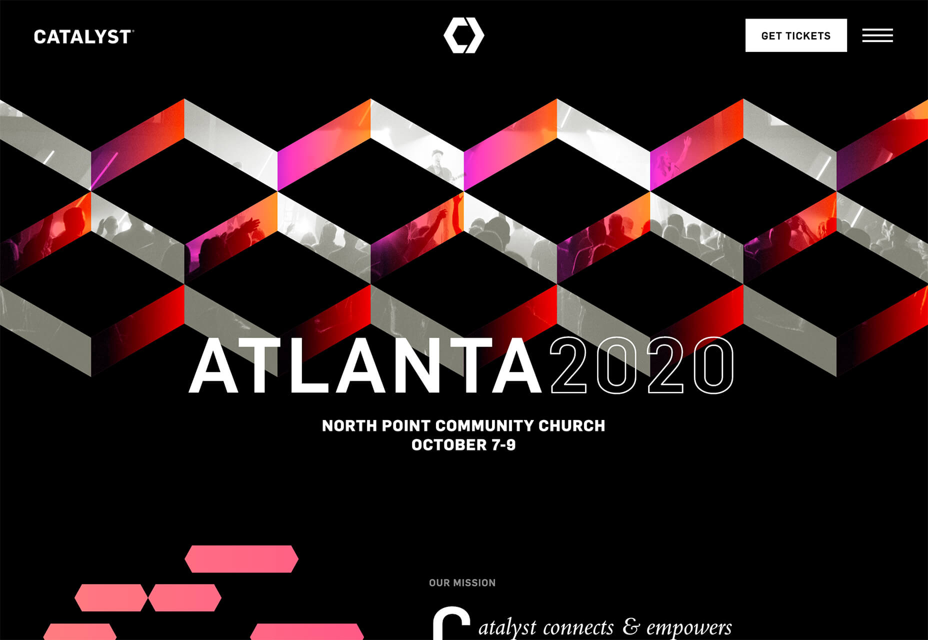
Catalyst uses pops of red with gradients to draw you into the 3D geo shape in the hero image. It creates a sense of motion and excitement for the event.
Full-Screen Heroes
An oversized hero image is nothing new. But hero headers that occupy the entire home screen are.
The trend also seems to come with another new element — no obvious navigation or need to scroll (although it’s often there). The result is a trend with super clean designs, with the possibility for design or usability challenges.
This trend works for one reason: Thanks to mobile usage, people are getting more accustomed to (or trained) to scroll. Small screens make it a way of life and this trend is relying on that to work.
But, will users know what to do and get past the homepage?
Can you find the visual cues in these examples?
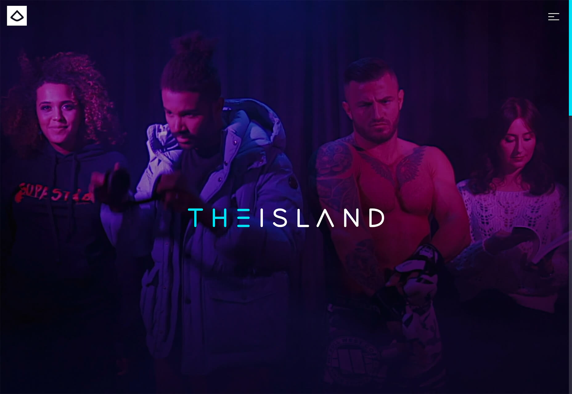
The Island has a fun full-screen video loop and has a right-hand scroll bar as a visual cue and a tucked in scroll icon on some screen sizes. A hamburger navigation menu can also help you find what you are looking for in this clean design.
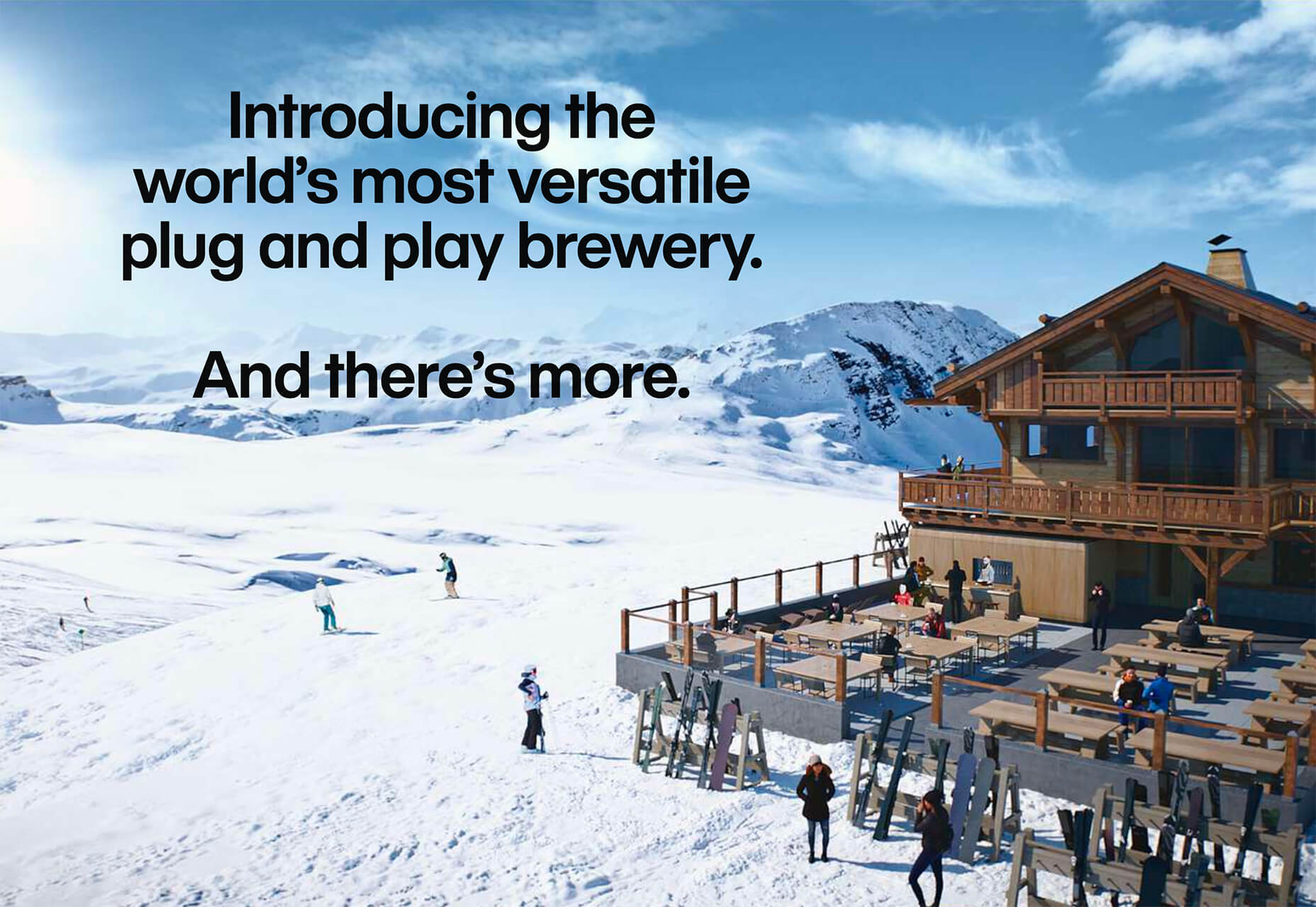
Wayout looks cool, but doesn’t have a scroll feature on screen. The phrase “And there’s more” is all you get to encourage looking further into the design. (There’s no navigation menu either.)
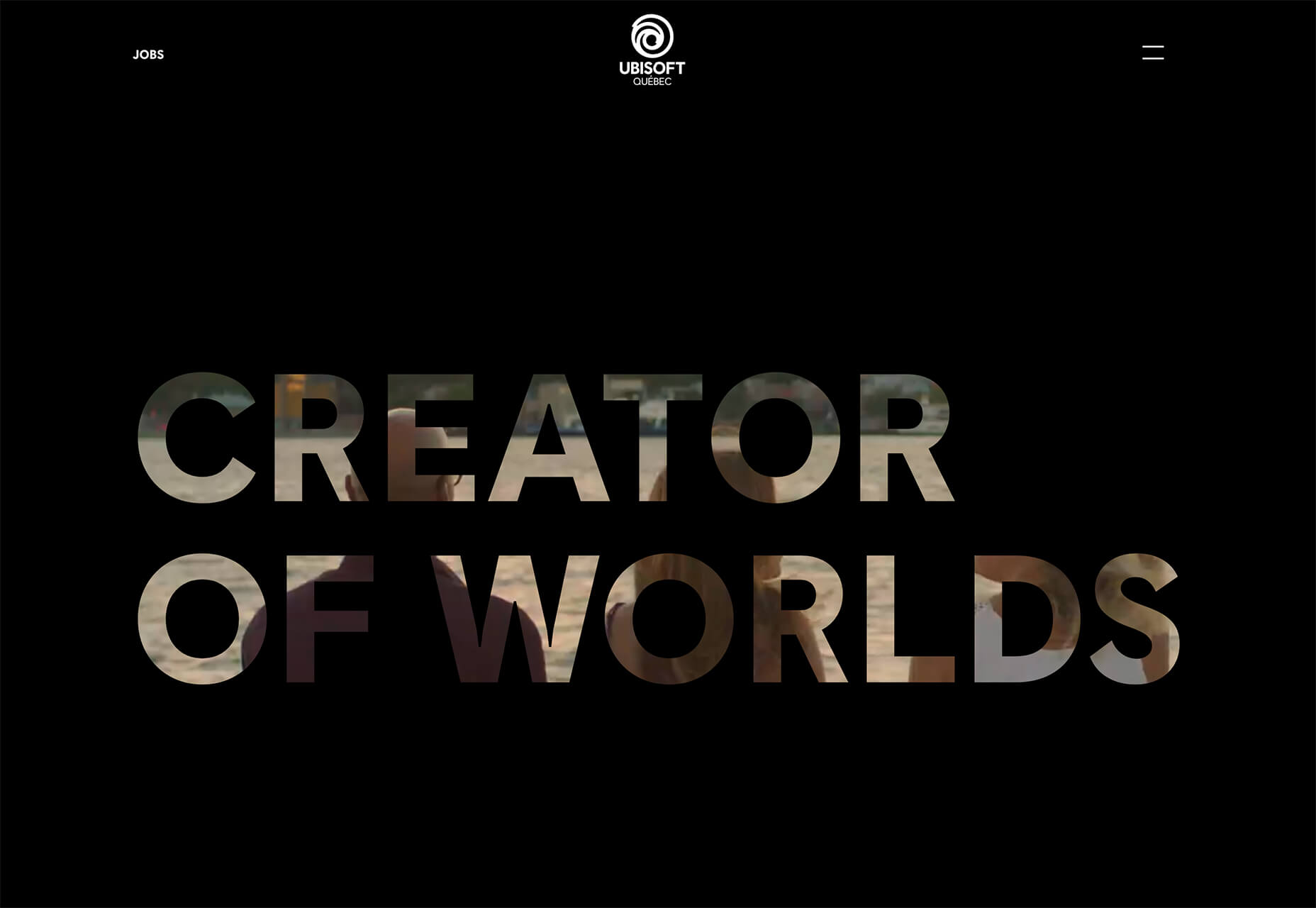
Ubisoft uses a full screen video that you get a glimpse of within text elements. There are no obvious scroll cues (and there is a scroll), but the hamburger icon is a visual cue that there’s more to the site than just a homepage.
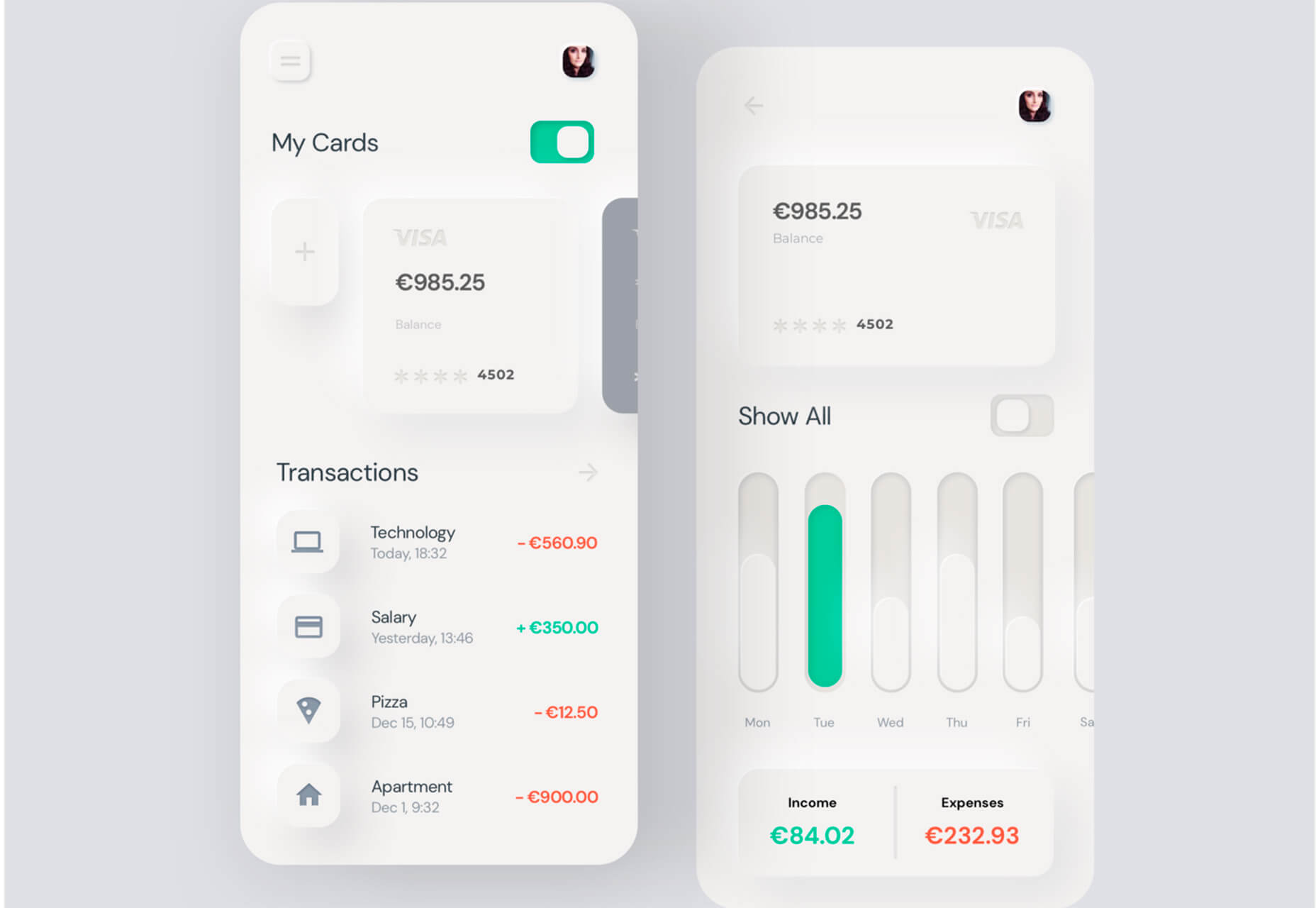
Neumorphism
This trend is one that is a mash up of popular web and app design techniques that’s starting to show up most commonly in app concepts.
Neumorphism (or new skeuomorphism) can be traced to an analysis by Michal Malewicz of Hype4 who did a nice deep dive into what this trend is (and isn’t) and how it works for designers. Neumorphism seems to be most popular when designing card-style interfaces.
The style can be identified by use of inner- and outer shadows to create an illusion of softer shapes that seem to lift off the background canvas.
Here’s how Malewicz describes it:
A Modern / Material (upgraded) card usually is a surface floating on top of our perceived background and casting a shadow onto it. The shadow both gives it depth and also in many cases defines the shape itself — as it’s quite often borderless.
While this trend has a cool, fresh look, it does come with some challenges. Primarily those issues deal with accessibility and contrast.
Either way, it’s a fun take on moving away from completely flat concepts to something with more depth, particularly for app-based interfaces. Time will tell if this trend really lifts off or not, since it is still in its infancy.
Want to play with neimorphism on your own? You can try this fun little CSS generator.
Conclusion
Of this month’s trends, the return of warm colors is especially nice. Red tones are inviting and interesting and a good shift from the super brights that have been so popular.
The other trends each present their own usability challenges, but have high visual interest. Could you see yourself using them in projects? (A portfolio, maybe?)
What trends are you loving (or hating) right now? I’d love to see some of the websites that you are fascinated with.
p img {display:inline-block; margin-right:10px;}
.alignleft {float:left;}
p.showcase {clear:both;}
body#browserfriendly p, body#podcast p, div#emailbody p{margin:0;}
from Webdesigner Depot https://ift.tt/38bQe57
from WordPress https://ift.tt/3ak0auD
No comments:
Post a Comment