
 Are you trapped in a fourth floor apartment listening to the guy next door serenade the block from his balcony with a saxophone he made from a length of rubber tubing and an old boot?
While people the world over very sensibly self-isolate, it’s still possible to be productive, why not work on your portfolio? Strap on your noise-cancelling headphones, turn on some white noise, and grab some inspiration from our monthly roundup of the best portfolios launched in the previous four weeks.
This month we see several previous trends still going strong. There’s a whole heap of color, masses of glitch effects, and the re-return of that old favorite, big bold typography. Enjoy!
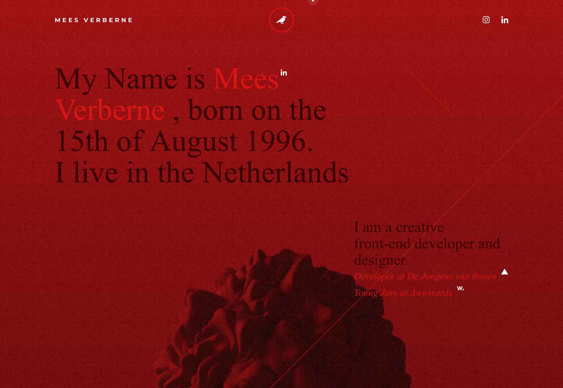
Mees Verberne
Mees Verberne describes himself as a creative front-end developer and designer. He makes full use of the popular glitch trend to give his site some character, but what it really does well is obscure the banding in his gradients, giving him a nice sophisticated lighting effect.
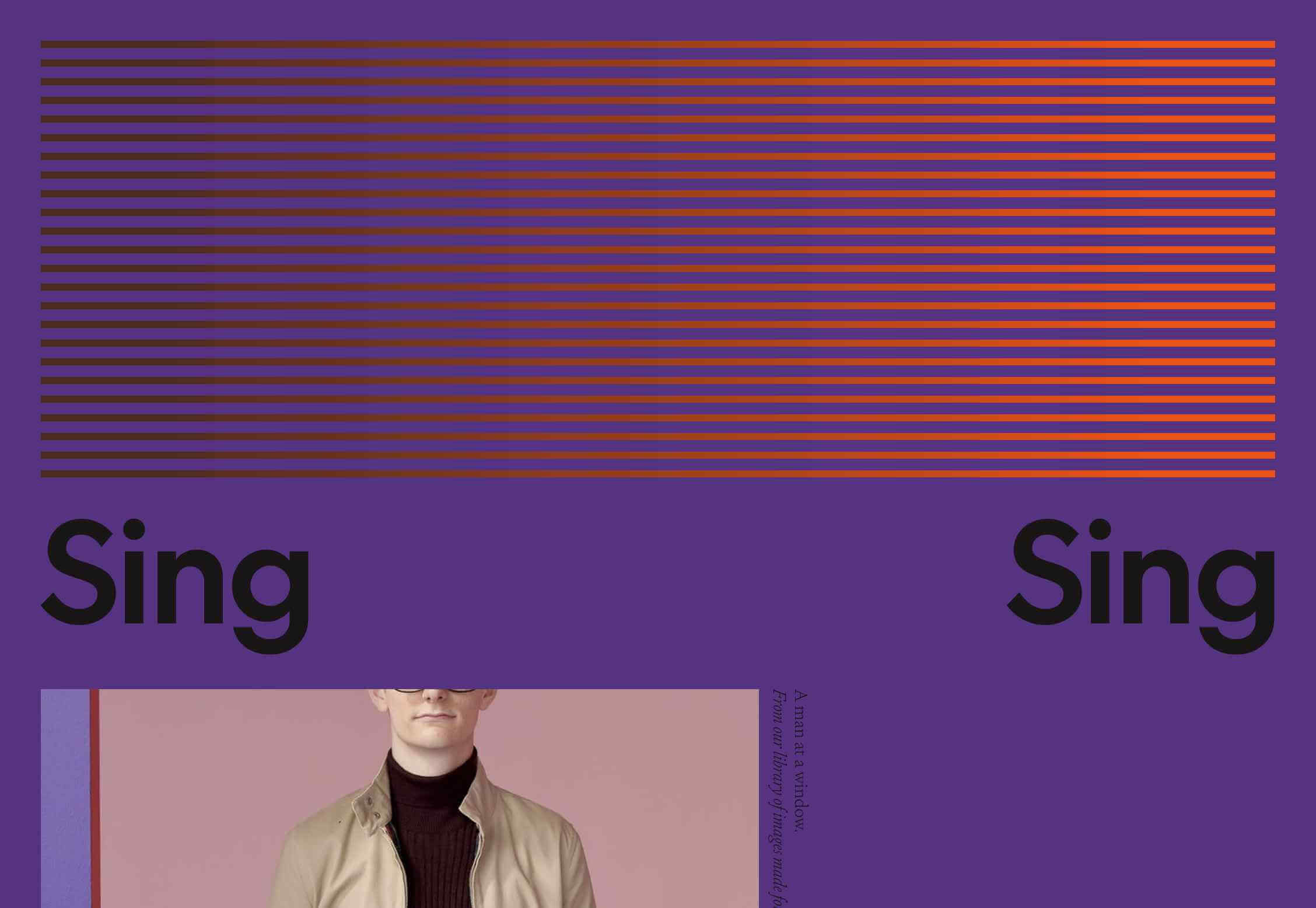
Sing-Sing
Adi Goodrich and Sean Pecknold founded Sing-Sing five years ago. Their award-winning work has a wonderful sense of color, with some genuinely original schemes in their design and film projects. The only criticism I would have is their hamburger menu, which isn’t immediately clear.
David Polonia
If you’re a fan of glitch effects, you’ll love David Polonia’s site. Normally I advise everyone to avoid sound on websites, but David’s portfolio benefits from the uplifting energy that it provides. There’s so much to explore here, it’s less a portfolio, and more of a showreel.
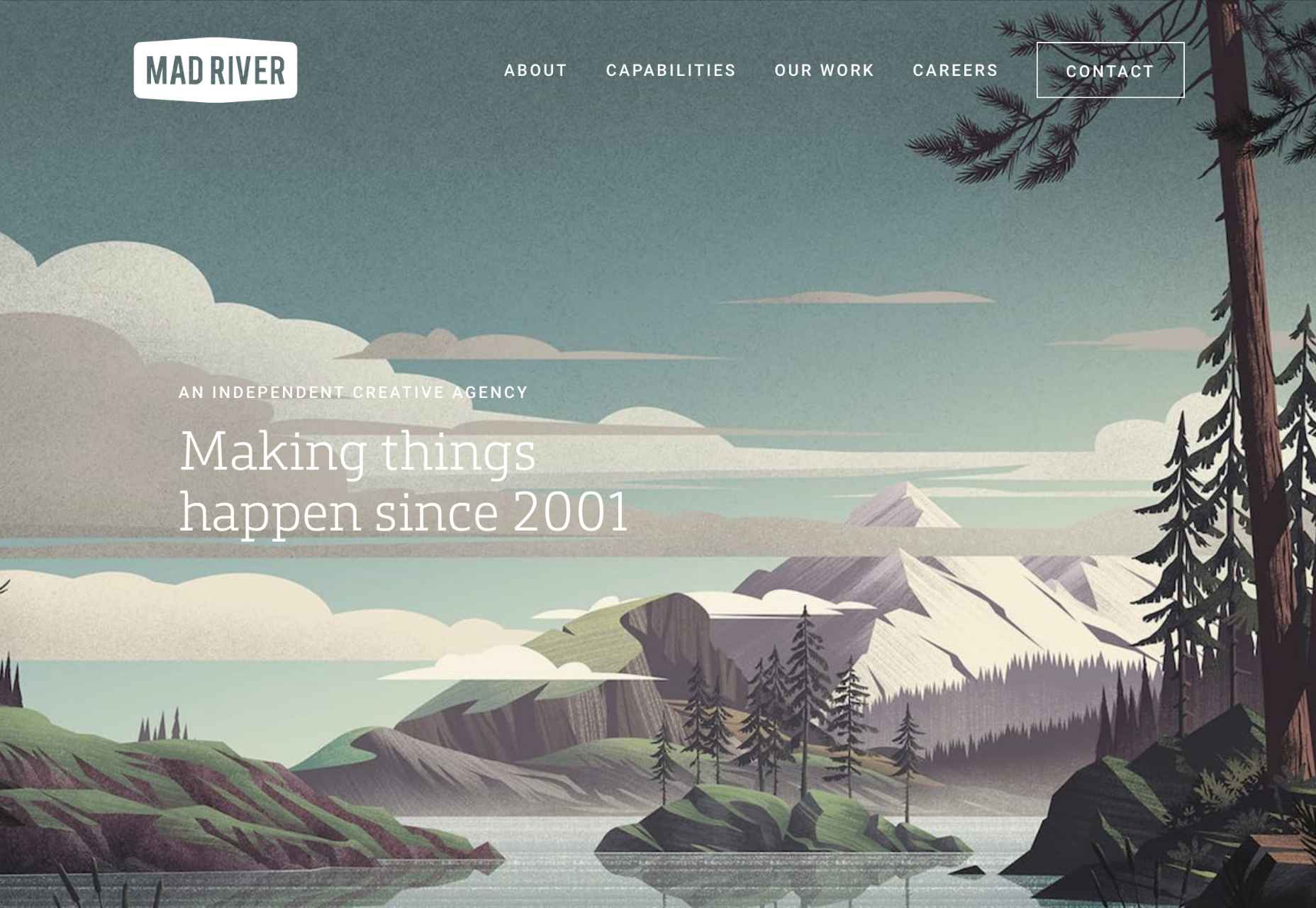
Mad River
Mad River’s work is the epitome of those hipster-lumberjack designs that have been popular for a few years. So naturally, for a British design agency, its site uses an illustration straight out of a US National Park guidebook. It is very beautiful though, and the site is a pleasure to browse round.
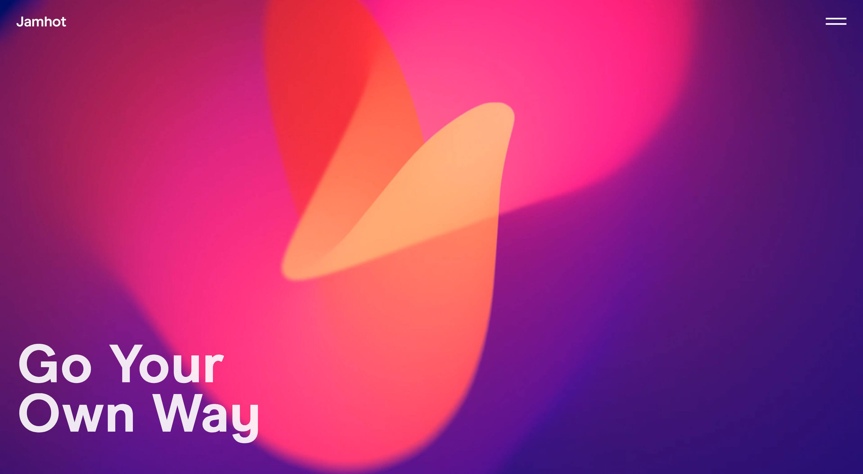
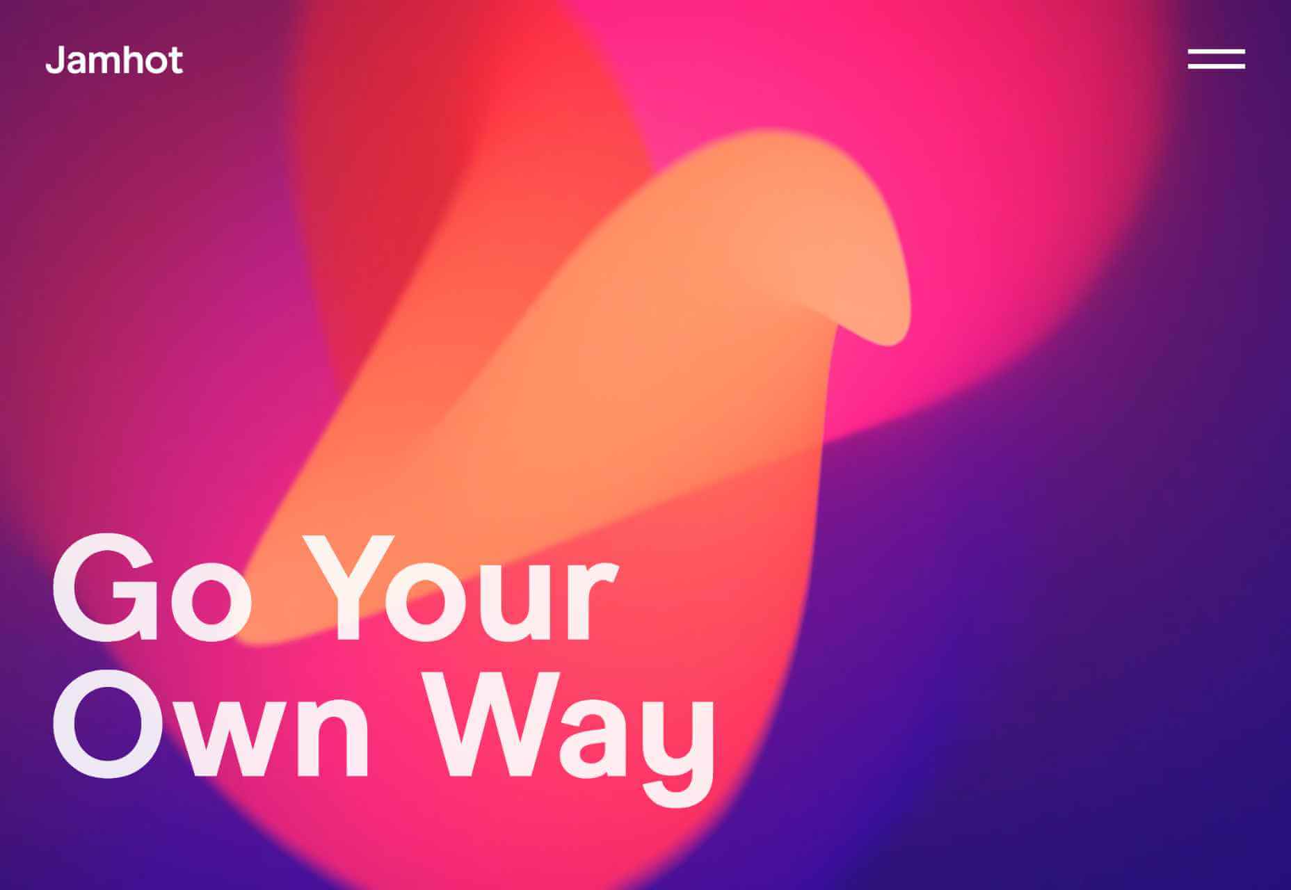
Jamhot
Tank fly boss walk jam nitty gritty you’re listening to the boy from the big bad city — ahem. Clearly someone else has a fondness for 90s-era dance music. Jamhot exudes confidence, but why not when you have that animation on your site’s landing page. Seriously, I could look at this beauty for hours.
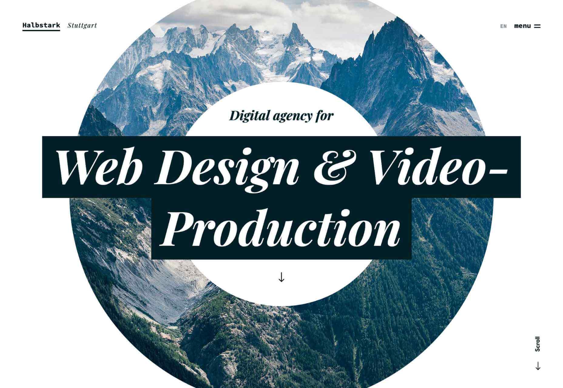
Halbstark
I love the mountains, so Halbstark’s blend of big bold type, and eye onto a mountain scene grabbed me immediately. The zoom effect when your scroll down is sublime, and it leads to a very simple, carefully ordered portfolio that showcases everything you want to see in a reliable agency.
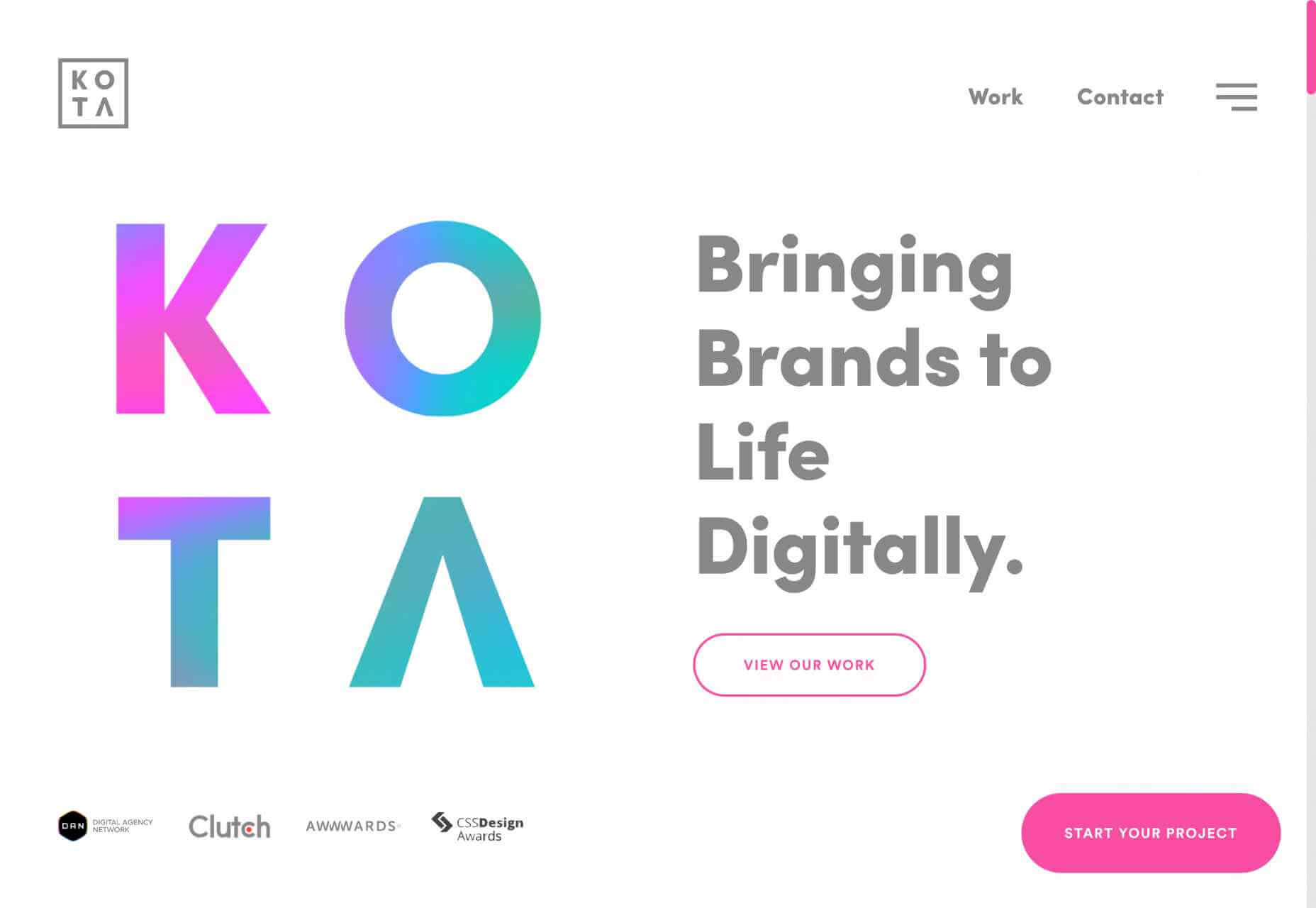
Kota
I said there were plenty of glitch effects this month, and my favorite of them is Kota. Run your cursor over the screen and the large type, with the gradient, will distort and glitch in a liquid style. How’s that for packing in every single current design trend into one graphic?
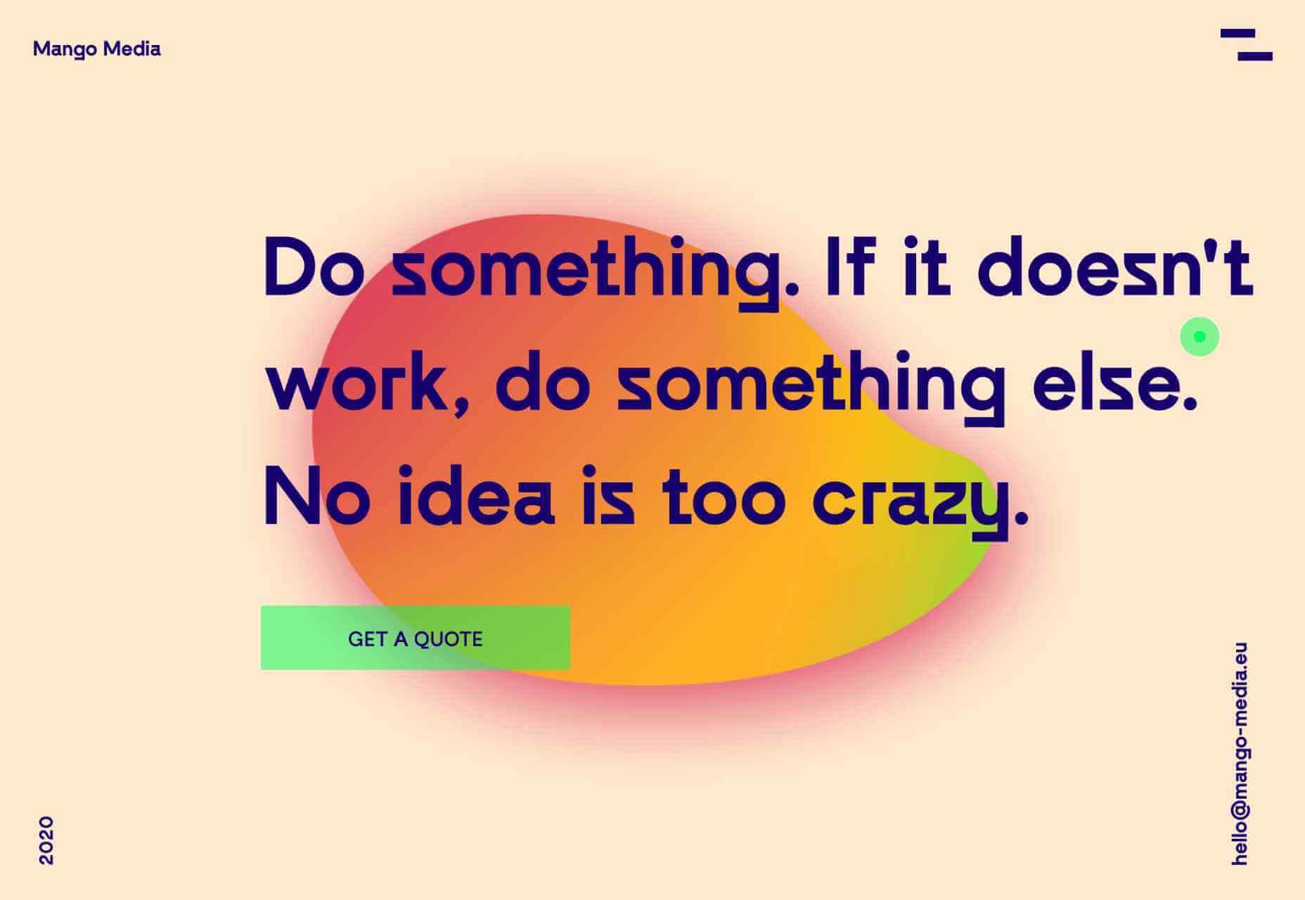
Mango Media
Some of the best sites this month combine several design trends, and Mango Media is one of them. Cursor over the blob and you’ll get bold gradients combined with the ever-popular glitch effect. And kudos for that hamburger menu icon that’s both original and perfectly clear.
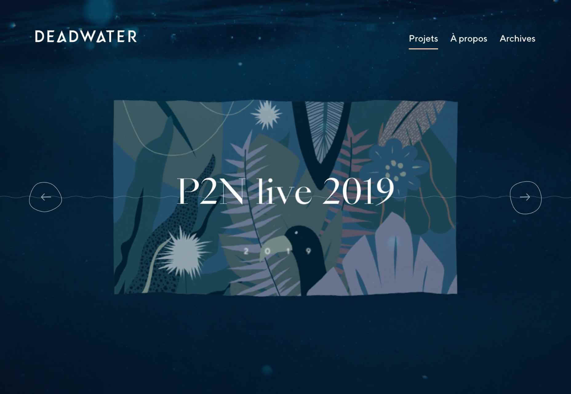
Deadwater
With a name like Deadwater, it’s no surprise that this French design agency has employed the liquid effect trend that’s been popular for the last few months. I love the way it’s been combined with a glitch effect to create the sense of being under water.
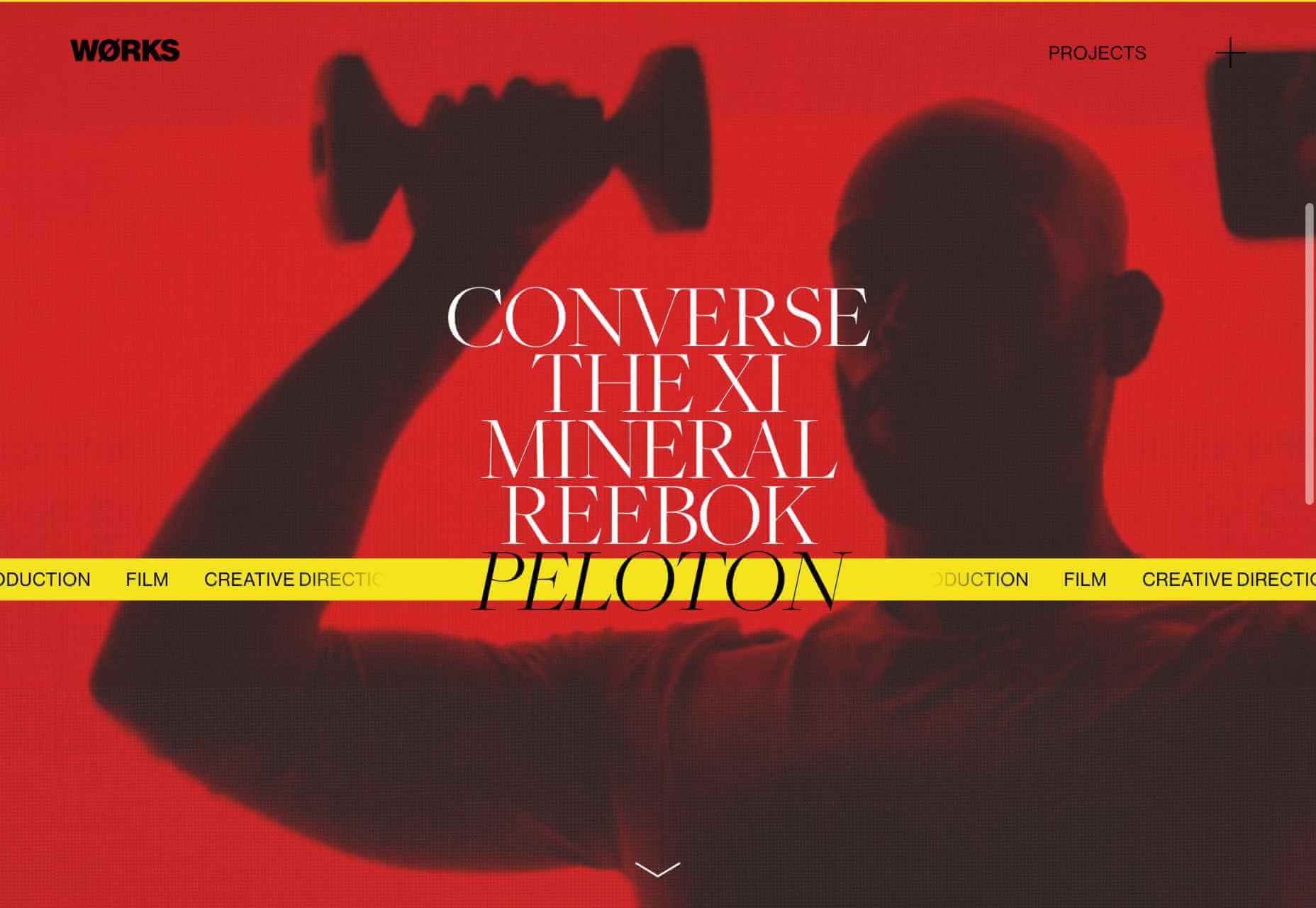
Works
There’s a long-standing tradition in this series of selecting portfolios that make good use of the color yellow. Works certainly does that with an acid-toned site, that once you scroll uses a ticker-style band of the same color to indicate a selection. It ties everything together perfectly.
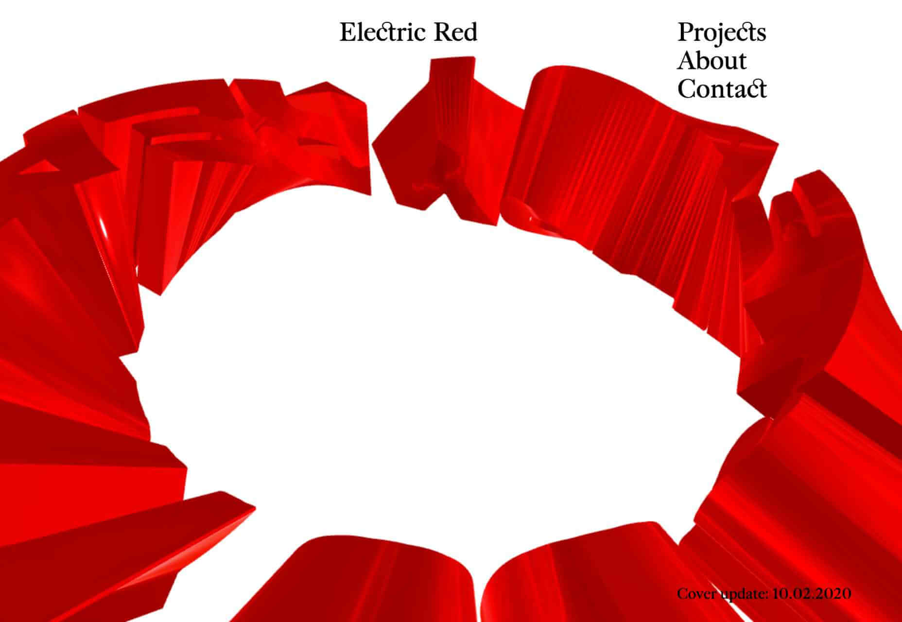
Electric Red
So, you think you’ve seen big type? Think again, you’ve not seen anything until you’ve seen Electric Red’s giant, 3D-rendered ring of spinning red text. The graphic grabs you as soon as you see it, but it’s also interactive, and it needs to be if you want to see enough to work out what it says.
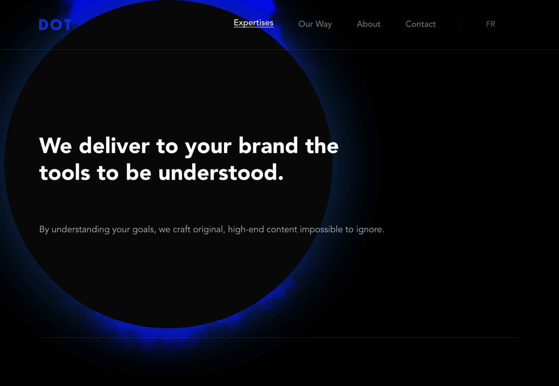
Studio Dot
Studio Dot obviously had to use a big dot on its site, behind which you’ll see a ton of glitchy graphics. What I really love are the links at the bottom of the homepage, which open without clicks when you hover over them for a while — usability aside I love that they tried to innovate in this area.
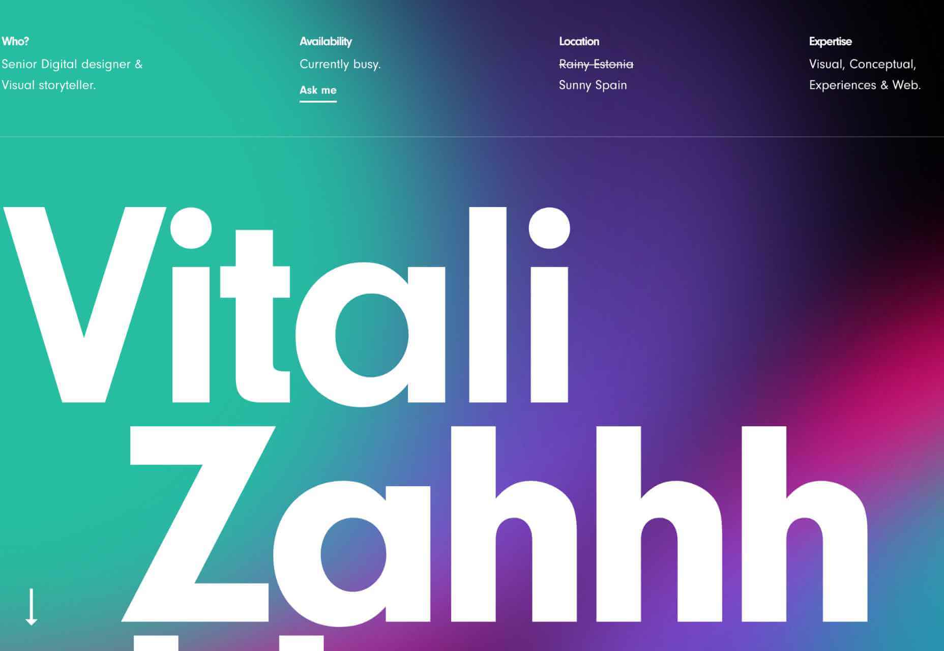
Vitali Zahharov
More animated gradients, this time curtesy of Vitali Zahharov. And yet more big bold typography, which is a trend that’s going to last throughout 2020 and beyond. Vitali’s a freelance designer based in Spain, and he’s worked for some really exceptional clients, scroll down to see selected work.
Tubik Studio
Tubik Studio’s site devoted to its staff has tons of personality on display, from its juggling balls load bar, to the eccentric sound effects when you cursor over a thumbnail. Its main site is very goal-orientated, so showing off some personality contrasts well and makes it approachable.
Superlab
If you read this series regularly you’ll know that I’m a sucker for animated abstract shapes. I guess I must have loved building blocks as a kid. Superlab’s are great because they tie everything together, without imposing themselves on the design. Nice bold, confident colors too.
p img {display:inline-block; margin-right:10px;}
.alignleft {float:left;}
p.showcase {clear:both;}
body#browserfriendly p, body#podcast p, div#emailbody p{margin:0;}
from Webdesigner Depot https://ift.tt/3bonGaf
from WordPress https://ift.tt/2J5iKv4
No comments:
Post a Comment